
Chapter 3. TrendiCity
Now that you have tools in your toolbelt, let’s talk about developing an actual mobile application. Instagram is a very popular photo sharing application. To make these photos even more interesting and to show off some Ionic features, we will be referencing an application that we developed, called TrendiCity. This application fetches and displays Instagram photos in a variety of ways.
One of the ways we display photos is by presenting their location on a map. Another is to display them in the form of Tinder/Swipe cards, where the user can indicate whether they like them or not. Lastly, we display them in a list view with a few more details.
The complete Trendicity application can be found on Github for your reference. You can download it and execute the application on your desktop browser, or you can deploy it to a device or a simulator.
The TrendiCity application is built as a side menu application, however, it also incorporates the use of tabs as well. We will discuss several aspects of the application. The Side Menu and the options the user can take, the Search feature, and the use of a Loading Service and the (Map View, Card View and List View) tabs.
Hang on to your hats as we dive into the code and take a bit of a roller coaster ride through the building of the application.
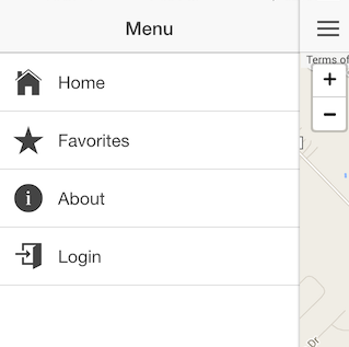
Side menu
The side menu consists of the following menu options:
- Home
- Favorites
- About
- Login/Logout
Below is a screenshot of the TrendiCity side menu on a mobile device. For details on how to implement a side menu and the routes that go along with it, see Chapter 5: Implementing a side menu and setting up the routes.
Home
The Home menu option will invoke the HomeCtrl. The user will be taken to the Map View Tab and display the current Trending posts.
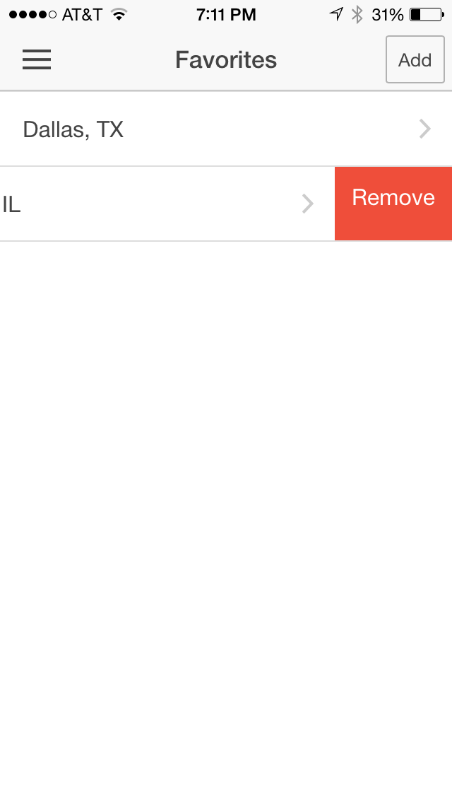
Favorites
The Favorites menu option will display the list of favorites that the user has added. For details on how the Favorites implementation works, see Chapter 6: Setting up the favorites controller.
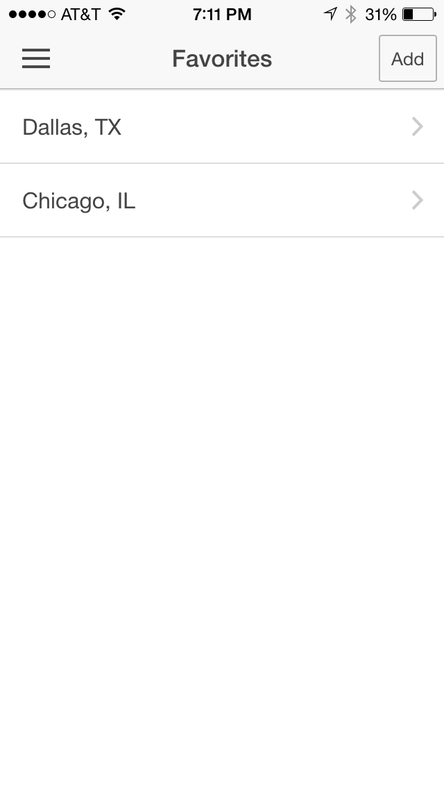
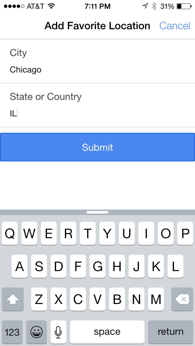
The user can choose the Add button at the top right, which will display a modal for a new Favorite to be added. By submitting, the new Favorite will be stored in localStorage and displayed in the list.
The user can swipe left on a Favorite to Remove that favorite. If Remove is selected, the Favorite will be removed from localStorage and will also be removed from the list.
About
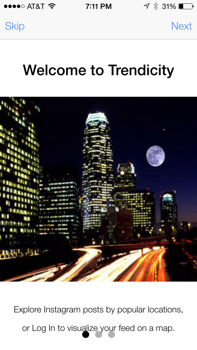
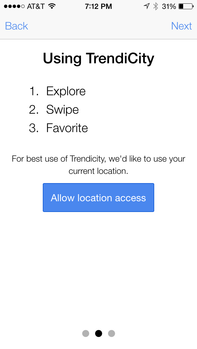
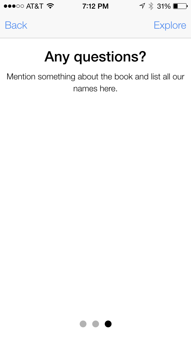
The About menu option will display a slide box containing introductory information about the application. The first time the application is launched, the user will be presented with this page.
Login/Logout
The menu option for Login will be displayed if the user is not currently logged in. Once the user is logged in, the Logout menu option will be displayed.
The following is a snippet from the app/templates/menu.html file showing how this can be acheived using ng-show and ng-hide.
<ion-itemnav-clearmenu-closeclass="item-icon-left"ng-click="login()"ng-hide="isLoggedIn()"><iclass="icon ion-log-in"></i>Login</ion-item><ion-itemnav-clearmenu-closeclass="item-icon-left"ng-click="logout()"ng-show="isLoggedIn()"><iclass="icon ion-log-out"></i>Logout</ion-item>
The isLoggedIn, login and logout functions can be found in the app/app.js file.
// Determine if the user is logged into Instagram$scope.isLoggedIn=function(){returnInstagramService.isLoggedIn();};// Open the login modal$scope.login=function(){$scope.loginModal.show();};// Perform the logout action when the user invokes the logout link$scope.logout=function(){InstagramService.logout();};
The isLoggedIn function is going to ask the InstagramService if the user is logged in. The logout function is going to ask the InstagramService to log the user out. We will talk more about that InstagramService in the Instagram service chapter.
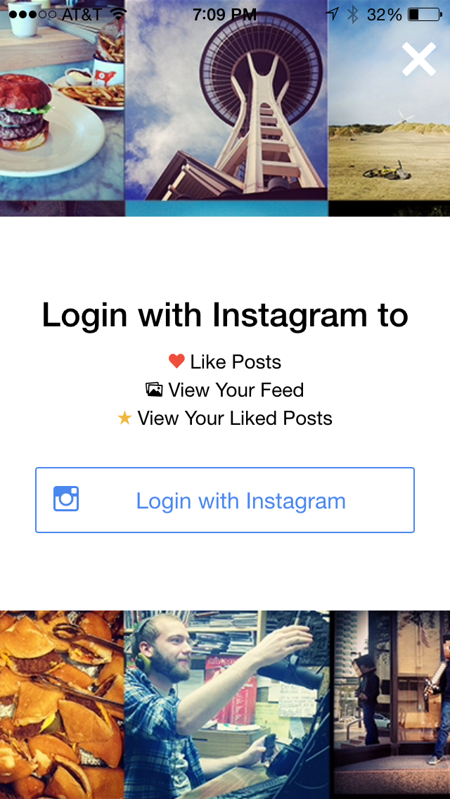
In order to do more interesting things with Instagram, we need the user to login to Instagram. To achieve this, we are going to make use of an $ionicModal to give a brief description of what we intend to do if the user chooses to proceed. Upon selecting the Login menu option, the login function will be invoked, and the user will be presented with the following login modal.
// Create the login modal that we will use later$ionicModal.fromTemplateUrl('templates/login.html',{scope:$scope,animation:'slide-in-up'}).then(function(modal){$scope.loginModal=modal;});//Cleanup the modal when we're done with it!$scope.$on('$destroy',function(){$scope.loginModal.remove();});
Normally, for a login page, we might do something like what is represented in the screenshot and HTML below. However, since we are integrating with Instagram, we need to login using an OAuth type approach.
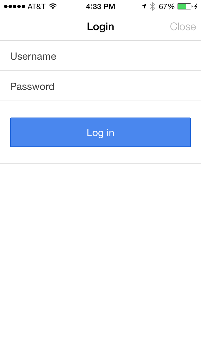
<divclass="modal"><ion-header-bar><h1class="title">Login</h1><divclass="buttons"><buttonclass="button button-clear"ng-click="closeLogin()">Close</button></div></ion-header-bar><ion-content><formng-submit="doLogin()"><divclass="list"><labelclass="item item-input"><spanclass="input-label">Username</span><inputtype="text"ng-model="loginData.username"></label><labelclass="item item-input"><spanclass="input-label">Password</span><inputtype="password"ng-model="loginData.password"></label><labelclass="item"><buttonclass="button button-block button-positive"type="submit">Log in</button></label></div></form></ion-content></div>
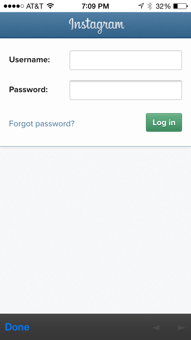
Instead of displaying a traditional login modal, we are going to inform the user of what we are intending to do, and what they can expect to be able to do once they login to Instagram. Once the user confirms that they want to login to Instagram, we are going to invoke the loginToInstagram function in app/controllers/app.js.
// Perform the OAuth login to Instagram$scope.loginToInstagram=function(){$scope.loginModal.hide();InstagramService.login();};
This function will perform OAuth level authentation using the InAppBrowser Cordova plugin. We are using this plugin to open a window with the Instagram login URL.
Search
The Search icon is represented by a magnifying glass in the top right portion of the Home view. The user has the following search options:
- Trending - “popular” posts currently trending on Instagram.
- Nearby - posts within a 1K mile radius of the user’s current location.
- User Feed - Instagram feed for the logged in user.
- Liked Posts - posts that the logged in user has liked.
In the HomeCtrl, we setup the search functionality. The code below has been slightly abbreviated in order to focus on the search feature.
First, we set up a couple of scope variables to hold the posts and the search value. We are using a JavaScript object for both so that we get consistent results when we setup the $watch on them.
$scope.data={posts:[]};$scope.search={value:'TR'};
Next, we setup the $scope.getPosts function that will be responsible for determining which function needs to be called based on the search value.
$scope.getPosts=function(value){if(value==='TR'){$scope.findPopularPosts();}elseif(value==='NB'){$scope.findNearbyPosts();}elseif(value==='UF'){$scope.findUserFeedPosts();}elseif(value==='LP'){$scope.findLikedPosts();}};$scope.findPopularPosts=function(){InstagramService.findPopularPosts().success(function(data){$scope.data.posts=data.data;});};$scope.findNearbyPosts=function(){InstagramService.findNearbyPosts($scope.location.coords.latitude,$scope.location.coords.longitude).success(function(data){$scope.data.posts=data.data;});};$scope.findUserFeedPosts=function(){InstagramService.findUserFeedPosts().success(function(data){$scope.data.posts=data.data;});};$scope.findLikedPosts=function(){InstagramService.findLikedPosts().success(function(data){$scope.data.posts=data.data;});};
By setting up a $watch on the search value, we can have the $scope.getPosts function invoked when the search value is changed in the ionicPopover component.
$scope.$watch('search.value',function(newValue){$scope.getPosts(newValue);$scope.closePopover();$ionicScrollDelegate.scrollTop();});
To implement the ionicPopover, we first need to load up the HTML for it by calling the fromTemplateUrl function. Here we set the scope for it to be the same scope that we are using in the HomeCtlr. When the template is loaded, we set the popover in our scope variable so that we can reference it later.
$ionicPopover.fromTemplateUrl('templates/search.html',{scope:$scope,}).then(function(popover){$scope.popover=popover;});
Below is a snippet of the search.html template. Here we are using the ion-popover-view component to define the view. We use the ion-header-bar component to display the title for the popover. We use the ion-content component to wrap the ion-radio components. The ion-radio components will be responsible for setting the appropriate search value when selected.
<ion-popover-view><ion-header-bar><h1class="title">Search</h1></ion-header-bar><ion-content><ion-radiong-model="search.value"value="TR">Trending</ion-radio><ion-radiong-model="search.value"value="NB">Nearby</ion-radio><ion-radiong-model="search.value"value="UF">My Feed</ion-radio><ion-radiong-model="search.value"value="LP">My Liked Posts</ion-radio></ion-content></ion-popover-view>
The ionicPopover will be displayed when the user selects the Nav button, which is defined in templates/home.html. Below is a snippet from that file.
<ion-nav-buttonsside="right"><buttonclass="button button-icon icon ion-ios7-search"ng-click="openPopover($event)"ng-hide="favorite"></button></ion-nav-buttons>
When the user touchs the Search magnifiying glass icon, the openPopover function will be invoked. All we have to do then is just ask the popover to show itself. When a selection is made, the closePopover function will be invoked. In that function, we just make sure that the popover is defined and isShown. If so, we ask it to hide itself. The last thing we need to do is to set up a $destroy listener so that the popover is removed from the DOM when the scope is destroyed.
$scope.openPopover=function($event){$scope.popover.show($event);};$scope.closePopover=function(){if($scope.popover&&$scope.popover.isShown()){$scope.popover.hide();}};// Cleanup the popover when we're done with it!$scope.$on('$destroy',function(){if($scope.popover){$scope.popover.remove();}});
Loading service
When photos are loading, instead of the user wondering what the application is doing, we would like to inform the user that we are loading data. We can make use of the $ionicLoading component to achieve this. A clever way to use the $ionicLoading component is to place it inside of an HTTP interceptor. We have slighlty abbreviated the TrendiCity code below so that we can focus on this particular topic.
.factory('TrendicityInterceptor',function($injector,$q){varhideLoadingModalIfNecessary=function(){var$http=$http||$injector.get('$http');if($http.pendingRequests.length===0){$injector.get('$ionicLoading').hide();}};return{request:function(config){$injector.get('$ionicLoading').show();},requestError:function(rejection){hideLoadingModalIfNecessary();return$q.reject(rejection);},response:function(response){hideLoadingModalIfNecessary();returnresponse;},responseError:function(rejection){hideLoadingModalIfNecessary();return$q.reject(rejection);}};});
The request function will be invoked when an HTTP request is made. Here we show the “Loading” message. To avoid a circular dependency error, we need to use the Angular $injector component to obtain the $ionicLoading service.
The requestError function will be invoked when an HTTP request error occurs. Here we will call the hideLoadingModalIfNecessary() function, which will check to see if there are any pending HTTP requests. If not, the ionicLoading service will be be asked to hide itself.
The response function will be invoked when a succuessful HTTP response is received. Here we do the same thing we did in the requestError function.
The responseError function will be invoked when an HTTP response error occurs. Again, we do the same thing we did in the response and requestError functions.
In order to get our HTTP interceptor to work, we need to essentially let AngularJS know about it. Generally, this is done in the app.js file as follows.
.config(function($httpProvider){$httpProvider.interceptors.push('TrendicityInterceptor');});
Here we are adding our intercepter to the array of interceptors on the $httpProvider.
Notice we didn’t provide the actual message when we asked the ionicLoading componet to show itself. The reason for that is because we have configured the default message in the app.js file.
.constant('$ionicLoadingConfig',{template:'<h3><icon ios="ion-ios7-reloading"android="ion-loading-c"default="ion-refreshing"></icon></h3>Loading...'})
We will go over this template in more detail in the next chapter. For now, we just wanted to show you why we didn’t need to pass in the message to the ionicLoading show function.
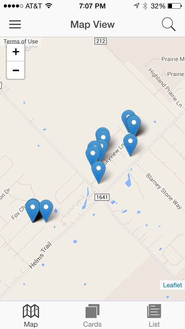
Map view tab
The map view tab will display the current result set of posts on an interactive map. A marker will be displayed to denote the user’s current location. Markers will also be displayed to represent the location of where the photo was taken. When a post marker is touched, the associated photo will be displayed. For details as to how the map view is implemented, see Chapter 7: Integrating a map view with Ionic.
Card view tab
The card view tab will display the photos as a deck of cards stacked on top of each other. The user can drag or swipe a card to the left to unlike the photo. Likewise, the user can drag or swipe a card to the right to like the photo.
These Swipe Cards are very much like the cards seen in the popular Tinder mobile application. This type of functionality has commonly been referred to as Tinder Cards.
Max Lynch, one of the co-founders of Drifty (the company responsible for bringing us Ionic) has created a library that allows us to create Swipe Cards in our mobile application. This type of add-on library is commonly referred to as an ion by the Ionic team. They typically showcase ways to use Ionic to do even more exciting things.
This library uses CSS animation to achieve the angling of the cards as they are swiped or dragged across the screen. It also uses a new physics-style animation library Collide to implement a spring-like effect when you pull a card straight down.
Prior to the Tinder Card ion library, a very similar swipe card ion was created. We just wanted to mention it so that you would not be suprised if you come across that one. We are not going to cover that library here.
Working files
The files related to the card view functionality are located at:
www/templates/tab-card.html,www/templates/card-intro.html,
www/js/controllers/card.js and
www/js/directives/no-touch-move.js.
Introductory popup
When navigating to the card view tab for the first time, we decided to display an explanatory popup message introducing the user and familiarizing them to our swipe card functionality.
We employ the $ionicPopup service to display an Ionic-styled popup message. The service allows you to define four types of popups:
show(options): Fully customizable popup with loads of options.alert(options): Popup with a single button.confirm(options): Displays a confirmation message with with “Cancel” and “OK” buttons.prompt(options): Requires the user to interact with an input field and displays the same buttons from theconfirmpopup type.
For our TrendiCity application, we define a custom popup like so:
$ionicPopup.show({title:'Swipe Cards',templateUrl:'templates/card-intro.html',scope:$scope,buttons:[{text:'Next',type:'button-positive',onTap:function(e){if(slidebox.currentIndex()==0){// Go to next slideslidebox.next();// Change button texte.target.innerHTML='OK';e.preventDefault();}else{// Close popupreturn;}}}]});
The popup’s body is defined by either the template or templateUrl fields in the options object passed into the show() function. For TrendiCity, since our template is a little complex, we defined it in its own file and linked it by specifying its location relative to the index: templates/card-intro.html.
Our template includes a slide box to allow for fluid transitions between one explanatory image to the other.
<ion-slide-boxdoes-continue="false"show-pager="false"delegate-handle="card-intro-slidebox"ng-init="disableSlideBox()"><ion-slide><imgclass="full-image"src="images/swipe-right.png"/></ion-slide><ion-slide><imgclass="full-image"src="images/swipe-left.png"/></ion-slide></ion-slide-box>
The slide box component comes with its own AngularJS service called $ionicSlideBoxDelegate. This service allows you to control the components’s behavior, such as switching from slide to slide, controlling the state of the auto-play feature and disabling slides from sliding. The addition of an update() function, which explicitly triggers the rendering of the slide box, is handy when changing the number of slides dynamically and resizing the directive to adapt its size to fit new slide dimensions.
For our purposes, we opted for disabling any automatic sliding by setting the does-continue attribute to false and even disallowed the user from swiping the individual slides with the initial call to our controller’s disableSlideBox() function which would disable all slides:
$scope.disableSlideBox=function(){$ionicSlideBoxDelegate.enableSlide(false);};
This would simplify handling the flow of the tutorial popup by requiring all steps to pass through the buttons.
The onTap function of Ionic’s popup service let us provide custom logic for the popup’s functionality. In essence, if the current slide being displayed was the first one, tapping on the “Next” button would switch to the following slide by invoking our slide box delegateInstance’s’ (given by $ionicSlideBoxDelegate.$getByHandle("card-intro-slidebox")) next() function and change the button’s text to “OK” as well as preventing the popup from closing. Otherwise, meaning when on the second and final slide, we would simply call return, which would close the popup.
Finally, each time the user accesses the card view, we execute a simple check on the locally stored seenCardIntro value to determine if the user has to see the introduction or not.
Card view
In the tab-card.html file, we setup a collection of cards using the td-cards element. This is a container that will hold our td-card elements. We use a ng-repeat to iterate over the posts. Then we define some attributes that allow us to respond to the user’s interactions with the cards.
<ion-viewtitle="Card View"><ion-contentclass="has-header padding"scroll="false"><td-cards><td-cardng-repeat="post in data.posts"on-destroy="cardDestroyed($index)"on-transition-left="cardTransitionedLeft($index)"on-transition-right="cardTransitionedRight($index)"><divclass="image"><divclass="no-text">NOPE</div><imgng-src="{{ post.images.low_resolution.url }}"/><divclass="yes-text">LIKE</div></div></td-card></td-cards></ion-content></ion-view>
Card view controller
We need the CardViewCtrl to disable the ability to slide the content, which would normally display the Side Menu. If we didn’t disable this, it would conflict with our Tinder card functionality. Here we use the $ionicSideMenuDelegate to disable the drag event on the content upon entering the view. When leaving the view, we enable it so that the other views will be able to support the dragging of the content to open the side menu.
.controller('CardViewCtrl',function($scope,$ionicSideMenuDelegate,$ionicPopup,$ionicSlideBoxDelegate,localStorageService){// Disable side-menu drag so that it doesnt interfere with our tinder cards functionality$scope.$on('$ionicView.enter',function(){$ionicHistory.clearHistory();$ionicSideMenuDelegate.canDragContent(false);});$scope.$on('$ionicView.leave',function(){$ionicSideMenuDelegate.canDragContent(true);});$scope.cardTransitionedLeft=function(index){console.log('cardTransitionedLeft called with index:'+index);if(!InstagramService.isLoggedIn()){return;}varpost=$scope.data.posts[index];if(post.user_has_liked){InstagramService.dislikePost(post.id).success(function(){console.log('you disliked it!');});}else{console.log('you didnt like it in the first place!');}};$scope.cardTransitionedRight=function(index){console.log('cardTransitionedRight called with index:'+index);varpost=$scope.data.posts[index];if(!post.user_has_liked){InstagramService.likePost(post.id).success(function(){console.log('you liked it!');});}else{console.log('you already liked it previously!');}};$scope.cardDestroyed=function(index){console.log('cardDestroyed called with index:'+index);$scope.data.posts.splice(index,1);};
The cardTransitionedLeft and cardTransitionRight functions are basically the same except that the cardTransitionedLeft function will remove a like, and the cardTransitionRight function will add a like. Both will check to see if they even need to make a call to Instagram or not. However, if the user tries to like a card and they are not logged in, they will be prompted to login. Upon a successful login, the card will be liked. This is the result of our authentication solution. You can read more about how this is achieved by reading the chapter on Authentication.
The cardDestroyed function will be called once a card has transitioned and has been destroyed. Here we just remove the card from the posts array.
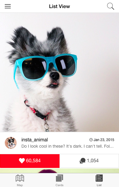
List view tab
TrendiCity’s list view tab is developed in order to show off some of Ionic’s core list functionality. Popular components such as pull-to-refresh, button bars action sheets, and gestures are included in the view. In this section, we will explore the development process of working with lists, and the aforementioned components.
Working files
The files related to the list view functionality are located at: www/templates/tab-list.html, www/js/controllers/list.js and www/js/directives/on-dbl-tap.js. The routing has been configured in the www/js/app.js module like so:
.state('app.home.list',{url:'/list',views:{'tab-list':{templateUrl:'templates/tab-list.html',controller:'ListViewCtrl'}}})
Template layout
The list view template can be divided into three sections: the refresher, the list of posts, and the button bar containing accessible user-actionable buttons.
Refreshing the list of posts
Ionic provides a very useful directive aptly named ion-refresher. To implement this component, it is as easy as including the tag in your view’s markup and attaching a function in the view’s controller to handle your application’s behavior once the user has fully pulled the content down and triggered the refreshing mechanism.
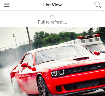
To keep it simple, we opted with the default refreshing icon (ion-arrow-down-c) supplied within the directive and set some custom text to be displayed when pulling down on the list of posts.
<ion-refresherpulling-text="Pull to refresh..."on-refresh="doRefresh()"></ion-refresher>
Note that the directive allows you to override its default settings through the following attributes:
on-refresh: Function to call once user completely pulls the content down triggering the refresh mechanism.on-pulling: Function to call once user starts pulling down the content.pulling-icon: Ionicon to display when user is pulling down.pulling-text: Text to display when user is pulling down.refreshing-icon: Ionicon to display once the refresh mechanism has been triggered.refreshing-text: Text to display once data is being refreshed.disable-pulling-rotation: Stops rotation of icon onceon-refreshis reached.
A noteworthy improvement to the ion-refresher component is the addition of a small timer, which causes the refresher to be displayed for a minimum of 400ms, for cases when your data is fetched in the blink of an eye. In these situations, the inclusion of a timeout creates the illusion of a smoother refreshing process that signals to the user that data has been fetched properly.
Back to TrendiCity, our refresher is setup to trigger our controller’s doRefresh() function when expecting to fetch new posts. Below is the code to handle the refreshing mechanism.
$scope.doRefresh=function(){$scope.getPosts($scope.search.value);// Hide ion-refresher$scope.$broadcast('scroll.refreshComplete');};
As explained in the previous sections, we make use of HomeCtrl’s getPosts function passing it the current search value. This allows the application to know what type of posts to target when fetching data from Instagram’s API, and is determined by the currently selected type of feed of the search’s popover list.
Lastly, we finish off by broadcasting the particular event scroll.refreshComplete to signal the directive’s refreshing mechanisms end, which causes the ion-refresher to return to its initial state and become hidden. This last step is required by the given component.
List of posts
When working with large lists of items you have many ways of offloading the mobile device’s limited hardware and maintain fluid application functionality. There is Ionic’s ion-infinite-scroll directive, which loads new data in preset intervals defined by you. Another feature, collection-repeat, mimics other well known mobile platform list views such as the iOS UITableViewController, by only loading a few rows of list items at a time, removing the ones off of the device’s screen. By minimizing the number of DOM elements required to be added and display your list’s content, collection-repeat improves your application’s performance.
Compared to other solutions, collection-repeat is an elegant directive that doesn’t require any complicated setup to gain the potential performance boost. The only configuration required from the developer is to specify each item’s height and width. This can be achieved by calling functions and optionally passing in the list item’s index to determine each item’s size. Otherwise, using a scoped variable or static value is also an acceptable approach.
In our case, we do not modify the item dimensions, however we perform a calculation based on the device’s screen width to determine the constant item size. Therefore, we summed the heights of either screen width or Instagram image width (whichever is the smallest), as well as the heights of item-avatar and button-bar:
functiongetItemHeight(){varscreenWidth=window.innerWidth,imageWidth=640,itemAvatarHeight=76,buttonBarHeight=46;varmin=(screenWidth<imageWidth)?screenWidth:imageWidth;returnmin+itemAvatarHeight+buttonBarHeight;}$scope.itemHeight=getItemHeight();
And in the template we use collection-repeat like so:
<divclass="list-post"collection-repeat="post in data.posts"collection-item-height="itemHeight">...</div>
Note that we haven’t defined the collection-item-width attribute’s value since it would have been equivalent to the directive’s default value of 100% in any case.
An important thing to note when working with the collection-repeat directive is the fact that it will apply absolute positioning on your list items, which may cause unexpected display behavior. To counter this, simply apply the following CSS rules to the list items:
left:0;right:0;
In our application, we included this segment in our list-post class.
Liking posts
As we did with the card view, we implemented a post liking mechanism in the list view. To spice things up, we decided to mimic Instagram’s functionality when it comes to liking posts. Similarly, we allow the user to double tap the post’s image as well as tapping the dedicated button to designate the liking of a post.
Implementing this functionality with a dedicated button is pretty straightforward. First of all, we use the button-bar class as a wrapper for the like and comment buttons:
<divclass="button-bar bar-light"><buttonclass="button"ng-click="like($index)"ng-class="{ 'button-assertive': post.user_has_liked }"><iclass="icon ion-heart"></i>{{ post.likes.count | number }}</button><buttonclass="button"><iclass="icon ion-chatbubbles"></i>{{ post.comments.count | number }}</button></div>
Furthermore, we added a ng-class attribute that would apply the button-assertive class on the like button if the particular post has been liked. A simple ng-click sufficed for the purpose of invoking our controller’s like($index) function.
For the image double tapping, we are going to introduce the topic of gestures. Conveniently, Ionic provides multiple directives for automatically handling common gestures such as tapping, dragging, and holding, amongst numerous others. These gestures come from a popular framework called HammerJS that handles the actual gesture-recognition mechanism for Ionic and our application. Ionic’s directive definitions do not include the double-tapping gesture we want to capture so we examined the source code responsible for all of the other gestures’ directives, as well as determining the corresponding HammerJS gesture name. We then defined an equal solution for the double tap gesture:
.directive('onDblTap',function($ionicGesture,$parse){return{restrict:'A',link:function($scope,$element,$attr){varfn=$parse($attr['onDblTap']);varlistener=function(ev){$scope.$apply(function(){fn($scope,{$event:ev});});};vargesture=$ionicGesture.on('doubletap',listener,$element);$scope.$on('$destroy',function(){$ionicGesture.off(gesture,'doubletap',listener);});}};});
In the template, the double tapping gesture directive is included like so:
<img...on-dbl-tap="like($index)".../>
When the user double taps the image within an interval of 250ms, the like($index) function is invoked passing the list item’s index.
Here is our like() function’s implementation:
$scope.like=function(index){if(!InstagramService.isLoggedIn()){// Show login modal$scope.loginModal.show();return;}varpost=$scope.data.posts[index];if(!post.user_has_liked){// jshint ignore:lineInstagramService.likePost(post.id).success(function(){console.log('you liked it!');// Update post to reflect like$scope.data.posts[index]['user_has_liked']=true;$scope.data.posts[index]['likes']['count']=post.likes.count+1;});}else{console.log('you already liked it previously!');}};
Finally, the like() function checks if the user is logged in, and depending on this state, either displays the login modal, or goes forth with liking the post using Instagram’s API.
Displaying options with action sheet
In tune with new advancements in mobile design with the advent of new components such as Android’s hamburger menus and iOS’s action sheets, Ionic has introduced a similarly named component: $ionicActionSheet. This service lets you invoke fully stylized action sheets from your controller, without having to add any markup whatsoever.
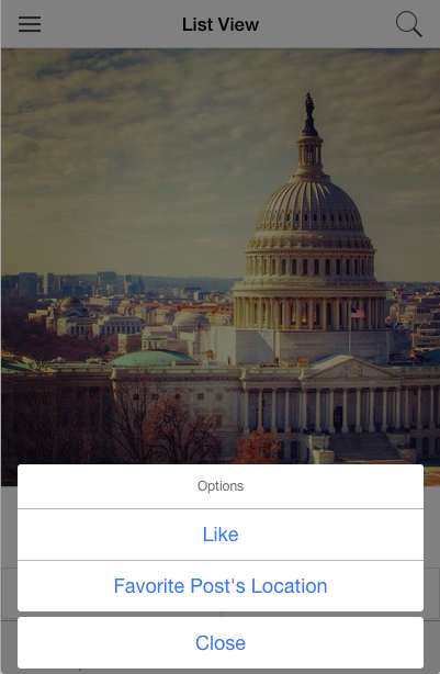
For our purposes, we want to allow the users to have more options when it comes to interacting with posts.
$scope.displayOptions=function(index){// Get postvarpost=$scope.data.posts[index];varbuttons=[{text:'Like'}];// Add button if location availableif(post.location!==null&&post.location.longitude!==null&&post.location.latitude!==null){buttons.push({text:'Favorite Post's Location'});}varactionSheet=$ionicActionSheet.show({buttons:buttons,titleText:'Options',cancelText:'Close',buttonClicked:function(i){if(i===0){// Like post$scope.like(index);}elseif(i===1){// Add post's location to favoritesFavoritesService.add({city:(post.location.name||post.user.username+''s post'),lng:post.location.longitude,lat:post.location.latitude});// Display confirmation$ionicLoading.show({template:'Added to Favorites',noBackdrop:true,duration:1000});}// Close action sheetreturntrue;}});};
First and foremost, we want to allow users to favorite the post’s location for future revisiting. Therefore, we ensure that the particular post has a location field and has valid longitude and latitude coordinates. This being the case, we add a new button to the action sheet. The buttonClicked() function allows us to handle particular buttons based on their indexes in the buttons array. In order to close (hide) the action sheet, you are required to return true within the buttonClicked() function. An alternative way of achieving the same effect is to store the action sheet definition in a variable and then calling the close() function on the latter.
Combined with the hold gesture, you get a pretty intuitive user interface. Naturally, we added the provided on-hold directive to trigger the action sheet whenever the user holds their finger on the post’s image:
<img...on-hold="displayOptions($index)"/>
The $ionicActionSheet service includes additional options that can be defined when invoking it which we didn’t include in our application, such as:
cancelOnStateChange: Whether to close the action sheet when changing the state (route). Defaults to true.destructiveText: Text for a button separated from other options and highlighted with abutton-assertiveclass. Used for actions that are irreversible.destructiveButtonClicked: Handler function for the destructive button.
A possible use case for the last two options would have been to include a flag button, similar to what’s found in Instagram’s application.
Summary
We have taken a long journey through most of the steps for building an Ionic mobile web application. Now you know how the TrendiCity application was constructed, and how it works. Along the way you learned about Side Menu options, implementing a Search using ionicPopover, triggering the Loading Service, and the use of Tabs in an Ionic application. You learned how to use a ion-slide-box in the About view. You were shown how simple it is to create Tinder cards in the the Card view. You also learned how to use ion-refresher, ionicActionSheet and collection-repeat in the List view. You are now well on your way to building your very own hybrid applications.
In the following chapter, we will examine how to fully implement a side menu, and how to set up the routes that go with it.