If you understand the way color works, you’ll be able to make creative decisions and solve a variety of problems, too.
When starting to think about color in printing and photography, forget about how you mixed paint in school! Instead, a six-color palette with three primaries is used: red, green, and blue. Opposite each of these are their secondary colors: cyan, magenta, and yellow. All color controls in image-editing software work with these pairs: red + cyan, green + magenta, and yellow + blue. There are no other colors you need to think about! This relationship is expressed through the color wheel, as shown left.

All images contain some kind of rogue color, usually caused by poor lighting or environmental influences. If you shoot a portrait in daylight with your subject in the shade of a big green tree, everything in the image will look green. This is because the leaves have made the light appear green. Yet removing green from your image is simple: increase the amount of its opposite color, magenta, and as if by magic, it will disappear! Elements’ Color Variations controls, shown left, provide the three pairs as six color buttons so you can easily remove unwanted color casts.


Many a good shot is dominated by cold blue natural light, yet you can remove this quickly by using a photo filter.
If you shoot outdoors in early morning, midwinter, or when there’s no direct sunlight, all of your images will be covered with a thin veil of blue. This color cast prevents other subtle colors from shining through.

The simplest way to correct this problem is to use a photo filter. From the Filter menu, select Adjustments > Photo Filter, as shown above, to open the Photo Filter dialog box.


To create a pastel effect print, try decreasing the color saturation and printing on a rich art paper.
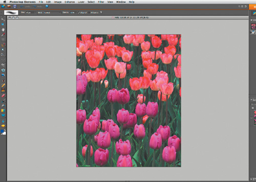
A good subject for this technique is a simple graphic flower study. The example shown above contains just three dominant colors and one repeating flower shape.
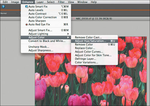
There are plenty of tools and techniques for changing and improving color, but only one for draining it away in precise amounts. From the Enhance menu, select Adjust Color > Adjust Hue/Saturation.


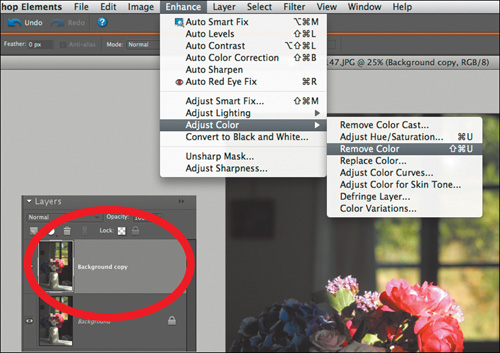
This technique is a simple way of merging the best parts of two different versions of the same image.
To start with, choose Layer > Duplicate Layer, so your Layers palette looks like the example above. Click on the Background Copy layer to make it active, then select Enhance > Adjust Color > Remove Color.
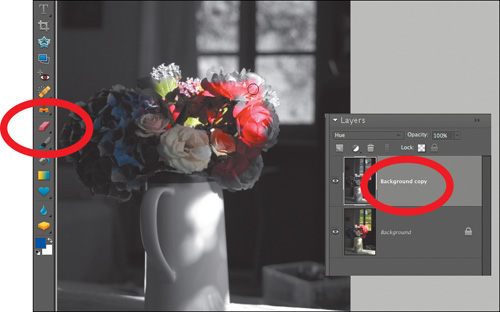
Your image should look like the one above, with a mono image layer floating above your colored starting point. Next, pick Hue from the Layers blending mode pop-up menu to define how color “reacts” in the next step.


Enhance your landscape imagery with a subtle watercolor filter from Photoshop Elements’ filter pack.
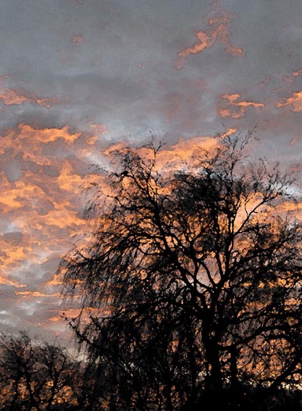
Watercolor filter effects look best when applied to landscape images that have plenty of tonal interest. The example above was chosen because of the contrast between the black tree and the delicately colored sky.

Select Filter > Artistic > Watercolor to reveal the three slider tools shown above. The Brush Detail slider creates fine results at the 8–10 end and coarse brush marks at 1–3. Keep the Shadow Intensity and Texture both at 1.


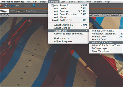
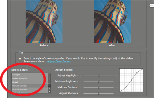
Photoshop Elements’ Curves controls are the best way to liven up weak or washed-out colors.
Although the original subject was brightly colored, the lighting on location was flat. The initial file, shown above, looked gray and lacked visual emphasis, as is typical of shots in JPEG format.

From the Enhance menu, choose Adjust Color > Adjust Color Curves. The Curves controls are an effective one-stop shop for boosting contrast, brightness, and color saturation.


This look, adapted from a traditional film technique, creates a luscious palette of purple and blue shades.
Open the file in the Camera Raw plug-in (see page 53). It doesn’t have to be a RAW format file; JPEGs or TIFFs will work too. The White Balance settings create the color effect shown above.

The unique color effect is created by sliding the Temperature scale to –75, as shown above. This creates the purply/blue color without any complex editing.


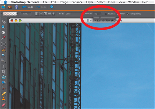
For images with blank or pale skies, a graduated filter effect can help to add interest.
Select the Gradient tool and then click in the Gradient Picker at the top left of the desktop. Next, choose the Foreground to Transparent option, as shown above.

The color of the effect is determined by the foreground color you choose. Click on the Color Picker and choose a vivid orange.

The trick with this effect is to make the new orange color blend seamlessly with the color in your photograph. From the Mode drop-down menu, pick the Color option.

To ensure that the filter can be applied in a convincing manner, you need to change the Opacity value from its default 100%. Click on the slider and set at 30%.


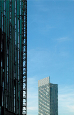

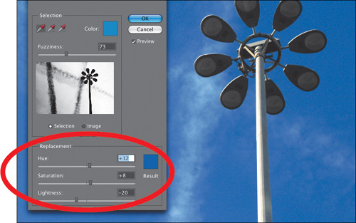
Boost the contrast in muted blue skies with an edit designed to resemble the look achieved with a screw-on lens filter.
Straight out of a digital camera, most images look lackluster. The plan for this example is to make the blues more vivid and increase the contrast with the white vapor trails.

To improve the overall contrast, select Enhance > Adjust Lighting > Levels. Drag the Highlight slider to the left so it sits under the base of the histogram shape, as shown above.

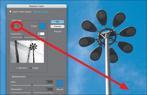
Next, select Enhance > Adjust Color > Replace Color. In the Selection panel, click on the dropper tool, as shown above, and then choose the Selection preview option.
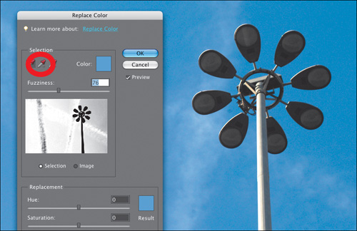
Click the dropper into the bluest area. The color you choose will show up as white in the Selection preview window. To increase or decrease the density, use the Fuzziness slider.