

Toning is an ideal technique for making both grayscale and plain RGB color images more eye-catching.
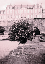
Before digital photography, only black and white images could be chemically toned, but today toning can be applied to color images too. The example shown above is an ideal subject for toning, since the amount of color is minimal.

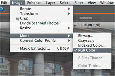
If your image is in Grayscale mode, you must convert it to RGB Color mode first, as shown above. If your image is already RGB, then desaturate by selecting Enhance > Adjust Color > Remove Color.
You create simple toning by using the Colorize function in the Hue/Saturation dialog box. This function applies a single color wash over the highlights, midtones, and shadows, as shown above. See page 120 for more details.

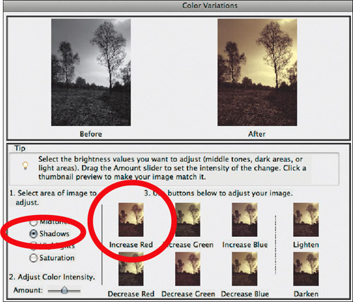
Complex effects can be achieved by using two different colors. The example above uses a yellow in the highlights and a red in the shadows, applied with Color Variations. See page 126 for more details.


This classic tone is used for making landscapes images appear three dimensional and to evoke timelessness.
Pick an image that would benefit from the toning process—one that has a rich tonal range, including whites and blacks, plus some textured elements too.

Start by selecting Enhance > Adjust Color > Hue Saturation. In the bottom-right corner, as shown above, select Colorize. Drag the Hue slider to 40 and reduce Saturation to 25–30. This will create a rich sepia color.


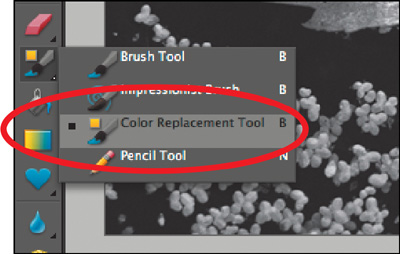
Like transparent inks, Elements’ Color Replacement tool allows you to tint your images.
Start by clicking and holding the Brush tool icon to reveal the submenu, as shown above. Choose the Color Replacement Tool and set your brush to 100 pixels with 0% Hardness. This will ensure that your brushwork looks more true-to-life.
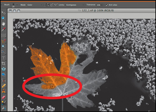
Rather than use the standard Color Picker to choose colors, open the Color Swatches palette through the Window menu. Begin by clicking on a midtone orange, as circled above. The Swatches palette stays on the desktop, making color changing fast.


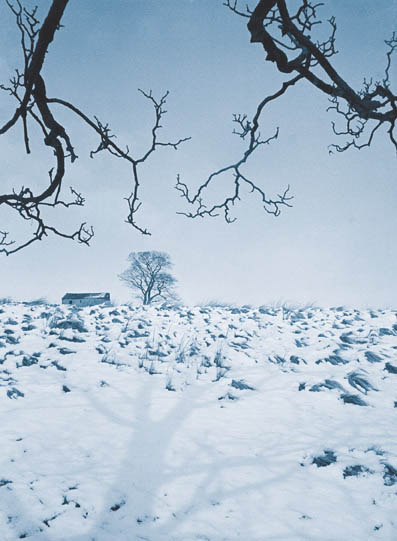
A delicate blue tone is the ideal color for enhancing monochrome winter landscapes.
This effect is created by merging two identical layers. Start by selecting Layer > Duplicate Layer, so your Layers palette looks like the example above. Click on the copy layer so it receives the next edit.

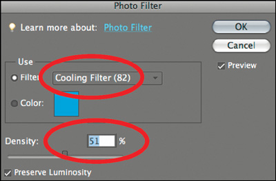
From the Filter menu, choose Adjustments > Photo Filter. From the Filter drop-down menu, choose the Cooling Filter (82) and set it with a 51% Density, as shown above. The image will now be deep blue in color.


This process mimics the chemical coloring technique favored by Ansel Adams for creating richly toned landscape prints.
Start by selecting Enhance > Convert to Black and White, as shown above. Ensure that the monochrome version still retains some contrast, without any large areas of white highlights, as these low-contrast areas will not accept the following tone colors correctly.

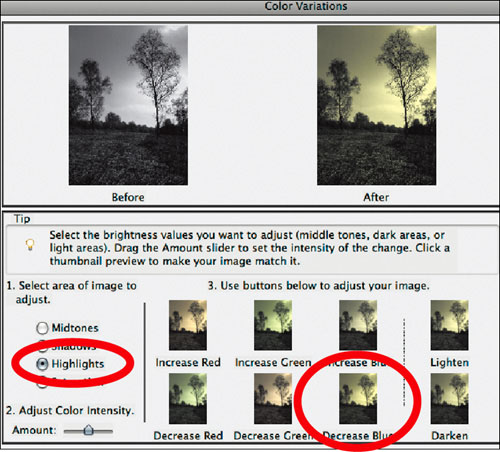
In the Color Variations dialog, select Highlights, then click the Decrease Blue thumbnail to make the lighter tones yellow.


One of the darkest arts of the darkroom, the lith print—with its unmistakable look—is much easier to create digitally.
A lith print is typified by its unusual pinkish orange color, mixed with high- and low-contrast areas. To start, open the Hue/Saturation dialog and choose the Colorize option. Next, set Hue to 353 and Saturation to 18, as shown above.

The next move is to split the image into two layers so the two contrast effects can be created independently. From the Layers menu, choose the Background layer as shown. Select the copy layer to receive the next edit.

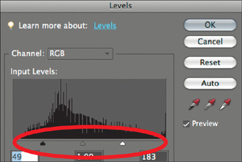
In the Input Levels section of the dialog, pull both highlight and shadow sliders toward the center, as shown above. This will increase the bright whites and solid blacks in the image.
Next, select the Background layer (bottom of the Layers palette) and open the Levels. This time, pull the Output Levels highlights and shadow sliders to the center, as shown above. This creates a low-contrast layer.


The red-toned Victorian albumen print is present in most family photo albums, and is simple to re-create with an unusual edit.
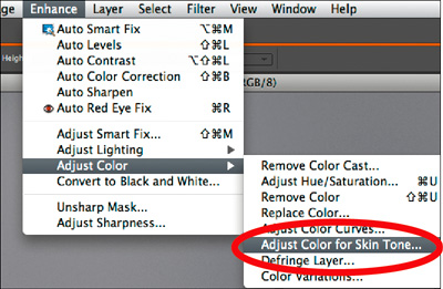
The albumen effect is best created using Elements’ excellent skin tone adjuster. Drain the color away first using the Remove Color command, then launch the Adjust Color for Skin Tone dialog, as shown above.
Move the dialog so you can see the whole image and then float the cursor over your image. Click and watch it turn a warm orange color.


