CHAPTER 4
Text and Typography
This chapter features a wide range of powerful plug-ins for managing most aspects of using and presenting fonts. These include quick access to font families, embedding any of an additional 19 fonts courtesy of Google, changing text size alignment and styles, and adding colors and drop shadows.
There are also handy classes to transform your text, automatically add icons and other characters such as quotation marks, create professional drop cap effects, and more. Between them, there are over 720 classes for doing almost everything you could want to do with text, without having to write your own CSS rules.
PLUG-IN 20: Fonts
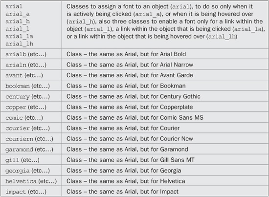
Choosing a font for displaying text is very easy using the classes in this plug-in group, as you only need to enter a short name into the class argument of an object. Plus, each font offers fallback fonts so that systems without the exact font you choose will display the closest match that they have. You can also decide when to enable the fonts since there are six versions of each class.
In Figure 4-1, all the available font classes have been used twice: once to display the associated fonts immediately, and again for mouse hover versions. In the second group of fonts, “Lucida Grande” is currently being hovered over.
Classes and Properties
About the Classes
These classes use the CSS font-family property to assign the font you choose. Fallback fonts are provided for each to ensure that if a computer doesn’t have a particular font, it can at least display the closest one it does have.
For example, the copper class uses the following rule:
font-family: "Copperplate", "Copperplate Gothic Light", serif;
How to Use Them
To use a font class, enter its name in the class argument of an object. For example, to change to the Impact font, you could use HTML such as this:
<span class='impact'>Impact</span>
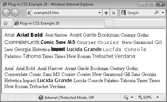
FIGURE 4-1 A typical collection of fonts on a Windows computer
Or, to change a font only when the mouse hovers over the object, you might use this:
<span class='impact_h'>Impact</span>
Or you can combine classes so that, for example, to change the font of an object to Verdana, and then to Georgia when it is hovered over, you might use this:
<span class='verdana Georgia_h'>Impact</span>
You can also use the other class suffixes to enable a font only when it is actively clicked (classname_a), or when it is a link that is part of the object (classname_l), when it is a clicked link that is part of the object (classname_la), or when it is a hovered link that is part of the object (classname_lh).
Here is the code used to create Figure 4-1:
<span class='arial'    >Arial</span>,
<span class='arialb'   >Arial Bold</span>,
<span class='arialn'   >Arial Narrow</span>,
<span class='avant'    >Avant Garde</span>
<span class='bookman'  >Bookman</span>
<span class='century'  >Century Gothic</span>
<span class='copper'   >Copperplate</span>
<span class='comic'    >Comic Sans MS</span>
<span class='courier'  >Courier</span>
<span class='couriern' >Courier New</span>
<span class='garamond' >Garamond</span>
<span class='gill'     >Gill Sans</span>
<span class='georgia'  >Georgia</span>
<span class='helvetica'>Helvetica</span>
<span class='impact'   >Impact</span>
<span class='lucida'   >Lucida Grande</span>
<span class='lucidacon'>Lucida Console</span>
<span class='palatino' >Palatino</span>
<span class='tahoma'   >Tahoma</span>
<span class='times'    >Times</span>
<span class='timesnr'  >Times New Roman</span>
<span class='trebuchet'>Trebuchet</span>
<span class='verdana'  >Verdana</span><br /><br />

<span class='arial_h'    >Arial</span>,
<span class='arialb_h'   >Arial Bold</span>,
<span class='arialn_h'   >Arial Narrow</span>,
<span class='avant_h'    >Avant Garde</span>
<span class='bookman_h'  >Bookman</span>
<span class='century_h'  >Century Gothic</span>
<span class='copper_h'   >Copperplate</span>
<span class='comic_h'    >Comic Sans MS</span>
<span class='courie_hr'  >Courier</span>
<span class='couriern_h' >Courier New</span>
<span class='garamond_h' >Garamond</span>
<span class='gill_h'     >Gill Sans</span>
<span class='georgia_h'  >Georgia</span>

<span class='helvetica_h'>Helvetica</span>
<span class='impact_h'   >Impact</span>
<span class='lucida_h   '>Lucida Grande</span>
<span class='lucidacon_h'>Lucida Console</span>
<span class='palatino_h' >Palatino</span>
<span class='tahoma_h'   >Tahoma</span>
<span class='times_h'    >Times</span>
<span class='timesnr_h'  >Times New Roman</span>
<span class='trebuchet_h'>Trebuchet</span>
<span class='verdana_h'  >Verdana</span>
The Classes
.arial,         .arial_a:active,        .arial_h:hover,
.arial_l a,     .arial_la a:active,     .arial_lh a:hover
   { font-family:"Arial", sans-serif; }
.arialb,        .arialb_a:active,       .arialb_h:hover,
.arialb_l a,    .arialb_la a:active,    .arialb_lh a:hover
   { font-family:"Arial Black", sans-serif; }
.arialn,        .arialn_a:active,       .arialn_h:hover,
.arialn_l a,    .arialn_la a:active,    .arialbn_lh a:hover
   { font-family:"Arial Narrow", sans-serif; }
.avant,         .avant_a:active,        .avant_h:hover,
.avant_l a,     .avant_la a:active,     .avant_lh a:hover
   { font-family:"Avant Garde", sans-serif; }
.bookman,       .bookman_a:active,      .bookman_h:hover,
.bookman_l a,   .bookman_la a:active,   .bookman_lh a:hover
   { font-family:"Bookman", "Bookman Old Style", serif; }
.century,       .century_a:active,      .century_h:hover,
.century_l a,   .century_la a:active,   .century_lh a:hover
   { font-family:"Century Gothic", sans-serif; }
.copper,        .copper_a:active,       .copper_h:hover,
.copper_l a,    .copper_la a:active,    .copper_lh a:hover
   { font-family:"Copperplate", "Copperplate Gothic Light", serif; }
.comic,         .comic_a:active,        .comic_h:hover,
.comic_l a,     .comic_la a:active,     .comic_lh a:hover
   { font-family:"Comic Sans MS", cursive; }
.courier,       .courier_a:active,      .courier_h:hover,
.courier_l a,   .courier_la a:active,   .courier_lh a:hover
   { font-family:"Courier", monospace; }
.couriern,      .couriern_a:active,     .couriern_h:hover,
.couriern_l a,  .couriern_la a:active,  .couriern_lh a:hover
   { font-family:"Courier New", monospace; }
.garamond,      .garamond_a:active,     .garamond_h:hover,
.garamond_l a,  .garamond_la a:active,  .garamond_lh a:hover
   { font-family:"Garamond", serif; }
.gill,          .gill_a:active,         .gill_h:hover,
.gill_l a,      .gill_la a:active,      .gill_lh a:hover
   { font-family:"Gill Sans", "Gill Sans MT", sans-serif; }
.georgia,       .georgia_a:active,      .georgia_h:hover,
.georgia_l a,   .georgia_la a:active,   .georgia_lh a:hover
   { font-family:"Georgia", serif; }

.helvetica,     .helvetica_a:active,    .helvetica_h:hover,
.helvetica_l a, .helvetica_la a:active, .helvetica_lh a:hover
   { font-family:"Helvetica, sans-serif"; }
.impact,        .impact_a:active,       .impact_h:hover,
.impact_l a,    .impact_la a:active,    .impact_lh a:hover
   { font-family:"Impact", fantasy; }
.lucida,        .lucida_a:active,       .lucida_h:hover,
.lucida_l a,    .lucida_la a:active,    .lucida_lh a:hover
   { font-family:"Lucida Grande", "Lucida Sans Unicode", sans-serif; }
.lucidac,       .lucidac_a:active,      .lucidac_h:hover,
.lucidac_l a,   .lucidac_la a:active,   .lucidac_lh a:hover
   { font-family:"Lucida Console", monospace; }
.palatino,      .palatino_a:active,     .palatino_h:hover,
.palatino_l a,  .palatino_la a:active,  .palatino_lha:hover
   { font-family:"Palatino", "Palatino Linotype", serif; }
.tahoma,        .tahoma_a:active,       .tahoma_h:hover,
.tahoma_l a,    .tahoma_la a:active,    .tahoma_lh a:hover
   { font-family:"Tahoma", sans-serif; }
.times,         .times_a:active,        .times_h:hover,
.times_l a,     .times_la a:active,     .times_lh a:hover
   { font-family:"Times", serif; }
.timesnr,       .timesnr_a:active,      .timesnr_h:hover,
.timesnr_l a,   .timesnr_la a:active,   .timesnr_lh a:hover
   { font-family:"Times New Roman", serif; }
.trebuchet,     .trebuchet_a:active,    .trebuchet_h:hover,
.trebuchet_l a, .trebuchet_la a:active, .trebuchet_lh a:hover
   { font-family:"Trebuchet", sans-serif; }
.verdana,       .verdana_a:active,      .verdana_h:hover,
.verdana_l a,   .verdana_la a:active,   .verdana_lh a:hover
   { font-family:"Verdana", sans-serif; }
PLUG-IN 21: Font Styles
Choosing font styles with CSS can involve up to three different properties. But when you want to choose font styles such as bold, italic, or underline, these classes are much simpler. Figure 4-2 shows the various styles being applied one at a time until all are employed (Internet Explorer doesn’t support the blink property, so on that browser, any blinking text is shown in bold).
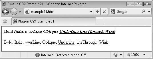
FIGURE 4-2 The various font styles supported by these classes
In the second row, the text is set to change font only when hovered over, as is the case with the word Underline.
Classes and Properties
About the Classes
These classes use three different CSS rules to create different font styles. They also support the suffixes such as _h to apply the new style only when an object is hovered over, and so on. For example, here are the CSS rules used to restore a font’s styling to normal:
font-style: normal;
font-weight: normal;
text-decoration: none;
Out of all modern browsers, only Internet Explorer will not display blinking text, so the bold attribute is selected instead. This is achieved using a CSS “hack” that only Internet Explorer can see, like this:
font-weight: bold�;
By adding the � to the end of the rule, all browsers except Internet Explorer will ignore the rule, while IE will accept the rule and ignore the �. This is also the case with the current preview version of IE 9.
How to Use Them
These font class names have been kept to single letters because they are frequently used, so it saves on typing and keeps class arguments short. To use them, just add the class letter (or letter plus suffix) to a class argument, like the following, which sets both an Arial font and italic styling:
<span class='arial i'>This text is in an italic Arial font</span>
This is the HTML used to create the screen grab in Figure 4-2:
<span class='b'>Bold
<span class='i'>Italic
<span class='l'>overLine
<span class='o'>Oblique
<span class='u'>Underline
<span class='t'>lineThrough
<span class='w'>Wink
</span></span></span></span></span></span></span><br /><br />

<span class='b_h'>Bold</span>,
<span class='i_h'>Italic</span>,
<span class='l_h'>overLine</span>,
<span class='o_h'>Oblique</span>,
<span class='u_h'>Underline</span>,
<span class='t_h'>lineThrough</span>,
<span class='w_h'>Wink</span>
The Classes
.b, .b_a:active, .b_h:hover,
.b_l a, .b_la a:active, .b_lh a:hover { font-weight:bold; }
.i, .i_a:active, .i_h:hover,
.i_l a, .i_la a:active, .i_lh a:hover { font-style:italic; }
.l, .l_a:active, .l_h:hover,
.l_l a, .l_la a:active, .l_lh a:hover { text-decoration:overline; }
.n, .n_a:active, .n_h:hover,
.n_l a, .n_la a:active, .n_lh a:hover { font-style:normal;
font-weight:normal;
text-decoration:none; }
.o, .o_a:active, .o_h:hover,
.o_l a, .o_la a:active, .o_lh a:hover { font-style:oblique; }
.u, .u_a:active, .u_h:hover,
.u_l a, .u_la a:active, .u_lh a:hover { text-decoration:underline; }
.t, .t_a:active, .t_h:hover,
.t_l a, .t_la a:active, .t_lh a:hover { text-decoration:line-through; }
.w, .w_a:active, .w_h:hover,
.w_l a, .w_la a:active, .w_lh a:hover { text-decoration:blink;
font-weight:bold�; /* IE */ }
PLUG-IN 22: Text Alignment
With these classes, you can choose between applying left, center, right, or full justification, as shown in Figure 4-3, which includes one example of each type of justification (taken from Charles Dickens’ novel, A Tale of Two Cities):
Classes and Properties
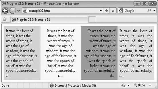
FIGURE 4-3 The four different types of text justification: left, center, right, and full
About the Classes
These classes use the text-align property to set the alignment of some text, like this:
text-align: right;
How to Use Them
You can use these classes to change the justification of text by entering their names into the class argument of an object, like this:
<span class='justify'>This text is fully justified</span>
Or you may prefer the shorthand class names, like this:
<span class='j'>This text is fully justified</span>
You can also use the standard suffixes to change the justification only when the text is hovered over, like this:
<span class=c_h'>This text is centered when hovered over</span>
Here is the HTML used for the screen grab in Figure 4-3:
<div style='width:125px' class='leftfloat padding lime_b'>
<div class='leftjustify'>It was the best of times, it was the worst of
times, it was the age of wisdom, it was the age of foolishness, it was
the epoch of belief, it was the epoch of incredulity, it…</div></div>

<div style='width:138px' class='leftfloat padding yellow_b'>
<div class='center'>It was the best of times, it was the worst of
times, it was the age of wisdom, it was the age of foolishness, it was
the epoch of belief, it was the epoch of incredulity, it…</div></div>

<div style='width:125px' class='leftfloat padding pink_b'>
<div class='rightjustify'>It was the best of times, it was the worst of
times, it was the age of wisdom, it was the age of foolishness, it was
the epoch of belief, it was the epoch of incredulity, it…</div></div>

<div style='width:125px' class='leftfloat padding aqua_b'>
<div class='justify'>It was the best of times, it was the worst of
times, it was the age of wisdom, it was the age of foolishness, it was
the epoch of belief, it was the epoch of incredulity, it…</div></div>
Each <div> is set to a width of 125 pixels, except for the second one, which has to be a little wider since centered text takes up more space. Also each one is given a different background color for clarity, and they are floated to the left so they line up in a row.
The Classes
.leftjustify,      .leftjustify_a:active,     .leftjustify_h:hover,
.leftjustify_l a,  .leftjustify_la a:active,  .leftjustify_lh a:hover,
.lj,               .lj_a:active,              .lj_h:hover,
.lj_l a,           .lj_la a:active,           .lj_lh a:hover
   { text-align:left;    	}
.center,           .center_a:active,          .center_h:hover,
.center_l a,       .center_la a:active,       .center_lh a:hover,
.c,                .c_a:active,               .c_h:hover,
.c_l a,            .c_la a:active,            .c_lh a:hover
   { text-align:center;  }
.rightjustify,     .rightjustify_a:active,    .rightjustify_h:hover,
.rightjustify_l a, .rightjustify_la a:active, .rightjustify_lh a:hover,
.rj,               .rj_a:active,              .rj_h:hover,
.rj_l a,           .rj_la a:active,           .rj_lh a:hover
   { text-align:right;   	}
.justify,          .justify_a:active,         .justify_h:hover,
.justify_l a,      .justify_la a:active,      .justify_lh a:hover,
.j,                .j_a:active,               .j_h:hover,
.j_l a,            .j_la a:active,            .j_lh a:hover
   { text-align:justify; }
PLUG-IN 23: Text Point Size
The classes in this group let you specify the point size for text from 1 to 100 points with varying intervals: 1–20 in steps of 1 point, 25–50 in steps of 5 points, and 60–100 in steps of 10 points.
In Figure 4-4, there are two rows of text. The first contains three immediately set font sizes, and the second uses the classes to set the font size only when an object is hovered over, as is the case with the text 25pt.
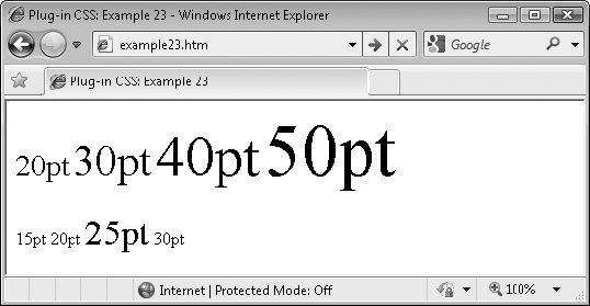
FIGURE 4-4 A variety of font sizes applied using these classes
Classes and Properties
About the Classes
You can change the size of a font in many ways, such as by using ems or pixels and so on, but one of the most common is to use point size, and so the most useful sizes have been given class names of pt1 through pt20, pt25 through pt50 in steps of 5 points, and pt60 through pt100 in steps of 10 points. These are applied using the font-size class, like this:
font-size: 45pt;
How to Use Them
To set the point size of some text, place the matching class name in the class argument of the object containing the text, like this:
<span class='pt14'>This is 14pt text</span>
You can also use the standard class suffixes to specify when the font size is applied, such as the font size hover class, like this:
<span class='pt20_h'>This is 20pt text when hovered over</span>
And you can combine classes too. For example, the following code sets the enclosed text to 10pt, or 14pt when hovered, and 12pt when clicked:
<span class='pt10 pt14_h pt12_a'>Hover over and click me</span>
Here is the code used to create the screen grab in Figure 4-4:
<span class='pt20'>20pt</span>
<span class='pt30'>30pt</span>
<span class='pt40'>40pt</span>
<span class='pt50'>50pt</span><br /><br />

<span class='pt15_h'>15pt</span>
<span class='pt20_h'>20pt</span>
<span class='pt25_h'>25pt</span>
<span class='pt30_h'>30pt</span>
The Classes
.pt1,      .pt1_a:active,      .pt1_h:hover,
.pt1_l a,  .pt1_la a:active,   .pt1_lh a:hover   { font-size:1pt;  }
.pt2,      .pt2_a:active,      .pt2_h:hover,
.pt2_l a,  .pt2_la a:active,   .pt2_lh a:hover   { font-size:2pt;  }
.pt3,      .pt3_a:active,      .pt3_h:hover,
.pt3_l a,  .pt3_la a:active,   .pt3_lh a:hover   { font-size:3pt;  }
.pt4,      .pt4_a:active,      .pt4_h:hover,
.pt4_l a,  .pt4_la a:active,   .pt4_lh a:hover   { font-size:4pt;  }
.pt5,      .pt5_a:active,      .pt5_h:hover,
.pt5_l a,  .pt5_la a:active,   .pt5_lh a:hover   { font-size:5pt;  }
.pt6,      .pt6_a:active,      .pt6_h:hover,
.pt6_l a,  .pt6_la a:active,   .pt6_lh a:hover   { font-size:6pt;  }
.pt7,      .pt7_a:active,      .pt7_h:hover,
.pt7_l a,  .pt7_la a:active,   .pt7_lh a:hover   { font-size:7pt;  }
.pt8,      .pt8_a:active,      .pt8_h:hover,
.pt8_l a,  .pt8_la a:active,   .pt8_lh a:hover   { font-size:8pt;  }
.pt9,      .pt9_a:active,      .pt9_h:hover,
.pt9_l a,  .pt9_la a:active,   .pt9_lh a:hover   { font-size:9pt;  }
.pt10,     .pt10_a:active,     .pt10_h:hover,
.pt10_l a, .pt10_l a:active,   .pt10_lh a:hover  { font-size:10pt; }
.pt11,     .pt11_a:active,     .pt11_h:hover,
.pt11_l a, .pt11_la a:active,  .pt11_lh a:hover  { font-size:11pt; }
.pt12,     .pt12_a:active,     .pt12_h:hover,
.pt12_l a, .pt12_la a:active,  .pt12_lh a:hover  { font-size:12pt; }
.pt13,     .pt13_a:active,     .pt13_h:hover,
.pt13_l a, .pt13_la a:active,  .pt13_lh a:hover  { font-size:13pt; }
.pt14,     .pt14_a:active,     .pt14_h:hover,
.pt14_l a, .pt14_la a:active,  .pt14_lh a:hover  { font-size:14pt; }
.pt15,     .pt15_a:active,     .pt15_h:hover,
.pt15_l a, .pt15_la a:active,  .pt15_lh a:hover  { font-size:15pt; }
.pt16,     .pt16_a:active,     .pt16_h:hover,
.pt16_l a, .pt16_la a:active,  .pt16_lh a:hover  { font-size:16pt; }
.pt17,     .pt17_a:active,     .pt17_h:hover,
.pt17_l a, .pt17_la a:active,  .pt17_lh a:hover  { font-size:17pt; }
.pt18,     .pt18_a:active,     .pt18_h:hover,
.pt18_l a, .pt18_la a:active,  .pt18_lh a:hover  { font-size:18pt; }
.pt19,     .pt19_a:active,     .pt19_h:hover,
.pt19_l a, .pt19_la a:active,  .pt19_lh a:hover  { font-size:19pt; }
.pt20,     .pt20_a:active,     .pt20_h:hover,
.pt20_l a, .pt20_la a:active,  .pt20_lh a:hover  { font-size:20pt; }
.pt25,     .pt25_a:active,     .pt25_h:hover,
.pt25_l a, .pt25_la a:active,  .pt25_lh a:hover  { font-size:25pt; }
.pt30,     .pt30_a:active,     .pt30_h:hover,
.pt30_l a, .pt30_la a:active,  .pt30_lh a:hover  { font-size:30pt; }
.pt35,     .pt35_a:active,     .pt35_h:hover,
.pt35_l a, .pt35_la a:active,  .pt35_lh a:hover  { font-size:35pt; }
.pt40,     .pt40_a:active,     .pt40_h:hover,
.pt40_l a, .pt40_la a:active,  .pt40_lh a:hover  { font-size:40pt; }
.pt45,     .pt45_a:active,     .pt45_h:hover,
.pt45_l a, .pt45_la a:active,  .pt45_lh a:hover  { font-size:45pt; }
.pt50,     .pt50_a:active,     .pt50_h:hover,
.pt50_l a, .pt50_la a:active,  .pt50_lh a:hover  { font-size:50pt; }
.pt60,     .pt60_a:active,     .pt60_h:hover,
.pt60_l a, .pt60_la a:active,  .pt60_lh a:hover  { font-size:60pt; }
.pt70,     .pt70_a:active,     .pt70_h:hover,
.pt70_l a, .pt70_la a:active,  .pt70_lh a:hover  { font-size:70pt; }
.pt80,     .pt80_a:active,     .pt80_h:hover,
.pt80_l a, .pt80_la a:active,  .pt80_lh a:hover  { font-size:80pt; }
.pt90,     .pt90_a:active,     .pt90_h:hover,
.pt90_l a, .pt90_la a:active,  .pt90_lh a:hover  { font-size:90pt; }
.pt100,    .pt100_a:active,    .pt100_h:hover,
.pt100_l a,.pt100_la a:active, .pt100_lh a:hover { font-size:100pt;}
PLUG-IN 24: Text Colors
In Chapter 3, a number of classes were provided that let you change the background color of an object. These classes partner them by letting you change the text color. The same set of 21 colors is supported, along with all the usual suffixes to control how they are applied.
In Figure 4-5, all the colors are shown twice: the first set uses the main text color class names to immediately apply the color, while the second set uses the _h suffix so the color is only applied when the mouse passes over an object.
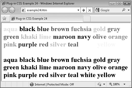
FIGURE 4-5 The 21 different colors supported by these classes, followed by the same colors as hover-over classes
Classes and Properties
About the Classes
The reason for using the _b suffix for the background colors in Chapter 3 is now clear: It’s because the text colors in this plug-in group have the non-_b names. As with the background classes, there are 21 color choices, and six different ways of applying them using the standard class suffixes such as _h to apply a color to an object only when it is being hovered over by the mouse.
The property being manipulated is color, like this:
color: #580;
How to Use Them
To change the color of a section of text, enter the matching class name (and any optional suffix) in the class argument of the object’s HTML tag, like this:
<span class='gold'>This text is gold</span>
You can also use the standard dynamic suffixes so that, for example, a section of text can be changed to navy when it is hovered over like this:
<span class='navy_h'>This text is navy when hovered over</span>
Here is the code used to create the image in Figure 4-5:
<div class='b pt20'>
   <span class='aqua'     >aqua   </span>
   <span class='black'    >black  </span>
   <span class='blue'     >blue   </span>
   <span class='brown'    >brown  </span>
   <span class='fuchsia'  >fuchsia</span>
   <span class='gold'     >gold   </span>
   <span class='gray'     >gray   </span>
   <span class='green'    >green  </span>
   <span class='khaki'    >khaki  </span>
   <span class='lime'     >lime   </span>
   <span class='maroon'   >maroon </span>
   <span class='navy'     >navy   </span>
   <span class='olive'    >olive  </span>
   <span class='orange'   >orange </span>
   <span class='pink'     >pink   </span>
   <span class='purple'   >purple </span>
   <span class='red'      >red    </span>
   <span class='silver'   >silver </span>
   <span class='teal'     >teal   </span>
   <span class='white'    >white  </span>
   <span class='yellow'   >yellow </span><br /><br />

   <span class='aqua_h'   >aqua   </span>
   <span class='black_h'  >black  </span>
   <span class='blue_h'   >blue   </span>
   <span class='brown_h'  >brown  </span>
   <span class='fuchsia_h'>fuchsia</span>
   <span class='gold_h'   >gold   </span>
   <span class='gray_h'   >gray   </span>
   <span class='green_h'  >green  </span>
   <span class='khaki_h'  >khaki  </span>
   <span class='lime_h'   >lime   </span>
   <span class='maroon_h' >maroon </span>
   <span class='navy_h'   >navy   </span>
   <span class='olive_h'  >olive  </span>
   <span class='orange_h' >orange </span>
   <span class='pink_h'   >pink   </span>
   <span class='purple_h' >purple </span>

   <span class='red_h'    >red    </span>
   <span class='silver_h' >silver </span>
   <span class='teal_h'   >teal   </span>
   <span class='white_h'  >white  </span>
   <span class='yellow_h' >yellow </span>
</div>
For clarity, the pair of color sets is enclosed in a <div> that sets the text to bold 20 point.
The Classes
.aqua,        .aqua_a:active,       .aqua_h:hover,
.aqua_l a,    .aqua_la a:active,    .aqua_lh a:hover    { color:#0ff; }
.black,       .black_a:active,      .black_h:hover,
.black_l a,   .black_la a:active,   .black_lh a:hover   { color:#000; }
.blue,        .blue_a:active,       .blue_h:hover,
.blue_l a,    .blue_la a:active,    .blue_lh a:hover    { color:#00f; }
.brown,       .brown_a:active,      .brown_h:hover,
.brown_l a,   .brown_la a:active,   .brown_lh a:hover   { color:#c44; }
.fuchsia,     .fuchsia_a:active,    .fuchsia_h:hover,
.fuchsia_l a, .fuchsia_la a:active, .fuchsia_lh a:hover { color:#f0f; }
.gold,        .gold_a:active,       .gold_h:hover,
.gold_l a,    .gold_la a:active,    .gold_lh a:hover    { color:#fc0; }
.gray,        .gray_a:active,       .gray_h:hover,
.gray_l a,    .gray_la a:active,    .gray_lh a:hover    { color:#888; }
.green,       .green_a:active,      .green_h:hover,
.green_l a,   .green_la a:active,   .green_lh a:hover   { color:#080; }
.khaki,       .khaki_a:active,      .khaki_h:hover,
.khaki_l a,   .khaki_la a:active,   .khaki_lh a:hover   { color:#cc8; }
.lime,        .lime_a:active,       .lime_h:hover,
.lime_l a,    .lime_la a:active,    .lime_lh a:hover    { color:#0f0; }
.maroon,      .maroon_a:active,     .maroon_h:hover,
.maroon_l a,  .maroon_la a:active,  .maroon_lh a:hover  { color:#800; }
.navy,        .navy_a:active,       .navy_h:hover,
.navy_l a,    .navy_la a:active,    .navy_lh a:hover    { color:#008; }
.olive,       .olive_a:active,      .olive_h:hover,
.olive_l a,   .olive_la a:active,   .olive_lh a:hover   { color:#880; }
.orange,      .orange_a:active,     .orange_h:hover,
.orange_l a,  .orange_la a:active,  .orange_lh a:hover  { color:#f80; }
.pink,        .pink_a:active,       .pink_h:hover,
.pink_l a,    .pink_la a:active,    .pink_lh a:hover    { color:#f88; }
.purple,      .purple_a:active,     .purple_h:hover,
.purple_l a,  .purple_la a:active,  .purple_lh a:hover  { color:#808; }
.red,         .red_a:active,        .red_h:hover,
.red_l a,     .red_la a:active,     .red_lh a:hover     { color:#f00; }
.silver,      .silver_a:active,     .silver_h:hover,
.silver_l a,  .silver_la a:active,  .silver_lh a:hover  { color:#ccc; }
.teal,        .teal_a:active,       .teal_h:hover,
.teal_l a,    .teal_la a:active,    .teal_lh a:hover    { color:#088; }
.white,       .white_a:active,      .white_h:hover,
.white_l a,   .white_la a:active,   .white_lh a:hover   { color:#fff; }
.yellow,      .yellow_a:active,     .yellow_h:hover,
.yellow_l a,  .yellow_la a:active,  .yellow_lh a:hover  { color:#ff0; }
PLUG-IN 25: Text Shadows
Using these classes, you can apply shadows of varying strengths underneath sections of text. Figure 4-6 shows two sets of shadowed text. The first has used the main class names to immediately apply the shadows, while the second has used the hover versions of the classes to apply the shadows only when the objects are hovered over, as is currently the case with the second instance of the phrase “Medium Shadow.”
This grab was taken using Internet Explorer, and the filter property used for creating these shadows is much harsher than those created in most other modern browsers, which also blur and round the shadows for a softer effect.
Classes and Properties
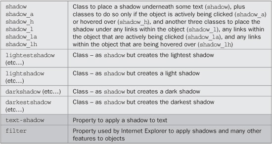
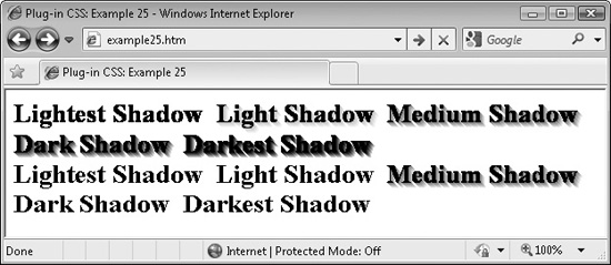
FIGURE 4-6 Applying shadows to text using the standard and hover versions of the classes
About the Classes
These classes apply shadows to text using the CSS text-shadow property or the Microsoft proprietary filter property in Internet Explorer, like this:
text-shadow:#888888 3px 3px 4px;
filter     :progid:DXImageTransform.Microsoft.Shadow(
            color='#888888', Direction=135, Strength=5);
How to Use Them
To use these classes, enter their names into the class argument of the containing object for some text. I recommend you use only the <div> tag when you want shadowed text (since Internet Explorer—even the version 9 preview—refuses to add shadows to text within a <span> or any other inline object), like this:
<div class='shadow'>This text is shadowed</div>
Alternatively, Internet Explorer will add shadows if a <span> is floated, as in the following, which uses the lf class (short for leftfloat):
<span class='shadow lf'>Shadowed text, floated left</span>
You can also use the hover and other forms of classes as in the following, which adds the shadow only when hovered over:
<div class='shadow_h'>This text is shadowed when hovered</div>
Following is the HML used to create Figure 4-6. In it, the <span> tags all use the lf class to float them so that Internet Explorer will be able to create shadows.
<div class='b pt20'> <span class='lightestshadow lf gray_bh'>Lightest Shadow </span> <span class='lightshadow lf gray_bh'>Light Shadow </span> <span class='shadow lf gray_bh'>Medium Shadow </span> <span class='darkshadow lf gray_bh'>Dark Shadow </span> <span class='darkestshadow lf gray_bh'>Darkest Shadow </span> </div><br clear='left'> <div class='b pt20'> <span class='lightestshadow_h lf'>Lightest Shadow </span> <span class='lightshadow_h lf'>Light Shadow </span> <span class='shadow_h lf'>Medium Shadow </span> <span class='darkshadow_h lf'>Dark Shadow </span> <span class='darkestshadow_h lf'>Darkest Shadow </span> </div>
When you hover over the first five elements, the background changes to gray (using the gray_bh class) so you can see the effect of the different lightnesses of shadow on different backgrounds. If you hover over the second set of five elements, the shadow will be applied only as the mouse passes over them.
The Classes
.shadow,                     .shadow_a:active,
.shadow_h:hover,             .shadow_l a,
.shadow_la a:active,         .shadow_lh a:hover {
   text-shadow:#888888 3px 3px 4px;
   filter     :progid:DXImageTransform.Microsoft.Shadow(
               color='#888888', Direction=135, Strength=5);
}
.lightestshadow,             .lightestshadow_a:active,
.lightestshadow_h:hover,     .lightestshadow_l a,
.lightestshadow_la a:active, .lightestshadow_lh a:hover {
   text-shadow:#ffffff 3px 3px 4px;
   filter     :progid:DXImageTransform.Microsoft.Shadow(
                color='#ffffff', Direction=135, Strength=5);
}
.lightshadow,                .lightshadow_a:active,
.lightshadow_h:hover,        .lightshadow_l a,
.lightshadow_la a:active,    .lightshadow_lh a:hover {
   text-shadow:#cccccc 3px 3px 4px;
   filter     :progid:DXImageTransform.Microsoft.Shadow(
                color='#cccccc', Direction=135, Strength=5);
}
.darkshadow,                 .darkshadow_a:active,
.darkshadow_h:hover,         .darkshadow_l a,
.darkshadow_la a:active,     .darkshadow_lh a:hover {
   text-shadow:#444444 3px 3px 4px;
   filter     :progid:DXImageTransform.Microsoft.Shadow(
                color='#444444', Direction=135, Strength=5);
}
.darkestshadow,              .darkestshadow_a:active,
.darkestshadow_h:hover,      .darkestshadow_l a,
.darkestshadow_la a:active,  .darkestshadow_lh a:hover {
   text-shadow:#000000 3px 3px 4px;
   filter     :progid:DXImageTransform.Microsoft.Shadow(
                color='#000000', Direction=135, Strength=5);
}
PLUG-IN 26: Text Transformations
When you need to quickly change the case of a section of text, you can simply apply one of the classes in this plug-in group. Figure 4-7 shows the four different transformations being used on a famous Albert Einstein quotation.
FIGURE 4-7 These classes provide a quick means of transforming sections of text.
Classes and Properties
About the Classes
These classes make use of the text-transform and font-variant properties to change a selection of text, like this:
text-transform:capitalize;
font-variant:small-caps;
How to Use Them
You can transform a section of text by using one of these classes in the class argument of the containing object, like this:
<span class='scaps'>This text displays in small capital letters</span>
The standard suffixes are also available for transforming the text only under certain conditions, such as when the mouse hovers over it, like this:
<span class='scaps_h'>Small caps when hovered over</span>
Here is the HTML used for the screen grab in Figure 4-7:
<div class='b pt15'>
  <div class='caps' >The important thing is not to stop questioning</div>
  <div class='scaps'>The important thing is not to stop questioning</div>
  <div class='lower'>The important thing is not to stop questioning</div>
  <div class='upper'>The important thing is not to stop questioning</div>
</div>
The Classes
.caps,      .caps_a:active,     .caps_h:hover,
.caps_l a,  .caps_la a:active,  .caps_lh a:hover
   { text-transform:capitalize; }
.scaps,     .scaps_a:active,    .scaps_h :hover,
.scaps_l a, .scaps_la a:active, .scaps_lh  a:hover
   { font-variant  :small-caps; }
.lower,     .lower_a:active,    .lower_h :hover,
.lower_l a, .lower_la a:active, .lower_lh  a:hover
   { text-transform:lowercase;  }
.upper,     .upper_a:active,    .upper_h :hover,
.upper_l a, .upper_la a:active, .upper_lh  a:hover
   { text-transform:uppercase;  }
PLUG-IN 27: Encapsulation
Encapsulation is a neat trick you can use to enclose a section of text within other text or objects. In this case, it is used to automatically add quotation marks and other symbols before and after a section of text, as shown in Figure 4-8, in which a phrase is repeated five times, each using a different encapsulation class.
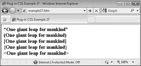
FIGURE 4-8 Enclosing a section of text with symbols using the encapsulation classes
Classes and Properties
About the Classes
These classes use the pseudo classes :before and :after to insert characters before and after a section of text using the content property, as in the following, which places curly quotation marks before and after the text:
.quotes:before { content:'201c'; }
.quotes:after  { content:'201d'; }
How to Use Them
When you want to encapsulate some text, enter the class needed into the class argument of the text’s container, like this:
<div class='quotes'>This will have quotes added to it</div>
Or, you could add the quotes, only when the mouse hovers over the text, for example, like this:
<div class='quotes_h'>This has quotes added when hovered over</div>
The other dynamic suffixes (such as _a, and so on) are not supported by these classes since they would almost certainly never be used.
The Classes
.quotes:before,   .quotes_h:hover:before   { content :'201c'; }
.quotes:after,    .quotes_h:hover:after    { content :'201d'; }
.parens:before,   .parens_h:hover:before   { content :'('; }
.parens:after,    .parens_h:hover:after    { content :')'; }
.brackets:before, .brackets_h:hover:before { content :'['; }
.brackets:after,  .brackets_h:hover:after  { content :']'; }
.braces:before,   .braces_h:hover:before   { content :'{'; }
.braces:after,    .braces_h:hover:after    { content :'}'; }
.chevrons:before, .chevrons_h:hover:before { content :'<'; }
.chevrons:after,  .chevrons_h:hover:after  { content:'>'; }
PLUG-IN 28: Google Fonts
Google has kindly placed a number of fonts on their servers that can be easily included in your web pages by referencing them in the class arguments of this plug-in group.
Figure 4-9 shows all the Google fonts being used at the same time. This is something you may not want to do normally, since each font takes a second or two to download and install. Generally, you will only want two or three fonts on a page anyway, or it will begin to look too cluttered.
Classes and Properties
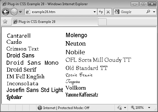
FIGURE 4-9 The 19 Google fonts supported by these classes
About the Classes
These classes provide a shorthand way of using the Google fonts. They access the font-family CSS property to do so, like this:
font-family:"Droid Serif", serif;
How to Use Them
To use the Google fonts, you will need to include a line such as the following for every Google font you plan to use:
<link rel='stylesheet' type='text/css'
 href='http://fonts.googleapis.com/css?family=fontfamily'>
The class names and their respective font family names to use in place of fontfamily are listed in Table 4-1. Note that the + symbol is used instead of spaces.
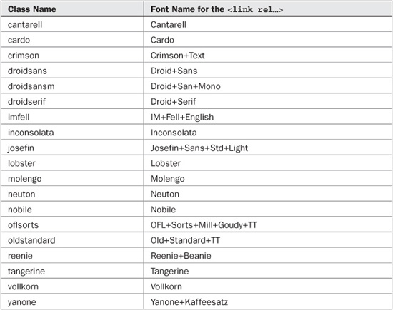
TABLE 4-1 The Google font families and plug-in class names
To load in the Crimson Text font, for example, you would, therefore, use the following code in the <head> section of a web page:
<link rel='stylesheet' type='text/css'
 href='http://fonts.googleapis.com/css?family=Crimson+Text'>
Then in the page’s body you can use the font like this:
<span class='crimson'>This text uses the Crimson Text Font</span>
The following is the <head> code used to create Figure 4-9. It’s a little long-winded because it loads in every single font (you will probably only want a few of them):
<link rel='stylesheet' type='text/css'
    href='http://fonts.googleapis.com/css?family=Cantarell'>
<link rel='stylesheet' type='text/css'
   href='http://fonts.googleapis.com/css?family=Cardo'>
<link rel='stylesheet' type='text/css'
   href='http://fonts.googleapis.com/css?family=Crimson+Text'>
<link rel='stylesheet' type='text/css'
   href='http://fonts.googleapis.com/css?family=Droid+Sans'>
<link rel='stylesheet' type='text/css'
    href='http://fonts.googleapis.com/css?family=Droid+Sans+Mono'>
<link rel='stylesheet' type='text/css'
    href='http://fonts.googleapis.com/css?family=Droid+Serif'>
<link rel='stylesheet' type='text/css'
    href='http://fonts.googleapis.com/css?family=IM+Fell+English'>
<link rel='stylesheet' type='text/css'
    href='http://fonts.googleapis.com/css?family=Inconsolata'>
<link rel='stylesheet' type='text/css'
   href='http://fonts.googleapis.com/css?family=Josefin+Sans+Std+Light'>
<link rel='stylesheet' type='text/css'
    href='http://fonts.googleapis.com/css?family=Lobster'>
<link rel='stylesheet' type='text/css'
    href='http://fonts.googleapis.com/css?family=Molengo'>
<link rel='stylesheet' type='text/css'
    href='http://fonts.googleapis.com/css?family=Neuton'>
<link rel='stylesheet' type='text/css'
    href='http://fonts.googleapis.com/css?family=Nobile'>
<link rel='stylesheet' type='text/css'
   href='http://fonts.googleapis.com/css?family=OFL+Sorts+Mill+Goudy+TT'>
<link rel='stylesheet' type='text/css'
    href='http://fonts.googleapis.com/css?family=Old+Standard+TT'>
<link rel='stylesheet' type='text/css'
   href='http://fonts.googleapis.com/css?family=Reenie+Beanie'>
<link rel='stylesheet' type='text/css'
    href='http://fonts.googleapis.com/css?family=Tangerine'>
<link rel='stylesheet' type='text/css'
   href='http://fonts.googleapis.com/css?family=Vollkorn'>
<link rel='stylesheet' type='text/css'
   href='http://fonts.googleapis.com/css?family=Yanone+Kaffeesatz'>
And here is the code from the body of the example:
<div class='pt15 lf padding'>
   <div class='cantarell'  >Cantarell               </div>
   <div class='cardo'      >Cardo                   </div>
   <div class='crimson'    >Crimson Text            </div>
   <div class='droidsans'  >Droid Sans              </div>
   <div class='droidsansm' >Droid Sans Mono         </div>
   <div class='droidserif' >Droid Serif             </div>
   <div class='imfell'     >IM Fell English         </div>
   <div class='inconsolata'>Inconsolata             </div>
   <div class='josefin'    >Josefin Sans Std Light </div>
   <div class='lobster'    >Lobster           </div></div>
<div class='pt15 padding'>
   <div class='molengo'    >Molengo                 </div>
   <div class='neuton'     >Neuton                  </div>
   <div class='nobile'     >Nobile                  </div>
   <div class='oflsorts'   >OFL Sorts Mill Goudy TT</div>
   <div class='oldstandard'>Old Standard TT         </div>
   <div class='reenie'     >Reenie Beanie           </div>
   <div class='tangerine'  >Tangerine               </div>
   <div class='vollkorn'   >Vollkorn                </div>
   <div class='yanone'     >Yanone Kaffeesatz</div></div>
NOTE In Chapter 9, I’ll introduce a method you can use to automate all this, as long as your users have JavaScript, but the method in this plug-in will allow you to display Google fonts to all users of recent browsers, regardless of having JavaScript or not.
The Classes
.cantarell,       .cantarell_a:active,     .cantarell_h:hover,
.cantarell_l a,   .cantarell_la a:active   .cantarell_lh a:hover
   { font-family:"Cantarell", sans-serif; }
.cardo,           .cardo_a:active,         .cardo_h:hover,
.cardo_l a,       .cardo_la a:active       .cardo_lh a:hover
   { font-family:"Cardo", serif; }
.crimson,         .crimson_a:active,       .crimson_h:hover,
.crimson_l a,     .crimson_la a:active     .crimson_lh a:hover
   { font-family:"Crimson Text", serif; }
.droidsans,       .droidsans_a:active,     .droidsans_h:hover,
.droidsans_l a,   .droidsans_la a:active   .droidsans_lh a:hover
   { font-family :"Droid Sans", sans-serif; }
.droidsansm,      .droidsansm_a:active,    .droidsansm_h:hover,
.droidsansm_l a,  .droidsansm_la a:active  .droidsansm_lh a:hover
   { font-family: "Droid Sans Mono", monospace; }
.droidserif,      .droidserif_a:active,    .droidserif_h:hover,
.droidserif_l a,  .droidserif_la a:active  .droidserif_lh a:hover
   { font-family:"Droid Serif", serif; }
.imfell,          .imfell_a:active,        .imfell_h:hover,
.imfell_l a,      .imfell_la a:active      .imfell_lh a:hover
   { font-family :"IM Fell English", serif; }
.inconsolata,     .inconsolata_a:active,   .inconsolata_h:hover,

.inconsolata_l a, .inconsolata_la a:active .inconsolata_lh a:hover
   { font-family :"Inconsolata", monospace; }
.josefin,         .josefin_a:active,       .josefin_h:hover,
.josefin_l a,     .josefin_la a:active     .josefin_lh a:hover
   { font-family:"Josefin Sans Std Light", sans-serif; }
.lobster,         .lobster_a:active,       .lobster_h:hover,
.lobster_l a,     .lobster_la a:active     .lobster_lh a:hover
   { font-family:"Lobster", fantasy, serif; }
.molengo,         .molengo_a:active,       .molengo_h:hover,
.molengo_l a,     .molengo_la a:active     .molengo_lh a:hover
   { font-family:"Molengo", sans-serif; }
.neuton,          .neuton_a:active,        .neuton_h:hover,
.neuton_l a,      .neuton_la a:active      .neuton_lh a:hover
   { font-family :"Neuton", sans-serif; }
.nobile,          .nobile_a:active,        .nobile_h:hover,
.nobile_l a,      .nobile_la a:active      .nobile_lh a:hover
   { font-family :"Nobile", sans-serif; }
.oflsorts,        .oflsorts_a:active,      .oflsorts_h:hover,
.oflsorts_l a,    .oflsorts_la a:active    .oflsorts_lh a:hover
   { font-family:"OFL Sorts Mill Goudy TT", serif; }
.oldstandard,     .oldstandard_a:active,   .oldstandard_h:hover,
.oldstandard_l a, .oldstandard_la a:active .oldstandard_lh a:hover
   { font-family :"Old Standard TT", serif; }
.reenie,          .reenie_a:active,        .reenie_h:hover,
.reenie_l a,      .reenie_la a:active      .reenie_lh a:hover
   { font-family:"Reenie Beanie", cursive, serif; }
.tangerine,       .tangerine_a:active,     .tangerine_h:hover,
.tangerine_l a,   .tangerine_la a:active   .tangerine_lh a:hover
   { font-family:"Tangerine", cursive, serif; }
.vollkorn,        .vollkorn_a:active,      .vollkorn_h:hover,
.vollkorn_l a,    .vollkorn_la a:active    .vollkorn_lh a:hover
   { font-family:"Vollkorn", serif; }
.yanone,          .yanone_a:active,        .yanone_h:hover,
.yanone_l a,      .yanone_la a:active      .yanone_lh a:hover
   { font-family:"Yanone Kaffeesatz", sans-serif; }
PLUG-IN 29: Drop Cap
Placing a drop cap at the start of an article is a mainstay of print design, but it’s also easy to achieve on the Web with Plug-in 29, as shown in Figure 4-10, which features a famous quotation from Shakespeare’s play, Macbeth.
Classes and Properties
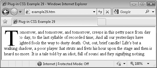
FIGURE 4-10 This plug-in makes it easy to add drop caps to your text.
About the Class
This class enlarges the text within it by five times and lines it up with the following text to create a drop cap. This is achieved by setting the font-size property to 500 percent. Also, to neatly align the drop cap, the line-height, margin-right, and margin-bottom of the object are tweaked. Finally, the object is floated to the left using the float property to let the following text flow around it.
How to Use It
To use this class, you should place the initial letter of some text within a <span> and use the dropcap class in the class argument, like this:
<span class='dropcap'>T</span>omorrow, and tomorrow, and tomorrow,
creeps in this petty pace from day to day, to the last syllable of
recorded time; And all our yesterdays have lighted fools the way to
dusty death. Out, out, brief candle! Life's but a walking shadow, a
poor player that struts and frets his hour upon the stage and then is
heard no more. It is a tale told by an idiot, full of sound and fury
signifying nothing.
A hover version of the class (dropcap_h) is also available, although the other dynamic versions such as _a are not, as they are most unlikely to be used.
The Class
.dropcap, .dropcap_h:hover {
   font-size:500%;
   line-height:0.8em;
   margin-right:0.04em;
   margin-bottom:-0.15em;
   float:left;
}
PLUG-IN 30: Columns
If you would like to present your text in columns to many of your users, these classes will automatically lay them out for you using between two and five columns, inclusive. I say many of your users because, unfortunately, no version of IE (including the preview of version 9) supports the web standard for columns, and neither does the Opera browser.
Nevertheless, on all other modern browsers columns work well, as shown by Figure 4-11, which shows these classes being used and displayed in the Google Chrome browser.
Classes and Properties
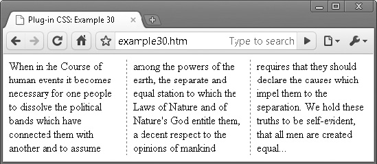
FIGURE 4-11 Create multiple columns on browsers that support the feature
About the Classes
These classes display text in the number of columns you choose, between two and five inclusive, using the CSS column rules, as in the following example, which creates a two-column display:
column-rule:dashed 1px #888888;
column-gap:20px;
column-count:2;
Firefox and other Mozilla-based browsers require -moz placed before these properties, and Apple Safari and Google Chrome require -webkit. Although Opera doesn’t yet support columns, it seems likely that the browser will do so soon, so to future proof the classes, versions of the properties prefaced with -o are also included.
How to Use Them
To use these classes, decide the number of columns you want and place the relevant class in the class argument of the text’s container, like the following text from the US Declaration of Independence, which was used to create the screen grab in Figure 4-11:
<div class='columns3'>When in the Course of human events it becomes
necessary for one people to dissolve the political bands which have
connected them with another and to assume among the powers of the earth,
the separate and equal station to which the Laws of Nature and of
Nature's God entitle them, a decent respect to the opinions of mankind
requires that they should declare the causes which impel them to the
separation. We hold these truths to be self-evident, that all men are
created equal…</div>
Neither Opera nor Microsoft Internet Explorer has caught up with the rest of the Web on this feature, so the text will simply display in a single column on those browsers. If you wish to have them also display columns, you will need to create an alternative section of HTML, which might look something like this:
<div style='width:160px' class='lf padding'>When in the Course of human
events it becomes necessary for one people to dissolve the political
bands which have connected them with another and to assume</div>
<div style='width:160px; class='lf padding'>among the powers of the
earth, the separate and equal station to which the Laws of Nature
and of Nature's God entitle them, a decent respect to the opinions of
mankind</div>
<div style='width:160px' class='lf padding'>requires that they should
declare the causes which impel them to the separation. We hold these
truths to be self-evident, that all men are created equal…</div>
The Classes
.columns2, .columns2_h:hover {
   -moz-column-rule:    dashed 1px #888888;
   -webkit-column-rule: dashed 1px #888888;
   -o-column-rule:      dashed 1px #888888;
   column-rule:         dashed 1px #888888;
   -moz-column-gap:     20px;
   -webkit-column-gap:  20px;
   -o-column-gap:       20px;
   column-gap:          20px;
   -moz-column-count:   2;
   -webkit-column-count:2;
   -o-column-count:     2;
   column-count:        2;
}
.columns3, .columns3_h:hover {
   -moz-column-rule:    dashed 1px #888888;
   -webkit-column-rule: dashed 1px #888888;
   -o-column-rule:      dashed 1px #888888;
   column-rule:         dashed 1px #888888;
   -moz-column-gap:     20px;
   -webkit-column-gap:  20px;
   -o-column-gap:       20px;
   column-gap:          20px;
   -moz-column-count:   3;
   -webkit-column-count:3;
   -o-column-count:     3;
   column-count:        3;
}
.columns4, .columns4_h:hover {
   -moz-column-rule:    dashed 1px #888888;
   -webkit-column-rule: dashed 1px #888888;
   -o-column-rule:      dashed 1px #888888;
   column-rule:         dashed 1px #888888;
   -moz-column-gap:     20px;


   -webkit-column-gap:  20px;
   -o-column-gap:       20px;
   column-gap:          20px;
   -moz-column-count:   4;
   -webkit-column-count:4;
   -o-column-count:     4;
   column-count:        4;
}
.columns5, .columns5_h:hover {
   -moz-column-rule:    dashed 1px #888888;
   -webkit-column-rule: dashed 1px #888888;
   -o-column-rule:      dashed 1px #888888;
   column-rule:         dashed 1px #888888;
   -moz-column-gap:     20px;
   -webkit-column-gap:  20px;
   -o-column-gap:       20px;
   column-gap:          20px;
   -moz-column-count:   5;
   -webkit-column-count:5;
   -o-column-count:     5;
   column-count:        5;
}
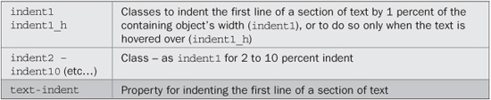
PLUG-IN 31: Text Indent
Indenting the first line of a paragraph is an alternative to separating paragraphs with extra line breaks. It is commonly used in print typography. You can easily implement this feature too using these classes, as shown in Figure 4-12, in which three different indent classes have been applied to the same piece of text.
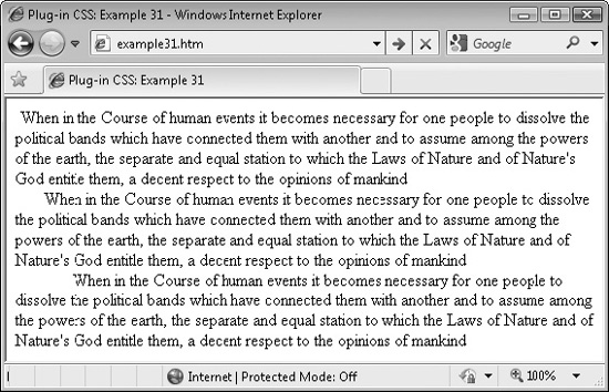
FIGURE 4-12 These classes enable indenting the first line of paragraphs by different amounts.
Classes and Properties
About the Classes
These classes use the CSS text-indent property to indent the first line of a section of text by between 1 and 10 percent of the width of the containing object, like this:
text-indent:3%;
Percentage values are used to make the classes scalable for all font sizes.
How to Use Them
When you want the first line of a section of text to be indented, use one of these classes in the class argument of the text’s container, like the following, which indents the first line by 5 percent:
<div class='indent5'>When in the Course of human events it becomes
necessary for one people to dissolve the political bands which have
connected them with another and to assume among the powers of the earth,
the separate and equal station to which the Laws of Nature
and of Nature's God entitle them, a decent respect to the opinions of
mankind</div>
Or more likely you will use the class within a <p> tag, like this:
<p class='indent5'>When in the Course of human events (etc…) </p>
The hover version suffix of these classes (_h) is also supported, but the other dynamic variants are not, as they are very unlikely to ever be used.
TIP If you do use <p> tags with these classes, you may wish to modify the top and/or bottom margins for this tag since paragraphs will be separated and identified by indentation, rather than by spacing.
The Classes
.indent1,  .indent1_h:hover  { text-indent :1%;  }
.indent2,  .indent2_h:hover  { text-indent :2%;  }
.indent3,  .indent3_h:hover  { text-indent :3%;  }
.indent4,  .indent4_h:hover  { text-indent :4%;  }
.indent5,  .indent5_h:hover  { text-indent :5%;  }
.indent6,  .indent6_h:hover  { text-indent :6%;  }
.indent7,  .indent7_h:hover  { text-indent :7%;  }
.indent8,  .indent8_h:hover  { text-indent :8%;  }
.indent9,  .indent9_h:hover  { text-indent :9%;  }
.indent10, .indent10_h:hover { text-indent:10%; }
PLUG-IN 32: Symbols
The final plug-ins in this chapter provide easy access to four commonly used icons: checkmark, cross, e-mail, and star. Figure 4-13 shows the icons automatically attached to a set of four buttons. A second set use the hover versions of the classes in which the icons are initially lighter, but darken when hovered over (although, unfortunately, not in Internet Explorer when used on a button).
Classes and Properties
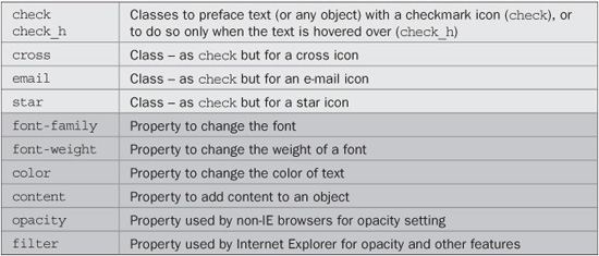
About the Classes
These classes use the content property to place an icon before the text (or any object) that uses them. The text is also set to Courier with the font-family property, bold using the font-weight property, with colors set to green for check, red for cross, blue for email, and yellow for star, using the color property.
To create the hover effect, the opacity property is set to 50 percent, or 100 percent when hovered over. Microsoft browsers use the alternate filter property for this.
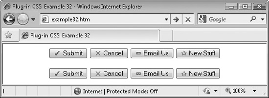
FIGURE 4-13 Use these classes to automatically add icons to text.
How to Use Them
To use these classes, simply refer to them in the class argument of an object, as with the following HTML, which was used to create Figure 4-13, and also utilizes the hover versions of the classes:
<center>
    <button class='check'>Submit</button>
    <button class='cross'>Cancel</button>
    <button class='email'>Email Us</button>
    <button class='star'>New Stuff</button><br /><br />

    <button class='check_h'>Submit</button>
    <button class='cross_h'>Cancel</button>
    <button class='email_h'>Email Us</button>
    <button class='star_h'>New Stuff</button>
</center>
The Classes
.check:before, .check_h:before, .check_h:hover:before {
   font-family:Courier;
   font-weight:bold;
   content:'2713 ';
   color :#008800;
}
.cross:before, .cross_h:before, .cross_h:hover:before {
   font-family:Courier;
   font-weight:bold;
   content:'2715 ';
   color:#ff0000;
}
.email:before, .email_h:before, .email_h:hover:before {
   font-family:Courier;
   content:'2709 ';
   color:#0066ff;
}
.star:before, .star_h:before, .star_h:hover:before {
   font-family:Courier;
   content:'2730 ';
   color:#888800;
}
.check_h:before, .cross_h:before, .email_h:before, .star_h:before {
   opacity:.5;
   filter :alpha(opacity = '50'),
}
.check_h:hover:before, .cross_h:hover:before, .email_h:hover:before,
.star_h:hover:before {
   opacity:1;
   filter :alpha(opacity = '100'),
}