CHAPTER 6
Page Layout
The plug-ins in this chapter provide classes for making your web pages appear as similar as possible when displayed on different web browsers; to emphasize sections of text and HTML using boxouts, sidebars, and quotes; and to format a web page so it looks its best when printed.
PLUG-IN 39: Reset CSS
When you plan a lot of style changes, sometimes it is easier to reset all the settings so whichever browser is used the styles will be the same (or as close as possible). By resetting all the styles, when you view a web page during development it should become clear when you haven’t created a style for an element, since it gives you a visual reminder.
Also, when you rely on the browser for default styles, you have no guarantee that all other browsers will use the same default setting. So by resetting all the properties, you are forced to create your own styling—which will be the same across all browsers.
For example, in Figure 6-1 I have displayed the same small segment of HTML in each of the Firefox, Internet Explorer, Chrome, Opera, and Safari web browsers.
The HTML each displays is the following, which simply creates a <div> with a solid one-pixel border, placing three headings within it:
<div class='bsolid'>
    <h1>Hello</h1>
    <h2>Hello</h2>
    <h3>Hello</h3>
</div>
You might think that such a tiny piece of HTML would display exactly the same way in all web browsers, but take a look at the figure and note the light line I have drawn across the top border of the <div> in each browser. As you can see, all the browsers have been aligned so that the top border of each <div> is against the line.
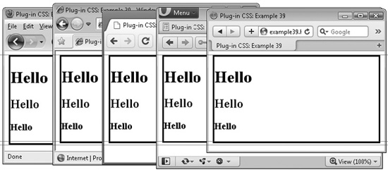
FIGURE 6-1 A simple section of HTML displayed in five different browsers
Now look at the bottom border of each <div>. Using a graphics program, I counted the difference in pixels and can report that the Internet Explorer <div> is three pixels shorter than the Firefox one. If you look at the two other light lines I drew—under the lowest and over the highest of the bottom borders—you can easily see this discrepancy. Also, the headings are one, one, and two pixels higher up respectively in IE.
Turning to Google Chrome, it has exactly the same appearance as IE and, therefore, is also different from Firefox in the same ways. The Opera <div>, on the other hand, is one pixel shorter than these two, and therefore four pixels shorter than the one in Firefox one. Also, its headings are zero, one, and one pixel higher than IE and Chrome, or one, two, and three pixels higher than Firefox.
Finally, Apple Safari has the same height <div> as IE and Chrome. Therefore, it is three pixels shorter than Firefox—and its headings are also slightly higher than Firefox.
Perhaps you never realized how different all the browsers are—and this example uses only a couple of elements. But by using the reset class, you can remove all these different attributes and start again with your own settings.
Classes and Properties
About the Class
This class resets all the properties of an object that sensibly can be reset, leaving them ready for you to assign your own values. These will then be the same on all browsers.
How to Use It
You can use this class in a couple of ways. First, to reset only the properties of an object and its subobjects, you might use code such as this:
<div id='obj' class='reset'>Everything in this div is reset</div>
You would then need to write CSS rules for the ID obj to create the property values you want, such as:
#obj p {
    display:block;
    Margin:1.12em;
}
Alternatively (and probably the most useful method), you can attach the class to the <html> tag, like this:
<html class='reset'>
Once you do this, your whole web page will lose almost all its styling, ready for you to provide the styles you need.
The Class
.reset a,          .reset abbr,     .reset  acronym,
.reset address,    .reset applet,   .reset  big,
.reset blockquote, .reset body,     .reset  caption,
.reset cite,       .reset code,     .reset  dd,
.reset del,        .reset dl,       .reset  dfn,
.reset div,        .reset dt,       .reset  em,
.reset fieldset,   .reset font,     .reset form,
.reset h1,         .reset h2,       .reset  h3,
.reset h4,         .reset h5,       .reset  h6,
.reset html,       .reset iframe,   .reset  img,
.reset ins,        .reset kbd,      .reset  label,
.reset legend,     .reset li,       .reset  object,
.reset ol,         .reset p,        .reset  pre,
.reset span,       .reset q,        .reset s,
.reset samp,       .reset small,    .reset  strike,
.reset strong,     .reset sub,      .reset  sup,
.reset table,      .reset tbody,    .reset  td,
.reset tfoot,      .reset th,       .reset  thead,
.reset tr,         .reset tt,       .reset  ul,
.reset var {
   margin         :0;
   padding        :0;
   border         :0;
   outline        :0;
   font-family    :inherit;
   font-style     :inherit;
   font-weight    :inherit;
   font-size      :100%;
   vertical-align :baseline;
}
.reset address,     .reset ar,       .reset  caption,
.reset cite,        .reset code,     .reset  dfn,
.reset em,          .reset strong,   .reset  th,
.reset v {
   font-style     :normal;
   font-weight    :normal;
}
.reset h1,          .reset h2,       .reset  h3,
.reset h4,          .reset h5,       .reset  h6 {
   font-weight    :normal;
   font-size      :100%;
}
.reset blockquote:after, .reset  blockquote:before,
.reset q:after,          .reset q:before {
   content        :'';
}
.reset caption,     .reset th,       .reset  td {
   font-weight    :normal;
   text-align     :left;
}

.reset              .reset fieldset, .reset img {
   border         :0;
}
.reset abbr,        .reset acronym {
   border         :0;
}
.reset ol,          .reset ul {
   list-style     :none;
}
.reset body {
   line-height    :1;
   background     :#ffffff;
   color          :#000000;
}
.reset  table {
   border-collapse:separate;
   border-spacing :0;
}
.reset:focus {
   outline        :0;
}
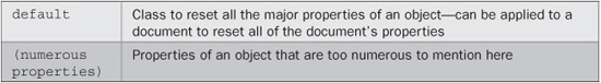
PLUG-IN 40: Default CSS
As an alternative to resetting all the CSS values, you can use this class, which creates a set of default property values, as recommended by the World Wide Web Consortium (w3.org/TR/ CSS2/sample.html).
Figure 6-2 shows the same code as in the previous plug-in, displayed in the same browsers, with a single difference—the default class has been attached to the <html> tag. Now that all the browsers are using the same settings, their display is much more similar.
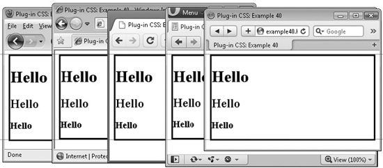
FIGURE 6-2 Using the default class the differences in display between browsers are reduced.
However, some slight differences still remain. This is because it is necessary to allow fonts and margins to scale up or down, so relative em measurements have been used for their values and, due to the different ways each browser calculates them, there is still a slight difference between them. Overall, however, you have a lot more control over a web page’s display using this class, instead of relying on each browser’s default settings.
Classes and Properties
About the Class
This class resets all the properties of an object to sensible defaults, as recommended by w3.org, the web standards body, so your pages look much more alike on different browsers.
How to Use It
You can use this class in a couple of ways. First, to set default styles only for the properties of an object and its subobjects, you might use code such as this:
<div id='obj' class='default'>This div has default settings</div>
Alternatively, you might be more likely to attach the class to the <html> tag, like this:
<html class='default'>
TIP In the case of both the reset and default classes, you may prefer to extract the CSS rules for these classes from the PC.css file into separate CSS style sheets that you can import before any others. In which case, use a search and replace facility to remove all instances of .reset for the reset class or .default for the default class, and then the styles will apply to the entire document, not just to classes using those names. For example, the rule .default h1 applies only to <h1> tags with an element ID of default. But by removing the .default prior to the h1, the rule will apply to all instances of the <h1> tag anywhere in a web page.
The Class
.default address,    .default blockquote, .default  body,
.default center,     .default dd,         .default dir,
.default div,        .default dl,         .default  dt,
.default fieldset,   .default form,       .default frame,
.default frameset,   .default h1,         .default  h2,
.default h3,         .default h4,         .default  h5,
.default h6,         .default hr,         .default  html,
.default menu,       .default noframes,   .default  ol,
.default p,          .default pre,        .default ul

   { display:block; }
.default blockquote, .default dir,        .default  dl,
.default fieldset,   .default form,       .default  h4,
.default menu,       .default ol,         .default  p,
.default ul
   { margin:1.12em 0; }
.default b,          .default h1,         .default  h2,
.default h3,         .default h4,         .default  h5,
.default h6,         .default  strong
   { font-weight:bolder; }
.default address,    .default cite,       .default  em,
.default i,          .default  var
   { font-style:italic; }
.default code,       .default kbd,        .default pre,
.default samp,       .default  tt
   { font-family:monospace; }
.default dd,         .default dir,        .default  menu,
.default ol,         .default  ul
   { margin-left :40px; }
.default button,     .default input,      .default select,
.default textarea
   { display :inline-block; }
.default ol ol,      .default ol ul,      .default  ul ol,
.default ul ul
   { margin-top:0; margin-bottom:0; }
.default del,        .default s,          .default  strike
   { text-decoration :line-through; }
.default small,      .default sub,        .default  sup
   { font-size :0.83em; }
.default tbody,      .default tfoot,      .default  thead
   { vertical-align :middle; }
.default td,         .default th,         .default  tr
   { vertical-align  :inherit; }
.default ins,        .default  u
   { text-decoration :underline; }
.default td,         .default  th
   { display:table-cell; padding:2px; }
.default a:active,   .default  a:link
   { text-decoration :underline; color:#0000ff; }
.default  big
   { font-size :1.17em; }
.default blockquote
   { margin-left:40px; margin-right:40px; }
.default body
   { margin :8px; }
.default  br:before
   { content:"A"; white-space:pre-line; }
.default caption
   { display :table-caption; text-align:center; }
.default center
   { text-align :center; }
.default  col
   { display :table-column; }

.default colgroup
   { display :table-column-group; }
.default  h1
   { font-size:2em; margin:0.7em 0; }
.default  h2
   { font-size:1.5em; margin:0.75em 0; }
.default  h3
   { font-size:1.17em; margin:0.83em 0; }
.default  h5
   { font-size:0.83em; margin:1.5em 0; }
.default  h6
   { font-size:0.75em; margin:1.67em 0; }
.default head
   { display:none; }
.default  hr
   { border:1px inset; }
.default  li
   { display:list-item; }
.default  ol
   { list-style-type:decimal; }
.default  table
   { display:table; }
.default  tbody
   { display:table-row-group; }
.default  tfoot
   { display:table-footer-group; }
.default  th
   { font-weight:bolder; text-align:center; }
.default  thead
   { display:table-header-group;  }
.default  tr
   { display:table-row; }
.default  pre
   { white-space:pre; }
.default  sub
   { vertical-align:sub;  }
.default  sup
   { vertical-align:super; }
.default  table
   { border-spacing:2px; }
.default a:visited
   { color :#800080; }
.default:focus
   { outline:thin dotted invert; }
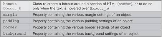
PLUG-IN 41: Boxout
With the boxout class, you can easily place a section of HTML within a special boxout to make it stand out from the rest of the page. Figure 6-3 shows the class being used to emphasize some information in an article on global warming (taken from wikipedia.org).
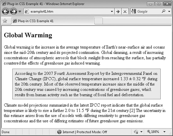
FIGURE 6-3 The boxout class helps add emphasis to important sections of a page.
Classes and Properties
About the Classes
These classes create a professional looking boxout around any section of HTML. They do so either immediately or only when hovered over, and completely restyle the HTML by altering the margin, padding, border, and background properties of an object.
How to Use Them
To place a section of HTML into a boxout, you would use HTML such as this:
<div class='boxout'>This text will appear in a boxout</div>
Or you can choose to make the boxout appear only when the HTML is hovered over, like this:
<div class='boxout_h'>This is a boxout when hovered</div>
TIP If you use the hover version of the class, it’s a good idea to ensure the section is already separated from the text above and below, otherwise the change when hovered over may be too much on the eye.
Following is the HTML used to create Figure 6-3. As you can see, when writing, it’s easy to drop the class into a section of text without distracting you from your creative flow:
<h2>Global Warming</h2>
Global warming is the increase in the average temperature of Earth’s
near-surface air and oceans since the mid-20th century and its projected
continuation. Global dimming, a result of increasing concentrations of
atmospheric aerosols that block sunlight from reaching the surface, has
partially countered the effects of greenhouse gas induced warming.
<div class=’boxout_h’> According to the 2 007 Fourth Assessment Report by the Intergovernmental Panel on Climate Change (IPCC), global surface temperature increased 1.33 +/- 0.32 °F during the 20th century. Most of the observed temperature increase since the middle of the 20th century was caused by increasing concentrations of greenhouse gases, which results from human activity such as the burning of fossil fuel and deforestation.</div>
Climate model projections summarized in the latest IPCC report indicate
that the global surface temperature is likely to rise a further 2.0 to
11.5 °F during the 21st century. The uncertainty in this estimate
arises from the use of models with differing sensitivity to greenhouse
gas concentrations and the use of differing estimates of future
greenhouse gas emissions.
The Classes
.boxout, .boxout_h:hover {
   margin:2% 5%;
   padding:1% 1.4%;
   border:1px solid #888;
   background:#eeeeee;
}
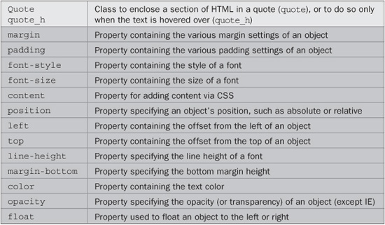
PLUG-IN 42: Quote
Another great way to emphasize a section of text is to change the font style to something like italic and add a faded-out icon behind it, as with the quote class. In Figure 6-4, an article about the poet William Wordsworth (from wikipedia.org) has been displayed, with a few lines from one of his poems shown using this class.
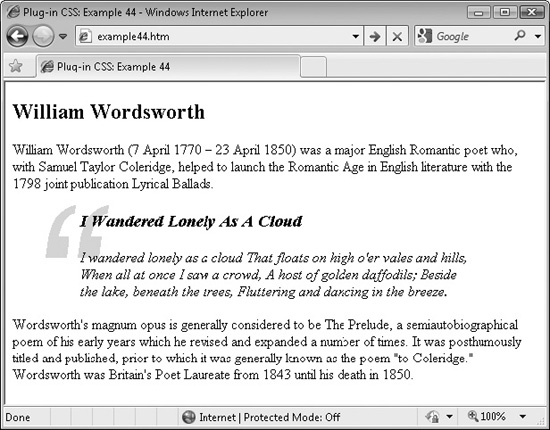
FIGURE 6-4 Using the quote class automatically sets up an appealing style.
Classes and Properties
About the Classes
These classes present a section of text in such a way that it is clearly obvious the text is a quotation. They do so by changing the text font to italic and resizing the margins and padding. Then, a large pale opening quotation mark symbol is placed at the top left of, and behind, the text.
Internet Explorer refuses to use the filter property to change the large quotation mark’s opacity. For some reason, filter seems to not like operating within a :before or :after pseudo class. Therefore, an IE-specific hack is used to set the color of the symbol to very light gray instead.
How to Use Them
To use these classes, simply mention one or the other in the class argument of an object, like this:
iv class='quote'>This text will appear as a quote</div>
Or you can choose to make the quote appear only when the HTML is hovered over, like this:
<div class='quote_h'>This appears as a quote when hovered over</div>
Here is the HTML used for the screen grab in Figure 6-4:
<h2>William Wordsworth</h2>
William Wordsworth (7 April 1770 - 23 April 1850) was a major English
Romantic poet who, with Samuel Taylor Coleridge, helped to launch the
Romantic Age in English literature with the 1798 joint publication
Lyrical Ballads.
<div class=’quote’><h3>I Wandered Lonely As A Cloud</h3>
I wandered lonely as a cloud That floats on high o’er vales and hills,
When all at once I saw a crowd, A host of golden daffodils; Beside the
lake, beneath the trees, Fluttering and dancing in the breeze.</div>
Wordsworth’s magnum opus is generally considered to be The Prelude, a
semiautobiographical poem of his early years which he revised and
expanded a number of times. It was posthumously titled and published,
prior to which it was generally known as the poem “to Coleridge.”
Wordsworth was Britain’s Poet Laureate from 1843 until his death in 1850.
You can change the quotation mark to one of many different styles by changing the font-family assignment in the following class in the PC.css file (available at plugincss.com). You may find you also need to play with the padding and left properties if you do so, since different fonts display at different sizes and in different ways.
The Classes
.quote, .quote_h {
margin:2% 10%;
padding:1% 3%;
font-style:italic
}
.quote: before, .quote_h:hover:before {
font-size:1500%;
font-family:Arial, serif;
content:'201c';
position:relative;
left:-15%;
top:-1%;
line-height:0.7em;
margin-bottom:-2em;
color:#dddddd�; /* hack for IE only */
opacity:.1;
float:left;
}
PLUG-IN 43: Left Sidebar
Another way of emphasizing a section of HTML is to move it to one side as a boxout and let the main article flow around it. Figure 6-5 shows this class being used to do exactly that on the example from the previous plug-in.
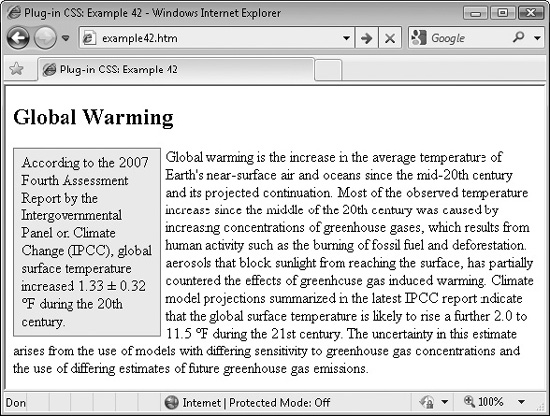
FIGURE 6-5 Boxouts are another great way to make your text more interesting.
Classes and Properties
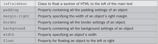
About the Class
This class floats a section of HTML to the left using the float property and then adds padding around it and a suitable margin to the right. The background is set to very light gray and the object’s width is set to 25 percent of its containing object.
How to Use It
To use this class, decide exactly where in the flow of your HTML you would like it to appear and then enclose the section for placement in the sidebar in a <div> using the class name leftsidebar, like this:
<div class='leftsidebar'>This text will appear in a left sidebar</div>
For example, here is the HTML used to create Figure 6-5, with the sidebar starting at the same vertical position as the main text:
<h2>Global Warming</h2> <div class=’leftsidebar’> According to the 2007 Fourth Assessment Report by the Intergovernmental Panel on Climate Change (IPCC), global surface temperature increased 1.33 +/- 0.32 °F during the 20th century.</div> Global warming is the increase in the average temperature of Earth’s near-surface air and oceans since the mid-20th century and its projected continuation. Most of the observed temperature increase since the middle of the 20th century was caused by increasing concentrations of greenhouse gases, which result from human activity such as the burning of fossil fuel and deforestation. Aerosols that block sunlight from reaching the surface, have partially countered the effects of greenhouse-gas-induced warming. Climate model projections summarized in the latest IPCC report indicate that the global surface temperature is likely to rise a furthe 2.0 to 11.5 °F during the 21st century. The uncertainty in this estimate arises from the use of models with differing sensitivity to greenhouse gas concentrations and the use of differing estimates of future greenhouse gas emissions.
The Class
.leftsidebar  {
   padding:1% 1.4%;
   margin-right:1%;
   border:1px solid #888;
   background:#eeeeee;
   width:25%;
   float:left;
}
PLUG-IN 44: Right Sidebar
This is the partner class to Left Sidebar. It works in exactly the same way, but moves the sidebar to the right-hand side of the main text. Figure 6-6 shows the same example used in the previous plug-in, with only the class used being changed to rightsidebar:
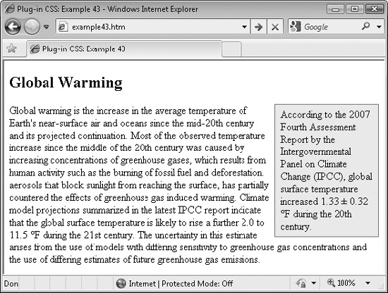
FIGURE 6-6 You can also create a sidebar on the right if you prefer.
Classes and Properties
About the Class
This class floats a section of HTML to the right using the float property and then adds padding around it and a suitable margin to the left. The background is very light gray and the object’s width is set to 25 percent of its containing object.
How to Use It
To use this class, decide exactly where in the flow of your HTML you would like it to appear and then enclose the section for placement in the sidebar in a <div>, with the class name rightsidebar, like this:
<div class='rightsidebar'>This text will appear in a right sidebar</div>
For example, here is the HTML used to create Figure 6-6, with the sidebar starting at the same vertical position as the main text (since the article text is identical to that in the previous plug-in, only the first five lines are shown):
<h2>Global Warming</h2> <div class=’rightsidebar’> According to the 2007 Fourth Assessment Report by the Intergovernmental Panel on Climate Change (IPCC), global surface temperature increased 1.33 +/- 0.32 °F during the 20th century.</div> (etc…)
The Class
.rightsidebar  {
   padding:1% 1.4%;
   margin-left:1%;
   border:1px solid #888;
   background:#eeeeee;
   width:25%;
   float:right;
}
PLUG-IN 45: Page Break
Plug-in 45 is a short and sweet class that you will find useful when visitors print out a web page, because with it you can specify where the page breaks should be located, so the printout will look much cleaner than web pages printed without using such a feature. For example, although the text is too small to read clearly, Figure 6-7 shows a copy of the Wikipedia Computer Printers page being viewed using Internet Explorer’s Print Preview mode.
Immediately, you may notice that a couple of things could be improved here, such as the heading near the bottom left of the first page, which would be better moved over to the top of the following page. At the same time, there’s a heading at the bottom of the second page that currently isn’t too short, but if the first heading is moved to that page, it will become so. Therefore, it could also be moved to the following page.
However, in Figure 6-8, by placing a <br /> tag containing this class just before each of the headings, you can see that the page layout is clearer—without headings commencing too near the bottom of any page.
After adding these two page breaks, it looks like a page break should also be forced at the start of the short paragraph at the bottom of the third page in Figure 6-8, which is also easily achieved.
Classes and Properties
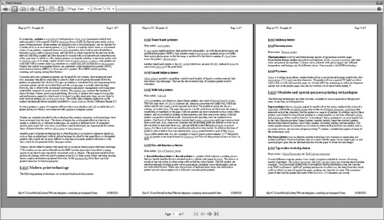
FIGURE 6-7 A copy of Wikipedia’s Computer Printers page in Print Preview mode
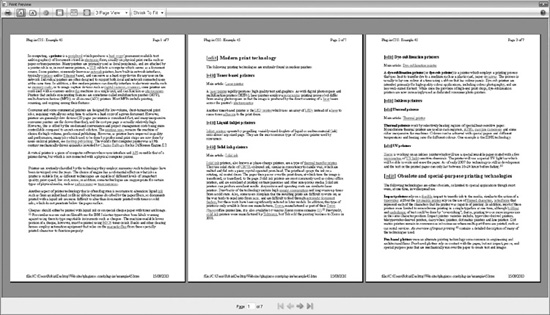
FIGURE 6-8 Using this class, printouts can be made much easier to read.
About the Class
This class is acted on only when a web page is being printed (or print previewed). With it, you specify where you want printing to continue on a new page of paper. To do this, the plug-in makes use of the page-break-before property.
How to Use It
The best way to use this class is to drop it in at the start of a heading you would like to ensure appears on a new sheet of paper when printed, like this:
<h1 class='break'>This is a heading</h1>
Or you may wish to attach it to a <p> or <br /> tag, like this:
<p class='break'>The start of a paragraph…
<br class='break' />Text after a line break…
CAUTION Usually, it’s best to add this class to an existing tag because if you add it to a new <p> or other tag, you may see unwanted extra line breaks or other styling when the web page is viewed normally.
The Class
.break { page-break-before:always; }