
Chapter 7. Lists
Introduction
Lists are common in web applications for displaying a collection of items. However, the approach used to present lists depends on the nature of items in the collection. A SIMPLE LIST is typically used to present a collection of items with only one or two attributes. It may be used for multiattribute items, if additional attributes are not going to be referenced by users for comparing or sorting. Presenting multiattribute items for which sorting and comparing are important is best accomplished using a TABULAR LIST.
When list items need to show a parent–child relationship, a HIERARCHICAL LIST is most appropriate. Items in a hierarchical list often revert to a TABULAR LIST when restored as a parent–child relationship may no longer be appropriate with the changed order of the list items.
An EVENTS LIST and TIMELINES are used for lists containing items with time-based information. EVENTS LIST are appropriate when showing future events and TIMELINES are suitable for showing historical events.
With increasing multimedia content, textual lists are giving way to IMAGE LISTS/GRIDS, where items are shown as image thumbnails. Images are now being considered even for items that have traditionally been shown as textual lists—especially for search results. With geographical map information being easily accessible through open application programming interfaces (APIs), map-based interaction is becoming commonplace and item lists with geographical (or spatial) attributes are often complemented by MAPS.
In web applications, users do not simply view list items but take actions either on individual items (e.g., edit, remove, copy, etc.) or on multiple items (e.g., compare, move, delete, etc.). These LIST ACTIONS affect items in one or more ways. There are a set of actions, however, that do not change the items and, instead, facilitate sharing, printing, and analysis by exporting data in other formats (LIST UTILITY FUNCTIONS).
Simple List
Problem
Users need to be presented with a list of items with one to a few attributes, and each item could be associated with one or more actions. In addition, the items to be presented do not need to be sorted or compared on any of the attributes.
Solution
Show users a simple list of items with associated actions (Figure 7.1).
Why
Users’ familiarity with lists makes it a very effective design approach to present a set of items, especially when items are primarily text based and have basic actions associated with them. For example, lists are commonly used on dashboards and portals (see Chapter 4), where users are shown a list of items such as to-dos, top referrer web sites, most popular products, and so forth (Few, 2006). Users can then click on a list item to navigate to view its details.
How
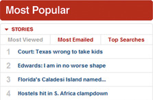
Show simple lists as either numbered or nonnumbered lists. Numbered lists are especially useful when numbers represent the item's rank order, such as in the top 10 movies of the week or the top 10 news stories (Figure 7.2).
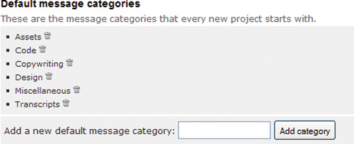
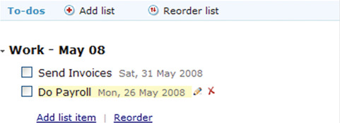
Consider using icons or other symbols with nonnumbered lists to improve the list's visual impact or to indicate the type of item. In addition, lists may use alternate shades of background color or a line separator to improve readability of closely spaced list items (Figure 7.3).
 |
| Figure 7.3 |
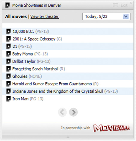
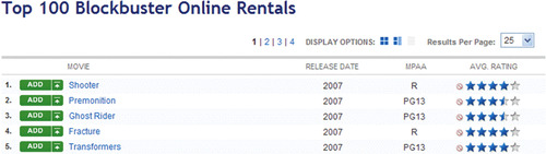
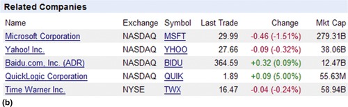
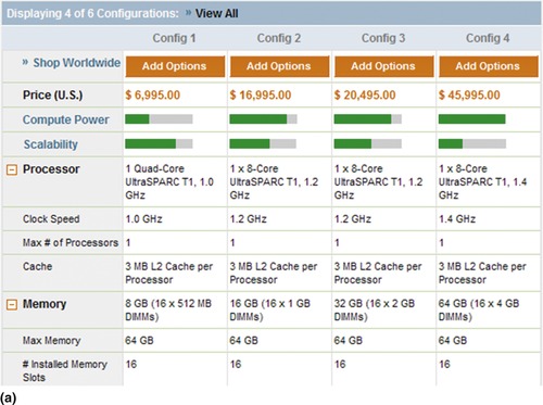
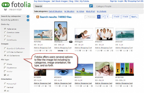
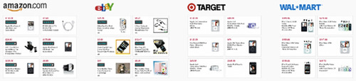
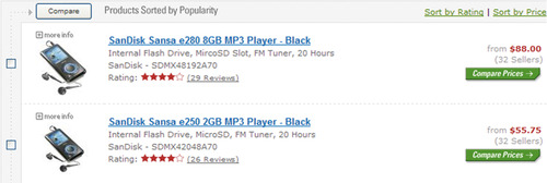
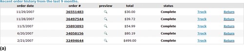
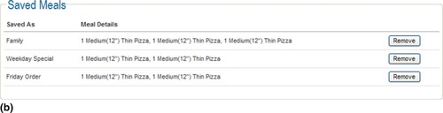
Although most simple lists show items with only one or two attributes, some lists may contain more. For example, search results often show page title, a brief description, web site address, and other information in a simple list format. When users do not need to sort the multiattribute list and compare items of those attributes, using a simple list is often a better alternative than a TABULAR LIST (see the next pattern). However, when showing simple lists with multiple attributes, facilitate quick scanning by making the most important attribute in the list salient and by placing it before other attributes (Figure 7.4).
 |
| Figure 7.4 |
CONSIDER SHOWING SECONDARY ACTIONS ON HOVER
Items in simple lists may have one or more actions associated with them. To minimize visual clutter, limit actions that are visible for each list item by showing additional actions on-hover (Figure 7.5).
Related design patterns
Although a simple list may be acceptable for showing items with multiple attributes, consider a TABULAR LIST if the list needs to be sorted or list items compared based on one or more of the attributes and as a way to minimize the space required for multiattribute lists.
Tabular List
Problem
Users need to be presented a collection of items with several attributes so that they can clearly associate each item with its attributes as well as compare items to each other based on those attributes. In addition, they may want to sort the list based on one or more attributes.
Solution
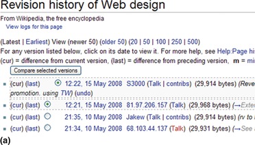
Show users the list in a tabular format, where items are listed in rows and their attributes are shown in columns (Figure 7.6).
Why
Multiattribute information is best presented in tables because it provides structure to data. For example, column headers can identify the attributes for items presented in rows. In addition, presenting information in a tabular format makes it easy for users to compare items and, when supported, sort them in the desired order. Most important, users’ familiarity with tabular arrangement of data into rows and columns makes it a useful approach to present multiattribute data.
How
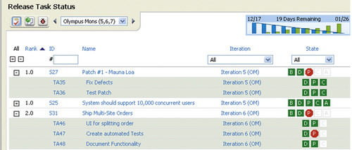
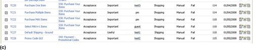
Tabular data are generally read in rows with items in rows and attribute values in columns. Show attribute names in the table headers, unless they are implied by the data. For effective design, it's important that the table design match its intended use rather than relying on users to do additional analysis (Figure 7.7).
MAKE TABULAR DATA READABLE BOTH BY ROWS AND COLUMNS
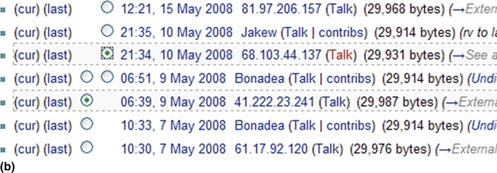
The readability of tabular data is affected by the readability of rows as well as columns. Improve the readability of rows by either adding a separator line for each row or using a different shade of color for alternate rows, known as row striping or zebra striping (Figure 7.8). Both approaches help create a visual grouping of items for rows and are particularly important for data tables with many columns (or wide columns), where users may find tracing data in each row difficult. A study by Enders (2008) concluded that zebra striping led to better task performance (at least not worse) and had a higher preference when compared with other table styles such as plain, lined, two-color row striping, double striped, and triple striped.
 |
 |
| Figure 7.8 |
In addition, improve the readability of columns by aligning attribute values in columns based on table cell contents (Figure 7.9). Follow these rules to align data (Galitz, 2002; Mayhew, 1992):
 |
| Figure 7.9 |
• Use right alignment for columns containing whole numbers (not “text” numbers such as a person's identifier).
• Use left alignment for columns that contain text (including date and time).
• Use center alignment for columns that contain short words or status information (e.g., active, inactive).
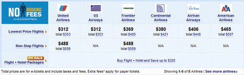
ALLOW USERS TO SORT DATA COLUMNS
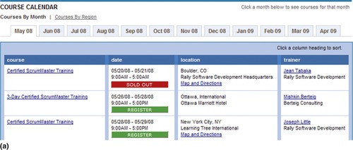
Sorting long data lists by columns helps users find desired items quickly and analyze them for specific types or statuses. Like its desktop counterpart, a common interaction approach for sorting tabular data is to let users click a column heading to sort by that column (Figure 7.10) and a second click to reverse the sort order (ascending or descending).
 |
| Figure 7.10 |
Indicate the column attribute by which the tabular data are sorted by placing an arrow icon next to the corresponding column heading to indicate whether data are sorted in an ascending (up arrow) or descending (down arrow) order. Sorting the data by columns and showing a sort indicator by default also suggests to users that the table can be sorted.
Sorting by column headings is appropriate when all possible ways users might sort data are available in columns. In instances where this is not possible, show sort options explicitly either as a dropdown list or a set of links (Figure 7.11).
 |
| Figure 7.11 |
For applications that require multiple levels of sorting (e.g., reporting), provide the functionality separately, where users can select more than one level of sorting, and for each sort can indicate if sorting should be ascending or descending (Figure 7.12). For multilevel sorting, three levels are usually sufficient.
ALLOW USERS TO FILTER LARGE LISTS
Filters help users narrow a large number of items in a list to a manageable set. If narrowing options are attributes contained in the list and users are likely to narrow down by only one of them at a time, filters may be embedded in the tabular list itself (Figure 7.13).
 |
| Figure 7.13 |
On the other hand, if not all of the filtering options are available in the list and users are likely to filter by more than one option at a time, show filtering options separately above the list (Figure 7.14).
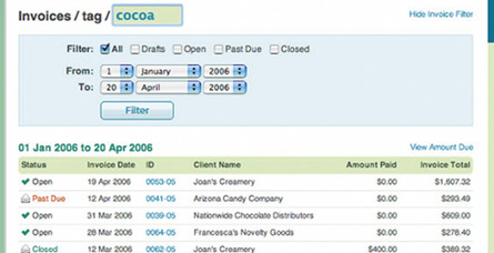 |
| Figure 7.14 |
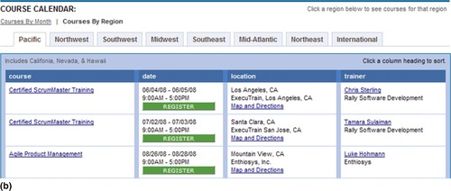
In addition, consider a matrix view when data can be filtered by row and column attributes individually and combined (Figure 7.15).
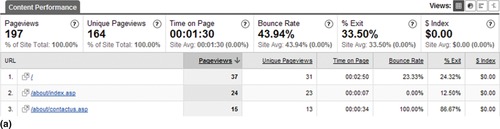
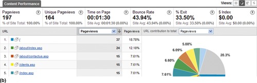
ALLOW USERS TO SEE ALTERNATE VIEWS OF TABULAR DATA
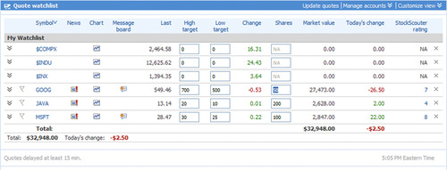
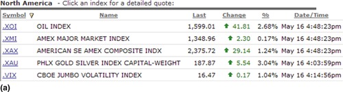
Offer alternative views of tabular data when they help users understand data better and/or make it easier for them to find desired items. For example, when viewing reports on e-commerce applications, it's common to allow users to switch between textual and graphical views (Figure 7.16 and Figure 7.17).
 |
 |
| Figure 7.16 |
IMPROVE THE ACCESSIBILITY OF TABULAR DATA
Improve the accessibility of tabular information by including the following in the HTML markup (see also the ACCESSIBLE TABLES pattern in Chapter 11):
1. Describe the table's content using the <CAPTION> tag and the <SUMMARY> attribute. Within the <CAPTION> tag, include a short title describing the table's content. Unlike the <CAPTION> tag, the content of which is visible to users, the content within the SUMMARY attribute is not rendered on the page but provides a more detailed description of the table's content to those using alternate browsers.
2. Describe the relationship between column or row headings and the corresponding data by using the SCOPE attribute in the <TH> tag, which helps users establish context for the table's data.
Related design patterns
Most large lists need to be filtered; see the FILTERING pattern in Chapter 6 and the DYNAMIC QUERYING pattern in Chapter 8 for the choices available to designers for narrowing large lists. Large lists also typically cannot show all items on the same page, so PAGINATION is often an integral part of tabular lists; consider CONTINUOUS SCROLLING as an option as well (see Chapter 6).
Hierarchical List
Problem
Solution
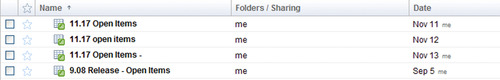
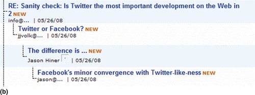
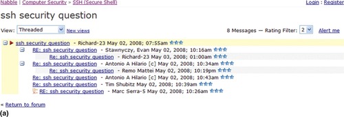
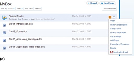
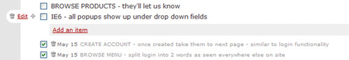
Show list items as a “tree” of items, which clearly illustrates the relationship between parent and child item(s) (Figure 7.18). List items at the parent level (i.e., a group node or a parent item) may contain other groups (i.e., parents) and/or individual items (i.e., a leaf node or a child item) and can be expanded and collapsed to view its contents.
Why
For many lists, especially in emails and forums that have several participants and topics, it's important to show how items relate to each other. Showing items in a hierarchical list makes it easier for users to follow the thread of a discussion or conversation. In addition, it makes it easier to trace the discussion's history.
How
Make the list items’ hierarchy clear by depicting the relationship between items at the parent and child levels. In addition, include expand and collapse controls for items at the parent level in the first column (Figure 7.19).
 |
| Figure 7.19 |
Indentation is the preferred method to indicate parent–child relationships among items in a multilevel hierarchical list. However, for single-level hierarchies—mainly used for grouping of information—some form of visual indication that emphasizes the item at the parent level is usually sufficient to show the hierarchical relationship (Figure 7.20).
 |
 |
| Figure 7.20 |
WHERE APPROPRIATE, OFFER A NONHIERARCHICAL VIEW
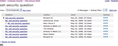
For hierarchical lists, the default organization (sorting method) is the tree structure that shows parent–child relationships. For multicolumn (i.e., multiattribute) lists, however, users may want to sort data by another attribute. For example, in discussion groups, users may want to view messages in a chronological order rather than the default hierarchical order of threaded discussions. When users can sort the columns, it may become necessary to switch to a nonhierarchical list; however, ensure that users are able to return to the original hierarchical view (Figure 7.21).
BE CAREFUL WHEN ALLOWING USERS TO DELETE PARENT ITEMS
Deleting an item at the parent level would cause all the child items, including other parent items within it, to be deleted. Therefore, when offering the “delete” option, make users aware of the actions’ consequences. If an action taken could inadvertently cause substantial data loss, restrict users to deletion of only “empty” parent items. In addition, if necessary, only allow the item creator to delete a parent item (Figure 7.22).
Related design patterns
When sorted, hierarchical lists need to be presented as nonhierarchical lists, which may be either SIMPLE LISTS or TABULAR LISTS. In addition, users may want to sort hierarchical lists (SORTING; see Chapter 6).
Events List
Problem
Solution
Use a calendar-like format to present items. In addition, consider showing items in a list view as well and allow users to switch between them (Figure 7.23).
Why
Users generally know how to interact with calendars because of their familiarity with desktop applications such as Outlook, Entourage, iCal, and so forth. In addition, using a calendar view makes it easy for users to see scheduled events and helps them with planning because as they can clearly see available and busy time slots.
How
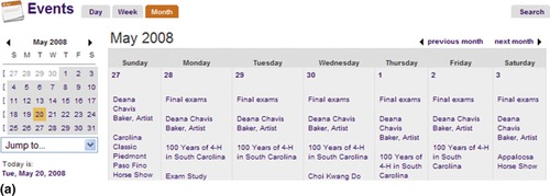
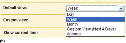
Show users a calendar with an appropriate default view—for example, calendars for personal or business use typically show a weekly view by default. However, allow them to change it to a different view per their preference (Figure 7.24).
 |
 |
| Figure 7.24 |
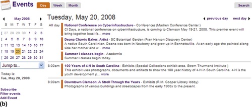
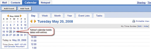
When using a calendar control for navigation, highlight days with one or more scheduled events to prevent unnecessary navigation (Figure 7.25).
 |
| Figure 7.25 |
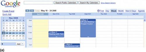
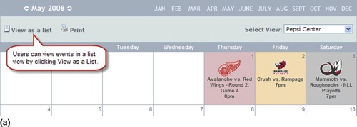
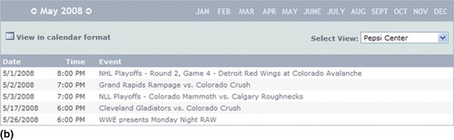
ALLOW USERS TO SWITCH BETWEEN CALENDAR AND LIST VIEWS
Although events are typically shown in calendars because users may want to print the events list for reference, offer users both a list view and a calendar view (Figure 7.26). In the list view, order events chronologically.
 |
 |
| Figure 7.26 |
If event information includes both location and schedule information, consider showing users a location view as well. Although locations are often effective as maps (see the MAPS pattern later in this chapter), a list view may be more suitable if many events are scheduled for the same location, which may appear cluttered on maps (Figure 7.27).
ALLOW USERS TO SEARCH CALENDAR ENTRIES
When the total number of events is too large to be reasonably shown in a calendar view, allow users to search calendar entries (Figure 7.28).
RELATED DESIGN PATTERNS
When showing events in a list format, instead of a calendar format, use either the SIMPLE LIST or TABULAR LIST pattern depending on the number of attributes that need to be shown to users. In addition, use the SEARCH RESULTS pattern (see Chapter 6) when showing the results of event searches.
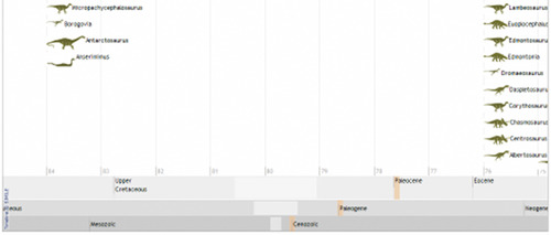
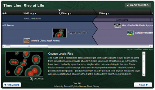
Timelines
Problem
Solution
Show historical information as a timeline (Figure 7.29).
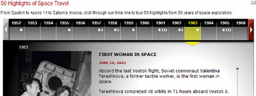 |
| Figure 7.29 National Geographic uses a timeline to help users navigate space travel content. The design also incorporates a CAROUSEL pattern (see Chapter 8) to allow users to navigate the timeline. |
Why
How
Show time along the horizontal axis and the data or event information along the vertical axis. When available screen real estate is limited, allow users to scroll or pan the timeline (Figure 7.30) or compress the timeline and allow them to zoom in and out as desired (Figure 7.31).
 |
| Figure 7.30 |
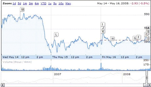
ALLOW USERS TO ACCESS EVENT DETAILS
Because a lot of information may be compressed in a small area, it may be difficult to show details on a timeline. Therefore, allow users to hover over or click on an event (or a data point) in the timeline to view its details (Figure 7.32).
Related design patterns
Large timelines that don't fit within the available screen space often incorporate the OVERVIEW-PLUS-DETAIL pattern (see Chapter 8) to allow users to zoom in and out to view details.
Image Lists/Grids
Problem
Items presented to users are visual in nature, and presenting them using only their textual description may make it difficult for users to recognize and locate desired items. In addition, users may be able to recognize an item by its image but may be unfamiliar with the item's name.
Solution
Show users items as image grids or image lists rather than a textual list. However, complement images with a textual description (Figure 7.33).
Why
A picture is worth a thousand words. –A proverb
Humans are able to recognize and recall images better than words (Paivio et al., 1968). Therefore, when showing multimedia content, such as photos, movies, music, and so forth, it's easier for users to scan and find the desired item when all items are presented as images rather than just in a textual list. The advantage of images over textual information—commonly referred to as Picture Superiority Effect (Lidwell et al., 2003)—is particularly evident in situations where users may have been casually exposed to the image before or know what the “prototypical” image they are searching for looks like. For example, if users are looking for a photo, an artist, an album, or a video that they have seen before or remember one or more elements of, it'd be faster for them to find it using images rather than text. Because memory for images and text together is generally better than text or images by themselves, consider complementing images with textual description (Childers and Houston, 1984; Paivio et al., 1968).
In the early days of the Web, bandwidth was a limiting factor, and the focus was on sharing textual information. With broadband becoming commonplace, user interaction is changing, as users are not only viewing and uploading photos, music, and videos, but also sharing them. This has made the use of image lists quite commonplace.
How
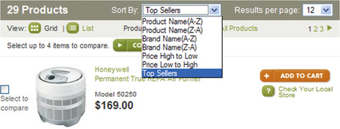
Facilitate the quick scanning of items by showing item thumbnails in an image grid. Like other lists, consider providing users with necessary list pagination, sorting, and filtering options (Figure 7.34; see also the PAGINATION, SORTING, and FILTERING patterns in Chapter 6).
 |
| Figure 7.34 |
When space is limited, image lists may be implemented using the CAROUSEL pattern, where users are shown fewer items at a time, but they can use navigation controls to view images hidden from their view (Figure 7.35; see also the CAROUSEL pattern in Chapter 8).
SHOW USERS A PREVIEW OF THE IMAGES
When thumbnails are used to represent actual images, consider showing users a preview of the larger image on hover to minimize unnecessary navigation (Figure 7.36).
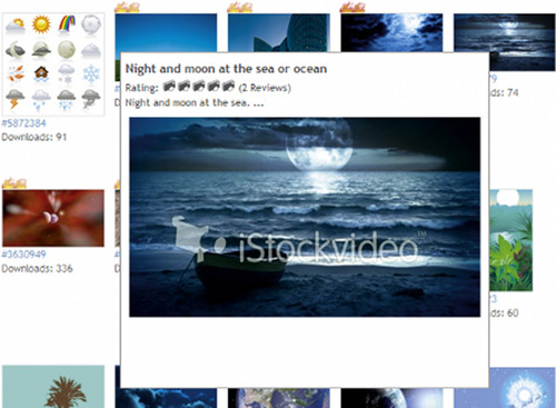
Image previews can also be integrated when an image list is part of a slideshow. Although the detailed image does not require navigating to another page, showing a preview makes it easy for users to distinguish between similar images, especially when thumbnails are relatively small in size (Figure 7.37).

EXPLORE USING AN IMAGES LIST AS AN ALTERNATIVE FOR OTHER INTERACTIONS
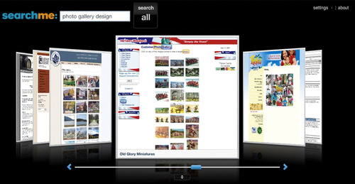
Increasingly, interaction with the Web is becoming visual. The assumption is that users would be more efficient and effective in their interaction if they can view (or preview) content before navigating. Newer search engines have started exploring use of images to show search results (Figure 7.38 and Figure 7.39).
Related design patterns
Unlike lists, especially tabular lists, which can be quite compact, image lists/grids usually require more space. When screen space is limited, consider using the CAROUSEL pattern to accommodate more items (see Chapter 8).
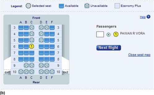
MAPS
Problem
Items to be presented to users contain spatial information that refers to either geographical (e.g., location of restaurants on a map) or physical locations (e.g., seating in an aircraft, a concert hall, or a stadium). In addition, for users, it's important to know the item's location in a geographical or physical space as well as its relation to other items in the same space.
Solution
Show items on either the map of a region or space in question (Figure 7.40).
Why
Because users are presented with spatial information, showing them on a map of the physical space eliminates the need for users to visualize its location. It also makes information more meaningful and relevant to user goals, such as finding a location, navigating to and from a location, and relating data to the targeted region.
How
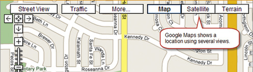
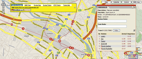
Maps are typically used as a background image on which geographical, physical, and statistical information are superimposed. Depending on users’ needs, maps may be represented as illustrations (using points, lines, and polygons), photographic or satellite images, text, or a combination (Figure 7.41).
SHOW DETAILED INFORMATION ON DEMAND
When showing several locations on a map, providing details of all of them at the same time could clutter the map and may make it difficult for users to parse relevant information. In addition, users may be interested in seeing details of only a few locations. To minimize complexity, a common approach is to provide users necessary details when they hover over or click on map markers. Detailed information is usually presented as hover tips or pop-ups.
Hover tips are typically used when details are not extensive, are purely informational in nature, and do not require users to take an action on the presented information, whereas, pop-ups are used when users can take actions such as find directions (Figure 7.42). Another alternative is to show the pop-up after a few seconds' delay to support relatively new users who may not know what actions are available on the map markers (e.g., Microsoft's Live Maps).
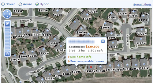 |
| Figure 7.42 |
FOR LARGE MAPS, PROVIDE USERS CONTEXT BY SHOWING OVERVIEWS
When panning and zooming large maps, it is important that users do not feel lost and are able to maintain their sense of location. Overviews within the map help provide such context (Figure 7.43). Most map overviews support panning within them, allowing users to move the “region” box inside the overview, thus affecting the map being viewed.
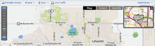
Some map overviews support zooming as well. However, using overviews for panning and zooming is generally not as efficient as panning and zooming on the main map (Hornbæk et al., 2002) (see also the OVERVIEW-PLUS-DETAIL pattern in Chapter 8).
CONSIDER USE OF SYMBOLS FOR SHOWING LOCATION TYPES
Maps may have to show more than one type of location—for example, a map may show restaurants, gas stations, lodging facilities, and so forth. Use one or more of the following approaches to indicate different location types:
Colors and shapes. Use of distinct colors and shapes is helpful when showing two to three location types on the map. Include a legend so that users can associate colors and shapes to location types. In addition, to not disadvantage users with color vision deficiencies, colored markers must be used in combination with a unique shapes.
Pictographic symbols. Use recognizable pictographic symbols use to identify types of locations such as restaurants, restrooms, gas stations, trail symbols, and so forth (Figure 7.44).
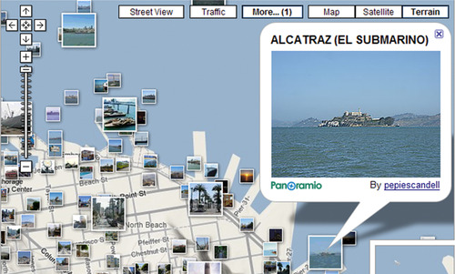
Although not used to indicate a location type per se, using thumbnails of actual photographs to identify a location is becoming a popular way to indicate a location on a map (Figure 7.45).
COMPLEMENT MAP VIEWS WITH A LIST, OR TABULAR VIEW, OF ITEMS
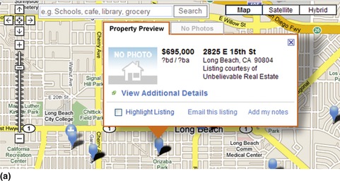
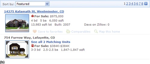
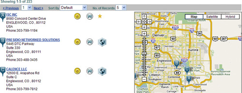
Although a map view is useful for showing location information, the location itself may have other attributes that are better represented in a list format. In addition, when users are interested in comparing attributes of items other than their location, tabular lists are more useful—for example, when comparing prices of homes shown on a map. Enable such comparison by offering users a list view of items in addition to the map view (Figure 7.46; see also TABULAR LISTS pattern earlier in this chapter).
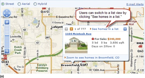 |
 |
| Figure 7.46 |
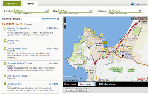
For data with just a few attributes, it may help to show the list and map views side by side to make it easy for users to either select a location from the list and see it on a map or select a location on the map and see it on the list with all its attributes (Figure 7.47).
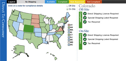
USE MAPS TO SHOW STATUS INFORMATION
Maps are also useful for showing status information on dashboards. For example, ShipCompliant for Six88 uses the U.S. map to show wineries their shipping compliance information to wineries (Figure 7.48).
USE MAPS TO SHOW REAL-TIME INFORMATION ABOUT MOVING OBJECTS
Maps may also be used to show real-time information about the location of objects in transit (e.g., trucks, trains, airplanes, and so forth). Once equipped with global positioning system (GPS) devices, an object's current position can be overlaid on the map to show its current location. This is useful for tracking locations of a fleet or figuring out the current location of a train, for example (Figure 7.49).
Related design patterns
Large maps typically don't fit within the available screen space and often use the OVERVIEW-PLUS-DETAIL pattern to allow users to maintain their context. In addition, maps use DRAG-AND-DROP for panning. See Chapter 8 for more information.
List Actions
Problem
For items in lists, users may want to take one or more actions such as editing, deleting, comparing, and so forth. Desired actions may apply to an individual item or may require users to select two or more items.
Solution
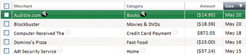
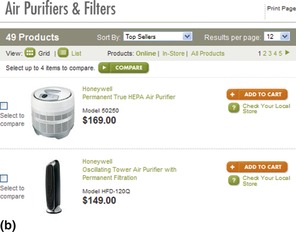
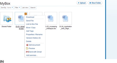
For actions such as edit, delete, copy, and so forth that apply to individual items, clearly associate and show actions for each item. For actions that require selection of two or more items, show checkboxes for each item in the list and corresponding actions outside the list (Figure 7.50). Baxley (2003) referred to them as dedicated actions and shared actions, respectively.
Why
By selecting a dedicated action for an item, users are implicitly choosing the item. Therefore, asking users to select the item before the action is an unnecessary step. In addition, long lists may require users to select an item and then scroll up or down to apply the action, further making the interaction inefficient.
For lists that support both dedicated and shared actions (see Figure 7.50), if not separated, clearly indicating which actions apply to individual items and which apply to multiple items would be a design challenge as well.
How
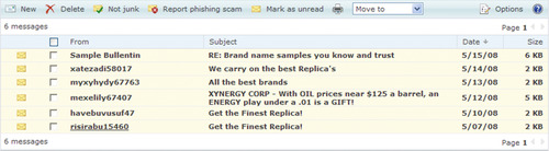
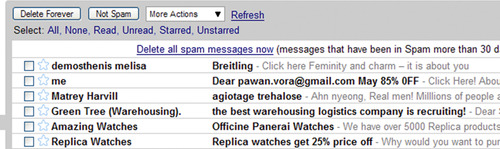
Place dedicated actions in the same row as the list item and repeat them for each item in the list and place shared actions outside the list. If users may select one or more items, like in many web-based email applications, placing both dedicated and shared actions outside the list is acceptable when it helps reduce visual clutter (Figure 7.51). However, to minimize errors, consider disabling dedicated actions when users have selected more than one item in the list.
 |
| Figure 7.51 |
HIGHLIGHT THE ROW CORRESPONDING TO THE SELECTED ITEM
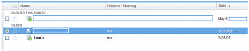
Showing selected items with only checkboxes often doesn't give enough visual indication about their selected states. A common approach to make selected items salient is to highlight corresponding rows by changing their background colors (Figure 7.52; see also the HIGHLIGHT pattern in Chapter 12).
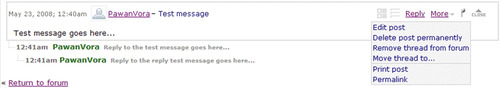
CONSIDER USE OF ICONS AND ACTION LISTS FOR DEDICATED ACTIONS
Dedicated actions can be shown as a set of links, buttons, or icons (Figure 7.53). However, because dedicated actions are repeated for each list item, having several actions in the same row as links or buttons may require additional screen real estate and can add to the visual clutter. In such situations, consider using action lists (Figure 7.54).
 |
 |
 |
| Figure 7.53 |
Another design option to allow dedicated actions in a limited space is to move less-common actions to the items’“details” page or show them on hover (Figure 7.55). Although this approach hides some actions, it may help simplify the user interface.
FOR LONG LISTS, REPEAT SHARED ACTIONS
FOR MULTISELECT LISTS, ALLOW USERS TO SELECT (UNSELECT) ALL ITEMS
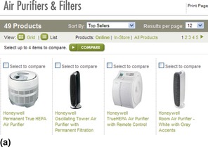
When users are likely to select many or all of the items in a list, allow them to select or unselect all list items (Figure 7.56). There is one exception to this rule, however. For actions such as compare, where users would benefit from selecting fewer items, since selecting many items would make it difficult to show all items on the comparison page, it's better not to offer users the “Select All” option.
DESIGN TO PREVENT SELECTION ERRORS
In instances where users' selections are constrained either by the number of items they can select or the specific items they can select, design the interface to prevent selection errors. For example, if users cannot select more than 4 items from a list of 10 items, as soon as users have selected 4 items, disable the checkboxes for other items. Or if there are dependencies on which users may select, enable or disable options based on their selections (Figure 7.57).
SHOW CONFIRMATION AND ACKNOWLEDGMENT MESSAGES AS APPROPRIATE
List actions affect the list items in one of the following ways:
1. They immediately apply the action to selected items and show users the result. The result may be shown on the same page or on a separate page. For example, actions, such as “update cart,” keep users on the same page, whereas actions, such as “compare,” take users to a separate page.
2. They ask users for additional information by showing a dialog or taking them to a separate page. Once users have provided additional information and “submitted” the request, they are returned to the list page, where they can see the results of the selected action. The actions in this category include “new,”“edit,”“copy,”“email to a friend,” and so forth.
3. They confirm user intent by requiring them to respond in affirmatively to the selected action—for example, “Are you sure you want to delete …?” (Figure 7.58). Requiring users to confirm their intent is important for actions that lead to unrecoverable data loss (e.g., “delete”).
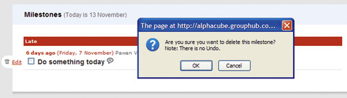
It's important to remember that not all “delete” actions require a confirmation message; only those actions with unrecoverable outcomes should require user confirmation. For example, deleting an item from a shopping cart should not require confirmation, as it's relatively easy to add it back.
In addition, for “delete” actions that are frequent and may annoy users if prompted to confirm every time, a more recent trend is to forego the confirmation message; instead, users are offered an “undo” option so that they can reverse their action (Raskin, 2007). This approach is becoming common in applications (e.g., emails), where deleting messages does not prompt for user confirmation but offers “undo” (Figure 7.59). The applications may allow users to undo only the last action, or they may allow several levels of undo similar to desktop applications. Plus, the applications may support a “redo” function as well.
 |
| Figure 7.59 |
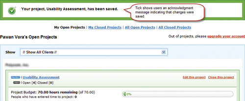
For list actions, where it may not be immediately clear to users that the action was accomplished successfully, it's important that they be presented with a message acknowledging a successful outcome (Figure 7.60). Conversely, if an action couldn't be completed successfully, users should be shown an appropriate error message indicating the reasons for failure and remedial user actions, if any.
List Utility Functions
Problem
Certain actions users might take do not require them to select specific items but rather apply to the list as a whole—for example, printing, downloading, emailing, and so forth.
Solution
Similar to dedicated functions, show utility functions, such as email, export, and so forth, outside the item list (Figure 7.61).
Why
The list view as shown may not be sufficient for users’ needs. They may want to use information in their own analysis using their own tools. In addition, they may want to share information with others who may not have direct access to the data. Utility functions can help users in performing such analyses and facilitate sharing.
How
First, distinguish utility functions from shared list actions. Because utility functions apply to the list as a whole and not individual items, it's important they be shown outside the list and are presented separately from the shared list actions. The latter requires selecting items from the list, whereas the former does not.
The most common export/download formats include Adobe PDF, Excel, CSV (comma-separated values), TSV (tab-separated values), and XML (eXtensible Markup Language), because they allow users to import data to a preferred spreadsheet or database application and manipulate or view the data as necessary. The XML data format is also useful when data may be used as input to other applications and/or converted to other formats such as HTML (HyperText Markup Language) or SVG (Scalable Vector Graphics) for presentation purposes. Adobe PDF is useful when it's important to maintain the visual look of data being exported.
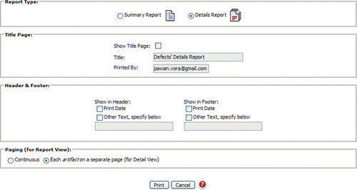
Another commonly used utility function is “Print.” This may be implemented as simply a “printer-friendly” version of the page that users can print on standard printers, by removing banners, advertisements, navigation, and other branding information and resizing it to fit. Resizing the page for printing is particularly important with FIXED-WIDTH LAYOUTS (see Chapter 12), which may cut off text on the right when pages are printed in a portrait layout mode (instead of landscape). When printing lists, it may help to ask users if they want to include details in the printed report (Figure 7.62).
SHOW USERS A PAGE PREVIEW BEFORE PRINTING
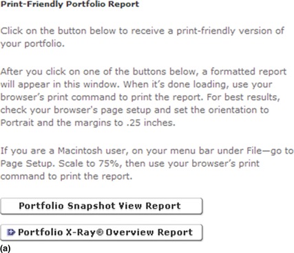
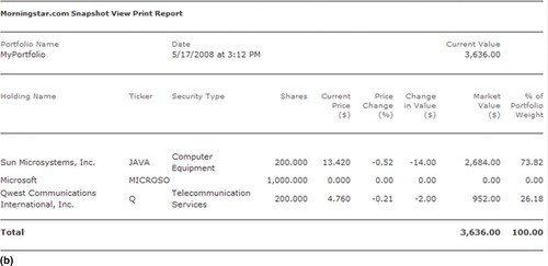
Because it may not be clear to users what they are printing, show users a preview and offer a print action (Figure 7.63).
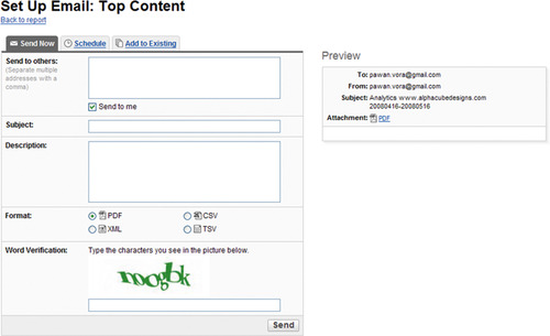
FOR REPETITIVE ACTIONS, ALLOW USERS TO SET UP ALERTS AND/OR SCHEDULES
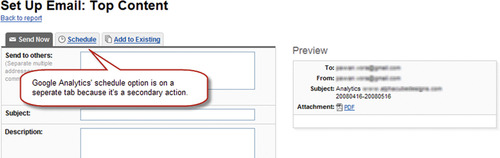
If a utility function is likely to be repeated in the future or on a regular basis (e.g., email), allow users to either set up an alert or schedule the function to repeat at regular intervals (Figure 7.64).
Related design patterns
List utility functions are similar to list actions and require users to be shown appropriate acknowledgment messages after successful task completion.
..................Content has been hidden....................
You can't read the all page of ebook, please click here login for view all page.