
Chapter 11. Accessibility
Introduction
In the context of web applications, the term accessibility refers to designing web pages such that they are accessible to all users, including those with visual, physical, auditory, cognitive, or other disabilities.
When designing accessible web applications, it's important to follow the principle of PROGRESSIVE ENHANCEMENT—that is, design web pages in layers so that the basic content and interaction are available to all, and the more interactive (i.e., enhanced) options are available as capabilities of browsers and/or devices that can access the application increase. To allow for progressive enhancement, it's essential that application pages use SEMANTIC MARKUP, UNOBTRUSIVE STYLE SHEETS, and UNOBTRUSIVE JAVASCRIPT. Because user interaction with web applications is through forms, it's important they are designed to be accessible (ACCESSIBLE FORMS). In addition, other content presented on pages should be made accessible as well (ACCESSIBLE IMAGES, ACCESSIBLE TABLES, ACCESSIBLE NAVIGATION).
Although not a preferred option, there are situations where web applications cannot be made completely accessible in their current form and an alternative design may need to be built to ensure accessibility (ACCESSIBLE ALTERNATIVE). This is particularly the case with Rich Internet Applications (RIAs), which pose significant challenges to accessibility. To address this concern, the World Wide Web Consortium's Web Accessibility Initiative (W3C-WAI) has proposed a road map and working-draft versions for Accessible Rich Internet Applications (WAI-ARIA). While assistive technologies are catching up to W3C-WAI's recommendations, designers may want to start incorporating proposed markup in their designs.
Patterns in this chapter help in making web applications accessible and supporting the standards and regulations for web accessibility (see Standards and Regulations for Web Accessibility sidebar).
STANDARDS AND REGULATIONS FOR WEB ACCESSIBILITY
Several countries have adopted different laws and standards to ensure web accessibility. In the United States, the applicable standards and regulations include the Americans with Disabilities Act (ADA), Individuals with Disabilities Education Act (IDEA), and Section 508 of the Rehabilitation Act of 1973.
Perhaps the most important and comprehensive guidelines are the Web Accessibility Initiative's (WAI) 1 Web Content Accessibility Guidelines 1.0 (WCAG 1.0) and WCAG 2.0 in meeting the accessibility needs on the Web and complying with the regulations just noted. These guidelines detail how web developers can make their web sites and web applications usable for people with disabilities and are based on the following four principles:
1The WAI is an organization within the W3C, the standards-making body for the World Wide Web. See www.w3.org/WAI for more information.
1. Perceivable. Information and user interface components must be presentable to users in ways they can perceive.
2. Operable. User interface components and navigation must be operable.
3. Understandable. Information and the operation of a user interface must be understandable.
4. Robust. Content must be robust enough that it can be interpreted reliably by a wide variety of user agents, including assistive technologies.
For additional information on standards and regulations, see resources for Government Laws, Regulations, Policies, Standards, and Support at www.uiaccess.com/access_links.html#government_laws_regs_policies.
This chapter focuses on accessibility using core web technologies (i.e., HTML, CSS, and JavaScript) and does not address accessibility issues related to Flash and PDF. Readers interested in learning more about Flash and PDF accessibility should consider the following resources:
• Adobe Flash Accessibility Design Guidelines, www.adobe.com/accessibility/products/flash/best_practices.html.
• Adobe Acrobat Accessibility, www.adobe.com/products/acrobat/solutionsacc.html.
Progressive Enhancement
Problem
Not knowing the browser and its version, platform, and assistive technology that users may utilize makes it difficult to predict how web applications will be used. As a result, exclusively relying on certain implementation approaches—even the highly recommended style sheets and JavaScript—may make a web application unusable or inaccessible to certain user populations.
Solution
Design web applications such that they support progressive enhancement. In other words, support users who have older browsers or assistive technologies to access the web application for content and functionality, while also offering users with newer browsers and more advanced technology to experience enhanced (i.e., more interactive) features in the web application (Champeon, 2003a, 2003b).
Why
Using progressive enhancement allows web applications the widest possible reach in terms of devices, browsers, and assistive technologies. In addition, by layering enhancements independent of each other, designers can avoid creating a separate accessible version (see the ACCESSIBLE ALTERNATIVE pattern later in this chapter), because regardless of the technology supported by the browser and/or assistive technology, users will be able to accomplish their tasks.
How
First and foremost, make web application content accessible by using web standards to mark up and structure page content and functionality without requiring client-side scripting technologies such as JavaScript (see the SEMANTIC MARKUP and ACCESSIBLE FORMS patterns later in this chapter).
Once content and functionality of a web application are made available to the widest possible audience, the next step is to improve its visual presentation using style sheets. However, make every effort to ensure that the incorporation of style sheets does not compromise its usability and accessibility for users whose browsers do not support them (see the UNOBTRUSIVE STYLE SHEETS pattern later in this chapter).
The final layer is to offer interactivity using client-side scripting approaches (e.g., JavaScript), which make the application more responsive and efficient by supporting drag-and-drop, performing basic form validation without having to send data to the server, sorting table content, and so forth. Like style sheets, added interactivity should not affect users’ ability to access web application content or functionality (see the UNOBTRUSIVE JAVASCRIPT pattern later in this chapter).
Finally, ensure that web applications using Ajax2 work even when JavaScript is unavailable. This can be accomplished using the HIJAX approach as follows (Keith, 2007):
2Ajax stands for Asynchronous JavaScript and XML, and is a combination of technologies such as JavaScript, cascading style sheets (CSS), document object model, and XML Http Request, which allow the creation of richer user experiences that are comparable to desktop applications (see Chapter 8 for additional details).
1. Begin by building a regular web application where users can request information from and send information to the server using links and forms. The server returns an updated version of the same page. Every time users click on a link or submit a form, the entire page is refreshed.
2. Use the Document Object Model (DOM) scripting approach (see UNOBTRUSIVE JAVASCRIPT pattern later in this chapter) to intercept (or “hijack,” thus the term HIJAX) links and forms requesting information from and sending information to the server. Reroute these requests using Ajax such that the server sends back only the changed part of the page instead of returning the entire page.
Related design patterns
Incorporating PROGRESSIVE ENHANCEMENT requires web pages to be marked up using SEMANTIC MARKUP and then enhanced using UNOBTRUSIVE STYLE SHEETS and UNOBTRUSIVE JAVASCRIPT.
Semantic Markup
Problem
It's difficult to ensure consistent presentation of web pages to all users without knowing the browser, platform, or assistive technology they use to access the web application. In addition, a page's information hierarchy established using images, style sheets, and layouts cannot be communicated visually because users’ browsers and assistive devices may render visual information unusable.
Solution
Convey the document's meaning using structural markup such that it clearly conveys the relationship between page elements and maintains the reading order of the content irrespective of the browser's ability to use CSS and/or render images. In addition, delegate page presentation aspects to style sheets so that the page structure remains meaningful regardless of the browser type, platform, or assistive device.
For web designers this means they must ensure that the order of the page elements is communicated via headings and lists (i.e., <h1>, <h2>, <h3>, <h4>, <ul>, <ol>, and so forth), <table> tags are not used for page layout,, and page presentation aspects are absent from the markup. For example, additional space between content paragraphs is not created using markup such < </p>, and markup doesn't include <ul> or <blockquote> tags to achieve indentation.
Why
With semantic markup, users accessing a web application using screen readers or browsers with limited or no support for style sheets or scripting languages will be able to understand the content structure, the relationship among page elements, and the nature of content inside an element. This is extremely important for users with screen readers, which ignore style sheets and allow users to navigate using structural markup—for example, JAWS for Windows, a screen reader, allows users to navigate page headings using the “h” key. In absence of semantic markup, navigating among page elements and accessing appropriate sections within the page can become extremely difficult (Cannon, 2008).
Using semantic markup along with UNOBTRUSIVE CSS facilitates a clear separation of structure and presentation and affords the largest reach by supporting a variety of browsers and devices. In addition, separating page structure from its presentation simplifies the page design and makes it possible to easily adapt and optimize the presentation for different devices and technologies.
How
In markup, semantics is concerned with the meaning of an element and how that element describes the content it contains.
– Molly E. Holzschalg (2005)
At its most basic level, using semantic markup requires selecting and using HTML tags that match the desired structural intent of page elements and do not rely on their presentational effect as interpreted by browsers. For example, the <blockquote> tag is intended to quote text from an external source and not to indent text contained within the <blockquote> tags. Similarly, to emphasize text, the <em> tag should be used instead of <i>, and the <strong> tag should be used instead of <b>. Although <b> and <i> elements are not deprecated, even in recent versions of HTML or XHTML, the use of <em> and <strong> are more appropriate for adding emphasis to certain words or phrases. Screen readers can then use a different inflection when encountering them in text and convey the emphasis.
Similarly, headings, paragraphs, and lists within a page should be marked with available HTML markup tags such as <h1>, <h2>, <p>, <ul>, <ol>, and so forth, and not with tags such as <div> or <span>, which do not have any inherent meaning.
STRUCTURE DOCUMENTS USING HEADINGS AND LISTS
Organize web pages using heading-related tags such as <h1>, <h2>, <h3>, and so on. Heading tags establish page information structure and help users identify page hierarchy. Users interacting with the page using screen readers or other assistive technology can also use the page structure to navigate (see the ACCESSIBLE NAVIGATION pattern later in this chapter). They can jump from first-level headings (i.e., <h1>) to second-, third-, or lower-level headings (i.e., <h2>, <h3>, and so forth). They can also use assistive devices to “listen” to the page's outline in order to understand the page's structure (Cannon, 2008). For sighted users, using HTML-based headings helps determine the page's visual hierarchy because web browsers style headings in larger and bolder fonts than the rest of the text, even when style sheets are disabled.
Similarly, navigation menus, submenus, and lists within pages should be marked up using lists (<ol>, <ul>, <dl>, etc.). A general rule of thumb is to use ordered lists (<ol>) for lists that suggest some form of sequence or priority-based ordering, unordered lists (<ul>) for lists that have items without any suggested sequence or ordering, and definition lists (<dl>) when the items in the list consist of a term (marked up using <dt>) and its description (marked up using <dd>).
USE STYLE SHEETS FOR LAYOUT AND PRESENTATION
Use CSS to control the presentation and layout of a web page. Put all style declarations in a separate file to enable easy updates (see also the UNOBTRUSIVE STYLE SHEETS pattern next).
Do not embed style-related markup in a page using tags such as <font>, <b>, <i>, and so forth. In addition, do not use deprecated tags—that is, HTML tags that are no longer part of the HTML specification. The Ultimate HTML Reference (Lloyd, 2008) lists the following elements as deprecated: <applet>, <basefont>, <center>, <dir>, <font>, <frame>, <frameset>, <iframe>, <isindex>, <menu>, <noframes>, <s>, <strike>, <u>, and <xmp> (see www.w3.org/TR/REC-html40/index/elements.htmlfor deprecated HTML 4.0 elements).
DO NOT USE STYLE SHEETS TO SIMULATE STRUCTURAL MARKUP
Do not use CSS to give visual appearance of structural elements such as headings, paragraphs, and lists to <span> and <div> tags (Figure 11.1).
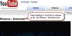 |
| Figure 11.1 |
Screen readers and other assistive technologies rely on structural markup to communicate page structure to their users. Just because an item looks like a first-level heading, if it's not using <>, it will be presented as regular text to users of assistive technology.
• Do this: <h1>Heading 1</h1>
• Not this: <div class=“heading1”>Heading 1</div>
Although both of these techniques use styles and achieve the same presentation results, the meaning of the first-level heading is lost without the <h1> tag.
Related design patterns
Once a page is marked up using structural tags, style sheets can be attached to make pages visually appealing. However, follow the UNOBTRUSIVE STYLE SHEETS pattern to ensure that the pages remain accessible.
Unobtrusive Style Sheets
Problem
Pages using just structural markup do not look visually pleasing. Most designers rely on style sheets (e.g., CSS) to improve the appearance of pages by laying them out in multiple columns, using appropriate fonts and colors, and adding images. Although adding style sheets can significantly improve the appearance of pages, if used inappropriately, they could render the pages inaccessible to some users.
Solution
Add style sheets so that they can adapt to different usage and browser contexts—that is, CSS disabled, CSS unavailable, poor CSS support, user CSS, and so forth—so that they can satisfy the needs of the widest possible audience. In addition, develop style sheets so that users have the necessary flexibility to adjust the presentation to improve page readability.
Why
As discussed (see the PROGRESSIVE ENHANCEMENT pattern earlier in this chapter), style sheets are a way for authors to describe page presentation. However, the designer's preferred presentation may render a page inaccessible to people who have vision deficiencies if, for example, the page doesn't allow enlarging text size or changing colors. Allowing users to “layer” their own presentation over the one suggested by the designer/publisher not only makes the page more usable, but also improves its reach to text-only browsers, screen readers, screen magnifiers, Braille readers, and other assistive devices.
How
Following the principle of PROGRESSIVE ENHANCEMENT, structure the page first so that the page order makes sense (see the SEMANTIC MARKUP pattern earlier in this chapter). Then, add presentation-related markup using style sheets such that the addition of style sheets does not limit the page's accessibility.
KEEP PAGE MARKUP AND STYLE SHEETS SEPARATE
Keep all style sheet declarations in external CSS files rather than embedding them in individual pages or presenting them inline with markup elements. Style sheet files can then be referenced using either the <link> or @import tag (Figure 11.2).
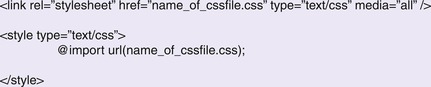
By keeping all style declarations in a separate file, it's also easier to update one external file rather than go through every application page and make updates.
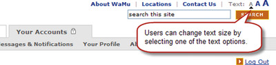
USE RELATIVE UNITS FOR FONT SIZES TO ALLOW USERS TO RESIZE TEXT
Using relative units, such as em, %, and keywords, allows users to enlarge or reduce text size as needed in web browsers such as Firefox, Safari, and Internet Explorer. Although px (pixels) is considered a relative unit, Internet Explorer (version 6 and older) doesn't allow text in the px-based layouts to be resized. Internet Explorer 7, however, allows user to zoom in and out of the page; this feature zooms in/out the entire page, not just the text.
It's possible that some users may not know how to resize text using browser controls. Therefore, consider providing users an explicit way to resize text (Figure 11.3).
ALLOW USER STYLE SHEETS TO OVERRIDE AUTHOR STYLE SHEETS
User style sheets are CSS files created by users and are used to override author style sheets to make pages easier to read. For example, a user might change the background color to black and the text color to yellow and set the font size larger to make the page easier to read. Most of the popular web browsers allow users to specify and use their own style sheet over the designer's/publisher's style sheet.
Browsers give preference to users’ style sheets unless a style declaration is marked !important in the style sheets. Not being able to override the author styles can, in some instances, make pages unreadable for some users. Therefore, avoid using !important declaration in style sheets.
Related design patterns
Even when using CSS unobtrusively, it's important to use structural tags to mark up pages to ensure that pages are accessible without style sheets (SEMANTIC MARKUP). In addition, style sheets should be added only after the page structure has been created (PROGRESSIVE ENHANCEMENT).
Unobtrusive Javascript
Problem
Using JavaScript on pages can offer users richer interactivity and make interaction more pleasant. However, not all web browsers support JavaScript, and users or system administrators may disable JavaScript because of their workplace security policy or personal preference. Therefore, web applications dependent on JavaScript may become inaccessible to at least some users.
Solution
Use JavaScript “unobtrusively”—that is, incorporate JavaScript within web pages in such a way that not having it available does not affect users’ ability to use the web application.
Why
Using JavaScript unobtrusively and redundantly allows web applications to be functional without being dependent on it. When JavaScript is supported and enabled, the web application can offer enhanced interactivity.
How
Following the principle of PROGRESSIVE ENHANCEMENT, structure the page first (SEMANTIC MARKUP), add necessary presentation enhancements (UNOBTRUSIVE STYLE SHEETS), and then enhance browser interaction using JavaScript such that not having it available does not affect structural and presentation layers and the use of the web application.
KEEP PAGE MARKUP AND JAVASCRIPT SEPARATE
Keep all JavaScript for the web application in external JS files rather than in the page itself or embedded in the HTML markup, and reference them using the <script> tag as follows:
Keeping JavaScript files separate from page structure also makes it easy to change scripts without updating individual pages within the application.
USE THE DOM SCRIPTING APPROACH TO ATTACH FUNCTIONS TO PAGE EVENTS
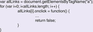
Do not embed JavaScript functions within page markup. That is, do not call JavaScript functions that use the approaches shown in Figure 11.4.
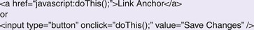 |
| Figure 11.4 |
Calling JavaScript functions from page markup may prevent pages from working correctly in browsers where JavaScript is unavailable or disabled. A better approach is to attach functions to events for different page elements using the DOM3 Scripting approach (Keith, 2005). Use DOM methods such as getElementById and getElementsByTagName to find a specific element or a set of elements, and then assign behavior to specific events such as click, mouse over, and so forth (Figure 11.5).
3DOM, or Document Object Model, refers to a way of representing HTML and XML documents so that they can be manipulated using scripting technologies such as JavaScript. For more information, see www.w3.org/TR/DOM-Level-3-Core/introduction.html.
DO NOT USE DROPDOWN LISTS TO INITIATE NAVIGATION OR FORM SUBMISSION
Do not use JavaScript to navigate to a different page or change effects on the web page when users change the option in a dropdown list. This is typically accomplished using the onchange event handler in JavaScript. Instead, allow users to select the menu item and then click an adjacent form button to go to the page corresponding to the item they have selected.
If a dropdown list is used to submit a form or to navigate to a different page, it will be extremely difficult, if not impossible, for keyboard users to select an appropriate option. For example, if a dropdown list is used to navigate to a different page as users select an item in the list, this would trigger the “onchange” event, and users would be immediately taken to the corresponding page. The only way for assistive technology users to select the last item in the dropdown list would be to repeatedly go back after selecting an option from the dropdown list, navigating to the page, and then select the next option in the list and so forth, until the last item is reached.
Related design patterns
Using JavaScript unobtrusively requires that pages be built using the principle of PROGRESSIVE ENHANCEMENT and that the “behavior” layer provided by JavaScript be completely separated from the structure and presentation layers (provided by SEMANTIC MARKUP and UNOBTRUSIVE STYLE SHEETS, respectively), such that its unavailability does not make the web application inaccessible.
Accessible Forms
Problem
Forms may become difficult to use if they are designed without regard to their use with keyboards and assistive technology such as screen readers or Braille readers.
Solution
Lay out form elements and incorporate appropriate accessibility tags in the markup to make forms accessible to assistive technology users. At a minimum, associate form elements with labels using <label> tags, group related form elements using <fieldset> tags, and set appropriate sequences for tabbing through form elements using tabindex attributes.
Why
Forms are the foundation of web applications. Making them accessible is essential to ensure the widest reach. Using <label> tags and grouping form elements using <fieldset> also adds meaning to elements and helps create a semantic structure in the markup (see the SEMANTIC MARKUP pattern earlier in this chapter). These techniques not only make forms accessible for users of assistive technology, but they also make them more usable and readable for users without disabilities.
How
First and foremost, follow the patterns in Chapter 2 to make forms usable and accessible. Ensure that forms are organized in a logical order and that it is easy for users to associate a form element with its label.
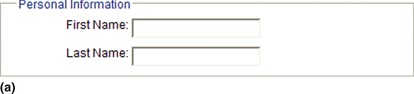
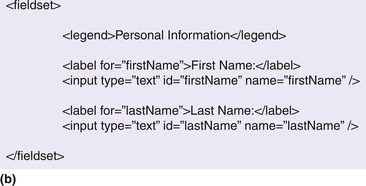
USE <LABEL> TAGS TO IDENTIFY CORRESPONDING FORM ELEMENTS
Use <label> tags to associate field labels to their corresponding form elements as follows:
In this example, the text field for first name has an id of “firstName” that is referenced in the <label> tag using the “for” attribute to associate the label First Name to the corresponding text field.
Not only does the <label> tag make it easy for screen readers to correctly associate labels to form control irrespective of where the form control is positioned, but it also helps sighted users when they interact with radio buttons and checkboxes. When used with radio buttons and checkboxes, the <label> tag allows users to click the label to select the corresponding radio button or checkbox. Thus, users have a larger clickable area and are not restricted to clicking the smaller radio button controls or checkboxes (Figure 11.6).
 |
| Figure 11.6 |
In addition, to ensure that screen readers present information to users in the correct order, place labels that relate to text fields or dropdown lists before the form element in the markup. This does not apply to radio buttons and checkboxes, where labels come after the corresponding controls.
GROUP FORM CONTROLS USING <FIELDSET> TAGS
Use the <fieldset> tag to group related form controls and use the <legend> tag to provide a heading to the grouped form controls (Figure 11.7). This helps screen readers identify and communicate groups to users. The tags <fieldset> and <legend> can also be styled using style sheets to make them visually appealing (Adams, 2008).
MAKE FORMS KEYBOARD ACCESSIBLE
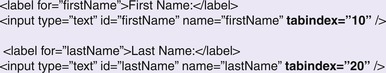
Most browsers allow users to navigate among links, frames, and form elements on a page using the Tab key, which when pressed, moves the focus from one element to another in the order of their presence in the markup. In most cases, when the page is marked up correctly, the sequence in which users would move from one element to another would be correct. However, in cases, when the default tab sequence needs to be changed to provide a better form-filling experience, use the tabindex attribute for form elements (Figure 11.8; see also the KEYBOARD NAVIGATION pattern in Chapter 2).
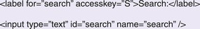
Another way to make forms keyboard accessible and efficient to use is by using the accesskey attribute, which allows users keyboard access to frequently used areas on a page or form (Figure 11.9). For example, the accesskey attribute can be used to navigate among primary navigation options in a web application and can also be used with a link to allow users to navigate to corresponding pages using the keyboard.
 |
| Figure 11.9 |
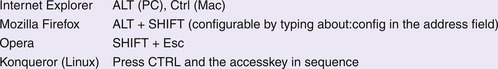
When the accesskey attribute is specified, users can press a combination of the “modifier” key(s) (e.g., Alt or Ctrl keys) in conjunction with the character specified in the accesskey attribute. See Figure 11.10 for a list of modifier key(s) on different browsers.
USE JAVASCRIPT UNOBTRUSIVELY WHEN USED FOR FORM VALIDATION
Many forms use client-side scripting technology, such as JavaScript, to manipulate forms or check for validity of users’ data input. However, use of such scripting technology may render forms inaccessible to users with assistive technology or those who have disabled JavaScript in their browsers. Therefore, perform the form validation on the web server regardless of whether it's done on users’ browsers using JavaScript. This will ensure that forms remain accessible to all, including those using browsers that do not support JavaScript (see also the HIJAX approach discussed in the progressive enhancement pattern earlier in this chapter).
Related design patterns
The patterns discussed in Chapter 2, such as LOGICAL GROUPING, REQUIRED FIELD INDICATORS, SMART DEFAULTS, FORGIVING FORMAT, KEYBOARD NAVIGATION, INPUT HINTS/PROMPTS, and ACTION BUTTONS, are all essential for designing usable and accessible forms.
Accessible Images
Problem
Images are not available to users with visual impairments.
Solution
Provide necessary text alternatives for images and minimize the use of superfluous graphics. There is a common misconception that to make a page accessible, all images must be removed. This is not true. Illustrations, graphics, and other images (including animated images) not only help improve comprehension for users without vision impairments but also help those with some forms of cognitive/learning disabilities (Brewer, 2005). By incorporating text alternatives for images, designers can possibly avoid building an alternative version of the web application.
Why
Making images accessible by providing a text alternative allows both screen reader users and those who have disabled images in their browsers to understand the purpose and function of the images. An added benefit is that it provides a semantic meaning and description that can be read by search engines to improve searchability of pages. When used appropriately, images can make a page look visually pleasing and be incorporated in the page without impacting its accessibility.
How
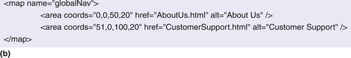
Provide a text alternative for images describing the image's purpose. This is accomplished using the alt attribute for all image-related markup, <img> tags, <area> tags for hotspots on image maps, and input tags of type=“image” (Figure 11.11).
 |
 |
 |
| Figure 11.11 |
USE AN EMPTY ALT ATTRIBUTE FOR DECORATIVE IMAGES
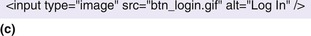
Decorative images refer to images that are used for presentation purposes only—for example, spacer images, transparent images, or filler photographs. Using the alt attribute to describe such images is not necessary because it doesn't communicate any relevant information to users. Therefore, use an empty alt attribute for images, such as <img src=“spacer.gif” alt=““ />.
When images are used only for decorative purposes, consider using them as background. Screen reader users will not see the image, and the need for an empty alt text will not arise. This can be easily accomplished using CSS (Figure 11.12).
 |
 |
 |
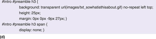 |
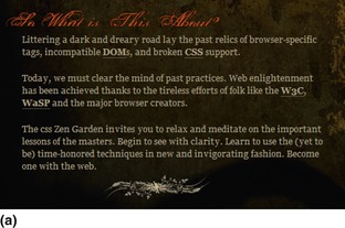
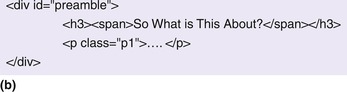
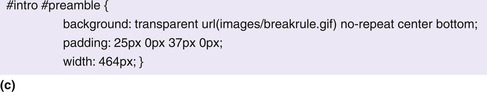
| Figure 11.12 In this example from CSS Zen Garden, the designer has included a decorative image below the section in the background (a). This is evident in the HTML code for this section (b) and the corresponding style (c). The designer uses the breakrule.gif file as the background image and positions it at the bottom of the paragraph to use it as a separator between it and the next section. A similar approach is used for the section header, the text of which (“So What Is This About?”) is enclosed within the <h3><span> tags (b), and its CSS shows the use of the image as background. The text is hidden from sighted users by setting its display to “none” but is still accessible to text reader users. Another option is to use a large negative text-indent value (e.g., –9999px). (Source: www.csszengarden.com/?cssfile=/204/204.css&page=0.) |
USE THE LONGDESC ATTRIBUTE FOR DETAILED DESCRIPTIONS
Use the alt attribute for images when a short description for the image is sufficient. In cases where the image cannot be described succinctly, use the longdesc attribute to reference and link to the page where the detailed image description is provided (Figure 11.13).
Because the longdesc attribute is not supported by older assistive technologies, often designers put a “d-link” (description link) next to the image that opens the description file—the same file referenced in the longdesc attribute (Figure 11.14).
USE MEANINGFUL TEXT WHEN DESCRIBING IMAGES
When describing images using either the alt or longdesc attribute, indicate the image's informational content and/or function as appropriate within its usage context. For example, consider Figure 11.15. This example from webAIM.org illustrates a good approach in determining what would constitute a meaningful text for the PDF icon image. Four potential values for the PDF icon's alt text are:
1. “Employment Application”
2. “PDF File”
3. “PDF icon”
4. “”, because the image content is presented in context
The preceding are discussed in the online article, Appropriate Use of Alternative Text (www.webaim.org/techniques/alttext/):
Notice that the image is within the link. If it were not within the link, then the alt text might be different. In this case, because the image provides additional information about the function of the link, it's important that it be within the link itself and is read with the link. This is vital because links are often accessed out of context from their surroundings.
Option A (“Employment Application”) is redundant with surrounding text so it is not the best choice. Option B is the best choice—it clearly provides the content that is being presented by the image—that the link is to a PDF file. The function (Download the Employment Application”) is presented within the text of the link, so it does not need to be included within the alt attribute. Option C (“PDF icon”) describes the image itself, but is not most appropriate for this context. In another context, it may be important that the user know that this image is indeed an icon—in such a case, using the word “icon” in the alt text may be appropriate. Option 4 (null or empty alt text) would not provide the important information that the image presents.
NOTE
Another option is to use the PDF icon as a background image and position it using the style sheet and use the text PDF in the HTML markup as follows:
HTML:
<a href=“/docs/employement_application.pdf” class=“pdfdoc”>
Download the Employment Application (PDF, 300KB)
AVOID USING TEXT IN GRAPHICS
Graphic formats (e.g., GIF, JPEG, and PNG) appear pixelated when zoomed in. When text is used in graphics, users who have magnified the screen to improve readability would end up reducing the page's readability (Figure 11.16). Readability is further compromised when text is overlaid on another image or a patterned background. Therefore, as much as possible, avoid using text in graphics; it also helps with internationalization (see the EXTENSIBLE DESIGN pattern in Chapter 10).
Related design patterns
Using images should not compromise the SEMANTIC MARKUP. Therefore, use decorative images as background images using CSS so that they are not included in the page structure (see also the UNOBTRUSIVE STYLE SHEETS pattern earlier in this chapter).
Accessible Tables
Problem
Reading and understanding data presented in tables can be confusing to assistive technology users if they are unable to establish the relationship among the data elements. For example, if users are not able to associate data in table cells to corresponding headings, they may not know exactly what the data represent and how they relate to data in other cells.
Solution
Reserve use of <table> tags for presenting tabular data and use style sheets for page layout (see the TABULAR LIST pattern in Chapter 7). Mark up tabular data such that table captions, column headings, and row headings are clearly identified. This helps screen readers understand and communicate the relationship between data presented in tables.
This is not to suggest that pages formatted using <table> tags are inaccessible. It is possible to build accessible pages using tables so that when content is “linearized”—that is, when all table-related tags are removed and content is presented in the order it appears in the markup—the resulting content order matches what users would expect and the page is accessible to assistive technology users. However, the same visual and structural result can be achieved using style sheets, and there is no longer a valid reason for favoring <table> tags for layout (Andrew and Shafer, 2006). In addition, using tables for layout violates the SEMANTIC MARKUP pattern, which suggests that content be marked up using tags to match its structural intent and not to achieve a certain visual presentation.
NOTE
With the new browsers supporting CSS tables using the display properties of table, table-row, and table-cell, soon there would be even fewer valid reasons to use HTML <table> tags for laying out pages (Andrew and Yank, 2008).
Why
Associating data in tables to their column and row headings helps screen readers correctly communicate the relationship among data elements, and users establish appropriate context for their use.
How
Most important, clearly distinguish headings that indicate what the data represent from data cells (the actual values). This is achieved by marking up headings (both column and row headings) using <th> tags and data values using <td> tags.
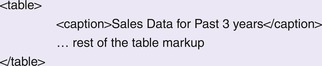
USE THE <CAPTION> TAG AND SUMMARY ATTRIBUTE TO ESTABLISH CONTEXT
Use the <caption> tag to provide a short descriptive title indicating the table's purpose (Figure 11.17). The information within the <caption> tag is displayed to users and can be formatted using style sheets.
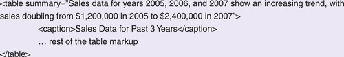
In addition, use the summary attribute to describe in detail what the table presents. Because information contained within the summary attribute is not displayed, its main purpose is to describe the data table's purpose and any relevant formatting information for assistive technology users (Figure 11.18).
IDENTIFY ROW AND COLUMN HEADERS OF DATA TABLES
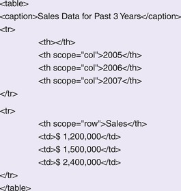
Ensure that data values are correctly associated with their headings by using the scope attribute. Such a practice lets assistive technology users know if data are tied to column headings (<th scope=“col”>), row headings (<th scope=“row”), or both (Figure 11.19).
USE THE HEADERS ATTRIBUTE ON CELLS OF COMPLEX DATA TABLES
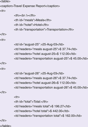
Use the headers attribute to specify the relationship among the headings for a given cell in more complex tables. This is accomplished by attaching an id attribute to any cell that you want to be a header cell and then adding the ids of those header cells to the headers attribute of the data cells (Figure 11.20).
Related design patterns
Data table presentation can be improved using style sheets so that the relationship between data values and headings are clear to those without vision impairments as well. (See Christie, 2008, for how CSS can be used to effectively present tabular data.) This is important for sighted users because attributes such as summary, scope, and headers are not displayed in web browsers. However, UNOBTRUSIVE STYLE SHEETS should be used to ensure that markup and presentation are layered independently as advocated in the PROGRESSIVE ENHANCEMENT pattern.
Accessible Navigation
Problem
Most web pages are organized such that the main “content” area comes after persistent elements such as a logo, utility navigation, primary navigation, and secondary navigation. Although this practice is beneficial for users without vision impairments because they prefer a consistent location for navigation (see Chapter 5), it's disruptive for screen readers and keyboard users because they have to navigate through those links with every page load before they can reach the main content.
Solution
Why
For users without vision impairments, it's easy to ignore persistent header and navigation sections of pages and focus on relevant content areas. Screen readers and keyboard users, however, are forced to access the page in a linear fashion, disrupting their experience. Built-in mechanisms to directly access a page's content via an explicit “skip navigation” link at the top of the page or through appropriate structural markup make interaction with web pages both efficient and pleasurable for assistive technology users.
How
Provide a link at the top of the page that allows users to skip over navigation links. The “skip navigation” or “skip to main content” link is just an HTML link created using the anchor <a> tag. If designers do not want to make the link visible, they may use CSS to hide it (Figure 11.21).
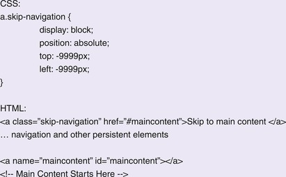 |
| Figure 11.21 |
NOTE
For sites with primary and secondary navigation, it's beneficial to provide separate skip navigation links: one for global (primary and utility) navigation and one for secondary navigation. The first “skip” link would then be “Skip Main Navigation” or “Skip Global Navigation” and the second “Skip Local Navigation,” which then takes users to the page's main content.
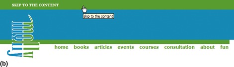
Another common approach is to make the link visible when it receives focus (Figure 11.22). This makes the link available to those who are navigating the page using the keyboard.
 |
 |
| Figure 11.22 |
USE HEADINGS IN THE MARKUP TO IDENTIFY PAGE STRUCTURE
Identify sections within the page using headings markup—that is, use <h1> through <h6>. This allows users with screen readers and browsers to navigate using a keyboard (e.g., JAWS for Windows users can use the “h” key to navigate the page content).
Related design patterns
It's also important that primary, secondary, and/or utility navigation features are marked up using appropriate SEMANTIC MARKUP. With the availability of working-draft versions of ARIA, consider marking up navigation elements using appropriate “role” attributes (see the Accessibility and Rich Internet Applications section later in this chapter).
Accessible Alternative
Problem
Solution
Create an accessible alternative for the web application that offers the same content and functionality, and provide a link to this alternative application. This follows the recommendation by WCAG 1.0, which states:
If, after best efforts, you cannot create an accessible page, provide a link to an alternative page that uses W3C technologies, is accessible, has equivalent information (or functionality), and is updated as often as the inaccessible (original) page.
And, from WCAG 2.0 (see Conformance Requirements at www.w3.org/TR/2007/ WD-WCAG20-20070517/#conformance):
If the Web page does not meet all of the success criteria for a specified level, then a mechanism to obtain an alternate version that meets all of the success criteria can be derived from the nonconforming content or its URI [Universal Resource Identifier], and that mechanism meets all success criteria for the specified level of conformance.
Why
Ideally, a web application should be able to adapt to the needs and capabilities of browsers, assistive technologies, or users without maintaining separate, difficult-to-maintain versions. However, sometimes web applications use technology that offers important benefits justifying its use (e.g., better performance, richer interactivity, etc.) but are not well supported by assistive technologies.
RIAs are a good example. They offer important usability and performance benefits (e.g., Google Maps, Gmail). However, when used with assistive technology, mobile devices, or browsers that have JavaScript and CSS disabled, they break down. In addition, there may be legal requirements to use an exact copy of a document, making modifications to original documents impossible. In such instances, rather than excluding users, it's better to create an alternative version of the application with the same content and core functionality.
How
Once the alternative version is developed, two important WCAG 2.0 requirements are:
1. The accessible version provides the same content even with compromises in design and functionality.
2. At the beginning of the pages of the nonaccessible version, a link is provided to the alternative accessible version.
Related design patterns
If Ajax or the use of JavaScript is making the application inaccessible, use approaches outlined in the UNOBTRUSIVE JAVASCRIPT and PROGRESSIVE ENHANCEMENT patterns to make the application as accessible as possible.
Accessibility and Rich Internet Applications
Approaches used in developing RIAs (see Chapter 8) make extensive use of dynamic HTML and Ajax to offer a richer and more interactive experience. However, they pose significant accessibility challenges. For example, if page content changes without a page refresh, new content may not be available to people who rely on screen magnifiers or screen readers. RIAs also use complex interface controls such as sliders, progress bars, tabs, trees, and so forth, which are not natively supported in current versions of HTML/XHTML markup.
The W3C-WAI group has been working on addressing these challenges through their ARIA suite (WAI-ARIA; see www.w3.org/WAI/intro/aria). The purpose of WAI-ARIA is to offer a way to associate behavior and structure to interactive controls used on rich web pages with existing markup to make RIAs accessible to people with disabilities. It does so by incorporating roles and states and properties within existing markup.
Roles allow an RIA designer to provide proper type semantics on custom controls to make them accessible. For example, as indicated in the SEMANTIC MARKUP pattern, page navigation should be marked up using lists. However, if a page has several other types of lists, it's not easy for users to distinguish between navigation-based lists and other lists. ARIA specification provides help by using the notion of roles, which provide information about what the control is irrespective of the HTML markup that was used to create it. For example, an unordered list used for navigation can be marked up as:
<ul role=“navigation”>
<li>Navigation Item 1</li>
…
</ul>
Roles are divided into widget roles and structural roles. Widget roles include widgets common in RIAs such as progressbar, slider, combobox, tree, alert, dialog, and others. Structural roles include roles such as menubar, toolbar, breadcrumbs, search, liveregion (in which content is changed without page refresh), tab, navigation, and so forth. Of particular importance for RIAs is the structural role of liveregion, which allows text in the live region to be spoken without giving it focus. Users can then be informed of any updates within the area tagged as liveregion without losing their place within the content.
While roles provide information about the type of control being used, the states and properties module of ARIA adds semantics about relationships and current states. For example, a slider control can have properties such as valuenow, valuemin, and valuemax; a liveregion can have a state of “busy”; a combobox could have the property of autocomplete; a tree can have the state of “expanded” with a treeitem having an attribute of level; and so forth.
Currently assistive technologies such as Window Eyes 5.5+, Jaws 7.0+, and ZoomText have some support for WAI-ARIA–based markup with Firefox 2 or later; and Orca 2.20 supports WAI-ARIA with Firefox 3. Therefore, designers should start adding appropriate WAI-ARIA attributes in their markup to improve accessibility of RIAs. Because extra attributes will be ignored by browsers that do not support WAI-ARIA, there is minimal risk in their use. As support grows in browsers and assistive technologies, accessibility of RIAs continue to improve as well.
..................Content has been hidden....................
You can't read the all page of ebook, please click here login for view all page.