
Chapter 8. Rich Internet Applications
Introduction
As discussed in Chapter 1, Rich Internet Applications (RIAs) can deliver responsiveness and interactivity comparable to desktop applications. With RIAs, the interaction seems continuous and dynamic because users do not have to wait for pages to refresh for basic data and layout updates and can immediately see the results of their actions.
Perhaps the earliest rich interaction in web applications was RICH-TEXT EDITORS, which enabled users to include formatted text on web pages without knowing the underlying HTML (HyperText Markup Language). With the advent of technologies such as Flash and Ajax (Asynchronous JavaScript and XML), richer interactions have become possible because they allow communications with web servers without explicit “submit” actions. Their initial use, therefore, has been to replace the interactions that require users to wait for results to be processed by web servers and returned to them with a page refresh. These include validating user input and providing necessary feedback to users when filling out forms (RICH FORM); offering valid choices for data input (AUTOSUGGEST/AUTOCOMPLETION); allowing users to edit information in the same location it’s being viewed (EDIT-IN-PLACE); panning and zooming around the information space (OVERVIEW-PLUS-DETAIL); sorting and filtering information in real time (DYNAMIC QUERYING); and previewing the effects of user changes (LIVE PREVIEW). Enabling such richer interactions requires use of direct manipulation techniques common in desktop applications such as DRAG-AND-DROP and interactive controls such as SLIDERS.
In addition, to communicate changes effected on the page and help users maintain their visual context, designers have started relying on visual effects (ANIMATIONS/TRANSITIONS). Popular techniques include showing delays and progress in retrieving data (DELAY/PROGRESS INDICATOR); briefly highlighting changed information on a page (SPOTLIGHT/YELLOW-FADE); and allowing users to browse through a large set of items in a limited space (CAROUSEL). By combining real-time aspects of data update with relevant visual effects, RIAs tend to make web application interactions efficient, effective, and pleasurable.
Rich-Text Editor
Problem
Information entered by users may benefit from richer formatting, such as bold, underline, italic, and bulleted list. In addition, the information may be better presented using colors, tables, images, and hyperlinks. Although this can be achieved with HTML, users cannot be expected to know HTML, and even if they do, they cannot be expected to provide valid HTML. In some instances, allowing users to directly enter HTML (or JavaScript) may lead to security breaches as well.
Solution
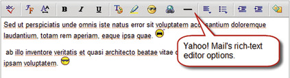
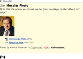
Allow users to enter information using rich-text editors with necessary controls for formatting and inserting images and hypertext links (Figure 8.1).
Why
Plain text can go only so far. In applications where information is targeted to be used by others, such as email and blogs, it is important for users to emphasize certain information by making it bold, underlined, italicized, or presented with a different color. In some instances (e.g., blogs, job sites), it may also be important to provide supporting information such as tables, images, and links to other web pages. Although this is possible by allowing users to enter their information in snippets of HTML, they cannot be expected to be familiar with it. Allowing users to enter HTML may take more development effort to ensure that user entered HTML is valid and that it doesn’t break the presentation of the rest of the page.
Rich-text editors, because of their WYSIWYG (What You See Is What You Get) nature, are easier ways to format text and can be converted to HTML both for storage and to allow users to see the effects of their selections immediately. Moreover, rich-text editors are easy for users because they are likely to already be familiar with similar interactions in office-productivity applications such as Microsoft Office, Corel WordPerfect Suite, OpenOffice, and so forth.
How
Rich-text editors are typically used as part of a larger application and for specific data-entry tasks such as composing an email or creating a blog entry. So, it’s important to show users the text-entry areas that can be formatted using rich-text controls and the formatting options that are available (e.g., bold, underline, italic, bulleted list, hyperlink, images, etc.).
OFFER USERS ALTERNATIVE TEXT INPUT OPTIONS
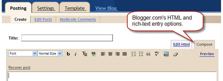
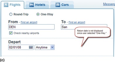
Some users may not want to use rich-text options. When feasible, offer alternative text-input options such as plain text or HTML. In email applications, for example, consider providing a text option (Figure 8.2). In blogs, on the other hand, offer the option to enter HTML directly (Figure 8.3). Ensure that user-entered scripts (e.g., JavaScript) in HTML code are removed before saving the information to prevent security breaches.

OFFER ONLY RELEVANT RICH-TEXT FORMATTING CONTROLS
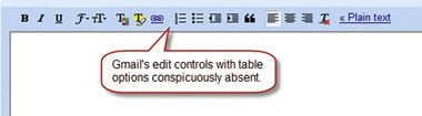
It is not necessary to offer all possible controls to users, just those most users are likely to use. For example, Gmail does not offer any controls for creating tables when composing an email (Figure 8.4). This does not mean that emails using rich-text editors should never offer users the option to create tables, but it is acceptable to restrict the set of rich-text controls.
ALLOW USERS TO ENLARGE THE TEXT-INPUT AREA
When users’ text input is lengthy, viewing the composed text in the available area may be difficult. In such cases, allow users to enlarge text-input areas and/or preview messages before posting. For example, Gmail (see Figure 8.4) and Yahoo! Mail (see Figure 8.1) both offer users the option to enlarge the text-input area, which launches the editor in a separate window so it can be enlarged as necessary (Figure 8.5). 1

Related design patterns
RICH-TEXT EDITORS are comparable to LIVE PREVIEW—both are transparent, WYSIWYG tools. While RICH-TEXT EDITORS reflect the effects of the changes, LIVE PREVIEW allows users to view the effects of their configuration choices on an item or the interface itself.
Rich Form
Problem
Some of the inefficiencies in filling out forms are caused by the need for users to wait after submitting the form for it to be validated. Fixing validation errors requires the form to be resubmitted and revalidated. In some instances, users have to be asked to fill out forms in short chunks because the dependencies in user choices can only be determined after the submitted form has been subjected to necessary business rules—for example, offering users a choice for a purchase order or credit card information based on their choice of billing.
Solution
In addition to patterns discussed in Chapter 2, such as FORGIVING FORMAT, INPUT HINTS/PROMPTS, SMART DEFAULTS, and REQUIRED FIELD INDICA-TORS, use interactive forms that validate users’ input as it is entered, preventing errors by offering users only valid choices. In addition, wherever possible, show dependent or subordinate choices closer to the parent selection (Figure 8.6).

Why
A non–rich form requires users to enter data and submit the form to the server for validation or send bits of selections to the server to show dependent choices. The user is then presented with either the “success” page or errors to be corrected with an accompanying page refresh. Using a rich form not only eliminates page refreshes but also can possibly prevent them altogether by identifying errors at the source. Users also feel in control as errors and prompts are now well integrated with the form.
How
Design the form so that user input is validated either as it is being entered or when the user moves to the next form element (or the focus is removed from the current form element). If the data input or selection is invalid, present appropriate prompts or messages so that users can correct errors immediately (Figure 8.7).
 |
| Figure 8.7 |
DESIGN THE FORM TO MINIMIZE ERRORS
Not only can rich forms validate user input as users are filling out the form, they can also help minimize errors in the first place. For example, as shown in Figure 8.6, the AUTOSUGGEST/AUTOCOMPLETION pattern can offer users valid options while entering data; effective calendar controls can ensure valid date selections; and enabling or disabling appropriate controls as per user selections can minimize incorrect data entry. Other common design elements include “drilldown” approaches to ensure that users see only correct dependent options (Figure 8.8) and password strength meters to ensure that users select secure passwords (Figure 8.9).
 |
| Figure 8.8 |

Related design patterns
As shown in the examples, richness in forms is achieved by patterns such as AUTOSUGGEST/AUTOCOMPLETION as they respond to users’ input to show only valid choices to prevent errors. A SLIDER pattern (aiding user entry for data ranges) and DELAY/PROGRESS INDICATORS (communicating progress during user waiting periods) are also common with rich forms.
Autosuggest/Autocompletion
Problem
Because the total number of possible items at the outset is fairly large, presenting users a standard dropdown list is not feasible when users enter data such as dates, email addresses, search terms, and so forth. However, it is possible to predict these data based on task context or partial user input. In addition, text being entered may be lengthy or difficult to remember, making errors likely and resulting in suboptimal user experience.
Solution
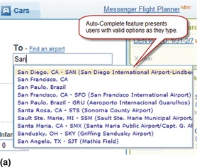
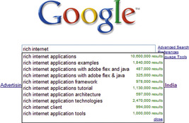
Suggest possible alternatives as users enter data and allow them to select one of the suggested alternatives (Figure 8.10).
Why
By suggesting matches and allowing users to select from a list, not only is the interaction made more efficient, since users may quickly focus on the correct choice, but the potential for errors is minimized as well. Because recognition is easier than recall, it is easier for users to recognize the correct syntax or format of information from available choices than recall it—for example, it’s easier to pick San Antonio (SAT) from a list of airports than to remember the code for it.
How
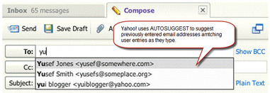
The user interface element for this pattern is a text box that allows free-form data entry. As users type, they are shown a list of items (below the text box) that closely match what has been typed so far. As users continue to type, the list continues to narrow down until the desired item is suggested or no matching items are found. In cases where related information is available for suggested items and could help users make a correct choice, include it as well. For example, when entering an email address, show both the address and name (Figure 8.11), or when entering the city in an air travel–reservation application, show both the city and airport code (Figure 8.12). Another example is to indicate the total number of matches for a given search query, as done by Google Suggest (see Figure 8.10).
 |
| Figure 8.11 |
 |
| Figure 8.12 |
For non-RIA applications, where potential choices for users are finite, users would typically be offered a “Select” button next to the text field. Clicking “Select” would open a pop-up window (or take users to another page) to allow users to select the desired item from a paginated or scrolling list; users may be offered a search mechanism as well.
ENABLE KEYBOARD ACCESS TO SELECT AN ITEM IN THE SUGGESTED LIST
Asking users to take their hands off the keyboard and use the mouse to select an item from the suggested list would be inefficient. Therefore, allow users to navigate within the suggested list of items using the up and down arrow keys, and select highlighted items using either the “Enter” or “Tab” key. For search applications, the “Enter” key can take users directly to the search results page and for web applications that have additional fields, move the focus to the next logical form element.
HIGHLIGHT THE FIRST MATCH IN THE SUGGESTED LIST
Highlight the very first match in the suggested list (see Figure 8.11 and Figure 8.12) and allow users to select it by pressing the “Tab” or “Enter” key. The application should then populate the text field with the highlighted item. However, it is important that users indicate their intent by pressing the “Tab” or “Enter” key and that the application not infer users’ intent and type the rest of the text for them.
Related design patterns
The AUTOSUGGEST/AUTOCOMPLETION pattern is typically used in RICH FORMS and DYNAMIC QUERYING to restrict users’ input to valid choices and thus prevent errors.
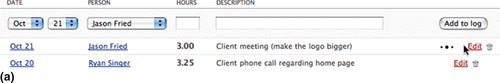
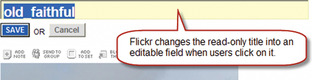
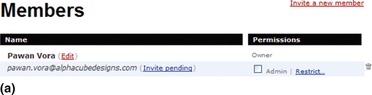
Edit-In-Place
Problem
When users are creating or editing items with just a few properties (no more than three or four), showing a pop-up window, or taking users to a separate “editor” page makes the interaction inefficient. This is because users have to launch the editor, make changes, save those changes, and wait for the page to refresh to see updated information.
Solution
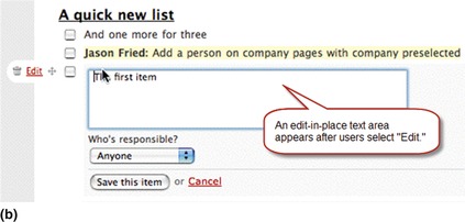
Allow users to create a new item or make changes to the properties of an existing item “in place” using a lightweight editor (Figure 8.13). In some instances, it is better to offer users the “edit-in-place” option only for editing a few chunks of information of existing items but not for creating new items. For example, in a bug-tracking application, changing an existing bug’s status is more suitable for edit-in-place, but creating a new bug entry may not be beneficial with edit-in-place, since entering a bug requires entering several pieces of information such as a brief title, description, steps to recreate the bug, and so forth.

Why
Allowing users to change an item’s properties in its original context, without popping up a separate window or going to a new page, is a far easier way to provide or change a few snippets of data. Requiring users to go to a separate page makes the interaction discontinuous because users have to wait for the editor to load and then switch their attention to a new context.
How
When users activate an edit feature, put the item in the “edit” mode by putting its properties in editable fields (i.e., text boxes, dropdown buttons, or other form controls as necessary). Users can then make necessary changes and either save or cancel their changes to return to the “read” mode (Figure 8.14).
 |
 |
| Figure 8.14 |
If necessary, use more space for the “edit” mode. In addition, since being able to edit text may be a new experience for web users, provide necessary prompts or instructions to let users know how the feature works; providing instructions and/or actions when users hover over an editable item is a common way to inform users.
SELECT THE TEXT FOR ITEMS WITH ONLY ONE EDITABLE PROPERTY
If the item being changed has only one editable property (e.g., name or title), select the item’s text so that users can simply overwrite existing text (Figure 8.15).
Overview-Plus-Detail
Problem
When presented with a large dataset, users may want to zoom in to different areas of the dataset to access detailed information. At other times, users may want to zoom out to a higher “overview” level to get reoriented. Requiring users to go back and forth between an overview and a detail view makes navigating the information space extremely inefficient.
Solution
Show users both the overview and detail view panes with a movable viewport in the overview pane that shows the zoomed-in area (Figure 8.16).
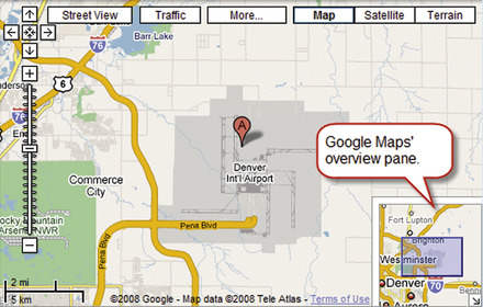
Why
When working with information spaces that are too large to fit on screens, users have to access information by zooming in and out to view the desired detail. By allowing users to view details of the areas of interest while simultaneously seeing the overview (albeit in a much coarser resolution), the need to zoom out to access other areas of the information space is eliminated. Allowing users to move or manipulate viewports also makes it easy to quickly navigate the information space without losing context. Moreover, showing viewports in the overview pane provides a sense of where the user is in the information space; in essence, it answers the common orientation-related question: Where am I?
This pattern is based on one of the basic principles of information visualization: focus plus context.
First, the user needs both overview (context) and detail information (focus) simultaneously. Second, information needed in the overview may be different from that needed in detail. Third, these two types of information can be combined within a single (dynamic) display, much as in human vision. (Card et al., 1999, p. 307)
The main design implication of this principle is to show selected regions of interest in greater detail (i.e., focus) and to preserve a global view at reduced detail (i.e., context) in such a way that all information is visible simultaneously.
How
Make the overview pane available to users at all times. It can be positioned as an inset pane within the detail pane (see Figure 8.16) or positioned next to the detail pane (Figure 8.17).
 |
| Figure 8.17 |
Show the viewport within the overview, highlighting the currently zoomed-in portion of the detail pane. Allow users to drag the viewport within the overview pane to zoom in to different areas within the overview. If users can pan information in the detail pane, move the viewport in the overview pane along with it. If feasible, allow users to adjust the viewport size to change the dataset’s scale in the detail pane. For example, Google Finance allows users to change the viewport size so they can zoom in or out of the date range for the stock price–trend chart (see Figure 8.17).
Related design patterns
When zooming and panning the detail area or moving and/or resizing the viewport, using DRAG-AND-DROP is necessary. Additionally, some type of visual effects (ANIMATION/TRANSITIONS) may be employed to allow users to maintain the visual continuity between states.
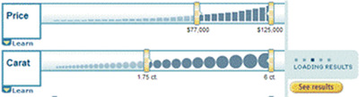
Dynamic Querying
Problem
When presented with a large number of items, users may want to “tune” their criteria to reduce the number of items to a manageable set. Although traditional filtering mechanisms address the problem (see the FILTERING pattern in Chapter 6), user interaction can become cumbersome, since with every filtering choice users need to “submit” their criteria and wait for the page to refresh to see an updated item list.
Solution
Allow users to filter items using a set of interactive controls (i.e., sliders, checkboxes, radio buttons, and so forth) so that with each selection, they can see updated results without having to wait for the page to refresh (Figure 8.18).
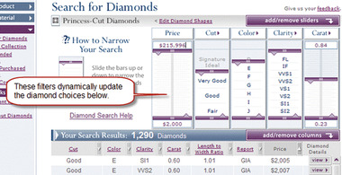
Why
In traditional web applications, filtering requires users to make narrowing selections, submit them to the server, and wait to view the updated result set after a refresh. With every filtering choice, users go through the same process, leading to an interrupted experience. RIAs eliminate the explicit “submit” action and accompanying page refreshes, thus providing a more fluid and interactive experience.
How
Show criteria to users as a set of checkboxes, sliders, radio buttons, and links along with results. As users make different selections, narrow or expand the results set without any page refreshes, enabling users to immediately see the effects of their choices (Figure 8.19).
 |
| Figure 8.19 |
To the extent possible, make all choices visible to users and minimize use of dropdown lists or hidden (cascading) options.
Related design patterns
Although DYNAMIC QUERYING is a powerful way to show users a filtered dataset in almost real time, processing delays are inevitable. Therefore, the DELAY/PROCESS INDICATORS pattern commonly accompanies this pattern.
Live Preview
Problem
Unlike off-the-shelf, mass-produced products, many new products can be customized to users’ preferences along one or more product attributes. For example, when purchasing a car, users may customize its color, trim, and other options and accessories. However, not being able to see the effect of their choices can leave users unsure about their selections and prevent them from exploring other possibilities. In addition, asking users to wait to see the effect of their changes after every selection can become tiresome.
Solution
Show users a preview of the item with their selections immediately without having to “submit” their choices and waiting for the page to refresh (Figure 8.20).
 |
| Figure 8.20 |
Why
Allowing users to preview the results of their selections makes it easier for them to decide whether they want to keep, update their choices, or discard. Also, by offering immediate feedback, live preview invites exploration not possible with traditional web applications, which require users to make selections, request a preview, and wait for the application to show the effects of their choices.
This is similar to the RICH-TEXT EDITOR pattern where users are customizing text in terms of color and formatting and can see the results right away in a WYSIWYG fashion.
How
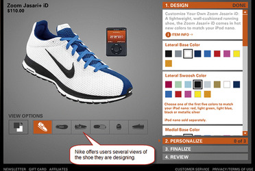
Offer users customization options along with an image of the actual item. As users choose different options, update the item’s image to reflect their choices.
CONSIDER SHOWING MULTIPLE VIEWS OF THE CUSTOMIZED ITEM
For three-dimensional items or items with multiple surfaces, consider showing users multiple views of the customized item so that they clearly understand the impact of their choices. For example, Nike allows users to view the customized shoe from a variety of angles such as top view, side view, front view, and so forth (Figure 8.21). Similarly, BMW allows users to switch between the front and back views to customize the exterior (see Figure 8.20) and between the driver’s view and dashboard view to customize the interior (see Figure 8.22). Lands End, on the other hand, offers not only the front and back view but also a view showing a model wearing the customized item (Figure 8.23).
 |
| Figure 8.22 |

Related design patterns
As mentioned, the LIVE PREVIEW pattern is similar to the RICH-TEXT EDITOR pattern in that it attempts to provide a WYSIWYG view of users’ selections as they are made. In addition, preview is useful when users are customizing the interface; CUSTOMIZATION is a relevant pattern as well (see Chapter 4).
Drag-and-Drop
Problem
Traditional web applications require indirect methods for rearranging or reordering data items. For example, users can reorder a list of items in one of two ways: select the desired item and choose up or down actions or enter the desired order of items in text fields and select a “reorder” action. Although both these approaches are reasonable, they do not provide users immediate feedback of their actions and can be cumbersome for even relatively short lists.
Solution
Allow users to directly manipulate data items and/or page components using a drag-and-drop interaction style (Figure 8.24).

Why
In non-RIA web applications, moving or rearranging of data items typically requires taking users to another page, where the effects of the changes are not visible until the desired rearrangement is submitted to the server and the original page is updated to reflect the new order or layout. Employing direct-manipulation methods similar to those common in most desktop applications (e.g., deleting a document by dragging it to the trash) can make the interaction efficient and encourage exploration.
How
Allow users to drag data items (or components) from their current place, move them to a new location and place, and drop them there. Drag-and-drop may be used for the following:
• Rearranging items on a list (Figure 8.25).

• Moving overlaying pop-ups from one location to another (Figure 8.26).

• Building lists such as adding an item to the shopping cart (Figure 8.27).

• Indicating an action (Figure 8.28).

• Resizing an object (Figure 8.29).

When supporting drag-and-drop, it is important that the user interface is responsive and changes are shown instantly without any delays.
OFFER NECESSARY AFFORDANCE FOR DRAG-AND-DROP AREAS
It is important that the user interface clearly indicate what is (and is not) “draggable,” and which areas are (and are not) valid “drop” zones. This can be accomplished by:
• Showing clear handles for dragging.
• Highlighting drop zones when an item is dragged over it.
• Not highlighting nondrop zones, which should show a “not allowed” icon ( ), by setting the CSS cursor property to not-allowed.
), by setting the CSS cursor property to not-allowed.Drag-and-drop is not accessible to users with visual and/or motor disabilities. Therefore, the interface should always use drag-and-drop interaction redundantly and offer other more accessible ways to allow rearrangement of data items. See Chapter 11 for more information on accessibility.
Related design patterns
The DRAG-AND-DROP pattern is also used to make selections using SLIDERS in DYNAMIC QUERYING and moving or adjusting viewport sizes in OVERVIEW-PLUS-DETAIL.
Slider
Problem
Specifying one or more values between a range of values is error-prone, as users have to know valid values. In addition, they also need to know the precision of the desired input (e.g., 10 versus 10.1 versus 10.12). Although such information can be included in the page design, the page may get cluttered as the number of form elements requiring such data input increase.
Solution
Offer users a slider control specifying an acceptable range of values. Users can then drag the slider(s) to set a value (Figure 8.30) or a range of values (Figure 8.31).
 |
| Figure 8.30 |

Why
For traditional web applications, because of a lack of native support for the slider control in the current version of HTML, users are offered a text field, a set of radio buttons, or dropdown lists to specify one or more values within a range. However, sliders provide an easier and more direct method of selecting a value within a range (Galitz, 2002). In addition, they prevent user errors when compared with entering values in text fields. Another important advantage of sliders is that the data range can be continuous as well as discrete, and the design of the slider can convey the appropriate precision of user input. It is also faster to select values using sliders when compared to a selection involving a text-input field or radio buttons.
How
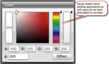
Allow users to set one value or a range of values by dragging and dropping the slider(s) in the slider control. In addition to drag-and-drop, enable users to click directly on the arm to move the slider to the clicked location. Allow users to control the slider using the left, right, up, and down arrow keys on the keyboard as well. It is important that the arrow keys match the orientation of the slider—that is, left and right arrow keys should work for horizontal sliders and up and down arrow keys should work for vertical sliders. However, it is good practice to have the other set of arrow keys work as well. Finally, where feasible, allow users to simply enter the value in a text field (Figure 8.32).
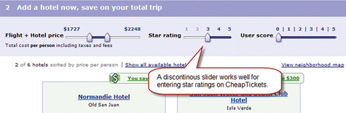
Most slider implementations are for selecting a value on a continuous scale within a range of available values. However, when users may only select discrete values within a given range, use a discontinuous slider that, when dragged, jumps from one value to another to prevent users from considering a value between two discrete values (Figure 8.33). Users should be able to click on any discrete value to have the slider jump to that value.
 |
| Figure 8.33 |
USE DESCRIPTIVE ANCHORS FOR SLIDER ARM VALUES
When using sliders for continuous values, use anchor labels (i.e., descriptors or icons) at the end of the slider arm (see Figure 8.33). For sliders with discrete values, use labels at each end as well as for each major value on the slider arm (see Figure 8.33). For sliders conveying colors or other multiattribute values, labels may not be necessary; however, show all attribute values such as RGB or hexadecimal values for colors (see Figure 8.32).
INFORM USERS OF THE SELECTED VALUE(S)
For both continuous- and discrete-value sliders, users should always know the value(s) they have selected. In addition, when selected values affect more than one value (e.g., specifying a color using RGB, CMYK [cyan, magenta, yellow, black], or hexadecimal values), show users all the values (see Figure 8.32).
Related design patterns
The DRAG-AND-DROP pattern is essential to make slider control work because users drag the slider to indicate their selections. Slider controls are also commonly used in DYNAMIC QUERYING and may be applicable in RICH FORMS to specify one or more values within a range.
Animations/Transitions
Problem
An important usability heuristic is to “keep users informed” of changes in the interface (Nielsen and Molich, 1990). When using RIAs, often only a part of the interface is changing, and it is quite likely that users will be unaware of those changes because they are focusing on other interface areas. In addition, when users are interacting with the application causing the page’s state to change—for example, showing the next set of photos when using the CAROUSEL pattern or zooming in and out of an image—showing users just the final state without showing intermediate states can be abrupt and disorienting, since they may find it difficult to understand the relationship between the initial and final states.
Solution
Use appropriate visual effects (i.e., transitions and animations) to direct users’ attention to page changes (Figure 8.34).

Why
Because our peripheral vision is attuned to detect movement (Faraday and Sutcliffe 1997; Peterson and Dugas, 1972), using animation to direct users’ attention to changes on the page is a useful and effective technique, especially for RIAs, where the page does not refresh with changes in the page’s content.
Animations and transitions also have an aesthetic value that cannot be ignored. They make web applications appear interactive and dynamic and contribute to the characterization of RIAs as “cool,” an attribute commonly lacking in traditional web applications, which are limited to relatively static images and layouts in their visual designs.
How
For RIAs, use animation when page elements change appearance but not position (Figure 8.35; see also Figure 8.46 later in the chapter) or when they move from one position to another, but not necessarily change appearance (see Figure 8.34).
 |
 |
| Figure 8.35 |
Users may be shown a very simple animation to demonstrate that the system is busy loading information or saving data (Figure 8.36; see also the ICONS pattern in Chapter 12).

In some instances, a similar animation may be used to force a delay, indicating to users that their request was received. When the animation disappears, they know that the request was processed and they can resume; an animated progress bar may be used for longer wait times (see the DELAY/PROGRESS INDICATOR pattern next). Upon successfully processing user requests, the updated element’s background can be faded out to subtly indicate the change on the page (see the SPOTLIGHT/YELLOW-FADE pattern later in this chapter).
USE TRANSITIONS WHEN INTRODUCING OR REMOVING CONTENT ON A PAGE
When showing new page content (or exposing hidden content), use appropriate transition effects. For example, when showing new content, consider using a slide-down (or slide-up, slide-left, or slide-right) transition effect (Figure 8.37).
 |
 |
| Figure 8.37 |
Slide-up and slide-down transition effects are most common for expand and collapse actions, respectively, in treelike structures or when using accordion controls for menus.
Match the transition direction to the direction implied in the user action. For example, if users click the “next” button, use the slide-left transition; conversely, use the slide-right transition when users click the “back” button (Figure 8.38; see also the CAROUSEL pattern later in this chapter).

PLAY ANIMATIONS BRIEFLY
The goal of animation should be to attract users’ attention and inform them about something. Once that’s done, the animation should either remain static or disappear; it should not loop endlessly.
AVOID GRATUITOUS ANIMATIONS
Animation is an effective tool only when it serves a specific purpose such as communicating state changes and/or improving interaction.
Because animated elements of a page draw users’ eyes, frivolous animations divert users’ focus from valuable page information. Therefore, do not use animation gratuitously—all it does is distract. Gratuitous animations that do not communicate include visual effects such as using a marquee (of course, it is acceptable when showing a stock ticker tape).
Related design patterns
Another way to keep users informed of changes in the interface is to use the DELAY/PROGRESS INDICATORS and SPOTLIGHT/YELLOW-FADE patterns.
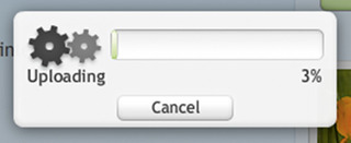
Delay/Progress Indicators
Problem
Even though RIAs strive to provide real-time feedback, users often face noticeable server or processing delays before processing is complete and new information is presented.
Solution
Show users either a delay indicator to suggest the system is busy processing the request (Figure 8.39) or a progress indicator not only to indicate that the system is busy but also to indicate progress in terms of percentage complete, stage of processing, time remaining, or a combination thereof (Figure 8.40).
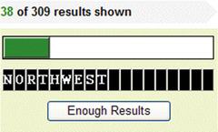
Why
Showing wait/progress indicators serves two purposes:
Users use this information to anticipate the amount of time they have to wait and can opt to cancel the operation. Like the ANIMATIONS/TRANSITIONS pattern, progress indicators provide necessary feedback to users and keep them informed of the system status (Galitz, 2002; Nielsen and Molich, 1990).
How
Different approaches may be used to indicate progress depending on the length of the delay. For shorter delays (less than 10–15 seconds), progress indicators may take the form of:
• A text message such as “loading” or “please wait …” (Figure 8.41).

• An animated icon (e.g., an hour-glass) (see Figure 8.36).
For longer delays (more than 10–15 seconds), use a progress bar that shows the extent of progress and that indicates the status and/or an estimate of remaining time. If completing an action is going to take a long time, let users cancel the operation at any time (Figure 8.42).
 |
| Figure 8.42 |
For really long delays, show status information or other engaging content to shorten the perception of the delay (Figure 8.43).
Related design patterns
Processing delays, usually shorter ones, are quite common in DYNAMIC QUERY-ING and EDIT-IN-PLACE implementations. If users need to be informed about any page changes when processing is complete, the SPOTLIGHT/YELLOW-FADE pattern may be useful.
Spotlight/Yellow-Fade
Problem
Often, it is important to direct user attention to a specific page change either caused by a user action or initiated by the system. Because the change is not significant enough to keep the updated information highlighted (see the HIGHLIGHT pattern in Chapter 12) and because several elements on the page could change over a period of time, permanently highlighting may make the interface appear cluttered. Offering messages that inform users of changes for monitoring-type applications that show live data, such as stock quotes or sports scores, may make the interface jumpy and distracting, as values on such interfaces keep changing frequently.
Solution
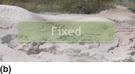
Highlight the changed area for a very brief period—like a spotlight—to create an animation-type effect that grabs user attention. This approach is a generic version of the yellow-fade technique proposed by Linderman (2004) to subtly spotlight a recently changed area on a page (Figure 8.44).
 |
 |
 |
| Figure 8.44 When users return to a page with a recent change, the changed area is highlighted (a). After a few seconds it gradually fades out (b) to return to the normal background (c). The change is thus communicated to the user without cluttering the interface. (Source:Linderman, 2004.) |
Why
This brief highlighting approach helps provide sufficient animated effect to get users to quickly attend to the change when relatively small changes are happening on the page. Additionally, because the effect is transient, users not only are not distracted by the highlight and can return to the task at hand, but the interface remains uncluttered as well.
How
Highlight changed content briefly (no more than a few seconds) to create an animation-like effect. Choose an unsaturated highlight color that provides a noticeable contrast from the rest of the background (Figure 8.45).


Related design patterns
Use of the SPOTLIGHT/YELLOW-FADE pattern is quite common in EDIT-IN-PLACE implementations and PORTALS with portlets that provide live-data updates (see Chapter 4).
Carousel
Problem
Solution
Show items as a “carousel” to allow users to browse through them quickly. Although the notion of a carousel conjures up a circular structure to facilitate navigation both forward and backward, many implementations of the carousel are linear and work as viewports that allow users to view a few items at a time, and go forward and backward to access remaining items (Figure 8.46).
Why
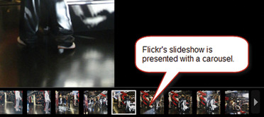
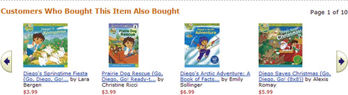
A carousel allows users access to several items in a relatively small amount of screen real estate and allows designers to allocate more space per item. Using circular carousels also enables users to access items by clicking on either left or right arrows. Carousels are most commonly used for images; for example, when browsing through photo albums (www.flickr.com); movies, music, or book listings (movies.yahoo.com, www.amazon.com); or real estate listings (www.zillow.com, www.funda.nl).
How
Present items in carousels either vertically or horizontally as a “strip” with navigation buttons (usually arrows) at each end of the strip (Figure 8.47). In designs where a carousel is implemented as a slideshow, highlight the item currently being viewed (see Figure 8.46). In addition, use a “slide” transition effect when one set of items in the carousel is replaced by the next set to indicate the relationship among the items.
INFORM USERS OF THE PRESENCE, OR ABSENCE, OF ADDITIONAL ITEMS
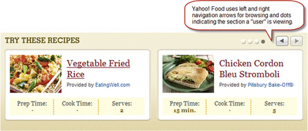
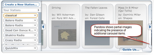
When using linear carousels, let users know whether additional items are available by enabling or disabling left and right arrows as appropriate. For example, when users reach the end of the carousel, disable the right arrow, and when users revert to the first item, disable the left arrow. Pagination cues may also be used to indicate that users have reached the first or last item in the set (Figure 8.48). Additionally, a partial image of the previous or next item in the carousel may be shown (Figure 8.49).
 |
| Figure 8.48 |
Related design patterns
Carousels use visual effects (ANIMATIONS/TRANSITIONS), such as slide-left, slide-right, slide-up, and slide-down, to allow users to maintain visual context between items in the carousel. For linear carousels, use PAGINATION indicators to show users’ location within the carousel (see Chapter 6).
Usability Issues Inherent with Rias
Like any other web application, poorly designed RIAs can undermine usability and must be tested for usability. In fact, there are a few inherent usability issues with RIAs designers must be aware of. These issues relate to the use of the “back” button and bookmarking (or favorites) functionality.
The “back” button problem
Users who are not used to RIA-style web applications may not be aware that it is possible for part of a page to update, so when they see a piece of a web page change, they may think they have navigated to a new page. They may then try to click the browser’s “back” button to return to the previous state of the application, which takes them to the previous page in the browser’s history instead of the previous state of the application. Although users are trying to undo a previous action, they typically find themselves completely out of their task context and could potentially lose data.
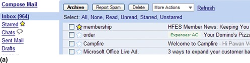
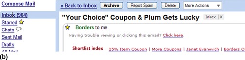
A common solution to this problem is to allow users to undo their actions on the same page. However, it is more important to understand users’ natural behavior with the application and determine if the RIA approach is appropriate for the task at hand. A good example is Gmail, which uses RIA for lists or emails (i.e., “Inbox,”“Starred,”“Sent Mail,” etc.) and when viewing conversations (i.e., chronological thread of email exchanges) but allows users to use the browser’s “back” button to return from the conversation page to the list page (Figure 8.50).
The bookmarking problem
Because the browser’s location/address bar stays exactly the same when users select functions and change the application’s state, turning bookmarking into specific application views is impossible. Although some clever approaches are available to address the bookmarking problem by rewriting URLs, it is typically not a big issue for web applications because users do not need to bookmark specific states.
..................Content has been hidden....................
You can't read the all page of ebook, please click here login for view all page.