
Chapter 2. Forms
Introduction
Forms are a distinguishing characteristic of web applications. By using form elements (e.g., text boxes, dropdown lists, scrolling lists, radio buttons, checkboxes, and action buttons), web applications allow users to accomplish goals such as buying products and services, making flight reservations, finding directions, uploading and sharing photos, and so forth. To ensure that users can accomplish their goals successfully, it is important that web applications are not cumbersome and are designed such that:
• Their purpose is clear (CLEAR BENEFITS).
• They ask for only relevant and a minimal amount of information (SHORT FORMS).
• Their organization clearly conveys the relationship among form elements (LOGICAL GROUPING).
• Labels and corresponding form elements are aligned to improve scanning and completion (LABEL ALIGNMENT).
• They clearly indicate what is expected from users (REQUIRED FIELD INDICATORS, INPUT HINTS/PROMPTS).
• They minimize user input and do not require users to enter the same information twice (SMART DEFAULTS).
• They make completing a form efficient (SMART DEFAULTS, FORGIVING FORMAT, KEYBOARD NAVIGATION).
• They clearly indicate how to complete a task (ACTION BUTTONS).
• They clearly guide users when errors occur (ERROR MESSAGES).
Although selection of appropriate form elements (i.e., when to use a checkboxes or radio buttons) is extremely important for usable form design, it’s not discussed here because excellent resources to address this topic already exist; for example, see Mayhew (1991), Galitz (2002), Apple OS X’s “Human Interface Design Guidelines” (2007), and Windows Vista’s “User Experience Guidelines” (2007).
It's important, however, to remember that web applications are developed using HTML and do not offer all the form controls available on popular platforms such as Windows and Macintosh. Specifically, the interaction in web applications is limited to the following form elements: text fields (single line and multiline), radio buttons, checkboxes, dropdown lists, scrolling lists, buttons (including image buttons), and a special control to browse files. Some of the missing controls are spin control, combo-box, tree control, and tabs. Although these controls have been implemented using some clever combinations of HTML, CSS, and JavaScript, they are workarounds and not true controls because they are not available as part of the basic markup language.
Clear Benefits
Problem
When presented with a form, users may not understand how filling it out and submitting it help them accomplish their goals and tasks.
Solution
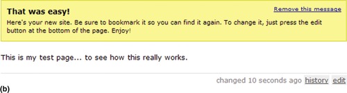
When designing, clearly indicate benefits of filling out and submitting forms. This is particularly important when users are creating a new account (i.e., registration forms), which is the first step before many web applications allow them access to their functionality (Figure 2.1).

Why
Users may not want to fill out forms and provide personal information unless they understand the benefits they will get in return and how it helps them achieve their goals. In addition, they may be concerned about the security of their personal information, since they may not know how it will be used. Clearly indicating benefits and addressing users’ concerns about security and privacy are the first steps in ensuring that users will not abandon the forms.
How
Users should be made aware of the benefits of filling out forms, even if it’s just a one-field form like signing up for email newsletters (Figure 2.2).
 |
| Figure 2.2 |
EXPLAIN THE BENEFITS OF REGISTERING ON LOGIN FORMS
When users view the login form, and if they are not registered application users, it’s a perfect opportunity to describe registration benefits to them. This makes it easy for users to decide whether they want to register or not (Figure 2.3).

EXPLAIN THE BENEFITS BEFORE LEADING USERS TO THE FORM
In many cases, users have to be led to a form. If they don’t know the benefits, they may not bother to click the link or button that leads them to the form. Therefore, it’s important that the form’s benefits are described before users get to the form. One way to accomplish this is with clear link labels, such as “Transfer Money” or “Pay Bills,” instead of generic link labels, such as “Learn More” or “Continue.” When benefits may not be clear to users, it helps to describe them near the action (Figure 2.4).
 |
| Figure 2.4 |
Increasingly, web applications offer functionality and benefits that may be difficult to explain with just a few statements. Or, even when the benefits are clear, users may want to learn more about how the benefits are realized when using the application. To explain such functionality in detail, offer users options to learn more about how the web application works and reduce their anxiety about filling out any required forms (Figure 2.5 and Figure 2.6).
 |
| Figure 2.5 |

Related design patterns
For many complex web applications and those that require users to pay upfront, consider offering a “CLICK-TO-CHAT” option (see Web Appendix: Help), which allows users to ask questions directly to a qualified company representative.
SHORT FORMS
Problem
Solution
Make forms as short as possible (Figure 2.7). Do not ask users for any information that “may be useful” in the future. If additional information fields may help and cannot be removed, offer them as optional and indicate them as such (see the REQUIRED FIELD INDICATORS pattern later in this chapter for more information).

Why
A study reported by Relevant Ads showed that shorter forms had higher conversion rates (Figure 2.8). Making forms shorter also reduces the potential for errors, since users have to respond to fewer form elements. This further increases the chance of successful form completion, resulting in a higher conversion rate.
 |
| Figure 2.8 In a study reported by Relevant Ads, the conversion rate decreased with an increase in the number of form fields. (Source:“Form Conversion Analysis: Less Is More,”www.relevantads.com/results/Form-Conversion-Analysis.aspx.) |
How
Analyze each form element for its importance and the downside of not including it in the form. In addition, consider how easy it would be for users to provide the information. If users have to think about how to respond to an item in the form, consider it as an obstacle to completing the form, and then consider removing it. The most quoted “simple” form page is probably Google’s, which on its search page simply presents a text entry field and search button (Figure 2.9).
 |
| Figure 2.9 |
Jottit is another example of the shortest and perhaps most effective form (Figure 2.10). To create a Web page, users simply type in what they want on their page and click “Create a Page.”
 |
 |
| Figure 2.10 |
DIVIDE LONG FORMS INTO MULTIPLE PAGES WITH SHORTER FORMS
Group information in a long form so that each group is focused on a subtask, and present form elements related to each group on a separate page (Figure 2.11). In addition, order groups so that the most important and required information is presented first and optional information later. Splitting forms makes filling out each page faster, and users are more likely to perceive them to be shorter as compared to the entire form presented on one page.

Related design patterns
Once forms are made as short as possible, make them appear even more manageable by indicating to users the required information (REQUIRED FIELD INDICATORS), grouping and ordering form elements logically (LOGICAL GROUPING), and ensuring that users are aware of the benefits of filling out the form (CLEAR BENEFITS). In addition, consider using the WIZARDS pattern for forms that are split into multiple pages (see Chapter 5).
Logical Grouping
Problem
To complete a task, users have to fill out a rather long form. However, designers want to give users an impression that the form is easy to fill out so that they are not reluctant to complete it.
Solution
Group form elements such that it is clear to users the type of information required by each group (e.g., shipping information, payment information, and so forth; see Figure 2.12).

Why
Grouping information such that users can clearly see what is expected from each group and how form elements relate to their corresponding group can make forms appear easy to fill out and manageable. Users are more likely to think of the form in terms of a small collection of groups instead of a larger collection of individual form elements.
How
Group form elements according to their functions such as shipping address, billing address, contact information, and so forth. For each group, ensure that the order of elements match users’ mental model of how information should be entered. For example, for users in the United States, organize address-related form elements so that users are asked first for street address, then city, and then state and zip code, or for setting up account information, ask for username (or email address) first and then password (Figure 2.13).
 |
| Figure 2.13 |
Once groupings and form elements in each group are identified, order them according to user tasks. For example, in an e-commerce checkout flow, it is better to ask for shipping information first because it can be used to calculate tax and shipping charges, so that on the billing page users can be shown the total price and an option to indicate that their billing address is the same as their shipping address (Figure 2.14).

Related design patterns
Grouping form elements may suggest that the form be split up into multiple pages to make it appear shorter (SHORT FORMS) or that it be structured so that data entered by users in earlier groups prepopulate fields in later groups (SMART DEFAULTS) so that users don’t have to go back and refer to previously entered information.
Label Alignment
Problem
Labels and corresponding form elements need to be clearly associated with one another to make form filling easier and to minimize user input errors.
Solution
There are three acceptable placements for labels in relation to form elements: above the element, with their left edges aligned with the elements; to the left, with their left edges aligned with other labels; and to the left, with their right edges aligned to other labels (Figure 2.15).


Why
The faster users are able to associate labels to corresponding form elements, the faster they will be able to fill out forms. In an eye-tracking study, Penzo (2006) found that users are able to easily associate labels with form elements with any of the three common label placements shown in Figure 2.15. However, the eye-tracking data showed that when field labels are left aligned, excessive distances between some labels and their input fields (which happen because not all labels are the same length—for example, “Company Name” compared to “City”) cause users to take more time to interact visually with the form. When compared with left-aligned field labels, the overall number of fixations was reduced by nearly half with right-aligned field labels, thus greatly reducing the cognitive load required for users to complete the task.
The same study also demonstrated benefits of placing field labels above form elements; this style had the shortest form-filling times. One downside of placing labels above form elements is the additional vertical space that it requires. However, if the form is to be translated into different languages, it maintains the layout’s visual integrity because different languages require different lengths for the same labels. Placing labels above form elements thus allows for necessary text expansion of labels when localizing the application (see the EXTENSIBLE DESIGN pattern in Chapter 10).
How
To associate labels correctly with corresponding form elements (for languages that read left-to-right), place labels either to the left or above the form control (Penzo, 2006; Wroblewski, 2008). When placing field labels to the left of form elements, right align the labels so that they are closer to each other (Figure 2.16).

When placing labels above form elements, it’s important to provide enough visual separation between the label for the next form element from the previous form element (Penzo, 2006); Wroblewski (2008) recommends a separation of about 50–75 percent of the height of a single input field. In addition, Penzo (2006) recommends using plain-text labels over bold-text labels because the latter are a little difficult to read (Figure 2.17).

USE EMBEDDED LABELS SPARINGLY
Embedded labels are acceptable for forms that have just a few input fields (typically one) and when most users are expected to be familiar with the nature of the input such as search terms (Figure 2.18). Because embedded labels are in the fields themselves and have to be removed when users focus on them, they are not visible once users have entered data in them. Therefore, they are not useful for long forms or forms where users are less likely to be familiar with data they are expected to enter.


Related design patterns
Labels in forms are generally accompanied by indicators for required information (REQUIRED FIELD INDICATORS).
Required Field Indicators
Problem
Users must provide certain information to complete a task successfully. For example, when setting up an account, users often must provide email addresses and passwords. However, to improve user interaction, forms may ask for additional optional information, which users may not want to provide or may not know at the time of filling out the form. Leaving out required information would lead to error messages and increase the time it would take users to accomplish tasks.
Solution
Clearly indicate required information on forms so that users can complete a task successfully and reduce the chance of encountering “missing required information” messages (Figure 2.19).
 |
| Figure 2.19 |
Why
How
Using asterisks (typically red) next to field labels to identify required information is common in web applications. Red asterisks are effective because they do not rely on color alone to communicate information to users; because the asterisks have both shape and color coding, they are accessible to people with color-vision deficiencies as well. Other forms of indicating required information (e.g., making the field label red and bold) is not preferred because often such visual styles are used to indicate errors within the page. In addition, changing colors may not be accessible to screen readers, and people with color deficiencies may have trouble distinguishing between required and optional information.
Although there may be other ways to indicate required fields with both shape and color encodings, using a red asterisk is recommended because most users’ experience on other web applications have likely habituated them to associate red asterisks with required information; the asterisk’s color may be different depending on the page’s background color.
SHOW THE REQUIRED FIELD INDICATOR LEGEND
Although most Web users will recognize red asterisks next to field labels as an indication of required fields, some web applications use this symbol to indicate optional information. Therefore, it helps to be clear and indicate at the top of the form that items marked with an asterisk (*) are required.
PLACE ALL FORMS REQUIRED FIELD INDICATORS CONSISTENTLY
There is no clear evidence about the efficacy of required field indicators’ location in relation to field labels; they are found in any of the following areas: after field labels, before field labels, before input form elements, and after input form elements.
However, considering that when filling out forms, users’ eyes are near form elements, showing required fields closer to form elements makes the most intuitive sense. In addition, placing them in a consistent location helps users quickly scan forms and identify required information. This may be accomplished by placing required field indicators to the left of form elements when labels are placed to their left and aligned right (see Figure 2.19). For top-aligned labels, place required field indicators to the left of labels (Figure 2.20), as they would then be closer to both field labels and form elements where users enter or select data; placing them to the left of form elements may become confusing when showing check boxes or radio buttons as users may feel that selecting that option is required.

DO NOT INDICATE OPTIONAL FIELDS
In situations where a form has fewer optional fields, there is a tendency to mark optional fields, as opposed to required fields, to reduce clutter. This is a poor practice. Because of users’ familiarity with other applications, most of which use required field indicators, they are more likely to consider them as required or at least be confused about what is expected of them.
PROVIDE INSTRUCTIVE TEXT FOR REQUIRED SENSITIVE INFORMATION
If information asked of users is personal in nature, such as their birth date, gender, or race, clearly indicate why the information is required. In addition, provide a link to the “Privacy Policy” informing users how their information will be used.
Related design patterns
Even when a form clearly shows required fields, designers should still strive to minimize the total number of fields on a form—both optional and required fields (SHORT FORMS). In addition, when users fail to provide required information, show them a message on the same page as the form with the required information (ERROR MESSAGES).
Smart Defaults
Problem
With every additional form element, both the total time it takes users to fill out the form and chances of potential errors increase. In addition, for multipart forms, if users have to reenter the same information, not only would it increase the time required to complete the form, but also require the application to check that the information was entered identically each time.
Solution
Use appropriate default values based on what most users are likely to choose or enter; this may be based on their previous input or selections (Figure 2.21). However, do not prepopulate form elements required for confirmation (e.g., reentering password, or users agreeing to have read terms and conditions of use) or related to security (e.g., resetting password).

Why
Providing good default values minimizes the need for users to enter or select data. This decreases the total time to complete the task and reduces data input errors. In some instances, using defaults may completely eliminate the need to fill out the form and reduce users’ task to simply verifying information. For example, on e-commerce web sites, users who have previously provided shipping and billing information (and consented to saving the information) need not go through the entire checkout process. Instead, they can be presented with a review/confirmation page with a “Place Order” button. Because most users are not likely to change shipping and billing information frequently, the checkout time is substantially reduced; however, users should be offered the option to change their shipping and billing information.
Providing default values serves another purpose: It provides users with an example of the type and format of data to enter and minimizes the potential for data entry errors (van Duyne et al., 2006).
How
Analyze every form element—text fields, radio buttons, dropdown lists, and so on—and if any reasonable data can be assumed about them, either based on users’ previous choices or task context, prepopulate them with those values. Smart defaults can be applied to the task flow as well; for example, if users completed task X, which is likely to be followed by task Y, take users directly to the page for task Y (Figure 2.22).
 |
| Figure 2.22 |
DO NOT USE DEFAULT VALUES FOR SENSITIVE INFORMATION
For sensitive information such as gender, salutation, age, race, and so forth, do not use default values, as they could offend some users or be perceived as biased. For example, when choosing gender, selecting male or female as the default may make users feel that the application is biased in favor of that gender; the same is true if the salutation is defaulted to Mr. or Ms.
Additionally, when it’s unclear as to why certain types of personal information would be relevant for an application, it’s better to make that information optional or offer users a choice to not disclose such information. For instance, on match-making applications, it would be clear to users why their gender information would be appropriate. However, for an email application, it may be difficult for users to understand how their gender information would be relevant.
DO NOT DEFAULT OPT-IN OPTIONS
When presenting opt-in options, such as those for newsletters or other communications from the company or third parties, make sure the default selections are not in favor of the company. If users don’t read forms carefully, they may sign up for services or communications they would not have chosen otherwise. Later, they would consider any follow-up communication received from the company as spam or would distrust the company for such practices.
Related design patterns
Using smart defaults is another way to make forms appear shorter and faster to fill out (SHORT FORMS). In addition, they minimize the chances of error and reduce the need for error messages (ERROR MESSAGES).
Forgiving Format
Problem
Forms often require users to provide information such as phone numbers, credit card numbers, dates, and so forth, which may be entered in a variety of formats and syntax. For example, when entering a phone number, various options are available to users: without spaces (e.g., 3035555555), separated by spaces or dashes (e.g., 303 555 5555 or 303-555-5555), and entered with appropriate separators (e.g., (303) 555-5555). Even when an example is provided to users, it is possible that they may not follow the format exactly as specified. Showing an error message may slow down the form-filling task and frustrate users if there are several form elements with stringent formatting requirements.
Solution
Allow users to enter data in a variety of formats and design web applications so that it can accept them without having to show an error message (Figure 2.23).

Why
For several types of information (e.g., dates, phone numbers, zip/postal code, etc.) there are several “correct” ways of entering data. When filling out forms, rather than putting the burden of formatting on users, it is easier for the application to accept multiple, yet unambiguous, data formats and parse them as necessary to meet application requirements.
How
Consider alternative ways a user might enter data and then design the application to accept them as long as they are unambiguous and can be parsed correctly. For ambiguous inputs, offer users alternatives to choose from so that they do not feel they have made an error and that they are making progress (Figure 2.24). This may also be accomplished by suggesting valid choices to users (Figure 2.25; see also the AUTOSUGGEST/AUTOCOMPLETION pattern in Chapter 8).
 |
| Figure 2.24 |
 |
| Figure 2.25 |
PROVIDE INPUT HINTS/PROMPTS
Even when applications are designed to accept multiple formats, show an example of at least one acceptable format (see the INPUT HINTS/PROMPTS pattern later in this chapter). Such formatting instructions eliminate doubts in users’ minds about the appropriate way to enter data.
Related design patterns
Allowing users to enter data in a variety of formats is just one of the ways to minimize user input errors and make form filling easier. Input errors can also be minimized by providing necessary formatting instructions and prompts (INPUT HINTS/PROMPTS) and by suggesting valid choices as users are entering data (see the AUTOSUGGEST/AUTOCOMPLETION pattern in Chapter 8).
Keyboard Navigation
Problem
When filling out forms, users often move between fields using the “Tab” key or use the keyboard keys to select an option from a dropdown. Requiring users to switch between the mouse and keyboard to fill out certain parts of forms can not only become frustrating but may also make the form inaccessible to users with assistive technologies.
Solution
Allow users to use the “Tab” key to move from one form element to another. In addition, ensure that users can press the “Enter” key to submit the form; and, if it improves interaction efficiency, allow them to navigate using keyboard shortcuts (Figure 2.26). Also make sure that the dropdown lists are accessible using the keyboard keys, especially those implemented using JavaScript.

Why
Allowing users to interact with forms with a keyboard is a good practice, not just for improving accessibility of forms, but also for making form filling faster, since users do not need to switch between the keyboard and mouse to fill out a form.
How
Enable keyboard navigation for all forms; that is, users should be able to use forms using either the keyboard or mouse. Pay particular attention to navigating between fields. By default, web browsers provide a default tab sequence to navigate among page elements (tabs, form elements, and links) based on their order of appearance in the HTML code. In most well-structured pages, designers do not have to specify the tab sequence. But in cases where the HTML code doesn’t match the users’ task flow (that is, how users are going to fill out the form), override the default tab sequence using the tabindex attribute, as in this example:
<input type=“text” name=“fieldname” id=“fieldname” tabindex=“110” />
This is often necessary when forms are presented using multicolumn layouts, where it is important that the “Tab” key moves the cursor to the next logical form element, not simply from left to right or top to bottom in the order of occurrence of form elements in the HTML code.
The tabindex attribute can take a value between 1 and 32,767. When coding forms and using the tabindex attribute, increment the tabindex value by 10. If the need arises to change the form and insert one or more form elements between existing elements, it’s possible to use numbers between existing tabindex values without affecting the rest of the form.
BE CAREFUL WHEN PLACING CURSOR IN FIRST FORM FIELD
When the primary task for users is to fill out a form (e.g., search, register, login, etc.), it’s usually acceptable to place the cursor in the first field when the page loads so that they can start filling out the form right away.
However, for pages with navigational elements that allow users to access other areas of the application, or with content users who may need to read (e.g., instructions for filling out the form or error messages), avoid placing the cursor in a form field. Automatic placement of the cursor in such instances would render the page unusable to screen reader users because they are likely to miss the information above the form field.
CONSIDER OFFERING KEYBOARD SHORTCUTS
Offer keyboard shortcuts for applications that are going to be used regularly and the primary focus is on interaction efficiency (e.g., applications for customer support centers). Keyboard shortcuts can be implemented in HTML using the accesskey attribute, as in this example:
<input type=“button” value=“buttonName” accesskey=“k”/>
By specifying the accesskey attribute, users can navigate directly to that form element by pressing the “Alt” key plus the letter or number specified in the accesskey attribute.
When assigning keyboard shortcuts, it’s important to not implement and redefine commonly used browser shortcuts. See Table 2.1 for a list of these shortcuts.
Make sure users know the keyboard shortcut exists by underlining the corresponding key using style sheets. For action buttons, this requires the use of the button element in the following example:
<style type=“text/css”>
.quick-key {
text-decoration: underline;
}
</style>
<button type = “button” accesskey=“k”> <span class=“quick-key”>K</span> ey Button</button>
This makes the button appear as follows, and users can press “Alt”1“k” on their keyboard to navigate to the button and then press the spacebar to activate the button:
 |
Underlining is not possible for the input type=“button” element because HTML tags are not valid inside the value attribute, where the button label is specified.
Related design patterns
Allowing keyboard navigation not only helps in filling out forms quickly but is also essential for making web pages accessible (see the ACCESSIBLE FORMS pattern in Chapter 11).
Input Hints/Prompts
Problem
For certain input fields, users may be unsure of what is expected of them or if they must adhere to specific syntax or formatting requirements. Users may then provide information that is either incorrect or is in an incorrect format.
Solution
Provide necessary hints, prompts, or formatting instructions to educate users on how they should enter d ata (Figure 2.27). In situations where it is possible to enter data in multiple ways, use a FORGIVING FORMAT (discussed earlier).

Why
A prompt that describes what is expected from users eliminates guesswork and reduces the chances of errors, which makes form filling faster.
How
There are several ways to provide hints and instructions to users (Figure 2.28):
 |
| Figure 2.28 |
• Show accepted formats for information such as dates, phone numbers, credit card numbers, and so forth. For dates, show acceptable formats as mm/dd/yy, dd/mm/yy, or mm/dd/yyyy; for phone numbers in the USA, use xxx-xxx-xxxx; and so forth).
• Show constraints for fields such as a minimum or maximum number of characters. For example, for a password field, users may be asked to enter at least six characters with at least one special character other than a space.
Make hints or prompts brief, no longer than a few words or a sentence—to avoid users ignoring them. In addition, put input hints or examples closer to the corresponding form elements. To clearly distinguish input hints from labels, make them less salient by using a lighter color and/or a smaller font.
CONSIDER DYNAMIC CONTEXTUAL INSTRUCTIONS
When hints or prompts need to include elaborate or detailed instructions, consider showing prompts dynamically for the form element (or group of elements) that has focus or the element users have hovered the cursor over (Figure 2.29). One downside of this approach is that it requires users to focus on a specific element (or group of elements) to see instructional text.

MATCH TEXT FIELD SIZES TO THE EXPECTED DATA
Do not make text field sizes appear longer (or shorter) than the expected length of data to be entered; in cases where the data length cannot be accurately predicted, make its size large enough to show a majority of the data entry. Field sizes can work as subtle hints for users and suggest the length of the data input expected from them. For example, if users are going to enter their zip code and the text field size is five characters long, most users will not consider entering the add-on code. In addition, if only five characters of the zip code are stored in the database, not only make the text field show only five characters but also restrict users’ input to five characters. This can be accomplished in HTML as follows:
<input type=“text” size= “ 5 ” maxlength= “ 5 ” />
In the preceding example, size=“5” controls the text field length as it appears to users, and maxlength=“5” restricts the number of characters users can enter to five.
In addition, having different lengths for text fields serves as a cue for the nature of the data in the text fields and makes it easier to find information on a page, especially when users are editing information (Mayhew, 1991).
Related design patterns
Reducing errors is an important aspect of designing effective forms. In addition to INPUT HINTS/PROMPTS, use the REQUIRED FIELD INDICATORS, FORGIVING FORMAT, and SMART DEFAULTS patterns to minimize user errors and reduce the time it takes to fill out forms.
Action Buttons
Problem
Users must “submit” the form after filling it out to continue with the next step in the workflow or to complete the task. It’s important that users choose the appropriate action so that they can move forward with the task and avoid any data loss.
Solution
Allow users to submit forms using action buttons; they are also referred to as command buttons (Galitz, 2002). Use meaningful labels that clearly describe the action, such as “Save Changes,”“Register,”“Log In,” and so forth. In addition, make the primary action button on the page salient so users don’t miss it (Figure 2.30).

Why
Buttons are typically identified with taking actions such as submitting form data, in contrast to links, which afford navigation between pages. Because of their “pushbutton-like” shape (i.e., a raised appearance), buttons invite “clicking” or “pressing.” In addition, because of users’ familiarity with them in desktop applications, they make a suitable choice for performing actions.
How
Use action buttons (or images that resemble buttons) for submitting form data. In addition, ensure that they have a higher visual saliency than secondary actions such as “Cancel,”“Preview,” and so forth. Reducing the visual prominence of buttons with secondary actions minimizes their inadvertent selection and potential errors (Wroblewski, 2008).
A recent trend is to show secondary actions as links to reduce their visual emphasis (Figure 2.31). But eye-tracking studies by Wroblewski (2008) did not find any added benefit for such a practice when compared with showing them as action buttons (even with the same emphasis as primary actions); however, they did not cause additional errors either.
 |
| Figure 2.31 |
Too many action buttons may clutter the interface and can make it difficult for users to decide which action is appropriate to perform a task. In such instances, consider changing a few action buttons into links (or links with icons), especially if they are of secondary importance. Additionally, try grouping related buttons to make three or fewer visually distinct groups.
LABEL BUTTONS CLEARLY AND CONCISELY
Use labels to clearly convey actions to minimize any confusion as to the outcome. Because buttons are used to perform a task or accomplish a goal, use a verb in the button’s label to represent that task or goal. Avoid using labels such as “Submit,” which only signify the act of submitting the form data; rather, use labels such as “Save Changes,”“Search for Flights,” or “Find Users” (Figure 2.32).
 |
| Figure 2.32 |
Following are two additional guidelines for labeling action buttons:
Using “Remove” and “Delete.” Use “Delete” when data elements will be permanently deleted and will not be available without having to create a new data element. Whereas, use “Remove” when data elements are removed only from that context but are still available in other contexts. For example, in email applications, to remove a document from a list of attachments, use “Remove attachment” or “Remove.” But to delete a message from a list of messages, use “Delete message” or “Delete.”
Using “Add” and “New.” Use “New” when creating a completely new record (or data element). Use “Add” when selecting or relating existing data elements to another data element. For example, to create a new user account, use “New user” or “New,” but to add another user’s calendar, use “Add calendar” or “Add.”
ALIGN PRIMARY ACTION BUTTONS WITH FORM INPUT ELEMENTS
Align primary action buttons with form input elements (Figure 2.33). In an eye-tracking study conducted by Wroblewski and Etre (2007), aligning action command buttons with form input elements lead to faster form completion times, as it provided a clear path to completion for users.

ENABLE PRIMARY ACTION WHEN USERS PRESS “ENTER”
The primary action for a form should be the default action when users press the “Return“ or “Enter” key. This is particularly important for forms with only one input field such as “Search”. This can be accomplished in HTML by setting the primary action button type to “Submit,” as shown in the following examples:
<input type=“submit” value=“Save Changes” /> or
<button type=“submit”>Save Changes</button>
BE CAREFUL WHEN DISABLING THE PRIMARY ACTION
On short forms, it may be acceptable to disable the primary action button until users have filled in the required fields (Figure 2.34). Such a practice can avoid errors caused by inadvertent submission of forms without all the required information. However, such a practice may be inappropriate for longer and complex forms because users may not know why the primary action is unavailable. They may then incorrectly conclude that the form is not working properly and abandon the form.

DISABLE THE ACTION BUTTON AFTER THE FIRST CLICK
Performing the same action multiple times (by repeatedly clicking the action button) could have undesirable consequences. For example, repeatedly clicking the action button may place an order multiple times or place buy/sell orders on stocks multiple times. In such instances, disable the action button or remove the action button and replace it with text such as “Processing …” or “Please Wait…” This will acknowledge users’ actions and indicate that the web application is waiting for a response (Figure 2.35).

ELIMINATE RESET BUTTONS
A “Reset” button reverts a form to its original state. If users start with a blank form, clicking “Reset” after filling out all or part of the form will cause them to lose all their entered data, and if they start with a filled-in form to make changes, clicking “Reset” will undo all their changes. This loss of changes cannot be undone. Therefore, do not use the “Reset” button (Nielsen, 2000).
Related design patterns
When submitted, form data usually require some form of validation. If the form fails validation, users must be informed of the reasons for its failure. This is usually accomplished using ERROR MESSAGES.
Error Messages
Problem
Errors are inevitable, even with the most usable form design. Despite appropriate labels and instructions, not all users will submit the form with accurate and complete information every time. The following types of interaction errors are particularly common:
• Missing information. This is when users fail to provide one or more pieces of required information.
• Formatting errors. This is when users’ input does not match the desired format—for example, mismatched data types (numerical versus alphabetical), length errors (either shorter or longer input than desired), date format errors, decimal errors, and so forth.
• Invalid information. This is when information provided is incorrect—for example, incorrect user ID and password, “to” date before the “from” date in a date range, and so forth.
Solution
Show users an error message and clearly indicate the reasons for the error(s) and appropriate instructions for fixing them. Additionally, show error messages on the same page as the form and retain the user-entered data (Figure 2.36). This approach has two important benefits:

1. Users can refer to the error message while correcting the error(s).
2. Users don’t have to reenter correct data.
Why
When errors are managed gracefully, users can quickly fix problems and are not distracted from their main task (or goal).
How
Most important, ensure that users know that an error occurred right away. Grab users’ attention to the error by showing messages in a salient color (either the background color or the text color). In addition to color, consider using an alert icon (or any other appropriate icon) to draw attention to the error message and/or the form elements that caused the error(s) (Figure 2.37).
 |
| Figure 2.37 |
PROVIDE INSTRUCTIONS TO FIX THE ERROR
This could be as simple as asking users to do something simple and specific (e.g., “Reenter your username and password. Then click Log In”) to offer suggestions to fix the error (e.g., “Username is case-sensitive. Check the Caps Lock key on your keyboard.”
SHOW ERROR MESSAGES ON THE SAME PAGE AS THE FORM
Web applications that show error messages on a different page force users to memorize the error(s) and the instructions to fix them before returning to the form page containing errors. If there are several errors on a page, this can become cumbersome, because users may have to go back and forth several times to fix all the errors. Showing error messages on the same page as the form eliminates the need to return to the page with the error message and makes it easier for users to fix errors.
RETAIN USER-ENTERED INFORMATION
When showing error messages, it’s important that user-entered information is not lost. Asking users to enter the same information again is annoying and may lead them to abandon the form (Figure 2.38).

IDENTIFY “PROBLEM” AREAS
In addition to showing the error message, clearly identify the specific form elements that caused the errors. This is particularly helpful for longer forms in which users may have to search for the form element(s) that caused the error (Figure 2.39).
Related design patterns
Although error messages are an important part of form design, every step should be taken to prevent errors. This can be accomplished by clearly indicating required fields (REQUIRED FIELD INDICATORS), providing appropriate instructions for formatting and the type of data expected from users (INPUT HINTS/PROMPTS), minimizing user data input using appropriate defaults (SMART DEFAULTS), and allowing users to accept data in common formats (FORGIVING FORMAT).
..................Content has been hidden....................
You can't read the all page of ebook, please click here login for view all page.