
Chapter 12. Visual Design
Introduction
Although web applications are designed to facilitate task completion, visual design of them shouldn't be ignored. Not only can visual design play an important role in how usable an application is perceived (Kurosu and Kashimura, 1995; Tractinsky, 1997), but it also affects how credible it is considered by users (Fogg et al., 2002).
Among the first decisions that web application designers make is whether application content should adjust to the browser window width (LIQUID-WIDTH LAYOUT) or remain the same regardless of its width (FIXED-WIDTH LAYOUT). Although usability and accessibility generally favor liquid-width layouts, page aesthetics are often compromised with excessively large or small browser window widths. Using a PROGRESSIVE LAYOUT with defined minimum and maximum widths is a reasonable compromise because not only can it help maintain the aesthetic integrity but also better accommodate users who have either high- or low-resolution browsers.
The next important step is related to the placement and alignment of page elements to aid users by providing a clear visual page structure (GRID STRUCTURE, VISUAL HIERARCHY). Designers also may make certain page elements stand out (HIGHLIGHT) or use images that indicate important states and actions (ICONS) to further assist users in navigating pages and accessing features.
Visual design involves carefully balancing distinct components: layout, colors, graphics, fonts, contrast, and so on. Several books have been written on both the theory and practice of these components for web design (e.g., Baird, 2007; Lidwell et al., 2003; McIntire, 2008; Wroblewski, 2002). This chapter, however, emphasizes visual design patterns that are relevant for web application designs. Best practices for effectively incorporating other elements to create an effective design (e.g., colors, size and proportion, gestalt, typefaces), though not discussed, are important and must be considered for all designs.
Liquid-Width Layout
Problem
Web page content (e.g., tabular data with many columns, image editors, portal applications with multicolumn layouts, etc.) requires considerable horizontal space. If presented using a preset width (FIXED-WIDTH LAYOUT), content would either appear too cramped to users with large monitors or require users with small monitors to scroll horizontally, which is typically not preferred (Nielsen, 2005).
Solution
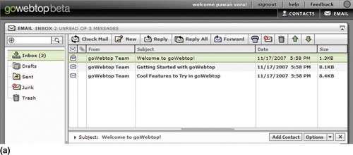
Design web pages using a liquid-width layout such that as users widen or narrow the browser window, page content and data adjust to its width; this approach is also referred to as a fluid or flexible layout (Figure 12.1).
Why
It is very difficult to know or predict users’ screen resolutions and browser window size preferences. Thus, designing for a specific width takes control away from users; instead of the design adapting to user preferences, users are forced to adjust to the design. Furthermore, with fixed-width layouts, much of the available screen space remains unused for users with high-resolution monitors. On the other hand, those using lower-resolution monitors may need to scroll pages horizontally to view the entire page.
Using a liquid-width design allows different page areas to adjust to browser window sizes and minimizes unnecessary horizontal scrolling. It also allows users to open sidebars for browser history and bookmarks without affecting their ability to view page content. In addition, users with vision deficiencies may prefer to use larger text sizes, which can be easily accommodated with liquid-width designs.
Although the study by Bernard and Larsen (2001) found no significant differences in user performance with liquid- or fixed-width layouts for reading and searching tasks, most users preferred a liquid layout. It could be argued that Bernard and Larsen's conclusion is dated because they used a monitor resolution of 1024 × 768, and almost 40 percent of users on the Web today use screen resolutions higher than 1024 × 768 and may have a different preference (see w3schools, www.w3schools.com/browsers/browsers_display.asp). However, using larger-resolution monitors does not necessarily imply that most users maximize their browser window to their maximum screen resolutions, and 60 percent of web users still use screen resolutions of 1024 × 768 or lower.
How
Designing a liquid-width or fluid-width layout requires page components—at least those occupying the main content area—to have a specific width relative to the browser's window width, which is usually accomplished by designing pages using percentage values. For example, overall content can be set to 100 percent, main content to 62 percent, and sidebar content to 38 percent (Clarke, 2007).
IT'S OKAY TO KEEP NAVIGATIONAL AREAS AS FIXED WIDTH
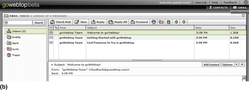
It's not necessary for all layout areas to expand proportionally for large windows. Page elements such as navigation, sidebars, and callouts, may be kept fixed to a certain width, while keeping areas occupied by main content flexible (Figure 12.2). This minimizes jumping and readjusting page components when users resize their browser's window.

ADJUST PAGE ELEMENTS TO BROWSER'S WINDOW SIZE
When using liquid-width layouts, page elements using background colors or images should fill up appropriately with expanding or narrowing browser window widths. The relative position of page elements—left- and right-aligned components such as headers, navigation bars, footers, and so on—should also maintain their alignment with varying window widths (Figure 12.3).

Related design patterns
As already mentioned, large screen resolutions are becoming common, and designers have started considering PROGRESSIVE LAYOUTS to ensure that pages' content readability does not suffer when users maximize browser window sizes.
Fixed-Width Layout
Problem
Liquid-width design can create excessive empty spaces between elements for pages with fewer elements. This not only makes pages appear sparse, disorganized, and disconnected but also less readable and visually appealing.
Solution
Use a design that has a fixed width to ensure that page components remain together and appear coherent (Figure 12.4). Fixed-width layout means that the width of the page content is set to a certain pixel width irrespective of browser window size. Users cannot change the width by resizing the window or by changing the text size.
Why
For web applications that do not demand excessive horizontal space (i.e., mainly textual content and tables with just a few columns), a fixed-width layout is the most suitable, as information readability and scanability can be maintained even for large browser window sizes. In addition, with fixed-width layouts, designers have complete control over the placement of page elements, which allows them to ensure the layout appears almost identical in all major browsers.
How
Fixed-width layouts are typically designed by specifying the page width in pixels—an absolute unit of measurement. A downside of such an approach is that it doesn't scale well for users who have set text sizes larger or smaller than those specified by the designer. A common alternative is to use measurement units relative to the text size—that is, in em or ex. This layout is commonly referred to as an elastic layout because such a layout changes its size based on the text size users set. However, designs using elastic layouts are still unaffected by browser window widths and thus are fixed-width designs.
Optimal screen resolution for specifying the width of the layout is an important consideration when designing fixed-width layouts. Design for 800 × 600 resolutions to accommodate the largest number of users without introducing horizontal scrollbars. The width of the layout is then typically set to 750 to 770 pixels (with 30–50 pixels allocated for the browser chrome). In situations where the design is targeted for 1024 × 768 screen resolutions, the fixed-width container is set at 960 to 980 pixels. The goal, of course, is to prevent horizontal scrolling for the vast majority of the web application's users. Baekdal's (2006) research suggests that fixed-width designs for lower (i.e., 800 × 600) resolutions would support about 95 percent of users, whereas those designed for larger (i.e., 1024 × 768) resolutions would support only about 80 to 85 percent of users.
CENTER THE LAYOUT ON THE PAGE
Reduce the perception of empty space for users with larger screen resolutions by centering the layout so that empty space is equally divided as the left and right margins. For example, viewing a design optimized for 800 × 600 resolutions (i.e., 770-pixel width) on a 1024 × 768 resolution screen would show an empty space of about 100 to 110 pixels on each side of the layout and 200 to 220 pixels worth of empty space on the right side for left-centered layouts (Figure 12.5).

FILL THE PAGE BACKGROUND FOR LARGER BROWSER WINDOWS
Like centering the layout, filling the page background with an appropriate color, image, or texture makes empty space more acceptable and the page more visually appealing (Figure 12.6).

MAKE PAGES PRINTER-FRIENDLY
When web pages that are designed with fixed-width layouts are printed in a portrait or vertical (as opposed to landscape) orientation, information on the right usually gets clipped. This is because most printers cannot support more than 600 pixels horizontally. If an application has pages likely to be printed by users, either offer users a “printer-friendly” link or create a separate style sheet for printing purposes such that printed pages show all relevant page content.
A separate style sheet for printing can be specified in one of the following ways:
1. Using an external cascading style sheet (CSS) file, which can work as a global style sheet and can be referenced by any page in the application:
<link href=“print.css” rel=“stylesheet” type=“text/css” media=“print” />
2. Embedding CSS on pages that are most likely to be printed by users (e.g., an “Order Confirmation” page on e-commerce applications) as follows:
<style type=“text/css” media=“print”>
… print specific selectors here…
</style>
The obvious downside is that the style sheet will need to be on every page likely to be printed.
Other approaches to specify style sheets for printing include the @media and @import rules. However, their support is inconsistent among browsers. For example, support for @media is buggy in IE 6.0 and IE 7.0 (see www.reference.sitepoint.com/css/at-media).
Related design patterns
Designers may want to consider a PROGRESSIVE LAYOUT, which offers a trade-off in that although it yields some design control to users by allowing the layout to adjust to the browser window width, it allows designers to put restrictions on minimum and maximum widths and still provide considerable control over the page's visual appearance.
Progressive Layout
Problem
Users with large screen resolutions (e.g., 1920 × 1200) may find pages using liquid layout difficult to read or scan with a maximized browser window. Users may not want to narrow the browser window size because they prefer larger widths for other applications, which may be available as tabs within the same browser window. On the other hand, users with smaller screen resolutions may find fixed-width designs difficult to use because they require them to scroll horizontally.
Solution
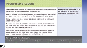
Use a progressive layout1 with defined minimum and maximum widths to maintain page readability and aesthetic integrity. Pages designed using a progressive layout work as a liquid-width layout within a range of browser window widths. For browser window sizes below a certain minimum width and above a certain maximum width, the page behaves as a fixed-width layout (Figure 12.7).
1The definition of progressive layouts referred to in this chapter is different from that used by Adobe Flex developers. Their definition is to progressively display the application's content as it is initialized instead of waiting for the entire application to initialize (Szeto, 2004).
 |
 |
 |
| Figure 12.7 This example shows a progressive layout with a fixed width below 540 pixels of browser width (a), liquid between 540 and 1024 pixels of browser width (b), and fixed over 1024 pixels of browser width (c). The maximum width of this design is set at 850 pixels. (Source: Fulciniti, 2005.) |
Why
Progressive layout offers benefits of both liquid- and fixed-width layouts. It works as a liquid-width layout between a range of browser window widths and as a fixed-width layout above and below those widths. This helps satisfy the needs of users with either lower or higher screen resolutions. In addition, it allows designers reasonable control over a page's visual appearance.
How
Identify the minimum and the maximum design widths based on the target users’ screen resolutions and design needs. Then design pages so that they remain at a fixed width below and above the minimum and the maximum browser window widths, respectively, and adjust to the browser window size between them.
Implementing such a design is possible by setting min-width and max-width style rules. However, because Internet Explorer versions 6 and 7 do not support min-width and max-width attributes, use of JavaScript is required to ensure that the design works correctly on all browsers (Fulciniti, 2005; Jesse, 2007a, 2007b).
Related design patterns
Progressive layouts provide a graceful solution to counter arguments against designs using fixed- or liquid-width layouts. However, depending on the nature of the content presented by the application, either FIXED-WIDTH LAYOUT or LIQUID-WIDTH LAYOUT may be more appropriate and should be considered during design.
Grid Structure
Problem
Users need to clearly see and understand relationships between different page elements. Not using a systematic approach to lay out the page and its elements may lead to a cluttered design and make it appear unnecessarily complex.
Solution
Use a grid-based system for placing and aligning web page elements, giving web pages a visual structure and coherence and making it easy for users to understand the content's organization (Figure 12.8).
Why
A grid offers a consistent approach for designers to position and align various elements on a page and create appropriate visual hierarchies such that the resulting layouts are visually pleasing and easy to use. Laying out and aligning page elements using grids not only makes the pages appear simpler and visually pleasing, but the consistent placement of components within the grid makes the application easier to navigate.
How
When using a grid, pages are divided into rows and columns, and grid lines are used to position and align web page elements. The grid of rows and columns itself may be established using the rule of thirds or using columnar grids that create units in multiples of threes (Figure 12.9; Baird, 2007; Vinh and Boulton, 2007).
 |
 |
| Figure 12.9 |
Once the grid is established, the next step is to position elements on the page that will be consistent throughout the application, such as logos, navigation (primary, secondary, and utility), headers, footers, and so forth. However, if content changes from one page to another, which may often be the case for web applications, it may be beneficial to position content within the grid first. The benefit of this approach is that after placing the most important content on the page, it should become pretty clear whether navigation should be placed at the top or on the sides (left or right). For example, if content demands horizontal space, such as reports or search results, positioning navigation at the top can free up horizontal space.
Unlike printed pages, which have a fixed width and height, web pages provide limited control for vertical content, especially with a varying amount of page content occupying different amounts of vertical space. If the layout has to adapt to varying amounts of page content, maintain relative positions of elements within the page. A trivial example is the page footer, which could always appear after the page content no matter how much vertical space is needed by the page content.
CONSIDER USING THE GOLDEN RATIO
The golden ratio, also known as divine proportion, is the ratio between two segments such that the smaller (bc) segment is to the larger segment (ab) as the larger segment is to the sum of the two segments (ac), or bc/ab = ab/bc = 0.618 (Figure 12.10; Lidwell et al., 2003).
In general, layouts based on the golden ratio are considered to be aesthetically pleasing. Although the aesthetic superiority of designs based on golden ratios have limited evidence (Markowsky, 1992), most designers consider them superior and base their grid layouts accordingly. Although designs shouldn't be forced to fit the golden ratio, it should be considered whenever possible (Lidwell et al., 2003).
To use the golden ratio for a two-column, 770-pixel, fixed-width design—for example, multiply 770 pixels × 0.618. The result is approximately 475 pixels, which can be the main content column's width. The remaining width of 295 pixels (i.e., 770–495) can be used for the second column, which can be used for navigation or other secondary content (Baird, 2007; Clarke, 2007). The same approach also can be used for larger widths (Figure 12.11).

ALIGN PAGE ELEMENTS ALONG GRID LINES
Align page elements along grid lines and with each other either vertically or horizontally. The objective is not only to create a minimal number of “invisible” grids on the page but also to do it in a way that reveals the structure of the page visually and makes it easy for users to understand and find different page elements. Creating effective alignment also helps lead a person through the design by associating related elements on the page (see the VISUAL HIERARCHY pattern that follows). Using alignment consistently on all pages within the web application improves the predictability of page elements within the design.
CREATE REUSABLE TEMPLATES
Once pages are laid out, they should be sliced into one or more page templates (depending on the number of page types) and used throughout the application. This ensures that designs work for the entire application and therefore prevents any guesswork on the developer's part as to how individual pages within the application should be designed.
Related design patterns
One of the important reasons for using the grid STRUCTURE pattern is to ensure that the resulting design leads to a logical and predictable organization, improves comprehension, and makes it easy for users to find desired information (VISUAL HIERARCHY).
Visual Hierarchy
Problem
Users need to make sense of information presented on web pages so that they can attend to the most important information first before moving to information of less importance.
Solution
Design pages such that the visual hierarchy is obvious to users. That is, use visual cues so as to clearly indicate grouping and the order of elements on a web page, and help guide users through the page so that they understand the page's purpose, comprehend its organization, and correctly assign importance to various page elements (Figure 12.12). As Lynch and Horton (1999) stated: “Graphic design is visual information management, using the tools of page layout, typography, and illustration to lead the reader's eye through the page.”

Why
Establishing a visual hierarchy serves several important functions (Wroblewski, 2002):
• It creates a center of interest to attract users’ attention.
• It creates a sense of order and balance.
• It establishes a pattern of movement to guide users through various page elements.
Creating an appropriate visual hierarchy, therefore, makes users more efficient and effective when interacting with web applications.
How
Because designers are attempting to correctly convey the importance of page elements through visual hierarchy, the obvious first step is to list page elements on a page in terms of their importance. The next step is to use one or more of the following visual components to order, position, and design those elements that reflect the desired visual hierarchy: contrast, chunking, images, alignment, white space, font sizes, shapes, colors, and others. For example, to elevate a page element to the top of the visual hierarchy—that is, provide the highest emphasis or importance to an element—it could be made larger, bolder, shown in a high-contrast color, separated from other elements using additional white space, wrapped into a bright-colored border, included with an image, and/or placed closer to the top left or top center of the page (Figure 12.13).
 |
| Figure 12.13 |
USE CONTRAST TO ESTABLISH VISUAL HIERARCHY
Contrast is a key design approach used to communicate visual hierarchy. It is created by visual difference between elements—the more two elements are different, the higher the contrast between them. In general, higher-contrasting elements grab users’ attention first when compared with lower-contrasting elements. For example, black has the highest contrast with white and varying levels of contrast with different shades of gray. Value is not the only way two elements can contrast from each other. Contrast can be created by using one or more of the following: size, texture, position, shape, color, and orientation (Figure 12.14).
 |
| Figure 12.14 The primary forms of contrast. (Source: From Rutledge, 2007.) |
By using a combination of these visual forms, an effective visual hierarchy can be designed, and desired elements can be emphasized to draw users’ attention. Contrast can be applied to page elements at the text level as well. For example, headings and subheadings can be made to stand out from the rest of the text by using contrast forms such as size and color (Figure 12.15).
 |
| Figure 12.15 |
It's important to remember that contrast does not just refer to background–foreground contrast but also about the contrast (i.e., differences) among page elements. If the background–foreground contrast is high, but the contrast among page elements is low, the web page will fail to establish a clear visual hierarchy. This can also make the page appear cluttered and disorganized to users because they will struggle to navigate through the page design to determine what to attend to first, second, and so forth.
GROUP RELATED INFORMATION VISUALLY
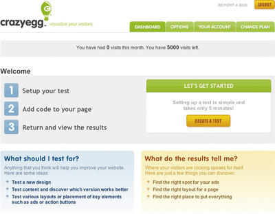
By grouping information visually and clearly indicating what the group represents, users can quickly decide whether to pay attention to it. When designed correctly, grouping makes pages appear simpler because it's easier for users to filter out (i.e., ignore) not-so-relevant information and focus on the areas of interest (Figure 12.16).
 |
| Figure 12.16 |
Visual hierarchy is important for both between groups and between elements within groups. Once users decide to focus on a logical group, they should be able to understand the importance of elements within the group. In Figure 12.16, Crazy Egg emphasizes different elements within the group to indicate their importance. For example, in the “Let's Get Started” section, “Create a Test” is higher in the visual hierarchy than the text “Setting up a test. . ..”
PLACE PERSISTENT ELEMENTS IN CONSISTENT LOCATIONS
Persistent elements on a page—that is, elements that appear on almost all pages within the application such as logos, navigation, headers, footers, and so forth—should be placed in consistent locations. For each persistent element, establish its importance and position it accordingly. For example, navigation is important and should be appropriately emphasized and clearly delineated from other elements such as logos and headers (Figure 12.17).

Related design patterns
Aligning page elements is extremely important for establishing an appropriate visual hierarchy and for guiding users through page elements. GRID STRUCTURE is typically used to ensure proper alignment of page elements and to facilitate content scanning. Knowing visual hierarchy of the page is also important for SEMANTIC MARKUP (see Chapter 11). The order of elements in the page markup should reflect the desired visual hierarchy so that when the page is rendered without style sheets and images, the visual hierarchy of page elements is still maintained.
Highlight
Problem
Certain page elements need to stand out and grab users’ attention, not only to establish their importance (VISUAL HIERARCHY) but also in response to users’ actions (e.g., selecting an element) or to communicate to users a status change for page elements or individual data items.
Solution
Highlight selected or changed elements to direct users’ attention to them (Figure 12.18). If necessary, indicate the “value” or the extent of the change.

Why
Highlighting is important to provide a visual feedback about selected elements as well as to direct users’ attention to changes. It is also useful in the following ways (Mahemoff, 2006):
Highlighting is particularly important for pages communicating different states for a wide variety of elements, since it not only directs users’ attention but also invites appropriate action.
How
There are several ways to highlight a page's elements to make them stand out: change the background color, change the text color, make the text bold or a larger size, change borders, use animation (see the patterns ANIMATIONS/TRANSITIONS and SPOTLIGHT/YELLOW-FADE in Chapter 8), dim some elements, or use icons; ideally, use a combination of these styles (Figure 12.19 and Figure 12.20).

 |
| Figure 12.20 This demo dashboard from BrightPoint Consulting (www.brightpointinc.com) shows several different ways of highlighting page elements: the selected campaign is in a different background color, campaign totals are in yellow, and different bubble sizes highlight campaigns with higher ad spending. |
HIGHLIGHT SELECTED ITEMS IN A LIST
Clearly indicate items with which users are working or will be taking action on by highlighting each selected item. Even when checkboxes are used for selection, highlighting is a better visual way of distinguishing selected items from unselected items (Figure 12.21).

USE TRANSIENT HIGHLIGHTING TO INFORM USERS OF PAGE CHANGES
Highlighting an item momentarily (typically by fading the highlight in and then fading it out) creates an animated effect and focuses users' attention on the changed area on the page (see the ANIMATIONS/TRANSITIONS and SPOTLIGHT/YELLOW-FADE patterns in Chapter 8).
USE A LIGHTBOX EFFECT TO HIGHLIGHT CHANGES THAT REQUIRE USER RESPONSE
In instances where a page element needs to be highlighted and users must interact with it before continuing (similar to a modal dialog box in desktop applications), a useful way to get users’ attention is to dim all elements on the page other than the highlighted element (Figure 12.22).
KEEP HIGHLIGHTING APPROACHES CONSISTENT
Keep highlighting approaches consistent throughout the application for similar interactions. Although the design may have different highlighting approaches for different contexts, such as selected items, messages (e.g., error, feedback, acknowledgment, and alert), selected navigation items, and so forth, they should remain consistent throughout the application. In Figure 12.21, Gmail uses a yellow background for selected emails, a blue background for the selected navigation item (in this case, “Inbox”), and a green icon for users who are currently online (in this case, Pawan Vora) for chatting.
Related design patterns
Animations and transitions are also useful ways to call users’ attention to the changed elements (see the ANIMATIONS/TRANSITIONS and SPOTLIGHT/YELLOW-FADE patterns in Chapter 8).
Icons
Problem
Solution
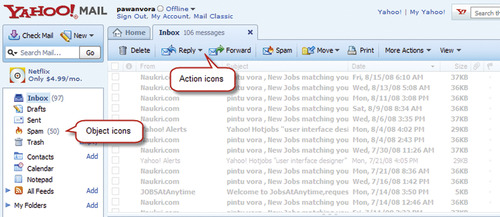
Use icons to represent commonly used objects and actions (Figure 12.23).
Why
Icons may be used in web applications for a variety of reasons:
• For many common objects and tasks, icons are more readily recognized and remembered.
• They take less space than corresponding textual links.
• Icons typically have more universal recognition than text; thus, when localizing a web application, icons, when appropriately used, have minimal layout impact. However, if icons are used with labels, label translation should account for text expansion when translating to other languages (see the EXTENSIBLE DESIGN pattern in Chapter 10).
How
Most important, use familiar icons (Nolan, 1989)—that is, use concrete (rather than abstract) icons and those that remind users of things already known. Use icons that clearly suggest the objects or actions they represent. Ideally, users should be able to recognize icons without any accompanying text labels.
SUPPLEMENT ICONS WITH LABELS
Undoubtedly, there will be objects and actions that are unfamiliar to users. Therefore, supplement icons with labels to make actions easier to identify. During users’ initial interaction with an application, users are more likely to rely on labels, but as their use continues, their interaction will become more efficient as the icons become familiar.
AVOID USING TEXT IN ICONS
Avoid using text as part of an icon's image, since it makes it more difficult to localize it (i.e., translate to other languages; see Chapter 10). Because of the smaller sizes of icons, text may also be difficult to read, and when used with a label, it may not be clear to users which label or text to consider for deciphering the icon's meaning. In addition, for users with vision deficiencies, the text may be difficult to read when zoomed in (see the ACCESSIBLE IMAGES pattern in Chapter 11).
USE MODIFIERS TO INDICATE OR CHANGE AN OBJECT'S STATUS
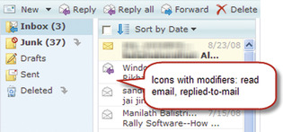
The same base icon can be used for multiple object states—for example, new email, read email, and responded-to email (Figure 12.24).
 |
| Figure 12.24 |
For monitoring applications, similar modifiers—referred to as “health badges”—are often used to indicate alarms or the status of objects. They are either placed side by side or to the bottom right or bottom left of the main icon (Figure 12.25). The modifier icon may be used over the main icon as long as the main icon is still recognizable and is not masked by the modifier icon (e.g., putting a “X” over an icon).

USE TOGGLE ICONS TO INDICATE ALTERNATE STATES
Toggle icons are used to indicate either the presence or absence of an attribute or to assign a state. For example, Figure 12.26 shows the star icon used as a toggle by Gmail to indicate the “starred” or “normal” states of an email. This is very similar to the “flagging” approach offered by desktop-based email systems such as Outlook. Toggle icons are also used to indicate the disabled and enabled states of objects.

Some common uses of toggle icons are to show expanded and collapsed states in tree structures, for navigation, or for specific page elements (as in portlets) (Figure 12.27).

MAKE ICONS VISUALLY DISTINCT FROM ONE ANOTHER
It's important that icons are easily distinguishable from each other to help users find appropriate icons (thus, actions) quickly and minimize confusion. This is usually accomplished by making their shapes visually distinct from one another (Figure 12.28) and is particularly important when icons are used to suggest “status” information. For example, avoid using the same-shaped icons with different colors (e.g., red, yellow, and green) to indicate status. Instead, use different shapes in addition to colors such as, red octagon, yellow triangle, and green circle. Using multiple coding methods also helps users with color-vision deficiencies, as they can use the icon's shape to determine status.
 |
| Figure 12.28 |
TIP
To test icons for their visual distinctness, fill nontransparent areas of icons with the same color and put them next to each other. The more distinguishable they are from one another by their shape, the better their discriminability.
USE THE SAME VISUAL STYLE FOR ICONS
Make sure that icons appear professionally designed and follow the same set of stylistic conventions—that is, the same base color set (matched to the site's brand) and the same visual styles and effects (Figure 12.29).


USE ANIMATED ICONS ONLY WHEN ABSOLUTELY NECESSARY
Animation usually grabs users’ attention and can be distracting. Therefore, use animated icons only when it's necessary to direct users’ attention—for example, when users need to wait for the web application to finish processing (Figure 12.30).
 |
| Figure 12.30 Animated icons are typically used to inform users that the application is processing information. This example shows 11 of the 24 frames used to create animated icons. Source: www.ajaxload.info. |
Related design patterns
When used with health badges, icons are often used to highlight status change. Therefore, consider using other highlighting practices to ensure that users have noticed the change (HIGHLIGHT).
..................Content has been hidden....................
You can't read the all page of ebook, please click here login for view all page.