
Dashboards for Continuous Monitoring of Quality for Software Product under Development
Miroslaw Staron1; Wilhelm Meding2; Jörgen Hansson3; Christoffer Höglund4; Kent Niesel5; Vilhelm Bergmann4 1 University of Gothenburg, Gothenburg, Sweden
2 Ericsson AB, Sweden
3 Chalmers University of Technology, Gothenburg, Sweden
4 Saab Electronic Defense Systems, Gothenburg, Sweden
5 Volvo Car Corporation, Gothenburg, Sweden
Abstract
Modern software development often uses Agile and Lean principles which focus on the customer’s requirement for continuous delivery of new functionality. These principles are applied to both small software products developed by one team and to large ones developed by programs consisting of over ten teams. As the Agile and Lean principles often prescribe the empowerment of the teams, a number of new challenges in monitoring and controlling software quality appear. One such challenge is to provide a comprehensive and succinct visualization of the progress of software development and the progress of quality assurance.
In this chapter, we explain how to develop and use dashboard for monitoring of software development progress and discuss the quality of software architectures under development. We present a case study of three companies—Ericsson, Volvo Car Corporation, and Saab Electronic Defense Systems—that have implemented such dashboards. The presented dashboards support the companies in monitoring the release readiness of their products, the quality of the software, or the progress of development. We present a number of elements that make dashboards successful and show how the specifics of each company are reflected in the design of the dashboards.
We conclude the chapter with recommendations for companies willing to adopt similar dashboards and list additional readings for researchers and practitioners interested in exploring the subject further.
Introduction
Qualities and architecture of modern software products are distinguishing excellent products from the average ones and can influence the success of software development companies. Extensible and scalable architectures of products, combined with Agile and Lean software development, can determine a long-term sustainable business models and maximize customer value. However, Agile and Lean software development methodologies come with a set of new challenges for monitoring and managing software quality in large software products (Tomaszewski et al., 2007). Continuous deliveries of customer value (features) need to be supported by extensible, reliable, and well-designed software architectures that demand shorter feedback loops, both before and after release. Combining the extensible and sustainable software architecture able to bear long-term evolution of complex software products and at the same time enabling agility can be exemplified by software products that are heavily affected by the evolution from traditional to Agile and Lean software development. These products are telecom nodes with millions of lines of executable code, embedded software in cars with millions of lines of code, or defense products with hundreds of thousands of lines of secure dependable code. In these products, monitoring quality needs to be done from two perspectives—upper management and software development teams.
The combination of extensible architectures, size of the product, and rapid feature development cause new information needs to emerge (Buse and Zimmermann, 2012), monitoring whether the desired quality level is achieved and when it is achieved, as well as monitoring that it stays at that level. These new challenges also require new ways of thinking when designing and building measurement systems visualizing large number of measures in form of dashboards (Staron et al., 2008) for both upper management and for teams. The dashboards are needed to collect the necessary information in the form of indicators and measures, visualize it in a simple way, and spread the information about the status of indicators within the organization.
In this chapter, we use the term dashboard to refer to a measurement system visualizing a small number of indicators (5-9) complemented with larger number of base and derived measures (> 10). Dashboards contain visualization components, calculations of indicators, base and derived measures, and can be in form of MS Sidebar gadgets, web pages/portals, or Excel files with visualizations. They are available for upper management to control the company and for self-organized software development teams to monitor and communicate the status of the quality of their product under development (Sharp et al., 2009). Additional goals for the dashboards are for the teams to monitor of software econometrics (Ward-Dutton, 2011), monitor the progress of verification and validation, or visualize architectural dependencies in software products (Sangal et al., 2005).
This chapter presents a systematic overview of good examples of how dashboards are used to monitor quality of software products under development, both using multiple measures and a single indicator (combining measures of quality and development progress). In this chapter, we extract recommendations for building such dashboards for practitioners by exploring how three companies use dashboards for monitoring and controlling external and internal quality of large software products under development. The dashboards presented by each company contain a number of indicators and have different premises due to the domain of the product, its purpose, and the organization developing it. We describe a number of common principles behind a set of measures that address the challenge of quantifying readiness to deliver of software products to their end customers. The experiences presented in this chapter come from multiple case studies at Ericsson, two studies at Volvo Car Corporation (VCC), and one at Saab Electronic Defense Systems in Sweden. All companies have a long experience with software development and have undergone a transition into Agile and Lean software development; however, the length of experience with these new paradigms differs from 2 to 5 years depending on the company. This difference provides a possibility for observing that companies with longer experience tend to focus on using measures to support self-organized teams, whereas companies with shorter experience tend to focus on using measures to communicate the status from teams to management.
The experiences presented in this chapter address the following challenges of successful dashboards for monitoring quality of products under development:
• How to standardize the measures and indicators for monitoring development progress, taking into account product quality rather than schedule?
• What kind of measures and indicators should be used in dashboards to monitor the development progress?
• How to combine the need for indicators attracting attention of management, with the need to collect larger number of measures for drill-down?
• How to visualize measures in order to effectively trigger decision processes?
• How to assure high-quality information provided by the measurement systems?
The results show that dashboards can be organized either as a single indicator (release readiness), a set of measures of development progress (e.g., number of model revisions), or as a combination of internal quality and external quality (e.g., complexity and number of defects). Depending on the presentation method, the dashboards trigger different kinds of decisions at each studied company.
This chapter is structured as follows: Section 8.1 describes how the development of large software products is organized according to Agile and Lean principles at the studied companies. Section 8.2 discusses elements of successful dashboards that visualize the release readiness and software development quality progress. Section 8.3 presents how the three studied companies realized this concept, complemented with recommendations for other companies in Section 8.4. Section 8.5 provides a number of useful directions where interested readers can find more information. Section 8.6 contains the conclusions.
8.1 Developing Large Software Products Using Agile and Lean Principles
In software engineering in general, release management is based on the delicate balance between the market pull for new features and the technology push and company strategy (Phaal et al., 2004). One of the main activities of release management is naturally the release planning activity, which is concerned with which features should be implemented in the product and when they should be delivered to the end customers (Ruhe, 2003; Ruhe and Saliu, 2005).
In modern Agile and Lean software practices (Poppendieck and Poppendieck, 2007), once the features are planned, their development is usually in the hands of self-organized Agile software development teams, which use the products’ architecture to design, implement, and test new product features. The self-organized teams are responsible for detailing the functional (FR) and nonfunctional requirements (NFR) for the feature, planning of feature development (PM), systemization and feature design (SM), implementation and detailed design (DM), and initial testing (usually functional testing) (Staron et al., 2010b; Tomaszewski et al., 2007)—all with the goal to deliver a fully functional feature to the main code branch as depicted in Figure 8.1.

In order to keep pace with market demands. multiple teams deliver their fully developed functional feature to the main code branch, where the feature is tested in the context of the real hardware and later in the context of the real execution environment, for example, telecom networks, complete vehicle manufacturers, or defense field testing.
Monitoring the agility can be challenging because it comprises both the functional delivery and quality of the product (both its features and its architecture). Release plans for features are developed based on experience and market needs. The plans are monitored so that the software development organizations are confident that the plans are fulfilled. Using indicators, the whole software development program (a set of self-organized development teams working on the common code base) can monitor the validity of the plan and address the issue of how confident the development program is that the plan is upheld. This monitoring of agility can be in the form of a release readiness indicator—an indicator that shows when a particular set of features is ready to be released. The indicator varies from company to company, but the principles of how it is defined, calculated, and visualized are the same. The prerequisite for this indicator is that the software architecture has a good quality.
In this chapter, we use the ISO 9000:2005 (ISO, 2005a) definition of quality, that is, the degree to which a set of inherent characteristics fulfills requirements. We also distinguish between the internal and external quality as defined in ISO 25000 (ISO, 2005b) and use the external view in the rest of the chapter, except for Section 8.3.3 where we present both internal and external quality in the studied dashboards.
Monitoring the development progress is based on identifying software development phases at the company. The phases reflect how the development is organized and help to identify indicators for monitoring the progress of development of the features by monitoring the indicators. Most software development processes usually include such high-level phases as requirements breakdown, software design or modeling, and testing. Examples of weekly measures for those phases are:
• Number of requirements in the backlog during the software analysis phase
• Number of model/code check-ins for the development phase
• Number of violations of architectural rules in models/code
• Percentage of passed test cases for the test phase
The measures support the teams in communicating the status of the development and are succinct enough to be used in communication upward to project leaders and management teams. As we explore in Section 8.3, these types of measures are simple enough and together with other components are complete enough for the dashboard to be successful.
The measures of test progress include tests of nonfunctional properties of the architecture and the product, in particular performance, reliability, stability, availability, and safety of the products. As we show in the case of Saab EDS in Section 8.3, these can be presented in two levels—one for the team and one for the management—or as we show in the case of Ericsson, as part of a single indicator.
8.2 Elements of Successful Dashboards
The indicators and measures used in the dashboards for monitoring the quality of products under development often support organizations in assessing the release readiness—that is, when the product is to be ready to be released based on its functionality and quality. The indicators and measures are by far the most important element that determines whether the dashboard is successful. However, they have to be complemented with others to make the dashboard widely used at the company—standardization (Section 8.2.1), early warning (Section 8.2.2), focus on decisions and predictions (Section 8.2.5), succinct presentation (Section 8.2.3), and assuring information quality (Section 8.2.4). Successful dashboards lead to actions by the team and the project aimed at achieving set goals (e.g., delivery of features according to schedule, preventing unintended quality drops, monitoring the erosion of architecture).
8.2.1 Standardization
Using international standards increases the portability of measures and provides the possibility of showing customers that the measurement processes are planned and executed according to state-of-the-art practices. This is particularly important for Agile and Lean organizations that usually have flexible planning seen as risky for stakeholders used to plan-driven development. By using the standards, we address the following challenge:
• How can a team or company standardize the measures and indicators for monitoring development progress and release readiness taking into account product quality rather than schedule?
This challenge needs to be addressed to show that the principles of Agile planning are well implemented in the company and that there is no risk of losing the importance of long-term product quality by focusing on flexible plans and immediate delivery of customer value. The most well-known standards for measurement processes in software and systems engineering are the European standard ISO/IEC 159391 (International Standard Organization and International Electrotechnical Commission, 2007) and the IEEE standard 1061-1998 (IEEE, 1998). The core component of the standard is the conceptual measurement information model, which describes relationships between the main types of elements of measuring systems. Figure 8.2 presents an overview of this model from the standard and the two most relevant definitions for our chapter.

The information need is insight necessary for a stakeholder to manage objectives, goals, risks, and problems observed in the measured objects. These measured objects can be entities such as projects, organizations, or software products characterized by a set of attributes. ISO/IEC 15939 includes the following definitions, which are relevant. The definitions were adopted from the more general standard—JCGM vocabulary in the metrology standard (International Bureau of Weights and Measures, 1993):
• Entity: Object that is to be characterized by measuring its attributes.
• Attribute: Property or characteristics of an entity that can be distinguished quantitatively or qualitatively by human or automated means.
• Base measure: Measure defined in terms of an attribute and the method for quantifying it.
• Derived measure: Measure that is defined as a function of two or more values of base measures.
• Decision criteria: Thresholds, targets, or patterns used to determine the need for action or further investigation or to describe the level of confidence in a given result.
• Indicator: Measure that provides an estimate or evaluation of specified attributes derived from a model with respect to defined information needs.
• Information product: One or more indicators and their associated interpretations that address an information need.
ISO/IEC 15939 is not the only framework available for structuring measures in measurement systems. The most well-known non-standard framework is Goal-Question-Metric (GQM) (van Solingen and Berghout, 1999; Basili et al., 1994), which is used as a base for IEEE 1061-1998. The GQM framework is widely used in the research community and can replace ISO/IEC 15939 for structuring measures, but it does not recognize the concepts of stakeholders, information needs, or indicators.
8.2.2 Focus on early warning
Knowing the status of the monitored entities at a particular point of time is naturally very important for stakeholders. However, even more important is knowing what the status will be a week, month, or year ahead. This is particularly important for monitoring qualities of architectures because daily design decisions can have significant impacts on the subsequent design choices available for architects and designers. The stakeholders need indicators that warn about potential problems when the stakeholders still have the means to react and get their monitored entities back on track—for example, to prevent architecture erosion. In other words, if early warning measures are “green,” then the stakeholders can focus on monitoring the current progress, but if the early warning is “red,” then the warning should be acted upon and takes precedence. This requires specific kinds of measures and brings us to the following challenge:
• What kind of measures and indicators should be used to monitor the development progress?
From our experience, we found that companies usually focus on quantifying the status as step 1 in introducing indicators. When this is in place, companies look for means of predicting the outcome based on the current situation. The most mature organizations also focus on indicators linked to simulations or “what-if” analyses (Scacchi, 1999). The analyses for architectures include performance simulations or architecture modifiability analyses, crucial for the Agile and Lean ways of working in the long run.
Examples of indicators used in early warning systems are:
• Release readiness: Warning that the current development progress is not sufficient to meet the project plan.
• Test execution progress: Warning that the current test progress is not sufficient to assure that the quality goals are met.
• Requirements breakdown progress: Warning that there are not enough detailed requirements to continue software design during the current sprint for the team.
• Architecture rules violations, non-conformance, performance degradation: Warning that the current internal quality of the software product can cause external quality problem at later development stages.
There are naturally more examples, which we discuss based on the dashboards from each studied company.
8.2.3 Focus on triggering decisions and monitoring their implementation
The most important concepts from an external perspective on dashboards are indicators and stakeholders. The indicators are means for communicating the most important information about the current or predicted status of the monitored entities. The indicators are meant to trigger decision processes in the companies, including both formulating and executing decisions. This leads to the need to address the following challenge:
• How can we combine the need for indicators triggering decisions at the correct time with the need to collect a larger number of measures for drill-down and monitoring of the execution of decisions?
In order to combine a few indicators with many measures, a dashboard has to show indicators and link to a system that collects measures and stores them in a document/database (e.g., an associated Excel file). For example, a successful indicator monitoring the complexity of the product attracts the attention of the stakeholder to components that are too complex given predefined criteria. This triggers decisions from stakeholders—for example, ordering additional resources to address the rising complexity in the product. By seeing a trend in complexity development, the stakeholders can observe whether the situation is getting out of control and when they should react.
The properly chosen stakeholders are crucial for the success in adopting the dashboard in a large organization. They must have the authority to define the indicator and its threshold (decision criteria and analysis model) and have the mandate to act upon the status of the indicator. For example, the stakeholder for the release readiness indicator is the project manager who needs to constantly monitor when the product is ready to be released and has the mandate to take actions to meet the target release date if necessary—for example, order overtime.
The stakeholders usually work closely with information providers who have an interest in communicating specific information using measures and indicators. For example, a software development team could be such a provider that assures that the team’s indicator objectively communicates the status of the development of a feature to the project management and to other interested entities such as line management. The team also needs to be notified about the status of the product architecture that can influence their planning.
8.2.4 Succinct visualization
In order to be effective in the communication of indicator’s status to the stakeholders, the information products (according to ISO/IEC 15939) have to present the information in a concise manner. Modern tools usually support this by using apps for current operating systems such as Android, iOS, Windows, or MacOS for presenting the status of the indicator and providing the entry point for more information such as trends or statistics of base and derived measures (Staron et al., 2008). Using such simple means and focusing on presenting the most important information succinctly addresses the following challenge:
• How do we visualize measures in order to effectively trigger decision processes?
Dashboards usually contain five to nine indicators and use metaphors of the same kind to convey the message of the status of the indicators. The metaphors are important for the presentation of the status of indicators (Johansson et al., 2007; Shollo et al., 2010). Based on the previous studies we could say that the most powerful metaphors are:
• Traffic lights: Many successful indicators communicate three states: problem, warning, normal state. The traffic light metaphor is perfect2 for this kind of communication, especially if accompanied with a number to address the status of the indicator. For an example, please see Figure 8.4.
• Gages and meters: When the focus of the indicator is primarily in the number rather than the state. Using this metaphor is suitable because it provides gradation of the status, for example, green is close to yellow.
The succinct presentation of the status of the indicator is combined with the ability (e.g., a hyperlink) to drill-down into detailed statistics to understand the cause of the status and act accordingly. The successful succinct indicator is usually supported by a number of base and derived measures directly used in calculating the status or monitoring that assumptions behind the analysis model and the indicator are upheld. The supporting base and derived measures are usually visualized as charts, for example, trends.
8.2.5 Assuring information quality
In large software products the number of base and derived measures per indicator can be rather large (in some cases over 10,000 data points per indicator), which means that the probability that one data point is erroneous cannot be neglected. Given that monitoring the architecture can comprise multiple indicators (as is shown in Section 8.3) and the information is spread to multiple teams, the quality of the calculations must be controlled automatically (to minimize the risk of teams making poor decisions). In this section, we elaborate on how the automated assessment of information quality addresses the following challenge:
• How do we assure that high-quality information is provided by measurement systems?
Naturally, the more data are automatically processed, the more important the question about its quality becomes (Staron and Meding, 2009a). Stakeholders need to be informed whether the information in the dashboard is, for example:
• Calculated without errors
• Within predefined limits (e.g., the number of weeks to software release must be positive)
There are frameworks that characterize information quality in a quantitative way such as the AIMQ framework (Lee et al., 2002). AIMQ provides a quality model for information that includes the following examples of characteristics:
• Accessibility: The information is easily retrievable.
• Completeness: The information includes all necessary values.
• Concise representation: The information is formatted compactly.
• Free of error: The information is correct.
• Objectivity: The information was objectively collected.
• Timeliness: The information is sufficiently current for our work.
These quality attributes can be organized into two categories: (i) external quality, including how the information is perceived by the stakeholder and semiotics of information (e.g., concise representation) and (ii) internal quality, including how the information is obtained and composed from components and internals of dashboards (e.g., free of error). Methods used for empirical validation of measures assess the external information quality, for example, case studies with indicators. The following work is particularly useful for this purpose: Bellini et al. (2005), Raffo and Kellner (2000), Stensrud et al. (2002), Yuming and Hareton (2006), and IEEE (1998). The internal information quality can be checked during the runtime operation of measurement systems. Naturally, a lot can be measured automatically, but there are limits to how much we can control. For example, we cannot automatically check whether designers reported defects correctly in defect databases—because we do not “parse” the natural language in defect description, we can only check that defects were reported and that the database was updated.
In Section 8.3, we show how information quality is communicated to the stakeholders in practice using the case of Ericsson’s release readiness dashboard.
8.3 Industrial Dashboards
In this section, we present how the three studied companies used the concept of release readiness in their dashboards for teams and for development projects. The approaches of the three companies are different and based on each company’s history of using measures; therefore, not all elements of a successful dashboard are present in all companies. Table 8.1 presents a summary by company.
Table 8.1
Mapping of Elements of Successful Dashboards by Company
| Ericsson | Volvo Car Corporation | Saab EDS | |
| Standardization | √ | √ | √ |
| Focus on early warning | √ | √ | √ |
| Focus on decisions and monitoring | √ | √ | √ |
| Succinct presentation | √ | √ | √ |
| Information quality | √ |
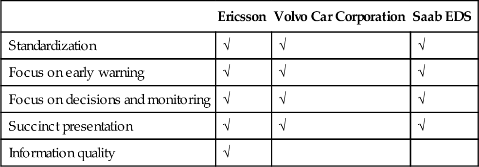
Ericsson has been the company with the longest measurement experience with respect to standardized measurement processes in software engineering; therefore, all elements are present in the dashboards at that company.
8.3.1 Companies
The companies operate in three different domains with commonalities (e.g., embedded software development) and variability (e.g., development methodology, dependency on suppliers). The breadth of the companies and commonalities in the presented dashboard show that similar challenges and elements of successful dashboards are applicable for each domain.
8.3.1.1 Ericsson
Ericsson AB develops large software products for mobile telecommunication networks. The size of the organization during the study was several hundred engineers, and projects numbered up to a few hundred.3 Projects were increasingly executed according to the principles of Agile software development and the Lean production system referred to as Streamline development within Ericsson (Tomaszewski et al., 2007). In this environment various teams were responsible for larger parts of the process compared to traditional processes: design teams (cross-functional teams responsible for complete analysis, design, implementation, and testing of particular features of the product), network verification and integration testing, and others.
The organization used a number of measurement systems for controlling the software development project (per project) described above, for controlling the quality of products in field (per product), and for monitoring the status of the organization at the top level. All measurement systems were developed $$using the in-house methods described in Staron et al. (2008, 2010a), with the particular emphasis on models for design and deployment of measurement systems presented in Staron and Meding (2009b) and Meding and Staron (2009).
The needs of the organization evolved from metric calculations and presentations (ca. 7 years before the writing of this chapter) to using predictions, simulations, early warning systems, and the handling of vast quantities of data to steer organizations at different levels and providing information from project and line. These needs have been addressed by action research projects conducted in the organization since 2006.
8.3.1.2 Volvo car corporation
VCC is a Swedish car original equipment manufacturer (OEM), based in Gothenburg. VCC developed software and hardware in a distributed software development environment. For a number of electronic control units (ECUs), software was developed in-house by software development teams that usually also had the responsibility for integrating the software with hardware developed by suppliers. The majority of the embedded software development, however, came from external suppliers who designed, implemented, and tested the functionality based on specifications from VCC (Eklund et al., 2012; McGee et al., 2010).
The size of the entire automotive project in terms of resources was substantially larger than the projects in the telecom domain due to the fact that both OEMs and suppliers (first and second tier) were involved, and car development projects were usually conducted using the product line approach with reference architectures (Gustavsson and Eklund, 2011). However, we studied one team, which had a comparable size to teams at Ericsson and Saab EDS.
The studied organization at VCC was a software development team responsible for software for the ECU for climate control. The team was provided a set of measures to visualize the progress of development and communicate that upward to the management.
8.3.1.3 Saab electronic defense systems
Saab EDS developed embedded software and graphical user interfaces for ground-based radar systems. The specific product we worked on was part of a larger product developed by several hundred developers, designers, testers, analysts, and others. The historic project developing the product was driven in increments and did not utilize cross-functional teams. Project management produced some manual metrics on trouble reports.
Since this project, the organization has evolved into using more Agile processes and cross-functional teams. A lot of improvements and optimizations have also been made regarding software build and delivery times. And to improve customer value, market competitiveness, and profit, Saab AB Electronic Defense Systems in Gothenburg is going through a Lean transformation.
The organization at Saab EDS has a history of using measures and communicating quality through dashboards. The dashboard presented in this chapter shows how the organization uses one measure—number of defects —in different granularity to provide insight into the status of software development.
8.3.2 Dashboard at Ericsson
Ericsson chooses a dashboard that shows product release readiness in a compact form. The product release readiness indicator is intended to predict when the product under development has achieved the appropriate quality for release (Staron et al., 2012). The quality is measured by the number of open defect reports for the product—meaning that the right quality for releasing of the product is 0 defects. The defects can be related to the functionality of the software and its nonfunctional properties, in particular, performance, reliability, and availability. The properties are tested as part of regularly executed test suites.
The 0-defect criterion is sufficient only when another criterion is fulfilled—all functionality is tested and all test cases are passed. The stakeholder for this indicator is the project manager, and the software development program is the group with the need to communicate the information upward to the management teams of the program and the organization. The indicator (RR, Release Readiness) has the following form:

where #defects is the number of open defects for the product,4 defect_removal_rate is the average number of removed defects during the last 4 weeks, test_execution_rate is the average number of test cases executed during the last 4 weeks, and test_pass_rate is the average number of test cases passed during the last 4 weeks. The 4-week period is chosen based on statistical and empirical analyses. These analyses have shown that based on the length of the test cycles and the defect removal activities, the 4-week period is the most appropriate length for this prediction and provides the most accurate results (Staron et al., 2012).
The formula is built from a number of base measures (e.g., tests passed per week) and derived measures (e.g., test pass rate during the last 4 weeks), which show how standardization according to ISO/IEC 15939 is realized in practice. Each of the measures in the formula is defined according to the standard with its measurement method and measurement function. The stakeholder has the means and ability to react and get the project back on track if needed.
Figure 8.3 presents how the indicator spreads in the organization on a daily basis—in a form of an MS Vista Sidebar gadget (example of succinct visualization). The gadget is the dashboard where the indicator is presented. It is complemented with an Excel file with trends for the measures in the formula for RR.
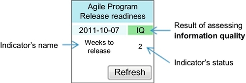
The content of the gadget shows 2 weeks for the project to obtain the release quality (weeks to release). The presentation is simple and succinct, giving the stakeholder (the manager of the studied product development project) the necessary information. The gadget also contains an information quality assurance indicator (assuring information quality), which is abbreviated IQ (Staron and Meding, 2009a). The details of the base and derived measures are available in an associated MS Excel file once the gadget is clicked on.
In addition to the gadget, the team has an auxiliary measurement system monitoring dependencies between architectural components, both explicit and implicit. The measurement system is based on monitoring how software components change over time and which components change together (Staron et al., 2013), with an example in Figure 8.4.

The dependencies are visualized in a very succinct manner and allow teams to quickly find dependencies that are not explicit and can lead to architecture erosion. New dependencies require updating the test strategies and thus influence the release readiness indicator (new test cases to execute, thus more time needed to test the product before the release.
8.3.3 Dashboard at VCC
In the case of VCC, we studied how one software development team can monitor development progress using a dashboard with three components—requirement management, version control for models, and test progress. The team’s interest was to communicate the status of the development of software for one ECU for a family of modern cars within the Volvo brand. The dashboard was designed and developed together with a stakeholder from the team who had insight into the development process and practices at the company. The stakeholder was designated by the team to represent the team’s common view.
The dashboard for monitoring the development progress for the team is presented in Figure 8.5.

This dashboard presents indicators for monitoring the trend in software development by monitoring the pace of modeling of the ECU’s functionality (the table under heading Indicators). Four indicators for check-in pace and trend have been chosen by the team to monitor:
• Check-in trend: The main indicator capturing the readiness of functionality defined as the difference between the moving average and the number of check-ins last week. If the number of check-ins decreases with respect to moving average, then there is a high probability that the team is moving towards the testing phase. In a succinct way it captures the readiness of the team with the implementation of the functionality.
• Number of check-ins last week: The indicator captured the “temperature” of the development of the functionality.
• Number of check-ins during the current week: The indicator monitors the activities during the current week to support the team in checking how the status develops over time.
• Check-in pace: The indicator showing the average level (moving average) of check-ins.
• Heatmap of revisions per model per week: The indicator visualizing how stable the architecture of the software is. This is a part of internal quality measurement for the team and helps to identify spots where architecture needs rework.
Due to the fact that the team is working in an Agile way with functional testing being an integral part of the development of models, the check-ins can be caused by new functionality being added or by changes to the existing functionality caused by defect fixes. Regression testing, however, was not included and therefore an additional measure was needed to control the progress of the basic quality assurance of the developed functionality.
The team monitored three auxiliary trends in the dashboard in order to control that the assumption of the indicators hold:
• Requirements elicitation and breakdown (number of REQPRODs): In order to decide about release readiness, the team assesses whether there are new requirements in the backlog. New requirements indicate that there is still new work to be done (in particular, new updates to the models or new models to be developed).
• Modeling (number of new checked files): In order to decide whether the team is ready with the product where they need to assess the development trend. The heatmap of model revisions shows the internal stability of the architecture.
• Test progress: The number of passed regression test cases.
The dashboard presented in Figure 8.5 is built based on the same principles as the gadget presented in Section 8.3.2, but the information is presented as a flow—three diagrams in one row instead of a single indicator. This more exhaustive presentation of release readiness is motivated by the fact that the team wanted to have more insight into the development and communicate the status visually to stakeholders outside the team, for example, sub-project managers.
The visual presentation of the information as a flow is also supposed to focus the team on early warning. By visualizing the trend in the number of new/changed requirements, the team can monitor whether there is still functionality to be implemented and tested.
When the trend in the requirement growth is flat, the check-in trend decreases and the number of passed regression test cases is stable or grows, then the team is close to the release (focus on decisions).
8.3.4 Dashboard at Saab electronic defense systems
At Saab EDS we studied two dashboards—one for monitoring the internal quality of software product under development (Figure 8.6) and one for monitoring the external quality (Figure 8.7). The dashboards are complemented with build radiators. The build radiators are used to show the current build status of products at the studied organization at Saab EDS. If a product is red (indicates a broken build) on the radiator, people react to that and perform the actions needed to make it pass again.


The dashboard in Figure 8.6 presents indicators for monitoring the current state and trend in internal software quality (ISO, 2005b), in particular the complexity of the product. This dashboard is used on a daily basis among the developers because it visualizes data that is immediately important for them. The data for the indicators is generated by a tool for static code analysis, and it shows the status of such quality indicators as the status of the complexity of source code.
The early warning for problems is provided by other views in the same dashboard by showing trends for the metrics below (as an example):
• The tree map/heatmap (in the center of the Figure 8.6 with red, intensive color pointing attention toward the problem area and green color showing high quality of the area) view is used to identify a software module with low rule compliance. The size of the rectangle is determined by lines of code. This information is used as input to decision making about whether to clean up or rewrite a certain module.5
• The top, right-hand side of the dashboard (Figure 8.6) shows hotspots caused by critical violations, which helps to quickly identify high-risk code and quick wins. The hotspots are the most important parts of software systems that violate the rules set by architects, for example, non-conformance to architectural guidelines and interface visibility defects.
• The box in the middle to the right lists the most violated rules by severity. The grayed-out field represents the number of occurrences and the distribution diagram to the left. This information is used to identify certain problem areas that should be addressed (focused code clean up, training, etc.).
• The bottom right box in Figure 8.6 shows code complexity. Given that a module with high complexity might be more prone to errors and also be harder to maintain, higher values demand that actions be taken for the module in question.
The dashboard presents a number of aspects of internal quality in a succinct way and is “clickable” in the sense that it allows the designers to drill-down into detailed measures or the same measures at lower abstraction levels (e.g., functions or parts of the code). Internal quality includes the majority attributes from ISO 25000 (the attributes from the parts of the standard that is approved by ISO). The attributes are calculated at multiple levels of the architecture from the product level down to the module or function level (if applicable).
The dashboard6 in Figure 8.7 presents indicators for monitoring trouble reports, that is, the external quality of the software product under development. The information is used to easily identify bottlenecks in the flow of resolving the trouble reports. The small graphs represent the number of trouble reports in the corresponding state at a given time. The summary graph contains the sum of the small graphs at a given time. The colored numbers under the summary indicates the trouble report delta over 24 h.
An upward trend for resolved trouble reports, for example, can point towards both positive effects (increased quality of product) and to negative effects (unbalance between the testing resources and development resources for defect-resolution).
8.4 Recommendations for Other Companies
Based on the experience with constructing dashboards for various companies, we can identify a number of recommendations for companies that intend to introduce dashboards. We divide the recommendations into two parts: constructing the dashboards (process) and indicators and measures (product).
8.4.1 Recommendations for constructing the dashboards
To be successful in introducing a dashboard we recommend that companies do the following:
• When defining indicators, choose the those that match stakeholders who have the mandate and means to react upon the status of the indicators. It is imperative that the stakeholders have the mandate to act. Without this, the dashboard is just a nice chart that perhaps can be used for discussion. With the stakeholder who has the mandate and means, the indicators become a very powerful tool for the organization to steer itself based on facts. For monitoring quality of product under development, stakeholders should be product managers and project managers. They have the mandate to order extra resources to address quality issues and to rework the architecture; they can also give assignments to architects and designers to address specific problems with architecture.
• Limit the number of indicators. Depending on the company’s awareness and trust in measures, the dashboards should contain the appropriate number of indicators. If there is a well-established measurement culture in the organization, where measurement teams have a strong reputation for providing reliable measurement products, then one indicator is enough to communicate efficiently. However, if the organization is still gaining the awareness and the measurement team is gaining reputation, then there should be more indicators (although no more than 10 for the sake of coherence). The number of indicators usually decreases over time as organizations become more aware of the inherent dependencies between the initial set of indicators. By assigning the right test cases, companies can monitor qualities of the product (e.g., performance or reliability) by monitoring the test progress, which is one example of combining two interdependent indicators.
• Involve multiple parts of the organization, at least product management, product development, and verification and validation (V&V). Even when defining indicators for smaller entities, the company should keep in mind that no entity is isolated. When companies work with products, they need to understand the premises for the product (features, markets—captured by product management), software development, and requirements of the company’s quality assurance (testing at different levels, customer feedback—captured by V&V). Having all three—product management, development, and V&V—allows the company to focus on the end result rather than suboptimizing toward smaller processes. This observation is particularly important for monitoring the quality attributes of the architecture because problems with architecture can influence the extensibility of the product (thus also the agility of the company), the performance of the product, or the quality assurance effort (thus cost of the quality).
8.4.2 Recommendations for choosing indicators and measures
To choose the right indicators and measures for dashboards for monitoring the quality of products under development, we recommend that companies:
• Focus on product: The focus of the successful indicator is usually on the monitored entity, which can be a product, a process, or a project. However, in reality companies focus on products and their profitability, which demands that the indicators also focus on products. Problems with processes or projects will be visible on the product level (e.g., architecture erosion, low quality, delays in delivery) and they have to be monitored using base/derived measures as trends. However, as companies do not sell their processes or projects, the indicators should be related to products. The RR indicator at Ericsson shows how a set of process and product measures (e.g., test progress) can be packaged into a product-focused indicator. Various test cases are supposed to test both functional and nonfunctional properties, but no gradation is done on which is more important.
• Focus on end result: The main focus of indicators for monitoring the quality of products under development should be on the end product, that is, the software or software-hardware system and not individual artifacts. It is the end product that the software organizations provide to their customers. So, it is the end product that should have the right quality and functionality. Therefore, monitoring particular artifacts like requirements or architecture is not sufficient and can lead to suboptimizations and short-sighted decisions.
8.5 Further Reading
The dashboards for monitoring the development progress are related to monitoring bottlenecks in large software development organizations, which has been studied by Staron and Meding (2011) and Petersen and Wohlin (2011). Monitoring bottlenecks is a useful method for monitoring the capacity of the organization. In the previous work we developed and introduced a method based on automated indicators for monitoring the capacity and bottlenecks in the work flow in the large software development project—that is, the process/project view of software development in that organization.
The very rudimentary and effective first measure to be used by Agile teams to monitor quality is the RTF (Running Tested Features) measure, popular in XP (Jeffries, 2004). The metric combines three important concepts—the feature (i.e., a piece of code useful for the end user, not a small increment that is not visible to the end user), execution (i.e., adding the value to the product through shipping the features to the customer), and the testing process (i.e., the quality of the feature—not only should it execute, but it should also be of sufficient quality). This measure stimulates smart continuous deployment strategies and is intended to capture similar aspects as our release readiness indicator although in smaller projects. Monitoring the trends in RTF can provide indications of architecture erosion over time (RTF becoming longer over time).
A set of other metrics useful in the context of continuous deployment can be found in the work of Fitz (2009) in the context of market-driven software development organization. The metrics presented by Fritz measure such aspects as continuous integration pace or the pace of delivery of features to the customers. These measures complement the indicators presented in this chapter with a different perspective important for product management.
The delivery strategy that is an extension of the concept of continuous deployment was found as one of the three key aspects important for Agile software development organizations in a survey of 109 companies by Chow and Cao (2008). The indicator presented in this chapter is a means of supporting organizations in their transition toward achieving efficient delivery processes that are in line with the delivery strategy prioritized by practitioners in this survey.
The view on indicators, stakeholders, and measures presented in ISO/IEC 15939 is consistent with other engineering disciplines; the standard states that it is based on ISO/IEC 15288:2007 (Systems and software engineering—System life cycle processes), ISO/IEC 14598–1:1999 (Information technology—Software product evaluation) (International Standard Organization, 1999), ISO/IEC 9126-x (International Standard Organization and International Electrotechnical Commission, 2001), ISO/IEC 25000 series of standards, or international vocabulary of basic and general terms in metrology (VIM) (International Bureau of Weights and Measures, 1993). These standards are recommended for companies aiming at successful use of dashboards for monitoring quality of products under development.
Finally, readers interested in more details about constructing dashboards based on ISO 15939 can find more information about automation, frameworks, and modeling of measures can find more information in Staron et al. (2008, 2010a).
8.6 Conclusions
Qualities and architecture of modern software products are distinguishing excellent products from the average ones and can influence the success of software development companies. Extensible and scalable architectures of products combined with Agile and Lean software development can determine long-term sustainable businesses and maximize the value that customers get from these products. Agile and Lean software development methodologies change the way in which organizations work with monitoring of quality of software products under development and assessment of release readiness. Continuous development of software using these methodologies demands continuous quality management. The inherent dependability of these methodologies on self-organized teams shifts the focus from monitoring quality from the higher management to communicating the quality status. The communicated quality status triggers decision processes on all levels in the organizations and new ways of monitoring the progress of the implementation of these decisions emerge.
In this chapter, we investigated how three organizations monitor the quality of software products during development. We explored how Ericsson in Sweden works with one effective indicator of release readiness to monitor the status and trigger decisions. We studied how Saab Electronic Defense Systems combines trends for defect management with monitoring internal quality of products. Finally, we also studied how a team at VCC in Sweden can communicate the software development progress as an alternative to manual status reporting. We provided recommendations for other companies willing to use dashboards—how to construct them and how to choose indicators and measures.