
Chapter 5. Content Controls, Items Controls, and Range Controls
In This Chapter
• Element alignment effects on sizing
• Using buttons
• Data binding CheckBoxes and RadioButtons to viewmodel collections
• Binding to the ListBox.SelectedItems property
• Using a BackgroundWorker to update a progress bar asynchronously
• Understanding implicit ListBoxItems
Silverlight for Windows Phone provides an extraordinarily diverse and rich set of controls, from layout to media controls, form elements suitable for line of business applications, to even multiscale image support (a.k.a. Deep Zoom). This was made possible by leveraging the existing controls and platform maturity of Silverlight for the browser.
Yet, bringing Silverlight to the phone was no mean feat, and meant that the Microsoft Silverlight team faced the challenge of adapting an existing set of controls, designed for the most part with a web browser experience in mind, to the mobile platform, where it was necessary to contend with differences in display size and resolution, touch support, and so on. Fortunately Silverlight itself has been designed with a seemingly remarkable level of foresight, allowing many controls to be dropped in to the Windows Phone Silverlight Framework Class Library (FCL) with only minor control template changes.
Accompanying this set of adapted controls are several new controls designed specifically for the phone, including the Panorama and Pivot (covered in Chapter 10, “Pivot and Panorama”).
Additionally, Microsoft provides a third set of controls, which are located in the Silverlight for Windows Phone Toolkit (covered in Chapter 9, “Silverlight Toolkit Controls”). It includes controls like the ListPicker, seen in some of the phone’s built-in apps, and providing increased usability and behavior in harmony with the Windows Phone Metro design philosophy.
This chapter begins by providing an overview of the elements available in the Silverlight for FCL. It then focuses on the three base control types: ContentControl, ItemsControl, and RangeBase. It examines the various subclasses of these controls, accompanied with practical examples. It looks at how ContentControls are able to host a single item of content and at the differences between the various button controls, including the HyperlinkButton, RepeatButton, and ToggleButton, and at how each is used. The chapter then ventures into some more advanced topics, such as binding CheckBox and RadioButton controls to viewmodel collections, and shows how to bind to the ListBox.SelectedItems property, a feat not readily achievable with Silverlight out-of-the-box!
Finally, the chapter explores the RangeBase controls: the Slider and ProgressBar and demonstrates how to provide feedback to a user during asynchronous activities carried out by a BackgroundWorker.
The majority of the source code for this chapter is located in the ControlExamples directory of the WindowsPhone7Unleashed project, in the downloadable sample code.
Control Type Taxonomy
Having a solid grasp of the class hierarchy of any library that you regularly use helps to improve your productivity and provides a good starting point to gaining a deeper understanding of how a framework is designed to work. It gives you a shortcut for determining what can and cannot be done with a particular type based on its inherited members and whether commonly named members from two different classes are from a shared superclass or have nothing to do with one another. In essence it allows you to better assess what you can achieve using the building blocks and how to avoid making poor design decisions. On that note, this section begins with an overview of the Silverlight control class hierarchy.
The title of this part of the book is “Essential Elements,” and we begin with the class FrameworkElement. The FrameworkElement provides a set of common APIs for objects that participate in Silverlight layout. FrameworkElement also defines members related to data binding, the visual tree, and object lifetime feature areas in Silverlight. It is also the superclass for most of the types presented in this part of the book (see Figure 5.1).
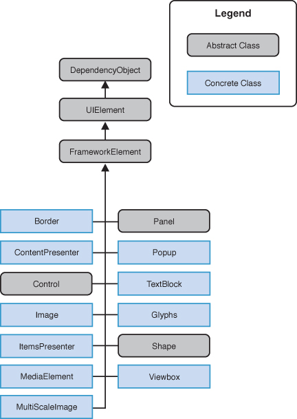
Figure 5.1. Top level elements of the Silverlight for Windows Phone FCL
The focus of this chapter is on types that derive from Control (see Figure 5.2), specifically ContentControl, ItemsControl, and RangeBase and their subclasses. The rest are explored in subsequent chapters.
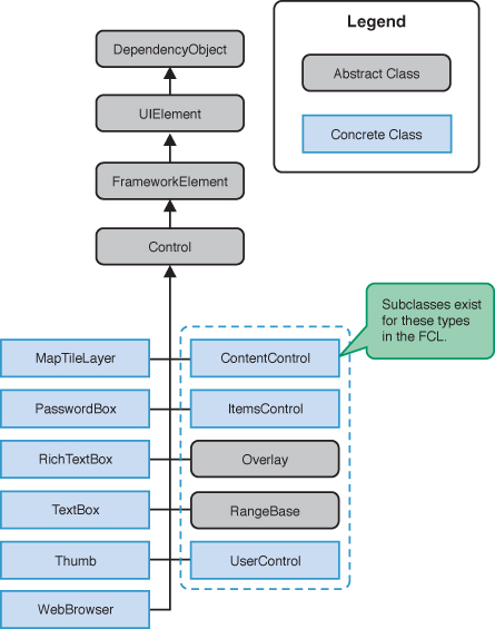
Figure 5.2. Control types within the FCL
Identifying Controls Not Supported or Absent in Silverlight for Windows Phone
Some controls that are present in Silverlight for Windows Phone are not shown in the Visual Studio Toolbox or are not recommended for use due to platform differences or design constraints. These platform differences are mostly related to the phone’s touch driven UI and reduced display size.
In addition, the following Silverlight 4 controls do not exist in the Silverlight for Windows Phone FCL:
• DataGrid
• DatePicker (present in the Silverlight for Windows Phone Toolkit)
• OpenFileDialog
• SaveFileDialog
• Label
• GridSplitter
• TabControl
• TreeView
Some controls exist but are not supported. The following controls should not be used directly:
• Calendar
• Frame—Use the PhoneApplicationFrame instead.
• Page—Use the PhoneApplicationPage instead.
• ScrollBar—Used by the ScrollViewer.
Content Controls
Controls that are derived from ContentControl are able to host a single object. ContentControls include Buttons, ListBoxItems, and containers such as the PhoneApplicationFrame and the ScrollViewer control (see Figure 5.3).
Figure 5.3. Content controls (excludes some mapping related types)
This chapter does not cover the Frame and its derived classes. For information on the Frame class see Chapter 3, “Application Execution Model.” Nor does this chapter cover the PanoramaItem and PivotItem classes, which are discussed in Chapter 10.
ContenControl has a Content property, whose value can be of any type. The way content is presented in the UI, however, depends on its type and whether a DataTemplate is associated with the ContentControl. The following lists the three ways in which content is presented:
• UIElements—If the object derives from UIElement, then the object will be rendered.
• Non-UIElements—If the object does not derive from UIElement then its ToString method is used to retrieve a textual representation of the object. If the ToString method has not been overridden, then the result is the fully qualified class name of the object.
• Non-UIElements with an associated DataTemplate—The ContentControl.ContentTemplate allows you to specify a DataTemplate, either as a StaticResource or inline, which is used to display an object. Data binding expressions within the DataTemplate are used to extract the object’s property values and to render them.
To better understand the Content property, let’s look at a commonly used ContentControl: the Button control. With a Button, you can set its Content property to a string, as shown:
<Button Content="Tap me!" />
Unlike the TextBlock control, for example, the Button control does not have a Text property, yet by setting the Content property to a string, the Button displays the string.
Defining the Default Content Property
The Content property is the default property of the ContentControl. The ContentPropertyAttribute specifies which property of a class can be interpreted as the main content property when the class is parsed by a XAML processor. This means that when, for example, a TextBlock is placed as a nested element of a Button, the TextBlock is rendered within the button itself:
<Button>
<TextBlock Text="Press me!" Foreground="Orange" />
</Button>
To further illustrate, the built-in control template for the Button control includes a Border that contains a TemplateBinding to the Content property of the Button, as shown in the following excerpt:
<Border>
<ContentControl x:Name="ContentContainer"
ContentTemplate="{TemplateBinding ContentTemplate}"
Content="{TemplateBinding Content}" />
</Border>
When the Button is rendered using its built-in style, the Content value, whatever it may be, is placed within a Border.
If you examine the source code for the ContentControl using Reflector, you see that a ContentPropertyAttribute is used to indicate to the Silverlight infrastructure that the Content property is the default property:
[ContentProperty("Content", true)]
public class ContentControl : Control
{ ... }
When creating your own custom controls, you can decorate a class with a ContentPropertyAttribute to specify a different default property.
Buttons
In most Silverlight for Windows Phone apps, buttons are the most commonly used element for receiving user input. Ordinarily, a button initiates an action when a user taps it. Unlike Silverlight for the browser, the minimum size of the Button has been increased, making it more amenable to touch. The shape is usually rectangular, and the standard layout allows for either text or an image to be displayed as content. Buttons support three visibility states: rest (the default state), pressed, and disabled. Unlike Silverlight for the browser, however, there is no visible focus state.
The inherited FrameworkElement.HorizonalAlignment and VerticalAlignment properties both default to Stretch. The Button’s Horizontal and Vertical size, therefore, depends on its parent’s size; the bigger the parent ContentControl the bigger the button. By placing a Button in a Grid, the Button is free to expand to inhabit the entirety of the space provided by the Grid (see Figure 5.4).
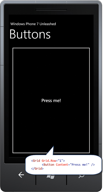
Figure 5.4. By default a Button will expand to inhabit its parent.
If the parent ContentControl happens to be a StackPanel, the button will not expand farther than the space allowed. By default, the StackPanel arranges its child controls vertically. The StackPanel inhabits the entire width of its parent control, but only uses as much vertical space as it needs (see Figure 5.5).
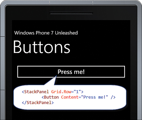
Figure 5.5. Button conforms to the vertical size constraints afforded by the StackPanel.
To constrain the button size to the size of its content, set its HorizontalAlignment and VerticalAlignment properties to something other than Stretch. An effective way to do this is by using a style, as shown in the following example:
<Style x:Key="ButtonStyle" TargetType="ButtonBase">
<Setter Property="HorizontalAlignment" Value="Left" />
<Setter Property="VerticalAlignment" Value="Top" />
</Style>
The style can then be applied like so:
<Button Content="Press me!" Style="{StaticResource ButtonStyle}" />
Tap and Click Events
With the release of the Windows Phone 7.1 SDK, the Click event of the ButtonBase class has been superseded by a UIElement event named Tap. The Tap event is designed for touch input, while the Click event relies on legacy code that handles mouse state.
While the ButtonBase Click event is still present in the SDK, unless your UI code needs to be shared with Silverlight for the browser projects, use the Tap event.
The following is an example of a UIElement.Tap event handler.
void Button_Tap(object sender, System.Windows.Input.GestureEventArgs e)
{
...
}
There is another public GestureEventArgs class residing in the Silverlight Toolkit that is unfortunately located in the Microsoft.Phone.Controls namespace. If you are using the Silverlight Toolkit, be mindful that the correct type needs to be specified or a runtime exception will be raised.
Either use the namespace qualified type name, as shown in the previous example, or add a type alias to the top of your class file, like so:
using GestureEventArgs = System.Windows.Input.GestureEventArgs;
Button Click Mode
If you need to use the Button.Click event, rather than the Tap event for whatever reason, you can tailor the type of user interaction that is required to raise the Button’s Click event using the Button.ClickMode property.
The following is a list of the three possible ClickMode values:
• Press—The Click event is raised as soon as the user touches the button.
• Release—The Click event is not raised until the user lifts his finger off the button. This is the default value.
• Hover—Has the same effect as Press. As there is currently no support for detecting when the user hovers over a control on a Windows Phone device, this value serves no purpose and exists to maintain compatibility with Silverlight for the browser.
Hyperlink Button
The HyperlinkButton allows you to embed hypertext links in a page.
As previously stated, all UIElements have a Tap event, which can be used to perform navigation within an event handler. Performing navigation in this manner, however, can be cumbersome, and the HyperlinkButton provides an easier way to navigate to pages within your app without having to subscribe to an event or use an ICommand.
The HyperlinkButton includes a NavigateUri property. When a user presses the HyperlinkButton, the button takes care of performing the navigation.
The default appearance of the HyperlinkButton does not resemble a button at all. In fact, the default style of a HyperlinkButton is underlined text, not unlike an HTML hyperlink.
For more information on using the HyperlinkButton and page navigation, see Chapter 3.
Repeat and Toggle Buttons
Neither the RepeatButton nor the ToggleButton controls are abstract. Yet both reside in the System.Windows.Controls.Primitives namespace, not in the System.Windows.Controls namespace, indicating that these two controls are not intended to be used in day-to-day page code.
Repeat Button
The RepeatButton behaves the same as the Button control; however, the RepeatButton’s Tap event is raised repeatedly while it is being pressed, whereas the Button control raises its Tap event once for each user press.
The RepeatButton is used as part of the ScrollBar control, which itself is part of the ScrollViewer control. Unlike Silverlight for the browser, however, which uses the RepeatButton to incrementally scroll content when pressed, the RepeatButton in the ScrollBar serves little purpose on the phone because the ScrollBar is for display purposes only.
The RepeatButton has two main properties:
• Interval—The duration between events, measured in milliseconds. The default value is 250 ms.
• Delay—The duration before the event is raised, measured in milliseconds. The default value is 250 ms.
The RepeatButton can be placed in XAML like so:
<RepeatButton Content="Press me!" Interval="200" Delay="500"
Tap="RepeatButton_Tap" />
Sample Overview
An example for the RepeatButton control can be found in the ButtonExampleView page and the ButtonExampleViewModel in the downloadable sample code. The ButtonExampleView has a RepeatButton that is used to execute the RepeatCommand in the viewmodel, as shown:
<RepeatButton Content="{Binding RepeatCount}" Interval="200" Delay="500"
Command="{Binding RepeatCommand}" />
The Content property of the RepeatButton is populated using a data binding to the RepeatCount property in the viewmodel:
int repeatCount;
public int RepeatCount
{
get
{
return repeatCount;
}
private set
{
Assign(() => RepeatCount, ref repeatCount, value);
}
}
Tapping the RepeatButton causes the RepeatCommand to execute. The RepeatCommand is a public property of the viewmodel, defined as shown:
readonly DelegateCommand repeatCommand;
public ICommand RepeatCommand
{
get
{
return repeatCommand;
}
}
The repeatCommand is instantiated in the viewmodel constructor. When executed, the command increments the RepeatCount property, which updates the RepeatButton’s Content property:
public ButtonExampleViewModel() : base("Buttons")
{
repeatCommand = new DelegateCommand(obj => RepeatCount++);
}
When the button is pressed and held, it causes the RepeatCount to increment periodically, which updates the content of the button (see Figure 5.6).
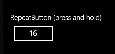
Figure 5.6. Pressing and holding the RepeatButton causes a counter to increment.
Toggle Button
The ToggleButton can visually represent two states: pressed or not pressed. When the user taps a ToggleButton, it switches state and stays in that state until tapped again. The ToggleButton is the base class for the CheckBox and RadioButton controls and, as such, is actually able to represent three states, which includes a third, indeterminate, state.
The terms pressed and not pressed are more readily understandable when talking about the ToggleButton. The ToggleButton, however, contains an IsChecked property that is used to identify the state of the button. So checked and unchecked, pressed and not pressed, are used interchangeably throughout this section.
While the ToggleButton inherits the Tap event from the UIElement class, it has other events that are raised when the state of the button is changed.
The following shows how to create a ToggleButton in XAML:
<ToggleButton Content="ToggleButton"
Checked="ToggleButton_Checked"
Unchecked="ToggleButton_Unchecked" />
Depending on the state of the ToggleButton, one of two events: Checked or Unchecked, is raised when the user presses the ToggleButton.
Setting the ToggleButton.IsThreeState property to true allows the user to set the indeterminate state by tapping the button. If set to false, the only way to return to the indeterminate state is via code.
The name of the ToggleButton.IsThreeState property can be confusing. Even though IsThreeState may be set to false, you can still set the indeterminate state in code. A better name might have been something like UserCanSetIndeterminateState.
The following is an example of a three-state ToggleButton:
<ToggleButton Content="ToggleButton" IsThreeState="True"
Checked="ToggleButton_Checked"
Unchecked="ToggleButton_Unchecked"
Indeterminate="ToggleButton_Indeterminate" />
The ToggleButton.IsChecked property is a nullable Boolean, with true representing checked, false representing unchecked, and null representing its indeterminate state.
While the ToggleButton can be used to allow the user to cycle through three states, it makes little sense unless you are providing a custom template to visually represent the third indeterminate state. The CheckBox and RadioButton controls do provide a representation of each of the three states, as you see later in the chapter.
The ToggleButton indeterminate state can be specified in XAML by setting the IsChecked property like so:
<ToggleButton Content="ToggleButton" IsChecked="{x:Null}" />
The Checked, Unchecked, and Indeterminate events detect when the button is tapped and has transitioned to a new state.
Rather than using the Checked, Unchecked, and Indeterminate events, use the Tap event to consolidate the logic for all three state changes. It is usually easier to handle all three state changes in the same place.
The state of the ToggleButton can be determined in a Tap event handler using the ToggleButton.IsChecked property, as shown in the following excerpt:
void ToggleButton_Tap(object sender, GestureEventArgs e)
{
ToggleButton button = (ToggleButton)sender;
Debug.WriteLine("IsChecked:"
+ (button.IsChecked.HasValue
? button.IsChecked.ToString() : "indeterminate"));
}
Radio Button
The RadioButton is a subclass of the ToggleButton class and offers the same events, such as Checked, Unchecked, and Indeterminate, and properties, such as IsChecked. A radio button is used to represent a set of related but mutually exclusive choices. The user taps on the radio button description text or glyph to select the control. Only one option from a particular group may be selected at a time.
RadioButtons that reside in the same container control automatically share the same group. In addition, the RadioButton has a GroupName property, which allows you to override the default behavior and to enforce mutual exclusivity explicitly by restricting those RadioButtons that share the same GroupName to no more than one being checked at a time. This is useful when multiple RadioButtons are placed in different containers but reside in the same logical group, or when multiple RadioButtons reside in the same container but reside in different logical groups. The GroupName property allows you to control the associations between the controls. Consider the following example:
<StackPanel>
<RadioButton Content="RadioButton 1 (group 1)" GroupName="group1" />
<RadioButton Content="RadioButton 2 (group 1)" GroupName="group1" />
<RadioButton Content="RadioButton 3 (group 2)" GroupName="group2" />
<RadioButton Content="RadioButton 4 (group 2)" GroupName="group2" />
</StackPanel>
By specifying the GroupName, you can have the RadioButtons reside in the same ContentControl, yet still operate as two distinct groups.
Data Binding Radio Button Controls to a ViewModel Collection
This example looks at data binding a ListBox.ItemsSource property to a collection of objects in a viewmodel, and you see how to represent each item in the collection as a RadioButton in the view. You also see how to synchronize the IsChecked property of a RadioButton with the ListBoxItem.IsSelected property.
The sample is located in the ButtonExampleView page and the ButtonExampleViewModel in the downloadable sample code. The viewmodel contains an ObservableCollection of a custom DataItem class, as shown:
readonly ObservableCollection<DataItem> radioItems
= new ObservableCollection<DataItem>
{
new DataItem(0, "Item 1"),
new DataItem(1, "Item 2"),
new DataItem(2, "Item 3")
};
public IEnumerable<DataItem> RadioItems
{
get
{
return radioItems;
}
}
The DataItem class is simply a container to hold an object value and an associated piece of text (see Listing 5.1).
Each DataItem object is represented as a RadioButton in the view. The DataItem’s ToString method override allows you to display the object easily in the view without requiring an explicit data binding path expression to the DataItem.Text property.
public class DataItem : NotifyPropertyChangeBase
{
object itemValue;
public object Value
{
get
{
return itemValue;
}
set
{
Assign("Value", ref itemValue, value);
}
}
object text;
public object Text
{
get
{
return text;
}
set
{
Assign("Text", ref text, value);
}
}
public DataItem(object value, object text)
{
itemValue = ArgumentValidator.AssertNotNull(value, "value");
this.text = ArgumentValidator.AssertNotNull(text, "text");
}
public override string ToString()
{
return text != null ? text.ToString() : base.ToString();
}
}
The collection of DataItem objects is displayed in the ButtonExampleView using a ListBox. The ListBox.ItemsSource is bound to the collection, as shown in the following excerpt:
<ListBox ItemsSource="{Binding RadioItems}"
SelectedItem="{Binding SelectedRadioItem, Mode=TwoWay}"
ItemContainerStyle="{StaticResource RadioButtonListItemStyle}"/>
By binding to the SelectedRadioItem property, the viewmodel is able to monitor and even to set the IsChecked property of any or all of the RadioButton controls.
To display each item in the collection as a RadioButton, we use a custom ItemContainerStyle called RadioButtonListItemStyle, which is located in the phone:PhoneApplicationPage.Resources element of the ButtonExampleView.xaml page. This style defines the ControlTemplate for a ListBoxItem, as shown in the following excerpt:
<Style x:Key="RadioButtonListItemStyle" TargetType="ListBoxItem">
<Setter Property="VerticalContentAlignment" Value="Top" />
<Setter Property="Template">
<Setter.Value>
<ControlTemplate TargetType="ListBoxItem">
<Grid Background="{TemplateBinding Background}">
<RadioButton Content="{TemplateBinding Content}"
IsChecked="{Binding Path=IsSelected,
RelativeSource={RelativeSource TemplatedParent},
Mode=TwoWay}" />
</Grid>
</ControlTemplate>
</Setter.Value>
</Setter>
</Style>
The IsChecked property is assigned using a binding to the ListBoxItem.IsSelected property. In addition, BindingMode is set to TwoWay, so that when the item is checked it will be selected in the ListBox. Conversely, when unchecked by the user or from code in the viewmodel the items will be unselected in the ListBox.
The Content property of the RadioButton is assigned using a TemplateBinding to the Content property of the ListBoxItem. This causes the DataItem in the collection to be assigned to the Content property of the RadioButton. Because the DataItem does not derive from UIElement, the RadioButton renders the DataItem using the ToString method override of the DataItem class (see Figure 5.7).
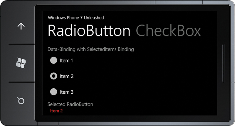
Figure 5.7. The DataItem collection is displayed using RadioButton controls.
When a RadioButton is selected, it is assigned to the SelectedRadioItem property in the viewmodel.
Finally, the selected item is displayed using a TextBlock, as shown:
<TextBlock Text="{Binding SelectedRadioItem}"
Style="{StaticResource ValueTextStyle}" />
Check Box
The CheckBox control is used to define a binary state and can be used in groups to display multiple choices from which the user can select one or more choices. A user can either tap a check box or the associated label text to select an option.
The CheckBox uses an alternative visual representation than its base class ToggleButton control, though it contains no new members.
CheckBox supports three visible states: rest, press, and disabled for both checked and unchecked settings. There is, however, no visible focus state. In addition to visible states, the CheckBox control is capable of representing three settings: checked, unchecked, or indeterminate, along with a disabled visual state for each (see Figure 5.8). The state of the CheckBox can be retrieved using its nullable Boolean IsChecked property.
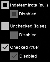
Figure 5.8. The CheckBox control checked states
The indeterminate state of the CheckBox is commonly used to show that the user has not set the state of the control, or that some data anomaly has been detected.
Sample Overview
An example for the CheckBox control can be found in the ButtonExampleView page and the ButtonExampleViewModel, in the downloadable sample code. The ButtonExampleView has a CheckBox that has a two-way data binding to the Checked property of the viewmodel, as shown:
<CheckBox Content="{Binding Checked}" IsChecked="{Binding Checked, Mode=TwoWay}"
IsThreeState="True" />
The viewmodel’s Checked property is a nullable Boolean:
bool? isChecked;
public bool? Checked
{
get
{
return isChecked;
}
set
{
Assign(() => Checked, ref isChecked, value);
}
}
When the user taps the CheckBox, it transitions to the next state and updates the viewmodel’s Checked property (see Figure 5.9).
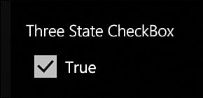
Figure 5.9. A CheckBox control, with its IsChecked property set to true
Data Binding Check Boxes to a ViewModel Collection
This example looks at data binding a ListBox.ItemsSource property to a collection of objects in a viewmodel, and you see how to represent each item in the collection as a CheckBox in the view. You also see how to synchronize the IsChecked property of a CheckBox with the ListBoxItem.IsSelected property. Finally, you investigate how to bind to the ListBox.SelectedItems property, which is not readily achievable with Silverlight out-of-the-box!
The sample for this section is located in the ButtonExampleView page and the ButtonExampleViewModel, in the downloadable sample code. Once again, the viewmodel contains an ObservableCollection of a custom DataItem class:
readonly ObservableCollection<DataItem> checkBoxItems
= new ObservableCollection<DataItem>
{
new DataItem(0, "Item 1"),
new DataItem(1, "Item 2"),
new DataItem(2, "Item 3")
};
public IEnumerable<DataItem> CheckBoxItems
{
get
{
return checkBoxItems;
}
}
The collection of DataItems is displayed in the ButtonExampleView using a ListBox. Each DataItem is represented as a CheckBox. The ListBox.ItemsSource is databound to the collection, as shown in the following excerpt:
<ListBox ItemsSource="{Binding CheckBoxItems}"
SelectionMode="Multiple"
ItemContainerStyle="{StaticResource CheckBoxListItemStyle}"
unleashed:SelectedItems.Items="{Binding SelectedCheckBoxItems}" />
To allow multiple CheckBox controls to be checked simultaneously, the ListBox.SelectionMode property of the ListBox is set to Multiple.
We cannot bind to the ListBox.SelectedItems property because it is not a DependencyProperty. As a workaround, the attached property SelectedItems.Items is used to bind to the SelectedCheckBoxItems property of the viewmodel. The SelectedItems.Items attached property is discussed in the next section “Data Binding to ListBox.SelectedItems.”
By binding to the SelectedCheckBoxItems property, you can monitor and set the IsChecked property of any or all of the CheckBox controls in the view.
To display each item in the collection as a CheckBox you use a custom ItemContainerStyle called CheckBoxListItemStyle, which is located in the phone:PhoneApplicationPage.Resources element of the ButtonExampleView.xaml page. This style defines the ControlTemplate for a ListBoxItem, as shown in the following excerpt:
<Style x:Key="CheckBoxListItemStyle" TargetType="ListBoxItem">
<Setter Property="VerticalContentAlignment" Value="Top" />
<Setter Property="Template">
<Setter.Value>
<ControlTemplate TargetType="ListBoxItem">
<Grid Background="{TemplateBinding Background}">
<CheckBox Content="{TemplateBinding Content}"
IsChecked="{Binding Path=IsSelected,
RelativeSource={RelativeSource TemplatedParent},
Mode=TwoWay}" />
</Grid>
</ControlTemplate>
</Setter.Value>
</Setter>
</Style>
The IsChecked property is assigned using a binding to the ListBoxItem.IsSelected property. In addition, the BindingMode is set to TwoWay, so that when the item is checked it is selected in the ListBox. Conversely, when unchecked by the user or from code in the viewmodel the items will be unselected in the ListBox.
The Content property of the CheckBox is assigned using a TemplateBinding to the Content property of the ListBoxItem. This causes the DataItem in the collection to be assigned to the Content property of the CheckBox. Because the DataItem does not derive from UIElement, the CheckBox renders the DataItem using the ToString method override of the DataItem class (see Figure 5.10).
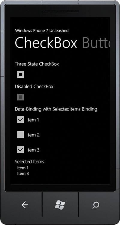
Figure 5.10. DataItem collection is displayed using CheckBox controls.
When a CheckBox is checked or unchecked, it is added to or removed from the list of SelectedCheckBoxItems property in the viewmodel:
readonly ObservableCollection<DataItem> selectedCheckBoxItems
= new ObservableCollection<DataItem>();
public ObservableCollection<DataItem> SelectedCheckBoxItems
{
get
{
return selectedCheckBoxItems;
}
}
Finally, the selected items are, once again, displayed in a ListBox in the view. This time, however, they are displayed not with a CheckBox, but a TextBlock; as shown:
<ListBox ItemsSource="{Binding SelectedCheckBoxItems}">
<ListBox.ItemTemplate>
<DataTemplate>
<TextBlock Text="{Binding}"
Style="{StaticResource NormalTextStyle}" />
</DataTemplate>
</ListBox.ItemTemplate>
</ListBox>
The TextBlock.Text data binding expression {Binding} indicates that value of the Text property is set to the result of calling the ToString method of the DataItem.
Data Binding to ListBox.SelectedItems
Recall that the previous example used the SelectedItems.Items attached property to enable data binding to the SelectedItems property of the ListBox control. We do this because the ListBox.SelectedItems property is not a DependencyProperty, which means it cannot be the target of a data binding.
The downloadable sample code contains a SelectedItems class, which enables data binding to the ListBox.SelectedItems property (see Listing 5.2).
The SelectedItems class contains two dependency properties: an ItemsProperty and a SelectedItemsBehaviorProperty. The ItemsProperty is used to specify the source property of the DataContext and is used to assign the selected items to the ListBox’s DataContext. When the SelectionChanged event of the ListBox is raised, the DataContext’s property is updated.
The SelectedItemsBehavior class contains the logic for updating the list of selected items, which also relies on the DataContextChangedListener class that raises an event when the DataContext of the ListBox changes. For more information on the DataContextChangedListener, see Chapter 23, “Input Validation.”
An instance of the SelectedItemsBehavior is associated with the ListBox using the SelectedItemsBehaviorProperty.
Listing 5.2. SelectedItems Class
public static class SelectedItems
{
public static readonly DependencyProperty ItemsProperty
= DependencyProperty.RegisterAttached(
"Items",
typeof(IList),
typeof(SelectedItems),
new PropertyMetadata(null, ItemsPropertyChanged));
public static void SetItems(ListBox listBox, IList list)
{
listBox.SetValue(ItemsProperty, list);
}
public static IList GetItems(ListBox listBox)
{
return (IList)listBox.GetValue(ItemsProperty);
}
static readonly DependencyProperty SelectedItemsBehaviorProperty
= DependencyProperty.RegisterAttached(
"SelectedItemsBehavior",
typeof(SelectedItemsBehavior),
typeof(ListBox), null);
static void ItemsPropertyChanged(
DependencyObject d, DependencyPropertyChangedEventArgs e)
{
var target = d as ListBox;
if (target != null)
{
GetOrCreateBehavior(target, (IList)e.NewValue);
}
}
static SelectedItemsBehavior GetOrCreateBehavior(
ListBox listBox, IList list)
{
var behavior = (SelectedItemsBehavior)listBox.GetValue(
SelectedItemsBehaviorProperty);
if (behavior == null)
{
behavior = new SelectedItemsBehavior(listBox, list);
listBox.SetValue(SelectedItemsBehaviorProperty, behavior);
}
return behavior;
}
class SelectedItemsBehavior
{
readonly ListBox listBox;
readonly IList sourceList;
public SelectedItemsBehavior(ListBox listBox, IList sourceList)
{
this.listBox = ArgumentValidator.AssertNotNull(listBox, "listBox");
this.sourceList = ArgumentValidator.AssertNotNull(
sourceList, "sourceList");
this.listBox.SelectionChanged += OnSelectionChanged;
DataContextChangedListener.Subscribe(
listBox, OnDataContextChanged);
}
void OnDataContextChanged(
DependencyObject d, DependencyPropertyChangedEventArgs e)
{
UpdateList();
}
void OnSelectionChanged(object sender, SelectionChangedEventArgs e)
{
UpdateList();
}
void UpdateList()
{
sourceList.Clear();
foreach (object item in listBox.SelectedItems)
{
sourceList.Add(item);
}
}
}
}
Tool Tip
The ToolTip control is present in the Windows Phone FCL, yet it serves no real purpose because it is a control designed to work with a pointing device such as a mouse and relies on hovering the mouse over the control. Hover events, which ordinarily dictate when a ToolTip is displayed, do not exist in the realm of the phone, making the ToolTip redundant unless used in an unorthodox way.
Perhaps future displays will have the ability to sense finger display proximity. Then, no doubt, the ToolTip will make it to the Windows Phone platform.
Items Controls
Just as the ContentControl plays host to a single child control, the ItemsControl can have many children. Controls that can contain more than one child usually derive from the ItemsControl class; these include the ComboBox control and, most notably, the ListBox control (see Figure 5.11).
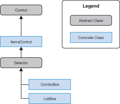
Figure 5.11. ComboBox and ListBox are derived from ItemsControl.
An ItemsControl allows you to populate its children either directly in XAML or in code using the ItemsControl.Items property, or indirectly using a data binding and the ItemsControl.ItemsSource property.
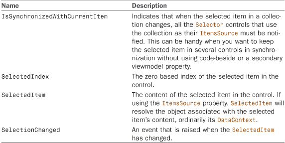
The Selector class extends the ItemsControl to provide the properties and events shown in Table 5.1.
ListBox
The ListBox is an items control, which means that you can populate it with items that contain text or other controls.
By default, the ListBox control allows the user to select a single item in the list. Multiple items can be selected if the ListBox.SelectionMode property is set to Multiple (see the previous section on the CheckBox control, where a ListBox was used to display a data bound collection).
The ListBox control contains a list of ListBoxItem controls. The ListBox control is a remarkably flexible control because it allows you to not only display ListBoxItems, but because the ListBoxItem control is a ContentControl any kind of object can be placed in a ListBox (see Figure 5.12).
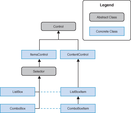
Figure 5.12. ListBoxItem and ComboBoxItem are derived from ContentControl.
In addition, it is unnecessary to wrap content in a ListBoxItem control, as shown in the following excerpt:
<ListBox>
<ListBoxItem>
<TextBlock Text="Item 1" Style="{StaticResource NormalTextStyle}" />
</ListBoxItem>
<ListBoxItem>
<TextBlock Text="Item 2" Style="{StaticResource NormalTextStyle}" />
</ListBoxItem>
</ListBox>
ListBoxItems are created implicitly for each element, making the previous excerpt equivalent to the following:
<ListBox>
<TextBlock Text="Item 1" Style="{StaticResource NormalTextStyle}" />
<TextBlock Text="Item 2" Style="{StaticResource NormalTextStyle}" />
</ListBox>
The example depicted in Figure 5.13 demonstrates that placing a TextBlock, implicitly or explicitly, in a ListBoxItem yields the same results.
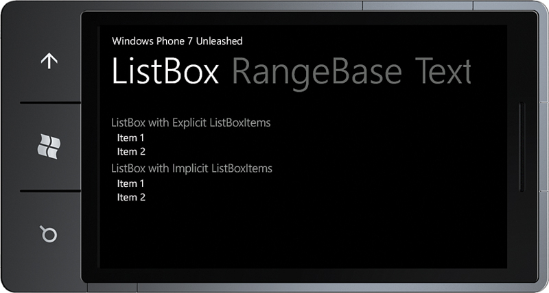
Figure 5.13. ListBox with implicit and explicit ListBoxItems
This works because the ListBoxItem ControlTemplate uses a TemplateBinding to the Content and ContentTemplate properties of the item control. When an item is being displayed, the ControlTemplate places it in a ContentControl, as this excerpt from the built-in ListBoxItem ControlTemplate shows:
<ControlTemplate TargetType="ListBoxItem">
<Border x:Name="LayoutRoot">
<ContentControl x:Name="ContentContainer"
ContentTemplate="{TemplateBinding ContentTemplate}"
Content="{TemplateBinding Content}" />
</Border>
</ControlTemplate>
The ListBox control inherits the Selector.SelectedItem and SelectedIndex properties together with a SelectionChanged event, which allow you to detect when the user selects or deselects an item.
The SelectedItem property is the value of the content item and not the ListBoxItem itself. It is the Content property of the ListBoxItem that is used to resolve the value.
For an example of how to consume the ItemsSource property using a data binding, see the previous sections on the CheckBox and RadioButton controls.
In addition to the selection related properties provided by the Selector class, the ListBox also provides a SelectedItems property, which can be used when using the multiple SelectionMode. The SelectedItems property is, however, not a DependencyProperty, and this means that it is not available for data binding. See the previous section on the CheckBox control for a solution.
ComboBox
While the ComboBox control exists in the FCL, it is not suitable for use in most cases. The ComboBox has its origins in desktop UI and is more suited to a mouse-driven UI, where the user can rely on a high level of precision manipulating the control using a mouse. The ComboBox is not suited to touch input, and there are alternative superior controls, such as the ListPicker control provided in the Silverlight for Windows Phone Toolkit, which is examined in Chapter 9.
For this reason, the ComboBox does not appear in the Visual Studio Toolbox, and the built-in styles for the ComboBox do not reflect the light and dark themes of the phone.
Range Controls
The RangeBase control is an abstract class that represents a control that oversees a numeric value that falls between a minimum and a maximum value. Silverlight for Windows Phone provides three RangeBase controls: the ProgressBar, ScrollBar, and Slider (see Figure 5.14).
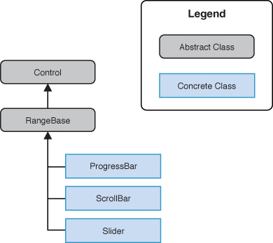
Figure 5.14. RangeBase controls
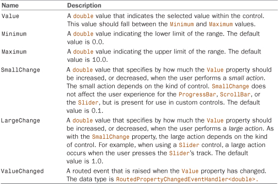
The RangeBase control provides various range related properties and events for monitoring its Value property (see Table 5.2).
Table 5.2. Properties of the RangeBase Class
If the Value property is set to a value outside the range defined by the Minimum and Maximum properties, no Exception is raised. Instead the Value property is coerced and set to either the Minimum or Maximum value.
However, setting Minimum, Maximum, Value, SmallChange, or LargeChange to NaN, NegativeInfinity, or PositiveInfinity raises an ArgumentException. In addition, setting SmallChange or LargeChange to a value less than zero raises an ArgumentException.
ProgressBar
During time-consuming operations, it is important to provide an indication to the user that your application is busy, while still remaining responsive. The ProgressBar serves this purpose. It is not interactive; the user cannot modify it directly, and it is able to work in two modes: determinate and indeterminate.
Determinate mode allows you to display a value indicating the amount of work completed relative to the amount of work remaining, allowing the user to estimate how long the remainder of the operation will take. If the IsIndeterminate property is not specified, the control defaults to determinate.
Progress is displayed by setting the Value property of the control to the amount of work completed, and the Maximum property to the total amount of work to be performed. There is also a Minimum property that allows you to set a base point and can be useful when a portion of the work has already been completed.
The noninteractive nature of the control means that the Value property is updated from code, or via a data binding, while performing a background operation.
Alternatively, when progress of an operation cannot be monitored, or the total duration of an operation is unknown, then the ProgressBar’s indeterminate mode can be engaged.
If the total amount of work required by an activity is known and progress can be periodically determined, avoid using an indeterminate ProgressBar. Use instead a determinate ProgressBar. Providing clear feedback about how long a user can expect to wait for completion of an operation improves the user’s experience.
When using the indeterminate mode by setting the IsIndeterminate property to true, the control is displayed as a series of animated dots.
The ProgressBar has a performance issue caused by its built-in control template in Silverlight for Windows Phone. The template has a negative performance cost in indeterminate mode. This performance cost is present even when the ProgressBar is hidden.
As a workaround, the IsIndeterminate property should be set to false when the control is not visible.
Alternatively, the Silverlight Toolkit’s PerformanceProgressBar can be used in place of the FCL’s ProgressBar. For more information on the PerformanceProgressBar, see Chapter 9.
In addition, the next section looks at the PerformanceIndicator, which leverages the native progress indicator in the phone’s status bar.
Progress Indicator
In the initial release of the Windows Phone OS, there was no way to control the native progress bar located in the status bar of the phone. Fortunately, with Windows Phone 7.5, you now can with the new ProgressIndicator class.
ProgressIndicator is a subclass of the DependencyObject class and provides the following bindable properties:
• IsIndeterminate—A bool value that allows you to enable or disable the indeterminate state of the indicator.
• IsVisible—A bool value that allows you to show or hide the ProgressIndicator.
• Text—A string that is displayed beneath the indicator.
• Value—A double value between 0.0 and 1.0 that allows you to set the length of the progress bar when in determinate mode, that is, when IsIndeterminate is set to false.
The default value of ProgressIndicator.IsVisible is false. You must set IsVisible to true, either explicitly or via a data binding for the control to be displayed.
A ProgressIndicator may be either defined in XAML or in code. The following example demonstrates adding a ProgressIndicator to a page’s XAML file:
<phone:PhoneApplicationPage
...
shell:SystemTray.IsVisible="True">
<shell:SystemTray.ProgressIndicator>
<shell:ProgressIndicator IsVisible="True"
IsIndeterminate="False"
Value="0.9"
Text="{Binding Message}" />
</shell:SystemTray.ProgressIndicator>
...
</phone:PhoneApplicationPage>
Adding a ProgressIndicator to a page must occur after the page has been initialized. This can be done by attaching the ProgressIndicator to the page within a Loaded event handler.
The ProgressIndicator instance may be retained as a field in the page and used directly, or data bindings can be established when the ProgressIndicator is instantiated, as demonstrated in Listing 5.3.
Listing 5.3. Initializing a ProgressIndicator in Code
public partial class ExampleView : PhoneApplicationPage
{
public ExampleView()
{
InitializeComponent();
DataContext = new ExampleViewModel();
Loaded += HandleLoaded;
}
void HandleLoaded(object sender, RoutedEventArgs e)
{
var progressIndicator = SystemTray.ProgressIndicator;
if (progressIndicator != null)
{
return;
}
progressIndicator = new ProgressIndicator();
SystemTray.SetProgressIndicator(this, progressIndicator);
Binding binding = new Binding("Busy") { Source = ViewModel };
BindingOperations.SetBinding(
progressIndicator, ProgressIndicator.IsVisibleProperty, binding);
binding = new Binding("Busy") { Source = ViewModel };
BindingOperations.SetBinding(
progressIndicator,
ProgressIndicator.IsIndeterminateProperty,
binding);
binding = new Binding("Message") { Source = ViewModel };
BindingOperations.SetBinding(
progressIndicator, ProgressIndicator.TextProperty, binding);
}
...
}
Chapter 26, “Local Databases,” uses the ProgressIndicator to display the progress of retrieving a live Twitter feed.
Performing time-consuming operations, such as downloads and database queries, on the UI thread is bad practice, as it locks the user interface making it unresponsive. Therefore, always perform any potentially long-running operation using a background thread.
Using a BackgroundWorker to Update the ProgressBar
The BackgroundWorker class allows you to run an operation on a separate, dedicated thread. When you want a responsive user interface and you must perform time-consuming operations, the BackgroundWorker class provides a convenient solution.
The BackgroundWorker class has events that are automatically raised on the UI thread, giving you the opportunity to update UIElements without risking cross-thread access exceptions. You can listen for events that report the progress of an operation and signal when the operation is completed. The following section uses a BackgroundWorker to perform an arbitrary time-consuming operation during which a ProgressBar is periodically notified of the progress.
ProgressBar and BackgroundWorker Sample Code
An example for the ProgressBar can be found in the ControlExamplesView page and the ControlExamplesViewModel class in the downloadable sample code.
The viewmodel contains a BackgroundWorker field. In the viewmodel’s constructor, the BackgroundWorker.WorkerReportsProgress property is set to true. This causes the BackgroundWorker to raise an event when its ReportProgress method is called. We then subscribe to three events: the DoWork event, which is raised when the RunWorkerAsync method is called; the ProgressChanged event, which is called when the BackgroundWorker ReportProgress method is called; and the RunWorkerCompleted, which is raised when the backgroundWorker_DoWork method completes (see Listing 5.4).
Listing 5.4. ControlExamplesViewModel Class (excerpt)
public class ControlExamplesViewModel : ViewModelBase
{
readonly BackgroundWorker backgroundWorker = new BackgroundWorker();
public ControlExamplesViewModel()
: base("Controls")
{
backgroundWorker.WorkerReportsProgress = true;
backgroundWorker.DoWork
+= new DoWorkEventHandler(backgroundWorker_DoWork);
backgroundWorker.ProgressChanged
+= new ProgressChangedEventHandler(
backgroundWorker_ProgressChanged);
backgroundWorker.RunWorkerCompleted
+= new RunWorkerCompletedEventHandler(
backgroundWorker_RunWorkerCompleted);
backgroundWorker.WorkerSupportsCancellation = true;
cancelProgressCommand = new DelegateCommand(
obj => backgroundWorker.CancelAsync());
backgroundWorker.RunWorkerAsync();
Message = "BackgroundWorker performing task.";
}
void backgroundWorker_ProgressChanged(
object sender, ProgressChangedEventArgs e)
{
ProgressPercent = e.ProgressPercentage;
}
void backgroundWorker_DoWork(object sender, DoWorkEventArgs e)
{
BackgroundWorker worker = (BackgroundWorker)sender;
for (int i = 0; i < 100; i++)
{
if (worker.CancellationPending)
{
e.Cancel = true;
return;
}
Wait(300);
worker.ReportProgress(i);
}
}
void backgroundWorker_RunWorkerCompleted(
object sender, RunWorkerCompletedEventArgs e)
{
Message = e.Cancelled
? "Background worker cancelled."
: "Background worker completed.";
}
int progressPercent;
public int ProgressPercent
{
get
{
return progressPercent;
}
private set
{
Assign("ProgressPercent", ref progressPercent, value);
}
}
bool cancelProgress;
DelegateCommand cancelProgressCommand;
public ICommand CancelProgressCommand
{
get
{
return cancelProgressCommand;
}
}
string message;
public string Message
{
get
{
return message;
}
set
{
Assign(() => Message, ref message, value);
}
}
static readonly object waitLock = new object();
static void Wait(int delayMs)
{
if (delayMs > 0)
{
lock (waitLock)
{
Monitor.Wait(waitLock, delayMs);
}
}
}
}
While running, the worker thread repeatedly sleeps, using the viewmodel’s Wait method, and then signals that the progress has changed.
If the BackgroundWorker.WorkerReportsUpdates property is set to false and the BackgroundWorker ReportProgress method is called, an InvalidOperationException will be thrown.
The following excerpt shows the view’s XAML for the relevant controls:
<TextBlock Text="ProgressBar" />
<ProgressBar Value="{Binding ProgressPercent}"
Minimum="0" Maximum="100" />
<Button Content="Cancel Progress"
Command="{Binding CancelProgressCommand}" />
<TextBlock Text="Message" />
<TextBlock Text="{Binding Message}" Height="80" />
On completion of the backgroundWorker_DoWork method, the backgroundWorker_RunWorkerCompleted method is called, and the viewmodel’s MessageProperty is updated (see Figure 5.15).
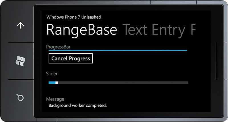
Figure 5.15. Updating the UI using a BackgroundWorker
The BackgroundWorker class also supports operation cancellation. By pressing the Cancel Progress button, the CancelProgressCommand is executed, which, in turn, calls the backgroundWorker’s CancelAsync method. This is then detected in the backgroundWorker_DoWork method, which sets the Cancel property of the DoWorkEventArgs.
Although cancelled, the BackgroundWorker.RunWorkCompleted event is still raised, and the backgroundWorker_RunWorkerCompleted handler is still called; however, the RunWorkerCompletedEventArgs.Cancelled property allows you to determine whether the operation was cancelled.
The NotifyPropertyChangeBase class in the downloadable sample code, which is the base class of the ViewModelBase class, automatically raises INotifyPropertyChanged.PropertyChanged events on the UI thread (one of its many benefits). Therefore, you could achieve the same thing shown in the example by replacing the BackgroundWorker with a thread from, for example, the ThreadPool, and by including two Boolean cancel and cancelled fields. It would make for a simpler implementation with fewer event subscriptions.
Slider
The Slider is an interactive control that allows the user to set its Value property by dragging or pressing the Slider track. It is ideal for values that do not require a high level of precision, such as the volume setting for music in a game.
The following demonstrates how to define a Slider in XAML:
<Slider Value="5" Minimum="0" Maximum="100" LargeChange="20" />
The Value, Minimum, and Maximum properties are described in the previous section on the RangeBase control.
When the user taps the Slider track, the Value property is incremented or decremented by the value of the LargeChange property.
The default orientation of the Slider is horizontal. The orientation can be changed by setting the Orientation property to Vertical.
The Slider is an especially useful control on the Windows Phone platform, since the use of touch makes the slider easier to control than it would otherwise be with the mouse.
The built-in Slider control is, however, somewhat cumbersome to use. The control template for the Slider was built for Silverlight for the browser, where mice are better at hitting small targets. A number of custom templates are available on the Web that provide better usability. Dave Relyea, the lead developer of the Silverlight Toolkit team, provides an improved Slider control. See http://bit.ly/b0YtQj for more information.
Further examples of the Slider control can be found throughout this book, such as in the section “Selecting a Photo from the Photo Hub Using the PhotoChooserTask” in Chapter 12, “Launchers and Choosers,” and the section “Displaying Location Using the GeoPositionView Page” in Chapter 15, “Geographic Location.”
Do not place a horizontal Slider control on a Pivot or Panorama control. Doing so may interfere with a user’s ability to move between items, or it may prevent a user from manipulating the Slider without moving between Panorama or Pivot items. This also applies to other controls like the Bing Maps control, which rely on the user performing a drag gesture.
You learn more about the Pivot or Panorama in Chapter 10.
Note that you may see a Slider placed in a Pivot in the sample code. This has been done for the sake of convenience and should not be taken as guidance.
ScrollBar
ScrollBar is a control that has a sliding thumb whose position corresponds to a value. The ScrollBar class provides a ViewportSize property, which determines the amount of scrollable content that is visible and an Orientation property, which can be either Horizontal or Vertical.
It is rare to see the ScrollBar used directly. It is more commonly used within other controls such as the ScrollViewer or in custom controls.
Summary
This chapter began by providing an overview of the elements available in the Silverlight for Windows Phone FCL. It then focused on the three control types: ContentControls, ItemsControls, and RangeControls. It showed the various subclasses of these controls, accompanied with practical examples.
The chapter examined how ContentControls can host a single element and the differences between the various buttons such as the HyperlinkButton, RepeatButton, and ToggleButton. It also demonstrated how to bind CheckBox and RadioButton controls to viewmodel collections, and you saw how to bind to the ListBox.SelectedItems property, which is not readily achievable with Silverlight out-of-the-box.
Finally, the chapter explored the RangeBase controls: the Slider and ProgressBar, and demonstrated how to provide feedback to a user during asynchronous activities carried out by a BackgroundWorker.