
4. Developing Views and View Controllers
In this chapter, we will flesh out the enter weight and history views for our Health Beat application. As we proceed, we will gain more experience graphically laying out views and linking user interface elements to their view controllers. We will also learn how to populate, monitor, and control a table view; how to set up static table views; and the differences between using a navigation controller and simply presenting modal views.
This chapter also includes a discussion of advanced techniques. We use Core Animation to modify a view’s appearance, which lets us create rounded buttons with custom background colors.
Entering Weight Data
Let’s start by modifying our enter weight view. Open the MainStoryboard.storyboard file, and zoom in on the enter weight scene.
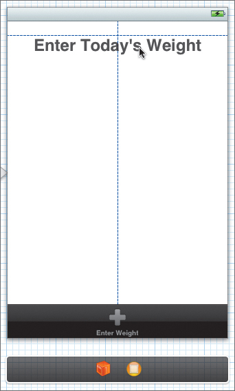
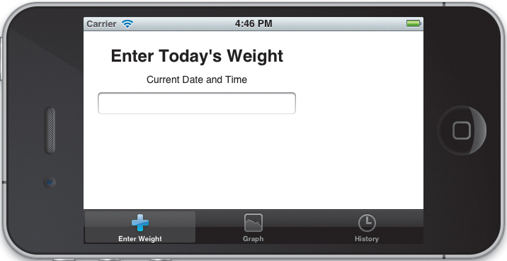
Drag a label from the library and drop it anywhere in the view. Double-click the label, and change the text to Enter Today’s Weight. In the Attributes inspector, change the font to System Bold 24.0. You can tap the  icon to bring up the Fonts window. Next, choose Editor > Size to Fit Content from the menu bar. Finally, center the label along the top of the view using the guidelines (Figure 4.1).
Figure 4.1 Centering the label
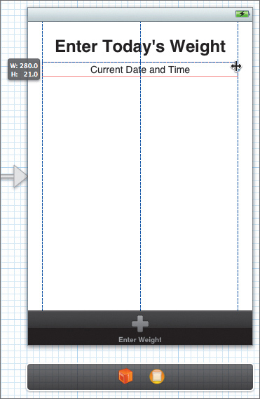
Drag out a second label and position it below the first. Change its text to Current Date and Time. Don’t worry, that’s just a placeholder. We will replace this text at runtime. Of course, we don’t know exactly how long the date and time string will be, but we still want it centered under our title. The easiest way to do this is to set the label’s Alignment attribute to Centered, and then stretch the label so that it fills the view from margin to margin (Figure 4.2).
Figure 4.2 Stretching a label to fill the view
Next, place a text field under the Current Date label. Stretch it so that it also fills the view from margin to margin. Set the attributes as shown in Table 4.1.
Table 4.1 Text Field Attributes
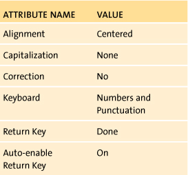
Whew, that’s a lot of settings. Let’s step through them one at a time. We want to restrict the input to valid decimal numbers. Also, since we’re only allowing numbers, it doesn’t make sense to enable autocorrection and capitalization. We may as well turn them off. The Numbers and Punctuation keyboard gives us all the keys we need (all the numbers, a Return key, and—for US English—a period). It actually allows too many characters, so we’ll need to filter our input. We’ll cover that in a bit.
The last two settings will help us create a more streamlined user interface. Essentially, we want to automatically create a new WeightEntry object and switch to the graph view as soon as the user presses the Return key. This reduces the total number of taps needed to enter a new weight. To help support this, we change the Return key’s label to Done to better communicate our intent. More importantly, auto-enabling the Return key means it will be disabled as long as the text field is empty. The system automatically enables the Return key once the user has entered some text. This—when paired with our input filtering—will guarantee that we have a valid weight entry whenever the Return key is pressed.
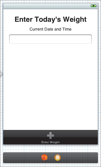
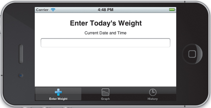
The interface should now match Figure 4.3. The basics are in place, but we’re going to spice it up a bit.
Figure 4.3 Completed enter weight view controller scene
Set Autorotating and Autosizing
We will want our view to rotate into any orientation. There are two steps to this. First, we must modify the controller to allow autorotation.
Open EnterWeightViewController.m and navigate to the shouldAutorotateToInterfaceOrientation: method. This method should return YES if the controller’s view can rotate to the given interfaceOrientation. In the default implementation, it allows rotation only into the right-side-up portrait orientation.
To allow the app to rotate into any orientation, simply have the method return YES, as shown here:
- (BOOL)shouldAutorotateToInterfaceOrientation:
(UIInterfaceOrientation)interfaceOrientation {
return YES;
}
However, if you run the app you may notice that autorotation still isn’t working. No matter how you twist the device, the interface remains locked in the portrait orientation.
That’s because there’s a trick. By default, tab views only allow autorotation if all of the contained view controllers support autorotation. Make the same change to the HistoryViewController and the GraphViewController, and then run the app again.
And...it’s still not working. OK, I lied. There were two tricks. When we created a custom tab view, it turns out that we inadvertently overrode the tab bar’s default shouldAutorotateToInterfaceOrientation: implementation. Open TabBarController.m, and delete the shouldAutorotateToInterfaceOrientation: method. This will restore the default behavior. Run it one last time. It should finally rotate as expected. Unfortunately, we have another problem (Figure 4.4). The UI elements are not properly resizing or repositioning themselves in the new, wider view.
Figure 4.4 Autorotation works, but autosizing does not.
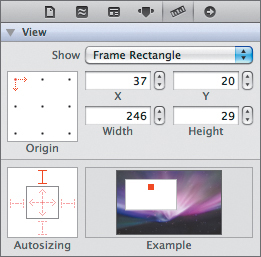
To fix this, open MainStoryboard.storyboard again. Select the Enter Today’s Weight label, and open the Size inspector. The Autosizing control allows us to lock the object’s position relative to the top, bottom, left, or right sides. It also allows us to automatically stretch and shrink our control horizontally or vertically.
By default, the view is locked to the left and top. We want it locked to the top—but we want it to remain centered in the view. Click the red I-bar on the left side of the Autosizing control to turn it off. After you make changes in the Autosizing control, check the Example preview to make sure the control will behave as you expect. In this case, it should remain centered at the top of the view as the size changes (Figure 4.5).
Figure 4.5 Locking the control to the top of the view
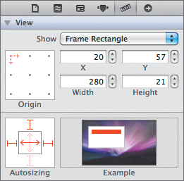
We want the Current Date and Time label to stretch so it fills the view from margin to margin. Select the label and then lock it to the top, left, and right sides. Also, turn on the horizontal resizing as shown in Figure 4.6. Use the same settings for the text field as well.
Figure 4.6 Stretching the control to fill the view horizontally
Run the app again. Now when it rotates into landscape mode, the app should position and resize the controls appropriately (Figure 4.7).
Figure 4.7 Correct autorotation and autosizing
Adding Outlets and Actions
Let’s start by opening EnterWeightViewController.h. We want our controller to conform to the UITextFieldDelegate protocol. This will let us respond to changes in our text field. Modify the header as shown here:
@interface EnterWeightViewController : UIViewController
<UITextFieldDelegate> {
}
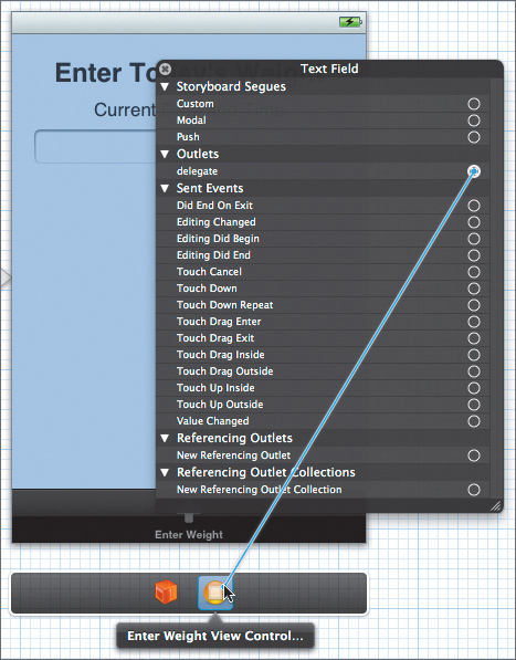
Switch back to MainStoryboard.storyboard and open the Assistant editor. Make sure EnterWeightViewController.h is shown in the second panel. Then right-click the text field, and drag a connection from the delegate to the view controller icon in the scene’s dock (Figure 4.8).
Figure 4.8 Connecting the text field’s delegate
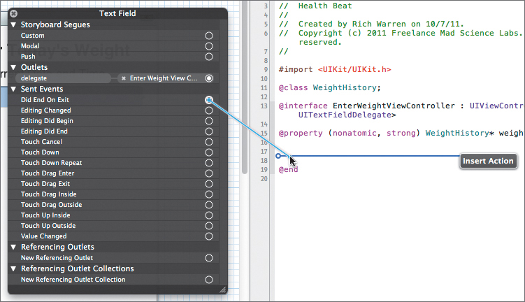
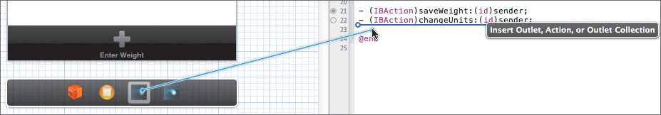
Next, drag the Did End On Exit event to the header file and create a new action (Figure 4.9). Name the action saveWeight.
Figure 4.9 Creating a new action
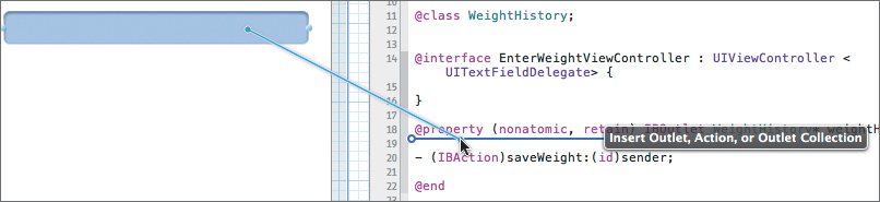
Dismiss the connections pop-up window, and Control-drag the text field to the header file (Figure 4.10). Create a new strong outlet named weightTextField.
Figure 4.10 Creating a new outlet
Finally, Control-drag from the Current Date and Time label and create a strong outlet named dateLabel.
The header file should now appear as shown here:
#import <UIKit/UIKit.h>
@class WeightHistory;
@interface EnterWeightViewController : UIViewController
<UITextFieldDelegate>
@property (nonatomic, strong) WeightHistory* weightHistory;
@property (strong, nonatomic) IBOutlet UITextField *weightTextField;
@property (strong, nonatomic) IBOutlet UILabel *dateLabel;
- (IBAction)saveWeight:(id)sender;
@end
Creating the Unit Button
Now we want to add a unit button inside the text field. This will allow us to both display the current unit type and change units.
Our unit button is somewhat odd. We won’t be adding it directly to our view hierarchy. Instead, we will programmatically assign it to our text field’s rightView property. This is not something we can do in Interface Builder.
Of course, we could still create the button in Interface Builder and assign it as a new top-level object. We could then use Interface Builder to configure its settings. Unfortunately, this doesn’t really help us, since we won’t be able to visually inspect it as we edit it. All things considered, it’s probably easiest to just create the button in code.
Open EnterWeightViewController.h and add the following property and action:
@property (nonatomic, strong) WeightHistory* weightHistory;
@property (strong, nonatomic) IBOutlet UITextField *weightTextField;
@property (strong, nonatomic) IBOutlet UILabel *dateLabel;
@property (strong, nonatomic) UIButton* unitsButton;
- (IBAction)saveWeight:(id)sender;
- (IBAction)changeUnits:(id)sender;
Next, switch to the implementation file and synthesize the property.
@synthesize unitsButton=_unitsButton;
Now, scroll down to the viewDidLoad method. Modify it as shown:
- (void)viewDidLoad
{
[super viewDidLoad];
self.unitsButton = [UIButton buttonWithType:UIButtonTypeCustom];
self.unitsButton.frame = CGRectMake(0.0f, 0.0f, 25.0f, 17.0f);
self.unitsButton.backgroundColor = [UIColor lightGrayColor];
self.unitsButton.titleLabel.font =
[UIFont boldSystemFontOfSize:12.0f];
self.unitsButton.titleLabel.textAlignment =
UITextAlignmentCenter;
[self.unitsButton setTitle:@"lbs"
forState:UIControlStateNormal];
[self.unitsButton setTitleColor:[UIColor darkGrayColor]
forState:UIControlStateNormal];
[self.unitsButton setTitleColor:[UIColor blueColor]
forState:UIControlStateHighlighted];
[self.unitsButton addTarget:self
action:@selector(changeUnits:)
forControlEvents:UIControlEventTouchUpInside];
self.weightTextField.rightView = self.unitsButton;
self.weightTextField.rightViewMode = UITextFieldViewModeAlways;}
We start by creating a custom button. Then we configure it. It’s 17 points tall and 25 points wide, with a light gray background. We also configure its title. It uses a 12-point bold system font and is center aligned. It’s important to center the title; as the user changes units, we will switch the button’s label between “lbs” and “kg.” Centering the label gives the button a nice, consistent appearance, even when the label’s size changes.
Next, we set the default title to “lbs” and then assign text colors for the different control states. Normally the text is dark gray, but when the button is highlighted, the text turns blue.
We also assign the changeUnits: action to our button’s UIControlEventTouchUpInside event. This is identical to drawing a connection between a button’s TouchUpInside event and the desired action in Interface Builder. When the unitsButton is touched, the system will call changeUnits:.
Finally, we assign the unit button to the text field’s rightView property. This will cause it to appear inside the text field along the right side. We then set the view mode so that our button is always visible.
As always, since we assigned the button in viewDidLoad, we should clear it in viewDidUnload. Navigate down to viewDidUnload and add the following line:
self.unitsButton = nil;
Finally, add a method stub for our changeUnits: action. We will flesh out this method after adding the change units view to our storyboard.
- (IBAction)changeUnits:(id)sender {
// method stub
}
Implementing Actions and Callback Methods
Now switch to EnterWeightViewController.m. Before we start tackling the action and delegate methods, let’s add an extension with a couple of private properties.
@interface EnterWeightViewController()
@property (nonatomic, strong) NSDate* currentDate;
@property (nonatomic, strong) NSNumberFormatter* numberFormatter;
@end
We’re adding two properties: currentDate will hold the current date (based on the date and time when the view appeared), and we will use the numberFormatter to process our user’s input.
Next, synthesize these properties.
@synthesize currentDate = _currentDate;
@synthesize numberFormatter = _numberFormatter;
Then, navigate to the viewDidLoad method. Add the following code to instantiate and configure our number formatter:
- (void)viewDidLoad
{
[super viewDidLoad];
self.numberFormatter = [[NSNumberFormatter alloc] init];
[self.numberFormatter
setNumberStyle:NSNumberFormatterDecimalStyle];
[self.numberFormatter
setMinimum:[NSNumber numberWithFloat:0.0f]];
self.unitsButton = [UIButton buttonWithType:UIButtonTypeCustom];
self.unitsButton.frame = CGRectMake(0.0f, 0.0f, 25.0f, 17.0f);
self.unitsButton.backgroundColor = [UIColor lightGrayColor];
...
}
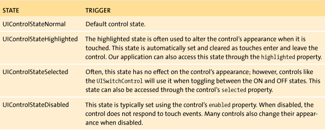
UIControlState all = UIControlStateNormal |
UIControlStateSelected |
UIControlStateHighlighted |
UIControlStateDisabled;
[self.button setText:@"default text" forState:all]
Figure 4.11 UIControlState changes for a two-state button
In the last chapter, we used number formatters to create number strings that would format properly regardless of the device’s language and country settings. In this chapter, we will see the other side. We will use the NSNumberFormatter to verify and filter the user’s input. Here, we set it to accept only positive decimal numbers. We will also use the formatter to parse the user input, converting it from a string into a float value.
Again, anything we set up in viewDidLoad needs to be torn down in viewDidUnload. Add the following line:
- (void)viewDidUnload
{
[self setWeightTextField:nil];
[self setDateLabel:nil];
self.unitsButton = nil;
self.numberFormatter = nil;
[super viewDidUnload];
}
We still need to reset the screen each time it appears. Remember, a view might be created only once but appear many times. Actually, it’s even more complicated than this. A view may be loaded and unloaded multiple times (usually due to memory shortages). Each time it is loaded, it may appear onscreen more than once. Therefore, it’s important to think things through. Which configuration items need to be performed once and only once? These are typically performed in the application delegate’s application:didFinishLaunchingWithOptions: method. Which configuration items should be performed each time a view loads? These should be performed in the view controller’s viewDidLoad method. Finally, which ones should be performed every time the view appears onscreen? These are done in the viewWillAppear: or viewDidAppear: method.
In our case, we want to update the current date and make sure our text field is ready to receive new information. Implement the viewWillAppear: method as shown:
- (void)viewWillAppear:(BOOL)animated {
// Sets the current time and date.
self.currentDate = [NSDate date];
self.dateLabel.text =
[NSDateFormatter localizedStringFromDate:self.currentDate
dateStyle:NSDateFormatterLongStyle
timeStyle:NSDateFormatterShortStyle];
// Clear the text field.
self.weightTextField.text = @"";
[self.weightTextField becomeFirstResponder];
[super viewWillAppear:animated];
}
Here we create a new NSDate object set to the current date and time. We then use the NSDateFormatter class method localizedStringFromDate:dateStyle:timeStyle: to produce a properly localized string representation. As you might expect, the formatting of dates and times also varies greatly from country to country and language to language. The NSDateFormatter lets us easily create date strings based on the device’s language and region settings.
Note

Both NSNumberFormatter and NSDateFormatter are subclasses of the NSFormatter abstract class. NSFormatter is designed to act as a base class for objects that format, validate, or parse strings. For more information on using formatters or even creating your own, see the Data Formatting Guide in Apple’s documentation.
Next, we clear the text field and make it the first responder. Making a text field the first responder will automatically display the keyboard. Now, we’ve already linked the text field’s Did End On Exit event to the saveWeight: method. This method will be called whenever the keyboard’s Done button is pressed.
As we described earlier, this provides a very streamlined system for entering the weights. When the user opens this view, the text field is automatically selected and the keyboard is ready and waiting. The user just types in the weight value and presses Done. They don’t need to select the text box or press a Save button. Everything is simple, automatic, and clean.
However, it does create one small problem. The keyboard covers our tab bar. This prevents our users from navigating away from this screen without entering a new weight.
Obviously, this is not ideal. We need to provide a way (preferably something intuitive and non-intrusive) to dismiss the keyboard, giving us access to the tab bar again. Let’s add a gesture recognizer that responds to a simple down swipe.
Open MainStoryboard.storyboard again. Drag a swipe gesture recognizer from the library and drop it onto the enter weight view controller scene’s main view (Figure 4.12).
Figure 4.12 Adding a swipe gesture recognizer
The gesture recognizer will appear in the scene’s dock. Select it and open the Attributes inspector. Set the Swipe attribute to Down. Leave the Touches attribute at 1. This will now trigger on a single-finger, downward swipe.
If we’re going to recognize downward swipes, we should recognize upward swipes as well. So, let’s add a second recognizer. Drag out another swipe gesture recognizer and add it to the view. Set its Swipe attribute to Up. Leave the Touches attribute at 1.
Now open the Assistant editor, and make sure the EnterWeightViewController.h file is showing. Right-click and drag from the down swipe gesture recognizer to just below the declaration of our changeUnits: method (Figure 4.13). Change the Connection to Action, and name it handleDownwardSwipe. Then do the same for the up gesture recognizer. Name its action handleUpwardSwipe.
Figure 4.13 Connecting a gesture recognizer
Then create an outlet for each gesture recognizer. Control-drag from the recognizer to the header file. Name the first outlet downSwipeRecognizer. Name the second upSwipeRecognizer.
Now switch to EnterWeightViewController.m and implement the actions:
- (IBAction)handleDownwardSwipe:(id)sender {
// Get rid of the keyboard.
[self.weightTextField resignFirstResponder];
}
- (IBAction)handleUpwardSwipe:(id)sender {
// display keyboard
[self.weightTextField becomeFirstResponder];
}
The handleDownwardSwipe method simply has the text field resign as first responder. Just as before, the keyboard is automatically linked to the first responder. When the text field resigns, the keyboard disappears. The handleUpwardSwipe method is just the inverse of that. It assigns the text field as the first responder, causing the keyboard to appear again. Of course, the user could do the same thing by simply tapping the text field, but many users will automatically try to undo a downward swipe with an upward swipe. Adding the inverse operation makes the interface feel more complete.
While this is an elegant solution, it brings up a common problem with iOS development. We can easily build complicated touch-, gesture-, and motion-based controls (see Chapter 8 for more examples), but how do we make sure the user knows they exist? iOS applications usually don’t have help screens, and—in my experience—few users actually read the help information that does exist.
For example, you might create a great three-finger swipe that radically simplifies your application’s workflow. However, unless your users stumble upon it by accident, most will never know it exists. That’s not to say that you should avoid using unusual gestures. On the contrary, many applications use novel gestures to great effect. The Twitter app is an excellent example: You scroll through the table view of incoming tweets. When you get to the top, you just pull down to check for new messages.
This is a brilliant gesture. Users will almost certainly stumble upon it as they accidentally try to scroll past the end of their tweets. More importantly, once you find it, the gesture is so natural that it quickly becomes part of your regular workflow.
The bottom line is that successfully communicating how your app operates can be one of the biggest challenges in iOS development. Typically, this involves extensive usability testing to make sure your interface is as intuitive and natural as possible.
OK, let’s switch gears and tackle the saveWeight: action.
#pragma mark – Action Methods
- (IBAction)saveWeight:(id)sender {
// Save the weight to the model.
NSNumber* weight = [self.numberFormatter
numberFromString:self.weightTextField.text];
WeightEntry* entry = [[WeightEntry alloc]
initWithWeight:[weight floatValue]
usingUnits:self.weightHistory.defaultUnits
forDate:self.currentDate];
[self.weightHistory addWeight:entry];
// Automatically move to the second tab.
// Should be the graph view.
self.tabBarController.selectedIndex = 1;
}
First, we parse the text field to extract the weight’s floating point value. Normally you want to check numberFromString:’s return value. If the number does not match the specified format, this method will return nil. However, in this case we know that the text field can only have valid values. The saveWeight: action is only triggered when the keyboard’s Done button is pressed, and the Done button only becomes active when our text field contains text. Since we will be filtering the user input, this text can only contain a valid decimal number.
Next, we instantiate a new WeightEntry object using this weight value, our defaultUnits, and the currentDate property (if you remember, currentDate was set when the enter weight view appeared onscreen). We add this entry to our model.
Finally, we change the tab bar’s selected controller. This will automatically move us to the second tab—currently set to the graph view. Again, we are trying to make entering new weights as streamlined as possible. For the most part, this means removing unnecessary touches. Users will typically enter only one weight at a time. Therefore, we should streamline their interaction and automatically bring up the weight trends graph after each new value.
We’re going to skip the changeUnits: method for now. We’ll get back to it in the “Changing Weight Units” section. Instead, let’s begin filtering the user’s input.
Filtering Keyboard Input
The UITextFieldDelegate protocol has a number of optional methods that we can use to monitor and control our text field. In particular, we will implement textField:shouldChangeCharactersInRange:replacementString: to filter the user input. Implement the method as shown:
#pragma mark - Delegate Methods
- (BOOL)textField:(UITextField *)textField
shouldChangeCharactersInRange:(NSRange)range
replacementString:(NSString *)string {
// It's OK to hit return.
if ([string isEqualToString:@"
"]) return YES;
NSString* changedString =
[textField.text stringByReplacingCharactersInRange:range
withString:string];
// It's OK to delete everything.
if ([changedString isEqualToString:@""]) return YES;
NSNumber* number =
[self.numberFormatter numberFromString:changedString];
// Filter out invalid number formats.
if (number == nil) {
// We might want to add an alert sound here.
return NO;
}
return YES;
}
This method is called whenever the user presses a button on the keyboard (including the backspace button). If we return YES, the change is made. If we return NO, the change is canceled.
We start by checking to see if the user hit the Return key. Since this is the trigger for our saveWeight: action, we need to accept it.
Next, we create a new string by applying the proposed change to textField’s current contents. If the resulting string represents a valid decimal number, we accept the change. Otherwise, we reject it.
Of course, it’s not quite that simple. First, we have to deal with another corner case. If the resulting string is empty, we allow the change. Technically, an empty string is not a valid decimal number; however, we really want to let the users delete all the characters, just in case they made a typing mistake and want to start over.
If the string is not empty, we use our numberFormatter to parse our string. Again, we use the numberFromString: method. If the string does not match the expected format, this method returns nil. We simply check the return value and return YES or NO as appropriate.
Technically, we could simplify the code and just return the result from parsing the string as shown here:
return [self.numberFormatter numberFromString:changedString];
However, we may want to add an alert sound or other feedback to the user. Using the more verbose version of the code will make those additions easier.
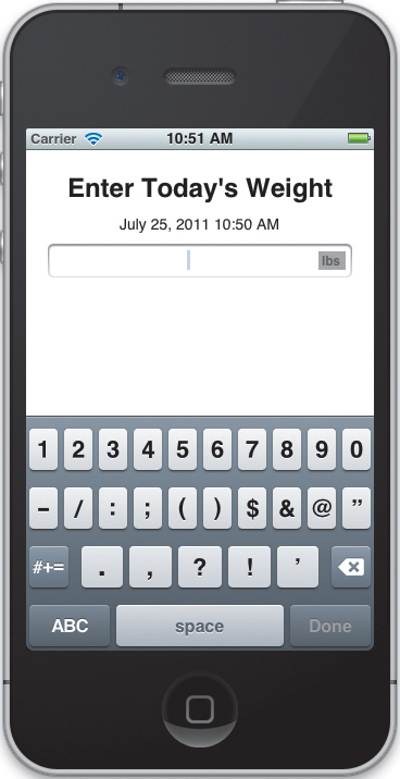
Run the application. The text field should appear with the embedded unit button. Check to make sure the input filtering works correctly. When you press the Done button, the view should switch to the graph view. Nothing shows up yet (of course), but the transition should work. Go back to the enter weight view. The system should automatically clear and select the text field. The keyboard should be visible. Swipe down to dismiss the keyboard. Swipe up to re-enable it. You can even tap the units button, but it won’t do anything yet. We’ll fix that next (Figure 4.14).
Figure 4.14 The completed enter weight view
Changing Weight Units
When the user presses the units button, we need to open a new view and let them change the default units. To do this, we will use a modal view. Modal views are perfect for presenting focused, short-term tasks that the user must either complete or explicitly cancel.
Let’s start by adding another UIViewController subclass. Name it UnitSelectorViewController and place it in the Controllers group (if you need help, follow the step-by-step instructions in “Configuring the Tab Bar” in Chapter 3).
Now open MainStoryboard.storyboard. Drag out a new UIViewController object and place it next to our enter weight view controller scene. Switch to the Identity inspector, and change its Class setting so that it uses our new UnitSelectorViewController class.
Ideally, we want a segue from our changeUnits: action to the unit selector view. Unfortunately, we cannot draw segues from actions directly. Instead, let’s create a segue that we can manually call from our code.
Control-drag from the enter weight view controller icon to our new scene. In the pop-up window, select modal. This creates a generic modal storyboard segue. This sets the segue between the two scenes. Select the segue and switch to the Attributes inspector. Set the Identifier attribute to Unit Selector Segue, and the Transition attribute to Flip Horizontal. Now we just need to trigger this segue from our changeUnits: action.
Switch back to EnterWeightViewController.m. Let’s start by defining a string constant for our segue’s identifier. Add the following line before the @implementation block:
static NSString* const UNIT_SELECTOR_SEGUE = @"Unit Selector Segue";
Now navigate down to the changeUnits: action. We just need to call our controller’s performSegueWithIdentifier:sender: method.
- (IBAction)changeUnits:(id)sender {
[self performSegueWithIdentifier:
UNIT_SELECTOR_SEGUE sender:self];
}
This will trigger our segue. Our enter weight view will flip over and reveal the new unit selector view.
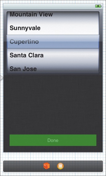
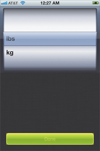
So, let’s design that view. Open the storyboard again, and zoom in on our unit selector scene. Select the view and change its Background attribute to View Flipside Background Color. Next, drag a picker view from the Object library and place it at the top of the view. In the Size inspector, make sure it is locked to the left, right, and top and that it scales horizontally.
Next, drag out a button and place it at the bottom of the view. Stretch it so that it fills the view from margin to margin. Its autosizing settings should lock it to the left, bottom, and right, with horizontal scaling enabled. Finally, set its Title attribute to Done.
We ideally want a colored button. The iOS 5 SDK gives us a number of functions for customizing the appearance of our controls. Unfortunately, this doesn’t include setting a button’s background color. There are a number of ways to work around this. For example, many developers create stretchable background images for their buttons. However, this does not give us very much control at runtime. We could create a UIButton subclass and provide custom drawing code—but that’s a lot of work. Instead, we’ll modify the button’s appearance using Core Animation (while also looking at some of the problems with this approach).
Change the button’s Type attribute to Custom, and set the Background attribute to a dark green. I selected Clover from the crayon box color selector. Click the Background attribute. When the pop-up menu appears, select Other. Make sure the crayon box tab is selected, and then choose the Clover crayon (third from the left on the top row).
Finally, set the Text Color attribute to Light Text Color.
The interface should now match Figure 4.15. Everything looks OK—except for the square corners on our Done button. We’ll fix that shortly. In the meantime, let’s set up our outlets and actions.
Figure 4.15 The unit selector view
First, open UnitSelectorViewController.h. This class needs to adopt both the UIPickerViewDelegate and the UIPickerViewDataSource protocols.
@interface UnitSelectorViewController : UIViewController
<UIPickerViewDelegate, UIPickerViewDataSource> {
}
@end
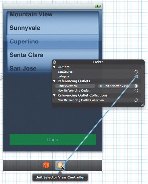
Then switch back to the storyboard file, and open the Assistant editor. Make sure UnitSelectorViewController.h is showing. Control-drag the picker view to the header file, and create a strong outlet named unitPickerView. Next, Control-drag the button twice. First, create a strong outlet named doneButton. Then create an action named done. Make sure its Event is set to Touch Up Inside.
Now we need to link the picker view to its delegate and data source. Right-click the picker view, and then drag from the pop-up window’s delegate outlet to the view controller icon in the scene’s dock (Figure 4.16). Next, drag the pop-up’s dataSource outlet to the view controller as well.
Figure 4.16 Connecting the delegate
Defining the View Delegate
Switch back to the Standard editor and the UnitSelectorViewController.h file. It should now appear as shown here:
#import <UIKit/UIKit.h>
@interface UnitSelectorViewController : UIViewController
<UIPickerViewDelegate, UIPickerViewDataSource>
@property (strong, nonatomic) IBOutlet UIPickerView *unitPickerView;
@property (strong, nonatomic) IBOutlet UIButton *doneButton;
- (IBAction)done:(id)sender;
@end
We still need to make a few additional changes. Start by importing our WeightEntry class, and add a forward declaration for the UnitSelectorViewControllerDelegate protocol before its @interface block.
#import <UIKit/UIKit.h>
#import "WeightEntry.h"
@protocol UnitSelectorViewControllerDelegate;
@interface UnitSelectorViewController :
UIViewController <UIPickerViewDelegate, UIPickerViewDataSource> {
...
Now let’s declare two additional properties: one for our delegate, the other for our default unit.
@property (strong, nonatomic) IBOutlet UIButton *doneButton;
@property (weak, nonatomic) id<UnitSelectorViewControllerDelegate>
delegate;
@property (assign, nonatomic) WeightUnit defaultUnit;
- (IBAction)done:(id)sender;
Finally, we need to define our protocol. Add the following, after the @interface block:
@protocol UnitSelectorViewControllerDelegate <NSObject>
- (void)unitSelectorDone:(UnitSelectorViewController*)controller;
- (void)unitSelector:(UnitSelectorViewController*)controller
changedUnits:(WeightUnit)unit;
@end
That’s it. We’re done with the interface. Now we need to implement these methods.
Implementing the Controller
Open UnitSelectorViewController.m and synthesize the delegate and the defaultUnit.
@synthesize delegate = _delegate;
@synthesize defaultUnit = _defaultUnit;
Now we want to automatically select the current default unit when our view loads. To do this, uncomment viewDidLoad and make the following changes:
#pragma mark - View lifecycle
- (void)viewDidLoad
{
[super viewDidLoad];
// Set the default units.
[self.unitPickerView selectRow:self.defaultUnit
inComponent:0
animated:NO];}
Remember, our WeightUnit enum values are assigned sequentially starting with 0. Our picker view is also zero-indexed, with exactly one row for each WeightUnit value. This means we can use WeightUnits and row indexes interchangeably. Each row index maps to a corresponding WeightUnit. Here, we simply select the row that corresponds with the default unit value.
Next, we need to enable autorotation to any orientation. As before, simply have the shouldAutorotateToInterfaceOrientation: method return YES.
- (BOOL)shouldAutorotateToInterfaceOrientation:
(UIInterfaceOrientation)interfaceOrientation {
return YES;
}
Now let’s implement the done: action. We just call the delegate’s unitSelectorDone: method, as shown here:
- (IBAction)done:(id)sender {
[self.delegate unitSelectorDone:self];
}
OK, we’re almost done with this controller. We still need to implement the UIPickerViewDataSource methods:
#pragma mark - UIPickerViewDataSource Methods
- (NSInteger)numberOfComponentsInPickerView:
(UIPickerView *)pickerView {
return 1;
}
- (NSInteger)pickerView:(UIPickerView *)pickerView
numberOfRowsInComponent:(NSInteger)component {
return 2;
}
The numberOfComponentsInPickerView: method simply returns the number of components that our picker view will use. Each component represents a separate settable field. For example, a date picker has three components: month, day, and year. In our case, we only need a single component.
The pickerView:numberOfRowsInComponent: method returns the number of rows (or possible values) for the given component. We know that our picker view only has a single component, so we don’t need to check the component argument. Since we only have two possible values, pounds and kilograms, we can just return 2.
Now let’s look at the delegate methods:
#pragma mark - UIPickerViewDelegate Methods
- (NSString *)pickerView:(UIPickerView *)pickerView
titleForRow:(NSInteger)row
forComponent:(NSInteger)component {
return [WeightEntry stringForUnit:row];
}
- (void)pickerView:(UIPickerView *)pickerView
didSelectRow:(NSInteger)row
inComponent:(NSInteger)component {
[self.delegate unitSelector:self changedUnits:row];
}
The pickerView:titleForRow:forComponent: method should return the title that will be displayed for the given row and component. In our case, we can map the rows directly to the WeightUnit enum values and simply call stringForUnit: to generate the correct string (@"lbs" or @"kg").
Meanwhile, the pickerView:didSelectRow:inComponent: method is called whenever the user changes the current selection. Here, we simply call the delegate’s unitSelector:changedUnits: method, passing in the row value. Again, our row values correspond directly to the appropriate WeightUnit values.
Passing Data Back and Forth
We still need to pass data into and out of our modal view. Start by opening EntryWeightViewController.h. We need to import UnitSelectorViewController.h and declare that EnterWeightViewController will adopt the UnitSelectorViewControllerDelegate protocol.
#import <UIKit/UIKit.h>
#import "UnitSelectorViewController.h"
@class WeightHistory;
@interface EnterWeightViewController : UIViewController
<UITextFieldDelegate, UnitSelectorViewControllerDelegate> {
Now switch to the implementation file. We trigger the modal segue in our changeUnits: method—but we cannot set the default unit value there. Our destination view controller may not exist yet. Instead, we wait for the prepareForSegue:sender: method—just as we did in Chapter 3.
- (void)prepareForSegue:(UIStoryboardSegue *)segue
sender:(id)sender {
if ([segue.identifier isEqualToString:UNIT_SELECTOR_SEGUE]) {
UnitSelectorViewController* unitSelectorController =
segue.destinationViewController;
unitSelectorController.delegate = self;
unitSelectorController.defaultUnit =
self.weightHistory.defaultUnits;
}
}
Here, we check the segue’s identifier, just to make sure we have the correct segue. Then we grab a reference to our UnitSelectorViewController, and we set both the delegate and the default unit value.
To get data from our modal view, we simply implement the UnitSeletorViewControllerDelegate methods. Let’s start with unitSelector:changedUnits:.
-(void)unitSelector:(UnitSelectorViewController*) sender
changedUnits:(WeightUnit)unit {
self.weightHistory.defaultUnits = unit;
[self.unitsButton setTitle: [WeightEntry stringForUnit:unit]
forState:UIControlStateNormal];}
This method is called whenever the user changes the units in the UnitSelectorViewController. Here, we tell the model to change its default units and then update the title in our unit button. Again, we only update the title for the UIControlStateNormal. All other control states will default back to this setting.
Now let’s look at unitSelectorDone:.
-(void)unitSelectorDone:(UnitSelectorViewController*) sender {
[self dismissModalViewControllerAnimated:YES];
}
This method is called when the user presses the UnitSelectorViewController’s Done button. Note that we could have dismissed the modal view within UnitSelectorViewController’s done: method by calling [self.parentViewController dismissModalViewControllerAnimated:YES]. However, the pattern we’re using here is generally best.
Passing control back to the parent view through a delegate method and then letting the parent view dismiss the modal view may take a bit more code, but it also gives us additional flexibility. For example, our parent controller might want to access the delegate view’s properties before dismissing it. Or we may want to perform some postprocessing after dismissing the modal view. We can easily add these features in our delegate method. Additionally, it just feels cleaner. If a class presents a modal view, then it should also dismiss that view. Splitting the presentation and dismissal code into different classes makes everything just a little harder to follow.
And this isn’t an entirely academic argument. As our code is currently written, we will change our default unit value whenever the user changes the value in the picker view. However, this is not necessarily the best approach. We may want to wait until the user presses the Done button, and then set the default unit value based on their final selection. With the delegate methods in place, we can easily change our implementation based on actual performance testing. More importantly, we can change this behavior in our EnterWeightViewController class; we don’t need to touch our modal view at all.
Note

Most delegate methods will follow the format shown for the UnitSelectorViewControllerDelegate. The method name begins with a description of the delegating class (e.g., tableView, pickerView, unitSelector), and the first argument is a reference back to the delegating class. While you may not use the reference, having it can greatly simplify your delegate methods. For example, for modal view delegates you don’t need to assign your modal view to an instance method—you can access it through the delegating reference instead.
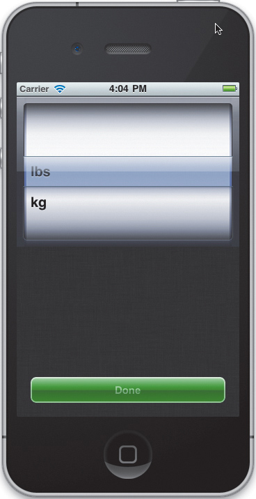
Run the application. You should be able to press the unit button and bring up the unit selector view. Change the units to kilograms and press Done. The button’s title should change from “lbs” to “kg.” There’s only one problem remaining: Our Done button still looks chunky. Let’s fix that.
Rounding Corners with Core Animation
Note
Manipulating views with Core Animation is an advanced topic. While this represents a useful technique for modifying the appearance of controls without having to subclass them, it can get a bit complicated. However, since it doesn’t add any critical features to the application, you can safely skip this section. Your application will still function normally.
Most of the time when you talk about Core Animation, you’re talking about smoothly moving user interface elements around the screen, having them fade in and out, or flipping them over. Here, however, we will hijack some of the more obscure features of Core Animation to round off our button’s corners, add a border, and layer over a glossy sheen.
As you might guess, Core Animation is a deep and complex subject. We will look at techniques for animating view properties in “Managing Pop-Up Views” in Chapter 8. However, even that only scratches the surface. If you want to get all the gory details, I recommend reading the Core Animation Programming Guide in Apple’s documentation.
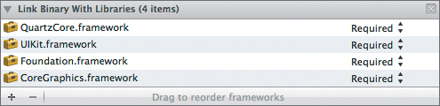
First things first, we need to add the QuartzCore framework to our project. Click the blue Health Beat icon to bring up the project settings. Make sure the Health Beat target is selected, and click the Build Phases tab. Next, expand the Link Binary With Libraries build phase, and click the plus button to add another framework. Scroll through the list and add QuartzCore.framework (Figure 4.17).
Figure 4.17 Adding a new framework
Next, open UnitSelectorViewController.m. We need to import the QuartzCore header.
#import <QuartzCore/QuartzCore.h>
Then navigate to the viewDidLoad method. Modify it as shown:
- (void)viewDidLoad
{
[super viewDidLoad];
// Set the default units.
[self.unitPickerView selectRow:self.defaultUnit
inComponent:0
animated:NO];
//Build our gradient overlays.
CAGradientLayer* topGradient = [[CAGradientLayer alloc] init];
topGradient.name = @"Top Gradient";
// Make it half the height.
CGRect frame = self.doneButton.layer.bounds;
frame.size.height /= 2.0f;
topGradient.frame = frame;
UIColor* topColor = [UIColor colorWithWhite:1.0f alpha:0.75f];
UIColor* bottomColor = [UIColor colorWithWhite:1.0f alpha:0.0f];
topGradient.colors = [NSArray arrayWithObjects:
(__bridge id)topColor.CGColor,
(__bridge id)bottomColor.CGColor, nil];
CAGradientLayer* bottomGradient =
[[CAGradientLayer alloc] init];
bottomGradient.name = @"Bottom Gradient";
// Make it half the size.
frame = self.doneButton.layer.bounds;
frame.size.height /= 2.0f;
// And move it to the bottom.
frame.origin.y = frame.size.height;
bottomGradient.frame = frame;
topColor = [UIColor colorWithWhite:0.0f alpha:0.20f];
bottomColor = [UIColor colorWithWhite:0.0f alpha:0.0f];
bottomGradient.colors = [NSArray arrayWithObjects:
(__bridge id)topColor.CGColor,
(__bridge id)bottomColor.CGColor, nil];
// Round the corners.
[self.doneButton.layer setCornerRadius:8.0f];
// Clip sublayers.
[self.doneButton.layer setMasksToBounds:YES];
// Add a border.
[self.doneButton.layer setBorderWidth:2.0f];
[self.doneButton.layer
setBorderColor:[[UIColor lightTextColor] CGColor]];
// Add the gradient layers.
[self.doneButton.layer addSublayer:topGradient];
[self.doneButton.layer addSublayer:bottomGradient];
}
There’s a lot going on here, so let’s step through it slowly. This code modifies our button’s Core Animation layer. The CALayer is a lightweight object that encapsulates the timing, geometry, and visual properties of a view. In UIKit, a CALayer backs each UIView (and therefore, anything that inherits from UIView). Because of the tight coupling between layers and views, we can easily access and change the visual properties contained in our button’s layer.
We start by creating a CAGradientLayer and giving the layer a name. We will use this name to identify our gradient layer in later methods. Next, we calculate the frame for this layer. We start with the button layer’s bounds, but we divide the height in half. Remember, the frame is the object’s coordinates and size in the containing view or layer’s coordinate system. The bounds represent the object’s coordinates and size in its own coordinate system. In other words, the origin is almost always set to {0.0f, 0.0f} (there are situations where you might use a non-zero origin as an offset, for example when clipping part of an image, but these cases are rare). Using the superlayer’s bounds for the sublayer’s frame means the sublayer will fill the superlayer completely. By dividing the height in half, we end up with a sublayer that will cover just the top half of the main layer.
CAGradientLayers accept an NSArray filled with CGColorRefs. By default, it creates a linear, evenly spaced gradient that transitions from one color to the next. We will just pass in two colors, which will represent the two end points.
Note that an NSArray technically only accepts pointers to Objective-C objects. A CGColorRef is simply a pointer to a CGColor structure—definitely not an Objective-C object. However, we can cast them into id objects to get around the compiler warnings. It’s a bit wacky, but we do what we have to do.
For the curious, this works because NSArray is toll-free bridged with the Foundation CFArray class (under the surface, they are the same objects). While NSArrays are only used to store Objective-C objects, CFArrays can be used to store any arbitrary pointer-sized data. In fact, the CFArrayCreate() method includes parameters that define how the objects are (or are not) retained when placed in the array. When we create an NSArray, we are really creating a CFArray that uses ARC for memory management, which is good. Our CGColors came from an Objective-C method call—so ARC is already managing their memory (see “ARC and Toll-Free Bridging” in Chapter 2 for more information).
As a result, this trick requires considerably less typing than creating a CFArray directly. We do need to use the __bridge annotation to tell ARC that we’re not transferring the references’ ownership, but other than that, memory management works as expected.
In our code, we create two colors. One is white with a 75 percent alpha. The other is completely transparent. We place these into an array and pass the array to the gradient. The CAGradientLayer then makes a smooth, linear transition that slowly fades out as you move down the screen. This adds a highlight to the top of our button.
We do the same thing for the bottomGradient. The only difference is that we increase its origin’s y value to position it on the bottom half of the button. We also use black colors whose alpha values will transition between 20 percent and completely clear. These will slightly darken the bottom half of our control.
Next, we set the corner radius, thus rounding the corners. We then clip our drawing to the area bounded by our rounded corners. This will clip our gradient sublevels as well.
Then we give our button a 2-pixel border, whose color matches the button’s title color. Notice, however, that whereas the button used a UIColor object, the CALayer uses CGColor structures. Again, we can request a CGColor reference from our UIColor object.
Run the application again. Now when you press the unit button, our modal view’s Done button looks all fancy (Figure 4.18).
Figure 4.18 Done button with rounded corners
This works fine in portrait mode, but if you rotate the view, you’ll notice that our gradients don’t stretch to fill the button. The problem is, we cannot automatically resize these layers. Instead, we need to manually resize them whenever the system lays out our views. To do this, implement the view controller’s viewDidLayoutSubviews method.
- (void)viewDidLayoutSubviews {
CALayer* layer = self.doneButton.layer;
CGFloat width = layer.bounds.size.width;
for (CALayer* sublayer in layer.sublayers) {
if ([sublayer.name hasSuffix:@"Gradient"]) {
CGRect frame = sublayer.frame;
frame.size.width = width;
sublayer.frame = frame;
}
}
}
This method is called right after the system lays out all our subviews. Here, we just grab a reference to our doneButton’s layer and the layer’s width. We then iterate over all the sublayers. If the sublayer has a name that ends with “Gradient,” we resize it to match the button’s width. This way our custom layers will be resized, but we won’t alter any of the button’s other layers.
Try it out. Switch back and forth between the enter weight and unit select views. Rotate the interface to all the different orientations. If everything is working, commit all our changes. Next stop, the history view.
Figure 4.19 Highlighting offscreen-rendered views using Instruments
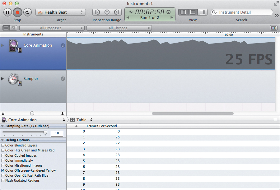
Figure 4.20 All offscreen-rendered views are highlighted in yellow
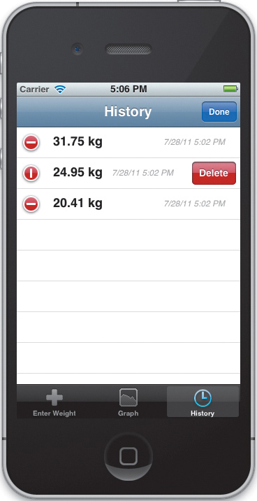
Showing Weight History
Now let’s shift over to our history view. Here, we display a list of all the entries in our WeightHistory. We will use a UITableView to present these entries, showing one entry per row. Let’s start by designing a custom cell for these rows.
Right-click the Views group and select New File > Objective-C Class. Make sure it is a subclass of UITableViewCell, and name it HistoryCell. Now open HistoryCell.h. Modify the header file as shown:
#import <UIKit/UIKit.h>
#import "WeightEntry.h"
@interface HistoryCell : UITableViewCell
@property (nonatomic, strong) IBOutlet UILabel* weightLabel;
@property (nonatomic, strong) IBOutlet UILabel* dateLabel;
- (void)configureWithWeightEntry:(WeightEntry*)entry
defaultUnits:(WeightUnit)unit;
@end
Unlike view controllers, outlets cannot be Control-dragged from the storyboard to a view’s header file. Instead, we need to manually declare them first. We’re also declaring a method to configure our cell—changing the contents of its labels based on the WeightEntry and WeightUnit arguments.
Switch to the implementation file. We’ll start by synthesizing our properties.
@synthesize weightLabel=_weightLabel;
@synthesize dateLabel=_dateLabel;
Then implement configureWithWeightEntry:defaultUnits:.
- (void)configureWithWeightEntry:(WeightEntry*)entry
defaultUnits:(WeightUnit)unit {
self.weightLabel.text = [entry stringForWeightInUnit:unit];
self.dateLabel.text =
[NSDateFormatter
localizedStringFromDate:entry.date
dateStyle:NSDateFormatterShortStyle
timeStyle:NSDateFormatterShortStyle];
}
Here, we use our WeightEntry’s stringForWeighInUnit: method to set the weightLabel outlet with a correctly formatted weight string. Next, we use NSDateFormatter to create a properly localized date string using the short date and short time formats. We then assign this to our dateLabel outlet.
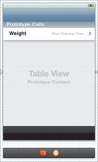
Now, let’s open the storyboard and zoom in on our history view. Select the prototype cell and switch to the Identity inspector. Set the cell’s class to HistoryCell. Then switch back to the Attributes inspector. Make sure the Accessory attribute is set to Disclosure Indicator. This will add a gray chevron on the right side of our cell.
Xcode provides two built-in accessories with very similar functions. Both the Disclosure Indicator and the Detail Disclosure indicate that the application has additional information related to this row. However, there are slight differences, both in the way they operate and in their intended use.
Detail Disclosure creates a round blue button with a white chevron. When the user taps the button, it should navigate to a detail view for the selected item. The Disclosure Indicator, on the other hand, just provides the gray chevron image. Here, the user must select the row itself, and they are then navigated to a sublist (usually containing additional options).
Arguably, Health Beat should use Detail Disclosure accessories—but I feel that having users select the row, not the disclosure button, works better. Besides, our detail view is a list (of sorts), so it’s not wholly inappropriate, and even Apple isn’t 100 percent consistent with their accessories.
Now, drag out two labels. Set the first label’s title to Weight. Make it 100 points wide, and set the font to 18-pt System Bold. Then drag it until it is vertically centered along the cell’s left margin. In the Size inspector, lock its Autosizing position to the top and the left side.
Make the second label right-aligned 12-pt System Italic with a light gray text color. Set its title to Short Date and Time. Then align it with the Weight label, stretched so it fills the area between the Weight label and the Disclosure Indicator accessory. Its Autosizing position should be locked to the top and the right side (Figure 4.21).
Figure 4.21 The finished history cell
Now, right-click the prototype cell and draw the connections from the dateLabel outlet to our Short Date and Time label. Draw a second connection from the weightLabel outlet to our Weight label. With that, our cell prototype is ready, and we just need to finish the HistoryViewController.
Let’s start by importing our HistoryCell class at the top of HistoryViewController.m.
#import "HistoryCell.h"
Now we need to clean up our temporary code. Our history list should only have a single section, so numberOfSectionsInTableView: should still return 1. However, we need a number of rows equal to the number of entries in our weight history. Modify tableView:numberOfRowsInSection: to return this value.
- (NSInteger)numberOfSectionsInTableView:(UITableView *)tableView
{
// We only have a single section.
return 1;
}
- (NSInteger)tableView:(UITableView *)tableView
numberOfRowsInSection:(NSInteger)section
{
// Return the number of entries in our weight history.
return [self.weightHistory.weights count];
}
Next, navigate to the tableView:cellForRowAtIndexPath: method, and modify this method as shown.
- (UITableViewCell *)tableView:(UITableView *)tableView
cellForRowAtIndexPath:(NSIndexPath *)indexPath
{
static NSString *CellIdentifier = @"History Cell";
HistoryCell *cell =
[tableView dequeueReusableCellWithIdentifier:
CellIdentifier];
// Configure the cell...
WeightEntry* entry =
[self.weightHistory.weights objectAtIndex:indexPath.row];
[cell configureWithWeightEntry:entry
defaultUnits:self.weightHistory.defaultUnits];
return cell;
}
It’s important to understand how table view cells work. We want to make our tables as efficient as possible, and there’s no point creating 10,000 separate cells if only ten of them can fit on the screen at a time. Therefore, when a cell scrolls off the screen, we should recycle it, reusing it the next time we need a new cell. Fortunately, UIKit can automatically do this for us.
To support cell reuse, we create a unique identifier for our cells. This is particularly important if you have different cells with different formats or even different classes. Each format needs its own identifier. When we need a new cell, we check to see if we have any available, unused cells by calling dequeueReusableCellWithIdentifier: and passing in our cell identifier.
Before iOS 5, if this method couldn’t find an unused cell, it simply returned nil. We then had to create a new instance ourselves. In the simplest cases, this was not too difficult; however, if our table had a number of different cell types, the code could rapidly grow complex. Fortunately, iOS 5 has automated much of this for us.
As long as we’re using a cell prototype from our storyboard, or a cell from a nib that we’ve registered using registerNib:forCellReuseIdentifier:, the dequeueReusableCellWithIdentifier: method will always returns a valid cell object. It will still reuse an existing cell, if possible; however, if nothing’s available, it will automatically create a new cell for us.
As you can see, this greatly simplifies our tableView:cellForRowAtIndexPath: method. When we modified this method, we deleted more code than we added.
Our code grabs a HistoryCell instance using our HistoryCellIdentifier constant. This, of course, matches the identifier set in our storyboard. Then we get the WeightEntry that corresponds with the current row, and we pass that weight entry and our default units value into the cell’s configureWithWeightEntry:defaultUnits: method. This, in turn, properly sets the text in the cell’s labels.
If you run the application now, you can enter new weight values; however, they may not appear in the history view. This is because our application doesn’t yet update the history view when our model changes. Let’s fix that.
Responding to Changes in the Model
Navigate back to the top of the file, and add the following extension before the @implementation block:
@interface HistoryViewController()
- (void)reloadTableData;
- (void)weightHistoryChanged:(NSDictionary*) change;
@end
This defines two private methods. The first, reloadTableData, will reload the entire table. We will call this whenever the default weight unit changes, since we will need to rewrite all the weight strings in all the cells.
The second method, weightHistoryChanged:, will be called whenever a WeightEntry is added to or removed from our history. In this case, we want to modify only the affected cells (adding or removing individual cells as needed).
Now, navigate to the viewDidLoad method and modify it as shown here:
- (void)viewDidLoad
{
[super viewDidLoad];
// Uncomment the following line to preserve
// selection between presentations.
// self.clearsSelectionOnViewWillAppear = NO;
// Uncomment the following line to display an Edit button
// in the navigation bar for this view controller.
// self.navigationItem.rightBarButtonItem = self.editButtonItem;
// Register to receive KVO messages when the weight history
// changes.
[self.weightHistory addObserver:self
forKeyPath:KVOWeightChangeKey
options:NSKeyValueObservingOptionNew
context:nil];
// Register to receive messages when the default units change.
[[NSNotificationCenter defaultCenter]
addObserver:self
selector:@selector(reloadTableData)
name:WeightHistoryChangedDefaultUnitsNotification
object:self.weightHistory];
}
The addObserver:forKeyPath:options:context: method registers our HistoryViewController as an observer of our weight history. Our controller will receive a notification whenever the list of weight entries changes. Notice that the KVOWeightChangeKey actually points to the private weightHistory property (see “The WeightHistory Class” in Chapter 3). We could observe the public weights property, but unfortunately, because it’s a virtual property we only receive a general notification that the array has changed—we don’t get any additional information about the change. When we observe the weightHistory array directly, we get additional information about the type of change and a list of the actual indexes that changed.
In many ways, using the KVOWeightChangeKey really lets us break the WeightHistory class’s encapsulation. In my opinion, this is not necessarily ideal, but by using a public variable for the key, we are essentially blessing this backdoor access. We are promising that we won’t change the underlying implementation without also changing KVOWeightChangeKey to match.
Realistically, however, we should change the WeightHistory code to manually throw the correct KVO notifications for the weights property and just get rid of the backdoor access. However, I wanted to show how to automatically generate KVO notifications using the keyPathsForValuesAffecting<key> method. This has the fortunate side effect of also highlighting some of the limits of this approach.
The addObserver:selector:name:object: method registers our controller to receive WeightHistoryChangedDefaultUnitsNotification messages from our model (and only from our model). When a matching notification is found, the notification center will call our reloadTableData method directly.
Next, we need to remove our observers when the view unloads. Modify the viewDidUnload method as shown here:
- (void)viewDidUnload
{
[self.weightHistory removeObserver:self
forKeyPath:KVOWeightChangeKey];
[[NSNotificationCenter defaultCenter] removeObserver:self];
[super viewDidUnload];
}
This shows another difference between KVO and notifications. For KVO, we must remove each observer/key pair separately. For notifications, we have a convenience method that removes all notifications for a given observer.
Now we must respond to the notifications. We need to implement the observeValueForKeyPath:ofObject:change:context: method and our two private methods, reloadTableData and weightHistoryChanged:.
#pragma mark - Notification Methods
- (void)observeValueForKeyPath:(NSString *)keyPath
ofObject:(id)object
change:(NSDictionary *)change
context:(void *)context {
if ([keyPath isEqualToString:KVOWeightChangeKey]) {
[self weightHistoryChanged:change];
}
}
All KVO notifications call the observer’s observeValueForKeyPath:ofObject:change:context: method. Here, we simply check to ensure that the notification’s key path matches the KVOWeightChangeKey. If that is the case, we call the weightHistoryChanged: method, passing in the change dictionary. We could process the changes here, but I like to keep the ObserveValueForKeyPath:ofObject:change:context: method as clean and simple as possible, typically using it to dispatch out to other methods. After all, this method will grow increasingly complex if we start adding new KVO notifications.
- (void)weightHistoryChanged:(NSDictionary*) change {
// First extract the kind of change.
NSNumber* value = [change objectForKey:NSKeyValueChangeKindKey];
// Next, get the indexes that changed.
NSIndexSet* indexes =
[change objectForKey:NSKeyValueChangeIndexesKey];
NSMutableArray* indexPaths =
[[NSMutableArray alloc] initWithCapacity:[indexes count]];
// Use a block to process each index.
[indexes enumerateIndexesUsingBlock:
^(NSUInteger indexValue, BOOL* stop) {
NSIndexPath* indexPath =
[NSIndexPath indexPathForRow:indexValue inSection:0];
[indexPaths addObject:indexPath];
}];
// Now update the table.
switch ([value intValue]) {
case NSKeyValueChangeInsertion:
// Insert the row.
[self.tableView insertRowsAtIndexPaths:indexPaths
withRowAnimation:UITableViewRowAnimationAutomatic];
break;
case NSKeyValueChangeRemoval:
// Delete the row.
[self.tableView deleteRowsAtIndexPaths:indexPaths
withRowAnimation:UITableViewRowAnimationAutomatic];
break;
case NSKeyValueChangeSetting:
// Index values changed...just ignore.
break;
default:
[NSException raise:NSInvalidArgumentException
format:@"Change kind value %d not recognized",
[value intValue]];
}
}
The KVO change dictionary becomes particularly useful when we are monitoring collections. It contains information on both the type of change that occurred and the affected indexes. In our weightHistoryChanged method, we start by extracting the type of change. There are four possible types: inserts, removals, replacements, and the somewhat oddly named “setting” changes.
The first two should be obvious. You are adding or deleting one or more elements in the collection. Replacement merely means you are changing the value at a given index in the collection. Setting changes mean you are changing the value of the key path itself. Usually, this occurs when you change the property’s value. For a collection, that means replacing the current collection with an entirely new one.
Next, we extract the set of affected indexes. Notice that the change dictionary returns an NSIndexSet. However, we need an NSArray of NSIndexPaths. We therefore need to convert our indexes.
Here, we’re using a block to iterate over our index set. The enumerateIndexesUsingBlock: method takes each index in the index set and passes it to the provided block. The block should have two arguments: an NSUInteger representing the current index, and a pointer to a BOOL. The pointer is an output-only argument. Setting its value to YES will stop the enumerations, causing enumerateIndexesUsingBlock: to return.
Our block simply takes the index and converts it to an index path. When dealing with UITableViews, the index path contains both the row and the section of a particular entry. Our table has only one section, so we just hard-code the section index to 0. The block then adds the new NSIndexPath to our indexPaths array. Notice how our block can access and modify objects in the same lexical scope. For more information on blocks, see “Blocks” in Chapter 2.
Finally, we update the table. We are primarily concerned with insertions and removals. If either of these occurs, we modify the corresponding rows in the table. We should not get any replacement changes, but we could see an accidental setting change (for example, when the model’s history array is deallocated); however, we can safely ignore these. For anything else, we throw an exception.
As you can see, this method only modifies the table rows that actually changed. Additionally, we animate our changes using UITableViewRowAnimationAutomatic. This tells the system to automatically select an animation style that will look good, based on the type of table view and the cell’s location within the table. In general, you should use automatic animation unless you have an overriding reason to use something else. This helps maintain consistency across applications.
Unfortunately, the new rows are inserted while the table view is offscreen, so the animation will finish before we can navigate to the history view. However, you will get to see the removals once we add editing support.
Our last private method is simply a wrapper around the table view’s reloadData method.
- (void)reloadTableData {
[self.tableView reloadData];
}
This raises the question, why don’t we have the table view observe the WeightHistoryChangedDefaultUnitsNotification and let the notification center call its reloadData method directly? While this would simplify our HistoryViewController class, it creates a subtle bug.
We still need to remove our table view from the observer list before it is deallocated. Unfortunately, our viewDidUnload method occurs after the view has already been released. Worse yet, if we accidentally try to access self.tableView in the viewDidUnload method, we will actually force the view to reload. Since viewDidUnload is only called during memory shortages, grabbing additional memory to rebuild our table view could cause our app to crash. At the very least, it would short-circuit our controller’s attempt to free up some unneeded memory.
Using the view controller as the observer lets us cleanly register and unregister ourselves for notifications, even if we do end up just dispatching the call back to the table.
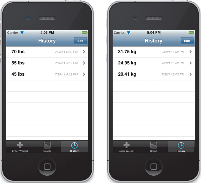
OK, run the application again. Try adding a few dates. You should see them appear in the history list, with the most recent weight at the top. Try switching from pounds to kilograms and back. The history view should update automatically (Figure 4.22).
Figure 4.22 Automatically updating when the default units change
Editing the History View
Now that we can add new weights, we really need a way to remove them. The easiest option is to enable editing in the table view. To do this, we just need to add our controller’s edit button to the navigation bar. The code is already located in viewDidLoad. We just need to uncomment it. While we’re at it, let’s delete the rest of the comments.
- (void)viewDidLoad
{
[super viewDidLoad];
self.navigationItem.rightBarButtonItem = self.editButtonItem;
// Register to receive KVO messages when the weight history
// changes.
[self.weightHistory addObserver:self
forKeyPath:KVOWeightChangeKey
options:NSKeyValueObservingOptionNew
context:nil];
// Register to receive messages when the default units change.
[[NSNotificationCenter defaultCenter]
addObserver:self
selector:@selector(reloadTableData)
name:WeightHistoryChangedDefaultUnitsNotification
object:self.weightHistory];
}
Pressing the edit button puts the table view in editing mode. By default, this displays a Delete icon beside each row. You can modify this behavior using several UITableViewDelegate methods, but for our case, the default behavior is exactly what we want.
Go ahead and run the app now. Enter a few weights, and then put the history view in edit mode. If you press one of the Delete icons, it will bring up a red confirmation button. However, pressing the confirmation button doesn’t do anything (Figure 4.23).
We still need to respond to the edit commands by both removing the row from the table and removing the corresponding WeightEntry from our model. To do this, uncomment and modify the tableView:commitEditingStyle:forRowAtIndexPath: method.
- (void)tableView:(UITableView *)tableView
commitEditingStyle:(UITableViewCellEditingStyle)editingStyle
forRowAtIndexPath:(NSIndexPath *)indexPath {
if (editingStyle == UITableViewCellEditingStyleDelete) {
[self.weightHistory removeWeightAtIndex:indexPath.row];
}
}
Here we just verify that we are deleting an object. Then we remove the selected object from our weightHistory. That’s it. We’ve already built in support for removing table rows when entries are deleted from our model. Our existing notifications will trigger that code automatically. Additionally, we never add new entries from within the table view, so we don’t need to check for inserts here.
And that’s it. Build and run the application. Try adding and deleting weights. If everything works correctly, remember to commit your changes.
There’s a lot more to editing table views, of course. If you really want, you can add the ability to reorder the weights (though I don’t know why we would want that feature for this project). You could also add new weights directly from the table view. You can even allow multiple selections using UITableView’s allowsMultipleSelections and allowsMultipleSelectionsDuringEditing properties. However, I’ll leave those as homework.
Showing Detail Views
There is still one piece left to implement. When the user selects one of the weights, we want to display detailed information about our weight entry. Unfortunately, once you’ve listed the weight and the date, there’s really not much more you can say about a single WeightEntry, so we will fill out our detail view by comparing the selected weight entry with the minimum, maximum, and current monthly average from our WeightHistory.
We will also look at using static tables to organize and display our data. Static tables are a very convenient way to display a fixed set of information. We lose a little bit of flexibility in that we cannot change the number, order, or types of rows in our table. However, we can build our entire interface directly in the storyboard. We don’t even need to implement a data source for our table.
Designing the Static Table View
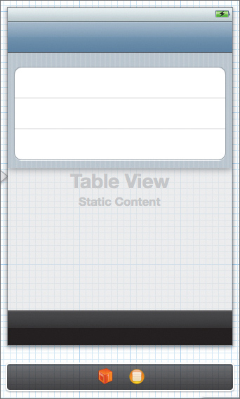
Open the storyboard and zoom in on the detail view scene. First things first, let’s turn it into a static table. Select the table view, then set its Content attribute to Static Cells. We also want to change the Style attribute to Grouped. This should give us a rounded bubble of three blank cells against a striped gray background (Figure 4.24).
Figure 4.24 After converting to a grouped static table
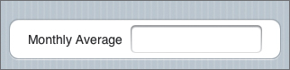
Now select and delete all but one of these cells. Select the remaining cell and change its Selection attribute to None. Then, drag out a label and place it in the row. Set its font size to 16pts, center it vertically, and align it with the left margin. Change its text to Monthly Average, and right-align the text. Finally, make sure the cell’s Autosizing settings are locked to the top and the left side.
Next, drag out a text field and position it so it’s centered vertically. Stretch it so it fills the space between our label and the row’s right margin. Its Autosizing settings should be locked to the left, right, and top, with horizontal scaling enabled. Finally, deselect the text field’s Enabled attribute. This will make the text field readonly. We can use it to display text, but the users won’t be able to edit it (Figure 4.25).
Figure 4.25 Our initial cell design
There’s a nice benefit to creating cells in our storyboard. Once we’ve designed one, we can copy it to create the others. This is a very easy way to create a number of controls, while keeping them all the same size and properly aligned.
Select the Table View section, and then change its Rows attribute to 2. We should now have two identical rows grouped together. While we’re here, change the Header attribute to Weight Entry.
Now select the table view itself. Change the Sections attribute to 2. This gives us two groups of two rows each. Notice that this copies everything, including the header. To modify the bottom section, select it and change its header to Statistics. Change its Rows attribute to 3. Now go through each row and set the label text. Starting at the top, they should be Weight, Date, Monthly Average, Loss from Max, and Gain from Min. When you’re done, the interface should match Figure 4.26.
Figure 4.26 Finished detail view interface
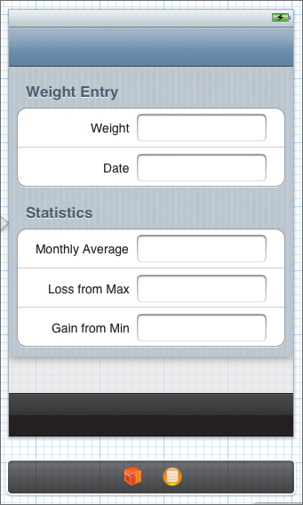
Now let’s create outlets for all our text views. Open the Assistant editor and make sure the DetailViewController.h file is showing. Control-drag from each text field to the header file. Name the outlets weightTextField, dateTextField, averageTextField, lossTextField, and gainTextField, respectively.
Now, switch back to the Standard editor and open DetailViewController.m. First things first, we no longer need a data source. Delete the following methods: numberOfSectionsInTableView:, tableView:numberOfRowsInSection:, and tableView:cellForRowAtIndexPath:.
Finally, we need to fill in our text fields with actual data. We will do this in the viewWillAppear: method. This lets us update the displayed values each time the view appears. However, this method gets a bit long, so let’s examine it in chunks.
- (void)viewWillAppear:(BOOL)animated {
[super viewDidAppear:animated];
WeightUnit unit = self.weightHistory.defaultUnits;
WeightEntry* currentEntry =
[self.weightHistory.weights objectAtIndex:
self.selectedIndex];
CGFloat weight = [currentEntry weightInUnit:unit];
// If the entry is within the same month.
NSDate* startOfMonth;
NSTimeInterval monthLength;
[[NSCalendar currentCalendar] rangeOfUnit:NSMonthCalendarUnit
startDate:&startOfMonth
interval:&monthLength
forDate:currentEntry.date];
First, we get some basic values. We grab the default unit value and the WeightEntry for the currently selected index. Then we extract the weight from our entry for the given unit.
Once we have the basic data, we want to calculate the start and length of the current month. We do that using the NSCalendar rangeOfUnit:startDate:interval:forDate: method. Notice that the startDate and interval are output-only arguments. You select a date and a calendar unit, and the method calculates the start and interval values for you.
CGFloat minWeight = CGFLOAT_MAX;
CGFloat maxWeight = CGFLOAT_MIN;
int monthlyCount = 0;
CGFloat monthlyTotal = 0.0f;
for (WeightEntry* entry in self.weightHistory.weights) {
CGFloat sampleWeight = [entry weightInUnit:unit];
if (sampleWeight < minWeight) minWeight = sampleWeight;
if (sampleWeight > maxWeight) maxWeight = sampleWeight;
// Check to see if it's in the same month.
NSTimeInterval timeFromStartOfMonth =
[entry.date timeIntervalSinceDate:startOfMonth];
if (timeFromStartOfMonth > 0 &&
timeFromStartOfMonth <= monthLength) {
monthlyTotal += sampleWeight;
monthlyCount++;
}
}
CGFloat monthlyAverage = monthlyTotal / (float)monthlyCount;
Next, we iterate over the weight history, looking for the minimum and maximum weight values. We also use the timeIntervalSinceDate: method to calculate the number of seconds between our startOfMonth date and the given WeightEntry’s date. If this is a positive number (meaning the weight entry occurred after the month began) and it is less than our monthLength interval, then it falls within the month in question. We add the weight to our monthly total, and we increment our monthly count.
Once we have iterated over the entire history list, we calculate the monthly average from our total and count.
// Now fill in our values.
self.weightTextField.text =
[WeightEntry stringForWeightInLbs:weight inUnit:unit];
if (weight < monthlyAverage) {
self.weightTextField.textColor = [UIColor colorWithRed:0.0f
green:0.5f
blue:0.0f
alpha:1.0f];
}
if (weight > monthlyAverage) {
self.weightTextField.textColor = [UIColor colorWithRed:0.5f
green:0.0f
blue:0.0f
alpha:1.0f];
}
self.dateTextField.text =
[NSDateFormatter
localizedStringFromDate:currentEntry.date
dateStyle:NSDateFormatterShortStyle
timeStyle:NSDateFormatterShortStyle];
self.averageTextField.text =
[WeightEntry stringForWeightInLbs:monthlyAverage
inUnit:unit];
self.lossTextField.text =
[WeightEntry stringForWeightInLbs:maxWeight -
weight inUnit:unit];
self.gainTextField.text =
[WeightEntry stringForWeightInLbs:weight -
minWeight inUnit:unit];
}
Here we fill in our text fields. Again, we use the stringForWeightInLbs:inUnit: class method to generate properly formatted and localized weight strings. The only catch here is the weightTextField. If the current WeightEntry’s weight is less than the monthly average, we set the text color to dark green. If it is greater than the monthly average, we set it to dark red. Here, we are using custom colors by specifying their RGBA values (Figure 4.27).
Figure 4.27 Filling in the detail view
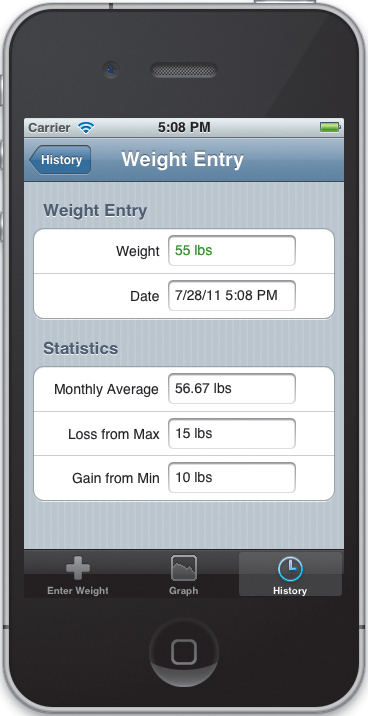
There’s one last step. Modify shouldAutorotateToInterfaceOrientation: so that it returns YES, allowing us to rotate into any orientation.
- (BOOL)shouldAutorotateToInterfaceOrientation:
(UIInterfaceOrientation)interfaceOrientation
{
return YES;
}
Wrapping Up
That’s it. Run the application. Try adding a few weight entries. Move to the history view and then select a few entries from the list. Rotate both the history view and the detail view to make sure they work in all orientations. If everything’s working fine, commit your changes.
That finishes off two of our three views. In the next chapter, we will look at creating a custom view for our GraphViewController. In Chapter 6, we will learn how to save both our application date and our user defaults.