
7. Creating Charts
Charts can help viewers of your presentation better understand quantitative information without overwhelming them with an avalanche of numbers. Using a chart, you can present complex data that can be understood at a glance. Charts illustrate the relationships between different sets of data, and they are also good for showing trends over time.
Keynote provides you with a wide variety of chart types, and you can manipulate those charts in many different ways to get your point across. You should have no problems tailoring your charts to suit your taste and the needs of your presentation.
You can also animate the parts of a chart to have them appear on your slide one at a time. To create these chart builds, see Chapter 8.
In this chapter, you’ll learn about the different chart types; how to use Keynote to create charts; and how to manipulate those charts so that they look the way you want.
About Chart Types
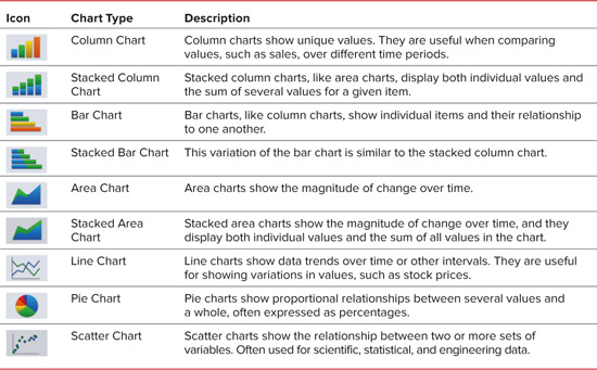
Keynote can create nine different types of charts, as shown in Table 7.1. Each type of chart is useful for displaying particular kinds of data.
It’s not always easy to decide on which kind of chart to use. Sometimes the data that you’re trying to present will practically beg for a particular chart type; for example, when you’re trying to show values as percentages that add up to 100%, a pie chart is almost always the right approach. But in other instances, several chart types might fit your data and do a good job of presenting it. Here are a few tips to help you choose the right chart for the job.
• Evaluate the data that you are trying to present, particularly the aspect of the data that you want to highlight. Data where the totals are more important than the individual values are good candidates for area charts, stacked bar charts, and stacked column charts.
• If you have many data series to present, use a chart type like bar or column, which show many data points well.
• Choose the chart type that produces the simplest chart for your data. If necessary, switch between the different types in Keynote to see the visual effect of each type on the data. Because your viewers don’t have control of how long your slide is on screen, it helps to give them charts they can grasp quickly.
• Pie charts shouldn’t be used to represent data with more than 5 to 8 data series. Each series will appear as a slice of the pie, and too-small pieces will not have good visual impact.
Chart anatomy
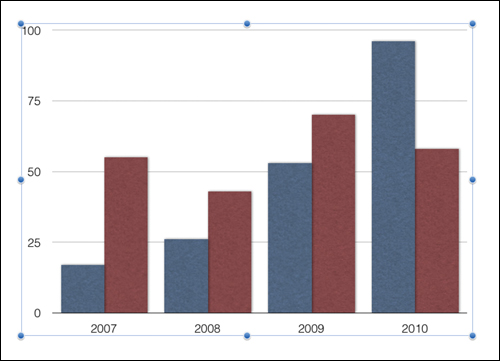
Before you begin creating charts, you’ll need to know a little about the terminology Keynote uses to refer to the different parts of a chart, and the different tools that Keynote gives you to manipulate charts. The column chart shown in ![]() labels the main parts that appear on a slide. When you double-tap a chart, it spins around and Keynote provides the Chart Data Editor, which is a spreadsheet-like view where you enter the information that makes up the chart
labels the main parts that appear on a slide. When you double-tap a chart, it spins around and Keynote provides the Chart Data Editor, which is a spreadsheet-like view where you enter the information that makes up the chart ![]() . As usual, you’ll be able to customize the chart with tools available from the Info button in the toolbar.
. As usual, you’ll be able to customize the chart with tools available from the Info button in the toolbar.
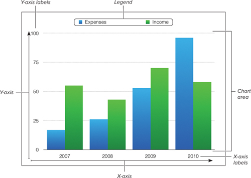
![]() The parts of a column chart.
The parts of a column chart.
![]() The Chart Data Editor resembles a spreadsheet, but it doesn’t do any calculations.
The Chart Data Editor resembles a spreadsheet, but it doesn’t do any calculations.
The data for the chart appear in the chart area, which contains the bars, columns, lines, etc. All chart types (except for pie charts) have two axes, the horizontal X-axis and the vertical Y-axis. One of these will be the value axis, which is where you read the values you are charting. For example, in ![]() , the value axis is the Y-axis. In column charts, area charts, and line charts, the Y-axis is the value axis. For bar charts, the X-axis is the value axis. Pie charts don’t have a value axis.
, the value axis is the Y-axis. In column charts, area charts, and line charts, the Y-axis is the value axis. For bar charts, the X-axis is the value axis. Pie charts don’t have a value axis.
Charts show the relationship between two types of data (for example, financial performance over a time period such as months or years). These two data types are called the data series and data sets. In ![]() , each row in the Chart Data Editor represents a data series, and each column represents a data set. The legend is the label or labels on the chart that explain what the different data series represent.
, each row in the Chart Data Editor represents a data series, and each column represents a data set. The legend is the label or labels on the chart that explain what the different data series represent.
Charting Alternatives
Keynote’s charting abilities are decent, but they are hardly complete. For example, Keynote doesn’t provide 3-D charts, and lacks many chart types found in other charting programs. Keynote also lacks the ability to create combination charts, which contain more than one chart type. If you need more charting power than Keynote can provide, you’ll need to turn to other applications that can create charts.
On the iPad, a good alternative for creating graphs on the fly is the Omni Group’s OmniGraphSketcher. This program lets you easily draw graphs on your iPad ![]() . You can export graphs made in the program to your Photos library to access them in Keynote, or you can simply copy and paste between the two programs.
. You can export graphs made in the program to your Photos library to access them in Keynote, or you can simply copy and paste between the two programs.
![]() It only took a few minutes to sketch out this chart using OmniGraphSketcher.
It only took a few minutes to sketch out this chart using OmniGraphSketcher.
On the Mac, Microsoft Excel has many chart types that Keynote lacks, including 3-D, surface, stock, radar, bubble, and doughnut charts. Excel gives you control over the transparency of chart objects, which allows you to create some nice effects. Because Excel’s charting abilities are coupled with a powerful spreadsheet, you can do all of your calculations in Excel, chart your results, dress up the chart using Excel’s advanced tools, and then save the finished chart as an image that you can move from the Mac into the iPad’s Photo library and then into Keynote.
Adding Charts
You’ll want to add a chart to a slide that has plenty of room for the chart, though you can add a chart to any slide. Of the built-in slide layouts, the one that is most appropriate for charts is Blank, which should be your go-to layout to use for charts that need to be as large as possible. Title & Blank is also a good choice, and the title on this layout is already well-matched to the rest of your presentation.
To add a chart to a slide:
1. Display the slide where you want to add a chart.
2. Tap the Media button in the toolbar and then tap the Charts button ![]() .
.
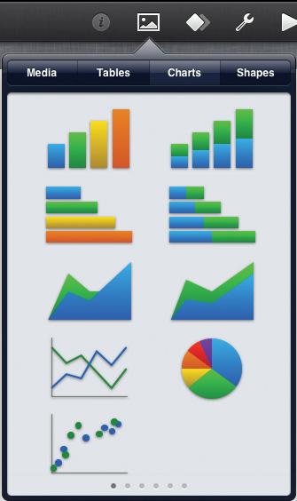
![]() Use the Charts pane of the Media popover to choose one of the nine chart types.
Use the Charts pane of the Media popover to choose one of the nine chart types.
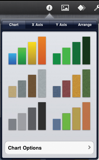
The Charts pane of the Media popover appears. You can swipe right or left to see the nine different types of charts in different color schemes.
3. Tap the chart type that you want.
A chart of the type you selected, using sample data, appears on the slide ![]() .
.
![]() This simple chart appears whenever you add a chart to a slide.
This simple chart appears whenever you add a chart to a slide.
4. Double-tap on the chart to enter data into the Chart Data Editor.
For more information about using the Chart Data Editor, see the next section.
Tip
You can add as many charts as you want to a slide, subject only to how many will fit on the slide, and to your sense of good taste.
Editing Chart Data
When you create a new chart in Keynote, the Chart Data Editor is filled by default with two rows and four columns of sample data. First, you’ll need to change the row and column labels so that they match your data. After that, you can enter your data in the Chart Data Editor’s cells.
Once your data is in place, it can be rearranged by dragging rows or columns around.
To enter your own chart data:
1. Double-tap on the chart with the sample data.
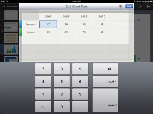
The chart spins around and displays the Chart Data Editor ![]() . You begin in the upper-left cell of the Editor’s data area. Because you’re in a cell that only accepts numeric values, the on-screen numeric keypad appears.
. You begin in the upper-left cell of the Editor’s data area. Because you’re in a cell that only accepts numeric values, the on-screen numeric keypad appears.
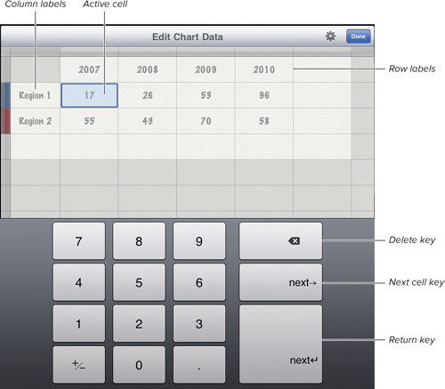
![]() Enter your chart’s data, replacing the sample data in the Chart Data Editor. Because we’re entering numeric data, the on-screen number pad appears.
Enter your chart’s data, replacing the sample data in the Chart Data Editor. Because we’re entering numeric data, the on-screen number pad appears.
2. Double-tap the name of the row or column that you want to change.
Because you’re now in a cell that accepts alphanumeric entries, the on-screen keyboard appears (unless you’re using an external keyboard), and the cell is highlighted.
3. Type the new name.
4. Tap the next label you want to change, and type in the new name. Repeat this for the rest of the row and column labels.
5. Tap the first data cell to highlight it.
The on-screen numeric keypad reappears.
6. Type a value into each of the cells ![]() .
.
![]() When you’re finished entering data, tap the Done button.
When you’re finished entering data, tap the Done button.
7. Tap Done.
The chart spins into view with your new labels and data ![]() .
.
![]() The new chart now reflects the data you entered.
The new chart now reflects the data you entered.
Tip
When you’re using the Apple Wireless Keyboard, the right and left arrow keys work to move around in the Chart Data Editor, but the up and down arrow keys don’t. The Tab key works, as does the Return key. The Tab, Return, and right arrow keys also add rows or columns to the spreadsheet if you get to the end of the current cells.
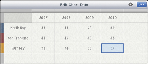
In the Chart Data Editor, touch, hold, and drag the bar adjacent to one of the row or column labels ![]() .
.
![]() You can move rows or columns by dragging the blue bar next to the element you’re moving.
You can move rows or columns by dragging the blue bar next to the element you’re moving.
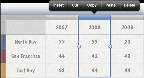
To edit entire rows or columns:
1. In the Chart Data Editor, tap the bar adjacent to one of the row or column labels ![]() .
.
2. Tap Insert, Cut, Copy, Paste, or Delete.
Changing Chart Types
You can change the chart type at any time in Keynote. All you need to do is select the chart and then choose a new type from the Info popover.
To change the chart type:
1. Select a chart on the Slide Canvas.
2. Tap the Info button in the toolbar.
The Chart popover appears ![]() .
.
![]() When you have a chart selected on the slide, tapping the Info button in the toolbar gives you the chart modification tools.
When you have a chart selected on the slide, tapping the Info button in the toolbar gives you the chart modification tools.
3. At the bottom of the popover, tap Chart Options.
The Chart Options pane appears ![]() .
.

![]() One of the things you can do in the Chart Options pane is change the chart type.
One of the things you can do in the Chart Options pane is change the chart type.
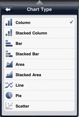
4. Tap Chart Type and then choose the new kind of chart you want in the resulting Chart Type pane ![]() .
.
![]() Pick the new chart type from the list.
Pick the new chart type from the list.
Transposing Chart Plots
Sometimes you need to look at your data in a different way, and Keynote can transpose the way it plots the data series and data sets, to give you a different perspective.
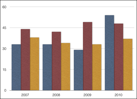
In ![]() , the rows (data series) in the Chart Data Editor show income and expense figures distributed across four months, which are expressed in the columns (data sets). The resulting graph
, the rows (data series) in the Chart Data Editor show income and expense figures distributed across four months, which are expressed in the columns (data sets). The resulting graph ![]() groups each month’s financial results together. If we transpose the data series and data sets, we get a very different view of the same data
groups each month’s financial results together. If we transpose the data series and data sets, we get a very different view of the same data ![]() . In this view, you can see how income and expenses change over the four months. The income figures and the expense figures for all months are grouped together, making it easier to see the trend for each group over time. Keynote changes the legend of the graph to reflect the new ordering of the data, and the labels in the Chart Data Editor also change to match.
. In this view, you can see how income and expenses change over the four months. The income figures and the expense figures for all months are grouped together, making it easier to see the trend for each group over time. Keynote changes the legend of the graph to reflect the new ordering of the data, and the labels in the Chart Data Editor also change to match.
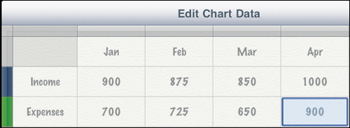
![]() The rows in the Chart Data Editor represent the data series.
The rows in the Chart Data Editor represent the data series.
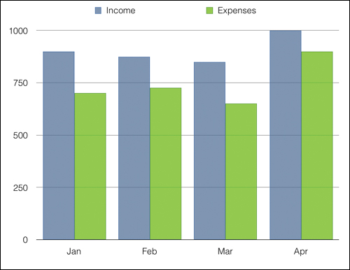
![]() When charted, the data series group the financial data together by month.
When charted, the data series group the financial data together by month.
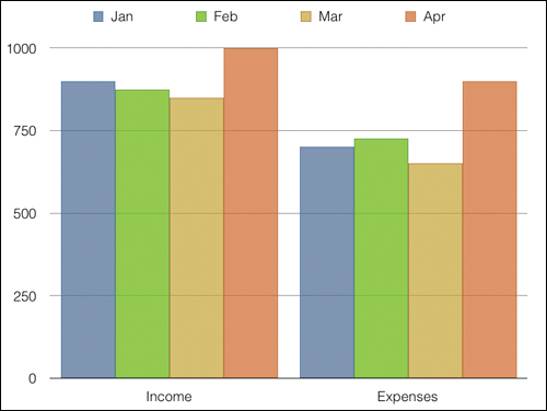
![]() By transposing the data series and data sets, you see all the income and all the expense figures grouped together.
By transposing the data series and data sets, you see all the income and all the expense figures grouped together.
The benefit of being able to transpose data series and data sets is that it allows you to change the presentation of the data in the Chart Data Editor without the need to retype your data.
To transpose data series and data sets:
1. Double-tap a chart on a slide.
The Chart Data Editor appears.
2. Tap the Settings button and then choose the unchecked setting in the resulting popover ![]() .
.
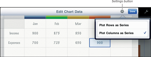
![]() Use the Settings button in the Chart Data Editor to transpose data sets.
Use the Settings button in the Chart Data Editor to transpose data sets.
The chart changes.
Modifying Chart Elements
You can format the different parts of a chart to serve your needs. You can change elements that affect the whole chart, or just elements that affect the X-axis or the Y-axis.
To change chart options:
1. Select a chart on the Slide Canvas.
2. Tap the Info button in the toolbar.
The Chart popover appears.
3. At the bottom of the Chart pane of the popover, tap Chart Options.
The Chart Options pane appears ![]() .
.
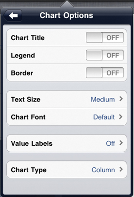
![]() You can customize many aspects of the chart in the Chart Options pane.
You can customize many aspects of the chart in the Chart Options pane.
4. Do one or more of the following ![]() :
:
• Turn on Chart Title, Legend, or Border.
• Change the Text Size. Your choices are Tiny, Small, Medium (shown), Large, and Extra Large.
• Change the Chart Font. You may choose from any of the fonts available on the iPad. The Default choice shown in ![]() denotes the font chosen by the presentation theme designer; there’s not really a font called “Default.”
denotes the font chosen by the presentation theme designer; there’s not really a font called “Default.”
• Turn on Value Labels. These are labels that appear within or outside the graphics in column or bar charts, and show you the numeric value that graphic represents.
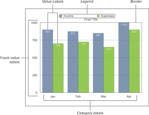
![]() The parts of a column chart that you can change using the Chart Options pane.
The parts of a column chart that you can change using the Chart Options pane.
Tip
Keynote can only use one font and one text size for items that you can change in the chart.
Tip
You can use a Chart Title if the chart needs, well, a title, but I’m not a big fan of it. It must use the same font and size as the rest of the chart. You’ll get more flexibility by using the Title & Blank slide layout, or even a free text box.
To change X-axis elements:
1. Select a chart on the Slide Canvas.
2. Tap the Info button in the toolbar.
The Chart popover appears.
3. Tap the X Axis button ![]() .
.
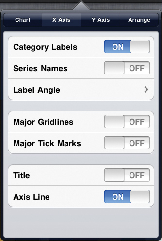
![]() Change X-axis options using this pane.
Change X-axis options using this pane.
4. Do one or more of the following:
• Turn off Category Labels (they are on by default) ![]() .
.
• Turn on Series Names. This is most useful when you have transposed plots (see above). You can then show both the category and series names to make your chart more under-standable, without resorting to chart legends ![]() .
.
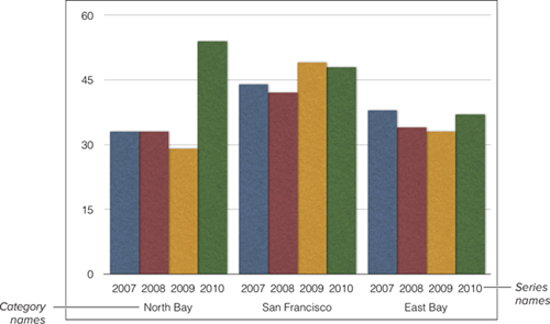
![]() This chart has Series Names turned on.
This chart has Series Names turned on.
• Set the Label Angle. This is set to Horizontal by default, but your other choices are Left Vertical, Left Diagonal, Right Diagonal, and Right Vertical.
• Turn on Major Gridlines or Major Tick Marks.
• Turn on the X Axis Title. This is an additional title that appears below the X-axis. It appears with the placeholder text Category Axis, which you can change.
• Turn off the Axis Line (on by default). This is a line that appears at the bottom of the chart and delineates the X-axis.
Tip
Column and Stacked Column charts usually look better without gridlines in the X-axis, and with gridlines turned on in the Y-axis. The reverse is true for Bar and Stacked Bar charts. Line charts often look good with gridlines turned on for both axes.
1. Select a chart on the Slide Canvas.
2. Tap the Info button in the toolbar.
The Chart popover appears.
3. Tap the Y Axis button ![]() .
.
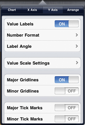
![]() Change Y-axis options using this pane.
Change Y-axis options using this pane.
4. Do one or more of the following (swipe to scroll the pane and show the last two items in this list):
• Turn off Value Labels which are on by default (shown as Y-axis value labels ![]() ).
).
• Tap Number Format to get to the Number Format pane ![]() . In this pane, you can set the decimals in the Y-axis labels, turn on comma or period separators, type a prefix or suffix for the labels, and format how negative numbers are shown.
. In this pane, you can set the decimals in the Y-axis labels, turn on comma or period separators, type a prefix or suffix for the labels, and format how negative numbers are shown.
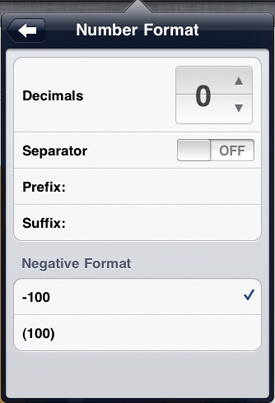
![]() You can change the way numbers in the Y-axis are displayed using this pane.
You can change the way numbers in the Y-axis are displayed using this pane.
• Change the Label Angle. You have the same options as with the X Axis Label Angles.
• Tap to change the Value Scale Settings ![]() .
.
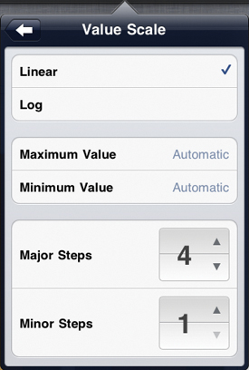
![]() Modify the scales shown for items in the values axis, or Y-axis.
Modify the scales shown for items in the values axis, or Y-axis.
• Set Major Gridlines (on by default), Minor Gridlines, Major Tick Marks, or Minor Tick Marks (all off by default).
• Turn on the Y Axis Title. This is an additional title that appears next to the Y-axis. It appears with the placeholder text Value Axis, which you can change.
• Turn off the Axis Line (on by default). This is a line that appears at the left of the chart and delineates the Y-axis.
Working with Pie Charts
Pie charts work a bit differently than the other charts in Keynote. Because a pie chart doesn’t have an X-axis or Y-axis, Keynote charts only the first data set in the Chart Data Editor. If the data series are in rows in the Chart Data Editor, only the first column will be charted. If the data series are in columns in the Chart Data Editor, only the first row will be charted. A single pie chart represents a single data set, and each wedge in the pie chart represents one element of that set. If there are other data sets in the Chart Data Editor, and you switch the chart type to a pie chart, the excess data sets won’t disappear, but they won’t be used, either.
Because pie charts are different, the Info popover changes to reflect those differences. For example, because a pie chart does not have more than one axis, the only panes that appear are Chart and Arrange.
Keynote allows you to manipulate the individual wedges of a pie chart separately. You can select a wedge and manually drag it away (“explode it”) from the main body of the pie chart for effect.
To explode a pie chart:
1. Select the chart.
2. Touch and hold to select a single wedge and drag to explode it from the rest of the chart ![]() .
.
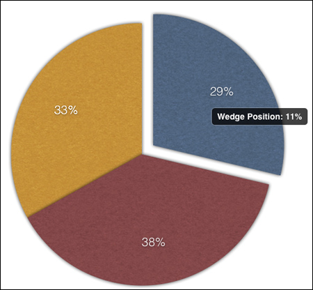
![]() You can explode one or more wedges from a pie chart by dragging the wedges.
You can explode one or more wedges from a pie chart by dragging the wedges.
As you move the wedge, a popover shows how far, in percentage units, you’ve moved the wedge from the rest of the chart.
To set pie chart options:
1. Select the chart.
2. Tap the Info button in the toolbar.
The Chart popover appears ![]() .
.
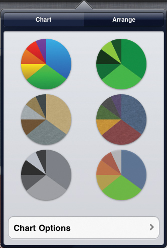
![]() Choose from pie chart color schemes in the Chart pane of the Info popover when you have a pie chart selected.
Choose from pie chart color schemes in the Chart pane of the Info popover when you have a pie chart selected.
4. At the bottom of the Chart pane of the popover, tap Chart Options.
The Chart Options pane appears ![]() .
.
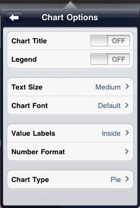
![]() Pie chart options are slightly different than those of other chart types.
Pie chart options are slightly different than those of other chart types.
5. Do one or more of the following:
• Turn on Chart Title or Legend.
• Change the Text Size. Your choices are Tiny, Small, Medium, Large, and Extra Large.
• Change the Chart Font. You may choose from any of the fonts available on the iPad.
• Turn on Value Labels. These are labels that appear inside or outside pie wedges, and show you the numeric value that graphic represents. In the pane you see when you tap Value Labels, you can also turn on Series Name, which displays them with the value labels ![]() .
.
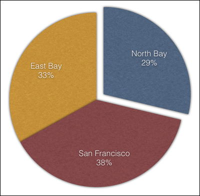
![]() With a pie chart, it’s especially useful to display series names and values together.
With a pie chart, it’s especially useful to display series names and values together.
• Set the way numbers are displayed in the pie with the Number Format option. The options here are similar to those shown in figure ![]() of “Modifying Chart Elements.”
of “Modifying Chart Elements.”