5. Introduction to Cascading Style Sheets™ (CSS): Part 2
Art is when things appear rounded.
—Maurice Denis
In matters of style, swim with the current; in matters of principle, stand like a rock.
—Thomas Jefferson
Everything that we see is a shadow cast by that which we do not see.
—Martin Luther King, Jr.
Objectives
In this chapter you’ll:
• Add text shadows and text-stroke effects.
• Create rounded corners.
• Add shadows to elements.
• Create linear and radial gradients, and reflections.
• Create animations, transitions and transformations.
• Use multiple background images and image borders.
• Create a multicolumn layout.
• Use flexible box model layout and :nth-child selectors.
• Use the @font-face rule to specify fonts for a web page.
• Use RGBA and HSLA colors.
• Use vendor prefixes.
• Use media queries to customize content to fit various screen sizes.
5.6 Linear Gradients; Introducing Vendor Prefixes
5.8 (Optional: WebKit Only) Text Stroke
5.9 Multiple Background Images
5.10 (Optional: WebKit Only) Reflections
5.13 Transitions and Transformations
5.13.1 transition and transform Properties
5.13.3 Transitioning Between Images
5.14 Downloading Web Fonts and the @font-face Rule
5.15 Flexible Box Layout Module and :nth-child Selectors
Summary | Self-Review Exercise | Answers to Self-Review Exercises | Exercises
5.1. Introduction
In the preceding chapter we presented “traditional” CSS capabilities. In this chapter, we introduce many features new to CSS3 (see the Objectives).
These capabilities are being built into the browsers, resulting in faster and more economical web development and better client-side performance. This reduces the need for JavaScript libraries and sophisticated graphics software packages such as Adobe Photoshop, Adobe Illustrator, Corel PaintShop Pro and Gimp to create interesting effects.
CSS3 is still under development. We demonstrate many key CSS3 capabilities that are in the draft standard, as well as a few nonstandard capabilities that may eventually be added.
5.2. Text Shadows
The CSS3 text-shadow property makes it easy to add a text shadow effect to any text (Fig. 5.1). First we add a text-shadow property to our styles (line 12). The property has four values: -4px, 4px, 6px and DimGrey, which represent:
• Horizontal offset of the shadow—the number of pixels that the text-shadow will appear to the left or the right of the text. In this example, the horizontal offset of the shadow is -4px. A negative value moves the text-shadow to the left; a positive value moves it to the right.
• Vertical offset of the shadow—the number of pixels that the text-shadow will be shifted up or down from the text. In this example, the vertical offset of the shadow is 4px. A negative value moves the shadow up, whereas a positive value moves it down.
• blur radius—the blur (in pixels) of the shadow. A blur-radius of 0px would result in a shadow with a sharp edge (no blur). The greater the value, the greater the blurring of the edges. We used a blur radius of 6px.
• color—determines the color of the text-shadow. We used dimgrey.
1 <!DOCTYPE html>
2
3 <!-- Fig. 5.1: textshadow.html -->
4 <!-- Text shadow in CSS3. -->
5 <html>
6 <head>
7 <meta charset = "utf-8">
8 <title>Text Shadow</title>
9 <style type = "text/css">
10 h1
11 {
12 text-shadow: -4px 4px 6px dimgrey; /* add shadow */
13 font-size: 400%; /* increasing the font size */
14 }
15 </style>
16 </head>
17 <body>
18 <h1>Text Shadow</h1>
19 </body>
20 </html>

Fig. 5.1. Text shadow in CSS3.
5.3. Rounded Corners
The border-radius property allows you to add rounded corners to an element (Fig. 5.2). In this example, we create two rectangles with solid Navy borders. For the first rectangle, we set the border-radius to 15px (line 17). This adds slightly rounded corners to the rectangle. For the second rectangle, we increase the border-radius to 50px (line 27), making the left and right sides completely round. Any border-radius value greater than half of the shortest side length produces a completely round end. You can also specify the radius for each corner with border-top-left-radius, border-top-right-radius, border-bottom-left-radius and border-bottom-right-radius.
1 <!DOCTYPE html>
2
3 <!-- Fig. 5.2: roundedcorners.html -->
4 <!-- Using border-radius to add rounded corners to two elements. -->
5 <html>
6 <head>
7 <meta charset = "utf-8">
8 <title>Rounded Corners</title>
9 <style type = "text/css">
10 div
11 {
12 border: 3px solid navy;
13 padding: 5px 20px;
14 background: lightcyan;
15 width: 200px;
16 text-align: center;
17 border-radius: 15px; /* adding rounded corners */
18 margin-bottom: 20px;
19 }
20 #round2
21 {
22 border: 3px solid navy;
23 padding: 5px 20px;
24 background: lightcyan;
25 width: 200px;
26 text-align: center;
27 border-radius: 50px; /* increasing border-radius */
28 }
29 </style>
30 </head>
31 <body>
32 <div>The border-radius property adds rounded corners
33 to an element.</div>
34 <div id = "round2">Increasing the border-radius rounds the corners
35 of the element more.</div>
36 </body>
37 </html>

Fig. 5.2. Using border-radius to add rounded corners to two elements.
5.4. Color
CSS3 allows you to express color in several ways in addition to standard color names (such as Aqua) or hexadecimal RGB values (such as #00FFFF for Aqua). RGB (Red, Green, Blue) or RGBA (Red, Green, Blue, Alpha) gives you greater control over the exact colors in your web pages. The value for each color—red, green and blue—can range from 0 to 255. The alpha value—which represents opacity—can be any value in the range 0.0 (fully transparent) through 1.0 (fully opaque). For example, if you were to set the background color as follows:
background: rgba(255, 0, 0, 0.5);
the resulting color would be a half-opaque red. Using RGBA colors gives you far more options than using only the existing HTML color names—there are over 140 HTML color names, whereas there are 16,777,216 different RGB colors (256 x 256 x 256) and varying opacities of each.
CSS3 also allows you to express color using HSL (hue, saturation, lightness) or HSLA (hue, saturation, lightness, alpha) values. The hue is a color or shade expressed as a value from 0 to 359 representing the degrees on a color wheel (a wheel is 360 degrees). The colors on the wheel progress in the order of the colors of the rainbow—red, orange, yellow, green, blue, indigo and violet. The value for red, which is at the beginning of the wheel, is 0. Green hues have values around 120 and blue hues have values around 240. A hue value of 359, which is just left of 0 on the wheel, would result in a red hue. The saturation—the intensity of the hue—is expressed as a percentage, where 100% is fully saturated (the full color) and 0% is gray. Lightness—the intensity of light or luminance of the hue—is also expressed as a percentage. A lightness of 50% is the actual hue. If you decrease the amount of light to 0%, the color appears completely dark (black). If you increase the amount of light to 100%, the color appears completely light (white). For example, if you wanted to use an hsla value to get the same color red as in our example of an rgba value, you would set the background property as follows:
background: hsla(0, 100%, 50%, 0.5);
The resulting color would be a half-opaque red. An excellent tool that allows you to pick colors from a color wheel to find the corresponding RGB and HSL values is available at:
http://www.workwithcolor.com/hsl-color-schemer-01.htm
5.5. Box Shadows
You can shadow any block-level element in CSS3. Figure 5.3 shows you how to create a box shadow. The div style in lines 10–19 indicates that divs are 200px-by-200px boxes with a Plum-colored background (lines 12–14). Next, we add the box-shadow property with four values (line 15):
• Horizontal offset of the shadow (25px)—the number of pixels that the box-shadow will appear to the left or the right of the box. A positive value moves the box-shadow to the right
• Vertical offset of the shadow (25px)—the number of pixels the box-shadow will be shifted up or down from the box. A positive value moves the box-shadow down.
• Blur radius—A blur-radius of 0px would result in a shadow with a sharp edge (no blur). The greater the value, the more the edges of the shadow are blurred. We used a blur radius of 10px.
• Color—the box-shadow’s color (in this case, dimgrey).
In lines 20–26, we create a style that’s applied only to the second div, which changes the box-shadow’s horizontal offset to -25px and vertical offset to -25px (line 25) to show the effects of using negative values. A negative horizontal offset value moves the box-shadow to the left. A negative vertical offset value moves the shadow up.
1 <!DOCTYPE html>
2
3 <!-- Fig. 5.3: boxshadow.html -->
4 <!-- Creating box-shadow effects. -->
5 <html>
6 <head>
7 <meta charset = "utf-8">
8 <title>Box Shadow</title>
9 <style type = "text/css">
10 div
11 {
12 width: 200px;
13 height: 200px;
14 background-color: plum;
15 box-shadow: 25px 25px 50px dimgrey;
16 float: left;
17 margin-right: 120px;
18 margin-top: 40px;
19 }
20 #box2
21 {
22 width: 200px;
23 height: 200px;
24 background-color: plum;
25 box-shadow: -25px -25px 50px dimgrey;
26 }
27 h2
28 {
29 text-align: center;
30 }
31 </style>
32 </head>
33 <body>
34 <div><h2>Box Shadow Bottom and Right</h2></div>
35 <div id = "box2"><h2>Box Shadow Top and Left</h2></div>
36 </body>
37 </html>

Fig. 5.3. Creating box-shadow effects.
5.6. Linear Gradients; Introducing Vendor Prefixes
Linear gradients are a type of image that gradually transitions from one color to the next horizontally, vertically or diagonally. You can transition between as many colors as you like and specify the points at which to change colors, called color-stops, represented in pixels or percentages along the gradient line—the angle at which the gradient extends. You can use gradients in any property that accepts an image.
Creating Linear Gradients
In Fig. 5.4, we create three linear gradients—vertical, horizontal and diagonal—in separate rectangles. As you study this example, you’ll notice that the background property for each of the three linear gradient styles (vertical, horizontal and diagonal) is defined multiple times in each style—once for WebKit-based browsers, once for Mozilla Firefox and once using the standard CSS3 syntax for linear gradients. This occurs frequently when working with CSS3, because many of its features are not yet finalized. In the meantime, many of the browsers have gone ahead and begun implementing these features so you can use them now. Later in this section, we’ll discuss the vendor prefixes that allow us to use many of CSS3’s evolving features.
1 <!DOCTYPE html>
2
3 <!-- Fig. 5.4: lineargradient.html -->
4 <!-- Linear gradients in CSS3. -->
5 <html>
6 <head>
7 <meta charset = "utf-8">
8 <title>Linear Gradient</title>
9 <style type = "text/css">
10 div
11 {
12 width: 200px;
13 height: 200px;
14 border: 3px solid navy;
15 padding: 5px 20px;
16 text-align: center;
17 background: -webkit-gradient(
18 linear, center top, center bottom,
19 color-stop(15%, white), color-stop(50%, lightsteelblue),
20 color-stop(75%, navy) );
21 background: -moz-linear-gradient(
22 top center, white 15%, lightsteelblue 50%, navy 75% );
23 background: linear-gradient(
24 to bottom, white 15%, lightsteelblue 50%, navy 75% );
25 float: left;
26 margin-right: 15px;
27 }
28 #horizontal
29 {
30 width: 200px;
31 height: 200px;
32 border: 3px solid orange;
33 padding: 5px 20px;
34 text-align: center;
35 background: -webkit-gradient(
36 linear, left top, right top,
37 color-stop(15%, white), color-stop(50%, yellow),
38 color-stop(75%, orange) );
39 background: -moz-linear-gradient(
40 left, white 15%, yellow 50%, orange 75% );
41 background: linear-gradient(
42 90deg, white 15%, yellow 50%, orange 75% );
43 margin-right: 15px;
44 }
45 #angle
46 {
47 width: 200px;
48 height: 200px;
49 border: 3px solid Purple;
50 padding: 5px 20px;
51 text-align: center;
52 background: -webkit-gradient(
53 linear, left top, right bottom,
54 color-stop(15%, white), color-stop(50%, plum),
55 color-stop(75%, purple) );
56 background: -moz-linear-gradient(
57 top left, white 15%, plum 50%, purple 75% );
58 background: linear-gradient(
59 45deg, white 15%, plum 50%, purple 75% );
60 }
61 </style>
62 </head>
63 <body>
64 <div><h2>Vertical Linear Gradient</h2></div>
65 <div id = "horizontal"><h2>Horizontal Linear Gradient</h2></div>
66 <div id = "angle"><h2>Diagonal Linear Gradient</h2></div>
67 </body>
68 </html>
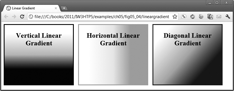
Fig. 5.4. Linear gradients in CSS3.
WebKit Vertical Linear Gradient
The example’s body contains three div elements. The first has a vertical linear gradient from top to bottom. We’re creating a background gradient, so we begin with the background property. The linear gradient syntax for WebKit (lines 17–20) differs slightly from that for Firefox (lines 21–22). For WebKit browsers, we use -webkit-gradient. We then specify the type of gradient (linear) and the direction of the linear gradient, from center top to center bottom (line 18). This creates a gradient that gradually changes colors from the top to the bottom. Next, we specify the color-stops for the linear gradient (lines 19–20). Within each color-stop are two values—the first is the location of the stop (e.g., 15%, which is 15% down from the top of the box) and the second is the color (e.g., white). We transition from White at the top to lightsteelblue in the center to navy at the bottom. You can use as many color-stops as you like.
Mozilla Vertical Linear Gradient
For Mozilla browsers, we use -moz-linear-gradient (line 21). In line 22, we specify the gradient-line (top center), which is the direction of the gradient. After the gradient-line we specify each color and color-stop (line 22).
Standard Vertical Linear Gradient
The standard CSS3 syntax for linear gradients is also slightly different. First, we specify the linear-gradient (line 23). In line 24, we include the values for the gradient. We begin with the direction of the gradient (top), followed by each color and color-stop (line 22).
Horizontal Linear Gradient
In lines 28–44 we create a rectangle with a horizontal (left-to-right) gradient that gradually changes from white to yellow to orange. For WebKit, the direction of the gradient is left top to right top (line 36), followed by the colors and color-stops (lines 37–38). For Mozilla, we specify the gradient-line (left), followed by the colors and color-stops (line 40). The standard CSS3 syntax begins with the direction (left), indicating that the gradient changes from left to right, followed by the colors and color-stops (lines 42–43). The direction can also be specified in degrees, with 0 degrees straight up and positive degrees progressing clockwise. For a left-to-right gradient, you’d specify 90deg. For top-to-bottom, you’d specify 0deg.
Diagonal Linear Gradient
In the third rectangle we create a diagonal linear gradient that gradually changes from white to plum to purple (lines 45–60). For WebKit, the direction of the gradient is left top to right bottom (line 53), followed by the colors and color-stops (lines 54–55). For Mozilla, we specify the gradient-line (top left), followed by the colors and color-stops (line 57). The standard CSS3 syntax begins with the direction (135deg), indicating that the gradient changes at a 45-degree angle, followed by the colors and color-stops (line 59).
Vendor Prefixes
In this example (Fig. 5.4), lines 17–24, 35–42 and 52–59 each define three versions of the background style for defining the linear gradients. The versions in lines 17, 35, and 52 and lines 21, 39 and 56 contain the prefixes -webkit- and -moz-, respectively. These are vendor prefixes (Fig. 5.5) and are used for properties that are still being finalized in the CSS specification but have already been implemented in various browsers.
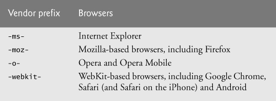
Fig. 5.5. Vendor prefixes.
Prefixes are not available for every browser or for every property. For example, at the time of this writing, linear gradients were implemented only in WebKit-based browsers and Mozilla Firefox. If we remove the prefixed versions of the linear gradient styles in this example, the gradients will not appear when the page is rendered in a WebKit-based browser or Firefox. If you run this program in browsers that don’t support gradients yet, the gradients will not appear. It’s good practice to include the multiple prefixes when they’re available so that your pages render properly in the various browsers. As the CSS3 features are finalized and incorporated fully into the browsers, the prefixes will become unnecessary. For example, we did not use any prefixes for the box-shadow example (Fig. 5.3) because it’s fully implemented in WebKit-based, Firefox, Opera and Internet Explorer browsers. Many of the new CSS3 features have not yet been implemented in Internet Explorer—we expect this to change with IE 10.
When using vendor prefixes in styles, always place them before the nonprefixed version (as in lines 17–22 of Fig. 5.4). The last version of the style that a given browser supports takes precedence and the browser will use it. So, by listing the standard non-prefixed version last, the browser will use the standard version over the prefixed version when the standard version is supported. To save space in the remainder of this chapter, we do not include all vendor prefixes for every example. Some online tools that can help you add the appropriate vendor prefixes to your code are:
http://prefixmycss.com/
http://cssprefixer.appspot.com/
There are also several sites that list the CSS3 and HTML5 features supported in each of the major browsers, including:
http://caniuse.com/
http://findmebyip.com/litmus/
5.7. Radial Gradients
Radial gradients are similar to linear gradients, but the color changes gradually from an inner point (the start) to an outer circle (the end) (Fig. 5.6). In this example, the radial-gradient property (lines 16–18) has three values. The first is the position of the start of the radial gradient—in this case, the center of the rectangle. Other possible values for the position include top, bottom, left and right. The second value is the start color (yellow), and the third is the end color (red). The resulting effect is a box with a yellow center that gradually changes to red in a circle around the starting position. In this case, notice that other than the vendor prefixes, the syntax of the gradient is identical for WebKit browsers, Mozilla and the standard CSS3 radial-gradient.
1 <!DOCTYPE html>
2
3 <!-- Fig. 5.6: radialgradient.html -->
4 <!-- Radial gradients in CSS3. -->
5 <html>
6 <head>
7 <meta charset = "utf-8">
8 <title>Radial Gradient</title>
9 <style type = "text/css">
10 div
11 {
12 width: 200px;
13 height: 200px;
14 padding: 5px;
15 text-align: center;
16 background: -webkit-radial-gradient(center, yellow, red);
17 background: -moz-radial-gradient(center, yellow, red);
18 background: radial-gradient(center, yellow, red);
19 }
20 </style>
21 </head>
22 <body>
23 <div><h2>Radial Gradient</h2></div>
24 </body>
25 </html>
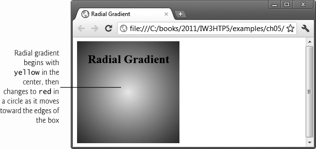
Fig. 5.6. Radial gradients in CSS3.
5.8. (Optional: WebKit Only) Text Stroke
The -webkit-text-stroke property is a nonstandard property for WebKit-based browsers that allows you to add an outline (text stroke) around text. Four of the seven browsers we use in this book are WebKit based—Safari and Chrome on the desktop and the mobile browsers in iOS and Android. Currently, the CSS3 specification is evolving and this property is not likely to appear as part of the standard in the short term. However, WebKit tends to be leading edge, so it’s possible that this feature could be added later.
Line 12 in Fig. 5.7 sets the color of the h1 text to LightCyan. We add a -webkit-text-stroke with two values (line 13)—the outline thickness (2px) and the color of the text stroke (black). We used the font-size 500% here so you could see the outline better. This nonstandard effect can be implemented for a one pixel stroke—with a bit more effort—using pure CSS3 as shown at http://css-tricks.com/7405-adding-stroke-to-web-text/.
1 <!DOCTYPE html>
2
3 <!-- Fig. 5.7: textstroke.html -->
4 <!-- Text stroke in CSS3. -->
5 <html>
6 <head>
7 <meta charset = "utf-8">
8 <title>Text Stroke</title>
9 <style type = "text/css">
10 h1
11 {
12 color: lightcyan;
13 -webkit-text-stroke: 2px black; /* vendor prefix */
14 font-size: 500%; /* increasing the font size */
15 }
16 </style>
17 </head>
18 <body>
19 <h1>Text Stroke</h1>
20 </body>
21 </html>
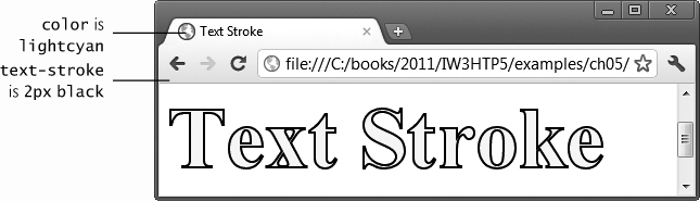
Fig. 5.7. A text-stroke rendered in Chrome.
5.9. Multiple Background Images
CSS3 allows you to add multiple background images to an element (Fig. 5.8). The style at lines 10–16 begins by adding two background-images—logo.png and ocean.png (line 12). Next, we specify each image’s placement using property background-position (line 13). The comma-separated list of values matches the order of the comma-separated list of images in the background-image property. The first value—bottom right—places the first image, logo.png, in the bottom-right corner of the background in the border-box. The last value—100% center—centers the entire second image, ocean.png, in the content-box so that it appears behind the content and stretches to fill the content-box. The background-origin (line 14) determines where each image is placed using the box model we discussed in Fig. 4.13. The first image (logo.png) is in the outermost border-box, and the second image (ocean.png) is in the innermost content-box.
1 <!DOCTYPE html>
2
3 <!-- Fig. 5.8: multiplebackgrounds.html -->
4 <!-- Multiple background images in CSS3. -->
5 <html>
6 <head>
7 <meta charset = "utf-8">
8 <title>Multiple Backgrounds</title>
9 <style type = "text/css">
10 div.background
11 {
12 background-image: url(logo.png), url(ocean.png);
13 background-position: bottom right, 100% center;
14 background-origin: border-box, content-box;
15 background-repeat: no-repeat, repeat;
16 }
17 div.content
18 {
19 padding: 10px 15px;
20 color: white;
21 font-size: 150%;
22 }
23 </style>
24 </head>
25 <body>
26 <div class = "background">
27 <div class = "content">
28 <p>Deitel & Associates, Inc., is an internationally recognized
29 authoring and corporate training organization. The company
30 offers instructor-led courses delivered at client sites
31 worldwide on programming languages and other software topics
32 such as C++, Visual C++<sup>®</sup>, C, Java™,
33 C#<sup>®</sup>, Visual Basic<sup>®</sup>,
34 Objective-C<sup>®</sup>, XML<sup>®</sup>,
35 Python<sup>®</sup>, JavaScript, object technology,
36 Internet and web programming, and Android and iPhone app
37 development.</p>
38 </div></div>
39 </body>
40 </html>

Fig. 5.8. Multiple background images in CSS3.
5.10. (Optional: WebKit Only) Reflections
Figure 5.9 shows how to add a simple reflection of an image using the -webkit-box-reflect property (lines 13–17 and 20–23). Like -webkit-text-stroke, this is a nonstandard property that’s available only in WebKit-based browsers for now, but it’s an elegant effect that we wanted to show.
The -webkit-box-reflect property’s first value is the direction of the reflection—in this case, below (line 13) or right (line 20). The direction value may be above, below, left, or right. The second value is the offset, which determines the space between the image and its reflection. In this example, the offset is 5px, so there’s a small space between the image and its reflection. Optionally, you can specify a gradient to apply to the reflection. The gradient in lines 14–16 causes the bottom reflection to fade away from top to bottom. The gradient in lines 21–23 causes the right reflection to fade away from left to right. The reflection effects shown here can be accomplished using pure CSS3—with a lot more code. For one example of this, see http://www.xhtml-lab.com/css/create-reflection-effect-using-css3.
1 <!DOCTYPE html>
2
3 <!-- Fig. 5.9: reflection.html -->
4 <!-- Reflections in CSS3. -->
5 <html>
6 <head>
7 <meta charset = "utf-8">
8 <title>Reflection</title>
9 <style type = "text/css">
10 img { margin: 10px; }
11 img.below
12 {
13 -webkit-box-reflect: below 5px
14 -webkit-gradient(
15 linear, left top, left bottom,
16 from(transparent), to(white));
17 }
18 img.right
19 {
20 -webkit-box-reflect: right 5px
21 -webkit-gradient(
22 linear, right top, left top,
23 from(transparent), to(white));
24 }
25 </style>
26 </head>
27 <body>
28 <img class = "below" src = "jhtp.png" width = "138" height = "180"
29 alt = "Java How to Program book cover">
30 <img class = "right" src = "jhtp.png" width = "138" height = "180"
31 alt = "Java How to Program book cover">
32 </body>
33 </html>

Fig. 5.9. Reflections in CSS3.
5.11. Image Borders
The CSS3 border-image property uses images to place a border around any block-level element (Fig. 5.10). In line 12, we set a div’s border-width to 30px, which is the thickness of the border we’re placing around the element. Next, we specify a width of 234px, which is the width of the entire rectangular border (line 13).
Stretching an Image Border
In this example, we create two image border styles. In the first (lines 16–22), we stretch (and thus distort) the sides of the image to fit around the element while leaving the corners of the border image unchanged (not stretched). The border-image property has six values (lines 18–21):
• border-image-source—the URL of the image to use in the border (in this case, url(border.png)).
1 <!DOCTYPE html>
2
3 <!-- Fig. 5.10: imageborder.html -->
4 <!-- Stretching and repeating an image to create a border. -->
5 <html>
6 <head>
7 <meta charset = "utf-8">
8 <title>Image Border</title>
9 <style type = "text/css">
10 div
11 {
12 border-width: 30px;
13 width: 234px;
14 padding: 20px 20px;
15 }
16 #stretch
17 {
18 -webkit-border-image: url(border.png) 80 80 80 80 stretch;
19 -moz-border-image: url(border.png) 80 80 80 80 stretch;
20 -o-border-image: url(border.png) 80 80 80 80 stretch;
21 border-image: url(border.png) 80 80 80 80 stretch;
22 }
23 #repeat
24 {
25 -webkit-border-image:url(border.png) 34% 34% repeat;
26 -moz-border-image:url(border.png) 34% 34% repeat;
27 -o-border-image:url(border.png) 34% 34% repeat;
28 border-image:url(border.png) 34% 34% repeat;
29 }
30 </style>
31 </head>
32 <body>
33 <h2>Image Borders</h2>
34 <img src = "border.png" alt = "image used to demonstrate borders">
35 <p><div id="stretch">Stretching the image border</div></p>
36 <p><div id="repeat">Repeating the image border</div></p>
37 </body>
38 </html>
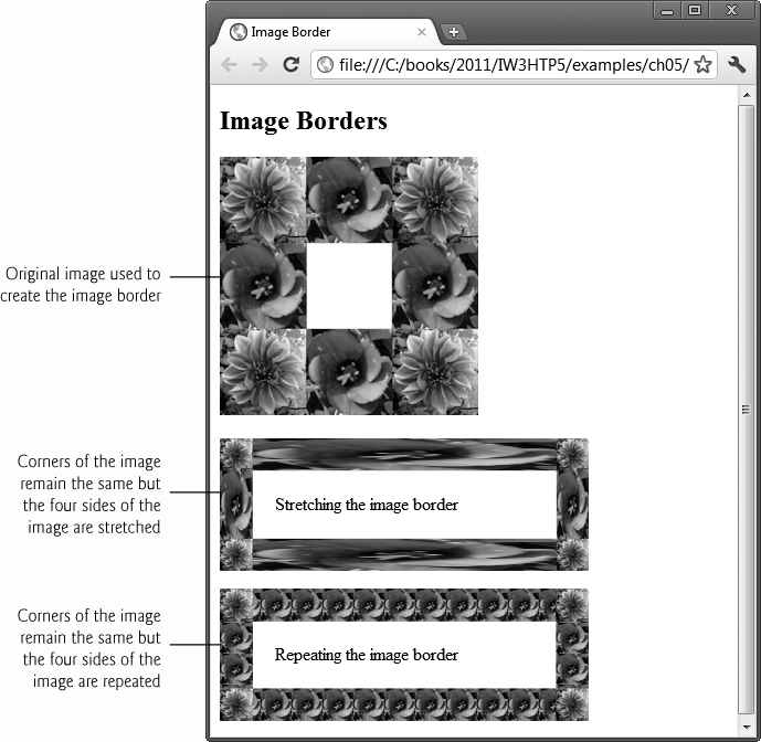
Fig. 5.10. Stretching and repeating an image to create a border.
• border-image-slice—expressed with four space-separated values in pixels (in this case, 80 80 80 80). These values are the inward offsets from the top, right, bottom and left sides of the image. Since our original image is square, we used the same value for each. The border-image-slice divides the image into nine regions: four corners, four sides and a middle, which is transparent unless otherwise specified. These regions may overlap. If you use values that are larger than the actual image size, the border-image-slice values will be interpreted as 100%. You may not use negative values. We could express the border-image-slice in two values—80 80—in which case the first value would represent the top and bottom, and the second value the left and right. The border-image-slice may also be expressed in percentages, which we demonstrate in the second part of this example.
• border-image-repeat—specifies how the regions of the border image are scaled and tiled (repeated). By indicating stretch just once, we create a border that will stretch the top, right, bottom and left regions to fit the area. You may specify two values for the border-image-repeat property. For example, if we specified stretch repeat, the top and bottom regions of the image border would be stretched, and the right and left regions of the border would be repeated (i.e., tiled) to fit the area. Other possible values for the border-image-repeat property include round and space. If you specify round, the regions are repeated using only whole tiles, and the border image is scaled to fit the area. If you specify space, the regions are repeated to fill the area using only whole tiles, and any excess space is distributed evenly around the tiles.
Repeating an Image Border
In lines 23–29 we create an image border by repeating the regions to fit the space. The border-image property includes four values:
• border-image-source—the URL of the image to use in the border (once again, url(border.png)).
• border-image-slice—in this case, we provided two values expressed in percentages (34% 34%) for the top/bottom and left/right, respectively.
• border-image-repeat—the value repeat specifies that the tiles are repeated to fit the area, using partial tiles to fill the excess space.
For additional information about the border-image property, see
http://www.w3.org/TR/2002/WD-css3-border-20021107/
#the-border-image-uri
5.12. Animation; Selectors
In Fig. 5.11, we create a simple animation of an image that moves in a diamond pattern as it changes opacity.
1 <!DOCTYPE html>
2
3 <!-- Fig. 5.11: animation.html -->
4 <!-- Animation in CSS3. -->
5 <html>
6 <head>
7 <meta charset = "utf-8">
8 <title>Animation</title>
9 <style type = "text/css">
10 img
11 {
12 position: relative;
13 -webkit-animation: movingImage linear 10s 1s 2 alternate;
14 -moz-animation: movingImage linear 10s 1s 2 alternate;
15 animation: movingImage linear 10s 2 1s alternate;
16 }
17 @-webkit-keyframes movingImage
18 {
19 0% {opacity: 0; left: 50px; top: 0px;}
20 25% {opacity: 1; left: 0px; top:5 0px;}
21 50% {opacity: 0; left: 50px; top: 100px;}
22 75% {opacity: 1; left: 100px; top: 50px;}
23 100% {opacity: 0; left: 50px; top: 0px;}
24 }
25 @-moz-keyframes movingImage
26 {
27 0% {opacity: 0; left: 50px; top: 0px;}
28 25% {opacity: 1; left: 0px; top:5 0px;}
29 50% {opacity: 0; left: 50px; top: 100px;}
30 75% {opacity: 1; left: 100px; top: 50px;}
31 100% {opacity: 0; left: 50px; top: 0px;}
32 }
33 @keyframes movingImage
34 {
35 0% {opacity: 0; left: 50px; top: 0px;}
36 25% {opacity: 1; left: 0px; top: 50px;}
37 50% {opacity: 0; left: 50px; top: 100px;}
38 75% {opacity: 1; left: 100px; top: 50px;}
39 100% {opacity: 0; left: 50px; top: 0px;}
40 }
41 </style>
42 </head>
43 <body>
44 <img src = "jhtp.png" width = "138" height = "180"
45 alt = "Java How to Program book cover">
46 <div></div>
47 </body>
48 </html>

Fig. 5.11. Animation in CSS3. The dotted lines show the diamond path that the image takes,
animation Property
The animation property (lines 13–15) allows you to represent several animation properties in a shorthand notation, rather than specifying each separately, as in:
animation-name: movingImage;
animation-timing-function: linear;
animation-duration: 10s;
animation-delay: 1s;
animation-iteration-count: 2;
animation-direction: alternate;
In the shorthand notation, the values are listed in the following order:
• animation-name—represents the name of the animation (movingImage). This name associates the animation with the keyframes that define various properties of the element being animated at different stages of the animation. We’ll discuss keyframes shortly.
• animation-timing-function (lines 13–15)—determines how the animation progresses in one cycle of its duration. Possible values include linear, ease, ease-in, ease-out, ease-in-out, cubic-bezier. The value linear, which we use in this example, specifies that the animation will move at the same speed from start to finish. The default value, ease, starts slowly, increases speed, then ends slowly. The ease-in value starts slowly, then speeds up, whereas the ease-out value starts faster, then slows down. The ease-in-out starts and ends slowly. Finally, the cubic-bezier value allows you to customize the timing function with four values between 0 and 1, such as cubic-bezier(1,0,0,1).
• animation-duration—specifies the time in seconds (s) or milliseconds (ms) that the animation takes to complete one iteration (10s in this case). The default duration is 0.
• animation-delay—specifies the number of seconds (1s in this case) or milliseconds after the page loads before the animation begins. The default value is 0. If the animation-delay is negative, such as -3s, the animation will begin three seconds into its cycle.
• animation-iteration-count—specifies the number of times the animation will run. The default is 1. You may use the value infinite to repeat the animation continuously.
• animation-direction—specifies the direction in which the animation will run. The value alternate used here specifies that the animation will run in alternating directions—in this case, counterclockwise (as we define with our keyframes), then clockwise. The default value, normal, would run the animation in the same direction for each cycle.
The shorthand animation property cannot be used with the animation-play-state property—it must be specified separately. If you do not include the animation-play-state, which specifies whether the animation is paused or running, it defaults to running.
@keyframes Rule and Selectors
For the element being animated, the @keyframes rule (lines 17, 25 and 33) defines the element’s properties that will change during the animation, the values to which those properties will change, and when they’ll change. The @keyframes rule is followed by the name of the animation (movingImage) to which the keyframes are applied. CSS rules consist of one or more selectors followed by a declaration block in curly braces ({}). Selectors enable you to apply styles to elements of a particular type or attribute. A declaration block consists of one or more declarations, each of which includes the property name followed by a colon (:), a value and a semicolon (;). You may include multiple declarations in a declaration block. For example, consider line 19:
0% {opacity: 0; left: 50px; top 0px;}
The selector, 0%, is followed by a declaration block with three declarations—opacity, left and right.
In this example, the @keyframes rule includes five selectors to represent the points-in-time for our animation. Recall that our animation will take 10 seconds (10s in lines 13–15) to complete. In that context, 0% indicates the beginning of a single animation cycle, 25% represents 2.5 seconds into the animation, 50% represents 5 seconds into the animation, 75% represents 7.5 seconds into the animation and 100% represents the end of a single animation cycle. You can break down the animation into as many points as you like. At each point, we specify the opacity of the image and the image position in pixels from the left and from the top. We begin and end the animation at the same point—left: 50px; top: 0px;—creating a diamond pattern along which the image moves.
5.13. Transitions and Transformations
With CSS3 transitions, you can change an element’s style over a specified duration—for example, you can vary an element’s opacity from opaque to transparent over a duration of one second. CSS3 transformations allow you to move, rotate, scale and skew elements. And you can make transitions and transformations occur simultaneously, doing things like having objects grow and change their color at once. Note that transitions are similar in concept to the animations (Section 5.12), but transitions allow you to specify only the starting and ending values of the CSS properties being changed. An animation’s keyframes enable you to control intermediate states throughout the animation’s duration.
5.13.1. transition and transform Properties
Figure 5.12 uses the transition and transform properties to scale and rotate an image 360 degrees when the cursor hovers over it. We begin by defining the transition (line 16). For each property that will change, the transition property specifies the duration of that change. In this case, we indicate that a transform (discussed shortly) will take four seconds, but we could specify a comma-separated list of property names that will change and the individual durations over which each property will change. For example:
transition: transform 4s, opacity 2s;
indicates that a transform takes four seconds to apply and the opacity changes over two seconds—thus, the transform will continue for another two seconds after the opacity change completes. In this example, we define the transform only when the user hovers the mouse over the image.
1 <!DOCTYPE html>
2
3 <!-- Fig. 5.12: transitions.html -->
4 <!-- Transitions in CSS3. -->
5 <html>
6 <head>
7 <meta charset = "utf-8">
8 <title>Transitions</title>
9 <style type = "text/css">
10 img
11 {
12 margin: 80px;
13 -webkit-transition: -webkit-transform 4s;
14 -moz-transition: -moz-transform 4s;
15 -o-transition: -o-transform 4s;
16 transition: transform 4s;
17 }
18 img:hover
19 {
20 -webkit-transform: rotate(360deg) scale(2, 2);
21 -moz-transform: rotate(360deg) scale(2, 2);
22 -o-transform: rotate(360deg) scale(2, 2);
23 transform: rotate(360deg) scale(2, 2);
24 }
25 </style>
26 </head>
27 <body>
28 <img src = "cpphtp.png" width = "76" height = "100"
29 alt = "C++ How to Program book cover">
30 </body>
31 </html>
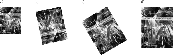
Fig. 5.12. Transitioning an image over a four-second duration and applying rotate and scale transforms.
The :hover pseudo-class (lines 18–24) formerly worked only for anchor elements but now works with any element. In this example, we use :hover to begin the rotation and scaling of the image. The transform property (line 23) specifies that the image will rotate 360deg and will scale to twice its original width and height when the mouse hovers over the image. The transform property uses transformation functions, such as rotate and scale, to perform the transformations. The rotate transformation function receives the number of degrees. Negative values cause the element to rotate left. A value of 720deg would cause the element to rotate clockwise twice. The scale transformation function specifies how to scale the width and height. The value 1 represents the original width or original height, so values greater than 1 increase the size and values less than 1 decrease the size. A complete list of CSS3 transformation functions can be found at:
www.w3.org/TR/css3-2d-transforms/#transform-functions
5.13.2. Skew
CSS3 transformations also allow you to skew block-level elements, slanting them at an angle either horizontally (skewX) or vertically (skewY). In the following example, we use the animation and transform properties to skew an element (a rectangle and text) horizontally by 45 degrees (Fig. 5.13). First we create a rectangle with a LightGreen background, a solid DarkGreen border and rounded corners. The animation property (lines 21–23) specifies that the element will skew in a three-second (3s) interval for an infinite duration. The fourth value, linear, is the animation-timing-function.
1 <!DOCTYPE html>
2
3 <!-- Fig. 5.13: skew.html -->
4 <!-- Skewing and transforming elements in CSS3. -->
5 <html>
6 <head>
7 <meta charset = "utf-8">
8 <title>Skew</title>
9 <style type = "text/css">
10 .skew .textbox
11 {
12 margin-left: 75px;
13 background: lightgreen;
14 height: 100px;
15 width: 200px;
16 padding: 25px 0;
17 text-align: center;
18 font-size: 250%;
19 border: 3px solid DarkGreen;
20 border-radius: 15px;
21 -webkit-animation: skew 3s infinite linear;
22 -moz-animation: skew 3s infinite linear;
23 animation: skew 3s infinite linear;
24 }
25 @-webkit-keyframes skew
26 {
27 from { -webkit-transform: skewX(0deg); }
28 25% { -webkit-transform: skewX(45deg); }
29 50% { -webkit-transform: skewX(0); }
30 75% { -webkit-transform: skewX(-45deg); }
31 to { -webkit-transform: skewX(0); }
32 }
33 @-moz-keyframes skew
34 {
35 from { -webkit-transform: skewX(0deg); }
36 25% { -webkit-transform: skewX(45deg); }
37 50% { -webkit-transform: skewX(0); }
38 75% { -webkit-transform: skewX(-45deg); }
39 to { -webkit-transform: skewX(0); }
40 }
41 @-keyframes skew
42 {
43 from { -webkit-transform: skewX(0deg); }
44 25% { -webkit-transform: skewX(45deg); }
45 50% { -webkit-transform: skewX(0); }
46 75% { -webkit-transform: skewX(-45deg); }
47 to { -webkit-transform: skewX(0); }
48 }
49 </style>
50 </head>
51 <body>
52 <div class = "box skew">
53 <div class = "textbox">Skewing Text</div>
54 </div>
55 </body>
56 </html>
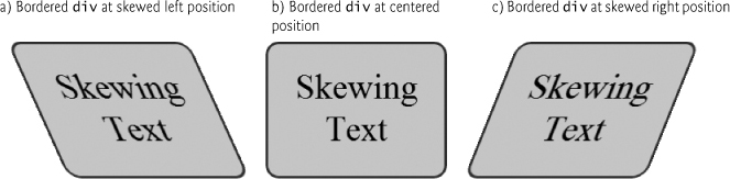
Fig. 5.13. Skewing and transforming elements in CSS3.
Next, we use the @keyframes rule and selectors to specify the angle of the skew transformation at different intervals (lines 25–48). When the page is rendered, the element is not skewed (0deg; lines 27, 35 and 43). The transformation then skews the element 45 degrees (45deg) to the right (lines 28, 36 and 44), back to 0deg (lines 29, 37 and 45) and then left by 45deg (lines 30, 38 and 46) and back to 0deg (lines 31, 39 and 47).
5.13.3. Transitioning Between Images
We can also use the transition property to create the visually beautiful effect of melting one image into another (Fig. 5.14). The transition property includes three values. First, we specify that the transition will occur on the opacity of the image. The second value, 4s, is the transition-duration. The third value, ease-in-out, is the transition-timing-function. Next, we define :hover with an opacity of 0, so when the cursor hovers over the top image, its opacity becomes fully transparent, revealing the bottom image directly behind it (lines 22–23). In lines 28–29 we add the bottom and top images, placing one directly behind the other.
1 <!DOCTYPE html>
2
3 <!-- Fig. 5.14: meltingimages.html -->
4 <!-- Melting one image into another using CSS3. -->
5 <html>
6 <head>
7 <meta charset = "utf-8">
8 <title>Melting Images</title>
9 <style type = "text/css">
10 #cover
11 {
12 position: relative;
13 margin: 0 auto;
14 }
15 #cover img
16 {
17 position: absolute;
18 left: 0;
19 -webkit-transition: opacity 4s ease-in-out;
20 transition: opacity 4s ease-in-out;
21 }
22 #cover img.top:hover
23 { opacity:0; }
24 </style>
25 </head>
26 <body>
27 <div id = "cover">
28 <img class = "bottom" src = "jhtp.png" alt = "Java 9e cover">
29 <img class = "top" src = "jhtp8.png" alt = "Java 8e cover">
30 </div>
31 </body>
32 </html>

Fig. 5.14. Melting one image into another using CSS3.
5.14. Downloading Web Fonts and the @font-face Rule
Using the @font-face rule, you can specify fonts for a web page, even if they’re not installed on the user’s system. You can use downloadable fonts to help ensure a uniform look across client sites. In Fig. 5.15, we use the Google web font named “Calligraffitti.” You can find numerous free, open-source web fonts at http://www.google.com/webfonts. Make sure the fonts you get from other sources have no legal encumbrances.
1 <!DOCTYPE html>
2
3 <!-- Fig. 5.15: embeddedfonts.html -->
4 <!-- Embedding fonts for use in your web page. -->
5 <html>
6 <head>
7 <meta charset = "utf-8">
8 <title>Embedded Fonts</title>
9 <link href = 'http://fonts.googleapis.com/css?family=Calligraffitti'
10 rel = 'stylesheet' type = 'text/css'>
11 <style type = "text/css">
12 body
13 {
14 font-family: "Calligraffitti";
15 font-size: 48px;
16 text-shadow: 3px 3px 3px DimGrey;
17 }
18 </style>
19 </head>
20 <body>
21 <div>
22 <b>Embedding the Google web font "Calligraffitti"</b>
23 </div>
24 </body>
25 </html>

Fig. 5.15. Embedding fonts for use in your web page.
To get Google’s Calligraffitti font, go to http://www.google.com/webfonts and use the search box on the site to find the font “Calligraffitti.” You can find this by using the search box on the site. Next, click Quick-use to get the link to the style sheet that contains the @font-face rule. Paste that link element into the head section of your document (lines 9–10). The referenced CSS style sheet contains the following CSS rules:
@media screen {
@font-face {
font-family: 'Calligraffitti';
font-style: normal;
font-weight: normal;
src: local('Calligraffiti'),
url('http://themes.googleusercontent.com/static/fonts/
calligraffitti/v1/vLVN2Y-z65rVu1R7lWdvyKIZAuDcNtpCWuPSaIR0Ie8
.woff') format('woff');
}
}
The @media screen rule specifies that the font will be used when the document is rendered on a computer screen (as discussed in Section 4.11). The @font-face rule includes the font-family (Calligraffitti), font-style (normal) and font-weight (normal). You may include multiple fonts with varying styles and weights. The @font-face rule also includes the location of the font.
5.15. Flexible Box Layout Module and :nth-child Selectors
Flexible Box Layout Module (FBLM) makes it easy to align the contents of boxes, change their size, change their order dynamically, and lay out the contents in any direction. In the example of Fig. 5.16, we create flexible divs for four of our programming tips. When the mouse hovers over one of the divs, the div expands, the text changes from black to white, the background color changes and the layout of the text changes.
Lines 48–66 define a div to which we apply the flexbox CSS class. That div contains four other divs. The flexbox class’s display property is set to the new CSS3 value box (lines 16–17). The box-orient property specifies the orientation of the box layout (lines 18–19). The default value is horizontal (which we specified anyway). You can also use vertical. For the nested divs, we specify a one-second ease-out transition (lines 23–24). This will take effect when these the :hover pseudo-class style (lines 38–39) is applied to one of these divs to expand it.
1 <!DOCTYPE html>
2
3 <!-- Fig. 5.16: fblm.html -->
4 <!-- Flexible Box Layout Module. -->
5 <html>
6 <head>
7 <meta charset = "utf-8">
8 <title>Flexible Box Layout Model</title>
9 <link href = 'http://fonts.googleapis.com/css?family=Rosario'
10 rel = 'stylesheet' type = 'text/css'>
11 <style type = "text/css">
12 .flexbox
13 {
14 width: 600px;
15 height: 420px;
16 display: -webkit-box;
17 display: box;
18 -webkit-box-orient: horizontal;
19 box-orient: horizontal;
20 }
21 .flexbox > div
22 {
23 -webkit-transition: 1s ease-out;
24 transition: 1s ease-out;
25 -webkit-border-radius: 10px;
26 border-radius: 10px;
27 border: 2px solid black;
28 width: 120px;
29 margin: 10px -10px 10px 0px;
30 padding: 20px 20px 20px 20px;
31 box-shadow: 10px 10px 10px dimgrey;
32 }
33 .flexbox > div:nth-child(1){ background-color: lightgrey; }
34 .flexbox > div:nth-child(2){ background-color: lightgrey; }
35 .flexbox > div:nth-child(3){ background-color: lightgrey; }
36 .flexbox > div:nth-child(4){ background-color: lightgrey; }
37
38 .flexbox > div:hover {
39 width: 200px; color: white; font-weight: bold; }
40 .flexbox > div:nth-child(1):hover { background-color: royalblue; }
41 .flexbox > div:nth-child(2):hover { background-color: crimson; }
42 .flexbox > div:nth-child(3):hover { background-color: crimson; }
43 .flexbox > div:nth-child(4):hover { background-color: darkgreen; }
44 p { height: 250px; overflow: hidden; font-family: "Rosario" }
45 </style>
46 </head>
47 <body>
48 <div class = "flexbox">
49 <div><img src = "GPP.png" alt = "Good programming practice icon">
50 <p>Good Programming Practices call attention to techniques that
51 will help you produce programs that are clearer, more
52 understandable and more maintainable.</p></div>
53 <div><img src = "EPT.png" alt = "Error prevention tip icon">
54 <p>Error-Prevention Tips contain suggestions for exposing bugs
55 and removing them from your programs; many describe aspects of
56 programming that prevent bugs from getting into programs in
57 the first place.</p></div>
58 <div><img src = "CPE.png" alt = "Common programming error icon">
59 <p>Common Programming Errors point out the errors that students
60 tend to make frequently. These Common Programming Errors reduce
61 the likelihood that you'll make the same mistakes.</p></div>
62 <div><img src = "SEO.png"><p>Software Engineering Observations
63 highlight architectural and design issues that affect the
64 construction of software systems, especially large-scale
65 systems.</p></div>
66 </div>
67 </body>
68 </html>
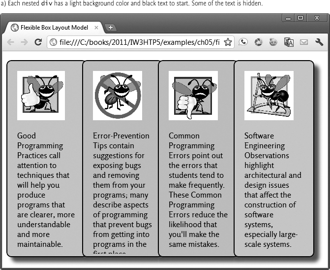

Fig. 5.16. Flexible Box Layout Module.
:nth-child Selectors
In CSS3, you can use selectors to easily select elements to style based on their attributes. For example, you could select every other row in a table and change the background color to blue, making the table easier to read. You can also use selectors to enable or disable input elements. In lines 33–36 we use :nth-child selectors to select each of the four div elements in the flexbox div to style. The style in line 33 uses div:nth-child(1) to select the div element that’s the first child of its parent and applies the background-color LightBlue. Similarly, div:nth-child(2) selects the div element that’s the second child of its parent, div:nth-child(3) selects the third child of its parent, and div:nth-child(4) selects the fourth child of its parent—each applies a specified background-color.
Next, lines 38–43 define styles that are applied to the nested div elements when the mouse hovers over them. The style at lines 38–39 sets the width (200px), color (white) and font-weight (bold). Next, we use :nth-child selectors to specify a new background color for each nested div (line 40–43).
Finally, we style the p element—the text within each div (line 44). We specify a paragraph height of 250px and the overflow as hidden, which hides any text that does not fit in the specified paragraph height. In the output, notice that the text in the second child element (the Error-Prevention Tips), the overflow text is hidden. When the mouse hovers over the element, all of the text is revealed. We also specify the Google font "Rosario", which we embedded in our style sheet (lines 9–10).
Selectors are a large topic. In later chapters, we’ll demonstrate additional CSS3 selector capabilities. To learn more about their powerful capabilities, visit:
http://www.w3.org/TR/css3-selectors/
5.16. Multicolumn Layout
CSS3 allows you to easily create multicolumn layouts. In Figure 5.17, we create a three-column layout by setting the column-count property to 3 (lines 15–18) and the column-gap property (the spacing between columns) to 30px (lines 20-23). We then add a thin black line between each column using the column-rule property (lines 25–28). When you run this example, try resizing your browser window. You’ll notice that the width of the columns changes to fit the three-column layout in the browser. In Section 5.17, we’ll show you how to use media queries to modify this example so the number of columns varies dynamically based on the size of the device screen or browser window, allowing you to customize the layout for devices such as smartphones, tablets, notebooks, desktops and more.
1 <!DOCTYPE html>
2
3 <!-- Fig. 5.17: multicolumns.html -->
4 <!-- Multicolumn text in CSS3. -->
5 <html>
6 <head>
7 <meta charset = "utf-8">
8 <title>Multicolumns</title>
9 <style type = "text/css">
10 p
11 { margin:0.9em 0em; }
12 .multicolumns
13 {
14 /* setting the number of columns to 3 */
15 -webkit-column-count: 3;
16 -moz-column-count: 3;
17 -o-column-count: 3;
18 column-count: 3;
19 /* setting the space between columns to 30px */
20 -webkit-column-gap: 30px;
21 -moz-column-gap: 30px;
22 -o-column-gap: 30px;
23 column-gap: 30px;
24 /* adding a 1px black line between each column */
25 -webkit-column-rule: 1px outset black;
26 -moz-column-rule: 1px outset black;
27 -o-column-rule: 1px outset black;
28 column-rule: 1px outset black;
29 }
30 </style>
31 </head>
32 <body>
33 <header>
34 <h1>Computers, Hardware and Software<h1/>
35 </header>
36 <div class = "multicolumns">
37 <p>A computer is a device that can perform computations and make
38 logical decisions phenomenally faster than human beings can.
39 Many of today's personal computers can perform billions of
40 calculations in one second—more than a human can perform
41 in a lifetime. Supercomputers are already performing thousands
42 of trillions (quadrillions) of instructions per second! To put
43 that in perspective, a quadrillion-instruction-per-second
44 computer can perform in one second more than 100,000
45 calculations for every person on the planet! And—these
46 "upper limits" are growing quickly!</p>
47 <p>Computers process data under the control of sets of
48 instructions called computer programs. These programs guide
49 the computer through orderly sets of actions specified by
50 people called computer programmers. The programs that run on a
51 computer are referred to as software. In this book, you'll
52 learn today's key programming methodology that's enhancing
53 programmer productivity, thereby reducing software-development
54 costs—object-oriented programming.</p>
55 <p>A computer consists of various devices referred to as hardware
56 (e.g., the keyboard, screen, mouse, hard disks, memory, DVDs
57 and processing units). Computing costs are dropping
58 dramatically, owing to rapid developments in hardware and
59 software technologies. Computers that might have filled large
60 rooms and cost millions of dollars decades ago are now
61 inscribed on silicon chips smaller than a fingernail, costing
62 perhaps a few dollars each. Ironically, silicon is one of the
63 most abundant materials—it's an ingredient in common
64 sand. Silicon-chip technology has made computing so economical
65 that more than a billion general-purpose computers are in use
66 worldwide, and this is expected to double in the next few
67 years.</p>
68 <p>Computer chips (microprocessors) control countless devices.
69 These embedded systems include anti-lock brakes in cars,
70 navigation systems, smart home appliances, home security
71 systems, cell phones and smartphones, robots, intelligent
72 traffic intersections, collision avoidance systems, video game
73 controllers and more. The vast majority of the microprocessors
74 produced each year are embedded in devices other than general-
75 purpose computers.</p>
76 <footer>
77 <em>© 2012 by Pearson Education, Inc.
78 All Rights Reserved.</em>
79 </footer>
80 </div>
81 </body>
82 </html>

Fig. 5.17. Multicolumn text in CSS3.
5.17. Media Queries
With CSS media types (Section 4.11), you can vary your styling based on the type of device on which your page is being presented. The classic examples are varying font styles and sizes, based on whether a page is printed or displayed on a screen. Users generally prefer sans-serif fonts on screens and serif fonts on paper. With CSS3 media queries you can determine the finer attributes of the media on which the user is viewing the page, such as the length and width of the viewing area on the screen, to better customize your presentation.
In Section 5.16 we created a page with a multicolumn layout that included three columns of text and a thin black rule between each column. No matter how you resized your browser window, the text was still rendered in three columns, even if the columns had to be extremely narrow. In Fig. 5.18, we modify that multicolumn example to alter the numbers of columns and the rules between columns based on the screen size of the device on which the page is viewed.
@media-Rule
The @media rule is used to determine the type and size of device on which the page is rendered. When the browser looks at the rule, the result is either true or false. The rule’s styles are applied only if the result is true. First, we use the @media rule to determine whether the page is being rendered on a handheld device (e.g., a smartphone) with a max-width of 480px, or a device with a screen that has a max-device-width of 480px, or on a screen having max-width of 480px (lines 13–15). If this is true, we set the column-count to 1—the page will be rendered in a single column on handheld devices such as an iPhone or in browser windows that have been resized to 480px or less (lines 17–19).
1 <!DOCTYPE html>
2
3 <!-- Fig. 5.18: mediaqueries.html -->
4 <!-- Using media queries to reformat a page based on the device width. -->
5 <html>
6 <head>
7 <meta charset = "utf-8">
8 <title>Media Queries</title>
9 <style type = "text/css">
10 p
11 { margin: 0.9em 0em; }
12 /* styles for smartphones with screen widths 480px or smaller */
13 @media handheld and (max-width: 480px),
14 screen and (max-device-width: 480px),
15 screen and (max-width: 480px)
16 {
17 div {
18 -webkit-column-count: 1;
19 column-count: 1; }
20 }
21 /* styles for devices with screen widths of 481px to 1024px */
22 @media only screen and (min-width: 481px) and
23 (max-width: 1024px)
24 {
25 div {
26 -webkit-column-count: 2;
27 column-count: 2;
28 -webkit-column-gap: 30px;
29 column-gap: 30px;
30 -webkit-column-rule: 1px outset black;
31 column-rule: 1px outset black; }
32 }
33 /* styles for devices with screen widths of 1025px or greater */
34 @media only screen and (min-width: 1025px)
35 {
36 div {
37 -webkit-column-count: 3;
38 column-count: 3;
39 -webkit-column-gap: 30px;
40 column-gap: 30px;
41 -webkit-column-rule: 1px outset black;
42 column-rule: 1px outset black; }
43 }
44 </style>
45 </head>
46 <body>
47 <header>
48 <h1>Computers, Hardware and Software</h1>
49 </header>
50 <div>
51 <p>A computer is a device that can perform computations and make
52 logical decisions phenomenally faster than human beings can.
53 Many of today's personal computers can perform billions of
54 calculations in one second—more than a human can perform
55 in a lifetime. Supercomputers are already performing thousands
56 of trillions (quadrillions) of instructions per second! To put
57 that in perspective, a quadrillion-instruction-per-second
58 computer can perform in one second more than 100,000
59 calculations for every person on the planet! And—these
60 "upper limits" are growing quickly!</p>
61 <p>Computers process data under the control of sets of
62 instructions called computer programs. These programs guide
63 the computer through orderly sets of actions specified by
64 people called computer programmers. The programs that run on a
65 computer are referred to as software. In this book, you'll
66 learn today's key programming methodology that's enhancing
67 programmer productivity, thereby reducing software-development
68 costs—object-oriented programming.</p>
69 <p>A computer consists of various devices referred to as hardware
70 (e.g., the keyboard, screen, mouse, hard disks, memory, DVDs
71 and processing units). Computing costs are dropping
72 dramatically, owing to rapid developments in hardware and
73 software technologies. Computers that might have filled large
74 rooms and cost millions of dollars decades ago are now
75 inscribed on silicon chips smaller than a fingernail, costing
76 perhaps a few dollars each. Ironically, silicon is one of the
77 most abundant materials—it's an ingredient in common
78 sand. Silicon-chip technology has made computing so economical
79 that more than a billion general-purpose computers are in use
80 worldwide, and this is expected to double in the next few
81 years.</p>
82 <p>Computer chips (microprocessors) control countless devices.
83 These embedded systems include anti-lock brakes in cars,
84 navigation systems, smart home appliances, home security
85 systems, cell phones and smartphones, robots, intelligent
86 traffic intersections, collision avoidance systems, video game
87 controllers and more. The vast majority of the microprocessors
88 produced each year are embedded in devices other than general-
89 purpose computers.</p>
90 <footer>
91 <em>© 2012 by Pearson Education, Inc.
92 All Rights Reserved.</em>
93 </footer>
94 </div>
95 </body>
96 </html>


Fig. 5.18. Using media queries to reformat a page based on the device width.
If the condition in lines 13–15 is false, a second @media rule determines whether the page is being rendered on devices with a min-width of 481px and a max-width of 1024px (lines 22–23). If this condition is true, we set the column-count to 2 (lines 26–27), the column-gap (the space between columns) to 30px (lines 28–29) and the column-rule (the vertical line between the columns) to 1px outset black (lines 30–31).
If the conditions in the first two @media rules are false, we use a third @media rule to determine whether the page is being rendered on devices with a min-width of 1025px (line 34). If the condition of this rule is true, we set the column-count to 3 (lines 37–38), the column-gap to 30px (lines 39–40) and the column-rule to 1px outset black (lines 41–42).
5.18. Web Resources
W3C home page for CSS3.
The Deitel CSS3 Resource Center includes links to tutorials, examples, the W3C standards documentation and more.
http://www.colorzilla.com/gradient-editor/
Sites that help you generate cross-browser CSS3 code.
Find the CSS3 features that are supported by each of the major browsers.
http://cssprefixer.appspot.com/
The CSSPrefixer tool helps you add vendor prefixes to your CSS3 code.
http://css-tricks.com/examples/HSLaExplorer/
A CSS demo that allows you to play with HSLA colors.
Summary
Section 5.2 Text Shadows
• The CSS3 text-shadow property (p. 143) makes it easy to add a text-shadow effect to any text. The shadow’s horizontal offset is the number of pixels that the text-shadow will appear to the left or the right of the text. A negative value moves the text-shadow to the left; a positive value moves it to the right. The vertical offset is the number of pixels that the text-shadow will be shifted up or down from the text. A negative value moves the shadow up, whereas a positive value moves it down.
• The blur radius (p. 143) has a value of 0 (no shadow) or greater.
Section 5.3 Rounded Corners
• The border-radius property (p. 144) adds rounded corners (p. 144) to any element.
Section 5.4 Color
• RGBA (Red, Green, Blue, Alpha, p. 145) gives you greater control over the exact colors in your web pages. The value for each color—red, green and blue—can range from 0 to 255. The alpha value—which represents opacity—can be any value in the range 0.0 (fully transparent) through 1.0 (fully opaque).
• CSS3 also allows you to express color using HSLA (hue, saturation, lightness, alpha) values (p. 146).
• The hue is a color or shade expressed as a value from 0 to 359 representing the degrees on a color wheel (a wheel is 360 degrees). The colors on the wheel progress in the order of the colors of the rainbow—red, orange, yellow, green, blue, indigo and violet.
• The saturation (p. 146)—the intensity of the hue—is expressed as a percentage, where 100% is fully saturated (the full color) and 0% is gray.
• Lightness (p. 146)—the intensity of light or luminance of the hue—is also expressed as a percentage. A lightness of 50% is the actual hue. If you decrease the amount of light to 0%, the color appears completely dark (black). If you increase the amount of light to 100%, the color appears completely light (white).
Section 5.5 Box Shadows
• The box-shadow property (p. 146) adds a shadow to an element.
• The horizontal offset of the shadow defines the number of pixels that the box-shadow will appear to the left or the right of the box. The vertical offset of the shadow defines the number of pixels the box-shadow will be shifted up or down from the box.
• The blur radius of the shadow can have a value of 0 (no shadow) or greater.
Section 5.6 Linear Gradients; Introducing Vendor Prefixes
• Linear gradients (p. 148) are a type of image that gradually transitions from one color to the next horizontally, vertically or diagonally.
• You can transition between as many colors as you like and specify the points at which to change colors, called color-stops (p. 148), represented in pixels or percentages along the so-called gradient line.
• You can use gradients in any property that accepts an image.
• Browsers currently implement gradients differently, so you’ll need vendor prefixes and different syntax for each browser.
• Vendor prefixes (e.g., -webkit- and -moz-, p. 151) are used for properties that are still being finalized in the CSS specification but have already been implemented in various browsers.
• Prefixes are not available for every browser or for every property.
• It’s good practice to include the multiple prefixes when they’re available so that your pages render properly in the various browsers.
• Always place vendor-prefixed styles before the nonprefixed version. The last version of the style that a given browser supports takes precedence and will be used by the browser.
Section 5.7 Radial Gradients
• Radial gradients (p. 151) are similar to linear gradients, but the color changes gradually from an inner circle (the start) to an outer circle (the end).
• The radial-gradient property (p. 151) has three values. The first is the position of the start of the radial gradient (center). Other possible values for the position include top, bottom, left and right. The second value is the start color, and the third is the end color.
• Other than the vendor prefixes, the syntax of the gradient is identical for WebKit browsers, Mozilla Firefox and the standard CSS3 radial-gradient.
Section 5.8 (Optional: WebKit Only) Text Stroke
• The -webkit-text-stroke property (p. 153) is a nonstandard property for WebKit-based browsers that allows you to add an outline (text stroke) around text. The -webkit-text-stroke property has two values—the thickness of the outline and the color of the text stroke.
Section 5.9 Multiple Background Images
• CSS3 allows you to add multiple background images (p. 153) to an element.
• We specify each image’s placement using property background-position. The comma-separated list of values matches the order of the comma-separated list of images in the background-image property.
• The background-origin (p. 154) determines where each image is placed using the box model.
Section 5.10 (Optional: WebKit Only) Reflections
• The -webkit-box-reflect property (p. 155) allows you to add a simple reflection (p. 155) of an image. Like -webkit-text-stroke, this is a nonstandard property that’s available only in WebKit-based browsers for now.
• The property’s first value is the direction of the reflection. The direction value may be above, below, left, or right.
• The second value is the offset, which determines the space between the image and its reflection.
• Optionally, you can specify a gradient to apply to the reflection.
Section 5.11 Image Borders
• The CSS3 border-image property (p. 156) uses images to place a border around any element.
• The border-width is the thickness of the border being placed around the element. The width is the width of the entire rectangular border.
• The border-image-source (p. 157) is the URL of the image to use in the border.
• The border-image-slice (p. 158) specifies the inward offsets from the top, right, bottom and left sides of the image.
• The border-image-slice divides the image into nine regions: four corners, four sides and a middle, which is transparent unless otherwise specified. You may not use negative values.
• We can express the border-image-slice in just two values, in which case the first value represents the top and bottom, and the second value the left and right.
• The border-image-slice may be expressed in pixels or percentages.
• border-image-repeat (p. 158) specifies how the regions of the border image are scaled and tiled (repeated). By indicating stretch just once, we create a border that will stretch the top, right, bottom and left regions to fit the area.
• You may specify two values for the border-image-repeat property. For example, if we specified stretch repeat, the top and bottom regions of the image border would be stretched, and the right and left regions of the border would be repeated (i.e., tiled) to fit the space, using partial tiles to fill the excess space.
• Other possible values for the border-image-repeat property include round and space. If you specify round, the regions are repeated using only whole tiles, and the border image is scaled to fit the area. If you specify space, the regions are repeated to fill the area using only whole tiles, and any excess space is distributed evenly around the tiles.
Section 5.12 Animation; Selectors
• The animation property (p. 161) allows you to represent several animation properties in a shorthand notation, rather than specifying each animation property separately.
• The animation-name (p. 161) represents the name of the animation. This name associates the animation with the keyframes that define various properties of the element being animated at different stages of the animation.
• The animation-timing-function (p. 161) determines how the animation progresses in one cycle of its duration. Possible values include linear, ease, ease-in, ease-out, ease-in-out, cubic-bezier. The value linear specifies that the animation will move at the same speed from start to finish. The default value, ease, starts slowly, increases speed, then ends slowly. The ease-in value starts slowly, then speeds up, whereas the ease-out value starts faster, then slows down. The ease-in-out starts and ends slowly. Finally, the cubic-bezier value allows you to customize the timing function with four values between 0 and 1, such as cubic-bezier(1,0,0,1).
• The animation-duration (p. 161) specifies the time in seconds (s) or milliseconds (ms) that the animation takes to complete one iteration. The default duration is 0.
• The animation-delay (p. 161) specifies the number of seconds or milliseconds after the page loads before the animation begins. The default value is 0. If the animation-delay is negative, such as -3s, the animation begins three seconds into its cycle.
• The animation-iteration-count (p. 161) specifies the number of times the animation will run. The default is 1. You may use the value infinite to repeat the animation continuously.
• The animation-direction (p. 161) specifies the direction in which the animation will run. The value alternate used here specifies that the animation will run in alternating directions. The default value, normal, would run the animation in the same direction for each cycle.
• The shorthand animation property cannot be used with the animation-play-state property (p. 161)—it must be specified separately. If you do not include the animation-play-state, which specifies whether the animation is paused or running, it defaults to running.
• For the element being animated, the @keyframes rule (p. 161) defines the element’s properties that will change during the animation, the values to which those properties will change, and when they’ll change.
• The @keyframes rule is followed by the name of the animation to which the keyframes are applied. Rules (p. 162) consist of one or more selectors (p. 162) followed by a declaration block (p. 162) in curly braces ({}).
• Selectors enable you to apply styles to elements of a particular type or attribute.
• A declaration block consists of one or more declarations, each of which includes the property name followed by a colon (:), a value and a semicolon (;). You may include multiple declarations in a declaration block.
Section 5.13 Transitions and Transformations
• With CSS3 transitions (p. 162), you can change an element’s style over a specified duration.
• CSS3 transformations (p. 162) allow you to move, rotate, scale and skew elements.
• Transitions are similar in concept to animations, but transitions allow you to specify only the starting and ending values of the CSS properties being changed. An animation’s keyframes enable you to control intermediate states throughout the animation’s duration.
• For each property that will change, the transition property (p. 162) specifies the duration of that change.
• As of CSS3, the :hover pseudo-class now works with any element.
• The transform property (p. 162) uses transformation functions (p. 163), such as rotate (p. 163) and scale (p. 164), to perform the transformations.
• The rotate transformation function receives number of degrees. Negative values cause the element to rotate left. A value of 720deg would cause the element to rotate clockwise twice.
• The scale transformation function specifies how to scale the width and height. The value 1 represents the original width or original height, so values greater than 1 increase the size and values less than 1 decrease the size.
• CSS3 transformations also allow you to skew (p. 164) block-level elements, slanting them at an angle either horizontally (skewX) or vertically (skewY).
• The transition-duration is the amount of time it takes to complete the transition.
• The transition-timing-function determines how the transition progresses in one cycle of its duration.
Section 5.14 Downloading Web Fonts and the @font-face Rule
• Using the @font-face rule (p. 166), you can specify fonts for a web page, even if they’re not installed on the user’s system. Downloadable fonts help ensure a uniform look across client sites.
• You can find numerous free, open-source web fonts at http://www.google.com/webfonts. Make sure the fonts you get from other sources have no legal encumbrances.
• The @media screen rule specifies that the font will be used when the document is rendered on a computer screen.
• The @font-face rule includes the font-family, font-style and font-weight. Multiple fonts can be specified with varying styles and weights. The @font-face rule also includes the font’s location.
Section 5.15 Flexible Box Layout Module and :nth-child Selectors
• Flexible Box Layout Module (FBLM, p. 168) makes it easy to align the contents of boxes, change their size, change their order dynamically, and lay out the contents in any direction.
• The box-orient property (p. 168) specifies the orientation of the box layout. The default value is horizontal. You can also use vertical.
• In CSS3, you can use selectors to easily style attributes. For example, you can select every other row in a table and change the background color to blue, making the table easier to read. You can also use selectors to enable or disable input elements.
• We use :nth-child selectors (p. 171) to select each of the for the four div elements in the flexbox div to style.
• div:nth-child(1) selects the div element that’s the first child of its parent and applies the specified style. Similarly, div:nth-child(2) selects the div element that’s the second child of its parent, div:nth-child(3) selects the third child of its parent, and div:nth-child(4) selects the fourth child of its parent.
• Setting the overflow to hidden hides any text that does not fit in the specified paragraph height.
Section 5.16 Multicolumn Layout
• CSS3 allows you to easily create multicolumn layouts (p. 171) using the column-count property (p. 171).
• The column-gap property (p. 171) specifies the spacing between columns.
• Add lines between columns using the column-rule property (p. 171).
• Resizing your browser window changes the width of the columns to fit the three-column layout in the browser.
Section 5.17 Media Queries
• With CSS3 media queries you can determine the finer attributes of the media on which the user is viewing the page, such as the length and width of the viewing area on the screen, to customize your presentation.
• The @media rule (p. 174) is used to determine the type and size of device on which the page is rendered. When the browser looks at the rule, the result is either true or false. The rule’s styles are applied only if the result is true.
Self-Review Exercises
5.1 Fill in the blanks in the following statements:
a. The ________ property makes it easy to add a text shadow effect to any text.
b. The ________ property allows you to add rounded corners to any element.
c. CSS3 includes two new ways to express color—________ and________.
d. The ________ defines the number of pixels that the box-shadow will appear to the left or the right of the box.
e. ________ are similar to linear gradients, but the color changes gradually from an inner circle (the start) to an outer circle (the end).
f. The ________ divides the image into nine regions: four corners, four sides and a middle, which is transparent unless otherwise specified.
g. The animation-timing-function determines how the animation progresses in one cycle of its duration. Possible values include ________, ________, ________, ________, ________ and ________.
h. For the element being animated, the ________ defines the element’s properties that will change during the animation, the values to which those properties will change, and when they’ll change.
i. ________ are similar in concept to animations, but they allow you to specify only the starting and ending values of the CSS properties being changed. An animation’s keyframes enable you to control intermediate states throughout the animation’s duration.
j. CSS3 ________ allow you to move, rotate, scale and skew elements.
k. ________ consist of one or more selectors followed by a declaration block in curly braces ({}).
l. In CSS3, you can use ________ to easily style attributes.
5.2 State whether each of the following is true or false. If false, explain why.
a. The @font-face rule specifies that an embedded font will be used when the document is rendered on a computer screen.
b. You can use gradients in any property that accepts an image.
c. A horizontal gradient gradually changes from top to bottom.
d. You can add lines between columns using the column-gap property.
e. The @media rule determines the type and size of device on which the page is rendered. When the browser looks at the rule, the result is either true or false. The rule’s styles are applied only if the result is false.
f. To add multiple background images to an element, use the background-position to specify where each image is placed using the box model.
Answers to Self-Review Exercises
5.1
a. text-shadow.
b. border-radius.
c. RGBA and HSLA.
d. horizontal offset.
e. Radial gradients.
f. border-image-slice.
g. linear, ease, ease-in, ease-out, ease-in-out, cubic-bezier.
h. @keyframes rule.
i. Transitions.
j. transformations.
k. Rules.
l. selectors.
5.2
a. False. The @media screen rule specifies that an embedded font will be used when the document is rendered on a computer screen.
b. True.
c. False. A horizontal gradient gradually changes from left to right.
d. False. You can add lines between columns using the column-rule property.
e. The @media rule’s styles are applied only if the result is true.
f. False. The background-origin specifies where each image is placed using the box model.
Exercises
For each of the following, build and render a web page that makes the indicated effect(s) appear. Validate your page with the following validators:
1. For CSS3: http://jigsaw.w3.org/css-validator/ (under More Options > Profile, select CSS level 3) [Note: Many CSS3 properties will not validate because they’re not yet standardized.]
2. For HTML5: http://validator.w3.org/#validate_by_upload
Also, test your page with as many as possible of the seven browsers we’re using in this book.
5.3 (Text Shadow) Create a text shadow on the phrase "New features in CSS3" with a horizontal offset of 2px, a vertical offset of 5px, a blur radius of 6px and a text-shadow color deepskyblue.
5.4 (Text Stroke) Create a text stroke on the phrase "New WebKit features". Make the color of the text LightBlue. Use a 3px Navy text-stroke and set the font-size to 700%.
5.5 (Rounded Corners) Create three div elements, each with a width and height of 100px. On the first element, create slightly rounded corners using a border of 3px black and border-radius of 10px. On the second element, use a border of 3px black and increase the border-radius to 50px. On the third, use a border of 3px black and increase the border-radius to 100px. Make the background-color of each element a different color of your choosing. Inside each element, display the value of the border-radius in bold text.
5.6 (Box Shadow) Create three div elements of varying colors, each with a width and height of 200px. On the first box, add a dimgrey box-shadow with a horizontal offset of 15px, a vertical offset of 15px and a blur radius of 20px. On the second box, add a dimgrey box-shadow with a horizontal offset of -15px, a vertical offset of -15px and a blur radius of 30px. On the third box, add a dimgrey box-shadow with a horizontal offset of 15px, a vertical offset of 15px and a blur radius of 10px.
5.7 (Linear Gradient) Create a div element with a width and height of 500px. Create a diagonal linear gradient using the colors of the rainbow—Red, Orange, Yellow, Green, Blue, Indigo, Violet.
5.8 (Radial Gradient) Create a div element with a width and height of 500px. Create a radial gradient with three colors. Start the gradient in the bottom-left corner with the colors changing as they move along the gradient line to the right.
5.9 (Animation) Create an infinite animation of an element moving in a square pattern.
5.10 (Skew) Modify the skew example in Fig. 5.13 to skew the element top to bottom 30deg, then left to right 30deg, alternating infinitely.
5.11 (Melting Images) Modify the example in Fig. 5.14 using five pictures. It might be interesting to try pictures of you or a family member at different ages or a landscape at various times. Set the transition-duration to 3s and a transition-timing-function to linear.
5.12 (Multicolumn Text) Change the format of the example in Fig. 5.17 to two columns, add a sub title and an author name and increase the color and thickness of the column-rule. Add an image and float the text around the image.
5.13 (FBLM) Modify the example in Fig. 5.16 to use a vertical flexbox.
5.14 (Transformation with :hover) Create a transformation program that includes four images. When the user hovers over an image, the size of the image should increase by 20%.
5.15 (Reflection) Create a reflection of an image 20px to the right of the original image.
5.16 (Media Queries) Create your own multicolumn web page and use media queries to adjust the formatting to use one column for mobile devices that have a maximum width of 480px.