6. Finishing Touches
Chapter Overview
So far, you’ve covered the basics and should be well on your way to discovering Illustrator’s potential as a competent UI design tool. In this chapter, you’ll delve into a few more advanced features that will help put the finishing touches on the mockup. The topics covered in this chapter include the following:
• Using Illustrator and Photoshop Effects
• Applying additional type techniques
• Working with images
Taking Appearances to the Next Level
In the last chapter, you learned how to use the Appearance panel to craft a fairly complex widget from just one object. That appearance can then be saved and applied to any other vector object in your document. Where this provides the most benefit is in documents that have multiple screens.
As you begin to add complexity to your design, saving those appearances for reuse increases efficiency by allowing you to apply styles and make changes really quickly, thereby increasing your ability to get more done in less time.
Let’s take a look at some advanced techniques with the Appearance panel and graphic styles.
Illustrator and Photoshop Effects
First, let’s delve into a little history. Many moons ago, Illustrator (a vector application) and Photoshop (a raster application) existed as completely separate products in every way. If I needed a logo that could scale to any size without any degradation, I knew I could count on Illustrator to come through. If there was a need for a photo composition that relied on special effects, photo filters, and textures, Photoshop was the tool for the job.
Then something happened. Over time, both programs gained from each other bits of native functionality you used to have to cut and paste from one app to the other to achieve. For example, it was a major leap when Photoshop gained vector shape tools and type. I could create elements in Photoshop I could resize without a loss of quality. It was amazing.
But what really floored me was when Illustrator acquired the ability to use many of Photoshop’s filters on vector objects. That seemed like such a huge jump; I could now add a drop shadow in Illustrator without having to cut and paste between the two applications. The time and effort saved by these additions was incredible.
This chapter shows you how to use this functionality to improve the design of certain elements within the Wheelr mockup, and how to use it in your own UI design projects. You’ll start by digging into the Effect menu, where you’ll notice two distinct divisions, Illustrator Effects and Photoshop Effects (6.1). The majority of these effects are tailor-made for illustration purposes, but a few of each are useful for UI design:
• Convert To Shape
• Distort & Transform > Transform
• Path
• Rasterize
• Stylize
• Artistic > Film Grain
• Blur
• Texture > Grain
• Texture > Texturizer
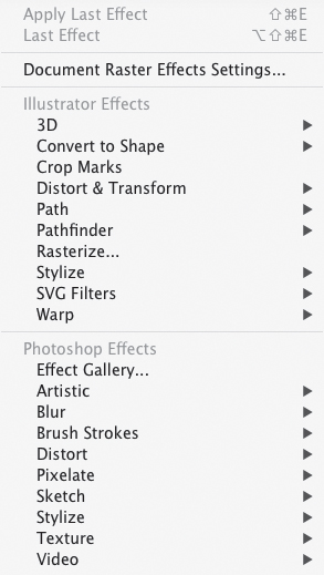
6.1. Illustrator and Photoshop Effects in the Effect menu
In case you opened the book to this chapter without reading any of the previous ones, the mockup mentioned in this chapter was started back in Chapter 4. I encourage you to go back and follow along through Chapters 4 and 5 to get more out of this exercise.
The main difference between Illustrator and Photoshop effects are as follows:
• Illustrator Effects are resolution-independent. Any object that has an Illustrator effect applied can be scaled with no loss of quality. When you resize an object, Illustrator does the math for you and scales the effect to match. Most Illustrator effects tend to be more vector-based anyway, with the exception of Drop Shadow, Inner Glow, Outer Glow, and Feather.
• Photoshop effects are not resolution-independent. They’re rendered at the settings found in the Document Raster Effects Settings (DRES), which is also accessed from the Effect menu. If an object is scaled that has a Photoshop effect applied, the effect scales, but remains at the resolution setting in the DRES.
For Photoshop effects, you can use the DRES to set the resolution to match that of your target device, or you can use the settings to optimize the appearance of the effect. You’ll see how this works later in the chapter. For now, let’s look at how you can use the most common Illustrator effects in the Wheelr mockup.
Using Illustrator’s Stylize Effects
You may have realized by now that you already used five Illustrator effects (Round Corners, Inner Glow and Drop Shadow, Distort & Transform, and Warp) when you created the search box and photo frame in Chapter 5. You’ll try some other examples to create a landing page for Wheelr.
Most applications have a landing page as the first thing a prospective user sees. It serves to advertise the features and benefits of the product. A landing page is an essential marketing tool that helps a prospective user to decide whether or not to use your app. I’ve started a simple one for you to enhance. To follow along, download the starter file at www.peachpit.com/UIwithAI/chp6/landingpage.ai.
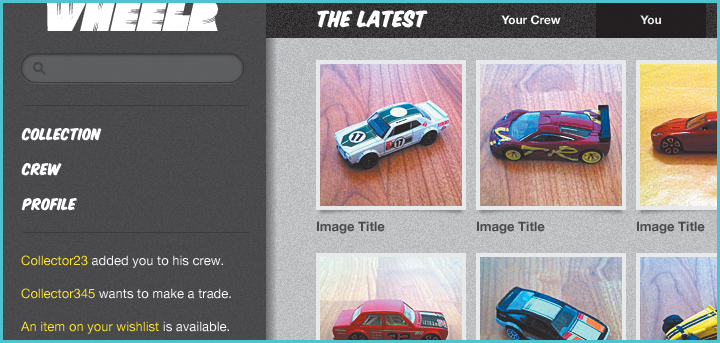
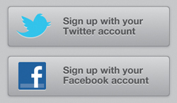
This is an extremely basic landing page (6.2) that provides a description of the product and a way to quickly get signed up for the service. When you’ve finished with the exercises, play around with the design to see how you might make this landing page even more effective.
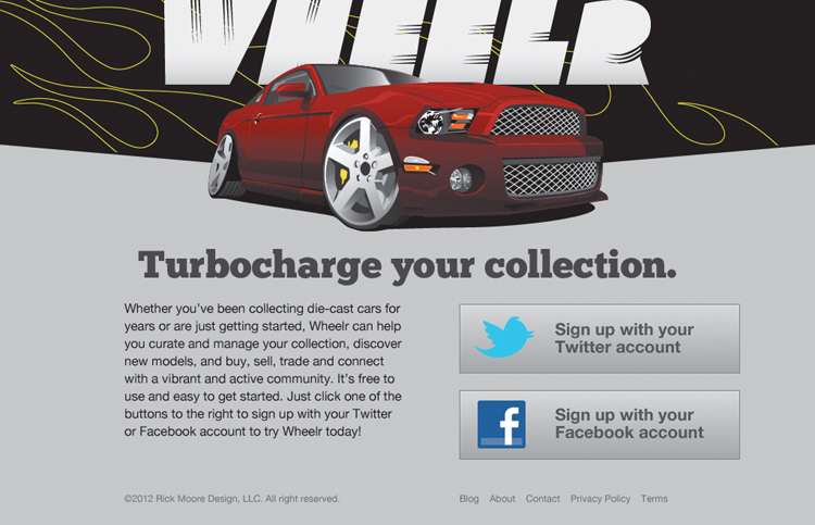
6.2. Wheelr’s landing page
Begin by styling the sign-up buttons. These buttons act as a call to action on the page, giving the viewer a clear idea as to what can be done. The buttons might be effective in their current state, but you’ll make them look more clickable than they do right now:
1. Select the Twitter sign-up button and click the Path layer in the Appearance panel.
2. Choose Effect > Stylize > Round Corners and enter 5 px as the value in the Round Corners dialog box.
3. Select the Fill layer and then choose Effect > Stylize > Drop Shadow.
4. In the Drop Shadow dialog box, choose Normal mode, 35% Opacity, an X offset of 0, a Y Offset of 1 px, and a Blur value of 3 px. If the color is not already set to #000000 (black), click the color swatch and make it so (6.3). Click OK.
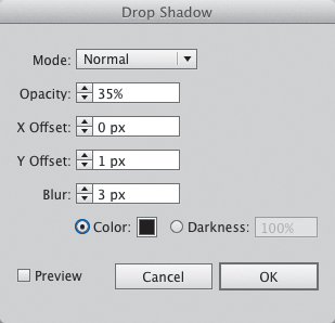
6.3. The Drop Shadow effect dialog box
At this point, this looks like a clickable button (6.4). Round corners serve to draw the eye into the button and its content rather than pointing outside of it. It relieves the visual tension that can be created sometimes by sharp corners. The drop shadow pops the button off the page and reinforces its clickability.

6.4. Making a nice button
Next, you’ll give the button content an inset look to add a little more visual weight to it.
5. Select the Twitter bird logo and the button text. In the Appearance panel, the selection will show as Mixed Objects (6.5).
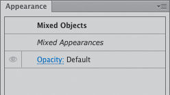
6.5. When multiple objects with different attributes are selected, the Appearance panel shows them as Mixed Objects.
6. Choose Effect > Stylize > Drop Shadow.
7. In the dialog box that appears, change the Opacity to 50%, the Y Offset to 2 px, the Blur value to 0, and the color to #ffffff (white). Click OK.
This effect makes the content look like it’s carved into the button (6.6). It adds to the realistic appearance by making the button seem three-dimensional. The next step is to save these appearances as graphic styles so you can apply them to the other button.
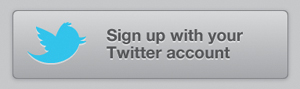
6.6. The finished button
8. With the Twitter button still selected, choose New Graphic Style from the Graphic Styles panel menu. (You can access the Graphic Styles panel by choose Window > Graphic Styles.) Be sure to give this new style an appropriate name. Click OK.
9. Select the text on the Twitter button and create a new graphic style using the instructions in the previous step. Name this graphic style 2px white drop shadow.
When you create a graphic style from a text object, Illustrator does not pull any text-formatting attributes. In this case, it saves only the white drop shadow in the style. This is a good thing, as you’ll see in a moment.
You can also add a new style by clicking the New Graphic Style button ![]() at the bottom of the panel. However, using the command in the panel menu lets you name the new style as you create it. Otherwise, you’ll have to double-click the style in the panel to change the name.
at the bottom of the panel. However, using the command in the panel menu lets you name the new style as you create it. Otherwise, you’ll have to double-click the style in the panel to change the name.
Applying Graphic Styles to Additional Objects
Now that the styling of that button is complete, you can use the graphic styles you just created to style the other button and its content.
1. Select the Facebook button and click the button style in the Graphic Styles panel (6.7).
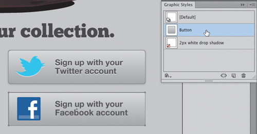
6.7. Applying a graphic style
2. Select the Facebook logo and the text in the button and click the white drop shadow style.
Because the white drop shadow style didn’t have any text-formatting attributes, you were able to apply it to both the logo and the text at the same time. You’d be able to apply this drop shadow to any other text and it would retain its formatting as well.
How easy was that (6.8)? Graphic styles really do make the task of designing for consistency drop-dead simple.
6.8. The finished set of buttons on the landing page
Adding Old-School Style to the Page Header
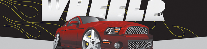
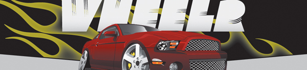
Next, you’ll move on to styling the flame in the header of the page (6.9). The flame is inside a mask that hides everything outside the black box. The inspiration for this flame graphic is the pinstriped and airbrushed look you might see on an old hot rod (6.10). I’d like to have the flame be more subtle than the one in the photo, so you’ll ignore the background color from the flame and just do a glow on the inside. You’ll use an Illustrator effect to make it a little more interesting:
1. Double-click the flame graphic to enter isolation mode. If you’ve disabled this feature, right-click the graphic and choose Isolate Selected Clipping Mask. Select the flame artwork and remove the yellow stroke. (It was there only for preview purposes.)
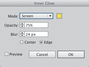
2. Click the fill layer in the Appearance panel and choose Effect > Stylize > Inner Glow.
3. In the dialog box, select Screen mode and give it a fill of #f2ec33. Set the Opacity to 75%, and make the Blur 24 px (6.11). Click OK and then press Escape to exit isolation mode.
6.9. Landing page header, pre-style
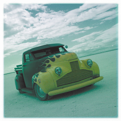
6.10. The flames on this old truck provided the inspiration for the landing page header. Photo by Rick Moore.
6.11. Inner Glow settings
That looks pretty good for now (6.12). You’ll make it look even better in the next section.
6.12. Header flame with Inner Glow effect added
Using Photoshop Effects
Photoshop effects are nice to have around as they can help add texture and depth that would be difficult to do with a purely vector approach. In the old days, you’d have to go into Photoshop, create the textured effects needed for the design, and then import them into Illustrator. It got the job done, but ultimately, that method was both time-consuming and inflexible. Any changes that needed to be made often meant that the textured effect would have to be recreated each time.
Those days are long gone. For all but the most complicated effects, you can use Illustrator’s Photoshop Effects to achieve the look you are after. There are quite a few effects included with Illustrator, and what’s really cool is that you can load third-party filters into Illustrator as well. If you’re a Photoshop user who has invested heavily in filters and effects, you’ll be pleased to discover that they can serve double duty.
Let’s go back to the flame graphic and punch it up a bit. I love old cars that have metallic flake paint jobs. I think it would look great to add that texture into the background behind the flames. The little sparkles in the paint would be really time-consuming to complete with pure vector artwork, so you’ll use a Photoshop effect to pull off the look.
1. With the Direct Selection tool ![]() (A), select the black background just behind the flame and then click the fill layer in the Appearance panel.
(A), select the black background just behind the flame and then click the fill layer in the Appearance panel.
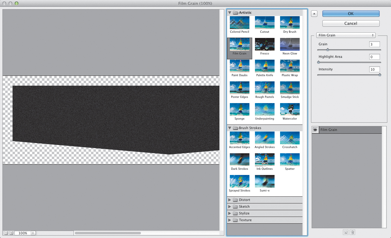
2. Choose Effect > Artistic > Film Grain.
3. In the Film Grain effect setting pane, set the Grain setting to 3 (6.13). Click OK.
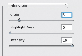
6.13. Film Grain effect settings
The grain makes the black background look like a metallic paint, and having the Screen blend mode set on the flame allows the grain to show through (6.14). I think it looks fantastic. Now, apply the same effect to the gray page background:
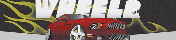
6.14. Flame header with grain added to simulate metal-flake paint
4. Select the gray background object and apply the Film Grain effect to it. Use a Grain setting of 2 for this object. Click OK.
The textured background helps the content to pop, giving it a good balance with the large red car at the top of the page. The buttons really stand out now, which is important for a call to action (6.15).
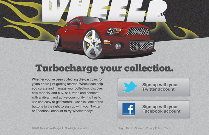
6.15. The finished landing page
Let’s move back to the Wheelr application mockup. Repeat the grain texture from the landing page to the background of the sidebar, section navigation bar, and content area. Doing so helps to create consistency in the design. Add the Film Grain effect to the sidebar, section navigation, and main content rectangles as described in the previous steps. Use a Grain setting of 1 for the sidebar, and 2 for the section navigation and content area (6.17).
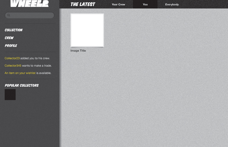
6.17. The mockup with texture effects applied
You can download the project file for this section’s examples at www.peachpit.com/UIwithAI/ch6/wheelr6.ai.
The shadow on the photo box needs to be softened a little to help it look more like a real shadow. Here is how you can use an effect to do that:
1. Select the photo box and click the bottom fill layer in the Appearance panel.
2. Choose Effect > Blur > Gaussian Blur.
3. Set the Radius for the effect to 1.5 and click OK.
The Gaussian Blur effect softens the edge of the object to the specified pixel radius. The larger the radius value is, the softer the shadow. A small number was used in this case so that the photo frame doesn’t appear as if it’s hovering too far off the background (6.18).
6.18. Using Gaussian blur to soften the photo frame drop shadow
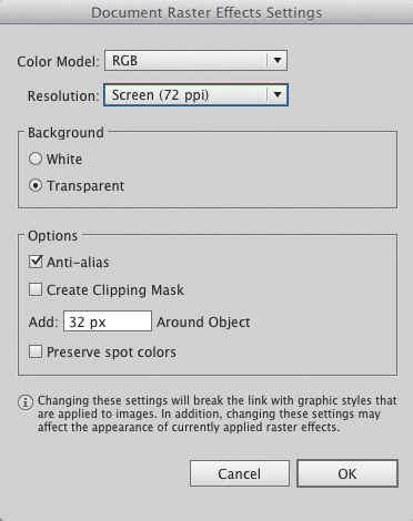
Understanding Document Raster Effects Settings
The Document Raster Effects Settings (DRES) determine the resolution for Photoshop Effects applied to your artwork. You can access the settings from the Effect menu. The dialog box (6.19) allows you to choose from three resolution settings (72, 150, or 300 ppi). You can also enter an arbitrary number by choosing Other from the Resolution pop-up menu.
6.19. The Document Raster Effects Settings dialog box
When you apply a Photoshop effect to an object, it will look different depending on what resolution you have set in the DRES. For example, you used the Film Grain effect on the sidebar background in the Wheelr mockup. 6.20 shows what that effect looks like in each of the three preset resolutions (in regular Preview mode, viewed at 600%). At lower resolution settings, the effect looks coarser because of the fewer number of pixels. As you get to 300 ppi, the effect is almost imperceptible, at least to my old eyes.
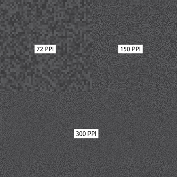
6.20. Film Grain effect at 72, 150, and 300 ppi
What resolution you use is really up to you and how you want the object to look in the final design, as well as how you plan to use it in the long term. If you plan to use it only onscreen, 72 ppi is probably good enough, provided you achieve the look you want. After all, when using Photoshop effects, what you see on the screen is what you will get when you export your art for final use. However, if you plan to repurpose the graphic for print, you may want to consider using a higher resolution and adjusting the settings to match your visual needs.
One important thing to note if you decide to change the resolution settings: Increasing or decreasing the DRES affects any object in your document that has a raster effect applied. That means it may negatively change the appearance of effects with which you are already satisfied. However, there is a way around this limitation: using the Rasterize effect.
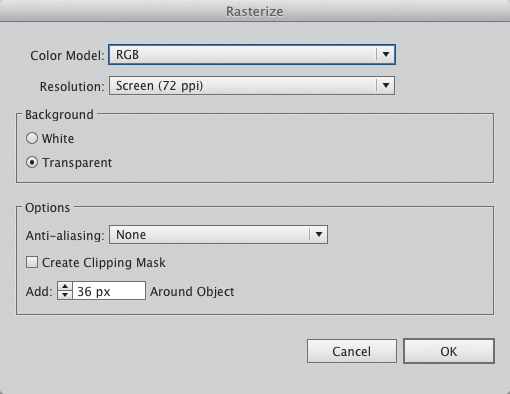
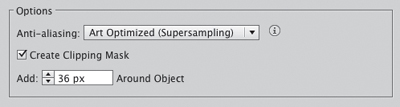
The Rasterize effect turns a vector object into a bitmap one. Illustrator has been able to do this for years, but it was a destructive effect; once it was applied, using undo was the only way to restore the object to a vector. Now you can use Rasterize as a live effect, which allows you to change the resolution of a single object on the artboard, rather than changing the DRES and affecting all objects. Here’s how it works:
1. In the Wheelr mockup, select the background rectangle of the sidebar. This had the Film Grain effect applied previously. Unless you changed it at some point, the DRES for this document is the default 72 ppi.
2. In the Appearance panel, select the fill layer.
3. Choose Effect > Rasterize.
The Rasterize dialog box appears, looking almost exactly like the DRES dialog box (6.21).
6.21. The Rasterize effect dialog box
4. Change the Resolution to High (300 ppi) and choose Art Optimized (Supersampling) from the Anti-aliasing pop-up menu. Click OK.
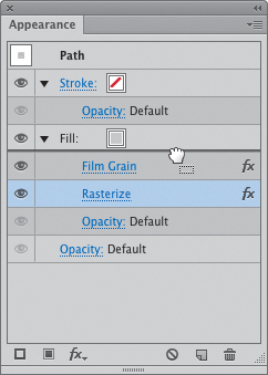
5. Drag the Rasterize effect above the Film Grain layer to have it apply correctly (6.22).
6.22. The Rasterize effect needs to be the top layer in order to be effective.
After a second or two, you’ll see the film grain almost disappear. It’s still there; it’s just at a much higher resolution now. The important thing to notice is that the other Film Grain effects on the artboard have not changed (6.23). This is an important feature, because it allows you to tailor raster effects at the object level so that they look exactly as you want them.
6.23. The Film Grain effect on the sidebar is almost imperceptible at 300 ppi.
Since you don’t really want to make that grainy texture disappear, you’ll need to get rid of the Rasterize effect on the sidebar. Instead of using the traditional undo (![]() Z/Ctrl+Z), select the sidebar in the Appearance panel and drag the unwanted effect to the panel’s Trash icon
Z/Ctrl+Z), select the sidebar in the Appearance panel and drag the unwanted effect to the panel’s Trash icon ![]() .
.
Additive Styles
So far you have learned to create a graphic style that comprises several appearance attributes. When applied to another object on the artboard, that object takes on all the attributes of the style, replacing any that it currently had. But you can also apply a graphic style to an object without replacing the current appearance. These are called additive styles.
Additive styles are useful when you need to add an appearance attribute to an object without changing its current look. One example would be to use an additive style to give a soft drop shadow to an object that already has a graphic style applied. A second example would be to create a step-and-repeat effect, which makes offset copies of a single object.
The best way to create an additive style is to make a new style that is not based on any selected objects. Because of that, you won’t see any change on the artboard as you create the style. To see how this works, you’ll create a style that will be used to generate several offset copies of the photo frame, its label, and the Popular Collectors section thumbnail, all in the Wheelr mockup. Follow these steps to create the additive style:
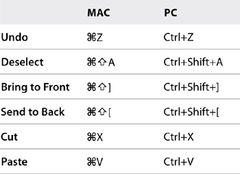
1. Choose Select > Deselect (![]()
![]() A/Ctrl+Shift+A) to make sure you have nothing selected on the artboard.
A/Ctrl+Shift+A) to make sure you have nothing selected on the artboard.
2. From the Appearance panel menu, choose Clear Appearance to remove any attributes that might remain from a previously selected object, allowing you to start with a clean slate.
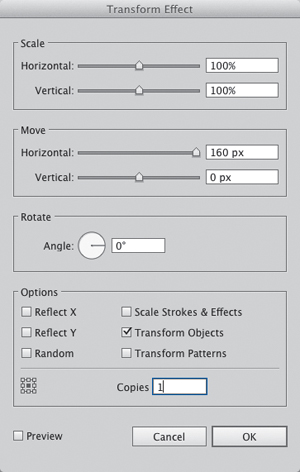
3. Choose Effect > Distort & Transform > Transform.
4. In the Transform Effect dialog box, set the Horizontal value in the Move section to 160 px, and the Copies value to 1 (6.25). Click OK.
6.25. The Transform Effect settings dialog box
When this effect is eventually applied to an object, it will offset a copy of that original object 160 pixels to the right.
5. Choose Effect > Distort & Transform > Transform to add a second effect to this style. You’ll most likely be warned that you are about to add another instance of this effect (6.26). Click Apply New Effect.
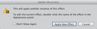
6.26. Applying another effect makes a warning dialog box appear, just in case you didn’t mean to add another effect.
6. In the Transform Effect dialog box, set the Vertical value in the Move section to 201 px, and the Copies value to 1. Click OK.
Again, when this effect is eventually applied to an object, it offsets another copy of the object 201 pixels below the original.
7. In the Graphic Styles panel, click the New Graphic Style button ![]() and then double-click the name to rename it Step and Repeat.
and then double-click the name to rename it Step and Repeat.
When this graphic style is applied, it will use both Transform effects to create two offset copies of the selected object at the same time.
The number to specify is not arbitrary; you’ll actually need to do a little math to figure out how far you want to offset the object. In this example, I know that I am going to use the 142-pixel-wide photo frame, which has a 4-pixel border. The border adds 4 pixels to each side of the frame, adding up to a 150-pixel-wide frame. I’d like 10 pixels of space between frames (to match the gutters in the grid), so the final number is 160 pixels.
You can now add this step-and-repeat effect to any object on the artboard, including objects that already have a graphic style applied. Let’s see how this works on the photo frame as an additive style.
1. Select the photo frame and click the Step and Repeat style in the Graphic Styles panel while pressing Option/Alt.
The additive style first creates the horizontal copy and then the vertical copy. By doing so, you end up with four squares (6.27). The blue selection outline shows that this is one object with three virtual copies. If you click one of the copies, Illustrator selects the original object. If you try to move the original, all the copies move with it. It makes dealing with a large number of identical objects really easy. Now, you’ll fill out the rest of the content area by editing the number of copies.
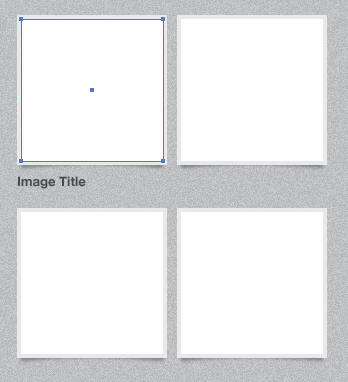
6.27. Applying the step-and-repeat style to an object
2. With the original photo frame selected, click each of the Transform effect links in the Appearance panel and respectively set the number of horizontal copies to 3 and the number of vertical copies to 2.
All that is left to do is step-and-repeat the photo frame label and the Popular Collectors thumbnail image.
3. Select the label and click the Step and Repeat style to copy it, and then add the extra copies using the instructions in the previous step. 6.28 shows the result.
6.28. Step-and-repeat the photo frame labels
4. Select the black square under the Popular Collectors headline in the sidebar and add three horizontal and three vertical copies to it using the same instructions from step 2. 6.29 shows the result.
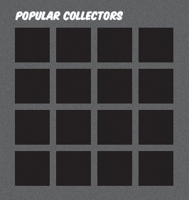
6.29. Applying the step-and-repeat style to another object
5. Press ![]() S/Ctrl+S to save your work.
S/Ctrl+S to save your work.
Additional Type Techniques
One thing I love about Illustrator is how easy it makes working with type. Being able to place, select, and edit type easily makes the design process much more enjoyable. In Chapter 4, you were introduced to the basics of Illustrator’s Type tools. Several more features in addition to those can be used effectively in a UI design workflow.
Getting Text into Illustrator
In order to format and design content, you need to have some content. So far, we have worked with very small amounts of text in Wheelr. But if you’re designing an app that will deal with large amounts of text, Illustrator has great features for dealing with that, too.
The first issue is getting text into Illustrator. There are several ways to do this. The first is to type all the content yourself. If you’re like me and avoided typing or keyboarding classes in high school, that option is probably not at the top of your list. (And here I am writing a book, using my finely honed hunt-and-peck typing technique. Ugh.)
The second is to import your type from another source. Illustrator imports the following file formats:
• Microsoft Word for Windows 97, 98, 2000, 2002, 2003, and 2007
• Microsoft Word for Mac OS X, 2004, and 2008
• Plain text (ASCII) with ANSI, Unicode, Shift JIS, GB2312, Chinese Big 5, Cyrillic, GB18030, Greek, Turkish, Baltic, and Central European encoding
You can also copy and paste text from another source, but if you import from a file, the text retains all its character and paragraph formatting. Any character and paragraph styles in the Word or RTF document are imported into their respective panels in Illustrator, which can be a big help if the content creator has created font and style specifications previously.
I created a simple Word document you can download from www.peachpit.com/UIwithAI/ch6/dummytext.doc. You can use this file to see how importing text works. To import the contents of this text file into your document:
1. Open a new document and choose File > Place.
2. In the dialog box, navigate to the file on your hard disk and click Place.
When importing a Word document or an RTF file, a secondary dialog box will appear asking you to specify which document extras to include and whether to remove text formatting. If you’re importing a Plain Text file, you’ll get a secondary dialog box that will allow you to set the encoding parameters as well as specify spacing and carriage return options.
Illustrator places the contents of the file in an Area type box large enough to fit in the current artboard (6.30).
6.30. Imported text
From there, you can edit this text like you would any other text container in Illustrator.
Sometimes you won’t have content to work with as you begin the design process. Although this definitely isn’t ideal, not every organization has the resources or capability to do full-scale content strategy before the design process begins, so you have to make do. If this is the case, you can use dummy text to flesh out the content areas in your design. If you know how to speak fake Latin (it’s a lost art), I’m jealous of your head start. But if you don’t, a couple of cool resources can get you any quantity of dummy text you need. The best cross-platform solution I have found is Lipsum (www.lipsum.com). It’s a web-based tool that allows you to generate any number of words, paragraphs, or lists for your layout. If you need a tool that doesn’t rely on a web connection, there is Lipservice (www.lipserviceapp.com) for Windows or LittleIpsum (www.littleipsum.com or the Mac App Store) for Macintosh. Both are free applications that copy user-specified amounts of dummy text to the clipboard. Again, use these only if you’re unable to get real content from your team or customer. It’s always better to know and understand the content of your site or app, as it helps to inform the design.
Area Type Options
Once you’ve imported your text into Illustrator, you’ll find several ways to edit it. Remember that area type is constrained to a user-specified container, allowing you to create blocks of type in your design. When designing user interfaces, you’ll discover that area type works best for areas where you need to relinquish control for how text wraps. To simulate text wrapping with point type, you would have to insert hard returns at the end of each line to create a block of text. If the column size were to change in any way, the text wrapping would break. That creates more work than necessary.
Using area type helps alleviate that extra work by handling the wrapping for you. For example, if you were designing an application for reading content from blog feeds, area type would be a great choice for visualizing how that content might fit within the screen design. If the container size changes, the type wraps accordingly. The size of the browser window determines the wrapping anyway, so why fight it?
Resizing blocks of area type is very simple. There are two ways to go about it:
• Resize one side or point at a time by using the Direct Selection tool (A) and dragging points or segments of the type container. The cursor changes as you drag the segment (6.31).
6.31. Using the Direct Selection tool to resize an area type container
• Choose Type > Area Type Options and adjust the settings (6.32) to get fine-grained control over height, width, and even inset values.
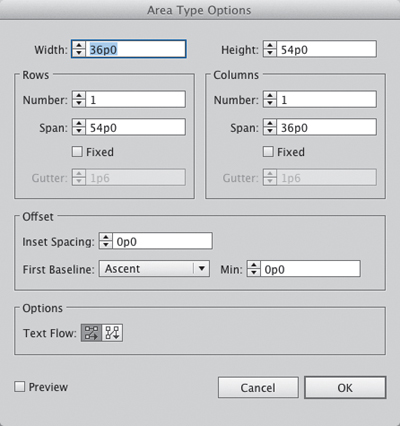
6.32. Area Type Options dialog box
One thing you should never do is use the Free Transform tool to resize an area type container. Doing so distorts the type inside by stretching or condensing it. There is no greater travesty in this world than artificially distorted type (6.33). Well, I’m exaggerating, but it is pretty bad.
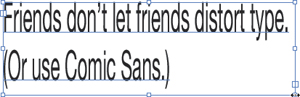
6.33. Don’t ever do this. Please.
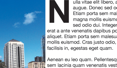
Simulating Floats
A float is a CSS property used to push content away from an image or other object in the layout. Floats have their roots in print where images are used to break up long passages of text, to help provide context, or to create interest and variety on the page. Floats are also used to create multicolumn layouts in HTML and CSS.
Illustrator has a feature that will help you to simulate floats in your design. Specifically, you can use the Text Wrap feature to help content flow around an image or graphic object. This feature places an invisible wall around an object that pushes all text aside. Once the text wrap has been set, you can change the object’s position and the text will always flow around it. Creating a text wrap is really easy. To follow along, download the file (6.34) from www.peachpit.com/UIwithAI/ch6/text-wrap.ai.
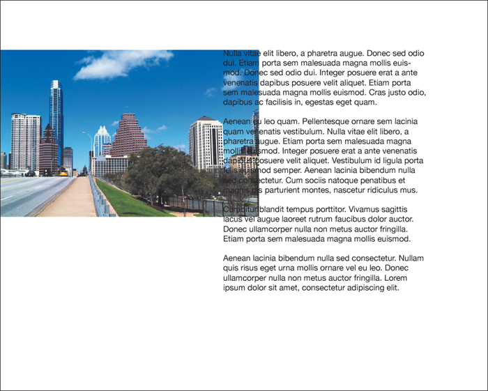
6.34. Working with text wraps
The file has a text area and an image. To create a text wrap, perform the following steps:
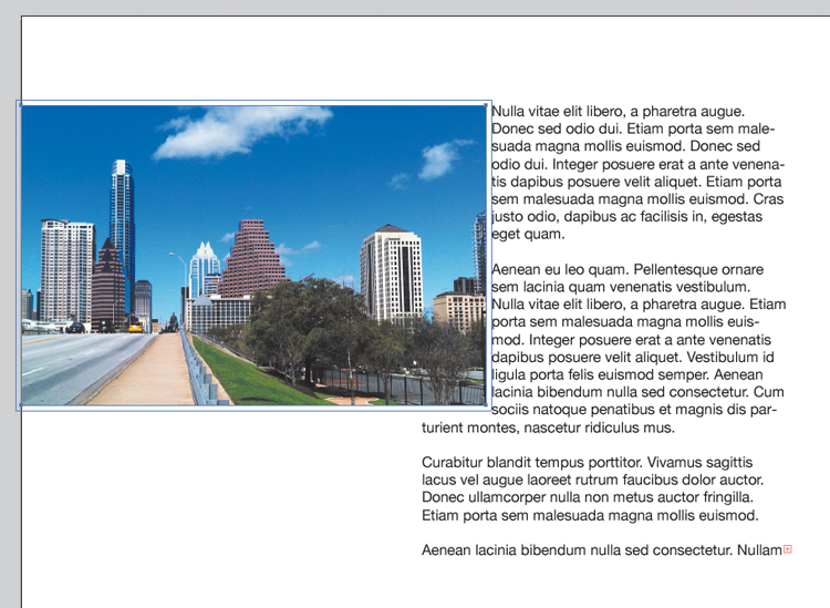
1. Select the image you want to float. Make sure that it is in front of the text by choosing Object > Arrange > Bring to Front (![]()
![]() ]/Ctrl+Shift+]).
]/Ctrl+Shift+]).
2. Choose Object > Text Wrap > Make.
Your text now flows around the image (6.35). You can adjust the margin around the image by choosing Object > Text Wrap > Text Wrap Options and adjusting the Offset value.
6.35. The image with the text wrap applied
1. Double-click the text block, select the first letter, and choose Edit > Cut (![]() X/Ctrl+X) to cut it to the clipboard.
X/Ctrl+X) to cut it to the clipboard.
2. While pressing ![]() /Ctrl, drag to create an area type box, and then choose Edit > Paste (
/Ctrl, drag to create an area type box, and then choose Edit > Paste (![]() V/Ctrl+V) to paste the letter from the clipboard (6.36).
V/Ctrl+V) to paste the letter from the clipboard (6.36).
6.36. Cut and paste the first letter into a separate area type container.
You could use either point or area type for this step, but I prefer area type so that the text wraps around the box and not the character.
3. Format your letter to make it big and bold, and then apply the text wrap by choosing Object > Text Wrap > Make. Move it into place at the front of the paragraph so the text flows around it.
6.37. The final drop cap
Using Find and Replace
If you’ve ever used a word processor to do anything more than type a letter or grocery list, you’ve probably discovered its find and replace feature. Find and replace allows you to find a character, word, or phrase in the text and replace it with something else. It’s great for when you have to swap out a wrong word, correct adjusted nomenclature, or change certain hyphens to en dashes. It’s a humongous timesaver.
After using Illustrator for several years, I discovered that it, too, has a find and replace feature. When working on a UI design with several artboards, find and replace allows you to work much more efficiently than making common text changes manually. It’s a pretty powerful feature and one that you should know how to take advantage of in your work.
Here’s how it works:
1. Using the text-wrap.ai file from the previous section, choose Edit > Find and Replace.
You’re going to use the feature to find all the instances of nulla and change them to nullam. (Again, if you can read fake Latin, you’re golden!)
2. Enter nulla in the Find field. Be sure to enter it in all lowercase.
3. Enter nullam in the Replace With field. As before, use all lowercase letters.
At this point, you’ll notice that the only actions you can take with this dialog box are to click Find or Done (6.38). That’s because you can’t replace anything in the text until Illustrator knows that what you’re looking for is actually there.
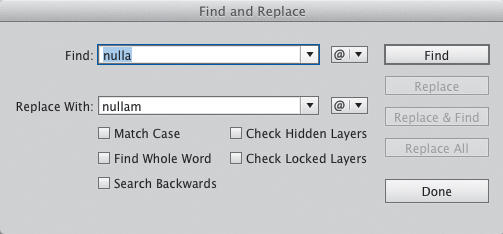
6.38. The Find and Replace dialog box
If Illustrator finds the word, it jumps to and highlights the text. The other buttons also become enabled in the dialog box (6.39).
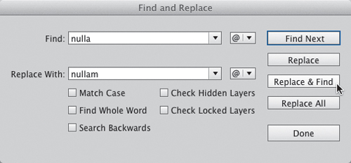
6.39. Find and Replace with all options available
Once Illustrator has found your text, you have several options:
• Click Find Next to cycle through all instances of the word in your document.
• Click Replace to replace the currently selected word.
• Click Replace & Find to replace the currently selected word and then select the next instance. This option lets you see what will be changed before you commit to changing it. That way you don’t accidentally replace a word that you didn’t mean to.
• Click Replace All to replace all instances of the word. This option replaces all instances automatically. Although it automates the process completely, it may end up making unwanted changes. Use it with caution.
Several options let you refine the selection. These can be very helpful in complex documents. You can also use find and replace to change certain characters such as bullets, tab characters, or quotation marks by selecting them from the @ pop-up menu.
5. When you’re finished with the Find and Replace dialog box, click Done.
Working with Images
UIs don’t have to be all spreadsheets, icons, and commands. Photographic images can provide color and life to your application interfaces. Even though Illustrator is a vector program, you’ll find that it handles images adequately. You can do basic image processing (color correction and color conversion), as well as performing basic transformations and Photoshop effects applications.
Images can either be linked to the original or embedded in the document. Each method has pros and cons. Linking images keeps the Illustrator document size small. It also allows you to edit the original in your image editor at any time and have it update in Illustrator. The only con to this method is that you need to keep all your external images and include them with the Illustrator file if you distribute it to someone else. This can get a little complicated if you are using a lot of images, because if you forget to include an image, it won’t show up if someone else opens the file.
Embedding images allows you to get rid of the originals and keep everything in one place, but at the expense of losing editing and bloating the file size. Personally, I find it easier to link images that would be difficult to recreate (like an original photo) or images that are really large. Then I embed all the rest. It really comes down to preference and what works best for your workflow.
Preparing Images for Import
There are several best practices to keep in mind when getting images ready for import into Illustrator. Following these practices will help keep your file sizes small and your workflow efficient. Since Illustrator is not an image-editing application, it’s best to leave these features to an app like Photoshop. The following suggestions are important to remember when preparing images:
• Size images in an image editor to the dimensions they will be used in your mockup. Trying to reduce or enlarge images in Illustrator doesn’t help with image quality and can add a lot or extra weight to both the file size and the amount of memory the app uses (6.40). This can cause slowdowns in performance and increases the risk of untimely crashes.
6.40. It’s best not to scale your images within Illustrator. Use an image editor instead.
• Crop, rotate, and flip images in your image editor before bringing them into Illustrator. Again, make Photoshop do all these image calculations for you, not Illustrator. You’ll be better off in the long run.
• Take care of any color correction and image fidelity issues beforehand as well. Illustrator’s tools are rudimentary compared to an image editor’s (see the sidebar, “Image Processing in Illustrator,” at the end of this chapter).
• For UI design, use images in the RGB color space, which will help ensure good color fidelity and accuracy when the final art ends up in development. CMYK images will be larger and the color may not be ideal since a fewer number of colors can be displayed in this color space.
• Save your image files in PSD or TIFF before importing. You can import JPGs and GIFs, but if you try to export from Illustrator, you’ll end up double-compressing them. Linking your files will save this step, as you can just use the original file as an asset in the final system.
Importing Images
To get images into Illustrator, you can either copy and paste from an image editor like Photoshop, drag them from the desktop into an Illustrator window, or import them using the Place command. With the photo frames you created earlier, you’ll have the opportunity to add several images into the Wheelr layout. You can download several images of toy cars from www.peachpit.com/UIwithAI/ch6/cars.zip. To import multiple files at once, follow these steps:
1. Unzip the cars.zip file and open the folder.
This folder contains the 12 images you’ll need to import into Illustrator for the layout.
2. Select all 12 files and drag them into the wheelr.ai window (6.41).
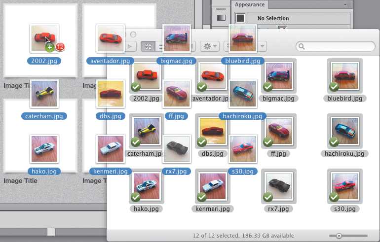
6.41. Dragging multiple images from the desktop into a document
Dragging images automatically links them to the original file. If you wish to embed any of them at this point, select the desired images and click the Embed button in the Control panel. Using File > Place allows you to specify linking or embedding at import.
1. Choose File > Place and navigate to the folder of images.
2. Select the file to import, choose whether to link the file (6.42), and then click Place.
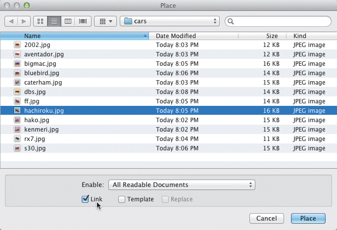
6.42. When using the File > Place command, you can choose whether to link the image.
Importing images one at a time allows you the option to link or embed. The next time you import, Illustrator remembers the previous setting so you don’t have to specify every time.
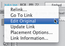
When an image is selected, additional options are available in the Control panel (6.43). Besides showing the color space and image resolution, you can embed it, edit it in an image editor, and even perform an image trace function. Furthermore, the filename appears as a link that displays a menu of useful commands (6.44).
6.43. Image options in the Control panel
6.44. Image commands from the file link
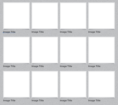
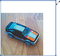
Once you have all the car images in Illustrator, you can use the tools to move them, transform them, and select them for adding effects. Go ahead and move each of the 12 cars into position inside the photo frames (6.45).
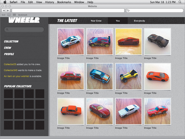
6.45. The final Wheelr mockup
Image Processing in Illustrator
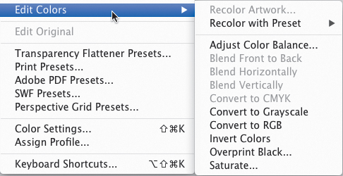
6.46. Edit Colors features for image processing
6.47. Click the Embed button to embed an image in Illustrator.
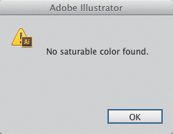
6.48. Dismiss this error message when you see it. The filter still works.
Conclusion
And with that, the Wheelr mockup is complete. This was an exercise designed to get you familiar with the concepts and tools and hopefully served to inspire you to go even further. Take some time to play around with the layout, colors, textures, and content to discover even more possibilities. This really is only the beginning of what you can do with UI design in Illustrator.
The next chapter will teach you how you can integrate Illustrator into your workflow to help you be more efficient without stifling your creativity.
Table 6.1. Keyboard Shortcuts in This Chapter