
Chapter 2. Drawing Expressive Lines
The exercises in this chapter encourage you to study line as a design element found in a landscape photograph of trees. The dark lines produced by the bark of the trees are read in stark contrast against a winter sky (FIGURE 2.1). You’ll use the Pencil and Brush tools and explore the Gradient and Transparency panels in Adobe Illustrator.
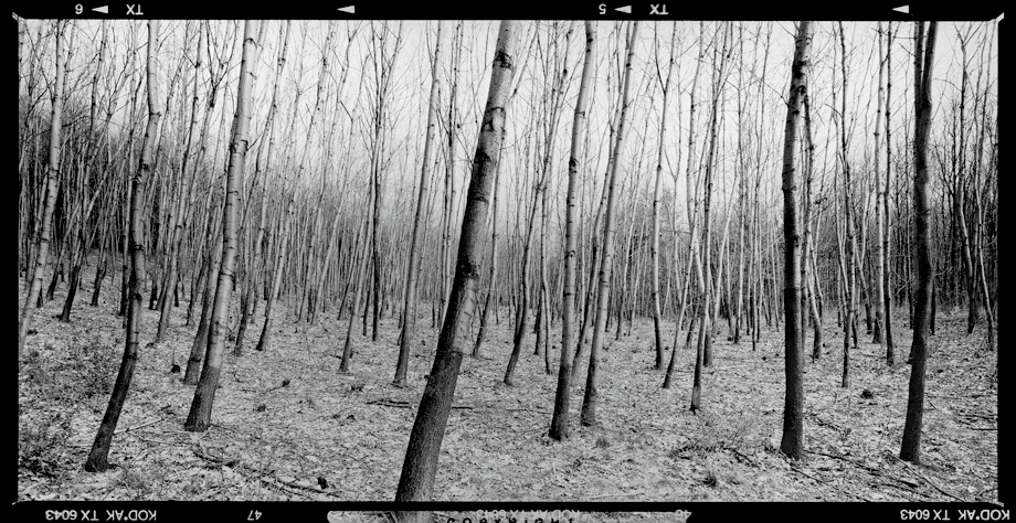
FIGURE 2.1 The original photograph used for a study in lines in Chapter 2 exercises was created by Aleš Jungmann. It is available on the Wikimedia Commons website.
A group of similar lines create a repeated pattern that is easy to read and understand when the weight (or thickness) of the lines is contrasting. Thicker lines will seem to push to the front of the composition, while thinner lines recede into the background. The same is true for dark and light values, respectively. In Chapter 1, The Dot, the Path, and the Pixel, we focused on the separation between the foreground and background of the composition space. In this chapter, lines will express the individuality of each tree in the landscape. While foreground and background are less likely to shift in this composition, you’ll begin to see how the sizes and values of design elements affect human perception.
Since a line connects two dots, it makes sense to follow a chapter study on dots with one on lines. In her book Decoding Design, Maggie Macnab articulates the complexity of the line by referring to the anchor points at each end of the line as a pole. “The poles, while repulsed in their division, are attracted back to one another—the paradox of this principle” [1]. A line can be used to join two elements or to separate parts of a whole (FIGURE 2.2).
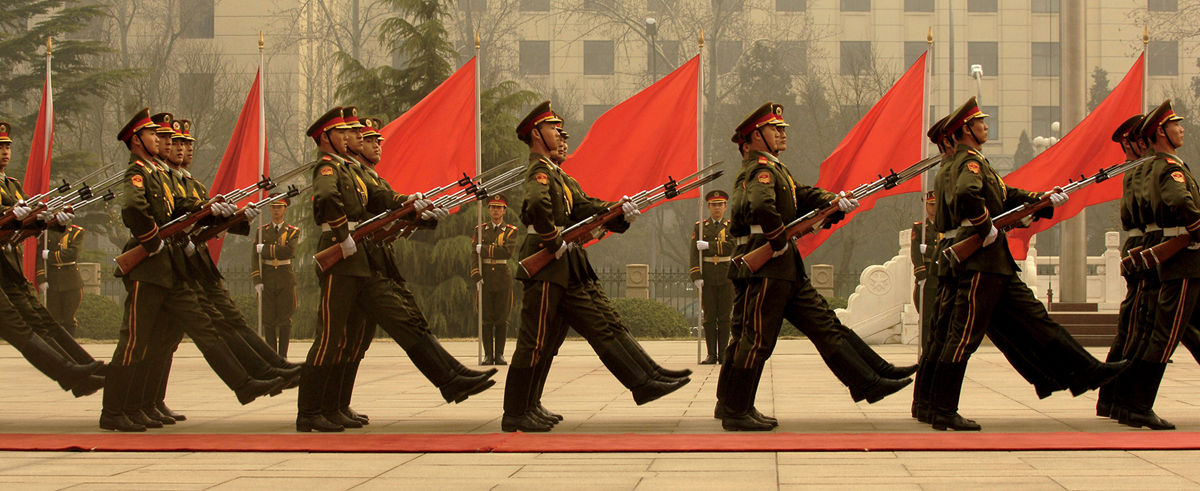
FIGURE 2.2 In this March 2007 photograph by Staff Sgt. D. Myles Cullen, members of a Chinese military honor guard march during a welcome ceremony for Chairman of the Joint Chiefs of Staff Marine Gen. Peter Pace at the Ministry of Defense in Beijing, China. Notice how each red flag and its pole divides the rows of marching men. The poles themselves stretch in opposite directions, from the earth toward the sky. At the same time, each row of marching men can be read as a set of vertical and diagonal (their front legs) lines.
A line can be tight or loose, meaning it can be straight and mechanical or flowing and organic. The plans for an architectural space will be clean and organized. The “hands” of Alicia Eggert and Mike Fleming’s Eternity clock form a composition of tight, black lines on a contrasting white background (FIGURE 2.3), while flowing water in Colleen Ludwig’s Cutaneous Habitats: Shiver demonstrates free-form movement (FIGURE 2.4).
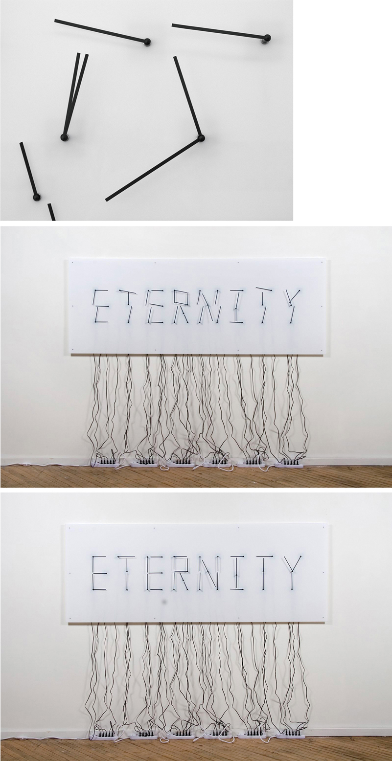
FIGURE 2.3 Alicia Eggert and Mike Fleming, Eternity, 78 × 96 × 3 inches, 2010. Electric clocks, acrylic, and power strips. Eternity uses the hour and minute hands of 30 electric clocks to spell the word “eternity” once every twelve hours. Photo credit: Mike Fleming.
FIGURE 2.4 Colleen Ludwig, Shiver from the series Cutaneous Habitats, interactive environment, 2012. Shiver integrates programming, electronics, and a recirculating water system into a prefabricated, architectural framework with water-resistant fabric walls. Images courtesy of the artist. Images ©Colleen Ludwig.
The exercises in this chapter will show you how to create a series of lines using the Pencil and Brush tools. You’ll experiment with various strokes (line weights) and values to alter the perception of depth between the foreground and background elements.
Saving and Sharing Files
When you save a file, you have many choices to make. How will you name the file? Are you collaborating with others? If so, will you all adhere to the same naming conventions? What type of file do you want to save? What do you plan to do with the file once it’s saved? How you answer these questions will play a role in how you choose to name and save your files. What follows are a few general guidelines that will help you determine how to save and share your files.
File names should be concise, organized, and descriptive. If you’re working on a series of files or collaborating with others (for instance, if you’re a student submitting a file to an instructor who is in effect “collaborating” with you and all of your peers), you should consider naming all files for one project with a consistent naming convention. File names should not include spaces or foreign characters, and they should always include an extension (for example, .ai, .psd, .jpg, and so on). The file name “My BEST picture ever!!!!!!!” is sloppy—it includes spaces and exclamation points, mixes upper- and lowercase letters, lacks the file extension, and, worst of all, it doesn’t describe the content of the image. In my classroom, I ask students to label all files with their first initial dash last name dot file extension, all in lowercase, for example, x-burrough.ai. I insist on file names with all lowercase letters as many of my foundations-level students later enroll in interactive media design classes where lowercase letters are the norm. (It saves time troubleshooting code if you know that the file names don’t utilize uppercase letters.)
In addition to how you name your files, you have to consider the saved format. Best practices include always saving the file in its master or native format (for instance, always save an Illustrator file in .ai format). The master file can be edited at any time in the application in which the file was originally developed. In addition, you may want to save a separate file for sharing. The file formats JPG and PDF are often used for sharing photographic images or type and image layouts. These formats may compress the file (which means that some data may be lost), resulting in a smaller file size. Most importantly, viewers don’t need Adobe applications in order to open these formats, as all computers can display JPG and PDF files via basic previewing applications, the freely downloadable Adobe Reader application, or even a web browser. It’s common to save two versions of the same file: one in the master format (which can be especially useful for later revision) and one in a format conducive to sharing a finished work.
File Naming
If an image is saved in two different formats, the files will have different file extensions. Therefore, you can keep the same file name in place, resulting in something like: x-burrough.ai and x-burrough.pdf so it’s clear they’re the same image.
![]() Aleš Jungmann’s original photograph (trees.jpg) from the Chapter 2 downloads area on the companion website
Aleš Jungmann’s original photograph (trees.jpg) from the Chapter 2 downloads area on the companion website
What You’ll Make
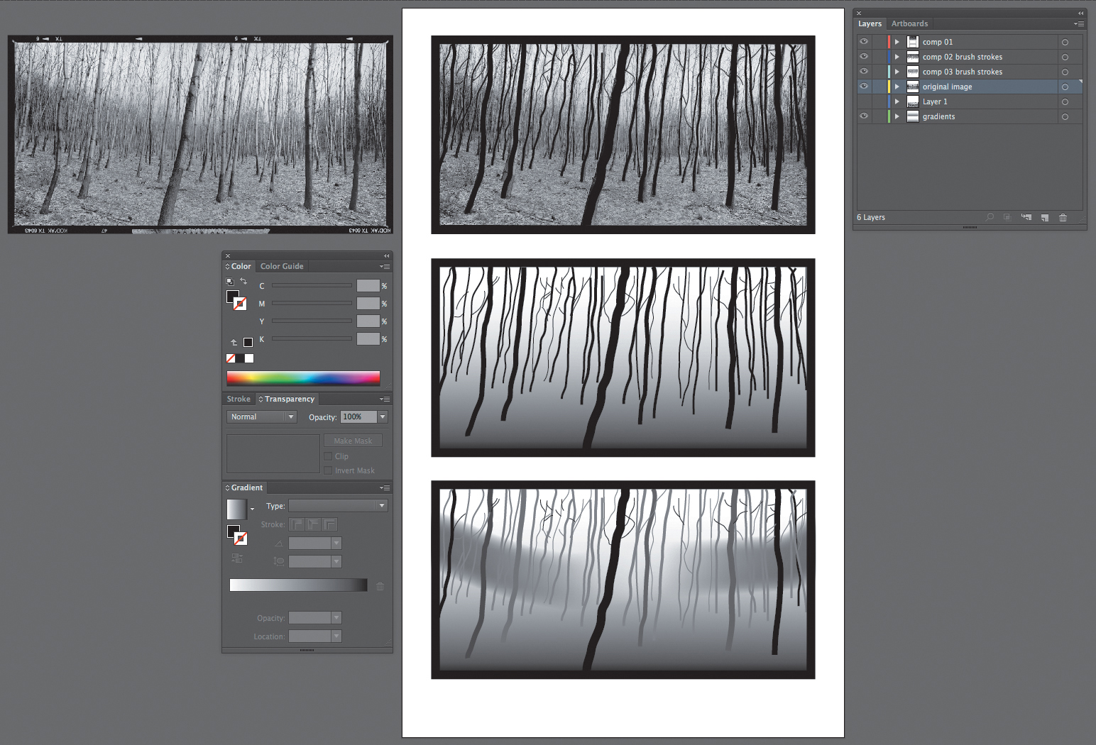
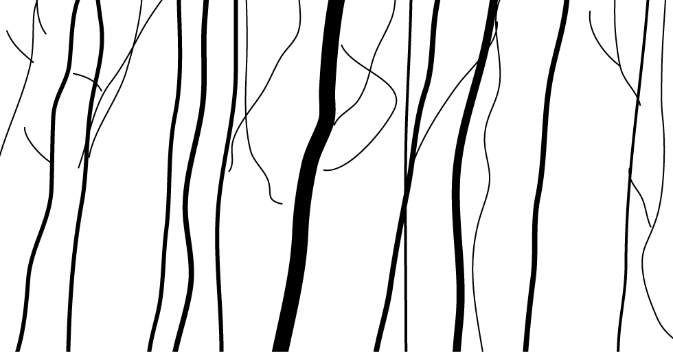
FIGURE 2.5 The final results file for exercises in Chapter 2 includes studies of lines in a black-and-white photograph. Aleš Jungmann’s photograph appears courtesy of the artist. It can also be found on Wikimedia Commons, http://commons.wikimedia.org/wiki/File:Ales_jungmann_krajina_1994-1997_8.jpg.
Exercise 1. Place and Lock an Image
1. Download the original photograph by Aleš Jungmann, trees.jpg, and save it in a folder named chapter02.
Workspace > Essentials
Open Illustrator and set the workspace to Essentials by selecting it from the pull-down list in the Application bar or by choosing the Window menu > Workspace > Essentials.
2. Choose File > New and adjust the following settings: use the Print profile, set the paper size to Legal (8.5 by 14 inches), and choose Inches from the Units pull-down menu. Once you alter the profile, the profile will reset to [Custom]. Name the new file chapter02 (FIGURE 2.6). Press OK.
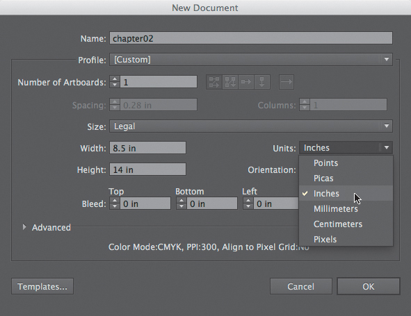
FIGURE 2.6 Start your new document by selecting a profile. When you modify a profile, its submenu is displayed as [Custom].
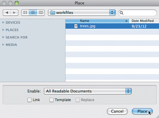
3. Choose File > Place to add the photograph of trees to the artboard. Browse your computer for the file trees.jpg in the chapter02 folder you created in Step 1 (FIGURE 2.7).
Workspace
You can set or reset the workspace at anytime. Reset the workspace by choosing the Window menu > Workspace > Reset (whichever workspace is active). You’ll want your workspace to look like mine so the screenshots are more likely to reflect what’s in front of you.
4. The photograph will appear small on the page. Since you’ll eventually create your own vector abstraction based on the image, don’t worry about file resolution for printing purposes. (This topic is thoroughly investigated in Chapter 5, Resolution and Value.) In this situation, it’s safe to enlarge the photographic image. Use the Selection tool to click on the image and then hold the Shift key while dragging any of the four corners out from the image. Click on the image and drag it to the top of the artboard while keeping an eye on the margin spacing—aim for equal margins on the top, left, and right sides of the image (FIGURE 2.8).

FIGURE 2.8 When the image is in position on the artboard, you’ll see equal margin spacing on the top, left, and right sides. There should be plenty of room for you to work toward the bottom of the page.
5. You’ll be drawing lines on top of the image in the next exercise. If you don’t lock the image, you may unintentionally select and move it while you’re trying to work. With that in mind, lock the image now in anticipation of the next steps. This is easily accomplished with the Layers panel in Illustrator. Any paths you draw or images you place on the artboard will appear in the Layers panel. Press the Layers button in the Panel menu on the right side of the application window (FIGURE 2.9). The Layers panel will appear.
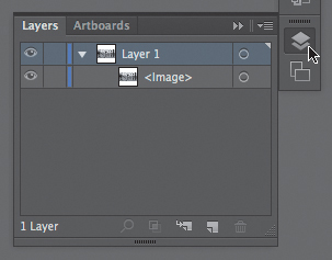
FIGURE 2.9 The arrow in this image represents the mouse clicking on the button to access the Layers panel. (You can also choose the Window Menu > Layers.) The Layers panel displays paths and images added to the artboard.
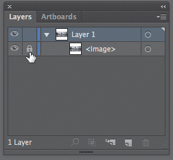
6. If it’s not already expanded, press the sideways arrow next to Layer 1 to flip it into a downward pointing arrow, revealing content saved on this layer (FIGURE 2.10). The image appears in Layer 1 as <Image>. Press the unlabeled box to the left of <Image> to lock it inside Layer 1 (FIGURE 2.11).
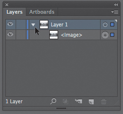
FIGURE 2.10 By default, all media is stored in Layer 1. Expand and collapse layers by clicking on the arrow to the left of its icon.
Finding panels If the Layers panel button is not easily visible, you can always open it by choosing the Window menu > Layers.
Exercise 2. Understand Layers
The Layers panel is a standard feature in many Adobe applications. Illustrator and Photoshop treat layers slightly differently because of the difference between how art is created in vector and bitmap applications.
In Illustrator, you’ll begin with one layer. Each time you add content to the artboard, it’s added as an element that’s part of Layer 1. You can lock elements. You can lock layers. You can create and delete layers. You can rearrange what’s referred to as the “stacking order” of layers to make content appear more in the foreground (or background) of the document, in front of or behind other elements. When you click where there are multiple elements, the topmost unlocked element will be selected. Much of this is also true in Photoshop, though you’ll see in later chapters that it’s safer to work with each element (graphic or text) on its own layer in bitmap applications.
One of the primary roles of layers is to help you organize your document. In the following exercises, you’ll create new layers to make the content of separate compositions easy to find.
Exercise 3. Create Lines with the Pencil Tool
1. Click on the Create New Layer button in the bottom row of the Layers panel (FIGURE 2.12). Layer 2 will appear on top of Layer 1.
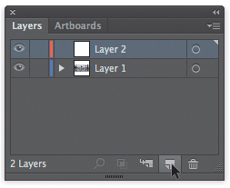
FIGURE 2.12 The Create New Layer icon appears at the bottom of the panel next to the Trash icon. (I always tell students that birth and death live next to each other.) The bottom of a panel is often the location for Create New and Trash icons in Adobe programs.
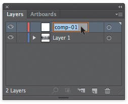
2. Double-click on the name Layer 2 and type the new name comp-01; then press the Enter key on your keypad or click anywhere outside the text field to set the text (FIGURE 2.13). You’ll draw all the new lines for the first composition on this layer.
3. Choose the Pencil tool from the Tools panel on the left side of the application window—it’s the 10th tool in the panel when tools are listed in a single column. Notice that many of the tools have a small arrow on the bottom right side. If you click this arrow, you can expand the tool to see related tools that are bundled with the top tool. The Pencil is the top tool, but it’s good for you to see the other tools that are bundled with this tool (FIGURE 2.14).
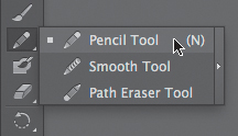
FIGURE 2.14 Clicking the small arrow in the lower right corner of a tool’s icon reveals related tools that are bundled with the top tool.
4. The default fill and stroke values for the pencil are no fill and a black stroke. Check this area of the Tools panel and set it to no fill with a black stroke if the default settings have been modified (FIGURE 2.15).
FIGURE 2.15 Set the Pencil tool to a black stroke (the front icon seen here) and no fill (the back icon).
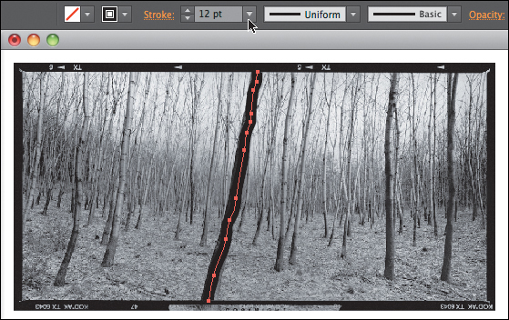
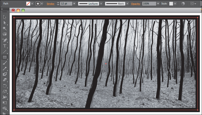
5. Use the Pencil tool to draw a line along the contour of the tree that’s most in the foreground (or the tree’s outline—you can choose the side). When you finish drawing the line, it will remain selected. Modify the weight of the line by increasing its stroke value in the Control area at the top of the application window (FIGURE 2.16). I set mine to 12 points, resulting in a line that’s nearly the same width as the trunk of the tree.
6. Repeat Step 3 to trace enough trees to create a recognizable abstract line drawing of the photograph. Change the weight of the line (the stroke value) as you develop lines that appear in the background (FIGURE 2.17). Watch out for areas where two lines seem to connect (for instance, in those tiny sideways branches in the background). When you draw a line with the Pencil tool, it’s constructed by a series of anchor points. The line remains selected after it’s drawn. If you draw another line on a new area of the artboard, the first line becomes deselected, and the second line is selected. If you try to draw a line that connects with the first line, instead of creating a new line, you’ll end up modifying the first (selected) line. Inevitably, you’ll do this when you don’t intend to. You’ll have to manually deselect the first line—use the Selection tool and click in any white space on the artboard—then draw the second line.
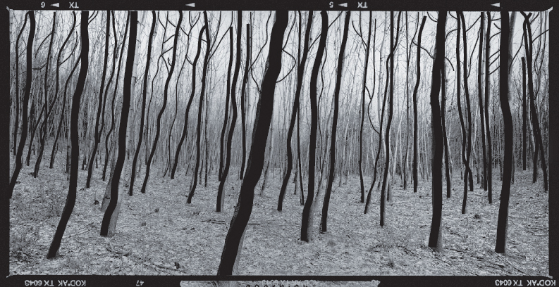
FIGURE 2.17 Continue to trace trees. Watch out for intersecting lines. You will need to deselect the path before drawing a new line that intersects with the previous drawn line.
Key Command
While you’re using the Pencil tool, you can easily access the Selection tool by pressing the Command key on a Mac (or the Control key on a PC). Hold this key while you’re using the converted Pencil to Selection tool. When you release the key, the tool returns to a Pencil.
7. Choose the Rectangle tool and draw a black border around the image, covering the film edges. Modify the stroke value to match the weight of this line at the edge of the photograph (FIGURE 2.18).
Exercise 4. Duplicate the Composition
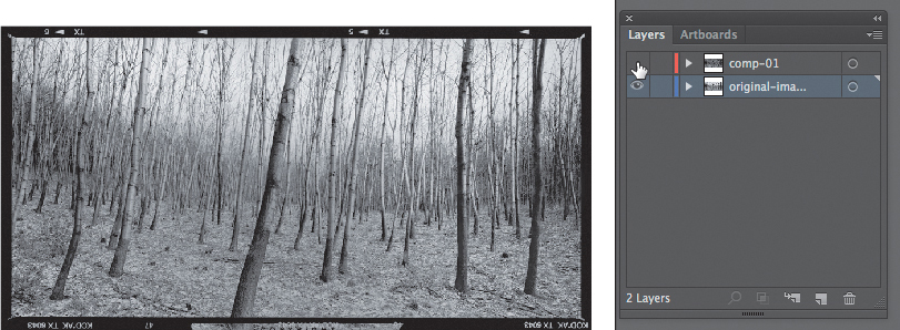
1. Rename Layer 1 so that it better describes the content on the layer. I named mine original-image.
2. Toggle off the eyeball icon next to the comp-01 layer so you can see the original image layer set behind it (FIGURE 2.19). The stacking order of the layers prevents you from seeing lower-level layers when top layers contain content that covers the same areas.
3. Expand the original-image layer and unlock the image (FIGURE 2.20).
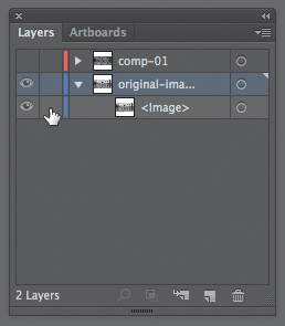
4. Select the image within the Layers panel by clicking in the last column to its right (FIGURE 2.21), called the Selection Column. When you see a box (mine is blue, yours may be another color), you’ve selected a layer element. Look on your artboard to see that the image has been selected.
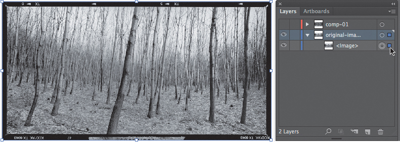
FIGURE 2.21 Select the image within the Layers panel by pressing the box icon to the far right of the layer.
5. Choose the Selection tool. Shift(![]() )-Option-drag to create a copy of the image beneath the first original image. Repeat this process to make a second copy. Keep the spacing of the margins (the negative space) in mind as you position both images. You’ll reference these when you create the next two compositions (FIGURE 2.22).
)-Option-drag to create a copy of the image beneath the first original image. Repeat this process to make a second copy. Keep the spacing of the margins (the negative space) in mind as you position both images. You’ll reference these when you create the next two compositions (FIGURE 2.22).
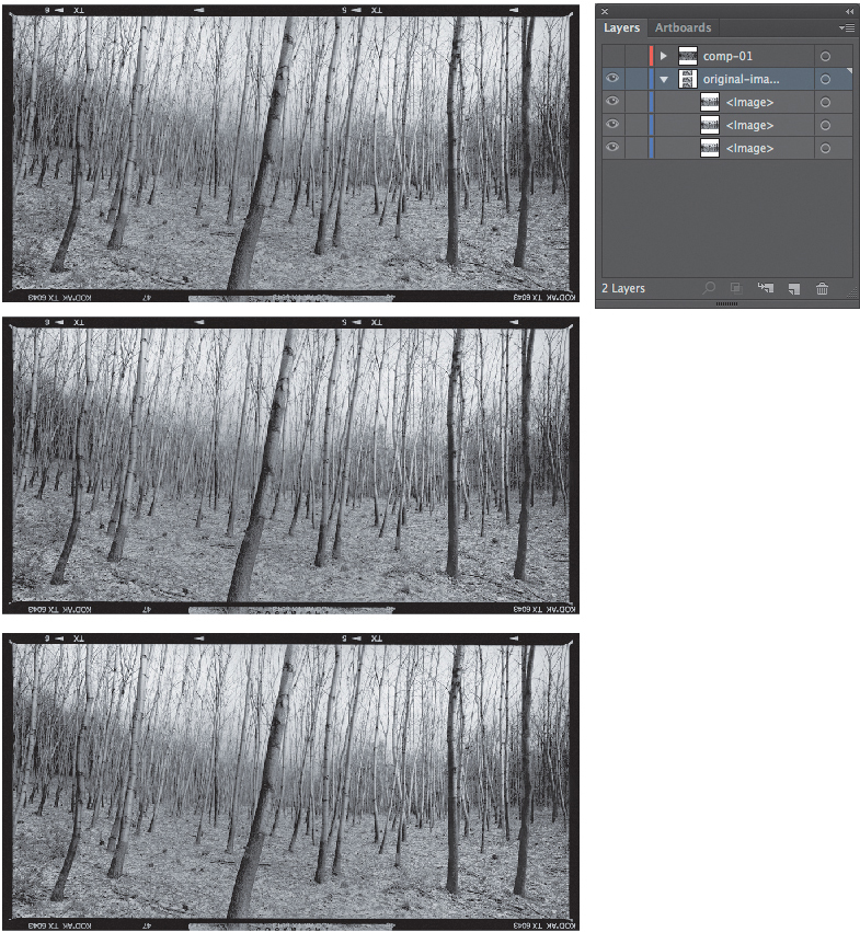
FIGURE 2.22 Choose the Selection tool and use Shift-Option-drag to copy the image. New images appear in the Layers panel.
Exercise 5. Add a Gradient Background
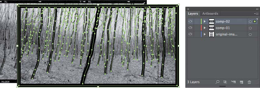
1. Toggle on the eyeball icon to make the comp-01 layer visible. Don’t expand the layer. Click in the Selection Column (FIGURE 2.23). This selects everything contained within the comp-01 layer. Every pencil stroke you created is selected. Choose the Edit menu > Copy or press Command(![]() )-C.
)-C.
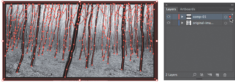
FIGURE 2.23 Clicking in the Selection column of the collapsed layer selects everything stored within it.
2. Before pasting all those paths, create a new layer and title it comp-02.
3. While the comp-02 layer is active, press ![]() -V or choose Edit > Paste. If yours is like mine, you’ll end up with a pasted set of lines that are not aligned with the second original photograph (FIGURE 2.24). While the lines are selected, use the Arrow keys on your keypad to move the composition of lines into position. I used
-V or choose Edit > Paste. If yours is like mine, you’ll end up with a pasted set of lines that are not aligned with the second original photograph (FIGURE 2.24). While the lines are selected, use the Arrow keys on your keypad to move the composition of lines into position. I used ![]() -→ to move my composition of lines to the left significantly faster than if I didn’t use the Shift key.
-→ to move my composition of lines to the left significantly faster than if I didn’t use the Shift key.
Key Command
Press the Shift key and the appropriate arrow key to move items faster—they travel by ten units rather than one unit at a time.
4. Create a new layer to store gradient fills. Name the layer gradients and drag it to the stacking position just above the original-image layer (FIGURE 2.25).
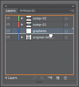
FIGURE 2.25 A layer can be moved to a new stacking order by dragging it into position in the Layers panel. The gradients layer is dragged into stacking position just above the original-image layer.
5. Click the gradients layer in the Layers panel to make it active. Draw a rectangle (use the Rectangle tool) on the gradients layer that’s the same size as the compositional space of the photographic image. Click once on the Fill to bring it to the front of the Stroke, if necessary, at the bottom of the Tools panel. Click once on the Gradient tool. The Fill has a default gradient applied, which you’ll modify in the next step (FIGURE 2.26).
6. You’ll see the Gradient panel (if you don’t see it, choose Window > Gradient) when you activate the Gradient tool. While the rectangle is still selected, modify the gradient settings in the Gradient panel. I chose a black-and-white gradient (the large pull-down box in the top-right corner) set to a linear (rather than radial) direction, or Type, at −90 degrees. At 90 degrees, the darker value was on top, where the sky should appear white (FIGURE 2.27).
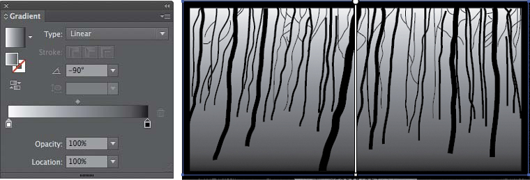
FIGURE 2.27 Choose Window > Gradient to modify the gradient settings. The Type setting (linear or radial) determines how the gradient is distributed.
Be Careful!
If you followed the last few steps but didn’t see a change on your artboard, you may have deselected the gradient fill before modifying the settings in the Gradient panel. Select the gradient fill on your artboard and then try those steps again.
7. You can modify the colors at the two ends of the gradient spectrum at any time. You can also add an additional “pit stop” of color or value by Option-dragging one of the color chip handles in the Gradient panel. Adjust the dark value so it’s 80% black (dark gray) rather than true black. Double-click the black color chip near the bottom of the Gradient panel. This will open a Color panel specific to the Gradient settings. Change the 100% K (or black) value to 80% (FIGURE 2.28).
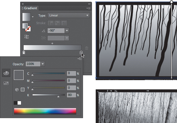
FIGURE 2.28 Double-click the black chip in the Gradient panel to open a Color panel controlling the Gradient settings.
Be Careful!
Value and Tonal Range 80% black is a value in the tonal range from white to black. Value and the tonal range of an image are explored in Chapter 5, Resolution and Value.
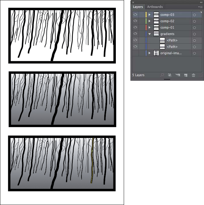
Exercise 6. Create Depth with Contrasting Values
In this third composition, you’ll modify the value of some of the lines to make viewers of your version of the forest perceive even greater depth. Depth and space are alluded to in two-dimensional space by properties that appear in our three-dimensional reality. The size of the trees becomes smaller as the viewer perceives the depth of the forest (both in terms of their height and the line weight of their contours). The overlapping nature of trees also helps the viewer perceive depth. These two values (size and overlap) were translated from the original photograph in black and white. However, atmospheric perspective accounts for the depth that’s achieved due to less visibility through contrast as items are farther from the viewer’s plane of vision. In this case, you’ll need to modify the values of the trees toward the background to allude to the atmospheric perspective.
You’ll also add a final diffused line to the third composition to separate the horizon line from the ground. All aspects of the original image can be translated with one basic design element: line.
1. Repeat Steps 1, 2, and 3 from Exercise 4 to create a third composition. This time, copy comp-02 and name the new layer comp-03. You’ll also need to copy, paste, and position the gradient for the third composition on the gradients layer (FIGURE 2.29).
2. Leave the tree in the very front black (the one with the trunk that extends all the way to the bottom of the frame). Choose the Selection tool and click on one of the trees/lines near the foreground. In the Color panel, set the Stroke value to 90% black (FIGURE 2.30).
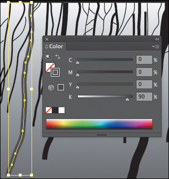
FIGURE 2.30 Use the Selection tool to select a line; then change its Stroke value in the Color panel.
Print Profile
Since you used the Print profile when setting up your document, the Color panel will display with CMYK or cyan, magenta, yellow, and black values.
3. Select the next set of near-foreground trees together. You can select multiple lines by pressing the Shift key as you click each one. If you accidentally add a line to your multi-selection, Shift-click it again to remove it. Set the value to 80% black (FIGURE 2.31).
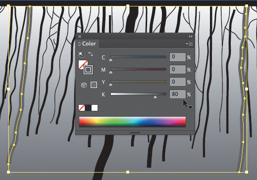
FIGURE 2.31 Hold the Shift key and click to select multiple trees with the Selection tool. Use the Color panel to decrease the stroke values on all of the selected lines.
4. Repeat this process as you set another group of lines to 70% black, then 60%, and so forth as you move backward in the compositional space. You may leave some of the smaller twigs black as they overlap other tree branches. This contrast between black and mid-gray will help the viewer see the details in the forest.
Exercise 7. Use Master Files and Shared Files
1. When the design is finished, save the master file—either press ![]() -S or choose File > Save As to rename or reposition the file on your hard drive. Save the file in master format, meaning .ai (Adobe Illustrator), the format that is specific to the Illustrator application. You can click OK through the Illustrator Options dialog unless you’ll need to open and edit the file in a prior version of Illustrator. (If so, see the following note on backward compatibility.)
-S or choose File > Save As to rename or reposition the file on your hard drive. Save the file in master format, meaning .ai (Adobe Illustrator), the format that is specific to the Illustrator application. You can click OK through the Illustrator Options dialog unless you’ll need to open and edit the file in a prior version of Illustrator. (If so, see the following note on backward compatibility.)
Note on Backward Compatibility
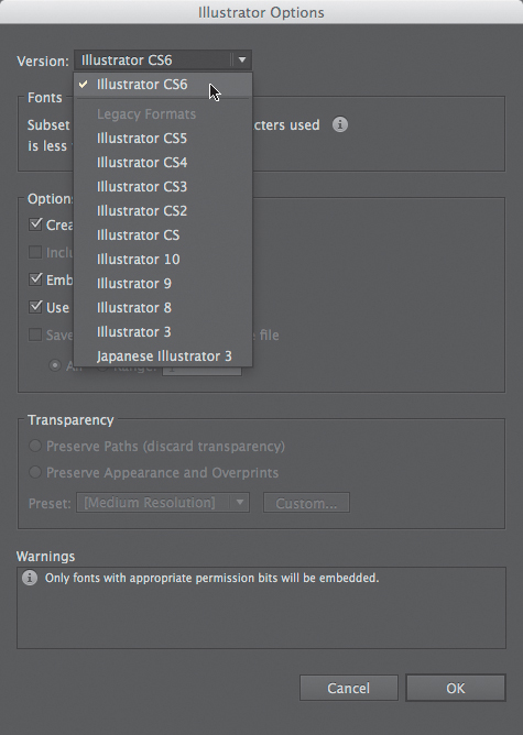
FIGURE 2.32 Choose File > Save As to save a native file. In the Illustrator Options window, select a version to save a master file compatible with your system settings.
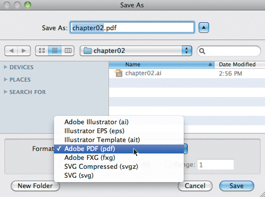
2. The .ai format is imperative: if the file is in this format, you’ll always be able to open and edit the file using Illustrator. However, you’ll also want to save your work in a format optimized for sharing. For this purpose, vector graphics are most often saved in PDF, SVG, and PNG file formats. Save the file as a PDF now. Choose File > Save As (![]() -
-![]() -S) and then choose Adobe PDF from the format pull-down menu (FIGURE 2.33). The next dialog contains a lot of information about how the PDF will save, which is more thoroughly covered in Chapter 11, The Grid (Illustrator), and Chapter 12, Continuity (InDesign). For now, press the Save PDF button and view the two files in your folder. As described earlier in this chapter, you can use the same name on both files because the file extensions (which are, officially, part of the name) are different.
-S) and then choose Adobe PDF from the format pull-down menu (FIGURE 2.33). The next dialog contains a lot of information about how the PDF will save, which is more thoroughly covered in Chapter 11, The Grid (Illustrator), and Chapter 12, Continuity (InDesign). For now, press the Save PDF button and view the two files in your folder. As described earlier in this chapter, you can use the same name on both files because the file extensions (which are, officially, part of the name) are different.
 Lab Challenge
Find or take a photograph of an athlete and develop a “tight” pencil illustration of her action or movement using the Pencil tool (or by exploring the Brush tool) in Illustrator.