
Section 4: Typography
Typography is the visual design of language. It’s an essential component of any media presentation that includes words. As mentioned in the introduction, readers and students of this book are enrolled in a wide variety of academic programs. The communications department I teach in doesn’t require students to complete a course in typography. Graphic design students, obviously, will take several typography classes. The exclusion of typography from any program that’s even a bit visually oriented is hard for me to understand (although I’m certain it has to do with the number of course units available, a bias toward nonvisual classes, and faculty who aren’t aware of typography in their everyday lives).
So this is what I tell all my students: take at least one typography class. Go to a junior college or community college, sit in on a university class for no credit, do whatever you have to do to take at least one course in type. Without a knowledge of typography, you’ll be left with a basic visual vocabulary for images but not for the design of words. Imagine a day in your life where you never see a printed word (on a screen, on paper, on the highway, on a billboard, or on informational signage). Life as we know it would be drastically different and wholly uninformed without the written word. Surely, we would rely on pictographs, petroglyphs (FIGURE S4.1), or design some other means of communicating ideas, but isn’t it convenient that in the English language we only have to consider 26 letterforms? This section focuses on the intelligent consideration of the design of letterforms with regard to how they appear when printed or on the screen, how the display of text is best planned for the human eye, and how type relates to other design elements.

FIGURE S4.1 A Pueblo petroglyph (a rock carving, as opposed to a rock painting which would be referred to as a pictograph) in Boca Negra Canyon at Petroglyph National Monument in New Mexico. Likely carved by ancestors of today’s Pueblo Indians, Puebloans had lived in the Rio Grande Valley since before 500 CE.
There are many resources for learning typography. My favorite books include Ellen Lupton’s Thinking with Type, which is accompanied by an outstanding website full of tools for students and educators alike; John Kane’s A Type Primer; Erik Spiekermann’s Stop Stealing Sheep & Find Out How Type Works; and Emil Ruder’s Typographie: A Manual of Design.
Letterforms
Letterforms are designed by typographers who manipulate the shapes of common glyphs (letterforms, numbers, and other communicative symbols). Typographers place a special emphasis on the relationships between thin and thick lines, positive and negative space, the space that a glyph occupies, and more. While you won’t be designing new letters in the exercises in this section, you’ll begin to notice the differences among typefaces. Each font has its own personality. Your choice of a typeface for a project should be informed by its style and the message you intend to communicate in your project. Toward this end, you’ll learn some basic anatomical definitions and historical classifications that will help you make informed decisions.
The movable type developed by the German blacksmith Johannes Gutenberg revolutionized European cultures in the 15th century (FIGURE S4.2). Ideas could be transmitted via printed matter with a new ease, much as the invention of the internet transformed communication in the latter part of the 20th century. The way in which type is disseminated, however, has changed in the last 500 years. Glyphs were once physical objects, carved into metal or wood, and then inked and pressed onto paper, vellum, or other materials. Printers in the predigital era faced the same design issues (such as alignment and spacing) that you’ll tackle with digital tools. Just as Photoshop’s Burn and Dodge tools are direct descendants of darkroom techniques (discussed in Chapter 7), the leading and kerning you’ll learn about in this section are descendants of movable type.

FIGURE S4.2 Johannes Gutenberg (and his craftsmen), Gutenberg Bible opened to the beginning of the Gospel of Luke, 1454 or 1455. Courtesy of the Library of Congress [LC-USZ62-110333]. From the Library of Congress website: “The Gutenberg Bible is composed of 1,282 pages. Each page measures 17 × 12 inches. The type is set in two columns, forty-two lines each, from which it has become known as the ‘forty-two-line Bible,’ or ‘B42.’” Today’s viewers have greater difficulty reading this text because the style of the typeface—Blackletter—is uncommon in body copy.
Link
See the Library of Congress’s interactive Gutenberg Bible exhibit at http://myloc.gov/Exhibitions/Bibles/Interactives/html/gutenberg/index.html.
What’s in a Letter?
A traditional typography course would cover the many parts of a letter in depth. I’ve limited the following list of definitions to those you’ll need for a basic conversation about type in a work of design or digital art. FIGURE S4.3 showcases a letter’s baseline, x-height, cap height, serif, ascender, and descender. The baseline is the invisible line that a letter, word, or sentence sits on: it’s the implied line that keeps typography moving in one direction. The x-height is the distance from the baseline to the top part of a lowercase letter in any font, while the cap height is the distance from the baseline to the top of an uppercase letter. Since typefaces can have enormous or tiny x-heights, the size of this part of the letterform influences the amount of space the letter takes up in a composition and the viewer’s perception of the size of the type. The serif is a small detail that hangs off the end of some of the strokes defining a letterform. Ascenders and descenders are parts of the letter that escape above the x-height or below the baseline, respectively.
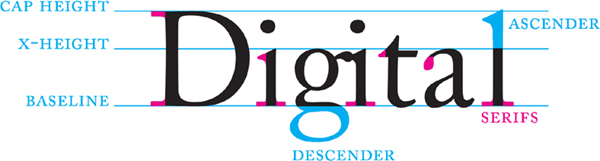
FIGURE S4.3 A diagram showing selected elements of a letter-form. Serifs are rendered in magenta. For a more robust directory, visit the Letter Anatomy page on Ellen Lupton’s Thinking with Type website at http://thinkingwithtype.com/contents/letter/#Anatomy.
Classifications of Type
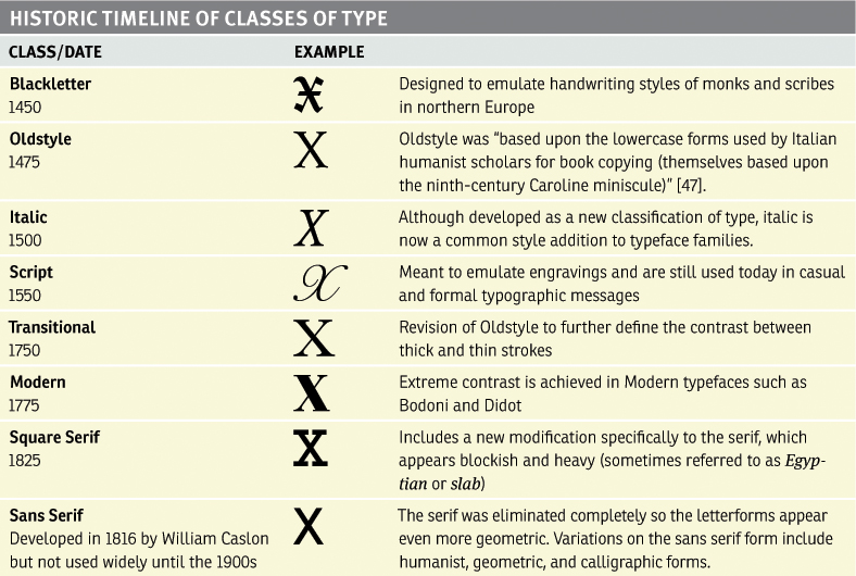
John Kane identifies classes of type on a historic timeline in his book A Type Primer in TABLE 7.1.
Though developed as a new classification of type, italic is now a common style addition to typeface families (FIGURE S4.4). Kane suggests that square serifs, for instance, were a response to the advertising industry’s need for bold, heavy, commercial type (FIGURE S4.5). Martin Majoor (designer of the Scala and Nexus typefaces, among others) coined the Nexus Principle [1], whereby multiple typefaces including both sans serif and serif letters are created based on one form.

FIGURE S4.4 Italic is now a common type style or variation. The same sentence appears here in Calson 10/12 point (read as “10 over 12 points,” meaning the size of the font is 10 points and the leading, or space between the lines, is 12 points). The top sentence is rendered in italic, and the bottom is in regular style. Notice how the italic style occupies less space on the page than the regular variation of the same typeface.
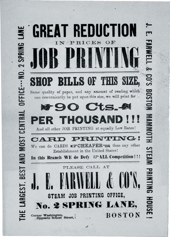
FIGURE S4.5 An American Time Capsule: Three Centuries of Broadsides and Other Printed Ephemera, the fourth of six advertisements of Boston Printing, 1860. Library of Congress, Rare Book and Special Collections Division. In this advertisement: bold, commercial type includes serifs, sans serifs, slabs, and more!
Serif vs. Sans Serif
It’s important for digital artists and designers to be able to distinguish the difference between a serif and sans serif typeface (FIGURE S4.6). Legibility is one of a typographer’s key concerns, and the differences between these two typeface styles can greatly influence the legibility of the text in particular situations. A serif typeface is easier to read in the body copy (paragraph text, for instance) of printed documents, such as newspapers, magazines, pamphlets, and brochures. The serifs offer contrast between the paper and ink that aids reading in this situation, where light is reflected from the paper to the reader’s eye.

FIGURE S4.6 In the left column, the word “help!” is set in several SERIF typefaces: Adobe Caslon Bold, Adobe Garamond Bold, FF Scala Bold, Goudy Old Style Bold, and Didot Bold. On the right side, the SANS SERIF typefaces used are Helvetica Black, Akzidenz Grotesk Extra Bold, Franklin Gothic Medium, News Gothic Bold, and Univers 65 Bold.
Sans serif typefaces are easier to read in body copy that appears on a screen, such as websites, mobile apps, and videos. Since light is being projected from the screen to the reader’s eye, the tiny serifs at the edges of the letterform become an annoyance that hinder legibility while the crisp edges of the sans serif form are simpler to perceive.
The 2007 movie Helvetica includes interviews with an international group of typographers and graphic artists who, for the most part, have strong opinions about the typeface Helvetica [2]. This ubiquitous font, designed by Max Miedinger in 1957, has been used in commercial advertising, corporate logos, information graphics, and so on for more than 50 years. Some designers view this modern, geometric typeface as a stifling indicator of a homogenous corporate culture. Others find beauty in the letterform’s chameleon-like flexibility. This particular font and Gary Hustwit’s movie provide an opportunity for reflection on the physical and symbolic differences between Roman typefaces (old style, transitional, and modern) and sans serif letterforms.
Type and Image
Philip Meggs’s 1989 book Type and Image remains one of my favorite resources for articulating the relationship between two visual elements that could be read as graphic and abstract, dominant and symbolic, or signs and pictures. Meggs quotes French critic and philosopher Roland Barthes in an observation of the way in which the word became subservient to the image as society’s pace quickened in the 20th century, “Formerly, the image illustrated the text (made it clearer); today the text loads the image, burdening it with a culture, a moral, an imagination” [3]. Typography can be rendered as an image form (see the Google Doodle note in this section). Text can alter the meaning of an image or direct the viewer toward an interpretation. As type and image are juxtaposed, their relationship dictates a layer of meaning to the viewer. Conventionally, type is isolated from images (for instance, in the way this book is designed). Juxtaposing text and image in surprising ways can result in a powerful message. Meggs suggests, “Frequent use is made of type that surprints or overprints an image and type that reverses or drops out from the image...to create strong visual hierarchy and effective communication” [4]. In the exercises in this chapter, you’ll overprint big, bold text on the collage you created in Chapter 8. The type will become a new graphic element in the composition, and its vector format will contrast with the photographic texture of the collage.
Philip B. Meggs, Type and Image: The Language of Graphic Design (New York: Van Nostrand Reinhold, 1989). pg. 41.
In Chapter 10, you’ll add type to the collage you created by completing the Chapter 8 exercises for Luis Buñuel and Salvador Dalí’s film Un Chien Andalou.
Google Doodles are short animations that transform the Google type-based logoform into a themed motion graphic. View the whole collection at www.google.com/doodles/finder/2013/All%20doodles.
Contrast and Hierarchy on the Grid
Typefaces are designed in sets known as families, which include a variety of styles and point sizes. A display font may have a limited family (or none at all), while a typeface revised and redesigned for different type factories will include a lush set of varieties (FIGURE S4.7). While you may need only one version of a typeface for a headline (where you might use a display font), it’s important to choose a large family for variations made in body copy. Using a single type family for the body copy in a layout will help keep the composition unified. However, using multiple varieties of that family will let you create typographic contrast. These two elements, unity and contrast, are used to direct the reader’s gaze as she scans a layout. To organize the layout, a simple (invisible) grid is established, and type is limited to alignment along its horizontal or vertical guides. Contrast is introduced through the usage of multiple guides. Hierachy is established through contrast and the perception of isolation or a shift in the ratio between negative and positive space. Different parts of the text (headings, body copy, image captions, and so on) play different roles in the composition—each corresponds to a different level of hierarchy and should be treated visually as such.
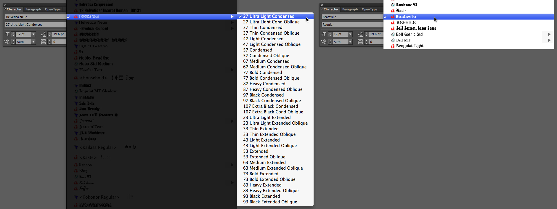
FIGURE S4.7 The lengthy list on the left shows variations for the typeface Helvetica Neue. The display typefaces listed on the right include few or no variations.
In Chapter 11, The Grid, you’ll use a grid to organize a typographic layout. You’ll create contrast and hierarchy through space, size, and typographic varieties.
Which Application Should I Use?
While you’re already familiar with Adobe Illustrator, there are good reasons to use Illustrator and equally good reasons for using Adobe InDesign. Illustrator has all the tools you need to produce posters, identity materials (business cards, letterhead, logo designs), and other one-page items. InDesign has additional tools and panels useful for controlling the design of multipage layouts, not to mention its recent additions for the development of electronic books and mobile applications.
In Chapter 12, Continuity, you’ll develop a multipage PDF portfolio using InDesign. Since the PDF is meant to be viewed on the screen, you’ll use a sans serif typeface throughout the document.
I recommend that students create a straightforward PDF of their portfolios for email correspondence with human resources staff or internship supervisors. This can be accomplished using multiple artboards in Illustrator. I’ve documented the process in an article on Peachpit.com [5], for anyone who doesn’t want (or have the time) to learn a new application.
xtine burrough, Create A PDF Portfolio Using Adobe Illustrator, October, 2010, www.peachpit.com/articles/article.aspx?p=1636981.