
Chapter 3. Modify Basic Shapes

The exercises in this chapter will help you create complex graphic icons using three basic shapes: the circle, the square, and the triangle. You’ll use the Pen, Add Anchor Point, Convert Anchor Point, Direct Selection, and Reflection tools and explore the Pathfinder panel.
Combining simple shapes to develop complex forms is a visual strategy employed by every illustrator or logo designer. As such, the three basic shapes should be well understood as psychological tools. Rudolf Arnheim, a master of perceptual psychology, declared that “visual experience is dynamic” [1]. He noted that shape and form are perceived in relation to every other lived experience and the simultaneous visual play within a composition. Compositions include “interplay(s) of directed tensions,” which can be read as “psychological forces.” Artist and Bauhaus instructor Johannes Itten said, “The character of the square is horizontal and vertical, that of the triangle, diagonal, and that of the circle circular” [2]. Each of these shapes can be harmonized or distressed by the horizontal, diagonal, or circular shape of the other.
Rudolf Arnheim, Art and Visual Perception: A Psychology of the Creative Eye (Berkeley, CA: University of California Press, 1974). pg. 11.
Johannes Itten, Design and Form: The Basic Course at the Bauhaus and Later (London: John Wiley & Sons, 1975). pg. 62.
In Chapter 2, Drawing Expressive Lines, you learned to see how repeated lines are understood on a visual plane through shifting values and contrasting weights. In this chapter, you’ll work with basic forms, while the lines will simply represent the perimeter of an object, or the difference between where a shape is present and where it is not. You’ll notice how perception is influenced by the dynamic nature of shape relationships as you build your composite icons.
Since a shape is the culmination of a line that either curves or is angled back onto itself, it’s no stretch of the imagination to follow a chapter study on lines with one on shapes. “To produce a work of art,” wrote Itten, “creative imagination should have many possibilities to draw on. To find the simplest and clearest form, the thinking, in terms of variations and combinations, must be developed by means of exercises” [3]. Logo designers notoriously sketch hundreds of designs before arriving at their final compositions (FIGURES 3.1 AND 3.2). In this chapter, you’ll work on two compositions. However, the lab challenge encourages you to continue this practice. The more relationships between these basic forms you can see and develop, the clearer you’ll be able to see and think visually.


When you read about the contrast between something that is present and something that is not, you should connect this idea to binary digital relationships (off/on, yes/no, present/hidden), as well as to the formal design property of figure/ground or positive/negative space. Review the introduction to this section if this is unclear.
All complex shapes are created from the three basic forms. 2pxBorder, a web design firm in New Zealand, created a virtual kaleidoscope to mesmerize viewers who visit kaleidolism.com. In their “watermelon,” “colored pencils,” and “toolbox” kaleidoscopes, you can dynamically change the relationship between the circles, squares, and triangles in a web browser (FIGURE 3.3).

FIGURE 3.3 Screenshots from Kaleideolism.com by 2pxBorder. Dynamic relationships between circles, squares, and triangles are seen in this playful study of basic shapes.
The exercises in this chapter will show you how to create two complex shapes based on circles and rectangles in Adobe Illustrator. You’ll experiment with various modifications to the shapes to create recognizable graphic icons—a generic online profile image and a tree.
Signs and Logos
When basic shapes are combined into simple forms, they can become visual marks that are easy to remember. These forms act as visual signs to indicate a language-based idea. For instance, think about the signs you might see while traveling, eating out, or attending a public event. Charles Sanders Peirce, an American philosopher whose work in semiotics is applied to visual culture, posited that there are three types of signs: symbols, indexes, and icons. In the realm of graphic design, a successful logo might take any one of the formats described by Peirce. However, most logos are simple, abstract forms (more closely aligned with an iconic sign).
Read more in James Hoopes, ed., Peirce on Signs: Writings on Semiotic by Charles Sanders Peirce (North Carolina: University of North Carolina Press, 1991). Also see Roland Barthes, Elements of Semiology, trans. Annette Lavers and Colin Smith (New York: Hill and Wang, 1973) or Mythologies, trans. Annette Lavers (New York: Farrar, Straus and Giroux, 1972).
The first trademarked logo can still be seen on bottles of Bass beer: a red triangle in close proximity to the script-styled “Bass” (FIGURE 3.4). As David Airey wrote in his book, Logo Design Love, “a truly enviable iconic design will also be simple, relevant, enduring, distinctive, memorable, and adaptable” [4]. While this all may sound like a simple recipe, designing a logo to represent a company’s brand that meets each of Airey’s criteria is incredibly difficult. This chapter is a primer for those who seek further development on the study of logos, icons, mark making, and graphic design.

FIGURE 3.4 The logo for Bass Ale—registered as a trademark in the 1870s—was the first trademarked logo.
David Airey, Logo Design Love: A Guide to Creating Iconic Brand Identities (Berkeley, CA: New Riders, 2010). pg. 22.
What You’ll Make

Vector Curves
While you’re modifying basic vector shapes in the following exercises, you’ll notice that the straight paths are made up of anchor points, while curves are controlled by anchor points and Bézier handles. The handles allow you to control the Bézier curve, named for a French engineer who used them to design automobiles. You can move or reposition the anchor point at the midpoint of the curve with the Direct Selection tool and drag the end of the handle (there’s one on each side of the midpoint) to lengthen or shorten it. The longer the handle, the softer (or smoother) the curve. Handles can also be repositioned with the Direct Selection tool to tweak the contour of a curve. If you’re reading this without looking at a curve in Illustrator, it may seem abstract. You’ll find Bézier handles a bit more intuitive after you modify some curves in Exercise 4.
Exercise 1. Create a Document with One Artboard
1. Create a new document in Illustrator as follows: press Command(![]() )-N or choose File > New Document. In the New Document dialog box, choose Profile > Print and then set the width and height to eight inches by typing “8 in” in each field (FIGURE 3.6). Change the units to Inches using the pull-down menu. Press OK.
)-N or choose File > New Document. In the New Document dialog box, choose Profile > Print and then set the width and height to eight inches by typing “8 in” in each field (FIGURE 3.6). Change the units to Inches using the pull-down menu. Press OK.

Workspace > Essentials
Open Illustrator and set the workspace to Essentials by selecting it from the pull-down list in the Application bar or by choosing the Window menu > Workspace > Essentials.
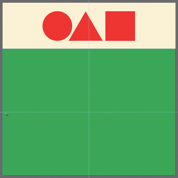
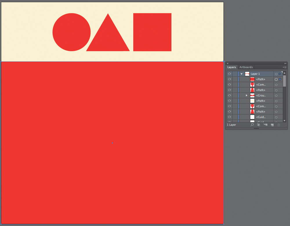
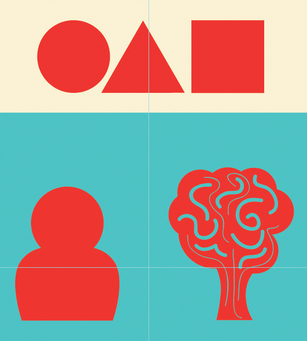
2. Draw a circle, triangle, and square at the top of the document using a fill and no stroke. (I used a red fill—you can use any color.)
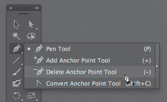

FIGURE 3.8 When an object is selected, its anchor points will be highlighted. Use the Delete Anchor Point tool to remove an anchor point, thereby changing the structure of the shape.


FIGURE 3.12 While the mouse is depressed, pressing the Down Arrow key decreases the number of sides in a polygon.
3. Set the three basic shapes aligned on a baseline at the top of the page—pay attention to a repetitive amount of negative space in the margins. Create a fill behind the three shapes with a light value. I set mine with the CMYK values seen in the Color panel in FIGURE 3.13. Those three shapes will be used to create more complicated forms while completing the exercises in this chapter.
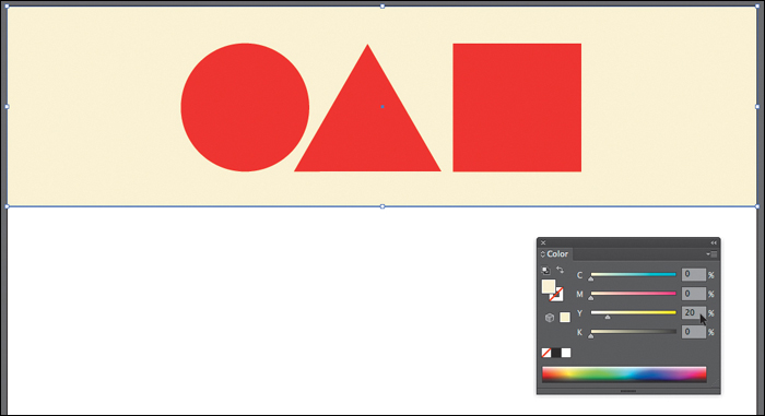
FIGURE 3.13 Fill the shape with 20% yellow using the Color panel in CMYK color mode. You can alter the color mode of this panel from the menu in its upper-right corner.
Arranging the Stacking Order of Paths in Illustrator
• Bring Forward: ![]() -] (Close Bracket)
-] (Close Bracket)
• To Front: ![]() -Shift(
-Shift(![]() )-]
)-]
• Backward: ![]() -[ (Open Bracket)
-[ (Open Bracket)
• To Back: ![]() -
-![]() -[
-[
Exercise 2. Create Two Basic Shape Combinations
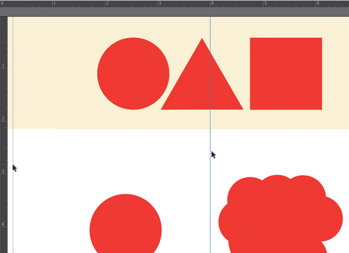
1. Using the rest of the white space of the page, create two shape combinations. Combine the circles and squares as if you were making a silhouette of a person’s head and shoulders (often used on the web to represent a generic “profile” icon) and use several copies of the circle to make a tree (FIGURE 3.14).

2. Press ![]() -R to view rulers; then click and drag from the left ruler to four inches (dividing the page in half). A guide will be placed to help you to see how to distribute your work evenly within the positive and negative space in reference to this division (FIGURE 3.15). Guides are helpful visual aides; they will not appear in a printout.
-R to view rulers; then click and drag from the left ruler to four inches (dividing the page in half). A guide will be placed to help you to see how to distribute your work evenly within the positive and negative space in reference to this division (FIGURE 3.15). Guides are helpful visual aides; they will not appear in a printout.
Smart Guides
Choosing the View menu > Smart Guides will present alignment guides while you’re working. In some situations, this can be extremely helpful, while in others it’s an annoyance. The key command for Smart Guides is ![]() -U. It’s one worth committing to memory!
-U. It’s one worth committing to memory!
3. Another way to find the halfway point between two endpoints is to draw a rectangle that starts at one point and ends at the other. Since every shape has an anchor point at the center, you can use a simple rectangle to determine the placement of a guide, and then delete it. Use this method to set a horizontal guide halfway between the row of basic shapes and the rest of the page (FIGURE 3.16). My rectangle is green—remember that it must be selected in order to see the anchor points. I deleted the green rectangle after my guide was in place.
Organizing shapes
Although it may be tempting, don’t group your shapes at this point. You’ll be organizing shapes in the next exercises.
4. Use the guides to help you organize the art on the page. I nudged my iconic graphics up a little so the center points in their bottom shapes (rectangles) intersected with the horizontal guide. I also nudged the graphics so they were equidistant from the vertical guide. Use your best judgment to use guides while aligning the art on the page.
Exercise 3. Duplicate the Artboard and Unite the Paths
Since you’ll use Option-drag key commands to duplicate the artboard, you’ll want to see a lot of space in the application window before making a copy. Zoom out if you need to by pressing ![]() -- (hyphen or minus) or use the Zoom tool while pressing the Option key.
-- (hyphen or minus) or use the Zoom tool while pressing the Option key.
Copying
You can Option-drag the new artboard to the top, right, bottom, or left of the original. Always use the Shift key to constrain the alignment of the artboards, paths, and objects.
1. Use the Artboard tool to see the specifications of the current artboard in the Control area. Press Option-![]() as you click and drag a new artboard (or page) to the right of the current artboard (FIGURE 3.17).
as you click and drag a new artboard (or page) to the right of the current artboard (FIGURE 3.17).
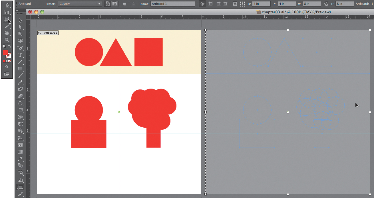
FIGURE 3.17 Duplicate the artboard with the Artboard tool using the Option and Shift keys as you click and drag the mouse.
2. Rename the artboard Artboard 2 in the Control panel (FIGURE 3.18). Complete Exercise 3 on this second page of your Illustrator document.

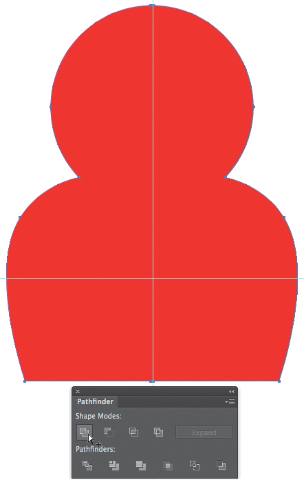
3. View the Pathfinder panel (Window > Pathfinder), where you’ll join the shapes in the following steps. Select the first set of shapes (use the Shift key to select both paths or marquee around both paths with the Selection tool) that comprise the profile icon. Press the Unite button in the Pathfinder panel (FIGURE 3.19). Notice how the two separate shapes are now united into one continuous path (FIGURE 3.20).

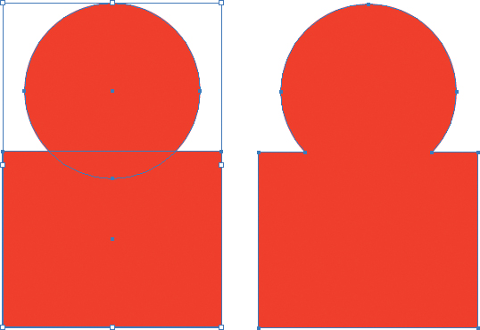
FIGURE 3.20 A side-by-side view of the two shapes when they are grouped (left) and when they are united into a single path (right). Notice that when the paths are selected, the perimeters of the full circle and square are visible in the grouped shape. The united path is transformed into a new shape that combines the original circle and square.
4. Select the second set of shapes comprising the tree and unite the paths using the Pathfinder panel as you did in Step 4.
Exercise 4. Duplicate the Artboard and Modify the Shapes
1. Duplicate the artboard again (see Exercise 3, Step 1). Rename it Artboard 3. Complete Exercise 4 on this third page of your Illustrator document.
2. Tear off the additional Pen tools by clicking on the Pen tool in the Tool panel and releasing your mouse over the sideways (“tear off”) arrow (FIGURE 3.21).

FIGURE 3.21 Release the mouse over the sideways arrow in the Tools panel to tear off a group of tools.
3. Use the Convert Anchor Point tool to change the anchor point at the top-left shoulder of the profile icon from a sharp angle to a rounded edge—this action requires a click-and-drag action (FIGURE 3.22). You’ll have to click directly on the anchor point to modify it with the Convert Anchor Point tool. The direction that you drag the mouse influences the curve of the path—if you find the path getting tangled into itself, drag the mouse in the opposite direction!

FIGURE 3.22 Use the Convert Anchor Point tool to change a hard edge to a soft curve. Click and drag the Bézier handles to modify the shape of the curve.
4. Modify the shoulder so it sits down, away from what would be the ear (if there were one), by moving the anchor point with the Direct Selection tool (FIGURE 3.23). Modify the softness of the curve by repositioning the Bézier handles (FIGURE 3.24).
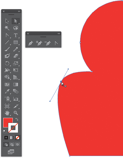
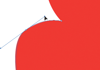
FIGURE 3.24 Modify the curve by altering the Bézier handles. The longer the handles, the softer the curve.
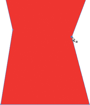
5. To add a curve to the center of the tree trunk, you’ll need to work in two steps. First, use the Add Anchor Point tool to add two anchor points at the center of the trunk (on the left and right sides) where you want to see the straight line bend (FIGURE 3.25). A straight line can become a curve only if there’s an anchor point indicating its direction. Be sure to click on the path of the trunk to add anchor points.

FIGURE 3.25 Use the Add Anchor Point tool on both sides of the rectangle to establish where the tree trunk will bend.
Missing the Path
If you see the warning message “Please use the add anchor point tool on a segment of a path,” then you missed the path when you clicked the mouse button. Press OK and try again.
You’ll only modify one half of the profile body. Instead of repeating the action on the right side of the profile, you’ll use the Reflect and Copy tool in the next exercise to ensure that the icon is symmetric.
6. Use the Direct Selection tool to move the new anchor points in toward the center of the trunk (FIGURE 3.26). This creates the new dent in the shape, but the edges are still angular rather than curved.
You can alter the order of the last two steps. Instead of pushing the anchor points inward before adding the curve, you could have converted the anchor points and then moved them. However, if the anchor points are still along the path of the tree trunk, the direction of your mouse movements won’t be too obvious.
7. Click and drag, one at a time, on each of the new anchor points with the Convert Anchor Point tool to convert the sharp angle to a curve. I dragged the right anchor point toward the top of the page (FIGURE 3.27) and the left anchor point toward the bottom (FIGURE 3.28).
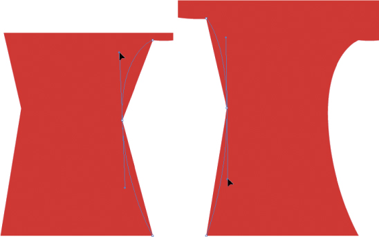
FIGURES 3.27 AND 3.28 Change the hard-edged anchor points to a curve by clicking and dragging on the anchor point with the Convert Anchor Point tool.
8. Make any further adjustments to the trunk with the Direct Selection tool on the anchor points or Bézier handles.
Exercise 5. Reflect and Copy a Second Half onto the Profile Icon
1. Create a duplicate, fourth artboard. Name it Artboard 4. Complete Exercises 5 and 6 on this page of your Illustrator document.
2. Create a vertical guide at the center of the profile icon. Draw a rectangle (use a new color so you can differentiate between the two paths) that starts at the intersection of the guide and ends well outside (covering) the right half of the profile icon (FIGURE 3.29).

3. Use the Selection tool to select both the visible half of the profile (with the rounded shoulder) and the box on top of the second half of the profile. Press the Minus Front button in the Pathfinder panel (FIGURE 3.30). The right half of the profile will be deleted because it was included in the “front” shape area.

FIGURE 3.30 The Minus Front button in the Pathfinder panel can be used to delete parts of an object according to a path placed in front of it.
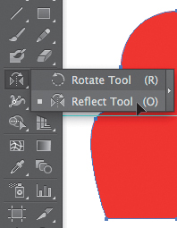
4. With the left half of the profile still selected, choose the Reflect tool in the Tools panel. It’s hidden beneath the Rotate tool, so you may need to click and hold the mouse on the Rotate tool before dragging to select the Reflect tool (FIGURE 3.31).
• The easiest way to hide and show guides is by pressing ![]() -; (semicolon). Use this key command to hide guides; then use it again to show them. Or you can choose the View menu > Guides > Hide/Show Guides.
-; (semicolon). Use this key command to hide guides; then use it again to show them. Or you can choose the View menu > Guides > Hide/Show Guides.
• Deleting guides can be annoying because, by default, Illustrator locks guides. So you’ll need to unlock your guides (View Menu > Guides > Unlock Guides) and then select a guide with the Selection tool and press the Delete key on your keypad.
5. Double-click the Reflect tool. In the Reflect dialog box, check the Vertical radio button, make sure the angle is set to 90 degrees (the default), and press the Copy button (FIGURE 3.32). Since you’re making a copy, the second half of the profile icon will appear; however, it may be misplaced.

FIGURE 3.32 The Reflect tool dialog box. Notice that you can exit the box by clicking the Copy, Cancel, or OK buttons.
6. Use the Selection tool to align the second half of the profile icon (use the guide you created). Once selected, I nudged the right half by holding Shift while pressing the Right Arrow key. Zoom in so you can make sure there’s no negative space between the halves. Select both halves and then press the Unite button in the Pathfinder panel to join the two paths into one shape (FIGURE 3.33).
Exercise 6. Brush Details into the Treetop
1. Use the Paintbrush tool with white or any color that will be visible on your tree icon assigned to the Stroke (no color assigned to the Fill) to add curvy lines in the treetop (FIGURE 3.34).

2. Add a few more lines and set them at half of the stroke weight you used in the previous step (FIGURE 3.35).
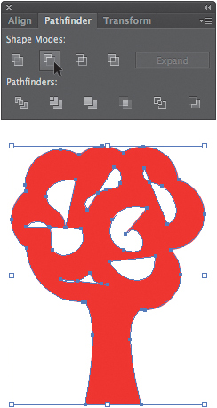
3. Select the tree and brush strokes and then try using the Minus Front button in the Pathfinder to see how these shapes relate. You’ll notice that since the brush strokes are not closed paths, the Pathfinder panel will close the path for you before making adjustments (FIGURE 3.36). This results in unwanted visual effects.

FIGURE 3.36 Adjustments made using the Pathfinder panel will often close paths. This may result in unwanted or unpredicted effects.
Tip
Adjust the Stroke value in the Control area to apply more or less weight to the line settings.
4. Choose Edit > Undo or press ![]() -Z to undo the last step. Before you can use the Pathfinder panel successfully, you’ll need to expand each of the brush strokes into its own closed path. Marquee over the entire tree using the Selection tool; then hold the Shift key while clicking on the tree trunk (where there are no curvy lines). You’ll have selected all the brush strokes and deselected the tree. Choose Object > Expand Appearance (FIGURE 3.37).
-Z to undo the last step. Before you can use the Pathfinder panel successfully, you’ll need to expand each of the brush strokes into its own closed path. Marquee over the entire tree using the Selection tool; then hold the Shift key while clicking on the tree trunk (where there are no curvy lines). You’ll have selected all the brush strokes and deselected the tree. Choose Object > Expand Appearance (FIGURE 3.37).

FIGURE 3.37 By expanding the appearance of the painted lines, the “lines” are converted to Illustrator “shapes.”
5. Now that the brush strokes are separate, closed paths, you can use the Minus Front button in the Pathfinder panel to render the strokes as transparent “holes” in the treetop (FIGURE 3.38). Be sure to select the whole tree, including the brush stroke paths, before pressing the Minus Front button.

FIGURE 3.38 Use the Minus Front button to render the strokes as “holes” or areas of negative space rather than white paint.
Exercise 7. Add a Background Color and Save a Multipage PDF
1. Create another duplicate artboard. Name it Artboard 5. Complete this exercise on the fifth page of your Illustrator document.
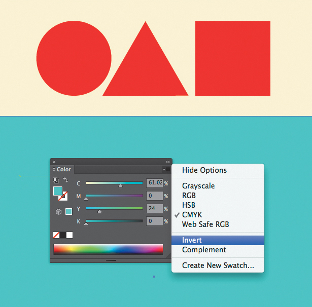
2. Draw a red (or whatever color you’ve been using for your graphics) rectangle from the bottom-left corner of the page to the lower-right corner of the yellow rectangle at the top of the page. For a moment, you’ll lose your graphics in a sea of one color (FIGURE 3.39). This would be a good time to notice that the new path is on the top of the Layer panel stacking order.
3. While the path is selected, use the top-right pull-down menu in the Color panel to select Invert (FIGURE 3.40).
4. Press ![]() -
-![]() -[ to send the background path to the back of the document (FIGURE 3.41).
-[ to send the background path to the back of the document (FIGURE 3.41).

5. The graphic icons have shifted in shape and size as you’ve made many modifications to their design. Set a guide to divide the page in half (vertically) and align your graphics toward the center of the bottom area of the page (FIGURE 3.42). Leave a little extra space on the bottom as the eye naturally pulls a composition down in space. (This is sometimes referred to as designing the composition in a space that is bottom heavy.)
6. Save the master (.ai) file. Then choose File > Save As and select Adobe PDF from the Format pull-down menu. Notice that you can save a range of pages since the document contains multiple artboards (FIGURE 3.43). Leave the default radio button for “All” selected, as you’ll want to see all five pages in your PDF. Press the Save PDF button in the following Save Adobe PDF dialog box.

7. Open the PDF to see your icons develop in stages, demonstrating the exercises in this chapter. In the future, you might use this technique to create a multipage document demonstrating several compositions for one project, different stages of an interactive work, or frames of an animation.
 Lab Challenge
Add another artboard or two to your document and develop two more complicated, unified shapes. Start with a combination of the circle, square, or triangle. Use the Direct Selection and Pen tools as well as the Pathfinder panel to unify and modify your shapes.