Hour 16. Building Responsive and Backward-Compatible User Interfaces
,What You’ll Learn in This Hour:
 How to make an application “responsive”
Using Auto Layout to enable automatic resizing and rotation
Creating UI elements programmatically for the ultimate control
How to swap views for landscape and portrait viewing
Ways to accommodate both iOS 7 and 6 UIs
You can use almost every iOS interface widget available, create multiple views and view controllers, add sounds and alerts, write files, and even manage application preferences, but until now, your applications have been missing a very important feature: responsive interfaces. The ability to create interfaces that display correctly regardless of your iDevice’s screen size, orientation, or iOS version is one of the key features that users expect in an application—and the key goal of responsive interface design.
This hour’s lesson explores the Xcode Auto Layout system and three different ways of adding rotatable and resizable interfaces to your apps. As you read this hour’s lesson, an important fact to keep in mind is that there are many different ways to solve the problem of responsive interface design. What works best for you may be entirely different than what I describe here.
Responsive Interfaces
Years ago, when I had my first Windows Mobile smartphone, I longed for an easy way to look at web content in landscape mode. There was a method for triggering a landscape view, but it was glitchy and cumbersome to use. The iPhone introduced the first consumer phone with on-the-fly interface rotation that feels natural and doesn’t get in the way of what you’re trying to do.
The iPhone 5 introduced the first 4" iPhone screen with a different aspect ration and resolution than the traditional 3.5" models. Rumor has it that Apple will be introducing many new screen sizes in the next few years. Does that mean you need a different storyboard for every single device variation? Nope! The iOS Auto Layout system makes it easy to adapt to different resolution displays and change your interface layout as your device resolution changes.
Although you should definitely plan to accommodate all sizes of the iPhone screen in your iPhone apps, the decision to handle rotation is entirely up to you. Consider how the user will be interfacing with the app. Does it make sense to force a portrait-only view? Should the view rotate to accommodate any of the possible orientations the phone may assume? The more flexibility you give users to adapt to their own preferred working style, the happier they’ll be. Best of all, enabling rotation is a simple process.
Tip
iOS 7 has made Auto Layout an even more important topic for developers who want to support older versions of the operating system. iOS widgets (switches, buttons, and things) differ in size between iOS 7 and earlier releases. Auto Layout enables your storyboard to maintain spacing and adjust its appearance regardless of the sizing of the controls.
Tip
Apple’s user interface guidelines for the iPad strongly encourage the support of any orientation/rotation: portrait, left landscape, right landscape, and upside-down.
Enabling Interface Rotation
The projects that you’ve built so far have supported limited interface rotation, based on a single line of code in a single method in your view controller. This is added by default when you use one of Apple’s iOS templates.
When an iOS device wants to check to see whether it should rotate your interface, it sends the supportedInterfaceOrientations message to your view controller. The implementation of supportedInterfaceOrientations just returns a value that describes the supported orientation. To cover more than one orientation, you just return the list of constants you want to use, separated by the | character.
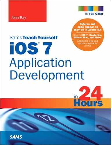
There are seven screen orientation support constants, as listed here.
For example, to allow your interface to rotate to either the portrait or landscape left orientations, you implement supportedInterfaceOrientations in your view controller with the code in Listing 16.1.
LISTING 16.1 Activating Interface Rotation
- (NSUInteger)supportedInterfaceOrientations {
return UIInterfaceOrientationMaskPortrait |
UIInterfaceOrientationMaskLandscapeLeft;
}
The return statement handles everything. It returns the combination of the two constants that describe landscape left and portrait orientations.
Note
In addition to adding this method to your view controllers, you must also choose the orientations supported by your app by clicking the Device Orientation checkboxes in the application Deployment Info settings. This is described in the section “Setting Supported Device Orientations” in Hour 2, “Introduction to Xcode and the iOS Simulator.”
At this point, take a few minutes and go back to some of the earlier hours and modify this method in your view controller code to allow for different orientations. Test the applications in the iOS Simulator or on your device. For iPhone apps, try switching between 3.5" and 4" displays.
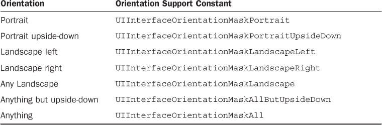
Some of the applications will probably look just fine, but you’ll notice that others, well, don’t quite “work” in the different screen orientations and sizes, as shown in Figure 16.1 (ImageHop, from Hour 8, “Handling Images, Animation, Sliders, and Steppers”).
Everything we’ve been building has defaulted to a portrait design and, for the iPhone, a 4" screen, so how can we create interfaces that look good regardless of the orientation and size of the screen? We obviously need to make some tweaks.
Designing Rotatable and Resizable Interfaces
In the remainder of this hour, we explore several different techniques for building interfaces that rotate and resize themselves appropriately depending on the device, or when the user changes the device’s screen orientation. Before we get started, let’s quickly review the different approaches and when you’d want to use them.
Auto Layout
The Xcode Interface Builder (IB) editor provides tools for describing how your interface should react when it is rotated or when the size of the screen can be variable. It is possible to define a single view in IB that positions and sizes itself appropriately—no matter what the situation—without writing a single line of code. This bit of Apple magic is called Auto Layout. It will be your best friend and worst enemy in creating responsive interfaces.
Using Auto Layout should be the starting point for all interfaces. If you can successfully define portrait and landscape modes in a single view in the IB editor, your work is done.
Unfortunately, Auto Layout doesn’t work well when there are many irregularly positioned interface elements. A single row of buttons? No problem. Half a dozen fields, switches, and images all mixed together? Probably not going to work.
Programming Interfaces
As you’ve learned, each UI element is defined by a rectangular area on the screen: its frame property. If we programmatically define an application interface, we can make it into anything we want. Although this might sound challenging, it’s actually very simple and very effective for creating interfaces that vary dramatically between different sizes and orientations.
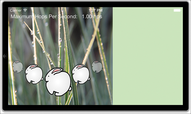
For example, to detect when the interface rotates, we can implement the method didRotate-FromInterfaceOrientation in our view controller. The view controller property interfaceOrientation will tell us the current orientation of the interface by containing one of these four constants.
The drawback to doing everything in code is that you are doing everything in code. It becomes very difficult to prototype interface changes and visualize what your final interface will look like. In addition, it is harder to adapt to changes in the future. It’s best, in my opinion, to use a combination of Auto Layout with hand-coded interfaces to provide the best flexibility and speed of development.
Swapping Views
A more dramatic approach to changing your view to accommodate different screen orientations is to use entirely different views for landscape and portrait layouts. When the user rotates the device, the current view is replaced by another view that is laid out properly for the orientation.
This means that you can define two views in a single scene that look exactly the way you want, but it also means that you must keep track of separate IBOutlets for each view. Although it is certainly possible for elements in the views to invoke the same IBActions, they cannot share the same outlets, so you’ll potentially need to keep track of twice as many UI widgets within a single view controller.
Note
To know when to change frames or swap views, you will be implementing the method didRotateFromInterfaceOrientation in your view controller. This message is sent to a view controller when the interface has finished changing orientation. If you want to react prior to the orientation change taking place, you could implement the willRotateToInterfaceOrientation:duration method.
Apple has implemented a screen-locking function so that users can lock the screen orientation without it changing if the device rotates. (This can be useful for reading while lying on your side.) When the lock is enabled, your application will not receive notifications about a change in orientation. In other words, to support the orientation lock, you don’t need to do a thing.
Using Auto Layout
As already mentioned, Auto Layout enables us to build responsive interfaces without writing a line of code. Because of that, our first tutorial is a series of examples that you can follow along with, rather than a project that we build. I’ve included several sample storyboard files in this hour’s Projects folder, but you should definitely get yourself into IB and attempt the examples on your own.
Note
You’ll be making changes to the Empty.storyboard file to test several of the concepts in this hour’s lesson. I recommend copying this file and making changes to your copies. This will save you the time of having to create a new storyboard file (or deleting the contents of the current file) each time you want to try something new.
In addition, the examples in this section all target the iPhone. Why? Because the iPhone screen is the perfect place for practice. It can change between both portrait and landscape orientations and resize from 3.5” to 4” displays.
The Language and Tools of Auto Layout
When I see something with auto in the name, I expect that it is going to do things for me: automatically. Auto Layout lives up to this, but not without a reasonably long “getting to know you” phase. To use Auto Layout effectively, you must understand the terminology and know where to look for the tools. We spend the next few minutes getting into details, and then walk through a few examples that should get you started on the way to mastery. (Perhaps of archery or speed skating. Auto Layout if you’re lucky.)
Adding Basic Constraints
Auto Layout works by building a series of constraints for your onscreen objects. Constraints define placement of objects, distances between objects, and how flexible these relationships are. A vertical constraint for a button, for example, might be along the lines of “keep X many points of space between this object and the top of the screen” or “keep object Y vertically centered in the view.” Unfortunately, the language used for positioning can be a bit confusing; you may not be familiar with these terms:
Leading: The “front” or left side of an object.
Trailing: The “back” or right side of an object.
Superview: The view that contains an object. In our examples, this is the “view” that makes up the scene itself.
Note
Xcode must always have enough constraints defined for an object that it can determine its horizontal and vertical position at any point in time (regardless of the screen orientation/size). If you don’t add constraints of your own, Xcode transparently adds them for you when you build your project. This is very different from the initial releases of Xcode with Auto Layout support, which always added constraints. Now, with Xcode 5.x, you can build interfaces without worrying about constraints, then add them when you’re ready.
For example, try adding a button to the window in the Empty.storyboard file; make sure it is located toward the top-left side of the view and that you’ve resized the button slightly. In its initial state, your button layout doesn’t display any constraints. That doesn’t mean that your layout won’t use them; it just means that Xcode will automatically add what it feels is appropriate when you build your project.
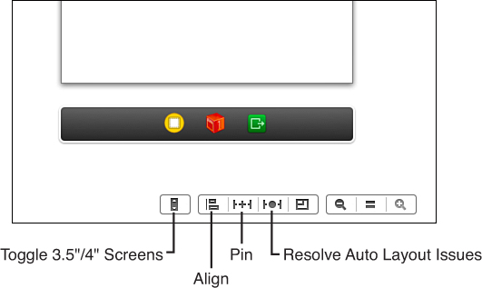
To add constraints that you can actually work with and adjust, you’ll use the Editor, Resolve Auto Layout Issues, Add Missing Constraints menu option (as shown in Figure 16.2). This adds constraints for the currently selected object. To add constraints to all objects in a scene, you can choose Add Missing Constraints in View Controller instead. Go ahead and try either of these options on your scene with the button.
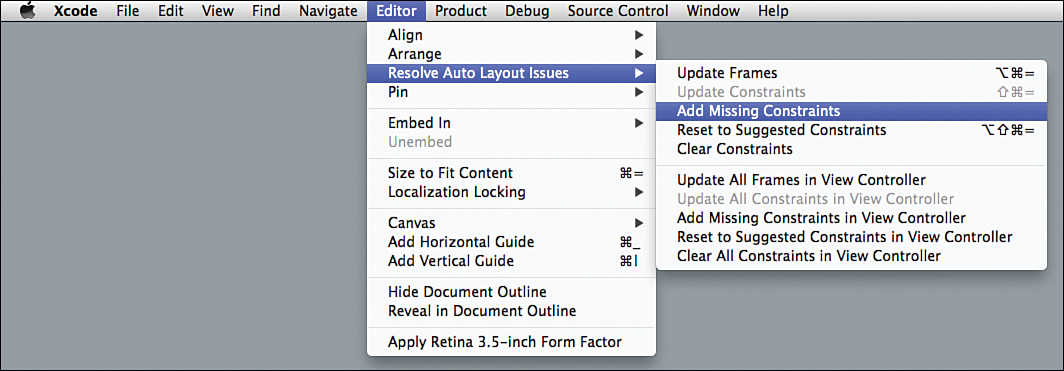
FIGURE 16.2 Use the Add Missing Constraints menu option to add default constraints to your UI objects.
After you’ve added constraints, you’ll notice two visual changes. First, there are blue lines (representing the constraints) attached to your UI objects. In addition, a new Constraints entry appears parallel to the button in the document outline hierarchy, as well as a Constraints item within the button object itself, as shown in Figure 16.3.
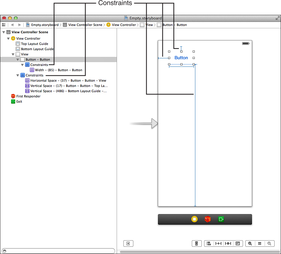
FIGURE 16.3 The Constraints object represents the positioning relationships within a view or constraints on the UI elements themselves.
Tip
If you ever feel like your constraint editing has gotten out of hand, you can use the Clear Constraints and Reset to Suggested Constraints options in the Resolve Auto Layout Issues menu to remove all existing constraints or to reset the object to the default constraints.
Navigating the Constraints Objects
Within the view’s Constraints object are two constraints: horizontal space and vertical space constraint. The horizontal constraint states that the left side of the button will be a certain number of points from the left edge of the view. This is known as the leading space (versus the space between the right side and the edge of the view, which is called the trailing space). The vertical constraint is the distance from the top of the view to the top of the button.
What constraints are added depend on where the object is in relation to its containing view. When you use Xcode to automatically add constraints, it does its best to choose what makes the most sense. If you position a button near the bottom of the view and add suggested (or missing) constraints, for example, Xcode will add a constraint for the distance between the bottom of the button and the bottom of the view.
Constraints, however, are more than just entries that tie an object to the view it is within. They can be flexible, ensuring that an object maintains at least or at most a certain distance from another object, or even that two objects, when resized, maintain the same distance between one another.
Tip
Alignment of objects is also a constraint, and is managed using the alignment tools found under the Editor, Align menu. In other words, when you set vertical or horizontal alignments, you’re actually configuring constraints that will be maintained regardless of the device’s screen size or orientation! We’ll use these later this hour.
Constraints that set a specific size or distance between objects are called pinning. The flexibility (or inflexibility of a constraint) is managed by configuring a relationship.
This brings us to the second constraint object in the document outline: constraints on the object itself, not on its positioning. When you’ve resized a user interface (UI) element or set constraints on how the content within it is positioned, Xcode will add a constraint object inside the UI element entry in the document outline. These constraints determine the width or height of the element. Not surprisingly, when you’ve got dozens of components in your UI, you’ll have lots of constraints in your document outline.
Viewing and Editing Constraints via the Size Inspector
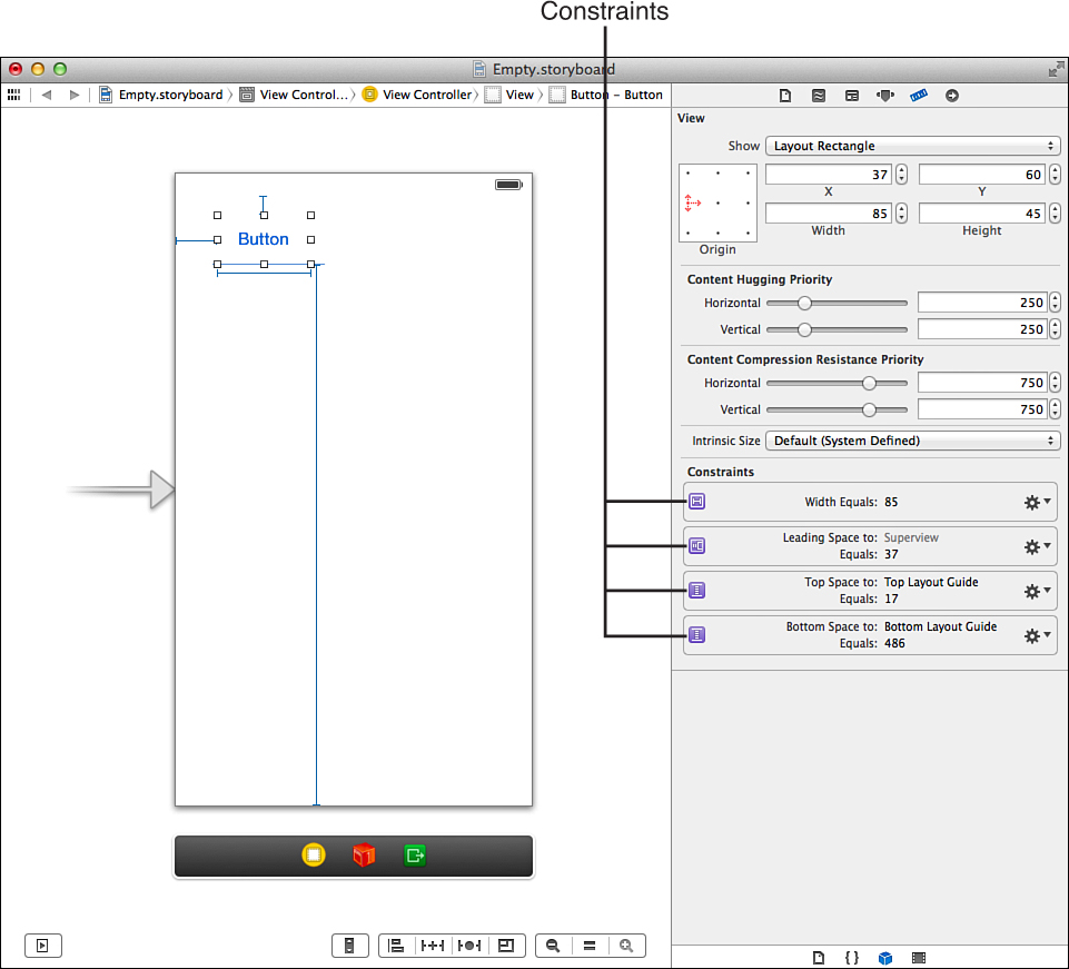
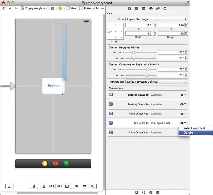
While sorting through constraints in the document outline can be a pain, you can quickly view all the constraints applied to an element (whether located in the Constraints object on the view the element is in, or within the UI element itself) within the Size Inspector (Option-Command-5). For example, if you’ve added a resized button to the storyboard, then used Xcode to add the default missing constraints, opening the Size Inspector should look something like Figure 16.4. Here horizontal and vertical positioning for the button are represented as constraints, as well as the width of the button.
Use the gear menu to the right side of each constraint to do one of two things: either delete the constraint entirely or select and edit it. For example, if you pick a width constraint and choose Select and Edit, Xcode jumps you into the Attributes Inspector, where you can see and adjust the details of the constraint, as shown in Figure 16.5.
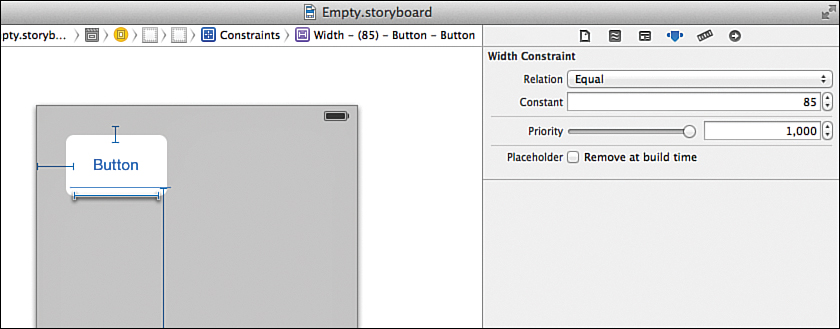
The Relation drop-down determines what the constraint is trying to do. Is it trying to keep a distance or size equal to a value? Greater than or equal to it? Less than or equal? You choose the relation that gives your interface the flexibility you need. With each relation, you can also set a constant. This is a measurement, in points, that the relationship will be maintaining.
You’ll also notice a Priority slider, a Placeholder check box, and a Standard check box (sometimes) appear in the editor. The Priority slider determines how “strong” the constraint relationship is. There may, for example, be instances when multiple constraints must be evaluated against one another. The priority setting determines the importance of any given constraint. A value of 1000 is a constraint that is required. If you move the slider, Xcode shows a description of what to expect at a given constraint priority.
The Standard check box (not visible in Figure 16.5) lets Xcode use its internal database of spacing to set the recommended space between two objects. This, in many cases, is preferred because it ensures a consistent interface.
The last setting, the Placeholder check box, is used if you plan to resize or move the UI object in your code. If you check this option, you can use Auto Layout tools to set up your UI element, but the constraints will be removed when your application runs.
In a few minutes, we’ll make use of the editor to configure a few relationships. Trust me, it makes more sense once you get started.
Constraints can also be edited by selecting them in the design view and opening the Attributes Inspector. If you’re good at clicking on thin lines, you can do this without first going into the Size Inspector. I personally prefer starting by selecting the UI element, viewing the constraints in the Size Inspector, and then jumping into editing from there.
Content Hugging and Content Compression Resistance
When viewing an interface object with constraints in the Size Inspector, you noticed settings for Content Hugging Priority and Content Compression Resistance Priority. These features are related to Auto Layout, but what do they do?
These settings control how closely the sides of an object “hug” the content in the object and how much the content can be compressed or clipped. Imagine a button that you want to expand horizontally, but not vertically. To allow horizontal expansion, you’d set horizontal hugging as a low priority. To keep it from growing vertically, you set vertical hugging to a high priority.
Similarly, the content (the button label) should not be compressed or clipped at all, so the content compression resistance settings for both horizontal and vertical compression should be very high priority.
You will not often need to adjust these settings beyond their defaults, which IB adds for you.
Tip
UI objects like buttons have intrinsic constraints that do not appear in the interface. These are the sizes that Xcode determines the object should have in order to display your content (such as a button label or button image). Xcode will automatically try to maintain these constraints unless you override them with your own user constraints and content compression/hugging settings. Other objects, such as switches, cannot resize at all, so there’s no tweaking that will cause them to violate their intrinsic constraints. Text views, image views, and other “generic” content holders, however, will happily resize with no difficulty. You’ll see this behavior in a few minutes.
Understanding and Correcting Constraint Errors
When I am reading a book, I tend to skip over anything that talks about errors. Why? Because I don’t make mistakes... and I’m sure you don’t either. Unfortunately, no matter how careful you are with Auto Layout, you’re going to see errors—lots of them—and they’re going to look ugly.
If you’re used to the old (pre-Xcode 5.x) Auto Layout system, you might have a bit more trouble than new developers. The reason is this: Constraints in Xcode 5 are static. Once you add constraints, they’re set. Previously, Xcode would try to “guess” what you intended when you did something that modified constraints; this meant that constraints were always up-to-date and always complete. Not anymore.
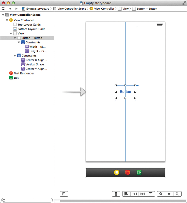
For example, we’ve been looking at a button in the Empty.storyboard. We added the button, added the constraints, and everything was fine. Now, try dragging the button to a new position in the window and see what happens. As soon as you drag the button, you’ll see constraints appear drawn in orange, along with a dotted line where your button was originally located, as shown in Figure 16.6.
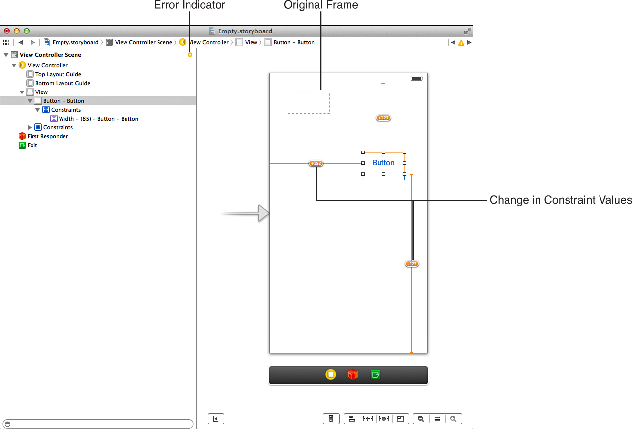
The solid lines (and numbers on the lines) show the changes in the original constraints. A +5 on a vertical constraint, for example, means the object has shifted down 5 points from the original constraint. A –5 on a horizontal constraint indicates a shift to the left. The dotted line shows the frame of the original object.
What’s important to understand here is that even though you’ve moved the object in IB, the original constraints remain—so your object is now considered “misplaced” in Xcode.
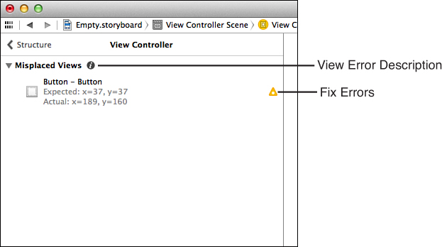
In addition to highlighting constraints in another color, Xcode also shows Auto Layout errors in the document outline. When you moved the button, for example, an orange indicator appeared by the scene in the object hierarchy; you can see this in Figure 16.6. To get a description of the error, click the indicator icon in the document outline. The display refreshes to show the error, as shown in Figure 16.7.
Tip
If you hover your mouse over the main error heading (in this case, Misplaced Views), a small i icon will appear. Clicking this icon will show a plain English description of what the error means and ways to correct it.
To fix the error, click the error indicator icon beside the UI object with an error that you want to fix. Xcode displays a list of possible fixes. Try this with the button example. Your display should resemble Figure 16.8.
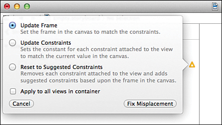
You have three options for automatically fixing errors:
Update Frame: Moves the control so that it fits the constraints that are defined. In the case of the button example, this puts it back where it came from.
Update Constraints: Changes the existing constraints to match the current positioning of the object.
Reset to Suggested Constraints: Adds new constraints to the object (eliminating the old) to match its current position. This uses the best constraints for the current position (in contrast to Update Constraints, which changes the original constraints to fit, even if they aren’t the best choice for the position).
Choose Update Constraints or Reset to Suggested Constraints and you should be back in business. Check the Apply to All Views in Container check box to apply to all similar errors, if desired. Click Fix Misplacement to update the storyboard accordingly.
Tip
From the menu bar, you can find the options for fixing Auto Layout issues under the Editor, Resolve Auto Layout Issues. Within this menu, you’ll also find selections for applying a fix to your entire view controller, not just a single control.
Although this scenario (in my opinion) is the most common that you will encounter, other constraint errors are possible. In some cases, you may have multiple conflicting constraints (two constraints pinning the height to different values, for example)—in which case, you’ll be prompted to delete one of the conflicts.
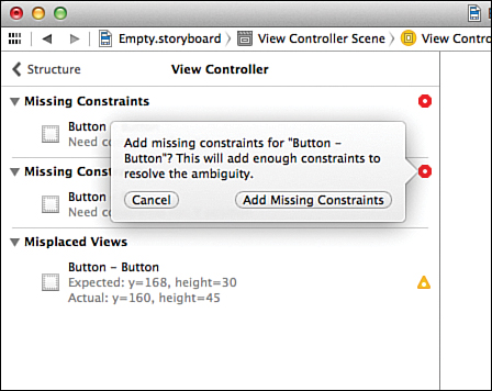
On the other end of the spectrum, if you don’t have enough constraints to determine an object’s position, you will see an error for missing constraints. Clicking through the error indicators will present you with the option to add the missing constraints, as shown in Figure 16.9.
Caution: Align Your Objects. Create an Error. Neato!
Early in the book (Hour 5, “Exploring Interface Builder”), I demonstrated how you can use the alignment tools to align UI elements. Using alignment adds constraints for your objects as if they had moved, but it doesn’t move them. The result? Errors. Lots and lots of errors.
The easiest way to deal with alignment is to add missing (default) constraints, align, and then update or reset the constraints.
Before we put what we’ve learned into practice, I want to make one thing clear: There is no “one way” to build interfaces with Auto Layout, but there is a mindset that will be helpful as you build your own designs. Specifically, start by identifying the interface elements that you want to anchor somewhere on the screen, regardless of orientation or screen size. From there, begin looking for the relationships between those elements and the other objects that make up your interface. Building relationships between objects, rather than trying to tie each element to specific coordinates within a view, is a good tactic for successful UI design.
Example One: Centering Constraints
Let’s look at a very simple example: a button that stays centered regardless of whether you use a 3.5" or 4" iPhone (or any iPad), or rotates between portrait and landscape orientations. To do this, begin by adding and positioning the button:
1. Open a copy of the Empty.storyboard file and add a button to the scene.
2. From the menu bar, choose Editor, Resolve Auto Layout Issues, Add Missing Constraints. This adds some initial constrains that we can work with.
3. Next, we’ll pin the width and height. Without a width and height set, the object won’t know whether it should grow, shrink, or move to center itself during a rotation. Pinning a width and height makes centering unambiguous. Select the button, then choose Editor, Pin, Width from the menu bar.
4. Reselect the button, and then choose Editor, Pin, Height. Yes, you have to keep reselecting the button. Annoying isn’t it? You’ve now set a width and height that will be maintained regardless of the orientation.
5. To set the Align constraints, select the button, then choose Editor, Align, Horizontal Center in Container.
6. Repeat the step 5 alignment, this time aligning to the Vertical Center in Container.
7. For the last step, select the button one more time, then choose Update Constraints. Your layout should now be finished and resemble Figure 16.11.
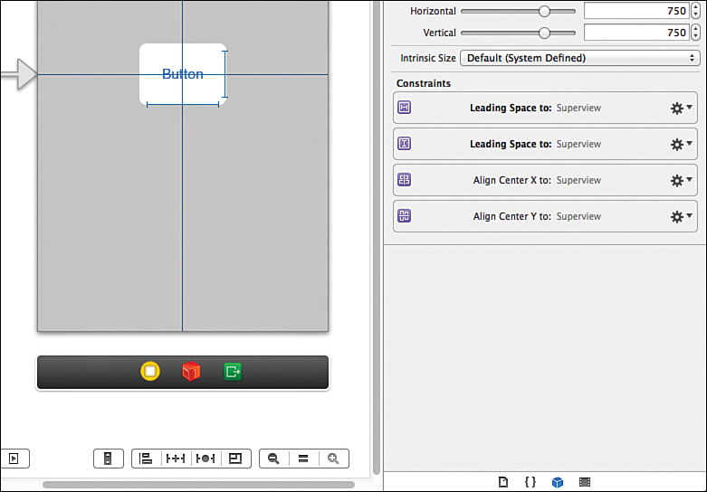
Unfortunately, during the process of adding constraints, Xcode added a bit more than it really needed. For everything to work correctly, you need a width constraint, a height constraint, and two constraints for center X alignment (horizontal) and center Y alignment (vertical). View all the constraints on the button by selecting it and then choosing the Size Inspector (Option-Command-5).
Find the constraints not related to maintaining the width and height and centering. Step through them one at a time, click the gear icon, and choose Delete, as shown in Figure 16.12.
Your final list of constraints should look similar to Figure 16.13.
Now try toggling the size of the screen between 3.5" and 4", using the screen size icon at the bottom of the IB editor. Your button should stay centered, regardless of the screen size. The real test, however, is to try the interface in another orientation.
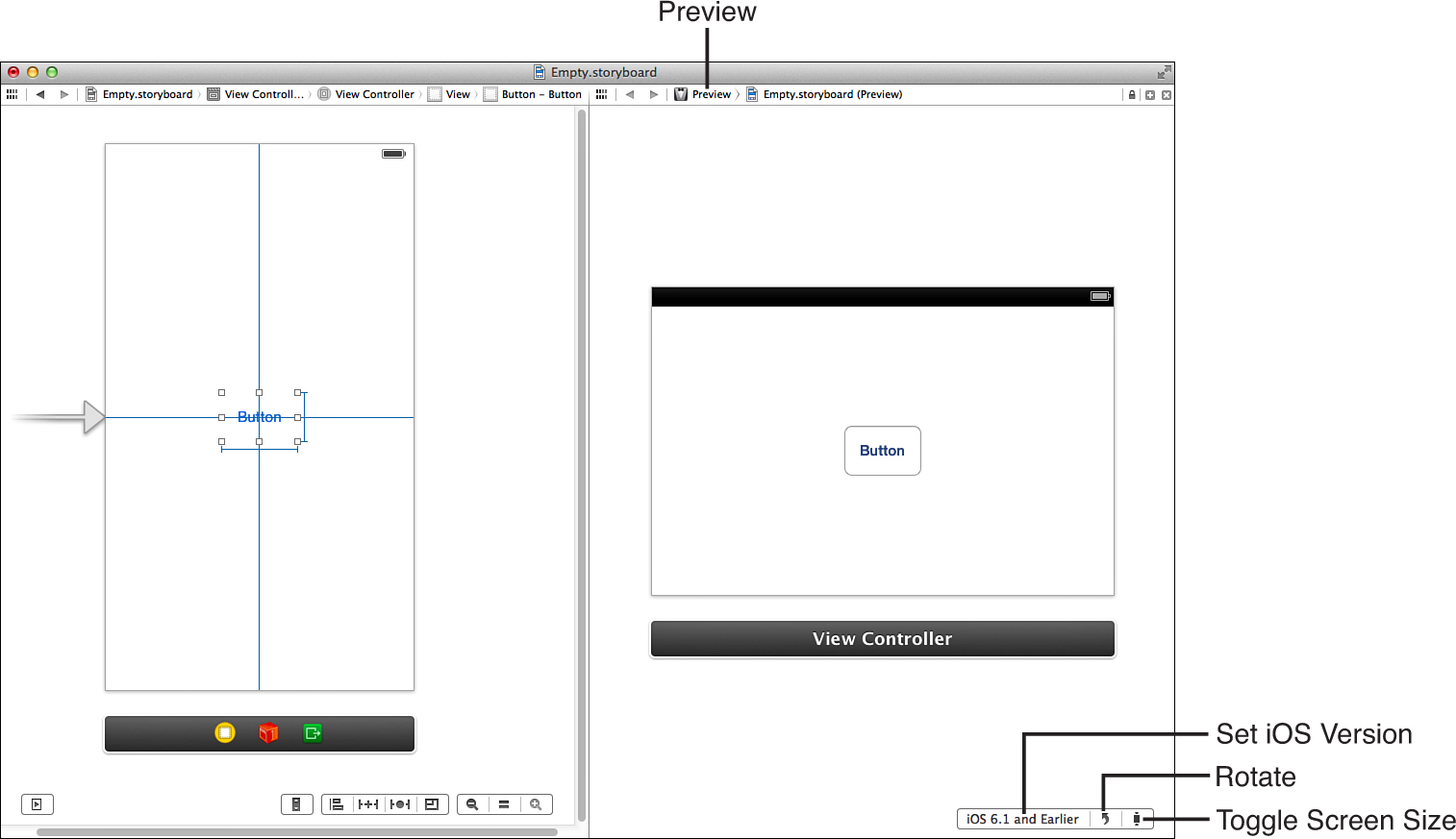
Switch to the assistant editor, and select Preview from the path bar above the editor (click where it initially shows Automatic). Use the controls at the bottom of the preview display to rotate the display, shrink it, and even show what it will look like on iOS 6. Assuming your constraints are correct, the button should also properly center itself regardless of your settings, as demonstrated in Figure 16.14.
That was pretty simple, wasn’t it? Of course, not all your applications will consist of just a single button (only the best ones). For that reason, we cover a few more examples, starting with resizing controls.
Tip
I highly recommend (if your screen space allows) turning on the assistant editor’s Preview feature while playing with Auto Layout. You will be able to see the changes you make take effect in real time (which makes debugging constraints a much easier process).
Example Two: Expanding Controls
A common design problem is where you have a series of controls on the screen and they need to expand to fill the size of the screen (or, in the case of a 3.5" iPhone display, properly shrink to fit on the screen). For example, let’s create an interface with two text views at the top and a button at the bottom. The button should always remain anchored at the bottom, but should grow horizontally to fill the width of the display. The text views should grow or shrink vertically, and expand horizontally to fill the screen.
Creating the Interface
Starting from a fresh copy of Empty.storyboard, follow these steps:
1. Drag a button to the storyboard, positioning it at the bottom center of the view using the guides that appear while dragging.
2. Resize each side of the button by dragging toward the side of the view, and then release when you see the blue guide appear.
3. Select the button, and then from the menu bar choose Editor, Resolve Auto Layout Issues, Add Missing Constraints.
By using the guides in steps 1 and 2, Xcode knows that when it adds the missing constraints it should use the default margins for pinning the button. You should see three constraints that anchor to the side and bottom margins of the view, as shown in Figure 16.15.
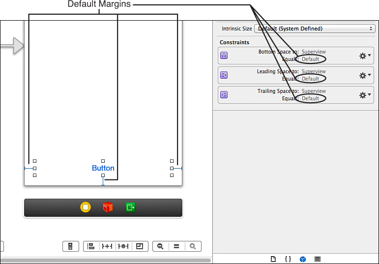
FIGURE 16.15 These three constraints make the button resize and stay anchored at the bottom, regardless of the screen size or orientation.
The constraints that have been created are a good start for the button. These ensure that the sides of the button are always an equal distance from the sides of the view, regardless of the orientation. The same goes for the distance from the bottom of the view to the bottom of the button.
Tip
If you “miss” aligning to one of the Xcode guides, you can quickly update a constraint to the default values by selecting your UI object and then using the Pin button at the bottom of the IB editor. You’ll see constraint values for each side of your object. Clicking the values will display a drop-down menu with the option Use Standard Value. This option updates the spacing to use Xcode’s preferred margins.
Next, add two text views to the scene:
1. Drag two text views to the scene, stacking one on top of the other.
2. Resize the text views to fill the scene horizontally, until the blue guides appear at the margins.
3. Size the text views vertically until the guides appear to keep the views from overlapping the button, one another, or the top margin of the scene.
4. Select both text views. And then from the menu bar, choose Editor, Resolve Auto Layout Issues, Add Missing Constraints.
5. Set the background color of the text views to something other than white so that they are easier to see. Your finished view should look like Figure 16.16.
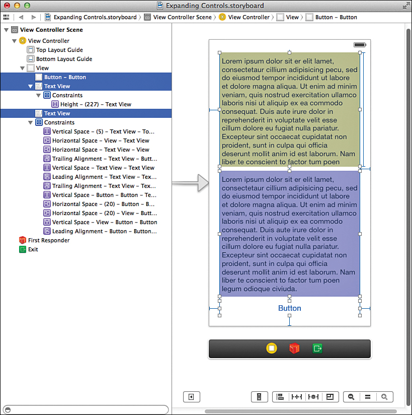
Depending on how you added and sized for your text views, you’ll notice that each of them has a variety of constraints that tie them to the sides of the screen, the top (or bottom) of the screen, and maintain spacing between each other and the button.
You’ll also see that one of the text views will have a height constraint applied. We’ll be working with this constraint in a few minutes, so find it now.
Why is there only one height constraint? Because as long as one is defined, the other text view can have a relative height calculated from all the other constraints. (If this sounds confusing, think of two lengths of string that together equal 1 foot. If one string is 7 inches long, you can calculate the second length of string... I hope.)
Setting the Constraints
Try resizing and rotating the display using the assistant editor’s Preview feature. What you’ll notice is that resizing it vertically (switching between 3.5" and 4" screens) likely works okay. What definitely doesn’t is rotating to landscape. In landscape mode, one of the text views will shrink so much that it isn’t even visible. To make the scene work right, you need to set some additional constraints.
Specifically, you need to accomplish these things:
1. Pin the height of the button so that it can’t get squished by one of the text views.
2. Choose the text views to be the first to shrink when the size changes. We set this view so that its height is greater than or equal to the smallest size we want it to reach. I will use the top view for this purpose and set its minimum height to 100 points or greater.
3. Set a fixed width on the bottom text view (I’ll use 250 points) so that it doesn’t change size. But, we need to set its priority to less than 1000 (the default). This lets the text view change sizes in an extreme situation. That “extreme situation” would otherwise occur in landscape mode where the top view would try to maintain a height of 100 points but the bottom view’s fixed height of 250 would force a condition where both can’t hold.
Begin by selecting the button. Then, from the menu bar, choose Editor, Pin, Height. Simple enough!
Next, take a look at which of your text views already has a height constraint. We need to make sure that both do. So, select the one that doesn’t and choose Editor, Pin, Height. You’re now ready to add some constraint logic.
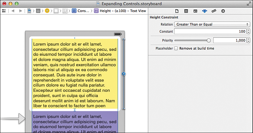
Select the top text view, then use the Size Inspector to select and edit the height constraint.
Using the Relation drop-down, choose Greater Than or Equal. Set the constant to 100 (the text view must be 100 points in height or greater) and leave the priority alone. Your configuration should look like Figure 16.17.
Now the top text view will shrink when it needs to, but it can also grow; in fact, until a constraint is set on the bottom text view, it can grow too large, pushing the bottom text view until it is too small in any orientation.
Select the bottom text view and again edit its height constraint. (Add one if it isn’t already there.) Make sure that the relation is set to Equal with a constant around 250, as shown in Figure 16.18. This time, however, set the priority down to 999. This makes the constraint turn into a dotted line (visible in Figure 16.18) showing that the constraint will try to be maintained, but, if necessary, it can resize to avoid violating other constraints.
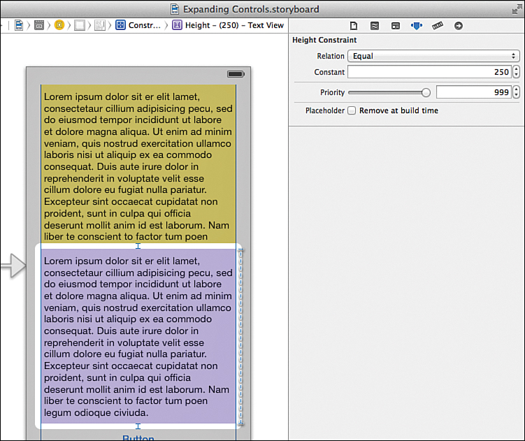
FIGURE 16.18 Set a height constraint with a priority lower than 1000 to enable the text view to change sizes if absolutely necessary.
Go ahead and try resizing the view between 3.5" and 4" iPhone screen sizes and rotating to landscape mode. Everything should work like a charm, with the top text view resizing when needed and the bottom text view resizing when it absolutely has to.
Caution: What If It Doesn’t Work?
If something doesn’t appear to be working, it’s likely because there are extra height constraints. Look for multiple height constraints (or any others that look out of place) and delete any duplicates that may be conflicting.
Tip
Combining multiple constraints with variable relationships, like this, is what you need to do to accommodate complex interfaces. You can also manually add all your constraints using the Pin options—instead of getting the default set with Add Missing Constraints.
Don’t be shy about trying different relationships and priorities to see how they interact. There isn’t a “recipe” for making effective Auto Layout designs. Spend a few hours playing with the tools—laying out interfaces in different ways. Hands-on is the only way you’ll get the experience you need to be comfortable with Auto Layout.
Example Three: Variable and Matching Sizes
Okay, one more quick exercise to round things out. This time, we add three buttons in a horizontal line, and we add enough constraints to make the buttons all resize equally when we shift to a landscape mode.
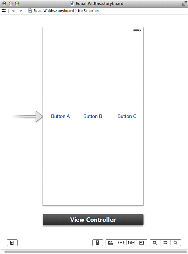
Create a new copy of the Empty.storyboard document, and then drag three buttons into the horizontal line on the screen. Use the guides to align them in the vertical center of the display. Label the buttons Button A, Button B, and Button C, as shown in Figure 16.19.
You now know enough to make one of the buttons resize, but how could we constrain them so that all the buttons resize to fill in the screen in landscape mode? These are the steps constraints that I came up with:
1. Start by adding the missing constraints for the view controller.
2. Align all the buttons to the vertical center in the container. This keeps them centered vertically on the screen. If errors appear, resolve the issue by updating the constraints.
3. Pin the Leading Space of Button A to the superview (the edge of the view). This is unnecessary if you used a guide to align the left edge of the button and Xcode already added a constraint tying the edge of the button to the edge of the view.
4. Pin the Trailing Space of Button C to the superview. Like the first constraint, you don’t technically need this one if you aligned the right side of the button to a guide and Xcode added a constraint for you.
5. Pin the Horizontal Spacing between Button A and Button B.
6. Pin the Horizontal Spacing between Button B and C. (If we stopped here, the center button (Button B) would stretch while the other buttons would stay the same size.)
7. Pin the buttons so that they all share the same width. (Select all the buttons, and then choose Editor, Pin, Widths Equally.)
8. Resolve any errors that appear by choosing Editor, Resolve Auto Layout Issues, Update Constraints.
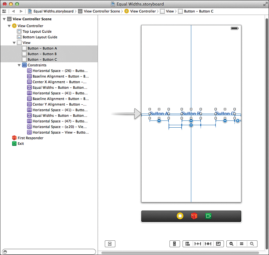
Use the Editor menu or the IB editor buttons to add these constraints to your storyboard; you should know how to do it by now. There is no need to adjust the priority or relationships in this case. Your finished layout will hopefully be similar to Figure 16.20. (One of the = constraints may be on a different button. This is fine.)
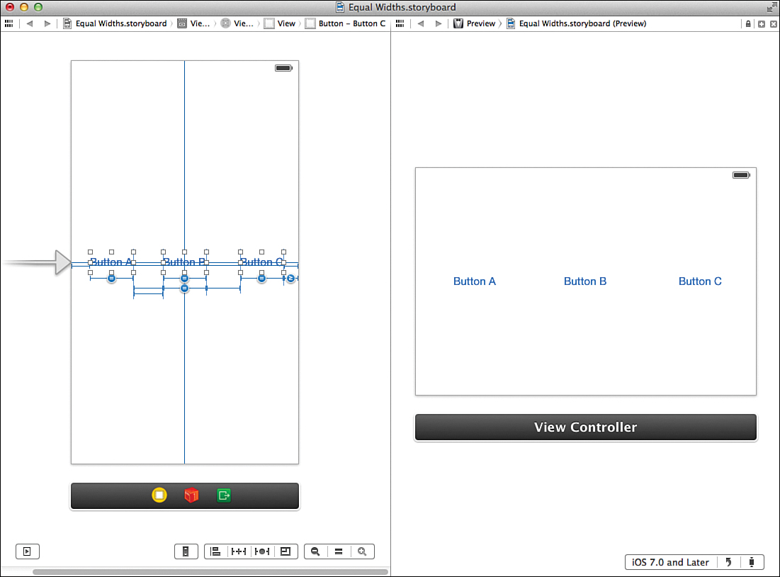
When you preview the view in landscape, all the buttons should resize equally and fill in the space across the screen, as shown in Figure 16.21.
Programmatically Defined Interfaces
In the previous example, you learned how the IB editor can help quickly create interface layouts that look as good horizontally as they do vertically and that can resize between the 3.5" and 4" iPhone displays. Unfortunately, in plenty of situations, IB can’t quite accommodate your dream UI. Irregularly spaced controls and tightly packed layouts rarely work out the way you expect. You may also find yourself wanting to tweak the interface to look completely different—positioning objects that were at the top of the view down by the bottom and so on.
In cases like this, consider implementing the UI (or portions of it) completely in code. But, what about the nice and neat drag-and-drop approach? Well, using code isn’t as convenient as drawing your interface in IB, but it isn’t difficult. We’re going to move to a project that is the exact opposite of our last few examples—rather than building a responsive interface without code, we’re going to only use code to create an interface.
Implementation Overview
In this tutorial, we create a very simple application with three UI elements: two buttons (Button A and Button B) and a label. The buttons trigger a method to set the label to the title of the button. Most important, however, is that the interface reacts properly to orientation and size changes.
In the portrait orientation, the buttons are drawn with the label sandwiched between them. In landscape, the buttons move closer to the bottom, and the label repositions above them. The final output will resemble Figure 16.22.
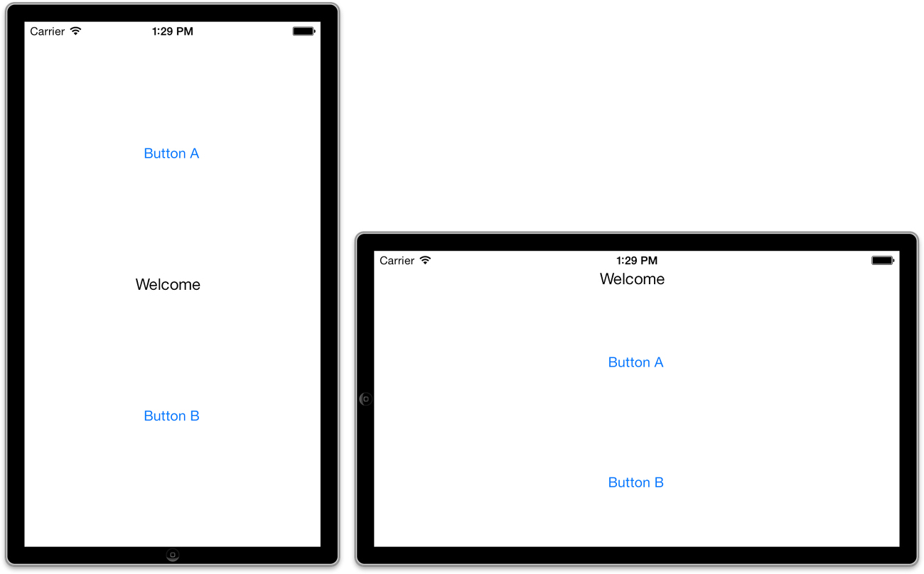
Take note that the positioning of the buttons and the label cannot be handled in Auto Layout (at least not through any straightforward approach). When you encounter issues that can’t be solved in Auto Layout, there’s no harm in coding your way out of the forest.
To handle the rotation and resizing of the objects, we use the bounds property of the scene’s view. This gives us the width and height of the device corresponding to whatever orientation it is in. We then use these values to position the UI elements on the screen. By basing the positioning on the bounds, the size of the device screen and orientation are largely irrelevant, as you’ll soon see.
Setting Up the Project
Unlike the previous example, we can’t rely on pointing and clicking for the interface, so there is a bit of code in the project. Once again, create a new single-view iOS application project and name it AllInCode.
Planning the Properties and Connections
In this exercise, you manually resize and reposition three UI elements: two buttons (UIButton) and one label (UILabel). Although we aren’t creating these with outlets, we define private properties for them: buttonA, buttonB, and theLabel should suffice.
We also implement a private method: handleButton, which updates the onscreen label to show the title of a button that was tapped. Like the properties, this won’t be declared using IB, but we’ll be using it just like an IBAction. We also add two additional methods, initInterface and updateInterface, to handle setting up and updating the interface, respectively. These will be triggered by a change in orientation, so our next step is to set up the project to properly handle orientation changes.
Enabling Orientation Changes
For this project, enable support of all orientations. To do this, start by updating the project summary (click the blue project icon at the top of the project navigator) and select all the device orientations within the Deployment Info section. Next, add the supportedInterface Orientations method to ViewController.m and have it return the constant UIInterface OrientationMaskAll, as shown in Listing 16.2.
LISTING 16.2 Supporting All Interface Orientations
- (NSUInteger)supportedInterfaceOrientations {
return UIInterfaceOrientationMaskAll;
}
Programming the Interface
We’ve now reached the point in the project where normally I’d say, “Let’s design the interface.” This time, however, there isn’t going to be a visual design, just code. In fact, you’ve already seen the two screenshots that accompany this project, so if you’re just skimming pictures, you’d better flip through a few more pages.
Defining Properties and Methods
We start by defining the private properties and methods that the view controller will be using. Recall that we’re adding three properties: buttonA, buttonB, and theLabel. We’ also have three methods that we should prototype in ViewController.h: initInterface, updateInterface, and handleButton.
Edit ViewController.m, adding the properties and method prototypes to the @interface block, as shown here:
@interface ViewController ()
@property (weak,nonatomic) UIButton *buttonA;
@property (weak,nonatomic) UIButton *buttonB;
@property (strong,nonatomic) UILabel *theLabel;
- (void)initInterface;
- (void)updateInterface;
- (void)handleButton:(id)sender;
@end
Look closely and you’ll notice that theLabel is set to use a strong property reference. Unfortunately, this is a result of overzealous memory cleanup by ARC. If we use weak instead, the label will actually be removed from memory before we can even get it onto the screen. Using strong ensures that the label sticks around as long as the ViewController object is active.
Everything else should look pretty straightforward. The initInterface and updateInterface methods don’t take any arguments or return any values. The handleButton method is styled after a typical IBAction because it will behave exactly like a typical action; it’s just being defined by hand rather than being built for us.
Initializing the Interface Properties
The next step is to add the initInterface method to ViewController.m. The purpose of this method is to configure all the interface elements (the two buttons and the label) so that they’re ready to be added to the interface, but not display them just yet.
By keeping the display logic separated from the initialization logic, we can build a method that can be called at any time to update the interface. This method, aptly named updateInterface, is called at the end of the initInterface and anytime interface rotation is sensed.
Add the initInterface method from Listing 16.3 to ViewController.m.
LISTING 16.3 Preparing the Interface (But Don’t Display It Yet)
1: - (void)initInterface {
2: self.buttonA =[UIButton buttonWithType:UIButtonTypeRoundedRect];
3: [self.buttonA addTarget:self action:@selector(handleButton:)
4: forControlEvents:UIControlEventTouchUpInside];
5: [self.buttonA setTitle:@"Button A" forState:UIControlStateNormal];
6:
7: self.buttonB =[UIButton buttonWithType:UIButtonTypeRoundedRect];
8: [self.buttonB addTarget:self action:@selector(handleButton:)
9: forControlEvents:UIControlEventTouchUpInside];
10: [self.buttonB setTitle:@"Button B" forState:UIControlStateNormal];
11:
12: self.theLabel=[UILabel new];
13: self.theLabel.text=@"Welcome";
14: [self updateInterface];
15: }
This might be the first time we’ve manually created a number of UI elements, but because you’ve been working with these objects and adjusting their properties for hours, this code shouldn’t seem completely foreign.
Line 2 initializes the buttonA property as a button of type UIButtonTypeRoundedRect—the standard button we use in our views. Lines 3–4 use the button’s addTarget:action:forControlEvents method to choose what will happen when the Touch Up Inside event occurs for the button. The @selector directive specifies which method will be called during the event—such as handleButton. This is exactly the same as connecting a button to an IBAction in IB.
Line 5 sets the title for the button to Button A.
Lines 7–10 repeat the same process for Button B (buttonB).
Lines 12–13 initializes a new label (theLabel) with the default text Welcome.
Lastly, line 14 invokes the updateInterface method so that the newly defined user elements can be placed on the screen. So, what do we do now? Implement updateInterface.
Implementing the Interface Update Method
The updateInterface method does the heavy lifting for the application. It checks to see what the current orientation is, and then it draws content based on the view’s bounds property. By basing the drawing on the height and width contained within bounds, you can scale to any screen size at all.
For example, consider this code snippet:
float screenWidth;
float screenHeight;
screenWidth=self.view.bounds.size.width;
screenHeight=self.view.bounds.size.height;
This grabs and stores the current screen width and height in the variables screenWidth and screenHeight. The dimensions and position of UI objects are determined by their frame, which is a property of type CGRect. To set the frame of a button property named theButton so that it filled the top half of the screen, I’d write the following:
self.theButton.frame=CGRectMake(0.0,0.0,screenWidth,screenHeight/2);
The first two values of CGRectMake (which create a CGRect data structure) set the origin point at 0,0. The second two parameters determine the width and height of the CGRect. Using screenWidth sets the button to the same width of the screen and screenHeight/2 sets the height of the button to half the height of the screen. In an actual implementation, you want to include some margin around the edges. This is why you’ll see +20 and other values tacked onto my coordinates. Speaking of which, go ahead and implement updateInterface, as shown in Listing 16.4. When you’re done, we step through the code.
LISTING 16.4 Implementing updateInterface
1: - (void)updateInterface {
2: float screenWidth;
3: float screenHeight;
4: screenWidth=self.view.bounds.size.width;
5: screenHeight=self.view.bounds.size.height;
6:
7: if (self.interfaceOrientation==UIInterfaceOrientationPortrait ||
8: self.interfaceOrientation==UIInterfaceOrientationPortraitUpsideDown) {
9: self.buttonA.frame=CGRectMake(20.0,20.0,screenWidth-40.0,
10: screenHeight/2-40.0);
11: self.buttonB.frame=CGRectMake(20.0,screenHeight/2+20,
12: screenWidth-40.0,screenHeight/2-40.0);
13: self.theLabel.frame=CGRectMake(screenWidth/2-40,
14: screenHeight/2-10,200.0,20.0);
15: } else {
16: self.buttonA.frame=CGRectMake(20.0,60.0,screenWidth-40.0,
17: screenHeight/2-40.0);
18: self.buttonB.frame=CGRectMake(20.0,screenHeight/2+30,
19: screenWidth-40.0,screenHeight/2-40.0);
20: self.theLabel.frame=CGRectMake(screenWidth/2-40,20.0,200.0,20.0);
21: }
22:
23: [self.view addSubview:self.buttonA];
24: [self.view addSubview:self.buttonB];
25: [self.view addSubview:self.theLabel];
26: }
Lines 2–5 grab and store the current screen size in screenWidth and screenHeight.
Lines 7–8 check the interfaceOrientation property of the view controller, and, if it is in one of the portrait orientations, lines 8–14 are executed. Otherwise, lines 16–20 are evaluated. These blocks both have the same purpose: defining the frame properties for each of the UI elements (buttonA, buttonB, and theLabel).
Lines 8–14 define positions for the buttons so that there are margins on the edges of the screen and a space in the middle for the label. Lines 16–20 position the buttons lower on the screen and put the label at the top. The margins and spacing I used is completely arbitrary. You can try changing these values around to see what effect they have.
Finally, lines 23–25 add the buttons and label to the view so that they are visible onscreen.
Everything is now in place for the interface, but we need to take care of three small tasks before the project is complete. First, we need to make sure that the interface is drawn when the application first loads. Second, the interface must update when an orientation change occurs. Third, we need to implement handleButton to update the label when the buttons are pressed.
Drawing the Interface When the Application Launches
When the application first launches, there isn’t an orientation change to trigger the interface to be drawn. To make sure there is something on the screen, we need to call initInterface when the application loads. Add this to viewDidLoad, as shown in Listing 16.5.
LISTING 16.5 Initializing the Interface When the Application Loads
- (void)viewDidLoad
{
[super viewDidLoad];
[self initInterface];
}
We’re getting closer. The application will now initialize and display the interface, but it still can’t adapt to a change in orientation.
Updating the Interface When Orientation Changes
To handle orientation changes, the application needs to call updateInterface within an implementation of didRotateFromInterfaceOrientation. We also need to remove the existing buttons, otherwise the old version of the interface will still be visible; this is surprisingly easy to do.
Add didRotateFromInterfaceOrientation to ViewController.m, as shown in Listing 16.6.
LISTING 16.6 Handling Rotation in didRotateFromInterfaceOrientation
1: - (void)didRotateFromInterfaceOrientation:
2: (UIInterfaceOrientation)fromInterfaceOrientation {
3: [[self.view subviews]
4: makeObjectsPerformSelector:@selector(removeFromSuperview)];
5: [self updateInterface];
6: }
Lines 3–4 use the very cool makeObjectsPerformSelector method on all the subviews in the scene’s view (all of our UI elements) to send them the message removeFromSuperview. This, as expected, removes the buttons and label from the view.
Line 5 calls updateInterface and draws the appropriate version of the interface for whatever orientation we are currently in.
Handling the Button Touches
The last piece of the puzzle is implementing handleButton so that it updates the onscreen label with the label of the button being touched. This is just a single line, so add Listing 16.7 to the view controller, and you’re done.
LISTING 16.7 Handling Button Touches
- (void)handleButton:(id)sender {
self.theLabel.text=((UIButton *)sender).currentTitle;
}
The one line of the implementation uses the sender parameter (typecast as a UIButton) to grab the title of the button (currentTitle) that was pressed.
Building the Application
Build and run the application. It should rotate and resize with no problem. What’s more, because all of the interface layout was based on the height and width of the view, this same code will work, without changes, in an iPad or iPhone project.
I hope this didn’t scare you too much. The purpose of this exercise was to show that responsive and flexible interfaces can be accomplished in code without it being too much of a hassle. The biggest challenge is determining how the controls will be laid out and then coming up with the CGRectMake functions to define their locations.
if (floor(NSFoundationVersionNumber) <= NSFoundationVersionNumber_iOS_6_1) {
// Load resources for iOS 6.1 or earlier
} else {
// Load resources for iOS 7 or later
}
Swapping Views on Rotation
Some applications display entirely different UIs depending on the device’s orientation. The iPhone Music application, for example, displays a scrolling list of songs in portrait mode and a view of albums when held in landscape. You, too, can create applications that dramatically alter their appearance by simply switching between views when the device is rotated.
Our last tutorial in this hour is short and sweet and gives you the flexibility to manage your landscape and portrait views all within the comfort of the IB editor. What’s more, you could even extend this concept to present entirely different views for iOS 6 or iOS 7—or create a special UI shown only on certain days of the week. Once you have the ability to programmatically swap out UIs, what you can do is essentially limitless.
Implementation Overview
The previous examples used a single view and rearranged it (either through Auto Layout or code) to fit a different orientation. When the view is too different or complex for this to be feasible, however, you can use two individual views with a single view controller. This is precisely what we do in this application. We start by adding a second view to the traditional single-view application, and then we design both views and make sure we can easily access them through properties in our code.
Once that is complete, we write the code necessary to swap the views when the device rotates. There is a catch, which you’ll learn about in a bit, but nothing that poses too much of a problem to coders as experienced as we are.
Setting Up the Project
Create a new project named Swapper using the Single View Application template. Although this includes a single view already (which we’ll use for the default portrait display), we need to supplement it with a second landscape view.
Planning the Property and Connections
This application does not implement any real UI elements, but we need to access two UIView instances programmatically. One view is for portrait orientation (portraitView) and another for landscape orientation (landscapeView). We will implement a method to handle orientation changes, but it will not be triggered by any actions.
Adding a Degree to Radians Constant
Later in this exercise, we have to call a special Core Graphics method to define how to rotate views. The method requires a value to be passed in radians rather than degrees. In other words, instead of saying we want to rotate the view 90 degrees, we have to tell it we want to rotate 1.57 radians. To help us handle the conversion, we define a constant for the conversion factor. Multiplying degrees by the constant gets us the resulting value in radians.
To define the constant, add the following line after the #import line in ViewController.m:
#define kDeg2Rad (3.1415926/180.0)
Enabling Orientation Changes
As with the previous example, we need to ensure that the implementation of supported InterfaceOrientations is behaving as we expect in our view controller. Unlike the previous implementation, however, this time we allow the device to rotate only between the two landscape modes and upright portrait.
Update ViewController.m to include the implementation in Listing 16.8.
LISTING 16.8 Disabling the Upside-Down Orientation
- (NSUInteger)supportedInterfaceOrientations {
return UIInterfaceOrientationMaskAllButUpsideDown;
}
Be sure to also go into the project summary and set the allowed orientations to everything but upside-down.
Designing the Interface
When you are swapping views, the sky is the limit for the design. You build them exactly as you would in any other application. The only difference is that if you have multiple views handled by a single view controller, you must define outlets that encompass all the interface elements.
This example demonstrates just how to swap views, so our work will be a piece of cake.
Creating the Views
Open the Main.storyboard file and drag a new instance of the UIView object from the Object Library to the document outline, placing it at the same level in the hierarchy as the view controller, as shown in Figure 16.23. Don’t put the UIView inside the existing view.
Tip
It might seem counterintuitive, but there’s no reason that a scene can’t contain multiple views if they are going to be managed by the same view controller. Only the view nested within the view controller is displayed by default. Additional views have to be displayed manually.
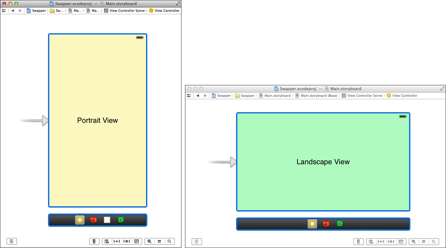
Now, open the default view and add a label, such as Portrait View; make sure that it is selected. Use Editor, Align from the menu bar to set constraints so that it is aligned to the horizontal and vertical centers of the view. Now set a background color to differentiate the view. That finishes one view, but we still have another to do. Unfortunately, you can only edit a view that is assigned to a view controller in IB, so we have to be creative.
Drag the view you just created out of the view controller hierarchy in the document outline, placing it at the same level as the view controller. Drag the second view onto the view controller line in the document outline. You can now edit it by adding a unique background color and a label such as Landscape View. You may want to switch the view controller to simulate a landscape mode while making these edits. When the second view is done, rearrange the view hierarchy again, nesting the portrait view inside the view controller and the landscape view outside the view controller.
If you want to make this more interesting, you’re welcome to add other controls and design the view as you see fit. Our finished landscape and portrait views are shown in Figure 16.24.
Creating and Connecting the Outlets
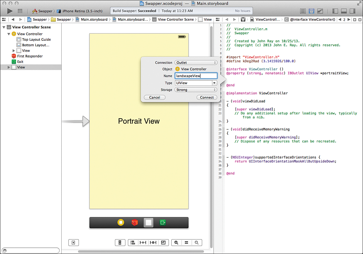
To finish up our interface work, we need to connect the two views to two outlets. The default view (nested in the view controller) will be connected to portraitView. The second view will be connected to landscapeView. Switch to the assistant editor and make sure that the document outline is visible.
Because we’re dealing with views rather than objects in our interface design, the easiest way to make these connections is to Control-drag from the respective lines in the document outline to the ViewController.m file. In addition, unlike with most of the projects in this book, we need to create outlets with the storage set to Strong; otherwise, ARC will conveniently get rid of the views when they aren’t visible.
Control-drag from the default (nested) view to below the @interface line in ViewController.m. Create a new outlet for the view called portraitView, with the storage set as Strong. Repeat the process for the second view, naming the connection landscapeView as demonstrated in Figure 16.25.
Implementing the Application Logic
For the most part, swapping views is actually easier than the reframing logic we implemented in the last project—with one small exception. Even though we designed one of the views to be in landscape view, it doesn’t “know” that it is supposed to be displayed in a landscape orientation.
Understanding the View-Rotation Logic
For a landscape view to be successfully swapped onto the screen, we need to rotate it and define how big it is. The reason for this is that there is no inherent logic built in to a view that says “hey, I’m supposed to be sideways.” As far as it knows, it is intended to be displayed in portrait mode but has UI elements that are pushed off the sides of display.
Each time we change orientation, we go through three steps: swapping the view, rotating the view to the proper orientation through the transform property, and setting the view’s origin and size via the bounds property.
For example, assume we’re rotating to landscape right orientation:
1. First, we can grab the current view size (after rotation) by accessing and storing self.view.bounds. This can be used later to make sure that the new view is set to the proper size:
currentBounds=self.view.bounds;
2. Second, we swap out the view by assigning self.view, which contains the current view of the view controller, to the landscapeView property. If we left things at that, the view would properly switch, but it wouldn’t be rotated into the landscape orientation. A landscape view displayed in a portrait orientation isn’t a pretty thing. For example:
self.view=self.landscapeView;
3. Next, to deal with the rotation, we define the transform property of the view. This property determines how the view will be altered before it is displayed. To meet our needs, we have to rotate the view 90 degrees to the right (for landscape right), –90 degrees to the left (for landscape left), and 0 degrees for portrait. As luck would have it, the Core Graphics C function, CGAffineTransformMakeRotation(), accepts a rotation value in radians and provides an appropriate structure to the transform property to handle the rotation. For example:
self.view.transform=CGAffineTransformMakeRotation(kDeg2rad*(90));
Note
Note that we multiply the rotation in degrees (90, –90, and 0) by the constant kDeg2Rad that we defined earlier so that CGAffineTransformMakeRotation() has the radian value it expects.
4. The final step is to set the bounds property of the view to the bounds that we stored in step 1. For example:
self.view.bounds=currentBounds;
Now that you understand the steps, let’s take a look at the actual implementation.
Adding the View-Rotation Logic
All the rotation magic happens within a single method: supportedInterfaceOrientations.
Open the ViewController.m file and implement the method, as shown in Listing 16.9.
LISTING 16.9 Rotating the View into the Proper Orientation
1: - (void)didRotateFromInterfaceOrientation:
2: (UIInterfaceOrientation)fromInterfaceOrientation {
3:
4: CGRect currentBounds=self.view.bounds;
5:
6: if (self.interfaceOrientation == UIInterfaceOrientationLandscapeRight) {
7: self.view=self.landscapeView;
8: self.view.transform=CGAffineTransformMakeRotation(kDeg2Rad*(90));
9: } else if (self.interfaceOrientation == UIInterfaceOrientationLandscapeLeft) {
10: self.view=self.landscapeView;
11: self.view.transform=CGAffineTransformMakeRotation(kDeg2Rad*(-90));
12: } else {
13: self.view=self.portraitView;
14: self.view.transform=CGAffineTransformMakeRotation(0);
15: }
16: self.view.bounds=currentBounds;
17: }
Line 4 grabs the current bounds of the scene’s view after the rotation has occurred, and stores it in currentBounds.
Lines 6–8 handle rotation to the right (landscape right). Lines 9–11 deal with rotation to the left (landscape left). Finally, lines 13–14 configure the view for the default orientation, portrait.
In the very last step, line 16, the bounds of the view we swapped in are set to the currentBounds that we stored when the method started.
Note
Although we used an if-then-else statement in this example, you could easily use a switch structure instead. The toInterfaceOrientation parameter and orientation constants are integer values, which means they can be evaluated directly in a switch statement.
Tip
In this hour’s exercises, we used didRotateFromInterfaceOrientation to detect and react to a change in orientation. If you’d prefer to be reacting immediately prior to iOS adjusting the orientation, you can use the method willRotateToInterfaceOrientation:duration instead.
Building the Application
Save the implementation file, and then run and test the application. As you rotate the device or the iOS Simulator, your views should be swapped in and out appropriately. This approach gives you a good combination of flexibility while keeping the benefits of Auto Layout. Unfortunately, it also means that you have to manage twice as many objects in your code.
When designing your own applications, you need to strike a balance between interface flexibility and code complexity. In some cases, it’s just easier to design a different scene and use a second view and view controller to handle other orientations.
Further Exploration
Although we covered several different ways of working with interface rotation, you may want to explore additional features outside of this hour’s lesson. Using the Xcode documentation tool, review the UIView instance methods. You’ll see that there are additional methods that you can implement, such as willAnimateRotationToInterfaceOrientation:duration, which is used to set up a single-step animated rotation sequence. What’s more, you can combine these methods with segues—programmatically triggering a segue to a new scene when an orientation event occurs.
In short, there are a number of ways to create interfaces that do anything you want. It’s a good idea to practice the techniques discussed here to learn what will work best for your projects.
Summary
iDevices are all about the user experience—a touchable display, intuitive controls, and now, rotatable and resizable interfaces. Using the techniques described in this hour, you can adapt to almost any type of rotation scenario. To handle interface size changes without a line of code, for example, you can take advantage of the Auto Layout. For more complex changes, however, you might want to programmatically define your onscreen elements, giving you complete control over their size and placement. Finally, for a good balance in flexibility, you can create multiple different views and swap them as the device rotates.
By implementing rotation and size-aware applications, you give your users the ability to use their devices in the way that feels most comfortable to them.
Q&A
Q. Why don’t many iPhone applications implement the upside-down portrait mode?
A. Although there is no problem implementing the upside-down portrait orientation using the approaches described in this hour, it isn’t recommended. When the iPhone is upside-down, the Home button and sensors are not in the “normal” location. If a call comes in or the user needs to interact with the phone’s controls, the user will need to rotate the phone 180 degrees—a somewhat complicated action to perform with one hand.
Q. How do I get the controls in application XYZ to behave using Auto Layout?
A. This is a difficult question with no clear answer because there may be dozens of ways of implementing constraints that have the desired effect. I have implemented Auto Layout constraints for 3.5" and 4" iPhone displays in all my sample projects. You may want to take a look at those to get an idea of how I solved resizing problems. (Landscape, however, is up to you!)
Q. How do I get my app to run on iOS 6?
A. If you’ve done the work of setting up the UI for both iOS 6 and iOS 7, you can build for iOS 6 (and later) by updating the Deployment Info section of the application’s General settings. Just click the top-level project group, then the General tab, and then scroll and look for the Deployment Target. Use this drop-down menu to choose the earliest OS you want to support.
Workshop
Quiz
1. The iDevice interface can rotate through three different orientations. True or false?
2. How does an application communicate which rotation orientations it supports?
3. What was the purpose of the kDeg2Rad constant that we defined in the final exercise?
Answers
1. False. There are four primary interface orientations: landscape right, landscape left, portrait, and upside-down portrait.
2. Through the supportedInterfaceOrientations method, implemented in the view controller, the application identifies which of the four orientations it will operate in.
3. We defined the kDeg2Rad constant to give us an easy way of converting degrees to radians for the Core Graphics C function CGAffineTransformMakeRotation().
Activities
1. Edit the Swapper example so that each view presents and processes user input. Keep in mind that because both views are handled by a single view controller, you must add all the outlets and actions for both views to the view controller interface and implementation files.
2. Return to an earlier lesson and revise the interface to support multiple different orientations and iPhone screen sizes. Use any of the techniques described in this hour’s exercises for the implementation.