
10. Designing for Mobile Devices
Lesson overview
• Add and edit alternate layouts in the Muse project
• Create mobile navigation for a Phone layout
• Copy assets and page content between layouts
• Add tel: links that call a phone number when tapped
Adobe Muse provides support for creating alternate layouts for different devices, including desktop, tablets, and phones, that allow you to provide an optimal viewing experience for visitors to your site.
Working with alternate layouts
These days when you’re creating a website, you may need to consider which mobile devices the site will be viewed on. Adobe Muse allows you to create alternate layouts for each page of your site. Although this isn’t “responsive design,” which means the entire design detects and resizes to display optimally based on the viewport size, it is a form of adaptive design.
 Note
Note
If you have not already downloaded the project files for this lesson to your computer from your Account page, make sure to do so now. See “Getting Started” at the beginning of the book.
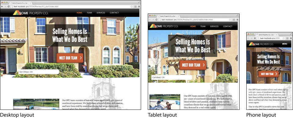
Here’s how alternate layouts work in Adobe Muse: For the sake of simplicity, suppose you have a website with a single web page and you decide that you need the viewing experience to be optimal on desktop, mobile, and tablet devices. You can start with any of those design layouts, and then create versions for the other layouts. For every version you create, Adobe Muse will create another set of HTML pages. When the site is viewed on a device, the correct home page is opened, depending on the size of that device screen. Adobe Muse generates code for the site that includes detection scripts that identify which type of computer or device and which type of browser the visitor is using to access the page. The detection code then automatically displays the correct layout. You don’t have to do anything to ensure that visitors using a tablet will see the tablet layout and visitors using smartphones will see the phone layout. It all happens behind the scenes.
Note
At the time of this writing, mobile browsers do not equally support pinned objects. As a result, it’s necessary to come up with alternate strategies such as using Motion scroll effects to ensure an element stays in the same location in relation to the browser window, even if the page is scrolled for pinned objects when you’re designing phone and tablet layouts. You’ll notice that the Pin options are grayed out and inactive when you’re designing phone or tablet layouts.
Why would you create alternate layouts for a mobile device? Often, a site designed with desktop viewing in mind has larger images and more information (such as long blocks of text, small navigation buttons, links to multiple pages, animated scroll effects, digital media, scripts, etc.). Mobile devices used to view your site tend to have slower processors and connection speeds. So sending all of the same larger images and content to a mobile device may result in slower downloads, poor rendering performance, and less-than-optimal experience.
The mobile layout features in Adobe Muse enable you to optimize your mobile layouts so device users do not download larger files unnecessarily. Alternate layouts allow you to serve up smaller, resized image files; therefore, the site performs well across all platforms and browsers.
First, you’ll explore the final site in your browser.
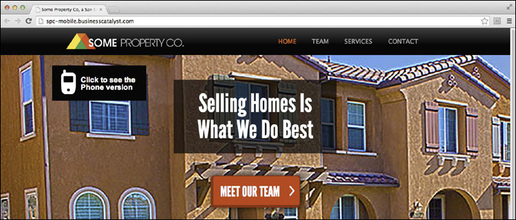
1. Open a browser and type http://spc-mobile.businesscatalyst.com/ to open the site to preview what you’ll build.
A desktop site may contain many additional pages with text and image content that might not be applicable to visitors using a mobile device. Before creating an alternate phone or tablet layout from an existing desktop design, spend some time imagining the use cases for mobile visitors. Be aware that if you try to display all of the desktop content on a small device, it can become unmanageable and difficult for visitors to navigate. One of the skills you gain as you begin designing sites for tablets and smartphones is the ability to convey useful information that is easy to read using a simplified layout and larger buttons that mobile visitors can interact with on a touch screen.
 Tip
Tip
You can open the final mobile site in Muse by choosing File > Open Site. Navigate to the Lessons > Lesson10 folder, and open the SPC-mobile.muse file. You may see a warning for missing fonts or missing/modified images. You can dismiss these dialog boxes.
2. On the home page of the site in the browser, click the “Click to see the phone version” link on the left side of the page to open a new browser window and to see an example of the phone version.
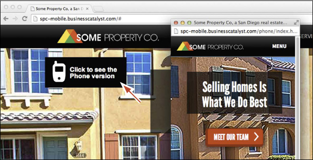
When the new browser window opens, you should see a smaller window that contains the phone layout. Explore the page to see how the menu works and the content on the pages.
3. Close the browser and return to Adobe Muse.
The capability to create alternate layouts in Muse enables you to create a single Adobe Muse project file that includes up to three different layout designs to be displayed on the corresponding screen size. All three layouts use the same domain name (such as my-site.com), so you can distribute a single URL to promote the site.
Adding an alternate layout
To create a new mobile layout for a phone, for instance, you’ll first need to review the content of the existing site and determine which items are needed for the smartphone user experience. Because smartphone visitors are often on the go and are viewing the content on a small screen, it’s important to simplify the design and display only the content that is useful and easy to interact with on a touch screen.
Next, you’ll add an alternate layout to the SPC site so the user experience is optimal on phones.
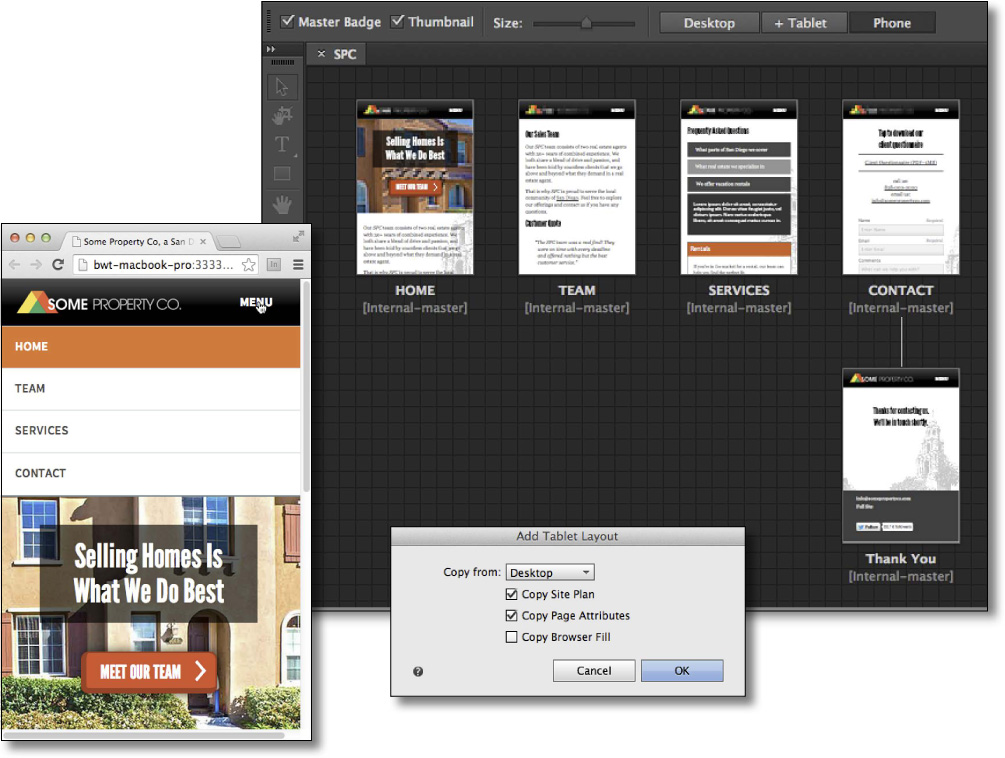
1. With the SPC site you’ve been creating up to this point still open, make sure that Plan mode is showing.
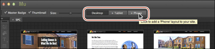
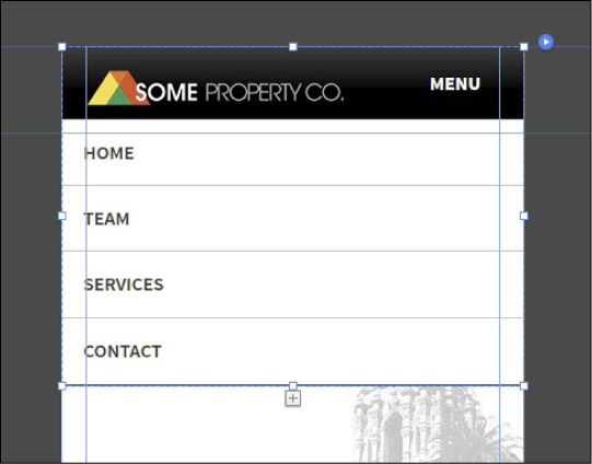
In Plan mode you’ll see three buttons above the site map thumbnails: Desktop, + Tablet, and + Phone. At the moment, the Desktop layout option is selected because that is the default layout for the site. You can create a new layout at any time by clicking the desired button. Layouts that have not yet been created display a plus (+) sign next to their name. In the case of the SPC site, the Desktop layout is the only one we have created.
2. Click the + Phone button above the site map to create a new phone layout.
Tip
You can also add an alternate layout by choosing Page > Add Alternate Layout > [choose your layout]. The layouts that are dimmed in that menu have already been added.
3. In the Add Phone Layout dialog box, select the following options:
• Copy From: Desktop
Currently, you’ll only see the options None or Desktop because you only have a desktop layout. If you were to click the + Tablet button above the site map after adding the phone layout, you would be able to choose from either the Desktop or Phone layout. You can choose None if you want to create the new layout from scratch.
• Copy Site Plan: Selected (the default setting)
• Copy Page Attributes: Selected (the default setting)
• Copy Browser Fill: Deselected (the default setting)
Notice the note that appears if you were to select Copy Browser Fill. Mobile layouts that appear on a phone typically have no or little padding. This means that the page area will most likely cover the browser fill unless the page has padding or the page area fill has some transparency.
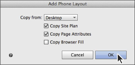
4. Click OK.
Adobe Muse creates a site plan for the phone layout. Page names, the site’s structure, and attributes of the master page are copied over from the Desktop layout. The Phone button no longer displays a plus (+) sign next to its name, because the layout has been added to the Adobe Muse project.
Tip
To remove an alternate layout, you can right-click the layout button in Plan mode (Desktop, Tablet, or Phone) and choose Remove ‘(name of layout)’ layout. You can also choose Page > Remove Alternate Layout > (name of layout).
Notice in the site map thumbnails that the page content from the original desktop pages is not added to the phone layout pages. That is intentional to allow you to copy just the content you actually want into each page of a mobile layout. As you copy the content from the Desktop layout that you want to add into each new page in the Phone layout, you can resize it to fit within the smaller dimensions of the mobile screen.
5. In Plan mode, click the Desktop button to return to the Desktop site map. Click the Phone button to see the phone site map and page thumbnails.

The same pages and master pages appear in both layouts now. On a mobile device, the user’s experience may not be exactly the same as viewing the site in a desktop browser. That means that some of the pages may not be necessary and content may be pared down a bit, depending on your design and preference.
Tip
Another way to jump between the different layouts in a site is to use the following keyboard shortcuts: Command+7 (Ctrl+7) displays the Desktop layout, Command+8 (Ctrl+8) displays the Tablet layout, and Command+9 (Ctrl+9) displays the Phone layout.
6. With the Phone site map showing, hover the pointer over the ContactEvent page thumbnail and click the X button in the upper-right corner of the page to delete it.
7. Hover the pointer over the Home-master page and click the X button in the upper-right corner of the page to delete it. The Phone layout only needs one master page.
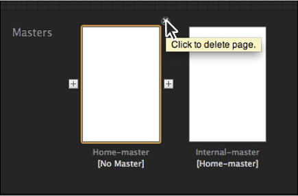
Note
Notice that after you delete the Home-master page (which contained content that was inherited by the Internal-master page), the label in brackets below the Internal-master page shows [No Master].
When you’re deciding which content and pages to keep, you really need to consider the user experience on a mobile device. Some argue that it should mirror the desktop experience as much as possible, and others believe that it should simply display a synopsis of the content—so mobile users can access the important information and get out.
With the phone site map set up, you’re ready to begin designing the mobile experience.
Reviewing the site properties
Next, you’ll review the site properties for the Phone layout, and then make some adjustments to the master page properties.
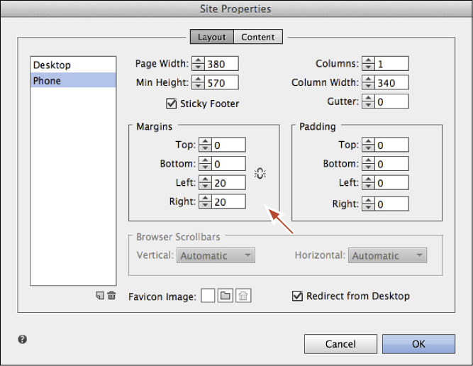
1. In Plan mode with the Phone button selected above the site map, choose File > Site Properties. Click the Layout tab at the top of the Site Properties dialog box, if it isn’t already selected, and the Phone option should already be selected on the left side of the dialog box.
Notice that there’s a new column on the left that lists the layouts for the current site. This project now has two layouts (Desktop and Phone), so the column on the left lists both Desktop and Phone. The Site Properties dialog box now contains Desktop and Phone layout options. You can switch between the two layout options by clicking the desired layout on the left side of the dialog box.
2. Click the Make All Margin Settings The Same to turn it off. Change the Right Margin and Left Margin values to 20. Ensure that the Page Width is 380.
Tip
In the Site Properties dialog box at the bottom of the alternate layouts are two small buttons: Create A New Layout ( ) and Delete The Selected Layout (
 ). These buttons offer another way to add or remove alternate layouts to your design.
3. Select the Desktop layout on the left side of the Site Properties dialog box.
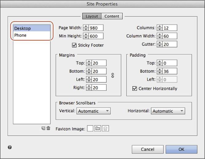
While the Desktop layout is selected on the left side of the dialog box, notice that the Desktop site properties include attributes such as Center Horizontally and the ability to numerically define Top, Bottom, and Left padding.
Note
Notice the Redirect From Desktop option when the Phone layout is selected in the Site Properties dialog box. This option allows you to turn on/off redirect for mobile/tablet layouts. This means you can choose to have the browser show (redirect to) a mobile or tablet version of a site when accessed from mobile or tablet devices, which is the default behavior.
4. Select the Phone layout on the left side of the Site Properties dialog box again.
No longer is there an option to center content horizontally, and the Padding section now includes options for Top, Bottom, Left, and Right, all set to 0. Also, notice that number of columns is set at 1, the margins are 0, and the page size (width) is optimized for a phone. Most mobile designs specifically for phones are one column due to the minimal width of device screens.
5. Click OK to close the Site Properties dialog box.
Editing an alternate layout master
When you created the alternate Phone layout, a new set of master pages was created for you that mirror those in the Desktop layout. They are sized for mobile devices and do not currently contain any content.
Now you’ll add design content to the phone Internal-master page.
1. With the Phone site map showing in Plan mode, double-click the Internal-master page thumbnail to open the master page in Design mode.
The page tab above the Document window will display “Internal-master [Phone].” When you create alternate layouts and open a page in the site, the page tab indicates which layout each page is from.
2. Choose Window > Reset Panels.
When you created the Phone layout, the option to copy the browser fill was deselected. The image that was in the browser fill on the Desktop design was too large in file size and dimensions to work properly on a mobile device.
Next, you’ll add a mobile-friendly background image.
3. With the Internal-master [Phone] page open in Design mode, ensure that the Fill color in the Control panel is None ( ).
).
4. Click the Browser Fill link in the Control panel. In the Browser Fill menu, click the Add Image link. In the Import dialog box, navigate to the Lessons > images > scroll-bg-mobile.jpg file. Select the image and click Open. Choose Scale To Fill from the Fitting menu, and select the center point of the Position reference point indicator ( ).
).
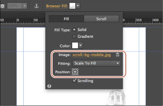
If you were to use the background image from the Desktop Home-master—the background image that works perfectly in your Desktop layout—that image is downloaded to the phone but is just scaled. The original background map is 1300 (width) x 1269 (height) and is over 100 KB in size! That is too big to download to a mobile device and can impact the site’s performance on the device. Resizing that same image in a program like Adobe Photoshop, compressing it further, and saving it as a “mobile” version is a best practice—depending on the image and design. Also, experiment with exporting image files using different file formats, such as PNG, JPG, and GIF, to see which offers the best balance of small file size and best quality.
For this reason, you should consider creating an alternate image for smaller devices that is smaller in file size and dimensions, and replace the background image, as in this example.
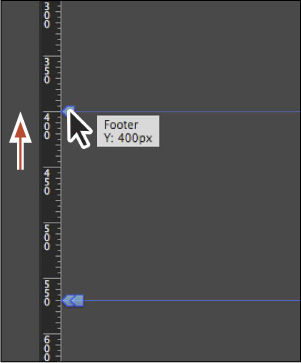
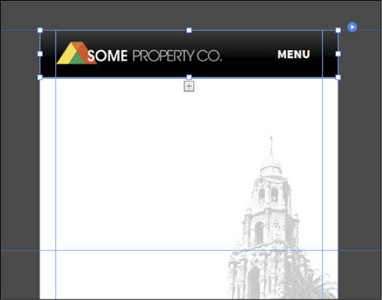
Now that you’ve added the background of the master, you can focus on setting the header and footer guides to where they need to be. Because smartphones have smaller screens, it’s usually necessary to redefine the header and footer regions so they take up less room than the Desktop layout header and footer.
Note
If you don’t see the guides, choose View > Show Guides and View > Show Header and Footer.
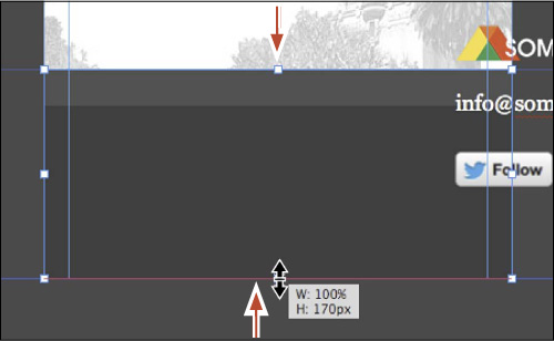
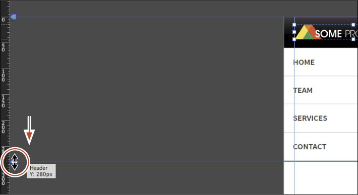
5. Drag the Footer guide up to approximately 400px from the top edge of the page area (the position will appear in the measurement label). You’ll adjust the Header guide later.
With the page options and guides set, you can focus on adding header and footer content to the Internal-master [Phone] page. To make it easier, you’ll copy some of the content from the footer of the desktop Home-master page and paste it into the phone Internal-master page. In the next section, you’ll also copy a mobile menu from another site and paste it into the phone Internal-master page.
6. Press Command+J (Ctrl+J), type the letter “H,” choose Home-master from the menu, and then click OK to open the Home-master [Desktop] page in Design mode.
7. Scroll down the page so you can see all of the footer content. With the Selection tool selected, drag a selection marquee across all of the footer content. Choose Edit > Copy.
8. Click the Internal-master [Phone] tab at the top of the Document window to return to the Internal-master [Phone] page in Design mode.
9. In the Layers panel, select the Master content layer.
10. Choose Edit > Paste.
The content is now pasted into the Internal-master [Phone] page. Notice that the rectangle, which was 100% width content, fits within the bounds of the page and is still 100% width.
11. Choose Edit > Deselect All. With the Selection tool, select the form and press Delete (Backspace) to delete it.
We will have mobile visitors go to the CONTACT page to fill out the form there.
12. Select the pasted rectangle, snap the top edge to the Footer guide, and snap the bottom edge to the Bottom of Page guide.
13. Click the logo group to select it. Choose Object > Ungroup, and then click away from the group content to deselect it.
14. Drag the logo above the Header guide, and snap the left edge of the logo to the left margin guide.
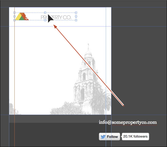
15. With the logo still selected, deselect the Footer option in the Control panel.
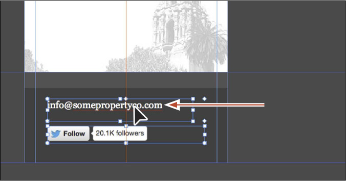
16. Select both the email text frame and the Twitter Follow widget, and drag them into the footer. Align them to the horizontal center of the page. A temporary red guide will appear in the center of the content when they are aligned.
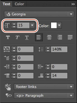
17. Click away from the footer content to deselect it. Click the email address text frame to edit the font size. In the Text panel (Window > Text) change the Font Size to 15.
The next step is to add mobile navigation to the Internal-master [Phone] page.
Adding a mobile menu to the Phone layout master page
When you’re deciding on navigation for a mobile layout, you need to strike a balance between allowing the site visitor to easily navigate the site content and not taking up too much space. The menu in the Desktop layout can be resized to fit in the mobile master page, but a common solution to this problem is to use a toggle menu that can expand and collapse.
The mobile menu you’ll insert is prebuilt, and you’ll copy it from an existing Muse site file. It is based on a mobile menu found here:
http://blogs.adobe.com/muse/2012/12/11/create-super-widgets-in-muse-the-expanding-mobile-menu/
Next, you’ll open a site, explore the mobile menu, and then copy and paste it into the Internal-master [Phone] page.
1. Choose File > Open Site. In the Open dialog box, navigate to the Lessons > Lesson10 folder and select the MobileMenu.muse file. Click Open.
2. Double-click the A-Master page thumbnail to open it in Design mode.
3. With the A-Master page open, press Command+P (Ctrl+P) to preview the menu. Click the word MENU several times to see it in action.
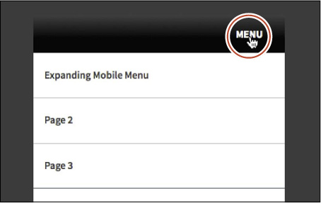
4. Choose File > Close Preview and return to the A-Master page.
5. With the Selection tool selected, click the “MENU” text in the header to select the accordion. Notice that the word “Accordion” shows in the Selection Indicator on the left end of the Control panel.
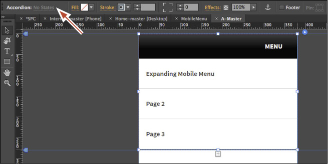
This menu is composed of two items: an Accordion widget and a vertical Menu widget. The accordion has only one trigger and target. In the trigger is the text “MENU.” In the target area is the vertical menu. When the user taps the accordion tab, the accordion content area slides open vertically, revealing the menu. See the following figure.
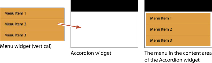
6. Click twice on the menu in the content area of the accordion to select it. In the Selection Indicator on the left end of the Control panel, the word “Menu” will show.
The menu is set to vertical and is the exact width of the page area (so is the accordion).
Tip
You can build mobile navigation in many ways. For another great mobile example, visit http://www.adobe.com/inspire/2013/09/mobile-navigation-muse.html.
To learn more about how this menu is built, visit http://blogs.adobe.com/muse/2012/12/11/create-super-widgets-in-muse-the-expanding-mobile-menu.
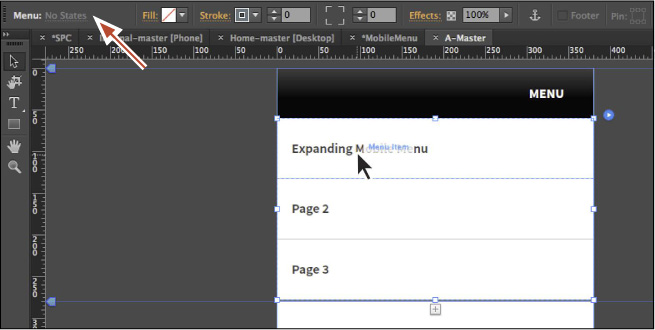
7. Click away from the accordion to deselect it. Click the “MENU” text (the accordion tab) until the accordion’s content area with the menu is showing, if necessary. Make sure it’s showing before you proceed.
8. Click away from the accordion to deselect it, and then click the accordion once to select it. Choose Edit > Copy to copy it.
9. Choose File > Close Site to close the MobileMenu site file without saving changes.
10. Click the Internal-master [Phone] tab to return to the Phone layout’s master page in Design mode, if necessary.
11. In the Layers panel (Window > Layers), select the Master content layer.
Tip
Layers, styles, swatches, library items, and assets are shared among alternate layouts.
12. Choose Edit > Paste In Place to paste the accordion in the same location on the Internal-master [Phone] page as the A-Master page.
13. With the accordion still selected, choose Object > Send To Back to arrange it behind the logo in the header.
14. Drag the logo so it’s vertically visually aligned with the “MENU” text to the right.
The last step in the mobile menu is to ensure that the content always stays beneath it. That way when the word MENU is tapped and the accordion opens, the accordion’s content area will slide down and push the page content down as well. Otherwise, the menu displays on top of the page content (which would work as well).
15. Drag the Header guide down to 280px—just below the menu content.
16. Click the “MENU” text until the accordion’s target area is collapsed and the menu is no longer showing.
Tip
To make it easier to copy content between layout pages, you can open the pages you are copying content to and from, and choose Window > Arrange > Tile. To consolidate the pages to tabs again, choose Window > Arrange > Consolidate All By Site.
17. Choose File > Save Site and close all open pages, returning to Plan mode.
With the header and footer content set, you’ll add content to a few of the pages to see how it’s done.
Copying content between layouts
Now that the master page has some content on it, you’ll add content and a few links to the pages in the Phone layout. Because the content has already been created on the Desktop layout, you’ll copy and paste from a page in the Desktop layout to the same page in the Phone layout, and adjust formatting or remove content where necessary. By design, styles you apply to elements are preserved when you copy them. Character styles, graphic styles, and paragraph styles are maintained throughout the different layouts you create.
Next, you’ll copy content from the HOME [Desktop] page to the HOME [Phone] page.
1. In Plan mode with the Phone layout site map showing (click the Phone button if necessary), double-click the HOME page thumbnail to open the Home page in Design mode.
Next, you’ll learn about another simple way to navigate pages in your site.
2. Choose Page > Go To Matching Page > Desktop.
The HOME [Desktop] page will open in Design mode. Using this command is an easy way to quickly navigate to the same master page in different layouts.
3. With the Selection tool selected, choose Edit > Select All to select all of the page content.

4. Choose Edit > Copy to copy the content, which includes a Slideshow widget.
Note
Widgets in Adobe Muse are designed and tested to work with all modern desktop and mobile browsers, so you don’t need to change anything to make the slideshow work on a touch screen.
5. Click the HOME [Phone] tab at the top of the Document window to return to the phone home page.
6. In the Layers panel (Window > Layers), select the Page content layer.
7. Choose Edit > Paste In Place.
8. Choose View > Fit Page In Window to see the entire page.
Editing the pasted content
After pasting the HOME [Desktop] page content, all of the content except for the 100% width slideshow is the same size as it was on the HOME [Desktop] page.
Next, you’ll fit the content into the HOME [Phone] page.
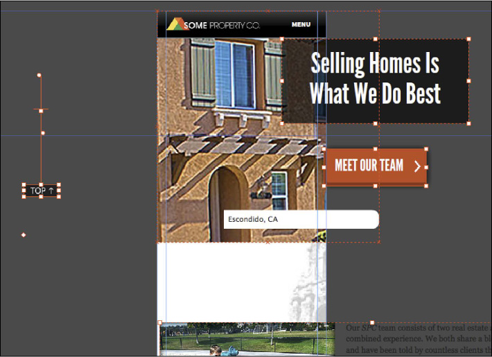
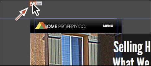
1. With the Selection tool, click away from the content to deselect it. Click the TOP button and delete it. Scroll up until you see the Top anchor (it will most likely appear above the page area). Select it and delete it as well.
Tip
If you don’t see the anchor, you can always hide layers in the Layers panel to try to locate it, hide content on the page (Object > Hide), or select all of the content to find where it is. You may need to scroll up to see it above the page content.
2. Click to select the image and text group toward the bottom of the page. Choose Object > Ungroup. Click away from the content to deselect it, and then click the image and delete it.
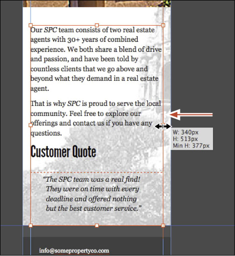
3. Drag the text frame onto the page, snapping the left edge to the left margin guide and then dragging the right, middle bounding point so that it snaps to the right margin guide. See the figure for help.
Next, you’ll make a style that uses a smaller font size that you’ll apply to only the mobile pages.
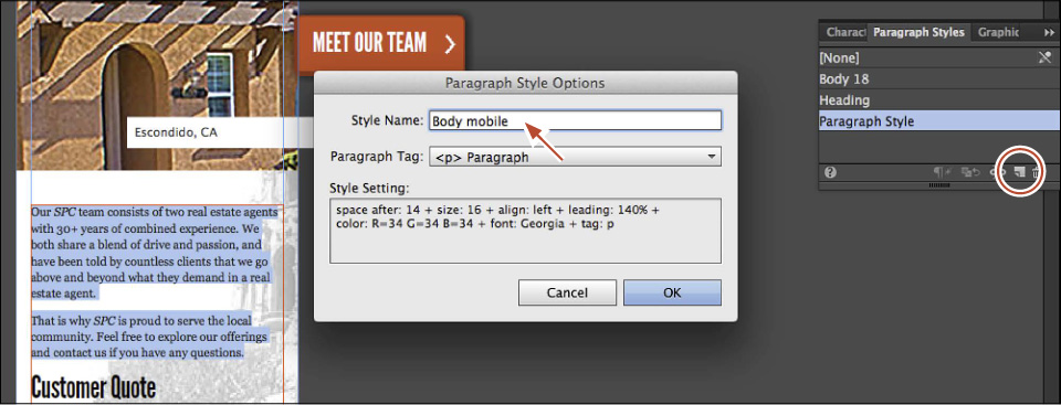
4. With the Text tool, select the first two paragraphs (above the “Customer Quote” text). Change the Font Size to 16 in the Control panel.
5. At the bottom of the Paragraph Styles panel (Window > Paragraph Styles), click the Create A New Style button ( ) to make a new style. Double-click the name of the style and change it to Body mobile. Click OK.
6. Select the quote paragraph below the “Customer Quote” headline text and change the font size to 16 in the Control panel.
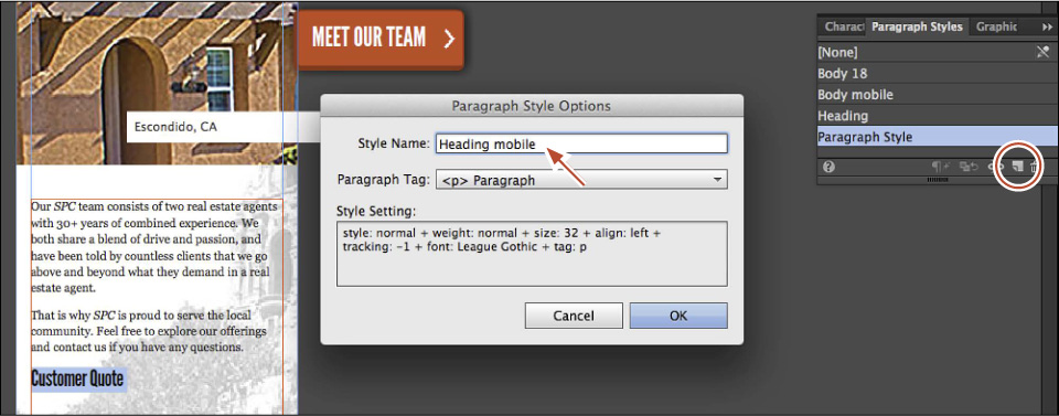
7. Select the “Customer Quote” headline text and change the font size to 32 in the Control panel.
8. With the “Customer Quote” text still selected, click the Create A New Style button () at the bottom of the Paragraph Styles panel to make a new style. Double-click the name of the style and change it to Heading mobile. Click OK.
When you’re working with alternate layouts, the character, paragraph, and graphic styles are shared between each layout. That means a change to a paragraph style in the Phone layout also affects the Desktop layout.
The last step is to fix the content at the top of the HOME page.
Note
If you click twice slowly on a style name in the Paragraph Styles panel, you can edit the name in the field.
9. With the Selection tool selected, click the caption on the slideshow twice to select it. Press Delete (Backspace) to delete it.
Tip
Deleting a widget sub-element, like the caption, is the same thing as deselecting the option in the widget Options menu. You can always enable the option later in the Options menu if you want to show it again.
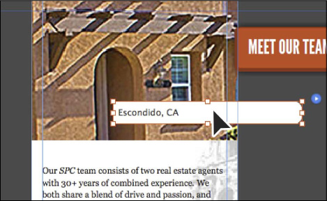
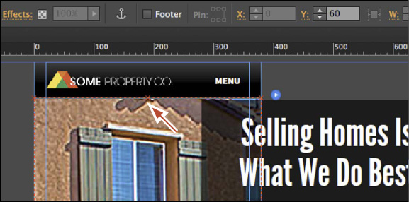
10. Click in a blank area of the Document window to deselect the slideshow. Click the slideshow to select it. Change the Y value to 60 in the Control panel (or Transform panel).
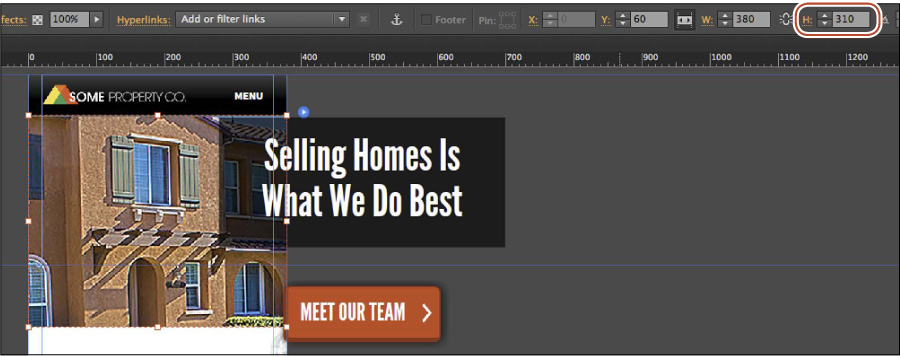
11. Click once more on the slideshow image to select the hero image. “Hero Image” will show in the Selection Indicator on the left end of the Control panel. Change the height (H:) to 310 in the Control panel.
12. Drag the text beneath the slideshow up, closer to the slideshow.
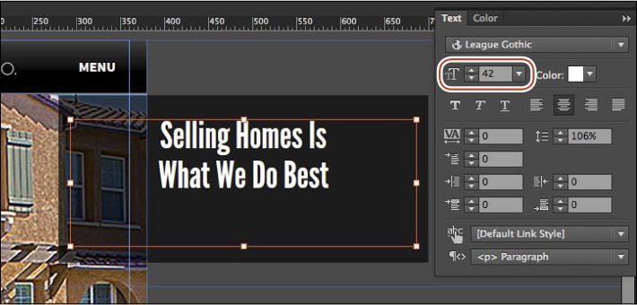
13. Click the “Selling Homes Is What We Do Best” text to select the group. Choose Object > Ungroup.
14. Click away from the selected content to deselect it, and then click the “Selling Homes Is What We Do Best” text frame. Change the font size to 42 in the Text panel.
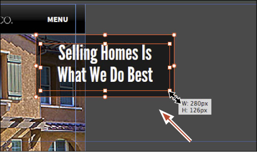
15. Shift-click the black rectangle beneath the text to select the text frame and the rectangle. Drag the lower, right bounding point of the rectangle in toward the center. When the measurement label shows a width of 280px and a height of 125px (roughly), release the mouse button and then the Shift key.
Note
You can also select just the background rectangle, resize it separately, and then select the text frame and center it on top of the rectangle again.
16. While both objects are selected, choose Object > Group and drag the group into the center of the page, on top of the slideshow. See the figure for placement help.

17. Click the red button and change the font size to 24 in the Text panel.
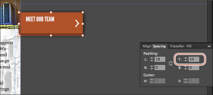
18. Choose Window > Spacing to open the Spacing panel. Ensure that the Make All Padding Settings The Same button is off and change the Top Padding to 10.
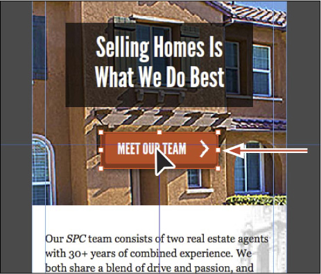
19. With the red button still selected, change the width to 175 and the height to 54 in the Control panel (or Transform panel).
20. Drag the red button beneath the “Selling Homes Is What We Do Best” text group, aligning it to the horizontal center of the page.
21. Choose File > Save Site.
Next, you’ll add content to the CONTACT page using a similar method.
Adding content to the CONTACT page for the Phone layout
Using a similar method of copy and paste, you’ll copy content from the Desktop layout CONTACT page and paste it into the Phone layout CONTACT page. Then, you’ll make adjustments to fit the content into the Phone layout.
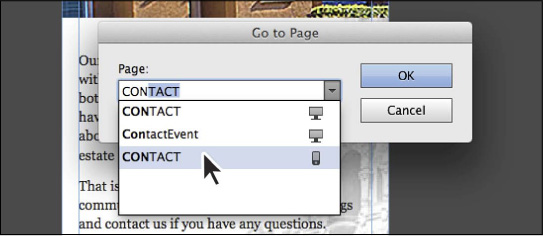
1. Press Command+J (Ctrl+J) and begin typing contact. Choose the CONTACT page with the mobile phone icon to the right of the name ( ). Click OK to open the CONTACT [Phone] page in Design mode.
2. Choose Page > Go To Matching Page > Desktop to open the CONTACT page from the Desktop layout. The page tab should be showing CONTACT [Desktop].
3. With the Selection tool selected, choose Edit > Select All to select all of the content on the CONTACT page.
4. Choose Edit > Copy.
5. Click the CONTACT [Phone] tab to return to the Phone layout CONTACT page in Design mode.
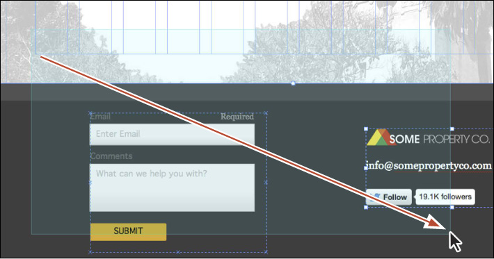
6. Choose Edit > Paste In Place. With the content on the page, Shift-drag it down so that the “Click to download our client questionnaire” text is below the menu. The Shift key will constrain the movement to 45 degrees.
Much like the content you pasted on the HOME page, the CONTACT page content needs to be edited to fit the design.
7. Choose Edit > Deselect All.
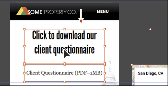
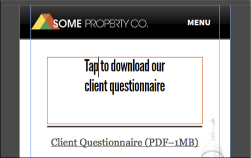
8. With the Selection tool selected, click the “Click to download our client questionnaire” text frame and change the font size to 30 in the Text panel. Insert the cursor in front of the word “client” and press Shift+Return (Shift+Enter) to insert a line break. Replace the word Click with the word Tap.
9. Use the Selection tool to resize the text frame so it more closely matches the height of the text. Center the text frame on the page.
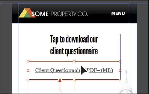
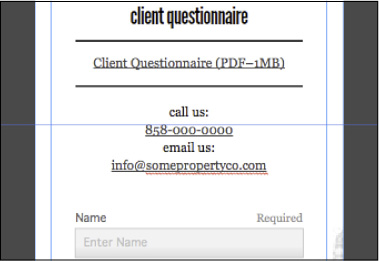
10. Select the “Client Questionnaire (PDF–1MB)” text frame and change the font size to 16 in the Text panel.
11. Change the height of the “Client Questionnaire...” text frame to 56 pixels in the Control panel (or Transform panel). Drag the text frame up so that it is vertically closer to the “Tap to download our client questionnaire” text frame. See the figure for placement help.
Next, you’ll edit the form to simplify it a bit.
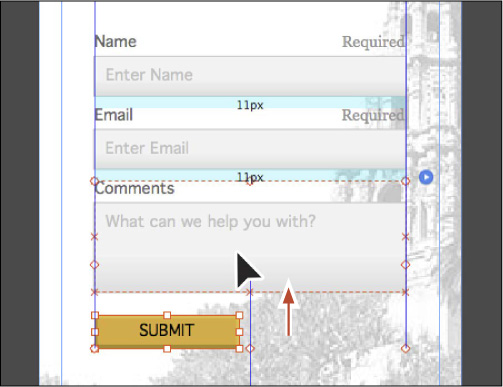
12. Click twice on the Phone form field to select it. Press Delete (Backspace) to delete it.
13. Click the Comments field and Shift-click the SUBMIT button to select both. Drag them up until the aqua gap measurements show the same value (11px) above and below the Email field, and then release the mouse button.
14. Press the Esc key to select the entire form.
The word “Form” will show in the Selection Indicator on the left end of the Control panel.
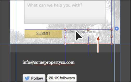
15. Click the Normal link on the left end of the Control panel and select Submit In Progress from the States menu.
16. Click the “Submitting Form...” form message beneath the form on the page to select it. Drag it up so that the top edge snaps to the top edge of the SUBMIT button.
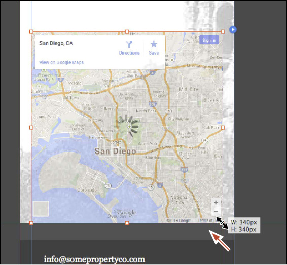
17. With the Selection tool, select the Google map. Drag the map beneath the form, snapping the left edge of the map to the left margin guide.
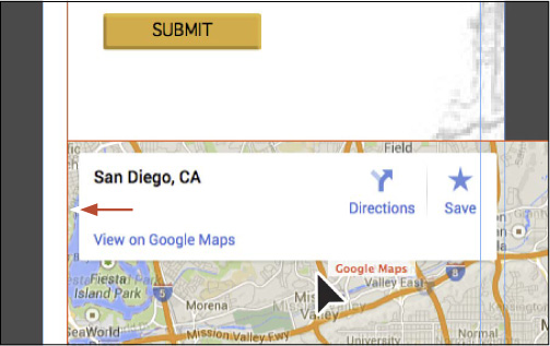
18. Shift-drag the lower, right corner bounding point toward the center of the map, snapping the right edge of the map to the right margin guide.
19. Choose File > Save Site, and close all open pages, returning to Plan mode.
Adding content to the rest of the mobile pages
For the remaining pages—TEAM, SERVICES, and Thank You—you’ll copy and paste content from a Muse site in the Lessons folder that contains the final content. You’ll be switching back and forth between pages quite a bit to accomplish this.
1. Choose File > Open Site. Navigate to the Lessons > Lesson10 folder and select the Copy-content.muse file. Click Open to open the site file.
Notice that the only layout in the Muse project is a Phone layout.
2. Double-click the TEAM page thumbnail in Plan mode to open the page in Design mode.
3. Click the Copy-content tab to return to the site map, and double-click the SERVICES page to open it in Design mode.
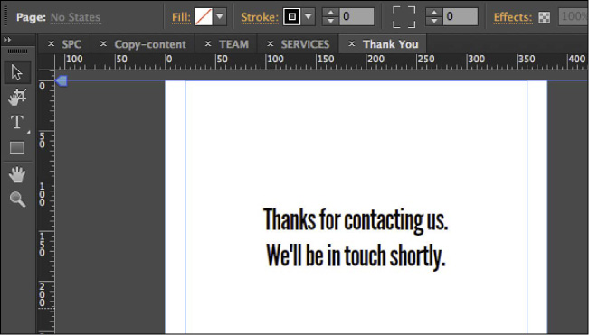
4. Click the Copy-content tab to return to the site map, and double-click the Thank You page to open it in Design mode.
With the three pages open, you’ll now copy and paste content from those Copy-content site pages into the SPC site pages.
5. With the Thank You page showing (in the Copy-content site), choose Edit > Select All, and then choose Edit > Copy.
6. Choose File > Close Page to close the Thank You page and return to the Copy-content site map in Plan mode.
7. Press Command+M (Ctrl+M) to return to Plan mode for the SPC site. Double-click the Thank You page thumbnail to open it in Design mode.
8. In the Layers panel (Window > Layers), select the Page content layer.
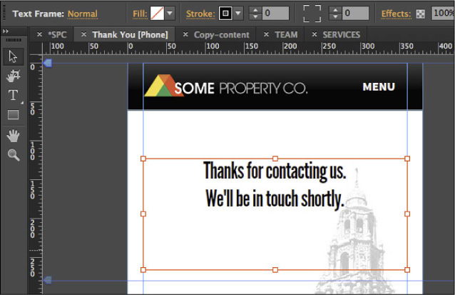
9. Choose Edit > Paste In Place, and then choose File > Close Page to close the Thank You [Phone] page and return to the SPC site map.
10. Double-click the SERVICES page thumbnail in the SPC site map to open it in Design mode.
11. Click the SERVICES tab to return to the SERVICES page in the Copy-content site.
12. Choose Edit > Select All, and then choose Edit > Copy.
13. Choose File > Close Page. Open the SERVICES [Phone] page by clicking the SERVICES [Phone] page tab at the top of the Document window, if it isn’t already showing.
14. Choose Edit > Paste In Place, and then choose File > Close Page to close the SERVICES [Phone] page and return to the SPC site map.
15. With the SPC site map showing, double-click the TEAM page thumbnail to open it in Design mode.
16. Click the TEAM tab to return to the TEAM page in the Copy-content site.
17. Choose Edit > Select All, and then choose Edit > Copy.
18. Choose File > Close Page. Return to the TEAM [Phone] page by clicking the page tab at the top of the Document window, if it isn’t already showing.
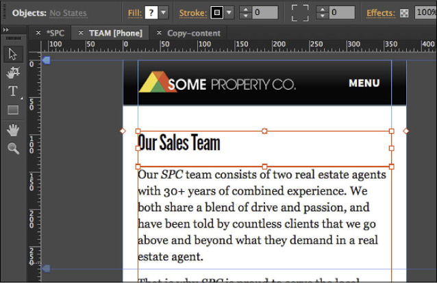
19. Choose Edit > Paste In Place, and then choose File > Close Page to close the TEAM [Phone] page and return to the SPC site map.
20. Click the Copy-content tab, and choose File > Close Site, without saving.
Working with links
When you add alternate layouts to your Muse site, the links in the Hyperlinks menu are organized by layout to differentiate between pages in Desktop, Tablet, or Phone layouts. Link support is available for mobile—phone numbers (e.g., tel:8585551212) and email (e.g., mailto:[email protected])—that results in touch-enabled links to a smartphone dialer or email client.
Next, you’ll edit several of the links and add a phone number link.
1. With the SPC site map visible in Plan mode and the phone site map showing, double-click the HOME page thumbnail to open the page.
2. With the Selection tool, click to select the red MEET OUR TEAM button.
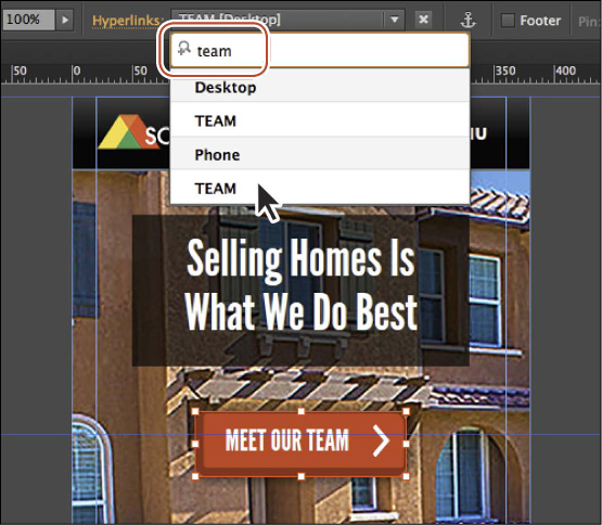
3. Click the Hyperlinks menu in the Control panel that contains the text “TEAM [Desktop].”
You can see that the Hyperlinks menu is divided into sections, and two of those sections corresponds to a layout. Right now, because the link was originally added in the Desktop layout, the link points to the Desktop version of the HOME page. That link should point to the Phone version of the HOME page.
4. Where you see “TEAM [Desktop]” at the top of the menu, type team, and choose TEAM from the Phone section of the filtered menu.
The link should now appear to the right of Hyperlinks: as “TEAM [Phone].”
5. Press Command+J (Ctrl+J) and type int in the field. When the filtered menu appears, select Internal-master with the mobile phone icon to the right of the name. Click OK to open the Internal-master [Phone] page in Design mode.
6. On the Internal-master [Phone] page, with the Selection tool, click the gray rectangle in the footer to select it. Click the Stroke link and change the top stroke value to 0 in the Stroke Options menu in the Control panel to remove the top stroke.
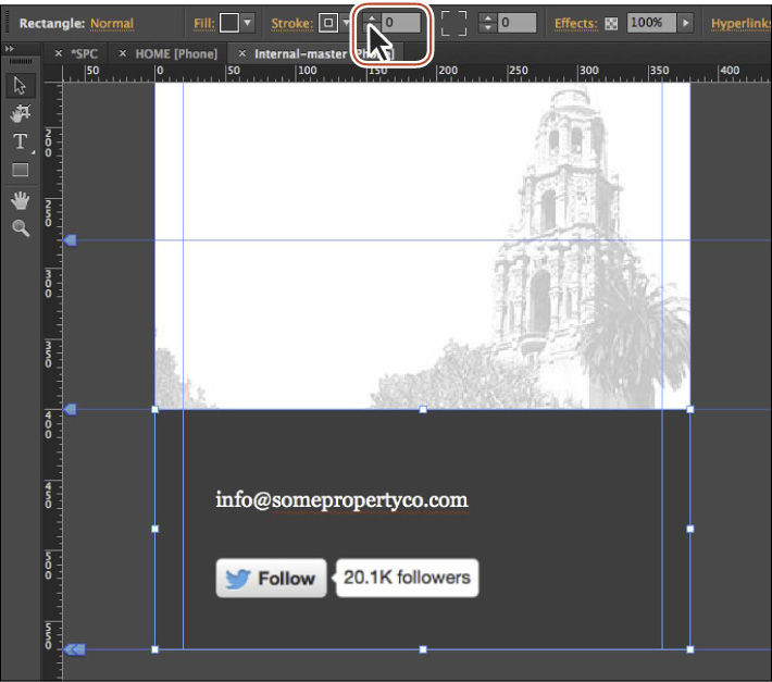
7. Click the email address text frame in the footer and drag it up closer to the top of the footer. Make sure the left edge is still aligned with the Twitter Follow widget. Drag the bottom, middle bounding point of that same text frame down to make room for another line of text.
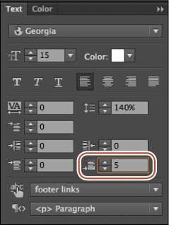
8. With the text frame still selected, change the Space After to 5 in the Text panel.
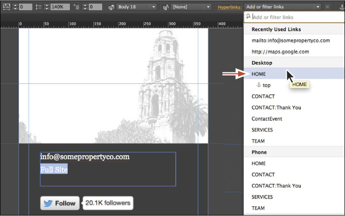
9. Select the Text tool, and insert the cursor after the email address in the footer. Press Return (Enter) and type Full Site.
10. Select the “Full Site” text, click the Add Or Filter Links menu, and select the HOME link in the Desktop category.
Note
You may need to move the Twitter Follow widget up a bit closer to the text frame.
11. Press Command+J (Ctrl+J) and type cont. Press the down arrow key several times to select the Phone version of the CONTACT page, and press Return (Enter) to open the page. The page should open, and the page tab should appear as CONTACT [Phone].
12. In the Layers panel (Window > Layers), select the Page content layer.
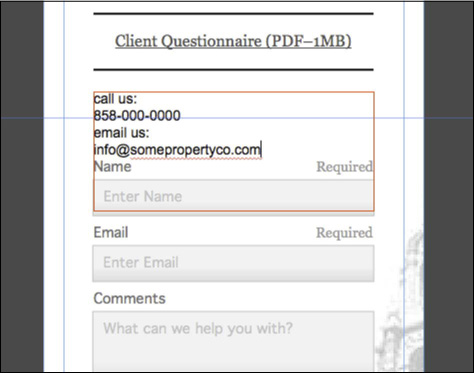
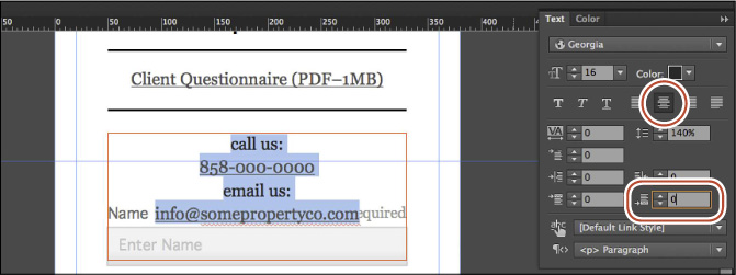
13. With the Text tool selected, create a text frame just below the “Client Questionnaire (PDF–1MB)” text. Insert the cursor, type call us:, and press Return (Enter); type 858-000-0000 and press Return (Enter); type email us: and press Return (Enter); and then type [email protected]. This should create four lines of text.
14. Select the phone number “858-000-0000.” Click the Add Or Filter Links menu and, in the field at the top of the menu, type tel:+18580000000. Press Return (Enter).
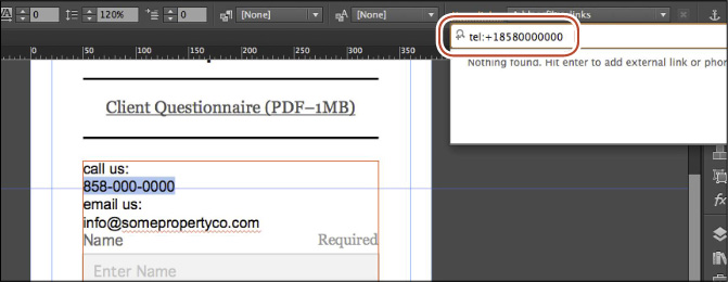
The “tel:+1” prefix should precede every phone number you enter into the Add Or Filter Links menu.
15. Select the text “[email protected].” Click the Add Or Filter Links menu and, in the field at the top of the menu, type [email protected]. Press Return (Enter) to accept it.

Tip
You could also choose mailto:[email protected] from the Recently Used Links section of the menu if it appears.
16. With the email address still selected on the page, choose Edit > Select All. In the Paragraph Styles panel (Window > Paragraph Styles), click the Body mobile paragraph style to apply it.
17. Click the Align Center button ( ), and change the Space After to 0 in the Text panel.
18. With the Selection tool selected, drag the form and Google map beneath the text a little farther down to make room for the new text.
19. Close all open pages, and return to Plan mode for the Phone layout.
Working with assets
For each layout you create (to display on desktop, tablet, or phone screens), the linked content that is copied, such as images and other assets, are all linked to the same original source files. The Assets panel lists each asset in a similar fashion to the Hyperlinks menu; it shows which layout(s) the asset belongs to via a small icon to the right of the name in the Asset panel list.
Next, you’ll take a look at how the assets appear in the Assets panel and learn how to replace an image.
1. In Plan mode, ensure that the Phone layout is selected and double-click the HOME page thumbnail to open it in Design mode.
2. Choose Window > Reset Panels.
3. Using the Selection tool, click twice on the slideshow image at the top of the page to select it (underneath the red button). The words “Hero Image” will show in the Selection Indicator of the Control panel.
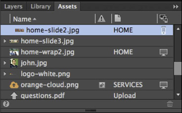
4. Open the Assets panel (Window > Assets); you’ll see that the home-slide2.jpg is selected. You may want to drag the left edge of the Links panel to the left to make it wider, like we did.
Tip
If you don’t see the image selected in the Assets panel, with the panel visible, click to deselect the slideshow. Then click twice on the image to see it in the panel.
Note
You will most likely see multiple “home-slide2.jpg” images listed. The panel in the figure just so happens to be scrolled so you don’t see the others.
The image selected in the Assets panel has a phone icon () to the right of the name, indicating that it appears on a Phone layout page.
5. Hover the pointer over the image name in the Assets panel until you see the yellow tooltip appear (be patient).
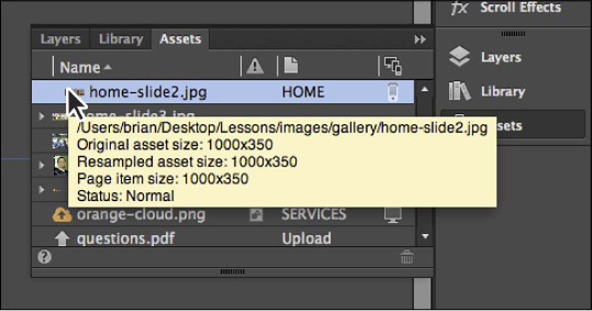
In the yellow tooltip you’ll see that the original asset size is 1000x350. The file size is also almost 135 KB, which is too large for a mobile device like a phone to download, considering also that there are three images in that slideshow that are all the same dimension and roughly the same file size.
Next, you’ll replace the image with the same image that was resized in Photoshop to better fit the phone page dimensions (380 pixel width) and is smaller in file size. The image was also saved with a different name so as not to confuse the Desktop version with the Phone version in the Muse project file.
6. Right-click the selected home-slide2.jpg image in the Assets panel list. Choose Relink from the menu that appears. Navigate to the Lessons > images > gallery > mobile folder, and choose the home-slide2-mobile.jpg image. Click Open.
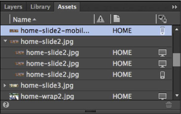
Note
You’ll see two of the same image (home-slide2.jpg) listed in the Assets panel with a mobile icon to the right of the name. One is for the thumbnail that the slideshow has generated, and the other is for the hero image.
In the real world, the other two images for the slideshow listed in the Assets panel—home-slide1.jpg and home-slide3.jpg—would need to be replaced as well. For this lesson, you’ll forgo replacing the remaining images. If you want to replace them, replacements are located in the Lessons > images > gallery > mobile folder.
Tip
If you want to locate the assets used for a specific layout, click the top of the column on the far right of the Assets panel that displays the Desktop, Tablet, or Phone icons. This sorts the list of assets so that the assets for each layout are displayed in a consolidated set.
7. Close the HOME [Phone] page (File > Close Page), and choose File > Save Site.
Previewing Phone and Tablet layouts
You can preview your alternate layouts directly within Adobe Muse the same way that you’ve been previewing sites in the past using Preview mode. For Tablet or Phone layouts, you can choose which (major) device to preview the pages in. For instance, when you’re previewing the Phone layout, you can choose between iPhone 4S, iPhone 5S, Nokia Lumia 1020, and Samsung Galaxy S5. When you’re previewing the Tablet layout, you can choose between the iPad, Kindle Fire, Kindle Fire HD, Kindle Fire HD 8.9”, Nexus 7, and the Surface RT.
Each device option in the Preview Size menu has predefined width and height settings to present the page content at a specific aspect ratio. Use your cursor to scroll the previewed page, simulating a finger swipe on a touch screen. While in Preview mode, you can click links and navigate through the site. To test the site, it’s best to test it on the actual devices you are targeting to check performance and browser behavior.
1. In Plan mode, press Command+9 (Ctrl+9) to ensure that the Phone layout’s site map is visible.
2. Press Command+P (Ctrl+P) to preview the home page in Preview mode.
Note
Adobe Muse Preview displays the height and width of the chosen device (such as iPhone 4S) but does not attempt to simulate device-specific features or nuances of the mobile browser on a given device.
3. In Preview mode, choose iPhone 5S from the Preview Size menu.
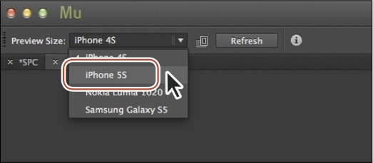
The preview window becomes larger to match the size of the chosen device.
Tip
If you click the i button to the right of the Refresh button in Preview mode, you’ll see a note explaining that Preview mode doesn’t emulate actual device behaviors. You can publish your site as a temporary site and then test the site directly on the devices.
4. Click the Change Orientation button ( ) to the right of the Preview Size menu to switch orientations from portrait (default) to landscape.

5. Choose File > Close Preview to return to Plan mode.
6. Choose File > Save Site, if necessary.
In the final lesson, Lesson 11, “Publishing and Exporting Your Site,” you’ll learn how to publish a temporary site for testing and sharing, upgrade the temporary site to a live site, upload changes, export the site content to HTML, and more.
Review questions
1. Briefly describe the benefit of alternate layouts.
2. When an alternate layout is created, what is not copied from the existing layout that the copy is based on?
3. Name the three alternate layouts you can create in Muse.
4. In the Site Properties dialog box, what purpose does the Redirect From Desktop option serve (for either Phone or Tablet layouts)?
5. When previewing a Phone or Tablet layout in Preview mode, what must you keep in mind?
Review answers
1. These days, with the proliferation of devices, we strive to produce an optimal viewing experience for site visitors. Alternate layouts in Muse allow you to manually adapt your design for different devices and customize it so that a unique experience can be delivered for each screen size.
2. When an alternate layout is created, you can choose an existing layout to base the new layout on (or choose None). The actual page content is not added to the new alternate layout. You can copy the content you want into each page of a mobile layout. As you paste content you want to add into each new page, you can resize it to fit within the smaller dimensions of the mobile screen.
3. In Muse, you can create separate layouts for desktop, tablet, and phone versions of a website in the same project file.
4. In the Site Properties dialog box, when a Phone or Tablet layout is selected, the Redirect From Desktop option redirects to the mobile or tablet versions of a site when accessed from smartphones or tablet devices. This option is enabled by default.
5. Muse will not render the sites in the same manner as an actual phone or tablet. Both the appearance and behavior of the site may differ, and you cannot detect performance issues. For these reasons, it is a best practice to always test the mobile layouts on actual devices or use device emulators for at least the most popular mobile devices.