Chapter 12. User Interface Components with Swing
In this chapter
• 12.1 Swing and the Model-View-Controller Design Pattern
• 12.2 Introduction to Layout Management
• 12.6 Sophisticated Layout Management
• 12.8 Troubleshooting GUI Programs
The previous chapter was written primarily to show you how to use the event model in Java. In the process, you took the first steps toward learning how to build a graphical user interface. This chapter shows you the most important tools you’ll need to build more full-featured GUIs.
We start out with a tour of the architectural underpinnings of Swing. Knowing what goes on “under the hood” is important in understanding how to use some of the more advanced components effectively. We then show you how to use the most common user interface components in Swing, such as text fields, radio buttons, and menus. Next, you will learn how to use the nifty layout manager features of Java to arrange these components in a window, regardless of the look-and-feel of a particular user interface. Finally, you’ll see how to implement dialog boxes in Swing.
This chapter covers the basic Swing components such as text components, buttons, and sliders. These are the essential user interface components that you will need most frequently. We will cover advanced Swing components in Volume II.
12.1 Swing and the Model-View-Controller Design Pattern
As promised, we start this chapter with a description of the architecture of Swing components. We first discuss the concept of design patterns and then look at the “model-view-controller” pattern that has greatly influenced the design of the Swing framework.
12.1.1 Design Patterns
When solving a problem, you don’t usually figure out a solution from first principles. Instead, you are likely to be guided by your past experience, or you may ask other experts for advice on what has worked for them. Design patterns are a method for presenting this expertise in a structured way.
In recent years, software engineers have begun to assemble catalogs of such patterns. The pioneers in this area were inspired by the architectural design patterns of the architect Christopher Alexander. In his book, The Timeless Way of Building (Oxford University Press, 1979), Alexander gives a catalog of patterns for designing public and private living spaces. Here is a typical example:
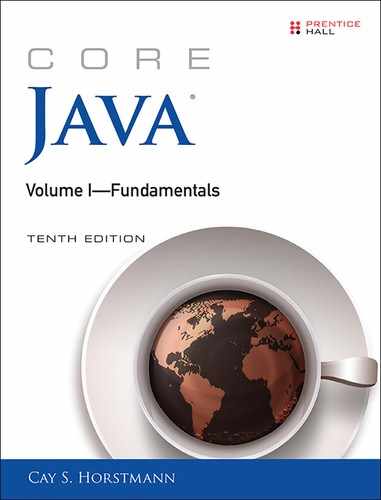
Window Place
Everybody loves window seats, bay windows, and big windows with low sills and comfortable chairs drawn up to them. . . A room which does not have a place like this seldom allows you to feel comfortable or perfectly at ease. . .
If the room contains no window which is a “place,” a person in the room will be torn between two forces: (1) He wants to sit down and be comfortable, and (2) he is drawn toward the light.
Obviously, if the comfortable places—those places in the room where you most want to sit—are away from the windows, there is no way of overcoming this conflict. . .
Therefore: In every room where you spend any length of time during the day, make at least one window into a “window place.” (Figure 12.1.)
Each pattern in Alexander’s catalog, as well as those in the catalogs of software patterns, follows a particular format. The pattern first describes a context, a situation that gives rise to a design problem. Then, the problem is explained, usually as a set of conflicting forces. Finally, the solution shows a configuration that balances these forces.
In the “window place” pattern, the context is a room in which you spend any length of time during the day. The conflicting forces are that you want to sit down and be comfortable and that you are drawn to the light. The solution is to make a “window place.”
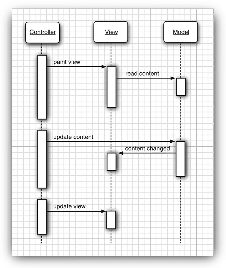
In the “model-view-controller” pattern, which we will describe in the next section, the context is a user interface system that presents information and receives user input. There are several forces. There may be multiple visual representations of the same data that need to be updated together. The visual representations may change—for example, to accommodate various look-and-feel standards. The interaction mechanisms may change—for example, to support voice commands. The solution is to distribute responsibilities into three separate interacting components: the model, the view, and the controller.
The model-view-controller pattern is not the only pattern used in the design of AWT and Swing. Here are several additonal examples:
• Containers and components are examples of the “composite” pattern.
• The scroll pane is a “decorator.”
• Layout managers follow the “strategy” pattern.
One important aspect of design patterns is that they become part of the culture. Programmers all over the world know what you mean when you talk about the model-view-controller pattern or the decorator pattern. Thus, patterns become an efficient way of talking about design problems.
You will find a formal description of numerous useful software patterns in the seminal book of the pattern movement, Design Patterns—Elements of Reusable Object-Oriented Software, by Erich Gamma et al. (Addison-Wesley, 1995). We also highly recommend the excellent book A System of Patterns by Frank Buschmann et al. (John Wiley & Sons, 1996), which we find less seminal and more approachable.
12.1.2 The Model-View-Controller Pattern
Let’s step back for a minute and think about the pieces that make up a user interface component such as a button, a checkbox, a text field, or a sophisticated tree control. Every component has three characteristics:
• Its content, such as the state of a button (pushed in or not), or the text in a text field
• Its visual appearance (color, size, and so on)
• Its behavior (reaction to events)
Even a seemingly simple component such as a button exhibits some moderately complex interaction among these characteristics. Obviously, the visual appearance of a button depends on the look-and-feel. A Metal button looks different from a Windows button or a Motif button. In addition, the appearance depends on the button state; when a button is pushed in, it needs to be redrawn to look different. The state depends on the events that the button receives. When the user depresses the mouse inside the button, the button is pushed in.
Of course, when you use a button in your programs, you simply consider it as a button; you don’t think too much about the inner workings and characteristics. That, after all, is the job of the programmer who implemented the button. However, programmers who implement buttons and all other user interface components are motivated to think a little harder about them, so that they work well no matter what look-and-feel is in effect.
To do this, the Swing designers turned to a well-known design pattern: the model-view-controller pattern. This pattern, like many other design patterns, goes back to one of the principles of object-oriented design that we mentioned way back in Chapter 5: Don’t make one object responsible for too much. Don’t have a single button class do everything. Instead, have the look-and-feel of the component associated with one object and store the content in another object. The model-view-controller (MVC) design pattern teaches how to accomplish this. Implement three separate classes:
• The model, which stores the content
• The view, which displays the content
• The controller, which handles user input
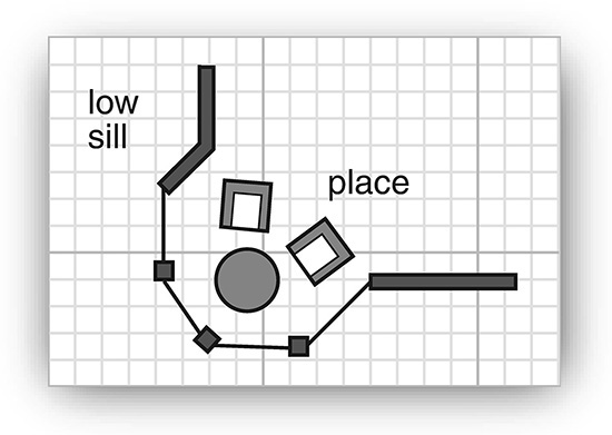
The pattern specifies precisely how these three objects interact. The model stores the content and has no user interface. For a button, the content is pretty trivial—just a small set of flags that tells whether the button is currently pushed in or out, whether it is active or inactive, and so on. For a text field, the content is a bit more interesting. It is a string object that holds the current text. This is not the same as the view of the content—if the content is larger than the text field, the user sees only a portion of the text displayed (see Figure 12.2).
The model must implement methods to change the content and to discover what the content is. For example, a text model has methods to add or remove characters in the current text and to return the current text as a string. Again, keep in mind that the model is completely nonvisual. It is the job of a view to draw the data stored in the model.
 Note
Note
The term “model” is perhaps unfortunate because we often think of a model as a representation of an abstract concept. Car and airplane designers build models to simulate real cars and planes. But that analogy really leads you astray when thinking about the model-view-controller pattern. In this design pattern, the model stores the complete content, and the view gives a (complete or incomplete) visual representation of the content. A better analogy might be the model who poses for an artist. It is up to the artist to look at the model and create a view. Depending on the artist, that view might be a formal portrait, an impressionist painting, or a cubist drawing that shows the limbs in strange contortions.
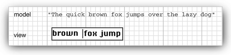
One of the advantages of the model-view-controller pattern is that a model can have multiple views, each showing a different part or aspect of the full content. For example, an HTML editor can offer two simultaneous views of the same content: a WYSIWYG view and a “raw tag” view (see Figure 12.3). When the model is updated through the controller of one of the views, it tells both attached views about the change. When the views are notified, they refresh themselves automatically. Of course, for a simple user interface component such as a button, you won’t have multiple views of the same model.
The controller handles the user-input events, such as mouse clicks and keystrokes. It then decides whether to translate these events into changes in the model or the view. For example, if the user presses a character key in a text box, the controller calls the “insert character” command of the model. The model then tells the view to update itself. The view never knows why the text changed. But if the user presses a cursor key, the controller may tell the view to scroll. Scrolling the view has no effect on the underlying text, so the model never knows that this event happened.
Figure 12.4 shows the interactions among model, view, and controller objects.
As a programmer using Swing components, you generally don’t need to think about the model-view-controller architecture. Each user interface component has a wrapper class (such as JButton or JTextField) that stores the model and the view. When you want to inquire about the content (for example, the text in a text field), the wrapper class asks the model and returns the answer to you. When you want to change the view (for example, move the caret position in a text field), the wrapper class forwards that request to the view. However, occasionally the wrapper class doesn’t work hard enough on forwarding commands. Then, you have to ask it to retrieve the model and work directly with it. (You don’t have to work directly with the view—that is the job of the look-and-feel code.)
Besides being the right thing to do, the model-view-controller pattern was attractive for the Swing designers because it allowed them to implement pluggable look-and-feel implementations. The model of a button or text field is independent of the look-and-feel—but, of course, the visual representation is completely dependent on the user interface design of a particular look-and-feel. The controller can vary as well. For example, in a voice-controlled device, the controller must cope with an entirely different set of events than on a standard computer with a keyboard and a mouse. By separating out the underlying model from the user interface, the Swing designers can reuse the code for the models and can even switch the look-and-feel in a running program.
Of course, patterns are only intended as guidance, not as religion. No pattern is applicable in all situations. For example, you may find it difficult to follow the “window places” pattern to rearrange your cubicle. Similarly, the Swing designers found that the harsh reality of pluggable look-and-feel implementations does not always allow for a neat realization of the model-view-controller pattern. Models are easy to separate, and each user interface component has a model class. But the responsibilities of the view and the controller are not always clearly separated and are distributed over a number of different classes. Of course, as a user of these classes, you need not be concerned about this. In fact, as we pointed out before, you often don’t have to worry about the models either—you just use the component wrapper classes.
12.1.3 A Model-View-Controller Analysis of Swing Buttons
In the previous chapter, you already learned how to use buttons without having to worry about their controllers, models, or views. Still, buttons are about the simplest user interface elements, so they are a good place to get comfortable with the model-view-controller pattern. You will encounter similar kinds of classes and interfaces for the more sophisticated Swing components.
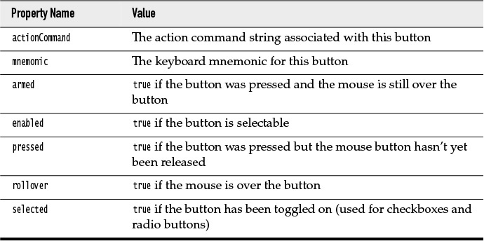
For most components, the model class implements an interface whose name ends in Model; in this case, the interface is called ButtonModel. Classes implementing that interface can define the state of the various kinds of buttons. Actually, buttons aren’t all that complicated, and the Swing library contains a single class, called DefaultButtonModel, that implements this interface.
You can get a sense of the sort of data maintained by a button model by looking at the properties of the ButtonModel interface—see Table 12.1.
Each JButton object stores a button model object which you can retrieve.
JButton button = new JButton("Blue");
ButtonModel model = button.getModel();
In practice, you won’t care—the minutiae of the button state are only of interest to the view that draws it. All the important information—such as whether a button is enabled—is available from the JButton class. (Of course, the JButton then asks its model to retrieve that information.)
Have another look at the ButtonModel interface to see what isn’t there. The model does not store the button label or icon. There is no way to find out what’s on the face of a button just by looking at its model. (Actually, as you will see in Section 12.4.2, “Radio Buttons,” on p. 660, purity of design is the source of some grief for the programmer.)
It is also worth noting that the same model (namely, DefaultButtonModel) is used for push buttons, radio buttons, checkboxes, and even menu items. Of course, each of these button types has different views and controllers. When using the Metal look-and-feel, the JButton uses a class called BasicButtonUI for the view and a class called ButtonUIListener as controller. In general, each Swing component has an associated view object that ends in UI. But not all Swing components have dedicated controller objects.
So, having read this short introduction to what is going on under the hood in a JButton, you may be wondering: Just what is a JButton really? It is simply a wrapper class inheriting from JComponent that holds the DefaultButtonModel object, some view data (such as the button label and icons), and a BasicButtonUI object that is responsible for the button view.
12.2 Introduction to Layout Management
Before we go on to discussing individual Swing components, such as text fields and radio buttons, we briefly cover how to arrange these components inside a frame. Unlike Visual Basic, the JDK has no form designer. You need to write code to position (lay out) the user interface components where you want them to be.
Of course, if you have a Java-enabled development environment, it will probably have a layout tool that automates some or all of these tasks. Nevertheless, it is important to know exactly what goes on “under the hood” because even the best of these tools will usually require hand-tweaking.
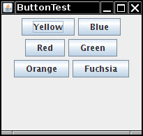
Let’s start by reviewing the program from Chapter 11 that used buttons to change the background color of a frame (see Figure 12.5).
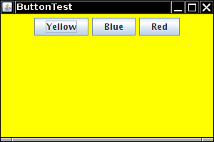
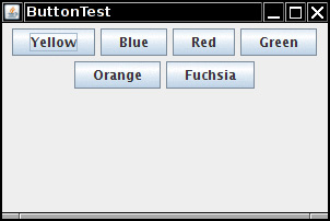
The buttons are contained in a JPanel object and are managed by the flow layout manager, the default layout manager for a panel. Figure 12.6 shows what happens when you add more buttons to the panel. As you can see, a new row is started when there is no more room.
Moreover, the buttons stay centered in the panel, even when the user resizes the frame (see Figure 12.7).
In general, components are placed inside containers, and a layout manager determines the positions and sizes of components in a container.
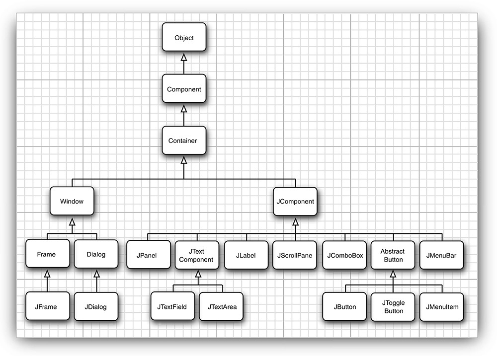
Buttons, text fields, and other user interface elements extend the class Component. Components can be placed inside containers, such as panels. Containers can themselves be put inside other containers, so the class Container extends Component. Figure 12.8 shows the inheritance hierarchy for Component.
Note
Unfortunately, the inheritance hierarchy is somewhat unclean in two respects. First, top-level windows, such as JFrame, are subclasses of Container and hence Component, but they cannot be placed inside other containers. Moreover, JComponent is a subclass of Container, not Component. Therefore one can add other components into a JButton. (However, those components would not be displayed.)
Each container has a default layout manager, but you can always set your own. For example, the statement
panel.setLayout(new GridLayout(4, 4));
uses the GridLayout class to lay out the components in four rows and four columns. When you add components to the container, the add method of the container passes the component and any placement directions to the layout manager.
java.awt.Container 1.0
• void setLayout(LayoutManager m)
sets the layout manager for this container.
• Component add(Component c)
• Component add(Component c, Object constraints) 1.1
adds a component to this container and returns the component reference.
java.awt.FlowLayout 1.0
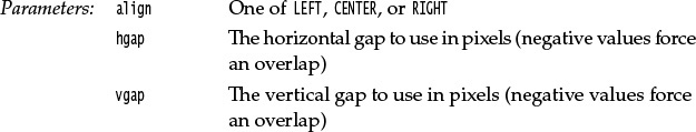
• FlowLayout()
• FlowLayout(int align)
• FlowLayout(int align, int hgap, int vgap)
constructs a new FlowLayout.
12.2.1 Border Layout
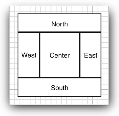
The border layout manager is the default layout manager of the content pane of every JFrame. Unlike the flow layout manager, which completely controls the position of each component, the border layout manager lets you choose where you want to place each component. You can choose to place the component in the center, north, south, east, or west of the content pane (see Figure 12.9).
For example:
frame.add(component, BorderLayout.SOUTH);
The edge components are laid out first, and the remaining available space is occupied by the center. When the container is resized, the dimensions of the edge components are unchanged, but the center component changes its size. Add components by specifying a constant CENTER, NORTH, SOUTH, EAST, or WEST of the BorderLayout class. Not all of the positions need to be occupied. If you don’t supply any value, CENTER is assumed.
Note
The BorderLayout constants are defined as strings. For example, BorderLayout.SOUTH is defined as the string "South". This is safer than using strings. If you accidentally misspell a string, for example, frame.add(component, "south"), the compiler won’t catch that error.
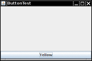
Unlike the flow layout, the border layout grows all components to fill the available space. (The flow layout leaves each component at its preferred size.) This is a problem when you add a button:
frame.add(yellowButton, BorderLayout.SOUTH); // don't
Figure 12.10 shows what happens when you use the preceding code fragment. The button has grown to fill the entire southern region of the frame. And, if you were to add another button to the southern region, it would just displace the first button.
To solve this problem, use additional panels. For example, look at Figure 12.11. The three buttons at the bottom of the screen are all contained in a panel. The panel is put into the southern region of the content pane.
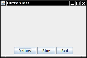
To achieve this configuration, first create a new JPanel object, then add the individual buttons to the panel. The default layout manager for a panel is a FlowLayout, which is a good choice for this situation. Add the individual buttons to the panel, using the add method you have seen before. The position and size of the buttons is under the control of the FlowLayout manager. This means the buttons stay centered within the panel and do not expand to fill the entire panel area. Finally, add the panel to the content pane of the frame.
JPanel panel = new JPanel();
panel.add(yellowButton);
panel.add(blueButton);
panel.add(redButton);
frame.add(panel, BorderLayout.SOUTH);
The border layout expands the size of the panel to fill the entire southern region.
java.awt.BorderLayout 1.0
• BorderLayout()
• BorderLayout(int hgap, int vgap)
constructs a new BorderLayout.
12.2.2 Grid Layout
The grid layout arranges all components in rows and columns like a spreadsheet. All components are given the same size. The calculator program in Figure 12.12 uses a grid layout to arrange the calculator buttons. When you resize the window, the buttons grow and shrink, but all buttons have identical sizes.
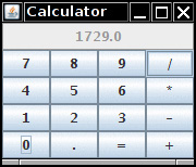
In the constructor of the grid layout object, you specify how many rows and columns you need.
panel.setLayout(new GridLayout(4, 4));
Add the components, starting with the first entry in the first row, then the second entry in the first row, and so on.
panel.add(new JButton("1"));
panel.add(new JButton("2"));
Listing 12.1 shows the panel class of the calculator program. This is a regular calculator, not the “reverse Polish” variety that is so oddly popular in Java tutorials. In this program, we call the pack method after adding the component to the frame. This method uses the preferred sizes of all components to compute the width and height of the frame.
Of course, few applications have as rigid a layout as the face of a calculator. In practice, small grids (usually with just one row or one column) can be useful to organize partial areas of a window. For example, if you want to have a row of buttons of identical sizes, you can put the buttons inside a panel that is governed by a grid layout with a single row.
Listing 12.1 calculator/CalculatorPanel.java
1 package calculator;
2
3 import java.awt.*;
4 import java.awt.event.*;
5 import javax.swing.*;
6
7 /**
8 * A panel with calculator buttons and a result display.
9 */
10 public class CalculatorPanel extends JPanel
11 {
12 private JButton display;
13 private JPanel panel;
14 private double result;
15 private String lastCommand;
16 private boolean start;
17
18 public CalculatorPanel()
19 {
20 setLayout(new BorderLayout());
21
22 result = 0;
23 lastCommand = "=";
24 start = true;
25
26 // add the display
27
28 display = new JButton("0");
29 display.setEnabled(false);
30 add(display, BorderLayout.NORTH);
31
32 ActionListener insert = new InsertAction();
33 ActionListener command = new CommandAction();
34 // add the buttons in a 4 x 4 grid
35
36 panel = new JPanel();
37 panel.setLayout(new GridLayout(4, 4));
38
39 addButton("7", insert);
40 addButton("8", insert);
41 addButton("9", insert);
42 addButton("/", command);
43
44 addButton("4", insert);
45 addButton("5", insert);
46 addButton("6", insert);
47 addButton("*", command);
48
49 addButton("1", insert);
50 addButton("2", insert);
51 addButton("3", insert);
52 addButton("-", command);
53
54 addButton("0", insert);
55 addButton(".", insert);
56 addButton("=", command);
57 addButton("+", command);
58
59 add(panel, BorderLayout.CENTER);
60 }
61
62 /**
63 * Adds a button to the center panel.
64 * @param label the button label
65 * @param listener the button listener
66 */
67 private void addButton(String label, ActionListener listener)
68 {
69 JButton button = new JButton(label);
70 button.addActionListener(listener);
71 panel.add(button);
72 }
73
74 /**
75 * This action inserts the button action string to the end of the display text.
76 */
77 private class InsertAction implements ActionListener
78 {
79 public void actionPerformed(ActionEvent event)
80 {
81 String input = event.getActionCommand();
82 if (start)
83 {
84 display.setText("");
85 start = false;
86 }
87 display.setText(display.getText() + input);
88 }
89 }
90
91 /**
92 * This action executes the command that the button action string denotes.
93 */
94 private class CommandAction implements ActionListener
95 {
96 public void actionPerformed(ActionEvent event)
97 {
98 String command = event.getActionCommand();
99
100 if (start)
101 {
102 if (command.equals("-"))
103 {
104 display.setText(command);
105 start = false;
106 }
107 else lastCommand = command;
108 }
109 else
110 {
111 calculate(Double.parseDouble(display.getText()));
112 lastCommand = command;
113 start = true;
114 }
115 }
116 }
117
118 /**
119 * Carries out the pending calculation.
120 * @param x the value to be accumulated with the prior result.
121 */
122 public void calculate(double x)
123 {
124 if (lastCommand.equals("+")) result += x;
125 else if (lastCommand.equals("-")) result -= x;
126 else if (lastCommand.equals("*")) result *= x;
127 else if (lastCommand.equals("/")) result /= x;
128 else if (lastCommand.equals("=")) result = x;
129 display.setText("" + result);
130 }
131 }
• GridLayout(int rows, int columns)
• GridLayout(int rows, int columns, int hgap, int vgap)
constructs a new GridLayout. One of rows and columns (but not both) may be zero, denoting an arbitrary number of components per row or column.
12.3 Text Input
We are finally ready to start introducing the Swing user interface components. We begin with the components that let a user input and edit text. You can use the JTextField and JTextArea components for text input. A text field can accept only one line of text; a text area can accept multiple lines of text. A JPasswordField accepts one line of text without showing the contents.
All three of these classes inherit from a class called JTextComponent. You will not be able to construct a JTextComponent yourself because it is an abstract class. On the other hand, as is so often the case in Java, when you go searching through the API documentation, you may find that the methods you are looking for are actually in the parent class JTextComponent rather than the derived class. For example, the methods that get or set the text in a text field or text area are actually in JTextComponent.
12.3.1 Text Fields
The usual way to add a text field to a window is to add it to a panel or other container—just as you would add a button:
JPanel panel = new JPanel();
JTextField textField = new JTextField("Default input", 20);
panel.add(textField);
This code adds a text field and initializes it by placing the string "Default input" inside it. The second parameter of this constructor sets the width. In this case, the width is 20 “columns.” Unfortunately, a column is a rather imprecise measurement. One column is the expected width of one character in the font you are using for the text. The idea is that if you expect the inputs to be n characters or less, you are supposed to specify n as the column width. In practice, this measurement doesn’t work out too well, and you should add 1 or 2 to the maximum input length to be on the safe side. Also, keep in mind that the number of columns is only a hint to the AWT that gives the preferred size. If the layout manager needs to grow or shrink the text field, it can adjust its size. The column width that you set in the JTextField constructor is not an upper limit on the number of characters the user can enter. The user can still type in longer strings, but the input scrolls when the text exceeds the length of the field. Users tend to find scrolling text fields irritating, so you should size the fields generously. If you need to reset the number of columns at runtime, you can do that with the setColumns method.
 Tip
Tip
After changing the size of a text box with the setColumns method, call the revalidate method of the surrounding container.
textField.setColumns(10);
panel.revalidate();
The revalidate method recomputes the size and layout of all components in a container. After you use the revalidate method, the layout manager resizes the container, and the changed size of the text field will be visible.
The revalidate method belongs to the JComponent class. It doesn’t immediately resize the component but merely marks it for resizing. This approach avoids repetitive calculations if multiple components request to be resized. However, if you want to recompute all components inside a JFrame, you have to call the validate method—JFrame doesn’t extend JComponent.
In general, users add text (or edit an existing text) in a text field. Quite often these text fields start out blank. To make a blank text field, just leave out the string as a parameter for the JTextField constructor:
JTextField textField = new JTextField(20);
You can change the content of the text field at any time by using the setText method from the JTextComponent parent class mentioned in the previous section. For example:
textField.setText("Hello!");
And, as was mentioned in the previous section, you can find out what the user typed by calling the getText method. This method returns the exact text that the user has typed. To trim any extraneous leading and trailing spaces from the data in a text field, apply the trim method to the return value of getText:
String text = textField.getText().trim();
To change the font in which the user text appears, use the setFont method.
12.3.2 Labels and Labeling Components
Labels are components that hold text. They have no decorations (for example, no boundaries). They also do not react to user input. You can use a label to identify components. For example, unlike buttons, text fields have no label to identify them. To label a component that does not itself come with an identifier:
1. Construct a JLabel component with the correct text.
2. Place it close enough to the component you want to identify so that the user can see that the label identifies the correct component.
The constructor for a JLabel lets you specify the initial text or icon and, optionally, the alignment of the content. You use constants from the SwingConstants interface to specify alignment. That interface defines a number of useful constants such as LEFT, RIGHT, CENTER, NORTH, EAST, and so on. The JLabel class is one of several Swing classes that implement this interface. Therefore, you can specify a right-aligned label either as
JLabel label = new JLabel("User name: ", SwingConstants.RIGHT);
or
JLabel label = new JLabel("User name: ", JLabel.RIGHT);
The setText and setIcon methods let you set the text and icon of the label at runtime.
Tip
You can use both plain and HTML text in buttons, labels, and menu items. We don’t recommend HTML in buttons—it interferes with the look-and-feel. But HTML in labels can be very effective. Simply surround the label string with <html>. . .</html>, like this:
label = new JLabel("<html>Required entry:</html>");
Note that the first component with an HTML label may take some time to be displayed because the rather complex HTML rendering code must be loaded.
Labels can be positioned inside a container like any other component. This means you can use the techniques you have seen before to place your labels where you need them.
javax.swing.JLabel 1.2
• JLabel(String text)
• JLabel(Icon icon)
• JLabel(String text, int align)
• JLabel(String text, Icon icon, int align)
constructs a label.
• String getText()
• void setText(String text)
gets or sets the text of this label.
• Icon getIcon()
• void setIcon(Icon icon)
gets or sets the icon of this label.
12.3.3 Password Fields
Password fields are a special kind of text field. To prevent nosy bystanders from seeing your password, the characters that the user enters are not actually displayed. Instead, each typed character is represented by an echo character, typically an asterisk (*). Swing supplies a JPasswordField class that implements such a text field.
The password field is another example of the power of the model-view-controller architecture pattern. The password field uses the same model to store the data as a regular text field, but its view has been changed to display all characters as echo characters.
12.3.4 Text Areas
Sometimes, you need to collect user input that is more than one line long. As mentioned earlier, you can use the JTextArea component for this. When you place a text area component in your program, a user can enter any number of lines of text, using the Enter key to separate them. Each line ends with a '
'. Figure 12.13 shows a text area at work.
In the constructor for the JTextArea component, specify the number of rows and columns for the text area. For example,
textArea = new JTextArea(8, 40); // 8 lines of 40 columns each
where the columns parameter works as before—and you still need to add a few more columns for safety’s sake. Also, as before, the user is not restricted to the number of rows and columns; the text simply scrolls when the user inputs too much. You can also use the setColumns method to change the number of columns and the setRows method to change the number of rows. These numbers only indicate the preferred size—the layout manager can still grow or shrink the text area.
If there is more text than the text area can display, the remaining text is simply clipped. You can avoid clipping long lines by turning on line wrapping:
textArea.setLineWrap(true); // long lines are wrapped
This wrapping is a visual effect only; the text in the document is not changed—no automatic '
' characters are inserted into the text.
12.3.5 Scroll Panes
In Swing, a text area does not have scrollbars. If you want scrollbars, you have to place the text area inside a scroll pane.
textArea = new JTextArea(8, 40);
JScrollPane scrollPane = new JScrollPane(textArea);
The scroll pane now manages the view of the text area. Scrollbars automatically appear if there is more text than the text area can display, and they vanish again if text is deleted and the remaining text fits inside the area. The scrolling is handled internally by the scroll pane—your program does not need to process scroll events.
This is a general mechanism that works for any component, not just text areas. To add scrollbars to a component, put them inside a scroll pane.
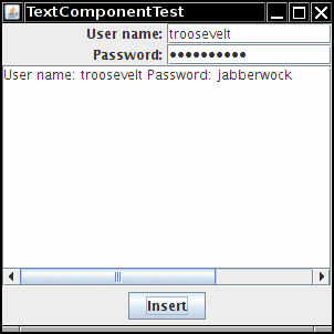
Listing 12.2 demonstrates the various text components. This program shows a text field, a password field, and a text area with scrollbars. The text field and password field are labeled. Click on “Insert” to insert the field contents into the text area.
Note
The JTextArea component displays plain text only, without special fonts or formatting. To display formatted text (such as HTML), you can use the JEditorPane class that is discussed in Volume II.
Listing 12.2 text/TextComponentFrame.java
1 package text;
2
3 import java.awt.BorderLayout;
4 import java.awt.GridLayout;
5
6 import javax.swing.JButton;
7 import javax.swing.JFrame;
8 import javax.swing.JLabel;
9 import javax.swing.JPanel;
10 import javax.swing.JPasswordField;
11 import javax.swing.JScrollPane;
12 import javax.swing.JTextArea;
13 import javax.swing.JTextField;
14 import javax.swing.SwingConstants;
15
16 /**
17 * A frame with sample text components.
18 */
19 public class TextComponentFrame extends JFrame
20 {
21 public static final int TEXTAREA_ROWS = 8;
22 public static final int TEXTAREA_COLUMNS = 20;
23
24 public TextComponentFrame()
25 {
26 JTextField textField = new JTextField();
27 JPasswordField passwordField = new JPasswordField();
28
29 JPanel northPanel = new JPanel();
30 northPanel.setLayout(new GridLayout(2, 2));
31 northPanel.add(new JLabel("User name: ", SwingConstants.RIGHT));
32 northPanel.add(textField);
33 northPanel.add(new JLabel("Password: ", SwingConstants.RIGHT));
34 northPanel.add(passwordField);
35
36 add(northPanel, BorderLayout.NORTH);
37
38 JTextArea textArea = new JTextArea(TEXTAREA_ROWS, TEXTAREA_COLUMNS);
39 JScrollPane scrollPane = new JScrollPane(textArea);
40
41 add(scrollPane, BorderLayout.CENTER);
42
43 // add button to append text into the text area
44
45 JPanel southPanel = new JPanel();
46
47 JButton insertButton = new JButton("Insert");
48 southPanel.add(insertButton);
49 insertButton.addActionListener(event ->
50 textArea.append("User name: " + textField.getText() + " Password: "
51 + new String(passwordField.getPassword()) + "
"));
52
53 add(southPanel, BorderLayout.SOUTH);
54 pack();
55 }
56 }
12.4 Choice Components
You now know how to collect text input from users, but there are many occasions where you would rather give users a finite set of choices than have them enter the data in a text component. Using a set of buttons or a list of items tells your users what choices they have. (It also saves you the trouble of error checking.) In this section, you will learn how to program checkboxes, radio buttons, lists of choices, and sliders.
12.4.1 Checkboxes
If you want to collect just a “yes” or “no” input, use a checkbox component. Checkboxes automatically come with labels that identify them. The user can check the box by clicking inside it and turn off the checkmark by clicking inside the box again. Pressing the space bar when the focus is in the checkbox also toggles the checkmark.
Figure 12.14 shows a simple program with two checkboxes, one for turning the italic attribute of a font on or off, and the other for boldface. Note that the second checkbox has focus, as indicated by the rectangle around the label. Each time the user clicks one of the checkboxes, the screen is refreshed, using the new font attributes.
Checkboxes need a label next to them to identify their purpose. Give the label text in the constructor:
bold = new JCheckBox("Bold");
Use the setSelected method to turn a checkbox on or off. For example:
bold.setSelected(true);
The isSelected method then retrieves the current state of each checkbox. It is false if unchecked, true if checked.
When the user clicks on a checkbox, this triggers an action event. As always, you attach an action listener to the checkbox. In our program, the two checkboxes share the same action listener.
ActionListener listener = . . .
bold.addActionListener(listener);
italic.addActionListener(listener);
The listener queries the state of the bold and italic checkboxes and sets the font of the panel to plain, bold, italic, or both bold and italic.
ActionListener listener = event -> {
int mode = 0;
if (bold.isSelected()) mode += Font.BOLD;
if (italic.isSelected()) mode += Font.ITALIC;
label.setFont(new Font(Font.SERIF, mode, FONTSIZE));
};
Listing 12.3 is the program listing for the checkbox example.
Listing 12.3 checkBox/CheckBoxFrame.java
1 package checkBox;
2
3 import java.awt.*;
4 import java.awt.event.*;
5 import javax.swing.*;
6
7 /**
8 * A frame with a sample text label and check boxes for selecting font
9 * attributes.
10 */
11 public class CheckBoxFrame extends JFrame
12 {
13 private JLabel label;
14 private JCheckBox bold;
15 private JCheckBox italic;
16 private static final int FONTSIZE = 24;
17
18 public CheckBoxFrame()
19 {
20 // add the sample text label
21
22 label = new JLabel("The quick brown fox jumps over the lazy dog.");
23 label.setFont(new Font("Serif", Font.BOLD, FONTSIZE));
24 add(label, BorderLayout.CENTER);
25
26 // this listener sets the font attribute of
27 // the label to the check box state
28
29 ActionListener listener = event -> {
30 int mode = 0;
31 if (bold.isSelected()) mode += Font.BOLD;
32 if (italic.isSelected()) mode += Font.ITALIC;
33 label.setFont(new Font("Serif", mode, FONTSIZE));
34 };
35
36 // add the check boxes
37
38 JPanel buttonPanel = new JPanel();
39
40 bold = new JCheckBox("Bold");
41 bold.addActionListener(listener);
42 bold.setSelected(true);
43 buttonPanel.add(bold);
44
45 italic = new JCheckBox("Italic");
46 italic.addActionListener(listener);
47 buttonPanel.add(italic);
48
49 add(buttonPanel, BorderLayout.SOUTH);
50 pack();
51 }
52 }
12.4.2 Radio Buttons
In the previous example, the user could check either, both, or neither of the two checkboxes. In many cases, we want the user to check only one of several boxes. When another box is checked, the previous box is automatically unchecked. Such a group of boxes is often called a radio button group because the buttons work like the station selector buttons on a radio. When you push in one button, the previously depressed button pops out. Figure 12.15 shows a typical example. We allow the user to select a font size from among the choices—Small, Medium, Large, or Extra large—but, of course, we will allow selecting only one size at a time.
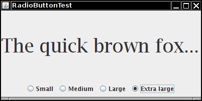
Implementing radio button groups is easy in Swing. You construct one object of type ButtonGroup for every group of buttons. Then, you add objects of type JRadioButton to the button group. The button group object is responsible for turning off the previously set button when a new button is clicked.
ButtonGroup group = new ButtonGroup();
JRadioButton smallButton = new JRadioButton("Small", false);
group.add(smallButton);
JRadioButton mediumButton = new JRadioButton("Medium", true);
group.add(mediumButton);
. . .
The second argument of the constructor is true for the button that should be checked initially and false for all others. Note that the button group controls only the behavior of the buttons; if you want to group the buttons for layout purposes, you also need to add them to a container such as a JPanel.
If you look again at Figures 12.14 and 12.15, you will note that the appearance of the radio buttons is different from that of checkboxes. Checkboxes are square and contain a checkmark when selected. Radio buttons are round and contain a dot when selected.
The event notification mechanism for radio buttons is the same as for any other buttons. When the user checks a radio button, the button generates an action event. In our example program, we define an action listener that sets the font size to a particular value:
ActionListener listener = event ->
label.setFont(new Font("Serif", Font.PLAIN, size));
Compare this listener setup to that of the checkbox example. Each radio button gets a different listener object. Each listener object knows exactly what it needs to do—set the font size to a particular value. With checkboxes, we used a different approach: Both checkboxes have the same action listener that calls a method looking at the current state of both checkboxes.
Could we follow the same approach here? We could have a single listener that computes the size as follows:
if (smallButton.isSelected()) size = 8;
else if (mediumButton.isSelected()) size = 12;
. . .
However, we prefer to use separate action listener objects because they tie the size values more closely to the buttons.
Note
If you have a group of radio buttons, you know that only one of them is selected. It would be nice to be able to quickly find out which, without having to query all the buttons in the group. The ButtonGroup object controls all buttons, so it would be convenient if this object could give us a reference to the selected button. Indeed, the ButtonGroup class has a getSelection method, but that method doesn’t return the radio button that is selected. Instead, it returns a ButtonModel reference to the model attached to the button. Unfortunately, none of the ButtonModel methods are very helpful. The ButtonModel interface inherits a method getSelectedObjects from the ItemSelectable interface that, rather uselessly, returns null. The getActionCommand method looks promising because the “action command” of a radio button is its text label. But the action command of its model is null. Only if you explicitly set the action commands of all radio buttons with the setActionCommand method do the action command values of the models also get set. Then you can retrieve the action command of the currently selected button with buttonGroup.getSelection().getActionCommand().
Listing 12.4 is the complete program for font size selection that puts a set of radio buttons to work.
Listing 12.4 radioButton/RadioButtonFrame.java
1 package radioButton;
2
3 import java.awt.*;
4 import java.awt.event.*;
5 import javax.swing.*;
6
7 /**
8 * A frame with a sample text label and radio buttons for selecting font sizes.
9 */
10 public class RadioButtonFrame extends JFrame
11 {
12 private JPanel buttonPanel;
13 private ButtonGroup group;
14 private JLabel label;
15 private static final int DEFAULT_SIZE = 36;
16
17 public RadioButtonFrame()
18 {
19 // add the sample text label
20
21 label = new JLabel("The quick brown fox jumps over the lazy dog.");
22 label.setFont(new Font("Serif", Font.PLAIN, DEFAULT_SIZE));
23 add(label, BorderLayout.CENTER);
24
25 // add the radio buttons
26
27 buttonPanel = new JPanel();
28 group = new ButtonGroup();
29
30 addRadioButton("Small", 8);
31 addRadioButton("Medium", 12);
32 addRadioButton("Large", 18);
33 addRadioButton("Extra large", 36);
34
35 add(buttonPanel, BorderLayout.SOUTH);
36 pack();
37 }
38
39 /**
40 * Adds a radio button that sets the font size of the sample text.
41 * @param name the string to appear on the button
42 * @param size the font size that this button sets
43 */
44 public void addRadioButton(String name, int size)
45 {
46 boolean selected = size == DEFAULT_SIZE;
47 JRadioButton button = new JRadioButton(name, selected);
48 group.add(button);
49 buttonPanel.add(button);
50
51 // this listener sets the label font size
52
53 ActionListener listener = event -> label.setFont(new Font("Serif", Font.PLAIN, size));
54
55 button.addActionListener(listener);
56 }
57 }
12.4.3 Borders
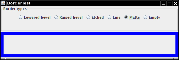
If you have multiple groups of radio buttons in a window, you will want to visually indicate which buttons are grouped. Swing provides a set of useful borders for this purpose. You can apply a border to any component that extends JComponent. The most common usage is to place a border around a panel and fill that panel with other user interface elements, such as radio buttons.
You can choose from quite a few borders, but you need to follow the same steps for all of them.
1. Call a static method of the BorderFactory to create a border. You can choose among the following styles (see Figure 12.16):
• Lowered bevel
• Raised bevel
• Etched
• Line
• Matte
• Empty (just to create some blank space around the component)
2. If you like, add a title to your border by passing your border to BorderFactory.createTitledBorder.
3. If you really want to go all out, combine several borders with a call to BorderFactory.createCompoundBorder.
4. Add the resulting border to your component by calling the setBorder method of the JComponent class.
For example, here is how you add an etched border with a title to a panel:
Border etched = BorderFactory.createEtchedBorder();
Border titled = BorderFactory.createTitledBorder(etched, "A Title");
panel.setBorder(titled);
Run the program in Listing 12.5 to get an idea what the various borders look like.
Different borders have different options for setting border widths and colors; see the API notes for details. True border enthusiasts will appreciate that there is also a SoftBevelBorder class for beveled borders with softened corners and that a LineBorder can have rounded corners as well. You can construct these borders only by using one of the class constructors—there is no BorderFactory method for them.
Listing 12.5 border/BorderFrame.java
1 package border;
2
3 import java.awt.*;
4 import javax.swing.*;
5 import javax.swing.border.*;
6
7 /**
8 * A frame with radio buttons to pick a border style.
9 */
10 public class BorderFrame extends JFrame
11 {
12 private JPanel demoPanel;
13 private JPanel buttonPanel;
14 private ButtonGroup group;
15
16 public BorderFrame()
17 {
18 demoPanel = new JPanel();
19 buttonPanel = new JPanel();
20 group = new ButtonGroup();
21
22 addRadioButton("Lowered bevel", BorderFactory.createLoweredBevelBorder());
23 addRadioButton("Raised bevel", BorderFactory.createRaisedBevelBorder());
24 addRadioButton("Etched", BorderFactory.createEtchedBorder());
25 addRadioButton("Line", BorderFactory.createLineBorder(Color.BLUE));
26 addRadioButton("Matte", BorderFactory.createMatteBorder(10, 10, 10, 10, Color.BLUE));
27 addRadioButton("Empty", BorderFactory.createEmptyBorder());
28
29 Border etched = BorderFactory.createEtchedBorder();
30 Border titled = BorderFactory.createTitledBorder(etched, "Border types");
31 buttonPanel.setBorder(titled);
32
33 setLayout(new GridLayout(2, 1));
34 add(buttonPanel);
35 add(demoPanel);
36 pack();
37 }
38
39 public void addRadioButton(String buttonName, Border b)
40 {
41 JRadioButton button = new JRadioButton(buttonName);
42 button.addActionListener(event -> demoPanel.setBorder(b));
43 group.add(button);
44 buttonPanel.add(button);
45 }
46 }
javax.swing.BorderFactory 1.2
• static Border createLineBorder(Color color)
• static Border createLineBorder(Color color, int thickness)
creates a simple line border.
• static MatteBorder createMatteBorder(int top, int left, int bottom, int right, Color color)
• static MatteBorder createMatteBorder(int top, int left, int bottom, int right, Icon tileIcon)
creates a thick border that is filled with a color or a repeating icon.
• static Border createEmptyBorder()
• static Border createEmptyBorder(int top, int left, int bottom, int right)
creates an empty border.
• static Border createEtchedBorder()
• static Border createEtchedBorder(Color highlight, Color shadow)
• static Border createEtchedBorder(int type)
• static Border createEtchedBorder(int type, Color highlight, Color shadow)
creates a line border with a 3D effect.
• static Border createBevelBorder(int type)
• static Border createBevelBorder(int type, Color highlight, Color shadow)
• static Border createLoweredBevelBorder()
• static Border createRaisedBevelBorder()
creates a border that gives the effect of a lowered or raised surface.
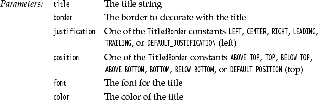
• static TitledBorder createTitledBorder(String title)
• static TitledBorder createTitledBorder(Border border)
• static TitledBorder createTitledBorder(Border border, String title)
• static TitledBorder createTitledBorder(Border border, String title, int justification, int position)
• static TitledBorder createTitledBorder(Border border, String title, int justification, int position, Font font)
• static TitledBorder createTitledBorder(Border border, String title, int justification, int position, Font font, Color color)
creates a titled border with the specified properties.
• static CompoundBorder createCompoundBorder(Border outsideBorder, Border insideBorder)
combines two borders to a new border.
javax.swing.border.SoftBevelBorder 1.2
• SoftBevelBorder(int type)
• SoftBevelBorder(int type, Color highlight, Color shadow)
creates a bevel border with softened corners.
12.4.4 Combo Boxes
If you have more than a handful of alternatives, radio buttons are not a good choice because they take up too much screen space. Instead, you can use a combo box. When the user clicks on this component, a list of choices drops down, and the user can then select one of them (see Figure 12.17).
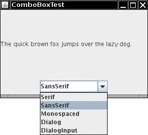
If the drop-down list box is set to be editable, you can edit the current selection as if it were a text field. For that reason, this component is called a combo box—it combines the flexibility of a text field with a set of predefined choices. The JComboBox class provides a combo box component.
As of Java SE 7, the JComboBox class is a generic class. For example, a JComboBox<String> holds objects of type String, and a JComboBox<Integer> holds integers.
Call the setEditable method to make the combo box editable. Note that editing affects only the selected item. It does not change the list of choices in any way.
You can obtain the current selection, which may have been edited if the combo box is editable, by calling the getSelectedItem method. However, for an editable combo box, that item may have any type, depending on the editor that takes the user edits and turns the result into an object. (See Volume II, Chapter 6 for a discussion of editors.) If your combo box isn’t editable, you are better off calling
combo.getItemAt(combo.getSelectedIndex())
which gives you the selected item with the correct type.
In the example program, the user can choose a font style from a list of styles (Serif, SansSerif, Monospaced, etc.). The user can also type in another font.
Add the choice items with the addItem method. In our program, addItem is called only in the constructor, but you can call it any time.
JComboBox<String> faceCombo = new JComboBox<>();
faceCombo.addItem("Serif");
faceCombo.addItem("SansSerif");
. . .
This method adds the string to the end of the list. You can add new items anywhere in the list with the insertItemAt method:
faceCombo.insertItemAt("Monospaced", 0); // add at the beginning
You can add items of any type—the combo box invokes each item’s toString method to display it.
If you need to remove items at runtime, use the removeItem or removeItemAt method, depending on whether you supply the item to be removed or its position.
faceCombo.removeItem("Monospaced");
faceCombo.removeItemAt(0); // remove first item
The removeAllItems method removes all items at once.
Tip
If you need to add a large number of items to a combo box, the addItem method will perform poorly. Instead, construct a DefaultComboBoxModel, populate it by calling addElement, and then call the setModel method of the JComboBox class.
When the user selects an item from a combo box, the combo box generates an action event. To find out which item was selected, call getSource on the event parameter to get a reference to the combo box that sent the event. Then call the getSelectedItem method to retrieve the currently selected item. You will need to cast the returned value to the appropriate type, usually String.
ActionListener listener = event ->
label.setFont(new Font(
faceCombo.getItemAt(faceCombo.getSelectedIndex()),
Font.PLAIN,
DEFAULT_SIZE));
Listing 12.6 shows the complete program.
Note
If you want to show a permanently displayed list instead of a drop-down list, use the JList component. We cover JList in Chapter 6 of Volume II.
Listing 12.6 comboBox/ComboBoxFrame.java
1 package comboBox;
2
3 import java.awt.BorderLayout;
4 import java.awt.Font;
5
6 import javax.swing.JComboBox;
7 import javax.swing.JFrame;
8 import javax.swing.JLabel;
9 import javax.swing.JPanel;
10
11 /**
12 * A frame with a sample text label and a combo box for selecting font faces.
13 */
14 public class ComboBoxFrame extends JFrame
15 {
16 private JComboBox<String> faceCombo;
17 private JLabel label;
18 private static final int DEFAULT_SIZE = 24;
19
20 public ComboBoxFrame()
21 {
22 // add the sample text label
23
24 label = new JLabel("The quick brown fox jumps over the lazy dog.");
25 label.setFont(new Font("Serif", Font.PLAIN, DEFAULT_SIZE));
26 add(label, BorderLayout.CENTER);
27
28 // make a combo box and add face names
29
30 faceCombo = new JComboBox<>();
31 faceCombo.addItem("Serif");
32 faceCombo.addItem("SansSerif");
33 faceCombo.addItem("Monospaced");
34 faceCombo.addItem("Dialog");
35 faceCombo.addItem("DialogInput");
36
37 // the combo box listener changes the label font to the selected face name
38
39 faceCombo.addActionListener(event ->
40 label.setFont(
41 new Font(faceCombo.getItemAt(faceCombo.getSelectedIndex()),
42 Font.PLAIN, DEFAULT_SIZE)));
43
44 // add combo box to a panel at the frame's southern border
45
46 JPanel comboPanel = new JPanel();
47 comboPanel.add(faceCombo);
48 add(comboPanel, BorderLayout.SOUTH);
49 pack();
50 }
51 }
12.4.5 Sliders
Combo boxes let users choose from a discrete set of values. Sliders offer a choice from a continuum of values—for example, any number between 1 and 100.
The most common way of constructing a slider is as follows:
JSlider slider = new JSlider(min, max, initialValue);
If you omit the minimum, maximum, and initial values, they are initialized with 0, 100, and 50, respectively.
Or if you want the slider to be vertical, use the following constructor call:
JSlider slider = new JSlider(SwingConstants.VERTICAL, min, max, initialValue);
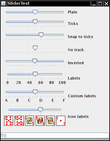
These constructors create a plain slider, such as the top slider in Figure 12.18. You will see presently how to add decorations to a slider.
As the user slides the slider bar, the value of the slider moves between the minimum and the maximum values. When the value changes, a ChangeEvent is sent to all change listeners. To be notified of the change, call the addChangeListener method and install an object that implements the functional ChangeListener interface. In the callback, retrieve the slider value:
ChangeListener listener = event -> {
JSlider slider = (JSlider) event.getSource();
int value = slider.getValue();
...
};
You can embellish the slider by showing ticks. For example, in the sample program, the second slider uses the following settings:
slider.setMajorTickSpacing(20);
slider.setMinorTickSpacing(5);
The slider is decorated with large tick marks every 20 units and small tick marks every 5 units. The units refer to slider values, not pixels.
These instructions only set the units for the tick marks. To actually have the tick marks appear, call
slider.setPaintTicks(true);
The major and minor tick marks are independent. For example, you can set major tick marks every 20 units and minor tick marks every 7 units, but that will give you a very messy scale.
You can force the slider to snap to ticks. Whenever the user has finished dragging a slider in snap mode, it is immediately moved to the closest tick. You activate this mode with the call
slider.setSnapToTicks(true);
 Caution
The “snap to ticks” behavior doesn’t work as well as you might imagine. Until the slider has actually snapped, the change listener still reports slider values that don’t correspond to ticks. And if you click next to the slider—an action that normally advances the slider a bit in the direction of the click—a slider with “snap to ticks” does not move to the next tick.
You can display tick mark labels for the major tick marks by calling
slider.setPaintLabels(true);
For example, with a slider ranging from 0 to 100 and major tick spacing of 20, the ticks are labeled 0, 20, 40, 60, 80, and 100.
You can also supply other tick mark labels, such as strings or icons (see Figure 12.18). The process is a bit convoluted. You need to fill a hash table with keys of type Integer and values of type Component. You then call the setLabelTable method. The components are placed under the tick marks. Usually, JLabel objects are used. Here is how you can label ticks as A, B, C, D, E, and F:
Hashtable<Integer, Component> labelTable = new Hashtable<Integer, Component>();
labelTable.put(0, new JLabel("A"));
labelTable.put(20, new JLabel("B"));
. . .
labelTable.put(100, new JLabel("F"));
slider.setLabelTable(labelTable);
See Chapter 9 for more information about hash tables.
Listing 12.7 also shows a slider with icons as tick labels.
Tip
If your tick marks or labels don’t show, double-check that you called setPaintTicks(true) and setPaintLabels(true).
The fourth slider in Figure 12.18 has no track. To suppress the “track” in which the slider moves, call
slider.setPaintTrack(false);
The fifth slider has its direction reversed by a call to
slider.setInverted(true);
The example program shows all these visual effects with a collection of sliders. Each slider has a change event listener installed that places the current slider value into the text field at the bottom of the frame.
Listing 12.7 slider/SliderFrame.java
1 package slider;
2
3 import java.awt.*;
4 import java.util.*;
5 import javax.swing.*;
6 import javax.swing.event.*;
7
8 /**
9 * A frame with many sliders and a text field to show slider values.
10 */
11 public class SliderFrame extends JFrame
12 {
13 private JPanel sliderPanel;
14 private JTextField textField;
15 private ChangeListener listener;
16
17 public SliderFrame()
18 {
19 sliderPanel = new JPanel();
20 sliderPanel.setLayout(new GridBagLayout());
21
22 // common listener for all sliders
23 listener = event -> {
24 // update text field when the slider value changes
25 JSlider source = (JSlider) event.getSource();
26 textField.setText("" + source.getValue());
27 };
28
29 // add a plain slider
30
31 JSlider slider = new JSlider();
32 addSlider(slider, "Plain");
33
34 // add a slider with major and minor ticks
35
36 slider = new JSlider();
37 slider.setPaintTicks(true);
38 slider.setMajorTickSpacing(20);
39 slider.setMinorTickSpacing(5);
40 addSlider(slider, "Ticks");
41
42 // add a slider that snaps to ticks
43
44 slider = new JSlider();
45 slider.setPaintTicks(true);
46 slider.setSnapToTicks(true);
47 slider.setMajorTickSpacing(20);
48 slider.setMinorTickSpacing(5);
49 addSlider(slider, "Snap to ticks");
50
51 // add a slider with no track
52
53 slider = new JSlider();
54 slider.setPaintTicks(true);
55 slider.setMajorTickSpacing(20);
56 slider.setMinorTickSpacing(5);
57 slider.setPaintTrack(false);
58 addSlider(slider, "No track");
59
60 // add an inverted slider
61
62 slider = new JSlider();
63 slider.setPaintTicks(true);
64 slider.setMajorTickSpacing(20);
65 slider.setMinorTickSpacing(5);
66 slider.setInverted(true);
67 addSlider(slider, "Inverted");
68
69 // add a slider with numeric labels
70
71 slider = new JSlider();
72 slider.setPaintTicks(true);
73 slider.setPaintLabels(true);
74 slider.setMajorTickSpacing(20);
75 slider.setMinorTickSpacing(5);
76 addSlider(slider, "Labels");
77
78 // add a slider with alphabetic labels
79
80 slider = new JSlider();
81 slider.setPaintLabels(true);
82 slider.setPaintTicks(true);
83 slider.setMajorTickSpacing(20);
84 slider.setMinorTickSpacing(5);
85
86 Dictionary<Integer, Component> labelTable = new Hashtable<>();
87 labelTable.put(0, new JLabel("A"));
88 labelTable.put(20, new JLabel("B"));
89 labelTable.put(40, new JLabel("C"));
90 labelTable.put(60, new JLabel("D"));
91 labelTable.put(80, new JLabel("E"));
92 labelTable.put(100, new JLabel("F"));
93
94 slider.setLabelTable(labelTable);
95 addSlider(slider, "Custom labels");
96
97 // add a slider with icon labels
98
99 slider = new JSlider();
100 slider.setPaintTicks(true);
101 slider.setPaintLabels(true);
102 slider.setSnapToTicks(true);
103 slider.setMajorTickSpacing(20);
104 slider.setMinorTickSpacing(20);
105
106 labelTable = new Hashtable<Integer, Component>();
107
108 // add card images
109
110 labelTable.put(0, new JLabel(new ImageIcon("nine.gif")));
111 labelTable.put(20, new JLabel(new ImageIcon("ten.gif")));
112 labelTable.put(40, new JLabel(new ImageIcon("jack.gif")));
113 labelTable.put(60, new JLabel(new ImageIcon("queen.gif")));
114 labelTable.put(80, new JLabel(new ImageIcon("king.gif")));
115 labelTable.put(100, new JLabel(new ImageIcon("ace.gif")));
116
117 slider.setLabelTable(labelTable);
118 addSlider(slider, "Icon labels");
119
120 // add the text field that displays the slider value
121
122 textField = new JTextField();
123 add(sliderPanel, BorderLayout.CENTER);
124 add(textField, BorderLayout.SOUTH);
125 pack();
126 }
127
128 /**
129 * Adds a slider to the slider panel and hooks up the listener
130 * @param s the slider
131 * @param description the slider description
132 */
133 public void addSlider(JSlider s, String description)
134 {
135 s.addChangeListener(listener);
136 JPanel panel = new JPanel();
137 panel.add(s);
138 panel.add(new JLabel(description));
139 panel.setAlignmentX(Component.LEFT_ALIGNMENT);
140 GridBagConstraints gbc = new GridBagConstraints();
141 gbc.gridy = sliderPanel.getComponentCount();
142 gbc.anchor = GridBagConstraints.WEST;
143 sliderPanel.add(panel, gbc);
144 }
145 }
• JSlider()
• JSlider(int direction)
• JSlider(int min, int max)
• JSlider(int min, int max, int initialValue)
• JSlider(int direction, int min, int max, int initialValue)
constructs a horizontal slider with the given direction and minimum, maximum, and initial values.

• void setPaintTicks(boolean b)
displays ticks if b is true.
• void setMajorTickSpacing(int units)
• void setMinorTickSpacing(int units)
sets major or minor ticks at multiples of the given slider units.
• void setPaintLabels(boolean b)
displays tick labels if b is true.
• void setLabelTable(Dictionary table)
sets the components to use for the tick labels. Each key/value pair in the table has the form new Integer(value)/component.
• void setSnapToTicks(boolean b)
if b is true, then the slider snaps to the closest tick after each adjustment.
• void setPaintTrack(boolean b)
if b is true, a track is displayed in which the slider runs.
12.5 Menus
We started this chapter by introducing the most common components that you might want to place into a window, such as various kinds of buttons, text fields, and combo boxes. Swing also supports another type of user interface element—pull-down menus that are familiar from GUI applications.
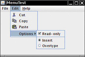
A menu bar at the top of a window contains the names of the pull-down menus. Clicking on a name opens the menu containing menu items and submenus. When the user clicks on a menu item, all menus are closed and a message is sent to the program. Figure 12.19 shows a typical menu with a submenu.
12.5.1 Menu Building
Building menus is straightforward. First, create a menu bar:
JMenuBar menuBar = new JMenuBar();
A menu bar is just a component that you can add anywhere you like. Normally, you want it to appear at the top of a frame. You can add it there with the setJMenuBar method:
frame.setJMenuBar(menuBar);
For each menu, you create a menu object:
JMenu editMenu = new JMenu("Edit");
Add the top-level menus to the menu bar:
menuBar.add(editMenu);
Add menu items, separators, and submenus to the menu object:
JMenuItem pasteItem = new JMenuItem("Paste");
editMenu.add(pasteItem);
editMenu.addSeparator();
JMenu optionsMenu = . . .; // a submenu
editMenu.add(optionsMenu);
You can see separators in Figure 12.19 below the Paste and Read-only menu items.
When the user selects a menu item, an action event is triggered. You need to install an action listener for each menu item:
ActionListener listener = . . .;
pasteItem.addActionListener(listener);
The method JMenu.add(String s) conveniently adds a menu item to the end of a menu. For example:
editMenu.add("Paste");
The add method returns the created menu item, so you can capture it and add the listener, as follows:
JMenuItem pasteItem = editMenu.add("Paste");
pasteItem.addActionListener(listener);
It often happens that menu items trigger commands that can also be activated through other user interface elements such as toolbar buttons. In Chapter 11, you saw how to specify commands through Action objects. You define a class that implements the Action interface, usually by extending the AbstractAction convenience class, specify the menu item label in the constructor of the AbstractAction object, and override the actionPerformed method to hold the menu action handler. For example:
Action exitAction = new AbstractAction("Exit") // menu item text goes here
{
public void actionPerformed(ActionEvent event)
{
// action code goes here
System.exit(0);
}
};
You can then add the action to the menu:
JMenuItem exitItem = fileMenu.add(exitAction);
This command adds a menu item to the menu, using the action name. The action object becomes its listener. This is just a convenient shortcut for
JMenuItem exitItem = new JMenuItem(exitAction);
fileMenu.add(exitItem);
• JMenu(String label)
constructs a menu with the given label.
• JMenuItem add(JMenuItem item)
adds a menu item (or a menu).
• JMenuItem add(String label)
adds a menu item with the given label to this menu and returns the item.
• JMenuItem add(Action a)
adds a menu item with the given action to this menu and returns the item.
• void addSeparator()
adds a separator line to the menu.
• JMenuItem insert(JMenuItem menu, int index)
adds a new menu item (or submenu) to the menu at a specific index.
• JMenuItem insert(Action a, int index)
adds a new menu item with the given action at a specific index.
• void insertSeparator(int index)
adds a separator to the menu.
• void remove(int index)
• void remove(JMenuItem item)
removes a specific item from the menu.
12.5.2 Icons in Menu Items
Menu items are very similar to buttons. In fact, the JMenuItem class extends the AbstractButton class. Just like buttons, menus can have just a text label, just an icon, or both. You can specify the icon with the JMenuItem(String, Icon) or JMenuItem(Icon) constructor, or you can set it with the setIcon method that the JMenuItem class inherits from the AbstractButton class. Here is an example:
JMenuItem cutItem = new JMenuItem("Cut", new ImageIcon("cut.gif"));
In Figure 12.19, you can see icons next to several menu items. By default, the menu item text is placed to the right of the icon. If you prefer the text to be placed on the left, call the setHorizontalTextPosition method that the JMenuItem class inherits from the AbstractButton class. For example, the call
cutItem.setHorizontalTextPosition(SwingConstants.LEFT);
moves the menu item text to the left of the icon.
You can also add an icon to an action:
cutAction.putValue(Action.SMALL_ICON, new ImageIcon("cut.gif"));
Whenever you construct a menu item out of an action, the Action.NAME value becomes the text of the menu item and the Action.SMALL_ICON value becomes the icon.
Alternatively, you can set the icon in the AbstractAction constructor:
cutAction = new
AbstractAction("Cut", new ImageIcon("cut.gif"))
{
public void actionPerformed(ActionEvent event)
{
. . .
}
};
javax.swing.AbstractButton 1.2
• void setHorizontalTextPosition(int pos)
sets the horizontal position of the text relative to the icon.
12.5.3 Checkbox and Radio Button Menu Items
Checkbox and radio button menu items display a checkbox or radio button next to the name (see Figure 12.19). When the user selects the menu item, the item automatically toggles between checked and unchecked.
Apart from the button decoration, treat these menu items just as you would any others. For example, here is how you create a checkbox menu item:
JCheckBoxMenuItem readonlyItem = new JCheckBoxMenuItem("Read-only");
optionsMenu.add(readonlyItem);
The radio button menu items work just like regular radio buttons. You must add them to a button group. When one of the buttons in a group is selected, all others are automatically deselected.
ButtonGroup group = new ButtonGroup();
JRadioButtonMenuItem insertItem = new JRadioButtonMenuItem("Insert");
insertItem.setSelected(true);
JRadioButtonMenuItem overtypeItem = new JRadioButtonMenuItem("Overtype");
group.add(insertItem);
group.add(overtypeItem);
optionsMenu.add(insertItem);
optionsMenu.add(overtypeItem);
With these menu items, you don’t necessarily want to be notified when the user selects the item. Instead, you can simply use the isSelected method to test the current state of the menu item. (Of course, that means you should keep a reference to the menu item stored in an instance field.) Use the setSelected method to set the state.
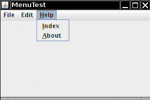
12.5.4 Pop-Up Menus
A pop-up menu is a menu that is not attached to a menu bar but floats somewhere (see Figure 12.20).
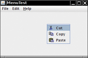
Create a pop-up menu just as you create a regular menu, except that a pop-up menu has no title.
JPopupMenu popup = new JPopupMenu();
Then, add your menu items as usual:
JMenuItem item = new JMenuItem("Cut");
item.addActionListener(listener);
popup.add(item);
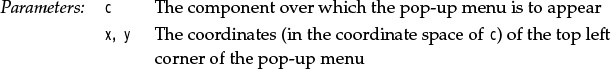
Unlike the regular menu bar that is always shown at the top of the frame, you must explicitly display a pop-up menu by using the show method. Specify the parent component and the location of the pop-up, using the coordinate system of the parent. For example:
popup.show(panel, x, y);
Usually, you want to pop up a menu when the user clicks a particular mouse button—the so-called pop-up trigger. In Windows and Linux, the pop-up trigger is the nonprimary (usually, the right) mouse button. To pop up a menu when the user clicks on a component, using the pop-up trigger, simply call the method
component.setComponentPopupMenu(popup);
Very occasionally, you may place a component inside another component that has a pop-up menu. The child component can inherit the parent component’s pop-up menu by calling
child.setInheritsPopupMenu(true);
javax.swing.JPopupMenu 1.2
• void show(Component c, int x, int y)
shows the pop-up menu.
• boolean isPopupTrigger(MouseEvent event) 1.3
returns true if the mouse event is the pop-up menu trigger.
12.5.5 Keyboard Mnemonics and Accelerators
It is a real convenience for the experienced user to select menu items by keyboard mnemonics. You can create a keyboard mnemonic for a menu item by specifying a mnemonic letter in the menu item constructor:
JMenuItem aboutItem = new JMenuItem("About", 'A');
The keyboard mnemonic is displayed automatically in the menu, with the mnemonic letter underlined (see Figure 12.21). For example, in the item defined in the last example, the label will be displayed as “About” with an underlined letter “A”. When the menu is displayed, the user just needs to press the A key, and the menu item is selected. (If the mnemonic letter is not part of the menu string, then typing it still selects the item, but the mnemonic is not displayed in the menu. Naturally, such invisible mnemonics are of dubious utility.)
Sometimes, you don’t want to underline the first letter of the menu item that matches the mnemonic. For example, if you have a mnemonic “A” for the menu item “Save As,” then it makes more sense to underline the second “A” (Save As). You can specify which character you want to have underlined by calling the setDisplayedMnemonicIndex method.
If you have an Action object, you can add the mnemonic as the value of the Action.MNEMONIC_KEY key, as follows:
aboutAction.putValue(Action.MNEMONIC_KEY, new Integer('A'));
You can supply a mnemonic letter only in the constructor of a menu item, not in the constructor for a menu. To attach a mnemonic to a menu, call the setMnemonic method:
JMenu helpMenu = new JMenu("Help");
helpMenu.setMnemonic('H');
To select a top-level menu from the menu bar, press the Alt key together with the mnemonic letter. For example, press Alt+H to select the Help menu from the menu bar.
Keyboard mnemonics let you select a submenu or menu item from the currently open menu. In contrast, accelerators are keyboard shortcuts that let you select menu items without ever opening a menu. For example, many programs attach the accelerators Ctrl+O and Ctrl+S to the Open and Save items in the File menu. Use the setAccelerator method to attach an accelerator key to a menu item. The setAccelerator method takes an object of type Keystroke. For example, the following call attaches the accelerator Ctrl+O to the openItem menu item:
openItem.setAccelerator(KeyStroke.getKeyStroke("ctrl O"));
Typing the accelerator key combination automatically selects the menu option and fires an action event, as if the user had selected the menu option manually.
You can attach accelerators only to menu items, not to menus. Accelerator keys don’t actually open the menu. Instead, they directly fire the action event associated with a menu.
Conceptually, adding an accelerator to a menu item is similar to the technique of adding an accelerator to a Swing component. (We discussed that technique in Chapter 11.) However, when the accelerator is added to a menu item, the key combination is automatically displayed in the menu (see Figure 12.22).
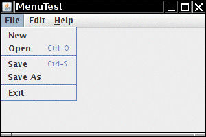
Note
Under Windows, Alt+F4 closes a window. But this is not an accelerator to be programmed in Java. It is a shortcut defined by the operating system. This key combination will always trigger the WindowClosing event for the active window regardless of whether there is a Close item on the menu.
javax.swing.JMenuItem 1.2
• JMenuItem(String label, int mnemonic)
constructs a menu item with a given label and mnemonic.
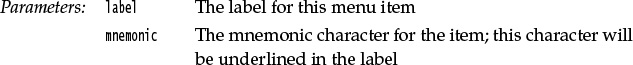
• void setAccelerator(KeyStroke k)
sets the keystroke k as accelerator for this menu item. The accelerator key is displayed next to the label.
12.5.6 Enabling and Disabling Menu Items
Occasionally, a particular menu item should be selected only in certain contexts. For example, when a document is opened in read-only mode, the Save menu item is not meaningful. Of course, we could remove the item from the menu with the JMenu.remove method, but users would react with some surprise to menus whose content keeps changing. Instead, it is better to deactivate the menu items that lead to temporarily inappropriate commands. A deactivated menu item is shown in gray, and it cannot be selected (see Figure 12.23).
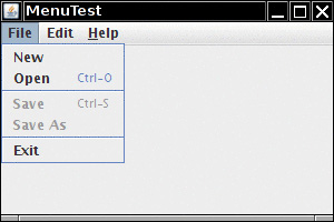
To enable or disable a menu item, use the setEnabled method:
saveItem.setEnabled(false);
There are two strategies for enabling and disabling menu items. Each time circumstances change, you can call setEnabled on the relevant menu items or actions. For example, as soon as a document has been set to read-only mode, you can locate the Save and Save As menu items and disable them. Alternatively, you can disable items just before displaying the menu. To do this, you must register a listener for the “menu selected” event. The javax.swing.event package defines a MenuListener interface with three methods:
void menuSelected(MenuEvent event)
void menuDeselected(MenuEvent event)
void menuCanceled(MenuEvent event)
The menuSelected method is called before the menu is displayed. It can therefore be used to disable or enable menu items. The following code shows how to disable the Save and Save As actions whenever the Read Only checkbox menu item is selected:
public void menuSelected(MenuEvent event)
{
saveAction.setEnabled(!readonlyItem.isSelected());
saveAsAction.setEnabled(!readonlyItem.isSelected());
}
Caution
Disabling menu items just before displaying the menu is a clever idea, but it does not work for menu items that also have accelerator keys. Since the menu is never opened when the accelerator key is pressed, the action is never disabled, and is still triggered by the accelerator key.
Listing 12.8 is a sample program that generates a set of menus. It shows all the features that you saw in this section: nested menus, disabled menu items, checkbox and radio button menu items, a pop-up menu, and keyboard mnemonics and accelerators.
Listing 12.8 menu/MenuFrame.java
1 package menu;
2
3 import java.awt.event.*;
4 import javax.swing.*;
5
6 /**
7 * A frame with a sample menu bar.
8 */
9 public class MenuFrame extends JFrame
10 {
11 private static final int DEFAULT_WIDTH = 300;
12 private static final int DEFAULT_HEIGHT = 200;
13 private Action saveAction;
14 private Action saveAsAction;
15 private JCheckBoxMenuItem readonlyItem;
16 private JPopupMenu popup;
17
18 /**
19 * A sample action that prints the action name to System.out
20 */
21 class TestAction extends AbstractAction
22 {
23 public TestAction(String name)
24 {
25 super(name);
26 }
27
28 public void actionPerformed(ActionEvent event)
29 {
30 System.out.println(getValue(Action.NAME) + " selected.");
31 }
32 }
33
34 public MenuFrame()
35 {
36 setSize(DEFAULT_WIDTH, DEFAULT_HEIGHT);
37
38 JMenu fileMenu = new JMenu("File");
39 fileMenu.add(new TestAction("New"));
40
41 // demonstrate accelerators
42
43 JMenuItem openItem = fileMenu.add(new TestAction("Open"));
44 openItem.setAccelerator(KeyStroke.getKeyStroke("ctrl O"));
45
46 fileMenu.addSeparator();
47
48 saveAction = new TestAction("Save");
49 JMenuItem saveItem = fileMenu.add(saveAction);
50 saveItem.setAccelerator(KeyStroke.getKeyStroke("ctrl S"));
51
52 saveAsAction = new TestAction("Save As");
53 fileMenu.add(saveAsAction);
54 fileMenu.addSeparator();
55
56 fileMenu.add(new AbstractAction("Exit")
57 {
58 public void actionPerformed(ActionEvent event)
59 {
60 System.exit(0);
61 }
62 });
63
64 // demonstrate checkbox and radio button menus
65
66 readonlyItem = new JCheckBoxMenuItem("Read-only");
67 readonlyItem.addActionListener(new ActionListener()
68 {
69 public void actionPerformed(ActionEvent event)
70 {
71 boolean saveOk = !readonlyItem.isSelected();
72 saveAction.setEnabled(saveOk);
73 saveAsAction.setEnabled(saveOk);
74 }
75 });
76
77 ButtonGroup group = new ButtonGroup();
78
79 JRadioButtonMenuItem insertItem = new JRadioButtonMenuItem("Insert");
80 insertItem.setSelected(true);
81 JRadioButtonMenuItem overtypeItem = new JRadioButtonMenuItem("Overtype");
82
83 group.add(insertItem);
84 group.add(overtypeItem);
85
86 // demonstrate icons
87
88 Action cutAction = new TestAction("Cut");
89 cutAction.putValue(Action.SMALL_ICON, new ImageIcon("cut.gif"));
90 Action copyAction = new TestAction("Copy");
91 copyAction.putValue(Action.SMALL_ICON, new ImageIcon("copy.gif"));
92 Action pasteAction = new TestAction("Paste");
93 pasteAction.putValue(Action.SMALL_ICON, new ImageIcon("paste.gif"));
94
95 JMenu editMenu = new JMenu("Edit");
96 editMenu.add(cutAction);
97 editMenu.add(copyAction);
98 editMenu.add(pasteAction);
99
100 // demonstrate nested menus
101
102 JMenu optionMenu = new JMenu("Options");
103
104 optionMenu.add(readonlyItem);
105 optionMenu.addSeparator();
106 optionMenu.add(insertItem);
107 optionMenu.add(overtypeItem);
108
109 editMenu.addSeparator();
110 editMenu.add(optionMenu);
111
112 // demonstrate mnemonics
113
114 JMenu helpMenu = new JMenu("Help");
115 helpMenu.setMnemonic('H');
116
117 JMenuItem indexItem = new JMenuItem("Index");
118 indexItem.setMnemonic('I');
119 helpMenu.add(indexItem);
120
121 // you can also add the mnemonic key to an action
122 Action aboutAction = new TestAction("About");
123 aboutAction.putValue(Action.MNEMONIC_KEY, new Integer('A'));
124 helpMenu.add(aboutAction);
125
126 // add all top-level menus to menu bar
127
128 JMenuBar menuBar = new JMenuBar();
129 setJMenuBar(menuBar);
130
131 menuBar.add(fileMenu);
132 menuBar.add(editMenu);
133 menuBar.add(helpMenu);
134
135 // demonstrate pop-ups
136
137 popup = new JPopupMenu();
138 popup.add(cutAction);
139 popup.add(copyAction);
140 popup.add(pasteAction);
141
142 JPanel panel = new JPanel();
143 panel.setComponentPopupMenu(popup);
144 add(panel);
145 }
146 }
12.5.7 Toolbars
A toolbar is a button bar that gives quick access to the most commonly used commands in a program (see Figure 12.24).
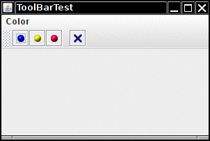
What makes toolbars special is that you can move them elsewhere. You can drag the toolbar to one of the four borders of the frame (see Figure 12.25). When you release the mouse button, the toolbar is dropped into the new location (see Figure 12.26).
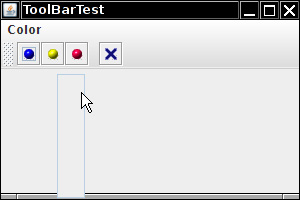
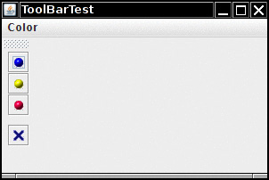
Note
Toolbar dragging works if the toolbar is inside a container with a border layout, or any other layout manager that supports the North, East, South, and West constraints.
The toolbar can even be completely detached from the frame. A detached toolbar is contained in its own frame (see Figure 12.27). When you close the frame containing a detached toolbar, the toolbar jumps back into the original frame.
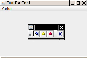
Toolbars are straightforward to program. Add components into the toolbar:
JToolBar bar = new JToolBar();
bar.add(blueButton);
The JToolBar class also has a method to add an Action object. Simply populate the toolbar with Action objects, like this:
bar.add(blueAction);
The small icon of the action is displayed in the toolbar.
You can separate groups of buttons with a separator:
For example, the toolbar in Figure 12.24 has a separator between the third and fourth button.
Then, add the toolbar to the frame:
add(bar, BorderLayout.NORTH);
You can also specify a title for the toolbar that appears when the toolbar is undocked:
bar = new JToolBar(titleString);
By default, toolbars are initially horizontal. To have a toolbar start out vertical, use
bar = new JToolBar(SwingConstants.VERTICAL)
or
bar = new JToolBar(titleString, SwingConstants.VERTICAL)
Buttons are the most common components inside toolbars. But there is no restriction on the components that you can add to a toolbar. For example, you can add a combo box to a toolbar.
12.5.8 Tooltips
A disadvantage of toolbars is that users are often mystified by the meanings of the tiny icons in toolbars. To solve this problem, user interface designers invented tooltips. A tooltip is activated when the cursor rests for a moment over a button. The tooltip text is displayed inside a colored rectangle. When the user moves the mouse away, the tooltip disappears. (See Figure 12.28.)
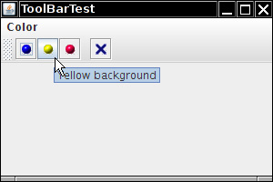
In Swing, you can add tooltips to any JComponent simply by calling the setToolTipText method:
exitButton.setToolTipText("Exit");
Alternatively, if you use Action objects, you associate the tooltip with the SHORT_DESCRIPTION key:
exitAction.putValue(Action.SHORT_DESCRIPTION, "Exit");
Listing 12.9 shows how the same Action objects can be added to a menu and a toolbar. Note that the action names show up as the menu item names in the menu, and the short descriptions as the tooltips in the toolbar.
Listing 12.9 toolBar/ToolBarFrame.java
1 package toolBar;
2
3 import java.awt.*;
4 import java.awt.event.*;
5 import javax.swing.*;
6
7 /**
8 * A frame with a toolbar and menu for color changes.
9 */
10 public class ToolBarFrame extends JFrame
11 {
12 private static final int DEFAULT_WIDTH = 300;
13 private static final int DEFAULT_HEIGHT = 200;
14 private JPanel panel;
15
16 public ToolBarFrame()
17 {
18 setSize(DEFAULT_WIDTH, DEFAULT_HEIGHT);
19
20 // add a panel for color change
21
22 panel = new JPanel();
23 add(panel, BorderLayout.CENTER);
24
25 // set up actions
26
27 Action blueAction = new ColorAction("Blue", new ImageIcon("blue-ball.gif"), Color.BLUE);
28 Action yellowAction = new ColorAction("Yellow", new ImageIcon("yellow-ball.gif"),
29 Color.YELLOW);
30 Action redAction = new ColorAction("Red", new ImageIcon("red-ball.gif"), Color.RED);
31
32 Action exitAction = new AbstractAction("Exit", new ImageIcon("exit.gif"))
33 {
34 public void actionPerformed(ActionEvent event)
35 {
36 System.exit(0);
37 }
38 };
39 exitAction.putValue(Action.SHORT_DESCRIPTION, "Exit");
40
41 // populate toolbar
42
43 JToolBar bar = new JToolBar();
44 bar.add(blueAction);
45 bar.add(yellowAction);
46 bar.add(redAction);
47 bar.addSeparator();
48 bar.add(exitAction);
49 add(bar, BorderLayout.NORTH);
50
51 // populate menu
52
53 JMenu menu = new JMenu("Color");
54 menu.add(yellowAction);
55 menu.add(blueAction);
56 menu.add(redAction);
57 menu.add(exitAction);
58 JMenuBar menuBar = new JMenuBar();
59 menuBar.add(menu);
60 setJMenuBar(menuBar);
61 }
62
63 /**
64 * The color action sets the background of the frame to a given color.
65 */
66 class ColorAction extends AbstractAction
67 {
68 public ColorAction(String name, Icon icon, Color c)
69 {
70 putValue(Action.NAME, name);
71 putValue(Action.SMALL_ICON, icon);
72 putValue(Action.SHORT_DESCRIPTION, name + " background");
73 putValue("Color", c);
74 }
75
76 public void actionPerformed(ActionEvent event)
77 {
78 Color c = (Color) getValue("Color");
79 panel.setBackground(c);
80 }
81 }
82 }