
Chapter 3. Creating Full Layouts With View Groups and Fragments
The previous chapter focused on the various views available for you to use. In this chapter you will learn how to bring those views together into one layout and how to use the Fragment class to inflate and interact with those layouts. You will also learn about the variety of view groups available for you to combine views as needed.
Understanding ViewGroup and the Common Implementations
As mentioned in Chapter 2, “Understanding Views—The UI Building Blocks,” the ViewGroup class is for views that can contain one or more child views. ViewGroup provides the standardized methods for these classes to use so that they can perform tasks such as adding, removing, getting, and counting child views. The primary method you will use to find a child is findViewById(int), which is actually defined in the View class.
Each child class of ViewGroup has a different means of positioning the views it contains, as detailed shortly, but (with very few exceptions) views are drawn in the order they are added to a view group. For example, if you have an XML layout that defines a TextView, an ImageView, and a Button, those views will be drawn in that exact order regardless of their position on the screen. If they are placed at the exact same position, first the TextView will be drawn, then the ImageView will be drawn on top of it, and finally the Button will be drawn on the very top, likely obscuring the lower views. This inefficient drawing of pixels on top of pixels is called overdraw, and reducing overdraw is covered in Chapter 10, “Using Advanced Techniques.”
One more useful thing to know is how to iterate through all the views belonging to a given ViewGroup. To do so, you will use getChildCount() and then a traditional for loop with getChildAt(int). See Listing 3.1 for an example.
Listing 3.1 Iterating through a ViewGroup’s Children
final int childCount = myViewGroup.getChildCount();
for (int i = 0; i < childCount; i++) {
View v = myViewGroup.getChildAt(i);
// Do something with the View
}
FrameLayout
If you wanted to start off with something easy, this is the view to do it. The FrameLayout class just aligns each child view to the top left, drawing each view on top of any previous views. This might seem a bit silly as a way of grouping views, but this class is most commonly used as a placeholder, especially for fragments, which are covered later in the chapter. Instead of trying to figure out where to place a fragment within a view group that has several other views in it already, you can create a FrameLayout where you want that fragment to go and easily add it to that view group when needed by searching for its ID. This view group is also sometimes used to add spacing around other views such as in a ListView.
LinearLayout
A LinearLayout aligns its children one after another, either horizontally or vertically (depending on its orientation attribute). You can specify gravity, which controls how the layouts are aligned within this view group (e.g., you could have a vertical series of views aligned to the horizontal center of the view group). You can also specify weight, a very useful technique for controlling the way views in a LinearLayout grow to use the available space. This technique is demonstrated in Listing 3.2, which shows an XML layout that explicitly defines a weight of 0 for each of the views inside the LinearLayout. By changing the middle view (the second TextView) to have a weight of 1, it is given all the extra vertical space that was not used. See Figure 3.1 for a visual of what this layout looks like.
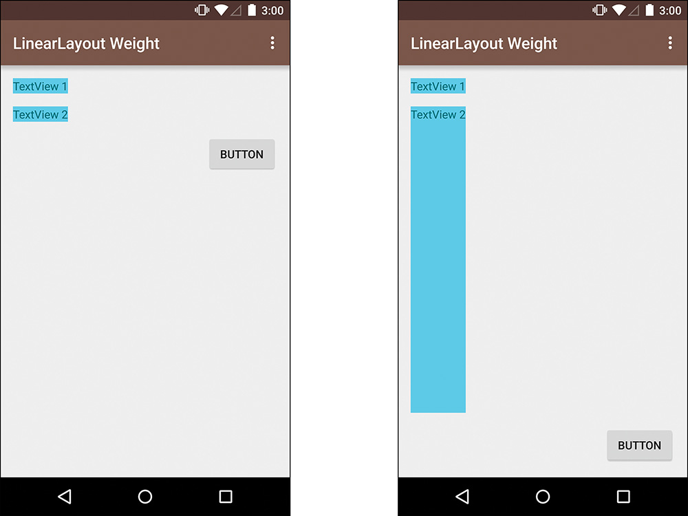
Figure 3.1 The left shows the layouts without weight applied; the right shows a weight of “1” applied to the second TextView
Listing 3.2 Utilizing Weight within a LinearLayout
<?xml version="1.0" encoding="utf-8"?>
<LinearLayout xmlns:android="http://schemas.android.com/apk/res/android"
android:layout_width="match_parent"
android:layout_height="match_parent"
android:paddingLeft="@dimen/activity_horizontal_margin"
android:paddingRight="@dimen/activity_horizontal_margin"
android:paddingTop="@dimen/activity_vertical_margin"
android:paddingBottom="@dimen/activity_vertical_margin"
android:orientation="vertical" >
<TextView
android:layout_width="wrap_content"
android:layout_height="wrap_content"
android:layout_marginBottom="@dimen/activity_vertical_margin"
android:layout_weight="0"
android:background="@color/accent"
android:text="TextView 1" />
<TextView
android:layout_width="wrap_content"
android:layout_height="wrap_content"
android:layout_marginBottom="@dimen/activity_vertical_margin"
android:layout_weight="1"
android:background="@color/accent"
android:text="TextView 2" />
<Button
android:layout_width="wrap_content"
android:layout_height="wrap_content"
android:layout_gravity="end"
android:layout_weight="0"
android:text="Button" />
</LinearLayout>
Notice that the width of the weighted TextView does not change, only the height grows. That is because the LinearLayout has a vertical orientation. One more thing to note is that weight is taken into account after all the views are measured. If you have three views that are 20dp and a total of 90dp of space to put them in, setting a weight of 1 on one of those will make that view take the remaining 30dp of space to be 50dp total. If the views had all been 30dp, the weight of 1 would have made no difference because there would be no extra space to use. Having the weight calculated after the other views are measured means that you can usually optimize cases such as the right layout in Figure 3.1 by supplying a height of 0dp for the view that has a weight specified. Because the weight of the view is going to cause it to take up the remaining space anyway, there is no need to measure it.
If you apply weight to more than one view, each view will grow in proportion to its weight. To calculate the ratio that it grows, you divide the weight of the view by the weight of all children in that LinearLayout. For example, if you have a view with a weight of 1 and a second view with a weight of 2 (total weight between the two views is 3), the first view will take up one-third of the available space and the second view will take up two-thirds. You can use whatever values you want for the weight, because they’re relative to all the other weights supplied, but most people stick to small values.
Warning: Explicitly Set the Orienation of a Linear Layout
When you do not specify an orientation, LinearLayout defaults to being horizontally oriented. Because views often have a width of match_parent, it’s easy to include several views within a LinearLayout without specifying an orientation and have all but the first view appear to be missing in your resulting layout. Because the first child view is set to match_parent for the width, it takes the full width of the LinearLayout. The next child would line up to the right of that, but that’s outside of the viewable area. For this reason, you should always explicitly set the orientation of a LinearLayout.
RelativeLayout
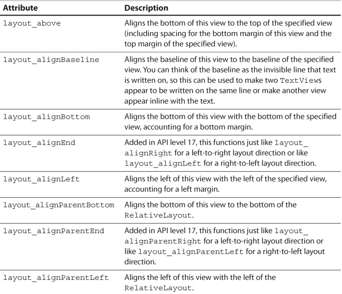
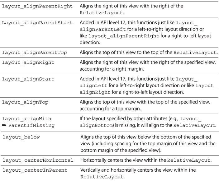
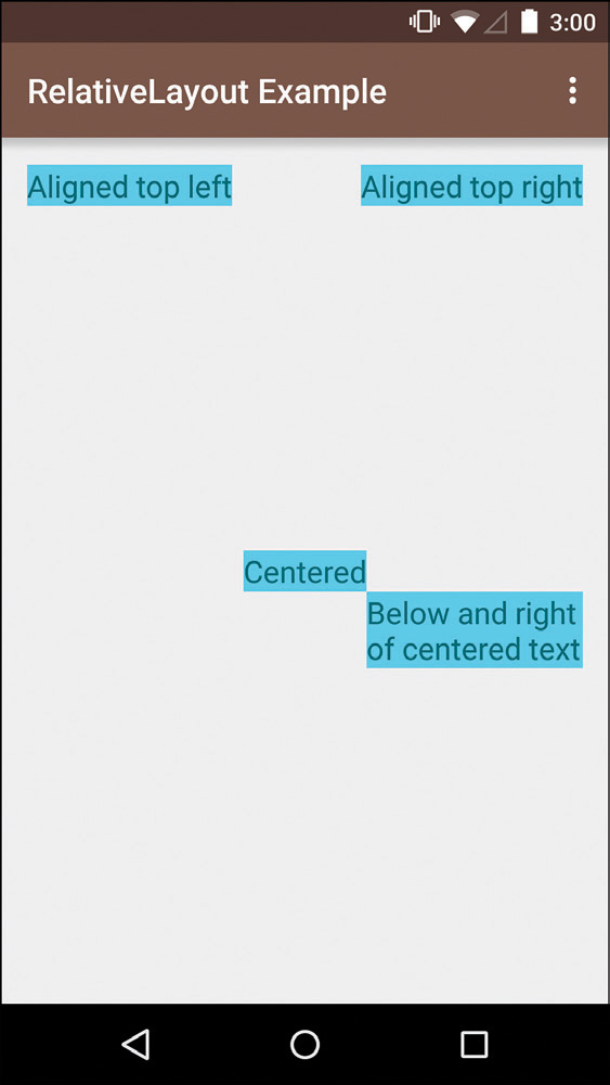
Learning to use a RelativeLayout class effectively is a little tricky at first, but once you are accustomed to using it, you will find it your go-to view group for a large portion of layouts. As the name indicates, you specify its children relative to each other or to the RelativeLayout itself. Not only is this an extremely efficient way to create semicomplex layouts that adapt to a variety of screens, it also allows you to create overlapping views and views that appear to float on top of others. See Table 3.1 for the LayoutParams that can be used with views within a RelativeLayout. Figure 3.2 demonstrates a simple use of a RelativeLayout that contains four TextViews. And don’t worry; this view will come up again in future chapters where real use cases make it more understandable.
AdapterView
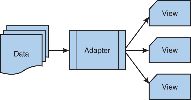
Sometimes you have a large data set to work with and creating views for every piece of data is impractical. Other times you simply want an easy and efficient way of creating views for some collection of data. Fortunately, AdapterView was created for these types of scenarios. AdapterView itself is abstract, so you will use one of its subclasses such as ListView, but the overall idea is the same. You have a data set, you throw it at an Adapter, and you end up with views in your layout (see Figure 3.3 for a simple conceptual illustration). Simple, right?
ListView
Sometimes concepts are easier to understand with concrete examples, and ListView is a great example of AdapterView. It presents a vertically scrolling list of views that can be reused. Figure 3.4 illustrates what happens when this view is scrolled. The far left column shows the initial layout, where a view is created for each position that has any content on the screen. The blue outline represents what is visible on the screen; portions of a view that are outside the screen appear faded. The second column shows the user scrolling down. The view that was at the bottom (View F) comes completely onto the screen, and a new view has to be inflated for the data from the adapter’s sixth position. The third column shows that as the user continues to scroll down, View A moves completely off the screen and becomes detached. It is no longer part of the view hierarchy, but it isn’t garbage collected because a reference to it is retained. The far right column shows that View A is reattached at the bottom and is given the data for the seventh position. In the adapter, this is the convertView parameter. This whole process is called “recycling” (as in avoiding garbage collection) and is vital for maintaining a smooth and efficient collection of content.

There is also a special version of ListView called ExpandableListView, which is used when you have two levels of content. For example, you might list all the countries of the world and then you could expand each country to show its states or provinces. ExpandableListView requires an ExpandableListAdapter.
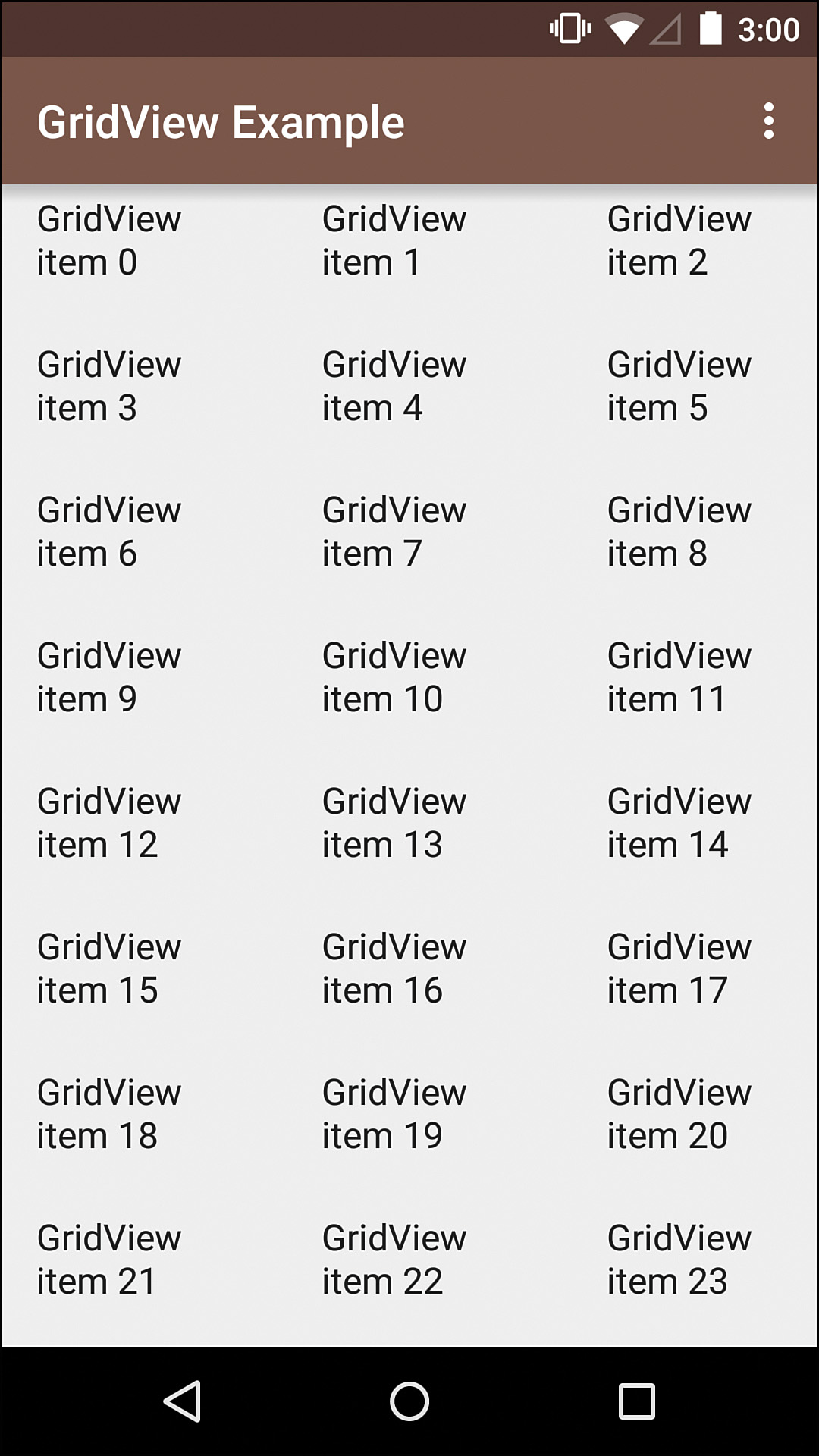
GridView
A GridView is a two-dimensional grid of views populated by the associated ListAdapter. One nice feature is that you can let the number of columns be automatically determined based on size, which makes this view group easy to use. Most commonly, you will see this used for a series of icons or images, although it is not limited to that functionality. See Figure 3.5 for an example.
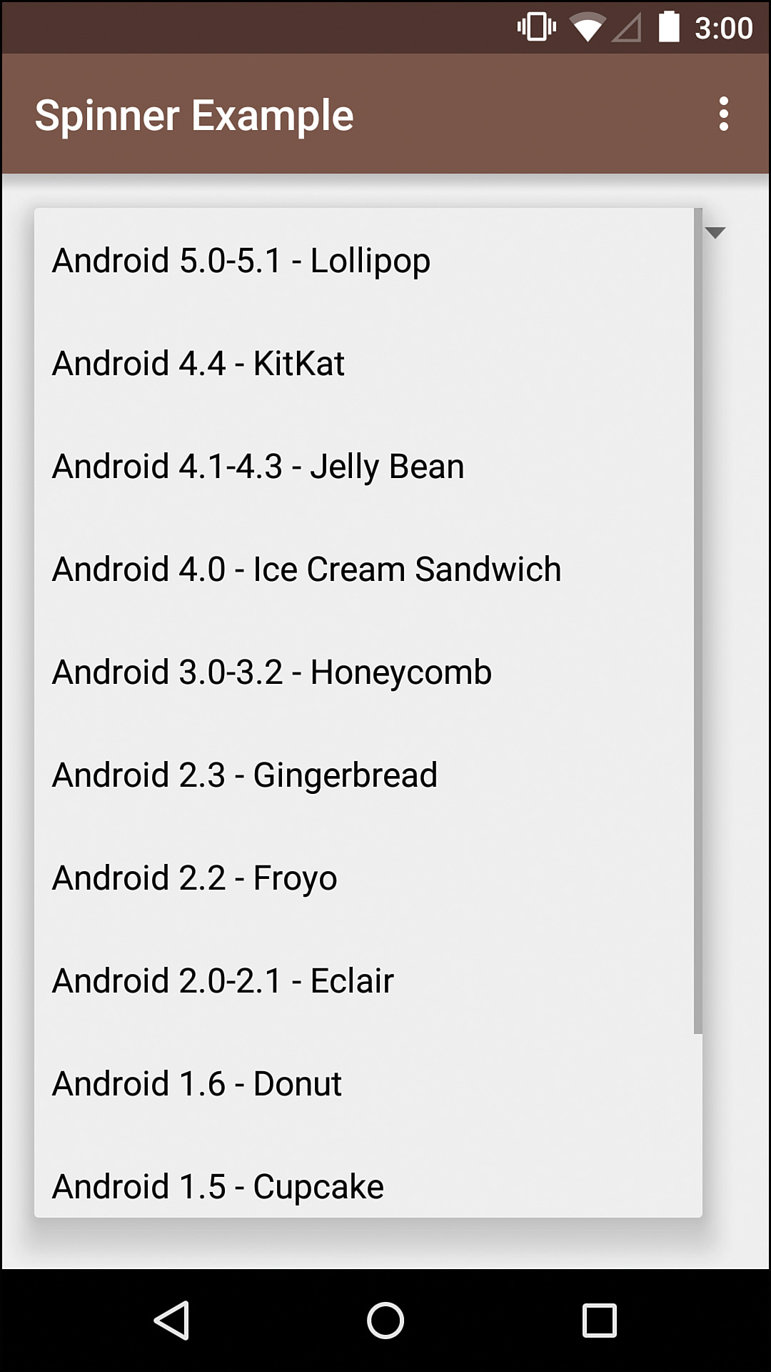
Spinner
When you need to give the user an easy way to select from multiple predefined choices, a Spinner is often a good solution. This class shows the currently selected choice and, when tapped, presents a drop-down menu of all the choices. A Spinner requires a SpinnerAdapter, which determines what the drop-down choices look like and what the currently selected item looks like when closed. See Figure 3.6 for an example.
Gallery
The Gallery class provides a way to show horizontally scrolling views backed by an Adapter. The original purpose was for, as its name states, displaying a gallery of (center-locked) photos. Each view was an ImageView. Because of this, Gallery does not recycle any of its views and is extremely inefficient. It also has some problems with scrolling, particularly on tablets where several views might be showing at once. Gallery has been deprecated, and you should not use it. It is mentioned here specifically because it comes up frequently as a solution to horizontally scrolling views, so you should be aware of it, but you should avoid using Gallery in your own apps. Instead, consider ViewPager or RecyclerView (both discussed later in this chapter).
Adapter
Adapter is the interface that takes a data set and returns views representing that data. The adapter is able to say how many items there are, return an item for a specific position, and return the view associated with a position, among other things. For a ListView, you will use the ListAdapter interface that extends Adapter to add a couple of list-specific methods. Similarly, you will use the SpinnerAdapter interface for use in a Spinner.
Fortunately, you do not need to implement these from scratch every time. For many cases, you will be using an array of data, so you can use ArrayAdapter directly or extend it to meet your needs. If your data is backed by a Cursor (a sort of pointer to a result set from a database query), CursorAdapter is the class to use. In some cases, you need a bit more control but don’t want to implement ListAdapter or SpinnerAdapter from scratch; fortunately, BaseAdapter gives a great starting place to extend.
The most important method of Adapter is getView(int position, View convertView, ViewGroup parent). This is where the adapter provides the actual view that represents a given position. The convertView parameter is for passing in any existing view of the same type that can be reused, but you must handle the case of this being null because the first calls to this method will not have an existing view to reuse and AdapterView does not require recycling views when it is extended. The third parameter, parent, is the ViewGroup that the view you’re building will be attached to. You should not attach the view yourself; instead, the parent is meant to be used for supplying the appropriate LayoutParams.
Interfaces for AdapterView
You will commonly use one of these AdapterView subclasses to allow each item to be interacted with. Instead of manually assigning event listeners to each view you generate, you can instead set a listener on the AdapterView. For example, to listen to clicks, you can create an implementation of the OnItemClickListener interface. There are also OnItemLongClickListener and OnItemSelectedListener interfaces. Each of these interfaces defines a single method that is passed the AdapterView itself, the view that the event was triggered on, the position of that view, and the ID for that position. Remember that you can use your Adapter’s getItem(int position) method within any of those methods when you need the object the view actually represents.
ViewPager
Being able to swipe horizontally through full pages of content has been common behavior since before Android, but its prevalence (e.g., the default launcher in each Android version) did not mean that it was supported by a native component. Instead, this pattern, which was originally referred to as “workspaces,” was implemented directly without abstraction.
Fortunately, the ViewPager was added to the support library (http://developer.android.com/tools/extras/support-library.html), so you can add it to any project that runs Android 1.6 or newer. A common use of this class is in apps that uses tabs for navigation; the user can swipe across each page or tap a tab to jump to a specific page. A ViewPager takes a PageAdapter that supplies the views, and one of the most common uses is to actually provide fragments via the FragmentPagerAdapter. Fragments are covered later in this chapter and throughout the book.
Toolbar
As mentioned in the first chapter, most apps have a toolbar at the top called the app bar. When this concept was introduced into the Android framework in Android 3.0 (referred to as the action bar at that time), its implementation made it part of the window décor, causing it to behave differently from other views and making a lot of desirable features exceedingly difficult to implement. In fact, that implementation caused a very specific problem: a navigation drawer could not slide in front of the app bar.
Android 5.0 introduced the solution: the Toolbar class. With this class, you can easily slide a navigation drawer in front of the rest of your app, animate the size of the app bar dynamically, and add whatever features you want. Because Toolbar is just another view, it can be included anywhere in your layouts and you have much better control of how you use it. What’s even better is that this class is included in the support library, so you can use it for older versions of Android as well.
Other Notable ViewGroups
You would be bored out of your mind if you had to read paragraphs about every single view group available. The fact is, there are many available, and those that were covered previously in the chapter are the main ones you will use. However, it’s worth knowing these others to avoid spending the time coding them yourself when they already exist:
 AbsoluteLayout—Deprecated layout that was used to position views based on exact pixels. Do not use this layout, but be aware that it exists so that you can shame developers who do use it.
AdapterViewAnimator—Switches among views that are supplied by an Adapter, using an animation for the transition. Introduced in API level 11.
AdapterViewFlipper—Similar to AdapterViewAnimator but supports automatically changing the view based on a time interval (e.g., for a slideshow). Introduced in API level 11.
AppWidgetHostView—Hosts app widgets, so you will probably only use this if you create a custom launcher.
DialerFilter—Hosts an EditText with an ID of android.R.id.primary and an EditText with an ID of android.R.id.hint as well as an optional ImageView with an ID of android.R.id.icon to provide an easy means of entering phone numbers (including letters that can be converted to numbers). You will probably never use this.
FragmentBreadCrumbs—Simplifies adding “breadcrumbs” (like displaying “Settings > Audio” as the user navigates deeper into content) to the UI, but it was deprecated for Android 5.0. Breadcrumbs are a more common pattern in web apps than mobile apps because most mobile apps should not be particularly deep.
GestureOverlayView—Exists on top of one or more other views to catch gestures on those views.
GridLayout—Organizes its children into a rectangular grid to easily align multiple views. Introduced in API level 14 but exists in the support library.
HorizontalScrollView—Wraps a single child view (usually a ViewGroup) to allow it to scroll horizontally when the content is larger than the view’s visible dimensions.
ImageSwitcher—Switches between images with an animation (see ViewSwitcher).
MediaController—Contains views to control media such as play, pause, fast forward, and a progress indicator.
PagerTabStrip—Provides interactivity to a PagerTitleStrip, allowing users to tap on a page title to jump to that page. Included in the support library.
PagerTitleStrip—Indicates the current, previous, and next pages for a ViewPager but is designed to display them without interaction. Included in the support library.
ScrollView—Wraps a single child view (usually a ViewGroup) to allow it to scroll vertically when the content is larger than the view’s visible dimensions.
SearchView—Provides a UI for allowing the user to search with the results coming from a SearchProvider. Introduced in API level 11 but also included in the support library.
SlidingDrawer—Holds two views: One is a handle and the other is the content. The handle can be tapped to show or hide the content, and it can also be dragged. This is the original app drawer in Android 1.x and is a very dated view. This class was deprecated in API level 17 and should not be used anymore.
StackView—Stacks multiple views that can be swiped through (so you can get an effect like multiple physical photos in a stack). The views are provided by an Adapter and are offset to show when more are below the top view. This is most commonly used as an app widget, and it was introduced in API level 11.
TabHost—Hosts tabs and a single FrameLayout for the content of the currently active tab. This was used for most tabbed interfaces prior to Android 3.0; most tabbed interfaces now use tabs in the app bar.
TabWidget—Lives within a TabHost and provides the tab event triggers.
TableLayout—Allows you to organize content in a tabular fashion, although you should generally use a GridLayout because it is more efficient.
TableRow—Represents a row in a TableLayout, although it is essentially just a LinearLayout.
TextSwitcher—Animates between two TextViews. This is really just a ViewSwitcher with a few helper methods.
ViewAnimator—Switches among views, using an animation.
ViewFlipper—Similar to ViewAnimator but supports automatically changing the view based on a time interval (e.g., for a slideshow).
ViewSwitcher—Animates between two views, where one is shown at a time.
ZoomControls—Controls zoom. No, really. It provides zoom buttons with callbacks for handling the zoom events.
Encapsulating View Logic with Fragments
One problem that plagued Android a bit early on was that there was no standardized way to encapsulate view logic for use across activities. This was not a major issue because one screen was typically represented by one activity and one layout; however, it started to become a problem when tablets gained popularity. Where you might display a list of news articles on the phone that you can tap to go to a full detail page, you would probably show that list on the left side of the tablet and the details on the right, so they’re always both visible. That presented a challenge because your code to populate the list was likely to be living in one activity and the detail page code was in another, but the tablet was only ever showing one activity and needed the logic from both. Enter the Fragment.
Like Activity, Context, and Intent, Fragment is another one of those classes that is a bit tough to describe up front but quickly makes sense as you use it. Think of a fragment as a chunk of your UI, containing the code necessary to inflate or construct a layout as well as handle user interaction with it. The fragment might even load content from the web or other source. A fragment can be simple, such as a full-screen ImageView, perhaps with a caption, or it can be complex, such as a series of form elements containing all the logic to validate and submit form responses. In fact, a fragment does not even have to be used for UI; it can be used to encapsulate application behavior needed for activities. But don’t worry, this is a book about design, so there’s no need to boggle your mind on why you’d do that!
The Fragment Lifecycle
Like activities, fragments have a lifecycle. In fact, activities are closely tied to fragments, and the activity lifecycle influences the lifecycle of the fragment associated with it. First, the fragment runs through this series of lifecycle events in the order they are presented here:
onAttach(Activity)—Indicates that the fragment is associated with an activity; calling getAcitivity() from this point on will return the Activity that is associated with the fragment.
onCreate(Bundle)—Initializes the fragment.
onCreateView(LayoutInflater, ViewGroup, Bundle)—Returns the view associated with the fragment.
onActivityCreated(Bundle)—Triggered to coincide with the activity’s onCreate() method.
onViewStateRestored(Bundle)—Triggered to indicate that the state of views (such as the text in an EditText instance from another orientation) has been restored.
onStart()—Triggered to coincide with the activity’s onStart() method and displays the fragment.
onResume()—Triggered to coincide with the activity’s onResume() method and indicates the fragment can handle interaction.
After the fragment has “resumed,” it will stay in that state until a fragment operation modifies that fragment (such as if you are removing the fragment from the screen) or its activity is paused. At that point, it will run through this series of lifecycle events in the order presented:
onPause()—Triggered to coincide with the activity’s onPause() method or when a fragment operation is modifying it.
onStop()—Triggered to coincide with the activity’s onStop() method or when a fragment operation is modifying it.
onDestroyView()—Allows the fragment to release any resources associated with its view; you should null out any view references that you have in this method.
onDestroy()—Allows the fragment to release any final resources.
onDetach()—Gives the fragment one last chance to do something before it is disassociated from its activity; at this point getActivity() will return null and you should ensure that you do not have any references to the activity.
Giving Fragments Data
One of the great things about fragments is that the system manages them for you. Things like configuration changes (e.g., orientation changes) are easily handled because fragments can save state and restore state. To do so, they must have a default constructor (i.e., a constructor that has no parameters). So, how do you pass data to them if they require a default constructor? The standard way is via a static newInstance() method that sets up the fragment’s arguments before it is attached to an activity. See Listing 3.3 for a simple example.
Listing 3.3 Passing Arguments to a Fragment and Using Them When Creating the View
public class TextViewFragment extends Fragment {
/**
* String to use as the key for the "text" argument
*/
private static final String KEY_TEXT = "text";
/**
* Constructs a new TextViewFragment with the specified String
*
* @param text String to associated with this TextViewFragment
* @return TextViewFragment with set arguments
*/
public static TextViewFragment newInstance(String text) {
TextViewFragment f = new TextViewFragment();
Bundle args = new Bundle();
args.putString(KEY_TEXT, text);
f.setArguments(args);
return f;
}
/**
* Returns the String set in {@link #newInstance(String)}
*
* @return the String set in {@link #newInstance(String)}
*/
public String getText() {
return getArguments().getString(KEY_TEXT);
}
@Override
public View onCreateView(LayoutInflater inflater, ViewGroup container, Bundle savedInstanceState) {
TextView tv = new TextView(getActivity());
tv.setText(getText());
return tv;
}
}
You can see that the static newInstance(String) method creates the fragment using the default constructor and then it creates a new Bundle object, puts the text into that bundle, and assigns that bundle as the fragment’s arguments. The bundle is maintained when the fragment is destroyed and will be automatically set for you if it’s created again (e.g., when a rotation triggers a configuration change, your fragment is destroyed, but a new one is created and the bundle is assigned to its arguments).
Obviously, using a fragment just for a TextView is contrived, but it illustrates how you can set data on a fragment that is retained across configuration changes. In doing this, you can easily separate your data from its presentation. Ideally, onCreateView(LayoutInflater, ViewGroup, Bundle) would inflate an XML layout, which might be different for landscape versus portrait. With your code designed in this way, the orientation change will just work with no extra effort on your part.
Fragments can also be set to be retained across activities with setRetainInstance(true). This allows you to keep data around that isn’t configuration-specific and is otherwise hard to put into a Bundle. When using this feature, the onDestroy() method is not called when the activity is destroyed and the subsequence onCreate(Bundle) is not called, because the fragment already exists.
Talking to the Activity
Although fragments can do a lot of things, it’s still quite common to need to talk to the activity they are attached to. For instance, you might have a custom DialogFragment and you need to tell the activity which button the user pressed. In other situations, you would do this with an interface and a setter method, but the fragment lifecycle makes that problematic. When the user rotates the device, the activity and fragment go away and the new versions are created. Because the fragment is created with an empty constructor, it no longer has reference to the interface you might have passed in. Instead, you do this by casting the activity. Because blindly casting can easily create bugs, it is a good idea to verify that the activity implements the correct interface in the onAttach(Activity) method and throw an exception if it does not. Listing 3.4 demonstrates both the communication back to the activity and the safety check when the fragment is attached to the activity.
Listing 3.4 Talking to the Activity from a Fragment
/**
* DialogFragment with a simple cancel/confirm dialog and message.
*
* Activities using this dialog must implement OnDialogChoiceListener.
*/
public class SampleDialogFragment extends DialogFragment {
/**
* Interface for receiving dialog events
*/
public interface OnDialogChoiceListener {
/**
* Triggered when the user presses the cancel button
*/
public void onDialogCanceled();
/**
* Triggered when the user presses the confirm button
*/
public void onDialogConfirmed();
}
private static final String ARG_CONTENT_RESOURCE_ID = "contentResourceId";
private static final String ARG_CONFIRM_RESOURCE_ID = "confirmResourceId";
private int mContentResourceId;
private int mConfirmResourceId;
private OnDialogChoiceListener mListener;
/**
* Creates a new instance of the fragment and sets the arguments
*
* @param contentResourceId int to use for the content such as R.string.dialog_text
* @param confirmResourceId int to use for the confirm button such as R.string.confirm
* @return new SampleDialogFragment instance
*/
public static SampleDialogFragment newInstance(int contentResourceId, int confirmResourceId) {
SampleDialogFragment fragment = new SampleDialogFragment();
Bundle args = new Bundle();
args.putInt(ARG_CONTENT_RESOURCE_ID, contentResourceId);
args.putInt(ARG_CONFIRM_RESOURCE_ID, confirmResourceId);
fragment.setArguments(args);
return fragment;
}
public SampleDialogFragment() {
// Required empty public constructor
}
@Override
public void onCreate(Bundle savedInstanceState) {
super.onCreate(savedInstanceState);
final Bundle args = getArguments();
if (args == null) {
throw new IllegalStateException("No arguments set, use the"
+ " newInstance method to construct this fragment");
}
mContentResourceId = args.getInt(ARG_CONTENT_RESOURCE_ID);
mConfirmResourceId = args.getInt(ARG_CONFIRM_RESOURCE_ID);
}
@NonNull
@Override
public Dialog onCreateDialog(Bundle savedInstanceState) {
AlertDialog.Builder builder = new AlertDialog.Builder(getActivity());
builder.setMessage(mContentResourceId)
.setPositiveButton(mConfirmResourceId, new DialogInterface.OnClickListener() {
public void onClick(DialogInterface dialog, int id) {
// Send the positive button event back to the host activity
mListener.onDialogConfirmed();
}
})
.setNegativeButton(R.string.cancel, new DialogInterface.OnClickListener() {
public void onClick(DialogInterface dialog, int id) {
// Send the negative button event back to the host activity
mListener.onDialogCanceled();
}
}
);
return builder.create();
}
@Override
public void onAttach(Activity activity) {
super.onAttach(activity);
try {
mListener = (OnDialogChoiceListener) activity;
} catch (ClassCastException e) {
throw new ClassCastException(activity.toString()
+ " must implement OnFragmentInteractionListener");
}
}
@Override
public void onDetach() {
super.onDetach();
mListener = null;
}
}
Fragment Transactions
In many cases, you will not need to worry about fragment transactions directly. You are able to embed fragments in XML, just like views, and DialogFragments have a show() method that just takes the FragmentManager (or FragmentSupportManager when using the support library) and a string tag to later find the fragment again. When you do need to add a fragment to the UI programmatically, you use a fragment transaction obtained from the FragmentManager’s (or the support version’s) beginTransaction() method. A fragment transaction can add, detach, hide, remove, replace, and show fragments and a single transaction can include multiple commands. When the transaction is ready, you call either commit() or commitAllowingStateLoss(). The former is more common but throws an exception if triggered after the activity has saved its state; the latter will not throw an exception, meaning that changes committed after an activity’s state has been saved (such as just before an orientation change) could be lost. Finally, a fragment transaction can add itself to the back stack, meaning that pressing the back button will reverse the transaction, by calling addToBackStack(String). See Listing 3.5 for an example of the typical use of a fragment transaction.
Listing 3.5 Typical Use of a Fragment Transaction
getSupportFragmentManager().beginTransaction()
.add(R.id.container, ExampleFragment.newInstance())
.addToBackStack(null)
.commit();
Controversy
Despite the capabilities that fragments bring to Android, they are not without their problems. The fragment lifecycle is complex, debugging is challenging both due to the underlying source code (particularly due to all the different states) and the asynchronous nature of fragment transactions, and the recreation of fragments using reflection (which means you can’t use anonymous classes or any other fragment that doesn’t have a default constructor). When making a mistake, it is not uncommon for it to show up later on (either due to a configuration change or an asynchronous transaction), which means the code that actually caused that situation can be very hard to track down.
Although most Android developers use fragments regardless of these issues, there are many other approaches to breaking UI into reusable pieces. Some developers create their own solutions on a case-by-case basis, some create custom view groups as fragment replacements, and some use a variety of third party libraries (such as Flow and Mortar, both developed by Square and available at http://square.github.io/). This book’s examples use fragments because they’re the most widely used solution to encapsulating reusable UI, but it’s a good idea to look at what else is out there once you’re familiar with the advantages and disadvantages of fragments.
The Support Library
One of the challenges of Android is that it is an open source operating system used in countless devices. Many of the manufacturers aren’t particularly incentivized to provide OS updates after a year or two when you may be looking to upgrade to a new device. One of the ways Google has combated the challenge of developing software for an operating system that evolves extremely rapidly and yet is frequently not up to date on most devices is the support library.
Originally, the support library came out as “Support-V4,” meaning that it worked with API level 4 (Android 1.6) and newer, bringing fragments and other features to the majority of Android devices. Google also released other versions such as v13 for Android 3.2 (the last version of Honeycomb), with the idea being that you would pick the support library you needed based on the minimum version you supported (if you didn’t support versions older than v13, you could use that library to avoid bringing in features such as fragments that would be natively supported). Later, Google released the ActionBarCompat library for bringing the action bar to older versions of Android.
Since then, the ActionBarCompat library has been renamed to AppCompat and the approach has changed slightly. The idea now is that you will use this library and its components even if the device that the code is running on has fragments or another feature natively supported. This simplifies your code and simplifies the library code because it doesn’t have to worry about swapping between native and support versions of classes. Another advantage of this is that XML attributes do not have to be declared twice (you used to have to declare XML attributes for the native code such as android:actionBarStyle and then again for the support library such as actionBarStyle, which was error prone and caused significant duplication).
The AppCompat library provides a significant amount of simplification that works across Android versions. With it, you can specify just a few colors to have all your app bars colored, the majority of input views such as checkboxes and radio buttons updated to the newer Material Design style, and a lot more. What used to take dozens of image resources for theming now takes just a few lines of XML. The benefits of using this library are such that virtually every app that is developed now should use it and all examples in this book rely on it.
There are eight more libraries that you should know about: CardView, Design, GridLayout, Leanback, MediaRouter, Palette, RecyclerView, and Support Annotations. To use any of them, be sure that you’ve installed the Android Support Repository via the SDK manager. Listing 3.6 shows the Gradle dependencies for the various libraries. If you’re not familiar with Gradle, it is the build system used by Android and it makes including dependencies (i.e., specifying libraries or other projects that your app depends on to build) and configuration details easy. More information about using Gradle for Android builds is available at https://gradle.org/getting-started-android/.
Listing 3.6 Support Library Dependencies for Your Gradle Configuration
dependencies {
// AppCompat - likely in every app you develop
compile 'com.android.support:appcompat-v7:22.2.1'
// CardView - for paper with shadows on older versions
compile 'com.android.support:cardview-v7:22.2.1'
// Design - for Material Design views and motion
compile 'com.android.support:design:22.2.1'
// GridLayout - for laying out views in a grid
compile 'com.android.support:gridlayout-v7:22.2.1'
// Leanback - for fragments that simplify TV apps
compile 'com.android.support:leanback-v17:22.2.1'
// MediaRouter - for outputting media to various devices
compile 'com.android.support:mediarouter-v7:22.2.1'
// Palette - for extracting colors from images
compile 'com.android.support:palette-v7:22.2.1'
// RecyclerView - for advanced AdapterView needs
compile 'com.android.support:recyclerview-v7:22.2.1'
// Support Annotations - for Java annotations to prevent bugs
compile 'com.android.support:support-annotations:22.2.1'
// Support V13 - probably not required in your app
compile 'com.android.support:support-v13:22.2.1'
// Support V4 - included by AppCompat, so not necessary to add
compile 'com.android.support:support-v4:22.2.1'
}
The CardView Library
One of the fundamental parts of Material Design is shadows. Unfortunately, this isn’t a feature that is easy to support on older versions of Android because of fundamental rendering changes. The CardView library is meant to help with that by providing the CardView class, a concrete implementation of a card (a piece of paper) with support for shadows on older versions of Android by using an image. Each card view can hold one child view and give it shadows with support for dynamically changing elevations. See Figure 3.7 for a simple example.
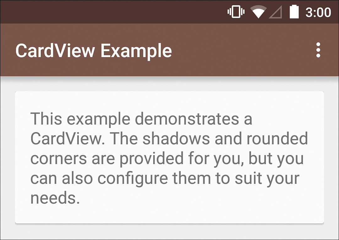
Figure 3.7 The CardView class provides a way to create Material Design “paper,” complete with shadow, on versions of Android prior to 5.0
Design Library
The design library provides concrete implementations of a variety of Material Design elements such as the FAB (with the FloatingActionButton class), snackbars (with the Snackbar class), scrollable and fixed tabs (with the TabLayout class), the navigation drawer (with the NavigationView class), and even floating labels for text entry (with the TextInputLayout class). Two other major classes to know in this library are the CoordinatorLayout and the AppBarLayout. These classes allow you to do things like moving your FAB out of the way when you display a snackbar or scrolling the app bar off the screen while scrolling down a list and back on when scrolling up.
Many of these classes are used in future chapters in this book, but it’s a good idea to read the initial announcement of this library so that you can get a feel for what’s in it at http://android-developers.blogspot.com/2015/05/android-design-support-library.html.
GridLayout Library
Occasionally you need to align views in a dynamic or complex grid and using relative layouts or nested linear layouts is problematic. In these cases, using the GridLayout class can be a good solution. This class was made available in API level 14 (Android 4.0), but this library allows you to use it with older versions of Android
Leanback Library
Apps designed for the TV have fundamentally different design requirements. The so-called 10-foot view necessitates larger fonts and pictures, simple directional navigation, and search. This library provides fragments to simplify implementing browsing rows of content, viewing details, video playback, and search for Android TV apps. For more information about designing for the TV experience, see http://developer.android.com/design/tv/.
MediaRouter Library
Android 4.1 (API level 16) brought about controls for easily routing media. If your app plays music, your users may want to play it from wireless speakers. Similarly, if your app plays video, your users may want to play it from a Chromecast. This library makes doing those things much easier and supports versions of Android as old as API level 7 (Android 2.1).
Palette Library
One common challenge in designing apps is dynamic images. If your app displays a lot of dynamic images, you have to be very careful about what colors you include in the UI around them. It’s easy to end up with something that clashes or detracts from the experience. The two main ways designers have gotten around this issue is to either design a UI with limited colors (that’s why so many photo apps and websites are white, black, or gray) or to use colors from the images themselves. The second solution is what the Palette class provides. It can analyze an image and give you the vibrant and muted colors (plus dark and light versions of each) from the image, allowing you to easily color buttons, chrome, or other UI elements dynamically.
RecyclerView Library
For most lists of content, a ListView class works fine. Unfortunately, there are some issues. For instance, you might try animating a view within a list, but scrolling causes that view to be reused while the animation is still going on, leading to a very confusing experience for users. In Android 4.1 (API level 16), ViewPropertyAnimator-based animations no longer had this problem issue and the View class had another method added called setHasTransientState(boolean), specifically designed to tell the adapters that a view was in a transient or temporary state and shouldn’t immediately be reused. You also can’t create content that is laid on horizontally or in a grid. The RecyclerView class is provided by this library to solve these problems and more. It is supported all the way back to API level 7 (Android 2.1) and it can handle custom animations and layouts. The use of this class is covered in detail in Chapter 10, “Using Advanced Techniques.”
Support Annotations Library
One of the challenges in writing code is knowing what is allowed or expected. For instance, if you call a method that returns a collection of items, what happens if it has no results? Depending on the developer, it could return null or it could return an empty collection. What if you have a method that takes a color resource ID and you want to prevent someone from accidentally passing in a raw color int? The support annotations solve these problems. You can specify a parameter or return value as @Nullable to indicate that it can be null or @NonNull to indicate that it can’t. You can also declare that a given int is a color resource ID with @ColorRes (and there are annotations for each of the types of resources such as @StringRes). In addition, there are times in Android when you want to use an enum, but you don’t want the performance penalty of full Java classes which Java creates for each enum. Typically these are strings or ints, but you have to rely on code comments to get someone to pass in correct values. The annotation library includes @IntDef and @StringDef for these cases. To learn more, see http://tools.android.com/tech-docs/support-annotations.
Summary
You’ve survived another dry chapter! Give yourself a pat on the back; you’ve almost made it to the good stuff. You should now have a solid understanding of how the ViewGroup class and its subclasses work as well as how to use fragments to create reusable layouts with display and handling logic contained within. Plus, you’re aware of the large number of support libraries that are available to make your life easier. Combine that with the knowledge from Chapter 2 and you know the most important aspects of getting your layouts on the screen exactly where you want them.
Next up, Chapter 4, “Adding App Graphics and Resources,” will explain how to add graphics to these views and how to utilize resources in an efficient, reusable manner. That is the last chapter before diving into the real-life process of designing an app.