The material design guidelines specify a few kinds of view components that were new in Lollipop. The Android team provides implementations of many of these components. Let’s take a look at a few of the views you are likely to run into.
The first new widget is a frame for other widgets: cards (Figure 35.10).
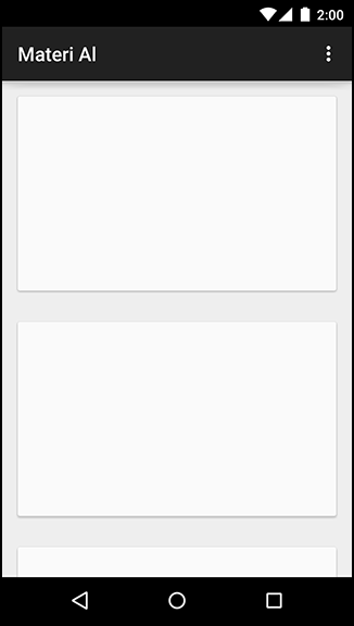
A card is a container for other kinds of content. It is elevated slightly, with a shadow behind it, and its corners are slightly rounded.
This is not a design book, so we cannot provide advice on when and where to use cards. (See Google’s material design documentation on the web if you are curious: www.google.com/design/spec.) We can tell you how to make them, though: by using CardView.
CardView is a class provided in its own v7 support library, much like RecyclerView.
You can include it in your project by adding a dependency on com.android.support:cardview-v7 to your module.
Once you do that, you can use CardView like any other ViewGroup in a layout. It is a FrameLayout subclass, so you can use any of FrameLayout’s layout params for CardView’s children.
Listing 35.9 Using CardView in a layout
<LinearLayout xmlns:android="http://schemas.android.com/apk/res/android"
              xmlns:tools="http://schemas.android.com/tools"
              android:layout_width="match_parent"
              android:layout_height="match_parent"
              android:orientation="vertical"
              tools:context=".MainActivity">
    <android.support.v7.widget.CardView
        android:id="@+id/item"
        android:layout_width="match_parent"
        android:layout_height="200dp"
        android:layout_margin="16dp"
        >
        ...
    </android.support.v7.widget.CardView>

</LinearLayout>
Because CardView is a support library class, it gives you some nice compatibility features on older devices. Unlike other widgets, it will always project a shadow. (On older versions, it will simply draw its own – not a perfect shadow, but close enough.) See CardView’s documentation for other minor visual differences, if you are interested.
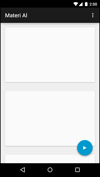
Another component you will often see is the floating action button, or FAB. You can see one in Figure 35.11.
An implementation of the floating action button is available in Google’s design support library.
You can include this library in your project with this dependency on your module: com.android.support:design:24.2.1.
Floating action buttons are little more than a solid-color circle with a custom circular shadow, provided by an OutlineProvider. The FloatingActionButton class, a subclass of ImageView, takes care of the circle and shadow for you. Simply place a FloatingActionButton in your layout file and set its src attribute to the image that you want to display in your button.
While you could place your floating action button in a FrameLayout, the design support library also includes the clever CoordinatorLayout. This layout is a subclass of FrameLayout that changes your floating action button’s position based on the movement of other components. Now, when you display a Snackbar (more on that in a moment), your FAB will move up so that the Snackbar does not cover it. This will look like Listing 35.10.
Listing 35.10 Laying out a floating action button
<android.support.design.widget.CoordinatorLayout
             xmlns:android="http://schemas.android.com/apk/res/android"
             xmlns:tools="http://schemas.android.com/tools"
             xmlns:app="http://schemas.android.com/apk/res-auto"
             android:layout_width="match_parent"
             android:layout_height="match_parent">
    [... main content here ...]
    <android.support.design.widget.FloatingActionButton
        android:id="@+id/floating_action_button"
        android:layout_width="wrap_content"
        android:layout_height="wrap_content"
        android:layout_gravity="bottom|right"
        android:layout_margin="16dp"
        android:src="@drawable/play"/>
</android.support.design.widget.CoordinatorLayout>
This code will place the button over the rest of the content in the bottom right, without interfering with any of it.
Snackbars are a bit more involved than floating action buttons. They are little interaction components that appear at the bottom of the screen (Figure 35.12).

Snackbars animate up from the bottom of the screen. After a certain period of time, or after another interaction on the screen, they automatically animate back down. Snackbars are similar in purpose to toasts, but unlike toasts they are a part of your app’s own interface. A toast appears above your app and will stick around even if you navigate away. Also, snackbars let you provide a button so that the user can take immediate action.
Like floating action buttons, Android provides an implementation of snackbars in the design support library.
Snackbars are constructed and displayed in a similar way as Toasts:
Listing 35.11 Having a snack(bar)
Snackbar.make(container, R.string.munch, Snackbar.LENGTH_SHORT).show();
When constructing a Snackbar, pass in the view where the snackbar will be displayed, the text to display, and the length of time that the snackbar should be visible for. Finally, call show() to display the snackbar.
Snackbars can optionally provide an action on the right side. This is handy if the user performs a destructive action, like deleting a crime, and you want to provide a way for the user to undo that action.