
STEP THREE  A
A
COVER DESIGN
INTRODUCTION
The creation of your own portfolio book is a creative statement about the value you place on your work and craft. It is important that your portfolio book function in two important yet different ways—addressing both the exterior and interior book design.
Cover Design
Your book cover design needs to get you noticed and distinguish you from “the crowd.” It needs to communicate your unique talents and experiences in a positive and memorable way. To do this, you need to capitalize on your own unique creative vision. Distinguishing yourself from hundreds of other seemingly similar candidates will provide you with a vital competitive edge. Therefore, it is important that your portfolio book not simply be a container for your work, but act as a well-thought-out and well-crafted creative statement, in and of itself. Creating your own unique book will also demonstrate your commitment and dedication to your profession. This is especially true in our competitive creative industries where creative professionals distinguish themselves by taking the initiative to make sure that they show their very best right from the start. This chapter will guide you through a number of steps in order to help turn your brand statement into a visually compelling branded design.
A Note about the Interior Layout
The second way in which your portfolio book needs to function is by clearly and effectively presenting your work. The interior layout design needs to support the image of the work itself and allow it to be the focal point within the composition of each page. Information about the work and any other related visual elements will therefore be secondary. As part of our process, in the following chapter we will guide you through the organization and layout of elements within the layout of a page, including typographic and compositional issues.
Your Approach
There are a number of approaches you can take with the design of your portfolio book. Depending on where you enter this process, your approach may vary. Keep in mind that you should be making conscious decisions that will ultimately provide a means to get you noticed and differentiate you within the marketplace.
At the most basic level your portfolio book is a formal exercise in print design and bookmaking. In addition, your cover design should reflect consideration of your brand statement. The purpose of your cover design is to get you noticed and differentiate you from the crowd. The style or “look and feel” of it should connect with your target audience immediately and reference the type of work you've done and/or want to do. Explored further, your cover design has the potential to distinguish you as a creative professional and leave a lasting memorable impression. By referencing a conceptual idea and/or establishing a specific brand identity you can connect all the components of your comprehensive portfolio package together into one clear and concise statement.
There are a couple of ways to think about your cover design:
Level 1: As a formal print design and bookmaking solution.
Level 2: As a conceptual statement that leads to a visual direction and/or a brand identity solution.
Style, in its most general sense, is a specific or characteristic manner of expression, design, construction, or execution. 1
– STEVEN HELLER and SEYMOUR CHWAST
Note: Consider the entirety of the book—front, back. and spine.
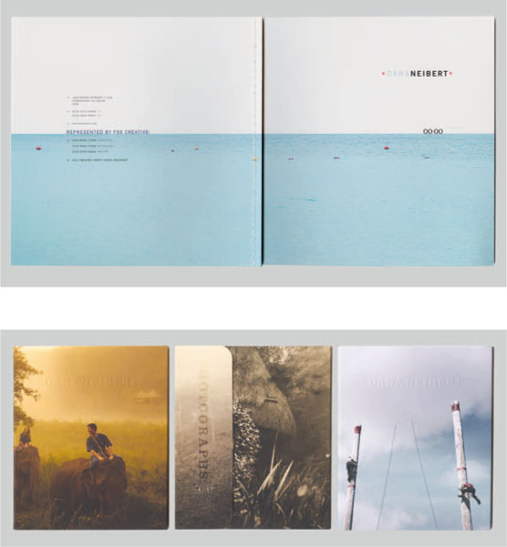
DANA NEIBERT, PORTFOLIO AND PROMOTIONAL MATERIALS, Coronado, CA.
My design is usually simple and graphic much like my photography.
– DANA NEIBERT
CONCEPTS
Now that you know what you want to say, you need to figure out how best to say it. To sell yourself you need a brand. To sell your brand you need a big idea. The next step in this process is to develop an overarching visual idea or concept—something that can provide the basis for the direction of your visual design. A visual concept can be more loosely or tightly defined. It can be a literal translation, or on the other extreme, act as an abstract reference to your brand statement. Whichever direction you head in, you should start by doing some thinking and sketching.
There are several ways to proceed:
- Connect your brand attributes to specific imagery or icons that are symbolic of you, your work, or simply your artistic vision.
- Reference a specific visual system or genre that works well to represent you.
- Utilize a conceptual methodology like satire or symbolism to develop an idea and take advantage of related visual systems and methods.
- Use your brand statement only as a launching point and work from there to brainstorm a concept or message.
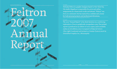
NICHOLAS FELTON, New York, NY.
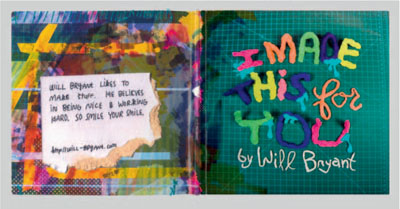
WILL BRYANT, Mississippi State University.
Good design IS ALL ABOUT MAKING OTHER DESIGNERS FEEL LIKE IDIOTS BECAUSE THAT IDEA WASN'T THEIRS.
FRANK CHIMER0
ILlustrator, Graphic Designer & Writer
Q&A: Interview with Gail Swanlund, Co-director and Faculty, CalArts, Graphic Design Program
Gail Swanlund is a designer and professor, and co-director of the graphic design program at CalArts in Valencia, CA. Her work has been exhibited at the San Francisco Museum of Modern Art and she has been recognized by the American Center for Design, AIGA, and The Type Directors Club. Her work has been featured in Emigre, Eye, Print, IdN, and Zoo, and has been published in various design anthologies, including Graphic Radicals, Radical Graphics, The Graphic Edge, and Typographics 4. Professor Swanlund received a master's degree from CalArts.
What kind of portfolio or bookmaking course do you teach? What's the course name? What level is it geared toward? Is it a required course?
In the B.F.A.4 year (the fourth year of the undergraduate program), students curate and design an exhibition catalog in their core design class. In the spring, the B.F.A. candidates prepare a portfolio, including resume, website, reel, and a printed book.
What do you think makes for an outstanding portfolio book?
Innovative work with a thoughtful concept supporting the thoughtful form.
How important is a print and/or online portfolio in securing a job in the industry?
It's essential. You can't hide anything with a printed book and it really helps support, for example, a reel, to show off typographic detailing, composition talents, skillfulness, and so forth.
In general, how many pieces of work do you think a student should include in his or her portfolio?
10–20 really great pieces. Get some advice from teachers, professionals, other pals. Don't overload the portfolio with too many projects, but do have some projects held in reserve in case the interviewer shows interest and wants to see more or something specific.
Understanding the Range of Possibilities
There are many ways to proceed with your approach. You need to discover what works best for you. You may perhaps decide to create a composition through illustration or photographic montage that references a narrative. Perhaps you are interested in developing a broader metaphor for your portfolio, like Jessica Hische's Body of Work [pgs. 42–43]. Perhaps poking fun at an idea, product, or company through a clever parody or witty satire is more suggestive of your personality. Or, you may simply want to reference certain qualities that can be expressed more abstractly. For example, an intricate pattern can communicate a sense of focus and attention to detail. While a composition developed from expressive lines and shapes can suggest a spontaneous dynamic energy. Even one image, be it witty or serious or bizarre or subtle, can communicate volumes about who you are as an artist. Whatever you decide, be conscious of the images, symbols, shapes, and visual styles that you reference. Don't just randomly choose things for no reason. Remember that out of all the concepts and subsequent visual references in the world, whoever views your portfolio will identify you with the ones you do choose. Make sure you know what your portfolio design will communicate about you.
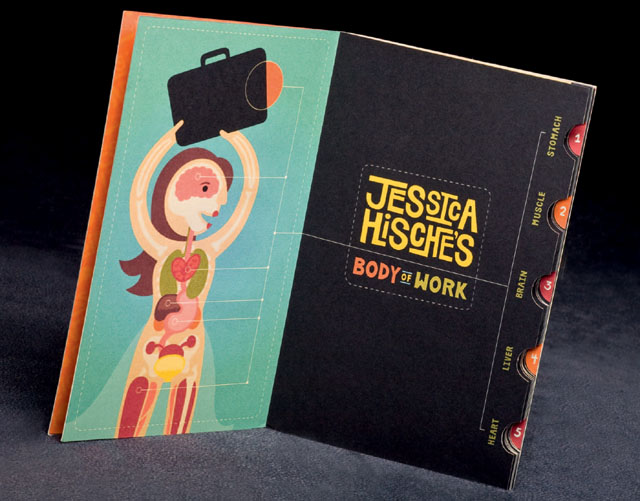
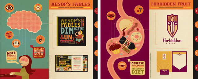
JESSICA HISCHE, STUDENT PORTFOLIO, Tyler School of Art.
Jessica's concept is developed through the use of a visual/verbal pun, playing with the phrase “body of work.” The concept, color palette, illustrations, and typographic treatment all work beautifully together to communicate a whimsical, animated, and witty approach to her portfolio. This is also a great example of a portfolio that is a completed piece in and of itself. Clearly, it stands out and communicates Jessica's unique creative vision and artistic talents.
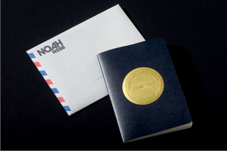
NOAH WEBB, PROMOTIONAL BOOK, Los Angeles, CA.
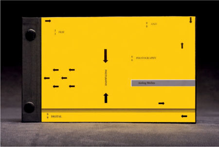
AISLING MULLEN, STUDENT PORTFOLIO, Endicott College.

LENA CARDELL, STUDENT PORTFOLIO, Tyler School of Art.
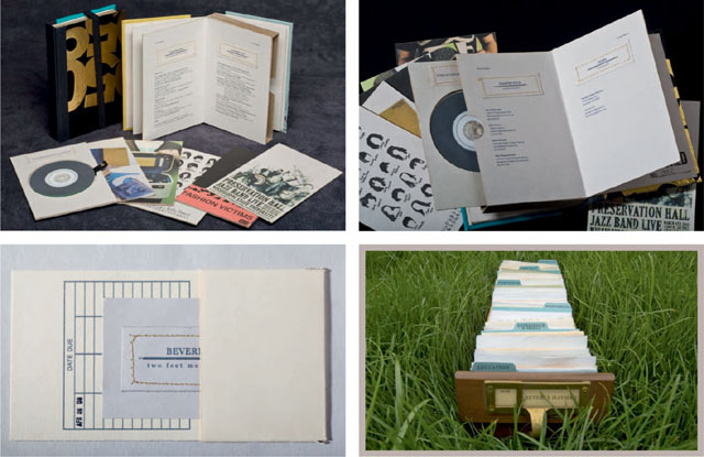
Lena's portfolio is based on the concept of a card catalog. The piece itself showcases her superb and thoughtful craftsmanship.
Conceptual Methodologies Defined
If you want to create a more tightly defined concept, investigate the following conceptual methodologies:
- Satire: Works great as a strategy to create concepts that are witty, sarcastic, edgy, and relevant.
- Parody: Spoofs, caricatures, humorous imitations—it's always fun to poke fun of something at its own expense, but these concepts need to be relevant and meaningful in order to be successful.
- Narrative: Whether linearly defined stories or loosely strung together nonlinear references, narratives describe a sequence of fictional or nonfictional events.
- Symbolism: Symbols do well to connect to abstract ideas and nonliteral references. If used strategically, the use of symbolism can bring a lot of meaning to a piece.
- Metaphor: Metaphors are poetic in nature. They are often used to explore abstract ideas through an underlying connection to a (sometimes seemingly unconnected) tangible idea or object. For this reason, while difficult to achieve successfully, metaphors often make for the development of some very original and thoughtful concepts.
- Visual pun: Witty, relevant, and fun, visual and verbal puns can be a great method for grabbing someone's attention and remaining memorable. The usage of puns also references the field of advertising – as this technique has been historically used to great advantage in this industry.
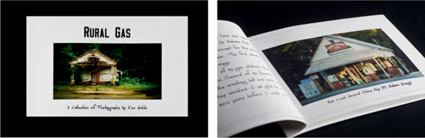
KEN GEHLE, PROMOTIONAL BOOK, Decator, GA.
Ken's promotional book makes use of a narrative structure to pair photographic images with his own observations and comments.
If you don't know where to begin, sketch out some ideas with paper and pencil. Brainstorming fresh and thoughtful ideas is difficult. You don't want to present a concept that is too generic or obvious. One way to get the ideas flowing is to do a word association (you can do the same thing with images too). Start with the words you wrote down in Step 1 —those qualities that define you and your work. Write down each word across the top of a piece of paper, and underneath each create a list of associated words. Write down anything that comes to mind—be creative and let your mind wander! Think of places, people, objects, and symbols that might be associated with the qualities you defined. Then from this list of words, circle those that seem more interesting and less obvious. Do the same thing again with these words and try to think of other things that might relate. In this way you may discover references that may help you develop a more interesting and unique idea.
Moodboards
The creation of moodboards is common practice in design, advertising, and marketing. A moodboard is essentially a collection of found imagery that define a particular concept, style, or overall “look and feel”. Moodboards are often used to inspire and communicate a sense of brand and visual direction. They should make an impact on the senses. The selection of imagery can be based on whatever strikes you—color palette, image, type, texture, composition, pattern, etc. It shouldn't be limited to subject matter. Seek out and derive materials from magazines, photographs, materials, fabrics, books, and other types of visual forms (if you don't want to cut up something, scan it and print it out first). If you come across something (say, a traffic sign or architectural detail) that you like, snap a photograph of it. Try to keep a visual log of things that inspire you. Keep in mind the brand attributes that you've used to describe yourself.
From the materials you are searching through, cut out the parts that relate to your vision and inspire you. Paste them onto something like
poster board. Creating moodboards is often quick and easy so it's a great way to try out a variety of ideas and directions. Create as many moodboards as you like—trying out different “looks and feels”—and create a range of ideas that you can step back from and evaluate. It's a great way to decide what you do and don't like.
Promotional Exercise
Produce a single promotional piece that presents you or your work through a particular concept. This exercise is designed to expand your thinking and stimulate ideas that eventually could be used as the launching point in the development of a larger portfolio concept. Focus on: Ideation—the generation of ideas.
Rather than trying to conceive a portfolio concept from scratch (even if you have already developed one) this process will allow you to experiment with packaging or presenting your work through a thematic approach to a concept-driven piece on a smaller scale. The intention here is to use this smaller scale process as a sketch for a larger potential idea without the burden or pressure of having to consider this larger effort.
To help you through a process of generating concepts and ideas for your visual approach, work on a single targeted marketing piece. Your approach should make reference to your brand statement and utilize a concept or method targeted toward a particular client or market.
1. Pick a client or clients and a particular market.
2. Pick an approach—stylistic, conceptual, formal, etc.
3. Develop a single marketing promotional piece. Start with something small, such as a:
• Two-sided postcard
• Matchbook or box of matches
• Mini CD with sleeve
• Set of stickers
• Small mailing
Q & A: Interview with Beverly Hayman, Recent B.F.A. Graduate, Mississippi State University
Beverly Hayman graduated summa cum laude with a B.F.A. in graphic design from Mississippi State University in May 2008.
Were you a student when you created this piece? Was it created in response to a course assignment?
Yes. I made the self-promos in an advanced graphics course my final semester of undergraduate work. The “self-promo” project is a course assignment allowing students the chance to create a comprehensive and well-crafted portfolio. In addition to the physical piece, we were required to create a promotional website (http://www.beverlyhayman.com). I feel that having a student's portfolio become a part of their curriculum allows them to focus and spend more time on it, as opposed to it being something they have to accomplish in addition to their classes.
How did you arrive at the idea or concept for your piece? What do you think it communicates about you?
“One man's trash is another man's treasure.” I love repurposing materials. With my portfolio, in particular, I felt that reusing old books and their covers provided a lot of inspiration both conceptually and literally. I liked the idea of modeling my “self-promo” after a book in format: chapters, library card pocket, stamping, etc. … In addition, reusing old book covers as the aesthetic for my portfolio says a lot about my style.
One thing that has always been important in my work is to never rely solely on one media, especially the computer. While graphic design has really been revolutionized with digital technology, I feel that it is best to use that technology to enhance your work, and not rely solely on its capabilities. I wanted to represent my skills and attention to detail in a way that really expressed who I was as a designer. Creating this handmade book that resembles a library book by repurposing materials really showcased my style and what I like to do.
Did you target a particular area of the market or industry with this approach?
No. Honestly I felt like this project should be seen as a culmination of my work as a student, and so I wanted to incorporate all of my skills into this one project, and hope that potential employers would appreciate that approach.
What was the most challenging part about creating this piece?
The whole piece was designed in a way that it really needed to be crafted delicately, so taking the time and effort to assemble all the various pieces was very tedious. In particular, the process of choosing books and removing their covers carefully was actually quite difficult.
Who have you sent it out to? How did you send it? What did you follow up with (call, email, etc.)? What was the response?
I've presented it to three firms in various interviews. All the meetings were in person, so I didn't have to package and mail them. A couple of the firms offered me a position during the interview, so no follow-up was required.
Do you have any advice for a student currently working on his or her portfolio and/or other promotional materials?
I would encourage them to really take ownership in their work and create something they can really be proud of. Promotional material may just be a snapshot of what you can do, but often it's the only way in which you can showcase your work.
Q & A: Interview with Jamie Burwell Mixon, Professor, Mississippi State University
At MSU, Professor Jamie Burwell Mixon is the coordinator of the graphic design emphasis area, teaches graphic design, and continues to design for select clients. Mixon was named an MSU Grisham Master Teacher in 2004 and won an MSU Grisham Teaching Excellence Award in 1996. She has twice been selected as MSU's CASE Professor of the Year nominee. (She loves teaching.)
Over the years, student designs created in her classes have been published in HOW magazine, CMYK, and Creative Quarterly, as well as won awards in ADCMW's The REAL Show, the International Design Against Fur poster competition, USA Today’s Collegiate Challenge Competition, the AAF Addy Competition, and DSVC's National Show, among others. (She loves students who love design.)
What kind of portfolio course do you teach? What's the course name? What level is it geared toward? Is it a required course?
I teach ART4640 Advanced Graphics. This is a capstone portfolio course required by all MSU graphic design emphasis students. Students are required to take this course their last semester.
What do you think makes for an outstanding portfolio?
Wow ! So many things go into the making of an outstanding portfolio! Certainly excellent design, concept, and perfect craft are expected. But also the ability to edit out your weaker work; a portfolio is judged by its weakest piece. When in doubt, throw it out! In my experience, when a student has complete confidence in their portfolio—without any doubt or hesitation—it shines bright!
How important is a print and/or online portfolio in securing a job in the industry?
Yes ! Both are important. A student must be ready for all opportunities. If a student is in contact with a potential employer online and secures an interview, then the printed self-promo piece is used as a leave-behind. A printed piece may also be used as a foot-in-the-door technique to introduce the student to a firm and generate interest in their online portfolio, thus securing a face-to-face interview or portfolio review. Students must be quick on their feet, flexible and persistent in the search for a great design position! One thing is certain: The student must know all there is to know about the firm they are contacting and be genuinely interested in it!
SO MANY THINGS GO INTO THE MAKING OF AN
outstanding portfolio!
Certainly excellent design, concept and perfect craft are expected
JAMIE BURWELL MIXON
How important is the brand or overall visual identity of the portfolio package (including book, website, resume, business card, etc.)?
In my portfolio course, students essentially create an entire brand for themselves. Self-promo, website, CD, and portfolio format are all visually and conceptually consistent with each other. It's not easy; the hardest, flakiest client is often yourself! The great thing is that a student can achieve amazing results by working hard and paying attention to detail. Students often feel overwhelmed at the beginning of their last semester. I encourage them to tackle one day at a time; check one thing off of their list each day. It works! Professors schedule due dates not to be cruel, but to create a framework for student success.
In general, how many pieces of work do you think a student should include in his or her portfolio?
MSU students have around 10–12, but some of those will be a series of 3 or a campaign of, say, 5 pieces. If a student has a few extra pieces, they can switch out what they carry to an interview, depending on what that firm is looking for. Always be in tune to the specific interview situation.
Do you have any advice for the student currently working on his or her portfolio and/or promotional materials?
After seeing lots of students go through the same portfolio process each semester, it's pretty easy to see why certain students are more successful than others. Hard work, passion for design, and attention to detail come to mind. I can see when a student's work is created out of love for design rather than fear of failure. Both get results, but I'd much rather work with the passionate designer! An excellent portfolio secures an interview; the designer behind that portfolio gets hired. I always tell my students to work hard, be brave, dream big, and aim high.
The visual focus of your cover design should reflect your brand statement and subsequent design concept. It may also refer to a brand identity that you have developed. As you visually translate your ideas you will need to decide how best to communicate your message through specific design decisions. Start by determining the dominant elements that you want to emphasize in your cover design. They should reflect the area of the industry you want to work in and communicate who you are as an individual creative. As such, the primary visual elements used in your design should be most closely associated with the type of work you want to do—that is, photography (the image rules), illustration (show off your drawing talent), brand (think logotype and brand scheme), advertising (such as witty image and word combinations), or design layout (think type and grid!). Establishing the right dominant visual elements to communicate your brand message is essential.
Subordinate Elements
You should spend some time thinking about the subordinate elements you would like to include in your cover design. The use of subordinate elements should of course be supportive to the visual message and not distract from the primary elements used. As mentioned before, the standard visual components of a “look and feel” include color palette, iconography, or stylization of imagery, and one or two specified typefaces. For brand designers, a logotype may also be a key element to consider. There are, however, less obvious aspects to consider as well. A visual identity should include the way in which the visual elements are joined together within the composition—like a composition that feels balanced and harmonious versus one that is full of dynamic energy and tension. In addition, a visual identity should address issues of scale and proportion.
Compose the Elements
Next, you need to take your design direction a step further and figure out how to compose each element within the overall cover design. For example, while a photographer may focus on the use of photographic imagery in his or her design, there are many, many visual techniques that can be used to interpret and communicate a specific message. So whether as montage, collage, sequence, digitally manipulated, large, small, abstract, close-up, etc. is totally dependent on what you want to communicate and the direction you decide to take in order to communicate it. As you sketch, comp, and work through this process, make sure to consider your design as a whole and work to integrate all the elements together as one cohesive statement.
Again, the foundation for this direction should come from the work you did in Step 2—defining your brand statement and big-picture concept. For example, a more “formal” brand does best with formal balance, classical text treatments, subtle color, and harmonious, proportional divisions of space. While a young, witty, dynamic brand relies more on asymmetry, dynamic forces, quirky balance, and bold color and typographic styles.
Consider Material and Formal References
As part of this exploration you should also consider material choices, especially for the front and back cover. What would vinyl, metal, or even canvas communicate about you and your work? You should consider all these aspects to some degree, depending on your discipline, background, and experience. As you continue to make choices, remember that the physical form of the portfolio is completely up to you; however, you should consider what forms best communicate for you purposes and also practical issues such as portability. As you consider the structure of the book, remember that there is just something tangible and reassuring about holding a book in your hands. Think about its weight, size, texture, and the types of materials used to construct it. All of these aspects are part of the design of your book (see Step 3B for more information on materials and forms).
Logos
Too often inexperienced designers think that a simple monogram, overlapping or combining two or more letters to form one symbol is a logotype. Simple monograms are things you see on fancy towels, not on visual communications portfolios. There are, of course, interesting ways to combine letterforms to make a logotype, but this requires careful study and practice. Logos can also be simplified pictorial symbols or abstract shapes. Creating a successful logo is challenging and difficult to do. A logo should be visually distinct enough so someone can immediately recognize it and relate it to a specific brand. It also needs to be abstracted and simplified enough so someone can remember it. If you've developed a personal logotype in the past and have received positive feedback about it, then it is perhaps a good idea to consider using it in the design of your portfolio. If you haven't, you may want to consider skipping this part and think more about the style of typeface that you will use to spell out your name or the title of your book. A poor personal logo is always an indication of overconfidence and inexperience. With that said, however, if you intend to pursue a career in brand design, you probably should consider developing your own logo and brand scheme to prove that you are capable of doing so. There are lots of great resources to help (see Appendix A for suggested resources).

THEORETICAL UNIVERSE, Boston, MA.

STEPHANIE KATES, Endicott College.
COLOR
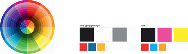
Finding the right color combinations to establish tone and attitude is essential. Color is the first visual component we perceive and can be the most memorable (based on Gestalt cognitive theory!).
Certain color palettes can reference a specific genre or visual system. Color can be associated with a specific time, place, or culture. Think about the vibrant colors associated with 1970’s punk verses the more formal palette of the Swiss Typographic style. Sometimes, it's only one or two colors that really capture the spirit of a genre, style, or time period. Consider if historic or contemporary color trends and styles make sense for your work.
You may decide to work with images or illustrations that include a multitude of colors. That's fine, but at some point you'll at least need to think about choosing a few specific colors for the typography and graphical elements. Aspects of your color palette should continue into the interior page design of your book in order to provide continuity throughout. A specific color palette can also be effective in order to unite other pieces of your comprehensive portfolio, such as a website, resume, and perhaps even a business card or promotional piece.
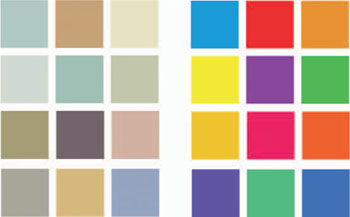
Note: Try the Color Guide palette in Adobe Illustrator for a variety of helpful color schemes and options, including tints/shades and split-compliments.
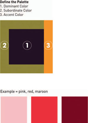
Color Palette: Dominant, Subordinate, Accent
A traditional color palette starts with three colors. In many cases two of the colors often harmonize with each other. This can be done by choosing colors that are near each other on the color wheel or by choosing colors with a similar tone (amount of gray). The third “accent” color is usually brighter and bolder. It is often used sparingly to call attention to important information and helps to establish a hierarchy of information.
Hue, Brightness, and Saturation
The perception of a color is greatly affected by its value and saturation; in planning a color combination, value and saturation are as important as hue.
- Saturation = intensity of color (hue). The saturation of a color is determined by the amount of gray added to it.
- Value = the lightness or darkness of a color. The value of a color is determined by its respective lightness or darkness.
Color that is more saturated tends to be described as bold, vivid, intense, clear, and rich. Color that is less saturated tends to be subtler and is often described as muted, neutral, timeless, and classic. Sepia tones are a good example of less saturated color.
Note: Be careful with very saturated colors. They are often “out of gamut” and cannot be printed accurately.
To create more neutral colors:
Shade = Add black to darken a color.
Tint = Add white to lighten a color.
Tone = Add gray to mute a color tone.
Web links:
Symbolic and Emotional
Color, more than any other visual property, tends to evoke the most visceral and immediate emotional reaction. It can be used to create symbolic meaning or reference a specific genre or style. Our psychological and emotional reactions to color may be based on cultural connotations or personal experience. Whatever the reason, color is an important aspect of establishing a mood and context to your work. It's important to know how certain color combinations will affect these reactions.
- Symbolism and context: Take red, for example. It can mean blood, stop, anger, or love—all very different meanings. One must look at its context in relationship to other colors, images, symbols, and text in order to understand its symbolic meaning.
- Cultural color combinations are more locally understood: For example, red, white, and blue can symbolize the United States to Americans or the United Kingdom to the British. Black is often associated with death, however, in parts of China and Japan, white is traditionally associated with death.
- Universal colors: These are more globally understood. For example, green is typically symbolic of the environment (although in the United States it can symbolize money as well).
- Functional color: Use color to establish visual emphasis and hierarchy.
- Color as brand: Such as McDonald's yellow and red combo, IBM's blue, UPS's brown, or Coca-Cola's red and white combo.
Need Help: Three Different Strategies
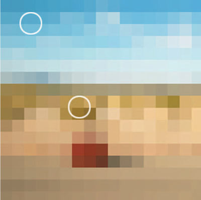
1. If you are using a specific image as a main element in your design, pull a dominant color from the image itself and build your palette around that. In Adobe Photoshop, go to Filter > Mosaic to pixelate the image and getter a better sense of the dominant colors.
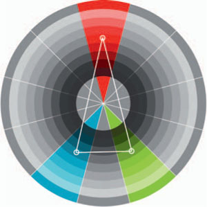
2. Split complimentary—a set of three colors forming a triangle on the color wheel. One color is coupled with a pair of colors adjacent to its compliment (usually the accent color). Work with the interrelationships (commonalities and variation) between hue, intensity, and value to develop a color palette that has strong visual contrast, but doesn't compete with too much tension.
3. Add a bit of gray to move away from more typical “crayon” colors. Work with color tone—matching the tone of two colors will help to relate them. Neutral tones often make for good background colors. They work well to accentuate bolder hues. In addition, earth tones such as brown, tan, and olive can also be used to make colors more neutral.
IMAGES & ICONOGRAPHY
Images and Iconography
Imagery and Visual References
When visual elements are used within a cover design they can function solely as formal devices designed to move the eye, and structure the composition. In this case visual elements may not have been intended to convey a specific meaning, but may reflect a style or visual approach. A visual, whether it is a photographic image or illustration, can be used to more concisely reflect your brand and contribute to your visual identity. There are many approaches to including visual elements and imagery that build meaning and references into your cover design. Beyond logos and known symbols, visual references and relationships between visual elements can come together to create a reading within the composition. With an understanding of how visual information can build meaning, a good design can be strengthened by informing it through thoughtful combinations of visual elements.
Look and Feel
The most fundamental method to build a characteristic reference or quality that will support your visual concept is through stylistic references. The incorporation of a visual style that is identifiable is one method of bringing visual character to your work. This can be done through formal elements that are associated with the particular style or the stylistic elements of a known movement in art.
Appropriation and Visual References
A very common practice today, appropriation has been fostered by the flexibility of digital information and imagery. It is a simple matter now to scan, photograph, and place visual material from any number of sources. The concept of appropriation is a grab-bag term to refer to any kind of repurposing and recontextualizing of photographs, stylistic elements, logos, and historical or culturally significant visuals. The essence of appropriation is the application and use of an image, or visual in its entirety, wherein the original reference or context is clearly recognizable and creates an association or identification. An appropriation can be an end unto itself, presenting you as a creative who taps into a broad and varied palette of ideas.
Web links (copyright and fair use):
- Editorial Photographers (EP) Resources: http://www.editorialphoto.com/copyright/
- U.S. Copyright Office: http://www.copyright.gov/
- AIGA Center for Practice Management: http://cpm.aiga.org/legal_issues/copyright-basics-for-graphic-designers
- Fair Use: http://en.wikipedia.org/wiki/Fair_use
Note about Copyright and Appropriation
Appropriated imagery has been a part of visual works from artists dating back to the early 20th century. Shepard Fairey is an example of a contemporary artist whose work incorporates appropriated material. For different reasons his work has sparked controversy among the public and artist's alike. General questions of copyright violation have been raised with regard to Fairey's use of images and artwork from a variety of movements and eras. Artists, critics, and the public have raised questions about the merits of works that rely so heavily on appropriated source material, and legal ramifications of pushing the envelope of fair use. Ultimately, his use of imagery is subject to both legal and aesthetic interpretation and the judgments vary greatly. He has to date been taken to court for copyright violations, but he has not been found guilty of violating any held copyrights or required to pay penalties. In an ironic twist, Fairey has also used legal means to protect his copyright and prevent others from appropriating his work.
The bottom line: One cannot sidestep copyright and ownership in appropriating materials. While styles and characteristics can be used and referenced, the appropriation of entire works that are not in the public domain, such as trademarks and copyrighted images, is illegal, and you can be subject to lawsuits and financial penalties. While certain kinds of uses, such as parody and satire, are allowed under fair use definitions, you need to understand the degree to which your use of an original work is legal or not. It would not reflect well on you as a professional if a potential client were to recognize a copyright violation in your materials.
Understanding Copyright Law: Basics and Resources
You should assume that any creative work is copyright protected. This would include images, trademarks, designs, written words, music, and so forth. Unless the work is in the public domain (and you must be certain that it is), someone owns the copyright. It doesn't have to be registered with the U.S. copyright office to fall under the protection of copyright law. Further, within a copyright protected work, other original elements are also protected. For example, you may own an image within which there is a logo for a particular retail business. Your copyright doesn't extend to the logo of that particular business. It is protected as well, and would require an agreement, or at least a release to be included in your work. This would also apply to individuals represented within your work, even private property.
Another issue is creating new works, while using other original works. If you are incorporating an original image in a new work, it must be different enough with respect to the original, or you must have transformed the original enough for it to not be recognizable (created a “transformative work”). This can fall into gray areas and the best policy is to avoid violating someone else's rights over any particular work.
There are many different aspects to copyright in relation to works that are for commercial purposes: works of fine artists, works of criticism and commentary, or works of satire, to name a few. This is a complex issue that has grown in complexity with the expansion of digitized resources, music, and materials. There are numerous and varied terms for copyright, and if in doubt, you can find many resources to assist you.
KRISTINA MANSOUR, STUDENT SENIOR THESIS, Endicott College.
Tip: Signs and symbols function most effectively as simplified reduced forms. By eliminating detail and reducing forms to basic elements, images and visuals can read more broadly.
Iconography
Iconography, in a nutshell, is the interpretation of signs and symbols in works of art. Traditionally, art historians have studied iconography to interpret the meaning and intent of historically significant works that reflect religious liturgy and incorporate symbols. The examination of iconography as applied to contemporary forms such as film and media involves interpreting images through the recognizable references within them. While this is fairly well established, it is not necessarily a uniform practice.
Attention to iconography and the allusions and associations to time, historical periods, styles, movements in design or art, as well as cultures or systems of information, can bring meaning to a work or design. Generally, visual icons are rooted in a culture or context and have clear, understandable associations. This differs from appropriation, in that appropriated visuals retain a direct relationship to their origin, whereas iconographic visuals tend to be general and have broader references that aren't necessarily rooted in one particular use or context.
Using Iconography versus Visual Icons
It is important to be able to make some distinctions between culturally determined visual icons, which are commonly understood symbols and signs, and the broader use of iconography. Commonly understood signs and symbols can be religious, part of corporate culture, or even linked to particular cohorts or communities.
For example, Christian crosses and the Star of David are religious icons. Flags and peace signs are icons rooted in a movement, or culture. Iconic images can be established through historical circumstances. The image of the Twin Towers in New York will forever be an iconographic reference to the tragedy of the September 11, 2001-terrorist attacks. The historical image of Uncle Sam is now an icon that has transformed. Originally linked with patriotism and service during World War II, it has a broad reference that can read as the paternal figure of “government.” Numerous artists (Seymour Chwast and Micah Wright) have since used the image of Uncle Sam as shorthand for government when making a critical work that attempts to challenge or skewer government authority. Your use of iconography can be far reaching. Some examples that can be a reference include: cultures (Americana, British aristocracy, online networks), industries (medicine, automobile), processes (science, law), or time periods (Victorian era, the 1950s). The use of particular visual references in order to build an idea or association can work toward informing your visual identity or creating a specific association regarding your work.
A good example of the use of iconography to create a set of references that inform the presentation of the material is found in the website of photographer Naomi Harris (http://www.naomiharris.com). The visual elements are not directly linked to a particular origin, as in appropriation, nor are they specific visual icons connected to a particular culture or system. In this website the iconography is general. The look and feel, as well as the particular visual elements, create a reference to a period of time and a broader category of style, which could be loosely defined as “kitsch” from the 1960s and 1970s. Harris uses a collection of objects as visual elements for navigation that create the kitschy appearance and recall the family room, basement den, or recreation room. This reference to the particular era is reinforced by the visual of a slide projector and screen as the interface of viewing her portfolio, which recalls family vacation slideshows. All of this broadly places her look and feel in a period of time and gives her a quirky, playful visual identity.
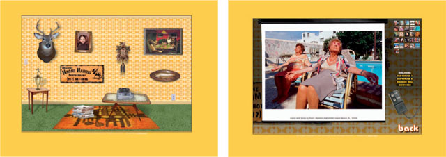
NAOMI HARRIS, WEBSITE, New York, NY.
Q & A: Interview with Naomi Harris, Photographer
What did you find that was lacking in websites that you had seen that led you to the concept for your website?
I found that many sites lacked originality or were based on a model where they would merely place their own photos on a predesigned site. I'm not opposed to simplicity but I'm not impressed by indistinguishable sites. One should take a little time out to figure out how to make themselves stand out and what it is they are trying to say about themselves and their work that makes them unique, and apply that to their web design. In this day and age of everyone having a website and everyone being familiar with how to navigate through them it's even more important to stand out and be original. I also hate websites that are difficult to navigate. Weird scroll bars, things that bounce around, buttons not staying stationary from one page to another really tick me off and often cause me to quit the site entirely. I imagine I'm not alone in that way of thinking.
You feel that websites need to convey something about the person as well as present the work so the potential client (or viewer) has a sense of who you are. What have you included in your website to make it more personable or characteristic of who you are?
I really dug the concept of making a rec room with all of the components working in order to show the slideshows, tell of my accomplishments, as well as a bio and how to contact me. It took some time to make it work and I did have to pay a designer to create it for me, but in the long run I'm very pleased with it. It completely reflects my sense of aesthetic and humor, and I hope people respond to that before even seeing the photos.
I decided to use a photo of myself at age six to be the intro to my bio and what I decided to share about myself. I wanted to have some seriousness but also a playful side. Yeah I'm a professional but I'm also not afraid to poke a little fun at myself and make myself more approachable. Including little bits of trivia that has nothing to do with photography sheds light on what I'm like as an individual (like being bitten by a monkey as a child).
You have a very fun website with great visual character. Did you have any concerns about visually competing with your photographs, and what did you do to address that in the way they are presented in your website?
While the home page is chockablock with different things, each representing a different section of the website, I didn't want it to be difficult for the viewer to navigate. That's why a white bold ring pops up around the icon with the name of what you would be searching through (bio, awards, news, contact, slideshow …). Once you do click on one of these icons the page zooms into the info so as not to distract the viewer from what it is they are looking at. I also have a back button in the same spot on each page so one can return to the homepage easily and quickly.
I was concerned that with a busy background it might be difficult to actually look at the photos, the real reason for having a website. And to solve that problem I have a screen roll down and the rest of the page goes into darkness just like a real slideshow we had to endure as kids in our family's rec rooms.
What has the response been to your website and the “kitschy den” look and feel?
Most tell me how fun and original the site is. No bad responses as of yet!
AISLING MULLEN, STUDENT PROMOTIONAL, Endicott College.
Denotative and Connotative Meaning
The use of imagery to denote or connote meaning or ideas is an effective and well-known practice. While this isn't a separate aspect of image use, nor a subset, denotation and connotation have a direct relationship to iconography, references, symbolism, and visual metaphor. Denotative and connotative associations are descriptive of how iconography can function and generate meaning.
When imagery is a direct reflection of your intended idea it is denotative. In this example [above left], a photographer's inclusion of the film packaging in the cover design has a direct relationship to the work of that individual. Using the appearance and style of a particular photographic film packaging is denotative of photography in general. If the viewer is knowledgeable, he or she will recognize this reference to a particular film system.
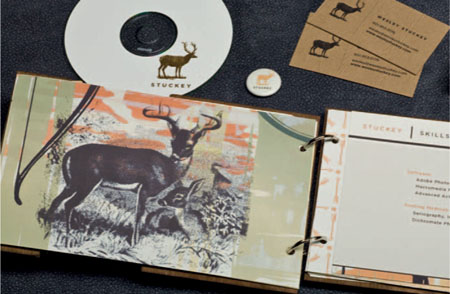
WESLEY STUCKEY, STUDENT PORTFOLIO, Mississippi State University.
The uses of rustic themes and images of deer [above right] do not carry literal meaning as much as connote a theme that has associations to hunting and backwoods cabins. While the overall effect is a result of the general iconography and appearance of the visuals, the deer or buck connotes hunting and backwoods life.
CHRISTINA MANSOUR, Endicott College.
Connotative meaning is a secondary reference, wherein the association that results from what is presented or portrayed is the intention. In the examples at left a known visual icon is transformed. One association is transformed to create another entirely different or more pointed association. In both cases, the meaning is not literally represented (denoted) but through the manipulation of imagery builds an association (a connotation).
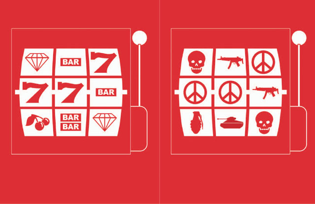
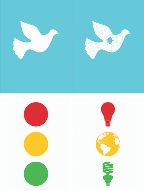
In this student thesis project, the meaning of known signs and symbols is investigated with the intention of bringing a new reading or particular context to the symbol. These symbols are well understood within the vocabulary of signs in western culture. The meaning of the symbol is changed by using the known reading and making deliberate alterations to it. In this example the visual image is a dove, which has a well-established connotation of peace. The connotation is transformed by the overlay of puzzle pieces on the symbol. The known meaning of the symbol is altered to reveal a broader idea: Peace as a puzzle to be “pieced” back together.
This example exploits the known meaning of the three colors presented in a stack: a stoplight, which in this configuration reads as red (stop), yellow (caution), and green (go). The stoplight structure and color is altered with the inclusion of images that refer to lighting and the earth. Seen in relation to each other, the lighting images and the earth direct the viewer to a reference about global warming. Taken further, and placed into the context of the stoplight, the entire image presents a connotative reading that speaks to the problem of global warming and suggests a direction solution.
Building Visual Texts
Extending the relationships between images can be achieved through a reading of images or a visual text. Meaning is formed additively, wherein the denoted meaning of the imagery, or allusions and associations within the imagery, as well as stylistic or formal elements combine to suggest the larger whole; the “reading” of references and content found within the whole image builds to a particular idea or set of associations.
These combinations of discreet images need to be thought through in order to be sure that the viewer's reading is directed in the intended way. Essentially, this is an outcome of image relationships, and can be found in multiple image pieces such as compound images (see example p. 114). Depending on the cover design, the imagery can be structured and ordered in a number of different ways. A grid structure can invite reading between images, and the proportions of this grid and placement of the images will effect the direction of the reading. Linear placement can be expected to follow the conventions of reading a western text. Left to right and top to bottom reading is often the default starting point for a viewer.
In this image (at right) documents and photographs are combined to create a reading that references history, personal experience, and systems of identity. The use of photographic imagery identifies the content as derived from real events and experiences. A defective snapshot reads as a personal image, while documents and forms, with their dates, add another layer of authenticity. Finally, the handwritten text adds individual character, and the aged appearance of the images through their vintage color and tone creates a reading that speaks of the past.
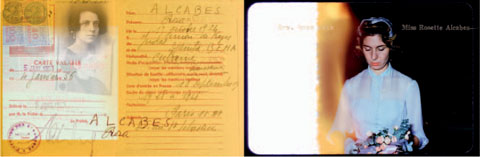
LARRY VOLK, from A Story of Roses.
Another form of combined imagery and visual elements in a contiguous space falls under the rough category of photo collage, montage, or image compositing. This is a common practice in which elements of appropriation and iconographic references are used to build meaning. Collage as a practice differs from montage in that the work is physically combined (typically glued) to create the image, and the material aspects of the work are as much of the reading as the combined whole itself. Montage is a seamless process and the visual whole is the emphasis. Photo montage has a long history within visual arts practice. Jerry Uelsmann is one of the most well-known pioneers of the seamless photo montage perfected in the darkroom. Currently, digital processes makes it fairly simple to create a seamless whole. Within a composite/montage or collage the viewer's reading of relationships between images and elements can be directed through common techniques that can include hierarchy, visual weight, contrast, and juxtaposition to name a few.
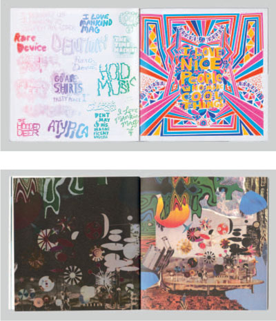
WILL BRYANT, STUDENT PORTFOLIO, Austin, TX.
In this example, Will Bryant combines a variety of styles and materials within the space of individual pages. The result has the reference and feel of collage, but digitally generated elements are integrated as well. As an illustrator, it reflects methodologies, style, as well as the ability to work more freely with an open page.
Building Imagery: Illustration versus Photographic Imagery
Digital systems along with traditional methods of image production allow artists incredibly broad-range approaches to create imagery, in some cases combining and converging these media. As a result, it is important to note the distinctions in reading such images.
A photographically based image carries its message quite differently than an illustration that has been hand drawn or digitally generated. Each method or system of image creation has a distinct reading and this effects the viewer's perception and understanding of the images. Photographs have a reference or index to an existing real object or scene, and as viewers we take the image to be real or derived from the real world. Viewers of an illustrated or drawn image enter the point of view of the artist in a different way because they suspend their disbelief, knowing this is an individual's creation.
Throughout his career, Andy Warhol deliberately used halftone images to reference media-based imagery. In addition, he chose to use materials of mass image production, such as silkscreen. Through these image and material choices he reinforced a reference to mass systems of imagery, reinforcing the pop art motifs and conceits.
In the following references, one finds distinctly different types of imagery being used for distinctly different ends. Barcinski & Jeanjean (pg 68, left) rely on photographic images to create a specific visual experience for their website. The rotating panoramic images and the hovering papers linking to specific projects in their portfolio are part of a visual whole. The photographic pictorial space and the effects of optically produced images create a reading that not only gives a perceptual experience of real space, but is reinforced by our knowledge that these images were derived from real space.
By contrast, Yvette Mohan (pg 68, right) uses hand-drawn illustrations in the home page and interface of her website. In this case, the marks, lines, and irregular nature of work produced by hand creates a reading that at minimum suggests that this work is unique and that of an individual. Further, the particular words and illustrations, through their quality, placement, and treatment, read as energetic, active, and free. In essence, one can interpret from a stylistic perspective that these suggest something about the personality and creativity of Yvette Mohan. The character of the marking reads iconographically as the “individualistic, personal, unique.” By contrast, once one explores the examples of work within the website, you find very polished, professional design. The website and its hand-drawn elements and interface allow for a more personal and dynamic expression.
BARCINSKI & JEANJEAN, Amsterdam, The Netherlands.
We realized that by shooting the photo footage in stereo, using two identical cameras, and by modifying the 3D rendering engine we could generate interactive 3D scenes to be viewed with 3D glasses. That got us really excited.
The subject for the website, a panorama of us standing on a picturesque bridge in the heart of Amsterdam with our portfolio cases as paper flyers suspended in the air around us, came quite naturally and wasn't thought out at all. But somehow it perfectly suits what we want to tell about ourselves and our work. Barcinski & Jeanjean is us two, so you immediately see who you will be dealing with.
– BARCINSKI & JEANJEAN
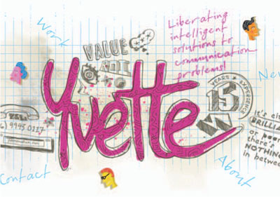
YVETTE MAHON, Sydney, Australia.
The site was initiated by doodling ideas on scraps of paper that would identify what makes my work different from many other creative directors pitching their skills to potential employers. My objective was to illustrate to my target audience that my work originates from creating original great ideas, even if the idea is just a doodle on a napkin.
With this in mind, I commissioned an illustrator and Flash developer to produce the entire visual aspect of my portfolio site using doodles, which helped us develop a unique and exciting visual language for this project that perfectly illustrated a basic truth that I strive to instill in my work: True creativity stems from original thought developed through years of artistic observation and professional practice.
– YVETTE MAHON
Some compositions are more organized and structured. These can be referred to as “clean and clear.” Such a composition may utilize a grid structure to subdivide the space evenly and organize visual elements so that they are aligned to each other and proportionally spaced apart. Other compositions are freer, or even more “chaotic,” expressing a more dynamic energy and bold playfulness. There are, of course, compositions that communicate a little of both—it's not necessarily one or the other, but a continuum of choices. Perhaps one element breaks out of a grid structure and is thus itself a more expressive focal point. Compositions can also be symmetrical or asymmetrical, straight up and down or on an angle. Experiment with the possibilities.
Hierarchy
Use hierarchy to develop visual weight and balance to focus attention. All elements within a composition should interact with each other—they should feel like independent parts that are united within a larger whole—and some should be more dominant than others. Don't forget about the back of the book either: Design your cover as a spread, considering both the front and back at the same time.
Negative Space
Activate not only the positive space, but also the negative space in your composition. In most cases, in order to create a visually compelling composition you need to do more than just put an image in the center of the page. Work to activate the compositional space by cropping visual elements and utilizing scale, depth, and angle. Work on your composition so that it isn't static. Remember: Your design should be engaging and interesting to look at. If you get stuck, try subdividing the space or cropping a visual element. Use the space, don't just plop something down and forget about it.
Size and Proportion
Consider the design and usability of your portfolio book. Ask yourself if the size, orientation, and proportion could change when you work out the interior layout of the book. Remember that your work is the most important part of your portfolio and should be visually supported by the book's design. Try some example spreads now to see if this will be an issue.
Consider if a size or aspect ratio out of the ordinary would make a stronger and more memorable impact on your audience. However, you need to keep in mind the manner in which you intend to use and distribute your portfolio. Nonstandard design sizes can create additional costs for printing, construction, and shipping. For example, if you want to be able to mail your portfolio you should consider a slightly smaller, more standard size so as not to incur additional shipping costs. Such considerations present a challenge, but can also yield some interesting, inventive solutions.
Always print your design out to get an accurate feel for the physical size of the piece and manner in which the elements are reading!
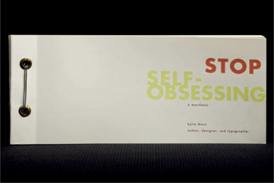
KYLIE THORN, STUDENT PROMOTIONAL BOOK, Ohio University.
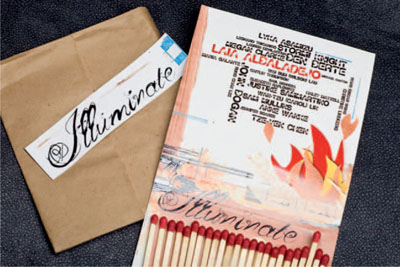
LAIA ALBALADEJO, STUDENT PROMOTIONAL, Suffolk University.
Overview
Depending on your expertise in this area and the visual style of your cover design, you may want to push your use of typography or just keep it simple. Keep in mind that different typefaces say different things. Each genre of typeface has certain qualities associated with it. For example, there are sans-serif typefaces that are described as “modern” and “clean” (Univers, Futura, Helvetica Neue), and also serif typefaces that are described as “classic” and have more visual contrast to them (Bodoni, Garamound, Caslon). Sans-serif typefaces are usually great for short lines of text (titles, subtitles), while serif typefaces work best for longer paragraphs. There are also decorative typefaces to consider (distorted, techno, handwritten). These are often used in a limited fashion to call attention to a word or line of copy. They are also typically a bit more difficult to read and need to appear larger in scale.
As most designers know, there are times when type is not just part of the design, but the design itself. In this way typography can be the focus of your cover design or integrated into the composition with other visual elements. It could be used concretely as purely a visual component, like texture. In such cases, one is less concerned with readability and more concerned with how the type functions as part of the composition's overall “look and feel.” On the other hand, you may very well decide to use type more pragmatically for informational purposes (like to state your name or the title of the book). Lastly, you may even decide to leave type out of the cover design entirely.
Words of Advice
- Decorative typefaces are not easy to read and typically need to be larger.
- If you're stuck, experiment with type, looking to different genres or people for inspiration. For example, David Carsons’ typographic treatment is fairly notorious—fractured, flipped, pushed off the page, inverted, distorted, cut up, mix-matched, etc. (Of course, you need to make sure that the style you are referencing still reflects your brand statement.)
- Consider not only the positive, but also the negative space of letterforms.
- Use a typeface that is a little less ordinary. Don't just use one of the standard Microsoft typefaces, like Papyrus, just because you can't think of anything.
- Take a look at concrete type, using type as a visual element within the composition.
- Consider tone of voice by utilizing properties such as scale, color, bold, italic, and the style of typeface. Consider how typography can help give life to your message.
- Consider phrasing—think about the value of space in between letters (kerning) and lines of text (leading).
For the Designer
Nothing says both inexperienced and careless more than poor basic type skills. Don't forget to pay attention to:
- Kerning
- Leading
- The typographic rag
Tips
1. Perhaps there are typefaces associated with a particular visual genre that has influenced your brand. For example, the sleek and jazzy art deco typefaces of the early 20th century are quite distinctive with their stylized, geometric shapes and graceful lines. You should explore the kind of typeface that fits best with the brand style you are trying to communicate.
2. Check out type foundries online to browse through a large collection of typefaces.
3. Look around—books, signs, product packaging, clothing.
Web link: http://www.myfonts.com/WhatTheFont/.
Copy
It's not just what you say, but how you say it. Although you may be more visually than verbally minded, a significant component of a concept and/or brand identity is the copy associated with it. Copy can be an integral part of a design concept. It can take the form of a title, a tagline, or simply a more clever and creative way to refer to a piece of work. By using less typical words or phrases, you can be sure to make your portfolio that much more memorable. In this brainstorming phase, think about how you may want to refer to your portfolio. This process may even help you come up with an overall idea about how to proceed.
Consider:
- Writing with attitude as part of the brand. Consider your tone.
- Providing real information—making what you say meaningful and relevant to your target audience.
- Acknowledging that copy is an important aspect of design. Typical design and advertising agencies pair a designer with a copywriter as part of one integrated team.
- Being concise, relevant, and memorable (in a positive way).
- Trying to avoid the same old, bland, vague language.
- Being careful of using obvious clichés. While it's okay to start with a cliché as a means to spark an idea, make sure you work on taking it to the next level by coming up with your own unique twist.
VISUAL TECHNIQUES
Note: George's postcard series (right) reference the iconic visual simplicity of Saul Bass and Paul Rand. It's also an example of some great copy, which drove the concept for this self-promotional piece. George's portfolio book was then designed in a similar style.
Visual References
There are many visual processes and techniques that have references to art history and the broader cultural history that is part of our visual lexicon. These can be employed to inform the look and feel of your visual identity and make associations to certain ideas and themes. For example, one could use a photomontage and typographic technique that references the Dadaists and their sarcastically charged works-aimed to rebel against conformity and mock tradition.
Dada propagated a distinctive collage, montage, and typographic style that has been borrowed by less politically committed designers, then and now. Today the Dada style, as reflected in Punk and Neo-Expressionist design, is an effective code for conveying the tempests of contemporary youth.2
– STEVEN HELLER
As referenced in an earlier exercise, look to history, current trends, and your own work as inspiration. The key is to make your approach support the intention for your brand. Think about which references are important to utilize in order to communicate your concept and message.
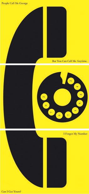
GEORGE GRAVES, STUDENT PROMOTIONAL, Endicott College.
Visual Properties and Techniques
In order to develop a more defined and unique visual statement you will need to do a lot more than just put an image down in the center of a composition. You will need to create a cover design that has style and communicates your brand in a manner that is both innovative and meaningful. Your “look and feel” should be created and defined through the emphasis of certain visual properties and the application of specific visual techniques.
Making Something New and Unique
Take this opportunity to make something new and unique. Don't just repurpose a work that is already in your portfolio and use it as the cover design. Instead, develop a design that works best for this specific design problem. Think about all of the visual properties you have to work with. Perhaps you will choose to be concerned with aspects of scale. Or perhaps color, texture, or shape. Perhaps you will focus on the balance of all three. Your visuals may tend to be more detailed in nature in order to make specific references, or more abstract and simplified, referencing broader more universal themes. You may choose to consider aspects of dimension, direction, or motion. You may decide to extrapolate aspects from a previously designed piece or pieces in order to arrive at a new solution. Perhaps there is even an approach that you have employed in a particular project that you can now carry over into this portfolio design.
Experiment
As a visual artist you should experiment with a variety of visual techniques in order to help characterize the meaning of your visual identity and concept. As tools in the visual communications process, each technique carries certain associations that can help express a visual tone or message. There are many diverse techniques and each one can be applied subtly or more dramatically, alone or in combination, depending on the desired aesthetic. However you determine—through techniques like variation, distortion, montage, simplicity, exaggeration, repetition, juxtaposition, intricacy, and fragmentation—you can continue to define and support your desired visual message.
Through the emphasis of some visual properties over others and the manipulation of those properties through various techniques you have the means to create many unique solutions. By working through the visual process you will find the one solution that works best for you.
Caution: Often Less Is More
Don't throw everything but the kitchen sink into this design. You need to make informed decisions about the visual properties and techniques you will utilize. Making decisions means deciding what to use and what not to use. The use of too many techniques will water down your visual voice and design style, and obliterate any associated meaning. If you are struggling because you have more than one specialty area, consider creating multiple books (one for each area), instead of trying to merge multiple references together.
Important Notes
You should use all your own original imagery in your design. If possible, don't rely on any stock or web imagery. If you do use stock imagery, make sure you buy the rights to use it.
Sketch, sketch, sketch!
Revisit the cover design after the interior page layout is determined – changes to size, proportion, etc. may need to be made.
As always, make sure you play with silly ideas on paper too, they get the creative juice flowing.3
– FERNANDO LINS, Art Director and Interface Designer