
Chapter 12. Light
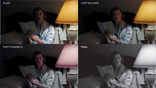
Image courtesy of 4charros
There are two kinds of light: the glow that illuminates and the glare that obscures.
–James Thurber
Light is the most complex phenomenon for a compositor to understand. By “understand” I mean not only scientifically but intuitively, like a painter or cinematographer.
The world of the compositor is less pure and scientific than other areas of digital production, which rely on elaborate models to simulate the way light works in the physical world. Like a painter, you observe the play of light in the three-dimensional world to re-create it two-dimensionally. Like a cinematographer, you succeed with a feeling for how lighting and color decisions affect the beauty and drama of a scene, and how the camera gathers them.
Several chapters in this book touch upon principles of the behavior of light. Chapter 5, “Color Correction,” was about the bread and butter work of the compositor, matching brightness and color of a foreground and background. Chapter 9, “The Camera and Optics,” was all about how the world looks through a lens. Chapter 11, “32 Bit HDR Compositing and Color Management,” explored less straightforward ways in which After Effects can re-create the way color and light values behave.
This chapter is dedicated to practical situations involving light that you as a compositor must re-create. It’s important to distinguish lighting conditions you can easily emulate and those that are essentially out of bounds—although, for a compositor with a good eye and patience, the seemingly “impossible” becomes a welcome challenge and a favorite war story.
Source and Direction
In many scenes, however, there is clearly more involved with light than matching brightness and contrast channel per channel. Light direction is one fundamental factor, especially where the quality of the light is hard (direct) rather than soft (diffuse).
Such a huge variety of light situations are possible in a shot, and in an infinite array of combinations, that it becomes difficult to make any broad statements stand up about lighting. This section, however, tries to pin down some general guidelines and workflows for manipulating the light situation of your scene.
Location and Quality
You may have specific information about the lighting conditions that existed when your plate footage was shot. On a set, you can easily enough identify the placement and type of each light; this information is contained to some extent in a camera report also. If the source shot was taken only with natural lighting, you only need determine the position of the sun relative to the camera (Figure 12.1).
Figure 12.1. Sometimes light direction and quality is plainly evident, sometimes ethereally mysterious.
Sometimes the location and direction of light is readily apparent, but not as often as you might think. Hard, direct light casts clear shadows and raises contrast, and soft, diffuse light lowers contrast and casts soft shadows (if visible at all). That much seems clear enough.
These, however, are broad stereotypes, which do not always behave as expected in the real world. Hard light aimed directly at a subject from the same direction as the camera actually flattens out detail, effectively decreasing contrast. And artificial lighting usually involves more than one light source, diffusing hard shadows (Figure 12.2).
Figure 12.2. Multiple lights create unpredictable overlapping light and shadow areas. (Image courtesy Pixel Corps.)
Neutralize Direction and Hotspots
When the direction or diffusion of light on a foreground element doesn’t match the target background environment, that’s potentially a big problem. The solution is generally to neutralize the mismatch by isolating and minimizing it, rather than actually trying to fix the discrepancy by attempting to simulate relighting the element in 2D.
Every shot in the world has unique light characteristics, but a couple of overall strategies apply. Assuming you’ve considered the simple solutions such as flopping the shot (where lighting is off by 180 degrees), you can
• Isolate and remove directional clues around the element, such as cast shadows (typically by matting or rotoscoping them out).
• Isolate and reduce contrast of highlights and shadows in the element itself, typically with a Levels or Curves adjustment (potentially aided by a luma matte, described below).
• Specifically invert the highlights and shadows with a counter-gradient.
The simple way to undo evidence of too strong a key light in a scene is to create a counter-gradient as a track matte for an adjustment layer; a Levels or Curves effect on this layer affects the image proportionally to this gradient. The Ramp effect can be set and even animated to the position of a key light hotspot (Figure 12.3).
Figure 12.3. A counter-gradient is created with the Ramp effect on a solid, which in this case has been repositioned in 3D space to match the hot spot on the floor. This is then used as a track matte for an adjustment layer that lowers the brightness and contrast in the hotspot region.
A radial ramp is merely linear, which is not the correct model for light falloff. Light’s intensity diminishes proportionally to its distance from the source squared, according to the inverse square law. An object positioned twice as far from a single light source is illuminated by one-quarter the amount of light. To mimic this with a gradient, precomp it, duplicate the radial gradient layer, and set the upper of the two layers to a Multiply blending mode (Figures 12.4a, b, and c).
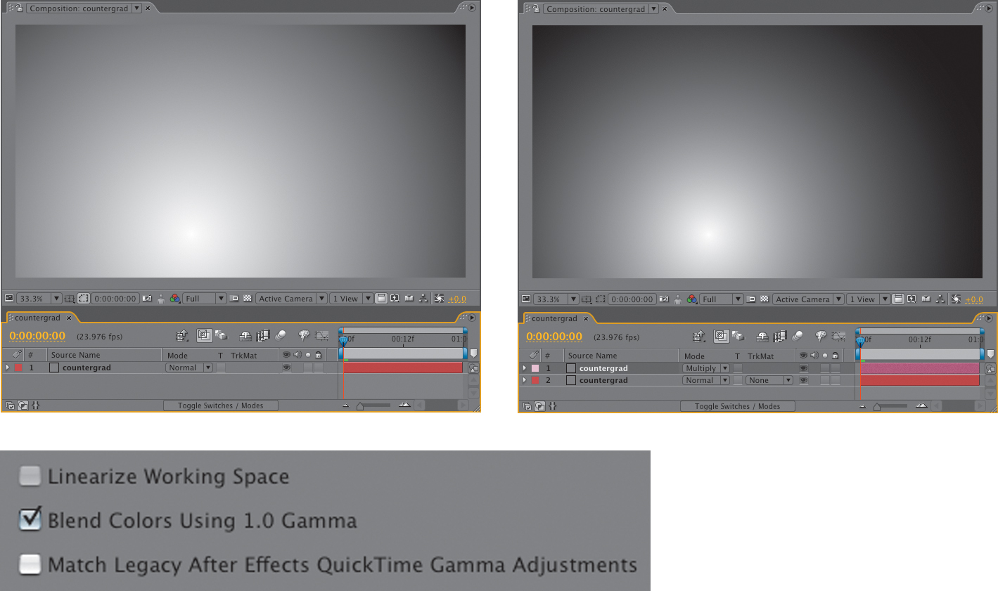
Figure 12.4a, b, and c. A simple gradient is linear (a), but light falls off in an inverse-square proportion, which can be re-created by multiplying a second gradient with linear blending enabled (b). Remember that, as explained in the previous chapter, in After Effects CS3 you can blend with a 1.0 gamma (giving you a precise inverse-square relationship) even without a linearized working space (c).
Color Looks
Have you ever seen unadjusted source clips or behind-the-scenes footage from a movie you consider visually compelling? It’s a great way to learn the bold and deliberate use of color in modern films. Look at the work prints included with a heavily color-corrected film—the magic more or less disappears.
In older films this transformation was often accomplished via physical elements such as lens filters or photochemical processes, such as the well-known bleach bypass method, but nowadays it tends to happen on such computer-driven systems as the DaVinci.
After Effects has a big advantage over a system like a DaVinci in that it is a true compositing system; the controls over image selection are much finer. The main disadvantage is that After Effects was not created solely with color timing in mind, so its principal color tools (as described in Chapter 5) are simpler and less interactive. Third-party solutions such as Colorista and Magic Bullet Looks, both from Red Giant, aim to bridge some of this gap.
Keeping in mind that your job as a compositor is to emulate the world as it looks when viewed with a camera, it can be effective to begin by emulating physical lens elements.
Use a Layer as a Lens Filter
Suppose a shot (or some portion of it) should simply be “warmer” or “cooler.” With only a camera and some film, you might accomplish this transformation by adding a lens filter. It could be a solid color (blue for cooler, amber to warm things up) or a gradient (amber to white to change only the color of a sky above the horizon).
Add a colored solid and set its blending mode to Color. Choose a color that is pleasing to your eye, with brightness and saturation well above 50%. Use blue or green for a cooler look, red or yellow for a warmer one (Figure 12.5).
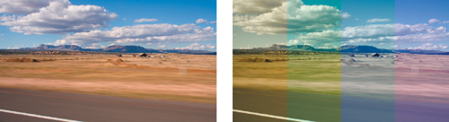
Figure 12.5. This saturated source image has four color filters applied to it as a test (you would normally choose just one to apply full frame, of course): yellow, green, blue/green, and blue. Linear blending is again enabled, so these solids applied with a Color blending mode behave a lot like lens filters of an equivalent color, but you control the opacity.
At 100%, this is the equivalent of a full-color tint of the image, which is too much. Dial Opacity down between 10% and 50%, seeking the threshold where the source colors remain discernable, filtered by the added color to set the look.
To re-create a graded filter, typically used to affect only the sky, apply the Ramp effect to the solid and change the Start Color to your tint color; an amber filter adds the look of a heavily smoggy urban day. This is best applied with an Add or Screen mode instead of Color because the default End Color, white, desaturates the lower part of the image. Sometimes, however, this might be just what you want.
The flag of Mars is a red, green, and blue tricolor selected by the Mars Society and flown into orbit by the Space Shuttle Discovery. Seriously. It bears no apparent resemblance to the one Marvin the Martian used to claim Planet X.
Black and White
When removing color from an element entirely, there is a huge difference between using the Hue/Saturation effect and the likely alternatives. Counter-intuitively, Hue/Saturation is typically not the best choice to create a black-and-white image, because it maintains luminance proportions, and as was mentioned in a sidebar back in Chapter 6, “Color Keying,” that’s not how the eye sees color. Figures 12.6a through c visually illustrate the difference.

Figure 12.6a through c. This Flag of Mars image (a) is made up of three fields of pure red, green, and blue. You can convert it to grayscale accurately with Tint (b), or a monochrome solid set to the blending mode Color (same result). Hue/Saturation (c) is mathematically correct but does not adjust for the perceptual differences in human color vision.
Even if converting an image to black and white is only an intermediate step, you’re best off doing so either using the Tint effect at the default settings or a fully desaturated solid (black, white, or gray, it doesn’t matter) with a Color blending mode. To really get the conversion right may involve adjusting or shifting color channels prior to the color-to-black-and-white conversion, as shown in the chapter opener images.
Hue/Saturation is great for more subtle saturation adjustments. Use it when you’re focused only on brightness and contrast (using Levels), and overall saturation is a little hot, making the element appear a little too juicy.
Day for Night
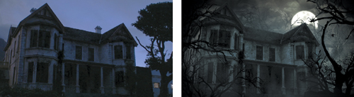
Stronger optical effects are even possible, such as making a daytime scene appear as if shot on a moonlit night. Known in French as la nuit américaine (and immortalized in Francois Truffaut’s ode to filmmaking of the same name), this involves a simple trick. Shoot an exterior scene under ordinary daylight with a dark blue lens filter to compensate for the difficulty of successful low light night shoots. If there is direct sunlight, it’s meant to read as moonlight.
Lighting techniques and film itself have improved since this was a common convention of films, particularly westerns, but digital cameras retain a low signal to noise ratio under low light, hence the Nightshot feature on many consumer video cameras.
Figure 12.7 shows the difference between a source image that is blue and desaturated and an actual night look; if instead you’re starting with a daylight image, look at the images on the book’s disc, which take the image more in that direction. Overall, remember that the eye cannot see color without light, so only areas that are perceived to be well illuminated should have a hue outside the range between deep blue and black.
(Images courtesy Mars Productions.)
Figure 12.7. An ordinary twilight shot of a house at dusk is converted to a spooky Halloween mansion. Note that the overall hue remains slightly blue, not monochrome, illuminated by its color opposite, a yellow moon. Other colors will not easily register in true low light, although this scene is much better lit than an actual moonlight shot would likely be if shot realistically.
Color Timing Effects
Digital tools can of course go far beyond what is possible with lens filters. The industry standard tools rely on a three-way color corrector, which allows you to tint the image in three basic luminance ranges, highlights, midtones, and shadows, adjusting each separately via wheels which control hue and brightness. Premiere Pro has such an effect, which is retained if you import a project from that application despite that there is no such actual plug-in native to After Effects.
Even many Premiere Pro editors eschew this effect, however, instead using Colorista, a relatively inexpensive Red Giant plug-in (Figure 12.8). This effect is a lot like adding three color solids instead of one, and it lets you emulate the complex color look that is all the rage these days: blue shadows, green midtones, and orange highlights, anyone?
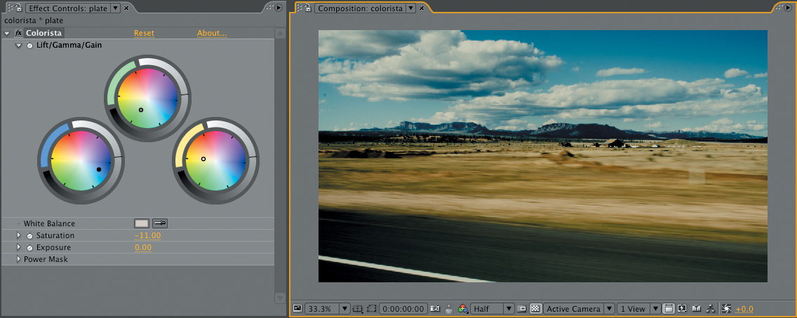
Figure 12.8. Colorista enables a subtle (or radical) mixture of individual Lift, Gamma, and Gain (low, medium, high) color wheel controls. The result uses Output Simulation to show how these changes will look on film (covered in the previous chapter).
If you don’t like the idea of adding a third-party plug-in to your workflow, there is even a free alternative wired to a Color Balance (HLS) effect included in The DV Rebel’s Guide (Stu Maschwitz, Peachpit Press) as RebelCC.
Source, Reflection, and Shadow
Scenes with strong prominent light sources are something of a gift to a compositor by offering a clear target. You can also make strong light choices confidently by referring to a shot that matches the target look. Either way, the message is simple: Use reference. You will be surprised how much bolder and more fascinating nature’s choices are than your own, especially if you are still building your skills (and aren’t we all continually doing that?).
You get the proverbial gold star for finding an unexpected surprise that works, and the play of light and shadow in the scene offers uniquely challenging and rewarding opportunities to do so. Such details can be the kiss of love, that something extra that nobody requested but everyone who is paying attention appreciates.
“Kiss of love” is a term Stu Maschwitz invented supervising Star Wars, Episode One: The Phantom Menace at Industrial Light + Magic. “I still use that term today,” he says. “It’s a great way to get an artist to think of a shot as theirs. Examples of kisses of love are reflections in things that might not strictly need it, aperture flares for lights leaving the frame (carefully matched to reference), or animating a starfighter pilot’s head to turn as he banks.”
Big, bold, daring choices about light can and should become almost invisible if they are appropriate to a scene, adding to the dramatic quality of the shot instead of merely showing off what you as an artist can do.
Backlighting and Light Wrap
The conditions of a backlit scene are a classic example where the compositor often does not go far enough to match what actually happens in the real world.
You can buy a light wrap plug-in for After Effects, but this is a case where “roll your own” works just as well, if not better.
This technique is designed for scenes that contain backlighting conditions and a foreground that, although it may be lit to match those conditions, lacks light wrapping around the edges (Figure 12.9).
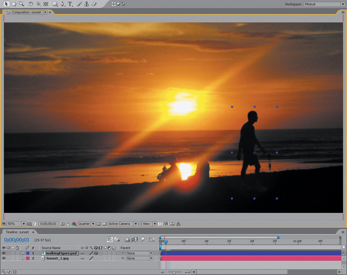
Figure 12.9. The silhouetted figure has been color corrected to match the scene, but lacks any of the light wrap clearly visible around the figures seated on the beach.
Set up a light wrap effect as follows:
1. Create a new composition that contains the background and foreground layers, exactly as they are positioned and animated in the master composition. You can do this simply by duplicating the master comp and renaming it something intuitive, such as Light Wrap. If the foreground or background consists of several layers, it will probably be simpler to precompose them into two layers, one each for the foreground and background.
2. Set Silhouette Alpha blending mode for the foreground layer, punching a hole in the background (Figure 12.10).
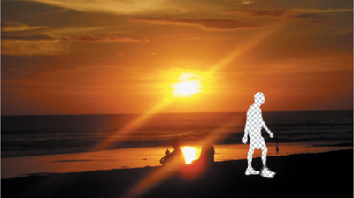
Figure 12.10. Using the alpha of the layer to which it’s applied, Silhouette Alpha punches a hole through that layer and all underlying layers.
3. Add an adjustment layer at the top, and apply Fast Blur.
4. In Fast Blur, check the Repeat Edge Pixels toggle on and crank up the blurriness (Figure 12.11).
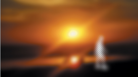
Figure 12.11. Heavy Fast Blur causes the background image color to bleed into the area of the underlying alpha channel.
5. Duplicate the foreground layer, move the copy to the top, and set its blending mode to Stencil Alpha, leaving a halo of background color that matches the shape of the foreground (Figure 12.12 on the next page). If the light source is not directly behind the subject, you can offset this layer to match, producing more light on the matching side.
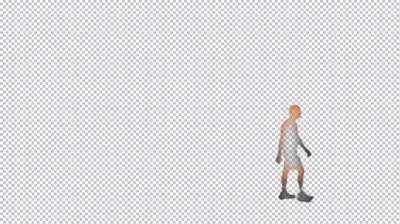
Figure 12.12. Stencil Alpha provides the inverse effect, preserving only the areas of the composition inside the alpha of the top layer to which it is applied. You have your light wrap.
6. Place the resulting comp in the master comp and adjust opacity (and optionally switch the blending mode to Add, Screen, or Lighten) until you have what you’re after. You may need to go back to the Light Wrap comp to further adjust the blur (Figure 12.13).
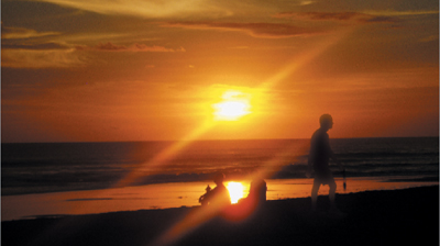
Figure 12.13. The addition of light wrap causes the figure to appear as part of the scene.
When there is no fill light on the foreground subject whatsoever, most cameras are incapable of picking up as much detail in the foreground as your eye might see. In your reference photo, an unlit foreground subject might appear completely silhouetted. Because the foreground subjects are often the stars of the scene, you might have to compensate, allowing enough light and detail in the foreground that the viewer can see facial expressions and other important dramatic detail.
In other words, this might be a case where your reference conflicts with what is needed for the story. Try to strike a balance, but remember, when the story loses, nobody wins.
Flares
For our purposes a “flare” is any direct light source that appears in shot, not just a cheesy 17-element lens flare whenever the sun pokes around the moon in some science fiction television show from the early 1990s. These don’t come for free in After Effects; 3D lights don’t even create a visible source if placed in shot until you add the Trapcode Lux effect (included on this book’s disc).
After Effects offers quite a few blur effects, but three are most common for general usage: Gaussian Blur, Fast Blur (which at best quality is no different but renders faster), and Box Blur, which can match the other two but offers more flexibility.
At the default Iterations setting (1), a Box Blur can seem crude and, well, boxy, but it can approximate the look of a defocused lens without all the more complex polygons of Lens Blur; you can also hold it out to the horizontal or vertical axis to create a nice motion blur approximation (where Directional Blur is actually too smooth and Gaussian).
Raising the Box Blur Iterations setting above 3 not only amplifies the blur but refines the blur kernel beyond anything the other two effects are capable of producing. What actually occurs is that the blur goes from a square appearance (suiting the name box blur) to a softer, rounder look. You’re more likely to notice the difference working with over-range bright values in 32 bit HDR.
Fast Blur and Box Blur also each include a Repeat Edge Pixels checkbox; enable this to avoid dark borders when blurring a full frame image. The same setting with these two effects will not, alas, produce the same amount of blur even if Box Blur is set to 3 iterations (to match Fast Blur).
Real lens flares are never cheesy: Our eyes accept them as natural, even beautiful artifacts without necessarily understanding anything about what actually causes them (Figures 12.14a, b, and c).
Figure 12.14a, b, and c. Figure 12.22a has no lens flare, when you might expect one; 12.22b has just the barest suggestion of a flare spiking out of the huge light source pouring in through the window, and 12.22c has a lens flare that is more natural but far less apparent than the flares you would get from the Lens Flare effect.
Therefore, to get lens flares or even simple glints right (not cheesy), good reference is often key. Only a tiny percentage of your viewers may know the difference between lens flares from a 50 mm prime and a 120 mm zoom lens, yet somehow, if you get it wrong, it reads as phony to a majority of viewers. Odd.
Prior to the 1970s-era of Easy Rider and moon shots, flares were regarded as errors on the part of the cinematographer, and shots containing them were carefully noted on the camera report and retaken.
Here are some things you should know about lens flares:
• They are consistent for a given lens. Their angles vary according to the position of the light, but not the shape or arrangement of the component flares.
• The big complex flares with lots of components are created by long zoom lenses with many internal lens elements. Wider prime lenses create simpler flares.
• Because they are caused within the lens, flares beyond the source appear superimposed over the image, even over objects in the foreground that partially block the source flare.
![]() Close-Up: What Causes a Lens Flare?
Close-Up: What Causes a Lens Flare?
Unlike your eye, which has only one very flexible lens, camera lenses are typically made up of a series of inflexible lens elements. These elements are coated to prevent light reflecting off of them under normal circumstances. Extreme amounts of light, however, are reflected somewhat by each element.
Zoom lenses contain many focusing elements and tend to generate a complex-looking flare with lots of individual reflections. Prime lenses generate fewer.
Several other factors besides the lens elements also contribute to the look of a flare. Aperture blades within the lens cause highly reflective corners that often result in streaks, the number of streaks corresponding to the number of blades. The shape of the flares sometimes corresponds to the shape of the aperture (a pentagon for a five-sided aperture, a hexagon for six). Dust and scratches on the lens also reflect light.
Finally, lens flares look very different depending on whether they were shot on film or video, the excess light bleeding out in different directions and patterns.
Moreover, not every bright light source that appears in frame will cause a lens flare—not even the sun. (Look again at Figure 12.14a.)
The Lens Flare effect included with After Effects is rather useless as it contains only three basic settings. Knoll Light Factory, available from Red Giant Software, is much more helpful both because the presets correspond to real lenses and because the components can be fully customized in a modular fashion. The lens flare plug-in offered by The Foundry as part of Tinderbox also makes realistic-looking flares possible, although the included defaults are not so convincing.
Reflected Light
Reflected light is a common “kiss of love” opportunity for a scene; rarely is it prominently missing, but often a surface with some degree of specularity is added to a scene which will seem more palpably real with the addition of reflected light, from a glimmer or glint to a full window reflection.
Glints are specular flares that occur when light is reflected toward the camera from shiny parts of an element in scene, such as the chrome of the taxi in Figure 12.15, taken from the Chapter 5 color matching example.

Figure 12.15. This sequence shows the glint that plays off the chrome areas of the taxi as it passes a spot in the frame where the sun is reflected directly into the camera lens.
There’s no plug-in to create glints and no hard and fast rule about when they should appear; they are a near-pure kiss of love, although in this particular example you would expect a shiny metallic plane to cast glints just as the shiny taxi does. The glints on the taxi seem to occur just to the left of the frame’s center, so you’re looking for a specular hotspot on the plane that passes that point in the frame, and you get one on the tail.
By zooming in on your reference, you get the color and shape of a typical isolated glint (Figure 12.16). And behold, there’s not much to it: a white blotch with six thin streaks coming off of it (which probably corresponds to a six-sided aperture). Looks like something you can paint rather quickly, no?
Figure 12.16. There’s not a whole lot to a glint when you look at it closely, especially at video resolution.
This is a perfect case in which it’s best not to be a perfectionist. Close-up, the result of my quickly painted glint looks most unimpressive indeed. But place it into a fast-moving shot that was never meant to be studied frame by frame, and I’ve just bought myself a good dose of extra realism for a few minutes’ extra work (Figure 12.17).
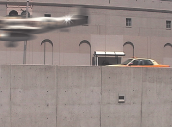
Figure 12.17. The plane passes by, hand-painted glints added to its tail.
Light Scattering and Volume
Light scatters as it encounters particles in the air, most dramatically causing the phenomena of volumetric light or God rays. Our atmosphere does not permit light to travel directly to the camera, uninterrupted. Instead, the light ricochets off tiny particles in the air, revealing its path.
The effect can be subtle. Lights that appear in the scene, casting their beams at the camera, tend to have a glowing halo around them. If the light traveled directly to the camera, the outline of the source light would be clear. Instead, light rays hit particles on their way to the camera and head off in slightly new directions, causing a halo (Figure 12.18).
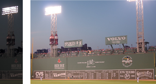
Figure 12.18. You’re so used to seeing halos around bright lights that it just plain looks wrong to lower the exposure so that the halos virtually disappear.
Add more particles in the air (in the form of smoke, fog, or mist), and you get more of a halo, as well as the conditions under which volumetric light occurs. God rays are the result of the fact that light from an omnidirectional source, such as the sun, travels outward in a continuous arc (Figure 12.19).
Figure 12.19. The cathedral of light known to pious and pagan alike as God rays.
The CC Light Rays effect is probably most helpful among those included with After Effects to re-create volumetric light effects, and even God rays. It not only boosts and causes halation around the source light, but also adds rays coming straight at camera. These rays can be made more prominent by boosting radius and intensity, but in order to create a God rays effect and not overwhelm an entire image with rays, it’s usually best to make a target source and apply the effect to that. For example, you can
1. Add a solid of your preferred color.
2. Apply Fractal Noise (default settings are acceptable to begin).
3. Mask the solid around the target God rays source area. Feather it heavily.
4. Apply CC Light Rays. Place the Center at the God rays target. Boost Intensity and Radius settings until the rays are prominent.
5. For rays only (no fractal noise) set Transfer Mode to None.
6. Set a Subtract mask or Alpha Inverted track matte to create occluded areas for the rays to wrap around, as in Figure 12.20.
Figure 12.20. The included CC Light Rays effect is essential to creating your own volumetric light effects in After Effects. Masks or mattes can be used to occlude rays.
You can further hold out and mask out the rays as needed, even precomping and moving the source outside of frame if necessary. To make the rays animate, keyframe the Evolution property in Fractal Noise or add an expression such as time*60 causing it to undulate over time. Different Fractal Type and Noise Type settings will also yield unique rays.
Shadows
As there is light, so must there be shadows. Unfortunately, they can be difficult to re-create in 2D because they interact with 3D space and volume, none of which 2D layers have. The behavior of shadows can be unpredictable, but luckily, your audience typically doesn’t know how they should look in your scene either.
You can certainly cast a shadow from a matted layer onto a plane by positioning each of them in 3D space and properly positioning a light. Be sure that you first change Casts Shadows for the matted layer from its default Off setting to On or Only (the latter option making it possible to create a precomp containing only the shadow).
You can instead corner pin the matte to the angle at which the shadow should fall and avoid the 3D setup altogether. In either case, the problem is that the illusion breaks if the light source is more than 10 degrees off-axis from the camera. The more you light a 2D element from the side, the more it just doesn’t look right (Figure 12.21).
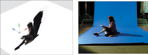
Figure 12.21. Compare the fake 3D shadow with the real thing and you instantly grasp the problem with this approach. You can cast a good shadow head-on, but not at this steep an angle.
There’s also the possibility of cheating: if it’s easy to add ground surface that would obscure a shadow (for example, grass instead of dirt), do so, and no one will even expect to see a shadow because it no longer belongs there.
Contact Shadows
For the most part, successful shading in a 2D scene relies on scaling back expectations. There are plenty of cases where a full cast shadow would be correct and no shadow at all clearly looks wrong, but a simple contact shadow will work.
A contact shadow is a lot like a drop shadow, basically just an offset, soft, dark copy directly behind the foreground. A drop shadow, however, is good only for casting a shadow onto an imaginary wall behind a logo, whereas a contact shadow is held out to only the areas of the foreground that have contact with the ground plane.
Figure 12.22 shows a good example based on a composite from Chapter 5. The foreground can layer is duplicated and placed behind the source. A mask is drawn around the base, and it is then offset downward. A blur is applied to soften the transparency channel. That gives you the matte.
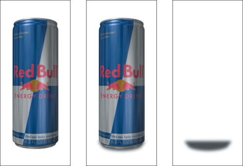
Figure 12.22. A simple contact shadow can make the difference between an object that appears to sit on a surface and an object that appears to float in space.
You might now expect to simply darken the layer down to black and lower opacity to taste, but shadows are not simply cast pools of black, they are areas of obscured light, so there is a better way. Create an Adjustment layer just below the contact shadow layer and set an Alpha track matte. Add a Levels (or if you prefer, Curves) effect and adjust brightness and gamma downward to create your shadow. Treat it like a color correction, working on separate channels if necessary; the result is typically less bland and more accurate than a simple pool of blackness.
Indirect Light
It’s easy to forget the actual physics of what gives an object a certain color; it is comprised entirely of the wavelengths of light that the surface does not absorb. All of the color in our world, save that of light sources such as the sun or your computer screen, is primarily the result of reflected light.
Most surfaces in the natural world are diffuse, and they reflect light softly in all directions (Figure 12.23). Thus in some subtle way, adjacent physical objects can color one another, but two layers composited together completely lack these light interactions, which occasionally would be quite prominent.
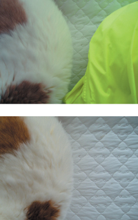
Figure 12.23. The color influence of indirect light is not always so evident as here, yet this phenomenon is always in play.
Computer software is becoming better at re-creating these types of interactions. Global illumination and radiosity features have been added to 3D rendering programs over the past decade to re-create the many effects of reflected light, enhancing the realism of completely synthesized scenes. For the compositor, of course, lighting remains more art than science. The 3D artist can be more like a sculptor, letting the light play over the created work, but the compositor is more like a painter, observing and artistically interpreting the world without the benefit of realistic physics. Light that interacts directly between objects presents one more golden opportunity to make the scene feel real the way that a painter would.
Multipass 3D Compositing
Some artists, including a majority of those who work predominantly in 3D, labor under the delusion that you should finalize the look of a computer-generated element in one pass. Certainly, as it becomes more and more possible to adjust the look of a 3D model in real time (via the GPU, i.e., OpenGL) this becomes tempting.
However, it’s possible to do better by dividing the render of a single element into multiple passes. This is different from rendering in layers, which while also useful for compositing is really only about separating foreground elements from the background. Multipass rendering is the technique of isolating individual surface qualities and creating a separate render for each. By surface qualities I mean things like specularity and wear and tear, also known as grunge. In his excellent book Digital Lighting & Rendering, Second Edition (Peachpit Press, 2006), Jeremy Birn calls out multiple benefits yielded by rendering a model on multiple passes, a few of which include
• Changes can be made with little or no re-rendering. If a shadow is too dark or a glow the wrong color, the adjustment can be made right in After Effects.
• Integration often requires multiple passes where the model interacts with the scene, casting a shadow on the ground or being reflected in water. If the cast shadow is simply part of a single render you lose all control over its appearance and cannot apply it as recommended in the previous section.
• Reflections, which often consume massive amounts of time to process, can be rendered at lower quality and blurred in After Effects.
• Bump Maps can be applied more selectively (held out by another pass such as a highlight or reflection pass).
• Glows can be created easily in 2D by simply blurring and boosting exposure of a specular pass.
• Depth of Field can be controlled entirely in 2D by using a Z pass as a matte for a blur adjustment layer.
• Less render power and time is required to render any one pass than the entire shaded model, so a lower powered computer can do more, and redoing any one element takes far less time than redoing the entire finished model.
Putting multiple passes to use is also surprisingly simple; the artistry is in all of the minute decisions about which combination of adjustments will bring the element to life. Table 12.1 (on the next page) describes some common render passes and how they are typically used.
Table 12.1. Ten Typical Multipass Render Layer Types
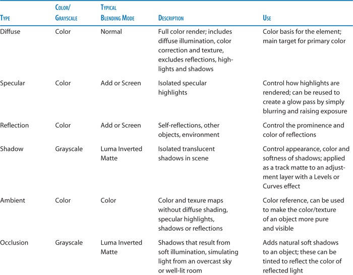
Other passes might include: a Fresnel (or Incidence) pass showing the sheen of indirect light and applied to an adjustment layer with a Luma Matte (raise Output Black in Levels to re-create sheen); a Grunge or Dirt map, applied as a Luma Inverted Matte, allowing you to dial in areas of wear and tear with Levels on an adjustment layer; a Light pass for any self-illuminated details; a Normal pass showing the direction of surface normals for relighting purposes. Many, many more are possible—really anything you can isolate in a 3D animation program. Figure 12.24a through i show a robot set up for multipass rendering and a few of its component render layers.
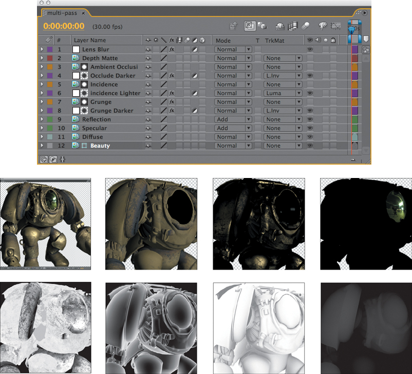
Figure 12.24a through i. A basic multipass setup (a, above) with the beauty pass (b) as reference, and made up of the following color passes: diffuse (c), specular (d) and reflection (e) as well as grayscale passes applied as luma mattes to adjustment layers, each containing a Levels effect: grunge (f), incidence (g), and occlusion (h). A depth matte (i) can be applied in various ways; here it is used as reference to an adjustment layer containing a Lens Blur effect that utilizes it.
Note that none of these passes necessarily requires a transparency (alpha) channel, and at the biggest old-school effects houses it is customary not to render them, since multiple passes of edge transparency can lead to image multiplication headaches.
RPF files are an Autodesk update to RLA. After Effects offers limited native support for these files (via the effects in the 3D Channel menu) but more robust support for some of the finer features of RPF such as Normal maps is only available via third-party plug-ins. Commercially available plug-ins that can translate normal maps for use in After Effects include ZBornToy (which also does amazing things with depth maps; a demo is available on this book’s disc) from Frischluft and WalkerFX Channel Lighting, part of the Walker Effects collection. There is a free option for Windows only called Normality (www.minning.de/software/normality).
As mentioned in Chapter 8, After Effects can also extract camera data from RPF files (typically generated in 3DS Max or Flame); place the sequence containing the 3D camera data in a comp and choose Animation > Keyframe Assistant > RPF Camera Import.
The general rules for multipass compositing are simple:
• Use the Diffuse layer as the base.
• Apply color layers meant to illuminate the base layer, such as specular and reflection, via Add or Screen blending modes.
• Apply color layers meant to darken the base layer, if any, via Multiply or Darken blending modes.
• Apply grayscale maps as luma mattes for adjustment layers. Apply Levels, Curves, Hue/Saturation to allow these mattes to influence the shading of the object or scene.
• Control the strength of any layer using that layer’s Opacity.
Note that multipass renders present an excellent case to enable Blend Colors Using 1.0 Gamma in Project Settings, whether or not you assign a Working Space (and whether or not that working space is linearized).
Multipass rendering is only partially scientific and accurate; successful use of multiple passes is a highly individualized and creative sport. With the correct basic lighting setup you can use multipass renders to place a given 3D element in a variety of environments without the need for a complete re-render.
An EXR image can contain multiple layers, each of which can be labeled to contain specific render passes. After Effects has no ability to read these extra layers until you install the ProEXR plug-in, free from Fnordware (www.fnordware.com/ProEXR). This plug-in also allows Photoshop to read and write multilayered EXRs.
Varied environments are themselves the subject of the following chapter.