Chapter 1. Getting Started
WHEN IT COMES TO TYPE, we are wide-eyed kids in a candy store. Our font menus are expansive and seductive, spanning centuries of typeface history and reflecting the glorious typographic contributions of different cultures, art movements, mass transit systems, and eccentric individuals. However, with so many typefaces just a mouse click away, it’s easy to feel more overwhelmed than empowered by such a treasure trove.
We’ve all felt intimidated at one time or another by the length of our font menus. If you’re like me, you’ve probably frittered away the best part of a day experimenting with this or that enticingly named font chosen almost randomly from a cast of thousands, only to find yourself dissatisfied with the results but not really knowing why. I hope that this book will help keep such days to a minimum.
Typefaces are to the written word what different dialects are to different languages.
— Steven Heller
But before we get into the practical details of choosing type and working with it in InDesign, we need to become acquainted with some essential type terminology and conventions. To set good type in InDesign it’s important to remind ourselves that InDesign is just a tool, and—breathtakingly brilliant tool though it is—unless we understand our raw material, all the power of InDesign won’t amount to much. To use InDesign effectively we must understand how type works—and to understand how type works, we need to look at its history, how it is measured, how it is classified, and what messages our typeface choices may carry. And of course, we need to get comfortable with the InDesign interface. Specifically, we need to know where to find the type-related tools and preferences, how to navigate our documents smoothly, and how to set up an efficient type-oriented workflow.
Typography is two-dimensional architecture, based on experience and imagination, and guided by rules and readability.
— Hermann Zapf
Typefaces can be loaded—intentionally or otherwise—with symbolism and meaning. In Gary Hustwit’s fantastic documentary film Helvetica (2007), graphic designer Paula Scher speaks of her negative connotations of the world’s most ubiquitous font, Helvetica, calling it the “font of corporate America.” She goes on, tongue firmly in cheek, to describe Helvetica as the font of the Vietnam War and the two Gulf Wars. Elsewhere in the movie, some of the leading lights of the type and design world extol the beauty and timelessness of Helvetica. Typefaces divide opinion.
Typography is a hidden tool of manipulation within society.
— Neville Brody
Taking Helvetica, or its now equally ubiquitous clone Arial, as a case in point, one might argue that their use screams “generic” because we see them as the “default” font, the choice that does not involve any conscious choice at all. But it’s not just Helvetica that comes with cultural baggage. Anyone who’s spent more than a few hours involved with type will have an opinion about why they love or hate this or that typeface; often it is through no fault of the typeface itself. To cite an extreme example, Fette Fraktur might now connote Nazism, even though similar Blackletter or Fraktur typefaces were used peaceably for hundreds of years before the National Socialists adopted them. Other typefaces, once fashionable, may be trapped in a historical period—great if you want to evoke that era, but a potential faux pas if you don’t. Certain typefaces may have been co-opted by an overexposed advertising campaign and can’t help but be associated with that product; others—like an overplayed song on the radio—may change from flavor of the month to fingernails-on-a-chalkboard irritation. What’s more, there are many type geeks out there who relish the opportunity to point out the historical inappropriateness of using an English sans serif from the late 1920s for a book about a Russian art movement of the early 1920s.
Typography is what language looks like.
— Ellen Lupton
If I exaggerate, it’s not by much. The thing is, there’s no way to predict how readers will react to our type choices, and, the bolder those choices, the more likely we are to upset someone. Therefore, it’s a good idea to be armed with a robust knowledge of typographic history, a solid understanding of the typefaces you use most often, and an awareness of the connotations that certain typefaces carry. The bibliography at the end of this book lists many excellent resources for learning more about type.
There are now about as many different varieties of letters as there are different kinds of fools.
— Eric Gill
My personal type aesthetic is a minimalist one, though perhaps this is just laziness: If less is more, then maybe I can get away with knowing fewer typefaces. Nevertheless, it’s better to know and understand a few typefaces well than to have a font list a mile long and only a passing acquaintance with the fonts that are on it.
Figure 1.3 The whimsical Periodic Table of Typefaces poster available at www.squidspot.com.
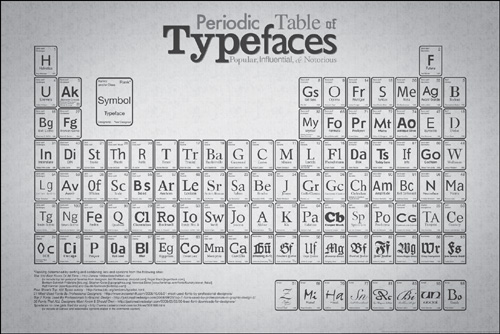
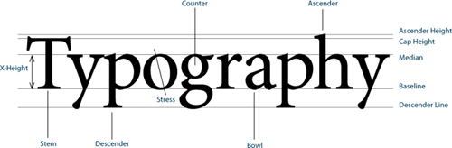
Figure 1.1 The parts of the letterform.
Stem: The main part of the letterform that is straight.
Descender: The portion of the lowercase characters g, j, p, q, and y that projects below the baseline.
Stress: The orientation of the letterform’s curved strokes, from thin to thick.
Counter: The interior “negative” space of the letter. A, a, B, b, D, d, e, g, O, o, P, p, Q, q all have closed counters.
Bowl: The rounded part of the letterform.
Ascender: The part of the lowercase characters b, d, f, h, k, l, and t that extends above the x-height.
Cap Height: The height of the uppercase letters.
Median: The imaginary line defining the x-height.
Baseline: The implied line upon which the characters sit.
X-Height: The height of the main body of the lowercase characters. The letter x is chosen because the letter’s strokes end at—rather than overshoot—this line of measurement.
Choosing a typeface is about enhancing the meaning of the text you are working with. It’s also about meeting the expectations and matching the tastes of your client. In a perfect world, we’d all read and thoroughly digest the text documents we are given to work with as raw materials. Depending on the length of your documents, that may or may not be possible, but you should at least have an understanding of the intended message.
Type Anatomy and Classification
To talk meaningfully about type, we need to share a common vocabulary. FIGURE 1.1 is a simple diagram deconstructing letter shapes into their constituent parts.
Typography is necessarily pedantic and relies heavily on small details. Let’s clarify some terms we’ll be using frequently. A typeface is a complete alphabet including letters, numerals, punctuation, and accents. A font is a specific size and style of that typeface. For example, Adobe Garamond Pro is a typeface; Adobe Garamond Pro Regular 10 point is a font. These terms are frequently used interchangeably, but typographers love to split hairs, and I guess I’m no exception.
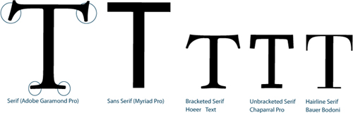
The broadest distinction we can make between typefaces is the distinction between serif and sans serif. Most typefaces fall into one or the other broad category.
Serifs are the small “ticks” at the end of the letter strokes. Sans serif typefaces do not have these ticks, sans meaning “without” in French.
Figure 1.2 The distinction between serif and sans serif, and examples of the different types of serif.
Once we’re familiar with this basic difference we’ll want to drill down deeper in classifying our type. There is no single recognized standard for classifying typefaces; rather there are several overlapping standards. For our purposes I’m going to use a simplified version of Adobe’s type classification, showing examples of each category.
Venetian Oldstyle
Venetian Oldstyle typefaces are named after the letterforms used by the scholars and scribes of northern Italy in the 14th and 15th centuries. Distinguishing features:
• Sloping cross stroke on the lowercase e
• Stress that approximates that of a broad-nibbed pen held at an angle to the page
• Little contrast between thick and thin strokes
• Examples: Adobe Jenson, Berkeley Oldstyle, Centaur

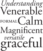
Garalde Oldstyle
Garalde typefaces represent the late Renaissance evolution from the earlier Venetian style, and include some of the most enduring typefaces in use today. Distinguishing features:
• Horizontal cross stroke on the lowercase e
• A slightly greater contrast between thick and thin strokes than Venetian types
• Stress that is inclined to the left
• Bracketed serifs
• Examples: Adobe Garamond, Bembo, Minion Pro
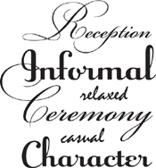
Script
Script typefaces mimic handwriting by joining letters with connecting lines. For this reason, scripts require extra attention to the kerning of their letters and should never be set in all caps. Historically, the problem with script typefaces is that their “personal” nature is antithetical to their digital manufacture. In handwriting, which script typefaces mimic, no two “a”s would be exactly alike, but in a font, of course, they are. Recently, however, a number of beautiful scripts have been released with a wide range of alternate characters for specific letter combinations, allowing you to create unique and personal type treatments. See Chapter 6, “Small (but Important) Details.”
• Examples: Bickham Script Pro, Champion Script Pro, Raniscript
Transitional
A move away from letter shapes based on handwriting, transitional types were the first typefaces to be drawn as shapes in their own right. They represent a transition between Garalde and Didone (Modern) typefaces, and contain aspects of both. Distinguishing features:
• A vertical, or near vertical, stress
• Pronounced contrast between hairlines and main strokes
• Serifs are thin, flat, and bracketed
• Examples: Baskerville, Perpetua, Stone Serif
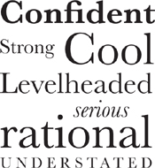
Didone (Modern)
Named after Firmin Didot (1764–1836) and Giambattista Bodoni (1740–1813), Didone typefaces were a response to improvements in late 18th-century paper production, composition, printing, and binding, which made it possible to develop typefaces with strong vertical emphasis and fine hairlines. Distinguishing features:
• Strong contrast between thick and thin strokes
• Vertical stress
• Mechanical appearance—constructed rather than drawn
• Hairline serifs
• Examples: Bodoni, Didot, Fenice
Slab Serif
Until the late 18th century, type was used primarily for books. With the Industrial Revolution came the increased use of posters, billboards, and other forms of advertising, and the need for bolder, more in-your-face typefaces that stood out from the competition. Slab serif typefaces were originally called “Egyptians,” reflecting the public’s enthusiasm for the archeological discoveries of the time. Distinguishing features:
• Heavy, squared-off serifs
• Relatively consistent stroke weight
• Sturdy
• Examples: Clarendon, Memphis, Chaparral Pro
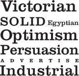
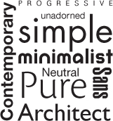
Sans Serif
William Caslon IV (the great, great grandson of William Caslon) issued the first sans serif typeface in 1816, but it wasn’t until the end of the 19th century that sans serifs became widely used.
This category can be subdivided into Grotesques (Helvetica, for example), relatively monoweight and noted for their plain or neutral appearance; Geometric (Futura), where the letterforms are geometric or near-geometric and the strokes monoweight; and Humanist (Gill Sans) where the letterforms are based on Roman proportions and the strokes are modulated.
• Examples: Futura, Helvetica, Gill Sans
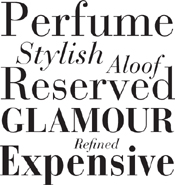
Decorative & Display
This is a catchall category for those typefaces whose primary purpose is to grab the reader’s attention. They are most effective when used in large sizes for headlines, titles, and signage. Because they are so expressive and tend to evoke a particular fashion or moment in time, they can have a short shelf life.
• Examples: Arnold Böcklin, Rosewood, Industria

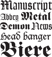
Blackletter
These types are called Blackletter because they look so dark on the page. They are also sometimes referred to as Old English or Gothic; in Germany they are referred to as Fraktur. They may suggest a traditional newspaper masthead and the authority that entails. However, Fette Fraktur, a typeface designed in the mid-19th century, was unfortunate enough to be adopted by the Nazis in preference to the “non-Germanic” sans serif faces favored by the Bauhaus and other radical art movements of the time. In an interesting twist, the Third Reich discontinued the use of Blackletter typefaces in 1941, after allegations of Jewish contributions in the development of these faces, but it’s still hard to see these letterforms without their negative baggage.
• Examples: Fette Fraktur, Goudy Text, Lucida Blackletter
Monospaced
Although most typefaces have proportionally spaced characters, all of the characters in a monospaced typeface have the same width. Monospaced typefaces are sometimes used when setting text on forms where exact spacing is necessary, or when differentiating a line of computer code in an instructional manual (although a proportionally spaced “techie looking” font like Letter Gothic is a good alternative). Courier is also used to indicate a missing font. InDesign can usually simulate the look of a missing font on screen, but it can’t do the same in print. Printing a document that contains missing fonts results in Courier being substituted for the missing font. This convention has been adopted by all page layout applications because Courier looks so wrong that you can’t miss it—you will presumably feel compelled to fix it.
• Examples: Courier, OCR A, Letter Gothic
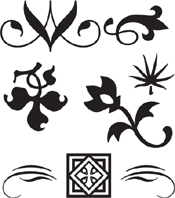
Ornaments
Ornament typefaces contain decorative elements that can be used to embellish documents. Some OpenType fonts include ornaments as part of their extended character set.
• Examples: Minion Pro Ornaments, Adobe Caslon Ornaments, Adobe Wood Type Ornaments
Symbol, Dingbat, or Pi
There exists a parallel universe of typefaces that aren’t letters at all, but pictograms. These picture fonts can be playful as well as practical, with such useful devices as bullets, ballot boxes, check marks, stars, and navigational arrows. As well as extending the range of your typical character set, they are used for musical notation, map making, mathematics, crosswords, and puzzle publishing. David Carson, enfant terrible of grunge typography in the 1990s, famously set an article—an interview with Bryan Ferry—for Raygun magazine in Zapf Dingbats. “It’s not worth reading—why not do it in Zapf Dingbats?”
• Examples: Symbol, Zapf Dingbats, Carta
Figure 1.15 Symbol, Dingbat, or Pi

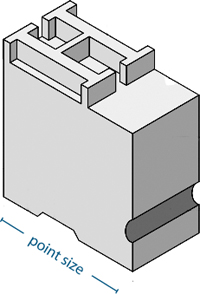
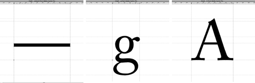
Why Some Fonts Look Bigger than Others
Take a selection of fonts, set them in the same point size, and you’ll find that some look bigger than others. This is a legacy from the days of metal type when point size referred to the size of the metal block on which the type was cast. Some typefaces occupied more space within their blocks than others. Today, point size refers not to the size of a metal block, but to the size of its digital equivalent: the bounding box that surrounds each letter. We measure the space in which the type lives, not the letter itself; some fonts occupy relatively more of that space than others. For this reason, let your eye guide you, not the point size.
Here’s an obvious point, but one still worth making: It’s hard to correctly evaluate the size (and other aspects) of your type exclusively on screen. Unless you’re creating type that is intended for screen reading only, print your test pages rather than rely on what you see on your monitor.
Figure 1.16 A sample type block. The size of the type (point size) refers to the vertical height of the block itself, not the letterform within the block.
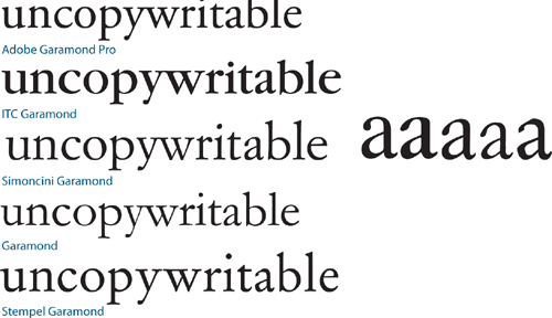
What’s in a Name?
Many typeface names are in the public domain, and many of the typefaces we work with are revivals or interpretations of the originals. Anyone with font editing software can create a typeface and call it “Garamond”—just because something is called Garamond, doesn’t mean it’s going to look the same as somebody else’s Garamond. Sometimes interpretations of a typeface can be dramatically different from each other in much the same way as interpretations of the same song may be more notable for how unlike they are rather than how similar. For this reason, be specific about which Garamond you’re using and what vendor supplied it.
Figure 1.17 The same passage of text at the same point size and leading showing how some fonts look bigger than others.
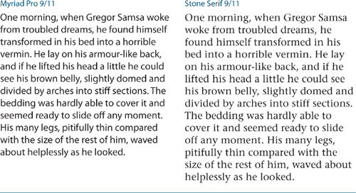
Figure 1.18 A selection of “Garamonds,” all at 30 point (right), and a comparison of the differences found in a single character.
An InDesign Type Map: Where to Find the Type Stuff
Everything in InDesign relates to type in one way or another, but here I want to point out the most frequently used type-related menu and panel options. I’ll also discuss InDesign preferences that control how type behaves. As with any of the big-hitter design applications these days, there’s usually more than one way to do something. Sometimes, it’s merely a matter of preference. Other times, new features have been added that improve on old features—and so that veteran users aren’t alienated, the old menu options remain. We all work differently, and InDesign encourages customization.
Tip:
You can view your menu items in alphabetical order by holding down Cmd+Shift+Option (Ctrl+Shift+Alt) when you choose the menu. This is handy when you’re searching for that pesky menu item you can’t find but you know is there. It may be a small thing, perhaps a feature you’ll never use, but it’s nice to know it’s there.
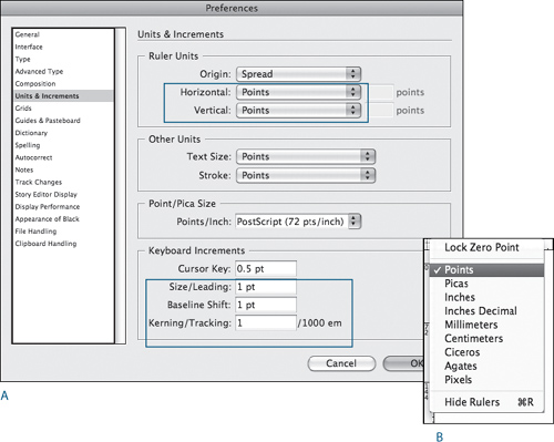
Figure 1.19 Units & Increments Preferences (A)
Ruler Units (circled): Points are a typographic standard. Wouldn’t you rather have an indent of 12 points (or 1 pica) than 4.233 millimeters?
Keyboard Increments (circled): Size/Leading determines the increment when sizing type with keyboard shortcuts. A smaller increment allows more control, especially when sizing small type. To size in bigger increments, add the Option (Alt) key to the keyboard shortcut to increase that increment fivefold.
Baseline Shift: The keyboard shortcut to adjust the baseline shift is Shift+Alt+Up Arrow or Shift+Alt+Down Arrow. It’s not one you use often, but you may as well change this preference, too.
Kerning/Tracking (circled): This value determines the increment used when custom tracking or kerning is applied through keyboard shortcuts: Option+Left Arrow (Alt+Left Arrow) to reduce the space or Option+ Right Arrow (Alt+Right Arrow) to increase the space. For fine (read: better) control, change this to the lowest increment possible, 1/1000 em. For bigger increments, add in the Cmd (Ctrl) key to increase that increment fivefold. You can easily change the measurement system on the fly by right-clicking where the rulers intersect (B).
There are several preferences relating to type; for now, I just want to point out where they are and suggest a couple of changes to the factory default settings. I’ll deal with each preference specifically in the relevant chapter.
When you make a change to InDesign’s preferences, you affect only the document you are working on. If you want to change the preferences for every document you create from this point on, make sure you have no InDesign document open so that your changes become application preferences. The following preferences become application-wide when you change them with no document open: General, Interface, Type, Advanced Type, Composition, Units & Increments, Grids, and Guides & Pasteboard.
If you’re serious about type, I suggest you get used to working in points (or picas, of which points are a subdivision). Points are a typographic unit of measurement originated in the early 18th century. They’re arcane and nondecimal, but there’s still good reason to use them. Since type is rarely expressed in anything but points, it’s helpful to have distances that relate to type, such as leading (space between the lines), indents, paragraph spacing, and gutter (inter-column) spacing also expressed in points. In the U.S., margin sizes and column widths are typically expressed in picas; in Europe they are more commonly expressed in millimeters.
Tip:
Regardless of your chosen measurement system, you can express values in any of InDesign’s supported measurement systems so long as you are explicit. For example, if you are using points but want a frame that is 50 millimeters square, select the frame and type 50 mm in the height and width fields of the Control Panel. InDesign will convert this to its equivalent in points.
Typography also has relative units, two commonly used examples being the em space (the size of your type—if you’re working with 10-point type, then an em space is 10 points) and the en space (half the size of the em space). Another relative unit is the 1/1000 em, which is used for kerning and tracking. To understand kerning and tracking units, it helps to know that each character of a typeface is designed within an em square of 1000 units. The character occupies a certain set width of that em square according to its shape; for example, an m will necessarily be wider than an i. The widest character in the typeface will likely be the em dash, which occupies nearly the full 1000 units. Kerning and tracking involve the adjustment of these relative amounts of space, either to create the “illusion” of perfect spacing or, in the case of tracking, to give the type a denser or airier feel.
Figure 1.20 Three screen captures from FontLab Studio, a typeface creation application, showing the different set widths of the characters within a 1000-unit em square.
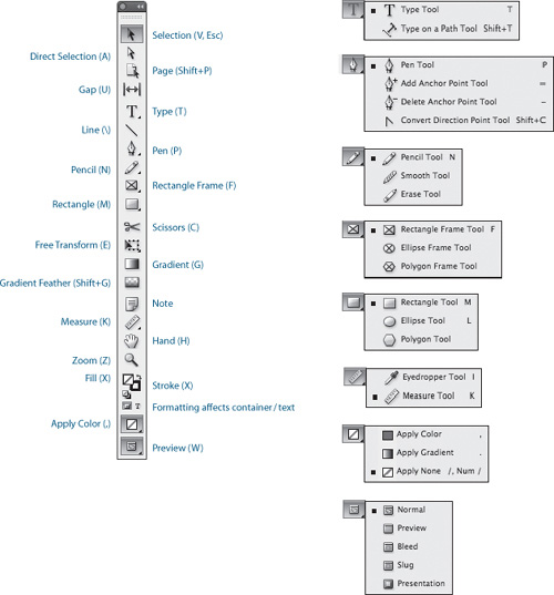
The Tools Panel
There are two tools we use most of the time: the Selection Tool and the Type Tool. The Selection Tool is used for (among other things) moving, resizing, and threading text frames. The Type Tool is used for formatting and editing the text inside those frames. You move back and forth between these tools a lot, so it’s handy that there’s a way to toggle between them.
To work with text frames while the Type Tool is selected, hold down Cmd (Ctrl) to switch to the Selection Tool. With the key held down, you can drag the frame to move it, or drag any of the frame handles to resize it. When you release the key, you’re back in the Type Tool.
When you’re using your Selection Tool, you can double-click a text frame and your cursor changes to the Type Tool, inserted at the point where you double-clicked.
It’s also worth memorizing the single-key shortcuts to access these tools: T for Type and the Esc key for the Selection Tool (V also works in other situations, but obviously not while you’re in the Type Tool).
Figure 1.21 The Tools panel. To access the additional tools shown on the right, click and hold down on those tools that have a black triangle in their bottom-right corner.
Tip:
When in any tool other than the Type Tool, pressing the spacebar temporarily switches the current tool to the Hand Tool; pressing “H” also works. However, if you are in the Type Tool, holding down the spacebar gets you a whole mess of spaces. This may appear to be an obvious point, but you’d be surprised how easy it is to make this mistake. If you are in the Type Tool, hold down the Option (Alt) key to temporarily access the Hand Tool. When working quickly it’s easy to forget where you are and which key you need, so it’s easier to standardize on Option+spacebar (Alt+spacebar), which works in all situations.
Figure 1.22 The Control Panel showing Character Formats (top) and Paragraph Formats (directly below). You can toggle between these two views by pressing Cmd+Option+7 (Ctrl+Alt+7). Click on the icon at the right of the Control Panel (circled) for more options (bottom left). Note that it’s possible to customize the appearance of the Control Panel (bottom right).
Press the Tab key to move from one field to the next, or press Shift+Tab to move backward through the fields. Once in a field, press the Up or Down arrow to increase or decrease the values.
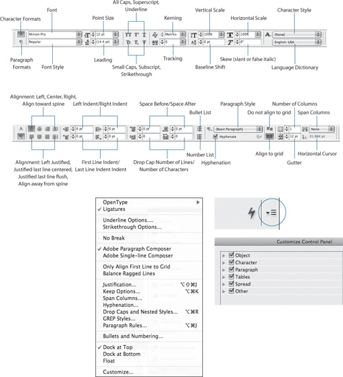
The Control Panel
The Control Panel is a chameleon, changing its appearance according to what you have selected. When you are using the Type Tool, the Control Panel has two views: Character Formatting Controls and Paragraph Formatting Controls. If your monitor is big enough, a digested list of Paragraph formats is displayed to the right of the Character formats in Character Formats view; this is reversed in Paragraph Formats view.
Note that it’s possible to customize the Control Panel. If you don’t see the options you expect—particularly if you are sharing your computer with another user—check the current options by choosing Customize from the bottom of the Control Panel menu.
Viewing Your Page
There are several ways to view and navigate your InDesign documents—some are better than others. Although you have myriad options, you can do most everything you need with just three shortcuts.
- Zooming In: Cmd+spacebar (Ctrl+spacebar). If you value your eyesight, get in big when editing text. There’s no point squinting at a page you can barely read. You could choose the Zoom Tool (
 ) from the Tools panel, but save yourself the trouble. Instead, access the Zoom Tool by holding down Cmd+spacebar (Ctrl+spacebar); your cursor changes to a magnifying glass. Now, rather than click to increase your view percentage, click and drag a marquee around the portion of your layout you want enlarged. The defined portion then fills your window. If you want to zoom out incrementally, press Cmd+Option+spacebar (Ctrl+Alt+spacebar) and click.
 - Moving Around: Option+spacebar (Alt+spacebar). Once at an enlarged view, you’ll likely want to move around. Press Option+spacebar (Alt+spacebar) and drag with the Hand Tool (
 ) to move your page or spread around within the document window. You can also use the Hand Tool at reduced view sizes to move vertically through pages. Don’t bother with the scroll bars; it’s hard to estimate their sensitivity and you’ll waste a lot of time getting to exactly where you want to be.
 - Zooming Out: Cmd+Option+0 (Ctrl+Alt+0). Use this key combination to fit your spread (or page) in the window. Having zoomed in and made your changes at a comfortable view size, zoom out again to get an overall perspective on your page or spread.
A valid alternative to this triumvirate of view shortcuts is Power Zoom: At any view size press Option+spacebar (Alt+spacebar) to access the Hand Tool, then pause for a fraction of a second. A red magnification rectangle appears that you can reposition to view a different part of your page or spread. To change the size of the zoom rectangle, continue to hold down Option-spacebar (Alt-spacebar) while you press the Up or Down arrow to increase or decrease its size—the smaller the rectangle the bigger the magnification, and vice versa.
When editing type, Cmd+2 (Ctrl+2) and Cmd+4 (Ctrl+4) are useful shortcuts for zooming in to 200 percent and 400 percent, respectively.
Tip:
If your type looks bitmapped on screen, it’s probably because you have switched to the Fast Display mode, InDesign’s low-resolution, quick screen redraw option. Choose View > Display Performance and switch to Typical or High Quality. If you have a fast computer, choose High Quality to ensure that your images are always rendered on screen at full resolution (note that Display Performance has no bearing on how your documents print). To make this an application preference, change the settings in Preferences > Display Performance, while no document is open.
Moving Between Pages
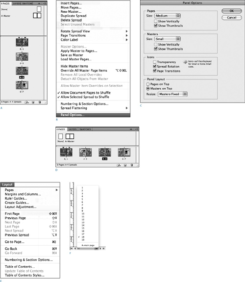
For documents consisting of only a few pages or spreads, you can navigate from one page to the next with the Hand Tool. For longer documents, use the Pages panel, the Pages pop-up menu at the bottom left of your document window, or the options under the Layout menu.
When using the Pages panel to navigate between spreads with facing pages, double-clicking the page numbers includes both pages of the spread in the window, whereas double-clicking the page icon fits that specific page in the window.
Tip:
Press the Tab key to hide and show all your panels. Press Shift+Tab to hide or show all panels except Tools and the Control Panel.
Creating a Typography Workspace
InDesign panels are so numerous you would swear they breed like rabbits when your back is turned. A great many of these panels you’ll seldom or never use, no matter how illustrious your InDesign career. Thankfully, InDesign gives you unprecedented control of your workspace, allowing you to save—and recall at any time—the visibility, positions, and groupings of your panels. The names of workspaces appear in the Workspace picker on the Application Bar or in the Workspace submenu of the Window menu. You can make a custom keyboard shortcut to switch to your workspace with a specified key combination.
First, arrange your panels the way you want them. Create groupings that make sense to you; close those panels you think you’ll seldom or never use (if you need them later, you can find them under the Window menu); then float or dock those you want, where you want them. From the Workspace picker choose New Workspace and give your workspace a name.
Figure 1.23 The Pages Panel in its familiar orientation showing thumbnails for an eight-page, facing-pages document (A). Some users prefer to change the Panel Options to have the thumbnails display horizontally, a more economical use of screen real estate (B), (C), (D). You can also navigate your document using the Layout menu (E), keyboard shortcuts, or the Pages drop-down at the bottom left of the document window (F).
Tip:
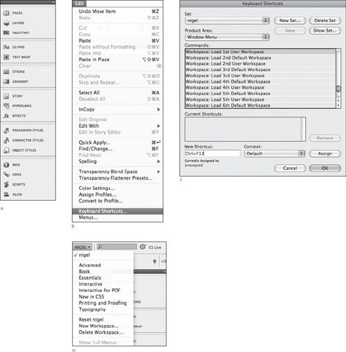
You can make a keyboard shortcut to load your custom workspace from the Edit > Keyboard Shortcuts menu. Because you can’t overwrite the default shortcut set, click New Set. For Product Area, choose Window Menu. You’ll get a long list of all the commands on the window menu—scroll down to Workspace: Load 1st User Workspace. Click into the New Shortcut field, press the keys for your new keyboard shortcut. I use Ctrl+F12—Ctrl being the fourth, seldom used, modifier on the Mac. (Leave the Context list set to Default so that the shortcut functions in all situations.) Click Assign to create the new shortcut.
InDesign comes with a selection of predefined workspaces. The Typography workspace is a good starting point. To this I like to add the following: Object Styles, Info, Links, Scripts, and Align. I close the Paragraph and Character panels because their offerings are also available on the Control Panel.
Having saved your workspace, you can load it at any time by choosing it from the Workspace picker (located next to the search field, upper right). If you’ve made changes to the workspace and want to revert it to its previously saved state, choose Reset. If you’d like those changes to overwrite the workspace, choose New Workspace and choose the same name (you’ll be asked to confirm that you want to overwrite the existing workspace).
Figure 1.24 Setting a typography workspace: My preferred workspace (A), a modified version of the predefined Typography Workspace. You can also create a keyboard shortcut to quickly load your workspace (B, C), or just choose it from the Workspace picker (D).