
13.2. Customizing the Authoring Experience
MOSS 2007 supports two methods for authoring web content. Using the web-based approach, content authors edit content directly in a web browser via server controls included in the SharePoint Publishing object model. Using the smart-client approach, content authors create a document in an application such as Microsoft Word, and then convert the document into HTML using the MOSS 2007 document conversion framework.
There are trade-offs for each method. Authoring content in the browser allows the author to see the content in the context of the page in which it will be rendered, and has the added advantage of incorporating document management features provided by the SharePoint platform. On the other hand, authoring content in a smart-client application is easier for authors already familiar with the application, and for adding preexisting content or developing lengthy reports and complex documents.
The following sections describe each method in detail, and show how to customize and extend the authoring experience.
13.2.1. Web-Based Authoring
The web-based authoring environment consists of two distinct sets of user interface elements. The Page Editing Toolbar enables authors to perform page-level operations, and the HTML Editor Toolbar provides a rich interface for entering HTML content. Both can be customized to create a constrained authoring environment or to ensure the availability of specific resources for authors to use.
13.2.1.1. The Page Editing Toolbar
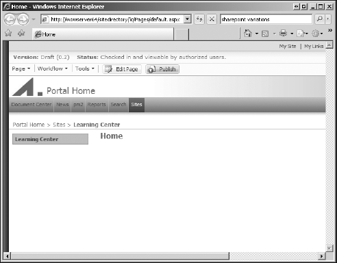
The Page Editing toolbar presents a panel of controls that display information to content authors about a publishing page. The toolbar appears at the top of the page and consists of three areas: the Page Status bar, the Page Editing menu, and a group of Quick Access buttons. Figure 13-6 shows the default Page Editing toolbar displayed on the welcome page of a publishing portal site.
In this diagram, the Version and Status items reflect the current state of the page. The Page, Workflow, and Tools items are menus that contain a standard set of default commands that apply to all pages regardless of status. To the right of these, the Edit Page and Publish items are Quick Access buttons that depend on the current page status.
The menu commands displayed on the Page Editing toolbar are declared in a pair of external XML files. The default menu commands are declared in the EditingMenu.XML file, located in the 12TEMPLATELAYOUTSEditingMenu folder. While it is possible to edit this file directly, doing so is ill-advised because it contains items that work in conjunction with the publishing framework. Inadvertently modifying or deleting a required command could break the page edit framework. Instead, you can create a separate file to declare custom menu commands, which are loaded into the control after the default menu items are processed.
Figure 13.6. Figure 13-6
13.2.1.1.1. Customizing the Page Editing Menu and Quick Access Button Panel
The EditingMenu.xml file contains a customfile element that points to the file containing custom menu commands. By default, this file is named CustomEditingMenu.xml and is located in the Editing Menu folder of the master page gallery associated with the site collection. At runtime, the Page Editing toolbar code searches for the custom definition file and processes the ConsoleNode elements it contains to complete the initialization process. For the Quick Access Button Panel, the QuickAccess.xml file is used, which refers to CustomQuickAccess.xml by default. The QuickAccess.xml file and the EditingMenu.xml file are structured in the same way.
Each file contains a collection of ConsoleNode elements that describe each menu item. These nodes are processed in order from top to bottom. The processing order is important, because it allows you to override the default menu items without editing the primary configuration file, thereby avoiding the risk of breaking the default implementation. To override a default menu item, simply use the same identifier as the item you want to replace.
The following listing shows a portion of the default EditingMenu.xml file. At the top is the customfile element that references the custom configuration file that should be loaded after the control is initialized. This element is followed by a references element containing assembly references, and a structure element containing ConsoleNode elements. Each ConsoleNode element describes an individual menu item.
The reference element operates in a similar fashion as the ASP.NET page directive used to register tag prefixes for referencing external user controls. In this case, as highlighted below, the "cms" prefix is declared as a short-hand reference to the Microsoft.SharePoint.Publishing.WebControls .EditingMenuActions namespace. This prefix is then used in the ConsoleNode elements to specify the ConsoleAction classes that are called when the menu command is executed.
<?xml version="1.0" encoding="utf-8" ?>
<Console>
   <customfile FileName="CustomEditingMenu" />
   <references>
       <reference TagPrefix="cms"
assembly="Microsoft.SharePoint.Publishing,    Version=12.0.0.0, Culture=neutral,
 PublicKeyToken=71e9bce111e9429c"
namespace="Microsoft.SharePoint.Publishing.WebControls.EditingMenuActions"/>
   </references>
   <structure >
       <ConsoleNode Sequence="100"
            NavigateUrl="javascript:" AccessKey="G"
            DisplayText="cms,console_pagesubmenu"
            ImageUrl="/_layouts/images/saveitem.gif"
            UseResourceFile="true"
            UserRights="EmptyMask"
            ID="saPageSubMenu">
           <ConsoleNode
                Action="cms:SavePublishingPageAction"
                DisplayText="cms,console_savechanges"
                ImageUrl="/_layouts/images/saveitem.gif"
                UseResourceFile="true" ID="saSaveChanges"/>
           <ConsoleNode
                Action="cms:SwitchToPublishedModeAction"
                DisplayText="cms,console_reviewmode"
                ImageUrl="/_layouts/images/saveitem.gif"
                UseResourceFile="true" ID="saReviewMode"/>
           <ConsoleNode
                IsSeparatorImage="True"
                UserRights="EmptyMask" />
<ConsoleNode
Action="cms:CheckInWithCommentAction"
HideStates="IsCheckedOutToCurrentUserFalse"
ImageUrl="/_layouts/images/checkin.gif"
UseResourceFile="true" ID="saCheckinWithComment"/>The cms prefix is also used here to reference resource strings. This overloaded usage is unrelated to the reference element described above. Resource strings in XML definition files follow the general format <resource filename>, <resource identifier>, directing the system to load a specific resource string from the named resource file. Unlike other resource files that are located in the 12Resources folder, the cms.resx file is located in the App_GlobalResources folder of the root folder for the web application, for example, c:inetpubwwwrootwssVirtualDirectories80App_GlobalResources.
13.2.1.2. The HTML Editor Toolbar
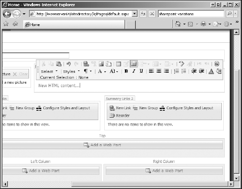
The HTML Editor field control is used in conjunction with columns of type Page Content to provide authors with a rich editor for HTML content. Figure 13-7 shows the default HTML Editor field control on a publishing page.
The HTML Editor toolbar is customizable both globally and locally. Global customizations apply to all instances of the HTML Editor field control, and involve adding custom command buttons that invoke custom JavaScript code. Local customizations apply to each control individually, and involve specifying custom styles that authors can apply to selected content, and also defining constraints that hide certain commands based on a set of required permissions.
Figure 13.7. Figure 13-7
13.2.1.2.1. Adding Custom Command Buttons
The HTML Editor toolbar buttons are declared in the RTE2ToolbarExtension.xml file, which is located in the Editing Menu folder of the master page gallery associated with the site collection. By default, this file contains only a root node of type RTE2ToolbarExtensions. Custom commands are defined by adding subnodes of type RTE2ToolbarExtraButton nodes, as in the following example:
<?xml version="1.0" encoding="utf-8" ?>
<RTE2ToolbarExtensions>
    <RTE2ToolbarExtraButton id="myExtraButton" src="MyExtraButton.js"/>
</RTE2ToolbarExtensions>
In this example, the custom button identifier myExtraButton is associated with a JavaScript file, which must be copied to the 12TEMPLATELAYOUTS1033 folder. This file must contain code that registers the toolbar button and also implements two methods for handling the onClickCallback and onResetStateCallback events. The onClickCallback method is called when the button is clicked, and the onResetStateCallback method is called to reset the button state when any state of the editor is changed.
The following example registers a custom command button that displays an alert message when clicked:
// Called when the button is clicked
function onClickMyButton(strBaseElementID, args) {
alert("MyExtraButton was clicked in " + strBaseElementID + ": " + args[1]);
}

// Called when the button is reset
function onResetMyButton(strBaseElementID, args) {
var document = RTE_GetEditorDocument(strBaseElementID);
if (document != null) {
    RTE_RestoreSelection(strBaseElementID);
    return true;
    }
    return false;
}

// Registers the custom button
RTE2_RegisterToolbarButton(

/* button mnemonic */
"MyExtraButton",

/* path to the button icon */
RTE_GetServerRelativeUnlocalizedImageUrl("rte2popup.gif"),

/* text to display next to the icon */
"! Alert",

/* tooltip to display while hovering over the icon */
"Testing toolbar extensibility",

/* method called when the button is clicked */
onClickMyButton,
/* method called when the button is reset */
onResetMyButton,
/* object passed to the callback methods */
new Array("test","this","button")
);13.2.1.2.2. Changing Styles and Branding
A commonly used feature of the HTML Editor is selecting predefined styles to apply to a given content element. For example, to create an unordered list, the author adds a UL element to the page, and then may wish to select a style to be applied to that list. The HTML Editor supports the ability to customize the collection of styles that are presented to the author in the Styles drop-down of the HTML Editor toolbar.
By default, the editor includes a default set of styles. These are loaded into the drop-down by searching through the CSS stylesheets associated with the page for styles with a designated prefix. The default prefix is ms-rteCustom-XXXX, where XXXX is the name of the CSS class that is displayed in the list. If any CSS classes are found whose names match this prefix, then the default styles are not loaded and the custom styles are loaded instead.
The following example declares a set of custom unordered list styles which are displayed when an unordered list element is selected in the editor:
UL.ms-rteCustom-MaroonSmallCaps
{
    color:Maroon;
    font-variant:small-caps;
}
UL.ms-rteCustom-NavySquareBullet
{
    color:Navy;
    list-style-type:square;
}
Unlike custom buttons, custom styles are processed locally by each instance of the control, allowing a different set of custom styles to be used for different sections of the page. This is achieved by changing the prefix used to name the CSS classes. The PrefixStyleSheet attribute of the RichHtmlField declaration specifies the prefix to be used.
<PublishingWebControls:RichHtmlField id="RegionOne" FieldName="RegionOneContent"
runat="server" PrefixStyleSheet="RegionOne" />

<PublishingWebControls:RichHtmlField id="RegionTwo" FieldName="RegionTwoContent"
runat="server" PrefixStyleSheet="RegionTwo" />
UL.RegionOne-UnorderedList1 { color:Blue; font-size:10pt; }
UL.RegionOne-UnorderedList2 { color:Red: font-size: 8pt; }

UL.RegionTwo-UnorderedList1 { color:Black; font-size:12pt;}
UL.RegionTwo-UnorderedList2 { color:Green; font-size:9pt; border:solid 2px;}
13.2.2. Smart-Client Authoring
Smart-client authoring allows content authors to use a client-side application such as Microsoft Word to create content or to import existing content. The term "smart-client authoring" is somewhat of a misnomer because the client-side authoring architecture does not take advantage of any "smart" connection between the client application and the SharePoint environment. Any application that can produce a document of the appropriate type can be used.
Content that is authored on the client is added to a MOSS 2007 publishing site through the use of document converters, which are command-line executables invoked by SharePoint on the server to convert a given document from one type to another. Document converters are managed at the server farm level, but individual document converters are scoped to the web application level. In other words, the executable file is installed on the server, but can be enabled or disabled for specific web applications.
The document conversion process is coordinated by two Windows Services. The DCLoadBalancer service is responsible for determining where the application should be executed on the server farm. The DCLauncher service is responsible for setting up the runtime environment, invoking the converter, and for retrieving and storing the converted document. Document converters are run by the DCLauncher service in a very isolated runtime environment to protect the server from potentially dangerous document converters, some of which may have been ported from other environments, and may have been originally designed for other purposes.
Consequently, the DCLauncher service creates a locked-down environment within which to run document converters. First, it creates a custom window station and desktop, and logs in as a guest user with a name of the form HVU_<machinename>. Then it sets up restricted permissions, basically allowing that guest user access to a single folder. Thus, when a converter runs, it can only read from the document it was given, and can only write to the folder from which it was executed.
13.2.2.1. Building Custom Document Converters
Implementing a custom document converter requires the following steps:
Create an EXE that performs the conversion.
Register the converter in the SharePoint environment.
Optionally create a custom ASPX page to allow the user to provide converter-specific settings.
The converter EXE file must accept the following parameters:
| –in infile | The input file containing the document to be converted |
| –out outfile.html | The fully qualified path to the output HTML file |
| [ –config config.xml ] | (optional) path to the configuration settings |
| [ –log logfile.log ] | (option) path to the log file |
The following example shows how to implement a simple converter for text files containing a comma-delimited list of values, where the first line contains a list of row headers, and the remaining lines contain column values. The resulting HTML file must contain two sections, an optional <head><style> ... </style></head> section and a <body> ... </body> tag. The converter generates a formatted HTML table while ensuring that each row contains the correct number of cells. Extra cells are discarded for any given row.
using System;
using System.IO;
using System.ComponentModel;
using System.Collections.Generic;
using System.Text;
using System.Web.UI;

namespace ProSharePoint2007
{
    class SimpleConverter
    {
        enum ArgType { _in, _out, _config, _log, _unknown };

        static void Main(string[] args)
        {
            ArgType m_argType = ArgType._unknown;
            string[] arg = new string[(int)ArgType._unknown];

            foreach (string s in args) {
                if (s[0] == "-' || s[0] == "/')
                    m_argType = (ArgType)Enum.Parse(
typeof(ArgType), s.Replace(s[0].ToString(), "_"));
                else {
                    arg[(int)m_argType] = s;
                    m_argType = ArgType._unknown;
                }
            }
            SimpleConverter.ConvertToHTML(arg[0],arg[1],arg[2],arg[3]);
        }

        /// <summary>
        /// Performs the conversion to HTML
        /// </summary>
        /// <param name="inFile"> comma-delimited strings</param>
        /// <param name="outFile">the HTML output file</param>
        /// <param name="configFile">optional settings file</param>
        /// <param name="logFile">optional log file</param>
        static void ConvertToHTML(string inFile, string outFile,
string configFile, string logFile)
        {
            using (StreamReader reader = new StreamReader(inFile)) {
using (HtmlTextWriter writer = new HtmlTextWriter(new StreamWriter(outFile))) {
writer.RenderBeginTag(HtmlTextWriterTag.Html);
WriteStyles(reader, writer);
WriteBody(reader, writer);
writer.RenderEndTag();
writer.Close();
}
}
}
static void WriteStyles(StreamReader reader, HtmlTextWriter writer)
{
writer.RenderBeginTag(HtmlTextWriterTag.Head);
writer.RenderBeginTag(HtmlTextWriterTag.Style);
writer.WriteLine("TABLE { border-style:solid; border-color:green; }");
writer.WriteLine("TH { font-weight:bold; font-size:10pt; }");
writer.WriteLine("TD { font-size:8pt; color:blue; }");
writer.RenderEndTag();
writer.RenderEndTag();
}
static void WriteBody(StreamReader reader, HtmlTextWriter writer)
{
writer.RenderBeginTag(HtmlTextWriterTag.Body);
writer.RenderBeginTag(HtmlTextWriterTag.Table);
int i, rows = 0, cols = 0;
while (!reader.EndOfStream) {
writer.RenderBeginTag(HtmlTextWriterTag.Tr);
HtmlTextWriterTag colTag = HtmlTextWriterTag.Td;
string[] tokens = reader.ReadLine().Split(",".ToCharArray());
if (rows++ == 0) {
cols = tokens.Length;
colTag = HtmlTextWriterTag.Th;
}
for (i = 0; i < cols; i++) {
writer.RenderBeginTag(colTag);
if (i < tokens.Length) {
writer.Write(tokens[i]);
}
writer.RenderEndTag();
}
writer.RenderEndTag();
}
writer.RenderEndTag();
writer.RenderEndTag();
}
}
}13.2.2.2. Deploying a Custom Converter
Document Converters are deployed at the web application level, using a SharePoint feature definition file and a Document Converter definition file.
Installing and running a document converter on a domain controller (DC) is not supported. This is because all document converters are executed in the context of a restricted local account, which is unavailable on a domain controller.
The following example shows the feature definition XML for the CSV to HTML converter:
<Feature xmlns="http://schemas.microsoft.com/sharepoint/"
         Id="{5FD4BBC0-1538-4ead-817A-A637AB66B1FF}"
         Title="Simple Document Converter"
         Description="Converts from CSV to HTML"
         Version="1.0.0.0"
         Scope="WebApplication"
         Hidden="FALSE">
    <ElementManifests>
        <ElementManifest Location="elements.xml"/>
    </ElementManifests>
</Feature>
The element manifest contains the converter definition XML:
<Elements xmlns="http://schemas.microsoft.com/sharepoint/">
    <DocumentConverter
        Id="{ADE66E1D-2750-44f5-A8BD-435B5BBFDA56}"
        Name="CSV to HTML"
        App="SimpleConverter.exe"
        From="csv"
        To="html"
    />
</Elements>
After copying these two files along with the SimpleConverter.exe application to a new folder named 12TEMPLATEFEATURESSimpleConverter, the STSADM command-line utility can be used to install and activate the feature as follows:
stsadm -o installfeature -name SimpleConverter
stsadm -o activatefeature -name SimpleConverter -url http://localhost
Figure 13.8. Figure 13-8
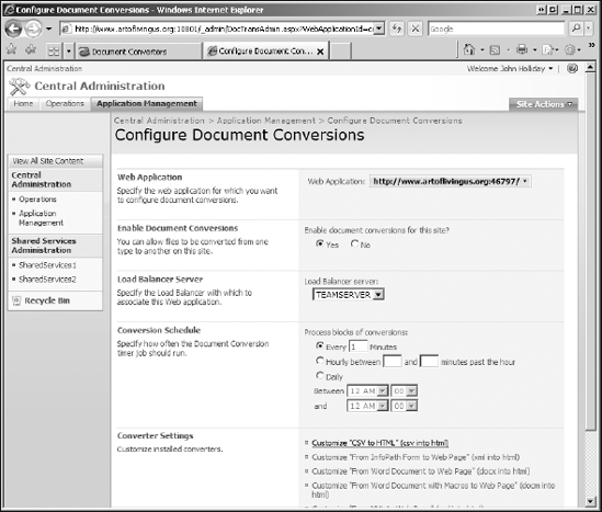
Installing and activating the document converter feature makes it available for final configuration from the Central Administration web site for the specified web application. Figure 13-8 shows the Configure Document Conversions page after the CSV to HTML converter feature is activated.
Once the document converter is configured, it is available for use by content authors. Typically, an author uploads a document with a given file extension to a document library, and then selects the Convert Document menu command. The available document converters for the selected file type are displayed in the drop-down menu, as shown in Figure 13-9.
Figure 13.9. Figure 13-9
13.2.2.3. Calling Document Converters Programmatically
Under certain conditions, it may be necessary to invoke a document converter programmatically. A common example might be a workflow activity that needs to convert a Microsoft Word document to html. You can invoke a document converter in one of two ways: by calling the Convert() method of the SPFile object associated with the document, or by adding the document to the PublishingPages collection of the publishing web site.
The PublishingWeb component is a special component that provides a wrapper around an existing SPWeb object that lets you call special methods for working with the Publishing API. The central concept here is that the conversion occurs when the document is added to the PublishingPages collection. This may seem counterintuitive outside the context of a user interface, but makes sense when you think about how the publishing system works.
You invoke a document converter by adding a page to the pages collection. The Add method takes the GUID of the converter you want to apply and the file to which it should be applied. It is important to understand what happens when using this method. When a page is added to the PublishingPages collection, some additional postprocessing occurs after the conversion is finished. This postprocessing step is responsible for extracting the CSS styles from the optional <style> section and for extracting the HTML markup from the <body> tag of the converted document. This information is then injected into the field controls embedded in the page layout associated with the page.
PublishingWeb publishingWeb = PublishingWeb.GetPublishingWeb(web);
PublishingPageCollection pages = publishingWeb.GetPublishingPages();
PublishingPage page = pages.Add("New Page Name",fileToConvert,
     converterId, PageConversionPriority.Immediately);
13.2.3. Creating and Using Field Controls
Field controls constitute the "heart" of the MOSS 2007 publishing system. Field controls are aptly named because each control is tightly bound to a field (site column) in the underlying content type associated with a page layout. This tight association can be seen by examining the page layout markup for the standard WelcomeSplash.aspx page layout.
<table cellpadding="0" cellspacing="6" width="100%" class="splashLinkFrame">
<tr>
<td width="50%" valign="top" class="splashLinkArea">
<PublishingWebControls:SummaryLinkFieldControl
id="SummaryLink1"
FieldName="SummaryLinks"
runat="server"/>
</td>
</tr>
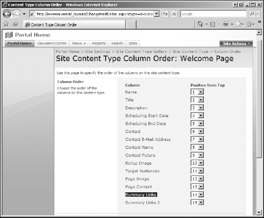
</table>The FieldName attribute binds the control to the SummaryLinks field of the Welcome Page content type (shown in Figure 13-10) with which the WelcomeSplash.aspx page layout is associated.
This also means that if the content type is modified, then the field control will no longer work as expected. Modifying content types installed by a feature is generally a bad idea because of other hidden dependencies that may exist between components. To prevent users from removing essential columns from a content type through the UI, you can mark the column as "sealed." This will not, however, prevent the field reference from being removed programmatically.
Field controls essentially define a mapping from one or more columns of the document library item to content which appears somewhere on the page when it is rendered. By placing field controls on the page layout, you are providing a container for authors to enter the metadata, as well as a canvas for displaying that metadata to end users.
13.2.3.1. Building a Custom Field Control
The many different pieces of the WCM puzzle start to come together when designing custom field controls because you can customize just about anything with a little bit of work. When dealing with so many moving parts, it helps to refer back to the MOSS 2007 object model to gain perspective. For instance, to support different types of rendering, an extra level of indirection is typically added to the implementation of various components. The names are similar in the definition files, but they may refer to different components in the object model. This may not be obvious when looking just at the XML markup.
Figure 13.10. Figure 13-10
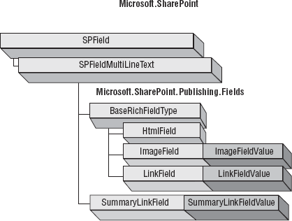
It is important to keep in mind that there is an SPField object associated with the markup for every field. This object defines both the underlying field data type and the CAML that determines how the field will be rendered in the browser when the user enters or edits the field value. The data for any given field is typically stored in a separate value object, not in the SPField object itself. Figure 13-11 shows the core set of publishing fields and their relationships.
It is useful to follow the same pattern when creating custom fields. The following example defines a MediaField class, and a corresponding MediaFieldValue class that is used to manage metadata about an individual media asset for a portal containing tutorials and other training materials. These classes in turn support the development of a RichMediaField field control for displaying rich media content on a publishing page.
using System;
using System.Collections.Generic;
using System.Text;
using Microsoft.SharePoint;
using Microsoft.SharePoint.WebControls;

namespace ProSharePoint2007.Chapter13
{
    public class MediaField : SPFieldMultiColumn
    {
        public MediaField(SPFieldCollection fields, string fieldName)
: base(fields, fieldName){}
Figure 13.11. Figure 13-11
public MediaField(SPFieldCollection fields, string typeName,
string displayName) : base(fields, typeName, displayName){}

        public override object GetFieldValue(string value)
        {
            if (String.IsNullOrEmpty(value)) return null;
            return new MediaFieldValue(value);
        }

        public override BaseFieldControl FieldRenderingControl
        {
            get
            {
                return base.FieldRenderingControl;
            }
        }
    }
    public class MediaFieldValue : SPFieldMultiColumnValue
    {

        const int NUM_FIELDS = 2;

        public MediaFieldValue() : base(NUM_FIELDS) { }
        public MediaFieldValue(string value) : base(value) { }
        public MediaFieldValue(string type, string url) : base(NUM_FIELDS)
        {
            this.MediaType = type;
            this.MediaUrl = url;
        }

        public string MediaType
        {
get { return this[0]; }
set { this[0] = value; }
}
public string MediaUrl
{
get { return this[1]; }
set { this[1] = value; }
}
}
}In this case, the MediaFieldValue stores both the media type and its location. Before this field can be used on publishing pages, two additional issues must be addressed:
How to render the field on the new and edit web forms
How to render the field on publishing pages
13.2.3.1.1. Rendering Fields in the SharePoint UI
It is important to keep in mind that SharePoint fields are rendered in two entirely different ways. When a list item is created or edited within the SharePoint user interface, its fields are rendered using CAML. When accessed through a publishing page, its fields are rendered using server controls. When building a custom SPField-derived object that supports a custom field control, you must support both rendering methods.
<FieldTypes>
  <FieldType>
    <Field Name="TypeName">Media</Field>
    <Field Name="ParentType">MultiColumn</Field>
    <Field Name="TypeDisplayName">Media File</Field>
    <Field Name="TypeShortDescription">Media File</Field>
    <Field Name="UserCreatable">TRUE</Field>
    <Field Name="ShowInListCreate">TRUE</Field>
    <Field Name="ShowInSurveyCreate">TRUE</Field>
    <Field Name="ShowInDocumentLibraryCreate">TRUE</Field>
    <Field Name="ShowInColumnTemplateCreate">TRUE</Field>
    <Field Name="FieldTypeClass">ProSharePoint2007.Chapter13.MediaField,
ProSharePoint2007.Chapter13.LearningCenter, Version=1.0.0.0, Culture=neutral,
PublicKeyToken=0b97b340d4a71524</Field>
    <PropertySchema>
      <Fields>
        <Field Name="DefaultMediaType" DisplayName="Default Media Type:"
MaxLength="50" DisplaySize="30" Type="Text">
          <Default>SWF</Default>
        </Field>
        <Field Name="DefaultMediaUrl" DisplayName="Default Media Url:"
MaxLength="50" DisplaySize="30" Type="Text">
          <Default></Default>
        </Field>
      </Fields>
    </PropertySchema>
<RenderPattern Name="DisplayPattern">
<Switch>
<Expr>
<Column />
</Expr>
<Case Value=""/>
<Default>
<Column SubColumnNumber="0" HTMLEncode="TRUE"/>
<HTML><![CDATA[ ]]></HTML>
<Column SubColumnNumber="1" HTMLEncode="TRUE"/>
</Default>
</Switch>
</RenderPattern>
</FieldType>
</FieldTypes>13.2.3.1.2. Rendering Fields on Publishing Pages
Once you have determined what kind of field you are working with, you are ready to build the server control that will render the data on publishing pages. This is the control that is referenced from within the page layout file. The key concept here is that the publishing framework needs a way to bind each control to a particular field (column) of the associated list item. This intelligence is implemented in the BaseFieldControl class.
Interestingly, the BaseFieldControl class and its parent, the FieldMetadata class is provided by the core Windows SharePoint Services 3.0 object model and not by the MOSS 2007 publishing framework. The SDK describes the FieldMetadata class as an "Abstract class which implements the common functionality for all the Windows SharePoint Services field controls... for all fields rendering metadata."
The BaseFieldControl class encapsulates concepts related to managing the general rendering behavior of a SPField instance. This includes storing and retrieving the list item field value, and formatting the "chrome" that is displayed around the field when it is rendered. Its parent class, the FieldMetadata class, stores a reference to the associated SPField.
The MOSS 2007 publishing framework includes a number of built-in field controls that can handle most publishing scenarios. These controls are designed to work with specific site columns that are also included in the publishing feature set. The following table describes the built-in field controls, their associated site columns and how they are used:
| Field Control | Field Type | Description |
|---|---|---|
| RichHtmlField | HtmlField | Provides an interactive browser-based environment for editing HTML content |
| RichImageField | ImageField/ImageFieldValue | Provides a way to direct users to specific locations when browsing for images |
| RichLinkField | LinkField/LinkFieldValue | Provides a way to direct users to specific locations when browsing for publishing assets |
Figure 13.12. Figure 13-12
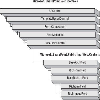
Figure 13-12 shows the derivation hierarchy for the default field rendering controls.
The following code fragment shows the rendering template used to display the custom field on publishing pages:
<%@ Control Language="C#" Debug="true" %>
<%@ Assembly Name="Microsoft.SharePoint, Version=12.0.0.0, Culture=neutral,
PublicKeyToken=71e9bce111e9429c" %>
<%@ Register TagPrefix="SharePoint" Namespace="Microsoft.SharePoint.WebControls"
Assembly="Microsoft.SharePoint, Version=12.0.0.0, Culture=neutral, PublicKeyToken=71e9bce111e9429c" %>
<SharePoint:RenderingTemplate ID="MediaFieldRendering" runat="server">
    <Template>
        <table class="ms-form">
            <tr align="left">
                <td>Media Type</td>
                <td>Media Url</td>
            </tr>
            <tr align="left">
                <td>
                    <asp:DropDownList ID="MediaType" runat="server">
                        <asp:ListItem>SWF</asp:ListItem>
                        <asp:ListItem>AVI</asp:ListItem>
                        <asp:ListItem>WMV</asp:ListItem>
<asp:ListItem>Camtasia</asp:ListItem>
</asp:DropDownList>
</td>
<td>
<asp:TextBox ID="MediaUrl" runat="server" />
</td>
</tr>
</table>
</Template>
</SharePoint:RenderingTemplate>13.2.3.1.3. Handling View, Edit and Design Mode
FieldControls may be displayed in any of several modes. Edit Mode is what the authors see while editing the page. View Mode is what appears when the page is rendered for end users. Design Mode is used to preview what the control will look like in view mode, and is also used to display a design surface for developers using tools like SharePoint Designer 2007.
The preferred approach for developing custom field controls, and the one adopted by Microsoft, is to have separate classes that implement the Edit Mode and View Mode behaviors. The main advantage being that you can delegate the Edit Mode behavior to a separate class that inherits functionality from one of the built-in "selector" classes.
Another approach is to implement the Edit and View Modes in a single class. This has the advantage of placing the entire implementation in one place, but has several disadvantages, the main one being that you are forced to implement everything and cannot easily inherit the base "selector" functionality.
13.2.3.2. Tips for Writing Field Controls
Field controls may appear on forms pages, so they should be tested in these scenarios as well as in publishing scenarios. For instance, the edititem.aspx page is displayed when a user edits the properties of a content type. Custom field controls that have been associated with the content type may be displayed on this page.
Don't use hard-coded styles when developing field controls. Doing so will limit the flexibility of the control and could interfere with custom CSS styles that have been applied to the pages on which they are rendered. This is an important guideline for all display modes, but is particularly important for view mode. If you need to use a special set of CSS styles, then SharePoint provides a mechanism for registering for a specific CSS stylesheet. Using this approach, you are guaranteed that the required style will be loaded at runtime and still allow graphic designers to tweak the styles you have provided.
Minimize database round trips in your field controls. The main point here is that the SharePoint publishing feature takes advantage of certain optimizations to minimize the time needed to render a page. Part of this optimization process involves caching the list item data so that requests for data are handled without having to go back to the database to get it. If you write a field control that makes direct connections to an external database, for example, then you risk a significant performance hit due to the frequency with which published pages are rendered. One way around this is to take advantage of the caching framework provided by ASP.NET 2.0 and the extensions to this framework provided by the SharePoint Publishing API.
Don't forget to implement design-time support for your field controls. This is an important step because your audience includes not only content authors but web designers as well. A good approach is to edit your pages in SharePoint Designer prior to deployment. This will show you exactly what web designers will see when using your controls. The following table describes when to use field controls versus Web Parts:
| Need | Field Control | Web Part |
|---|---|---|
| Data storage | Field in the page list item | Web part data associated with the page |
| Location in page | Fixed as a control in the page layout | Fixed as a control in the page layout, but within a Web Part zone |
| Versioning | Versioned with the page | Versioned with the page, but without historical versions. |
| Personalization | No | Yes |
| Standard uses | Used to display content stored within the page | Used to display the result of queries or views of external content. |
| Example | Rich HTML FieldImage FieldSummary Links | Content Query Web PartTable of Contents Web Part |
13.2.3.3. Publishing Content on a Schedule
You can control when list items are displayed using scheduled items. A ScheduledItem list item is visible on a published site only between specified start and end dates. Since every published page is a list item, you can effectively control when certain pages appear using this approach.
You create a ScheduledItem list item using the ScheduledItem wrapper class for a given list item. You create the wrapper class instance using a static method of the ScheduledItem class, which is defined in the Microsoft.SharePoint.Publishing namespace. The following example shows how this is done.
using Microsoft.SharePoint;
using Microsoft.SharePoint.Publishing;
...
SPListItem item = myList["SelectedItem"];
ScheduledItem scheduledItem = ScheduledItem.GetScheduledItem(item);
scheduledItem.StartDate = DateTime.Parse("1/15/2007");
scheduledItem.EndDate = DateTime.Parse("3/15/2007");
scheduledItem.Schedule();
Scheduling an item is equivalent to approving the item for display. You can include an approval comment at the same time the item is scheduled by using the overloaded Schedule (string approvalComment) method. If the specified start date is earlier than the date on which the method is called, then the item is published immediately. You can omit the end date, which publishes the item indefinitely. Otherwise, the item is unpublished on the date specified. When the current date is outside the range of dates specified for a scheduled item, the page is no longer visible.
13.2.3.3.1. Using Timer Jobs
You can set up a timer job to publish pages. This approach is useful in many situations. For instance, you can set up a document library that contains job notices and automatically post new job listings on a separate web site as soon as they appear in the list. For this kind of solution, you could use one of the built-in document converters and post the job listing as a Microsoft Word document. You could then set up a timer job that automatically converts the document into an HTML page, which is then published to the site. Both the original document and the converted page are stored in the document library. End users can view the job posting using the styles and presentation defined by the page layout.
13.2.4. Using Variations
Variations are a way to keep web site structure and content synchronized across multiple languages or form factors. You can use variations to publish foreign language versions of a web site or to publish content simultaneously to desktop browsers, mobile phones, or other devices. You can also use variations to implement themes, allowing the user to choose easily between different versions of the same content, applying different master pages and layouts, for example.
The MOSS 2007 variations architecture introduces the concept of a variation label to synchronize published content. A variation label is an identifier that describes each version, or variation, of a web site, and its relationship to its source. You can only declare one set of variation labels for a given site collection, and you can only designate one variation label as the source site, with the rest as target sites. As content is published to the source site, the SharePoint publishing framework then propagates the content automatically from the source to the target sites.
Figure 13-13 illustrates the variations architecture.
Figure 13.13. Figure 13-13

Whatever changes are made to the pages of the source site are replicated in the target sites, but the target pages can be associated with different layouts and different master pages. This is done through the property bag associated with a given page layout. When a page layout is associated with a variation label, the label identifier is stored along with the properties of the page layout. This causes special processing to be invoked when content is being propagated from one variation to another.
Since standard SharePoint lists are used to keep track of variations and the relationships between source and target pages, there is an opportunity to develop custom solutions that generate variation reports, or that modify the list programmatically if necessary.
To use the variations framework, you first configure the variations settings (either via the SharePoint user interface or programmatically), and then create the variation labels, electing which Variation is the Source variation. Next, you create the variation hierarchies, and create and approve source pages. As new pages are added to the source site, they must then be translated (manually) and approved before being finally rendered to end users.
13.2.4.1. Configuring Variations Settings
You configure variations for a site collection from the Variation Settings link of the Site Settings page. The Variation Home specifies the starting location for variations of the site. This represents the root of variation hierarchy.
You must create variation labels through the SharePoint user interface. The goal is to specify the label name and description, the designated locale, and how its associated site hierarchy should be created when new content is added to the source variation.
To create a variation label, navigate to the Site Settings page of the top-level site, and then select the Variation Labels link. This will display the current list of variation labels. Selecting Create New Label from the drop-down menu displays the page shown in Figure 13-14.
Once the variation labels have been created, and the source variation has been designated, you can create the variation hierarchy. After creating the variation hierarchies, you can only edit the display name and description of the variation labels. The other settings can no longer be modified.