Fathoming the unfathomable by definition seems unfathomable, so most folks don't try. However, like Question One, it doesn't require any additional scholarship, genetic superiority, or magical superhero powers. All you need is Question Two: What can I see that others can't? The more you ask, the more you see. Since the only basis for a market bet is knowing something others don't, this question provides the second basis for a bet. Go ahead and ask yourself: What do I know that others don't? At this point, your answer may be, "Well... nothing." It's most people's immediate reaction.
Don't be discouraged. You won't be bombarded with Question Twos like you are with Question Ones. We get bombarded with investing nonsense daily. Discovering something others don't know isn't a "Eureka!" moment. It's not the apple falling on Newton's head. It's what happened afterward when Newton asked, "I wonder what the heck made that happen?" and contemplated what forces, natural or sinister, could be at play. It's the reflection in a quiet room away from the incessant market and media noise when you wonder if factor Q could possibly cause result Y when everyone else is yammering on about X causing Y.
The world is busy insisting high P/Es cause poor stock prices (wrong—usually), debt is bad for stocks (wrong—always in Western nations), you shouldn't fight the Fed (wrong about half), and high trade deficits cause a weak dollar (wrong, wrong, wrong). But to know something others don't, you tune out the noise and wonder—if everything everyone insists moves currencies doesn't, I wonder what actually does? (We go there in Chapter 7.) And if I shouldn't fight the Fed, is it possible the yield curve can tell me anything at all about stocks? Or, must I just look at it differently somehow? I wonder? Wondering is wonderful.
Suppose no one has a clue what causes result-Y. If everyone knows no one knows what causes Y, then probably almost no one is willing to think about what causes Y because they will believe it a waste of time. In our contemporary world, in America and more so elsewhere, if something is seen as unfathomable, normal people will treat it as a complete untouchable. These areas are especially ripe for inquiry because they are so virginal.
Misapplication of Question Two can lead you to waste time plowing through common media sources for clues. Clients often e-mail me a news item they feel might be significant to our investment strategy. While I appreciate the concern, through the miracle of mass production and electronics, pretty much all media is everywhere and all around us. Whether through mainstream sources like the Wall Street Journal, the New York Times, Barron's, the Economist, the Washington Post, the Miami Herald, or lesser sources like the Ontario Onionpeeler, or Invest Romania, and whether directly or through a consolidator like the Drudge Report or Little Brother's Blog, it's pretty much force-fed to us from everywhere. Your investment edge won't present itself in a ready-to-use format in a front-page news story in any such publication, or in an evening news program, or blog, or e-mail newsletter. No matter how buried a news item or how insignificant a blog, we live in a fast-moving world. Your "news" edge almost certainly will be snatched from you before you've found it. Don't despair; you can still use all that widespread noise to help you find something no one else knows. All it requires is you fight eons of behavioral conditioning. Here is how.
Thousands of years ago, our ancestors grouped together for security against other tribes and giant fanged beasts. When darkness fell, they gathered around campfires for warmth, protection, and the occasional grilled mammoth burger. Glowing by the campfire, they regaled each other with stories of the hunt and mythological tales, carrying their culture to younger generations. On a nice night, warm and mammoth-gorged, they could feel a real sense of security, well-being, and envision a beckoning future. Suddenly, in the dark, a loud and unexplained mammalian noise slices through their sense of security. Instantly, instinctually they all look toward the source of that noise—in the bushes—and prepare for what could be threatening and ugly. An attacking rival tribe, perhaps, or a lion or a stampeding wildebeest herd. Every ear and eye correctly focused on the noise to maximize the human power that can identify and, if possible, overcome the threat.
If you were from another tribe and led a warring group wanting to attack this camp, what would you do? To be clever, you might throw a stone or create some other ruckus that distracts the camp—then attack from a different direction. Of course, a stampeding herd wouldn't do that. But for the camp, in case of a planned attack from clever marauders, a more evolved military-like response would be to have some folks look away from the noise, into the darkness elsewhere, to spot any surprise marauder threat. The problem? Unless well organized, no group of people behaves that way. You hear a noise in the darkness and you turn toward it. Go camping sometime and see. Your instinctual reaction isn't to turn away from the noise but toward it. In Stone Age days, that instinct protected lives from the most common natural forces. From tens of thousands of years of evolution, we are mentally hardwired to turn toward the noise, face it as a group, and instinctually presume our ability to immediately unite our tribal eyes and ears and react.
I suspect some male readers may be tempted to pound their chests and say, "Me evolved. Me sophisticated. Me modern. Me would look in other direction from noise, save women and children, be crowned king of tribe, have many wives, eat many mammoth." I expect many female readers may be tempted to put their hands over their mouths and say, "Me look to child to pull close to save. Me not look to noise." Both groups would be wrong. The next time you hear an unexpected noise, check what your instinctual reaction is. I guarantee you'll look to the noise. If you don't, you're really, really weird. The person who most thinks he won't is most certainly the person turning to the noise fastest. The rare bird that doesn't face the noise doesn't think about it. To know what your fellow investors don't know, you must look anywhere but where everyone else is looking. You must train yourself to stop looking toward the noise. Instead note whenever everyone is looking one direction, whether you hear a noise or not, you should look away—where they're not.
You may be tempted to ignore the media altogether since what you hear or read is either wrong or has already been discounted into current prices. There is some rationality to that view, but it's wrong. By all means, don't avoid mass media—it's your friend and ally on your quest to invest by knowing what others don't. The media is a discounting machine—you must read (watch, listen to) the media to know what everyone else is focused on so you know exactly what you can ignore and look away from and focus elsewhere. Whatever they're fretting, you needn't because they're doing it for you—a service—and you don't even have to pay them for it. They do it for free for you. Such a simple concept is very hard for tribal-oriented humans to get. But anyone can train themselves to do it.
For example, I've already told you the collective histrionics regarding the so-called triple deficits are so much hooey. You may not believe it but I've told you. You also know pretty much everyone misinterprets high P/Es. (We debunk more ubiquitous myths in later chapters, but you get the idea.) Paying attention to what the media covers and consequently discarding what is irrelevant will prevent you from being trampled by herd mentality and let you begin fathoming new paths.
Avoiding being trampled by the herd sounds easy enough—look where they are stampeding and get the heck out of the way. However, if it were easy, it wouldn't be called "herd mentality." It would be called "calm, noncompelling, no pressure here, join us as we run over this cliff if you please, if not, no problem" mentality. Remember when your mom asked if you'd jump off a bridge just because cool-kid Jimmy did it? Of course you wouldn't jump, but you might buy small-cap stocks at the wrong time if your poker group pokes enough fun at you for not having done it when they did. They keep bragging about what a killing they're making—with you sitting there feeling like a schmuck with your lousy balanced portfolio.
My March 1995 Forbes column, "Advanced Fad Avoidance,"[25] described how best to avoid getting swept away with the herd. It's still good advice, so I'll repeat the four steps to fad avoidance here:
"If most folks you know agree with you on a price move or some event's impact, don't take this as confirmation you are right. It is a warning; you are wrong. Being right requires aloneness, and willingness to let others see you as maybe nuts."
Still very true. And lots of people think I'm nuts. It's okay if people think you're nuts. It doesn't hurt. With the evolution of the Internet and blogs, I've become used to people reading my articles and columns and writing scathing criticisms of my very best things. (Of course, sometimes they're right and that would be when I'm wrong, but either way what they think of me isn't any of my business.) I've trained myself to ignore what anyone who I don't already know very well thinks about me or my work. If my wife is upset at me, I take it seriously. She knows me, my strengths and weaknesses and desires my well-being. Family, friends, associates! Other than that, if you're upset at me and don't like something I've said, feel free to criticize, but know you will run into an emotional desert. You can train yourself to have that same emotional desert too. What most people think about you is none of your business; and if they think you're nuts, it might be good.
"If you read or hear about some investment idea or significant event more than once in the media, it won't work. By the time several commentators have thought and written about it, even new news is too old."
Even more true today. The Internet has multiplied the venues and speed by which news travels. Now everything moves faster and gets discounted into pricing faster. Compounding the discounting speed, which has been increasing for decades, traders trade 24 hours a day, fully five and half days a week around the globe. It used to be evening news didn't sneak up on you until morning. Now, not only does news move across the Internet at night, but someone somewhere is trading extensively while you snooze.
"The older an argument is, the less power it has. So, for example, inflation fears may have moved markets in 1994, but sometime early in 1995 that view will run out of steam."
Every year's hot fear is obsolete the next year. It's the new thing no one expected that has the herd stampeding around your village, not last year's noise. To think better about this—take any issue and consider when you first heard about it. The older it is, the more certain it won't affect you. The older it is, the more certain everyone has had multiple opportunities to discount the price fully. Here is the best single example I can remember. Recall people expected all computers to break down on January 1, 2000 (01/01/00—GASP!) because of a supposed widespread glitch in everyone's software. The Y2K scare was ubiquitous, and in the fall of 1999, it scared lots of folks out of stocks. I devoted my October 18, 1999, Forbes column, entitled "Greater Fools," to why Y2K wouldn't hurt stocks. Quoting from that column: "Y2K is the most widely hyped 'disaster' in modern history. It is well documented: The only folks who aren't familiar with it are in the upper Amazon basins, rapidly fleeing the rest of humanity. I need not define Y2K for you to know exactly what I'm referencing. My July 6, 1998, column detailed why Y2K could not hurt the stock market." Because it was an old argument and well-discounted, the S&P 500 in 1999 had a back-end rise during the supposed crisis with a total return for the year of 21 percent.[26] Using this simple rule, anyone could have known Y2K wouldn't bite. Fear of Y2K was bullish. But few knew because they couldn't get themselves to embrace the rule. How can you use this rule today, here in 2007? Think Bird Flu. It's too old a story to bite stocks. If we see a future big fear of Bird Flu, that would be a very bullish thing. I discuss bird flu at length in Chapter 5 and how to see it correctly. (If you care to read my two "Y2K" columns, they follow.)
"Any category of security that was hot in the last five years won't be in the next five years, and vice versa."
Still true. Always true. And yet investors still fall prey to this one. Energy in 1980. Tech in 2000. Small value stocks in 2007. You can play this game endlessly. That they were hot in the last five doesn't mean they will be the coldest in the next five, or even necessarily cold at all, but no category stays hot for 10 years. And if one did one day, it would be a double warning to seek safer and higher future returning turf elsewhere.
Forbes, July 6, 1998. Reprinted by permission of Forbes magazine. © Forbes, 2006.
Forbes, October 18, 1999. Reprinted by permission of Forbes magazine. © Forbes, 2006.
Follow these four steps whenever you are presented with an investment decision, and you'll be better armed to ignore the noise and see what others find unseeable.
Another great source of discounted information are investment professionals—stock brokers, financial planners, CPAs, CFAs, and so on. Precious few have access to any information their peers or even a client with a cable modem doesn't have. Brokerage firms across the globe subscribe to the same handful of news and research sources. What's more, they analyze and interpret the same information using similar methods. Whatever they focus on, you shouldn't waste time on. If they're writing about it, ignore it. Focus elsewhere.
Universities teach largely the same curriculum to their students in finance and economics. Harvard, Stanford, Michigan, Boston College, USC, UNLV—it doesn't matter. They're teaching pretty much from the same play-book. They're supposed to. The textbooks, methodologies, and theories taught are widely available; they contain little many tens of thousands of others can't read, learn, and thereby discount into markets. Decades of students have learned all this and been trained to think in these ways with the curriculum as their guide. It is basic to the craft. Every bit of what is taught is known by so many people that the curriculum, while fine, offers nothing others don't know. It offers nothing as a way to process information that isn't already in prices by the actions of the very large number of market participants who use the curriculum as the glasses through which they see the world. It's the way they were taught to see the world. Hence it's in pricing. One very hard fact for craftsman to accept is the curriculum itself is widely known and hence discounted into pricing.
There is nothing wrong with learning it, but it doesn't teach you something others don't know. If professionals as a group have the same education, look at the same information, and interpret it largely the same way, where is their edge? What unique information do they think they have? The answer is most often: none. This is why, along with the media, professionals are useful in figuring out what information is priced and can be safely ignored and discarded.
The media is generally wrong. Professionals are generally wrong or out to make a buck at your expense or both—and are at least fully discounted into pricing. Following the herd is fraught with peril. Does this mean you should do the exact opposite of what you hear from pundits and professionals? Should you become a classic contrarian?
Absolutely not. No, no, and no!
I am frequently called a contrarian. But I'm not—not as that term is generally used. Of course, I've been called far worse and will be, but the contrarian label happens to be wrong. Contrarianism has become increasingly popular in recent decades, rendering it priced by the market just as much as the consensus view. We are all contrarians now and none of us are. Being contrarian will get you about as far in the long term as being wholly influenced in your investment decisions by the New York Times and the nightly news.
The word contrarian implies going against the crowd—if folks are bullish, a classic contrarian becomes bearish and vice versa. If everyone thinks electing a given politician as good for stocks, the contrarian sees it as bad. If everyone thinks bird flu will make stocks fall, the contrarian sees higher prices ahead. Technically a contrarian correctly knows what everyone assumes will happen won't, but wrongly assumes the exact reverse will happen.
Let's wade further into this. The market is a pretty efficient discounter of all known information so, as we stated multiple times, if people tend to agree something will happen to markets it won't—something else will happen instead. But that doesn't mean the something else that happens is the exact reverse. Suppose most folks agree the market will go up. That doesn't mean it will go down. It might, but it might also go nowhere, which would also make everyone wrong. Or it might go up, but a lot more than anyone expects. That too would make everyone wrong. Over history, all those things have happened and in about equal proportions.
If you're a classic contrarian and correctly see most folks agree the market will go up, so you bet it will go down, and then it goes up but much more than most folks expected, you end up the most wrong guy in town. Being a contrarian is better than betting with the crowd, but not much, and will still have you being right something on the shy side of one time in three. Think of this like a 360 degree circle—like a compass. The consensus thinks the market will go North. Contrarians think it will go South. But it could just as well go East or West, making the crowd wrong and the contrarians wrong and the discounting mechanism work. Because those two other outcomes are less expected than the contrarian position, they actually happen more often.
The key is to remember—something else happens than what the consensus expects, but not necessarily the reverse. True contrarians these days aren't much more right than consensus followers. It is surprise that shifts demand, which drives prices. The problem is the surprise could come from any direction.
To know something others don't, you must focus away from the noise. Ask what you can come to know that others can't. But how can you know about a thing you don't know?
There are patterns to be discovered everywhere. Granted, many are simply meaningless. But there is so much out there we haven't discovered yet, people will make new capital markets discoveries for many decades to come. There is no reason you shouldn't find your share. If you seek them out, there are many patterns you can discover on your own before the rest of the investing world becomes aware. And there is your edge—your basis for a market bet.
Essentially, you seek one of two things when asking Question Two. First, you want a pattern—some sort of correlation—between two or more variables people generally think are wholly unrelated. Second, you're looking for a pattern many people see but disregard, deride, or misinterpret. We show you two such examples here and more in later chapters.
You can't turn on MSNBC without hearing about interest rates. Switch on the telly and you'll find analysis on interest rates with all the gravitas and excitement of a Monday Night Football play-by-play, riveting bulls and bears alike.
Rates rose until 11:14 a.m. before plummeting and then rocketing upward! What will the Fed do next to kill off inflation? Will homeowners be killed or thrilled? Tune in tomorrow for more inanity on the show everyone loves—Raving About Interest Rates!
Despite all the attention interest rates garner, investors are seeing something horribly wrong and missing a remarkable pattern and life lesson.
Before we delve into remarkable patterns and causal correlation, let's clear the air regarding interest rates. Interest rates are important. They determine the rate at which we can borrow, either short term or long term. They also determine the yield investors can get in return for locking up their liquid assets for a predetermined time period.
How often have you either heard or read, "Interest rates are falling," or "The Fed is raising interest rates," or some such news regarding interest rates (rates—plural)?
What the heck are these interest rates people keep talking about? The short rate (rate—singular) in America or elsewhere is controlled by that country's central bank—in America, the Federal Reserve, a.k.a. the "Fed." A central bank has monopolistic power over setting its country's short rate. If America's Fed feels it should reduce or increase the money supply, it raises or lowers the short rate target respectively. The Federal Open Market Committee (FOMC) meets eight times yearly to discuss if they should raise, lower, or stay the federal funds rate (also sometimes referred to as the overnight rate or the short rate) and how much the rate should move, if at all. The short rate is that at which banks lend to each other, and drives the interest rate banks pay you for deposits (savings accounts and certificates of deposit [CDs]). This is the rate (singular) investors mean to imply when they talk about the Fed monkeying around with rates. Not rates. Rate. One rate. The short rate. The fed funds rate. Singular rate.
The 10-year Treasury rate, traditionally referred to as the long rate isn't set by the Fed, the government, the president, or an evil conspiracy of rich, white Texans. The long rate is set by global market forces. In our contemporary global economy, traders reach across country lines to trade bonds in a global, free, and open market. The market is what sets the long rates, including not just the 10-year Treasury bond, but government bonds of other maturities—3-months, 6-months, 5-years, or 30-years, all of them. Make no mistake—though investors blather about "rates falling" and "rates rising" and "the Fed raising rates"—the short rate and long rates move independently of each other, sometimes in the same direction and other times in opposing directions. Let's say that again differently. Sometimes when the Fed raises the short rate (rate—singular), long rates rise too. Other times long rates fall. Sometimes long rates go nowhere. That is true in America and everywhere else. Shock and awe! I always tell investors to never again say, "Interest rates are going up," or "Interest rates are going down." Always in your speech and thereby your mind separate short rate movements from long rates.
The difference between the shortest-term Treasury bill (which is a very short-term rate, not the short rate) and varying longer-rate maturities can be plotted visually on a graph resulting in the infamous yield curve. The vertical axis plots interest rates from zero at the bottom to higher rates up top. The horizontal axis plots time from now at the left to longer-term securities stretching out to the right with the far right being 10 or 30 years into the future. A typical yield curve can look something like the hypothetical one in Figure 2.1.
Shorter-term rates usually tend to be lower than longer-term rates while longer-term rates tend to be higher in return for taking the additional risk of locking money away for longer periods. On our graph, the rates form a curve. It usually slopes upward to the right—which is a positively sloped yield curve. Positive yield curves are characterized as either normal or steep, depending on the spread between the short-term and long-term rates. Sometimes, rarely, shorter-term rates are actually higher than long-term rates. When this happens our graph slopes downward to the right and is called inverted. Still rare but less so than an inverted yield curve is when rates are all at about the same level—this is referred to as flat.

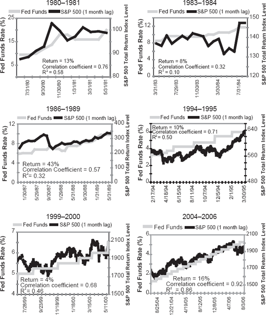
Investors have all manner of theories about fluctuations in the short rate and long rates and what it all means for the stock market. You may have heard an age-old mythology phrased as, "don't fight the Fed," which is meant to prompt you to sell stocks when the Fed raises the short rate. Nonsense—on average, stocks have done perfectly fine when the Fed raised the short rate—although not always. But nothing is "always" one way or the other. Figure 2.2 shows periods of a rising fed funds rate since 1980, and the resulting return on the S&P 500.
What you can see is the S&P 500 and a rising fed funds rate correlate pretty closely at times. I wouldn't take that to mean anything—the stock market is generally more positive than negative, so there is no surprise here. And sometimes the market was more positive than at others. But because positive markets have followed a rising short rate, "don't fight the Fed" is rendered one of those Question One myths you should ignore. This isn't to say a rising short rate is any kind of a bull or bear market indicator—but neither is a dropping short rate. There is no credible link between the short rate moving any direction and bull or bear markets. None.
For example, from 2001 to 2003, the Fed steadily cut the short rate and those who would argue you shouldn't "fight the Fed" would have owned stocks the whole time and gotten killed as the global stock market was in a sustained bear market. In 2004 and 2005, the Fed raised the short rate steadily and the Fed-fighting fans would have avoided stocks and been on the wrong side of the market again.[27] What are they missing?
The first step in asking a successful Question Two is setting aside any unproductive fretting about concerns that don't matter. As far as the short rate moving in any one direction—it's priced, so you can set it aside. Anyone can Google the FOMC or go to the web site (http://www.federalreserve.gov/fomc/#calendars) and see when they're meeting. What's more, as the years passed after Mr. Greenspan took the helm, the FOMC became ever more transparent about when it planned to lower or raise the fed funds rate and by nearly exactly how much. By the end of Mr. Greenspan's term, market expectations for what the Fed would do and when were rarely wrong. Mr. Bernanke seemingly started out with a little verbal diarrhea and an inability to know, as Mr. Greenspan did, when to say nothing or simply mumble incoherently. (Greenspan was the all-time master of well-delivered incoherent mumbling—no one ever did it more professionally.) But Mr. Bernanke will likely learn the act before long. Nonetheless, the Fed raising the rate a quarter of a point, or even a half a point, is hardly a market-moving event when the Fed has been talking about the planned pace of rate raises for months.
Instead of focusing on short rate movements, focus on the yield curve (if you can figure out the right one to use—we'll get to that soon). Most investors will tell you a positive yield curve is good and an inverted one is bad. That's more or less true. The yield curve is normally positively sloped. A truly inverted yield curve is rare and has a reputation for being bearish.
But right now you're thinking about yield curves incorrectly, and it can hurt you. Before we can discover something new, let's check if what we believe about yield curves is correct with Question One. Is it true an inverted yield curve is a harbinger of doom? The answer is—it depends on what you mean by "yield curve," or more specifically, where. One problem behind the yield curve—I won't call it a myth so much as a misunderstanding—is folks tend to lump recessions and bear markets together. They're not the same things. You can have a bear market without a recession and vice versa, though they do tend to come together because the stock market will price in dour sentiment caused by a recession. But it doesn't always (for instance, if the recession is long feared and well priced).
A moment for two definitions: A bear market is a prolonged stock market downturn exceeding 20 percent. (The difference between a bear market and a correction is magnitude and duration—a correction being much shorter lived, only months, and a drop smaller than 20 percent.) By contrast, a recession is generally defined as two consecutive quarters of negative GDP growth, but it's tough to know if you're in a recession while it's happening since GDP numbers get heavily restated afterwards.
Two mildly negative quarters of GDP can be difficult to feel as they occur. Recessions usually aren't labeled recessions until long after they've started—sometimes not until after they're over. For example, the 1973 to 1974 bear market was followed immediately by a recession that was steep and pervasive throughout 1974, extending into 1975. It was one of the biggest of the post-World War II era yet wasn't recognized as having happened until 1975. Meanwhile, in September 1974, President Ford and his economic advisors were still calling for tax hikes to slow the economy and fight inflation. That's because no one knew we were in a recession.
While I was pretty darned young at the time, I remember the period very well. For me it was a strange time. What I remember was all the people I talked to in 1974 thought the economy was strong when later we'd learn it had been declining all year. In many ways, I wasn't very sensitive or plugged in that year. My wife and I had just lost our young daughter. I was pretty well shattered and capable of only working part-time for about six months. I didn't trust myself to have a good view of what was happening with the economy, so I spent a lot of time asking others what they thought was going on. Without intending to, I did a pretty good job of polling a big cross-section of investors and business people. Pretty much no one knew in 1974 we were already long in recession. I don't think much of anyone saw it as a recession until 1975 and by then it was mostly over—and that was a huge one. It was heavily masked by the high level of inflation then—for many firms, revenues remained strong as unit volume shrank. Still, if few saw it, note how few would see a mild economic decline.
A better measure of recession comes from the National Bureau of Economic Research (NBER; www.nber.com). Their definition of a recession captures more data, though one prominent data point is GDP, and more accurately characterizes an economic contraction. The NBER characterizes a recession thusly:
The NBER does not define a recession in terms of two consecutive quarters of decline in real GDP. Rather, a recession is a significant decline in economic activity spread across the economy, lasting more than a few months, normally visible in real GDP, real income, employment, industrial production, and wholesale-retail sales.[28]
Historically, a steep yield curve suggests an environment in which financial institutions can lend profitably, and lending is an important driver of future economic activity. Whereas, an inverted yield curve creates a disincentive for banks to lend, thereby reducing liquidity (remember this for later in this chapter), and it's a fairly reliable predictor of recessions.
But whether an inverted yield curve causes a bear market or not depends on whether the related bad news is priced into the market. For example, in 1998 we had a flattening yield curve here in America that had people in a collective tizzy. Fear of an upcoming inverted yield curve ran rampant. That, along with the Russian ruble crisis and the supposed Long-Term Capital Management crisis was widely expected to drive stocks down, long, and hard. We had a big midyear correction but no bear market—the S&P 500 finished 1998 up 29 percent.[29] Fear of a flattening yield curve was so prevalent it lost its power to create a major decline.
Fast forward to 2000 when the yield curve actually did invert. This time, nobody paid heed. Instead, folks were lauding the "new economy" and saying, "Earnings don't matter," and "It's different this time," as they rushed off to parties celebrating the launch of SweetLobster.com and other dot-com stocks. Among other things, the recent memory of 1998 convinced them inverted yield curves didn't matter. In 2000, the yield curve, because it wasn't noted and feared—the tribe was looking elsewhere—was a harbinger of economic weakness and peaking tech stock prices that led to a three-year bear market. If everyone is talking about it, dreading it, and stocking up on canned goods because of it, then the inverted yield curve has lost its power, like anything else. If everyone skips about singing, "Tra-la-la! It's different this time," as in early 2000, then an inverted yield curve can devastate stocks.
Even with that clarified, people still see yield curves incorrectly. It's important we see them correctly because of the economic conditions an inverted yield curve implies. You think about interest rates here in America and the yield curve they engender. Why wouldn't you think about U.S. interest rates? What other interest rates would you consider? The Question Two I'm about to share can be recast over and over again into other problem-solving contexts where it works just as well. So here goes.
Question Two: I wonder if there is a yield curve more important than America's? You've probably never thought to ask yourself that question. Why on earth would you? What could possibly be more important than America? Particularly to Americans!
After all, when we look at U.S. yield curves from 30, 50, and 100 years ago, we can see some pretty compelling long-standing evidence they're predictive. Everyone knows that (or at least, plenty of folks believe it—including most reporters which means pretty much everyone). It's widely accepted that America's yield curve matters and is a somewhat reliable indicator of good and bad times ahead. Whenever the short rate has been above long-term rates, banks became disinterested to lend as aggressively. And bad things came after. Thirty years ago when America's yield curve inverted, the only way for a bank to make money lending was to lend to a worse credit risk at a higher rate than the bank's borrowing costs. This was and is risky and banks dislike doing it. In fact, the riskier the customer they need to profitably lend, the less they like it and don't want to do it. In the days of yore, America's yield curve and its camber mattered. A lot! Of course, in those days most folks didn't know the yield curve mattered.
Fast forward to now—we have not just national banks but fully global banks, a wide array of derivatives and financial futures for hedging, and electronics allowing instant access to precise accounting and trade information globally. Now money flows fairly freely across borders. A global bank can borrow in one country and lend in another and hedge its currency risk all as fast as you can read this sentence. I can borrow money from an investment bank that got it from a syndicate of insurance firms in Europe who crossed the money through global banks, and I may never know the source was overseas. To me, as the borrower, it's just money. Decades back—in a world of national banks, minimal high-volume electronics for accounting and trading, no material hedging instruments, and fixed instead of flexible currency prices—it was the national yield curve that mattered. Never again! Global tendencies prevail over local ones in every country, including America, the greatest country in the world. Foreign interest rates and yield curves provide or deny liquidity heavily impacting our own. They also determine the cost effectiveness of using leverage as a means to snap up both domestic and foreign assets.
The analysis of any country's yield curve—even a country as massive as America—has become less meaningful. The right way to think about this now, something I fathomed no one had ever written about before I first did, is the GDP-weighted global yield curve. The global yield curve is representative of worldwide lending conditions. In today's world, if the global yield curve says one thing and America's says another, go with the global. America's or any other single stock market will subordinate to the global curve.
Figure 2.3 shows the global yield curve as of June 2006. The reason it's important? If a bank can borrow more cheaply in one country and lend more profitably in another, it will. Everybody, including banks and their customers, likes cheap money. Note this illustration is based on the global yield curve being GDP weighted. It makes sense intuitively that a country with a larger GDP would have greater impact on the global yield curve. It's not hard to arrive at, but a fast Internet connection helps.

Figure 2.3. Global Yield Curve, June 2006. Source: International Monetary Fund, Global Financial Data, and Bloomberg. Disclaimer: If a 30-year rate was unavailable, the 10-year rate was used.
In constructing the GDP-weighted yield curve, first I made a list of the countries included in the MSCI World Index—all 23. I didn't use the full list of ACWI countries because the developed nations' GDPs dwarf those of the emerging nations, so their interest rates would barely register—and accurate data on emerging nations is devilishly tough to come by. Then, I input the latest GDP for each of the countries. The GDP for all of these countries can be found at the web site for the International Monetary Fund (IMF; www.imf.org). My list looked something like this:
Country | GDP ($ in Billions) | GDP Weight (%) |
|---|---|---|
Country A | 50 | 14.3 |
Country B | 50 | 14.3 |
Country C | 250 | 71.4 |
Total | 350 |
Clearly, that is all hypothetical information, but you get the idea. To get each country's appropriate GDP weight, sum for the total world GDP and divide for each country.
Next, input the short-term and long-term interest rates. (Here I show the 3-month and the 10-year rates.) I have access to some great data sources letting me compile interest rates quickly, but anyone can find this information for free at a little place called Yahoo! Finance (http://finance.yahoo.com/international).
Rate | ||||
|---|---|---|---|---|
Country | GDP ($ in Billions) | GDP Weight (%) | 3-Month | 10-Year |
Country A | 50 | 14.3 | 3.25 | 6.5 |
Country B | 50 | 14.3 | 2.5 | 7.2 |
Country C | 250 | 71.4 | 4.5 | 4.25 |
Total | 350 | |||
That part is just data entry. Now, I subtract the 3-month rate from the 10-year rate to get the spread. A positive spread means a positive yield curve and a negative spread means an inverted curve.
Rate | |||||
|---|---|---|---|---|---|
Country | GDP ($ in Billions) | GDP Weight (%) | 3-Month | 10-Year | Spread |
Country A | 50 | 14.3 | 3.25 | 6.5 | 3.25 |
Country B | 50 | 14.3 | 2.5 | 7.2 | 4.70 |
Country C | 250 | 71.4 | 4.5 | 4.25 | −0.25 |
Total | 350 | ||||
Note Country C actually has a negative spread, meaning the yield curve has inverted slightly in that country. And Country C has a massive relative GDP. Does this spell doom for Country C? We aren't done yet. Next, multiply each country's spread by the appropriate GDP weight, and sum up the column for the global yield curve spread, as shown here:
Rate | ||||||
|---|---|---|---|---|---|---|
Country | GDP ($ in Billions) | GDP Weight (%) | 3-Month | 10-Year | Spread | GDP-Weighted Spread |
Country A | 50 | 14.3 | 3.25 | 6.5 | 3.25 | 0.46 |
Country B | 50 | 14.3 | 2.5 | 7.2 | 4.70 | 0.67 |
Country C | 250 | 71.4 | 4.5 | 4.25 | −0.25 | −0.18 |
Total | 350 | 0.95 | ||||
Though Country C has a negative yield curve, the global yield curve is still positively sloped—the 10-year is above the 3-month. The global yield curve spread is 0.95—signifying a positive global yield curve—a spread from low to high of almost exactly 1 percent. You can imagine Country C, with a much bigger GDP than its friends on this imaginary index, is a country like the United States. The other countries' yield curves matter too, even to a country as big as Country C. If credit conditions are suboptimal for Country C's banks and institutions, they will borrow in other countries without feeling much of a slowdown, if at all, which is not what they would have done decades ago. (You can use the same methodology to calculate the global short-term and long-term rates if you want to create an actual global yield curve. Just multiply each country's interest rate by their GDP weighting, then sum up for the global rate. In our example, the global 3-month rate is 4.04 and the 10-year is 4.99. Subtracting the shorter-term rate, you still arrive at the same yield curve spread of 0.95.)
Therefore, an inverted U.S. yield curve by itself is no basis for immediate panic. Rather, you must look at what global rates and the global curve are doing. Figure 2.4 shows the spread between global short-term rates and global long-term rates over the past 25 years—another way of depicting the relative steepness of the global yield curve. Anything above the 0 percent line is a positive yield curve and anything below is inverted. The higher the line, the greater the spread between short-term and long-term rates, and hence the steeper the curve.
Note the global yield curve inverted in 1989, signaling the oncoming recession (a global recession—by the way). Now consider 2000. The global yield curve gets pretty flat—which is negative—but not much flatter than 1998 when the economy and stock market returns were robust. The U.S. yield curve inverted but because the global yield curve remained flattish, the U.S. recession starting in March of 2001 was extremely short-lived, as measured by the NBER.[30]

Table 2.1. Quarterly GDP Growth
Year, Quarter | GDP Growth |
|---|---|
Source: Bureau of Economic Analysis. | |
2000q1 | 1.15% |
2000q2 | 2.01% |
2000q3 | 0.40% |
2000q4 | 0.93% |
2001q1 | 0.68% |
2001q2 | 1.07% |
2001q3 | 0.06% |
2001q4 | 0.90% |
2002q1 | 1.05% |
2002q2 | 0.90% |
2002q3 | 0.97% |
2002q4 | 0.61% |
Those of you preferring the GDP measurement of a recession may be shocked to learn during 2000, 2001, and 2002, we never—not ever—had two consecutive quarters with negative GDP growth. Heck, we didn't have one quarter of negative growth. Keep in mind, when the media runs a story they rarely go back and update you when they're wrong. Table 2.1 shows quarterly GDP growth for 2000 through 2002. The third quarter of 2001 growth was pretty darn flat, but positive nonetheless. Other than that, nary a negative-growth quarter.
Starting in December 2005 and continuing through mid-2006, bears bolstered their bearish beliefs based on the flat or mildly inverted U.S. yield curve 2006 ushered in. Fair enough. We were warned repeatedly by pundits throughout 2006 to expect a recession. No recession materialized. And the global stock market was positive. The U.S economy could slow, maybe, but it wasn't about to decline. I'm amused by the CNN.com Quick Vote poll (you can find it each day on CNN.com's homepage) asking readers' opinions on whether we are in a recession. A recession isn't a matter of opinion. We are either in one or not and how CNN.com readers feel about it is simply that—how they feel. Nonetheless, whenever I check, it seems 50 percent or so of the respondents answer yes, they think we are in a recession. A better question would be, "Do you know what a recession is and how it is measured?" Leave the polls about feelings to Oprah.
America's 2006 "inverted" yield curve didn't matter much because the media made sure it was duly priced—and the global yield curve, which no one talks about, remained healthily positive. If one country's yield curve inverts while the global yield curve remains positive, there are still opportunities for businesses, institutions, private clients, and so on to continue doing business globally. Banks borrow in one country and lend in another all day long and over night with myriad risk controls never before thought of in the form of derivatives and other securities, allowing them to lay off risk. They also diversify their risk by investing in bonds in a variety of foreign countries. This is another reason the short and shallow recession of 2001 came and went without any major bank or brokerage firm imploding as happened in most earlier recessions. Banks managed their risk so they better weathered the storm.
You might still be sputtering that I stated the 2001 recession was short or shallow. It's currently fashionable to think the economy went to hell in a hand basket on or around November of 2000 coinciding with the election (or appointment, depending on your view) of George W. Bush. According to many, our economy didn't just go to hell in said hand basket, in ensuing years it hasn't much revived. Why shouldn't the recession have been deep, terrible, and lingering? After all, we experienced a huge three-year bear market.
Because the data show otherwise. Praise or vilify your president all you like over dinner with like-minded individuals, but if you're making investment decisions based on your political affiliations, you're utterly wrong-headed and will miss out on opportunities. The U.S. and global bear market of 2000 to 2003 was one of the more severe on record, but the economy survived it fairly well due largely to a positively sloping global yield curve, smart monetary policy steered by Mr. Greenspan and his peers overseas, and the tax cuts (hooray for supply side economics!). Since then, the U.S. economy has been growing at a healthy clip with GDP growing 3.4 percent in 2002, 4.7 percent in 2003, 6.9 percent in 2004, and 6.3 percent in 2005[31] (2006 hasn't quite ended as this goes to print, but growth will be positive). The global stock market returned a whopping 33 percent in 2003[32] to kick-start a new bull market. Grumpy pundits scramble for other indicators confirming their sour outlook (more of that in Chapter 3), searching for something, anything supporting their preformed biases, but try as they might, they can't counter reality.
So, an inverted U.S. yield curve doesn't signal bad times ahead if the global yield curve is positive. At worst, this condition is an argument for lightening up your U.S. holdings relative to foreign stocks but is no reason to get bearish overall. The global yield curve is a more useful leading indicator for stocks and the global economy than any single country's curve.
A recent practical example of this is Britain in 2005. As 2005 started, the United Kingdom had a yield curve at almost exactly the same level and slope as America's when 2006 started—shown in Figure 2.5. Exactly the same—flatter than a pancake!
Yet Britain experienced neither a bear market nor a recession in 2005. Its economy remained strong. Its market rose—lagging the world—but rose nonetheless. A flat or inverted single-country curve in an overall positive yield curve world is an argument for underweighting that country. Nothing worse! (That is another simple, fathomable feature that has been unfathomable to almost everyone. You can put it to use immediately in your own portfolio.)
To my knowledge, until I did it, no one ever constructed a GDP-weighted global yield curve to summarize global credit conditions. This is a simple and perfect example of a Question Two—fathoming what is unfathomable to most people: The global, not national, yield curve is causal today. And yet fathoming what is unfathomable to most people isn't complicated, prohibitively theoretical, or hard to grasp. It's actually pretty darned basic and simple.

One really neat point mentioned earlier is you can extend this principle to many other phenomena. It's the global budget deficit that matters (or doesn't) to global GDP and markets. It's the global level of inflation that will drive inflation in America and elsewhere. You can use the same methodology I just described to create a GDP-weighted global money supply and watch its growth. Why? Because it's global money creation that will drive global inflation, not what any single country does. You know you worry about trade deficits and current account deficits. By definition, these simply disappear on a global level, but we cover how to think about that later. You can apply global thinking to so many things that the age-old but seldom applied notion of "Think global, act local" is a truly valuable saw—one way ahead of its time.
Now you're thinking about yield curves correctly and can begin looking for other remarkable patterns and another basis for a market bet. Another Question Two: What is it the yield curve can tell you about stocks that no one else knows? By now you know (or you should know if you don't) all investment styles cycle in and out of favor. We talk more about why in later chapters, but you've probably seen something akin to Table 2.2, which shows changes in leadership among equity sizes and styles.
What Table 2.2 shows is no one size or style leads for all time. More noticeably, no predictable pattern exists to indicate which size or style will lead next. Or is there? Can you know if and when growth will give leadership over to value and cycle back again? And if so, wouldn't that be a Question Two unfathomable? Who wouldn't want to know that? If you could predict which style would lead next and when the change would take place, you would know something others don't—giving you a basis for a big and beautiful bet. And you'd know it in time to buy low and sell high.
Look at Table 2.2 again. If you buy the previous year's winner, you very often end up with this year's loser—except for an unusual lengthy period of leadership in the late 1990s for large cap U.S stocks. Or course, you were then rewarded for your heat chasing with a long period of miserable performance starting in 2000 (as I said, styles pretty much are never hot for 10 years). If a pattern existed indicating when to change equity categories, how could all the smart people who've been investing through all these years have missed it?

Pretty easily.
We've already shown you an illustration similar to Figure 2.6 on page 67—demonstrating not the global yield curve but its spread between the short-term and long-term rates. But Figure 2.6 adds on top relative performance of value versus growth stocks. For example, in 1987 after the yield curve steepened significantly to nearly two and a half percentage points of spread—value stocks assumed leadership and out-performed growth for the rest of the decade by an impressive 28 percent. Then the yield curve flattened and inverted, and growth took over leadership until the yield curve steepened again. The pattern just repeats itself—sometimes with longer periods of leadership and even more decisive out-performance—55 percent and 76 percent! Investors who fret over not fighting the Fed or worry about interest rates being too high or too low miss this remarkable pattern.
Figure 2.6 demonstrates that after the global yield curve steepens significantly, value stocks outperform growth stocks. After the curve flattens, growth takes over leadership from value. It's uncanny how the two shift. The change in the yield curve tends to happen abruptly, as does the change in style leadership. The difference in performance between the styles is significant—we're not talking about a few percentage points. If you can get the change in leadership right, you see serious out-performance based on one of the most basic market differentiators, namely which half of the market based on growth versus value will lead. Simply put, the global yield curve tells you when to switch from value to growth and back. After it has gone completely flat, you head into a period of growth stock dominance. After it gets very steep, you switch into value stock dominance. After it flattens again, it's time to tilt to growth again.
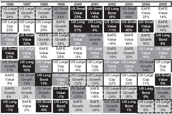

Figure 2.6. Global Growth and Value Performance Relative to Global Yield Curve Position. Source: Bloomberg, Global Financial Data, IMF, Thomson Financial Datastream.
Unless you've been to a seminar given by me or my firm, you've probably never seen yield curve spread and performance of value and growth stocks overlaid this way. Nobody sees this pattern, and yet, the relationship is remarkable. And for good reason.
You see the correlation between the yield curve flattening and growth taking over leadership, and vice versa—but so what? As said before, there are many existing patterns that don't necessarily mean anything. Before you go half-cocked and make serious portfolio changes based on a chart with correlation, you must check your pattern for causality. Without a causal correlation, you have no basis for a bet. If something is causal—if something happens because of something else—then they're always correlated. But two correlated variables won't always be causal. When you took statistics in school, they told you high correlation doesn't necessarily mean causality but causality does mean high correlation. The essence of a Question Two is looking first for high correlations and then seeing if you can justify causality tied to simple economics.
Two events can show correlation by accident or coincidence (by definition, the same thing). This is the gambler's fallacy in reverse—every time you flip a coin, you have a 50/50 chance of getting heads, no matter if the previous 100 flips resulted in heads. Just because you have evidence of Y happening with some regularity after you observe Q a number of times, you can't bet it will happen again, no more than you have better odds on the 101st flip being tails.
If Y happens to follow Q often, but you can't sort out good economics behind the correlation, go back to the drawing board. There might be something else happening when you observe Q that is really causing Y, and you must figure out what the mystery variable is (X, perhaps?) before you start placing bets. Or you might simply have found a statistical freak. Statistics can be freaky. If you have correlation without causality, you have nothing. Your discoveries must make basic, economic sense before they are useful.
What if you measure Q seeming to cause Y and, what's more, it makes sense? But you observe Q leading to Y only 70 percent or 80 percent of the time. Should you abandon this tool? No way! In investing, 100 percent correlation never happens. There are so many market pressures, so many moving maybes—if you wait for 100 percent correlation, you will never make a market bet. If something is correlated 70 percent of the time, that's a biggie. You can worry about the other 30 percent later. Often in life, Y is caused 70 percent by Q and 30 percent by X or X+L and is simply multifactorial. Still a 70 percent correlation with good causality is heck-a-profitable. If you could bet steadily winning 70 percent of the time, you would blow away all professional investors in no time. All! If you can show Q causes Y with some regularity and it makes economic sense, when no one else has a clue what causes Y—you have found the Holy Grail.
So, does the change in yield curve spread correlating to whether value or growth leads the market link to any basic economics? Absolutely! It stems from how corporations raise capital and how much incentive banks have to lend that capital.
The core business of banking is and has always been borrowing short-term money as the basis upon which they make long-term loans. In the industry vernacular, it has always been phrased, "Borrowing short and lending long." The difference between the short rate and the long rates is the bank's gross operating profit margin on the next loan it makes. The steeper the curve, the greater the profit banks reap on lending. As the curve flattens, banks make less of a profit on the next loan. If the curve goes inverted, banks don't feel much incentive to lend at all, which is why an inverted curve can be so bearish. Recall, banks must seek riskier loans to make a profit in this environment, and banks don't like writing loans likely to default. The yield curve spread determines banking system propensity or eagerness to lend.
If you are a bank CEO and faced with a steep yield curve, and have any sense at all, you are doing all you can to encourage your loan officers to lend. When the curve gets very steep, they get very eager. When it gets very flat, they get less eager. It isn't any more complicated than that in figuring out their eagerness to lend.
Value companies raise capital, by and large, through the use of debt. They leverage themselves to acquire other companies, build a plant, expand their product line, increase their marketing reach, or what-have-you. When the yield curve is steep and banks have an additional incentive to lend, they are more prone to lend to value companies (we see why in a moment), and value companies and their stockholders benefit.
On the flip side, growth companies raise capital, by and large, through the issuance of new stock. They can borrow money too, and do, but they can also issue stock and it's usually cheaper for them to issue stock (again, we see why soon). When the yield curve flattens, banks have less of an incentive to lend because their profit margin gets skinnier on the next loan—or disappears entirely; but investment bankers still have a terrific incentive to help growth companies issue new stock because initial public offerings (IPOs) and new stock issuances are supremely profitable undertakings for them. Consequently, in this environment, value companies begin to fall out of favor and growth takes over leadership. The growth companies now have ample opportunities to raise capital to fuel higher earnings just when the value companies can't raise capital easily.
Again, when you can't fathom something, reframing or flipping it around so you see it differently often helps. Let's flip P/Es to see this right. You know growth stocks typically have higher P/Es than value stocks, by definition. And they have loftier public images as great firms. Suppose some growth stock has a P/E of 50 and some value stock has a P/E of 5. You know the 50 is really $50 of price divided by $1 of earnings and the P/E of 5 is $5 of price divided by $1 of earnings. Now flip them into an E/P and you have the earnings yield we discussed in Chapter 1. The 50 flipped becomes 1 divided by 50 or 2 percent. If the company's accounting is accurate, and its earnings are stable, that 2 percent is effectively its after-tax cost (remember the P/E was after tax so the E/P is too) of raising expansion capital by selling stock—a very low cost compared to borrowing long-term debt at corporate bond rates. The company with the P/E of 5 is an E/P of 1 divided by 5, or 20 percent—a very high after-tax cost of raising expansion capital compared to borrowing long-term debt through bonds.
When companies borrow, the rate they pay is a pretax rate too, so the company with the P/E of 50 (E/P of 2 percent) can make its own earnings-per-share rise by simply selling stock at 2 percent and buying a 5 percent Treasury note and picking up the after-tax spread as profit. The firm with a P/E of 5 (E/P of 20 percent) can make its earnings-per-share rise by simply borrowing 10-year money at 7 percent (if that is what the going rate is) and buying back its own stock with a 20 percent after-tax return. It picks up the after-tax spread as free money. The growth company will be prone, whenever it can, to raise expansion capital cheaply by selling stock. The value company won't; it will want to get expansion capital by borrowing money to the extent it can.
Let's flip and reframe again. Instead of being a corporate borrower or stock issuer, you are a bank loan officer. You've got four loan customers:
Microsoft, a famous big-cap growth company,
Ford, a famous big-cap value company,
Geewhizatronics, a not-famous small-cap growth company, and
Local County Cement, a not-famous small-cap value stock.
These four are your only customers, and each one has borrowed the same amount from you. Pretend these loans were issued so you could call them back in, forcing the borrower to pay them off whenever you want. One day your bank president comes in and tells you something goofy has happened with the credit markets and it's no longer profitable for the bank to have so many loans. He tells you to pull in 25 percent of your loan base by cutting off one of your customers—your choice. Who do you cut off?
Well you don't cut off Microsoft, generally regarded as one of the world's greatest companies. If you did, all the good old boys at the Loan Officers Club-and-Pub would laugh you under the bar. You don't much want to cut off Ford either. It isn't quite up to Microsoft's image for quality but it's a pretty big name—although you've heard Ford isn't doing so well recently and Toyota has overtaken them in sales—still you don't want to cut them off. Cut off Gee-whizatronics? I don't think so. Some local folks have a rumor it could become the very next Microsoft. If you cut them off, again, the good old boys will be laughing you under the bar when (if?) Geewhiz actually whizzes. Nope! The one you cut off is small-cap value Local County Cement. Doggy, stodgy, been-there-forever—but if construction dries up their profits do too. No seeming growth potential. This decision is easy. You keep Microsoft, Ford, and Gee-whizatronics, and cut off Local County Cement. The good old boys won't laugh at you for that. They never think about Local County Cement other than when laughing at them. They won't even let the CEO of Local County Cement into their Club-and-Pub.
In effect, what have we done? We've deprived capital from the value side, primarily smaller value though you were tempted to ding the big boy—Ford (and maybe you will next time)—but not growth. Local County Cement had been planning to expand, but now must scrap those plans and hence its stock tanks. Looking forward it can be nothing but defensive and must live mainly from cash flow without access to any expansion capital other than what it produces through profits. Meanwhile, growth stocks can get expansion capital by selling stock since they have high P/Es—low E/Ps. They keep growing and looking good to investors. In fact, the high P/E firm can grow right then and there, if it wants, by selling some cheap stock and launching the expansion into cement that Local County Cement previously intended, eating its lunch.
Fast forward three years. You've been living happily with your three loan customers, but one day your boss walks in and says something goofy happened in the credit markets and now he (I say "he" because historically big bank presidents are male—something genetic in the industry I'm sure) needs you to expand your loan portfolio. He tells you the yield curve, whatever that is, is really steep and the bank will make fat gross operating profit margins on the next loan you make. "So go out there and make a loan, Johnson," he orders you. "My name isn't Johnson," you mutter to yourself, but nonetheless you call Microsoft. They don't want to borrow any more money because they just floated some stock. Ford has already borrowed beyond what a drunken sailor on leave could consume and is figuratively lying unconscious on the factory floor. Geewhizatronics just laughs at you because they are planning an upcoming stock offering at 1200 times future earnings and don't want to be seen talking to a banker for fear it could hurt their offering.
And suddenly you get this weird idea. There was that local cement company: Local County Cement. You call them and offer to lend them money. The CEO falls out of his chair because no one has spoken to him in years. He calls downstairs to the basement asking for Ed and says, "Ed! Remember those expansion plans we put on the back shelf a few years ago? Find 'em, dust 'em off, and get 'em up here. There's some crazy banker wants to lend us money and suddenly we can grow just like we're Geewhizatronics."
Actually, Local County Cement can't grow like Geewhizatronics might, but it can become more growth-like with financing than without it. Hence, the swing in the yield curve determines when the bank lends to Local County Cement and when it won't, and when the stock will be priced more like a growth company or more like dead meat—or old, cold concrete.
This anecdote shows the simple economics behind why shifts in the global yield curve, which reflect banking system propensity to lend, define when growth stocks and value stocks alternate in leading and lagging the market. Pretty simple.
Now you have a correlation pattern supported by economics—very fundamental. What's more, your fellow investors aren't thinking about how the yield curve impacts corporations in their quest for capital and how that, in turn, impacts market returns. They're probably not even thinking about the yield curve correctly to begin with.
The answer to this Question Two gives you a rational basis for a market bet—understanding when growth and value will cycle in and out of favor. How does this impact you and the decisions you make? Easy! Look at the yield curve in America and interest rates around the globe. We've gone from a pretty steep yield curve to a much flatter yield curve in a short time. Value stocks have led globally all while the yield curve was steep and as it flat-tened—which we know is normal. As I write, America's yield curve is slightly inverted, though the global curve is slightly positive. Keep an eye on global rates. They will let you know when growth should take over leadership. It could be very soon. Might not! When that global curve is completely flat, start jettisoning value stocks in favor of growth to capitalize on what you know that others don't.
How changes in yield curve spread impact the growth versus value trade off is easy to see with data and makes sense. No advanced degree in finance or statistics required—just publicly available data and an Excel spreadsheet, or even some graph paper. As we learned in Chapter 1, if you need fancy engineered equations, your hypothesis is probably wrong.
But what if you discover a pattern that is tough to prove with data though it makes tremendous sense? And what if the pattern is fairly predictable? Here is an example. Table 2.3 shows presidents going back to 1925 and the subsequent annual return on the S&P 500 (which goes back to 1926). By splitting the first two years of the presidential term from the last two years, you can see, for the most part, the last two years of the presidential cycle tend to be positive.
Take a pencil and put a line through 1929 through 1932. You will remember these years as the beginning of the Great Depression, a period unlikely to be repeated any time soon due to extensive banking and market reform and much knowledge we didn't have back then about how economies and central banking work. Otherwise, you get only three other negative years in the back halves of presidents' terms. Negative a scant 0.4 percent, 1939 was not such a bad year.[35] Even 1940 was negative just 10 percent.[36] Those years being negative oughtought not shock you since the market was discounting the beginning of World War II. The year 2000 was pretty odd as well and in many ways is the exception that proves the rule. After the terrific bull run of the 1990s, we experienced the tech bubble bursting—plus late in the year a near constitutional crisis surrounding the presidential election. It was the first time in modern times we had a president who hadn't won a majority of the popular vote.
Table 2.3. The Presidential Term Anomaly
President | 1st Year | 2nd Year | 3rd Year | 4th Year | ||||
|---|---|---|---|---|---|---|---|---|
Source: Ibbotson Analyst. | ||||||||
Coolidge | 1925 | n.a. | 1926 | 11.6% | 1927 | 37.5% | 1928 | 43.6% |
Hoover | 1929 | −8.4% | 1930 | −24.9% | 1931 | −43.3% | 1932 | −8.2% |
FDR - 1st | 1933 | 54.0% | 1934 | −1.4% | 1935 | 47.7% | 1936 | 33.9% |
FDR - 2nd | 1937 | −35.0% | 1938 | 31.1% | 1939 | −0.4% | 1940 | −9.8% |
FDR - 3rd | 1941 | −11.6% | 1942 | 20.3% | 1943 | 25.9% | 1944 | 19.8% |
FDR / Truman | 1945 | 36.4% | 1946 | −8.1% | 1947 | 5.7% | 1948 | 5.5% |
Truman | 1949 | 18.8% | 1950 | 31.7% | 1951 | 24.0% | 1952 | 18.4% |
Ike - 1st | 1953 | −1.0% | 1954 | 52.6% | 1955 | 31.6% | 1956 | 6.6% |
Ike - 2nd | 1957 | −10.8% | 1958 | 43.4% | 1959 | 12.0% | 1960 | 0.5% |
Kennedy/Johnson | 1961 | 26.9% | 1962 | −8.7% | 1963 | 22.8% | 1964 | 16.5% |
Johnson | 1965 | 12.5% | 1966 | −10.1% | 1967 | 24.0% | 1968 | 11.1% |
Nixon | 1969 | −8.5% | 1970 | 4.0% | 1971 | 14.3% | 1972 | 19.0% |
Nixon / Ford | 1973 | −14.7% | 1974 | −26.5% | 1975 | 37.2% | 1976 | 23.8% |
Carter | 1977 | −7.2% | 1978 | 6.6% | 1979 | 18.4% | 1980 | 32.4% |
Reagan - 1st | 1981 | −4.9% | 1982 | 21.4% | 1983 | 22.5% | 1984 | 6.3% |
Reagan - 2nd | 1985 | 32.2% | 1986 | 18.5% | 1987 | 5.2% | 1988 | 16.8% |
Bush | 1989 | 31.5% | 1990 | −3.2% | 1991 | 30.6% | 1992 | 7.6% |
Clinton - 1st | 1993 | 10.0% | 1994 | 1.3% | 1995 | 37.5% | 1996 | 22.9% |
Clinton - 2nd | 1997 | 33.3% | 1998 | 28.6% | 1999 | 21.0% | 2000 | −9.1% |
Bush, G.W. | 2001 | −11.9% | 2002 | −22.1% | 2003 | 28.7% | 2004 | 10.9% |
Bush, G.W. | 2005 | 4.9% | 2006 | 15.8% | ||||
Median | 2.0% | 6.6% | 23.4% | 13.8% | ||||
Number of Positive Years | 10 | 13 | 18 | 17 | ||||
Number of Negative Years | 10 | 8 | 2 | 3 | ||||
Average | 7.3% | 8.7% | 20.1% | 13.4% | ||||
Actually, that is widely stated but untrue. We often have a president elected without a majority of the popular vote. Al Gore, despite media commentary to the contrary, didn't win a majority of the popular vote (48 percent) in 2000.[37] Bill Clinton never did because of minority candidates like Ross Perot and later Ralph Nader.[38] Abraham Lincoln didn't win a majority of the 1860 popular vote—he only got 39.8 percent.[39] But he did in 1864 with 55 percent.[40] What people mean is Al Gore got more votes than George Bush. Neither won a majority of the popular vote in 2000, and they are in good company with John Kennedy in 1960 and Richard Nixon in 1968.[41]
What they mean—what was different in 2000—wasn't the lack of a winner by majority vote, but that Gore, who won the most popular votes, didn't win the Electoral College—which is the end game. That launched us into uncharted territory to determine the election's outcome as Gore challenged the Florida vote in court for its precious electoral votes. The challenge created uncertainty and increased the weirdness of year-end 2000. Markets hate uncertainty. To show you the effect of that year-end, on September 1, 2000, the S&P 500 was up 4.3 percent for the year.[42] The negative year is from the election uncertainty in the last quarter—leading 2000 to be one of the very few fourth years of any president's term that has ever been negative.
What we can say is, barring events of epic proportions, the back halves of presidential terms are periods when the stock market hasn't wanted to have negative returns. It's also obvious, as you look at these data, the third year of a president's term has been the best—most uniformly positive with the highest average returns.
All else being equal, the back halves of presidents' terms have been quite positive. Knowing this can alleviate some anxiety as you attempt to forecast. You should be otherwise slightly biased toward bullish in the last two years in an election cycle. This is widely disregarded (and therefore, powerful) information you can put to use immediately as this book first appears in 2007—the third year of Bush's last term.
By contrast, market risk tends to concentrate in the first two years of a president's term, where yet another pattern emerges. When you do get a negative year in the first half, you usually (although not always) tend to get only one. If the first year is negative, the second year is usually not, and vice versa. While you do occasionally get two positive years in the first half, two negatives in a row are rare. Again, ignore 1929 and 1930 as Great Depression years and therefore an anomaly. You also get a second negative year during Nixon's truncated second term, but that was a pretty darned weird time too.
You might find this bit of forecasting technology an assault on your intelligence. "Why, it's patently absurd and overtly simplistic," you might say. It is simple, and that's why it's so great. This pattern isn't hidden away, cloaked in mystery. It's right out there, in the open, plain and easy to see. You've probably already heard of the presidential term cycle—it is a term that is well-known and censured as voodoo (although no one uses it like I'm prescribing). If everyone thought it a nifty tool, it would have become priced into the market and lost all its power. As long as folks continue to sneer at it, you know you have an edge.
Strong trends not commonly observed or accepted are powerful. Even so, this one is a little hard to prove with raw data statistically—calendar years don't work that way. But it makes tremendous economic sense. The market dislikes nothing so much as uncertainty; and a new president, even a newly reelected president, presents the market with tremendous uncertainty. Among poli-tics, the president is the big tic—the one who ultimately knows how to tic off the fewest people while getting elected and tic off the most afterwards. If a poli-tic is a phony, one capable of winning a presidential election is a genuine and most capable phony. Nobody can predict what a genuine phony will do next.
George W. Bush thoughtfully violated a basic rule in 2002 all presidents have known—their party almost always loses some relative power to the opposition party in Congress during the mid-term elections. Bush was the first Republican president in more than 100 years to have his party gain seats in the mid-terms.[43] A president knows his party is likely to lose relative power to the opposition in the mid-terms, so whatever is the most onerous legislation he would hope to pass, the hardest to get through Congress, the landmark of his presidency, he must try to get it passed in the first two years. If he can't get it legislated then, he certainly wouldn't be able to do so in the back half of his term.
The biggest and ugliest attempts at redistribution of wealth, property rights, and regulatory status (which is property rights) almost always have occurred in the first half of presidents' terms. Fundamental to capitalism itself and capital markets stability is faith in the stability of property rights. We often take property rights for granted because America has the best, most perfected, and most stable system of property rights in the world's history. It is a key part, going back to George Mason's fundamental force on the founding fathers, leading to America being so great a nation. Anything threatening the sanctity of property rights raises risk aversion and scares the heck out of capital markets.
In the first year of his term, a president is in his honeymoon, eager to spend the political capital he earned during the campaign. Rosy-cheeked, with a sparkle in his eye and his shiny family at his side, the new guy usually shoots out the gate trying to get his toughest stuff passed—this being the infamous first 100 days of a president's term when he lays out his agenda. The threat of those shifts in property rights or wealth re-distribution lead to higher risk aversion and the first halves of presidents' terms being perfect loam for bear markets to propagate in. Hence, the first half of a president's term is generally marked with a busy legislative calendar and a disproportionate amount of our bear markets. This doesn't mean the president's proposed legislation succeeds, mind you, but that he makes a go at it. And there is the risk he gets his agenda passed and the markets don't like that risk.
Remember after Bill Clinton's 1992 election, he raised taxes in 1993 though he had promised in his campaign to cut taxes, and then in 1994, he threatened to nationalize health care (a shift in property rights). All typical first-half politico-tomfoolery of a genuine phony. Other times, as with President Bush, there was never a material legislative agenda proposed at all—not for either term. When there is, it's the grist of a disproportionate amount of our bear markets.
Any new proposed legislation implies potential change and a reapportionment of your money and property rights. No matter what the government decides to do, no matter how wonderful the new programs may sound, no matter how incontrovertible the benefit is—new legislation means money and rights get shifted around. Low cost prescriptions for the poor and elderly! Who could see that as bad? Stiffer penalties for society's worst offenders—pedophiles, rapists, and puppy stranglers? Sign me up! Free ponies for all children? You'd have to be a monster to oppose that! Whatever it is, Uncle Sam takes money or rights from one group, fusses around with it, and passes whatever is left to yet another group. We already know we hate losses more than we like gains. The group on the losing end of the transfer hates losing much more than those on the winning end of the transfer like it. Those not party to the transfer watch it transpire and think they've just seen a mugging. Markets view redistribution of wealth or property rights like witnessing a mugging. It causes fear beyond the size of the action itself because it makes all witnesses realize they could be mugged next. Consequently, the market can be weak somewhere in the first two years because the market doesn't like politically forced change.
By the third and fourth years, we know our president. He may be a poli-tic, and we may dislike him, but he is our time-proven bloodsucker. There's not much left to surprise—we think we know what he is up to, what his agenda is, and how capable he is of getting anything done (or not, and sometimes not is a pretty good thing in a world that doesn't like forced political change). Moreover, presidents tend to avoid any potentially controversial legislation in the back half of their terms because they are either trying to get reelected themselves or they're just tired and hanging on, which is often true in a president's seventh and eighth year.
A particularly good poli-tic will hang back in his third year, get little done, and at election time blame his administration's ineffectiveness on poli-tics from the opposing party. "I could have gotten you the free ponies I promised," he might intone, "had it not been for those uncooperative Senators from that other damned party who opposed me! So get rid of those losers, and vote for these other guys who support me, and next time I'll get you your free ponies." Quiet legislative years lead to happier markets. (They almost never lead to free ponies.)
We're not done with presidential terms yet. Ask yourself, what else is going on no one notices or lends any credence? We know the first two years are where most of the market risk will likely be. Is there anything particularly remarkable about the first half of a second term for a reelected president? Ignoring all the first and the single presidential terms, see what patterns you can find in Table 2.4.
Table 2.4. Incumbents Uninhibited
Won Re-Election | ||||
|---|---|---|---|---|
Election Year | Party | President | 1st Year of Second Term S&P 500 | 2nd Year of Second Term S&P 500 |
Source: Global Financial Data. | ||||
1900 | R | McKinley | 19.8% | 4.9% |
1904 | R | Roosevelt, T. | 19.7% | 6.8% |
1916 | D | Wilson | −25.3% | 25.6% |
1924 | R | Coolidge | 29.5% | 11.6% |
1936 | D | Roosevelt, F. | −35.0% | 31.1% |
1948 | D | Truman | 18.8% | 31.7% |
1956 | R | Eisenhower | −10.8% | 43.4% |
1964 | D | Johnson | 12.5% | −10.1% |
1972 | R | Nixon / Ford | −14.7% | −26.5% |
1984 | R | Reagan | 32.2% | 18.5% |
1996 | D | Clinton | 33.3% | 28.6% |
2004 | R | Bush | 4.9% | 15.8% |
Again, you tend not to get two negatives in a row, except for that screwy Nixon. But when you don't get a negative year, you tend to get a big positive year. Positive years in the first half of a reelected president's term have averaged 21 percent and 23 percent respectively[44]—big booming positive years. These years typically are either negative or up super big—extreme one way or the other—sort of barbell-like returns. Being on the right side of the market is more important and most keen in its impact during these years. This is a good example of looking beyond averages into what makes up the averages. The historic averages of first and second years of presidents' terms are below average. But within those averages, you get a very wide spread between nasty years and pretty great years. Averages can be very deceiving. And in this regard, your most recently and therefore most emotionally felt experience from 2005 causes you to otherwise not notice the pattern. The small positive return in 2005 is out of character for the first year of a president's reelected term when they tend to be negative or very big. In 2009, I'd bet on negative or huge.
(Technically, Teddy Roosevelt wasn't really reelected in 1904 since he wasn't elected in the first place—same for Truman in 1948 and Johnson in 1964. But I'm not really sure that matters to the phenomenon.)
Should you abandon all other forecasting efforts and let your political calendar be your one determining factor in your allocation of stocks, bonds, and cash? No! That would be beyond super silly! While the presidential term cycle is a trend and makes absolute socioeconomic sense, keep in mind there are many other market forces at work, including all the ones that are outside of America. For example, the U.S. markets correlate to foreign markets in our increasingly globalized economy. Foreign forces can and will impact America. Never assume you have found the one silver bullet.
To summarize, market risk trends higher in the first half of presidents' terms. The back half tends to be positive with the third year most positive. In the front half when it isn't negative, it tends to be up big and particularly so in second terms (even though that didn't happen in 2005 and 2006, making it more likely in 2009 and 2010). What's more, the tendency for nonnegative years to be up big makes sense. Apprehension about political risk fading away can lead to elation causing big positive years. As this book comes out in 2007, I'd see its being a third year as a definite mild market positive. Would I bet the house on it? No way. If lots of people start talking about the third year being positive and getting excited about it, I'd know this phenomenon was discounted into pricing already and I wouldn't count on it at all. That would be bearish. If it were mentioned a lot but only to be demeaned as ridiculous then I'd believe it might have legs and 2007 could be nicely positive. And I'd already remember forces outside America are as powerful as those in America.
Something like this is a simple example of fathoming something others can't or won't fathom. But then, if for whatever reason others start widely fathoming it, it won't work because it will be discounted into pricing.
I'm waiting to see if a president can turn the presidential cycle on its head. Most presidents push through their most controversial agenda in their first two years when their congressional power is greatest and they have political capital to spend. A truly smart genuine phony—a really big, blood-sucking poli-tic—would fool the populace into thinking he's going to follow suit, but instead focus his first two years on gathering still more political capital as opposed to spending it. This would lead to less legislation and happier markets, all the while bolstering the presidential term cycle naysayers's argument that this forecasting tool is bunko. Then, he would parlay his political capital into a mid-term victory with more of his congressional brethren earning seats. Then he could legislate more easily during the back half of his term. Effectively, he would have reversed the trend by saving all the legislation, risk aversion, and negative market-moving change for the back half of his term. Someday someone will pull that off. It will be a thrill to see. So far we haven't had tics skilled enough to do it. But someday, maybe.
You may be surprised I'm sharing with you, in this chapter and others, any of what I've come to believe I know that others don't. Why give it away if I think I know something giving me an edge? Now lots of people will know what I know, meaning it will soon be priced into markets and therefore not work anymore, right?
Maybe, maybe not. I've been talking and writing about presidential term cycles for a long time and every time I do, someone looks for a giant butterfly net to haul me away. Just like my views on high P/Es. People think I'm a kook for believing this works, which is how I know this little bit of technology still is powerful. The same is true for most other examples I share in this book. Once I've found something that works, I continually test it to make sure it hasn't become priced. Once I believe I've fathomed something new, I look to see if others can or will fathom it. The way I test it is by giving it away. The more people think it's nuts, the more they don't fathom what I find fathomable and the more I know it will still work. If they start embracing it, thinking it's good and not nuts, then it won't work. It becomes obsolete. When an unfathomable becomes widely fathomable, it's time to abandon it and fathom new unfathomable truths.
The goal with Question Two is to know something now that might be common knowledge in 3 or 30 years. Once everyone knows your new piece of reality it will no longer be useful to you. So test it. Ask your friends and colleagues if they were aware shifts in the yield curve signal a change in style leadership. Ask if there is any truth to the presidential term cycle. As long as the response is a blank look, a "What?" or, "That's crazy!" or an even better, "You're crazy!" you still have a basis for a bet.
I give away some—not all—of the findings I've had over the years so I know what I can safely continue using and what has outlived its usefulness. Far too many of my peers stick to repeating what they learned at the knee of their mentors and wonder why they can't beat the market. Winning at investing requires constant innovation and constant testing.
Now you can use Question One to free yourself from blindness and Question Two to fathom the unfathomable. However, none of this will keep you from persisting in your old investing errors if you can't control your brain. Investing is inherently counter-intuitive. You can remind yourself of that all you like but your cranial command center rebels. In a fight between you and your brain, your unruly brain will always win—unless you learn how to ask Question Three. Next chapter!