Color is the unsung hero of web design. A good color palette can draw your audience into your site, give them a powerful feeling of immersion, and keep them coming back for more. And when it comes to color and web design, it’s not just about picking a good color palette, it’s also about how you apply those colors. You can have a great color palette, but if you don’t use those colors thoughtfully, people might avoid your site like the plague. By the end of this chapter, you’ll not only be intimately familiar with the impact that color has on the web user, but you’ll also be able to choose a great looking color palette that fits in—and even complements—your user-centered websites.
The site you designed for RPM Music was a big hit. Sam, the store owner, has received such good feedback that he wants to extend his reach and create a new site called SampleRate that offers coverage of the local music scene—and he wants you to design his new website. The thing is, Sam has got it in his head that he wants the new site to be part of the 9Rules Music network (http://9rules.com/music). If this new site is chosen to be part of the network, it would mean a lot of exposure for the store and the site (and you as a designer).

In today’s web, blogs are everywhere. The problem is that there are so many that it’s hard to know where to find the good ones. That’s where 9Rules comes into the picture. 9Rules (http://9rules.com) is a cross between a blog aggregator and a blog network. It syndicates the posts of its members (which are conveniently organized by topic categories, such as music, photography, science, design, and games) and provides a one stop shopping spot for those wanting to find top quality blogs.
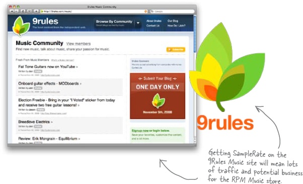
So how do we get SampleRate onto the site? Periodically through the year, 9Rules has a 24 hour submission process. During this time, site owners can submit their blogs to be reviewed for membership. On average, 9Rules only accepts about 30 or 40 sites per submission round (out of thousands). The bottom line is that getting accepted into 9Rules is a huge deal and the goal of many designers, content producers, and bloggers.
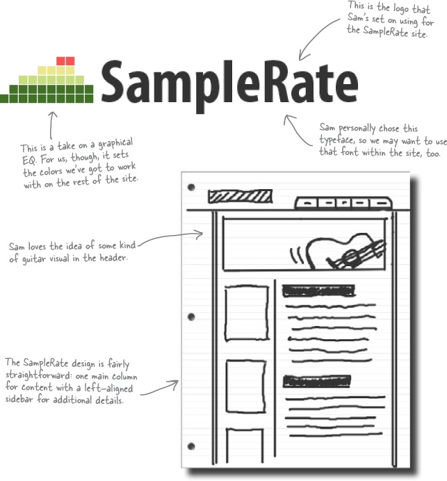
Sam loves your storyboards, but there’s a catch: he’s already got a logo for SampleRate that he loves. No matter what else you come up with, you’ve got to make the new SampleRate site mesh with the existing logo Sam’s picked out.
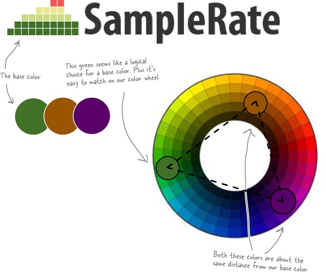
That means we’ve got some choices taken care of for us, like colors. Take a look at the SampleRate logo... what will this dictate about our design?
So how did you feel when you first looked at the SampleRate logo? No matter whether you liked it or hated it, you probably felt something. That’s because color creates emotion. For example, red is associated with excitement, purple is dignified and stately, yellow is cheerful, and blue is associated with comfort and security.
When we’re designing a site that involves strong colors, we’ve got to think about the emotions those colors generate. Pages that use color well have a feeling that you don’t get from sites that don’t consciously use color as a design element or that use color poorly. You should treat color as an element, one that’s just as important as navigation, images, or content.
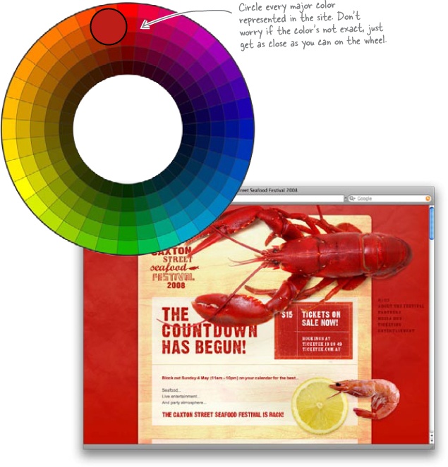
Take a look at these bold colors and the sites that use them. You can’t help but have a reaction... and that’s what we want with SampleRate: a strong, positive reaction!


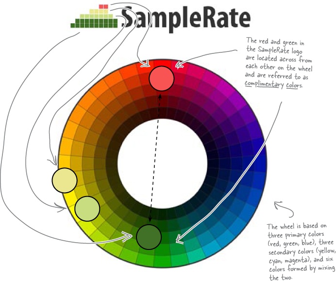
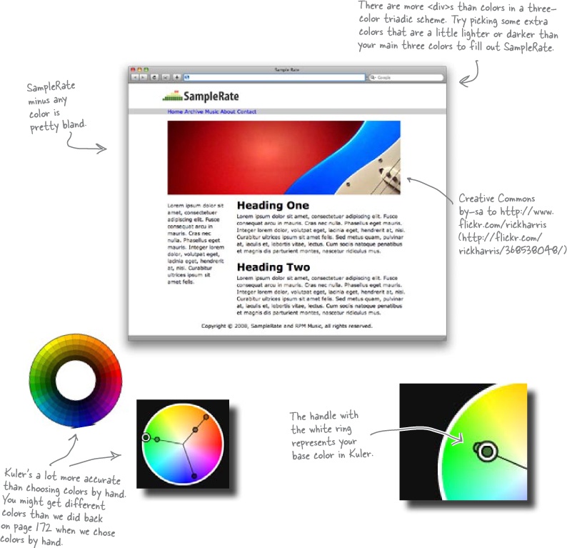
Before we can even think about what colors we’re going to use for SampleRate, let’s get acquainted with the mother of all color tools in the design world: the color wheel. The color wheel (or color circle as it’s sometimes called) is a circular diagram that displays different colors and shows the relationship between those colors.
Those relationships are key... and the color wheel lets us choose colors that go well together. Let’s start by finding some of the colors in the SampleRate logo on the color wheel:
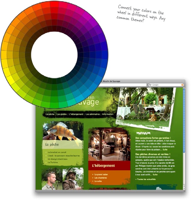
You might already be thinking, “Yeah, the color wheel is cool and all, but how do I use it to actually pick colors that work together and don’t look like a dog barfed on my web page?” This is where color schemes come into the picture. Color schemes are more than just collections of colors. A color scheme is a certain grouping of colors that goes well together.
And here’s the kicker: all good color schemes start with a single color and your handy-dandy color wheel.
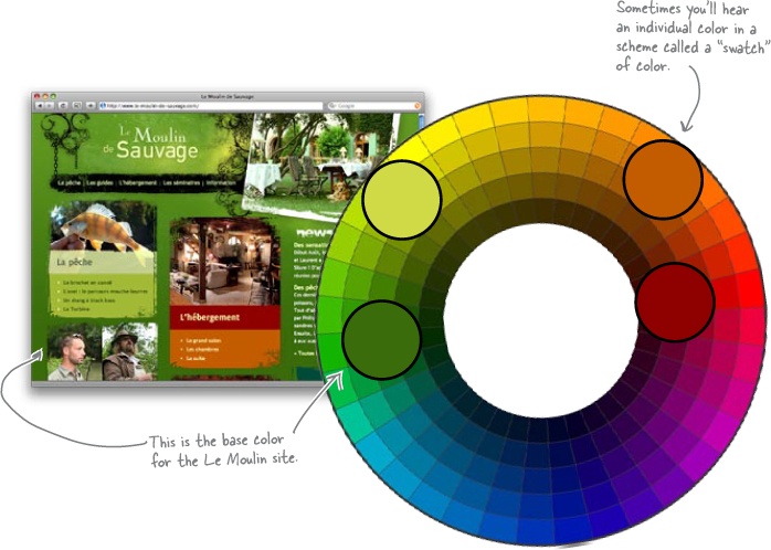
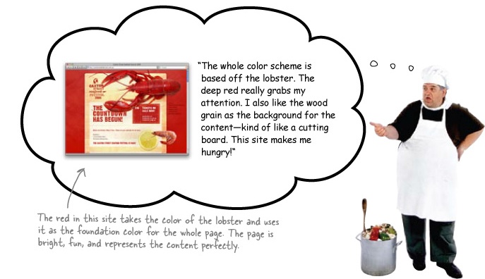
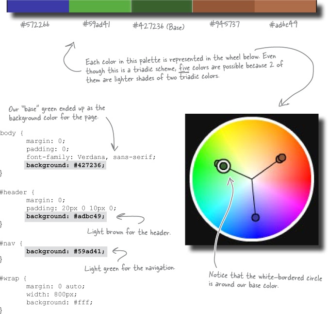
The site above has a fairly deep green all over the place. That’s the base color of the site: the color that most represents the visual metaphor and that all other colors are based on. For SampleRate, we’ll need to begin by choosing a base color. Then, we base everything else—other colors, their depth, their hue—off of that base color.
But don’t get too stressed out! There’s no right or wrong base color... and you can always abandon a scheme that you end up not liking and start over.
Color schemes come in all shapes and sizes—and they all have fancy-sounding names (monochromatic, analogous, complementary, triadic, tetradic, etc.). Don’t worry, once you get past their names, they’re really just pretty simple ways to pick different kinds of color palettes that you can use for your site. Think of color schemes as just another helpful tool in your web design toolbox.
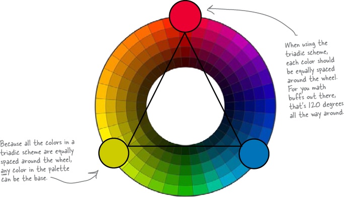
The triadic color scheme is one of the most commonly used color schemes around. Triadic uses three colors, equally spaced around the color wheel. So once you pick your base color, you can just draw an equalateral triangle (three equal sides), and pick your other two colors:
Exercise
Create a three-color palette based on the SampleRate logo that Sam provided. Make sure you start with a base color and build your palette from there.


We need a digital color wheel.
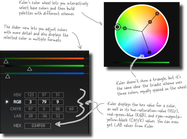
CSS requires hexadecimal values for all but the most basic colors. Hex values are 6 characters long, like #572266. A hex value tells the browser how much red, green, and blue to display. So we need a way to take the values we chose on the color wheel and turn them into hex.
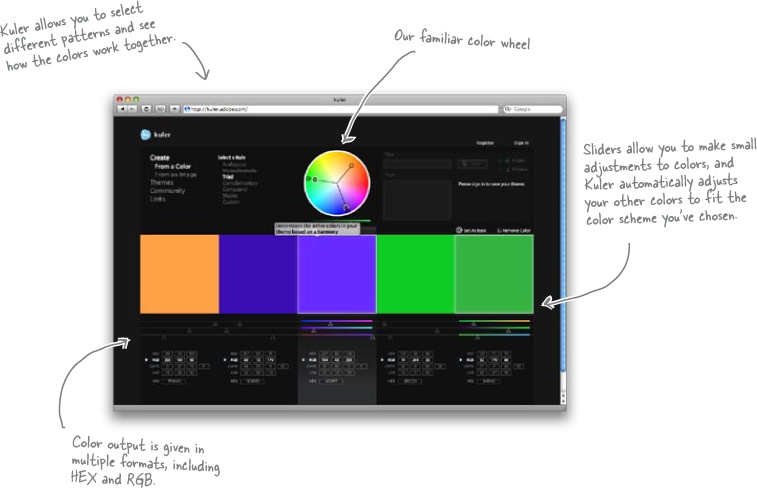
Fortunately, there’s a program perfect for the job: Kuler (available at kuler.adobe.com). Kuler not only has a digital color wheel and hex-conversion tool, it lets you check out other people’s palettes and even export your own palettes.
Stop!
Go load Kuler by going to kuler.adobe.com now. You’ll see it throughout the rest of the chapter.
Exercise
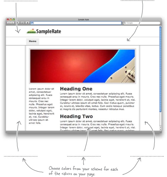
Use Kuler to take the base color you selected in the previous exercise and build a digital color palette based on the triadic scheme. Once you have your palette, add the hex color values to your SampleRate CSS file and see how they work together. Use your colors for the background colors of the various <div>s in the SampleRate site.

Sam thinks SampleRate looks heavy. That’s not surprising... remember, color causes people to feel things more than any other type of web element. So what do we do about a site feeling heavy? Well, we try and make the site feel lighter.
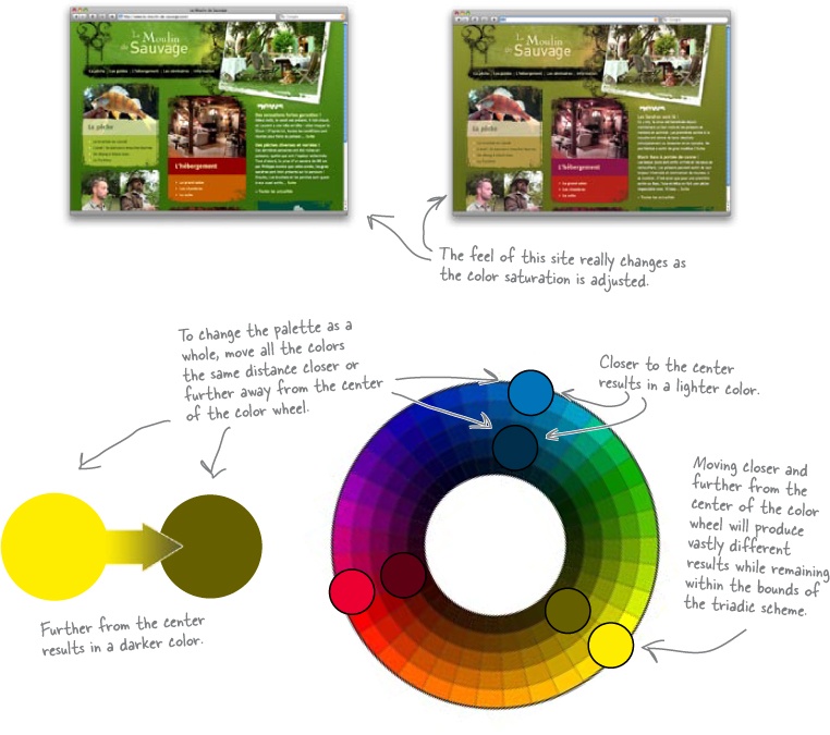
The great thing about the triadic color scheme (or any other type of color scheme) is that as long as you stick to the general location of a color on the color wheel, you can change its saturation. Saturation is just a fancy design term for the darkness or lightness of a color. So we can lighten the saturation of our color scheme... it’s the same colors, but a lighter feeling result.

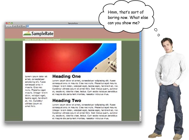
When people find a site boring, that may mean the colors are too light... but we already know that Sam doesn’t like a darker triadic color scheme for SampleRate. So if you can’t go darker, consider adding colors. In other words, go from a three-color scheme to a four-color scheme.
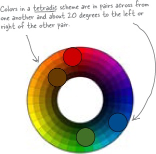
One of the most common four-color schemes is the tetradic color scheme. The tetradic color scheme (which is sometimes also called the double complementary scheme) is the richest of all the schemes because it uses four colors arranged into two complementary color pairs.
Be careful, though. Four different colors is a lot to deal with, and you can’t use all four colors equally or your site will look like a mess. But for adding some extra complexity and energy to a site, a fourth color can really make a difference.
Exercise
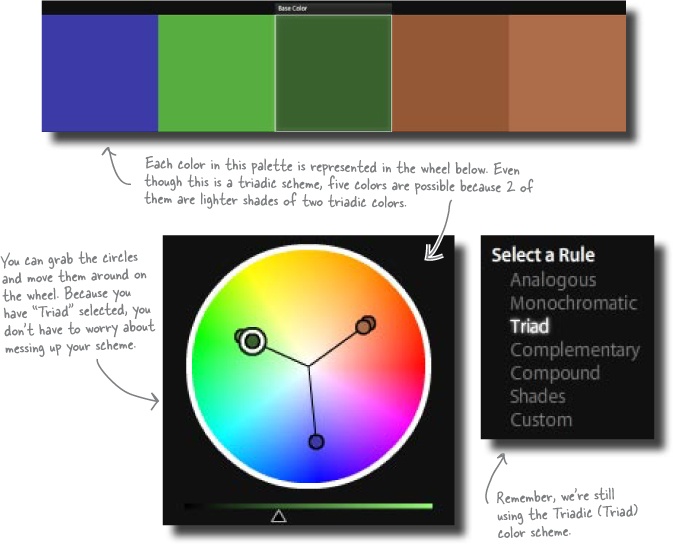
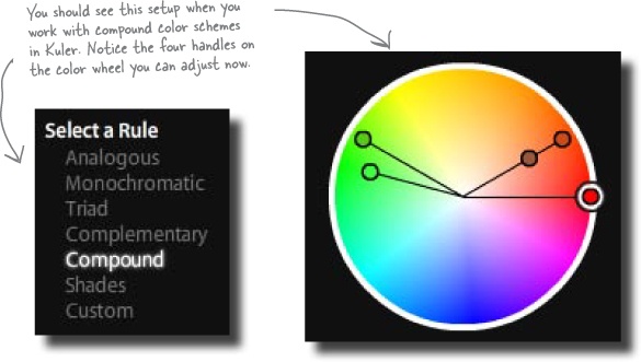
Create a new color palette for SampleRate based on a more complex color scheme like tetradic (split complimentary). Use Kuler to find the hex values for the colors you choose.
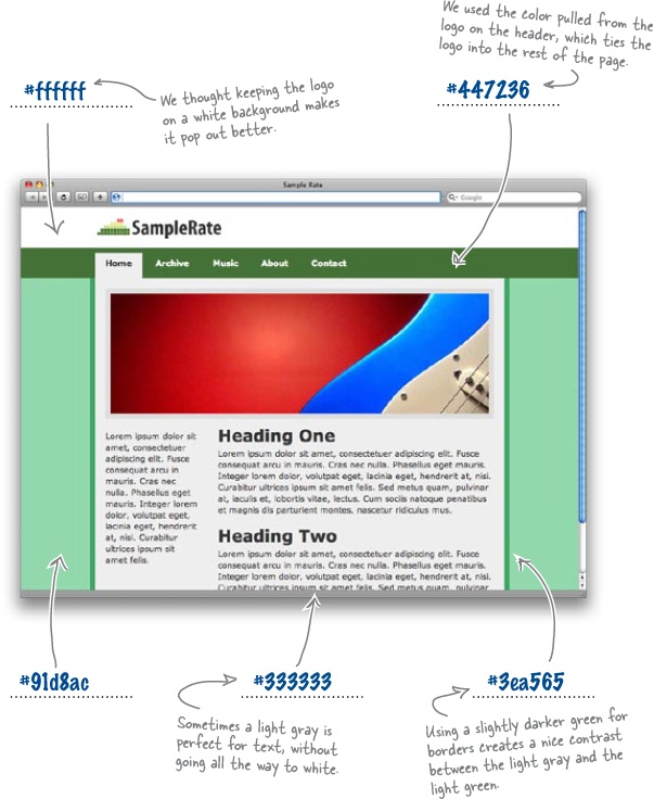
Choose a swatch from the logo colors to set as the base color of your palette (any one that you like, it really doesn’t matter).
Set this as the base color in Kuler and play around with the controls until you find a palette you like (make sure you select the “Compound” option from the Rule menu).

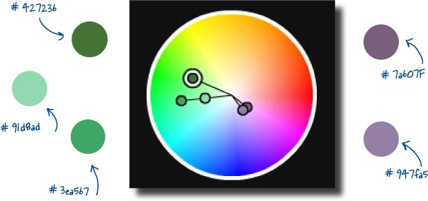
Exercise Solution
We used a tetradic scheme based on the dark green in the SampleRate logo. Kuler gave us four colors in the tetradic scheme, and we also took a lighter swatch of one of the greens Kuler provided for a little more variety.
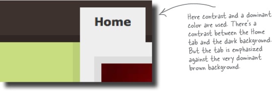
There’s no golden rule for color placement.
There really isn’t a set of rules that will always work for all sites. What looks great for one site’s structure could look awful for another site’s layout and design. On top of that, you’ve got to match your site’s theme and visual metaphor.
But there are definitely some principles you can apply:
If you want to separate different areas of your layout (say a main column and sidebar), use contrasting colors. This contrast creates a border between two areas. That border lets users know that the two areas are different and probably have different functions or uses within the context of the site.

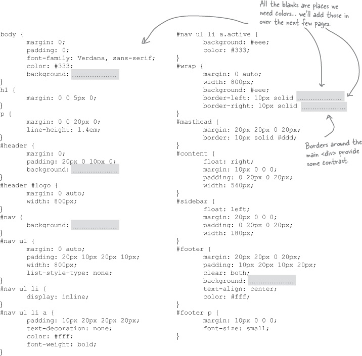
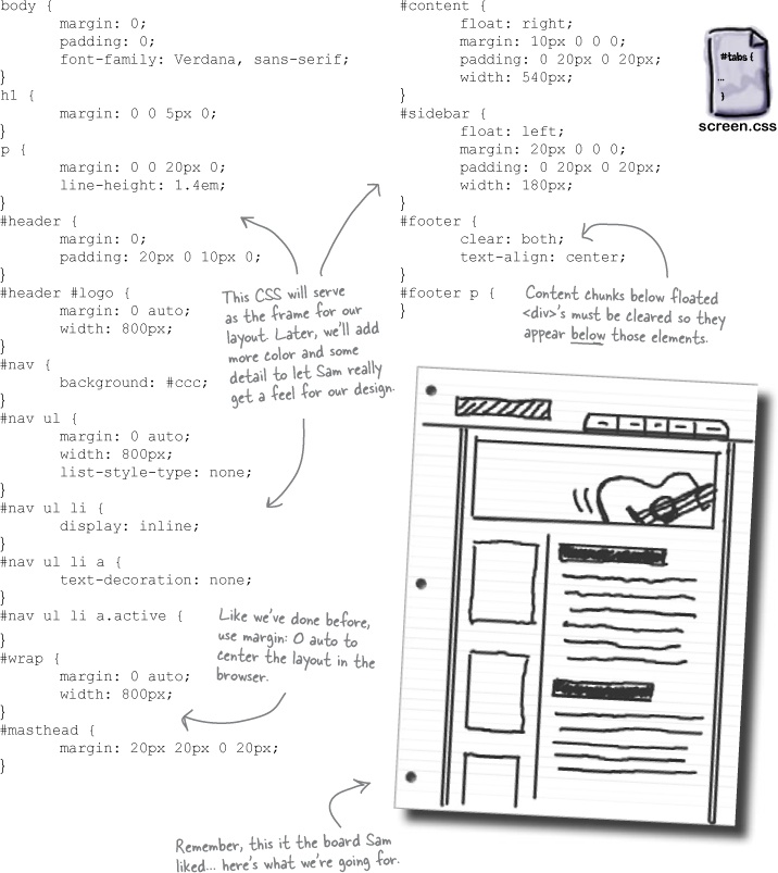
Here is the completed CSS for the SampleRate site. The colors for the design are blank (and represented by the grey bars). Get the CSS linked up with your XHTML and double check the layout. We’ll add the color in the next few pages.