Tired of butting heads with a picky client? Yeah, you know the type... every time you show them their latest crazy design idea, they’ve already moved on to another look... another color scheme... another entire website. So how do you deal with fickle clients or those tricky hard-to-get-right websites? You start with paper, pencil, and a big fat pink eraser. In this chapter, you’ll learn how to work smart before you dig into your HTML editor. Coming up with a theme and visual metaphor for your site, mocking up sketches in pencil, and using storyboards will turn you into a nimble, flexible web designer. So get out your sketch pad, and let’s pre-produce!
Mark loves to travel. After college, he took a year off to backpack around Japan and experience everything the island nation had to offer–from sushi to samurai. Now that he’s back, he wants to document his experience. It’s up to you to build Mark a great, engaging website detailing his trip to Japan.
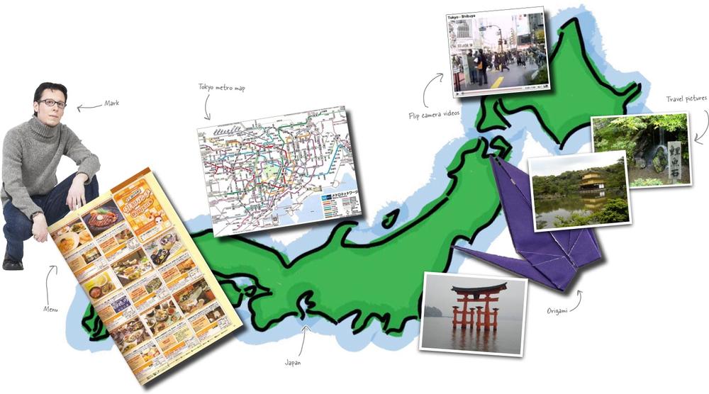
Mark’s got a ton of content, and all we know is he wants a great site. How in the world can we make sure we build Mark something he’ll love, without wasting a ton of time?
How would you start building Mark’s site?
Pre-production is all about getting things right before you dive into writing XHTML and CSS. Its all about getting your site’s design right on paper. That way, when you get to the point where you go to code, you know exactly what you are building. For Mark’s site, we can get our ideas down, before we spend a ton of time fitting text and pictures into a layout scheme Mark might totally hate.
Pre-production is also about letting your user approve what you’re doing—on the front-end, when you can still make changes easily. There’s nothing worse than investing days or even weeks into a design and then finding out the client hated it.
One sure way to get your site looking right is to figure out what the site is about. In other words, what is the site’s theme, and how can you express that visually? A visual metaphor takes advantage of familiar visual elements (likes images, interface elements, icons, colors, or fonts) and reinforce the site’s theme.
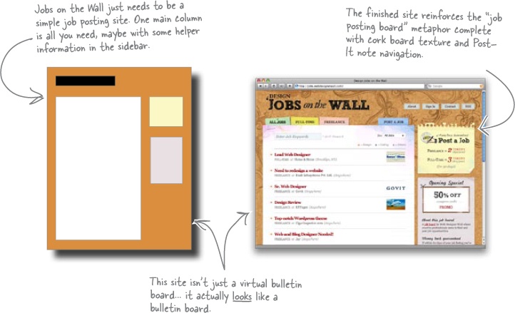
Suppose you’re building a job posting site. The postings could be made to look like an actual bulletin board using a good visual metaphor:
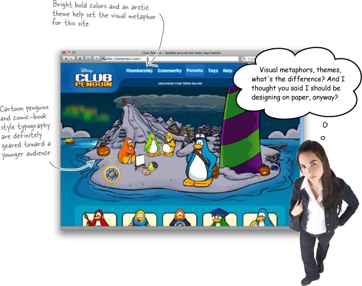
Suppose you’re creating a children’s online community site geared for kids ages 7 to 10. Visually, you’d want to use bright and bold primary colors with cartoony interface elements and fonts. These design elements reinforce the subject matter of the site: kid oriented, fun, etc. The look of the site actually tells you what the site’s about.
A visual metaphor can range from subtle (using colors that give the user an abstract feeling that the designer wants to associate with the site’s theme) to direct (using graphics that tie right into the site’s name or identity–like using graphics of rocket ships for a site called Rocket Ship Designs).
The word theme is used to refer to all kinds of different things in the world of web design-–which can be kind of confusing. In this case, a theme is your site’s purpose and content. So, the theme of amazon.com is an online merchant that focuses mostly on books. The visual metaphor uses design elements (color, graphics, typography, etc.) that reinforce the site’s theme.
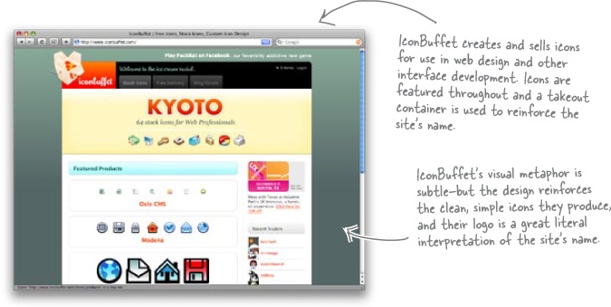
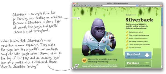
Here are a few more good examples of theme and visual metaphor working well together:
Sharpen Your Pencil
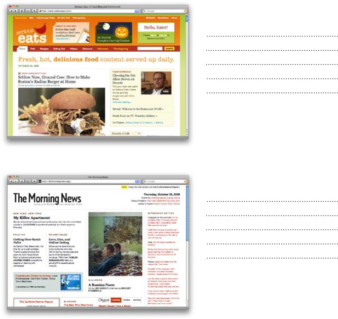
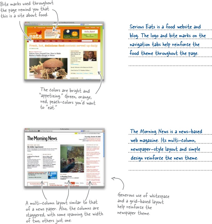
Take a look at the screenshots below. Write down the site’s theme and circle (yes, draw in the book) some of the design elements that are used in the site’s visual metaphor. Remember, a site’s theme is its content/purpose, while the visual metaphors are the design elements that are used to reinforce the theme.
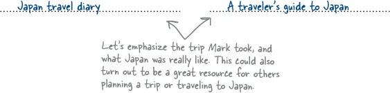
Let’s get back to Mark’s site... we need to figure out the theme, and come up with a good visual metaphor. Not only that, but we want to figure this out without thinking too much about how many columns his site will need, or what sort of navigation Mark might like.
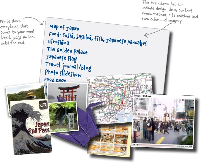
Developing a visual metaphor is really all about brainstorming–spending some time really thinking about your client’s content, audience, and what visual elements they want to see on the page. And remember one thing: don’t discredit any ideas or concepts you come up with. Just write them all down... you can refine things later..
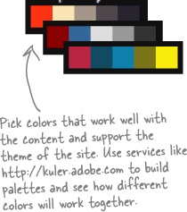
Coming up with a theme and a visual metaphor can be tricky. Once you know what content you have to work with and have a few brainstorming sessions under your belt, it’s time to start thinking about the best way to convey and display that content to your client’s users. Color, layout, and element placement are all important factors when deciding the best way to reinforce a site’s theme.
So once you’re clear on a theme, here’s what you need to do:

A visual metaphor uses common visual elements (colors, fonts, icons, etc) to help reinforce a site’s theme.
Sharpen Your Pencil Solution
Write down two possible central themes for Mark’s site. Then come up with several design elements (remember, these can be fonts, colors, logos, icons, interface elements, etc.) that will contribute to a cool visual metaphor for Mark’s site and reinforce his site’s theme. Here’s what we wrote down...
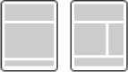
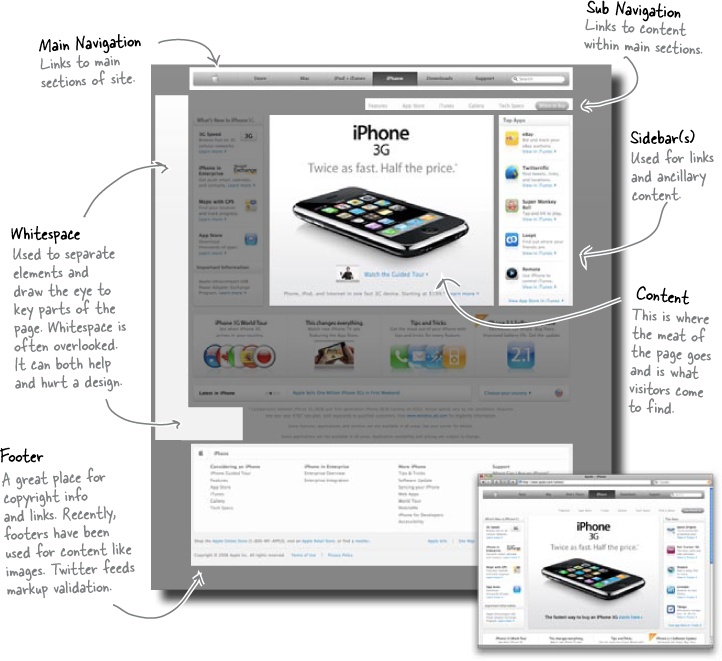
Once you have a general site theme and have started to think about what you want on your site, you need to consider where all your client’s content is going to go. How you lay out your site affects your overall visual metaphor a lot... it dictates what can and can’t appear on a given page. For example, if you only have a single column, it may be difficult to make your site “feel” like a newspaper or magazine. But add a few more columns and you can make that page mimic the grid-like, multi-column layouts of your typical daily paper.
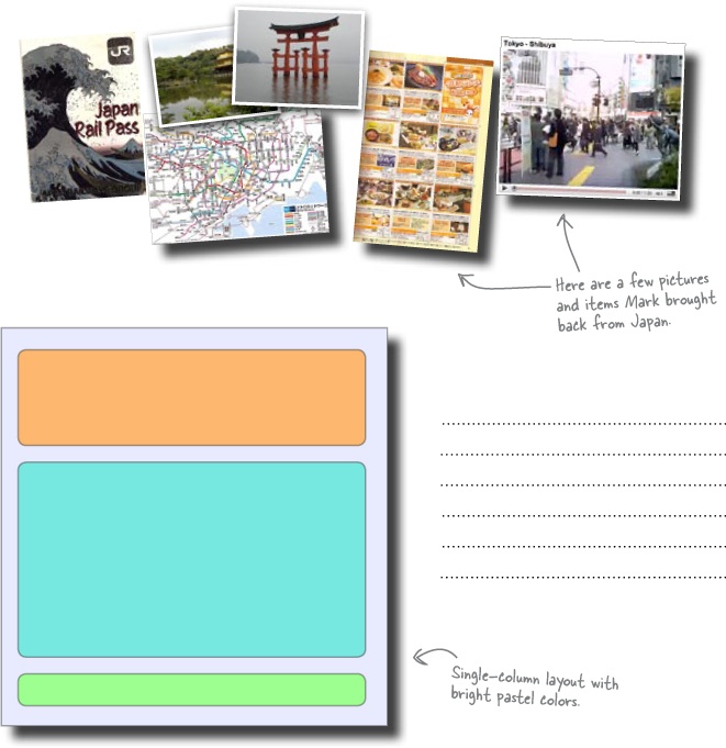
Exercise
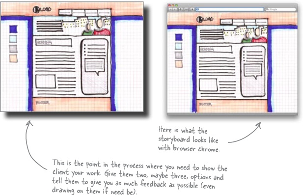
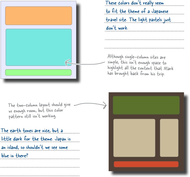
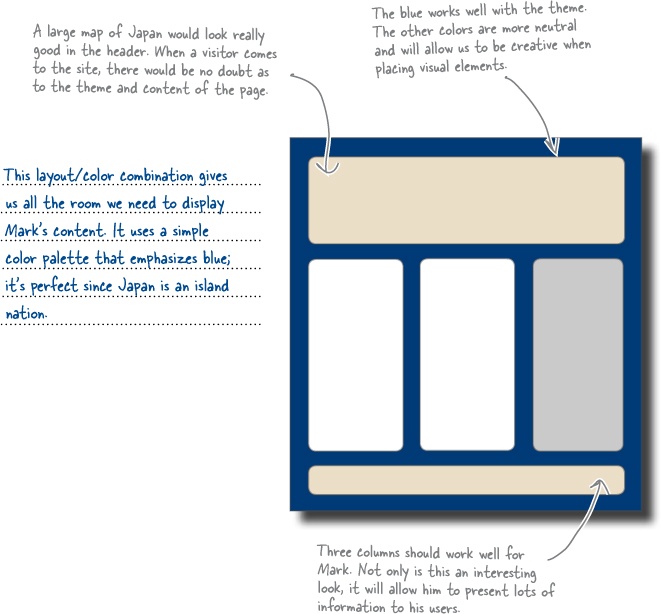
To finalize the visual metaphor for Mark’s site, we need to look at some different color and layout combinations and see how they will work with our content. Check out the following layout and color mockups and write down your thoughts on how well each of them represent Mark’s content. Remember to think about the themes and visual elements you identified in the previous exercise.
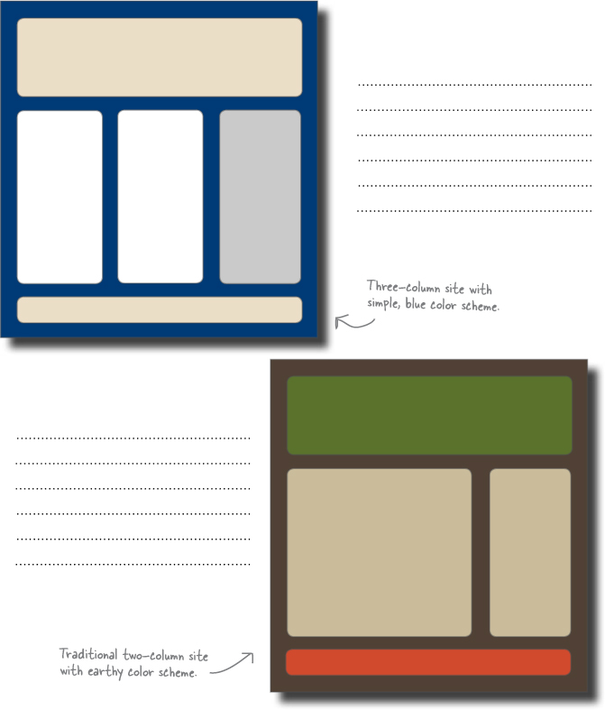
Exercise Solution
To finalize the visual metaphor for Mark’s site, we need to look at some different color and layout combinations and see how they will work with our content. Check out the following layout and color mockups and write down your thoughts on how well each of them represent Mark’s content. Remember to think about the themes and visual elements you identified in the previous exercise.
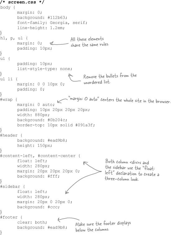
Just because you’re focusing on pencil and paper doesn’t mean you have to abandon XHTML altogether. Now that we’ve got some well-thought out ideas, let’s build a very simple mockup of Mark’s site in XHTML with some simple CSS to add color and formatting.
Fire up your favorite text or HTML editor and create a new file:
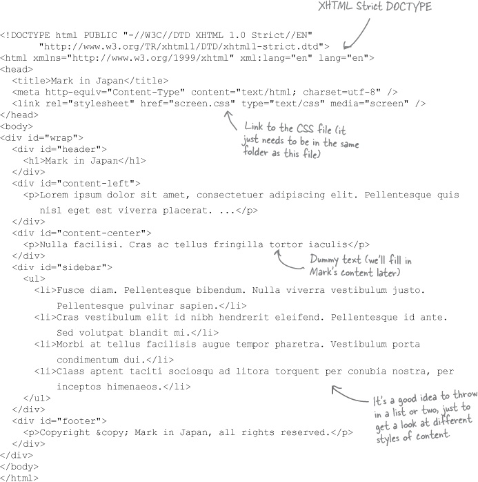
We’ll need screen.css, too, a simple CSS stylesheet for displaying Mark’s site:
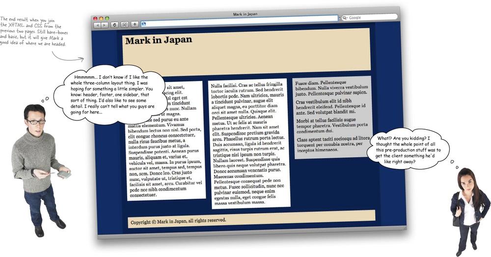
Joe: Can’t we reuse some of the work we’ve already done?
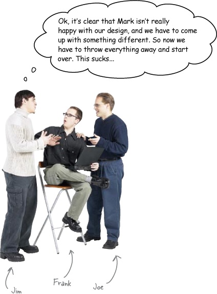
Jim: What, built another XHTML page using our theme? Then we’ll be right back where we started... and Mark still might not like what we come up with.
Frank: But it’s like you just said... we still have a theme that should work. And I don’t even think our visual metaphor has to be totally scrapped, right? We just need to show Mark some different variations.
Joe: What about Photoshop? We could build the sites there and show him PDF versions of the designs. If he likes them, we already have a leg up on the visuals and imagery needed for the final sites.
Jim: By the time we finish a handful of comps in Photoshop, we could have done them in XHTML and CSS, too. That’s still a ton of work. And what if Mark doesn’t like those, either?
Frank: What if we just draw some ideas out on paper? We can sketch our site ideas, add a little color, and send them to Mark to get his approval. If he doesn’t like them, we can draw some more. That shouldn’t take any time at all.
Jim: Hmmm... and because they’re on paper, Mark could draw on them too, giving us a better idea of what he’s looking for when he doesn’t like something.
Joe: You know, this could work. So we can reuse our theme, but deliver two or three different designs on paper and give Mark some nice choices. I like that...
Jim: The drawings don’t have to be really detailed, either, right? They just have to give Mark an idea of what his finished site is going to look like.
One of the most important things in pre-production is the storyboard (sometimes called concept art). Storyboards are used to visualize your design in its entirety. They give you a chance to see how colors interact with one another, how interface elements play off one another, how your navigational system looks, how your visual metaphor plays out, and whether content is represented in the best way possible... without getting into code.
Note
Well, maybe getting into XHTML so early wasn’t such a good idea after all... time to get back out the pencil and paper.
In fact, storyboards are like another level of brainstorming. You already did some brainstorming on the theme... now it’s time to brainstorm your visual metaphor and design element ideas.
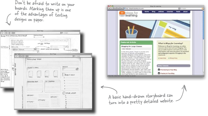
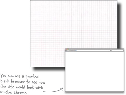
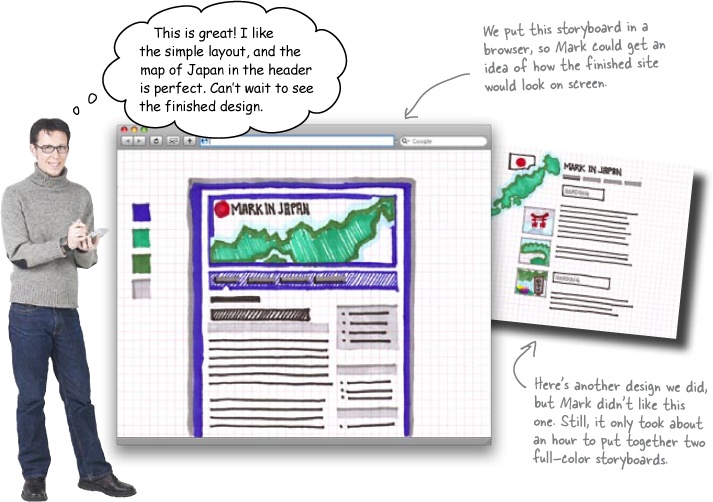
Try creating your storyboards in a photocopy of an empty browser window. This is a great way to give your client a “web” context for your ideas.
Remember, when you’re designing for a client, it isn’t about you—it’s about the client’s needs. And taking the client’s needs into account obviously starts as early as storyboarding. Getting your client (that’s Mark, remember?) involved in your design process could be as simple as sitting down for a meeting, having them fill out a design survey, or sending them early storyboard designs throughout the pre-production process. Not only will this allow you to build designs that your clients really like, they will be appreciate being involved in the process.
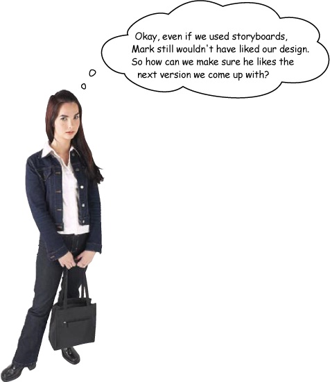
We came up with things that we liked about Mark’s content, but maybe we should have asked Mark what he wanted out of his website...
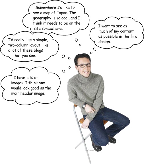
Brain Power
What did we do wrong? Based on Mark’s thoughts above, how would you change the ideas we came up with in Exercise Solution? What would you keep the same?
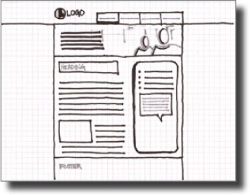
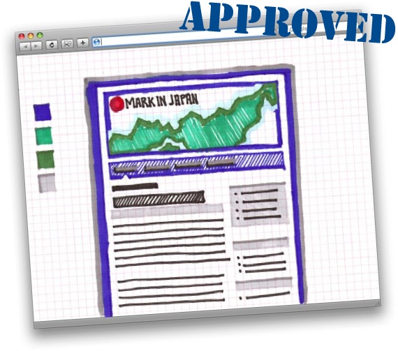
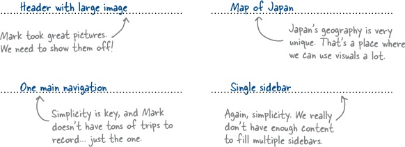
Let’s build Mark a different version of his site, on paper. We know a lot more about what he wants, this time, too... a logo, two columns, and lots of space for content.
So get out some paper. Here’s what you need to do:
Find some paper and make a grid
Grab a piece of paper (8.5 × 11 is perfectly fine) and sketch out or fold the paper to create a grid. You might even want to use a piece of graph paper, which has the grid built right in. A nice grid provides a way to line up elements when you are creating your storyboard. Grids also provide a foundation that allow you to lay out your site so that things line up, appear ordered and well-organized, and make sense to users’ eyes.
Note
We’ll talk a lot more about grids in Chapter 4.
Sketch out your design
Here’s where you get let out your inner design geek. Layout your site, and sketch logos, images, and anything else that comes to mind. All of the site’s text can be replaced by lines or a box with the words “text appears here.” The point of the storyboard is not to see the actual content–it’s to play with and finalize the layout.
Add color and finalize your storyboard
It’s pretty important that you add color to your storyboards—color changes everything. So break out your pencil crayons and add color to your storyboard. Even though your favorite shade of crayola blue might not be web safe, your colors should be close enough to see how they play off of one another when your idea goes digital. When you are finished with the colors, fill in any missing details–and Voila! One supremely awesome storyboard!