What would the Web be without navigation? Navigation is what makes the Web such a powerful information medium. But here’s the thing: navigation is a lot more than just whipping up some cool-looking buttons and slapping them into your design. Building smart navigation starts with your information architecture and continues through your entire design process. But how does it work? How do you really make sure your users never get lost? In this chapter, we’ll look at different styles of navigation, how IA guides your page links, and why icons (alone) aren’t always iconic.
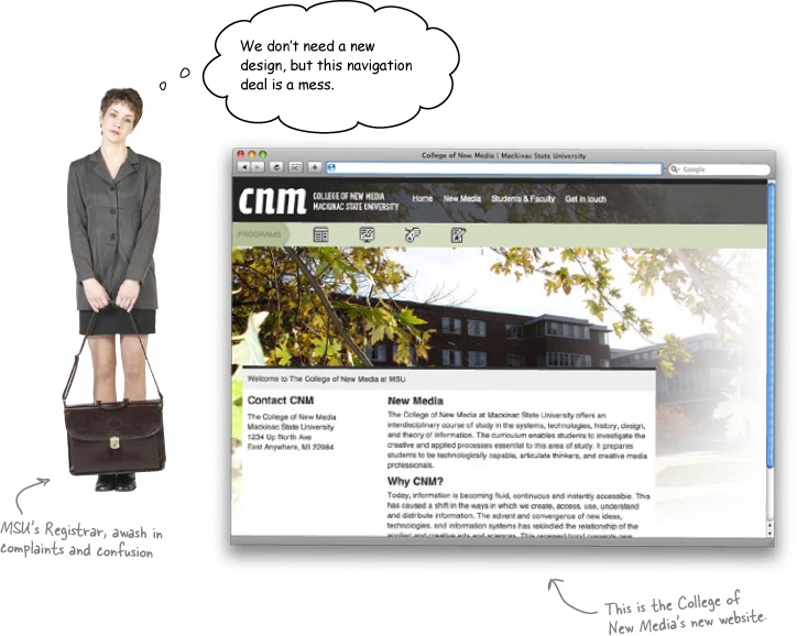
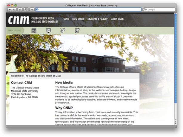
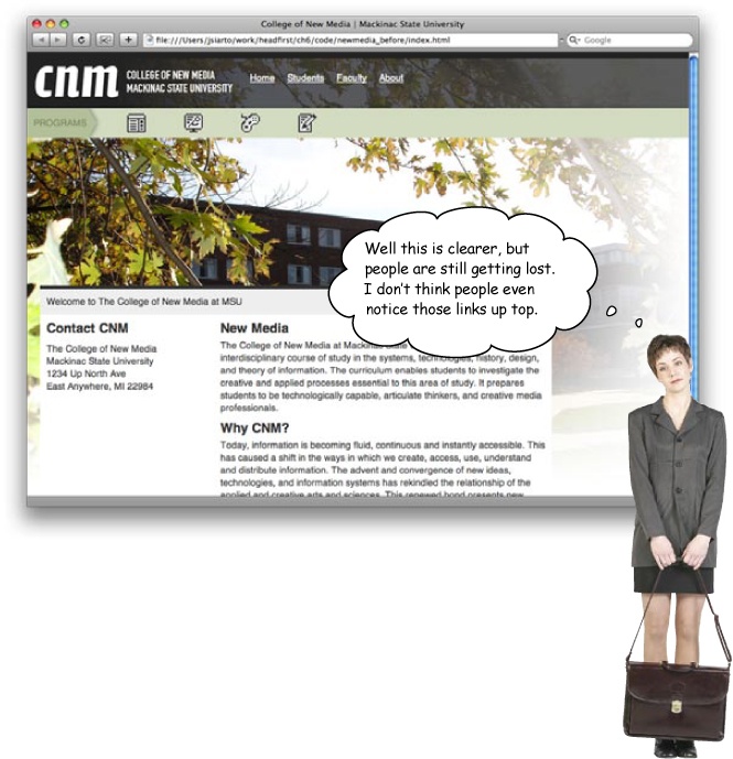
The College of New Media at Mackinac State University has a bit of a problem. They’ve just paid a bundle to a web design firm to redo their site. The new site looks great... but nobody can find anything anymore! Professors can’t find their papers and documents, teaching assistants can’t even figure out what classes they’re teaching, and new students need to register for the next semester’s classes... now.
The college needs you to unravel their navigation nightmare, and do it fast. Otherwise they’re going to lose students and faculty!
Exercise
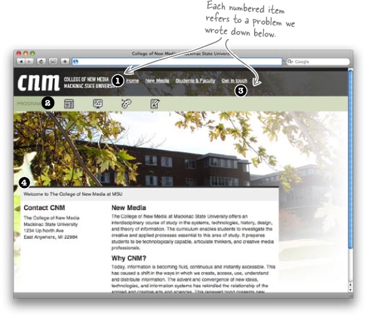
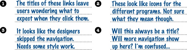
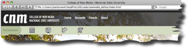
Take a look at the screenshot of the current CNM site. First circle all the different areas of navigation. Then list any problems you find in the blanks below the screenshot. Be thorough and remember, both students and faculty are using this site.
_______________________________
_______________________________
_______________________________
_______________________________
_______________________________
_______________________________
_______________________________
_______________________________
_______________________________
_______________________________
_______________________________
_______________________________
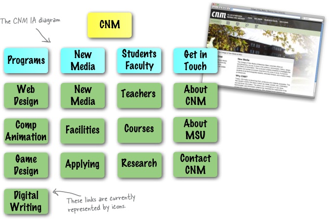
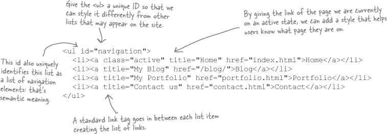
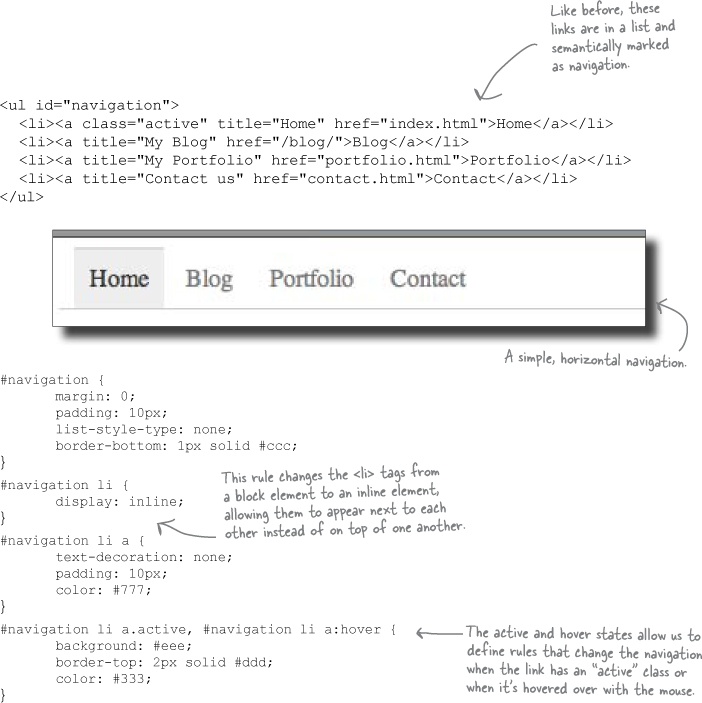
The names of your links are more than just helpers for your users. They’re actually the categories that organize your entire site. And most of the time, a bad link name means someone wasn’t thinking about navigation way back at the information architecture stage.
Let’s see what the CNM IA diagram looks like:
Note
Flip back to Chapter 3 if you need a refresher on content organization and information architecture.
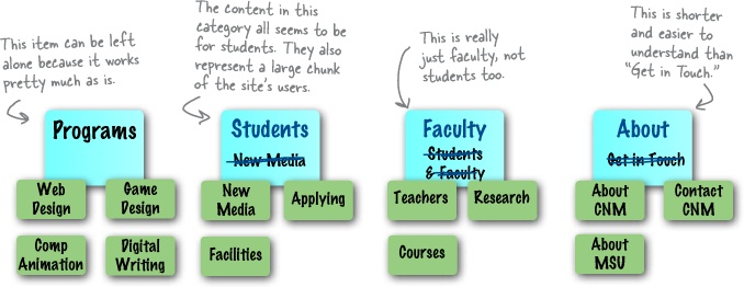
The names that you give your navigational elements (links, buttons, etc.) have a direct impact on the usability of your site. In other words, names are a really big deal on the Web. You should put a lot of thought into the name you use for each of your IA categories and navigational elements. Here are some general guidelines to help you come up with good names:
Keep names short. Make sure that your names are as short as possible. You want your user to be able to scan a name quickly. One word is ideal. Only use two if you really need that extra word. Avoid using words like “the” or “a” in names, too. Those are just a wasted of space.
Keep names descriptive. Make sure that the name you choose is as clear and straight to the point as possible. You don’t want your users to look at a link and be confused. If you’re not 110% sure what a name means, your users sure won’t be, either.
Test Drive
Download the College of New Media site files from the Head First Labs site.
Visit http://www.headfirstlabs.com, find the Web Design link, and click through to the Chapter 6 sample files.
Update the main CNM navigation links.
Check out the site and make sure things look right.
The Web is both VISUAL and SEMANTIC.
We’ve mostly been focusing on how sites look, but there’s another element to the Web: the semantic Web. Right now, our navigation links look good, but they’ve got no meaning. Really, those links are a list of items that are all part of the site’s navigation.
What we need is a way to give some semantic meaning to our list of links. Of course, XHTML gives us a couple of list elements, so let’s start there:
Sharpen Your Pencil
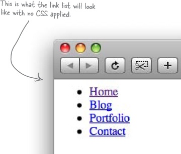
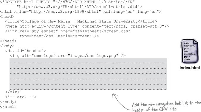
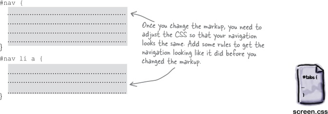
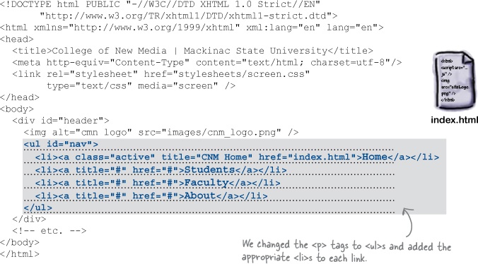
Before we can start updating the look and feel of the CNM navigation, we need to get the main nav into an unordered list. Take a look at the main XHTML and CSS for the site file and update the markup and rules to work with an unordered list.
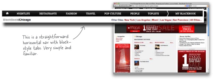
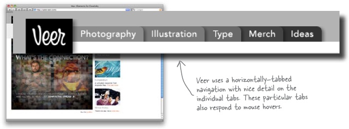
Many of today’s modern, standards-based designs feature horizontally-tabbed navigation systems. This type of design works great with a one or two-column layout (though they tend to get a little stretched out the wider a layout gets). A horizontally-tabbed navigation system also works great for your primary navigation because if the links are put at the top of your page, they attract the attention and focus of your user. Tabs also gives the impression of the site having different sections—which it does.
Here’s what horizontal tabs usually look like in XHTML and CSS:
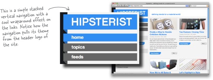
Vertical navigation designs are just as popular as horizontal ones—and show up in a lot of two-column designs. Vertical navigation isn’t inherently better than horizontal navigation designs; it’s just a different way to display your site links.
You can’t always go with vertical navigation, though. Some single-column designs just don’t play nicely with vertical navigation... but with most designs, you can go horizontal or vertical.
Here’s what vertical navigation looks like in XHTML and CSS:
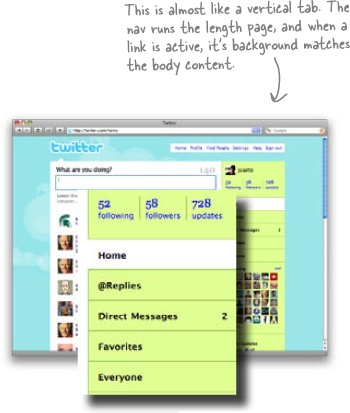
Inconsistent navigation confuses users.
We base the way in which we interact with the world around us on the predictability of events. Every day millions of people pull up to a red light, wait for it to turn green, and then continue driving. But what if you pulled up to a red light and instead of it turning green, it turned blue? You’d probably have absolutely no clue what to do.
Navigation works in a similar way. When a navigational system works right, people rely on it. In the CNM system, the navigation isn’t what users are expecting. That’s because it probably violates at least one of the following three principles:
Navigation should be in a place users expect it to be: usually the top of a page or along either side.
Links should look like links. They should appear to be “clickable” for users.
Links should be clearly identified and separate from each other.
Exercise
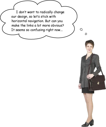
Using the header overlays below, sketch three different navigation designs for the CNM site. Think about consistency and how familiar your scheme is going to feel for a typical user.
Exercise Solution
How did your navigation design go? Were you able to come up with some ideas that clearly followed the three navigation principles we looked at back in Sharpen Your Pencil?
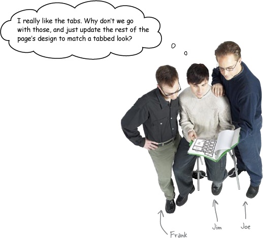
Joe: I thought the registrar said they really liked the current design and just wanted to fix the navigation?
Frank: Besides, I think navigation should fit into your design, not make you change it.
Jim: Why not? I thought we all agreed that navigation should start way back when we’re doing IA. So doesn’t navigation have to influence our design?
Frank: Well, when we were doing IA, we just needed to make sure our category titles were short—
Joe: —and descriptive.
Frank: Right. But that’s got nothing to do with how navigation actually looks on the page.
Jim: So we’re stuck with the current design?
Joe: I’m not sure we’re stuck with it. It’s pretty nice, you know? I just don’t think we need to mess with something that’s working already.
Frank: Exactly. We’re not getting paid to do all that extra design work.
Jim: Hmm. That’s true. And I don’t suppose the school would give us extra cash out of the goodness of their heart, huh?
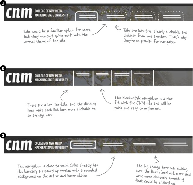
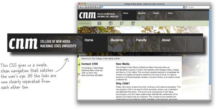
Frank: Probably not. I think going with a simple, block-style of navigation is our best bet.
Joe: That’s where we just have some dividing lines between our navigation links, right?
Frank: Exactly.
Jim: So why do you call it block navigation?
Frank: Let me show you... it’s all about the CSS we’ll need to create that sort of a navigation menu...
Know your role in a web design gig. You’ll rarely get paid for doing “extra” work unrelated to your core assignments.
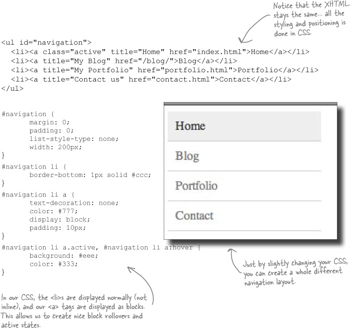
Block elements (like paragraphs and headings) literally form a block from one side of the page to the other. And by default, block elements are as tall as the content they contain.
Note
This is why when you apply a background image to a heading. The image stretches well beyond the text within the element.
We’ve got our links in block elements already—those <li>s we added earlier:
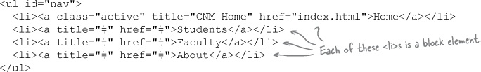
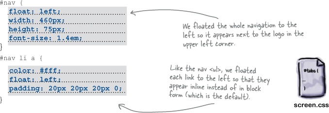
But we can adjust the height of a block element, as well as its position. The nice thing about blocks—and why they’re great for navigation elements—is that they all automatically line up horizontally:
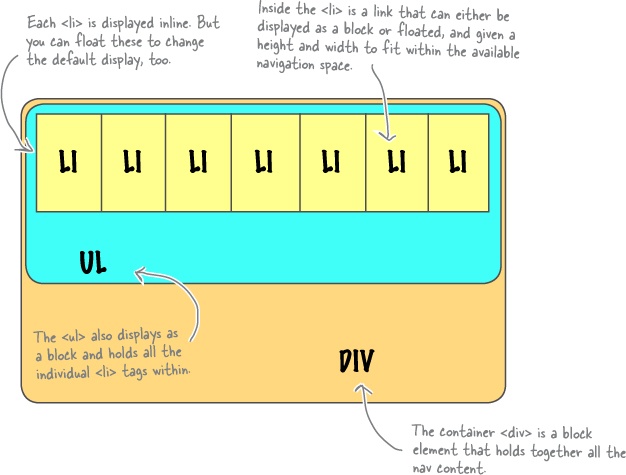
If we think of each <li> in our navigation as a block, then we just need some CSS to style those blocks. We can add borders to separate each block and make sure each block is positioned related to the previous block.
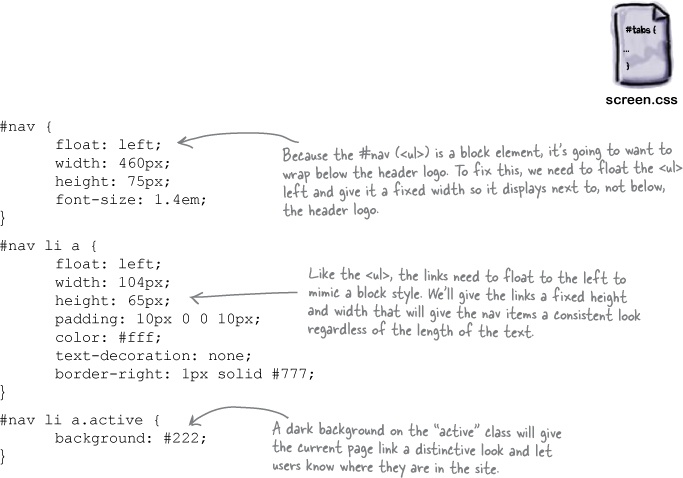
Make these changes to your version of screen.css:
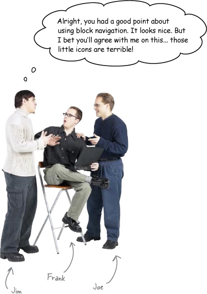
Frank: Yeah, no argument there. What are those?
Joe: I tried clicking on them. They’re actually navigation.
Frank: Really? Where’d they take you?
Joe: To different degree program sub-sites. One was video games—
Jim: Oh, I bet that was the little icon that looks like a game controller, right?
Joe: Right. But another was...
Frank: Wait, let me guess. If the icons are good, I should be able to figure this out for myself, right?
Joe: Ha, I guess. Good luck though.
Frank: Let’s see. It’s a school for new media, so... web design. Was one of them web design?
Joe: Wow, nice call.
Jim: Wait a second... which icon stands for web design, Frank?
Frank: Hmm. Honestly? I have no idea...
Jim: My point exactly. We’ve got to do something about those icons. I didn’t even know you could click on them at first!
Confusion is the enemy of good web design. If something’s confusing to you, it will probably be VERY confusing to your users.
Yes, icons are cool little design elements. The problem is, when used for navigation, they can cause some serious problems. What does an icon mean? What happens if you click on it? Where will the site take me?
What one icon represents to you might be completely different from what it represents to another person. And if you use an icon as a navigational element, your users might get the wrong impression about where they will end up if they click the icon. The end result? The user’s taken somewhere they didn’t mean to go, and now they’re a lot more likely to move on to another site.
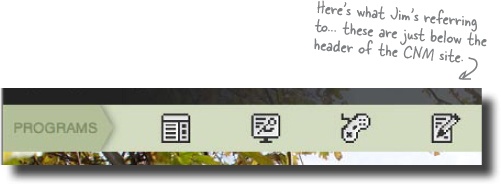
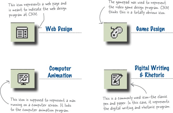
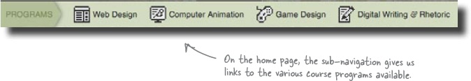
Take the icons on the CNM site... how clear are their meanings?
Sharpen Your Pencil
Write down what you think each icon represents, or what you may see if you click on that particular link.
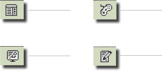
Sharpen Your Pencil Solution
Here is what the College of New Media says each of the icons mean. How close were you? If you got even two of these right on, then you get the Ambiguous Icon Detective award for the day...
When in doubt, ADD TEXT.
Sometimes you’re gonna get stuck with a bad display element, or perhaps just some meaningless or confusing icons. If you’re not able to make major changes, one easy fix is to simply add text, clarifying the icons or explaining how to use a particular page element.
A little bit of clarifying text goes a long way to let a user know what to click or where to go on a page.
Right now the four CNM icons are little images inserted into the XHTML. If we want to add text descriptions of those icons, we’d need to squeeze the text between each icon, potentially resize the icon, align the text with the image... and things get pretty complicated fast.
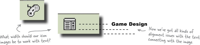
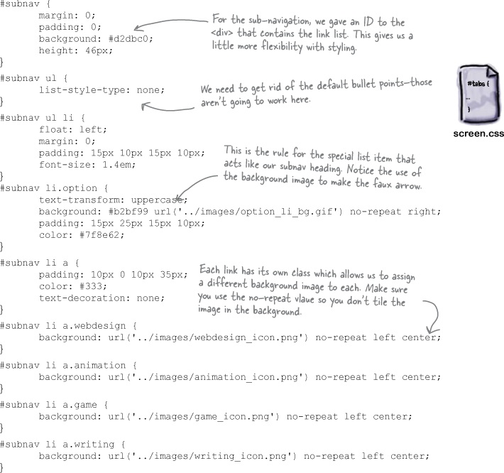
So what can we do? Suppose we started with text, like “Web Design” and “Computer Animation.” The icons are meant to be links, so we can surround the text with <a> tags. But once we’ve got <a> tags, we can style those with CSS.
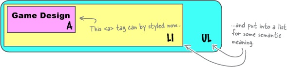
With stylable elements to work with, we can get around all the position issues and actually insert the icons as background images to the <li> text items. That means the <li> will grow to the right size, and since each link is in an <li>, everything will naturally line up properly.
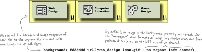
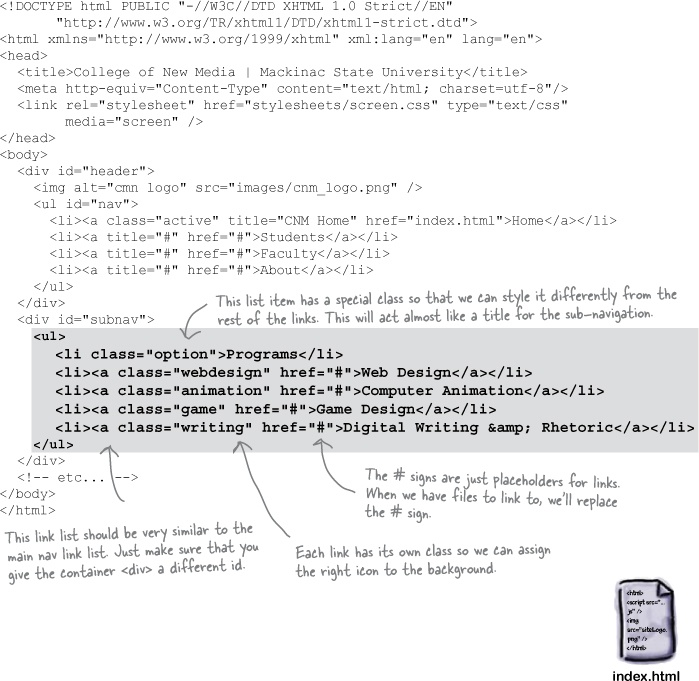
Let’s open up index.html and remove the icon images from the XHTML. We need a new unordered list, with <li>s and <a>s for each link. We’ll use the textual link name, and then in a moment we can update our CSS to style each link.
Go ahead and make these changes to your copy of index.html:

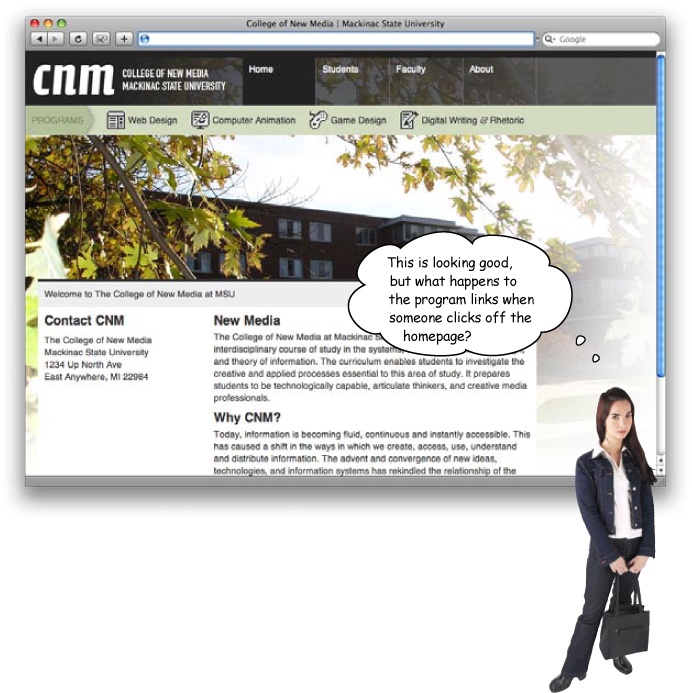
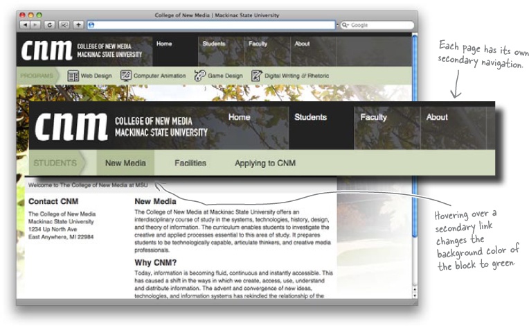
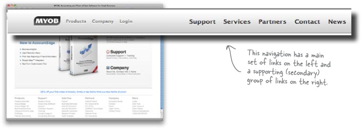
Primary navigation is the navigation that provides links to the main sections of the site. So with CNM, our primary navigation is the top-level blocks, with Home, Students, Faculty, and About displayed. These links should be displayed on most (if not all) of the pages in your site.
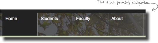
Secondary navigation is navigation that links to subsections of the site. Secondary navigation should apply to what’s going on with the page and where the user is at a specific time.
Suppose someone clicks the Faculty link on the CNM page. The primary navigation links still make sense, but the secondary navigation—the program links—probably don’t anymore. What about on the About page... should those links appear there?
Primary navigation applies to your ENTIRE site.
Secondary navigation applies to the CURRENT SECTION of a site you’re on.
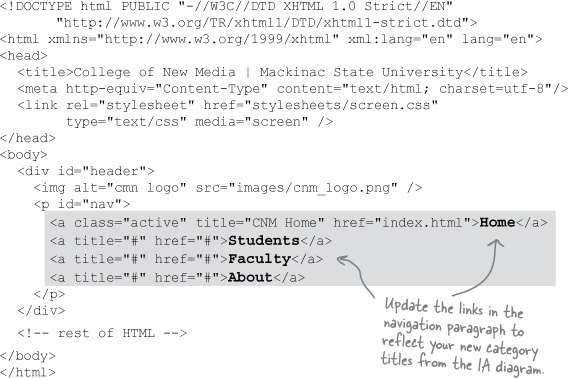
Open up the page you created for the Students section. We called ours students.html. We need to change the title and update the secondary navigation based on the CNM’s IA diagram:
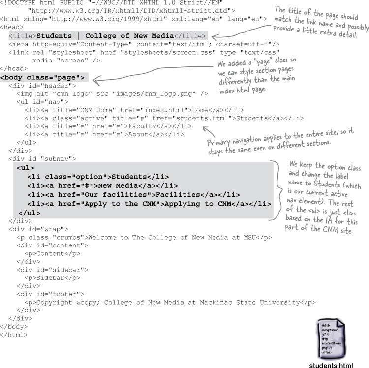
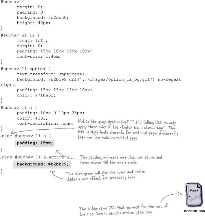
Now that we’ve got some actual secondary navigation in place, we can add some CSS rules to style the sectional pages. Each sectional page will have a body with a class of “page,” so we can style those separately.
Test Drive
Create students.html and update index.html to link to your new section page. Be sure and update your CSS. Create pages for the Faculty and About sections, too.
Then it’s time to try things out again. This time open up index.html and select one of the main links: Students, Faculty, or About. On each sub-page, you should see secondary navigation that matches the site’s IA. You also should get a nice green color when you hover over a link: