
Writing for the Web is just like any other kind of writing, right? Actually, writing for the Web is completely different than writing for print. People don’t read text on the Web like they read text on a printed page. Instead of reading text from left to right, beginning to end, they scan it. All of the text on your site needs to be quickly scannable and easily digestible by the user. If not, users won’t waste their time on your site, and they’ll go somewhere else. In this chapter, you’ll learn a bevy of tips and tricks for writing scannable text from scratch and making existing text easy to scan.
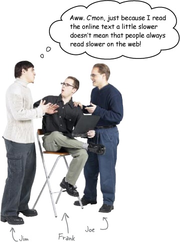
Frank: Woah, hold on there, buddy. Actually, it does. See, text on screen reads slower than text on a printed page. People read about 15% slower on the Web than they do from a print document.
Jim: You’re kidding. All the time? Wow. That’s quite a bit slower.
Frank: And that’s not all. Move your eyes really close to your computer monitor. What do you see?
Jim: Ack, that’s nasty. The text gets blurry and fuzzy on my screen.
Frank: Exactly. You read slower on screen because computer display devices have a far lower resolution than print does.
Joe: Oh, I get it. I read slower because my eyes are trying to make up for the blurry text?
Frank: Exactly. And you’ll probably experience eye strain faster than you would if you were reading from a print document. So people read text on screen differently than they do other kinds of text to avoid eye strain and headaches.
Jim: But they don’t know you’re doing that? Reading slower?
Joe: Did you realize you were doing it?
Jim: Huh. No, I guess not. But how does this help me write text for my websites?
Frank: Users scan your text, looking for keywords, sentences, and paragraphs that are meaningful to them. So if you write text that’s specifically designed to be scannable, your users will read your faster and understand and retain your message better.
Joe: That sounds like the holy grail of copywriting. Are you sure you’ve got this right, Frank?
Frank: Yup. Scannable text gives users a better experience on your site—which means they’ll stay longer and come back more often. And that’s the whole goal of user-centered design: giving your users what they want and keeping them coming back for more.
Sharpen Your Pencil
Grab a stopwatch and take exactly 20 seconds to read the block of text on this page. Then answer the questions below the text. But don’t cheat: look at the questions only after you’ve read the text.

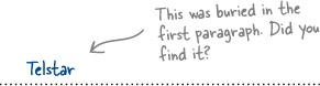
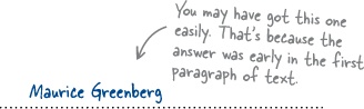
Coleco Industries, which was originally named the Connecticut Leather Company, was founded in West Hartford, Connecticut in 1932 as a shoe leather company by Russian immigrant Maurice Greenberg. Moving into plastic molding in the 1950’s, Coleco eventually sold off their leather business, and became a publicly traded company. By the beginning of the 1960s, the company was one of the largest manufacturers of above-ground swimming pools. In 1976, after an unsuccessful attempt to enter the dirt-bike and snowmobile market, they released Telstar, a clone of the home PONG unit being sold and marketed by Atari. Despite the fact that Coleco was certainly not the only company releasing home PONG clones, they enjoyed moderate success and went on to produce nine more varieties of the Telstar unit. Unfortunately, in 1978, as the home videogame market moved to programmable, cartridge based game units, Coleco was forced to dump over a million obsolete Telstar machines at a nearly crippling cost of more than 20 million dollars. Coleco president Arnold Greenberg ignored this near disaster and directed his Research and Design team to begin work on a new home videogame system, the ColecoVision, which he felt would set the standard in graphics quality and expandability. |
What was the name of the home PONG clone that Coleco released?
__________________________________________
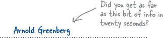
What was the name of the man who founded Coleco?
__________________________________________
Who was the president of Coleco in the 1970’s?
_________________________________________
Now try the same thing with this block of text. Don’t cheat!
Be sure to read the text before you look at the questions.
The Release of the ColecoVision |
ColecoVision was released in the summer of 1982 at a retail cost of $199, featuring several noteworthy advancements:
|
Donkey Kong: The Key to the ColecoVision’s Success |
The key to this new system’s success was its included cartridge. In the case of the ColecoVision, Coleco successfully negotiated the right to release the smash arcade hit Donkey Kong. |
Donkey Kong: Legal Problems with Universal |
While amazingly popular, Coleco’s release of Donkey Kong with the ColecoVision was not without its problems. Universal City Studios Inc., believing that Donkey Kong infringed upon their own King Kong, threatened both Nintendo and Coleco with legal action. With a large sum of money already invested in the license, Arnold Greenberg agreed to pay Universal 3% of the net sale price of the game. |
Coleco Caves and Nintendo Fights Back |
Unlike Coleco, Nintendo fought the lawsuit, offering numerous in-court demonstrations of gameplay vs. movie plot. Nintendo argued that in a previous case, Universal had argued that King Kong’s characters and plot were in the public domain. Nintendo successfully argued its claim and was awarded $1.8 million in damages. This prompted Coleco to file as well, earning back a portion of the royalties they had previously paid to Universal. |
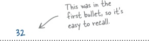
How many sprites could the ColecoVision display on screen?
______________________________________________
What game was included with the ColecoVision?
_______________________________________________
Who sued Nintendo & Coleco over copyright infringement?
________________________________________________
Sharpen Your Pencil Solution
So you took exactly 20 seconds to read two blocks of text and answer questions on each. How did you do?
What was the name of the home PONG clone that Coleco released?
What was the name of the man who founded Coleco?
Who was the president of Coleco in the 1970s?
How many sprites could the ColecoVision display on screen?
What game was included with the ColecoVision?
Who sued Nintendo & Coleco over copyright infringement?


Text written specifically to be scannable is easier to quickly read and understand. One of the blocks of text was written for scannability, one wasn’t. Which do you think it was?
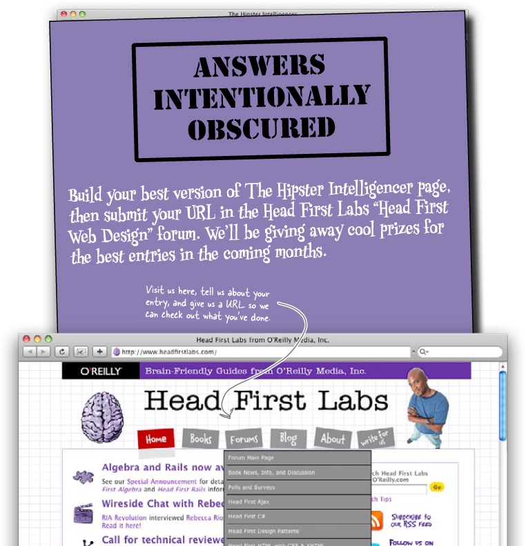
A local alternative newspaper was so impressed with the successful launch of the RPM record store site that they’ve decided to hire you to create an online version of their print newspaper.
Although the paper’s always had well-written articles, they’ve been struggling lately to keep their readers. The Editor-in-Chief also wants to cover more than just news on the paper’s website. He thinks adding hip articles on computing and gaming pop culture (geek chic) will appeal to readers. The biggest challenge for this project isn’t layout—it’s writing text for the Web. This new site’s the last chance to save their paper, so they really need your help...
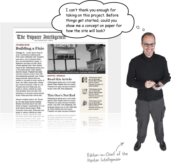
Before you get started, the paper’s sent over some specs. This will help you refine the look and feel of the site you’re building for them.
|
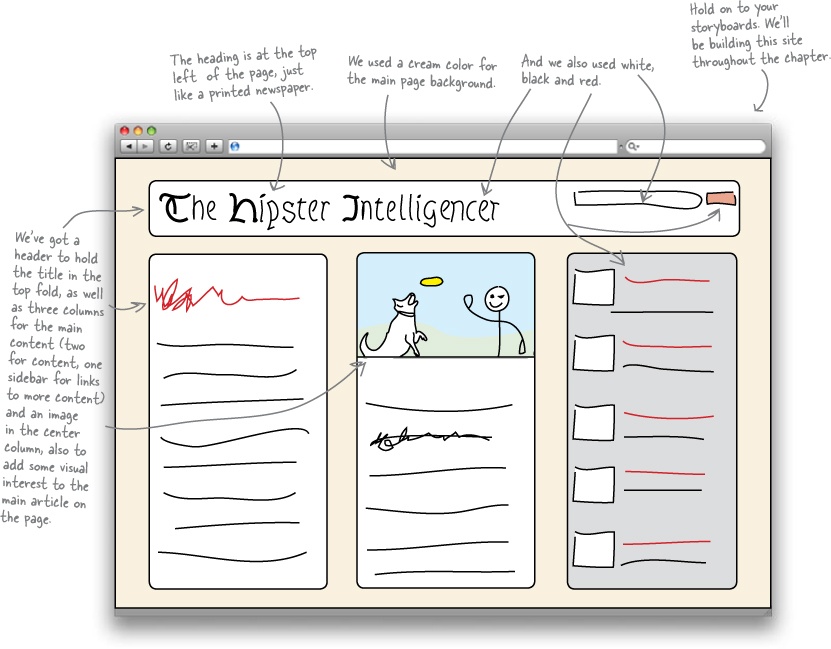
None of these specs look like that big of a deal. However, there’s one major issue not in these specs: the Hipster is mostly text—lots and lots of text. So we’ve got to build a text-heavy site that still feels usable and hip.
Exercise
Based on the specifications for the site’s design provided by the Editor-in-Chief of the Hipster Intelligencer, use this handy-dandy browser template to put together a polished storyboard.

Exercise Solution
You put together a polished storyboard based on the specifications for the site. How does yours compare? How many colors did you use?
Ready Bake Code
Here’s some basic HTML and CSS to get you started implementing your storyboard.
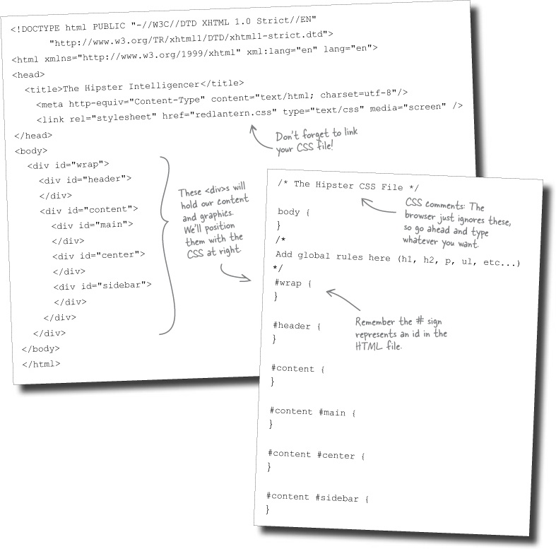
Now we need some content so we can add some style...

The hipster Intelligencer
DAILY HIPSTER NEWS + EVENTS
Website copy
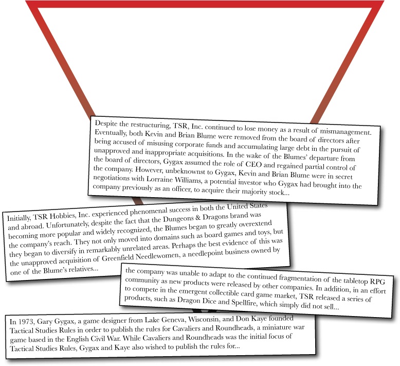
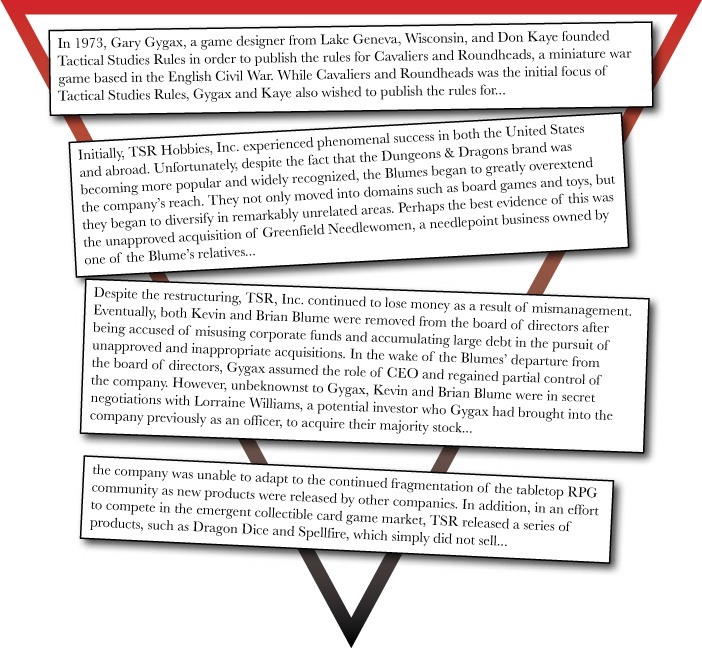
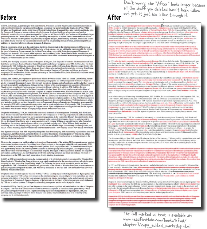
In 1973, Gary Gygax, a game designer from Lake Geneva, Wisconsin, and Don Kaye founded Tactical Studies Rules in order to publish the rules for Cavaliers and Roundheads, a miniature war game based in the English Civil War. While Cavaliers and Roundheads was the initial focus of Tactical Studies Rules, Gygax and Kaye also wished to publish the rules for Dungeons & Dragons, a fantasy miniature role playing game developed by Gygax whose rules were based on Chainmail, a medieval miniature game developed by Gygax and Jeff Perren in 1971. As Cavaliers and Roundheads began generating revenue for Tactical Studies Rules, the partnership was expanded to include Dave Arneson and Brian Blume. While Dave Arneson was brought into the partnership as a game designer, and left shortly thereafter, Brian Blume entered as a funder. Blume believed that Cavaliers and Roundheads was not generating enough revenue, and encouraged Gygax and Kaye to focus their efforts on releasing Dungeons & Dragons.
There is considerable debate as to the contributions that Dave Arneson made to the initial development of Dungeons & Dragons. While Arneson has labeled himself “The Father of Role-playing,” and has said that he was responsible for writing
Relax
Don’t worry! All this text is available online
Check out www.headfirstlabs.com/books/hfwd/chapter7/copy.html to get the full text you’ll need to complete your site.
Test Drive
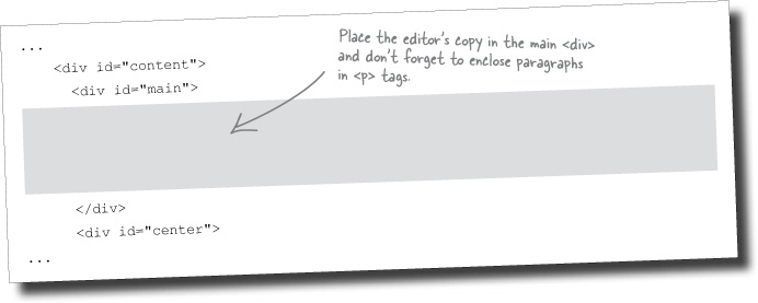
Now that you’ve got the framework for your site built in markup, add the content that the Editor-in-Chief has provided to the main content section of your HTML page. Remember, you can download all the copy from the Head First website.
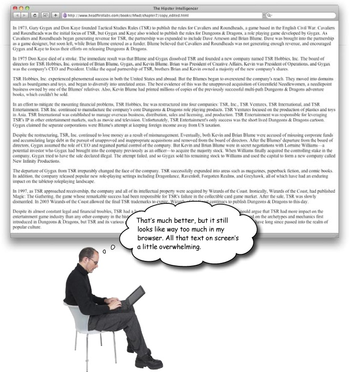
Open the new Hipster page in your browser. How does it look?
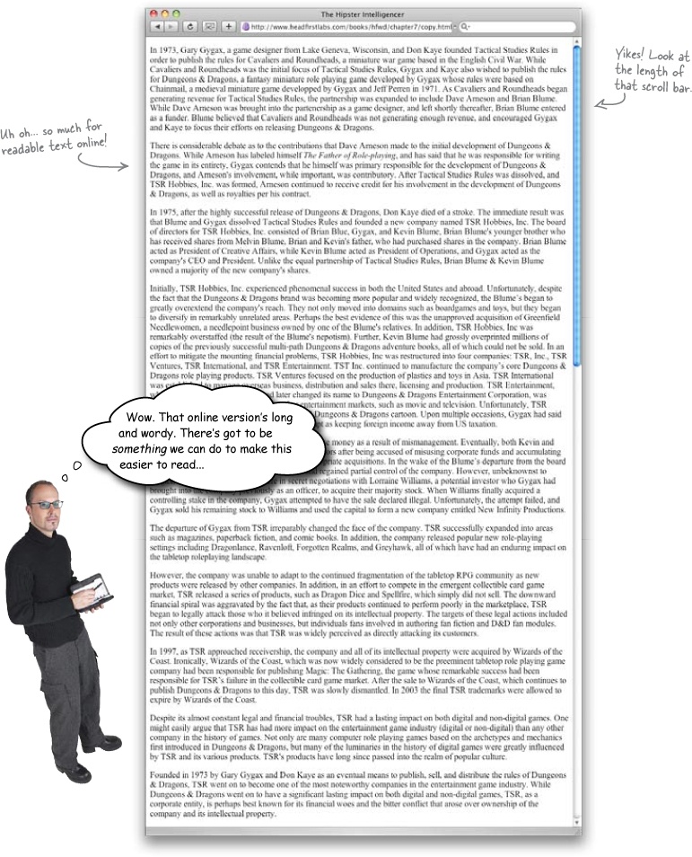
A low percentage of people scroll beyond the information that’s initially visible in their browser window. Even if your users are willing to scroll, most of them decide whether they want to read the page based on what they see in the browser window when the page loads.
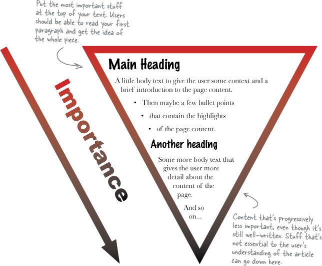
To account for this, you should structure your text like an inverted pyramid. Start with a short conclusion so that users can quickly get the gist of the page, and add detail afterward. This way, users can stop reading at any time and still be confident that they’ve already read the important pieces of information.
Exercise
Here are two pieces of text. One was written using the inverted pyramid, the other was not. Read both, but stop reading when you feel that you’ve gotten the gist of what the article contains.
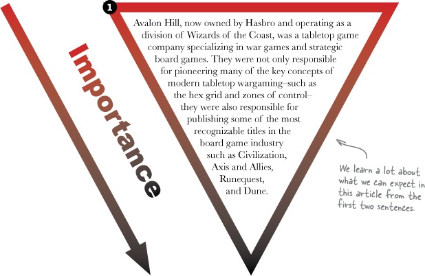
1 | Avalon Hill, now owned by Hasbro and operating as a division of Wizards of the Coast, was a tabletop game company specializing in war games and strategic board games. They were not only responsible for pioneering many of the key concepts of modern tabletop wargaming–such as the hex grid and zones of control–they were also responsible for publishing some of the most recognizable titles in the board game industry such as Civilization, Axis and Allies, Runequest, and Dune. In 1958, Charles Roberts founded Avalon Hill in order to capitalize on the success of his game Tactics. Self-published in 1952, Tactics was particularly noteworthy because it was based on actual war tactics and scenarios. As such, Tactics is considered to be the first modern tabletop war game. Shortly after the company was founded, it released Tactics II, the sequel to Roberts’ original game. Shortly after the release of Tactics II, Avalon Hill published Gettysburg, which is widely considered to be the first tabletop wargame based upon an actual historical battle. Avalon Hill enjoyed moderate growth through the 1980s and early 1990s. However, during the mid 1990s, the board game industry as a whole began suffering a downturn in sales. Not only had overall sales of their board games decreased, but the company had also lost the rights to two of their most popular games, Civilization and 1830, in a legal battle with the computer game publisher Microprose. In the summer of 1998, Eric Dott, president of Monarch Avalon, Inc. (the parent company of Avalon Hill), sold the rights to all Avalon Hill titles, all back stock, and the name company itself to Hasbro, Inc. Hasbro continued to publish games under the Avalon Hill name. In late 1999, Avalon Hill was made a division of Wizards of the Coast, who had been purchased by Hasbro earlier that year. Wizards of the Coast continues to release games under the Avalon Hill name, including Axis & Allies, Betrayal at House on the Hill, RoboRally, and Risk 2210 A.D. |
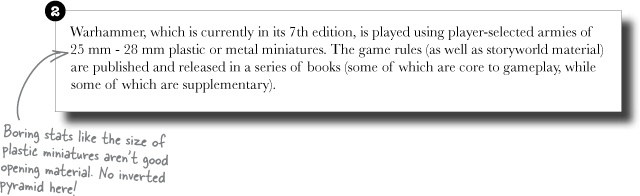
2 | Warhammer, which is currently in its 7th edition, is played using player-selected armies of 25 mm - 28 mm plastic or metal miniatures. The game rules (as well as storyworld material) are published and released in a series of books (some of which are core to gameplay, while some of which are supplementary). The game itself is generally played on a surface, the standard size of which is 4x6 feet. While the game can be played with just the miniatures, players will often use model scenery, such as trees, buildings, and topography, in order to add realism and depth to their game. Each unit (either a single miniature or a group of miniatures) has a point value based on their power or skills. Players build (or “draft”) an army based on an overall point value set by the game type. For instance, a 700 point game means that each player can build an army totally 700 points or less. Movement across the playing surface, which is turn-based, is measured in inches and combat between units is accomplished through use of six-sided dice. Victory in Warhammer is most often determined by victory points, which earned by killing enemy units and meeting scenario based special objectives. It’s important to note that Warhammer is not a collectible game. As a result, miniatures are not sold using a closed-box, random model. Players simply pick and choose the miniatures they want to have in their armies, and buy them individually or in large sets. It is also important to note that Warhammer miniatures do not come pre-painted. It is the responsibility of the player to paint their own miniatures. As such Warhammer is somewhat of a niche product as it requires specialized skills to fully experience the game. In addition, unlike other pre-painted tabletop miniature games, such as WizKids’ HeroClix, Wizards of the Coast’s Star Wars Miniatures, or Fantasy Flights Games’ Mutant Chronicles CMG, the Warhammer community has a unique system (which is both formal and informal) that recognizes particularly talented miniature painters. Generally speaking, Warhammer is most commonly played in game stores, hobby stores, and comic stores. In addition, Games Workshop organizes a Grant Tournament season each year in which players compete against one another for community-wide recognition and prizes. |

Which was easier to read?
Can you identify the text written using the inverted pyramid?
How do you think the inverted pyramid makes text easier to read?
Exercise Solution
You read two pieces of text until you felt you’d gotten the gist of what each article contained. Which one did you stop reading first? Let’s take a look at the first two sentences of each opening paragraph:

One of the easiest things you can do to make text more web-friendly is remove unnecessary content. If your text’s clear and concise, your users will spend less time reading and will be happier.
So what’s the best way to write less but still keep the relevant content in your article? It’s a matter of careful editing. Get to the point quickly with short words and phrases and concise two to three sentence paragraphs.
Reduce adverbs (words that change other words and often end in -ly, like “a really big moose”) and replace passive phrases with active phrases (“the brain was hydrated by eight glasses of water a day” vs. “hydrate your brain with eight glasses of water daily”). You’d be surprised how many words don’t have to be included in copy for it to make sense.
When you’re done, re-read your copy. If you can’t work out what it says, what hope do your users have of understanding it?
Sharpen your red pen Solution Solution
You edited the article that the Editor-in-Chief gave you so it’s shorter. What else will you need to do?
The inverted pyramid and editing are useful tools, but so is re-reading. Once you’re done editing, take another pass through and see if you can shave off just a little bit more.
Test Drive
Update your XHTML so that it contains only your edited text. Let’s test it out in the browser... are we getting any closer?
How would you fix this?
You’re a web user. What do other sites do to break up content and make it manageable?
Jim: How would that work? Doesn’t a list just add a bunch of different-sized chunks of text for user’s eyes to scan?
Frank: Lists break up large blocks of text into smaller chunks that are easier for the user to read. And they give the user’s eyes something to lock onto when they scan the page. Let me show you how it works. I’ll write out some text then show you how it can be broken down into a list.
Lists do a great job of breaking up text and making the content on your page more scannable. Lists can break up paragraphs that seem to have lots of list-type items in them, and lists can even break larger paragraphs into smaller chunks, essentially building a list of paragraphs. Lists can be used in the main content body, sidebars, navigation, forms, and pretty much everywhere else on your page.
Jim: That’s not bad, actually. Looks like the first paragraph of an article about lists, using the inverted pyramid to get all the important points up top.
Frank: Ha ha. Yes, well, you know, I’ve been paying attention. So anyway, like you say, this text isn’t bad. But it could be much quicker to scan and read—
Jim: —in a list?
Frank: You betcha. Just like this:
Use a list when:
You need to make your text scannable
Paragraphs or sentences have “listable” elements
Large blocks of text can be broken into 1 or 2 sentence chunks
Jim: Neat. Those bullets summarize three sentences of your text into just three bullet points. But what about the rest of the text?
Frank: [writing]
Lists can be used in different ways all over your site. Try them in:
Your main content
Sidebars
Navigation and Headers
Long Exercise
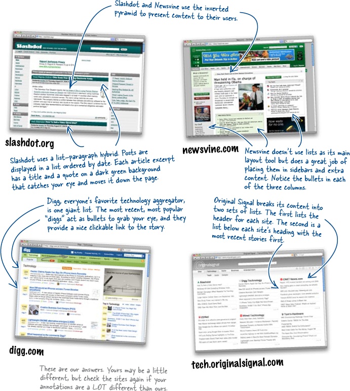
Visit the following sites and annotate these screenshots. Which of these sites use the inverted pyramid? Why do you think any of the sites wouldn’t use the inverted pyramid? Do any of the sites use lists and bullets? Why or Why not?
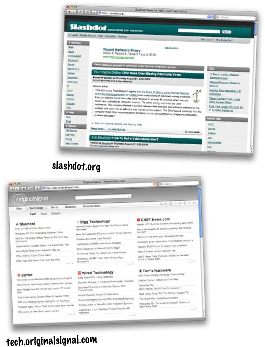
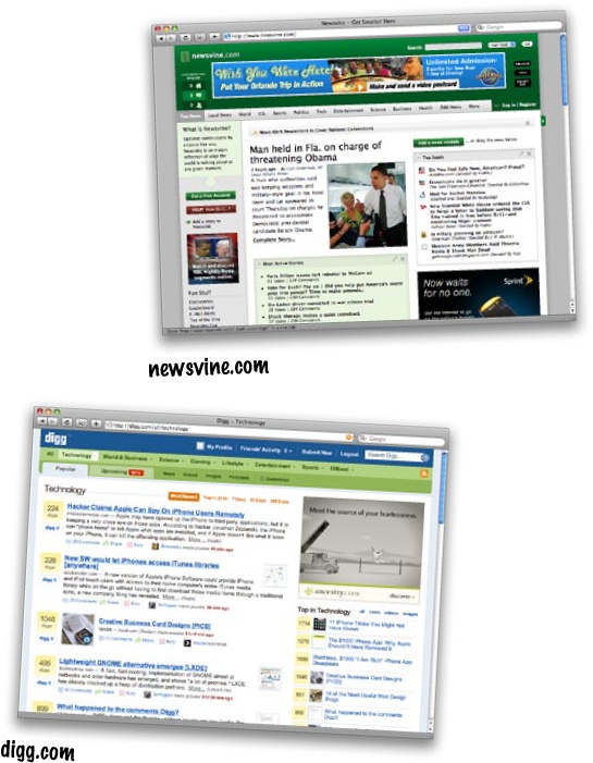
Long Exercise Solution
Which of these sites use the inverted pyramid? Why do you think any of the sites wouldn’t use the inverted pyramid? Do any of the sites use bullets? Why or Why not?
Sharpen Your Pencil
Take this paragraph from the Editor-in-Chief’s copy you already edited and make it more readable by turning it into a list.
Hint: You can use a sentence or two to explain what the list is.
Note
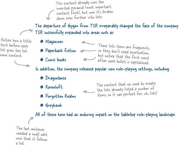
The departure of Gygax from TSR irreparably changed the face of the company. TSR successfully expanded into areas such as magazines, paperback fiction, and comic books. In addition, the company released popular new role-playing settings including Dragonlance, Ravenloft, Forgotten Realms, and Greyhawk, all of which have had an enduring impact on the tabletop roleplaying landscape.

Sharpen Your Pencil Solution
You made this edited paragraph more readable by turning it into a list. Leaving a sentence or two to explain what the list is helps give the user context.
Note
The departure of Gygax from TSR irreparably changed the face of the company. TSR successfully expanded into areas such as magazines, paperback fiction, and comic books. In addition, the company released popular new role-playing settings including Dragonlance, Ravenloft, Forgotten Realms, and Greyhawk, all of which have had an enduring impact on the tabletop roleplaying landscape.
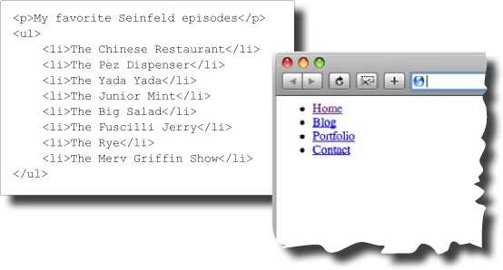
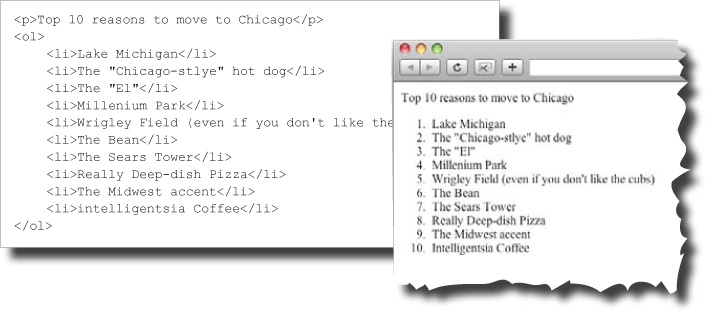
Go ahead and edit the rest of your text to add lists where appropriate. When you’re done, alter your XHTML so that it uses lists, too. You can use unordered and ordered lists to give you bulleted or numbered list items:
So you’ve used lists to break down some paragraphs and sentences into bullets, but what else can you do to help users scan your content? Headings are a great way to make blocks of text more scannable.
Headings reduce large blocks of text into more manageable chunks, and they announce exactly what that chunk of text is about—which lets your users decide whether they want to invest their time in reading that bit of text.
Exercise
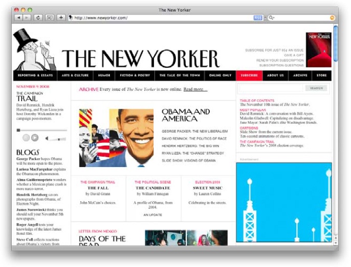
Here’s the home page of the New Yorker, www.newyorker.com.
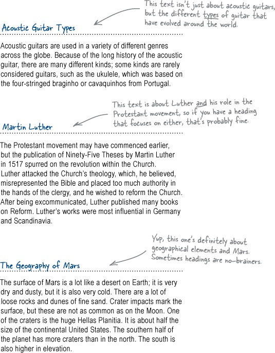
Circle all the headings and lists. Take your time... try not to miss anything.
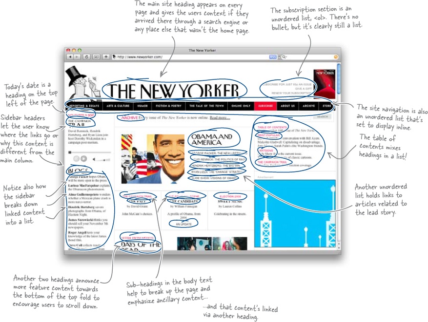
Exercise Solution
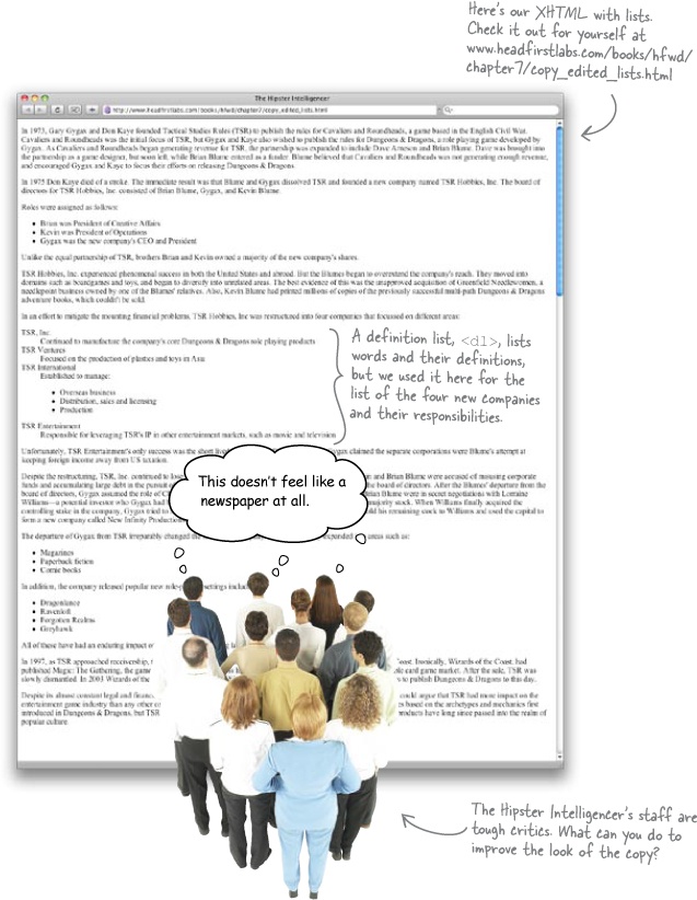
You wrote headings that are straight to the point and scannable for the blocks of text. Is this enough to give the copy that newspaper feel that the Hipster Intelligencer’s staff wanted?
Keep practicing. The more web copy you write and edit, the better you’ll be at slimming text down and making it scannable.
Long Exercise Solution
You should now have headings for all of your copy including the center and sidebar <div>s.
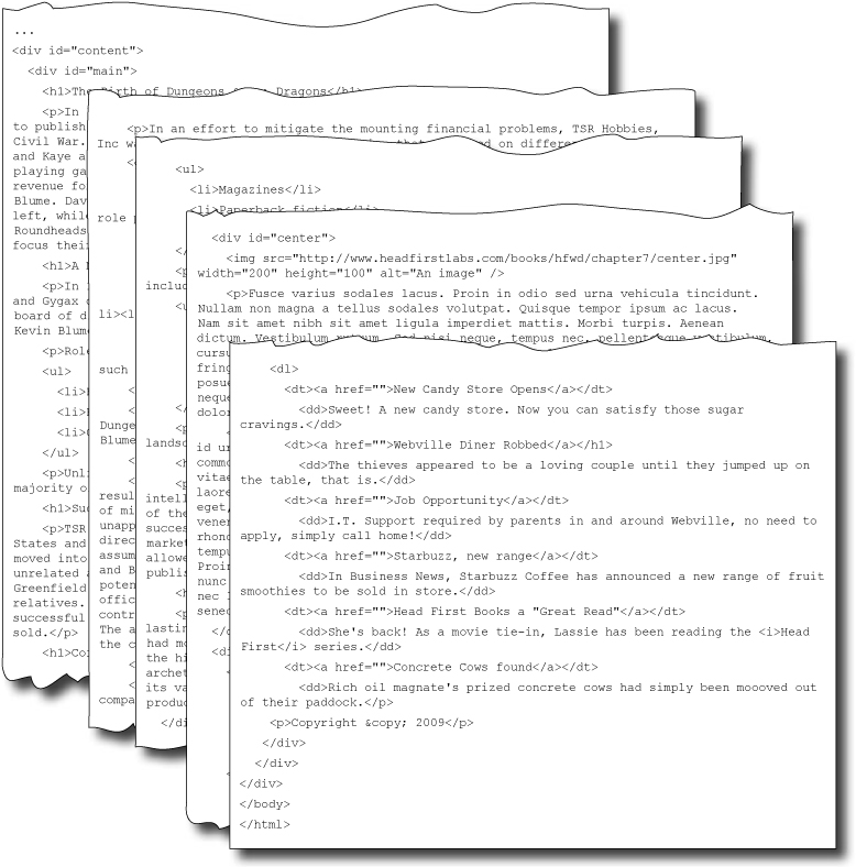
Note
That’s a heck of a lot of code. Download the full version: www.headfirstlabs.com/books/hfwd/chapter7/copy_edited_headings.html
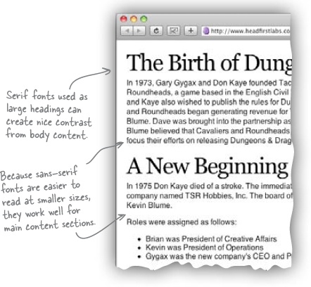
Using a different font for your site can dramatically change the feel and emotion of the design. On top of that, different fonts can make your text more readable and make life easier for your users. There are two distinct categories of fonts for the Web: serif and sans-serif.
A mix of serif and sans-serif fonts can add a nice touch to pages and help separate content from headings. It also allows you to render serif fonts at a larger size and keep the body content in a sans-serif that can be safely displayed in a smaller size.
Geek Bits
Serif fonts look like Times New Roman and are defined by the small projections—or “serifs”—that extend off the main stroke of the character.
Sans-serif means “without (sans) serif” and is composed of font families like Helvetica and Arial. Sans-serif fonts are easier to read on screen because the relatively low resolution of computer monitors makes serif fonts look blurry, especially at smaller sizes.
This doesn’t mean you can’t use serif fonts on the Web; they just need to be used properly and rendered large enough so that they can be easily read by your users.
We could, but be careful. Do you mean text size or heading level?
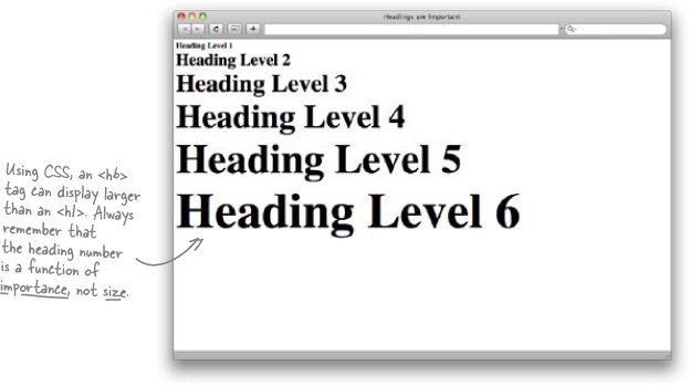
HTML comes out of the box with six different header levels: <h1> through <h6>. With no stylesheet (just the naked markup), most browsers will render <h1> in the largest text and <h6> in the smallest.
Remember, HTML’s a markup language and isn’t intended to convey style information. The different heading levels are used to signify importance in your content. A level one heading <h1> is the most important heading, <h2> is the next-most important, and so on.
When you’re marking up your sites, remember to make main headings <h1> or <h2> and make other sub-headings a lower heading level. This will ensure that the site is semantically correct and search engines are interpreting your content correctly. (Remember, the bots can’t actually see your design.)
Brain Barbell
Just because you can style the lower-level headings in larger fonts with CSS, does that mean you should?
Exercise
Okay, you’re on to the final stretch. Here’s what’s left to do:
Change up your XHTML to use the different heading levels. | |
Create CSS styles for the different heading levels | |
Use CSS to style the main content text. | |
Do you like how your lists look out of the box? If not, use CSS! |
Keep this page open and tick off each to-do as you complete it.
You’ve got Chapter 7 under your belt, and you now know the ins and outs of writing good web content. You should be able to write organized, scannable web text. But there’s still more... keep reading!