A little shaky on your site navigation?
When it comes to the Web, users are impatient. They don’t want to waste lots of time looking for the right button or wading through three levels of your JavaScript pull-down menus. That’s why you’ve got to spend a lot of time getting your site’s organization right... before you get into construction and design. Last chapter, you came up with a great theme and look for your site. In this chapter, you’ll really amp things up with a clear organization. By the time you’re done, you’ll have a site that tells your users where to go and keeps them from ever getting lost again.
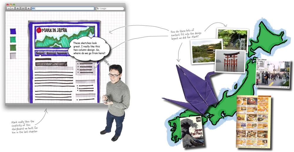
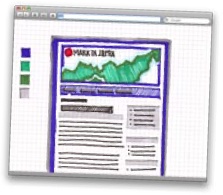
On his voyages throughout Japan, Mark collected a lot of material. He took pictures, kept a daily journal, collected items (maps, travel booklets, trinkets, etc.), and even managed to take some video. The big question is, how should all of this content be organized into his new design?
A website is all about communicating information. No matter how good your design is or how cutting edge your layout is, if your site doesn’t speak to your audience, it won’t be nearly as successful as a site that says something, and says that something clearly.
A huge part of how well your website communicates its content has to do with how its information is organized. If a site’s content isn’t organized well, all sorts of bad things can happen–like confused users leaving your site for someone else’s. Organizing your site’s information well (and logically) is the difference between good and bad navigation–which means the difference between your users finding what they want quickly and easily and your users being really confused.
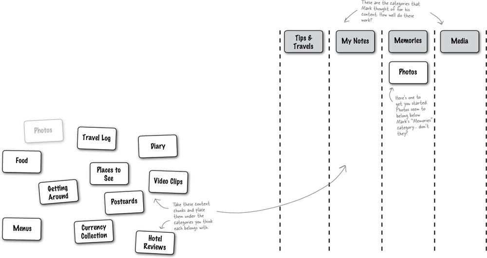
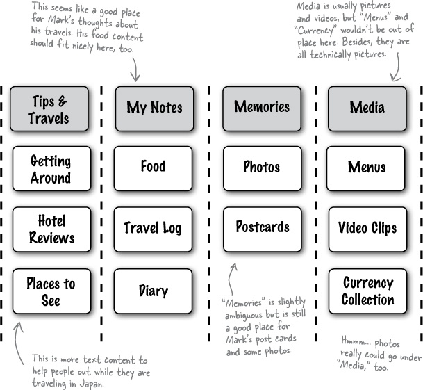
Sharpen Your Pencil Solution
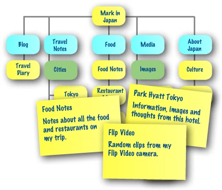
So you needed to take the chunks of content and associate them with the most appropriate top level navigation category. Here’s what we came up with... what does your solution look like?

Ambiguous navigation confuses users
Thinking about what to name your main navigation categories is important and should not be a last-minute decision or an afterthought. Confusing categories will make it difficult for your users to find the information they’re looking for and make your site look unorganized and haphazard. Let’s take a closer look at Mark’s top level categories:
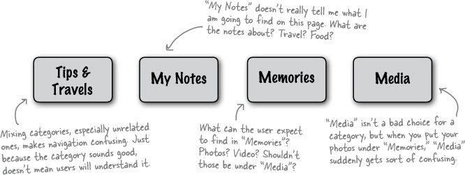
Sharpen Your Pencil Solution Better Solution
Having clear top navigation categories is the key to making information easier to find on your site. Let’s see how some new main categories makes our organization more logical.
Better Solution

Navigation headings should always be short, concise and reflect (as closely as possible) the content that a visitor will find when they click the link.

Jim: I actually think the categories are ok. This is what Mark gave us. Shouldn’t we just go with it?
Joe: The organization isn’t the best, but I think users will be able to find their way around. The headings are still a little confusing, but they’re an improvement over the originals, and I don’t think they’ll get any better. Plus, I want to start coding. We shouldn’t be spending so much time on something as trivial as categorization for a travel site.
Frank: But this is the foundation of our navigation!
Joe: What are you talking about?
Frank: Our navigation... isn’t most site navigation just putting links and sub-pages to good categories?
Jim: I hadn’t thought about it like that.
Joe: Well, what else can we do? We’ve already done one revision of the categories—or navigation, I guess—and like I said, it’s not going to get much better.
Frank: I think we’re too far into things to really know what problems we might have.
Jim: You mean, start from scratch?
Joe: Oh brother. We’ll just end up right where we are now!
Frank: What if we don’t just start over? What if we approach things in a completely different way?
Jim: Like how?
Frank: Let’s build up an information architecture, not just a bunch of categories.
Joe: A what?
Frank: Information architecture. Here, let me show you...
Take your time with organizing your site. Navigation is built on your organization... and nobody likes confusing navigation options.
Information architecture is just a way to organize the content you already have into groups that are meaningful and logical both for you and for your users. Sometimes thinking about navigation, or categories, gets you too far into how a site is going to look.
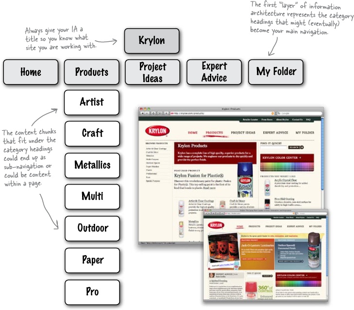
Information architecture is all about taking a step back and really looking at what sort of content you’ve got... how does it all fit together? Take a look at this partial IA for a popular paint manufacturer, Krylon:
How exactly do you organize your site’s information? Well, there are lots of ways. One of the best is something called card sorting.
Card sorting is a cheap and easy way to impose a structure on your site’s information. It’s also a great way to see how other people (maybe even your potential users) organize your site’s information. Card sorting also takes a step back from XHTML or even the Web in general and lets you think about organization, not just navigation.
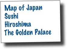
A stack of 3x5 cards
A pen and a clear table (or the floor)
A solid idea of your site’s content
Exercise
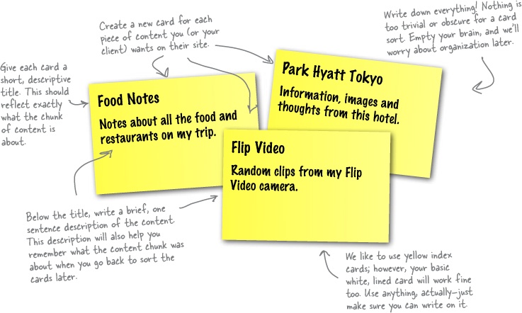
Its now time to do a card sort based on Mark’s content. On each of the cards, write down a single chunk of information and a (very) brief description. Try to be as precise as possible. After you’ve filled out a card, set it aside–we’ll come back to these cards in a bit. Continue doing this until you’ve got all of the possible content from Mark’s site written down on the cards. You may need more cards than we provided, so use your own index cards if you need to.

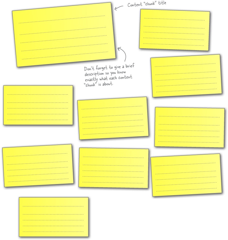
Don’t be afraid to make lots of cards. For now, just get all your content down on the cards.
Once you’ve finished filling out your cards, you need to sort them into groups. The cards in each group should obviously be related–and their grouping should make sense to you. Here’s a little hint:These groups will eventually become sections within Mark’s website.

After you’ve created your groups, it’s time to give each group a name. The name has to be short and descriptive. These descriptions may end up becoming part of your main navigation, so keep them focused on the content, but broad enough to contain the content they describe.
Since you’ve already spent some time digging into Mark’s content, try and come up with category headings that are different (and better) that what you came up with earlier in the chapter, back in Sharpen Your Pencil Solution Better Solution.
Take a picture of how you organized your cards. You can reference the picture later and still move your cards around into different arrangements.
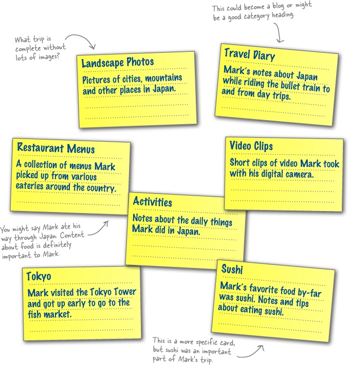
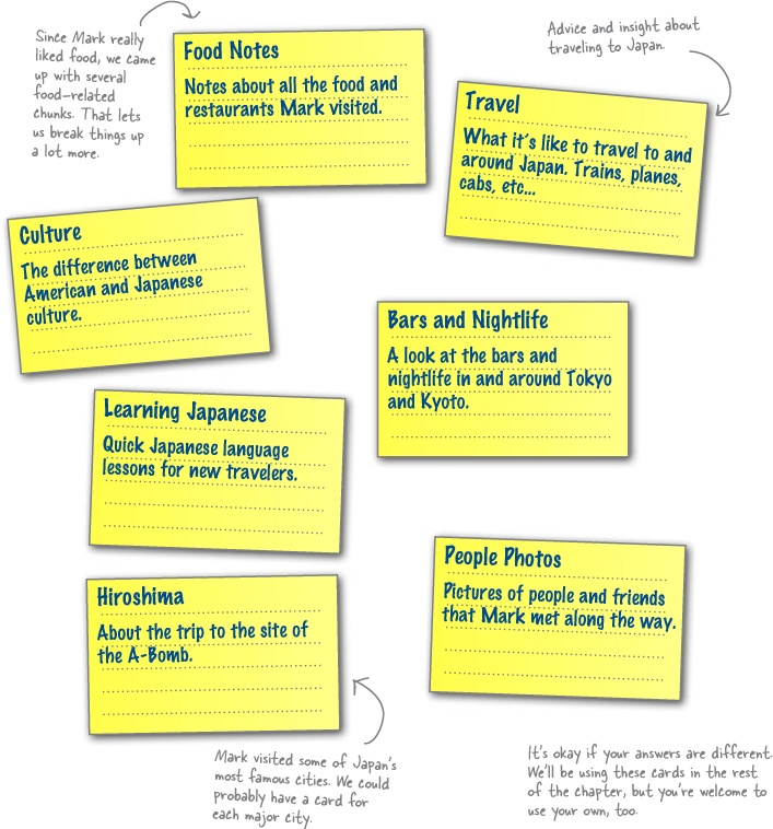
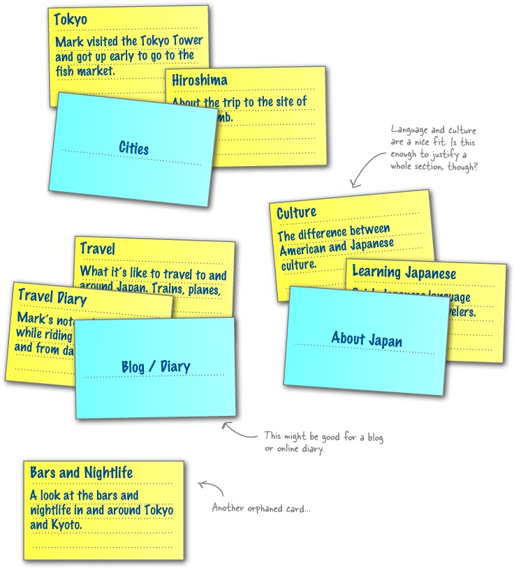
Exercise Solution
In this exercise, you needed to organize your cards into logical “stacks” and then give each a name that best represents that content. Here’s what we came up with:
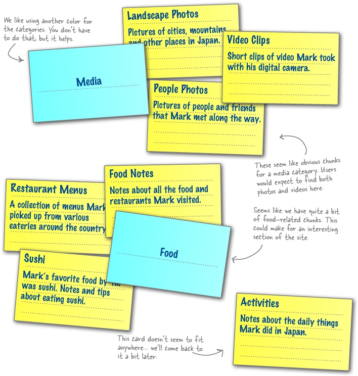

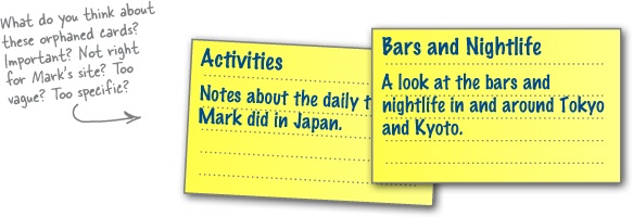
Orphaned cards force you to ask yourself: “Is this content really necessary?”
In some cases, you’ll find that cards don’t fit anywhere–these are called orphaned cards. You might be wondering whether you’ve done something wrong, but don’t worry. These cards are usually a sign that you are doing something right!
Orphaned cards come in two flavors. You can have orphaned cards that didn’t fit into another pile–however, you think that the content is important enough to your site that you create a new group with your single orphaned card. Then there are cards that don’t fit into another pile but are so different from the other cards that you couldn’t come up with a group if you tried (let’s call these the really orphaned cards). Including orphaned content that doesn’t fit into your site’s information architecture always results in confusion for your user.
What if, for example, the produce section at your local grocery store had a pile of toasters, a large display of beef jerky, and an entire wall of deodorant? Shoppers would get amazingly confused. We interact with the world around us based on the predictability of things. There is no reason whatsoever for deodorant (or toasters and beef jerky) to go in the produce section. The same holds true for the organization of a website’s information. If random content appears in a section of the site where we never assumed it would be, we’ll be confused–and our experience with the site will be negatively impacted.
So, what do you do with orphaned cards? You’ve got two choices. First, you could change the content in such a way that it fits into another one of your groups. However, more often than not, that strategy just isn’t going to work. The other alternative is simply to recognize the fact that the content doesn’t fit into your website and toss it out.
Friends don’t let friends sort alone
Up until now, you’ve done the card sort all by your lonesome. But doing a card sort by yourself is not the (only) way to do things. Why? Well there’s one really good reason: You aren’t designing for yourself–you’re designing for your audience! And if you aren’t designing for yourself, why would you do a card sort by yourself?
Ideally, you want to run the exact same card sort with the exact same cards–but have someone else sort the cards. Try to choose someone from your target audience. If for some reason you can’t find someone from your target audience, enlist someone else to help. At the very least, they will give you a second opinion on your site’s information structure.
Get your camera out again! Now you should have two pictures of two totally different organizations of Mark’s content.
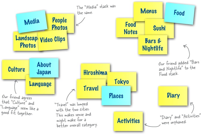
Getting a second opinion on your sorts is important and often results in organization that you may not have initially thought of. But how do you know which one is better or which one deserves more weight? Well, it depends. If five of your friends do the sort and all come up with similar results, you can bet that’s probably the best way to organize things.
However, you’re the web designer. Sometimes having two or three options and just tweaking your original sort is all you need. Make sure that when you’re done, though, you feel good about the organization you’ve come up with. You (and Mark!) are going to have to live with it for a long time.
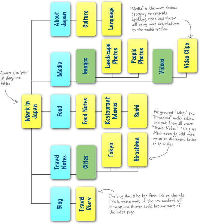
Once you’re happy with your card stacks and titles, you need to put some structure in place. Lay your cards out like a site map. Just take a bunch of your leftover 3x5 cards and write the group names that you came up with. Spread those out on the table that you’ve been using. Then, line up each “content” card below the appropriate “section” card.
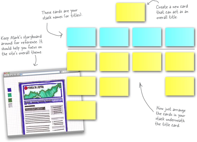

An IA diagram is a lot like the “on the table” site map you created (and photographed) in the last exercise, but it’s also a lot more. An IA diagram not only shows the organization of your site’s content, but it shows the hierarchical relationship between sections and subsections of that content. The good news is, because you already took the time and did a few card sorts, most of your work is done!
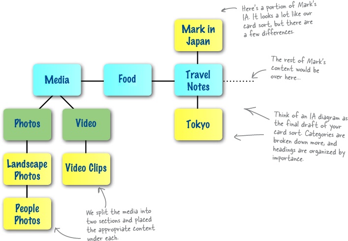
When you make your final IA diagram, make sure you order your main headings by importance. The most prominent items should appear higher up in your IA.
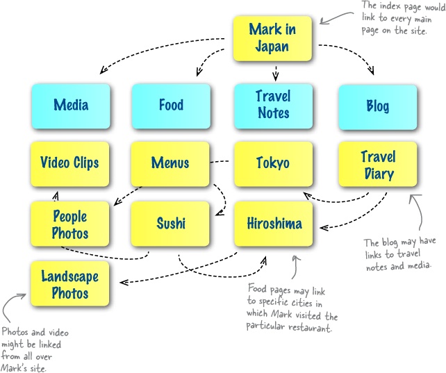
IA diagrams are not about links—they’re all about the hierarchical relationship between sections and subsections of content. If you were to try to create a diagram that showed links between sections, you would end up with a useless, spaghetti-looking mess that wouldn’t give you any kind of information whatsoever about this vital hierarchical relationship between the site’s content.
Think about it like this... most sites have links all over the place, cutting across categories and site sections. That would make for a pretty messy IA!
Geek Bits
There are lots of flowcharting programs out there that can help you create a slick and professional looking IA diagram. On the Windows side of things, Visio is a good choice (though on the expensive side). On the Mac side of things, OmniGraffle is a great choice.

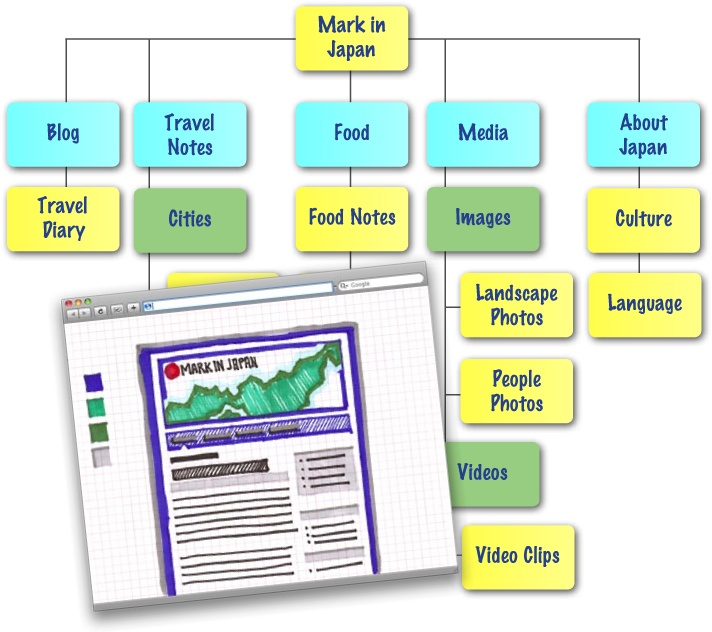
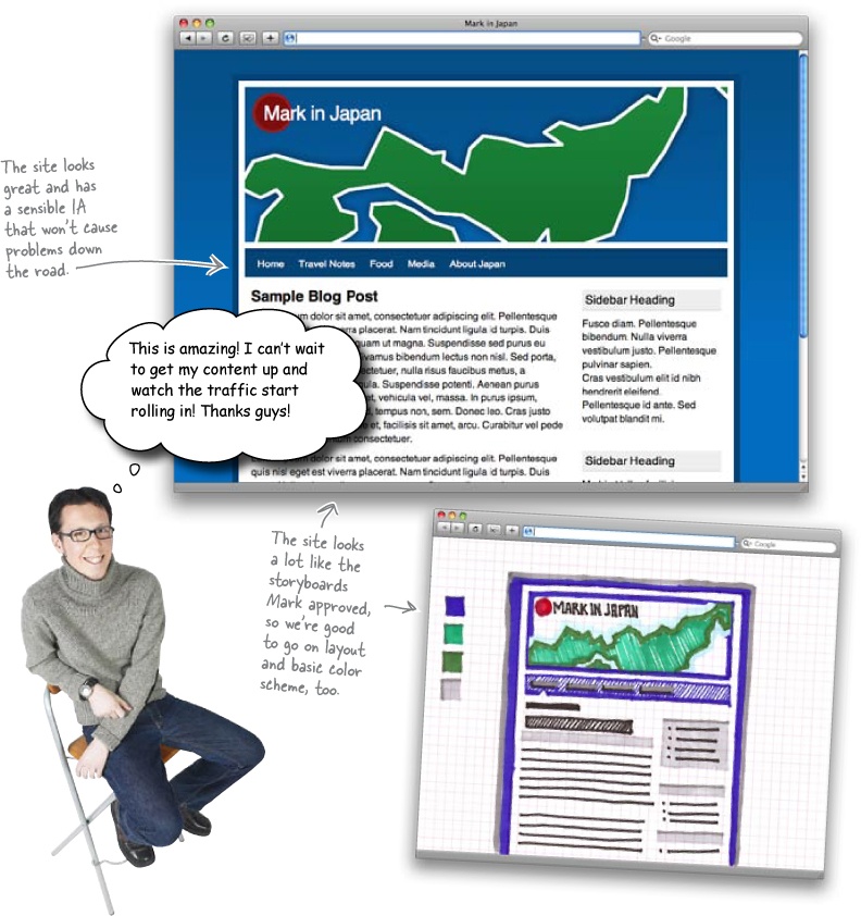
Coming up with an IA diagram and doing all those card sorts may have seemed like a lot of work for a simple navigation. Mark will love you, though, especially when his users are easily navigating his site and finding all his content without any problems.
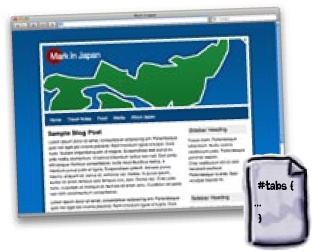
And now we’ve got a well-organized IA, a storyboard Mark likes, and a clear idea where we want to take the site. Let’s lay down some markup and style!


You’ve got Chapter 3 under your belt, and now you’ve added card sorting, IA diagrams and information organization to your tool box. Next up? We’ll dive into designing a site for your audience...