
We’ve really covered a lot of ground in this book. The thing is, there are some important topics and tidbits that didn’t quite fit into any of the previous chapters. We feel pretty strongly about these and think that if we didn’t at least cover them in passing, we’d be doing you a disservice. That is where this chapter comes into the picture. Well, it’s not really a chapter; it’s more like an appendix (ok, it is an appendix). But it’s an awesome appendix of the top ten best bits that we couldn’t let you go without.
The Web is a truly global place—and that means your websites have to be too. People from every corner of the globe are checking out your sites. The thing is, everyone has a different cultural, linguistic, and ethnic background—all of which might impact how they interpret your site’s design. There are some things you should keep in mind when you are designing a site for an international audience (or an audience whose culture is different from your own).
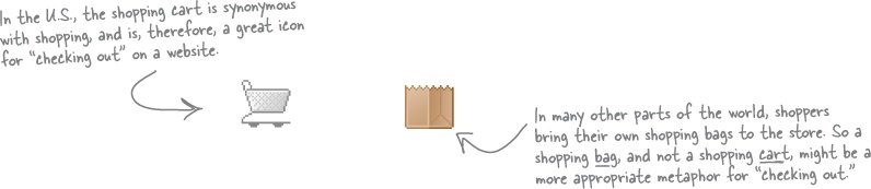
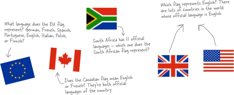
Icons are cool and can convey a lot of information in a little bit of space. But what an icon means to you might be completely different from what that icons means to someone in another country or culture:
If you translate the content of your site into a variety of different languages—a process called localization—you’ll find that phrases may take up a lot more space than they originally did. Take a look:
“Click here for current site news.”
“Klicken Sie hier für gegenwärtige Aufstellungsortnachrichten.”
Щелкните здесь для в настоящее время весточки места
If you originally design your site in English and then go to translate it to German, you’re going to find that the phrases take up more space—throwing your carefully planned design into chaos. So what can you do? You either need to design your site so that an increased number of characters doesn’t really have an impact on your layout, or you’ll need to reformat your site after you translate the content into the target language. Either way, you can’t ignore language lengths if your site is going to be translated.
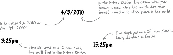
Even something as simple as how date and time are displayed can differ from country to country. If your site has the date or time formatted incorrectly for that national or cultural context, your users might get confused, or even miss an important event or deadline. Here are just a few date and time formats you’ll want to think about:
It’s fairly common to see flag icons used to indicate language choice. English might be represented by the Union Jack, and French represented by the flag of France. The problem with this is that nationality (and flags) don’t represent language. There are lots of people who don’t live in France who speak French. So some users might feel frustrated or even alienated that your site equates their native language with some other country. Instead of using flag icons to indicate language choice, simply spell the language out in the actual language—English, Francais, Deutsche, etc.
The web is constantly evolving. New markup and style specifications are being proposed, developed, and implemented by the World Wide Web Consortium (W3C)—all of which will have an impact on how web designers do their thing. Most notable are HTML 5 and XHTML 2.
Both HTML5 and XHTML2 are specifications currently being developed by the W3C. This often causes confusion, as many people believe that XHTML 1.x was the successor to HTML 4.01 (and that HTML is effectively dead). So what’s the difference between XHTML 2 and HTML 5? XHTML 2 is pretty much the successor of XHTML 1.x—it’s designed to be the Web’s general-purpose markup language, with a minimum of default features that are easy to extend using CSS and other technologies. The most important goal for the XHTML 2 working group is to further separate document content and structure from document presentation. To these ends, the XHTML 2 working group has completely removed elements such as basefont, big, font, s, strike, tt, u, small, b, i, and hr. The XHTML 2 group has also been less concerned with backward compatibility, which has led them to drop some of the syntactic baggage present in earlier incarnations of HTML. The result is a cleaner, more concise language... but one that won’t work with old HTML (and some XHTML) web pages.
HTML 5 has taken a radically different approach. Instead of being a markup language for the web (as its ancestor HTML 4 was), HTML 5 is all about moving away from document markup and creating a language specifically for web applications. So a lot of the HTML 5 specification focuses on creating a more robust, full-featured client-side environment for web application development by providing a variety of APIs (and elements that work specifically with those APIs). Examples include the 2D drawing API, which can be used with the new canvas element, and an API for playing video and audio, which can be used with the new video and audio elements.
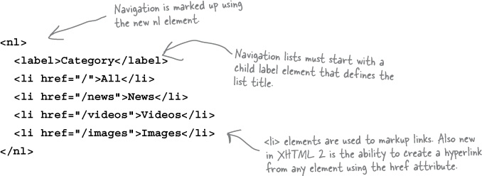
Among many of the cool things you can expect in both HTML 5 and XHTML 2 are navigation lists. In XHTML 2, navigation lists look something like this:
In HTML 5, navigation lists look a little something like this:
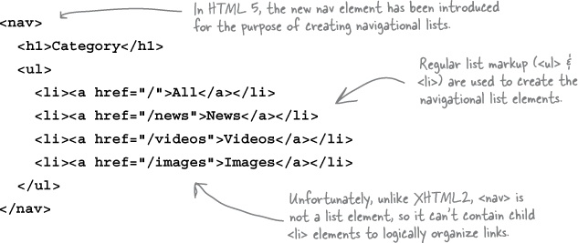
The whole point of navigational lists (especially in XHTML2) is to create simple, lightweight navigation markup that can then be styled using CSS.
Neither XHTML 2 nor HTML 5 have been officially released by the W3C (though draft specifications and recommendations for both have been released). So when will you see official releases? Honestly, there’s no good way to know. Because of the open and collaborative nature of developing these sorts of specifications, discussion and deliberation by the members of the individual working groups will go on until the job is done and everyone gets a chance to contribute. In the grand scheme of things, the release of the final specifications are not the issue. What is important is when (and how fast) browser developers completely adopt the new standards.
Note
For a full rundown on the HTML5 specification, check out http://www.w3.org/html/wg/html5/.
To explore the XHTML2 specification, visit http://www.w3.org/TR/xhtml2/

Just like HTML and XHTML, CSS is marching forward. While XHTML 2 and HTML 5 are cool from the perspective of web design, CSS 3 (the next version of CSS) is really the icing on the cake. One of the most interesting things about CSS 3 is that it will be released as a series of modules—instead of one big single release. This means that CSS can be updated faster, as modules can come out individually. Modules can be changed and updated independent of other modules, too, which means that you don’t have to wait for the next “big” revision of CSS to get a particular update of your favorite module.
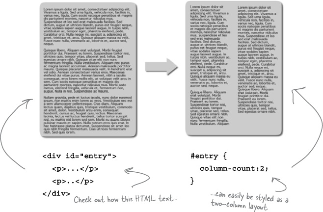
While there are lots of cool modules out there, one of the coolest is the multi-column module. It offers new CSS properties that let designers specify the number of columns an element should have. This not only allows designers to create documents that look more print-like, but it changes the process of creating multi-column layouts entirely.
The multi-column module includes the following new CSS properties:
Note
For a full rundown on all the CSS 3 modules, check out http://www.w3.org/TR/
column-countdetermines the number of columns into which the content of the element will flow.column-widthdescribes the width of each column.column-gapsets the padding between columns.column-ruledefines a border between columns.
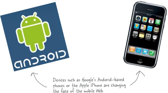
Over the past couple of years, design for mobile devices has become a really big deal. Not only are new mobile network infrastructures coming online that allow for faster data transfer, but new and far more powerful devices are hitting the market and becoming widely available and adopted.
If you are designing for mobile devices, there are some things you should think about:
Even though many mobile devices now have a zoom and browse feature, you still need to remember that you are designing for a device with a screen that is far smaller than you are probably used to. While there is variation, the screen real estate of a mobile device usually comes in around 320 × 240. As a result, you are going to have to be incredibly frugal when designing your layout... there’s just not a lot of screen real estate to work with.
Many carriers still charge customers for the amount of data that’s pushed to their phone. This means you need to create pages that have a very light footprint. Besides, mobile connectivity is still quite a bit slower than what you’re used to on desktops or laptops. The smaller the file size of the page, the faster it will download.
Above all else, test your design on as many mobile devices as possible (or the target device—which you can identify using audience research).
The web has developed to the point where you can not only create web pages, but you can also create web applications—websites that act (in one way or another) like a desktop application. These web applications don’t just display information, they actually do something.
To create a web app, you’ll need to work in a serverside scripting or programming language. Options include PHP, Ruby on Rails, Perl, or ASP.NET. Each language has its own strengths and weaknesses, and with a little research, you’ll find the one that fits your needs. The language you choose is determined by the server on which you’ll be hosting your web app. Remember that some servers will support one web language but not another.
Remember, though, just because you may be coding a web app, you’ve still got to use good design principles. Here are a few books that can get you started with web apps:

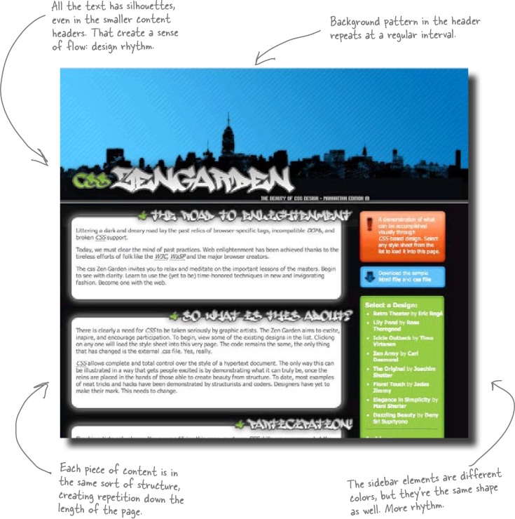
Rhythm—the repetition of design elements—is a term often used in print design. But don’t think rhythm is just about print design... it’s just as important on the Web. Repetition allows you to create consistency, which contributes to the layout’s visual logic. Repeat a common element or theme, and your site feels intuitive, more usable, and logical to users.
Let’s take a look at how repetition can be used:
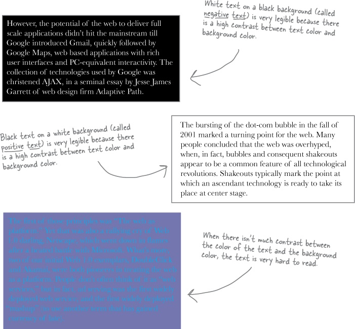
Back in Chapter 7, we talked a lot about how to make content more scannable. But scannable text isn’t necessarily legible text. Legible text is text that’s easy to read because of the colors and contrast, not because it’s easy (or hard) to understand.
There are a lot of things you can do to make your text more legible. Most importantlyt, make sure that you have a high contrast between the color of your text and the color of your background. If there isn’t much contrast between your text color and your background color, users are going to find your text hard to read the text.
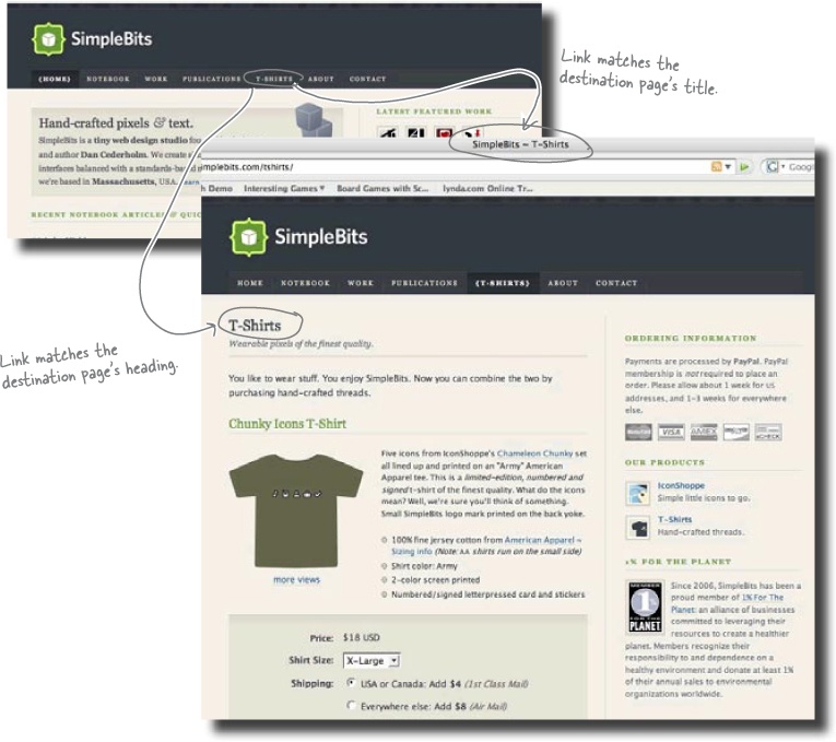
As we talked about back in Chapter 6, signposting is one of the guiding principles of usable and intuitive navigation design. However, there are many other ways to give users a clear indication of where they are, where they can go, and a confirmation that they’ve arrived at the right place. One simple technique is to make sure you match the name of a link with the destination page’s title. That way, users will immediately know they’ve arrived where they expected to be when they clicked on the link.
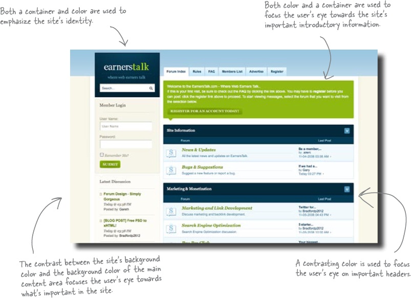
Contrast applies to more than just text and background color. Contrast, more broadly, is the juxtapositioning of dissimilar graphic elements. Sounds fancy, but it’s not that difficult.
Contrast is commonly used to create emphasis in a layout. The idea is simple: the greater the difference between a design element and its surroundings, the more that particular element will stand out. In the context of layout, there are generally two things that create contrast: color and containers. When you put elements on your page in a container (callout, column, window, etc.), they stand out from the elements closeby. So when you apply contrasting colors to an element and its surroundings, that element will stand out.
You can use contrast to obviously identify different parts of your layout or focus the user’s eye towards a particularly important aspect of your layout.
There are lots of great online and offline tools that will help you envision, create, and implement your design. We’re not talking about visual markup editors like Dreamweaver here. Instead, we’re talking about tools that actually help with the process of design. We’ve already talked about Kuler (a great little online app for creating color schemes), but there are so many more. Here are a couple of the good ones:
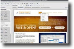
Pencil is an incredibly powerful little open source app that is designed specifically to create storyboards, interface prototypes and design diagrams. It comes in two flavors: a Firefox add-on and a desktop app (only Windows and Linux—sorry, no Mac version yet). Honestly, Pencil is pretty much an image editing application with features (such as built-in GUI stencils) geared specifically towards interface design and prototyping. Best of all, it’s completely free. http://www.evolus.vn/Pencil
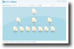
WriteMaps is a web application for building robust information architecture diagrams. On top of this, it allows you to share and collaboratively edit your IA diagrams with others. Like Pencil, WriteMaps is also free. http://writemaps.com
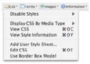
Web Developer is a Firefox add-on that puts a host of web development and testing tools at your fingertips. With it, you can directly edit the CSS of a currently displayed web page, display all of a site’s style sheets by media type, outline all block level elements in a page, automatically resize the browser window, and directly edit the markup of a currently displayed web page. http://chrispederick.com/work/web-developer/
CSSTidy is an open source desktop application (available for Windows, Linux, and Mac) which parses and optimizes CSS. It can easily reduce the size of your CSS by 25%—which is especially good if you are obsessed with optimization or are designing for a platform where small file size matters (like a mobile device). http://csstidy.sourceforge.net
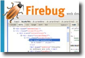
Firebug is an open source (and free) Firefox extension, much like Web Developer, that puts a wealth of web design, development, and testing tools at your fingertips. With it, you can inspect and edit markup and CSS, view a page’s various CSS containers (box model), view a page’s response time (download time) broken down by file type, debug and execute JavaScript on the fly, and inspect JavaScript performance (among many other things). http://getfirebug.com/