Make Good Design Choices
</objective> <objective>Use Fonts, Pictures, and Shapes Successfully
</objective> <objective>Create Harmonious Color Selections
</objective> </feature>This chapter is more about pictures than words. We use visual content to show you what works better, and in most examples, we show you the “before” and “after” stages as well.
Remember that the backgrounds in a slide must remain in the background! It’s easy to forget this when you use backgrounds composed of colors that are highly saturated and bright. True, these may look great as wallpapers, but if you allow the background to scream, it’s going to take attention away from everything else, including the subject of your presentation.
Slide A in Figure 10.1 uses one of PowerPoint’s built-in theme color sets, but it certainly is a wrong choice. The background and foreground colors are both highly saturated values, and the slide seems to be screaming more than anything else.
In contrast, slide B uses subtle and less-saturated colors that do not take attention from the real content on the slide. Moreover, these colors will project well.
Beveled text with drop shadows does not work with all colors. The color set shown on slide A in Figure 10.2 is quite nice, but it cannot cope well with a large, empty expanse and text with drop shadows.
On the other hand, slide B uses one subtle color (for the background) and one bright color (for the text). This works well and can cope with all sorts of effects that PowerPoint 2007 allows, such as drop shadows and beveled text.
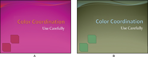
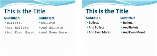
Both slides in Figure 10.3 use PowerPoint’s built-in theme colors, and that shows how important it is to experiment with the choices that are available.

Slide A uses the default colors associated with the theme. This isn’t too bad, but we won’t call this professional. The gray and pink seem to be at war.
On slide B, blue and yellow seem to be happier, and they provide a more pleasing balance.
You can learn more about Theme Color sets and how to create and apply them in Chapter 6, “Makeover 5: Halloween Scrapbook.”
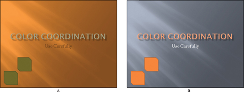
The brown used on slide A in Figure 10.4 is too saturated, and the blue is too bright. It’s almost as if the colors are opposing each other. The gray seen on slide B is perfect as a neutral color, and a more subdued blue makes this a winner.

Whatever you do, make sure that your text can be read. In addition, make sure that your text is not in some teeny-weeny font size that makes the audience squint their eyes, then feel tired, then sleep, and finally snore!
Speaking of contrast, remember that your text color should not be similar to the background color. The sections that follow explain more.
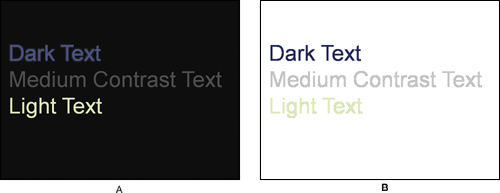
This slide (see Figure 10.5) is based on one of PowerPoint 2007’s built-in themes. The backdrop is beautiful, but you need to be careful with the text colors. Dark text works well, but text that is lighter than, or even similar to, the background colors does not make any impact.

Both slides shown in Figure 10.6 use a plain color background. Slide A has a dark (black) background while slide B has a light (white) background. As expected, colors contrasting with the backgrounds work best.
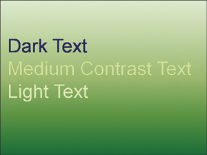
Gradient backgrounds can be tough when it comes to creating contrast. This slide (see Figure 10.7) uses a gradient background that includes both dark and light areas. If you use a slide like this, you need to make sure that the text color contrasts in both the dark and light areas. As you can see, the light text in the lower area of the slide is clearly visible, but text in the same color might be illegible in the top area of the slide.
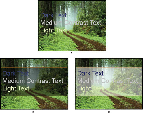
Picture backgrounds are not too compatible with text because pictures typically contain a riot of colors in different hues and saturation values. If your text is a light color, insert a shape in a dark color behind the text, and make the shape semitransparent, as you can see in slide B. On the other hand, if your text needs to be in a dark color, insert a shape in a light color (see slide C).
The Shape Styles gallery is quite addictive and can provide umpteen hours of fun if you start playing with all the options! However, that might actually be time well spent.
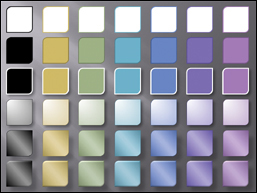
All the fills, outlines, and effects for the shapes in the Shape Styles gallery actually come from the active theme of the presentation, including the Theme Effects and Theme Colors. This means that when you can change the theme of the presentation, all the shapes in your presentation that have shape styles applied to them get changed to the colors and effects in the new theme. Not only is this almost magical, but also it ensures that your presentation always uses the right colors for all elements.
The four slides in Figures 10.9 through 10.12 include the same shapes with different themes applied. As you can see, the Shape Styles updated themselves successfully each time.


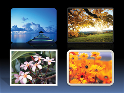
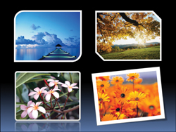
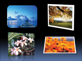
It’s surprisingly easy to add drop shadows, bevels, borders, and other niceties to pictures on PowerPoint slides by using the Picture Effects engine built in to PowerPoint. Although it is easy to apply, let me tell you what makes it even easier: the new Picture Styles drop-down gallery in the Picture Tools Format tab of the Ribbon.
See the Picture Styles options shown in Figures 10.13 through 10.16.
Well, we’re not really going to ask you to stay away from any particular font style, but we do have some opinions that we want to share.
Some PowerPoint users want to type every line of their presentation in a different font style. While we don’t want to curtail their freedom, they should know that’s the very reason why Microsoft introduced the Theme Fonts option in this version of PowerPoint. See Figure 10.17 for an example that speaks louder than words or fonts!
Many fonts look a little edgy, and while they are great for an invitation to an exhibition of contemporary art, a fashion catalog, or even a wedding card, they won’t exactly work in a presentation scenario.
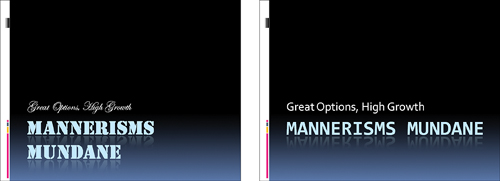
For the same reason, stay away from script style fonts, especially, because they are so hard to read! (See Figure 10.18.)
Tip
The font used for the main title in Figure 10.18 is known as a display font. Although display fonts can be useful for small bits of text, they’re not usually good to use for slide titles and body text because they’re so decorative.
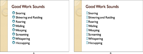
Dingbats are those cute fonts that produce drawings and illustrations rather than actual alphabet characters. Many people love to use them as bullets, but when these presentations travel to another computer where the dingbat font is not installed, they end up showing as ugly boxes, as you can see in Figure 10.19. Even if you embed the fonts while saving the presentation, anything used as a bullet does not get embedded, so be careful with this one.
Color harmonies are a difficult subject, and we really can’t cover it in a page or two; it needs an entire book. However, we’ll make it as easy as we can for you.
Tip
For most purposes, you need not learn more than what we explain in this section, but if you do want to learn more, please do so because it will make your presentations look so much more professional.
You’ll find links to some online resources on this book’s companion site: http://www.pptkit.com/color/.
Based on the colors in the harmonies, you can create your own Theme Color sets. Use the background color of the slide as a starting point, and use the color harmonies to find hues that will work well with that particular background color.
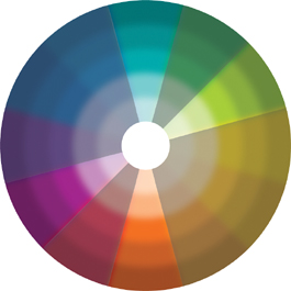
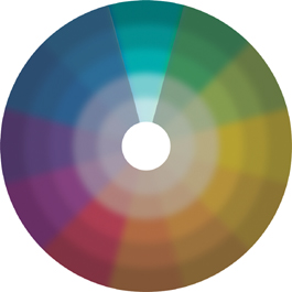
There are several types of color harmonies, but four of them work best in PowerPoint. We’ll explain to you how these work using the simple color wheel that you see in Figure 10.20.

A monochromatic color harmony uses different hues of the same color to create an elegant look (see Figure 10.21). Monochromatic harmonies are successful almost all the time, but they can look a little dull.
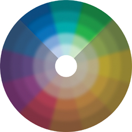
Analogous harmonies use similar color values. They build on the monochromatic choices, and you can extend that a little more so that you get a larger range of choices in the pie slice, as you can see in Figure 10.22. Thus, if you start with blue-green, you also could delve into any blue or green shade.
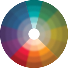
Split complementary harmonies provide a much larger choice of colors, but those are mainly in the opposite side of the wheel, as you can see in Figure 10.23.
Double complementary harmonies take a different approach. They place a rectangle over the color wheel, and each of the four corners of this rectangle comprises the areas from which colors can be sourced for this color harmony, as you can see in Figure 10.24.