
Understanding Layouts
Now that you have created the Screen Brightness Toggle application inside Eclipse, you can begin to design the application's user interface. Because the user interface is the part of your application with which your users interact, you must make this area of the application as quick and responsive as possible in all regards.
For the Screen Brightness Toggle application, all you need is a single button centered in the middle of the screen to toggle the screen brightness. Directly below the button you can include some text that lets the user know whether the tablet is in regular daytime mode or in night mode. (See Figures 6-2 and 6-3, respectively.)
Figure 6-2: The Screen Brightness Toggle application in daytime mode (100% screen brightness).
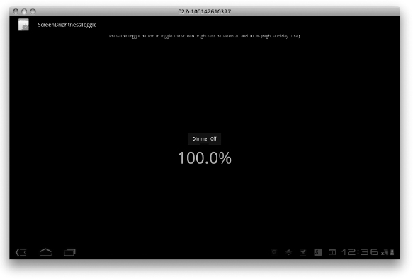
Figure 6-3: The Screen Brightness Toggle application in night mode (20% screen brightness).

Understanding the XML layout file
All layout files for your application are stored in the res/layouts directory of your Android project in Eclipse. Android Development Tools (ADT) creates a default layout file when you create a new application. When you created the Screen Brightness Toggle application, the ADT created a file in the res/layouts directory named main.xml.
Open that file by double-clicking it, and the XML code appears in the Eclipse editor window, as shown in Figure 6-4.
Figure 6-4: The main.xml layout file opened in Eclipse.
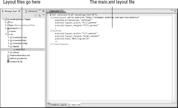
Your XML code is a simple layout in which you have a text value in the middle of the screen, and it should look like this:
<?xml version=“1.0” encoding=“utf-8”?>                                   →1
<LinearLayout xmlns:android=“http://schemas.android.com/apk/res/android” →2
    android:orientation=“vertical”
    android:layout_width=“fill_parent”
    android:layout_height=“fill_parent”
    >                                                                    →6
<TextView                                                                →7
    android:layout_width=“fill_parent”
    android:layout_height=“wrap_content”
    android:text=“@string/hello”
    />                                                                  →11
</LinearLayout>                                                         →12
This XML file defines exactly what your view is to look like. In the following list, I break this file down for you element by element:
| →1 | The first element provides the default XML declaration, letting text editors such as Eclipse and consumers like Android know what type of file it is. |
| →2 to →6 | The next element defines the layout type. In this case, you're working with a LinearLayout. I give you more info about LinearLayout layout types in a moment, but for now, be aware that a LinearLayout is a container for items — known as views — that show up on the screen. Notice how the closing </LinearLayout> tag isn't included here. The reason is that the LinearLayout tag is a container for other items. The close tag is inserted only after all the view items have been added to the container. |
| →7 to →11 | These lines define the items within the LinearLayout container. The views are the basic building blocks for user interface components. Lines 7–11 define TextView, which is responsible for displaying text to the screen.
|
| →12 | At the end of it all, you have the closing tag for the LinearLayout. This closes the container. |
 A view occupies a rectangular space on the screen and is responsible for drawing and event handling. All items that can show up on a device's screen are views. The
 Arranging components with Android SDK's layout tools
When creating user interfaces, you have to lay components out in a number of different ways. Thankfully the engineering geniuses at Google who created Android thought of all this and provided you with the tools necessary to create many different types of layouts. Table 6-2 gives you a brief introduction to the common types of XML layout objects that are available in the Android Software Development Kit (SDK).
Other different types of layout tools exist, such as TabHost for creating tabs and Sliding Drawer for you to hide and display views with finger-swiping motions. I'm not going to get into those at this point because they are only used in special-case scenarios. The items in Table 6-2 outline the layouts that you will use most commonly.
Using the visual designer
To lay out your application, you can code Android's layouts by hand, but doing so can be complicated and difficult. However, I have some good news for you: Eclipse includes a visual designer, which allows you to drag and drop the elements of your app as you please. I also have some bad news: The designer (like all visual designers) is limited in what it can do.
The visual designer works well for simple scenarios in which your contents won't need to change. It is best suited for static content scenarios — that is, scenarios in which your layout is created once and is not updated dynamically. In such scenarios, the text of TextViews or images might change, but the actual layout of the views inside the layout would not change. But what happens when you need to draw items on the screen dynamically based on user input? That's where the designer falls down. It cannot help you in those scenarios.
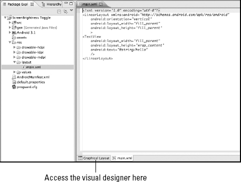
To view the visual designer, with the main.xml file open in the Eclipse editor, click the Graphical Layout tab (see Figure 6-5).
Figure 6-5: The Layout button, which shows the visual designer.
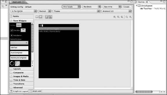
You should now see the visual designer, as shown in Figure 6-6. From here, you can drag and drop items from the Layouts or Views toolboxes.
Figure 6-6: The visual designer.
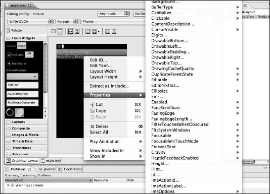
A feature I really like about the designer is the ability to view the properties of a given view. Right-click on a view and hover your cursor over Properties to access the Properties view in Eclipse, as shown in Figure 6-7. To use the Properties pop-up menu, simply select a view in the visual designer and right-click on it. The view has a red border around it, and the properties show up in the Properties window below. Scroll through the list of properties to examine what can be changed in the view.
Figure 6-7: The properties of a selected item in the visual designer.
 A view's available properties can change depending on its parent layout. For example, a TextView that is inside a LinearLayout will have a different set of layout properties than one inside a RelativeLayout.