
Creating the User Input Interface
The most common input type is free-form text — known as an EditText widget. In other programming platforms, this is known as a text box. With an EditText widget, you can provide an onscreen keyboard or the user can elect to use the physical keyboard (if the device provides one) to enter input.
Creating an EditText widget
In Chapter 11, you create a view layout XML file with the name of reminder_edit.xml that contains the following code:
This snippet of code defines the text input for the title of the task. The snippet creates an input on the screen so that the user can type into it. This EditText widget spans the entire width of the screen and takes up only as much room as it needs in regard to height. When selected, Android automatically opens the onscreen keyboard to allow the user to enter some input on the screen. This example is minimalistic compared to the following EditText example, which is also created in the reminder_edit.xml layout file:
<EditText android:id=“@+id/body” android:layout_width=“fill_parent”
    android:layout_height=“wrap_content”
    android:minLines=“5”
    android:scrollbars=“vertical”
    android:gravity=“top” />
Here, you create the body description text for the task. The layout width and height are the same as in the previous EditText widget, but the differences between these two widgets are outlined in the following three properties:
- minLines: This property specifies how tall the EditText view should be. The EditText view is a subclass of the TextView object; therefore, they share the same property. Here you specify that the EditText object on the screen be at least five lines tall. This is so that the view resembles a text input that is for long messages. This is much like the body portion of any e-mail client: the height of the body is much larger than the height of the subject. In this case, though, the body is much larger than the title.
- scrollbars: This property defines which scroll bars should be present when the text overflows the available input real estate. In this instance, you specify vertical so that scroll bars appear on the side of the EditText view.
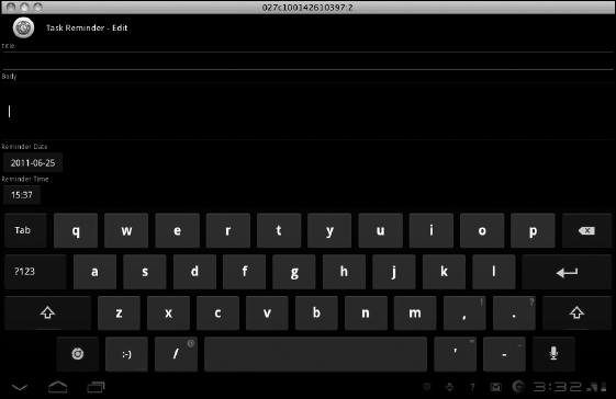
- gravity: By default, when the user places focus into an EditText field, the text aligns to the middle of the view, as shown in Figure 13-1. However, this is not what users would expect when they work with a multiline input mechanism. The user normally expects the input to have the cursor placed at the top of the EditText view. To do this, you must set the gravity of the EditText view to “top.” This forces the text to gravitate to the top of the EditText input.
Figure 13-1: An EditText view without the gravity set.
Displaying an onscreen keyboard
Because some devices do not have a physical keyboard, an onscreen keyboard must be present to interact with the input mechanisms. The EditText view is very versatile and its properties can be configured many ways. One of these properties is responsible for the display of the onscreen keyboard.
Why would you need to adjust the onscreen keyboard? It's simple: Different EditText input types sometimes need different keys. For example, if the EditText is a phone number, the onscreen keyboard should display numbers only. If the EditText value is an e-mail address, the onscreen keyboard should display common e-mail style attributes — such as the at symbol (@). The way you configure the onscreen keyboard can increase the usability of your application.
You configure the onscreen keyboard through the inputType property on the EditText view. This configuration offers far too many options for me to cover in this book, but if you like, you can review all of them at http://developer.android.com/reference/android/widget/TextView.html#attr_android:inputType.