
Lesson 5: Advanced CSS Layout
In this lesson, you’ll learn how to refine the appearance of your page layout by adding graphics, color, and additional page sections.
What you’ll learn in this lesson:
- • Using comments in cascading style sheets
- • Using background images
- • Creating navigation styles
- • Working with absolute positioning
Starting up
You will work with several files from the HTML5_05lessons folder in this lesson. Make sure you have loaded the HTML5lessons folder onto your hard drive from www.digitalclassroombooks.com/HTML5. See “Loading lesson files” in the Starting Up section of this book.
 This lesson uses the TextWrangler text editor to create the markup, but you can use any text editor and get the same results.
Building your page layout
In this lesson, you will be working with the two-column fixed-width layout from Lesson 4. In Lesson 4, you added background colors to the various page elements. In this lesson, you will remove the background colors to unify the appearance of the page.
You will also create a more attractive and useful navigation bar, add more images, create a styled data table, and add form elements for a contact page. At the end of the lesson, you will look at a few alternative page layouts based on the one you create.
Removing the background color
Your first task is to remove the background colors from the page. You do not need to delete the CSS properties for these elements, just comment them out in the code.
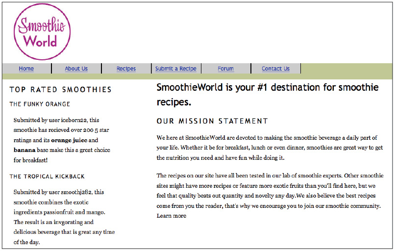
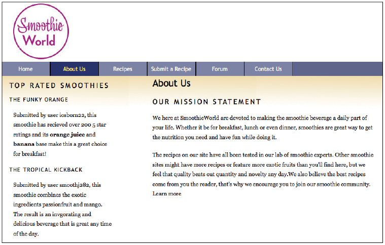
1 In your text editor, choose File > Open. In the dialog box that appears, navigate to the HTML5_05lessons folder, choose the 05_start.html file, and click Open. Preview this page in your browser to see the current layout.
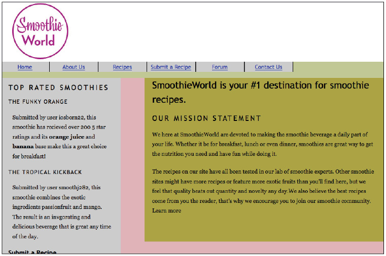
Your page in its initial state.
2 Return to your text editor. Choose File > Save As, and in the dialog box that appears, go to the HTML5_05lessons folder. Name this file 05_layoutwork.html, and then click Save. This ensures you have a backup file.
3 Locate the #wrap rule in your CSS, and then add the following commenting code to the background-color property:
#wrap {
/*background-color:#E0B3B9; */
width:960px;
border:thin solid black;
margin:0 auto;
}
This code disables the style so the browser ignores it. You can remove these comments at any time to activate the style. Designers often keep either background-colors or borders in the code to help them identify layout elements in the future. Save the file and preview it in your browser. The purple background for the wrap is now gone.
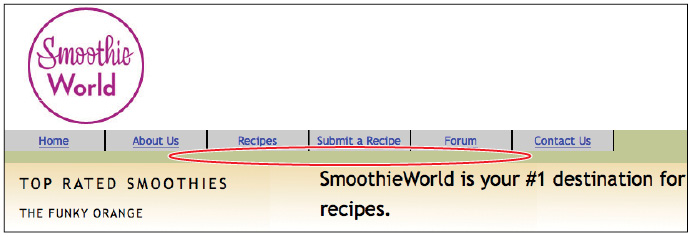
4 Return to your text editor and repeat step 3, but this time add the commenting code for the #sidebar and #maincontent background-color properties. Save the file and preview it in your browser. Your page no longer uses color to define the two columns.
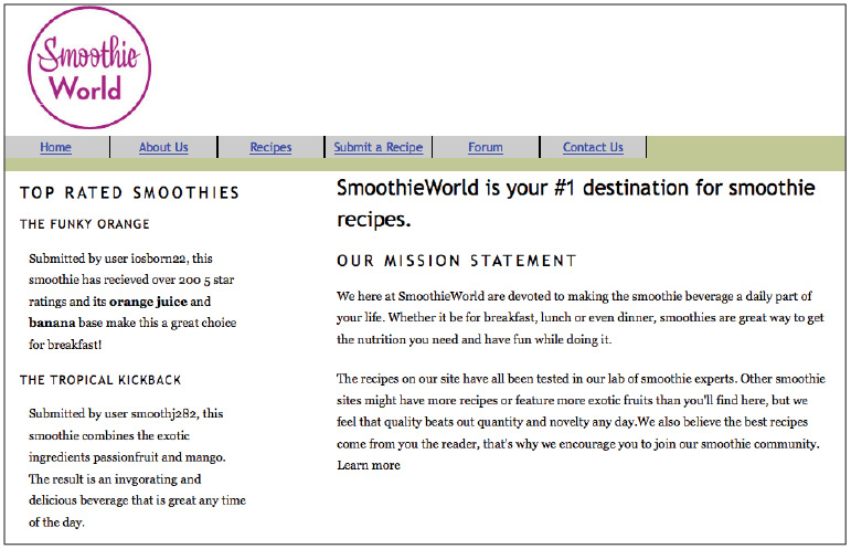
Your page with the background-colors for your columns removed.
Now that you have disabled the background colors of the columns, you’ll add other colors, starting with the page itself. The CSS body selector allows you to do this; you need to open your external style sheet to modify it.
5 In your text editor, choose File > Open. Navigate to your HTML5_05lessons folder, select the base.css file, and then click Open.
Remember that your page is currently using three sources for the styles: the internal styles, which you have already modified; an external style sheet named reset.css, which applies margins and a padding of 0 to most of your HTML elements; and the base.css style sheet, which contains common styles, such as font family and font size.
6 In your base.css file, locate the body rule and add the following property:
body {
font-family:"Trebuchet MS", Tahoma, Arial, sans-serif;
font-size:100%;
background-color:#B3BBCA;
}
This adds a light-blue background color to the page. Save the file and preview it in your browser. You can see that with no background colors applied, your columns are transparent and the body background is visible. You’ll fix that by applying a white background to the wrap div.
7 In your text editor, return to 05_layoutwork.html. Locate the rule for the #wrap div. Modify the color value and remove the commenting code:
#wrap {
background-color:#ffffff;
width:960px;
border:thin solid black;
margin:0 auto;
}
Save the file and preview it in your browser. With the wrap div using the white background, your page is beginning to take shape. Now you’ll add some images.
Working with CSS background images
There are two ways to add images to a web page. The first way uses HTML to insert an inline image. You have already added an inline image when you inserted your site logo. Inline images rely on the HTML image tag, and the code is similar to this:
<img src="images/smoothieworld_logo.jpg" width="200" height="150" alt="smoothieworld_logo" />
The second way to add images to a web page is by using CSS background images. You should generally use CSS background images as decorative elements and not primary content. In the following steps, you will add a CSS background image to the div container named #innerwrap that is nesting your two columns.
1 In your 05_layoutwork.html file, locate the div tag with the ID innerwrap. Here is a list of the containers currently on your page, from the top of your HTML code to the bottom: wrap div, masthead div, mainnav div, and innerwrap div. Currently, the innerwrap div is the parent container of the sidebar and maincontent div, which are the columns you created in Lesson 4.
The innerwrap is currently unstyled. Its function right now is to provide a container for the two columns. Note the behavior of this container in the next few steps.
2 In your internal style sheet, locate the wrap rule and below it add a new rule for the innerwrap:
#innerwrap {
background-image:url(images/inner-wrap_bg.png);
height:450px;
}
The background-image property is pointing to a small gradient image located in your images folder. The height property gives the innerwrap some structure; this value of 450 pixels is arbitrary, and you will return to this shortly. For now, save the file and preview it in your browser.
Background-images tile by default.
Your page looks strange because by default, background images tile both horizontally and vertically. In order to correct this, you need to tile the image horizontally (the direction of the x-axis).
3 In your text editor, add the following property and value to the innerwrap rule:
#innerwrap {
background-image:url(images/inner-wrap_bg.png);
background-repeat:repeat-x;
height:450px;
}
Save the page and preview it in your browser. Your background image now tiles across the top of the innerwrap div, which creates the intended effect.
Using hacks to solve layout problems
CSS layouts that rely on floated boxes sometimes have unexpected results because various browsers render the same content differently. When an elegant solution does not exist, you need to resort to hacks. A hack is a solution where you use elements or properties within HTML or CSS for a purpose other than their intended application. You’ll use a hack in the following exercise to properly apply the background image that spans across your two columns.
In the previous exercise, you applied a background image to the innerwrap div and you defined a height of 450 pixels. The problem with this method is that the two columns inside the innerwrap div are longer than 450 pixels, and it’s against best practices to have a containing element smaller than its content. To address this problem, you will remove the height value and then add new code to make the innerwrap work well in any situation.
1 In your 05_layoutwork.html page, locate the rule for the innerwrap and delete the entire height:450px; line.
Save the page and preview it in your browser. Your background image disappears because without a defined height, there is no content inside the innerwrap div.
Your innerwrap div has no defined height, so it collapses and hides the background image.
The sidebar and maincontent divs are contained within the innerwrap div; note that these elements are floated, and floated elements are removed from the flow of HTML. Also, the sidebar and maincontent div do not have height values, so the innerwrap cannot expand. You will now add code that solves this problem.
2 In the CSS below the #innerwrap rule, add a new empty rule:
#innerwrap {
background-image:url(images/inner-wrap_bg.png);
background-repeat:repeat-x;
}
#innerwrap:after{
}
The :after is a special CSS property that allows extra content to be added at the end of an element using CSS. You will now add a series of rules that force the innerwrap to act as though there were content inside.
3 Add the following properties to this rule:
#innerwrap:after{
content:".";
display:block;
clear:both;
height:0;
visibility:hidden;
}
Save the file and then preview it in your browser. Your innerwrap now displays properly. (If you are viewing this page in Internet Explorer 6 or 7, you might not be able to see the intended result; you will address this shortly.) It goes beyond the scope of this lesson to explain exactly what each one of these properties is doing, but essentially they are forcing the innerwrap to behave as a true container with content, not just a background image.
 For more information about how this code works, go to www.positioniseverything.net/easyclearing.html.
The solution from the previous step will not work reliably in Internet Explorer 6 or 7, so you have to add a special set of rules for these browsers.
4 In your 05_layoutwork.html document, scroll to locate the links to your external style sheets. Type the following code below the link to the base.css style sheet:
<link href="reset.css" rel="stylesheet" type="text/css" />
<link href="base.css" rel="stylesheet" type="text/css" />
<!--[if IE ]>
<link href="iefixes.css" rel="stylesheet" type="text/css">
<![endif]-->
This section of code is called a conditional comment. A conditional comment uses a special syntax that only Microsoft browsers will understand. For now, think of this as a link to an external style sheet that will only be used if the browser is Internet Explorer. All other browsers will ignore this code. The next step explains the content of the iefixes.css style sheet.
5 In your Text Editor, choose File > Open. Navigate to your HTML5_05lessons folder, select the iefixes.css file, and then click Open. It contains the following rule:
#innerwrap {
zoom:1;
}
This is a special rule that forces Internet Explorer 6 to render the page as you intend. (You will learn more about these details in the next lesson.) Close this file without making any changes.
Enhancing your CSS navigation bar
Now you’ll make your navigation bar more aesthetically pleasing. Currently, it uses the positioning and colors you added in Lesson 4 to understand how floats work. You’ll now use CSS to add styling and interactivity. To review how the menu works, modify some of the properties to create a navigation menu better suited for the style of your page, as indicated in the following steps.
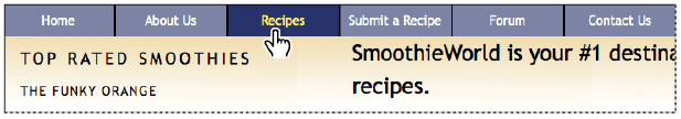
1 In your 05_layoutwork.html internal style sheet, locate the #mainnav rule. This rule sets the height of the div to 40 pixels and gives it a pale-green background color. Below this rule is the #mainnav li rule, which is floating the list items to the left as well as setting styles such as width, height, background color, and more.
Preview the page in your browser to see how the navigation bar is currently styled. The list items (with a background color of grey) are not the same height as the #mainnav div, which is why there is a gap. You’ll fix this now.
Your list items are not the same height as the surrounding navigation section; this accounts for the visual gap.
2 Return to your text editor. To make the list fit into the mainnav, both elements need to be the same height. Make the following changes to your rules:
#mainnav {
background-color:#60668B;
height:35px;
}
#mainnav li {
float:left;
width:120px;
height:35px;
background-color:#7D83A4;
text-align:center;
border-left:1px black solid;
border-right:1px black solid;
line-height:35px;
}
Save the page and then preview it in your browser. By making the heights the same value, you now have a narrower navbar. By changing the background colors to shades of blue, you now have colors that are more compatible with the background color of the page. Unfortunately, the default hyperlink color is also blue, and the rule below the links is not very attractive. You’ll now change the link color and remove the underline next.
3 Below your #mainnav li rule, add the following rule:
#mainnav ul li a {
color:#ffffff;
text-decoration:none;
}
This rule is necessary because you are targeting hyperlinks inside the mainnav div. The color and text-decoration properties set the style of these links to white and also remove the underline. Save the page and preview it in your browser.
Styling the appearance of the hyperlinks by removing the underline and setting the color to white.
This navbar is aesthetically pleasing. You can improve its usability by making the nav items change color when the user moves the mouse cursor over them and by providing a visual indicator of which page the user has navigated to. See the next step for instructions.
4 In your text editor, add the following rule below your #mainnav ul li a rule:
#mainnav ul li a:hover {
background-color:#29336B;
color:#F8F068;
}
The a:hover property is an example of a pseudoclass, which are special properties of elements (links, in this case) based on user interaction. The a:link property defines the default appearance of a hyperlink before it is first clicked by a user. The a:hover property defines the appearance of a link when a user hovers the mouse cursor over it (this action is sometimes known as a rollover). The a:visited property defines the appearance of a link on the page after it has been visited. (This helps the user identify the links she already clicked.) The last pseudo-class is a:active, which defines the appearance of a link when it is being clicked (when the user is pressing down but not releasing the mouse).
You do not have to create styles for all these properties, but you will often see them in groups of four. To see the a:hover property in action, save your page and preview it in your browser.
Move the mouse cursor over your links to see the effect. The behavior appears odd because the background color is defined by the size of the text. Fill the entire block with color, as instructed in the next step.
5 In your text editor, add the following property to your #mainnav ul li a rule:
#mainnav ul li a {
color:#ffffff;
text-decoration:none;
display:block;
}
This property and value override the default inline value of links in the mainnav, so the entire block expands. Save your file and check the menu in your browser.
Setting the hyperlink element to display as a block element forces it to fill the menu area.
Return to your text editor. You will now set a style that defines the appearance of the menu when a user is on a specific page; this will help him identify which page he is on.
6 In your HTML, locate the code for the mainnav list. Add the following class names to each list item:
<ul>
<li><a class="nav-home" href="index.html">Home</a></li>
<li><a class="nav-about" href="about.html">About Us</a></li>
<li><a class="nav-recipe" href="recipes.html">Recipes</a></li>
<li><a class="nav-submitrecipes" href="submitrecipe.html">Submit a Recipe</a></li>
<li><a class="nav-forum" href="forum.html">Forum</a></li>
<li><a class="nav-contact" href="contact.html">Contact Us</a> </li>
</ul>
The purpose of assigning a unique class to each list item is to target the list items with a style. You must also find a way to identify the page the user is on. You can do this by creating a unique ID style for each page.
7 In your HTML, scroll up to locate the <body> tag, and add the following code:
<body id="home">
By adding an ID to the body tag, you can set a style that applies to this page only. In this case, the style is for the appearance of the Home link on this page.
8 In your internal style sheet, add the following rule:
body#home .nav-home {
background-color:#29336B;
color:#F8F068;
display:block;
}
This rule targets the class nav-home on the page with the ID “home.” Save your page and preview it in your browser.
Setting a unique class name for the home page allows you to create distinct styles for it.
Notice that the Home link is permanently set to the same style as the hover effect. You can style it completely differently, for example, by choosing different values for the background color and color properties.
You will now add another page to your site and then style the navigation accordingly.
Moving internal styles to the external style sheet
Currently, the majority of the layout styles for this page are internal. These styles will not automatically apply to new HTML pages that you might want to add. To avoid this problem, you will cut the styles from this page and paste them into your base.css external style sheet.
1 In your 05_layoutwork.html document, select all the rules between your opening <style> and closing </style> tags. Press Ctrl + X (Windows) or Command + X (Mac OS) to cut the style rules.
2 Choose File > Open, navigate to your HTML5_05lessons folder, and select the base.css style sheet. This style sheet currently contains the style rules for your text. At the bottom of the style sheet, after the last <ol> rule, press Return a few times to add some space, and then press Ctrl + V (Windows) or Command + V (Mac OS) to paste all your rules. Choose File > Save to save your changes.
3 Keep this file open because any future additions or modifications that you make to your pages will be made here. Switch to your 05_layoutwork.html page and choose File > Save. Preview it in your browser to ensure you followed the steps correctly. There should be no change in the page. Your styles are now contained in the base.css page, not the 05_layoutwork.html page.
Creating a style for the active page
Now that you have saved your styles in an external style sheet, you will create two new pages that will use these styles: the Contact page and the About Us page. You’ll create additional pages at the end of this lesson.
1 In your 05_layoutwork.html page, choose File > Save As and rename this file about.html. Scroll to locate the heading 1 content: SmoothieWorld is your #1 destination for smoothie recipes. You’ll change this heading to help you identify this page, and later, you’ll add more content to this page. Type the following:
<h1>About Us</h1>
2 Add an ID to identify this page as the About Us page, as you did with the home page, by adding the following code to the body tag:
<body id= "aboutus" >
Choose File > Save. Now, you’ll add a rule to your style sheet to target the nav-about class attached to your About Us link, as instructed in the next step.
3 Choose File > Save to save the HTML file, and then toggle to your base.css file. Locate the rule you created for the home page and add to it as follows:
body#home .nav-home, body#aboutus .nav-about {
background-color:#29336B;
color:#F8F068;
}
This appends the new rules for the About Us page (make sure you include the comma after the .nav-home class). Choose File > Save, and then preview about.html in your browser.
Setting a unique class for the about page allows you to create distinct styles for it.
Repeat the steps above for the Contact Us page, as instructed below.
4 In your about.html page, choose File > Save As and rename this file contact.html. Scroll to locate the heading 1 content, About Us, and change it to Contact Form.
5 Add an ID to identify this page as the Contact page by adding the following code to the body tag:
<body id= "contact" >
Choose File > Save. Add the necessary rule in your base.css file to highlight the Contact link, as instructed in the next step.
6 Locate the rules you have been working with and modify them as follows:
body#home .nav-home, body#aboutus .nav-about, body#contact .nav-contact {
background-color:#29336B;
color:#F8F068;
}
Choose File > Save and preview the page in your browser. The Contact link is now active. Click the About Us and Home links to activate them.
In the On Your Own section, you will repeat these steps for the Recipes, Submit a Recipe, and Forum pages.
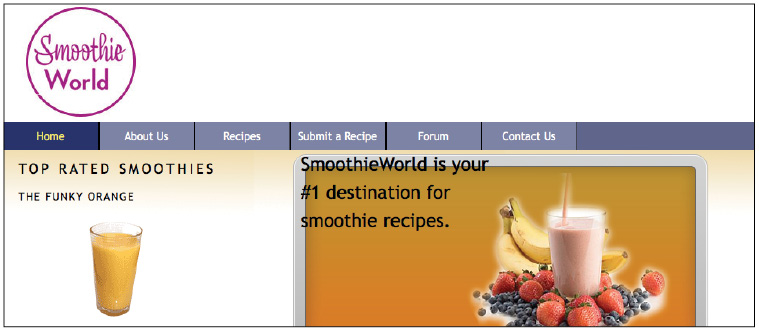
Adding images to your sidebar
In the Home page, add two images to the sidebar and one to the main section, as instructed below.
1 Open your 05_layoutwork.html page. In your HTML, locate the sidebar div, and below the heading 3 code, add the following:
<h3>The Funky Orange</h3>
<p><img src="images/FunkyOrange.png" width="235" height="130" alt="FunkyOrange Smoothie" /></p>
2 Add another image further down in the sidebar as follows:
<h3>The Tropical KickBack</h3>
<p><img src="images/TropicalKickback.png" alt="" width="235" height="130" /></p>
Note that these images have been sized to the same dimensions of 235 pixels wide by 130 pixels high. These images are located in your images folder so they will be correctly linked, but ensure you type the file name correctly so the links to the images are not broken.
3 Save the file and then preview it in your browser. The two images you added are inside the sidebar. You’ll now use a more advanced technique to add another image into the main area.
Working with absolute positioning
You now need to place a large splash image in the main column and place it below your heading 1 (currently labeled “SmoothieWorld is your #1 destination for smoothie recipes”). You can create this layered effect of text on an image in several ways, but nothing you have learned up to this point would be ideal. The following paragraphs describe the methods you have learned, and explain why they would not work.
Method 1
Open Photoshop, add a text layer to your splash image, and save it as an optimized web graphic. The problems with this method are:
- • Text in a graphic becomes invisible to search engines.
- • You lose accessibility for other devices, such as screen readers.
- • The method is inefficient when updating text, since it requires access to the original Photoshop file.
Method 2
Place the splash image as a background image within the main column and position the heading 1 over it. The problems with this method are:
- • CSS background images are to be used as decoration, not as replacement for content.
- • You can only use one background image for any given div; multiple background images are not possible in CSS.
The method you will learn in this subsection takes advantage of relative and absolute positioning in CSS. Following this method, you will first insert your splash image as a standard inline image in HTML and add a new div container for the text. You will then position this new container as needed.
Start by adding the inline image into the maincontent div, as explained below.
1 Type the following code between the heading 1 and heading 2 in the maincontent div:
<h1>SmoothieWorld is your #1 destination for smoothie recipes.</h1>
<img src="images/frontpage_splash.png" width="551" height="270" alt="frontpage_splash" />
<h2>Our mission statement </h2>
Save the page and preview it in your browser. The image is located between the two headings.
Superimpose the <h1> text on the image (similar to a layer in Photoshop) by wrapping a new div container around it with the name splash, as indicated below.
2 Add the following code around the heading 1:
<div id="splash">
<h1>SmoothieWorld is your #1 destination for smoothie recipes.</h1>
</div>
Add a new style rule for this ID, as shown below.
3 Open the base.css external style sheet, scroll to the bottom, and add the following:
#splash {
position:absolute;
width:290px;
height:230px;
top:0px;
left:0px;
}
Absolute positioning allows you to define the width and height of the div (as you did earlier), and then it allows you to move this box along a set of coordinates (in this case, a top value of 0 pixels and a left value of 0 pixels). Note that the default coordinates of 0 top and 0 left are defined as the top-left corner of the page.
Save the file and preview it in your browser.
Your heading is absolutely positioned, but it is incorrectly using the entire page as a reference.
 Your browser may have the text positioned differently. This should have no impact on the final result.
Recall that you nested the splash div inside the maincontent div, but this box appears in the top-left corner of the entire page. This is because absolutely positioned items are positioned independently of their containers by default, but you can change the position so it appears relative to the container.
4 Locate the maincontent rule in your base.css style sheet. Add the following property and value at the top of your list of rules:
#maincontent {
position:relative;
width:600px;
float:right;
/*background-color:#ADA446; */
}
Save the file, and then preview it in your browser. Although not positioned exactly where you need it, the splash div is now positioned in the top-left corner of the maincontent div.
By setting a position:relative property on the maincontent div, your heading is using this div as a reference.
Setting this div to position:relative instructs the absolutely positioned splash div to use the top-left corner of the maincontent div, not the top-left corner of the page. To position the box exactly where you want it, you can change the top and left coordinates.
5 Modify the top and left values as follows:
#splash {
position:absolute;
width:290px;
height:230px;
top:35px;
left:35px;
}
Save the file and preview it in your browser. Your splash div and the enclosed heading have now been pushed down 35 pixels from the top-left corner of the maincontent div.
The advantage of this technique is that your text is not a graphic, so it will be readable by search engines and by users browsing with images turned off. Also, the image and the text are independent from each other, which makes them easy to modify. For example, the text may be resized a bit smaller to avoid the crowding effect.
Self study
1 In the Creating a style for the active page exercise, you learned how to add IDs to the body tag of your Home, About Us, and Contact pages. Create a fully functional navigation bar by following the directions in that exercise to add similar code for the Recipes, Submit a Recipe, and Forum pages.
2 Try experimenting with different background images and applying them to your sidebar and maincontent columns. Although this requires an image editor such as Adobe Photoshop for best results, you can use the background graphic supplied for you in your images folder. Add the following code to your #sidebar rule:
background-image:url(images/sidebar_bg.png);
background-repeat:repeat-x;
background-color:#EAB8C3;
Note that the background-color property seamlessly matches the color in the sidebar_bg.png graphic, thereby creating a transition between the image and the sidebar background color. This effect is often used to keep your graphic files small. In addition, this technique avoids the problem of predicting how tall a column needs to be.
Review
Questions
1 What is the difference between an HTML inline image and a CSS background image? Indicate the optimal conditions for each use?
2 What is the purpose of the a:hover property in CSS?
3 What is the default behavior of an element that is absolutely positioned?
Answers
1 An HTML inline image is an image on your page that originates from the HTML <img> tag. A CSS background image is an image that originates from the background-image property in CSS. Inline images are most suited for important content within a page (such as a product image). CSS background images are generally reserved for decorative elements (such as a pattern).
2 The a:hover property allows you to choose a style for a hyperlink that is triggered when a user rolls over, or “hovers” over a link.
3 If you add the position:absolute property to an element in CSS, you can specify positional values for it (most often, top and left). These values will always position the object based on the corners of the browser page.