
Lesson 7: Creating HTML5 Forms
In this lesson, you will learn how use the new HTML5 form elements in a way that is consistent and compatible with current web browsers.
What you’ll learn in this lesson:
- • Backwards compatibility for HTML5 forms
- • An overview of the new form elements in HTML5
- • How to create a form using the new elements
Starting up
To accurately preview the HTML5 content you will create in this lesson, you need a browser that supports the relevant HTML5 form features. See “Using web browsers that support HTML5 tags” in the Starting Up section of this book to determine whether you are using such a browser, or for instructions on downloading one.
The need for updated forms
Forms are one of the oldest and most familiar examples of interactivity on the Web. The FORM element was introduced to HTML in 1993, and the associated controls, such as check boxes, radio buttons, and the submit button, are a familiar part of the web user’s environment. The functionality of forms has remained largely unchanged for many years. For this reason, the Web Hypertext Application Technology Working Group (WHATWG) began working on an update in the mid-2000s called the Web Forms 2.0 specification. The WHATWG integrated this specification into the current HTML5 specification.
The new components of HTML5 forms add functionality that web designers and developers traditionally incorporated through other means, such as JavaScript and Flash. For example, a common feature on many website forms is the required field, which prevents a user from submitting data until specific form fields have been filled. This functionality was not built into HTML 4.0.1, but it is now available in HTML5. Similarly, the limitations of the current library of form controls forced designers and developers who wanted sophisticated functionality, such as sliders and date pickers, to create JavaScript or other scripting language alternatives. HTML5 forms facilitate the creation of some of these types of features, thus reducing the amount of scripting knowledge needed to incorporate them.
Reviewing how forms work
Users interact with forms through controls, and HTML specifies a number of control types. For example, the following code creates a simple form that uses a text input control and a submit input control:
<form>
First name:<input type="text" name="firstname" />
<input type="submit" value="Go">
</form>
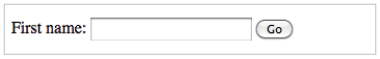
A simple form using standard control types is currently available in HTML and XHTML.
HTML5 introduces several new input types for varied information, such as email, telephone numbers, web addresses, and more. When rendered on the page, many of the new input types appear as traditional form fields, and a few appear as new controls. For example, the range input type is rendered as a slider in a browser that supports it.
<input type="range" min="0" max="100" value="50"/>
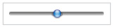
The range input type renders as a slider on the page.
In addition to input types, the functionality of a form object can be dictated by its attributes. For example, a check box with no attribute specified will not appear selected; adding the checked attribute adds a check mark so the check box appears selected.
<input type="checkbox" checked />
An input type for a check box with the checked attribute.
You can also style forms and form elements with CSS. In the next exercise, you will review the various components of a form and how to style them.
The components of a form
In this exercise, you will build a simple contact form and style it. The goal is for you to review standard forms as applicable to HTML 4.0 and XHTML 1.0 before adding the HTML5 features.
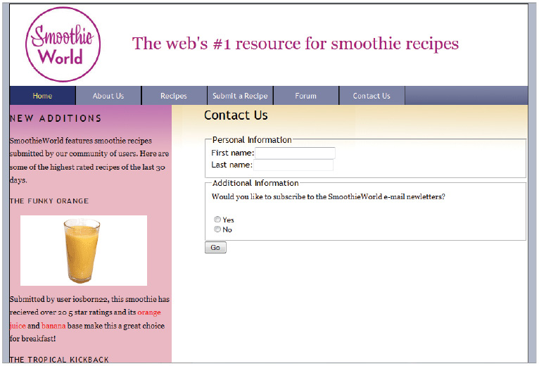
1 In your text editor, open 07_contactform.html located in the HTML5_07lessons folder. This page contains a very simple contact form that might be used to send a customer’s name to a company.
<form id="contactform" action="" method="post">
First name:<input type="text" name=" "> <br />
Last name:<input type="text" name=" ">
<input type="submit" value="Go">
</form>
Preview the page in your browser. Currently, the form has the two form fields and a submit button. Close your browser and return to your text editor.
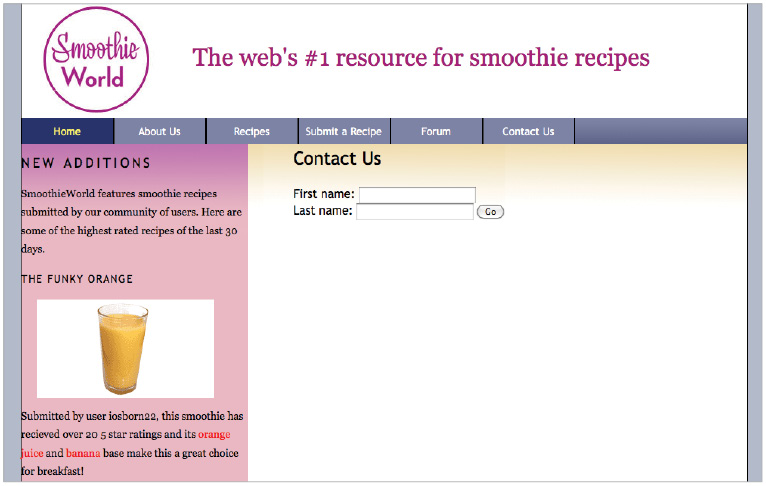
A simple form currently exists with two text input fields and a submit button.
2 Notice that the opening form tag has three attributes: ID, action, and method.
The ID attribute lets you style the form with CSS. Currently, it sets the background color, width, and some padding.
The action attribute specifies the form-processing agent; in other words, the location to send the user’s data. Typically, this value is a URL that points to a script hosted on a server. The script then takes the submitted data and processes it in a variety of different ways, such as placing it into a database; it could even format it into an email. When you leave the action value blank, as you did in this exercise, the form data is submitted to the URL the browser is currently on. There are other ways in which form data can be processed, but listing all such ways is beyond the scope of this lesson.
The method attribute for this exercise has a value of post; the other possible value is get. For the purposes of this exercise, the role of this attribute is not important. You can learn more about the method attribute at http://www.w3schools.com/TAGS/att_form_method.asp.
3 The second line is a text input control for the First name. As noted in the previous section, text is the default input type for forms. Note that the name attribute for this exercise is empty; you will now add it by typing the following code:
<form id="contactform" action="" method="post">
First name:<input type="text" name="firstname"><br />
Last name:<input type="text" name="lastname">
<input type="submit" value="Go">
</form>
The name attribute you choose in a form control is important because it is used to refer to this control in the submitted data. For example, a name such as textfield1 instead of firstname would not meaningfully represent the nature of the submitted data.
4 You’ll now add a <label> element around the first line by typing the following code:
<label>First name:<input type="text" name="firstname"> </label> <br />
<label>Last name:<input type="text" name="lastname"> </label>
The <label> element is optional, but it makes your forms more accessible by letting the user click the text of the form field to select it; without a label, the user would have to click directly inside the form field. The addition of the <label> element is even more important for users who rely on assistive technology such as screen readers. When a form element has a label, additional cues and direction are present in the form, and these can be picked up by various devices. In short, adding labels to form elements helps make your form accessible by all users, and much more likely to be completed.
 For more information about improving the accessibility of your forms, see http://webaim.org/techniques/forms/.
5 You’ll now add a <fieldset> element to group the form elements on the page, and the <legend> element to add a caption to the top of the form. Add this code on the line below the opening form tag:
<fieldset>
<legend> Personal Information </legend>
<label>First name:<input type="text" name="firstname"> </label><br />
<label>Last name:<input type="text" name="lastname"> </label>
</fieldset>
<input type="submit" value="Go">
The <fieldset> element groups relevant sections of a page. The first section of your form groups the fields for the user’s personal information. You will add another fieldset to group form elements related to subscriptions for the site’s newsletter.
6 After the closing </fieldset> tag, add the following code:
<fieldset>
<legend>Additional Information</legend>
<p>Would you like to subscribe to the SmoothieWorld e-mail newsletter?</p>
<ol>
<li> <input name="subscribe" type="radio"> <label>Yes</label> </li>
<li> <input name="subscribe" type="radio"> <label>No</label> </li>
</ol>
</fieldset>
Make sure that you place this new fieldset element before the submit button code.
Note that you are using the radioinput type: one for Yes, the other for No. Both have the same name value. When radio buttons have the same name, users can only select one of them. Use check boxes to provide multiple options.
7 Choose File > Save and preview your page in the browser. Click the Last name text and note that the text field is activated as a result of the <label> element. Adding the fieldset and legend elements let you define the two sections on the page. Click the radio buttons and note that you can only select one button at a time.
Clicking the text for First name and Last name activates these fields because they have labels.
You can style form elements in CSS. You will now add some styles to this page.
8 Close your browser and return to your text editor. Open the base.css stylesheet located in your HTML5_07lessons folder. Scroll to the end of the stylesheet. For this lesson, all form styles are grouped into one section. Note the style rule that sets all margins and padding values of the form elements is zero. Also notice the style rule for the ID #contactform is empty.
form {
margin:0 0 0 0;
padding:0;
}
#contactform {
}
You will define a width for this ID and add some padding to override the default style of the form and to better position it within the page. You’ll also add a background color, borders, and curved corners.
9 Add the following code:
#contactform {
background: #9AB4D7;
padding: 20px;
width: 400px;
border:solid #6E3E4D 2px;
-webkit-border-radius: 18px;
-moz-border-radius: 18px;
border-radius: 18px;
}
The first four rules are basic properties that add background color, padding, width, and a border. The last three styles are varieties of the rule that modifies the corner radius of the form; you need all three styles to ensure cross-browser compatibility. Lesson 11 teaches you more about these CSS3 properties and how to use them.
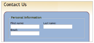
10 Choose File > Save. Switch back to 07_contactform.html and preview your page in the browser. The padding and width styles create a narrower form and add space within the form.
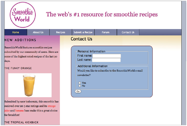
Your contact form styled with CSS.
 If your browser does not support the border-radius property, you will not see the rounded corners on your form.
You will now add margins to the fieldset elements to increase the amount of space between the Required and Optional sections. Close your browser and return to your base.css stylesheet.
11 Add the following rule below the one for the contactform:
#contactform fieldset {
margin-bottom:20px;
}
12 You can also add rules to style the legend. Add the following new rule to make the text bigger, bolder, and more colorful:
legend {
color:#384313;
font-size:1em;
font-weight:bold;
padding-bottom:10px;
}
You can also use positioning properties to control the location of your form objects. This is where the <label> element is useful.
13 Add the following rule to style the label elements inside the contact form:
#contactform label {
float:left;
font-size:13px;
width:110px;
margin-right:60px;
}
By floating the label elements to the left, you can place the first and last name fields on the same line. Defining the width and adding margins can also help you accomplish the same goal.
Save your file and preview it in the browser.
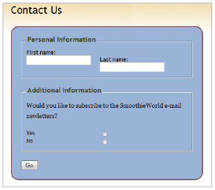
The label elements are now floated and have margins.
Notice that there are two problems with your page: the first and last name fields are not even because there is a break element used to place them on separate lines. In addition, the radio buttons are floated. You will fix these two problems now. Close your browser and return to your text editor.
14 In your HTML on the 07_contactform.html page, locate the </br> tag after the First name line and delete it. The first and last name fields are now aligned.
To fix the radio buttons, add additional information to your label and input tags as explained in the next steps.
15 Add the following code to your four label and input elements:
<label for="firstname">First name:<input id="firstname" type="text" name="firstname"></label>
<label for="lastname">Last name:<input id="lastname" type="text" name="lastname"> </label>
and further down in the second fieldset:
<li>
<input name="subscribe" id="yes" type="radio">
<label for="yes">Yes</label>
</li>
<li>
<input name="subscribe" id="no" type="radio">
<label for="no">No</label>
</li>
The for attribute defines a binding between each label and its new ID. Now that you have defined a specific connection in the HTML, you can create specific styles in the CSS. For this exercise, you will add two styles for the radio buttons to return them to their original position.
16 In your base.css stylesheet, add the following styles (be sure you type the following code carefully, an added or missing space may not result in the correct results):
#contactform label[for=yes],#contactform label[for=no] {
float:none;
}
This completes the loop and assigns styles to the labels of the yes and no radio buttons.
Save your stylesheet and your HTML file and preview your page in the browser. Your form now has styles that are consistent, attractive, and useful.
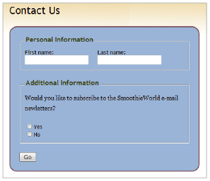
Adding specific styles for the labels gives you precise control over their appearance.
This concludes the review of web form foundations and styling. Keep this file open, in the next exercise you will add some of the new HTML5 form input types and attributes to your contact form.
Adding new HTML5 input types and attributes
The first new input type you will add is the email input type, designed to identify a user’s email address. Note that when a browser does not support this new HTML5 input type, the browser reverts to the default text input type. For this particular input type, the page looks and acts the same from the user’s perspective.
1 In your 07_contactform.html file, locate the code for the Last name field and add the new email input type on the next line as follows:
<label for="lastname">Last name:<input id="lastname" type="text" name="lastname"></label>
<label for="email">Email:<input id="email" type="email" name="customeremail"></label>
2 Save your file and preview it in the browser.
Your email form field appears below the first two form fields.
The new email input type form field looks just as the first two text input type form fields. A new email classification in the HTML will eventually let designers easily sort the data from websites. Potentially, this means that the data could be sent automatically to a specific database. Additionally, future browsers could render all email input type fields differently from other type fields. For example, an email icon or another visual cue could be placed within the field.
Another new HTML5 input type is URL, designed for website addresses.
3 If your browser is still open, close it and go back to your 07_contactform.html file. Add the following code below the email field:
<label for="email">Email:<input id="email" type="email" name="customeremail"></label>
<label for="website">Website:<input id="website" type="url" name="customerwebsite"></label>
If you preview this page in a web browser you will see a new form field for the website. It will be helpful in the future to have this new input type to categorize website URLs for data.
You will now add a placeholder attribute for the First name and Last name fields. Placeholder text is a visual prompt within a form field that helps your users understand what to type in the field. Before HTML5, you could only add this feature with a scripting language, such as JavaScript.
4 Add the following code to the First name and Last name fields:
<label for="firstname">First name:<input id="firstname" type="text" name="firstname" placeholder="Enter Your First Name" ></label>
<label for="lastname">Last name:<input id="lastname" type="text" name="lastname" placeholder="Enter Your Last Name" ></label>
5 Save your file and preview it in the browser. The First name and Last name fields now have placeholder text within them. If your browser does not support the placeholder text, you will only see a blank field.
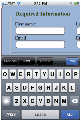
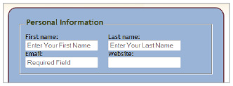
Close your browser. You will now add a required attribute to the First name, Last name, and Email fields. A required attribute in a field forces the user to enter information into the field before submitting the form. As is the case with placeholder text, required fields could only be added with a scripting language before HTML5.
6 Add the following code for the First name, Last name, and Email fields:
<label for="firstname">First name:<input id="firstname" type="text" name="firstname" placeholder="Enter Your First Name" required></label>
<label for="lastname">Last name:<input id="lastname" type="text" name="lastname" placeholder="Enter Your Last Name" required></label>
<label for="email">Email:<input id="email" type="email" name="customeremail" placeholder="Required Field" required></label>
Save your file and preview in the browser. Type your first name and last name, but do not type an email address. Click the Go button. If your browser supports the required attribute, you might see a visual alert. If your browser does not support the attribute, your data will be submitted and disappear. The following figure illustrates the behavior of Firefox 5.0, which triggers a popup on the first field and outlines all required fields in red.
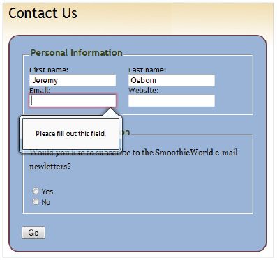
The required field alert in the Firefox 5.0 browser.
 Remember that you can obtain up-to-date information regarding the support different browsers offer for form validation at http://caniuse.com/#feat=form-validation.
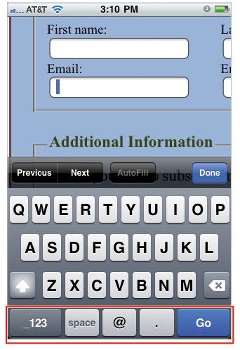
Autofocus is another HTML5 attribute you can now use. The autofocus attribute lets you predetermine the form field where you want the user to start. The result is a useful lead for the user.
7 Add the following code to the First name field:
<label for="firstname">First name:<input id="firstname" type="text" name="firstname" placeholder="Enter Your First Name" required autofocus></label>
Save your page and then preview it in the browser. If your browser supports the autofocus attribute, the First Name field will be focused with your cursor in the field. Begin to type your first name. In the previous step, you typed your first name in full, so the form should auto complete the name. This is the default behavior of HTML5 form fields. You might want to disable this behavior, particularly when the fields are used to enter potentially sensitive data, such as credit card information. You can use the autocomplete attribute to make this feature unavailable.
8 In your text editor, locate the first name field and add the autocomplete attribute and value as follows:
<label for="firstname">First name:<input id="firstname" type="text" name="firstname" placeholder="Enter Your First Name" required autofocus autocomplete="off"></label>
Save your page and then preview it in the browser. Begin typing your first name in the field; it should not be auto completed. Typing the Last name field should still trigger the autocomplete.
 To make the autocomplete attribute unavailable for an entire form, add autocomplete="off" to the opening form tag.
You can easily add the new HTML5 types and attributes described in this subsection to new and existing forms. Browsers that do not support the features don’t negatively impact your site because their behavior to these new features is similar to browsers that do support the features. If your site must have functionality, such as required fields and auto-complete for all browsers, you will need to add scripting solutions; different options are explained at the end of this lesson.
Save and close 07_contactform.html as well as base.css.
Creating an order form with new HTML5 input types and attributes
In this next exercise, you will build a basic form using the new list, datalist, min, and max attributes. The list attribute and datalist input types let you create a menu of choices for a user to choose from. The min and max attributes help define a range of numbers. All four of these attributes replace and address current reliances on JavaScript.
 Important: The datalist element used in this exercise has very limited support in browsers. As of this writing, Firefox and Opera are the only two browsers to support it. If you do not have a version of these browsers on your current system, you can still follow the exercise. Later in this lesson, you will learn techniques that let you add support for older browsers.
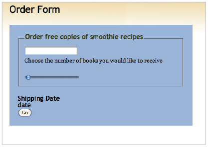
1 Choose File > Open, navigate to your HTML5_07lessons folder, and open the 07_orderform.html document. The initial form element and fieldset have already been created for this exercise; you will add the datalist element.
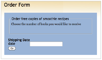
This is the empty contact form you will modify.
2 In the line below the <legend> element, add the following line:
<form id="orderform" action="" method="post">
<fieldset>
<legend> Order free copies of smoothie recipes </legend>
<input type="text" list="smoothierecipes">
<p>Choose the number of books you would like to receive</p>
</fieldset>
The input type is the common text type, and the list attribute defines a meaningful name for the group of smoothie recipes you will add. The list attribute requires a <datalist> element to be useful.
3 Add the datalist element as follows:
<form id="orderform" action="" method="post">
<fieldset>
<legend> Order free copies of smoothie recipes </legend>
<input type="text" list="smoothierecipes">
<datalist id="smoothierecipes">
</datalist>
<p>Choose the number of books you would like to receive</p>
</fieldset>
Be sure to press the Return key a few times between the opening and closing <datalist> tags because you need to add three option elements. The datalist element requires an option element for every choice you want the user to have. For this exercise, you will add three options for different smoothie recipes.
4 Add the three following option elements within the <datalist> element:
<datalist id="smoothierecipes">
<option value="Mango Smoothie">Mango Smoothie</option>
<option value="Strawberry Smoothie">Strawberry Smoothie</option>
<option value="Banana Smoothie">Banana Smoothie</option>
</datalist>
Save your file and preview it in your browser. If you have a browser that supports the datalist element, press the down arrow on your keyboard to see the choices appear.
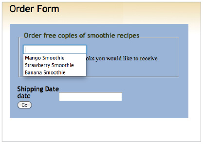
The datalist element lets the user type a custom value or choose from a pre-defined list.
 For an up-to-date list detailing the support of the datalist element in different browsers, visit: http://caniuse.com/#feat=datalist
5 You’ll now focus on the next section of the form, the section labeled “Choose the number of recipe books you would like to receive”. How could you add a form field that prevented the user from adding any number above 3? In HTML5, there is a new input type called number you can use; you can also specify the minimum and maximum numbers allowed for a form field.
6 Close your browser; in your text editor, locate the paragraph, “Choose the number of books you would like to receive,” and add the following code:
<p>Choose the number of books you would like to receive</p>
<input type="number" value="1">
The number state creates a field with a default value of 1. You need to add the min and max attributes to set number limits.
7 Add the following min and max attributes and their values:
<input type="number" min="1" max="3" value="1">
In a browser that supports these attributes, such as Safari 5, a new control appears; for this exercise, the new control is a vertical double-arrow, often referred to as a spin box control. A user with a browser that supports the number input type and the min and max attributes can click the arrows and cycle through the 3 options.
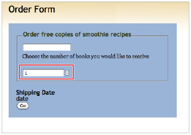
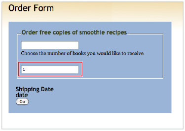
A browser that supports the min and max attributes displays a control, as the figure on the left shows. A browser that does not support the min and max attributes reverts to a plain text field, as the figure on the right shows.
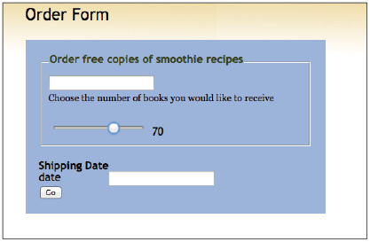
You can convert this spin box control into a slider bar by changing the input type value from number to range.
8 Close your browser and in your text editor change the input type value as follows:
<input type="range" min="1" max="3" value="1">
Save your file; if you are using a supported browser, you should see a slider with a thumbnail you can drag along the path.
A slider bar control lets the user click and drag a thumbnail along a path, thus affecting the page.
You can perform other actions with the slider. For example, you could increase the max value and add the step attribute to force the slider to move along specific intervals. You could also have the thumbnail first appear in the middle of the bar by changing the value attribute. Both of these examples are illustrated in the next step.
9 Close your browser and in your text editor modify the max and value attributes, and add the new step attribute as follows:
<input type="range" min="0" max="100" value="50" step="10" >
Save your page and preview in the browser. The thumbnail should appear in the center of the slider; when you drag it, it should move in increments of 10.
Note that in this example, the slider has no effect on the page. You could connect the value of the slider to an object through JavaScript. The following example demonstrates the effect.
10 In the head section of your HTML page, locate the <script> element that links to the modernizr library; on the line below, add the following new <script> tag and JavaScript code:
<script src="modernizr-1.7.js"></script>
<script type="text/javascript"> function showValue(newValue) { document.getElementById("range").innerHTML=newValue; }
</script>
You’ll now need to add the necessary JavaScript and a number for the JavaScript to control.
11 Add the following JavaScript event to your slider code and the span element:
<input type="range" min="0" max="100" value="50" step="10" onchange="showValue(value)" >
<span id="range">50</span>
Save your file and preview the page in your browser. When you click and drag the thumbnail, the number value changes.
Using JavaScript, you can view the value of the slider as you drag it.
Keep in mind that the slider control, and the ability to style it, still has limited and inconsistent browser support. Currently, there is no simple way to style this control using CSS; browser manufacturers will likely add this ability in the future.
The elements discussed thus far represent the limit of what today’s web browsers can render. The next section provides a brief description of form controls that are currently under development. Close your HTML file as you will not need in in the next exercise.
HTML5 form features under development
Many of the new HTML5 form features replace JavaScript solutions used today. HTML5 also provides other sophisticated controls for forms; for example, the date picker and the color picker. Native browser support for these features, particularly without help from JavaScript, is extremely limited. As a result, many of these input types are at-risk of being removed from the final HTML5 specification.
 For a complete list of HTML5 features that are at-risk of not being included in the final specification, visit http://www.w3.org/html/wg/wiki/HTML5.0AtRiskFeatures.
Date picker
You can see an example of a date picker control when you click the calendar icon on an airline website. The current implementation for these controls is most often based on JavaScript. HTML5 forms can add a date picker natively now, but browser support is virtually non-existent, with the exception of the Opera web browser. In fact, the current lack of support makes the date input type one of the elements listed as at-risk. The basic code for this control is very simple:
<input type="date">
Version 11.0 of the Opera web browser will use the control illustrated in the following figure when the page is rendered.
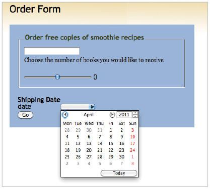
A date picker as rendered in the Opera web browser.
You can use other values for the date picker control, including time, week, datetime, and datetime-local. When these input types are fully supported, it will make many designers’ and developers’ jobs easier.
Color picker
You can’t find color pickers on websites as often as you can date pickers, but a color picker control is also part of the HTML5 form specification. However, the color input type is also considered at-risk of being dropped from the final specification (see above). Color pickers are more often used in web applications as components that let the user indicate a color for a specific purpose; for example, to change a background or color scheme. Currently, the primary solution for developers and designers who want to add a color picker to their web applications is to use a JavaScript plug-in, such as Jpicker. The HTML5 code for a color picker is very simple:
<input type="color">
Version 11.0 of the Opera web browser will use the control illustrated in the following figure when the page is rendered:
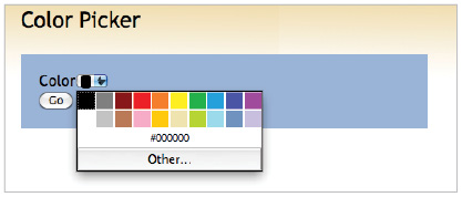
A color picker as rendered in Opera 11.
Providing fallbacks for browsers that don’t support HTML5 features
As indicated in the previous section, the more advanced HTML5 form elements, such as the Date and Color pickers, are currently under development and you should not currently use them as part of your website design. In the case of the more stable features, such as the required and placeholder attributes, only the browsers that support the features will display the content. The following figure shows an example of a browser that supports the placeholder attribute and a browser that does not. In this case, the First and Last name fields are empty in the browser that does not support the attribute.
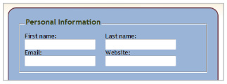
A browser that supports the HTML5 placeholder attribute is shown on the left; a browser that does not is shown on the right.
If you want placeholder text to appear for browsers that do not support HTML5 form features, you will need to provide a JavaScript fallback. The fallback needs to do two things: detect if the browser supports HTML5, and then substitute a JavaScript placeholder in the form. The Modernizr JavaScript library (used at the beginning of Lesson 6 to provide support for HTML5 elements in Internet Explorer 6, 7, and 8) is a good choice for this.
The Modernizr library is unique because it detects if a specific HTML5 form feature is supported in the browser; when the form feature is not supported, Modernizr calls the JavaScript required for the feature. This technique is relatively new in web design, and it is sometimes referred to as regressive enhancement or a polyfill.
This section explains how to use three different JavaScript libraries, Modernizr.js, yepnope.js, and hf5.js, to ensure that your HTML5 form features are active in the browsers that support them, and that a backup JavaScript option is used for browsers that don’t support them.
1 Open the HTML5_07lessons folder. Locate these two files: modernizr.custom.03287.js and h5f.js. The first file is a custom version of the Modernizr JavaScript library that combines the standard Modernizr code with the code from a script loader called Yepnope. For more information about the role of script loaders and how to generate custom code, be sure to read the “Creating Custom Modernizr Code” section later in this exercise.
The second file, h5f.js, is an example of JavaScript that adds features, such as placeholder text or required fields, to web pages.
2 In your text editor, choose File > Open, navigate to your HTML5_07lessons folder, and open the 07_contactform.html document you worked on earlier in the lesson. Note that within your head section and below the links to the stylesheets, there is a link to the custom Modernizr code:
<script src="modernizr.custom.03287.js"></script>
You will now add a new script element below this line, and then add a JavaScript function.
3 Type the following code:
<script src="modernizr.custom.03287.js"></script>
<script>
yepnope({
test:Modernizr.input.placeholder, nope:'h5f.js'
});
</script>
This JavaScript function uses the Modernizr detection code to test whether the user’s browser supports the HTML5 placeholder attribute. If it does, the browser uses it. If the browser does not support the attribute, it uses the h5f.js library to provide the feature. This is an elegant solution because the h5f JavaScript code is downloaded only when the user needs it.
You need more code to complete the process.
4 Add the following code and pay careful attention to all of the syntax:
yepnope({
test:Modernizr.input.placeholder,
nope:'h5f.js',
callback:function(url, result, key) {
H5F.setup(document.getElementById(" "));
} });
This code is a callback function that ensures the h5f.js code will not be used until the page downloads it. Note the empty quotation marks on the fifth line: you need to add the name of the ID you are targeting to make the link between this new JavaScript and your HTML.
5 Scroll to locate the opening form tag in your HTML and note that it has the ID name, contactform; this is the value you need to add in your function.
<form id="contactform" action="" method="post">
6 Scroll back to your function and add the ID value:
yepnope({
test:Modernizr.input.placeholder,
nope:'h5f.js',
callback:function(url, result, key) {
H5F.setup(document.getElementById("contactform"));
} });
This completes the necessary code: browsers that support the HTML5 placeholder attribute will use it; browsers that don’t support it will load the JavaScript placeholder alternative.
Save your file. In order to test this page, you would need access to a browser that does not support the HTML5 placeholder attribute.
For example, the following figure compares the form as seen in Firefox 5.0 (which supports the HTML5 placeholder attribute) and Internet Explorer 8 (which does not support the placeholder attribute and is using the JavaScript fallback).
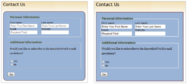
A browser that supports the HTML5 placeholder attribute is shown on the left; a browser that uses the JavaScript option is shown on the right.
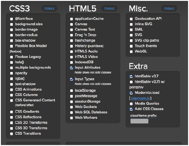
Select checkboxes to add the desired tests and features to your custom Modernizr code.
7 Choose File > Save All and then close your lesson files.
Congratulations! You have completed this lesson.
Self study
The best way to experiment with the new HTML5 forms is to use them within a project. Save a copy of your 07_contactform.html document and name it 07_addprofileform.html. Create a new form that would be used to build the user profile for a SmoothieWorld profile page. Be sure to add fields for email, URL, and any required fields you might think necessary.
Review
Questions
1 What is the <label> element and how can it be used in a form?
2 What is the placeholder attribute and why would you use it in a form?
3 Todd is designing a hotel website and is considering using the date input type in order to add a date picker control, allowing users a way to access a popup calendar to make reservations. What factors should go into his decision to use the HTML5 date input type?
Answers
1 The <label> element associates a label (typically invisible) for a specific input element. Labels can be clicked on by the user resulting in better usability. Additionally, labels can be bound to an ID element allowing for custom styling by the designer.
2 The placeholder attribute is the initial text that appears within a form field. You can use placeholder text to give your users additional guidance for what to enter in any given field.
3 The date input type has very little browser support at this time and is at-risk of being unsupported in the final HTML5 specification. If Todd uses it without a fallback option, the hotel users will not see a datepicker control. A better option would be to provide a JavaScript fallback for users whose browsers do not support the input type.