
Lesson 11: Styling with CSS3
In this lesson, you will learn to use CSS3 properties that enhance web pages with styling, such as rounded corners, border images, gradients, transparent colors, and animation.
What you’ll learn in this lesson:
- • Working with the border-radius and border-image properties
- • Using vendor-specific prefixes
- • Adding multiple background images
- • Creating CSS gradients
- • Creating CSS animations targeted for WebKit browsers, such as Mobile Safari for the iPhone and iPad
Starting up
To accurately preview the HTML5 content you will create in this lesson, you need a browser that supports HTML5 tags. See “Using web browsers that support HTML5 tags” in the Starting Up section of this book to determine whether you are using such a browser, or for instructions on downloading one.
Understanding the role of CSS3
Cascading Style Sheets is a separate language from HTML, and the W3C specification that details the features and rules of CSS has its own timeline. The original CSS1 specification became a W3C recommendation in 1996; the CSS2 specification became a W3C recommendation in 1998; and an updated version, named CSS2.1, became a recommended specification in June of 2011.
The details of the evolution of CSS are not as important as what it signifies: browser support. Designers and developers need to know which features they can use in their stylesheets and whether they will be supported by web browsers. CSS specifications can help evaluate whether the features are supported, but they cannot indicate whether individual browsers support a specific feature.
The upcoming CSS3 specification adds many new features, so to make it easier for developers and designers to sort through the complexities of browser support, the W3C has separated the new CSS3 features into modules, rather than release an entire update. Some examples of these modules are Image Values and Replaced Content, Backgrounds and Borders, Animations, Media Queries, and many more. Each module has different features with varying levels of browser support.
The following exercises highlight the browser support available for various CSS3 features, and provide guidance for how you can best use them. The first exercise explains the CSS Backgrounds and Borders module.
Using CSS3 border-radius and border-image
When CSS first became available, the addition of borders and background styling was a key feature. The border property lets you style any or all sides of a CSS box with a colored border. You can also adjust the thickness of the borders and choose from a few styles, such as dotted, dashed, and others.
A box with a dashed border.
These features provide excellent tools for designers, but the ability to provide certain features is still missing. For example, you cannot create rounded corners using CSS2.1 and it is not part of its specification, but you can do it with CSS3 using the border-radius property. Other additions include the border-image property that lets you add an image to a border. In this exercise, you will use the border-radius and border-image properties.
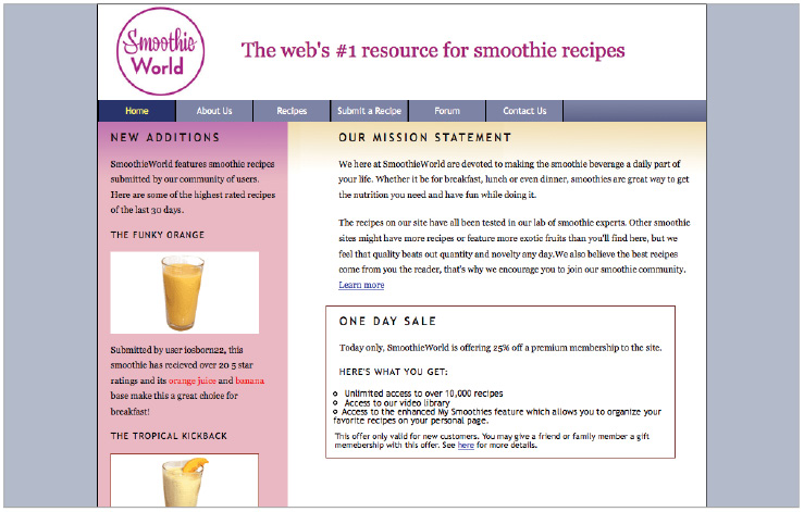
1 Open the 11_borders.html file from the HTML5_11lessons folder. Preview this page in your browser. The Upcoming Sale box has a basic border and a background-color you will modify with the new CSS3 properties.

You will apply rounded corners to this box using the border-radius property.
Return to your text editor.
2 The style for this box is an internal style; locate the rules for the .specialsale class in the style section of your page:
.specialsale {
width: 400px;
background-color:#D67E5C;
border: 2px #773636 solid;
}
These properties define the appearance of this box. Your first task is to add a border-radius to create four curved corners.
3 Add the following border-radius property:
.specialsale {
width: 400px;
background-color:#D67E5C;
border: 2px #773636 solid;
border-radius: 24px;
}
The border-radius property is part of the CSS3 specification and is widely supported by modern browsers (Safari 5.0+, Firefox 4.0+, Internet Explorer 9.0+, Google Chrome 10.0+, and Opera 11.0). Previous versions of these browsers lacked support for the border-radius property, and as a result, you needed to add vendor-specific prefixes to your CSS rules. We won’t need to add them here, but will be adding them for other properties later in this lesson.
For more information on these prefixes and why they were necessary, refer to the sidebar The curious case of vendor-specific prefixes. You will add two additional properties with a vendor-specific prefix.
4 Choose File > Save and preview your page in the browser. If your browser supports the border-radius property, you should see the rounded corners. If your browser does not support it, the standard square corners appear.

A box with four rounded corners, as defined by the border-radius property.
There are more options available to style your box. For example, you can define only some of the corners as rounded, as explained in the next step.
5 Return to your text editor and add the following values to your border-radius declaration:
border-radius: 24px 0 0 0;
This is a CSS shortcut that assigns values to the top-left, top-right, bottom-right, and bottom-left sides, respectively. In this example, the top-left corner is rounded while the rest are set to no radius, making them square.

A box with only the top-left radius property set.
To apply the same radius to the bottom-right corner, change the third value, as shown in the next step.
6 Add the 24px value to the third value:
border-radius: 24px 0 24px 0;
 Use CSS shorthand to simplify the value as follows: border-radius: 24px 0. Using this notation, the 24px value refers to the top-left and bottom-right corners, and the 0px value refers to the top-right and bottom-left corners.
You can create other effects with the border-radius: the radius at each corner has two components, vertical and horizontal. Adding a forward slash between a set of values lets you create different effects, as shown in the next step.
7 Replace the current radius values with the following:
border-radius: 48px / 24px;
Save your file, and then preview your page in the browser.

A box with horizontal radii set to 48px and the vertical radii set to 24px.
 If your box is square again, it is possible you have an older browser that supports the border-radius property but does not have support for the horizontal and verticall radii syntax.
In this example, the value 48px applies to the two horizontal radii (on the top and bottom) and the 24px applies to the two vertical radii (on the right and the left).
Another new CSS3 property is the border-image property, which lets you replace an existing border with an image, so you can create unique border effects not available with the border-style property. The range of options for the border-image property is extensive and the property is not fully supported, so this lesson only explains the basic application of the property.
8 The border-image property is easier to understand if you have no border-radius applied, so you will add a CSS comment to prevent the browser from displaying the radius styles. Add the following commenting code to your border-radius rules:
/*-webkit-border-radius: 48px / 24px;
-moz-border-radius: 48px / 24px;
border-radius: 48px / 24px;*/
Increase the width of the border to help you understand the effects, as explained in the next step.
9 To change the width of the border, increase the value from 2 to 20:
border: 20px #773636 solid;
Add the border-image properties, as shown in the next step. Note that in this example, you will need to add rules for Webkit to maintain maximum compatibility among browsers. The border-image property is not supported in Internet Explorer until version 11 so users will not see the effect and will instead see a solid border around the specialsale div.
10 Add the border-image properties and the link to the image file as follows:
/*border-radius: 48px / 24px;*/
-webkit-border-image: url(images/border-bg.png) 33%;
border-image: url(images/border-bg.png) 33%;
The image file border-bg.png has been configured to help you understand how the border-image property works. The graphic file represents the four corners and four sides of the border and the background of the element. This graphic file is segmented into nine parts; each part is applied to a box. The figure below, on the left, shows the initial image. The figure on the right shows how the image is segmented into nine parts when you use the border-image property.
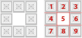
The original image (left). An overlay showing how the image is segmented into nine parts (right).
Parts 1, 3, 7, and 9 are used for the corners; parts 2, 4, 6, and 8 are used for the sides; part 5 is used for the center or background of the element (white for this example). To apply the center portion of the border-image you will need to add the fill property in the non-prefixed declaration. Specifying a value of 33% indicates where the image should be cut relative to the height and width of the image. Because of the way this graphic was made, cutting by 33% maintains the individual squares and circles. Next, you will add the fill keyword which will allow the center of the div to maintain the white background color of the center of the background image.
11 Modify the border-image rule by adding the fill keyword before the value 33% as follows:
border-image: url(images/border-bg.png) fill 33%;
12 Save your file, and then preview it in the browser.

The default appearance of a border image segmented by 33% and a using the fill keyword.
As the figure on the right shows, the four squares (parts 1, 3, 7, 9) are applied to the corners. The four circles (parts 2, 4, 6, 8) are applied to the sides and are stretched to fit. Part five is also stretched, but you cannot see it because it is white. Stretching is the default behavior of the border-image, but you have options to create different effects.
13 Return to your text editor and add the following attribute to your border-image value:
-webkit-border-image: url(images/border-bg.png) 33% repeat;
border-image: url(images/border-bg.png) fill 33% repeat;
Save your file and preview in the browser; the border-image now repeats parts 2, 4, 6, and 8 along the sides of the box.

The border-image after repeating parts 2, 4, 6, and 8.
The border-image property will become a powerful tool for designers who want to create more complex and interesting borders. Browser support for this property is still inconsistent; browsers that do not support it will display the standard border style.
 For a list of browsers that support the border-image property and for more examples, visit: http://www.css3files.com/border/#borderimage
Adding multiple background images
The background-image property has always been an essential tool for designers using CSS because of the ability to add a background image to any box, tile the image horizontally or vertically, and position the image. Note that CSS2.1 only allows one background image per container. CSS3 provides support for multiple background images, thus letting designers create more complex styles.
In this exercise, you will create a striped background for your page using a combination of three background images. If you have an image editor installed, you can open the images used: bg1.png, bg2.png, and bg3.png. Each image is a simple colored gradient that fades to transparency; the transparency provides the bulk of the layered effect.
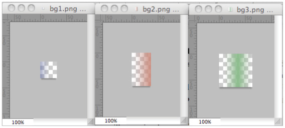
The three image files used are vertical gradients that fade from the color to transparency.
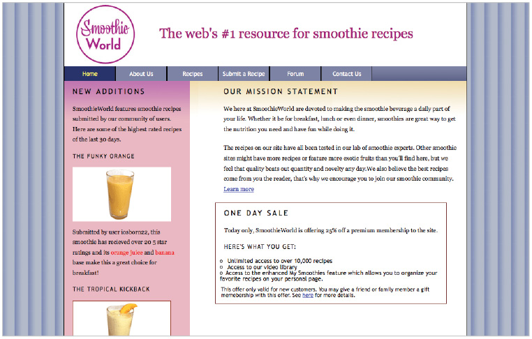
1 Open the 11_backgrounds.html file, located in the HTML5_11lessons folder, and then open the base.css stylesheet. Preview the page in your browser.
The initial appearance of your page.
You will now add a background image to the body of the page.
2 Open the base.css file in the HTML5_11lessons folder and scroll to the body rule. Currently, there is a property for the background-color; add the declaration for your first background-image as follows:
body {
font-family: "Trebuchet MS", Tahoma, Arial, sans-serif;
font-size:100%;
background-color: #B3BBCA;
background-image: url(images/bg1.png);
}
Save your HTML page, and then preview it in the browser. This is the standard tiling effect of a background image; the bg1.png is semi-transparent, so the blue background color is visible beneath the background image.
The body of your page with a single (semi-transparent) background image tiled horizontally and vertically.
Since the effect is repetitious, it could be distracting to the user. You will now layer another semi-transparent background image above the current one.
3 Return to your text editor and add the URL link to the next background image; ensure you add the comma between the two images:
body {
font-family: "Trebuchet MS", Tahoma, Arial, sans-serif;
font-size:100%;
background-color: #B3BBCA;
background-image: url(images/bg1.png), url(images/bg2.png);
}
Save your stylesheet and preview your page in the browser. The bg2.png image has a transparent gradient and a smaller width and height. Both background images are automatically tiled, but the smaller graphic is tiled at shorter intervals, thus interacting with the graphic underneath it in unique ways, including blending colors. You will further increase the variety and complexity of bars and colors by adding a third layer.
4 Add another URL link for the third background image as follows:
background-image: url(images/bg1.png), url(images/bg2.png), url(images/bg3.png);
Save your stylesheet and preview your page in the browser. Now you have three layered, semi-transparent background images interacting with each other to create a complex and layered background for your page. Extend the width of your browser and note that the background is automatically visible.
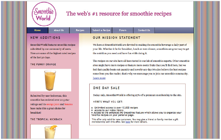
The body of your page with three (semi-transparent) background images tiled horizontally and vertically.
CSS3 multiple background images are supported in modern browsers; browsers that do not support the feature will default to the first background image (for this example, bg1.png). For this reason, we recommend making this image an acceptable and logical fallback for users with non-supported browsers.
You can use multiple background images in other ways. For example, a common technique for background images is to position them using keywords such as top and right.
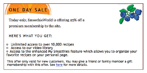
5 In your 11_backgrounds.html file, scroll to the .specialsale class in the internal stylesheet. Add the following code to include an image of blueberries in the top right corner of the container:
.specialsale {
width: 450px;
border: 2px #773636 solid;
background-image: url(images/blueberry.jpg);
background-repeat: no-repeat;
background-position: top right;
}
By setting the background-repeat value to no-repeat, only a single instance of the image appears. The background-position value of top right places the image at the top right corner of the container. You can currently achieve this effect in CSS2.1, but you cannot add and position another image within the same container, as you will do in the next step.
6 Using your text editor, enter the following code to add an image of an orange at the top left corner:
background-image: url(images/blueberry.jpg), url(images/orange.png);
background-repeat: no-repeat;
background-position: top right, top left;
Save your file and preview the page in the browser.

CSS3 allows you to position multiple background images within a container.
The previous step demonstrates the ability to add another background image; the next step shows how you can control the placement of the orange graphic. Instead of using simple keywords, you can specify a position with pixels or other values.
 Depending on the level of support, you may find your browser supports the multiple background images but not the positioning.
7 Add the following code to position the orange graphic below the heading One Day Sale:
background-position: top right, 0 -45px;
The first value is the horizontal position and the second value is the vertical position. The negative value of -45px lets you move the graphic beyond the top border of the container. Save your file and preview it in the browser. The orange graphic has moved up and it is located below the One Day Sale heading.
Multiple background images allow this type of independent control. You can also gain more flexibility when you make changes to the surrounding container. Increase the width of your container to see this effect, as explained in the following step.
8 In your .specialsale class style, change the width value to create a wider box:
.specialsale {
width: 550px;
border: 2px #773636 solid;
background-image: url(images/blueberry.jpg), url(images/orange.png);
background-repeat: no-repeat;
background-position: top right, 0 -45px;
}
Save your file and preview in the browser.
The blueberry image shifts when the container is widened, but the separate orange image is unaffected.
Even though the container is wider, the blueberry image remains aligned to the top right corner, and the orange image is positioned using the precise pixel values you assigned to it.
Working with CSS3 transparency and opacity
CSS3 lets you create complex styles using transparency and opacity, but you should understand the vocabulary and differences between the syntax and application of the properties. CSS3 adds a new level of control when adding color as RGBA values. In the CSS2.1 specification, you can use the common hexadecimal colors and color keywords, or create a specific color by assigning values between 0 and 255 for Red, Green, and Blue. CSS3 lets you control a fourth value called alpha, which allows you to change the opacity of a color value. In this exercise, you will learn to use the RGBA color values and the opacity property, which is easily confused with RGBA.
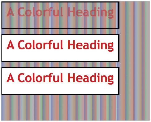
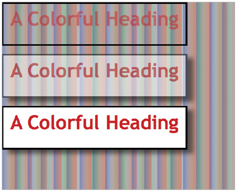
1 Open the 11_rgba.html file in your text editor located in the HTML5_11lessons folder. Preview this page in the browser. There are three boxes on the page with the text “A Colorful Heading”. The top box has no background color; the second and third boxes have background color of white.
2 Return to your text editor and locate the <style> section at the top of the page; each box has two classes assigned to it: one for the box and another for the heading inside the box. You will work with the top container first, the two styles are as follows:
.rgba {
width: 450px;
height: 100px;
border: #000 4px solid;
}
.rgba h1 {
text-align:center;
font-weight:bold;
font-size:48px;
color:rgb(200,30,35);
}
The current color property uses three RGB values to create the dark red color for the heading. The first value (200) represents the red value, the second value (30) represents the green value, and the third value (35) represents the blue value. The fourth value you can now use in CSS3, a (or alpha), controls the opacity of a color. By default, the alpha value is 1.0 or 100% opacity. You need to specify the value to use it.
3 Change the rgb value to rgba as follows:
.rgba h1 {
font-weight:bold;
font-size:48px;
color:rgba(200,30,35);
}
If you do not specify an alpha value, 100% opacity is automatically used. For this example, the heading would not appear different.
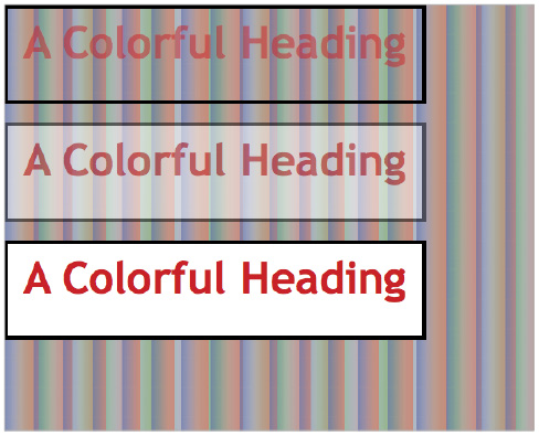
4 To change the opacity, add a new value in decimal form:
color:rgba(200,30,35,0.5);
Save your file and preview your page in the browser.
A heading with the RGBA values of 200, 30, 35, and 0.5 (the alpha value is 0.5).
The rgba property is relatively well supported in modern browsers; if your browser supports it, the background of the page should appear behind the semi-transparent heading.
 For a list of browser support for the rgba property, visit: http://caniuse.com/#feat=css3-colors.
Browsers that do not support RGBA use the RGB value, so the user does not see the transparency effect. Remember that RGBA only applies to colors. To affect the transparency of a container and its contents, use the opacity property, as explained in the next step.
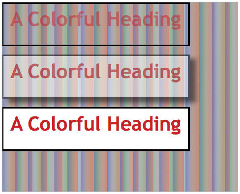
5 In your text editor, locate the .opacity class and add the following property:
.opacity {
width: 450px;
height: 100px;
border: #000 4px solid;
background-color:#FFF;
opacity: 0.5;
}
Save your file and preview it in the browser. Setting the opacity value set to 0.5 (or 50%) causes the entire container and its contents to appear semi-transparent.
The entire container and the heading within are now at 50% opacity.
You can make further use of the new rgba and opacity properties with another new CSS3 property, box-shadow.
6 Return to your text editor and add the following property to your .opacity class:
.opacity {
width: 450px;
height: 100px;
border: #000 4px solid;
background-color:#FFF;
opacity: 0.5;
box-shadow: 15px 10px;
}
The first value (15px) is the horizontal offset of the shadow to the right; the second value (10px) is the vertical offset to the bottom.
 You can offset a shadow horizontally to the left by using a negative value. Likewise, a negative value for the vertical offset places the shadow to the top.The horizontal and vertical offset values are required, but you can add a third, optional value to change the blur distance of the shadow, as shown in the next step.
7 Add the following value to your box-shadow declaration:
box-shadow: 15px 10px 10px;
The box-shadow property benefits from vendor-specific prefixes to be compatible with as many browsers as possible. Add support for Webkit and Moz now, as explained in the next step.
8 Add the following property to increase support for older Webkit browsers:
-webkit-box-shadow: 15px 10px 10px;
box-shadow: 15px 10px 10px;
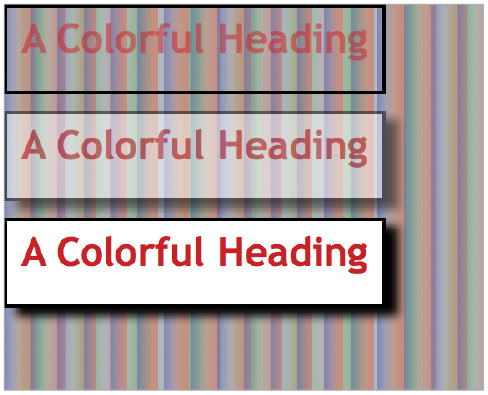
Save your file and preview in the browser. Your second container now has a drop shadow. Since the container has an opacity value of 0.5, the drop shadow is subject to the same transparency effect. If you are still not seeing the shadow, it may still be a matter of browser support. Webkit browsers appear to need a color value to reliably display the shadow. You will be adding this color value in a few steps.
The box-shadow property applies a drop shadow to your container.
You will now add a drop shadow to the third box and control the color and opacity of just the drop shadow using RGBA values.
9 In your style section, locate the .dropshadow class. This style is the same as the final .opacity class from the last step, but opacity is at the default value of 100%. Add the following box-shadow declaration:
.dropshadow {
width: 450px;
height: 100px;
border: #000 4px solid;
background-color:#FFF;
-webkit-box-shadow: 15px 10px 10px;
box-shadow: 15px 10px 10px;
}
These style rules as similar to the ones you applied in the last step, but now you can see the default black color of the drop shadow. Save your file and preview in the browser.
The default color of box shadows is black.
Use RGBA values when you need to control the color and opacity of the drop shadow.
10 Return to your text editor and add the following RGBA value to your three box-shadow properties:
-webkit-box-shadow: 15px 10px 10px rgba(0,0,0,0.5);
box-shadow: 15px 10px 10px rgba(0,0,0,0.5);
When the first three RBGA values are 0, as in this example, the resulting color is pure black. Recall that the fourth value represents the opacity value; for this example, the opacity is set at 0.5 (50%). Save your file and then preview in the browser.
Use the RGBA value to reduce the opacity of a box-shadow without affecting the opacity of the surrounding container.
Box-shadows and RGBA values have the same level of support among browsers. For browsers that do not support these values, such as Internet Explorer 7 and 8, no box-shadow appears.
 Internet Explorer 9 supports box-shadow, but if you need the equivalent effects in earlier versions of IE, use the Internet Explorer-only filter property. For more information, visit: http://hedgerwow.appspot.com/demo/shadow.
Using CSS3 gradients
Gradients are a common design element on many web pages, but prior to CSS3, designers had to create a gradient in an image editor, such as Photoshop, and then export it as a web graphic. Since gradients are decorative, designers often use the CSS background-image property to apply the gradient image to a container or to the body of the page. With image-based gradients, you cannot easily update or modify the gradient colors.
In CSS3, native gradients can be created using new properties available in the Image Values and Replaced Content module. With these new properties, you can create gradients using linear-gradient, radial-gradient and repeating-gradient. Native gradients in CSS3 are similar to gradients in programs such as Illustrator or Photoshop in that you are creating an actual image. However, since CSS3 gradients are created within the browser, you can now update and experiment easily and efficiently. Another benefit of native gradients is that all gradient images are created with no intrinsic height or width, meaning the resulting gradient will fit whatever element it is applied to.
Linear Gradients
Linear gradients are defined by an axis, the gradient line, and two color stops that specify the starting and ending colors at opposite end of the axis. The gradient-line is aligned in the center of the element it is applied to, and the entire gradient is sized to fill the element.
The starting point is the point on the gradient line where the color starts. The ending point is the point on the gradient line where the final color is reached. All along the gradient line, the background color transitions from the starting color to the ending color.
For example, the figure below shows a color stop of blue on the left and a color stop of green on the right. The transition point between the two stops is where one color makes the transition to the other, which by default is located in the middle of the two stops, but you can change the location.
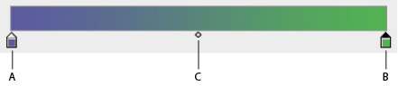
A simple blue-green gradient with a transition point exactly in the middle. A. blue color stop B. green color stop C. transition point
You can create more complex linear gradients by adding more color stops or by moving the transition point. In the next exercise, you will apply a gradient to the background of a container and learn about some of the available options. You will also learn about browser compatibility issues, but you can obtain more information about browser support for CSS3 gradients at http://caniuse.com/#feat=css-gradients.
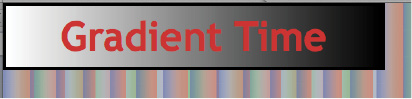
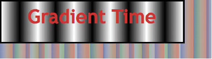
1 Open the 11_gradients.html file from the HTML5_11lessons folder. This file has a simple container with a white background and a headline. You will add a basic horizontal gradient that transitions from top to bottom with a white and a black color stop.
2 Because CSS3 gradients are actually images, they can only be added to properties that expect image data types. For this reason, we will be applying our gradients to the background or background-image properties.
Add the following code to your gradient class:
.gradient {
width: 450px;
border: #000 4px solid;
background-color:#FFF;
background: linear-gradient(white, black);
}
The gradient in this example starts at the top and ends at the bottom. To change the direction of the gradient, you can provide a directional keyword. If no directional keyword is present, the default direction is top to bottom.
A linear gradient stretching from top to bottom.
In the next example, you will reverse the direction of the gradient by specifying to top for the direction keyword.
3 Change the background property by adding to top as follows:
.gradient {
width: 450px;
border: #000 4px solid;
background-color:#FFF;
background: linear-gradient(to top, white, black);
}
A linear gradient stretching from bottom to top.
The gradient now transitions from white at the bottom to black at the top of the container.
4 In addition to top and bottom, the gradient can also be created to transition to the left or right side of the element by adding to left or to right, respectively.
Change the background property by adding to right as follows:
.gradient {
width: 450px;
border: #000 4px solid;
background-color:#FFF;
background: linear-gradient(to right, white, black);
}
A linear gradient stretching from left to right.
The gradient now transitions from white on the left to black on the right.
In the next exercise, you will learn how to change the angle of the gradient-line and apply multiple color stops to create even more gradient effects.
Angles and Multiple stops
The ability to change the angle of a gradient and to add multiple stops will provide fine control over the gradient appearance.
background: linear-gradient(45deg, white, green, black);
This code creates a gradient with the gradient line tilted to a 45 degree angle and a green color stop between the white and black stops, as shown in the following figure.
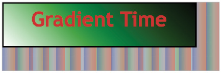
A 45 degree gradient with multiple color stops.
Radial Gradients
Radial gradients are easy to add and have a few additional values. Radial gradients also position themselves in the center of the containing element by default. Additionally, you can specify the size of the radial gradient using specific keywords.
background:radial-gradient(60% 60%, circle closest-corner, white, black);
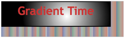
A radial gradient with a circle shape and a positioned center point.
The first two values (60% 60%) define the center point of the radius; for this example, the center point is 60% from the top and 60% from the left of the container. You can also designate a circle shape instead of an ellipse, and specify a size (for this example, closest-corner).
Repeating Gradients
Currently, to achieve a repeating gradient effect, you need to use a background-image and then tile it horizontally or vertically. In CSS3, you can repeat linear and radial gradients.
background: repeating-linear-gradient(left, white 80%, black, white);
A repeating gradient.
The result of the code above is a white-to-black-to-white gradient repeated horizontally. By starting and ending with the same color stop (white), you can achieve a smooth repeating pattern.
Using RGBA colors
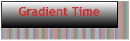
You can use RGBA colors to add transparency to any gradient, thus providing depth. A possible use is to add a layer of depth to an image or a button. In the following example, a transparent gradient is applied to the H1 style, thus allowing the background image of the container to show through.
.gradient h1 {
margin:0;
font-weight:bold;
font-size:48px;
color:#C33;
text-align:center;
background: linear-gradient(rgba(174, 185, 196, 0.9), rgba(110, 124, 140, 0.9));
}
A semi-transparent gradient applied to the background of a heading allows the image below to show through.
CSS3 transforms, transitions, and animation
A CSS transform lets you rotate, scale, or skew an element on your page. For example, with a simple transform you can rotate an image on the page slightly to one side for aesthetic effect. You can also animate transforms; for example, animating the scale property lets you create an enlarging or minimizing effect on an image or other element. The perspective property lets you simulate an object positioned or animated in 3D space.
You can use a CSS transition to change one or more CSS property values over time. For example, when a user clicks a button, a transition would let you create an animated effect from the default color of the button to another color.
CSS animations can appear similar to transitions because you can use both to create the illusion of motion onscreen, but CSS animations use keyframes that allow you to specify how often to repeat the illusion of movement.
The following exercise will help you understand the difference between transitions and animations, and learn more about all three features.
Creating CSS3 transforms and transitions
At the present time, the most current versions of all the major browsers support CSS3 transforms and transitions, though some still require the use of a vendor-specific prefix. In the following exercise, you will only use the CSS properties associated with Webkit; some of the transform and transition features covered in this lesson are supported in other browsers, but not to the same degree as Webkit browsers such as Safari (desktop and mobile) and Chrome.
For most of this exercise, you must either have a Webkit browser such as Safari or one of the more recent versions of Internet Explorer 10+, Firefox 16+, Chrome 26+, or Opera 12.1+.
While support for the CSS3 transform and transition properties has vastly improved in modern browsers, you may still need to add vendor-specific prefixes for specific properties.
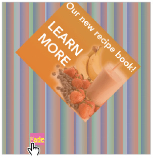
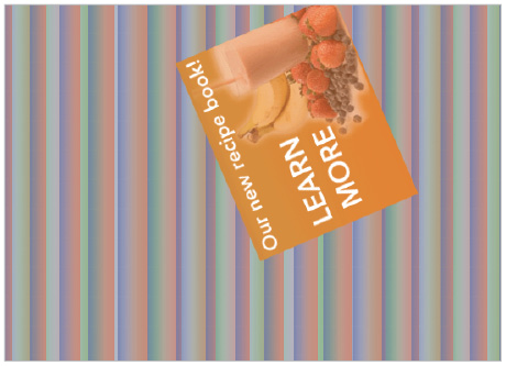
1 Open the 11_transitions.html document from the HTML5_11lessons folder. Preview this page in your browser. You should see a basic page with an image centered in the middle. You will begin the exercise by applying the transform property to the image to rotate it.

You will rotate the image on this page using the CSS3 transform property.
2 Return to your text editor; notice that the <img> element is contained within a div element with the class name “transform” .
<div class="transform">
<img src="images/learn_more.png">
</div>
3 Locate the .transform class in the internal stylesheet at the top of your page. Add two transform properties as follows:
.transform {
margin-top:2em;
-webkit-transform: rotate(45deg);
transform: rotate(45deg);
}
Notice that you have added the supported transform properties for both Webkit and more modern browsers. The transform property has a higher level of support than the animation properties you will use in this exercise. If a browser does not support the transform property, the object is displayed in the non-transformed state.
Choose File > Save, and then preview in the browser. If your browser supports the transform property, you should see the image rotated 45 degrees.
 To determine whether your browser supports the transform property, and for a list of browsers that support it, visit http://caniuse.com/#feat=transforms2d.

An image transformed by 45 degrees with the transform property.
The example above is a simple example of a 2D transform. Next, you will see an example of a CSS transition that uses a hyperlink.
4 Use your text editor to locate the div container that holds the hyperlink:
<div class="fade">
<a href="#">Fade</a>
</div>
The class called fade is a style that adds a top margin to the container, thereby placing it below the image.
5 Add a new class to the hyperlink as follows:
<div class="fade">
<a href="#" class="transition">Fade</a>
</div>
You now need to create a class for this hyperlink.
6 In your internal stylesheet, add the following two rules:
.fade {
margin-top: 6em;
}
a.transition {
padding: 10px 15px;
background: #C9C;
}
a.transition:hover {
background: #F6C;
}
The first rule, a.transition, adds padding and a background color of light pink to the hyperlink. The second rule, a.transition:hover, specifies the appearance of background color of a bright pink when the user places the mouse cursor over the link.
Save your file and preview in the browser. Place your mouse cursor over the link; the background color should change color from a muted pink to a bright pink. This behavior is possible because hyperlinks are pseudo-classes and have four properties: link, visited, hover, and active. For this example, you are defining a style for the hover pseudo-class. You will now add a CSS3 transition that will fade between the default background color and the hover style.
7 Add the following properties to your a.transition class:
a.transition {
padding: 10px 15px;
background: #C9C;
-webkit-transition-property: background;
-webkit-transition-duration: 1s;
transition-property: background;
transition-duration: 1s;
}
The transition-property defines the property to transition; for this example, you are choosing the background property. The transition-duration defines the length of time for the transition; for this example, you have chosen one second (1s).
Save your file and preview the page in the browser. Place your mouse cursor over the hyperlink; it should fade to a bright pink. When you move your cursor away from the link, it should fade to the original color.

The transition is triggered when the user places the mouse cursor on and off the hyperlink.
8 Return to your text editor. Add a property to smooth out the animation further:
a.transition {
padding: 5px 0px;
background: #C9C;
-webkit-transition-property: background;
-webkit-transition-duration: 1s;
transition-property: background;
transition-duration: 1s;
-webkit-transition-timing-function: ease-out;
transition-timing-function: ease-out;
}
Easing is a technique commonly used in all animations that lets you define the speed of the transition. This property is different from the duration, which is still 1 second; the value ease-out starts your transition quickly and then slows it toward the end. The value ease-in starts the transition slowly and then speeds it. The value linear provides a constant rate of acceleration.
 There are two other values you could potentially use here: ease-in-out and cubic-bezier. For a more in-depth explanation and demonstration of easing, visit http://www.the-art-of-web.com/css/timing-function/
Save your file and place your mouse cursor over the hyperlink. There is a difference in speed that you might not notice immediately; easing differences are more noticeable with longer durations.
9 You can write the transition properties in shorthand, as is the case with many CSS properties. Replace the three lines you have written with the following line:
a.transition {
padding: 5px 0px;
background: #C9C;
-webkit-transition: background 1s ease-out;
}
You can also animate multiple properties; for example, you could change the color of the hyperlink text when the user clicks it, as explained in the following steps.
10 First, you must add a new class for the state of the hyperlink you want to target; for this example, the active pseudoclass (active is the appearance of the link when the user clicks it). Add the following rule:
a.transition:hover {
background: #F6C;
}
a.transition:active {
color: yellow;
}
Now you have to add this new color property to the original transition code.
11 In your a.transition class, add the following values, making sure to include the comma after the ease-out value to separate the two properties you are targeting:
a.transition {
padding: 5px 40px;
background: #C9C;
-webkit-transition: background 1s ease-out, color 0.1s linear;
}
In this example, you are defining the property to be transitioned (color), the duration (0.1 seconds), and the easing to be used (linear). Save your file and preview in the browser.
A color transition for the hyperlink has been added.
When you place your mouse cursor over the hyperlink, it should fade as demonstrated before; when you click the hyperlink, it should briefly flash yellow (the transition has a very short duration).
You cannot target every CSS property as a transition, but you can target a large number of them. For example, you could create a transition for a gradient background image or the borders of a button. For a complete list of the CSS properties you can target with the transition property, visit http://www.w3.org/TR/css3-transitions/#properties-from-css-.
Working with CSS animation
The difference between CSS animation and CSS transitions is not immediately apparent because both properties create an illusion of motion. For example, the simple fading effect you created in the previous exercise responds to user interaction (it fades when you place your mouse cursor over it and fades again when you move your mouse cursor away), but you cannot specify the number of times it should fade. If you want the hyperlink button to flash three times when the user places the cursor over it, you would not use a transition, but the CSS animation property. You will achieve a similar effect in this exercise using the smoothie image.
1 Open the 11_animation.html document from your HTML5_11lessons folder. Preview this page in your browser. This is the same file you used in the last exercise, but with a different file name. You will now add the animation properties using the Webkit vendor-prefixes and the standard method for modern browsers.
 Support for CSS3 animation exists in all major browsers at the time of this writing. However, the current version of the Android Browser, version 4.4 is particularly buggy under some circumstances. To view the updated status for all web browsers, visit: http://caniuse.com/#feat=css-animation.
2 Locate the .spin class in your internal stylesheet and add the animation-name and the animation-duration properties as follows:
#spin {
margin-top:2em;
-webkit-animation-name: imageRotate;
-webkit-animation-duration: 2s;
animation-name: imageRotate;
animation-duration: 2s; }
For this example, the animation-name is the name of the animation you are specifying; the name is arbitrary, but you should use names that are logical. The property animation-duration defines the length of the animation. These two properties are contained within this class; you now need to define the animation.
3 Add the following code below the #spin rule:
#spin {
margin-top:2em;
-webkit-animation-name: imageRotate;
-webkit-animation-duration: 2s;
animation-name: imageRotate;
animation-duration: 2s;
}
@-webkit-keyframes imageRotate {
from {
-webkit-transform:rotate(0deg);
}
to {
-webkit-transform:rotate(360deg);
}
}
@keyframes imageRotate {
from {
transform: rotate(0deg);
}
to {
transform: rotate(360deg);
}
}
The animation consists of a few lines of code: the code @keyframes is a keyword followed by the name of the animation (imageRotate). Keyframes are a fundamental concept in virtually all animation, not just CSS. If you have used animation in other programs, such as Flash or After Effects, the concept should be familiar. Each keyframe has a value for a specific property. For this example, you are animating the rotation property; your first keyframe starts from a value of 0 degrees and goes to the second keyframe, which has a value of 360 degrees. The animation engine of the browser interpolates between these two keyframes, thus creating a smooth animation of 360 degrees.
Choose File > Save and preview in the browser.
Animating the rotation of an image using Webkit’s animation properties
A browser supporting CSS3 animation should rotate the image once over a period of two seconds, and then stop. You can speed up and slow down the animation by adjusting the duration value; you will learn other properties first.
4 Add the following declarations below the previous rules:
#spin {
margin-top:2em;
-webkit-animation-name: imageRotate;
-webkit-animation-duration: .5s;
-webkit-animation-iteration-count: 2;
-webkit-animation-timing-function: ease-in-out;
animation-name: imageRotate;
animation-duration: 2s;
animation-iteration-count: 2;
animation-timing-function: ease-in-out;
}
The animation-iteration-count property is one of the keys to understanding the difference between transitions and animation in CSS. In this example, you have instructed the animation to run twice, but you can specify any number of times or use the value infinite, which creates a never-ending loop. The animation-timing-function lets you control the timing of the animation to create a smoother result.
Save your file and preview in the browser. The image should rotate twice and then stop. Additionally, you should notice the effect of the easing: when the image approaches the end of the rotation, it slows down.
You have finished this lesson. You learned about the different features of CSS3, including vendor-specific prefixes, CSS3 border-radius properties, CSS3 multiple backgrounds, CSS3 gradients and box-shadows, RGBA color values, and how to create animated effects with transforms, transitions, and animation.
Self study
1 Set different border-radius numbers for the vertical and horizontal properties, such as border-radius: 96px / 24px.
2 Reverse the values and add larger values to see different effects.
3 Create a transition that uses the gradient property following the instructions in the CSS gradients and CSS transitions exercises.
Review
Questions
1 When using the CSS3 border-image property, how many segments are created automatically when applying a graphic to a border?
2 Is a color stop used for a CSS3 border, a CSS3 background image, or a CSS3 gradient? What is the role of a color stop?
3 What is a keyframe and where is it used in CSS3?
Answers
1 Graphics are automatically segmented into 9 parts; each segment can be applied to corresponding regions of a CSS container.
2 A color stop is used for a CSS3 gradient. A color stop is used to define a specific color value within a gradient. Two or more color stops with different color values create the smooth gradation of color associated with a gradient.
3 A keyframe is used in CSS3 animation and defines a specific value of a property, such as the degree of rotation. You can animate an element by setting at least two keyframes with different values.