
Lesson 4: Introduction to CSS Layout
In this lesson, you will learn the fundamentals of how to create a two column, fixed-width CSS layout.
What you’ll learn in this lesson:
- • Understanding CSS reset files
- • An overview of CSS layout options
- • How to use margins and padding to add space to your pages
- • Working with the float and clear properties
Starting up
You will work with several files from the HTML5_04lessons folder in this lesson. Make sure you have loaded the HTML5lessons folder onto your hard drive from www.digitalclassroombooks.com/HTML5. See “Loading lesson files” in the Starting Up section of this book.
 The examples in this lesson use the TextWrangler text editor to create the HTML markup, but you can use any text editor and achieve the same results.
Working with a CSS reset file
Before you start building your page layout, you will learn to use a CSS reset file. In Lesson 3, you learned that virtually all HTML elements (such as paragraphs and headings) have default styles rendered by the browser. For example, the heading 1 default style has top and bottom margins of 10 pixels. If you want to style a heading so there is no margin, you must explicitly set the style rules to zero.
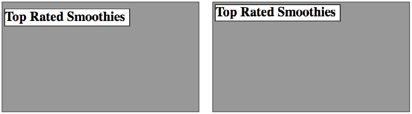
On the left is a heading 1 with default margins of 10 pixels. On the right is a heading 1 with the margins set to zero.
The CSS rule for setting the margins to zero is as follows:
h1 {
margin-top:0px;
margin-bottom:0px;
}
All HTML elements have default margins; unfortunately, web browsers use their own rules for rendering content, and interpret the appearance of these margins differently. For example, the 10-pixel margin in browser A might be rendered as 15 pixels in browser B. These differences can introduce inconsistencies in your page layouts. Fortunately, you can use the CSS reset file to remove the default styles from the most commonly used HTML elements. With the CSS styles reset, you have a reliable and consistent foundation on which to base your new styles. To get a better sense of how styles work, open a page that contains a number of default styles and link the CSS reset style sheet to this page.
1 In your text editor, choose File > Open. In the dialog box that appears, navigate to the HTML5_04lessons folder, choose the 04_reset.html file, and click Open.
This file has a number of generic HTML elements, such as headings, paragraphs, lists, and forms; it has no CSS styles.
2 Preview the page in your web browser and notice the space between the headings as well as the appearance of the lists and the form. Your next step will be to a link to your CSS reset style sheet to see how this affects the appearance of these elements. Close your web browser and return to your text editor.
3 Add the following line of code to attach the reset.css style sheet located in the HTML5_04lessons folder:
<head>
<meta charset="utf-8" />
<title>Digital Classroom Lesson 04 CSS Reset</title>
<link href="reset.css" rel="stylesheet" type="text/css">
</head>
Save the file and preview it in your browser.
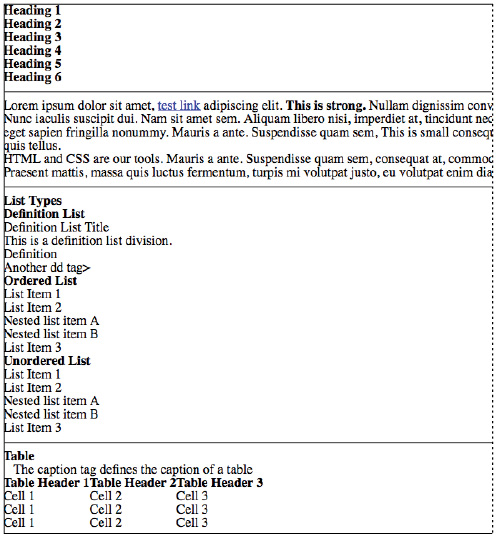
A page of common HTML elements that have been reset.
Many of the elements on your page have had the margins and padding set to zero. As a result, all the space between them has collapsed. There are a number of other reset styles; for example, your list-styles are set to “none,” which removes the default bullet points from unordered lists and the numbers from ordered lists. Close your browser and return to your text editor.
4 Choose File > Open. In the dialog box that appears, select the reset.css file and click Open. Take a few moments to look through the file.
This group of rules removes the default margins, padding, and borders from most of your HTML elements.
You will not change this style sheet, but will attach it to your pages. Remember that reset style sheets are optional. They help standardize your layout across browsers, and some designers also add their most frequently used styles to their reset style sheets.
A brief history of layout techniques on the Web
Although you will be learning how to build your page layout using CSS styles, you should note that this was not always a standard practice. As web design developed in the mid-1990s, the only method available for sophisticated page layout, such as adding multiple columns to a page, was to use the HTML <table> tag. The HTML table was originally designed to present data in a logical format using rows, columns, and cells.
Designers adopted this table element and used it as the foundation for their page structure. At the time, this technique made perfect sense: tables were the only tool available to create the sort of designs required at the time.
Designers often used techniques such as nesting tables. For example, the code for a standard two-column page might start with a table consisting of three rows and two columns.
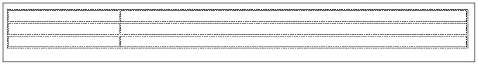
A three-row and two-column table.
Because the first row would become a header section, the column being defined would be in the way. The HTML <colspan> tag allowed the designer to merge the two cells.
A table with two merged cells in the first row.
In this merged first row, a designer might want an independent three-column section for a logo and other elements, such as navigation or a user login. To add this section, the designer would add a new table (with three columns) into the top row.
Nesting a new three-column table into the top row of the original table.
To give this table structure, the designer might set the original table to a fixed width and height. Assume the designer also wanted a thin, black border around the entire layout. The border property for HTML tables is very basic and does not allow the addition of colors. One common solution was to insert the existing table into another table, which would consist of a single cell with a background color of black. By modifying the padding and background color and merging additional cells, the designer was able to create a table-based layout with some basic styling.
A typical empty “template” for a table-based layout as rendered in a browser.
This review of web layout is relevant today because a vast number of websites were built and continue to be built using the table method. CSS has been replacing the use of tables for page layout, but the process is a slow, gradual one. Table layouts have an advantage of being reverse-compatible with older browsers. This advantage has diminished as people update to newer browsers.
CSS layouts were also not well supported (if at all) in early web browsers, and so for web designers, there was no real incentive to discard table layout techniques for CSS layout. One of the disadvantages of table-based layouts was the amount and type of code required to build a page. The layout described in the previous paragraphs would have required code similar to the following:
<table width="799" border="0" cellspacing="1" cellpadding="1">
<tr>
<td bgcolor="#000000">
<table width="800" height="485" border="0">
<tr>
<td height="81" colspan="2" bgcolor="#CCCCCC">
<table width="100%" border="0">
<tr>
<td bgcolor="#FF9966"> </td>
<td bgcolor="#FF9966"> </td>
<td bgcolor="#FF9966"> </td>
</tr>
</table>
</td>
</tr>
<tr>
<td width="191" bgcolor="#FFFFFF"> </td>
<td width="599" bgcolor="#FFFFFF"> </td>
</tr>
</table>
</td>
</tr>
</table>
This is a relatively simple layout with no content or navigation. Defining the relationship between all the various elements is very confusing, and it requires multiple lines of code.
 If you want to look at this code in your text editor, you can find it in the 04_table.html file within the HTML5_04lessons folder.
Remember that one of the main goals of CSS was to separate the style from the structure of HTML. In the table code above, note that values for width and height, as well as the background color and a few other values, are embedded within the HTML. Although this practice was unavoidable before CSS, you can now set these values using CSS.
The HTML table element is slowly returning to its original function of presenting data, and not being used for layout. You might still find examples of these layouts on the Web, but you will not learn to build them in this book. Instead, you will learn the basics of layout using CSS.
An overview of page layout options
Before building a page layout, there are a few decisions you should make. The first is the width of the layout. There are two main categories of layout widths: fixed-width layouts and flexible layouts. Fixed-width layouts are much more common: in a fixed-width layout, all page elements are nested within a container that has an explicit width (in this example, you will use 960 pixels, but the unit of measurement is often in ems as well). A fixed-width layout is useful for the designer because it offers a way to reliably position the various layout elements (such as headers, sidebars, and footers). It also provides a reliable structure for elements, such as the width of a paragraph on a page or the placement of images.
Fixed-width layouts have explicit widths and have a defined space on a web page.
Flexible layouts are so named because they are designed to adapt to the width of the browser window. This style of layout is useful when users have different monitor resolutions, making it impossible to build a fixed-width layout that looks the same on every screen. A properly designed flexible layout can automatically adjust to fit the user’s browser window.
Flexible layouts readjust as the browser window changes size.
Flexible layouts are appropriate for the Web because both text and images on a web page can reflow. Mobile devices also make up a substantial proportion of web browsers, and flexible layouts are often better suited to these new interfaces than are fixed-width layouts.
Flexible-width layouts are more difficult to build. There are additional decisions for the designer consider. For this reason, you will learn how to create a fixed-width layout in this lesson. See Lesson 12, CSS3 Media Queries and the future of CSS3 for more discussion on flexible layouts.
Understanding the <div> element: creating a two-column fixed-width CSS layout
In this exercise, you will build a two-column fixed-width layout. To begin, you will work with a basic page that has been set up for you. This page uses a series of HTML <div> elements as the basic structure. Think of the <div> element as a container into which you’ll place logically related elements on a page. Opening and closing <div> tags are often placed around other elements on a page, thereby nesting the related items inside the container. You may have multiple <div> elements on a page and they are often used to create the layout structure of a page. A <div> element often has either a CSS class or ID attribute, which are used to style the container. By using <div> elements, you can make it easier for others to identify the sections of your pages, and it can make it easier to control and style a section of a page. Here you will combine the div element with CSS IDs.
1 In your text editor, choose File > Open. In the dialog box that appears, navigate to the HTML5_04lessons folder. Select the 04_layoutstart.html file and click OK.
2 Choose File > Save As and name this file 04_layoutwork.html. This preserves the original structure of the page for you. This page has a series of HTML <div> elements with some placeholder content. Analyze and style this page to understand how it was set up. The HTML page contains several comments to guide you through the file.
The structure of the page was established for you; you will go through each section to get an understanding of how it works. The first step is to understand the function of the HTML <div> tag and its central role in CSS layout.
3 In your HTML, locate the line <div id="wrap">. This is the beginning of a section of your page that will nest all your other page elements. By itself, the HTML <div> tag does nothing, which makes the tag unique, since all the other HTML elements, such as paragraphs (<p>) and lists (<ul>, <li>, <dl>), have some effect on their content.
The <div> tag as well as paragraphs and lists, among others, is a block-level element. Block-level elements usually start new lines of text when they are used. The div tag is often paired with either a CSS class or a CSS ID. Once you pair the CSS class or ID with a div tag, you can begin to add rules to control its appearance. Before doing this, you should take a look at the page before you style it.
4 Preview the page in your browser. The reset.css file you examined earlier is causing the elements on your page to be collapsed.
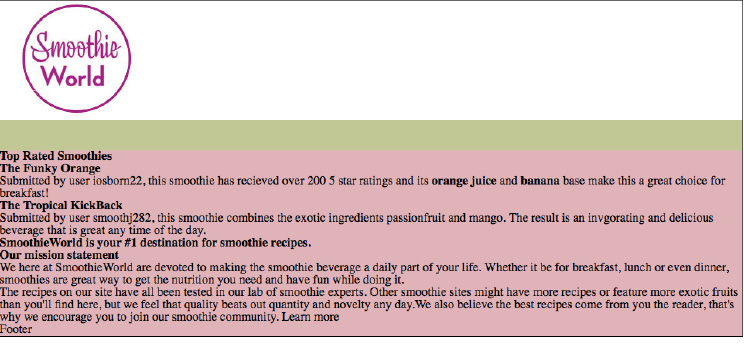
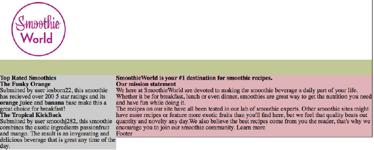
This page has a number of pre-built div sections and the HTML elements have been reset.
To understand div tags, you will style the wrap div to begin your fixed-width layout. Close your browser and return to your text editor.
5 Locate the <style> tag that was added to your document. Add a style rule for the ID named wrap. The following code shows how:
<style type="text/css">
#wrap {
background-color:#E0B3B9;
}
</style>
Save the file and then preview it in your browser. The wrap div encompasses all the other content on the page, as shown by the background color you added. Currently, this div stretches from one side of the browser to the other. This is a very basic flexible-width layout. Resize your browser window and notice how the text reflows. You will now define the width of the wrap div.
6 Return to your text editor and add the following two lines of code to your #wrap style:
#wrap {
background-color:#E0B3B9;
width:960px;
border:thin solid black;
}
Save the page and preview it in your browser. The wrap div now occupies 960 pixels of space on your page.
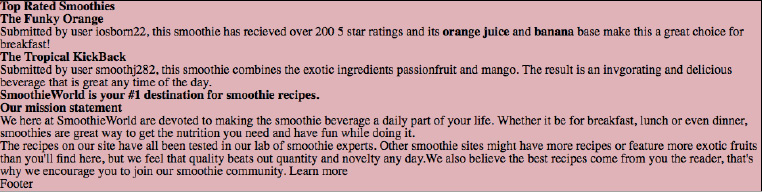
Your wrap div is now 960 pixels wide and has a thin, black border.
The border is there to help illustrate the boundaries of the wrap div. Resize your browser window again. The text no longer reflows, and if your browser window is narrower than 960 pixels, your content is cropped. When the browser window is wider than 960 pixels, the box defined by the wrap div is aligned to the left. There is a simple way to position this div so it will always be centered in the browser window.
7 Return to your text editor and add the following line of code:
#wrap {
background-color:#E0B3B9;
width:960px;
border:thin solid black;
margin:0 auto;
}
This is a margin shorthand rule; the value ‘0’ defines the top and bottom margins of the wrap div, and the value auto defines the left and right margins. The auto value automatically calculates equal amounts of margin on both sides of the wrap div. As a result, the box is always centered.
Save the file, and then preview it in your browser to see how the margin shorthand rule works. Close your browser and return to your text editor. You will work with the other div elements, but you must first apply a basic style to the header.
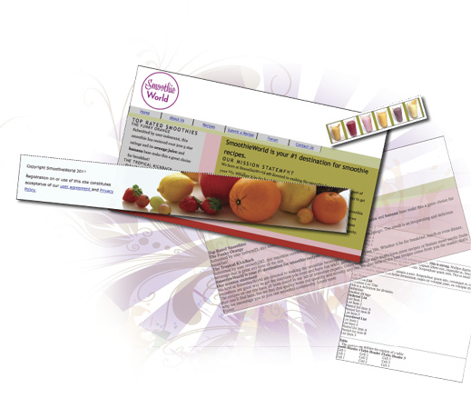
8 In your HTML, insert an image into the masthead div — in this case, the site’s logo. To begin, allow the height of the image to set the height of the header div by adding the following code to link to the logo image located in the HTML5_04lessons folder.
<div id="masthead">
<img src="images/smoothieworld_logo.png" width="200" height="150" alt="smoothieworld_logo" />
</div>
The div tag has no style, even though the height of the header div is controlled by the image. This is why you can see the color of the wrapper, for example, but if you set the background color of the header, it will be visible.
9 Below your rules for #wrap, add the following rule for the masthead div:
#masthead {
background-color:#FFF;
}
Save the file and preview it in your browser. The entire masthead div now has a white background color, and this overrides the background color of the wrap div.
Your masthead section now has a logo and a background color.
10 The navigation section will require some more advanced work later in this lesson. For now, you will set a few basic style rules in order to define this section on the page. Add the following selector and style rules below the #masthead rule:
#mainnav {
background-color:#C2C895;
height:40px;
}
Save your page and preview it in the browser.
Your mainnav section with a background color and defined height.
You have now reached the inner wrap section, which contains the sidebar and the main content sections. You will learn to create columns by positioning them with divs. The current CSS specification does not have a column element; “columns” are styled divs that are often taller than they are wide. To understand how columns are made, you need to understand the concept of the CSS float property.
Understanding the CSS float property
The float property in CSS allows text to wrap around an image. This style was borrowed from print design, where the effect is called text wrap or runaround. CSS achieves this effect by allowing elements following a floated element in the HTML markup to surround the element, effectively changing their position. This behavior also makes it possible to create columns on a page.
In the left image below, there is an inline graphic nested inside a paragraph. This is the default behavior of the graphic, as there is no float property. In the right image, nothing changes except that the rule float:right has been applied to the graphic. The graphic shifts as far to the right as posssible and the text wraps around the left side automatically.
An image in the default flow of HTML (left). The same image floated to the right (right).
You can also have a float value of left. In the above example, this would place the graphic at the left-most margin and wrap the text on the right.
 The only values possible for a float are left, right, or none. You cannot center an object using the float property.
If you have multiple floated elements within the same element, they align beside each other. This behavior is often used for common web page features such as horizontal menus or image galleries.
Understanding how multiple floated elements interact with each other is crucial to using them effectively. Consider the following example: there are six images inside a div that is 360 pixels wide. Each image is 50 pixels wide, and also has 10 pixels of margin space (5 on the left and 5 on the right). By adding the values, you can see that 6 × 50 is 300 pixels for the images and 6 × 10 is 60 pixels of margin. Consequently, the images plus the margins fit inside the div, with a total width of 360 pixels.

If you have defined an explicit width for the container, adding another image causes the new image to break to the next row.
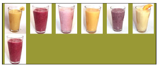
This behavior might work well for a thumbnail image gallery, but not for navigation.
You will learn more about using floats in the next exercise when you build a two-column layout.
Creating columns with the float property
You will apply the float property to the sidebar and main content divs to see how they are affected.
1 Add the following selector and style rules below the #mainnav rule:
#sidebar {
float:left;
width:300px;
background-color:#CCC;
}
Save the page and preview it in your browser. The page has become “broken”; you will learn to recognize the reasons behind a “broken” page such as this one, because this behavior teaches you how floats work.
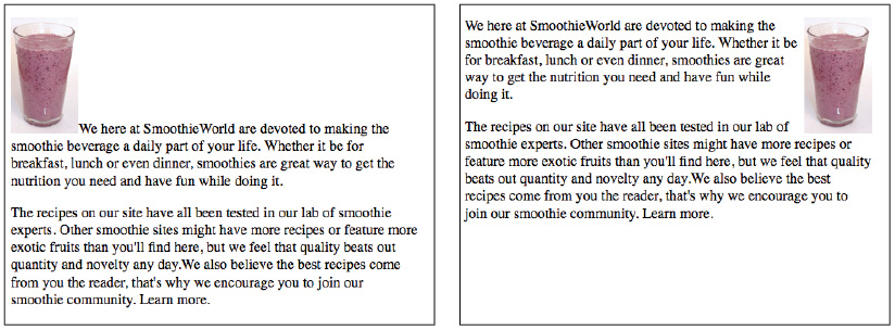
When you float an element (in this case, the sidebar div), it is removed from the normal flow of the HTML. This is why the sidebar extends over the entire container.The two divs that have content are contained within boundaries of the sidebar.
The sidebar is floated, but is also overlapping the boundaries of other page elements.
This containment can be deceptive because it is affected by the amount of content in each div. To illustrate, you will add more content into the main div by duplicating the current paragraph.
2 In your HTML, select the entire paragraph element within the main div and press Ctrl + C (Windows) or Command + C (Mac OS) to copy it. Click once after the element and press Ctrl + V (Windows) or Command + V (Mac OS) to paste it.
3 Save the file and then preview it in your browser. When additional content is added to the main div, it expands and pushes the footer div downwards. Now the footer div appears below the sidebar because there is space for the div above it. Close your browser and return to your text editor.
4 These three divs (sidebar, main, and footer) currently appear to be interdependent. Removing (or adding) content from the sidebar also has an effect. In your HTML, select the “tropical kickback” paragraph within the sidebar and delete it. Save the page and preview it in your browser. Now that the height of the sidebar is shorter than both the footer and the main divs, they “flow” beneath it. This can lead to some layout problems; you will learn strategies for solving these problems in a later section, but now, you will float the main container as well.
5 Close your browser and return to your text editor. Press Ctrl + Z (Windows) or Command + Z (Mac) to undo the deletion of the paragraph in the sidebar. Additionally, select the paragraph in the main div that you duplicated in step 2 and delete that as well.
6 Add the following selector and style rules below the #sidebar rule:
#main {
width:600px;
float:right;
background-color:#ADA446;
}
Save the file and preview it in your browser.
The main div floats to the right, but the footer has moved upwards in the flow of the page.
Floating this div to the right solves the problem of the content appearing below the sidebar; although the amount of content in the main div forces it to extend outside the entire container. This is a problem when you consider the footer element: footers should appear at the bottom of the page, and this one is not.
To force the footer div to the bottom of the page, you will assign a new property called clear to this div.
Working with the clear property
When you add the CSS clear property to an object, you add a rule that says, “No floated elements are allowed to my sides.” You can specify whether you want to clear floated elements on the left side, the right side, or both. In the case of the footer, you will choose both.
1 Add a new selector and style rules below your #main div:
#footer {
clear:right;
background-color:#BA2B22;
}
2 Save the file and preview it in your browser. Your footer is now placed at the bottom of the main div. This is because the clear:right rule does not allow any floated elements to the right of the footer. The main div was floated, and so the footer moves to the next available spot on the page. Close your browser and return to your editor.
As in the earlier examples, the amount of content in your divs can affect your floated and cleared elements. For example, if the amount of text in the sidebar expands to the point of reaching the footer, you have a problem again as the sidebar extends outside. For this reason, elements are often set to clear on both sides.
3 Change the value of your clear property as follows:
clear:both;
This code ensures that no floated elements are allowed on either side of the footer.
Creating a list-based navigation using floats
Now that you have learned the basics of floating and clearing, you will return to your navigation section and add a simple navigation bar based on an unordered list. The list items inside your navigation should be floated to override the default vertical appearance of a list. CSS navigation menus are used frequently in standards-based design because they can easily be updated and modified, and because they are text-based (not images), which improves accessibility in devices such as screen readers and can even help a website’s search engine rankings.
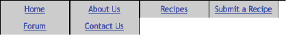
1 In your HTML, locate your mainnav div and add the following unordered list and list items:
<div id="mainnav">
<ul>
<li><a href="index.html">Home</a></li>
<li><a href="about.html">About Us</a></li>
<li><a href="recipes.html">Recipes</a></li>
<li><a href="submitrecipe.html">Submit a Recipe</a></li>
<li><a href="forum.html">Forum</a></li>
<li><a href="contact.html">Contact Us</a></li>
</ul>
</div>
The list items are linking to pages that do not exist yet. Nevertheless, you are linking the items because they need to be hyperlinked to be styled correctly.
2 Preview the page in your browser.
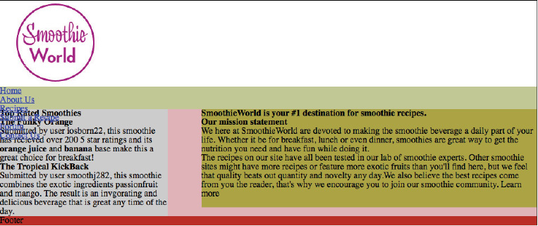
Your list is in the default vertical position and is overlapping your sidebar.
Notice that your page appears “broken” again. This is because your list is overlapping your floated sidebar. Also, the list has no bullet points. Remember that your CSS reset style sheet is attached to this page and one of the rules has a property of list-style:none, which removes the bullet points. For this example, the lack of bullet points is acceptable because you are using this list for navigation.
3 Return to your text editor and locate your #mainnav rule. Add a new rule between this one and the sidebar by pressing Return a few times to add some space and then adding the following code:
#mainnav li {
float:left;
}
This is a new type of CSS rule called a contextual selector; it targets only list items that are inside the mainnav div. If you were to define a new rule just for list items, all the list items on the page would be affected, which would not work for this example.
4 Save the page and preview it in your browser. All the list items are now stacked side by side. Notice that the list inside the main content has not been affected. Add space between the list items and add other styles, as indicated in the following step.
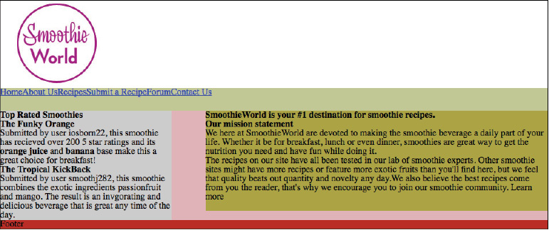
Floating the list items causes them to be stacked side by side.
5 Add the following code to your mainnav li rule:
#mainnav li {
float:left;
width:120px;
height:25px;
background-color:#CCC;
text-align:center;
border-left:1px black solid;
border-right:1px black solid;
}
In this code, you have done the following: defined the box around each list item as 120 pixels wide by 25 pixels high, added a background color, aligned each list item to the center, and added a border to both sides of the item. Save the file and preview it in your browser.
When you define the width and height of the box, the text naturally sits at the top. Unfortunately, while there is a text-align:center property that centers the text horizontally, there is no simple way to vertically center objects in CSS. In this case, you will use the line-height property to move the nav text downwards.
6 Add the following line of code below your border-right declaration:
line-height:25px;
Save the file and preview it in your browser. Your text is now centered within the box. Remember that the line-height number is based on the font size; it will likely change if you change the font size.
Adding line-height to the list items positions them vertically within the navbar.
Adding text styles
Before continuing with your layout, you will import the text styles you worked on in Lesson 3. Until now, you have added your styles to an internal style sheet instead of an external one. When building a layout, using an internal style sheet is a matter of convenience: creating and modifying style rules is easier to do by scrolling up the page than by accessing an external style sheet. Eventually, you will move the layout rules you have created to an external style sheet. For now, you will attach a style sheet that sets the base rules for elements, such as your headings, lists, and paragraphs.
1 At the top of your HTML, locate the <link> tag for your reset.css style sheet. To add another external style sheet, select this line, and then press Ctrl + C (Windows) or Command + C (Mac OS) to copy it. On the next line, press Ctrl + V (Windows) or Command + V (Mac OS) to paste the line. Now replace the value “reset.css” with the following value:
<link href="reset.css" rel="stylesheet" type="text/css" />
<link href="base.css" rel="stylesheet" type="text/css" />
2 Save the file and then preview it in your browser to see the effect of the new values.
Your page now uses an external style sheet for the text elements.
3 Return to your text editor and choose File > Open. In the dialog box that appears, navigate to your HTML5_04lessons folder, select the base.css file, and click Open. Review the styles in this CSS file. They should be familiar to you from Lesson 3, but the margin and padding styles were removed because these styles made sense in the context of that lesson, but not in the new layout. You can add a style to these elements.
The effect of margins and padding on your fixed-width layout
In this section, you will add space between the sections of text on your page (which have margins of zero from the reset style sheet). You will learn some strategies for controlling the layout. The goal of this exercise is not to show you a single method of CSS layout, but to help you understand the different options, which should help you in your future projects to decide which method to use.
In this first exercise, you will add padding to the sidebar element.
1 Preview the page in your browser and notice the lack of space between your text and the edge of your sidebar. Also, notice the width of this sidebar: if you measure it based on the navigation bar above, the sidebar ends approximately one-third of the way through the “Recipe” list item.
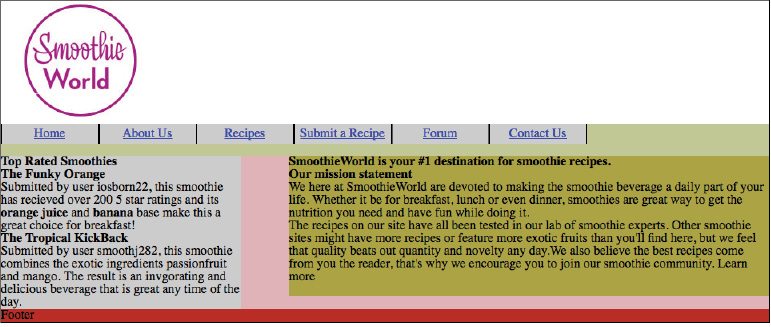
A guide is added in this screenshot to show where the sidebar ends in relation to the navigation bar.
The width of this sidebar is set to 300 pixels. Increase the padding of the sidebar by following the instructions in the next step.
2 Return to your text editor, locate the rule in your CSS for the sidebar, and add the following code:
#sidebar {
float:left;
width:300px;
background-color:#CCC;
padding:0px 20px 0px 20px;
}
Remember that this is a CSS shortcut and you should read the values in a clockwise manner. The first value (0px) is the top padding, the second value (20px) is the right padding, the third value (0px) is the bottom padding, and the last value (20px) is the left padding. Save the page and preview it in your browser.
Using the guide as a reference, you can see the width of the sidebar has expanded by 40 pixels.
By adding 20 pixels of left padding and right padding to the sidebar div, you can increase the amount of space inside the column. Notice the end of the sidebar now lines up at the end of the Recipe item. This is because increasing the padding has increased the width of the sidebar by 40 pixels. This means the absolute width of the sidebar is 340 pixels, where 300 pixels comes from the width property in the sidebar rule and 40 pixels comes from the padding that you add.
3 Return to your text editor. Add an equivalent amount of padding to the main div because it also needs space for the text.
Locate your #main rule and add the following padding:
#main {
width:600px;
float:right;
background-color:#ADA446;
padding:0px 20px 0px 20px;
}
Save the file and preview it in your browser. A new problem arose: the total width of your two columns when you include the padding is wider than the container they are nested in. If you scroll down the page in your browser, you see the main div has slid into the only space it is allowed, underneath the sidebar.
You can fix this problem in several ways: you could expand the overall width of the wrap div, you could reduce the width value of the sidebar or the main div (or both), or you could reduce the padding values. All these methods are based on using padding, and there is an alternative method of adding space to columns that does not rely on padding at all. You’ll take a look at this technique now.
4 Return to your text editor and locate the padding rules you added in steps 2 and 3. Select and delete these rules. You can achieve a similar effect by adding margin rules to the text elements inside the columns, as described in the following step.
5 Below the #footer rule in your CSS, add the following rule:
p, h1, h2, h3 {
margin-left:20px;
margin-right:20px;
}
This rule places 20 pixels of margin on the left and right of all paragraph and heading elements on the page. Save the file and preview it in your browser.
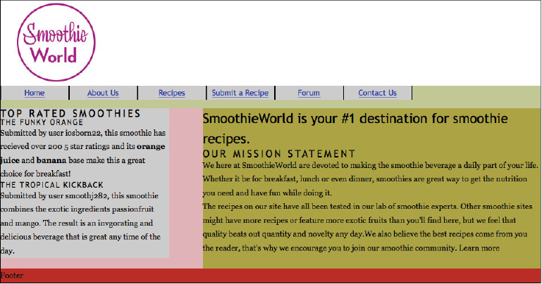
Adding margins to the elements within the sidebar increases the amount of space, but does not increase the width of the sidebar.
As in the earlier padding example, the result is extra space between the text and the columns. A crucial difference is that when you add margins to the text elements, the width of the columns is not affected. This can be advantageous, as you no longer have to add width to the padding. You only need to consider the width property for the column.
This technique has its own disadvantages, because the rules you set currently apply to all paragraphs and headings 1, 2, and 3 elements on the page. For example, notice that the footer was pushed 20 pixels to the right because the content is a paragraph. In cases where you only want to specify the elements within the sidebar and main ID, the contextual selector you used earlier for the navigation is useful.
6 Return to your text editor and delete the margin-left and margin-right properties you added in step 5 (but leave the rule intact). Add the following group of rules:
p, h1, h2, h3 {
}
#sidebar p, #sidebar h2, #sidebar h3, #main p, #main h1, #main h2, #main h3 {
margin-left:20px;
margin-right:20px;
}
This is a CSS shorthand to select any paragraph, heading 1, heading 2, or heading 3 element child of the sidebar ID or the main ID, and apply left and right margins of 20 pixels.
7 Save the file and preview it in your browser. Scroll to the footer paragraph and notice that it no longer has margins. Close your browser and return to your text editor.
This method of styling requires a bit more attention to detail than the padding method. For example, when new elements are added inside a div, they do not use the same margins. The next step shows an example of this problem and then the solution, which involves adding a heading 4 element to the sidebar.
8 In the HTML of your sidebar div after the last paragraph, add the following code:
<h4>Submit a Recipe</h4>
Save the page and preview it in your browser. This heading 4 uses its zero margins (inherited from the reset.css style sheet), so it is flush against the column. Close your browser and return to your text editor.
9 In your group of rules for the sidebar and main columns, add a new rule in the sidebar for heading 4 (h4):
#sidebar p, #sidebar h2, #sidebar h3, #sidebar h4, #main p, #main h2 {
margin-left:20px;
margin-right:20px;
}
Save the page and preview it in your browser. The heading 4 element now has the same margins as the others.
The heading 4 element now has the same margins as the other elements in the sidebar.
You can add a different margin to one of the elements. For example, you might want to move the paragraphs inside the sidebar to the right so they are indented. In this case, add another rule specifically for the p elements in the sidebar, as indicated in the next step. Close your browser and return to your text editor.
10 Add a new rule immediately below your previous rule set for the sidebar paragraph,
#sidebar p, #sidebar h2, #sidebar h3, #sidebar h4 #main p, #main h1, #main h2, #main h3{
margin-left:20px;
margin-right:20px;
}
#sidebar p {
margin-left:30px;
}
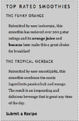
This rule overrides the rule you set in step 9. Save the page and preview it in your browser. The paragraphs in the sidebar now have a left margin of 30 pixels, and in contrast to the other elements, are now indented.
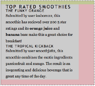
The paragraphs in the sidebar have specific rules for a left margin of 30 pixels.
With the exceptions of the changes you made in this exercise, all the margins and padding for the elements on your page are set to zero based on the reset style sheet. Add new values to the top and bottom margin values for most of your elements, as indicated in the next step.
11 Locate the empty p, h1, h2, and h3 rules in your style sheet. Also add the h4 selector to cover the elements on your page, and modify this rule set as follows:
p, h1, h2, h3, h4 {
margin-bottom:20px;
}
Save the page and preview it in your browser. Most of your elements now have some added space from these margins. To add a top margin to the heading 2 in your sidebar, you could add another rule as shown in the next step.
12 In your text editor, add the following rule set:
#sidebar h2 {
margin-top:15px;
}
Save the page and preview it in your browser. Your heading 2 in the sidebar has been pushed down by the top margin.
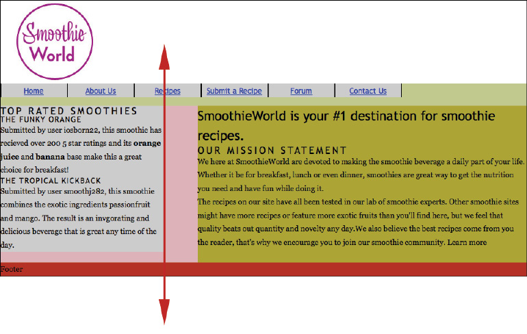
Your sidebar, with a top margin of 15 pixels, applied.
A review of using margins and padding for layout
In this lesson, you have learned two methods for adding space between the elements in a page. The first method is to add padding to a div element. The advantage with this method is that all the elements inside the div are affected simultaneously, making it quick and efficient. A disadvantage to using padding for a div container is that increasing padding changes the width; to compensate, you must take into account the extra width.
The second method is to add margins to the elements inside the divs. The disadvantage to this method is that it requires more code and attention to detail, because you must notice how individual elements are positioned. The advantage is that column behavior is more predictable, since there is only one width property to consider.
There is another less obvious advantage to the second method that has not been discussed. This method is more reliable for achieving similar layouts across browsers, and it solves a bug found in Internet Explorer 6.
Finally, you should note that a combination of methods (using margins and padding) might be necessary for some situations. Consequently, you should understand the cause and effect of each method you use.
Styling your footer with a background image
So far, the structure of your page has been defined by the background colors of your div elements. In this section, you will learn to add images. To do this, you will add a CSS background image to your footer.
1 Locate the #footer div and replace the placeholder content inside the div with the following code:
<div id="footer">
<p>Copyright SmoothieWorld 2014</p>
<p>Registration on or use of this site constitutes acceptance of our <a href="useragreement.html"> user agreement </a> and <a href="privacy.html">Privacy Policy.</a></p>
</div>
2 Save the page and preview it in your browser. Each paragraph is styled based on the current rules for paragraphs. You will adjust the rules for the footer, but you must know the size of the footer, which will be based on the dimensions of the background images you will add.
3 In your internal style sheet, locate the current rule for the footer. Add a new rule to apply a background image from your images folder:
#footer {
clear:both;
background-color:#BA2B22;
background-image:url(images/footer_background.jpg);
background-repeat:no-repeat;
}
Save the page and preview it in your browser.

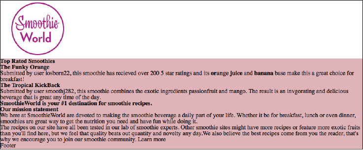
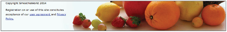
Your footer now has a background image applied.
Your background image is now applied to the footer. This allows the footer text to be visible above it. Notice the background-repeat property in the code above. CSS background images tile by default, so setting a value of no-repeat ensures that this image will never tile. This code might seem redundant when your background image is the same size as your footer; if the footer expands, the code will ensure the image does not tile.
Set the footer dimensions to match the background image as indicated in the next step.
4 Modify your footer rule as follows:
#footer {
clear:both;
background-color:#BA2B22;
background-image:url(images/footer_background.jpg);
background-repeat:no-repeat;
width:960px;
height:128px;
}
Save the file and preview it in your browser. Your footer is sized correctly and you can adjust your paragraphs. Use another contextual selector, as shown in the next step.
5 In your text editor, add a new rule for paragraphs inside the footer div:
#footer p {
margin:10px 0 0 20px;
width:280px;
font-family:Verdana, Geneva, sans-serif;
font-size:0.689em;
}
This rule adds 10 pixels to the top margin and 20 pixels to the left margin of each paragraph in your footer. By defining a width for the paragraphs, you can force a break approximately where you need it: inside the white space of the image. The font properties define a different font family and a smaller font-size.
6 Save the page and preview it in your browser.
Your footer paragraphs with new styles.
In the previous section, you learned that applying padding and margins is a common technique. You could add more space between the first paragraph and the top of the footer, but increasing the top margin of the #footer p rule affects the second paragraph. In this case, add padding to the top of the footer as indicated in the next step.
7 Add the following declaration to your #footer rule:
#footer {
clear:both;
background-color:#BA2B22;
background-image:url(images/footer_background.jpg);
background-repeat:no-repeat;
width:960px;
height:128px;
padding-top:10px;
}
Save the file and preview it in your browser. Notice that the additional padding increased the true height of the footer, but the red background color is extending out. You can solve this problem in several ways, but the simple solution is to subtract 10 pixels from the height of the footer.
8 Change the height of the footer div to 118 pixels:
height:118px;
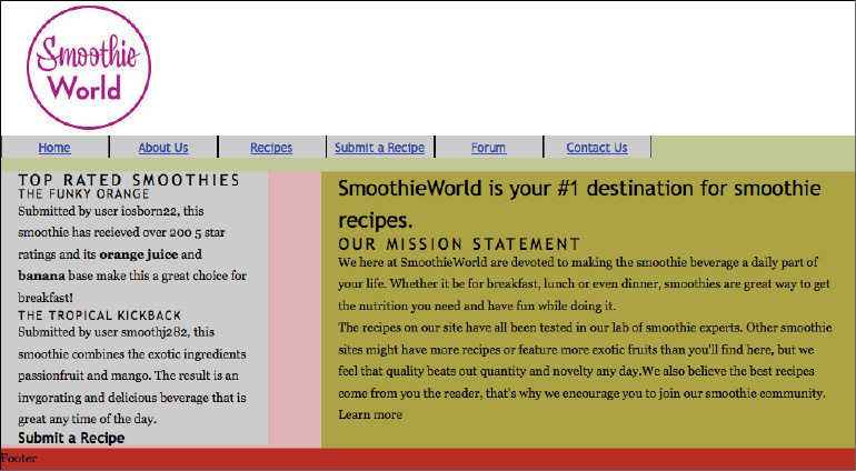
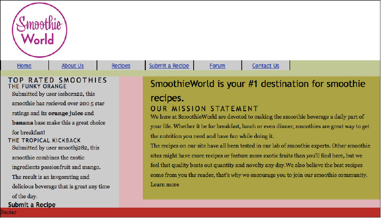
Save the file and preview it in your browser. Your footer is now positioned correctly.
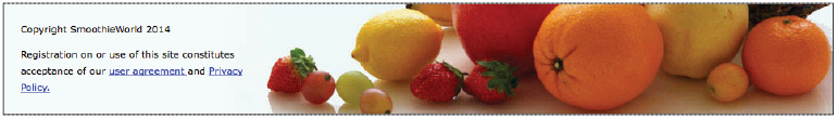
The final appearance of the footer.
In this lesson, you learned the difference between table and CSS layouts. You also learned to use the float and clear properties to create columns on your page. Finally, you explored the advantages and disadvantages of using margins and padding to control your layout. Although you have a strong foundation for your page, in the next lesson, you will continue working on this design, add more images, upgrade the style of your navigation bar, and add other elements to your page.
 To compare your work with a complete version of the final page, open the file named “04_final.html” in your HTML5_04lessons folder.
Self study
1 To practice styling with margins and padding, add new content to your main section. For example, add a new heading 3 and an unordered list between your two paragraphs:
<h3>Recipe of the Day: Honeydew Melon</h3>
<ul>
<li>3 cups Honeydew Melon (seeded & chopped)</li>
<li>2 tsp Lime Juice</li>
<li>1 cup Vanilla Nonfat Yogurt</li>
<li>1 cup Ice Cubes</li>
</ul>
2 After adding this HTML, use what you learned in this lesson to experiment with positioning these elements on the page.
Review
Questions
1 What is a fixed-width layout and what is a flexible layout? What are some of the advantages and disadvantages of each?
2 What is the CSS float property and where would you use it?
3 Cheri added a paragraph to the sidebar div she created. The paragraph is flush against the side of the sidebar. Name two options Cheri could use to move the paragraph away from the edges of the sidebar.
Answers
1 A fixed-width layout has a defined width (usually in pixels or ems) for the primary container. One of the main advantages to this type of layout is that this primary container provides a reliable way to position the other page elements. One disadvantage to this type of layout is that it does not resize with the web browser, and some features, such as text reflowing, are lost. Flexible layouts resize based on the browser or device; this creates a more challenging layout for the designer.
2 The CSS float property lets you remove an element from the default flow of HTML and move (or float) it to either the left or right of its containing element. You would use floats when you want to wrap text around images, create horizontal navigation menus, or use columns for page layout.
3 Cheri could add some padding to the sidebar (which would move any content inside away from the edges). She could also add a rule for paragraphs inside the sidebar; specifically, Cheri could add margin values that would move the paragraphs away from the edges. (Cheri could also use a combination of padding and margins.)