
Chapter 5
Data: Distribution
What you will learn in this chapter:
- How to create histograms and other graphics of sample distribution
- How to examine various distributions
- How to test for the normal distribution
- How to generate random numbers
Whenever you have data you should strive to find a shorthand way of expressing it. In the previous chapter you looked at summary statistics and tabulation. Visualizing your data is also important, as it is often easier to interpret a graph than a series of numbers. Whenever you have a set of numerical values you should also look to see what the distribution of the data is. The classic normal distribution for example, is only one kind of distribution that your data may appear in. The distribution is important because most statistical approaches require the data to be in one form. Knowing the distribution of your data will help you towards the correct analytical procedure. This chapter looks at ways to display the distribution of your data in graphical form and at different data distributions. You will also look at ways to test if your data conform to the normal distribution, which is most important for statistical testing. You will also look at random numbers and ways of sampling randomly from within a dataset.
Looking at the Distribution of Data
When doing statistical analysis it is important to get a “picture” of the data. You usually want to know if the observations are clustered around some middle point (the average) and if there are observations way out on their own (outliers). This is all related to the distribution of the data. There are many distributions, but common ones are the normal distribution, Poisson, and binomial. There are also distributions relating directly to statistical tests; for example, chi-squared and Student’s t.
It is necessary to look at your data and be able to determine what kind of distribution is most adequately represented by them. It is also useful to be able to compare the distribution you have with one of the standard distributions to see how your sample matches up.
You already met the table() command, which was a step toward gaining an insight into the distribution of a sample. It enables you to see how many observations there are in a range of categories. This section covers other general methods of looking at data and distributions.
Stem and Leaf Plot
The table() command gives you a quick look at a vector of data, but the result is still largely numeric. A graphical summary might be more useful because a picture is often easier to interpret. You could draw a frequency histogram, and indeed you do this in the following section, but you can also use a stem and leaf plot as a kind of halfway house. The stem() command produces the stem and leaf plot.
In the following activity you will use the stem() command and compare it to the table() command that you used in Chapter 4.

> data2
[1] 3 5 7 5 3 2 6 8 5 6 9 4 5 7 3 4> table(data2)
data2
2 3 4 5 6 7 8 9
1 3 2 4 2 2 1 1 > stem(data2)
The decimal point is at the |
2 | 0000
4 | 000000
6 | 0000
8 | 00> stem(data2, scale = 2)
The decimal point is at the |
2 | 0
3 | 000
4 | 00
5 | 0000
6 | 00
7 | 00
8 | 0
9 | 0> data4
[1] 23.0 17.0 12.5 11.0 17.0 12.0 14.5 9.0 11.0 9.0 12.5 14.5 17.0 8.0 21.0
> stem(data4)
The decimal point is 1 digit(s) to the right of the |
0 | 899
1 | 11233
1 | 55777
2 | 13> stem(data4, scale = 2)
The decimal point is at the |
8 | 000
10 | 00
12 | 055
14 | 55
16 | 000
18 |
20 | 0
22 | 0> grass
rich graze
1 12 mow
2 15 mow
3 17 mow
4 11 mow
5 15 mow
6 8 unmow
7 9 unmow
8 7 unmow
9 9 unmow> stem(grass$rich)
The decimal point is 1 digit(s) to the right of the |
0 | 7899
1 | 12
1 | 557> with(grass, stem(rich[graze == 'mow']))
The decimal point is at the |
10 | 0
12 | 0
14 | 00
16 | 0The stem() command is a quick way of assessing the distribution of a sample and is also useful because the original values are shown, allowing the sample to be reconstructed from the result. However, when you have a large sample you end up with a lot of values and the command cannot display the data very well; in such cases a histogram is more useful.
Histograms
The histogram is the classic way of viewing the distribution of a sample. You can create histograms using the graphical command hist(), which operates on numerical vectors of data like so:
> data2
[1] 3 5 7 5 3 2 6 8 5 6 9 4 5 7 3 4
> hist(data2)In this example you used a simple vector of numerical values (these are integer data) and the resulting histogram looks like Figure 5-1:
the frequencies are represented on the y-axis and the x-axis shows the values separated into various bins. If you use the table() command you can see how the histogram is constructed:
> table(data2)
data2
2 3 4 5 6 7 8 9
1 3 2 4 2 2 1 1 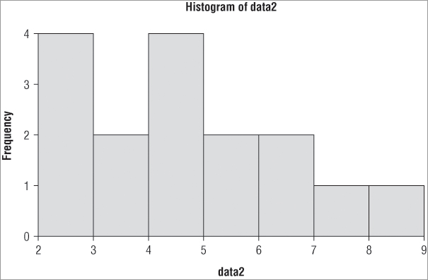
The first bar straddles the range 2 to 3 (that is, greater than 2 but less than 3), and therefore you should expect four items in this bin. The next bar straddles the 3 to 4 range, and if you look at the table you see there are two items bigger than 3 but not bigger than 4. You can alter the number of columns that are displayed using the breaks = instruction as part of the command. This instruction will accept several sorts of input; you can use a standard algorithm for calculating the breakpoints, for example. The default is breaks = “Sturges”, which uses the range of the data to split into bins. Two other standard algorithms are used: “Scott” and “Freedman-Diaconis”. You can use lowercase and unambiguous abbreviation; additionally you can use “FD” for the last of these three options:
> hist(data2, breaks = 'Sturges')
> hist(data2, breaks = 'Scott')
> hist(data2, breaks = 'FD')
Thus you might also use the following:
> hist(data2, breaks = 'st')
> hist(data2, breaks = 'sc')
> hist(data2, breaks = 'fr')
You can also specify the number of breaks as a simple number or range of numbers; the following commands all produce the same result, which for these data is the same as the default (Sturges):
> hist(data2, breaks = 7)
> hist(data2, breaks = 2:9)
> hist(data2, breaks = c(2,3,4,5,6,7,8,9))
Being able to specify the breaks exactly means that you can produce a histogram with unequal bin ranges:
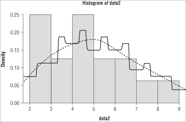
> hist(data2, breaks = c(2,4,5,6,9))The resulting histogram appears like Figure 5-2.
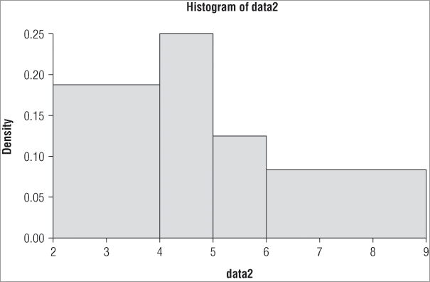
Notice in Figure 5-2 that the y-axis does not show the frequency but instead shows the density. The command has attempted to keep the areas of the bars correct and in proportion (in other words, the total area sums to 1). You can use the freq = instruction to produce either frequency data (TRUE is the default) or density data (FALSE).
You can apply a variety of additional instructions to the hist() command. Many of these extra instructions apply to other graphical commands in R (see Table 5-1 for a summary).
Table 5-1: A Summary of Graphical Commands Useful with Histograms
| Graphical Command | Explanation |
| col = 'color' | The color of the bars; a color name in quotes (use colors() to see the range available). |
| main = 'main.title' | A main title for the histogram; use NULL to suppress this. |
| xlab = 'x.title' | A title for the x-axis. |
| ylab = 'y.title' | A title for the y-axis. |
| xlim = c(start, end) | The range for the x-axis; put numerical values for the start and end points. |
| ylim = c(start, end) | The range for the y-axis. |
These commands are available for many of the other graphs that you meet using R. The color of the bars is set using the col = instruction. A lot of colors are available, and you can see the standard options by using the colors() command:
colors()You can also use an alternative spelling.
colours()Note that this command does not have any additional instructions and you simply type the brackets. There are more than 650 colors to choose from!
As an example, here is a histogram created with a few additional instructions (see Figure 5-3):
> hist(data2, col='gray75', main=NULL, xlab = 'Size class for data2',
ylim=c(0, 0.3), freq = FALSE)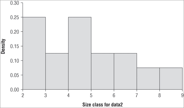
To create the histogram in Figure 5-3, perform the following steps:
You can even avoid a fair bit of typing if you omit the spaces and use a few abbreviations like so:
> hist(co='gray75',ma=NULL,xla='Size class for data2',yli=c(0,0.3),fr=F,x=data2)However, if you show the command to anyone else they may not be able to recognize the abbreviations. There is another (more sensible) reason to demonstrate the reordering of the command. If you want to create histograms for several vectors of data you can use the up arrow to recall the previous command. If the name of the data vector is at the end, it is quicker to edit it and to type the name of the new vector you want to plot.
Density Function
You have seen in drawing a histogram with the hist() command that you can use freq = FALSE to force the y-axis to display the density rather than the frequency of the data. You can also call on the density function directly via the density() command. This enables you to draw your sample distribution as a line rather than a histogram. Many statisticians prefer the density plot to a regular histogram. You can also combine the two and draw a density line over the top of a regular histogram.
You use the density() command on a vector of numbers to obtain the kernel density estimate for the vector in question. The result is a series of x and y coordinates that you can use to plot a graph. The basic form of the command is as follows:
density(x, bw = 'nrd0', kernel = 'gaussian', na.rm = FALSE)You specify your data, which must be a numerical vector, followed by the bandwidth. The bandwidth defaults to the nrd0 algorithm, but you have several others to choose from or you can specify a value. The kernel = instruction enables you to select one of several smoothing options, the default being the “gaussian” smoother. You can see the various options from the help entry for this command. By default, NA items are not removed and an error will result if they are present; you can add na.rm = TRUE to ensure that you strip out any NA items.
If you use the command on a vector of numeric data you get a summary as a result like so:
> dens = density(data2)
> dens

Call:
	density.default(x = data2)

Data: data2 (16 obs.);     Bandwidth 'bw' = 0.9644

       x                 y
 Min.   :-0.8932   Min.   :0.0002982
 1st Qu.: 2.3034   1st Qu.:0.0134042
 Median : 5.5000   Median :0.0694574
 Mean   : 5.5000   Mean   :0.0781187
 3rd Qu.: 8.6966   3rd Qu.:0.1396352
 Max.   :11.8932   Max.   :0.1798531
The result actually comprises several items that are bundled together in a list object. You can see these items using the names() or str() commands:
> names(dens)
[1] "x"         "y"         "bw"        "n"         "call"      "data.name"
[7] "has.na"

> str(dens)
List of 7
 $ x        : num [1:512] -0.893 -0.868 -0.843 -0.818 -0.793 ...
 $ y        : num [1:512] 0.000313 0.000339 0.000367 0.000397 0.000429 ...
 $ bw       : num 0.964
 $ n        : int 16
 $ call     : language density.default(x = data2)
 $ data.name: chr "data2"
 $ has.na   : logi FALSE
 - attr(*, "class")= chr "density"
You can extract the parts you want using $ as you have seen with other lists. You might, for example, use the $x and $y parts to form the basis for a plot.
Using the Density Function to Draw a Graph
If you have a density result you can create a basic plot by extracting the $x and $y components and using them in a plot() command like so:
> plot(dens$x, dens$y)However, for all practical purposes you do not need to go through any of this to produce a graph; you can use the density() command directly as part of a graphing command like so:
> plot(density(data2))This produces a graph like Figure 5-4.
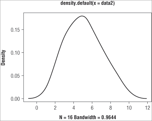
The plot() command is a very general one in R and it can be used to produce a wide variety of graph types. In this case you see that the axes have been labeled and that there is also a main title. You can change these titles using the xlab, ylab, and main instructions as you saw previously. However, there is a slight difference if you want to remove a title completely. Previously you set main = NULL as your instruction, but this does not work here and you get the default title. You must use a pair of quotation marks so set the titles to be empty:
> plot(density(data2), main = "", xlab = 'Size bin classes')The preceding command removes the main title and alters the title of the x-axis. You can change other aspects of the graph as well; for instance, you already met the xlim and ylim instructions to resize the x and y axes, respectively.
Adding Density Lines to Existing Graphs
One use you might make for the density command is to add a density line to an existing histogram. Perhaps you want to compare the two methods of representation or you may want to compare two different samples; commonly one sample would be from an idealized distribution, like the normal distribution. You can add lines to an existing graph using the lines() command. This takes a series of x and y coordinates and plots them on an existing graph. Recall earlier when you used the density() command to make an object called dens. The result was a list of several items including one called x and one called y. The lines() command can read these to make the plot.
In the following example you produce a simple histogram and then draw two density lines over the top:
> hist(data2, freq = F, col = 'gray85')
> lines(density(data2), lty = 2)
> lines(density(data2, k = 'rectangular'))
In the first of the three preceding commands you produce the histogram; you must set the freq = FALSE to ensure the axis becomes density rather than frequency. The next two commands draw lines using two different density commands. The resulting graph looks like Figure 5-5.
Here you made the rectangular line using all the default options. The gaussian line has been drawn using a dashed line and this is done via the lty = instruction; you can use a numerical value where 1 is a solid line (the default), 2 is dashed, and 3 is dotted. Other options are shown in Table 5-2.
Table 5-2: Options for Line Style in the lty Instruction
| Value | Label | Result |
| 0 | blank | Blank |
| 1 | solid | Solid (default) |
| 2 | dashed | Dashed |
| 3 | dotted | Dotted |
| 4 | dotdash | Dot-Dash |
| 5 | longdash | Long dash |
| 6 | twodash | Two dash |
You can use either a numerical value or one of the text strings (in quotes) to produce the required effect; for example, lty = “dotted”. Notice that there is an option to have blank lines. It is also possible to alter the color of the lines drawn using the col = instruction. You can make the lines wider by specifying a magnification factor via the lwd = instruction.
Some additional useful commands include the hist() and lines(density()) commands with which you can draw an idealized distribution and see how your sample matches up. However, first you need to learn how to create idealized distributions.
Types of Data Distribution
You have access to a variety of distributions when using R. These distributions enable you to perform a multitude of tasks, ranging from creating random numbers based upon a particular distribution, to discovering the probability of a value lying within a certain distribution, or determining the density of a value for a given distribution. The following sections explain the many uses of distributions.
The Normal Distribution
Table 5-3 shows the commands you can use in relation to the normal distribution.
Table 5-3: Commands Related to the Normal Distribution
| Command | Explanation |
| rnorm(n, mean = 0, sd = 1) | Generates n random numbers from the normal distribution with mean of 0 and standard deviation of 1 |
| pnorm(q, mean = 0, sd = 1) | Returns the probability for the quantile q |
| qnorm(p, mean = 0, sd = 1) | Returns the quantile for a given probability p |
| dnorm(x, mean = 0, sd = 1) | Gives the density function for values x |
You can generate random numbers based on the normal distribution using the rnorm() command; if you do not specify the mean or standard deviation the defaults of 0 and 1 are used. The following example generates 20 numbers with a mean of 5 and a standard deviation of 1:
> rnorm(20, mean = 5, sd = 1)
 [1] 5.610090 5.042731 5.120978 4.582450 5.015839 3.577376 5.159308 6.496983
 [9] 3.071729 6.187525 5.027074 3.517274 4.393562 3.866088 4.533490 6.021554
[17] 5.359491 5.265780 3.817124 5.855315
You can work out probability using the pnorm() command. If you use the same mean and standard deviation as in the preceding code, for example, you might use the following:
> pnorm(5, mean = 5, sd = 1)
[1] 0.5
In other words, you would expect a value of 5 to be halfway along the x-axis (your result is the cumulative proportion). By performing the following command you can turn this around and work out a value along the x-axis for any quantile; that is, how far along the axis you are as a proportion of its length:
> qnorm(0.5, 5, 1)
[1] 5
You can see here that if you go 50 percent of the way along the x-axis you expect a value of 5, which is the mean of this distribution. You can also determine the density given a value. If you use the same parameters as the previous example did, you get the following:
> dnorm(c(4,5,6), mean = 5, sd = 1)
[1] 0.2419707 0.3989423 0.2419707
Here you work out the density for a mean of 5 and a standard deviation of 1. This time you calculate the density for three values: 4, 5, and 6.
Additionally, you can use the pnorm() and qnorm() commands to determine one- and two-tailed probabilities and confidence intervals. For example:
> qnorm(c(0.05, 0.95), mean = 5, sd = 1)
[1] 3.355146 6.644854
Here is a situation in which it would be useful to compare the distribution of a sample of data against a particular distribution. You already looked at a sample of data and drew its distribution using the hist() command. You also used the density() command to draw the distribution in a different way, and to add the density lines over the original histogram. If you create a series of random numbers with the same mean and standard deviation as your sample, you can compare the “ideal” normal distribution with the actual observed distribution.
You can start by using rnorm() to create an ideal normal distribution using the mean and standard deviation of your data like so:
> data2.norm = rnorm(1000, mean(data2), sd(data2))The more values in your distribution the smoother the final graph will appear, so here you create 1000 random numbers, taking the mean and standard deviation from the original data (called data2). You can display the two distributions in one of two ways; you might have the original data as the histogram and the idealized normal distribution as a line over the top, or you could draw the ideal normal distribution as a histogram and have your sample as the line. The following shows the two options:
> hist(data2, freq = FALSE)
> lines(density(data2.norm))

> hist(data2.norm, freq = F)
> lines(density(data2))
In the first case you draw the histogram using your sample data and add the lines from the ideal normal distribution. In the second case you do it the other way around. With a bit of tweaking you can make a quite acceptable comparison plot. In the following example you make the ideal distribution a bit fainter by using the border = instruction. You also modify the x-axis and main titles. The lines representing the actual data are drawn and made a bit bolder using the lwd = instruction. The resulting graph looks like Figure 5-6.
> hist(data2.norm, freq = F, border = 'gray50', main = 'Comparing two
distributions', xlab = 'Data2 size classes')
> lines(density(data2), lwd = 2)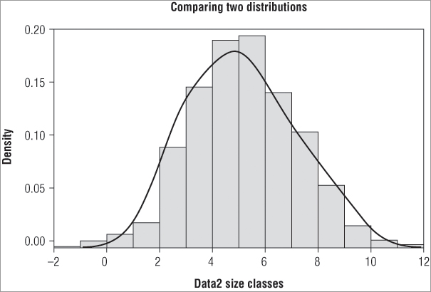
You can see that you get a seemingly good fit to a normal distribution. Mathematical ways to compare the fit also exist, which you look at later in the chapter.
Other Distributions
You can use a variety of other distributions in a similar fashion; for full details look at the help entries by typing help(Distributions). Look at a few examples now to get a flavor of the possibilities. In the following example, you start the Poisson distribution by generating 50 random values:
> rpois(50, lambda = 10)
 [1] 10 12 10 13 10 11  8 17 14  7 12  9 16  8 15  5  6  7 10 11 15 15 10  6 10 12
[27] 14 11  7 12 14 10  8 12  7 13  8  7  8  6  8 10  9 12 12  5 11 12 11 12
The Poisson distribution has only a single parameter, lambda, equivalent to the mean. The next example uses the binomial distribution to assess probabilities:
> pbinom(c(3, 6, 9, 12), size = 17, prob = 0.5)
[1] 0.006363 0.166153 0.685471 0.975479
In this case you use pbinom() to calculate the cumulative probabilities in a binomial distribution. You have two additional parameters: size is the number of trials and prob is the probability of each trial being a success.
You can use the Student’s t-test to compare two normally distributed samples. In this following example you use the qt() command to determine critical values for the t-test for a range of degrees of freedom. You then go on to work out two-sided p-values for a range of t-values:
> qt(0.975, df = c(5, 10, 100, Inf))
[1] 2.571 2.228 1.984 1.960

> (1-pt(c(1.6, 1.9, 2.2), df = Inf))*2
[1] 0.10960 0.05743 0.02781
In the first case you set the cumulative probability to 0.975; this will give you a 5 percent critical value, because effectively you want 2.5 percent of each end of the distribution (because this is a symmetrical distribution you can take 2.5 percent from each end to make your 5 percent). You put in several values for the degrees of freedom (related to the sample size). Notice that you can use Inf to represent infinity. The result shows you the value of t you would have to get for the differences in your samples (their means) to be significantly different at the 5 percent level; in other words, you have determined the critical values.
In the second case you want to determine the two-sided p-value for various values of t when the degrees of freedom are infinity. The pt() command would determine the cumulative probability if left to its own devices. So, you must subtract each one from 1 and then multiply by 2 (because you are taking a bit from each end of the distribution). You can get the same result using a modification of the command using the lower.tail = instruction. By default this is set to TRUE; this effectively means that you are reading the x-axis from left to right. If you set the instruction to FALSE, you switch around and read the x-axis from right to left. The upshot is that you do not need to subtract from one, which involves remembering where to place the brackets. The following example shows the results of the various options:
> pt(c(1.6, 1.9, 2.2), Inf)
[1] 0.9452 0.9713 0.9861

> pt(c(1.6, 1.9, 2.2), Inf, lower.tail = FALSE)
[1] 0.05480 0.02872 0.01390

> pt(c(1.6, 1.9, 2.2), Inf, lower.tail = FALSE)*2
[1] 0.10960 0.05743 0.02781
In the first result you do not modify the command at all and you get the standard cumulative probabilities. In the second case you use the lower.tail = FALSE instruction to get probabilities from “the other end.” These probabilities are one-tailed (that is, from only one end of the distribution), so you double them to get the required (two-tailed) values (as in the third case).
In the next example you look at the F distribution using the pf() command. The F statistic requires two degrees of freedom values, one for the numerator and one for the denominator:
> pf(seq(3, 5, 0.5), df1 = 2, df2 = 12, lower.tail = F)
[1] 0.08779150 0.06346962 0.04665600 0.03481543 0.02633610
In this example you create a short sequence of values, starting from 3 and ending at 5 with an interval of 0.5; in other words, 3, 3.5, 4, 4.5, 5. You set the numerator df to 2 and the denominator to 12, and the result gives the cumulative probability. In this case it is perhaps easier to use the “other end” of the axis, so you set lower.tail = FALSE and get the p-values expressed as the “remainder” (that is, that part of the distribution that lies outside your cut-off point[s]).
The four basic commands dxxx(), pxxx(), qxxx(), and rxxx() provide you access to a range of distributions. They have common elements; the lower.tail = instruction is pretty universal, but each has its own particular instruction set. Table 5-4 gives a sample of the distributions available; using help(Distributions) brings up the appropriate help entry.
Table 5-4: The Principal Distributions Available in R
| Command | Distribution |
| dbeta | beta |
| dbinom | binomial (including Bernoulli) |
| dcauchy | Cauchy |
| dchisq | chi-squared |
| dexp | exponential |
| df | F distribution |
| dgamma | gamma |
| dgeom | geometric (special case of negative binomial) |
| dhyper | hypergeometric |
| dlnorm | log-normal |
| dmultinom | multinomial |
| dnbinom | negative binomial |
| dnorm | normal |
| dpois | Poisson |
| dt | Student’s t |
| dunif | uniform distribution |
| dweibull | Weibull |
| dwilcox | Wilcoxon rank sum |
| ptukey | Studentized range |
| dsignrank | Wilcoxon signed rank |
The final distribution considered is the uniform distribution; essentially “ordinary” numbers. If you want to generate a series of random numbers, perhaps as part of a sampling exercise, use the runif() command:
> runif(10)
 [1] 0.65664996 0.58738275 0.07514039 0.34420863 0.30101891 0.58277238 0.24750941
 [8] 0.09282271 0.65748986 0.10004270
In this example runif()creates ten random numbers; by default the command uses minimum values of 0 and maximum values of 1, so the basic command produces random numbers between 0 and 1. You can set the min and max values with explicit instructions like so:
> runif(10, min = 0, max = 10)
 [1] 8.6480966 6.4076579 1.0365540 9.8101588 5.4944734 8.2056503 4.2407627
 [8] 0.2206528 4.9709090 9.1819653
Now you have produced random values that range from 0 to 10. You can also use the density, probability, or quantile commands; use the following command to determine the cumulative probability of a value in a range of 0 to 10 (although you hardly needed the computer to work that one out).
> punif(6, min = 0, max = 10)
[1] 0.6
Random Number Generation and Control
R has the ability to use a variety of random number-generating algorithms (for more details, look at help(RNG) to bring up the appropriate help entry). You can alter the algorithm by using the RNGkind() command. You can use the command in two ways: you can see what the current settings are and you can also alter these settings. If you type the command without any instructions (that is, just a pair of parentheses) you see the current settings:
> RNGkind()
[1] "Mersenne-Twister" "Inversion"
Two items are listed. The first is the standard number generator and the second is the one used for normal distribution generation. To alter these, use the kind = and normal.kind = instructions along with a text string giving the algorithm you require; this can be abbreviated. The following example alters the algorithms and then resets them:
> RNGkind(kind = 'Super', normal.kind = 'Box')
> RNGkind()
[1] "Super-Duper" "Box-Muller"

> RNGkind('default')
> RNGkind()
[1] "Mersenne-Twister" "Box-Muller"

> RNGkind('default', 'default')
> RNGkind()
[1] "Mersenne-Twister" "Inversion"
Here you first alter both kinds of algorithm. Then you query the type set by running the command without instructions. If you use default as an instruction, you reset the algorithms to their default condition. However, notice that you have to do this for each kind, so to restore the random generator fully you need two default instructions, one for each kind.
There may be occasions when you are using random numbers but want to get the same random numbers every time you run a particular command. Common examples include when you are demonstrating something or testing and want to get the same thing time and time again. You can use the set.seed() command to do this:
> set.seed(1)
> runif(1)
[1] 0.2655087

> runif(1)
[1] 0.3721239

> runif(1)
[1] 0.5728534

> set.seed(1)
> runif(3)
[1] 0.2655087 0.3721239 0.5728534
You use a single integer as the instruction, which sets the starting point for random number generation. The upshot is that you get the same result every time. In the preceding example you set the seed to 1 and then use three separate commands to create three random numbers. If you reset the seed to 1 and generate three more random numbers (using only a single command this time) you get the same values!
You can also use the set.seed() command to alter the kind of algorithm using the kind = and normal.kind = instructions in the same way you did when using the RNGkind() command:
> set.seed(1, kind = 'Super')
> runif(3)
[1] 0.3714075 0.4789723 0.9636913

> RNGkind()
[1] "Super-Duper" "Inversion"

> set.seed(1, kind = 'default')
> runif(3)
[1] 0.2655087 0.3721239 0.5728534

> RNGkind()
[1] "Mersenne-Twister" "Inversion"
In this example you set the seed using a value of 1 (you can also use negative values) and altered the algorithm to the Super-Duper version. After you use this to make three random numbers you look to see what you have before setting the seed to 1 again but also resetting the algorithm to its default, the Mersenne-Twister.
Random Numbers and Sampling
Another example where you may require randomness is in sampling. For instance, if you have a series of items you may want to produce a random smaller sample from these items. See the following example in which you have a simple vector of numbers and want to choose four of these to use for some other purpose:
> data2
 [1] 3 5 7 5 3 2 6 8 5 6 9 4 5 7 3 4
> sample(data2, size = 4)
[1] 3 8 9 6
In this example you extract four of your values as a separate sample from the data2 vector of values. You can do this for character vectors as well; in the following example you have a character vector that comprises 12 months. You use the replace = instruction to decide if you want replacement or not like so:
> sample(data8, size = 4, replace = TRUE)
[1] "Apr" "Jan" "Feb" "Oct"

> sample(data8, size = 4, replace = TRUE)
[1] "Feb" "Feb" "Jun" "May"
Here you set replace = TRUE and the effect is to allow an item to be selected more than once. In the first example all four items are different, but in the second case you get the Feb result twice. The default is to set replace = FALSE, resulting in items not being selected more than once; think of this as not replacing an item in the result vector once it has been selected (placed).
You can extend this and select certain conditions to be met from your sampled data. In the following example you pick out three items from your original data but ensure that they are all greater than 5:
> data2
 [1] 3 5 7 5 3 2 6 8 5 6 9 4 5 7 3 4
> sample(data2[data2 > 5], size = 3)
[1] 7 9 8
If you leave the size = part out, you get a sample of everything that meets any conditions you have set:
> sample(data2[data2 > 5])
[1] 9 8 7 6 6 7

> data2[data2 > 5]
[1] 7 6 8 6 9 7
In the first case you randomly select items that are greater than 5. In the second case you display all the items that are greater than 5. When you merely display the items they appear in the order they are in the vector, but when you use the sample() command they appear in random order. You can see this clearly by using the same command several times:
> sample(data2[data2 > 5])
[1] 8 6 7 9 7 6
> sample(data2[data2 > 5])
[1] 6 9 7 8 7 6
> sample(data2[data2 > 5])
[1] 7 7 9 6 8 6
Because of the way the command is programmed you can get an unusual result:
> data2
 [1] 3 5 7 5 3 2 6 8 5 6 9 4 5 7 3 4
> sample(data2[data2 > 8])
[1] 7 6 4 2 3 5 9 1 8
You might have expected to get a single result (of 9) but you do not. Instead, your condition has resulted in 1 (there is only 1 item greater than 8). You are essentially picking out items that range from 1 to > 8. Because there is only one item > 8 you get a sample from 1 to 9, and if you look you see nine items in your result. In the following example, you look for items > 9:
> data3
 [1]  6  7  8  7  6  3  8  9 10  7  6  9
> sample(data3[data3 > 9])
 [1]  1  5  4  7  6 10  3  8  9  2
Because there is only one of them (a 10) you get ten items in your result sample. This is slightly unfortunate but there is a way around it, which is demonstrated in the help entry for the sample() command. You can create a simple function to alter the way the sample() command operates; first type the following like so:
> resample <- function(x, ...) x[sample(length(x), ...)]This creates a new command called resample(), which you use exactly like you would the old sample() command. Your new command, however, gives the “correct” result; the following example shows the comparison between the two:
> data2
 [1] 3 5 7 5 3 2 6 8 5 6 9 4 5 7 3 4

> set.seed(4)
> sample(data2, size = 3)
[1] 2 6 7

> set.seed(4)
> resample(data2, size = 3)
[1] 2 6 7

> set.seed(4)
> sample(data2[data2 > 8])
[1] 3 5 2 8 4 7 1 9 6

> set.seed(4)
> resample(data2[data2 > 8])
[1] 9
In this example you use the set.seed() command to ensure that your random numbers come out the same; you use a value of 4 but this is merely a whim, any integer will suffice. At the top you can see that you get exactly the same result when you extract three random items as a sample from your original vector. When you use the sample() command to extract values > 8 you see the error. However, you see at the bottom that the resample() command has given the expected result.
Creating simple functions is quite straightforward; in the following case the function is named resample and this appears as an object when you type an ls() command:
> ls(pattern = '^resa')
[1] "resample" "response"
> str(resample)
function (x, ...)
 - attr(*, "source")= chr "function(x, ...) x[sample(length(x), ...)]"
In this example you choose to list objects beginning with “res” and see two objects. If you use the str() command you can see that the resample object is a function. If you type the name of the object you get to see more clearly what it does—you get the code used to create it:
> resample
function(x, ...) x[sample(length(x), ...)]

> class(resample)
[1] "function"
The left part shows the instructions expected; here you have x and three dots. The x simply means a name, the vector you want to sample, and the three dots mean that you can use extra instructions that are appropriate. The right part shows the workings of the function; you see your object represented as x, and the sample() and length() commands perform the actual work of the command. The final three dots get replaced by whatever you type in the command as an extra instruction; you used the size = instruction in one of the previous examples. In the following examples you use another appropriate instruction and one inappropriate one:
> resample(data2[data2 > 8], size = 2, replace = T)
[1] 9 9

> resample(data2[data2 > 8], size = 2, replace = T, na.rm = T)
Error in sample(length(x), ...) : unused argument(s) (na.rm = TRUE)
In the first case the replace = TRUE instruction is valid because it is used by sample(). In the second case, however, you get an error because the na.rm = instruction is not used by either sample() or length().
Creating functions is a useful way to unlock the power of R and enables you to create templates to carry out tedious or involved commands over and over again with minimal effort. You look at the creation of custom functions in more detail in Chapter 10.
The Shapiro-Wilk Test for Normality
You commonly need to compare a sample with the normal distribution. You saw previously how you could do this graphically using a histogram and a density plot. There are other graphical methods, which you will return to shortly, but there are also statistical methods. One such method is the Shapiro-Wilk test, which is available via the shapiro.test() command. Using it is very simple; just provide the command with a numerical vector to work on:
> data2
 [1] 3 5 7 5 3 2 6 8 5 6 9 4 5 7 3 4

> shapiro.test(data2)

       Shapiro-Wilk normality test

data:  data2
W = 0.9633, p-value = 0.7223
The result shows that the sample you have is not significantly different from a normal distribution. If you create a sample using random numbers from another (not normal) distribution, you would expect a significant departure. In the following example you use the rpois() command to create 100 random values from a Poisson distribution with lambda set to 5:
> shapiro.test(rpois(100, lambda = 5))

       Shapiro-Wilk normality test

data:  rpois(100, lambda = 5)
W = 0.9437, p-value = 0.0003256
You see that you do get a significant departure from normality in this case. If you have your data contained within another item, you must extract it in some way. In the following example you have a data frame containing three columns, two of numeric data and one of characters:
> grass3
  rich graze poa
1   12   mow   4
2   15   mow   5
3   17   mow   6
4   11   mow   5
5   15   mow   4
6    8 unmow   5
7    9 unmow   6
8    7 unmow   8
9    9 unmow   7
> shapiro.test(grass3$rich)

       Shapiro-Wilk normality test

data:  grass3$rich
W = 0.9255, p-value = 0.4396
In this case you use the $ to get the rich sample as your vector to compare to normality. You probably ought to test each grazing treatment separately, so you have to subset a little further like so:
> with(grass3, shapiro.test(rich[graze == 'mow']))

       Shapiro-Wilk normality test

data:  rich[graze == "mow"]
W = 0.9251, p-value = 0.5633
In this example you select the mow treatment; the with() command has saved you a little bit of typing by enabling you to read inside the grass data frame temporarily. When you have only a couple of treatment levels this is not too tedious, but when you have several it can become a chore to repeat the test for every level, even if you can use the up arrow to recall the previous command. There is a way around this; you will see the command in more detail in Chapter 9, but for now an example will suffice:
> tapply(grass3$rich, grass3$graze, shapiro.test)
$mow

       Shapiro-Wilk normality test

data:  X[[1L]]
W = 0.9251, p-value = 0.5633


$unmow

       Shapiro-Wilk normality test

data:  X[[2L]]
W = 0.8634, p-value = 0.2725
In this example you use the command tapply(), which enables you to cross-tabulate a data frame and apply a function to each result. The command starts with the column you want to apply the function to. Then you provide an index to carry out the cross tabulation; here you use the graze column. You get two results because there were two levels in the graze column. At the end you specify the command/function you want to use and you can also add extra instructions if they are applicable. The result is that the shapiro.test() is applied to each combination of graze for your rich data.
The Kolmogorov-Smirnov Test
The Kolmogorov-Smirnov test enables you to compare two distributions. This means that you can either compare a sample to a “known” distribution or you can compare two unknown distributions to see if they are the same; effectively you are comparing the shape.
The command that allows you access to the Kolmogorov-Smirnov test is ks.test(), which fortunately is shorter than the actual name. You furnish the command with at least two instructions; the first being the vector of data you want to test and the second being the one you want to compare it to. This second instruction can be in various forms; you can provide a vector of numeric values or you can use a function, for example, pnorm(), in some way. In the following example you look to compare a sample to the normal distribution:
> ks.test(data2, 'pnorm', mean = 5, sd = 2)

       One-sample Kolmogorov-Smirnov test

data:  data2
D = 0.125, p-value = 0.964
alternative hypothesis: two-sided

Warning message:
In ks.test(data2, "pnorm", mean = 5, sd = 2) :
  cannot compute correct p-values with ties
In this case you specify the cumulative distribution function you want as a text string (that is, in quotes) and also give the required parameters for the normal distribution; in this case the mean and standard deviation. This carries out a one-sample test because you are comparing to a standard distribution. Note, too, that you get an error message because you have tied values in your sample. You could create a normal distributed sample “on the fly” and compare this to your sample like so:
> ks.test(data2, pnorm(20, 5, 2))

       Two-sample Kolmogorov-Smirnov test

data:  data2 and pnorm(20, 5, 2)
D = 1, p-value = 0.3034
alternative hypothesis: two-sided

Warning message:
In ks.test(data2, pnorm(20, 5, 2)) :
  cannot compute correct p-values with ties
Now in this example you have run a two-sample test because you have effectively created a new sample using the pnorm() command. In this case the parameters of the normal distribution are contained in the pnorm() command itself. You can also test to see if the distribution is less than or greater than your comparison distribution by adding the alternative = instruction; you use less or greater because the default is two.sided.
You can, of course, use other distributions; the following example compares a data sample to a Poisson distribution (with lambda = 5):
> ks.test(data2, 'ppois', 5)

       One-sample Kolmogorov-Smirnov test

data:  data2
D = 0.241, p-value = 0.3108
alternative hypothesis: two-sided

Warning message:
In ks.test(data2, "ppois", 5) : cannot compute correct p-values with ties
Quantile-Quantile Plots
Earlier you looked at histograms and density plots to visualize a distribution; you can perhaps estimate the appearance of a normal distribution by its bell-shaped appearance. However, it is easier to judge if you can get your distribution to lie in a straight line. To do that you can use quantile-quantile plots (QQ plots). Many statisticians prefer QQ plots over strictly mathematical methods like the Shapiro-Wilk test for example.
A Basic Normal Quantile-Quantile Plot
You have several commands available relating to QQ plots; the first of these is qqnorm(), which takes a vector of numeric values and plots them against a set of theoretical quantiles from a normal distribution. The upshot is that you produce a series of points that appear in a perfectly straight line if your original data are normally distributed. Run the following command to create a simple QQ plot (the graph is shown in Figure 5-7):
> data2
 [1] 3 5 7 5 3 2 6 8 5 6 9 4 5 7 3 4
> qqnorm(data2)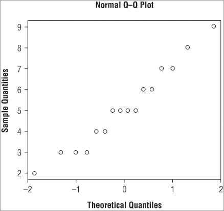
The main title and the axis labels have default settings, which you can alter by using the main, xlab, and ylab instructions that you met previously.
Adding a Straight Line to a QQ Plot
The normal QQ plot is useful for visualizing the distribution because it is easier to check alignment along a straight line than to check for a bell-shaped curve. However, you do not currently have a straight line to check! You can add one using the qqline() command. This adds a straight line to an existing graph. You can alter the appearance of the line using various instructions; you can change the color, width, and style using col, lwd, and lty instructions (which you have met previously). If you combine the qqnorm() and qqlines() commands you can make a customized plot; the following example produces a plot that looks like Figure 5-8:
> qqnorm(data2, main = 'QQ plot of example data', xlab = 'Theoretical',
ylab = 'Quantiles for data2')
> qqline(data2, lwd = 2, lty = 2)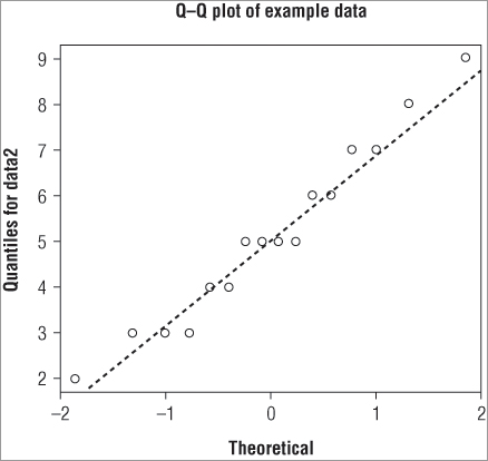
In Figure 5-8 you produce a plot with a slightly thicker line that is dashed. You can now judge more easily the fit of your data to a normal distribution.
Plotting the Distribution of One Sample Against Another
You can also plot one distribution against another as a quantile-quantile plot using the qqplot() command. To use it you simply provide the command with the names of the two distributions you want to compare:
> qqplot(rpois(50,5), rnorm(50,5,1))
> qqplot(data2, data1)
In the top example you compare two distributions that you create “on the fly” from random numbers. The bottom example compares two samples of numeric data; note that this is not simply one sample plotted against the other (because they have different lengths you could not do that anyhow). It would be useful to draw a straight line on your qqplot() and you can do that using the abline() command. This command uses the properties of a straight line (that is, y = a + bx) to produce a line on an existing plot. The general form of the command is:
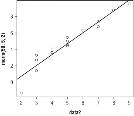
abline(a = intercept, b = slope)You supply the intercept and slope to produce the straight line. The problem here is that you do not know what the intercept or slope values should be! You need to determine these first; fortunately the abline() command can also use results from other calculations. In the following example you take the data2 sample and compare this to a randomly-generated normal distribution with 50 values; you set the mean to 5 and the standard deviation to 2:
> qqp = qqplot(data2, rnorm(50,5,2))This makes a basic plot; your sample is on the x-axis and the sample you compare to, the random one, is on the y-axis. Notice that you do not just make the plot but assign it to an object; here called qqp. You do this because you want to see the values used to create the plot. If you type the name of your plot (qqp) you see that you have a series of x-values (your original data2) and a series of y-values:
> qqp
$x
 [1] 2 3 3 3 4 4 5 5 5 5 6 6 7 7 8 9

$y
 [1] 1.405236 2.625890 3.429247 4.037570 4.433178 4.648895 4.983500 5.292363
 [9] 5.372463 6.154243 6.424723 6.817186 7.360115 7.580486 7.976507 8.793080
The qqplot() command has used the distribution you created (using the rnorm() command) as the basis to generate quantiles for the y-axis. Now the x and y values match up. You can use these values to determine the intercept and slope and then draw your straight line:
> abline(lm(qqp$y ~ qqp$x))Another new command must be introduced at this point: lm(), which carries out linear modeling. This command determines the line of best fit between the x and y values in your qqp object. The abline() command is able to read the result directly so you do not have to specify the a = and b = instructions explicitly. The final result is a straight line added to your QQ plot.
So, the final set of commands appears like this:
> qqp = qqplot(data2, rnorm(50, 5, 2))
> abline(lm(qqp$y ~ qqp$x))
This produces the plot shown in Figure 5-9.
You can alter the titles of the plot and the appearance of the line using the same commands that you met previously (main, xlab, ylab, lwd, lty, and col).
You look at graphical commands in more detail in Chapter 7 and also Chapter 11. You also look more carefully at the lm() command (in Chapter 10), which is used in a wide range of statistical analyses.
Summary
- You can visualize the distribution of a numeric sample using the stem() command to make a stem-leaf plot or the hist() command to draw a histogram.
- A variety of distributions can be examined with R; these include the normal, Poisson, and binomial distributions. The distributions can be examined with a variety of commands (for example, rfoo(), pfoo(), qfoo(), and dfoo(), where foo is the distribution).
- You can test the distribution of a sample using the Shapiro-Wilk test for normality via the Shapiro.test() command. The Kolmogorov-Smirnov test can compare two distributions and is accessed via the ks.test() command.
- Quantile-Quantile plots can be produced using qqnorm() and qqplot() commands. The qqlines() command can add a straight line to a normal QQ plot.
Exercises
You can find the answers to these exercises in Appendix A.
Use the Beginning.RData file for these exercises; the file contains the data objects you require.
What You Learned in This Chapter
| Topic | Key Points |
| Numerical distribution (for example, norm, pois, binom, chisq, Wilcox, unif, t, F): rfoo() pfoo() qfoo() dfoo() |
Many distributions are available for analysis in R. These include the normal distribution as well as Poisson, binomial, and gamma. Other statistical distributions include chi-squared, Wilcox, F, and t.Four main commands handle distributions. The rfoo() command generates random numbers (where foo is the distribution), pfoo() determines probability, dfoo() determines density function, and qfoo() calculates quantiles. |
| Random numbers: RNGkind() set.seed() sample() |
Random numbers can be generated for many distributions. The runif() command, for example, creates random numbers from the uniform distribution.A variety of algorithms to generate random numbers can be used and set via the RNGkind() command. The set.seed() command determines the “start point” for random number generation.The sample() command selects random elements from a larger data sample. |
| Drawing distribution: stem() hist() density() lines() qqnorm() qqline() qqplot() |
The distribution of a numerical sample can be drawn and visualized using several commands: the stem() command creates a simple stem and leaf plot, for example. The hist() command draws classic histograms, and the density() command allows the density to be drawn onto a graph via the lines() command.Quantile-quantile plots can be dealt with using qqnorm(), which plots a distribution against a theoretical normal. A line can be added using qqline(). The qqplot() command enables two distributions to be plotted against one another. |
| Testing distribution: shapiro.test() ks.test() |
The normality of a distribution can be tested using the Shapiro-Wilk test via the shapiro.test() command. The Kolmogorov-Smirnov test can be used via the ks.test() command. This can test one distribution against a known “standard” or can test to see if two distributions are the same. |
| Graphics: plot() abline() lines() lty lwd col xlim xlab ylim ylab main colors() lm() |
The plot() command is a very general graphical command and is often called in the background as the result of some other command (for example, qqplot()).The abline() command adds straight lines to existing graphs and can use the result of previous commands to determine the coordinates to use (for example, the lm() command, which determines slope and intercept in the relationship between two variables).The lines() command adds sections of line to an existing graph and can be used to add a density plot to an existing histogram.Many additional parameters can be added to plot() and other graphical commands to provide customization. For example, col alters the color of plotted elements, and xlim alters the limits of the x-axis. A comprehensive list can be found by using help(par).The colors() command gives a simple list of the colors available. |