7
Regression
Regression analysis is the statistical method you use when both the response variable and the explanatory variable are continuous variables (i.e. real numbers with decimal places – things like heights, weights, volumes, or temperatures). Perhaps the easiest way of knowing when regression is the appropriate analysis is to see that a scatterplot is the appropriate graphic (in contrast to analysis of variance, say, when the appropriate plot would have been a box-and-whisker or a bar chart).
The essence of regression analysis is using sample data to estimate parameter values and their standard errors. First, however, we need to select a model which describes the relationship between the response variable and the explanatory variable(s). There are literally hundreds of models from which we might choose. Perhaps the most important thing to learn about regression is that model choice is a really big deal. The simplest model of all is the linear model:
The response variable is y, and x is a continuous explanatory variable. There are two parameters, a and b: the intercept is a (the value of y when x = 0); and the slope is b (the slope, or gradient, is the change in y divided by the change in x which brought it about). The slope is so important that it is worth drawing a picture to make clear what is involved.
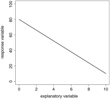
The task is to work out the slope and intercept of this negative linear relationship between the response variable and the explanatory variable. It is easiest to start with the intercept in this case, because the value of x = 0 appears on the graph (it does not always). The intercept is simply the value of y when x = 0. We can get this by inspection. Draw a vertical line from x = 0 until it intercephs the black regression line (the green line) then a horizontal line (red) from the regression line until it cuts the y axis. Read off the value directly. It is 80 in this case.
Estimating the slope is slightly more involved because we need to calculate
In practice, it is a good idea for precision to select a large change in x. Let us take it from 2 to 8. Because the slope of the graph is negative, the value of y is lower when x = 8 than it is when x = 2. At x = 2, we draw a blue line vertically downwards from the regression line to the value of y when x = 8. The length of this blue line is the change in y (often denoted as ‘delta y’, or Δy in symbols). Now we draw a horizontal brown line showing the change in x from 2 to 8. The length of this brown line is Δx. When x = 2 we can read off the value of y (approximately) from the graph: it is roughly 66. Similarly, when x = 8 we can read off the value of y as 24.
So the change in x is +6 (from 2 up to 8) and the change in y is −42 (from 66 down to 24). Finally, we can calculate the slope of the straight line, b:
We now know both of the parameter values of the line: the intercept a = 80 and the slope b = −7.0. We can write the parameterised equation like this:
We can predict values of y at x values we have not measured (say, at x = 10.5):
We can also ask what x values are associated with particular values of y (say, y = 40). This is a bit more work, because we have to rearrange the equation
First, subtract 80 from both sides
then divide both sides by −7 to find the value of x:
You can get a rough check on this value by inspection of the graph. You should work through this example repeatedly until you understand it completely.
Linear Regression
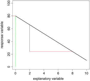
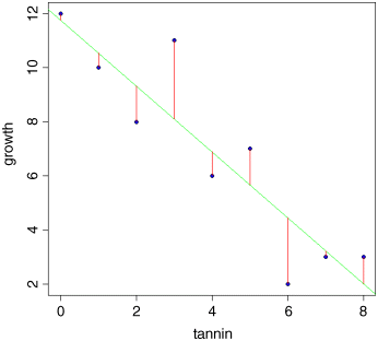
Let us start with an example. The thing to understand is that there is nothing difficult, or mysterious about estimating the regression parameters. We can do a reasonable job, just by eye.
reg.data <- read.csv("c:\temp\tannin.csv")attach(reg.data)names(reg.data)
[1] "growth" "tannin"
plot(tannin,growth,pch=21,bg="blue")
This is how we do regression ‘by eye’. We ask: what has happened to the y value? It decreased from about 12 to about 2, so the change in y is −10 (the minus sign is important). How did the x value change? It increased from 0 to 8, so the change in x is +8 (when working out regressions by eye, it is a good idea to take as big a range of x values as possible, so here we took the complete range of x). What is the value of y when x = 0? It is about 12, so the intercept is roughly a ≈ 12. Finally, what is the value of b? It is the change in y (−10) divided by the change in x which brought it about (8), so b ≈ −10/8 = −1.25. So our rough guess at the regression equation is
That's all there is to it. Obviously, we want to make the procedure more objective than this. And we also want to estimate the unreliability of the two estimated parameters (i.e. the standard errors of the slope and intercept). But the basics are just as straightforward as that.
Linear Regression in R
How close did we get to the maximum likelihood estimates of a and b with our guesstimates of 12 and −1.25? It is easy to find out using the R function lm which stands for ‘linear model’ (note that the first letter of the function name lm is a lower case L, not a number one). All we need do is tell R which of the variables is the response variable (growth in this case) and which is the explanatory variable (tannin concentration in the diet). The response variable goes on the left of the tilde ~ and the explanatory variable goes on the right, like this: growth ~ tannin. This is read ‘growth is modelled as a function of tannin’. Now we write:
lm(growth~tannin)
Coefficients:(Intercept) tannin11.756 -1.217
The two parameters are called Coefficients in R: the intercept is 11.756 (compared with out guesstimate of 12), and the slope is −1.217 (compared with our guesstimate of −1.25). Not bad at all.
So where does R get its coefficients from? We need to do some calculations to find this out. If you are more mathematically inclined, you might like to work through Box 7.1, but this is not essential to understand what is going on. Remember that what we want are the maximum likelihood estimates of the parameters. That is to say that, given the data, and having selected a linear model, we want to find the values of the slope and intercept that make the data most likely. Keep rereading this sentence until you understand what it is saying.
The best way to see what is going on is to do it graphically. Let us cheat a bit by fitting the best-fit straight line through our scatterplot, using abline like this:
abline(lm(growth~tannin),col="green")
The fit is reasonably good, but it is not perfect. The data points do not lie on the fitted line. The difference between each data point and the value predicted by the model at the same value of x is called a residual. Some residuals are positive (above the line) and others are negative (below the line). Let us draw vertical lines to indicate the size of the residuals. The first x point is at tannin = 0. The y value measured at this point was growth = 12. But what is the growth predicted by the model at tannin = 0? There is a built-in function called predict to work this out:
fitted <- predict(lm(growth~tannin))fitted
1 2 3 4 5 6 711.755556 10.538889 9.322222 8.105556 6.888889 5.672222 4.4555568 93.238889 2.022222
So the first predicted value of growth is 11.755556 when tannin = 0. To draw the first residual, both x coordinates will be 0. The first y coordinate will be 12 (the observed value) and the second will be 11.755556 (the fitted (or predicted) value). We use lines, like this:
lines(c(0,0),c(12,11.755556))
We could go through, laboriously, and draw each residual like this. But it is much quicker to automate the procedure, using a loop to deal with each residual in turn:
for (i in 1:9)lines (c(tannin[i],tannin[i]),c(growth[i],fitted[i]),col="red")
These residuals describe the goodness of fit of the regression line. Our maximum likelihood model is defined as the model that minimizes the sum of the squares of these residuals. It is useful, therefore, to write down exactly what any one of the residuals, d, is: it is the measured value, y, minus the fitted value called ![]() (y ‘hat’):
(y ‘hat’):
We can improve on this, because we know that ![]() is on the straight line
is on the straight line ![]() , so
, so
The equation includes a − bx because of the minus sign outside the bracket. Now our best-fit line, by definition, is given by the values of a and b that minimize the sums of the squares of the ds (see Box 7.1). Note, also, that just as ![]() (Box 4.1), so the sum of the residuals
(Box 4.1), so the sum of the residuals ![]() (Box 7.2).
(Box 7.2).
To get an overview of what is involved, it is useful to plot the sum of the squares of the residuals against the value of the parameter we are trying to estimate. Let us take the slope as our example. We know one thing for certain about our straight-line model; it will pass through the point in the centre of the cloud of data whose coordinates are (![]() ). The best-fit line will be pivoted about the mean values of x and y and our job is to find the best value for this slope – the one that minimizes the sum of squares of the red lines in the graph above. It should be reasonably clear that if our estimate of the slope is too steep, then the fit will be poor and the sum of squares will be large. Likewise, if our estimate of the slope is too shallow, then the fit will be poor and the sum of squares will be large. Somewhere between these two extremes, there will be a value for the slope that minimizes the sum of squares. This is the best-fit value that we want to discover. First we need to loop thorough an appropriate range of values which will include the best-fit value (say −1.4 < b < −1.0) and work out the sum of the squared residuals: let us call this quantity sse (you will see why later):
). The best-fit line will be pivoted about the mean values of x and y and our job is to find the best value for this slope – the one that minimizes the sum of squares of the red lines in the graph above. It should be reasonably clear that if our estimate of the slope is too steep, then the fit will be poor and the sum of squares will be large. Likewise, if our estimate of the slope is too shallow, then the fit will be poor and the sum of squares will be large. Somewhere between these two extremes, there will be a value for the slope that minimizes the sum of squares. This is the best-fit value that we want to discover. First we need to loop thorough an appropriate range of values which will include the best-fit value (say −1.4 < b < −1.0) and work out the sum of the squared residuals: let us call this quantity sse (you will see why later):
- change the value of the slope b
- work out the new intercept

- predict the fitted values of growth for each level of tannin

- work out the residuals

- square them and add them up,
- associate this value of sse[i] with the current estimate of the slope b[i]
Once this process is complete, we can produce a U-shaped graph with the squared residuals on the y axis and the estimate of the slope on the x axis. Now we find the minimum value of sse (it turns out to be 20.072) and draw a horizontal dashed green line. At the point where this minimum touches the graph, we read down to the x axis to find the best value of the slope (the red arrow). This is the value (b = −1.217) that R provided for us earlier.

Here is the R code that produces the figure and extracts the best estimate of b:
b <- seq(-1.43,-1,0.002)sse <- numeric(length(b))for (i in 1:length(b)) {a <- mean(growth)-b[i]*mean(tannin)residual <- growth - a - b[i]*tanninsse[i] <- sum(residual^2)
}
plot(b,sse,type="l",ylim=c(19,24))arrows(-1.216,20.07225,-1.216,19,col="red")abline(h=20.07225,col="green",lty=2)lines(b,sse)
b[which(sse==min(sse))]
Calculations Involved in Linear Regression
We want to find the minimum of ![]() . To work this out we need the ‘famous five’: these are
. To work this out we need the ‘famous five’: these are ![]() and
and ![]() ,
, ![]() and
and ![]() and a new quantity,
and a new quantity, ![]() , the sum of products. The sum of products is worked out pointwise, so for our data, it is:
, the sum of products. The sum of products is worked out pointwise, so for our data, it is:
tannin
[1] 0 1 2 3 4 5 6 7 8
growth
[1] 12 10 8 11 6 7 2 3 3
tannin*growth
[1] 0 10 16 33 24 35 12 21 24
We have 0 × 12 = 0, plus 1 × 10 = 10, plus 2 × 8 = 16, and so on:
sum(tannin*growth)
[1] 175
The next thing is to use the famous five to work out three essential ‘corrected sums’: the corrected sum of squares of x, the corrected sum of squares of y and the corrected sum of products, xy. The corrected sums of squares of y and x should be familiar to you:
because if we wanted the variance in y, we would just divide SSY by its degrees of freedom (and likewise for the variance in x; see p. 55). It is only the corrected sum of products that is novel, but its structure is directly analogous. Think about the formula for SSY, above. It is ‘the sum of y times y’ ![]() , ‘minus the sum of y times the sum of y’
, ‘minus the sum of y times the sum of y’ ![]() ‘divided by the sample size’,
‘divided by the sample size’, ![]() . The formula for SSX is similar. It is ‘the sum of x times x’
. The formula for SSX is similar. It is ‘the sum of x times x’ ![]() , ‘minus the sum of x times the sum of x’
, ‘minus the sum of x times the sum of x’ ![]() ‘divided by the sample size’,
‘divided by the sample size’, ![]() . Now the corrected sum of products is:
. Now the corrected sum of products is:
If you look carefully you will see that this has exactly the same kind of structure. It is ‘the sum of x times y’ ![]() , ‘minus the sum of x times the sum of y ’
, ‘minus the sum of x times the sum of y ’ ![]() ‘divided by the sample size’,
‘divided by the sample size’, ![]() .
.
These three corrected sums of squares are absolutely central to everything that follows about regression and analysis of variance, so it is a good idea to reread this section as often as necessary, until you are confident that you understand what SSX, SSY and SSXY represent (Box 7.3).
The next question is how we use SSX, SSY and SSXY to find the maximum likelihood estimates of the parameters and their associated standard errors. It turns out that this step is much simpler than what has gone before. The maximum likelihood estimate of the slope, b, that we extracted from the graph (above) is just:
(the detailed derivation of this is in Box 7.1).
Now that we know the value of the slope, we can use any point on the fitted straight line to work out the maximum likelihood estimate of the intercept, a. One part of the definition of the best-fit straight line is that it passes through the point (![]() ) determined by the mean values of x and y. Since we know that
) determined by the mean values of x and y. Since we know that ![]() , it must be the case that
, it must be the case that ![]() , and so
, and so
We can work out the parameter values for our example. To keep things as simple as possible, we can call the variables SSX, SSY and SSXY (note that R is ‘case sensitive’ so the variable SSX is different from ssx):
SSX <- sum(tannin^2)-sum(tannin)^2/length(tannin)SSX
[1] 60
SSY <- sum(growth^2)-sum(growth)^2/length(growth)SSY
[1] 108.8889
SSXY <- sum(tannin*growth)-sum(tannin)*sum(growth)/length(tannin)SSXY
[1] -73
That is all we need. So the slope is
and the intercept is given by
Now we can write the maximum likelihood regression equation in full:
This, however, is only half of the story. In addition to the parameter estimates, a = 11.756 and b = −1.2167, we need to measure the unreliability associated with each of the estimated parameters. In other words, we need to calculate the standard error of the intercept and the standard error of the slope. We have already met the standard error of a mean, and we used it in calculating confidence intervals (p. 60) and in doing Student's t test (p. 91). Standard errors of regression parameters are similar in so far as they are enclosed inside a big square-root term (so that the units of the standard error are the same as the units of the parameter), and they have the error variance, s2, in the numerator. There are extra components, however, which are specific to the unreliability of a slope or an intercept (see Boxes 7.6 and 7.7 for details). Before we can work out the standard errors, however, we need to know the value of the error variance s2, and for this we need to carry out an analysis of variance.
Partitioning Sums of Squares in Regression: SSY = SSR + SSE
The idea is simple: we take the total variation in y, SSY, and partition it into components that tell us about the explanatory power of our model. The variation that is explained by the model is called the regression sum of squares (denoted by SSR), and the unexplained variation is called the error sum of squares (denoted by SSE; this is the sum of the squares of the lengths of the red lines that we drew on the scatterplot on p. 119). Then SSY = SSR + SSE (the proof is given in Box 7.5).
Now, in principle, we could compute SSE because we know that it is the sum of the squares of the deviations of the data points from the fitted model, ![]() . Since we know the values of a and b, we are in a position to work this out. The formula is fiddly, however, because of all those subtractions, squarings and addings up. Fortunately, there is a very simple shortcut that involves computing SSR, the explained variation, rather than SSE. This is because
. Since we know the values of a and b, we are in a position to work this out. The formula is fiddly, however, because of all those subtractions, squarings and addings up. Fortunately, there is a very simple shortcut that involves computing SSR, the explained variation, rather than SSE. This is because
so we can immediately work out ![]() . And since SSY = SSR + SSE we can get SSE by subtraction:
. And since SSY = SSR + SSE we can get SSE by subtraction:
These components are now drawn together in what is known as the ‘ANOVA table’. Strictly, we have analysed sums of squares rather than variances up to this point, but you will see why it is called analysis of variance shortly. The leftmost column of the ANOVA table lists the sources of variation: regression, error and total in our example. The next column contains the sums of squares, SSR, SSE and SSY. The third column is in many ways the most important to understand; it contains the degrees of freedom. There are n points on the graph (n = 9 in this example). So far, our table looks like this:
| Source | Sum of squares | Degrees of freedom | Mean squares | F ratio |
| Regression | 88.817 | |||
| Error | 20.072 | |||
| Total | 108.889 |
We shall work out the degrees of freedom associated with each of the sums of squares in turn. The easiest to deal with is the total sum of squares, because it always has the same formula for its degrees of freedom. The definition is ![]() , and you can see that there is just one parameter estimated from the data: the mean value,
, and you can see that there is just one parameter estimated from the data: the mean value, ![]() . Because we have estimated one parameter from the data, we have n − 1 degrees of freedom (where n is the total number of points on the graph; 9 in our example). The next easiest to work out is the error sum of squares. Let us look at its formula to see how many parameters need to be estimated from the data before we can work out
. Because we have estimated one parameter from the data, we have n − 1 degrees of freedom (where n is the total number of points on the graph; 9 in our example). The next easiest to work out is the error sum of squares. Let us look at its formula to see how many parameters need to be estimated from the data before we can work out ![]() . We need to know the values of both a and b before we can calculate SSE. These are estimated from the data, so the degrees of freedom for error are n − 2. This is important, so reread the last sentence if you do not see it yet. The most difficult of the three is the regression degrees of freedom, because you need to think about this one in a different way. The question is this: how many extra parameters, over and above the mean value of y, did you estimate when fitting the regression model to the data? The answer is 1. The extra parameter you estimated was the slope, b. So the regression degrees of freedom in this simple model, with just one explanatory variable, is 1. This will only become clear with practice.
. We need to know the values of both a and b before we can calculate SSE. These are estimated from the data, so the degrees of freedom for error are n − 2. This is important, so reread the last sentence if you do not see it yet. The most difficult of the three is the regression degrees of freedom, because you need to think about this one in a different way. The question is this: how many extra parameters, over and above the mean value of y, did you estimate when fitting the regression model to the data? The answer is 1. The extra parameter you estimated was the slope, b. So the regression degrees of freedom in this simple model, with just one explanatory variable, is 1. This will only become clear with practice.
To complete the ANOVA table, we need to understand the fourth column, headed ‘Mean squares’. This column contains the variances, on which analysis of variance is based. The key point to recall is that
This is very easy to calculate in the context of the ANOVA table, because the relevant sums of squares and degrees of freedom are in adjacent columns. Thus the regression variance is just SSR/1 = SSR, and the error variance is s2 = SSE/(n − 2). Traditionally, one does not fill in the bottom box (it would be the overall variance in y, SSY/(n − 1)). Finally, the ANOVA table is completed by working out the F ratio, which is a ratio between two variances. In most simple ANOVA tables, you divide the treatment variance in the numerator (the regression variance in this case) by the error variance s2 in the denominator. The null hypothesis under test in a linear regression is that the slope of the regression line is zero (i.e. no dependence of y on x). The two-tailed alternative hypothesis is that the slope is significantly different from zero (either positive or negative). In many applications it is not particularly interesting to reject the null hypothesis, because we are interested in the effect sizes (estimates of the slope and intercept) and their standard errors. We often know from the outset that the null hypothesis is false. Nevertheless, to test whether the F ratio is sufficiently large to reject the null hypothesis, we compare our test statistic (the calculated value of F in the final column of the ANOVA table) with the critical value of F. Recall that the test statistic is the value of F that is expected by chance alone when the null hypothesis is true. We find the critical value of F from quantiles of the F distribution qf, with 1 d.f. in the numerator and n − 2 d.f. in the denominator (as described below). Here is the completed ANOVA table:
| Source | Sum of squares | Degrees of freedom | Mean squares | F ratio |
| Regression | 88.817 | 1 | 88.817 | 30.974 |
| Error | 20.072 | 7 | s2 = 2.86746 | |
| Total | 108.889 | 8 |
Notice that the component degrees of freedom add up to the total degrees of freedom (this is always true, in any ANOVA table, and is a good check on your understanding of the design of the experiment). The last question concerns the magnitude of the F ratio = 30.974: is it big enough to justify rejection of the null hypothesis? The critical value of the F ratio is the value of F that would arise due to chance alone when the null hypothesis was true, given that we have 1 d.f. in the numerator and 7 d.f. in the denominator. We have to decide on the level of uncertainty that we are willing to put up with; the traditional value for work like this is 5%, so our certainty is 0.95. Now we can use quantiles of the F distribution, qf, to find the critical value:
qf(0.95,1,7)
[1] 5.591448
Because our calculated value of F (the test statistic = 30.974) is much larger than the critical value (5.591), we can be confident in rejecting the null hypothesis. Perhaps a better thing to do, rather than working rigidly at the 5% uncertainty level, is to ask what is the probability of getting a value for F as big as 30.974 or larger if the null hypothesis is true. For this we use 1-pf rather than qf:
1-pf(30.974,1,7)
[1] 0.0008460725
It is very unlikely indeed (p < 0.001).
Next, we can use the calculated error variance s2 = 2.867 to work out the standard errors of the slope (Box 7.6) and the intercept (Box 7.7). First the standard error of the slope:
The formula for the standard error of the intercept is a little more involved (Box 7.7):
Now that we know where all the numbers come from, we can repeat the analysis in R and see just how straightforward it is. It is good practice to give the statistical model a name: model is as good as any.
model <- lm(growth~tannin)
Then, you can do a variety of things with the model. The most important, perhaps, is to see the details of the estimated effects, which you get from the summary function:
summary(model)
Coefficients:
Estimate Std. Error t value Pr(>|t|)(Intercept) 11.7556 1.0408 11.295 9.54e-06 ***tannin -1.2167 0.2186 -5.565 0.000846 ***
Residual standard error: 1.693 on 7 degrees of freedomMultiple R-squared: 0.8157, Adjusted R-squared: 0.7893F-statistic: 30.97 on 1 and 7 DF, p-value: 0.0008461
This shows everything you need to know about the parameters and their standard errors (compare the values for SEa and SEb with those you calculated long-hand, above). We shall meet the other terms shortly (residual standard error, multiple R-squared and adjusted R-squared). The p value and the F statistic are familiar from the ANOVA table.
If you want to see the ANOVA table rather than the parameter estimates, then the appropriate function is summary.aov:
summary.aov(model)
Df Sum Sq Mean Sq F value Pr(>F)tannin 1 88.82 88.82 30.97 0.000846 ***Residuals 7 20.07 2.87
This shows the error variance (s2 = 2.87) along with SSR (88.82) and SSE (20.07), and the p value we just computed using 1-pf. Of the two sorts of summary table, summary.lm is vastly the more informative, because it shows the effect sizes (in this case the slope of the graph and the intercept) and their unreliability estimates (the standard errors of the slope and intercept). Generally, you should resist the temptation to put ANOVA tables in your written work. The important information like the p value and the error variance can be put in the text, or in figure legends, much more efficiently. ANOVA tables put far too much emphasis on hypothesis testing, and show nothing directly about effect sizes or their unreliabilities.
Measuring the Degree of Fit, r2
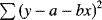
There is a very important issue that remains to be considered. Two regression lines can have exactly the same slopes and intercepts, and yet be derived from completely different relationships:
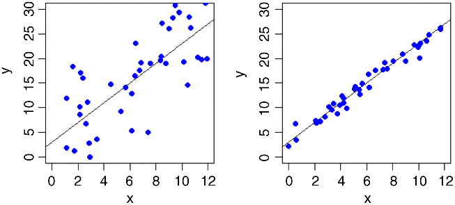
We need to be able to quantify the degree of fit, which is low in the graph on the left and high in the one on the right. In the limit, all the data points might fall exactly on the line. The degree of scatter in that case would be zero and the fit would be perfect (we might define a perfect fit as 1). At the other extreme, x might explain none of the variation in y at all; in this case, fit would be 0 and the degree of scatter would be 100%.
Can we combine what we have learned about SSY, SSR and SSE into a measure of fit that has these properties? Our proposed metric is the fraction of the total variation in y that is explained by the regression. The total variation is SSY and the explained variation is SSR, so our measure – let us call it r2 – is given by
This varies from 1, when the regression explains all of the variation in y (SSR = SSY), to 0 when the regression explains none of the variation in y (SSE = SSY).
The formal name of this quantity is the coefficient of determination, but these days most people just refer to it as ‘r-squared’. We have already met the square root of this quantity (r or ![]() ), as the correlation coefficient (p. 108).
), as the correlation coefficient (p. 108).
Model Checking
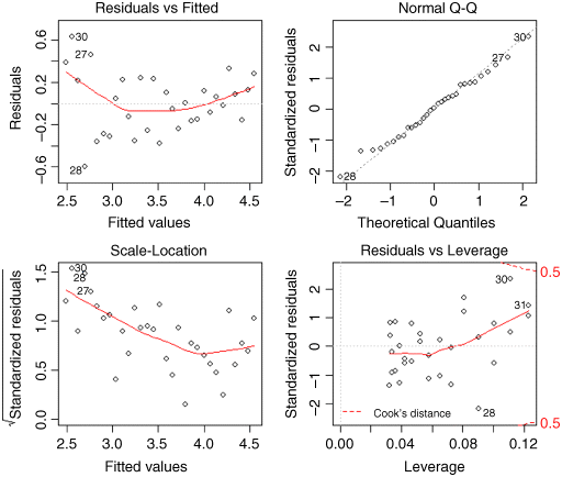
The final thing you will want to do is to expose the model to critical appraisal. The assumptions we really want to be sure about are constancy of variance and normality of errors. The simplest way to do this is with four built-in model-checking plots:
par(mfrow=c(2,2))plot(model)
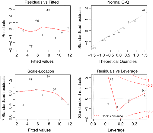
The first graph (top left) shows residuals on the y axis against fitted values on the x axis. It takes experience to interpret these plots, but what you do not want to see is lots of structure or pattern in the plot. Ideally, as here, the points should look like the sky at night. It is a major problem if the scatter increases as the fitted values get bigger; this would show up like a wedge of cheese on its side (like this ![]() or less commonly like this
or less commonly like this ![]() ; see p. 65). But in our present case, everything is OK on the constancy of variance front.
; see p. 65). But in our present case, everything is OK on the constancy of variance front.
The next plot (top right) is the normal quantile–quantile plot (qqnorm, p. 79) which should be a straight line if the errors are normally distributed. Again, the present example looks fine. If the pattern were S-shaped or banana-shaped, we would need to fit a different model to the data.
The third plot (bottom left) is like the first, but on a different scale; it shows the square root of the standardized residuals (where all the values are positive) against the fitted values; if there was a problem, the points would be distributed inside a triangular shape, with the scatter of the residuals increasing as the fitted values increase. But there is no such pattern here, which is good.
The fourth and final plot (lower right) is all about highlighting influential points (p. 148); these are the points on the graph that have the biggest effects on the parameter estimates. It shows Cook's distance as red contours on a plane defined by leverage and standardized residuals, with each point on the graph represented by an open circle, and selected points numbered (based on the order in which they appear in the dataframe). You can see that point number 9 has the highest leverage, point number 7 (all but hidden behind the label) has the highest Cook's distance, and point number 4 has the largest residual. In my opinion, this information is more clearly displayed in tabular form; try influence.measures(model).
It is the top two graphs of plot(model) that are most important, and you should concentrate on these. The important point is that we always do model-checking; the summary(model) table is not the end of the process of regression analysis.
Transformation
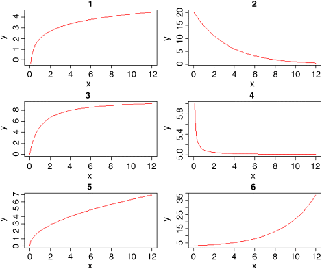
You must not fall into the trap of thinking that y = a + bx is the only two-parameter model for describing the relationship between the response variable and a single continuous explanatory variable. Model choice is a vitally important part of statistical analysis. Here are some other useful two-parameter models:
| log X | 1. | |
| log Y | 2. | |
| asymptotic | 3. | |
| reciprocal | 4. | |
| power law | 5. | |
| exponential | 6. |
It is straightforward to estimate the parameters of such models if the equations can be transformed so that they become linear in their parameters. An example should make this clear. The following data show the relationship between radioactive emissions and time:
par(mfrow=c(1,1))data <- read.csv("c:\temp\decay.csv")attach(data)names(data)
[1] "time" "amount"
plot(time,amount,pch=21,col="blue",bg="green")
We start by fitting a straight line through the scatterplot, using abline with a linear model:
abline(lm(amount~time),col="red")
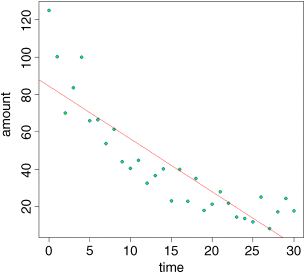
This draws attention to the pronounced curvature in the data. Most of the residuals at low values of time are positive, most of the residuals for intermediate values of time are negative, and most of the residuals at high values of time are positive. This is clearly not a good model for these data.
There is a very important point here. If, instead of looking at the fit of the model to the data using plot, we had simply done the statistics, then we might easily have come to the opposite conclusion. Here is a summary of the linear model applied to these data:
summary(lm(amount~time))
Coefficients:Estimate Std. Error t value Pr(>|t|)(Intercept) 84.5534 5.0277 16.82 < 2e-16 ***time -2.8272 0.2879 -9.82 9.94e-11 ***
Residual standard error: 14.34 on 29 degrees of freedomMultiple R-squared: 0.7688, Adjusted R-squared: 0.7608F-statistic: 96.44 on 1 and 29 DF, p-value: 9.939e-11
The model explains more than 76% of the variation in the response (a very high value of r-squared) and the p value is vanishingly small. The moral is that p values and r-squared are not good measures of model adequacy.
Because the data relate to a decay process, it might be that an exponential function ![]() describes the data better. If we can linearize this equation, then we can estimate the parameter values using a linear model. Let us try taking logs of both sides
describes the data better. If we can linearize this equation, then we can estimate the parameter values using a linear model. Let us try taking logs of both sides
If we replace log(y) by Y and log(a) by A, you can see that we have a linear model:
The intercept of this linear model is A and the slope is −b. To fit the model we have the untransformed values of time on the x axis and the log of amount on the y axis:
plot(time,log(amount),pch=21,col="blue",bg="red")abline(lm(log(amount)~time),col="blue")
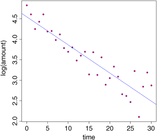
The fit to the model is greatly improved. There is a new issue, however, in that the variance appears to increase with time and, as you will recall, non-constant variance is a potentially serious problem. Let us estimate the parameter values of this exponential model and then check its assumptions using plot(model).
model <- lm(log(amount)~time)summary(model)
Coefficients:Estimate Std. Error t value Pr(>|t|)(Intercept) 4.547386 0.100295 45.34 < 2e-16 ***time -0.068528 0.005743 -11.93 1.04e-12 ***
Residual standard error: 0.286 on 29 degrees of freedomMultiple R-squared: 0.8308, Adjusted R-squared: 0.825F-statistic: 142.4 on 1 and 29 DF, p-value: 1.038e-12
The slope of the straight line is −0.068528 and its standard error is 0.005743. The value of r2 is even higher following transformation (83%) and the p value is even lower. The intercept of 4.547386 with its standard error of 0.100295 is for A, not the value we need for our exponential equation, but a is the antilog of A. When we back-transform, the standard errors become asymmetric up and down. It may take a moment for you to see why this is the case. Let us add one standard error to the intercept and subtract one standard error from it to get upper and lower intervals.
upper <- 4.547386 + 0.100295lower <- 4.547386 - 0.100295
Now we return to the original scale of measurement by taking antilogs using exp:
exp(upper)
[1] 104.3427
exp(lower)
[1] 85.37822
so the intercept on the original axis is between 85.38 and 104.34, but the best estimate for the intercept is
exp(4.547386)
[1] 94.38536
which means that the interval above the intercept is 9.957 but the interval below it is 9.007. Beginners often find it disconcerting that the two unreliability measures are different sizes.
Now we check the assumptions of the model using plot(model):
The good news is that the normality of errors assumption looks good (the top right plot is reasonably straight). As we guessed by looking at the transformed data, however, the variance does show strong signs of non-constancy (the top left and bottom left plots). The bottom right plot shows that data points 30 and 31 have high leverage and point number 28 has a large residual. We shall see how deal with these issues later, but for the moment, we want to plot the curved line through the scatterplot on the original scale of measurement.
par(mfrow=c(1,1))plot(time,amount,pch=21,col="blue",bg="green")
The key thing to understand about drawing curved lines in R is that curves are made up of lots of small straight-line sections. Once you get more than about 100 sections in the width of a graph, the curve typically looks quite smooth. Looking at the scatterplot, you can see that we want the values of time to go from 0 up to 30. To get more than 100 segments to the curve we therefore want more than three steps per unit time; let us take four steps, which makes the sequence interval 0.25. We call the variable xv, to stand for ‘x values’:
xv <- seq(0,30,0.25)
This gives us 121 values (length(xv)). We know the equation for the exponential curve is 94.38536 exp(−0.068528 x), so now we can calculate the y values (amounts) associated with each x value:
yv <- 94.38536 * exp(-0.068528 * xv)
Now we use the lines function to add the curve to the scatterplot:
lines(xv,yv,col="red")
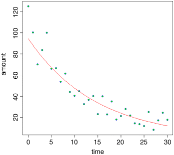
As you can see, our model is a good description of the data for intermediate values of time, but the model is poor at predicting amount for time = 0 and for time > 28. Clearly, more work is required to understand what is going on at the extremes, but exponential decay describes the central part of the data reasonably well.
Polynomial Regression
The relationship between y and x often turns out not to be a straight line. But Occam's razor requires that we fit a linear model unless a non-linear relationship is significantly better at describing the data. So this begs the question: how do we assess the significance of departures from linearity? One of the simplest ways is to use polynomial regression
The idea of polynomial regression is straightforward. As before, we have just one continuous explanatory variable, x, but we can fit higher powers of x, such as x2 and x3, to the model in addition to x to describe curvature in the relationship between y and x. It is useful to experiment with the kinds of graphs that can be generated with very simple models. Even if we restrict ourselves to the inclusion of a quadratic term, x2, there are many curves we can describe, depending upon the signs of the linear and quadratic terms:
par(mfrow=c(2,2))curve(4+2*x-0.1*x^2,0,10,col="red",ylab="y")curve(4+2*x-0.2*x^2,0,10,col="red",ylab="y")curve(12-4*x+0.3*x^2,0,10,col="red",ylab="y")curve(4+0.5*x+0.1*x^2,0,10,col="red",ylab="y")
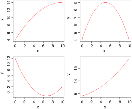
In the top left panel, there is a curve with positive but declining slope, with no hint of a hump (![]() ). At top right we have a curve with a clear maximum (
). At top right we have a curve with a clear maximum (![]() ), and at bottom left a curve with a clear minimum (
), and at bottom left a curve with a clear minimum (![]() ). The bottom right curve shows a positive association between y and x with the slope increasing as x increases (
). The bottom right curve shows a positive association between y and x with the slope increasing as x increases (![]() ). So you can see that a simple quadratic model with just three parameters (an intercept, a slope for x, and a slope for x2) is capable of describing a wide range of functional relationships between y and x. It is very important to understand that the quadratic model describes the relationship between y and x; it does not pretend to explain the mechanistic (or causal) relationship between y and x.
). So you can see that a simple quadratic model with just three parameters (an intercept, a slope for x, and a slope for x2) is capable of describing a wide range of functional relationships between y and x. It is very important to understand that the quadratic model describes the relationship between y and x; it does not pretend to explain the mechanistic (or causal) relationship between y and x.
We can use the decay data as an example of model comparison. How much better than a linear model with two parameters (call it model2) is a quadratic with three parameters (model3)? The function I stands for ‘as is’ and allows you to use arithmetic operators like caret (^ for calculating powers) in a model formula where the same symbol would otherwise mean something different (in a model formula, caret means the order of interaction terms to be fitted).
model2 <- lm(amount~time)model3 <- lm(amount~time+I(time^2))summary(model3)
Coefficients:Estimate Std. Error t value Pr(>|t|)(Intercept) 106.38880 4.65627 22.849 < 2e-16 ***time -7.34485 0.71844 -10.223 5.90e-11 ***I(time^2) 0.15059 0.02314 6.507 4.73e-07 ***
Residual standard error: 9.205 on 28 degrees of freedomMultiple R-squared: 0.908, Adjusted R-squared: 0.9014F-statistic: 138.1 on 2 and 28 DF, p-value: 3.122e-15
You can see that the slope for the quadratic term (0.15059) is highly significant, which indicates important curvature in the data. To see how much better the quadratic model is when compared to the simpler linear model we can use AIC (see p. 232) or anova (see p. 172):
AIC(model2,model3)
df AICmodel2 3 257.0016model3 4 230.4445
The much lower AIC of the quadratic model3 means that it is preferred (see p. 232 for details). Alternatively, if you like p values, then comparison of the two models by anova shows that the curvature is highly significant (p < 0.000001):
anova(model2,model3)
Analysis of Variance Table
Model 1: amount ~ timeModel 2: amount ~ time + I(time^2)Res.Df RSS Df Sum of Sq F Pr(>F)1 29 5960.62 28 2372.6 1 3588.1 42.344 4.727e-07 ***
Non-Linear Regression
Sometimes we have a mechanistic model for the relationship between y and x, and we want to estimate the parameters and standard errors of the parameters of a specific non-linear equation from data. There are a number of frequently-used non-linear models to choose from. What we mean in this case by non-linear is not that the relationship is curved (it was curved in the case of polynomial regressions, but these were linear models), but that the relationship cannot be linearized by transformation of the response variable or the explanatory variable (or both). Here is an example: it shows jaw bone length as a function of age in deer. Theory indicates that the relationship is an ‘asymptotic exponential’ with three parameters:
In R, the main difference between linear models and non-linear models is that we have to tell R the exact nature of the equation as part of the model formula when we use non-linear modelling. In place of lm we write nls (this stands for ‘nonlinear least squares’). Then we write y~a-b*exp(-c*x) to spell out the precise nonlinear model we want R to fit to the data. The slightly tedious thing is that R requires us to specify initial guesses at the values of the parameters a, b and c (note, however, that some common non-linear models have ‘self-starting’ versions in R which bypass this step). Let us plot the data and work out sensible starting values. It always helps in cases like this to evaluate the equation's ‘behaviour at the limits’. That is to say, the values of y when x = 0 and when x = infinity. For x = 0, we have exp(-0) which is 1, and 1 × b = b so y = a − b. For x = infinity, we have exp(-infinity) which is 0, and 0 × b = 0 so y = a. That is to say, the asymptotic value of y is a, and the intercept is a − b. If you need to check your maths, you can do calculations with infinity and zero in R like this:
exp(-Inf)
[1] 0
exp(-0)
[1] 1
Here are the data on bone length as a function of age:
deer <- read.csv("c:\temp\jaws.csv")attach(deer)names(deer)
[1] "age" "bone"
par(mfrow=c(1,1))plot(age,bone,pch=21,bg="lightgrey")
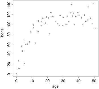
Inspection suggests that a reasonable estimate of the asymptote is a ≈ 120 and intercept ≈ 10, so b = 120 − 10 = 110. Our guess of the value of c is slightly harder. Where the curve is rising most steeply, jaw length is about 40 where age is 5; rearranging the equation gives
Now that we have the three parameter estimates, we can provide them to R as the starting conditions as part of the nls call like this: list(a = 120, b = 110, c = 0.064)
model <- nls(bone~a-b*exp(-c*age),start=list(a=120,b=110,c=0.064))summary(model)
Formula: bone ~ a - b * exp(-c * age)
Parameters:Estimate Std. Error t value Pr(>|t|)a 115.2528 2.9139 39.55 < 2e-16 ***b 118.6875 7.8925 15.04 < 2e-16 ***c 0.1235 0.0171 7.22 2.44e-09 ***Residual standard error: 13.21 on 51 degrees of freedom
Number of iterations to convergence: 5Achieved convergence tolerance: 2.381e-06
All the parameters appear to be significant at p < 0.001. Beware, however. This does not necessarily mean that all the parameters need to be retained in the model. In this case, a = 115.2528 with SE = 2.9139 is clearly not significantly different from b = 118.6875 with SE = 7.8925 (they would need to differ by more than 2 standard errors to be significant). So we should try fitting the simpler two-parameter model
model2 <- nls(bone~a*(1-exp(-c*age)),start=list(a=120,c=0.064))anova(model,model2)
Analysis of Variance Table
Model 1: bone ~ a - b * exp(-c * age)Model 2: bone ~ a * (1 - exp(-c * age))Res.Df Res.Sum Sq Df Sum Sq F value Pr(>F)1 51 8897.32 52 8929.1 -1 -31.843 0.1825 0.671
Model simplification was clearly justified (p = 0.671), so we accept the two-parameter version, model2, as our minimal adequate model. We finish by plotting the curve through the scatterplot. The age variable needs to go from 0 to 50:
av <- seq(0,50,0.1)
and we use predict with model2 to generate the predicted bone lengths:
bv <- predict(model2,list(age=av))
Note the use of list to assign our steps along the x axis (called av) to the variable used for the x axis in model2 (called age).
lines(av,bv,col="blue")
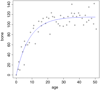
The parameters of this curve are obtained from model2:
summary(model2)
Formula: bone ~ a * (1 - exp(-c * age))
Parameters:Estimate Std. Error t value Pr(>|t|)a 115.58056 2.84365 40.645 < 2e-16 ***c 0.11882 0.01233 9.635 3.69e-13 ***
Residual standard error: 13.1 on 52 degrees of freedom
Number of iterations to convergence: 5Achieved convergence tolerance: 1.356e-06
which we could write like this ![]() or like this y = 115.58(1 − exp(−0.1188 x)) according to taste or journal style. If you want to present the standard errors as well as the parameter estimates, you could write:
or like this y = 115.58(1 − exp(−0.1188 x)) according to taste or journal style. If you want to present the standard errors as well as the parameter estimates, you could write:
The model y = a (1 − exp(−b x)) had a = 115.58 ± 2.84 (1 s.e., n = 54) and b = 0.1188 ± 0.0123 (1 s.e.) and explained 84.9% of the total variation in bone length.
Note that because there are only two parameters in the minimal adequate model, we have called them a and b (rather than a and c as in the original formulation).
You may be puzzled as to how we know that model2 explained 84.9% of the total variation in bone length, because the summary does not give an r-squared figure. We need to do a little more work to find SSY and SSR (see p. 123). The easiest way to find SSY is to fit a null model, estimating only the intercept. In R, the intercept is parameter 1 and is fitted like this: y~1. The sum of squares associated with this model is SSY:
null.model <- lm(bone ~ 1)summary.aov(null.model)
Df Sum Sq Mean Sq F value Pr(>F)Residuals 53 59008 1113
The key figure to extract from this is the total sum of squares SSY = 59 008. The non-linear output (above) did not give us either SSE or SSR but it did print:
Residual standard error: 13.1 on 52 degrees of freedom
This is useful because we can get the residual variance by squaring the residual standard error (13.12 = 171.61) and convert this into the residual sum of squares SSE by multiplying it by the degrees of freedom (52 × 13.12 = 8923.72). Recall that r-squared is SSR/SST expressed as a percentage, and that SSR = SSY − SSE. Thus, the fraction of the variance in bone length explained by our model is
100*(59008-8923.72)/59008
[1] 84.8771
Generalized Additive Models
Sometimes we can see that the relationship between y and x is non-linear but we do not have any theory or any mechanistic model to suggest a particular functional form (mathematical equation) to describe the relationship. In such circumstances, generalized additive models are particularly useful, because they fit non-parametric smoothers to the data without requiring us to specify any particular mathematical model to describe the non-linearity. This will become clear with an example.
library(mgcv)hump <- read.csv("c:\temp\hump.csv")attach(hump)names(hump)
[1] "y" "x"
We start by fitting the generalized additive model as a smoothed function of x, s(x):
model <- gam(y~s(x))
Then we plot the model, and overlay the scatterplot of data points:
plot(model,col="blue")points(x,y-mean(y),pch=21,bg="red")
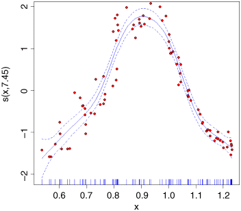
The y axis is labelled s(x,7.45) which is interpreted as saying that the smoothed function of x shown by the solid blue curve (‘the non-parametric smoother’) involves the equivalent of 7.45 degrees of freedom (remember that a straight line would use 2 d.f.: the intercept and the slope). The dotted lines show the confidence interval for the location of the smoothed function of x. On the x axis you see a rug plot, showing where the x points on the graph are located.
The model summary is obtained in the usual way:
summary(model)Family: gaussianLink function: identity
Formula:y ~ s(x)
Parametric coefficients:Estimate Std. Error t value Pr(>|t|)(Intercept) 1.95737 0.03446 56.8 <2e-16 ***
Approximate significance of smooth terms:edf Ref.df F p-values(x) 7.452 8.403 116.9 <2e-16 ***
R-sq.(adj) = 0.919 Deviance explained = 92.6%GCV score = 0.1156 Scale est. = 0.1045 n = 88
This shows that the humped relationship between y and x is highly significant (the p value of the smooth term s(x) is less than 0.0000001). The fitted function explains 91.9% of the variance in y (r2 = 0.919). The intercept (1.95737) is just the mean value of y.
Note that because of the strong hump in the relationship, a linear model lm(y~x) indicates no significant relationship between the two variables (p = 0.346). This is an object lesson in always plotting the data before you come to conclusions from the statistical analysis; in this case, if you had started with a linear model you would have thrown out the baby with the bathwater by concluding that nothing was happening. In fact, something very significant is happening but it is producing a humped, rather than a trended relationship.
Influence
One of the commonest reasons for a lack of fit is through the existence of outliers in the data. It is important to understand, however, that a point may appear to be an outlier because of misspecification of the model, and not because there is anything wrong with the data.
Take this circle of data that shows absolutely no relationship between y and x:
x <- c(2,3,3,3,4)y <- c(2,3,2,1,2)
We want to draw two graphs side by side, and we want them to have the same axis scales:
windows(7,4)par(mfrow=c(1,2))plot(x,y,xlim=c(0,8),ylim=c(0,8))
Obviously, there is no relationship between y and x in the original data. But let's add an outlier at the point (7,6) using concatenation c and see what happens.
x1 <- c(x,7)y1 <- c(y,6)plot(x1,y1,xlim=c(0,8),ylim=c(0,8))abline(lm(y1~x1),col="blue")
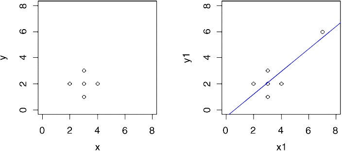
Now, there is a significant regression of y on x. The outlier is said to be highly influential.
Testing for the presence of influential points is an important part of statistical modelling. You cannot rely on analysis of the residuals, because by their very influence, these points force the regression line close to them.
Measures of leverage for a given data point y are proportional to ![]() . The commonest measure of leverage is
. The commonest measure of leverage is
where the denominator is SSX. A good rule of thumb is that a point is highly influential if its
where p is the number of parameters in the model. There is a useful function called influence.measures which highlights influential points in a given model
reg <- lm(y1~x1)influence.measures(reg)
Influence measures oflm(formula = y1 ~ x1) :
dfb.1_ dfb.x1 dffit cov.r cook.d hat inf1 0.687 -0.5287 0.7326 1.529 0.26791 0.3482 0.382 -0.2036 0.5290 1.155 0.13485 0.1963 -0.031 0.0165 -0.0429 2.199 0.00122 0.1964 -0.496 0.2645 -0.6871 0.815 0.19111 0.1965 -0.105 -0.1052 -0.5156 1.066 0.12472 0.1746 -3.023 4.1703 4.6251 4.679 7.62791 0.891 *
You can see point #6 is highlighted by an asterisk, drawing attention to its high influence.
Further Reading
- Cook, R.D. and Weisberg, S. (1982) Residuals and Influence in Regression, Chapman & Hall, New York.
- Hastie, T. and Tibshirani, R. (1990) Generalized Additive Models, Chapman & Hall, London.
- Wetherill, G.B., Duncombe, P., Kenward, M. et al. (1986) Regression Analysis with Applications, Chapman & Hall, London.