8
Analysis of Variance
Analysis of variance or ANOVA is the technique we use when all the explanatory variables are categorical. The explanatory variables are called factors, and each factor has two or more levels. When there is a single factor with three or more levels we use one-way ANOVA. If we had a single factor with just two levels, we would use Student's t test (see p. 97), and this would give us exactly the same answer that we would have obtained by ANOVA (remember the rule that with just two levels then F = t2). Where there are two or more factors, then we use two-way or three-way ANOVA, depending on the number of explanatory variables. When there is replication at each level in a multi-way ANOVA, the experiment is called a factorial design, and this allows us to study interactions between variables, in which we test whether the response to one factor depends on the level of another factor.
One-Way ANOVA
There is a real paradox about analysis of variance, which often stands in the way of a clear understanding of exactly what is going on. The idea of ANOVA is to compare two or more means. But it does this by comparing variances. How can that work?
The best way to see what is happening is to work through a graphical example. To keep things as simple as possible, we shall use a factor with just two levels at this stage, but the argument extends to any number of levels. Suppose that we have atmospheric ozone concentrations measured in parts per hundred million (pphm) in two commercial lettuce-growing gardens (we shall call the gardens A and B for simplicity).
oneway <- read.csv("c:\temp\oneway.csv")attach(oneway)names(oneway)
[1] "ozone" "garden"
As usual, we begin by plotting the data, but here we plot the y values (ozone concentrations) against the order in which they were measured:
plot(1:20,ozone,ylim=c(0,8),ylab="y",xlab="order",pch=21,bg="red")
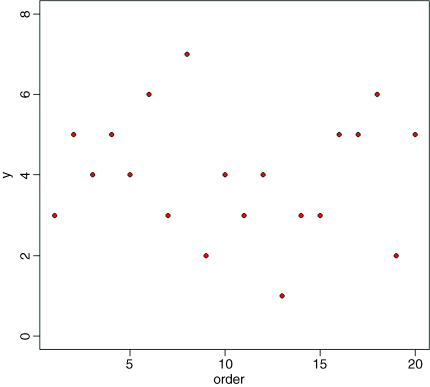
There is lots of scatter, indicating that the variance in y is large. To get a feel for the overall variance, we can plot the mean value of y, and indicate each of the residuals by a vertical line from mean(y) to the value of y, like this:
abline(h=mean(ozone),col="blue")for(i in 1:20) lines(c(i,i),c(mean(ozone),ozone[i]),col="green")
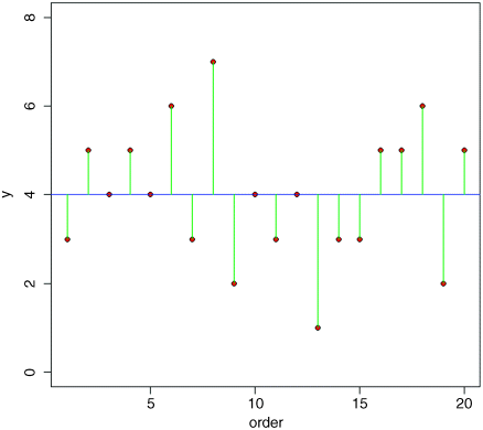
We refer to this overall variation as the total sum of squares, SSY, which is the sum of the squares of the lengths of the green lines. More formally, this is given by:
which should look familiar, because it is the formula used for defining the variance of y (s2 = sum of squares/degrees of freedom; see p. 51).
This next step is the key to understanding how ANOVA works. Instead of fitting the overall mean value of y thorough the data, and looking at the departures of all the data points from the overall mean, let us fit the individual treatment means (the mean for garden A and the mean for garden B in this case), and look at the departures of data points from the appropriate treatment mean. It will be useful if we have different colours for the different gardens; say, black for garden A (col= 1) and red for garden B (col = 2). Note the use of as.numeric to turn the factor levels A and B into the numbers 1 and 2 for the purposes of selecting the colours (bg) for the plotting symbols.
plot(1:20,ozone,ylim=c(0,8),ylab="y",xlab="order",pch=21,bg=as.numeric(garden))abline(h=mean(ozone[garden=="A"]))abline(h=mean(ozone[garden=="B"]),col="red")
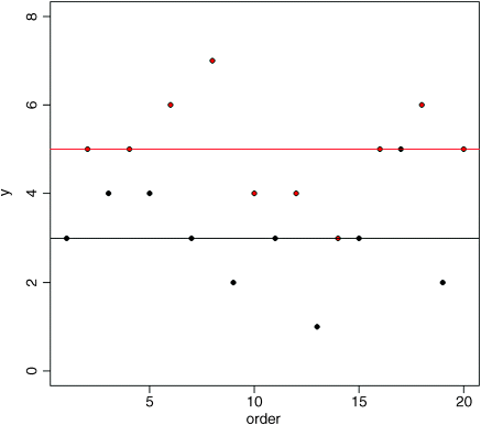
Now it is clear that the mean ozone concentration in garden B (red) is substantially higher than in garden A. The aim of ANOVA is to determine whether it is significantly higher, or whether this kind of difference could come about by chance alone, when the mean ozone concentrations in the two gardens were really the same.
Now we draw the residuals – the differences between the measured ozone concentrations, and the mean for the garden involved:
index <- 1:length(ozone)for (i in 1:length(index)){if (garden[i] == "A")lines(c(index[i],index[i]),c(mean(ozone[garden=="A"]),ozone[i]))elselines(c(index[i],index[i]),c(mean(ozone[garden=="B"]),ozone[i]), col="red")}
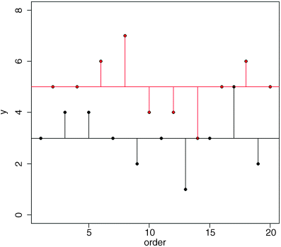
Now here's the quiz. If the means in the two gardens are not significantly different, what should be the difference in the lengths of the red and black residual lines in this figure and the green lines in the first figure we drew? After a bit of thought, you should see that if the means were the same, then the red and black horizontal lines in this figure would be in the same place, and hence the lengths of the residual lines would be the same as in the previous figure.
We are half way there. Now, suppose that mean ozone concentration is different in the two gardens. Would the residual lines be bigger or smaller when we compute them from the individual treatment means (the red and black lines, as above), or from the overall mean (the green lines in the previous figure)? They would be smaller when computed from the individual treatment means if the individual treatment means were different.
So there it is. That is how ANOVA works. When the means are significantly different, then the sum of squares computed from the individual treatment means will be smaller than the sum of squares computed from the overall mean. We judge the significance of the difference between the two sums of squares using analysis of variance.
The analysis is formalized by defining this new sum of squares: it is the sum of the squares of the differences between the individual y values and the relevant treatment mean. We shall call this SSE, the error sum of squares (there has been no error in the sense of a mistake; ‘error’ is used here as a synonym of ‘residual’). It is the sum of the squares of the lengths of the vertical red lines added to the sum of the squares of the lengths of the vertical black lines in the graphic above:
We compute the mean for the jth level of the factor in advance, and then add up the squares of the differences. Given that we worked it out this way, can you see how many degrees of freedom should be associated with SSE? Suppose that there were n replicates in each treatment (n = 10 in our example). And suppose that there are k levels of the factor (k = 2 in our example). If you estimate k parameters from the data before you can work out SSE, then you must have lost k degrees of freedom in the process. Since each of the k levels of the factor has n replicates, there must be k × n numbers in the whole experiment (2 × 10 = 20 in our example). So the degrees of freedom associated with SSE is kn − k = k(n − 1). Another way of seeing this is to say that there are n replicates in each treatment, and hence n − 1 degrees of freedom for error in each treatment (because 1 d.f. is lost in estimating each treatment mean). There are k treatments (i.e. k levels of the factor) and hence there are k(n − 1) d.f. for error in the experiment as a whole.
Now we come to the ‘analysis’ part of the analysis of variance. The total sum of squares in y, SSY, is broken up (analysed) into components. The unexplained part of the variation is called the error sum of squares, SSE. The component of the variation that is explained by differences between the treatment means is called the treatment sum of squares, and is traditionally denoted by SSA. This is because in two-way ANOVA, with two different categorical explanatory variables, we shall use SSB to denote the sum of squares attributable to differences between the means of the second factor. And SSC to denote the sum of squares attributable to differences between the means of the third factor. And so on.
Analysis of variance, therefore, is based on the notion that we break down the total sum of squares, SSY, into useful and informative components.
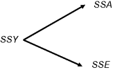
Typically, we compute all but one of the components, then find the value of the last component by subtraction of the others from SSY. We already have a formula for SSE, so we could obtain SSA by difference: ![]() . Starting with SSY, we calculate the sum of the squares of the differences between the y values and the overall mean:
. Starting with SSY, we calculate the sum of the squares of the differences between the y values and the overall mean:
SSY <- sum((ozone-mean(ozone))^2)SSY
[1] 44
The question now is: ‘How much of this 44 is attributable to differences between the means of gardens A and B (SSA = explained variation) and how much is sampling error (SSE = unexplained variation)?’ We have a formula defining SSE; it is the sum of the squares of the residuals calculated separately for each garden, using the appropriate mean value. For garden A, we get
sum((ozone[garden=="A"]-mean(ozone[garden=="A"]))^2)
[1] 12
and for garden B
sum((ozone[garden=="B"]-mean(ozone[garden=="B"]))^2)
[1] 12
so the error sum of squares is the total of these components SSE = 12 + 12 = 24. Finally, we can obtain the treatment sum of squares, SSA, by difference:
At this point, we can fill in the ANOVA table (see p. 128):
| Source | Sum of squares | Degrees of freedom | Mean square | F ratio |
| Garden | 20.0 | 1 | 20.0 | 15.0 |
| Error | 24.0 | 18 | s2 = 1.3333 | |
| Total | 44.0 | 19 |
We need to test whether an F ratio of 15.0 is large or small. To do this we compare it with the critical value of F from quantiles of the F distribution, qf. We have 1 degree of freedom in the numerator, and 18 degrees of freedom in the denominator, and we want to work at 95% certainty (![]() ):
):
qf(0.95,1,18)
[1] 4.413873
The calculated value of the test statistic of 15.0 is much greater than the critical value of F = 4.41, so we can reject the null hypothesis (equality of the means) and accept the alternative hypothesis (the two means are significantly different). We used a one-tailed F test (0.95 rather than 0.975 in the qf function) because we are only interested in the case where the treatment variance is large relative to the error variance. But this approach is rather old-fashioned; the modern view is to calculate the effect size (the difference between the means is 2.0 pphm ozone) and to state the probability that such a difference would arise by chance alone when the null hypothesis was true and the mean ozone concentration was the same in the two gardens. For this we use cumulative probabilities of the F distribution, rather than quantiles, like this:
1-pf(15.0,1,18)
[1] 0.001114539
So the probability of obtaining data as extreme as ours (or more extreme) if the two means really were the same is roughly 0.1%.
That was quite a lot of work. Here is the whole analysis in R in a single line:
summary(aov(ozone~garden))
Df Sum Sq Mean Sq F value Pr(>F)garden 1 20 20.000 15 0.00111 **Residuals 18 24 1.333
The first column shows the sources of variation (SSA and SSE, respectively); note that R leaves off the bottom row that we included for total variation, SSY. The next column shows degrees of freedom: there are two levels of garden (A and B) so there is 2 − 1 = 1 d.f. for garden, and there are 10 replicates per garden, so 10 − 1 = 9 d.f. per garden and two gardens, so error d.f. = 2 × 9 = 18. The next column shows the sums of squares: SSA = 20 and SSE = 24. The fourth column gives the mean squares (sums of squares divided by degrees of freedom); the treatment mean square is 20.0 and the error variance, s2 (synonym of the residual mean square) is 24/18 = 1.3333. The F ratio is 20/1.333 = 15, and the probability that this (or a result more extreme than this) would arise by chance alone if the two means really were the same is 0.001115 (just as we calculated long-hand, above).
We finish by carrying out graphical checks of the assumptions of the model: namely, constancy of variance and normality of errors.
plot(aov(ozone~garden))
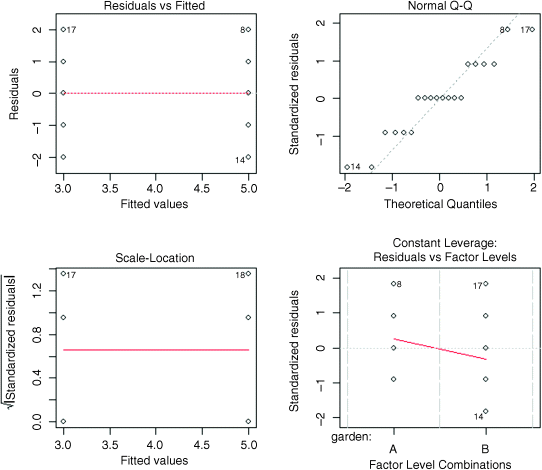
The first plot shows that the variances are identical in the two treatments (this is exactly what we want to see). The second plot shows a reasonably straight line relationship on the normal quantile–quantile plot (especially since, in this example, the y values are whole numbers), so we can be confident that non-normality of errors is not a major problem. The third plot shows the residuals against the fitted values on a different scale (constant variance again), and the fourth plot shows Cook's statistics, drawing attention to the fact that points 8, 17 and 14 have large residuals.
Shortcut Formulas
In the unlikely event that you ever need to do analysis of variance using a calculator, then it is useful to know the short-cut formula for calculating SSA. We calculated it by difference, above, having worked out SSE long-hand. To work out SSA from first principles, the thing you need to understand is what we mean by a ‘treatment total’. The treatment total is simply the sum of the y values within a particular factor level. For our two gardens we have:
cbind(ozone[garden=="A"],ozone[garden=="B"])
[,1] [,2][1,] 3 5[2,] 4 5[3,] 4 6[4,] 3 7[5,] 2 4[6,] 3 4[7,] 1 3[8,] 3 5[9,] 5 6[10,] 2 5
tapply(ozone,garden,sum)
A B30 50
The totals for gardens A and B are 30 and 50 respectively, and we will call these T1 and T2. The shortcut formula for SSA (Box 8.1) is then:
We should confirm that this really does give SSA:
which checks out. In all sorts of analysis of variance, the key point to realize is that the sum of the subtotals squared is always divided by the number of numbers that were added together to get each subtotal. That sounds complicated, but the idea is simple. In our case we squared the subtotals T1 and T2 and added the results together. We divided by 10 because T1 and T2 were each the sum of 10 numbers.
Effect Sizes
So far we have concentrated on hypothesis testing, using summary.aov. It is usually more informative to investigate the effects of the different factor levels, using summary.lm like this:
summary.lm(aov(ozone~garden))
It was easy to interpret this kind of output in the context of a regression, where the rows represent parameters that are intuitive: namely, the intercept and the slope. In the context of analysis of variance, it takes a fair bit of practice before the meaning of this kind of output is transparent.
Coefficients:Estimate Std. Error t value Pr(>|t|)(Intercept) 3.0000 0.3651 8.216 1.67e-07 ***gardenB 2.0000 0.5164 3.873 0.00111 **
Residual standard error: 1.155 on 18 degrees of freedomMultiple R-squared: 0.4545, Adjusted R-squared: 0.4242F-statistic: 15 on 1 and 18 DF, p-value: 0.001115
The rows are labelled (Intercept) and gardenB. But what do the parameter estimates 3.0 and 2.0 actually mean? And why are the standard errors different in the two rows (0.3651 and 0.5164)? After all, the variances in the two gardens were identical.
To understand the answers to these questions, we need to know how the equation for the explanatory variables is structured when the explanatory variable, as here, is categorical. To recap, the linear regression model is written as
lm(y~x)
which R interprets as the two-parameter linear equation
in which the values of the parameters a and b are to be estimated from the data. But what about our analysis of variance? We have one explanatory variable, x = ‘garden’, with two levels, A and B. The aov model is exactly analogous to the regression model
aov(y~x)
But what is the associated equation? Let us look at the equation first, then try to understand it:
This looks just like a multiple regression, with two explanatory variables, x1 and x2. The key point to understand is that x1 and x2 are the levels of the factor called x. If ‘garden’ were a four-level factor, then the equation would have four explanatory variables in it, x1, . . . , x4. With a categorical explanatory variable, the levels are all coded as 0 except for the level associated with the y value in question, which is coded as 1. You will find this hard to understand without a good deal of practice. Let us look at the first row of data in our dataframe:
garden[1]
[1] A
So the first ozone value in the data frame comes from garden A. This means that x1 = 1 and x2 = 0. The equation for the first row therefore looks like this:
What about the second row of the dataframe?
garden[2]
[1] B
Because this row refers to garden B, x1 is coded as 0 and x2 is coded as 1 so the equation for the second row is:
So what does this tell us about the parameters a, b and c? And why do we have three parameters, when the experiment generates only two means ? These are the crucial questions for understanding the summary.lm output from an analysis of variance. The simplest interpretation of the three-parameter case that we have dealt with so far is that the intercept a is the overall mean from the experiment:
mean(ozone)
[1] 4
Then, if a is the overall mean, so a + b must be the mean for garden A and a + c must be the mean for garden B (see the equations above). If that is true, then b must be the difference between the mean of garden A and the overall mean. And c must be the difference between the mean of garden B and the overall mean. Thus, the intercept is a mean, and the other parameters are differences between means. This explains why the standard errors are different in the different rows of the table: the standard error of the intercept is the standard error of a mean
whereas the standard errors on the other rows are standard errors of the difference between two means:
which is a bigger number (bigger by a factor of ![]() if, as here, the sample sizes and variances are equal).
if, as here, the sample sizes and variances are equal).
With three parameters, then, we should have b equal to the mean ozone concentration in garden A minus 4 and c equal to the mean ozone concentration in garden B minus 4.
mean(ozone[garden=="A"])-mean(ozone)
[1] -1
mean(ozone[garden=="B"])-mean(ozone)
[1] 1
That would be a perfectly reasonable way to parameterize the model for this analysis of variance. But it suffers from the fact that there is a redundant parameter. The experiment produces only two means (one for each garden), and so there is no point in having three parameters to represent the output of the experiment. One of the three parameters is said to be ‘aliased’ (see p. 16). There are lots of ways round this dilemma, as explained in detail in Chapter 12 on contrasts. Here we adopt the convention that is used as the default in R using so-called treatment contrasts. Under this convention, we dispense with the overall mean, a. So now we are left with the right number of parameters (b and c). In treatment contrasts, the factor level that comes first in the alphabet is set equal to the intercept. The other parameters are expressed as differences between this mean and the other relevant means. So, in our case, the mean of garden A becomes the intercept
mean(ozone[garden=="A"])
[1] 3
and the difference between the means of garden B and garden A is the second parameter:
mean(ozone[garden=="B"])-mean(ozone[garden=="A"])
[1] 2
Let us revisit our summary.lm table and see if it now makes sense:
Coefficients:
Estimate Std. Error t value Pr(>|t|)(Intercept) 3.0000 0.3651 8.216 1.67e-07 ***gardenB 2.0000 0.5164 3.873 0.00111 **
The intercept is 3.0 which is the mean for garden A (because the factor level A comes before level B in the alphabet). The estimate for garden B is 2.0. This tells us that the mean ozone concentration in garden B is 2 pphm greater than in garden A (greater because there is no minus sign). We would compute the mean for garden B as 3.0 + 2.0 = 5.0. In practice, we would not obtain the means like this, but by using tapply, instead:
tapply(ozone, garden, mean)
A B3 5
There is more about these issues in Chapter 12.
Plots for Interpreting One-Way ANOVA
There are two traditional ways of plotting the results of ANOVA:
- box-and-whisker plots
- barplots with error bars
Here is an example to compare the two approaches. We have an experiment on plant competition where the response variable is biomass and we have one factor with five levels. The factor is called clipping and the levels are control (i.e. unclipped), two intensities of shoot pruning and two intensities of root pruning:
comp <- read.csv("c:\temp\competition.csv")attach(comp)names(comp)
[1] "biomass" "clipping"
This is what the data look like:
plot(clipping,biomass,xlab="Competition treatment",ylab="Biomass",col="lightgrey")
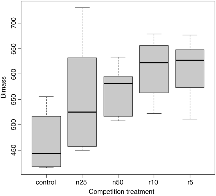
The box-and-whisker plot is good at showing the nature of the variation within each treatment, and also whether there is skew within each treatment (e.g. for the control plots, there is a wider range of values between the median and upper quartile than between the lower quartile and median). No outliers are shown above the whiskers, so the tops and bottoms of the bars are the maxima and minima within each treatment. The medians for the competition treatments are all higher than the upper quartile of the controls, suggesting that they may be significantly different from the controls, but there is little to suggest that any of the competition treatments are significantly different from one another (see below for the analysis).
Barplots with error bars are the style preferred by many journal editors, and some people think that they make hypothesis testing easier. We shall see. Unlike S-PLUS, R does not have a built-in function called error.bar so we shall have to write our own. First, the barplot on its own. We need to calculate the heights of the bars to represent the mean biomass from each of the five treatments, and the simplest way to do this is to use tapply:
heights <- tapply(biomass,clipping,mean)
Now draw the barplot, making sure that the y axis is long enough to accommodate the tops of the error bars that we intend to add later:
barplot(heights,col="green",ylim=c(0,700),ylab="mean biomass",xlab="competition treatment")
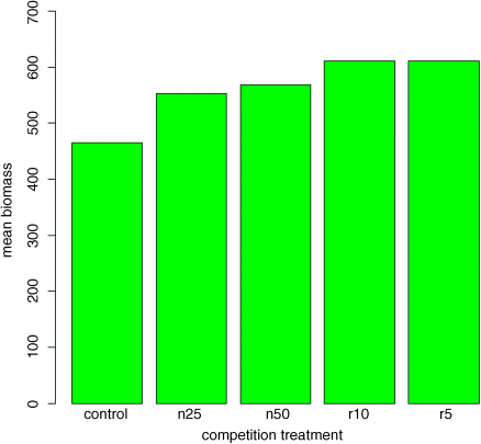
This is fine as far as it goes, but it gives us no impression of the uncertainty associated with the estimated heights of the bars.
Here is a very simple function without any bells or whistles. We shall call it error.bars to distinguish it from the much more general S-PLUS function. We shall pass two arguments to the function; the heights of the bars y and the lengths of the error bars, z like this:
error.bars <- function(y,z) {x <- barplot(y,plot=F)n <- length(y)for (i in 1:n)arrows(x[i],y[i]-z,x[i],y[i]+z,code=3,angle=90,length=0.15)}
The second line works out the x coordinates of the centres of the bars without redrawing the barplot (plot = FALSE). The next line works out how many error bars are to be drawn (n <- length(y), which is 5 in this example). The trick here is to modify the arrows function to draw the errors bars with heads at right angles (angle=90) and heads at both ends of the arrow (code=3). The default head length looks a bit clunky, so we reduce the width of the head to 0.15 inches. We use a for loop to draw the n error bars separately.
To use this function we need to decide what kind of values (z) to use for the lengths of the bars. Let us use one standard error of the mean based on the pooled error variance from the ANOVA, then return to a discussion of the pros and cons of different kinds of error bars later. Here is the one-way ANOVA:
model <- aov(biomass~clipping)summary(model)
Df Sum Sq Mean Sq F value Pr(>F)clipping 4 85356 21339 4.3015 0.008752 **Residuals 25 124020 4961
From the ANOVA table we can see that the pooled error variance s2 = 4961. Now we need to know how many numbers were used in the calculation of each of the five means:
table(clipping)
clippingcontrol n25 n50 r10 r56 6 6 6 6
There was equal replication (which makes life easier), and each mean was based on six replicates, so the standard error of the mean is ![]() . We shall draw an error bar up 28.75 from each mean and down by the same distance, so we need five values, one for each bar, each of 28.75:
. We shall draw an error bar up 28.75 from each mean and down by the same distance, so we need five values, one for each bar, each of 28.75:
se <- rep(28.75,5)
Now we can use the new function to add the error bars to the plot:
error.bars(heights,se)
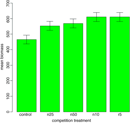
We do not get the same feel for the distribution of the values within each treatment as was obtained by the box-and-whisker plot, but we can certainly see clearly which means are not significantly different. If, as here, we use ± 1 standard error as the length of the error bars, then when the bars overlap this implies that the two means are not significantly different. Remember the rule of thumb for t: significance requires 2 or more standard errors, and if the bars overlap it means that the difference between the means is less than 2 standard errors. This shows clearly that none of the means for the clipped plants (n25, n50, r10 or r5) is significantly different from any other (the top of the bar for n25 overlaps the bottom of the bar for r10).
There is another issue, too. For comparing means, we should be using the standard error of the difference between two means (not the standard error of one mean) in our tests (see p. 91); these bars would be about 1.4 times as long as the bars we have drawn here. So while we can be sure that the pruning treatments are not significantly different from one another, we cannot conclude from this plot that the controls have significantly lower biomass than the rest (because the error bars are not the correct length for testing differences between means).
An alternative graphical method is to use 95% confidence intervals for the lengths of the bars, rather than standard errors of means. This is easy to do: we multiply our standard errors by Student's t, qt(.975,5) = 2.570582, to get the lengths of the confidence intervals:
ci <- se*qt(.975,5)barplot(heights,col="green",ylim=c(0,700),ylab="mean biomass",xlab="competition treatment")error.bars(heights,ci)

Now, all of the error bars overlap, implying visually that there are no significant differences between the means. But we know that this is not true from our analysis of variance, in which we rejected the null hypothesis that all the means were the same at p = 0.00875. If it were the case that the bars did not overlap when we are using confidence intervals (as here), then that would imply that the means differed by more than 4 standard errors, and this is much greater than the difference required for significance. So this is not perfect either. With standard errors we could be sure that the means were not significantly different when the bars did overlap. And with confidence intervals we can be sure that the means are significantly different when the bars do not overlap. But the alternative cases are not clear-cut for either type of bar. Can we somehow get the best of both worlds, so that the means are significantly different when the bars do not overlap, and the means are not significantly different when the bars do overlap?
The answer is yes, we can, if we use LSD bars (LSD stands for ‘least significant difference’). Let us revisit the formula for Student's t test:
We say that the difference is significant when t > 2 (by the rule of thumb, or t > qt(0.975,df) if we want to be more precise). We can rearrange this formula to find the smallest difference that we would regard as being significant. We can call this the least significant difference:
- LSD = qt(0.975,df) × standard error of a difference

In our present example this is
qt(0.975,10)*sqrt(2*4961/6)
[1] 90.60794
because a difference is based on 12 – 2 = 10 degrees of freedom. What we are saying is that the two means would be significantly different if they differed by 90.61 or more. How can we show this graphically? We want overlapping bars to indicate a difference less than 90.61, and non-overlapping bars to represent a difference greater than 90.61. With a bit of thought you will realize that we need to draw bars that are LSD/2 in length, up and down from each mean. Let us try it with our current example:
lsd <- qt(0.975,10)*sqrt(2*4961/6)lsdbars <- rep(lsd,5)/2
barplot(heights,col="green",ylim=c(0,700),ylab="mean biomass",xlab="competition treatment")error.bars(heights,lsdbars)
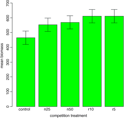
Now we can interpret the significant differences visually. The control biomass is significantly lower than any of the four treatments, but none of the four treatments is significantly different from any other. The statistical analysis of this contrast is explained in detail in Chapter 12. Sadly, most journal editors insist on error bars of 1 standard error. It is true that there are complicating issues to do with LSD bars (not least the vexed question of multiple comparisons; see p. 17), but at least LSD/2 bars do what was intended by the error plot (i.e. overlapping bars means non-significance and non-overlapping bars means significance). Neither standard errors nor confidence intervals can say that. A better option might be to use box-and-whisker plots with the notch=T option to indicate significance (see p. 93).
Factorial Experiments
A factorial experiment has two or more factors, each with two or more levels, plus replication for each combination of factor levels. This means that we can investigate statistical interactions, in which the response to one factor depends on the level of another factor. Our example comes from a farm-scale trial of animal diets. There are two factors: diet and supplement. Diet is a factor with three levels: barley, oats and wheat. Supplement is a factor with four levels: agrimore, control, supergain and supersupp. The response variable is weight gain after 6 weeks.
weights <- read.csv("c:\temp\growth.csv")attach(weights)
Data inspection is carried out using barplot (note the use of beside=T to get the bars in adjacent clusters rather than vertical stacks; we shall add the error bars later):
barplot(tapply(gain,list(diet,supplement),mean),beside=T)
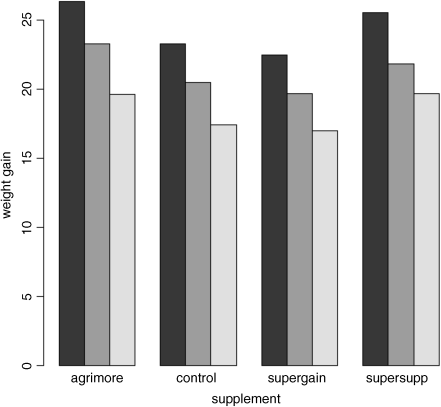
Note that the second factor in the list (supplement) appears as groups of bars from left to right in alphabetical order by factor level, from ‘agrimore’ to ‘supersupp’. The first factor (diet) appears as three levels within each group of bars: dark = barley, mid = oats, light = wheat, again in alphabetical order by factor level. We should really add a legend to explain the levels of diet. We use levels to extract the names of the diets to use as labels in the key:
labels <- levels(diet)
We have used colours so far, but it is easy to use gray scales in R. The continuum goes from 0 = black to 1 = white, so we could use 0.2, 0.6 and 0.9 here:
shade <- c(0.2,0.6,0.9)
The tricky bit is locating the key on the plot so that it does not overlap any of the bars. You need to understand that R locates the legend on the plot using the coordinates of the top left-hand corner of the box that surrounds the key. So you need to find some space below and to the right of a suitable point. Then move the cursor to this point and click. R will draw the legend at that point.
barplot(tapply(gain,list(diet,supplement),mean),beside=T,ylab="weight gain",xlab="supplement",ylim=c(0,30))
legend(locator(1),labels,gray(shade))
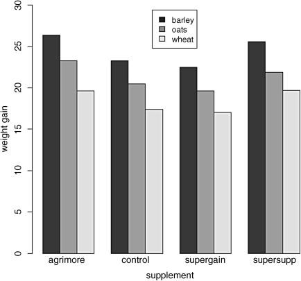
There are clearly substantial differences between the three diets, but the effects of supplement are less obvious. We inspect the mean values using tapply as usual:
tapply(gain,list(diet,supplement),mean)
agrimore control supergain supersuppbarley 26.34848 23.29665 22.46612 25.57530oats 23.29838 20.49366 19.66300 21.86023wheat 19.63907 17.40552 17.01243 19.66834
Now we use aov or lm to fit a factorial ANOVA (the choice affects only whether we get an ANOVA table or a list of parameters estimates as the default output from summary). We estimate parameters for the main effects of each level of diet and each level of supplement, plus terms for the interaction between diet and supplement. Interaction degrees of freedom are the product of the degrees of freedom of the component terms (i.e. (3 − 1) × (4 − 1) = 6). The model is
gain ~ diet + supplement + diet:supplement
but this can be simplified using the asterisk notation like this:
model <- aov(gain~diet*supplement)summary(model)
Df Sum Sq Mean Sq F value Pr(>F)diet 2 287.17 143.59 83.52 3.00e-14 ***supplement 3 91.88 30.63 17.82 2.95e-07 ***diet:supplement 6 3.41 0.57 0.33 0.917Residuals 36 61.89 1.72
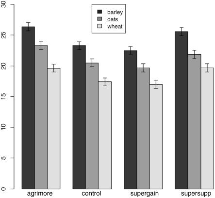
The ANOVA table shows that there is no hint of any interaction between the two explanatory variables (p = 0.9166); evidently the effects of diet and supplement are additive but both are highly significant. Now that we know that the error variance s2 = 1.72 we can add the error bars to the plot. For bars showing standard errors, we need to know the replication for each combination of factor levels:
tapply(gain,list(diet,supplement),length)
agrimore control supergain supersuppbarley 4 4 4 4oats 4 4 4 4wheat 4 4 4 4
so the appropriate standard error is ![]() . The error.bars function that we wrote earlier will not work for grouped bars, so we need to modify the code like this:
. The error.bars function that we wrote earlier will not work for grouped bars, so we need to modify the code like this:
x <- as.vector(barplot(tapply(gain,list(diet,supplement),mean),beside=T,ylim=c(0,30)))y <- as.vector(tapply(gain,list(diet,supplement),mean))z <- rep(0.656,length(x))for( i in 1:length(x))arrows(x[i],y[i]-z[i],x[i],y[i]+z[i],length=0.05,code=3,angle=90)
As usual, we need to make room on the y axis for the top of the highest error bars. Note the use of as.vector to convert the tabular output of tapply into a form suitable for plotting. Don't forget to add the legend:
legend(locator(1),labels,gray(shade))
The disadvantage of the ANOVA table is that it does not show us the effect sizes, and does not allow us to work out how many levels of each of the two factors are significantly different. As a preliminary to model simplification, summary.lm is often more useful than summary.aov:
summary.lm(model)
Coefficients:
Estimate Std. Error t value Pr(>|t|)(Intercept) 26.3485 0.6556 40.191 < 2e-16 ***dietoats -3.0501 0.9271 -3.290 0.002248 **dietwheat -6.7094 0.9271 -7.237 1.61e-08 ***supplementcontrol -3.0518 0.9271 -3.292 0.002237 **supplementsupergain -3.8824 0.9271 -4.187 0.000174 ***supplementsupersupp -0.7732 0.9271 -0.834 0.409816dietoats:supplementcontrol 0.2471 1.3112 0.188 0.851571dietwheat:supplementcontrol 0.8183 1.3112 0.624 0.536512dietoats:supplementsupergain 0.2470 1.3112 0.188 0.851652dietwheat:supplementsupergain 1.2557 1.3112 0.958 0.344601dietoats:supplementsupersupp -0.6650 1.3112 -0.507 0.615135dietwheat:supplementsupersupp 0.8024 1.3112 0.612 0.544381
Residual standard error: 1.311 on 36 degrees of freedomMultiple R-squared: 0.8607, Adjusted R-squared: 0.8182F-statistic: 20.22 on 11 and 36 DF, p-value: 3.295e-12
This is a rather complex model, because there are 12 estimated parameters (the number of rows in the table): 6 main effects and 6 interactions. The output re-emphasizes that none of the interaction terms is significant, but it suggests that the minimal adequate model will require five parameters: an intercept, a difference due to oats, a difference due to wheat, a difference due to control and difference due to supergain (these are the five rows with significance stars). This draws attention to the main shortcoming of using treatment contrasts as the default. If you look carefully at the table, you will see that the effect sizes of two of the supplements, control and supergain, are not significantly different from one another. You need lots of practice at doing t tests in your head, to be able to do this quickly. Ignoring the signs (because the signs are negative for both of them) we have 3.05 versus 3.88, a difference of 0.83. But look at the associated standard errors (both 0.927); the difference is only about 1 standard error of the difference between two means. For significance, we would need roughly 2 standard errors (remember the rule of thumb, in which ![]() is significant; see p. 83). The rows get starred in the significance column because treatment contrasts compare all the main effects in the rows with the intercept (where each factor is set to its first level in the alphabet, namely agrimore and barley in this case). When, as here, several factor levels are different from the intercept, but not different from one another, they all get significance stars. This means that you cannot count up the number of rows with stars in order to determine the number of significantly different factor levels.
is significant; see p. 83). The rows get starred in the significance column because treatment contrasts compare all the main effects in the rows with the intercept (where each factor is set to its first level in the alphabet, namely agrimore and barley in this case). When, as here, several factor levels are different from the intercept, but not different from one another, they all get significance stars. This means that you cannot count up the number of rows with stars in order to determine the number of significantly different factor levels.
We begin model simplification by leaving out the interaction terms:
model <- lm(gain~diet+supplement)summary(model)
Coefficients:
Estimate Std. Error t value Pr(>|t|)(Intercept) 26.1230 0.4408 59.258 < 2e-16 ***dietoats -3.0928 0.4408 -7.016 1.38e-08 ***dietwheat -5.9903 0.4408 -13.589 < 2e-16 ***supplementcontrol -2.6967 0.5090 -5.298 4.03e-06 ***supplementsupergain -3.3815 0.5090 -6.643 4.72e-08 ***supplementsupersupp 0.7274 0.5090 -1.429 0.16
Residual standard error: 1.247 on 42 degrees of freedomMultiple R-squared: 0.8531, Adjusted R-squared: 0.8356F-statistic: 48.76 on 5 and 42 DF, p-value: < 2.2e-16
It is clear that we need to retain all three levels of diet because oats differ from wheat by 5.99 − 3.10 = 2.89 with a standard error of 0.44 (![]() ). It is not clear that we need all four levels of supplement, however. Supersupp is not obviously different from the agrimore (−0.727 with standard error 0.509). Nor is supergain obviously different from the unsupplemented control animals (3.38 − 2.70 = 0.68). We shall try a new two-level factor to replace the four-level supplement, and see if this significantly reduces the model's explanatory power. Agrimore and supersupp are recoded as ‘best’ and control and supergain as ‘worst’:
). It is not clear that we need all four levels of supplement, however. Supersupp is not obviously different from the agrimore (−0.727 with standard error 0.509). Nor is supergain obviously different from the unsupplemented control animals (3.38 − 2.70 = 0.68). We shall try a new two-level factor to replace the four-level supplement, and see if this significantly reduces the model's explanatory power. Agrimore and supersupp are recoded as ‘best’ and control and supergain as ‘worst’:
supp2 <- factor(supplement)levels(supp2)
[1] "agrimore" "control" "supergain" "supersupp"
levels(supp2)[c(1,4)] <- "best"levels(supp2)[c(2,3)] <- "worst"levels(supp2)
[1] "best" "worst"
Now we fit the simpler model, then compare the two models:
model2 <- lm(gain~diet+supp2)anova(model,model2)
Analysis of Variance TableModel 1: gain ~ diet + supplementModel 2: gain ~ diet + supp2Res.Df RSS Df Sum of Sq F Pr(>F)1 42 65.2962 44 71.284 -2 -5.9876 1.9257 0.1584
The simpler model2 has saved 2 degrees of freedom and is not significantly worse than the more complex model (p = 0.158). This is the minimal adequate model: now all of the parameters are significantly different from zero and from one another:
summary(model2)
Coefficients:Estimate Std. Error t value Pr(>|t|)(Intercept) 25.7593 0.3674 70.106 < 2e-16 ***dietoats -3.0928 0.4500 -6.873 1.76e-08 ***dietwheat -5.9903 0.4500 -13.311 < 2e-16 ***supp2worst -2.6754 0.3674 -7.281 4.43e-09 ***
Residual standard error: 1.273 on 44 degrees of freedomMultiple R-squared: 0.8396, Adjusted R-squared: 0.8286F-statistic: 76.76 on 3 and 44 DF, p-value: < 2.2e-16
Model simplification has reduced our initial 12-parameter model to a much more tractable four-parameter model that is far easier to communicate to readers. If maximum weight gain is your objective, then a diet of barley and a supplement of either agrimore or supersupp is indicated. Note that the recommendations of the model might be different if profit were the response variable rather than weight gain because we have not taken the costs into account.
Pseudoreplication: Nested Designs and Split Plots
The model-fitting functions aov, lme and lmer have the facility to deal with complicated error structures. Detailed analysis of these topics is beyond the scope of this book (see The R Book (Crawley, 2013) for worked examples), but it is important that you can recognize them, and hence avoid the pitfalls of pseudoreplication. There are two general cases:
- nested sampling, as when repeated measurements are taken from the same individual, or observational studies are conducted at several different spatial scales (most or all of the factors are random effects)
- split-plot analysis, as when designed experiments are carried out with different treatments applied to plots of different sizes (most of the factors are fixed effects)
Split-Plot Experiments
In a split-plot experiment, different treatments are applied to plots of different sizes. Each different plot size is associated with its own error variance, so instead of having one error variance (as in all the ANOVA tables up to this point), we have as many error terms as there are different plot sizes. The analysis is presented as a series of component ANOVA tables, one for each plot size, in a hierarchy from the largest plot size with the lowest replication at the top, down to the smallest plot size with the greatest replication at the bottom.
The example refers to a designed field experiment on crop yield with three treatments: irrigation (with two levels, irrigated and not), sowing density (with three levels, low, medium and high), and fertilizer application (with three levels, low, medium and high):
yields <- read.csv("c:\temp\splityield.csv")attach(yields)names(yields)
[1] "yield" "block" "irrigation" "density" "fertilizer"
The largest plots were the four whole fields (block), each of which was split in half, and irrigation was allocated at random to one half of the field. Each irrigation plot was split into three, and one of three different seed-sowing densities (low, medium or high) was allocated at random (independently for each level of irrigation and each block). Finally, each density plot was divided into three and one of three fertilizer nutrient treatments (N, P, or N and P together) was allocated at random. The model formula is specified as a factorial, using the asterisk notation. The error structure is defined in the Error() term, with the plot sizes listed from left to right, from largest to smallest, with each variable separated by the slash operator/. Note that the smallest plot size, fertilizer, does not need to appear in the Error() term:
model <- aov(yield~irrigation*density*fertilizer+Error(block/irrigation/density))summary(model)
Error: blockDf Sum Sq Mean Sq F value Pr(>F)Residuals 3 194.4 64.81
Error: block:irrigationDf Sum Sq Mean Sq F value Pr(>F)irrigation 1 8278 8278 17.59 0.0247 *Residuals 3 1412 471
Error: block:irrigation:densityDf Sum Sq Mean Sq F value Pr(>F)density 2 1758 879.2 3.784 0.0532 .irrigation:density 2 2747 1373.5 5.912 0.0163 *Residuals 12 2788 232.3
Error: WithinDf Sum Sq Mean Sq F value Pr(>F)fertilizer 2 1977.4 988.7 11.449 0.000142 ***irrigation:fertilizer 2 953.4 476.7 5.520 0.008108 **density:fertilizer 4 304.9 76.2 0.883 0.484053irrigation:density:fertilizer 4 234.7 58.7 0.680 0.610667
Residuals 36 3108.8 86.4
Here you see the four ANOVA tables, one for each plot size: blocks are the biggest plots, half blocks get the irrigation treatment, one third of each half block gets a sowing density treatment, and one third of a sowing density treatment gets each fertilizer treatment. Each plot size has a different error variance. Note that the non-significant main effect for density (p = 0.053) does not mean that density is unimportant, because density appears in a significant interaction with irrigation (the density terms cancel out when averaged over the two irrigation treatments; see below). The best way to understand the two significant interaction terms is to plot them using interaction.plot like this:
interaction.plot(fertilizer,irrigation,yield)
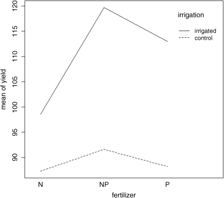
Irrigation increases yield proportionately more on the P-fertilized plots than on the N-fertilized plots. The irrigation:density interaction is more complicated:
interaction.plot(density,irrigation,yield)
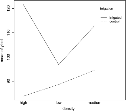
On the irrigated plots, yield is minimal on the low-density plots, but on control plots yield is minimal on the high-density plots.
Random Effects and Nested Designs
Mixed effects models are so called because the explanatory variables are a mixture of fixed effects and random effects:
- fixed effects influence only the mean of y
- random effects influence only the variance of y
A random effect should be thought of as coming from a population of effects: the existence of this population is an extra assumption. We speak of prediction of random effects, rather than estimation: we estimate fixed effects from data, but we intend to make predictions about the population from which our random effects were sampled. Fixed effects are unknown constants to be estimated from the data. Random effects govern the variance–covariance structure of the response variable. The fixed effects are often experimental treatments that were applied under our direction, and the random effects are either categorical or continuous variables that are distinguished by the fact that we are typically not interested in the parameter values, but only in the variance they explain.
One or more of the explanatory variables represents grouping in time or in space. Random effects that come from the same group will be correlated, and this contravenes one of the fundamental assumptions of standard statistical models: independence of errors. Mixed effects models take care of this non-independence of errors by modelling the covariance structure introduced by the grouping of the data. A major benefit of random effects models is that they economize on the number of degrees of freedom used up by the factor levels. Instead of estimating a mean for every single factor level, the random effects model estimates the distribution of the means (usually as the standard deviation of the differences of the factor-level means around an overall mean). Mixed effects models are particularly useful in cases where there is temporal pseudoreplication (repeated measurements) and/or spatial pseudoreplication (e.g. nested designs or split-plot experiments). These models can allow for:
- spatial autocorrelation between neighbours
- temporal autocorrelation across repeated measures on the same individuals
- differences in the mean response between blocks in a field experiment
- differences between subjects in a medical trial involving repeated measures
The point is that we really do not want to waste precious degrees of freedom in estimating parameters for each of the separate levels of the categorical random effects. On the other hand, we do want to make use of the all measurements we have taken, but because of the pseudoreplication we want to take account of both the:
- correlation structure, used to model within-group correlation associated with temporal and spatial dependencies, using correlation
- variance function, used to model non-constant variance in the within-group errors using weights
Fixed or Random Effects?
It is difficult without lots of experience to know when to use categorical explanatory variables as fixed effects and when as random effects. Some guidelines are:
- Am I interested in the effect sizes? Yes means fixed effects
- Is it reasonable to suppose that the factor levels come from a population of levels? Yes means random effects
- Are there enough levels of the factor in the data on which to base an estimate of the variance of the population of effects? No means fixed effects
- Are the factor levels informative? Yes means fixed effects
- Are the factor levels just numeric labels? Yes means random effects
- Am I mostly interested in making inferences about the distribution of effects, based on the random sample of effects represented in the dataframe? Yes means random effects.
- Is there hierarchical structure? Yes means you need to ask whether the data are experimental or observations
- Is it a hierarchical experiment, where the factor levels are experimental manipulations? Yes means fixed effects in a split-plot design (see p. 173)
- Is it a hierarchical observational study? Yes means random effects, perhaps in a variance components analysis (see p. 183)
- When your model contains both fixed and random effects, use mixed effects models
- If your model structure is linear, use linear mixed effects, lmer
- Otherwise, specify the model equation and use non-linear mixed effects, nlme
Removing the Pseudoreplication
The extreme response to pseudoreplication in a data set is simply to eliminate it. Spatial pseudoreplication can be averaged away and temporal pseudoreplication can be dealt with by carrying out carrying out separate ANOVAs, one for each time period. This approach has two major weaknesses:
- it cannot address questions about treatment effects that relate to the longitudinal development of the mean response profiles (e.g. differences in growth rates between successive times)
- inferences made with each of the separate analyses are not independent, and it is not always clear how they should be combined
Analysis of Longitudinal Data
The key feature of longitudinal data is that the same individuals are measured repeatedly through time. This would represent temporal pseudoreplication if the data were used uncritically in regression or ANOVA. The set of observations on one individual subject will tend to be positively correlated, and this correlation needs to be taken into account in carrying out the analysis. The alternative is a cross-sectional study, with all the data gathered at a single point in time, in which each individual contributes a single data point. The advantage of longitudinal studies is that they are capable of separating age effects from cohort effects; these are inextricably confounded in cross-sectional studies. This is particularly important when differences between years mean that cohorts originating at different times experience different conditions, so that individuals of the same age in different cohorts would be expected to differ. There are two extreme cases in longitudinal studies:
- a few measurements on a large number of individuals
- a large number of measurements on a few individuals
In the first case it is difficult to fit an accurate model for change within individuals, but treatment effects are likely to be tested effectively. In the second case, it is possible to get an accurate model of the way individuals change though time, but there is less power for testing the significance of treatment effects, especially if variation from individual to individual is large. In the first case, less attention will be paid to estimating the correlation structure, while in the second case the covariance model will be the principal focus of attention. The aims are:
- to estimate the average time course of a process
- to characterize the degree of heterogeneity from individual to individual in the rate of the process
- identify the factors associated with both of these, including possible cohort effects
The response is not the individual measurement, but the sequence of measurements on an individual subject. This enables us to distinguish between age effects and year effects (see Diggle, Liang and Zeger, 1994, for details).
Derived Variable Analysis
The idea here is to get rid of the pseudoreplication by reducing the repeated measures into a set of summary statistics (slopes, intercepts or means), and then analyse these summary statistics using standard parametric techniques such as ANOVA or regression. The technique is weak when the values of the explanatory variables change through time. Derived variable analysis makes most sense when it is based on the parameters of scientifically interpretable non-linear models from each time sequence. However, the best model from a theoretical perspective may not be the best model from the statistical point of view.
There are three qualitatively different sources of random variation:
- random effects: experimental units differ (e.g. genotype, history, size, physiological condition) so that there are intrinsically high responders and other low responders
- serial correlation: there may be time-varying stochastic variation within a unit (e.g. market forces, physiology, ecological succession, immunity) so that correlation depends on the time separation of pairs of measurements on the same individual, with correlation weakening with the passage of time
- measurement error: the assay technique may introduce an element of correlation (e.g. shared bioassay of closely spaced samples; different assay of later specimens)
Dealing with Pseudoreplication
For random effects we are often more interested in the question of how much of the variation in the response variable can be attributed to a given factor than we are in estimating means or assessing the significance of differences between means. This procedure is called variance components analysis.
rats <- read.csv("c:\temp\rats.csv")attach(rats)names(rats)
[1] "Glycogen" "Treatment" "Rat" "Liver"
This classic example of pseudoreplication comes from Snedecor and Cochran (1980). Three experimental treatments were administered to rats, and the glycogen contents of the rats' livers were analysed as the response variable. This was the set-up: there were two rats per treatment, so the total sample was n = 3 × 2 = 6. The tricky bit was this: after each rat was killed, its liver was cut up into three pieces: a left-hand bit, a central bit and a right-hand bit. So now there are six rats each producing three bits of liver, for a total of 6 × 3 = 18 numbers. Finally, two separate preparations were made from each macerated bit of liver, to assess the measurement error associated with the analytical machinery. At this point there are 2 × 18 = 36 numbers in the dataframe as a whole. The factor levels are numbers, so we need to declare the explanatory variables to be categorical before we begin:
Treatment <- factor(Treatment)Rat <- factor(Rat)Liver <- factor(Liver)
Here is the analysis done the wrong way:
model <- aov(Glycogen~Treatment)summary(model)
Df Sum Sq Mean Sq F value Pr(>F)Treatment 2 1558 778.8 14.5 3.03e-05 ***Residuals 33 1773 53.7
Treatment has a highly significant effect on liver glycogen content (p = 0.00003). Wrong! We have committed a classic error of pseudoreplication. Look at the error line in the ANOVA table: it says the residuals have 33 degrees of freedom. But there were only six rats in the whole experiment, so the error degrees of freedom must be ![]() (not 33)!
(not 33)!
Here is the analysis of variance done properly, averaging away the pseudoreplication. First reduce the dataframe from 36 numbers to just six numbers: one mean value per rat:
yv <- tapply(Glycogen,list(Treatment,Rat),mean)yv
1 21 132.5000 148.50002 149.6667 152.33333 134.3333 136.0000
Turn this object into a vector to act as our new response variable:
( yv <- as.vector(yv))
[1] 132.5000 149.6667 134.3333 148.5000 152.3333 136.0000
From the tapply output you can see that the data appear columnwise. The columns (1 and 2) are the replicate rats, and the rows (1, 2 and 3) are the treatments (control, supplement and supplement plus sugar). We need to produce a new factor of length 6 to contain the treatment in the correct order, 1, 2, 3 then 1, 2, 3 (make sure you understand this):
treatment <- factor(c(1,2,3,1,2,3))
Now we can fit the non-pseudoreplicated model:
model <- aov(yv~treatment)summary(model)
Df Sum Sq Mean Sq F value Pr(>F)treatment 2 259.6 129.80 2.929 0.197Residuals 3 132.9 44.31
As you can see, the error degrees of freedom are correct (d.f. = 3, not 33), and the interpretation is completely different: there are no significant differences in liver glycogen under the three experimental treatments (p = 0.197).
There are two different ways of doing the analysis properly in R: ANOVA with multiple error terms (aov) or linear mixed effects models (lmer). The problem is that the bits of the same liver are pseudoreplicates because they are spatially correlated (they come from the same rat); they are not independent, as required if they are to be true replicates. Likewise, the two preparations from each liver bit are very highly correlated (the livers were macerated before the preparations were taken, so they are essentially the same sample, and certainly not independent replicates of the experimental treatments).
Here is the correct analysis using aov with multiple error terms. In the error term we start with the largest scale (treatment), then rats within treatments, then liver bits within rats within treatments. Finally, there were replicated measurements (two preparations) made for each bit of liver (see Box 8.2):
model2 <- aov(Glycogen~Treatment+Error(Treatment/Rat/Liver))summary(model2)
Error: TreatmentDf Sum Sq Mean SqTreatment 2 1558 778.8
Error: Treatment:RatDf Sum Sq Mean Sq F value Pr(>F)Residuals 3 797.7 265.9
Error: Treatment:Rat:LiverDf Sum Sq Mean Sq F value Pr(>F)Residuals 12 594 49.5
Error: Within
Df Sum Sq Mean Sq F value Pr(>F)Residuals 18 381 21.17
You can do the correct, non-pseudoreplicated analysis of variance from this output. The F test involves the treatment variance (778.8) divided by the error variance at the spatial scale immediately below (i.e. rats within treatments 265.9). This means that the test statistic F = 778.8/265.9 = 2.928921 is not significant (compare with the wrong analysis on p. 180). Note that the current version of R does not print the F values or p values. The critical value of F would need to be
qf(0.95,2,3)
[1] 9.552094
Variance Components Analysis (VCA)
To turn this nested ANOVA table into a variance components analysis we need to do a little work. The thing to understand is that each row of the table includes the variability from the level below plus the new variability introduced at that level. So at the bottom, the variance of 21.17 represents measurement error (differences between readings produced by similar samples put through the same machine). The next level up reflects heterogeneity within individual rats' livers (e.g. if the middle of the liver was different in glycogen content than the left- or right-hand ends of the liver; physiological differences, if you like). The next level up reflects differences between rats; these will include gender effects, genetic effects, nutritional effects and such like (although we would hope that these had been controlled in the experimental design).
We are interested in discovering the variance entering the system at each level in the hierarchy. To find this out we begin by calculating the difference in variance between adjacent levels:
- Level 2 versus level 1: 49.5 − 21.17 = 28.33 reflecting liver bit difference
- Level 3 versus level 2: 265.9 − 49.5 = 216.4 reflecting rat differences
We stop at this point, because the next level up is a fixed effect (treatment) not a random effect (like rat, or liver bit within rat).
The next step is to divide these differences by the number of pseudoreplicates in the lower of the two levels (2 preparations per liver bit; 6 preparations per rat, 2 from each of 3 liver bits). So now we have:
- Residuals = preparations within liver bits: unchanged = 21.17
- Liver bits within rats within treatments: (49.5 − 21.17)/2 = 14.165
- Rats within treatments: (265.89 − 49.5)/6 = 36.065
These numbers are the variance components. You can see straight away that most variation enters this experiment as a result of differences between individual rats in their mean liver glycogen contents (36.065). Least variation is introduced by cutting each liver into three pieces (14.165).
The results of a variance components analysis are traditionally expressed as percentages. We add the three components together to do this:
vc <- c(21.17,14.165,36.065)100*vc/sum(vc)
[1] 29.64986 19.83894 50.51120
That's all there is to it. An analysis like this can be very useful in planning future experiments. Since more than 50% of the variance is attributable to differences between the rats, then increasing the number of rats will have the biggest positive effects on the power of the next experiment (you might also consider controlling the rats more carefully by using the same age and same gender of the same genotype, for instance). There is no real point in splitting up each liver: it makes for three times the work and explains less than 20% of the variance.
References
- Crawley, M.J. (2013) The R Book, 2nd edn, John Wiley & Sons, Chichester.
- Diggle, P.J., Liang, K.-Y. and Zeger, S.L. (1994) Analysis of Longitudinal Data, Clarendon Press, Oxford.
- Snedecor, G.W. and Cochran, W.G. (1980) Statistical Methods, Ames, Iowa State University Press.
Further Reading
- Pinheiro, J.C. and Bates, D.M. (2000) Mixed-Effects Models in S and S-PLUS, Springer-Verlag, New York.
