
Chapter 4
Content Creation 101
You have a vision in your head of how you want a certain projection to look and now you need to create it. Sometimes you know exactly how to do so. Other times you may need to watch tutorials and teach yourself a new method. Don’t despair—we all are constantly learning new techniques, new software, and new creation methods. It’s part of the profession. Each time you learn a new way to reproduce a historical photo or a new method to sculpt a 3D model you add to your quiver of creative arrows. By the end of a few designs you will be amazed at the new skills you’ve gained (and the new gray hairs you’ve gained as well).
Making great content can be an arduous and painstaking task. Quite simply, the perfect content isn’t just sitting out there waiting for you to download it. You need to make beautiful and appropriate art while ensuring you aren’t overtaxing your resources and missing deadlines. The proper research and a strong conceptual design provide a foundation and your cue list is your guide.
What is this content we are creating? As we’ve discussed previously, it can be anything from rerecorded live action video to 2D or 3D animation to sensor-driven, data-driven, real-time or algorithmic visuals to live video to user-generated texts to audience-manipulated avatars. As a designer, you must have broad knowledge of many types of possible content, across many mediums. This does not come without study and practice.
Our audiences have become expert multitaskers with the ability to work across multiple software packages on their desktops while rapidly flipping between many phone apps. Even though their attention may be split between tasks, it is still focused on a screen, which is framing all of the content they see. Everything within these screens are their sole focus. This is also true of viewing movies at the cineplex or at home via our favorite streaming service. In the theatre, while the content might still be framed within a screen or dwells within some other type of architecture, it also exists within the built environment of the set and lives alongside the onstage performers.
Content unfolds in relation to a real time performance and needs to complement, trade focus with, and not compete with the live action onstage. Audiences instinctively gravitate to looking at large projections and screens instead of the live action onstage if it is too frenetic in a calm moment, or not composed to maintain the audiences’ focus on the live action. Pay careful attention to the scale and motion of the content in order to keep the focus on an integrated stage picture at any given time.
One of the more difficult aspects of content creation is the fact that our audience is savvy at deciding what is a good and bad image. Modern audiences are easily dismissive of visuals that don’t pass their critique or don’t seem to fit the context. If the content lives outside the world of the onstage action, either because of style, technical considerations, or display choice, the audience might experience cognitive dissonance, causing them to wrestle in their minds with two different worlds: the world of the play and the world of the content. Choices you make in designing the content for the show, as simple as adding a color filter to a video clip, have an enormous impact on the way it is perceived. Make sure the images match the style of the production, fitting into the genres, periods, and visual language of the world the director and other artists have created.
Though the main focus of content creation is about creativity and design, there are many technical aspects involved in creating content. Learning to manipulate software interfaces, transcoding video files, working with cameras, and so forth are just some of the many technical aspects to content creation that you need to consider and that are explored in this chapter.
2D and 3D Content in a 3D World
In order to fully understand how our content is perceived it is vital to understand how video, a 2D type of content, is viewed and fits into the three-dimensional world of the theatrical architecture. The design elements of scale,line,visual flow, and forced perspective are highly relevant to how the dimensionality of a composition is perceived and manipulated.
The first thing to consider is the creation of 2D content. Descriptive geometry, which is a method to represent three-dimensional objects in two dimensions, reminds us that orthographic view (projection) is a type ofparallel projection where imagined lines are located perpendicular to a projection plane. To create forced perspective, the imaginary lines are not parallel to the projection plane and lead to a vanishing point. This allows us to perceive dimension, depth, and scale.
Unless you are working with stereographic 3D content where the audience wears 3D glasses, the content that the audiences sees, no matter if it is 2D or 3D, is displayed in 2D on an actual 3D object (projection screen, LED panel, performer, set piece, etc.). The same rule of geometry for the creation of the 2D content comes into play in the display of the content. This is further complicated by the audience’s viewing angle to the screen, which is determined by where they are located in physical space. This in turn is complicated one more time due to the actual 3D forms of actors, set pieces, and so forth, and where they are located in space in relation to the screen and the audience’s viewing angle.
That’s really hard to understand. Let’s try an experiment. Pretend your kitchen is a theatre. The kitchen table is the stage. Put a box of cereal on the stage (the table). The cereal box represents a screen. Even though it is kind of flat, it has some depth or dimension. It is a 3D object. The images on the cereal box are the content. They are in 2D, on a 3D object. Put the cereal box three feet away from the edge of the table. Place a pepper mill, your new leading lady, directly centered in front of the cereal box, about twelve inches away from it. Now place a chair directly across the table, perfectly in line with the cereal box and the pepper mill. Sit in the chair.
You are now sitting in what we call in the theatre the king’s seat. Congratulations. This is the best seat in the house. Everything looks great and perfectly aligned from here.
Now close your left eye. Then switch and close your right eye. Did you see how the salt shaker changed perceived location in relationship to the content on the cereal box? That is the off-axis viewing angle of every seat in the house that is not directly in line with center stage. This is how real-world viewing of your content in relationship to real-world objects and performers is perceived differently by members of the audiences sitting in different seats in the house. This variability in how 2D content is perceived is vital to understand and consider when your content needs to relate in a very particular manner to actual 3D objects and performers within the theatrical architecture.
Creating Content in Relation to the Theatrical Set and for Surfaces other than Projection Screens
We’ve covered this previously in Chapters 2 and 3, but it is worth repeating here. It is extremely important to know what surfaces the content will be displayed on and how they fit into the overall set and stage picture as early as possible. Ideally you will know these answers before you begin making content. The more you know about the final display and staging when creating content, the better the content will integrate into the

Figure 4.1Subtle differences between parallel projection and forced perspective rendered from the same angle in a Sketchup model of The Survivor’s Way (Arizona State University Mainstage, 2012)
Source: Alex Oliszewski

Figure 4.2Examples of king seat and off-center sight lines taken during construction of Forbidden Zones: The Great War , a devised new work, conceived, and directed by Lesley Ferris, codirected by Jeanine Thompson, with the MFA actors and designers. Set design by Cassandra Lentz. (The Ohio State University Mainstage, 2017)
Source: Alex Oliszewski
final stage picture. Here is a summary of key things to keep in mind:
- Is a projection or emissive screen better for the world of the play?
- Will the edges of the projection be blurred to make it look like the video is emerging from the architecture? Or will you create some sort of mask on the edges to blend it into the set? If so, be sure to keep important elements of the video away from the edges of the frame.
- Know the aspect ratio of the surface, such as 4:3, 16:9, or 16:10. This greatly influences the compositions you create. How does the aspect ratio of the video fit within the entire composition of the stage set?
- How will the performers interact with the content? What is their relationship to each other?
Here is a summary of key things to know about surfaces that affect content:
- Is content projected or displayed via emissive displays?
- The reflective quality of the surface you project onto. The more reflective the surface, the more light that hits it bounces back. There is a delicate balance between not enough and too much. Traditional projection screens are treated and have particular screen gain, which affects the reflective quality. How reflective a surface is affects colors, contrast, and perceived brightness. The more reflective the surface, the narrower the viewing angle for the audience becomes.
- The color of the surface being projected onto. This affects colors, contrast, and perceived brightness of the projection. If you are projecting onto a black scrim or black wall, you need to know that before you begin creating content, as you want to anticipate how the surface absorbs black and dark colors in the content.
- The porousness of the surface being projected onto. The more porous the material, the more light travels through.
- Textures on projection surfaces. This creates an uneven surface that can break up and distort projected images.

How much Content do you Need and how Long does it Take to Create?
A good place to start in figuring out how long your content needs to be is to use the general rule that one script page takes about one minute of stage time. So, if you have ten pages of script that you want to have moving images for, the content needs to be roughly ten minutes. But that is not always the case. Sometimes it may be quicker or slower, depending on the density of text and amount of stage action.
Saying that you will support the entire monologue on pages seven to eight is one thing; actually filling the amount of time the performer is going to take performing that text is another. It may be only two pages of text, but let’s say that the way it is played onstage takes ten minutes. Will that ten minutes of content be a single still image or moving images? If it is a moving image for the ten-minute sequence that is only two pages of the script, then you are responsible for 18,000 frames (30 frames per second × 60 seconds in a minute × 10 minutes). This can explode very quickly. If you have a total of thirty minutes of moving images, that number triples to 54,000 frames. That is a lot of video.
The cue list and conversations with the director are the best way to determine how much content you actually need. Regardless of the type of content you are creating it is time-consuming. Given the typical short window of time to create content for a theatrical production, you should know exactly what you are responsible for and about how long it will take to create the finished design. Reliably knowing the difference between a two-to-four-hour solution and a three-to-four-week solution can make or break you, allowing you to rule out certain types of content creation solely based on the time it will take to create.
Still images take less time to create than moving images, but there is still a good deal of time that can be spent on a single image. The amount of time varies depending on if you take the photograph yourself, are altering stock footage, or are creating a still image in some other format. You should plan on spending at least one to three hours per still image used in a production.
For video and animation, you can expect to spend anywhere between five and twenty hours in active production and postproduction for each minute of final video that you end up placing on the stage (this does not apply to twenty-second looping videos). It is an industry standard that one minute of video equals, on average, about three hours of editing time. This is for straightforward video without a lot of effects. If the video has a lot of effects or heavy animation, the editing time could be longer. The remaining time spent is on set, recording the video or creating the animation. The more complicated the video shoot or the animation, the longer it takes to make.

If you plan on using live video of actors or are setting up a live camera rig to project something else that is happening in real time onstage, you should plan on at least two to six hours of time to set up all the equipment and write live camera cues in the media server. If you are creating precise composited images with the live video feed and other assets or applying a lot of real-time video effects, the time spent to create the look may be longer.
When creating abstract generative content, it usually takes one to five hours for one minute of stage time. Like creating an animation using many key frames, the more parameters and/or key frames you use with generative content, the longer it takes to create.
Organization of Assets
Per cue you create there may be different assets that you use. For instance, you may have an animation cue of a sky, in which the sun slowly moves, the clouds move, and a bird flies through. In this case the sun, sky, clouds, and the bird are independent assets that you create (or source) and that will all be part of the final cue. You might create all the assets in Adobe Illustrator and then import them into Adobe After Effects or the media server to animate.
Keeping track of all these assets and project files is vitally important, especially when working on shows where you have a lot of cues. If you download an image from the Internet with a filename of “1243Hg45567gf9. jpeg,” this will not be helpful to you later when you are flipping through the images on your hard drive, trying to locate it. So, make sure to name your files something meaningful, like what the image is, so at a glance you can easily find the thing you are seeking. Give it a name of what it actually is, like “gray_and_white_cat2.jpeg.”
We also recommend keeping yourself organized by using folders based on specific cues. Sub-folders are your friend to keep a logical organization structure of assets. This is especially true when there are multiple members of the team who may need to use the same assets.
Backing up your Data
We cannot stress enough how important it is to back up all your files when working on a show. Hard drives fail. Data gets corrupted. If you don’t want to lose hours of work that you may not have the time to replicate, make sure to back up all your files. We recommend using cloud-based storage in addition to physical hard drives. Additional bonuses to cloud-based storage are:
- Other members of the design team can all access the files, which keeps everything in one place and organized.
- Some cloud storage services allow you to go back in time to rescue a previous version of a file. This can be helpful if you made a lot of changes to something that you no longer like or if a file becomes corrupt Do not rely on cloud services as your only back up.
The Basics of Design
This section provides an introduction to core design principles that are vital to designers. We don’t have room here to go in-depth in any one area. Set some time aside to visit the local arts library and/or to search online resources for detailed analysis about the basics of design. Having a firm foundation in the basic principles of design provides a strong starting point for content creation.
Style
Styles arise from a deliberate combination of visual elements and principles or rules of image making used in a work or individual composition. It can also refer to specific recognized types of design, which can be used as templates for predictable results. Skeuomorphism, flat, minimalist, Victorian, mid-century modern, classical, and contemporary are examples of established styles. Style can be broken down into component parts, such as line, shape, composition, color, contrast, negative space, texture, rendering techniques, and pattern, among many possible others.
In theatrical design a show’s style is directly guided and emerges from the storytelling needs of a performance. Theatre designers collaborate with others and in turn need to be able to match their work to various styles and situations. Simply choosing to include projections in a show helps to define the overall style. Regardless of how those projections are incorporated, as an extension of the environment or separated out on a screen, a designer should always know why and how his or her projections affect the style of the show.
Some projection design tasks, such as the use of supertitles, have predictable styles. Supertitles demand to be legible and usually should not upstage the primary action taking place on the stage. Because of this, they are typically made of white text projected on a dark background just outside of the stage’s framing. This way they can be both large enough to be legible and within the peripheral vision of the audience.
Line

Figure 4.5 Example of the mid-century modern style and architecture of the Stahl House, designed by Pierre Koenig
Source: Ovs
Discretely visible or implied, lines refer to a mark or band of defined space. Lines can be straight, curved, textured, jagged, smooth, or any number of different variations. Straight lines feel unlike curved lines and delicate lines convey something different than bold lines. Lines can be defined in the negative space between different elements just as they can be deliberately placed objects. Line type and orientation help define spatial, emotional, and physical qualities of an environment. Vertical lines can be used for defining height and help in defining architectural or man-made buildings. Slightly curving horizontal lines evoke nature, balance, and organic forms. Diagonal lines convey movement and can be stimulating or even overwhelming when repeated or patterned. Flowing lines that meander about can be used to draw the eye along a path or help frame other elements in an image.
Theatre projections tend to be as large if not larger than the performers onstage and in turn tend to help define the qualities of environment. Lines can readily be used to define horizons and any variety of skyline. When working with a scenic designer, note how he or she is using lines both in the shapes and surfaces the projections and displays will be on and near.
In projection design, 3D effects are often achieved through the use of forced perspective and 3D animation techniques that use combinations of lines and shapes to create an illusion of depth and dimension. By combining horizontal, vertical, and diagonal lines set to specific vanishing points, you can create illusions of depth and expand the perceived volume of the content in the shared theatrical space.
![]() For More Info 4.1 Vanishing Points
For More Info 4.1 Vanishing Points
Refer to “2D and 3D Content in a 3D World” in Chapter 4.

Figure 4.6 Example of different line types. Digital media designs by Alex Oliszewski. Upper and lower left images from The House of the Spirits by Caridad Svich. Lighting design by Anthony Jannuzzi. Scene design by Brunella Provvidente. Costume design by Anastasia Schneider. Arizona State University Mainstage, 2012. Upper right image from Forbidden Zones: The Great War . Set design by Cassandra Lentz. Lighting design by Kelsey Gallagher. Costume design by Julianne Nogar. The Ohio State University Mainstage, 2017. Lower right image from Big Love by Charles Mee. Directed by Kim Weild. Set design by Jeannie Bierne. Lighting design by Troy Buckey. Costume design by Maci Hosler. (Arizona State University Mainstage, 2010)
Source: Alex Oliszewski
Shape
Shapes are made from enclosing an area with lines or otherwise defining it with color, texture, or contrast values. Shapes can be geometric, abstract, organic, evocative of a silhouette, stylized, or nonrepresentational.
One of the most common shapes found in conjunction with projections is that of a rectangular screen. Learning how to mask and feather the edges of the projections is key to creating projections that fade into their environments. Being able to frame video or even obfuscate the edges of the rectangular projection area with feathered edges or shapes that merge into an environment’s line and form helps the projections seem more integrated with the shapes of the surfaces you’re projecting on.
Composition
Arrangements of shapes, lines, and forms are described as compositions. An object’s relationship to another object creates meaning. A set of design principles has been developed that interprets and codifies these meanings into component parts that can be defined and used with predictable results. Some of the principles of compositional design are often listed as balance, unity, variety, pattern, repetition, scale and proportion, rhythm, emphasis, balance, space, and eye path.
When discussing composition there are a number of terms that come up quite often. These include contrast, alignment, proximity, and repetition. How objects are aligned with one another, above and below, beside and away, indicates the objects’ relationship to one another within a composition.
Rule of Thirds
The rule of thirds is a method for creating compositions. It involves mentally or literally overlaying lines that divide an image into a grid of three equal rows and columns and gives preference to placing emphasis on intersecting lines. This offsets the subject and is usually more visually

Figure 4.7 Example of shape types. A Brief Anniversary of Time by Lance Gharavi. Digital media design by Daniel Fine. Lighting/costume/set design by Anastacia Schneider. (Arizona State University, Marston Theatre, 2012)
Source: Matthew Ragan

Figure 4.8 Example of composition from The House of the Spirits by Caridad Svich. Digital media design by Alex Oliszewski. Lighting design by Anthony Jannuzzi. Scene design by Brunella Provvidente. (Arizona State University Mainstage, 2012)
Source: Alex Oliszewski

Figure 4.9 Example of rule of thirds between staging and projections from Good Kids by Naomi Iizuka. Digital media design by Alex Oliszewski. Lighting design by Josh Poston. Set design by Brad Steinmetz. Costume design by Travis Bihn. (The Ohio State University, 2015)
Source: Alex Oliszewski

Figure 4.10 Example of negative space from A Brief Anniversary of Time by Lance Gharavi. Digital media design by Daniel Fine. Lighting/costume/set design by Anastacia Schneider. (Arizona State University, Marston Theatre, 2012)
Source: Matthew Ragan
pleasing than images that place emphasis directly in the center of the image.
The rule of thirds translates nicely into digital media design but must be considered in three dimensions. When designing for the theatre there is a wide range of sight lines to consider that affects how an audience sees your compositions in relation to the set. On a thrust stage, you may find that elements of your design end up being in different thirds depending on where in the house you sit.
Negative Space
Negative space is a term that refers to empty space between and surrounding shapes and areas of detail or texture. This empty space can itself have a form and offer interesting or even hidden meanings.
Negative space is particularly useful when you want projections to blend into an environment. Projecting a bright white rectangular border around a projection reveals the edges and artificial nature of the images and their method of display. Conversely, the projections seem to emerge from the environment if you surround them with projector/video black or otherwise blend them into the existing light and ambient projection surfaces.
Unity
Unity in a design is achieved when each component element and subject of a composition are visually and aesthetically related to one another. Balance, alignment, repetition, color, juxtaposition, and so forth can be used to achieve unity in a composition. Unified compositions include only those visual elements that are needed to fulfill the goals of a design.
Onstage, digital media sometimes sacrifices unity of image complexity and detail. When you find yourself needing to work toward a more unified design with other design areas, we recommend you simplify and look for ways of balancing visual elements among all design areas.

Figure 4.11 Example of unity between the projection, lighting, the set, and the staging from Forbidden Zones: The Great War . Digital media design by Alex Oliszewski. Set design by Cassandra Lentz. Lighting design by Kelsey Gallagher. Costume design by Julianne Nogar. (The Ohio State University Mainstage, 2017)
Source: Alex Oliszewski

Figure 4.12 Example of variety from a workshop of Beneath: A Journey Within by Lance Gharavi. Digital media design by Daniel Fine. Costume and set design by Brunella Provvidente. Lighting design by Michael Bateman. (Arizona State University, Marston Theatre, 2016)
Source: Daniel Fine
Variety
Variety is to make something different. Variety works with unity to help create visual interest. Without variety, an image can become visually uninteresting. Seek a balance between unity and variety. Design elements need to be alike enough so they seem to belong together as part of a cohesive whole, yet varied enough to be visually interesting. Some ways to create visual variety within a unified design is to change the size, shape, color, texture, value, line, and so forth of individual elements.
Balance
Balance describes the visual weight, distribution, and proportion that elements such as textures, objects, colors, and empty space have in relation to one another. Many small objects can be grouped and arranged to balance one or two larger objects. Balance can be made to be symmetrical or follow any number of composition principles, such as the rule of thirds. Balance can be centered symmetrically, asymmetrically, and radially.
Onstage, performers and oftentimes set pieces constantly move. This shifting of onstage elements changes the balance of the projections unto itself and in relation to the physical world of the set and actors.
Color
Color is extremely important in design. Certain colors are often associated with specific emotions, times of day, and even specific storytelling contexts. Reds, yellows, and oranges are warm colors associated with fires, mornings, spring, and high-energy situations. Cool colors, such as green, blue, and purple, evoke plants, water, nighttime, and winter and are calmer and more constrained.
![]() For More Info 4.2
For More Info 4.2
Refer to “The Basics of Digital Content: CMYK and RGB Color, Bit Depth, and Alpha Channels” in Chapter 4.

Figure 4.13 Example of symmetrical, asymmetrical, and radial balance. Top left: Good Kids by Naomi Iizuka. Digital media design by Alex Oliszewski. Lighting design by Josh Poston. Set design by Brad Steinmetz. Costume design by Travis Bihn. (The Ohio State University, 2015) Top right: Workshop of Beneath: A Journey Within by Lance Gharavi. Digital media design by Daniel Fine. Costume and set design by Brunella Provvidente. Lighting design by Michael Bateman. (Arizona State University, Marston Theatre, 2016) Bottom: The Survivor’s Way by Alex Oliszewski. Digital media design by Alex Oliszewski and Daniel Fine. Light design by Adam Vachon. (Arizona State University, 2012)
Source: Alex Oliszewski
Any color on surfaces you are projecting onto changes the perceptions of the colors you are using. For instance, you may find it difficult, if not impossible, to project vibrant red outlines on a dark green surface. Create real-world tests using the actual projectors and sample surfaces provided by the scenic designer whenever possible.
Texture
Texture is an actual or implied tactile quality to a surface. It can be real and emerge from physical qualities of a surface, such as the layering of paint or the weaving of textiles, or it can be mimicked through the application of patterned highlights and shadows to create the impression of texture. Textures are visible because they cause patterns of shadow and light that the eye interprets as a tactile quality to a surface. Any number of textures can be digitally added to content to give the impression that the image is on a textured surface.
The texture of a surface changes how it takes and reflects a projection. Just as matte and glossy surfaces scatter light that strikes them differently, so do different textured surfaces. Test any textured surfaces you intend to project on early in the design process to ensure that they reflect the content appropriately.
Emphasis
Emphasis creates focus in a composed image. It draws your attention to a certain element. Areas of emphasis might be defined by a juxtaposed color, convergence of lines, or an area of contrast that draws the focus of the eye.
Contrast
In design, contrast refers to how elements are noticeably different than one another. The juxtaposing of different design elements against one another is key to establishing meanings between them. A large heading followed by small text and a bright white spot in a sea of dark blue are examples of high-contrast images. Contrast is used to grab attention and direct the eye to specific information. Objects that are contrasted become the focus and help eliminate visual details that are less important.

Figure 4.14 Example of texture from Soot & Spit by Charles Mee. Directed by Kim Weild. Digital media design by Boyd Branch. Lighting design by Adam Vachon. Set design by Brunella Provvidente. Costume design by Haley Peterson. (Arizona State University Mainstage, 2014)
Source: Boyd Branch

Scale and Proportion
Scale refers to the size of a visual element in relationship to another. Through intentional sizing of visual elements in a composition, scale can be used to manipulate the implied size of an object. In film, scale is used by juxtaposing close-up and wide-angle shots of a subject to create moments of intimacy or distance between the subject and the audience.
Proportion is the relative size of all the various parts that make up an object in relationship to the whole. If you draw a human body and desire all the parts to be in correct proportion and you draw a foot that is bigger than the torso, then the proportion would be wrong.
In theatrical projection and digital media design, compositions must be considered in relation to the human scale of performers. The scale of projections in relation to the performers defines the flexibility of the compositions you are able to make. This is one element of compositions that remains a constant concern when working in live performance. Additionally, the scale of the projections needs to fit within the architecture of the set and the venue.
When using live or prerecorded video to magnify an actor, small details of a performance are made visible. Scale can also be manipulated to juxtapose the size of the human body onstage. Performers can be embodied through digital media and rescaled so that they become larger than or smaller than life. This allows for digital avatars to perform at extreme scales from their onstage human form, the environment, and the audience.
Repetition and Pattern
Repetition describes the reuse of shapes, lines, colors, arrangements, ratios, and so forth of any single element or group of visual elements in a composition. Repetitions are perceived as patterns when their elements seem to loop back into one another. Patterns are regular, consistently repeating elements of a design.
The use of repetition is a powerful tool when working toward a unified design between different mediums and especially in creating meaning and context between images and real-world objects onstage.

Figure 4.16 Example of scale: projections in relation to actors from Everybody’s Talkin’: The Music of Harry Nilsson by Steve Gunderson and Javier Velasco. Digital media design by Daniel Fine. Set design by Sean Fanning. Lighting design by Philippe Bergman. Costume design by Gregg Barnes. (San Diego Rep, 2015)
Source: Daniel Fine

Figure 4.17 Example of repetition and pattern from Everybody’s Talkin’: The Music of Harry Nilsson by Steve Gunderson and Javier Velasco. Digital media design by Daniel Fine. Set design by Sean Fanning. Lighting design by Philippe Bergman. Costume design by Gregg Barnes. (San Diego Rep, 2015)
Source: Daniel Fine
Typography
A large portion of graphic design deals with the art and technical specifications of arranging text. All of the elements of design discussed earlier should be considered when rendering words. The art form focuses on ensuring the legibility and easy comprehension of text. The terms leading, kerning, tracking, hierarchy, justification, pica, serif, along with many others, all come from typography and its established techniques for formatting and manipulating text.
The use of rendered text is common in theatre and often prioritizes practical needs over qualities of abstraction or artistic details. The most common uses of text in theatre productions are to place time and location as films often do and for supertitles.
![]() For More Info 4.3 Supertitles
For More Info 4.3 Supertitles
See “Style” in Chapter 4.
The Basics of Digital Content
The following section provides an introduction to the core concepts of digital content. That is to say, what lies just above the surface of the ones and zeros. This information is the foundation to understanding how to create, manipulate, and display digital content. This is not meant to go in-depth in any one area, but rather to give you an overview to understand how the technical aspects of the digital realm affect content. It is vital to have a working knowledge and competency in these basics of digital matters in order to be successful as a digital media designer.
Bits and Bytes
A bit is the smallest unit of information in computing and digital video and has two values. These values are typically 1 and 0, but can be any two values that correspond to each other, such as on/off.
A byte is a group of binary bits that function as a unit and are counted in number groupings that double: 2, 4, 8, 16, 32, 64, and so forth.

Figure 4.18 Example of typography from Count of Monte Cristo by Frank Wildhorn and Jack Murphy. Digital media design by Daniel Fine. Set design by Rory Scanlon. Lighting design by Michael Kraczek. Costume design by La Beene. (Brigham Young University Mainstage, 2015)
Source: Daniel Fine
Bits and bytes are important to understand because they are the building blocks of computational information, especially in terms of rendering visual media.
Pixels, Rasters, and Resolution
The smallest visual element of a digital image is called a pixel. In digital media pixels are made up of bits. There are two primary pieces of information used to create a pixel: chrominance (color) value and luma (intensity) value. If you take all the chroma out of an image you are left with a black and white image. Remove the luma and you have only black.
Images formed on monitors or in the light of video projectors are made up of groupings of individual pixels. Digital files, digital display devices, and digital image capturing devices rely on the concept of pixels arranged in a grid and are commonly referred to as a raster.
The number of pixels you have in a raster is defined in terms of resolution. The more pixels there are in a raster the greater the resolution. An image’s resolution is represented and determined by two values that correspond to the number of pixels in a grid:
- The number of pixels along a row in the width (x) of an image
- The number of pixels along a column in the height (y) of an image
To calculate the number of pixels in an image you would times (×) the number of pixels wide by the number of pixels high. For instance, one of the most common resolutions currently used in commercial video equipment is 1920 × 1080. This means that the video image is 1920 pixels wide and 1080 pixels high. Think of 1920 × 1080 as a shorthand way of expressing the total number of pixels (resolution) per image as determined by the equation 1920(w) × 1080(h) = 2,073,600 total pixels in each image frame of video.
Beware that there are many different ways of describing the resolution of an image. Still camera companies use the term megapixel to describe one million pixels, meaning that the foregoing example resolution would be a 2-megapixel image. Projection and emissive display companies use terms such as HD, 4k, and others that imply a resolution but are imprecise. Whenever possible it is preferred to describe resolution in exact width and height.
![]() Tip 4.1 Tricks for Making the Resolution You Have Look the Best
Tip 4.1 Tricks for Making the Resolution You Have Look the Best
- Problem: Individual pixels are large, visible, and distracting.
- Solution: Try moving the projector ever so slightly out of focus. This can help bleed the edges of the pixels together and actually look better from a distance than a perfectly in-focus projection.
- Problem: The media server is having difficulty maintaining smooth playback of content when you start compositing multiple high-resolution media files.
- Solution 1: After you have locked down the exact placement and timing of the content, return to the content creation software and render the composited video down to a single piece of high-resolution media.
- Solution 2: If the media server allows, try turning down the resolution throughput of some of the content to anywhere between 15 percent and 33 percent. Depending on how close the audience is sitting to the display screen or projected content you can get substantial performance gains with little or no perceived loss in quality. This option is great if you have limited time for re-rendering or if you are trying to improve quality on the fly during a rehearsal.
Note: Always check with the manual and forums for the media server you are using to ensure you have encoded the content in the recommended codec(s).
Pixels Are Data
Pixels are recorded/stored/displayed as data. There is a wide range of file formats that are available for storing digital image data. The standard in digital photography and video is a raster-based storage method using pixels.
If an image is black and white (with no shades of gray) only one number is needed to correspond with each pixel in an image. White would be represented by a 1 and black by a 0.

Figure 4.19 Chart of different resolutions and aspect ratios
Source: Alex Oliszewski, adapted from Shutter Stock figure 162928304
![]() For More Info 4.4 Color and Alpha
For More Info 4.4 Color and Alpha
See “CMYK and RGB Color, Bit Depth, and Alpha Channels” in Chapter 4.
To represent the 16 million or so colors that can be displayed on modern digital displays requires more complicated code with greater combinations of numbers. Using 1920 × 1080 resolution, there is a total of 2,073,600 total pixels. If each of those pixels requires only the red, green, and blue color data, then for all the pixels there are 6,220,800 (2,073,600*3) bits of data that need to be rendered in the raster of a single image. Begin animating a 1920 × 1080 raster at the rate of 30 frames a second and you are up to 186,624,000 (6,220,800×30) pixels’ worth of data to be processed per second.
The encoding method you use affects how large the final video file ends up being. To help give a sense of what this means in terms of file size, consider the foregoing example of a 1920x1080 video rendered with Apple ProRes codec at 4:2:2, with no compression, which ends up being approximately 18.9 MB per second. Add intensity levels, layer information, alpha levels, and so forth and the data size of the bytes within pixels increases even more.
While greater resolution correlates with greater detail in an overall image it also means more information. This translates to larger files. While 4K and 8K video are wonderful, the amount of data involved makes these high resolutions more technically demanding to work with and store. This large mass of data explains the long hours experienced waiting for a video to render into the proper display format.
Pixels in Displays
There is a wide variety of shapes and size in pixels across the spectrum of digital video technologies. In displays, square pixels rule. Almost all display devices dictate the use of square pixels. Non-square pixels are specific to different types of video camera recording methods. You need to convert these pixels to square pixels for display. When working with digital video, always work with square pixels unless the camera or video capture device you are using demands otherwise. If creating content that is not camera-based, always choose square pixels in the creation software. Remember this when you are first configuring your compositions in software packages, such as After Effects or Final Cut Pro.
It is best to use square pixels from the beginning, rather than converting pixels afterwards, as this process alters your artwork. Each one of the elements in a physical display’s pixels is translated from the bytes of data recorded in a digital image file. If the shapes of the pixels in the display and the content match, the images will look as you intended.
![]() For More Info 4.5 Pixels in Projectors
For More Info 4.5 Pixels in Projectors
See “Calculating Pixel Size/PPI, and Approximate Perceived Pixel Size” in Chapter 5.
Pixelization
Pixelization is a term used to describe when jagged and stairstep-type shapes of individual pixels are visible in an image. Pixelization can be used as a stylistic and aesthetic choice but is often highly undesirable. It most commonly results from the use of heavy video compression techniques or the upscaling of low-resolution content into high-resolution rasters. In general, it is always a best practice to work in a high resolution. If you need a smaller resolution you can easily lower it, but you can’t raise it without risking pixelization.
Pixelization commonly occurs from configuring a projection display so that its pixels are large enough for an audience member to see. It can occur on any type of digital display but is surprisingly common in theatrical video projections.

Figure 4.20 Example of projected pixels (top) vs. LED computer monitor pixels (bottom)
Source: Alex Oliszewski and Pg8p at English Wikipedia
Depending on a show’s design aesthetics you need to decide if this type of artifact is appropriate. Theatrical projections are used at large physical scales and this often means that individual pixels in a projector’s raster end up being visible. You may certainly come across situations where the distinct digital quality that comes from being able to distinguish individual pixels is not desirable and proves to be a dramaturgical problem that should be considered.

Figure 4.21 Example of upscaling content to the point of seeing pixelization. Lower left: 250 percent. Lower right: 750 percent. Image from There Is No Silence , a devised work by the MFA Acting Cohort and Jennifer Schlueter with Max Glenn. Conceived and Directed by Jeanine Thompson. Digital media design by Alex Oliszewski. Image by Vita Berezina-Blackburn. 3D models by Sheri Larrimer and Jeremy Baker. Costume design by Natalie Cagle. Lighting design by Andy Baker. Scene design by Brad Steinmetz. (The Ohio State University, 2014)
Source: Matt Hazard
Raster vs. Vector
Raster and vector-based file formats are the two primary methods of creating digital images.
Raster-based graphics files are not infinitely scalable. Within a raster, you have only the information recorded per each pixel. Zooming out of a raster image removes pixel information as multiple pixels are combined into the same space. Zooming into an image requires the interpolation of new information to fill in pixels that didn’t exist. This leads to pixelization or distortions and degradations in image quality. Raster-based image formats include .bmp, .gif, .jpeg, and .png. All digital video formats are based on raster graphic image files.
Vector graphics rely on math and do not use a raster (or pixel-based) method to store or manipulate image data. Vectors rely on points, lines, and curves within a digital mathscape that is converted into a raster of pixels only when they are being displayed. This allows vector images to be infinitely scalable as all pixel data is rendered via math and not via pixel creation. Because the pixels are redrawn via math each time the scale changes, vector images do not become pixelated. Put another way, vector graphics always seem to have smooth lines along their edges no matter how far you zoom in or out.
Due to the versatility of scaling, vector graphics are commonly used in fonts, logos, and images that need to be scaled to many different extreme physical proportions. If you know you are going to change the scale of images in the media server, work with vectors. Vector-based image formats include .ai, .eps, .cdr, and .odg among others.

CMYK and RGB Color, Bit Depth, and Alpha Channels
The two basic models of color are CMYK andRGB. Bit depth is the number of bits used to create color in a single pixel. Each bit can store up to two values. The greater the bit depth is, the more color it can store and so the greater range of different possible colors per pixel.
CMYK
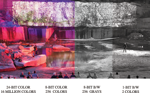
Figure 4.23 Composite of different bit depths. Terra Tractus by Projects for a New Millennium. Digital media design by Daniel Fine and Matthew Ragan. Lighting by Jamie Burnett.
Source: Alex Oliszewski
In pigment-based color theory, used in printing and color mixing, there are three primary colors: cyan (blue), magenta (red), and yellow. These three colors are subtractive primaries and when mixed together form black (K). The theory is that these three hues are the parents of all other colors. No other colors can be mixed together to create these three. However, these three primary colors can mix together to create three secondary colors:
- Orange (yellow + red)
- Green (blue + yellow)
- Purple or violet (red + blue)
A third level of six tertiary colors is created by mixing a primary and its nearest secondary color together:
- Yellow-orange (yellow + orange)
- Red-orange (red + orange)
- Red-violet (red + violet)
- Blue-violet (blue + violet)
- Blue-green (blue + green)
- Yellow-green (yellow + green)
These twelve colors can then be mixed together to create endless varieties of color.


Figure 4.25 Primary, secondary, and tertiary color wheel
Source: Mallory Maria Prucha
In print, actual black pigments are sometimes used to reduce the amount of ink or other material to ensure a truer black or darker color than the mixing of physical pigments would otherwise allow.
RGB
Red, green and blue (RGB) are the three primary colors of light. In the light model, these three colors use an additive system and when mixed together create white. Black is created by the absence of light. Like the CMYK model, these three primary colors can be combined to create all other colors. The RGB model is used in lighting and digital imaging technologies, such as projectors, televisions, and cameras.
Hue, Saturation, and Value
There are a number of different properties of color. Three of the most important for a digital media designer to be aware of are hue, saturation, andvalue (HSV). Each of these three elements can typically be adjusted independently on a value scale.

Hue is the actual color. We all perceive color differently, so there is not an exact science to working with hues. You can think of different hues as having variations in tint, shade, and intensity. Hue is sometimes described in terms of temperature, with reds and oranges being warmer and blues and greens being cooler.
Saturation is the purity of a hue and is sometimes referred to as chroma. The more saturated a hue is the richer it appears. As a color becomes desaturated it appears duller and less vibrant. At a value of 100 (full) a hue is completely pure. At a value of 0 a hue appears grey.
Value refers to the lightness/darkness of a hue. The value is what controls the intensity of light in a hue. At a value of 100 (full) a hue is brighter. As the value approaches 0 the value becomes darker or appears blacker.
RGB(A): Alpha Channels
In digital files, it is common to include what is called an alpha channel to allow for the layering of rasters into a composite image. Images and videos that include alpha channels are referred to as having transparency. Alpha channels are used to record the translucency of a pixel. It can be thought of as its own channel of color, like red, green, or blue, because of its similar role in defining how a pixel is to be rendered. In this way, a pixel on a layer above another raster can be turned on or off, controlling how a pixel from a lower layer is visible.
Figure 4.27 Hue scale

Figure 4.28 Saturation and value scale
Source: Alex Oliszewski, based on the Munsell color system
Adobe Photoshop’s proprietary layered image file format (.psd) relies on the use of alpha channels to allow for the pixel-perfect blending of elements into composited images. Image file types that include an alpha channel are:
- .tff
- .png
The .hap alpha codec is a current gold standard for video with alpha channels. Working with alpha channels increases the computational complexity of an image and creates larger files that can have longer render times.
Digital Color Space
Color spaces have different bit depths and volumes of color. The colors available originate from a three- or four-dimensional mathematic color model. It establishes a coordinate system that defines every possible color that can be displayed within a given color space. This full range of any given color space is called a gamut.

Figure 4.29 RGB(A) image, with checkerboard background representing the transparent alpha channel and the same image composited with foreground and background assets
Source: Alex Oliszewski
In general, CMYK and sRGB (s is for standard and is commonly not written) are the two most commonly used digital color spaces. The CMYK color space is used in the print industry to create artwork that eventually is printed. Because of the emissive natures of light, RGB produces a larger color volume than CMYK. As a digital media designer, working with RGB light technologies, you should work in RGB color space. The CMYK color space has a more restricted gamut than RGB and images converted from RGB to CMYK normally need some form of color correction to ensure that blacks remain black and colors don’t seem to flatten out.
The number of specialized RGB color spaces available is dauntingly large. The most popular are Adobe RGB, ColorMatch RGB, and ProPhoto RGB. These color spaces are used a lot in digital photography in relation to various types of printing technologies and are rarely relevant to our work in the theatre. However, they deserve further research if you have not heard of them before.
If the color space of the display you are designing on is different than the one you are designing for, it may be hard to anticipate how content will actually be seen. Each file format and display device have their own idiosyncrasies when it comes to the gamut or volume of colors they are able to represent and display.
As a rule of thumb, you should be aware of the color space you are designing in and how it is different than the colors you will actually be displaying. Figure 4.30 was created using Apple’s OSX ColorSync utility from a computer used to design projection content. In these images, ColorSync shows how the color space of the designer’s display monitor can be compared to the color space of a projector used to display content. Notice how, in all but a small section of blue, the video projector has a noticeably smaller color space. This means that any images the designer creates that use colors outside of the projector’s color space are compressed into the color volume of the projector. All the color information compressed down into the smaller projector volume generally causes the overall images to have reduced color contrast and potentially lose some detail and image quality. Depending on how color compression is applied you may also encounter banding artifacts in gradients and areas of color that pass through the compressed color ranges.
We recommend using a utility such as ColorSync or otherwise researching the color space of the display and design devices you are working with in order to properly plan the image creation workflow. It is possible to reconfigure your design displays to represent any given projector or display device. However, it is difficult in the theatre to quantify everything required to simulate how color will be perceived by the audience. Knowing the theories behind the use and combination of color and how human perception automatically adjusts color to certain lighting situations is very useful.

Figure 4.30 3D visualization of RGB color space (gray form) in comparison to CMYK color space (colored form) as rendered by the Apple ColorSync application
Source: Alex Oliszewski
Chroma (Color) Subsampling or 4:2:0 vs 4:2:2 vs. 4:4:4
As noted earlier, digital media files can be quite large and computationally difficult to work with. Computer graphics engineers have developed chroma subsampling, a method that produces decent-quality images by compressing the amount of color information needed to encode an image while simultaneously boosting computing performance. It allows for each pixel in a raster to have its own luminance data, but groups pixels together to share chrominance data. This sharing of chrominance across pixels reduces the computational difficulty of displaying large amounts of pixels in each frame of video.
Subsampling is notated as a three- (or four if alpha is present) numeric formula that indicates the ratio of the pixel width of a sampling area compared to the total number of pixels from each row within said sampling area. The ratio is represented as J:a:b.
- J = total number of horizontal pixels in the sampling area, usually 4.
- a = total number of chrominance samples (Cr, Cb) in first vertical row of J pixels.
- b = total number of changes between the chrominance samples (Cr, Cb) of the first and second vertical rows of J pixels.
- If alpha is present, it is represented as a fourth number that is relative to J.
The most common levels of chroma sampling are described in order of low to high quality as:
- 4:2:0, every square group of 4 pixels is using the same chroma data.
- 4:2:2, every rectangular group of 2 pixels is using the same chroma data.
- 4:4:4, no chroma subsampling is used at all.
Different video codecs use different levels of chroma subsampling. When choosing a video codec, pay attention to how you are applying chroma subsampling to the images. As a rule of thumb, try to work with at least 4:2:2 content and sensors. 4:4:4 is prized for when you apply chroma keying to digital content or need to maintain the highest levels of image quality.
Because we work with large-scale projections and displays in theatre, using heavy chroma subsampling can lead to certain types of digital distortion. When groups of pixels act as a single homogenous unit it can make projected pixels stand out and create a pixelated effect.
Contrast and Dynamic Range
Contrast is the range between the darkest black (dark) and brightest white (light) in an image. Images with high contrast include elements across a full range of tones, from dark black shadows to bright white highlights. Low-contrast images have a small range between the brightest and the darkest areas and appear flatter or to have less depth when compared to a similar image with higher contrast.
Dynamic range is a way of describing the possible contrast levels on a camera or display and is defined by measuring the maximum and minimum values of the blacks and whites it is able to represent. When working with digital cameras, projectors, emissive displays, and so forth, you want to have the highest dynamic range possible in order to display the greatest variations in tone. Fine details and subtle textures in an image are quickly lost with reduced levels of dynamic range.
Regardless of how large the dynamic range is on digital devices, it is bound to be restricted in some way due to technical limitations, and no display technology yet matches the range of contrast that human eyes are capable of seeing.
Both contrast and dynamic range are important aspects of all phases of digital design because every display and capture sensor has its own dynamic range. When you are projecting digital camera content you will deal with dynamic range in every step of the process. The camera recording the scene has a maximum dynamic range, and so do the editing software and the editing display. Once in the theatre, the projector has its own dynamic range. The way contrast and dynamic range are actually perceived in the projected image is also affected by the projection surface.
Compositing

Figure 4.31 Comparison of dynamic range. Left: low dynamic range. Right: high dynamic range.
Source: Alex Oliszewski
Compositing refers to combining different visuals together. Oftentimes compositing is used to create an illusion that different elements are all part of the same image. The most common example of this is when a subject shot against a greenscreen is composited into another image. Compositing can also refer to how different layers of images/video are blended together. Digital editing tools have different blend/composite modes to choose from to achieve desired results. Most media servers have a limited set of blend modes compared to video and image manipulation software packages, such as Photoshop or After Effects, but do allow for compositing of images and videos. By leveraging the media server’s ability to composite you can keep assets more flexible and save time throughout the production process.
![]() For More Info 4.6 Compositing
For More Info 4.6 Compositing
See “Render vs. Real Time” in Chapter 4.
Types of Content
Content creation covers a wide array of design and style, but also considers the many different types of content that can be sourced, captured, scanned, developed, shot, key framed, edited, coded, and rendered. This section breaks down content creation into the categories of still images, moving images (video), generative art, data, and interactive digital media as content. For the majority of shows you design you may end up using some combination of these different types of content.
The categories are arranged in order of complexity, from less complex still images to more complex algorithmic, computer-generated images. This is definitely not definitive reasoning, as a still image may require hundreds of hours of labor, while a computer-generated animation may take just ten minutes to create by writing three lines of code. The world of content creation is a craft like many others: the more creativity, work, thought, and time you put into it, the better the end product becomes.
Custom Content
Most productions require custom content, specific to the style and design approach. Custom content is any type of asset (photo, video, illustration, text, etc.) that you personally create, cocreate, or hire/commission a designer/artist to create. Nearly every aspect of content creation is a field in itself. As a digital media designer for theatre when you create content you take on the roles of photographer, graphic designer, animator, film director, editor, and more. Each of these roles has a cadre of tools and techniques that take many years to master. But this isn’t a new concept, we’ve mentioned this before, and you’ve still kept reading. So, congratulations—you are up for the challenge.
There are many working designers who do not know how to create multiple types of content and others who know many methods. It is best to be well versed in as many techniques as you can when it comes to image and video creation. If you focus on one style or type of content, you may have to wait longer between jobs or you may work often, depending on the need or interest in the type of content you specialize in.
Found Content
To find content that already exists all you need to do is a simple Internet search with the correct keywords. There continues to be a rise of content creators freely sharing their work and making it available on the Internet for all to use under Creative Commons licensing. If you do some digging with Creative Commons search engines you may find content that is free to use as long as you follow the guidelines posted by the original creators.
It is rare, however, to use found content as is. You almost always need to alter it in order to match the specific style of the show. Everything in the show should intentionally fit into the style of the production.
Stock Content
Most designers have a database of their own stock content that they have created and/or purchased the rights to use, which might include large banks of textures, particle effects, photographs, graphics, videos, environments, and so forth. A digital media designer uses this bank of content in the same way a sound designer might use a large database of prerecorded sounds to pull from when creating a sound design.
There are many websites that sell stock photography, graphics, and video footage ranging from very affordable to extremely expensive. If you are primarily relying on stock content you need to have a budget for purchasing, because rarely is high-quality footage free.
More often than not, stock footage is used when the script calls for historical and/or period content. It certainly can be a lot cheaper to purchase footage of the Great Wall of China rather than flying to China for a video shoot. But this doesn’t mean you should be using the stock footage completely unchanged. Imagine sitting in a theatre watching a show that had only unaltered found and stock footage. How would you feel? Is this an artist at work or merely a good researcher who found a bunch of content? If the show requires a lot of stock photos and videos consider applying filters and color treatments or altering the framing, and so forth. This helps make them all live in the same world and feel like they are part of a unified design.
If you are doing any kind of large professional work and/or touring work, the producers may require a chain of rights proving that you have the permission to use anything you did not make. When purchasing stock content, make sure to buy the correct clearance for your needs. Stock houses have different prices and clearances for educational vs. commercial work, and so forth. Some licenses are perpetual and others are for a single use. Keep a record of all the purchases, permissions, and clearances you obtain.
Still Images
We are all familiar with still images in terms of photographs, as we see them and even create them on a daily basis every time we take a selfie or a photo of our lunch. This section introduces the basics of still images in the categories of photography, graphic design, text, and collage. This knowledge expands upon the basics of design and digital basics that you have already learned in previous sections.
Photography
Of the types of still images used in design, photography is one of the best ways to create content that provides a lot of information, such as context, mood, and period, in one single frame. The phrase “a picture is worth a thousand words” holds true onstage.
The history of photography tells a story of innovation and meaning making that has evolved over time with different image-making technologies. Today’s photographic technology expands beyond what our naked eyes can see, such as what lies in the depths of the oceans, in the far reaches of space, or the details of an atom. Each historic evolution in photography has left its mark on how we see and understand particular periods of time. By finding proper period photographs and making new images in the same style you can create a feeling onstage of a specific moment in time.
Photographs don’t always have to convey realism. They can be abstract and used to great effect in creating mood or atmosphere. For example, a close-up of an ant struggling to walk on tree bark might be exactly the right abstraction that underlies tension in a given scene.
The Ubiquity of the Photograph
Photography is one of the more prevalent art forms in use today, especially with the abundance of cell phone cameras. This means that the eyes of our audience are strongly attuned to pull information from photographs. Since the first photographic images made their way to the public, people have been obsessed by them. This is fortunate because its popularity has left us with a vast array of resources and styles to draw from for our designs.
![]() For More Info 4.7
For More Info 4.7
See “Cameras” in Chapter 5.
The Basics of Photography and Still Images
Creating the right photo for a moment may require you to shoot the photograph yourself, thus making you a photographer. You also need to edit and manipulate that photo. The practice of making still images bleeds over into video creation in nearly every way, as video is just a series of still images played back in sequence. So, we begin with a foundation on the basics of photography and photographic still images.
Types of Shots/Framing
There are a number of shots that make up the foundation of photography practices. These shots all apply to video as well. They include the following:
- Wide/long shot
- Camera is far away from subject (and/or wide-angle lens is used)
- Establishes context
- Emphasizes surroundings
- Medium shot
- Typically of a person
- From the waist up
- Subject and setting typically take up the same amount of space in the frame
- Leaves space for hand gestures
- Bust (medium close shot)
- Typically of a person
- From the chest up
- Close-up
- Shows detail of subject
- Face or detail of subject fills the entire frame
- Extreme close-up
- Shows a fine detail of subject
Angle
Camera angles are created by where the camera is placed to take a shot. How the audience understands the subject is directly related to angle. There are a few basic angles you should know. They include:
- High angle (camera looking down)
- Looks down at subject
- Used to make the subject feel small in the environment
- Used to indicate that the character in frame has less power

Figure 4.33 Examples of types of shots
Source: Alex Oliszewski
- Low angle (camera looking up)
- Looks up at subject
- Used to make the subject feel big
- Used to indicate that the character in frame has more power
- Eye level (camera lens is level with the actor’s eyes)
- Used to indicate the character has the same amount of power
- Can establish point of view
- Dutch/titled angle (camera is tilted to left or right)
- Used to give a sense or feeling that things are out of balance or to show tension

Lighting
Lighting can be available light (the sun, a streetlamp, etc.), created artificially by the photographer using lighting instruments, or a combination of both. The brightness, color, color temperature, and direction of the light all work together to affect the visual appearance of an image. The way in which light hits a subject creates highlights and shadows, which combined forms contrast. Lighting helps to create style and mood.
Usually, soft, diffused light is more flattering for human subjects. When you are using available light, shooting on an overcast day provides a softer, more even light since the sunlight is diffused by the clouds. A popular time to shoot is just before sunset or after sunrise. This is what is known as magic or golden hour, when the sun appears redder and lower in the sky, thus creating longer, softer shadows.
![]() For More Info 4.8 How to Adjust the Way a Camera Handles Light
For More Info 4.8 How to Adjust the Way a Camera Handles Light
See “Camera Basics” Chapter 5. For tips regarding three-point lighting and lighting for video see “Video Lighting” in Chapter 4. See also “Lighting for Live Cameras” in Chapter 5.

Lighting plays an important role in digital media design, especially when projecting atmospheric images to convey time of day. For example, if it is supposed to be morning in a scene onstage, you need to make sure that the lighting in the images looks like morning light.
Sharpness
Sharpness refers to clarity in terms of the quality of detail in edges of shapes and objects in an image. Sharpness of an image is created by many factors, including sensor size, lens type, and ISO. Sharpness is often subjective from person to person.
Noise/Grain
Noise is the random variation of information, such as color and brightness—that is, in an image, but not in the actual subject that was photographed. It is created in images during the capture process via the camera’s sensor, usually when using lower ISO settings or in low light. Film grain is like noise, but it appears as small, random particles on actual film stock.
Noise and grain usually are not a desired effect when photographing. However, adding noise or grain to an image in postproduction is popular. It can be used to help mute an image or add a gritty realism and texture to otherwise clean footage.
Moiré Patterns
Moiré patterns are not normally our friends. They most typically occur in digital media content when a physical grid or other repetitive texture or detail, such as a pinstripe suit, lines up with the pixels in an image raster. When the camera’s pixel sensor is in line with the pinstripes (or other detail) it can produce an interference pattern that adds a pixelated wavy pattern or a distorting rainbow-type effect. This type of distortion is exacerbated in video and can also create a flickering, zebra-like effect.
By changing the zoom factor on your subject, you may be able to make these patterns less visible. Some picture and video editing software packages offer specific filters that are designed to mitigate moiré patterns in an image.
This type of distortion also occurs when projecting on scrim or other surfaces that have grid-like structures on them that are similar in shape and size to the raster of pixels being cast on them. If you come across this image artifact in your work you can either attempt to change the size of the projections or throw the projectors slightly out of focus to mitigate a moiré pattern. Otherwise you need to recapture the images after eliminating the offending textures or use different capture settings.

Figure 4.37 Example of moiré effect created by the overlapping of two scrims
Source: Alex Oliszewski
Collage
In the traditional art world, a collage is a type of picture or image in which a composition is created by assembling different real-world materials or artifacts. A collage can be a powerful method to convey a lot of meaning in a single image or to bring a certain type of energy to a moment. When using collage imagery onstage, be careful as the visual elements can easily become busy and still need to balance with the stage design and action.
Moving Images
Moving images are a sequence of still images put together one after another. Our eyes and brain work together to interpret these sequences of still images as continuous movement, known as persistence of vision. Persistence of vision tricks our brain into seeing these multiple images as one when the sequence of still images moves at a fast-enough rate to induce the sensation of continuous motion. It also causes the trails of light left when we close our eyes after looking at a bright light source.

Figure 4.38 Example of collage projected onto a set from Soot & Spit by Charles Mee. Directed by Kim Weild. Digital media design by Boyd Branch. Lighting design by Adam Vachon. Set design by Brunella Provvidente. Costume design by Haley Peterson. Arizona State University Mainstage, 2014.
Source: Boyd Branch
This section looks at the basic process of creating moving images (digital video). A firm foundation in still image creation serves you well as you begin to make moving images. The elements that go into making a good still image are the building blocks to video. While there are a number of design considerations in creating video, there are also technical aspects to master.
Video Basics
Before you can master the art of making video, you have to understand the basic elements of video. Knowing the components of video ensures that the content you create is delivered, played back, and viewed by an audience the way you intend.
Analog vs. Digital
Moving images started out as an analog format in the late nineteenth century with experimenters like Eadweard Muybridge working with film. In the middle of the twentieth century the analog format continued when videotape was invented. Analog video records moving images as a set of continuous signals via the shifting values of luma and chrominance. These signals are stored as fluctuations in a field on a magnetic layer affixed to a tape. Digital video, on the other hand, 8-bit digital video in particular, records imagery via discrete numbers between zero and 255 that represent different values. So, a dark component of an image would be recorded as zero and a bright area would be recorded as 255.
Two of the major differences between analog and digital video are degradation and storage. When you make a copy of analog video—for instance, a VHS copy of a VHS tape—the copy is deteriorated. It has slight variations in signal strength compared to the original, because the recording/copying process introduces fluctuations in the signals that distort the image. When digital video is copied, there is no physical form to copy. What is copied is a set of numbers from the original to the copy. There is no degradation because each number that is copied is exact and discrete, so there is no noise introduced that causes distortion of the image.

Figure 4.39 Comparison between interlaced and progressive scanning
Source: Alex Oliszewski and Kien Hoang
Analog video has a particular quality of image, movement, resolution, degradation, and audio. This is also true of each of the different types of digital video. Knowing how to create content that looks and feels like a certain type of analog or digital video type is something that you can learn and implement as needed.
Interlaced/Progressive
Interlaced scan (indicated with an “i”—e.g., 60i) and progressive scan (indicated with a “p”—e.g., 24p) refer to methods for capturing, displaying, and transmitting video. Interlaced scanning divides each frame of video into two separate fields and draws the image in two steps or passes. The first pass scans all the odd number of horizontal video lines and then the second pass scans all the even numbers of horizontal lines. The second pass draws in 1/60th of a second after the first. This number varies based on the chosen frame rate. For instance, a frame rate of 50 draws in 1/50th of a second later.
In progressive scan video, all the lines of a frame are drawn in at once, in progressive order, starting with the first horizontal line at the top and ending with the last line at the bottom.
Frame Rates and Standards
Frame rate refers to the frequency at which consecutive frames of video (or film) are recorded and displayed. Frame rate is also referred to as frames per second (FPS). Typically, the greater the frame rate, the smoother and more realistic action looks when played back. When playing back video in a media server you should target 30–60 FPS for smooth playback. Once you dip below 30 FPS you may start to notice choppiness/staggering in the video. For fast-moving, real-time, generated animations it is common to aim for 60–90 FPS. Slow motion effects often rely on 120 FPS or higher.
NTSC (National Television System Committee) and PAL (Phase Alternating Line) are analog color encoding systems developed as television standards. NTSC is primarily used in the United States. In digital video, you shouldn’t have to worry about NTSC or PAL because these standards are being phased out and replaced with digital standards. However, digital standards and frame rates are based on the legacy of NTSC and PAL systems, so it is good to have an understanding of what they mean.
NTSC is in use by countries that have an electrical frequency of 60 HZ, with a corresponding frame rate of 60i or 30p and 480 lines of resolution (720x480). PAL on the other hand is used by countries that have an electrical frequency of 50 HZ, with a corresponding frame rate of 50i or 25p and 576 lines of resolution (720 × 576).
When NTSC was originally invented it transmitted only a black and white signal. In 1953, when color was added a modification was made to the video signal forcing the frame rate to be reduced from 30 FPS to 29.97 FPS. This meant that .03 frames were dropped. This introduced a distinction between frame rates: drop frame and non-drop frame. This is mostly a complex issue that television broadcasters have to deal with that relates to video timing—in order to have a thirty-second video clip, the video must actually be at a frame rate of 29.97. Since digital media designers don’t deal with the same needs as broadcast video, choosing drop frame vs. non-drop frame shouldn’t really matter. However, you should note that certain cameras, media servers, and video hardware devices require footage to be at a certain frame rates. It is a best practice to work in the same frame rate across your entire workflow, from acquisition to editing to playback, in order to ensure the best quality of the footage.
Editing software counts frames using timecode as a way to specify in a linear fashion where you are in a video clip. Timecode can also be embedded in a video as meta data. Timecode counts by hour, minute, second, and then frame, and when displayed looks like: 01:00:00:00. If the frame rate of the video is 30 FPS then every time 30 frames go by, a second is added and so forth up to hours.
Typical frame rates for digital video capture, editing, and playback are as follows:
- 23.97p: progressive, drop frame
- 24p: progressive, non-drop frame, matches the frame rate of film, for a classic film look and feel due to the lower frame rate
- 24.97p: progressive, drop frame
- 25p: progressive, non-drop frame
- 29.97p: progressive, drop frame
- 30p: progressive, non-drop frame
- 49.97i: interlaced, drop frame
- 50i: interlaced, non-drop frame
- 59.97i: interlaced, drop frame
- 60i: interlaced, non-drop frame
- 60p: progressive, non-drop frame
When you see a resolution listed, such as 1920 × 1080p30, it indicates the video signal is running at 30 progressive frames of video per second.
![]() For More Info 4.9 The Basics of Resolution
For More Info 4.9 The Basics of Resolution
See “The Basics of Digital Content: Pixels, Rasters, and Resolution” earlier in Chapter 4.
Video Resolution/Aspect Ratio
Aspect ratio and resolution are closely linked, in that a resolution has an aspect ratio. The aspect ratio is determined by the relationship between the width and height of an image. There are two basic video aspect ratios: more of a square (like an old TV) or more of a rectangle (like new HD TVs). Typical video resolution and aspect ratios can be grouped into the broad categories shown in Figure 4.40.

Bit Rate
Bit rate (bit/s or bps) is the number of bits (information/data) that are stored, processed, or transmitted per second in a video stream. Generally, the higher the bit rate, the better the quality of the video. The higher the bit rate is, though, the harder a media server has to work to play back a video, so too high a bit rate may work against you for playback in the theatre. Be sure to check the media server specifications for a target bit rate. Also, note that the larger the bit rate is, the more data per second the video has, so it translates to a larger file size.
Compression, File Types, Codecs, and Containers
Video files can be large and need to be compressed or shrunk in order to travel or playback. Compression is simply a way to pack a lot of information into a smaller space. There are two broad categories of how to compress video: lossy and lossless.
In the lossy compression process, video ends up having less data than the original file. This means that the video loses quality, but has a smaller file size. Compression formats such as H.264 are lossy but are effective, and if the compression is applied lightly it takes a keen eye to pick out any degradation.
A lossless compression process means that the video does not lose any data from the original file. The quality remains the same, but the video file size is the same or sometimes larger than the original file size.

Figure 4.41 Comparison of an image at various levels of compression. Top: original. Middle: heavy compression. Bottom: extreme compression.
Source: Dana Keeton
A codec is the algorithm used to compress/decompress and encode/decode data such as video and audio. The word itself is compressed from the term compressor-decompressor. A codec can take raw, uncompressed digital media and either compress it for storage or decompress it for viewing/listening and transcoding. There are many different types of codecs available, but we focus only on those generally used for theatre. Once you have compressed the video and/or audio into a suitable format and a workable file size using a codec, you still need to choose a container or wrapper for it to live inside in order for it to be transported and displayed.
It can be confusing, but it is vital to understand the difference between codec and wrapper/container. Let’s think about a video or an audio file like a candy bar. What is a candy bar? There are many different types of candy bars (codecs), such as milk chocolate (H.264) or dark chocolate (QuickTime’s Animation codec) or white chocloate (Photo JPEG), and they come in a wide variety of wrappers (containers), such as Hershey (.mov) or Nestle (.avi). The same codecs are used in different wrappers. Nestle and Hershey’s (container/wrapper) can both have the same kind of chocolate bar (codec) inside, such as dark (Animation) or milk chocolate (H.264).
All good candy bar wrappers contain a list of ingredients. Included in a container/wrapper is metadata that ensures the video and audio remain in synchronization with each other while they are being played back, in a process called encapsulation. Other types of information can also be included such as time code, subtitles, etc.
How you use and intend on compositing the content in a show dictates the types of codecs. Some codecs are better for compositing or linear playback and others are better for flipping between frames in a video nonlinearly for interactive use. Each media server or software you use for playback typically requires or recommends a specific wrapper/container for optimal playback. Some servers have proprietary codecs. Be sure to read the documentation for the server/software you are using and choose a codec and wrapper/container that are appropriate for your setup.
Here is a quick reference to the most common video containers/wrappers currently used in digital media design:
- .mov
- .mpg/.mpeg
- .MP4
- .MP2
Here is a quick reference to the most common video codecs currently used in digital media design:
- H.264: When you want high-quality video with low file size, and a video meant to be played from beginning to end. Each frame in this codec requires references to other frames in order to render properly. The process has been tuned only for linear playback and adds significant computing overhead when trying to play back files nonlinearly.
- PHOTO J-PEG: Not as heavily compressed as H.264 and is a standard for fluid playback of files that requires nonlinear playback. Each frame in this codec is self-contained. This allows for lower CPU and GPU when playing a movie backward or forward, or jumping randomly between individual frames of the video. This codec creates much larger files because it is not heavily compressed.
- ANIMATION: One of the few codecs that includes alpha channel information. Like the PHOTO J-PEG, this codec is not heavily compressed and creates movies with large file sizes.
- PRORES: A lossless codec used when working with high-quality footage in the editing process and maintaining fidelity and image reproduction are a high priority. This codec does not compress the video, treating it more like a RAW file. This means that the files tend to be incredibly large compared to other codecs and require significant hard drive storage and computer resources to play back.
- HAP: A newer codec currently quite popular because it requires fewer system resources to play high-quality videos while also having reasonably small file sizes. It provides a good balance of image reproduction and nonlinear playback abilities. This codec uses the GPU vs. the CPU for its encoding and decoding processes, which uses fewer system resources. There is also a version of HAP that includes an alpha channel option, making it one of the best nonproprietary codecs at the time of this writing.
Transcoding
Transcoding is a conversion process from one type of encoded file to another. Whereas copying digital video is a lossless process, encoding and transcoding video are a lossy process. If you are not paying careful attention when transcoding, you can easily introduce generation loss in the video.
You transcode video when you need to change a file from one format to another. For instance, if you download a stock video loop that is an .avi, but the media server prefers file types that are mpeg2, you need to transcode the file for optimal playback of the video.
![]() For More Info 4.10
For More Info 4.10
See “Video Signals” in Chapter 5.
Making Movies: Video Production 101
Creating digital video requires you to be producer, director, editor, cinematographer, lighting designer, sound engineer, and so forth. But you already have a leg up. We all carry in our pockets and purses more filmmaking tools than filmmakers could carry in a road case even twenty years ago. Our smart devices have cameras, microphones, color screens, editing apps, and graphics processing units that make it easier than any time in history to make video content.
One of the mantras of video production is to be prepared. Unlike other video production circumstances, you are limited to the production schedule of the theatrical show you are working on, so it is important to be as prepared as you can. Planning and preparation create the most ideal circumstances on a video shoot. They allow you to be ready for happy accidents: those magical, spontaneous moments on set that you didn’t plan for, but are ready for only because of your organization.
The basics that were covered in the section “The Basics of Photography and Still Images” all apply to video production, so it is good to refer back to them as needed.
Before you start capturing images, know what the final display resolution and aspect ratio of the footage will be onstage. When in doubt, it is always better to shoot the highest resolution available. You can easily lower the resolution later, but you can’t increase it later without pixelization. Know what the end style will be and how you plan to edit. This information helps you determine things like aspect ratio, framing, shot selection, colors, locations, and so forth.
![]() Tip 4.2 Video Production
Tip 4.2 Video Production
Buy the fastest SD or Flash card supported by your recording device. Make sure the camera batteries are charged. Bring the battery charger with you just in case. Invest in a wall plug adaptor for the camera. Assemble a video production kit that you take with you on every shoot. Things to include in the kit:
- Powder and brush to take away the shine on actors’ faces
- Extra disposal batteries for microphones and other gear
- Granola or energy bar
- Safety pins and bobby pins
- A travel sewing kit
- Lint roller
- Super glue
- Instant stain remover
- Sharpie and pen
- Gaff tape
Set Protocols
- When turning on a light say, “Striking,” “Sparking,” “Turning on a 10k, look away,” or “Lights changing.”
- Avoid standing in the actor’s sightline when he or she performs. Unless you are actively engaged with performers to support them, the last thing actors should see while they are trying to concentrate and give a great performance is you standing there drinking coffee.
- When crossing in front of the camera say, “Crossing.”
- Turn off phones and watches.
- No loud talking.
- Always check with the assistant director (the stage manager of video production) before leaving the set.
- Remember that the sound department can hear everything on set at all times.
![]() For More Info 4.11
For More Info 4.11
See “Video Production Gear” in Chapter 5.
Types of Shots
In addition to the types of shots described in the “Basics of Photography” section, there are specific shots to cinematic storytelling. Some of the most popular are:
- Two shot
- POV shot
- Reverse shot
- Over the shoulder shot
- Zoom shot
- Insert shot
- Handheld shot
- Bridging shot
- Panning shot
- Tracking shot


Video Lighting
While the basics that were covered in the section “The Basics of Photography and Still Images” apply to lighting for video, there are additional considerations. Video does not respond to light the same way our eyes do. Lower-end video camera sensors do not “see” as much contrast as the human eye or a high-end DSLR camera’s sensor. This is important to remember when lighting for video. The contrast between the whites and blacks, between low and high brightness is not as subtle and gradual on video as what you see with your naked eyes or may be familiar with when working with photos. Be sure to always look through the viewfinder to see what the light looks like when it hits the sensor.
![]() Tip 4.3 Video Lighting
Tip 4.3 Video Lighting
Just like on the stage, lighting helps tell story, create mood, set time of day, and so forth. It is common to start with three-point lighting and then go from there, adding or taking away lights as needed to achieve the desired effect. Whenever possible, bounce the light, rather than pointing instruments directly at the subject. When pointing the light directly at a subject from the front diffuse it with a soft box ordiffusion gel.
Digital cameras are getting better at shooting in low light every day. Unless you have a camera that handles low light well, it is better to have more light than less light. You can always stop down your camera settings to counter the brightness. More light allows you to use the lowest possible ISO settings on your equipment. This reduces noise in your images.
Don’t be afraid of shadows. They are your friends. They make things look more interesting.
Whenever possible, turn the lights off. This saves on lamp hours and reduces the heat in the room.
Audio
You may be able to rely on an audio designer to create the aural environment for your content; however, sometimes you need to capture a performer’s vocal performance or some other aural element. It is always best to use a professional microphone rather than the built-in microphone on the camera. If you are using a DSLR, the built-in microphone is helpful in the editing process when syncing high-quality audio recorded separately, but it is never ideal for a final presentation, as it is typically a lowend mic and usually located right next to the camera’s motor.
Unless you are shooting with a professional video camera that has balanced audio inputs you can attach a quality microphone to, it is best to use an external audio recorder, rather than using the unbalanced mic input on a camera. An external audio recorder has better preamps, balanced inputs, and better, more detailed recording controls and monitoring. Make sure to record the audio at the highest uncompressed file type as possible on your device, such as .AIFF or.WAV. Recording to an external audio recorder requires that you sync the audio with the video in postproduction. Syncing high-quality audio with video shot separately has never been easier and most professional editing software packages can do this automatically with just a few mouse clicks.
When using editing software, such as Adobe Premiere Pro, to sync high-quality audio recorded with an external audio recorder to video, the automated syncing processes offered by the software needs an audio track to compare the high-quality track to. This means you need to record audio from the camera as well. This low-quality audio track is used to auto-sync the high-quality recording. Automated syncing software compares the wavelengths of both audio tracks and then syncs them. Without this comparison track, you have to manually sync the audio, which can be a long and tedious process.
Be sure to use some sort of clapper at the beginning of a take. This gives the syncing software an additional, clearly defined waveform for syncing. It also helps if you end up needing to manually sync the audio.
Always choose to manually record the sound vs. using automatic settings. You want full control of the recording levels to lay down the best sound and want to avoid changes in the recording volume that demand a more laborious editing process. A good rule of thumb is to aim for −20–0db levels. Usually somewhere around −12db is the sweet spot for most sound recordings. You can always boost the sound in post. It is much more difficult to fix audio that is peaking, known as clipping. Always be sure to check the audio meter and stay clear of those spiking red peaks. When digital audio is over-modulated, the sound recording creates distortions, that are difficult to fix in post.
When recording audio, always be sure to get as much wild sound as possible. This audio is recorded when the cameras are not rolling. If you are shooting in a park, get the microphone as close to the birds or crickets as possible. Or if you have a long shot of actors in a field, but no wireless microphones, you might need to record their lines separately. Also, be sure to record audio that could be added as Foley in post. For instance, if the shot is of a mailman walking up the stairs and knocking on the door, be sure to record separate audio of the actor walking up the stairs and knocking. Without having to be concerned about what the camera is seeing, you are able to put the microphone anywhere to get the best sound. Giving the editor the option to use this audio provides more choices in post.
Like wild sound, you should record room tone separately. Whenever you are in a space, that room or setting has a certain underlying sound unlike any other space. Make sure to record at least one minute of nothing else but sound of the room. You want to do this for every different location for which you shoot. The reason to do so is in case the editor has to make a cut where there is a gap in audio and the underlying sound of the location goes to nothing. This is jarring for an audience. With room tone, the editor is able to insert a bit of it in that gap, making it sound like a continuous silent moment within the actual location room tone.
Monitor the audio recording with both your ears and a visible meter. The best, closed ear headphones that you can afford are highly recommended. If possible, have someone be solely responsible for the recording of the audio.
There are many varieties of microphones, such as condenser,dynamic, andribbon, that are used for different types of locations, shots, and types of sound to be recorded. Microphones also come in different polar patterns, such as omnidirectional,unidirectional (cardioid andhypercardioid), andbidirectional. Having a variety of different types of microphones gives you the most flexibility for different recording situations. As part of a standard kit, choose a shotgun microphone and, if the budget allows, two wireless lavalier microphones.
Video Editing
No matter how you create content, you need to edit it. Depending on the project you may find yourself moving between many different applications, such as Premiere Pro, After Effects, Photoshop, and Final Cut Pro. The most basic skills and techniques transfer between software packages. So, while it is good to master a specific editing software it really boils down to understanding the basics of editing and how it is used to shape a story.
Editing can alter a performance—making it better or worse. It can call attention to itself, such as using wipes orjump cuts, or it can be subtle and hidden, meant to keep focus on the story and not the style. As an editor and also as a director of video, you should think in cuts. How do different video sequences, angles, framing, compositions, and so forth work together to effectively tell a story? How does the cut drive the emotion of the scene, reveal character, or move the story along?
Audio is a powerful tool to help in cutting and transitions. There are many different ways that audio helps in editing, such as having audio from one shot carry through to the next shot. When a video cuts from one shot to another, but the audio remains constant, it reinforces that there has not been a change in location or a jump in time. Well-chosen music helps the rhythm and pace of a video.
When editing, it becomes incredibly important to be organized. You need to keep track of all the footage that has been shot, what clips you are using, sequences that need to be exported, and so forth. Pay attention to the little details, such as file naming, as this helps you find clips faster.
While becoming a master editor can take a lifetime, ahead are some of the basic elements of editing to get you started. All of these aspects of editing carry over to your work incorporating digital media into the theatrical production when using media servers.

![]() Tip 4.4 Video Editing
Tip 4.4 Video Editing
- The performance is in the actor’s eyes.
- Cut on the action, not after.
- Avoid jump cuts, unless it is a chosen visual style for the piece.
- Cut on cross frame movement.
- Cut tight—try to erase the gaps between things.
- Use transition effects sparingly and only when style dictates.
- Dissolves show passage of time, blending things together.
- When working with audio, use it to help maintain continuity between shots.
- The eye follows movement. Use it deliberately to guide the eye from one shot to another.
- Use a variety of shots.
Linear vs. Nonlinear
Linear editing is a dying method tied directly to analog technology of tape and film. In order to make a cut, you have to physically and sequentially cut the film/tape. This is known as a destructive process. With the introduction of nonlinear editing systems, you could now transfer the film/tape to a digital format and then load it into an editing software system. This allows for editing in a nonsequential and nondestructive manner. Nearly all editing processes are now nonlinear.
Pace/Speed
Pace is one of the most important components of editing. Perhaps this is why so many musicians and dancers make great editors. Pace is the timing of cuts, or put another way, how long each shot lasts before a cut. It is a bit abstract and not at all a precise science. Pacing is about finding the natural rhythm and flow of the length of shots to properly tell the story. Usually in a long-form video, editors try to vary the pacing. Like everything, pacing affects the story.

Figure 4.45 Screenshot of Final Cut Pro X nonlinear editing system
Source: Alex Oliszewski
Slow pacing (long shots before cutting to another shot) gives the viewer time to really live in the moment. It can also help create tension or anticipation of what is coming next.
Fast pacing (short shots) are typically used in action sequences or to suggest urgency/intensity.
In theatre, we might refer to the pace of a video as speed. Something you may often hear from a director is, “Can you slow that video down?” It is good to clarify if she means fewer cuts, which would be slowing down the pace, or slowing the speed of the actual video down from playing at 100 percent speed to playing at 75 percent speed. Note that once you slow down the speed of a video past a certain point (beyond ~20 percent depending on the subject matter and the FPS it was shot in) it starts to look choppy/staggered. If you know you need slow-motion footage, insure that your capture device is recording at least 60–120 FPS if possible. Editing software typically renders better slowed-down footage than slowing a clip down in the media server.
Typically, for most theatrical situations using atmospheric digital media the pace/speed needs to be slow so it does not distract from what is happening onstage. For interactive digital media, faster paces and speed can be used as appropriate, because interactive digital media can be a character who needs to communicate fast or intensely, and so forth. Also, video projected at architectural scales will seem to move faster on stage than it does on your smaller screen.
Looping
Looping is one of the more common aspects of editing video for theatre, the Internet, and VJing. For example, there is a five-minute-long scene that needs atmospheric digital media—let’s say clouds. There are two choices to create this:
- Make a five-minute-long video of clouds moving.
- Make a shorter video of clouds that you can loop.
When creating loops, you want them to be seamless at the point where the video loops back to the beginning. This is called a perfect loop. In order to create a perfect loop, all the compositional elements (position, scale, color, etc.) in the last frame of the video have to be one frame away from exactly matching the way they were at the first frame of the video. When played back on repeat the video is seamless. Most media servers have the ability to loop a video. Double-check that the server you are using has this capability before arriving at tech.
Cutting on Action/Matching Eyeline
As a general editing rule, cut on action before it completes. A typical example is a woman opening a window. When she lifts the window the video cuts to a reverse shot from the other side of the window opening. The action of opening the window starts in the first shot and is completed in the second shot, creating a visual link between the two shots.
Maintain actor’s eyelines from shot to shot. If an actor is looking up at a character in shot one, but then in shot two, the other actor is also looking up, the eyeline won’t match. To make them match, the actor in shot two would need to be looking down.
Montage
In still imagery, a montage is another way of saying collage. In video, montage is a method of editing that juxtaposes a sequence of shots. Montage is typically used to:
- Compress or show the passage of time.
- Compress the distance of physical or metaphorical space.
- Provide a lot of information quickly.
Animation
To animate means to bring to life and animating is to give movement to something that cannot move on its own. To animate you must determine how an object moves through space and time. There is not one tool that is right for every project or for every animator. The particular software or tool that you choose depends on the desired outcome. There are several different types of animation, from traditional cel drawn animation tostop-motion animation to computer 2D and 3D animation. Since most animation is shown via video, it shares the basic rules and methods of digital video and editing. A good deal of your time as a digital media designer will be spent creating animations.
2D Animation
Animation originally began as 2D with attempts at 3D being limited to manual techniques, such as stop-motion animation. Before computer animation, artists drew by hand or painted every frame onto glass or clear

plastic sheets called cels. 2D animation limits an object’s movement in only the two dimensions of X and Y space. While objects can sometimes appear to move through Z space by manipulating the scale, they actually cannot move toward or away from the camera since there is no Z space.
2D animation is created using raster and/or vector graphics. You may find yourself animating a still photo or creating a complex animation by drawing vectors in Adobe Illustrator and then animating them in After Effects. As a designer, you will spend a great deal of time working with specialty video manipulation tools, such as After Effects, along with traditional nonlinear editing software. After Effects is a great tool for animating the types of content we find ourselves working with in the theatre, not only because of its relative ease of animating content but also for its robust compositing, image manipulation, color grading, special effects, chroma keying, and so forth. After Effects has limited 3D capabilities, but the most current versions include a lite version of Cinema 4D to deal with basic 3D content.
3D Animation
3D is typically considered to be a type of computer-generated animation, although techniques such as stop-motion animation are a form of 3D animation. Digital 3D animation allows for the automated rendering of objects that can be moved and viewed in all three dimensions of X, Y, and Z space. For example, in 2D animation the earth is created by drawing a circle. It can look three-dimensional only by shading and other artistic techniques within the skillset of the artist. It is a flat plane, whereas in 3D, the earth is easily made by creating a virtual sphere that can be turned in 360 degrees or allowing a virtual camera to rotate around the sphere at the press of a few buttons.
In 3D, you create wire meshes of objects that you then add textures onto. This allows you to create realistic-looking objects since the textures can be photo-realistic. You can also place cameras and lights in the 3D space to light the objects from any angle, much the same as you would in a video shoot. You can also move the camera through a 3D world or have the objects move around the camera to create different types of animation. On professional 3D movies, there are often animators who specialize in different areas, such as character rigging, compositing, shading, character animation, and lighting.
Because 3D animation requires so many technical and artistic skills to master, most digital media designers have basic to intermediate knowledge of 3D animation. When complex 3D animation is required, a freelance 3D animator is typically hired. For those wanting to get their feet wet with 3D animation we recommend starting with a relatively simple 3D modeling software, such as Cinema 4D, Cheeta 3D, or even Sketchup. These easy-to-learn tools give you a foundation in the process of dealing with 3D models and what it takes to create them.
Real-Time Effects on Prerecorded Content
There are many real-time effects you might apply to prerecorded content, such as compositing, color correction, scaling, and speed. These basic real-time video manipulations are heavily relied on in theatrical media servers. This allows designers flexibility with their assets and allows rehearsal edits to content that would otherwise require long render times. Prerecorded content can use other types of real-time effects to make this type of content become interactive.
Generative Art/Video as Content
One of the newer and still noticeably developing kinds of content that is being used for theatre is generative video. Most of today’s generative art is created by human-computer interaction through code, algorithms, sensors, and other means. This type of imagery is not always meant to look realistic, but rather something more abstract. Generative art as a method for creating content can be used as either interactive or atmospheric digital media in a show.
Generative art is widely considered to be digital and/or technological, but in fact stems from a long tradition of varied art-making practices that existed long before the computer age. As defined by Philip Galanter, in broad terms, generative art is any art practice wherein the artist uses some form of system, be it a computer program, a machine, or any other procedural application or material in the creation of

art. A generative system, which has been given a set of parameters or a physical composition by the artist, typically functions with various degrees of autonomy. The key component in generative art is that the artist cedes either total or partial control of the creation process to the system.
The 1960s began what might be considered the foundation of what we now consider generative art. Performance and conceptual artists incorporated process into their art making, which often used systems to generate the work. It was also at this time that the computer expanded the ability of artists to code different processes (physical, mechanical, digital, etc.) and complete them or automate them faster than ever before.
There are many popular software programs that digital media designers use to create a system based on procedural methods and algorithms that in turn are incorporated into the theatre. These include Processing, Max MSP, TouchDesigner, Isadora, Notch, and others. Computer “screen savers” are a familiar example of procedural video creation. Much of this type of work is based on existing systems and algorithms, such as particle systems andflocking. These code-based approaches to art making offer a great deal of flexibility. Because of this flexibility and relative ease of real-time change, generative art can more easily become interactive than traditional digital media.
![]() Case Study 4.1 Generative Art and Theatre
Case Study 4.1 Generative Art and Theatre
The Fall of the House of Escher
Arizona State University Mainstage School of Film, Dance and Theatre 2013
- Media Designer: Matthew Ragan
- Assistant Media Design: Tyler Eglen
- Directors: Meagan Weaver and Brian Foley
- Costume/Makeup Designer: Anastacia Schneider
- Lighting Designer: Adam Vachon
- Sound Designer: Stephen Christiansen
- Set Design: Brunella Provvidente
Brief Synopsis of Show
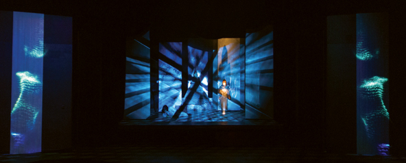
Figure 4.48 Generative art in The Fall of the House of Escher 1
Source: Matthew Ragan
The Fall of the House of Escher was a devised piece that came out of the work of Arizona State University’s graduate cohort of actors and designers. Set in a mashed-up world of the Gothic and geometric, the audience discovers the cast caught in a deteriorating time loop. Their only hope is through interacting with the audience—who get to choose which direction our players will take in pivotal moments. Playing somewhere between a choose-your-own-adventure novel and a piece of Gothic literature, The Fall of the House of Escher explored themes of quantum entanglement, choice, and identity.

How Was Media Used?
Media came to represent the invisible quantum properties of the house made manifest. During the production, the house would be constantly activated by a sea of rolling particles, waves, or strings. The ethereal and roiling quality of the media left the house feeling distinctly other, active, and on the verge of shifting. This was amplified by a collaboration with lighting to ensure that our aesthetic and technical approaches would feel complementary. Sound was added to the production during tech week, and further amplified the sense of inner/outer space that was created with lights and media.
What Was Your Process?
The media design process was a cross between traditional animation and the design of real-time, responsive, generative media elements. My work on Escher happened early in my graduate program, and I spent a large chunk of my time working on the development of small applications made in a programming environment called Quartz Composer. These small programs could be fed a set of values from the playback engine that was being developed in tandem with the production, and allowed the design and direction team the flexibility of making immediate changes to composition, speed, color, and tone in the media. Based on the call for media to be a constant presence in the house, it was essential that several media elements could always run and never loop.
From a process perspective, my work started with the script. I first mapped out the script and all of its possible permutations. From there I started with questions about the tone and feeling of different house locations. This would eventually become questions about how “the house” felt about the various players—what did “the house” want, and how might I show that through the use of media?
Along with these responsive and undulating machinations, it was also important to craft specific sequences in the production. In addition to the usual production schedule, I also set aside time to shoot several actors and capture photos and images to use in my process. Perhaps one of the most fun, and tedious, sequences to work on was the opening drift through a starry expanse. Using a Microsoft Kinect, I recorded the depth image of several dance sequences with one of the performers. This was then used to compose the opening sequence of particles and dancing forms that would coalesce and evaporate across the theatre space.
What Software and Technical Gear Did You Use?
- MacPro
- Projectors—Barco RLM W8, Panasonic
- Microsoft Kinect V.1
- Isadora
- Quartz Composer
- After Effects
- Photoshop
The Basics of Generative Art/Video
Ahead are a few fundamentals to begin exploring interactive and generative art/video. Like anything in content creation, you could focus solely on this one area and spend the rest of your life perfecting this type of art making. Some of the things you need to learn a bit about are navigating directories and working with the command line. You surely need to know the underlying details of the operating system you are using.
Code- vs. graphics-based programming languages provide different levels of abstraction and access to the same basic computational capabilities of a computer and its peripherals. A simple example is looking at the Python coding language vs. the media server TouchDesigner. Python is a high-level computer programming language that is relatively easy to learn and is used in various applications. Python is the underlying code that is used to create the software program TouchDesigner, which is a highly flexible graphics-based programming language that is often used as a media server when interactive or generative content is needed. In order to use TouchDesigner, one does not need to know how to program extensively in Python. But because of the built-in customization of TouchDesigner, you have the added ability to use Python to extend TouchDesigner’s capabilities. Having the ability to program directly in Python unlocks a wide potential of possibilities for using TouchDesigner, without having to build an entire program from scratch. There may be times when you actually need to build software from scratch in order to create the type of generative video or interaction that you need.
Data as Content
We are in the age of big data. Data is constantly being generated and recorded by nearly everything, nearly all the time. Almost every digital process produces data, documenting nearly all aspects of our digital lives, from surfing the web to our interactions on social media via our smartphones, to doctor visits and airplane travel. Data is being captured from so many multiple sources at such a fast speed that it is in a lot of ways changing and transforming our daily lives.
Artists are increasingly using data as a primary source, much like a painter might use oils, to do more than simply visualize information. Increasingly the lines between visualizing data and using it to make art are not simply being blurred but being transformed. Theatre artists have been slow to use big data as the primary source for content creation, but it allows for great possibilities to visualize and sonify information and to incorporate it into stories in increasingly new and meaningful ways. Not all data visualizations need to happen in real time or be used as interactive digital media. This method of creating content can be used as atmospheric digital media by rendering out a movie from the visualization software.
![]() Case Study 4.2 Using Big Data to Create Content for Beneath: A Journey Within, a Workshop Performance
Case Study 4.2 Using Big Data to Create Content for Beneath: A Journey Within, a Workshop Performance
Beneath: A Journey Within
- A workshop performance
- Arizona State University, Marston Theatre
- School of Film, Dance and Theatre and The School of Space and Earth Exploration 2016
- Written and Directed by: Lance Gharavi
- Lead Media Design: Daniel Fine
- Media Design: Miwa Matreyek, Ian Shelanskey, Matt Regan, Alex Oliszewski
- Data Visualization: Ian Shelanskey
- Software Design: Matt Regan, Ian Shelanskey
- Associate Media Design: Dallas Nichols Minsoo Kang
- Assistant Media Design: Elora Mastison, Brittany Cruz
- Costume Design & Set Design: Brunella Provvidente
- Lighting Design: Michael Bateman
Beneath immerses live performers and the audience within stereoscopic 3D projections using custom software to create real-time data visualizations and artistic interpretations of the current scientific research happening within the interior of the Earth. Conceived as a way of highlighting earth scientists and what they do, one section of the script called for a visual representation of actual data collected and modeled by earth scientists. We worked closely with Dr. Ed Gar-nero at Arizona State University, who had modeled the inside of the earth using a process called seismic tomography. Data is collected from around the globe, recording precise timing of earthquake waves as they travel through the planet. The data is then compiled and modeled into an interpretation of what the inside of the earth looks like. This is just data, though—a spreadsheet of numbers. The task at hand was to make those numbers into a visually meaningful representation that can be flown around in, a tall order for the traditional tools of a media designer.
How Was Creating Content Using Data Different/Similar?
I felt like I needed to be very true to the data. I couldn’t alter the numbers to make better shapes or lose track of what the values actually meant. I needed to show the model as accurately as possible. Keeping the data true was my only constraint.
What Was the Data Set? How Did You Access It/Parse It?

Figure 4.50 Earthquake data used to render an interpretation of what the inside of the Earth looks like in stereoscopic 3D
Source: Daniel Fine
I was given a 2 Gb file that was just numbers—a big .txt with hundreds of thousands of rows of data. Each row contained X, Y, Z position [information] using the center of the earth as the origin and aligning the true north pole with the y-axis. At each position was a “Delta,” which Dr. Garnero explained as the change in velocity of the wave as it travels through the [geologic] material located at that position.

What Was the Workflow?
I wrote a Python script that split up all of the data into planes according to its Z position and created a new .txt file for each plane (think about it like the layer of a CT scan). I then used TouchDesigner to take those data files and make a single image for each, using X and Y as the pixel coordinates and the Delta as the pixel value in greyscale.
Since we were working in a stereoscopic theatre and the visualization did not have to be generated in real time I was able to use Blender to create my content. Blender has a very handy feature for volumetric data that allows you to load in a series of images to use as a density variable. It’s normally used to create fog or clouds in scenes using image noise, but you can also feed it real [non-pelerine] data and create a 3D visualization. Between both left- and right-eye animations the whole rendering process took about twenty-four hours on two computers.
What Do You Think the Future of This Type of Content Creation Is and How It Affects Storytelling in Theatre?
One thing content creators are going to have to wrestle with in the future is big data and the need to express it intuitively. Humans are visual beings; our understanding of information is sculpted by how it is visually presented to us. You can pack a lot of concepts and meaning into a single image that you would need ages to figure out if you were just looking at numbers on a spreadsheet. We have always tried to simplify data into visual representations in order to make things intuitively make sense, especially in theatre. Think of how a lighting designer can communicate time of day or tone of a scene just from a color or quality of light. This same idea must be in content creation. We need to present a lot of information in an intuitive way so exposition is irrelevant in order for the story to move. If you have to explain it, you have already failed.
What Tools Do You Use for Content Creation?
TouchDesigner, Python, Blender, After Effects.
Interactive Systems as Content
A real-time, interactive relationship in performance is a synergistic relationship between the story, the digital media (content), the technology running the content (system), the performer, and the technician all working together to create a work of art that is greater than the sum of its parts.
Most practitioners and theorists might agree that fundamentally theatre is a performance composed of live performers and live audience members creating and viewing at the same moment in time. This interaction between the performers and actors is what makes a live performance live. In computational terms, this fundamental element of theatre can be referred to as an example of a feedback loop. For example, a simple feedback loop occurs when a performer speaks and an audience laughs. The performer speaks her line, and then waits for the audience to laugh, which closes the loop, thus creating a simple feedback loop. The performer had an effect on the audience, making them laugh, and the audience in turn affected the performer, by making her wait to continue her lines and perhaps even coloring her delivery of the next line based on the intensity of their response.
It is this communication between the performer and the audience that creates a simple feedback loop. This is also true of performer-to-performer feedback loops when actors speak their lines to each other. These ongoing back and forth communications that occur constantly throughout a show create a system of feedback loops made by the variable, living series of exchanges between performers, performers and the audience, and individual audience members. It is this kind of interaction that is often cited as being the essence of live theatre.
A key component of this feedback loop system is the nature of the unpredictable. Because the performance is live, anything is possible. An actor might forget all his lines; a prop might roll off stage into the audience. Once the live performance has begun, there are no second takes. There also is no telling if an audience will even attend a show, let alone how they will react to a moment from night to night. Perhaps the audience will be extremely quiet or noisy, continuously talking to each other and disrupting the performance. Maybe several audience members might leave in the middle of the show, dampening the spirits of the performers or other audience members. A moment that was totally missed by an audience the night before may suddenly become the funniest thing in a show the next performance. The point is that there is an element of flux and unknown in live performance. Even though the performance may have been rehearsed, it is subject to human and/or mechanical variations and since there is a new audience, who has not been rehearsed at every performance, there are inherent mysteries in the system.
Within the world of computation and representation technology (projectors, movie players, displays, etc.) it is common to think of feedback loops that make up an entire system. Computational environments are responsive to a user’s input. The computer system, like a performer, responds to input from a user or audience member and like a performance, which is written and rehearsed, the computer is coded and tested to perform a certain way. The computer displays a blinking cursor, like a performer might set up a joke. The computer user (audience) then does nothing, leaving the loop open, or perhaps they type in characters on a keyboard (like the audience laughing) and the computer closes the first loop by displaying characters on a screen.
In both of these situations there needs to be two parts to create a feedback loop: a computer/user and a performer/audience. Human-computer feedback loops are often more predictable then performer-audience feedback loops. On day two of typing on a laptop, you can look at the computer’s blinking cursor and be relatively assured that if you type in the word “feedback” the computer will close the loop in the same manner it did the previous day, by displaying the word “feedback.” Conversely, in live performance, an audience member cannot assume that if he laughs at the same joke on day two, the performer will always stop talking and wait in the moment to continue while he laughs. Nor can the performer expect that on the following day an audience will find the same line funny. In these fundamental ways, the feedback loop of the theatre and the computer is different.
When we include computational-driven interactive digital media in theatre, we are seeking a feedback loop that is more akin to the performer-performer system. The goal here is to allow the interactive digital media to respond in real time to a performer or audience member in order to create a system or performance that is alive, but repeatable.
It is precisely this notion of liveness, of variability, that makes theatre compelling, especially in the digital age. It doesn’t matter how well rehearsed the actors and technicians of a theatrical play are; each performance is slightly different from the previous one. But for the most part theatre is highly scripted and rehearsed, with all the outcomes predetermined. There is a set order and timing of moments and scenes. So, how does the inclusion of interactive systems disturb or enhance this order? Interactive systems make the performance more spontaneous and less predetermined. This is why interactive systems have been traditionally less common in theatre than they are in dance, music, and performance art.
Live cameras allow for an actor to be telepresent in a performance without the need to be physically onstage, in the theatre, or even in the building. An actor could be halfway around the world, sitting in front of a camera, which is live-broadcasted, captured in the theatre, and displayed for the audience. Another example might be a performer backstage in front of the live camera that is then displayed in real time onstage. This is a simpler form of telepresence, where the remote actor is still participating in the live event of the play.
Let’s imagine a scene between two lovers, where Lover A is a prerecorded video and Lover B is a live performer onstage. The actor playing Lover B has to completely follow the prerecorded video of Lover A. Any slight variation or nuance from night to night by the live performer is not reflected by the prerecorded video. The prerecorded performance of Lover A is always the same. It is never able to pause in the middle of a line, never able to make an adjustment to something new the live performer might do or to an audience’s response. While there is a feedback loop created here, it isn’t one where the prerecorded performance is interactive or has real agency. This often makes the live performance suffer. The actor playing Lover B knows there will never be any variation in the response from the video, so her performance tends to be more static and less alive.
By having an actor play the role of Lover A in real time in front of a live camera it allows the performance to become more interactive and alive. The feedback loop created between the performers and the interactive system becomes just as live and spontaneous as two live performers. This is because the digital media is reactive to the performer, creating a more nuanced feedback loop, instead of just the performer reacting to the same exact prerecorded digital media.
Another type of a real-time feedback loop is between a system and an operator. Instead of connecting a system’s responsiveness to a performer, often digital media designers allow a technician to operate sliders or buttons and so forth in a more fluid manner than pushing go buttons. This type of control of a system by a technician is akin to a type of digital puppeteer, making the liveness of the digital technology seem more lifelike and/or magical.
These types of interactions open a whole new world of performance possibilities that truly combine the best of digital media and live performance in ways that will only grow and expand as technology develops.
Meaning Making from Interactivity
Does the interactivity of a system have to be apparent to an audience for it to have meaning? Sometimes the meaning of interactive digital media is only for the creators or performers, and it doesn’t matter if the audience is aware that there is an advanced interactive media system in place.
We advocate that when interactive elements are used onstage, they must have meaning to the story, the performers, and/or the audience, just like any other form of digital media. Otherwise, you might as well be playing cued, pre-rendered movies, because they are more stable and easier to program. In all cases, there should be direct dramaturgical meaning to the story to motivate the interactivity or at the very least there should be a clear artistic or technical reason for using interactive digital media. This does not imply that the interactive media system needs to be blatant.
Let’s imagine a moment in a production where there is a Kinect sensor onstage, watching a certain playing area. An actor waves his or her hand, and the digital media system recognizes this real-time physical gesture and responds by triggering a video, lighting, or audio element. There is a direct one-to-one relationship or feedback loop that is created between the performer and the system. Should the one-to-one relationship be perceivable to an audience?
Regardless of where you fall on the spectrum in answering this question, we suggest that all interactive moments should have meaning, at the very least to the artists. If you choose to reveal the one-to-one relationship for an audience to understand and see, it does not suggest meaning must always be overt. Sometimes it is necessary to the story or form of storytelling to hide the system and/or meaning.
Live Video/Cameras
The integration of live cameras is currently used in nearly every large-scale live event to magnify the talent onstage so that the audience can have a better view and connection to the performer. This use of cameras is usually referred to as image magnification or IMAG for short. Effects can be layered on top of the video, such as adding text or graphics, overlays, or other elements, in order to create a broadcast-like experience.
The addition of cameras to a digital media design is one of the more common and accessible ways to add interactive digital media to a performance. The Wooster Group popularized incorporating live video cameras into theatrical productions to create a theatre of simultaneous, multilayered experiences. The 1980s, with the availability of affordable video cameras and mixers, allowed artists the ability to experiment with techniques such as cross-fades, luma and chroma keying, and adding effects to live video.
Live cameras add their own dramaturgical meaning and aesthetic to the theatrical reality. They might transform the human performer into something else, add texture, offer different points of view, provide a glimpse into multiple realities, or reveal an otherwise hidden aspect of a character’s inner thinking and actions.
The inclusion of live camera work in performance adds many layers of technical challenges. If the actors are going to operate the cameras, train them and give them adequate rehearsal time with the equipment. All the basics of working with digital video apply to live camera work but there are technical considerations to consider, such as latency,video capture, lighting, and video degradation due to long cable runs.
![]() For More Info 4.12 Technical Aspects of Using Live Cameras
For More Info 4.12 Technical Aspects of Using Live Cameras
See “Cameras for Live Video” in Chapter 5.
Real-Time Effects on Live Cameras
Powerful real-time video effects can be applied to live-camera feeds either by media servers or by video hardware. This allows for real-time manipulation of video camera signals and compositing with prerecorded or real-time generated images. Using real-time processing, video can be affected in as many ways as the media server or hardware device allows. This not only can include the compositing of multiple video streams into a single image but also can be used to apply distortion and mapping techniques to content or live video signals that would otherwise have to be manipulated and re-rendered in a postproduction process.
A popular real-time live-camera effect used in theatre is the process of chroma or luma keying. Typically, the colors green or blue are chosen as those that are keyed out; however, any color can be removed or keyed from an image. Keying is the process of choosing a color or level of brightness (luma) in a video signal and essentially making it transparent so lower layers of video are revealed. Using this technique, the form of a live performer (or object) can be easily composited onto a background video. This allows a designer to place the subject of one video in front of any background content he or she chooses. Applying this process in real time allows the designer to either work with a live camera signal focused on a performer working in full view of an audience or quickly compose images in the rehearsal hall.
Rehearsing with Cameras
When using live cameras, there are latency issues, so it is best to give the performers and director enough rehearsal time to adjust to the delay between video capture and display. Performers react differently when working alongside a digital version of another character than a live performer standing in front of them. Performance changes in subtle and not-so subtle ways when framed inside a monitor, or placed within the confines of a projection surface.
In rehearsal, try to simulate the production setup as accurately as possible. If you can’t afford to have the HD cameras intended for the final production in the rehearsal hall, use a cheap camera, a cheap projector, or monitor and start rehearsing with the live footage. Keep in mind that when equipment changes so does the system’s latency.
With everything that has to happen in tech week, there isn’t much time to explore the correct angle or framing of a shot or to really discover the nuance of a performance. By incorporating the live camera and playback method in rehearsal, the actors and the director have the chance to shape a refined, rich performance. And the designer has the ability to really explore camera angle and framing—things that convey meaning all by themselves.

Figure 4.52 Real-time green screen effect from workshop of King Gordogan by Radovan Ivsic, translated by Carla Stockton. Digital media and lighting design by Daniel Fine and Boyd Branch. Direction and costume design by Erika Hughes. The Bridge Initiative: Women in Arizona Theatre, 2016.
Source: Dana Keeton
![]() Case Study 4.3 Rehearsing with Live Cameras
Case Study 4.3 Rehearsing with Live Cameras
The Survivors Way
- Arizona State University
- School of Film, Dance and Theatre 2012
- Digital Media Designers: Alex Oliszewski and Daniel Fine
- Director: Brian Foley
- Lighting Design: Adam Vashon
- Set Design: Alex Oliszewski, Brian Foley, Daniel Fine
- Costume Design: Jennifer Brautigam
- Dramaturg: Joya Scott

Figure 4.53 Alex Oliszewski (center) and Tyler Eglen (right shadow)
Source: Dana Keeton
The production utilized eight live-feed cameras that made it possible to implement Oliszewski’s plan “to composite, record, augment in real time, as well as perform blob tracking and motion detection on any of the live video signals.” There was a green screen onstage where we performed live keying and compositing.
The interactive media in Survivor’s Way went beyond being a character. It became a primary method of establishing the aesthetic of different moments and modes for the main performer to shift between the different times and story worlds of the show. The entire storytelling method of the show revolved around the use of media. It was not only embedded into the story and the structure of the piece but also incorporated into the architecture of the set, creating a multilayered feedback loop. This type of work could not be mounted without close-to-show conditions as early as possible. Rehearsing under close-to-show conditions allowed the director, performer, designers, and the entire production team to truly explore how the technology, the performance, and the rest of the design elements worked together.
Having a nearly complete system at the beginning of the process allowed it to evolve organically through discoveries we made in rehearsal. Each day we integrated something new into the system for that day’s rehearsal or cut technology and ideas that didn’t work. Oliszewski notes, “While some of the moments when the system was implemented were pre-envisioned (e.g., the camera attached to a fly rail above a green-screened section on the floor), there were other moments in the performance that were discovered only after the system was up, running, and interacting with the performance.”
Another important distinction about Survivor’s Way is that the media technicians running the show were onstage, thus becoming performers. All the mixing of the eight cameras and the sensor work was done in real time using manual mixing techniques like a DJ manipulating sound live onstage. Without proper, extensive rehearsal with the media system in place, the technician and the performer would not have been in sync enough to create a smooth and polished performance where the two could easily dialogue in real time.

Figure 4.54Theatre schematic for Survivor’s Way
Source: Alex Oliszewski

To See a Camera Operator or Not?
Since the decision to have a camera onstage and the framing, angle, and composition of shots all convey meaning, careful thought should be given to how the camera is operated. Should the audience see a performer operating a camera onstage? Or should the camera be hidden, operated remotely without being seen by the audience? Or perhaps there is a crew member onstage operating the camera?
If an actor operates the camera, is it part of her character? Does she always have a camera? Does she see the world through a lens? If this one character always operates the camera the audience understands that all the video from that camera is subjective, from her POV. Is that how the video should be seen? Is that the story you are telling?
Or is the actor operating the camera simply meant to be about style and approach? Is the camera operation meant to be viewed in a similar fashion as actors moving set pieces? If this is the case, then it needs to be clear. More than one actor probably needs to handle the camera, so that the audience understands it is part of the style. You’ll still need to answer the question about the camera’s subjectivity, though. Is it meant to be used as a gaze? Or simply as magnification? Or is it meant to create an alternate view? A more objective view?
The most objective view possible might be a crew member or remote operation of the camera. But is a crew member onstage operating the camera the right choice? Does this person inevitably end up becoming a character; always there, always gazing? Who is that crew member? What does he or she represent? How does seeing a crew member operate a camera fit dramaturgically within the world of the characters? No matter what your intent is, the audience assigns meaning to an onstage camera operator, so you need to think about it and make specific choices.
If the camera operator is hidden offstage or in the house or if the camera is operated remotely, another meaning is inherently built in. Who is controlling this camera? Is it surveillance? Big Brother? Or is it a more objective, all-seeing presence? Or could it just be meant to simply be about approach or magnification? Or does the script simply call for this moment when the characters are to be broadcast on national television and the live camera is being used as a device to represent only that moment in the story?
The answer to these questions directly affects the dramaturgy, aesthetic, and style of the show. Your answers should start with the fundamental question, “What do the camera and video mean in this world and how is that communicated to the audience?” Once you know that, it is easier to decide on the details of how a camera is operated and how/whether it is seen by the audience.
Computer/Machine Vision

Figure 4.56A performer operating a camera from the workshop of King Gordogan by Radovan Ivsic, translated by Carla Stockton. Digital media design by Daniel Fine and Boyd Branch. Directed by Erika Hughes. The Bridge Initiative: Women in Arizona Theatre, 2016.
Source: Dana Keeton
We use our eyes to see and our brains to process visual information as a means of comprehension. Computer vision is an interdisciplinary science that attempts to give these same high-level capabilities to computers or machines. Typically, we associate computer vision with computer scientists and engineers working in such fields as manufacturing and artificial intelligence. However, artists including digital media designers use computer vision as a tool to create systems that use hardware and computer algorithms to acquire, process, analyze, and manipulate digital images and videos in real time. This allows a designer to automate certain processes, such as the calibration of projectors, and enables direct interactions between performers and prerecorded as well as generative content.
Integrating computer vision into a performance is not easy and must be well considered if it is going to provide reliable results. If you include this type of interactivity into your designs, ensure that you understand thoroughly how the sensors work in a theatrical environment. Theatre lights throw off a lot of infrared light and may cause interference you don’t experience in your studio. Start rehearsing as soon as you can in the environment you will be performing in with as close to performance conditions as possible. Because of the technical difficulties associated with ensuring the reliable functioning of these types of systems, they are normally used for the creation of abstracted textures, particle effects, and graphic shapes that do not demand extreme levels of precision in the data that is driving them. That said, technologies that rely on some form of computer vision are becoming more practical to incorporate into theatrical designs.
Tracking Performers and Objects
By using computer vision and automation techniques, a designer has the ability to perfectly coordinate the movement of physical objects and performers with real-time content. Tracking performers and objects such as scenery and props is an increasingly popular way to include interactive digital media in theatre. Different tracking techniques such as motion capture have tended to be more popular in dance than theatre, but more theatre artists are increasingly incorporating these kinds of technologies and interactions into their stories and creation methods.

Figure 4.57Projection content matching the movement of scenery (the turn table the actors are standing on) through the use of an encoder. From Out of Many by the MFA Cohort. Directed by Kyra Jackson, Wyatt Kent, and Phil Weaver-Stoesz. Digital media design by Ian Shelanskey. (Arizona State University Mainstage, 2016)
Source: Tim Trumble
When tracking a moving piece of scenery, or triggering a prerecorded piece of video content based on a performer action, nine times out of ten, simply relying on an encoder or the stage manager to count out and cue a trigger is satisfactory. A digital encoder can be used to measure and provide location data, in real time, of moving scenery. Encoders, such as rotary or shaft encoders, are electromechanical devices that convert their exact positions, number of rotations, or other motions of an object into real-time digital code. This code can be read by a media server and translated into data used to synchronize digital media onto or with moving scenery.
High-end systems like BlackTrax or Pandoras Box tracking system have options to use IR cameras and markers placed on performers or objects to track their location in physical space. This data is then parsed and sent to a media server to be able to know where the performer or object is at all times. More affordable but less robust solutions, like the Kinect sensor, can track the skeletal data of a performer and are utilized by theatre artists as a way to create interactive digital media with a lower cost of entry.
Using cameras or other sensors to track props or actors onstage is an effective way to create interactive digital media that can respond in real time to performers. This method of creating content can be effective in shows where movement is improvisational, allowing performers to walk on clouds or through water without having to keep to a particular path. Another example could be to generate colored dots on the floor in the precise location of the performer’s foot with every step he or she takes. The size and color of the dots could be influenced by the speed at which the actor travels.
Utilizing sensors usually adds time to rehearsals and tech, and increases the budget. The stability of tracking systems is increasingly becoming more reliable and thus being incorporated in theatre more often. Ultimately, the needs of the story you are telling should drive your use of these techniques.
![]() For More Info 4.13 Sensors
For More Info 4.13 Sensors
See “Sensors” in Chapter 5.

Figure 4.58Projections and sound being manipulated by a performer using a Kinect sensor. From Ten Minutes , a solo performance by Alex Oliszewski at Live Arts Platform. (Arizona State University, 2012)
Source: Alex Oliszewski
![]() Case Study 4.4 There Is No Silence
Case Study 4.4 There Is No Silence
There Is No Silence
The Ohio State University
Devised by MFA Acting Cohort of 2014
- Media Codesigners: Vita Berezina-Blackburn and Alex Oliszewski
- Media Design Associates: Janet Parrott, Sheri Larrimer, Thomas Heban
- Conceived and Directed by Jeanine Thompson
- Script: Jennifer Schlueter with Max Glenn
- Costume Design: Natalie Cagle
- Lighting Design: Andy Baker
- Scenic Design: Brad Steinmetz
In partnership with the Advanced Computing Center for the Arts and Design (ACCAD)
Introduction—What Were the Questions That Led to the Project?
The seeds for this show were planted well before I arrived at OSU. In 2001, Marcel Marceau was brought to OSU by Jeanine Thompson, one of only a handful of Marcel’s students he chose to officially continue his legacy. While at OSU he led a series of day-long workshops and lectures. He was convinced to visit Ohio State’s Advanced Computer Center for the Arts & Design (ACCAD), where he took part in one of only two mocap sessions I am aware he ever performed. In this session a number of his trademark movements and performance routines, referred to as adagios, were recorded in 3D space with enough accuracy that even his breathing, an important aspect of his performance style, is visible in the data. These mocap recordings have been housed at ACCAD and are part of the university’s Marcel Marceau archives held by the Jerome Lawrence and Robert E. Lee Theatre Research Institute at Ohio State.
I was hired as a joint appointment between ACCAD and OSU’s Department of Theatre in 2011, well after all this had occurred. However, I was aware his mocap existed in ACCAD’s archives and had been told about his work at OSU by those who remembered greatly enjoying his visit.
I learned in early 2013 that Jeanine Thompson was beginning the process of devising a new work based on the life and times of Marcel. I eagerly inquired if she was interested in collaborating with me as a media designer. While uncertain what a show focused on mime might need with a media designer it was my hope that some part of the amazing resource represented in his mocap data might be staged or help in the training of her current crop of performers. Jeanine proved to be quite receptive to my ideas and interest and kindly invited me and ACCAD’s animation artist and motion capture specialist, Vita Berezina-Blackburn, to join her devising team.
We spent over a year working together, exploring and establishing methods for using Marcel’s motion capture data for both the movement and technique training of students, as well as establishing methods of how we might try to stage his motion capture data with live performers.
In our development process, we discovered some very powerful theatrical moments when live performers were rigged for mocap and performed with their live avatars along with Marcel’s prerecorded data. It took some doing but we were able to eventually convince everyone involved to allow the transfer and installation of ACCAD’s Vicon-based motion capture system into the theatre department’s main theatre for the rehearsal and run of the show.
During this research and development time we found that the most engaging aspect of this performance style was not simply the visualization output from the media system, but the simultaneous presence of the physical performer in an empty space in relation to an environment clearly reacting in real time with the performer’s movement and gesture. Once we were able to demonstrate the effect of having a physical actor onstage and the live motion capture tracking of that performer, was mixed with interactions derived directly from Marcel’s recordings, it became much easier to convince those involved that the trouble of the incredibly complicated system was worth it.
Ultimately, my role in this production was as a translator between the technology, the director, the performers, my fellow visual artists, and the traditional theatrical production process.

Figure 4.59 Sarah Ware manipulates a digital avatar projected above her through the motion capture system installed onstage.
Source: Matt Hazard
Without experience in all of these roles we would not have been able to tie this all together successfully.
During our year-long pilot project, we started to focus on image research and what we considered to be a form of augmented reality or mixed-reality real-time visualization. This research phase was very important in allowing me to learn the details of Vicon and Adobe’s Motion Builder system as well as their live video output capabilities. This began the process of me building an understanding of how to best translate the needs of a complicated hybrid technical setup into the theatrical devising and production process. A design such as this would not have been possible without this year-plus time frame and the creative space for exploration provided by Jeanine.
In terms of sets and projection surfaces we established quite early on that there were not going to be many scenic elements beyond a bench and a number of screens and curtains that could fly in and out of the space. I worked with set designer Brad Steinmetz, who began clearly defining the curtains, scrim, and screens at various depths on the stage that made up the surfaces that various projections would help to establish the environments required by the script. Along with screens hung from the fly system this design also included a 9’x9’ freestanding screen that the performers could move by hand and allowed for the playback of documentary-type videos from autobiographical moments written by the performers devising the final piece. Brad also designed an amazingly expressive iris-type curtain that itself performed for and focused the audience’s attention and framed the media design beautifully.
In the end, I created less of the content for this show than I normally do, instead relying on the support of Vita Berezina-Blackburn Janet Parott, and our graduate students Shari Larimar and Tom Hebin. I focused on designing a video mixing system based on Isadora as a hub that would capture the live mocap data from two Motion Builder systems and mix it seamlessly with our more traditional media design content. This included a fail-safe backup design in the system that could be triggered at any point during a performance in case the motion capture system, never intended for live performance, failed as it had done in rehearsals.

We needed to use two separate Motion Builder systems because there is no built-in way to quickly switch between 3D environments and avatar riggings on a single machine. This way we could have both systems loaded into their respective scenes and “simply” switch between their video signals. Because of the network-based method of transferring data between Vicon and Motion Builder both were driven by the same live data simultaneously.
VJ Style
The video jockey or VJ as a professional artist emerged most recently through the live music scene of 1960s, with earlier roots grounded in creating light shows as early as the mid-1700s with the first color organ, designed by Louis Bertrand Castel. This ocular harpsichord was a rudimentary machine that aligned keys of a harpsichord to corresponding colored papers that moved in front of a candle when the associated note was played. This early link to music has continued to the modern era of VJing, which typically includes elements of rehearsed, improvised, prerecorded, and live video that accompanies live music or acts as a counterpart to a disc jockey. The advance of the personal laptop computer, cheaper projectors, and free or low-cost software has helped fuel a sustained explosion of VJs onto the artistic scene, most popularized in dance clubs, music festivals, and raves.
The ability to manipulate and mix prerecorded video clips and live camera feeds in real time by an artist/technician clearly positions the use of VJ technologies and techniques as a potential storytelling method for digital media design in theatre. This type of live interaction opens new possibilities that extend beyond setting up an interactive system for an operator to control and squarely puts the technician in the role of a performing artist, responding in real time to fellow performers.
Some of the more popular and affordable VJ software currently available are Arkaos’ Grand VJ, Resolume, Modul8, and VDMX. These tools are generally flexible and integrate Syphon,Spout, orWyphon allowing the hand off of video between media servers. They are relatively easy to use, if difficult to master.
Video Game Theory and Technology
One of the reasons that video games are so popular is that they allow players to be active. In varying degrees, players or users embody characters and have some form of agency within the narrative of the game. Most video games are played in the form of a first-person point of view (POV), where the player is interacting in real time within a feedback loop–created system that responds to his or her input. In video games the spectator becomes an actor or role player performing a character who is immersed in a mediated world, where the audience and performer space are one.
There is a long lineage of experimental theatre artists, such as Richard Schechner andThe Open Theatre, who have specifically dealt with these issues of audience agency and theatrical space. However, these artists were mainly experimenting in a time before the widespread popularity of first-person video games.
If we begin to incorporate the fundamentals of a game’s underlying rules, interface, and concept of play, then there is a possibility to create a different type of theatrical experience where a true sense of immersion in a staged or alternate world is gained. What can happen when we think of a theatre play as exactly that, a type of narrative, game-like story where audiences can indeed play and participate?
The fact that an audience might be participating in the story or embodying a role or object does not mean the audience member actually has any power to change, affect, or alter the direction of the story. Typically, audiences do not expect to have agency within a narrative theatrical environment. Audience participation is generally predetermined by the creators to limit any broad agency that may derail the intentions of a work. So too in a typical video game, players can act only within the rules, concepts, and limitations that have been created by the writers and the programmers. Given that the role of theatre artist is generally considered to be one of a storyteller, how can artists go about giving real agency to an audience? If agency goes beyond both participation and embodiment and allows the audience to choose outcomes, how can the storyteller keep control of the narrative while simultaneously giving it away?
![]() Case Study 4.5 The Veterans Project
Case Study 4.5 The Veterans Project
The Veterans Project
Multiple venues. Annual production supported by grants from the Arizona State University (ASU) Office of Veteran and Academic affairs, ASU Institute for Humanities Research, and The School of Film Dance and Theatre.
- 2013–2016
- Digital Media Designer: Boyd Branch
- Director: Erika Hughes

Brief Synopsis of Show
“The Veterans Project is an ongoing work of embodied historiography in which American military veterans appear onstage in an unscripted forum where they are invited to share their stories of military service and civilian life. We employ the phrase ‘embodied historiography’ to describe the practice of regarding performers as historical documents, using the act of performance to expose the subjective processing of memory and historical events through the live layering of multiple perspectives.”—Boyd Branch and Erika Hughes, “Embodied Historiography,” Performance Research, volume 19, number 6, pp. 108–115, 2014.
How Was Media Used?
The individual narratives that emerge during the performance are consistently interrupted and thereby disrupted through the use of an evolving media system that interjects various video, audio, and graphic media into the conversation. Those onstage do not select the media projected onto a large screen behind them, but they do have the ability to pause, replay, or reject each individual item as it appears. In addition to the projected video for the audience, performers watch the content on small monitors facing upstage. These monitors serve as a way for performers to view the selected video content, and also as a way for the directors to communicate with the performers during the show.
For each new iteration of the project hundreds of short media clips are collected from social media sites based on keywords that emerge during critical conversations between military veteran performers that occur as part of the rehearsal process. While some content is specifically curated, the majority is collected with a Python script that scrapes social media sites and automatically downloads content tagged with the emerging keywords. An algorithm selects a video at random from the collected database of content each time a performer presses a “Go” button.
What Was Your Process?
Our original goal for The Veterans Project was to present an unscripted real conversation among veterans about their military experiences in an intimate setting for invited members of the community. To achieve this, we devised a rehearsal process that essentially consisted of uninterrupted natural conversation between performers for seventy minutes, followed by a reflection on the subjects that emerged. The first rehearsal/discussion turned out to be a riveting, provocative, funny, and utterly fascinating discussion by itself that we felt completely captured everything we hoped the performance would be. In subsequent rehearsals we noticed a reluctance by the veterans to revisit many of the interesting topics that emerged in previous sessions because they felt like they needed to constantly search for new stories. To address this issue I devised the media system originally as a rehearsal tool to remind the performers about previous topics and give them permission to revisit their original stories.

To avoid the appearance of directing the conversation intentionally I developed a patch in Isadora that randomly selected videos that I collected based on the previous conversations. By having the videos present randomly I hoped the performers would feel more autonomy about addressing or rejecting the content and we would be able to preserve the integrity of real conversation. I created a TouchOSC interface for a couple of iPads that could trigger the video and distributed them to the performers for the next rehearsal. The resulting conversation not only resulted in reinvigorating dialogue around many of the original subjects but also revealed new details and anecdotes around the original stories, and effectually created a new “public” performer that the veterans were eager to address. The videos effectually became the “popular notion of veteran” that the real veterans could directly confront.
The success of the rehearsal tool motivated us to develop it out for the actual performance and became the basis for all subsequent performances. I continued to use Isadora to build out the server for the initial performance and added the ability to serve separate media to the performers’ monitors so we could prompt them about remaining show time and when to end. The performers asked for additional prompts regarding when to transition from dialogue to monologue and to help make sure everyone’s voice was being heard. To facilitate this I created buttons for the various prompts as well as a text box for custom messages, and an improvisational relationship emerged not just between the performers but also between performers and directors that proved highly successful.
By the third iteration I found myself wanting to add more features to the system, including automation of the videos collection process, capture and real-time playback of the performance, and the ability to allow for audiences to help in the curation of specific media content that would be randomly presented during performance. To incorporate these features, I decided to move to TouchDesigner to take advantage of Python scripting and better control of graphics card processing. As the media platform has developed we decided to turn it into a stand-alone program that others can use to engage in the act of embodied historiography that we have coined to describe this form of ethnotheatre. The platform is being called Recollect/Repeat and is currently in development.
What Technical Gear Did You Use for Display? (Projectors, Media Servers, Screens)
The original productions used Isadora as a media server run on a 2011 Mac Pro with a Blackmagic Intensity Pro capture card connected to a Blackmagic ATEM switcher routing video from four stationary DV cameras. Isadora served video to two stacked Sanyo XU106 4K projectors mapped to a custom-built curved 11 X 20ft screen and two 20” LCD monitors facing upstage for the performers. Later iterations used TouchDesigner as the media platform and server.
Figure 4.63
Screenshot of TouchDesigner sketch
Source: Boyd Branch
When given agency, the audience has direct influence on a performance. They can shift the story in directions that the creators did not intend or anticipate. Here the audience is no longer even an embodied co-performer, but now a cocreator. When audiences have agency in the narrative they begin to experience something different than in a traditional performance. Audiences perceive actions and reactions firsthand as they become more invested in their role in a narrative. This moves the audience beyond embodiment or participation in a unified audience/performer space to being immersed in a personal experience of a communal event.
In addition to using these ideas of game theory, digital media designers are using gaming technology and platforms to integrate into theatre, such as the Microsoft Kinect sensor, to track performers and Wii-motes to control digital avatars. Gaming development platforms, such as Unity and Unreal Engine, are examples of software that digital media designers use to create 3D animated worlds that can be navigated in real time by performers and audiences.
Being able to include complicated computer graphics and 3D video content in real time is becoming more and more possible as many media servers are now taking advantage of using the same GPU-based GLSL processing frameworks developed for the video game market. GPU-powered, real-time tools are opening the possibilities for high-quality effects and minimize the processing demand.
These types of experiments are the new frontiers of theatrical storytelling and are great tools for digital media designers to use. The theatre group Rimini Protokoll has produced numerous productions that include game theory, digital media, and other performative interventions to create performance events where the audience has agency within the story.
Hybrid Content/Systems
Depending on the kinds of shows you work on, you may find that you never have to do more than play back premade content and occasionally use a live camera feed. It is rare for a classic theatre piece to demand that a media system fully flex its features and stretch to the extremes of what is possible in digital media design. Digital media designs and video systems do not need to be complex, but they certainly have the potential to be. For example, if you use an overhead transparency projector, movies being played back via a media server and interactive VJ software or video game software, you won’t be able to control everything within one media server interface or rely on a single operator. Should you use multiple combinations of analog and digital systems and devices, you are in essence creating a new and likely unique system for content playback and meaning making.
Newer performance technology gear, software, and automation are networkable, allowing more types of systems to integrate with each other than ever before. This kind of integration allows video, lighting, and audio designers to blend the inputs and outputs of their systems. This is not to say that because everything can be networked together that it should be. Any complexity in system design should be balanced by the strength of its contribution to the aesthetic and storytelling at the heart of the production.
![]() Case Study 4.6 Technology as Content and Hybrid Forms
Case Study 4.6 Technology as Content and Hybrid Forms
Wonder Dome
- Spark! Festival of Creativity
- The Mesa Arts Center 2014
- Digital Media Designer: Alex Oliszewski
- Director/Cowriter/System, Design/Executive, Producer: Daniel Fine
- Lighting Design/Producer: Adam Vachon
- Systems/Touch Designer Programmer: Matthew Ragan
- Composer: Istvan Peter B’Racz
- Sound Designer: Stephen Christensen
- Cowriter: Carla Stockton
- Production Manager: Mollie Flanagan
- Costume Design/Stage Manager: Elizabeth Peterson
- Puppet Director/Performer: Aubrey Grace Watkins
- Performer: Julie Rada
What happens when we begin to think beyond the basics of how lighting, sound, and digital media design interact? What can we aspire to as we move beyond traditional practices and begin to think of lighting and sound as a form of digital media? As we build smart,

interactive performance spaces digital media, light and sound can be integrated in ways that go far beyond the separate departments and systems that we traditionally see in typical venues and productions.
On a project I produced and directed, entitled Wonder Dome, the media system was designed to directly network the projection, lighting, sound, and sensing systems, allowing bidirectional control between each. I was interested in creating a system that was flexible and would create a real-time feedback loop between the system and performers/audience members. Both the media server and the lighting server were custom-built solutions, programmed using TouchDesigner, and run on custom-built PCs. A custom digital sound mixer was programmed using MAX, also a real-time visual programming software, running on a MAC. From the foundation up, the entire media system was a dynamic real-time, interactive, experiential media system with room to grow and expand.
We used Open Sound Control (OSC) as our system protocol to send and receive data across traditionally separate departments in order to achieve full-system integration where projections triggered audio and lighting, audio triggered lighting and projections, and lighting triggered audio and projections. All departments received data from the performance space’s IR camera sensor system.
We were basically thinking of the system as an actor. We wanted it to respond to the performers and the audience. Behind the scenes the multiple computers passed data back and forth between each other. The computers became like performers, speaking to each other and creating a live environment. For example, the projection computer sent the sound computer real-time data about where a digital character was located on the dome. The sound computer received this data and in return sonically followed the digital characters around the dome by panning the audio from one surround speaker to another.

Figure 4.65
LED lights and projections color matching
Source: Daniel Fine
The main communication between projections and lighting involved the setup of a pointer in the projection playback system that analyzed the RGB value of a specific location and then instantly sent the RGB color data of the image to lighting. The lighting playback system instantly received this data and automatically controlled the RGB color value of the LED lights, which illuminated the entire audience and performance space in the near exact RGB color value of the video projection.

Figure 4.66 Wonder Dome WiiMote system
Source: Daniel Fine

Figure 4.67
Wonder Dome facial recognition system
Source: Daniel Fine
Another system that was running at the same time used the incorporation of gaming technologies. Isadora was running on a separate computer that allowed a performer to manipulate digital avatars using a WiiMote game controller. When the performer pushed different buttons, the digital avatar responded with movement and sound. Both the audio and the video from this system were dynamically linked to the main TouchDe-signer media server.

Figure 4.68Wonder Dome facial recognition composite of backstage performer and onstage avatar
Source: Daniel Fine
Yet another system was also running in this show. Facial recognition was used to allow a live performer inside a tent beside the dome to control a digital character’s face in real time. The 3D virtual face was created using Autodesk Maya. Once all of the elements of the 3D face were rigged inside Maya, the 3D object was imported into the software Faceshift, which used a Microsoft Kinect to detect, via facial recognition, elements of the performer’s face and assign them to those of the attached rigged 3D puppet. Faceshift’s live video output screen was then placed on a virtual screen using Syphon Virtual Screen, an open-source software. This virtual screen was then sent via Syphon to Black Syphon, an open-source software, which captured the video stream and output the video to a Blackmagic capture card installed on the local computer (a Mac Pro G4 tower). The live video was then sent via HDMI to a Blackmagic capture card on the TouchDesigner media server inside the dome.
Rendering, Storage, and Playback
Some of the biggest considerations you need to address about content have to do with rendering, storing, and playing back the content you worked so hard to create. Once you have calculated the final raster size for the display of the content, you need to create all content for that specified resolution.
For example, if you are edge blending three 1920x1080 resolution projectors and you want there to be a 20 percent overlap (10 percent of 1920 = 192, × 2 = 384 pixels) between projectors, then you have a final resolution of 4992x1080 (1920 × 3−768). That’s a lot of pixels, 5,391,360 to be exact. When you create a raster in your editing or animation software with that many pixels it is going to task the computer for a real-time preview of any complex animations or videos that have many effects applied to them. You may need to turn down the preview resolution within the software, which is not always ideal for detailed work. If you don’t turn down the preview resolution or pre-render the timeline, you may often encounter choppy, stuttering playback.
Additionally, for any complex content, you may well spend a good deal of time rendering or exporting videos from the creation software. If you don’t have a dedicated render machine this means your primary computer may be tied up for many valuable hours with rendering/exporting instead of being able to be used for additional content creation. In tech, you may find the need to make multiple changes to a cue over the course of a night. If you have an asset that takes four hours to render, you won’t be able to make a change and see it in full resolution in the same session. It may be possible to render the content quicker at a low quality to get a proof of concept up onstage and then use the evening/next morning to render at full production quality.
There are a number of reasons why it may take so long to render a video, but resolution size helps to determine this. Other reasons why it may take a long time to render/export a video are the number of layers, many different video clips with lots of effects, or alpha channels in your assets. Complex 3D animations, particle effects, and so forth tend to be very CPU- and GPU-intensive and take a long time to render.
![]() Tip 4.5 When to Render
Tip 4.5 When to Render
Whenever possible, set the software to batch export or batch render when you are done working for the day or right before you go to sleep. This way, your machine is busy rendering/exporting multiple videos while you are sleeping or otherwise occupied for hours doing something else.
More often than not, large resolution files— especially those with alpha channels—have a bigger file size. The more assets and versions of assets your show has, the more space you need to store and back up the content. This may quickly become an issue depending upon your hard drive and/or cloud storage options.
Playback is also a concern worth thinking through. Each media server has limitations based on the physical hardware configuration (CPU and GPU) for the resolution of files that it can play back. So, if you have a 4992x1080 asset, the media server may not even be able to play back a resolution that high or it may struggle to play it back, dropping frames that cause choppy playback. Know these limitations before going into technical rehearsals.
Depending on how far the audience is from the projection surface or what the projection surface is, they may not even be able to see the details of the higher resolution. If this is the case, you certainly don’t want to spend valuable time and system performance creating and playing back a resolution size an audience cannot even discern.
If live preview is not an issue when creating content, then you should create the video in the 4992x1080 resolution. If the final display resolution is not important, then when you export/render the video you can cut down the resolution by a quarter to a half. This keeps the same aspect ratio of the video while also putting less of a burden on the media server for playback.
By keeping the initial resolution at the full 4992x1080 you always have the opportunity to export/render it at full resolution. If you know from the beginning that you need only half resolution, then you can go ahead and create the content at 2496x540. Another way to boost pixels is to use a video scaler. A video scaler is an external piece of hardware that boosts the resolution of content. So, without using valuable resources on the creation side, the rendering side, the storage side, and for playback, you could use 2496x540 content and then once it leaves the media server en route to the projectors, boost the signal back up to 4992x1080.
![]() For More Info 4.14
For More Info 4.14
See “Media Servers and Specialized Video Equipment” in Chapter 5.
Render vs. Real-Time
When creating content, you often have three options for creating cues. For any one show, you may use any combinations of these methods or just one of them. To understand the difference between the three methods, let’s look back to our previous example of the cue where there is a video of a sky in which the sun slowly moves, the clouds move, and birds fly through. The first method, rendering, is to render a movie where everything is baked into one asset or video file. The second method, real-time, is to create four separate video files as follows:
- The background of the blue sky.
- The sun moving with an alpha layer.
- The birds flying with an alpha layer.
- The clouds moving with an alpha layer.
In this case the sun, sky, clouds, and the birds are independent assets that you composite together in the theatre via the media server.
The third method is a variation of method 2. It is also a real-time method, where you create four separate assets as follows:
- An image of the background of the blue sky.
- An image of the sun with an alpha layer.
- A video of the birds flying with an alpha layer.
- An image of a cloud with an alpha layer or a video of moving clouds with an alpha layer.
With the third method, all the assets are still independent of each other and you composite them together in the theatre via the media server. The additional step you need to take with this method is to animate the movement of the images within the media server. Depending on the media server you may be able to animate movement only in X and Y space and not Z space.
Let’s look at the pros and cons of each method:
Method 1: Rendered as one file by content creation software
- Pros: All the compositing and movement is completed within the content creation software. This gives you finer and more detailed control of the types of blend modes between layers or assets and allows you to create more detailed movement with advanced keyframes. More often than not, this is the most straightforward approach as it is the only one video file you need to keep track of and to play back in the media server.
- Cons: If you need to make a change to only the color of the sky or the speed/directions of the birds flying, you need to re-render the entire video. Depending on the situation, you may find yourself re-rendering this one movie over and over again. Depending on how long the render time is, this can become a hurdle to being able to make changes in a timely fashion during tech.
Method 2: Real-time video files composited in the media server
- Pros: Since each file is a separate asset, you can make changes such as timing, color, and effects each video independently of each other. If you want to change the sky from blue to gray, you don’t need to re-render the video, but simply apply a color effect to that video in the server. This speeds things up and allows you to make quick changes on the fly. If you or a member of the team decides that everything is perfect but the types birds, you can go back to the content creation software and change the birds from pigeons to seagulls without having to re-render the entire video. This allows for a great deal of flexibility in tech. If the director would like to see a different sky background, you can quickly swap out that one image in the media server without having to render anything more than the new background.
- Cons: While you save time in rendering and allow for flexibility, you front-load time programing the media server to be able to play back and layer/composite different media elements. Make sure to allot for this time. You also use more system resources to play multiple files and any real-time affects applied to each asset within the media server. This may cause performance issues, such as dropped frames.
Method 3: Real-time files animated and composited in the media server
- Pros: All the same benefits from method 2 apply here with the added benefit of being able to make changes to the movements of assets in real time. If you need to make the sun move in Y space instead of X space, you are able to quickly animate this path in the server’s settings rather than needing to re-render the sun movie in the content creation software. This allows for a great deal of flexibility and can be useful for certain types of content and motion.
- Cons: The same cons from method 2 apply as well. Additionally, the quality and detail of the motion are limited by the media server and is rarely as high a quality as when you create the motion in the content creation software. Because you are animating assets in X, Y, and potentially Z space in addition to playing multiple files at once with added effects, you use even more system resources than method 2.
