
2 Exploratory Data Analysis and Graphics
This chapter covers both the practical details and the broader philosophy of (1) reading data into R and (2) doing exploratory data analysis, in particular graphical analysis. To get the most out of the chapter you should already have some basic knowledge of R's syntax and commands (see the R supplement of the previous chapter).
2.1 Introduction
One of the basic tensions in all data analysis and modeling is how much you have all your questions framed before you begin to look at your data. In the classical statistical framework, you're supposed to lay out all your hypotheses before you start, run your experiments, come back to your office and test those (and only those) hypotheses. Allowing your data to suggest new statistical tests raises the risk of “fishing expeditions” or “data-dredging”—indiscriminately scanning your data for patterns.* Data-dredging is a serious problem. Humans are notoriously good at detecting apparent patterns even when they don't exist. Strictly speaking, interesting patterns that you find in your data after the fact should not be treated statistically, only used as input for the next round of observations and experiments.† Most statisticians are leery of procedures like stepwise regression that search for the best predictors or combinations of predictors from among a large range of options, even though some have elaborate safeguards to avoid overestimating the significance of observed patterns (Whittingham et al., 2006). The worst aspect of such techniques is that in order to use them you must be conservative and discard real patterns, patterns that you originally had in mind, because you are screening your data indiscriminately (Nakagawa, 2004).
But these injunctions may be too strict for ecologists. Unexpected patterns in the data can inspire you to ask new questions, and it is foolish not to explore your hard-earned data. Exploratory data analysis (EDA; Tukey, 1977; Cleveland, 1993; Hoaglin et al., 2000, 2006) is a set of graphical techniques for finding interesting patterns in data. EDA was developed in the late 1970s when computer graphics first became widely available. It emphasizes robust and nonparametric methods, which make fewer assumptions about the shapes of curves and the distributions of the data and hence are less sensitive to nonlinearity and outliers. Most of the rest of this book will focus on models that, in contrast to EDA, are parametric (i.e., they specify particular distributions and curve shapes) and mechanistic. These methods are more powerful and give more ecologically meaningful answers, but they are also susceptible to being misled by unusual patterns in the data.
The big advantages of EDA are that it gets you looking at and thinking about your data (whereas stepwise approaches are often substitutes for thought), and that it may reveal patterns that standard statistical tests would overlook because of their emphasis on specific models. However, EDA isn't a magic formula for interpreting your data without the risk of data dredging. Only common sense and caution can keep you in the zone between ignoring interesting patterns and overinterpreting them. It's useful to write down a list of the ecological patterns you're looking for and how they relate your ecological questions before you start to explore your data, so that you can distinguish among (1) patterns you were initially looking for, (2) unanticipated patterns that answer the same questions in different ways, and (3) interesting (but possibly spurious) patterns that suggest new questions.
The rest of this chapter describes how to get your data into R and how to make some basic graphs in order to search for expected and unexpected patterns. The text covers both philosophy and some nitty-gritty details. The supplement at the end of the chapter gives a sample session and more technical details.
2.2 Getting Data into R
2.2.1 Preliminaries
ELECTRONIC FORMAT
Before you can analyze your data you have to get them into R. Data come in a variety of formats—in ecology, most are either plaintext files (space- or comma-delimited) or Excel files.* R prefers plaintext files with “white space” (arbitrary numbers of tabs or spaces) or commas between columns. Text files are less structured and may take up more disk space than more specialized formats, but they are the lowest common denominator of file formats and so can be read by almost anything (and, if necessary, examined and adjusted in any text editor). Since a wide variety of text editors can read plaintext formats, they are unlikely to be made obsolete by changes in technology (you could say they're already obsolete), and less likely to be made unusable by corruption of a few bits of the file; only hard copy is better.*
R is platform-agnostic. While text files do have very slightly different formats on Unix, Microsoft Windows, and Macintosh operating systems, R handles these differences. If you later save data sets or functions in R's own format (using save to save and load to load them), you will be able to exchange them freely across platforms.
Many ecologists keep their data in Excel spreadsheets. The read.xls function in the gdata package allows R to read Excel files directly, but the best thing to do with an Excel file (if you have access to a copy of Excel, or if you can open it in an alternative spreadsheet program) is to save the worksheet you want as a .csv (comma-separated values) file. Saving as a .csv file will also force you to go into the worksheet and clean up any random cells that are outside of the main data table—R won't like these. If your data are in some more exotic form (e.g., within a GIS or database system), you'll have to figure out how to extract them from that particular system into a text file. There are ways of connecting R directly with databases or GIS systems, but they're beyond the scope of this book. If you have trouble exporting data or you expect to have large quantities of data (e.g., more than tens of thousands of observations) in one of these exotic forms, read the R Data Import/Export Manual, which is accessible through Help in the R menus.
METADATA
Metadata is the information that describes the properties of a data set: the names of the variables, the units they were measured in, when and where the data were collected, etc. R does not have a structured system for maintaining metadata, but it does allow you to include a good deal of this metadata within your data file, and it is good practice to keep as much of this information as possible associated with the data file. Some tips on metadata in R:
• Column names are the first row of the data set. Choose names that compromise between convenience (you will be typing these names a lot) and clarity; larval_density or larvdens is better than either x or larval_density_per_m3_in_ponds. Use underscores or dots to separate words in variable names, not spaces. Begin names with a letter, not a number.
• R will ignore any information on a line following a #.† I usually use this comment character to include general metadata at the beginning of my data file, such as the data source, units, and so forth—anything that can't easily be encoded in the variable names. I also use comments before, or at the ends of, particular lines in the data set that might need annotation, such as the circumstances surrounding questionable data points. You can't use # to make a comment in the middle of a line: use a comment like # pH calibration failed at the end of the line to indicate that a particular field in that line is suspect.
• If you have other metadata that can't easily be represented in plaintext format (such as a map), you'll have to keep it separately. You can reference the file in your comments, keep a separate file that lists the location of data and metadata, or use a system like Morpho (from ecoinformatics.org) to organize it.
Whatever you do, make sure that you have some workable system for maintaining your metadata. Eventually, your R scripts—which document how you read in your data, transformed it, and drew conclusions from it—will also become a part of your metadata. As mentioned in Chapter 1, this is one of the advantages of R over (say) Excel: after you've done your analysis, if you were careful to document your work sufficiently as you went along, you will be left with a set of scripts that will allow you to verify what you did; make minor modifications and rerun the analysis; and apply the same or similar analyses to future data sets.
SHAPE
Just as important as electronic or paper format is the organization or shape of your data. Most of the time, R prefers that your data have a single record (typically a line of data values) for each individual observation. This basically means that your data should usually be in “long” (or “indexed”) format. For example, the first few lines of the seed removal data set look like this, with a line giving the number of seeds present for each station/date combination:

Because each station has seeds of only one species and can be at only a single distance from the forest, these values are repeated for every date. During the first two weeks of the experiment no seeds of psd or uva were taken by predators, so the number of seeds remained at the initial value of 5.
Alternatively, you will often come across data sets in “wide” format, like this:

(I kept only the first two date columns in order to make this example narrow enough to fit on the page.)
Long format takes up more room, especially if you have data (such as dist above, the distance of the station from the edge of the forest) that apply to each station independent of sample date or species (which therefore have to be repeated many times in the data set). However, you'll find that this format is typically what statistical packages request for analysis.
You can read data into R in wide format and then convert it to long format. R has several different functions—reshape and stack/unstack in the base package, and melt/cast/recast in the reshape package*—that will let you switch data back and forth between wide and long formats. Because there are so many different ways to structure data, and so many different ways you might want to aggregate or rearrange them, software tools designed to reshape arbitrary data are necessarily complicated (Excel's pivot tables, which are also designed to restructure data, are as complicated as reshape).
• stack and unstack are simple but basic functions—stack converts from wide to long format and unstack from long to wide; they aren't very flexible.
• reshape is very flexible and preserves more information than stack/unstack, but its syntax is tricky: if long and wide are variables holding the data in the examples above, then

convert back and forth between them. In the first case (wide to long) we specify that the time variable in the new long-format data set should be date and that columns 4–5 are the variables to collapse. In the second case (long to wide) we specify that date is the variable to expand and that station, dist, and species should be kept fixed as the identifiers for an observation.
• The reshape package contains the melt, cast, and recast functions, which are similar to reshape but sometimes easier to use, e.g.,

in the formulas above,…denotes “all other variables” and denotes “nothing,” so the formula![]() means “separate out by all variables” (long format) and station+dist+species
means “separate out by all variables” (long format) and station+dist+species![]() means “separate out by station, distance, and species, put the values for each date on one line.”
means “separate out by station, distance, and species, put the values for each date on one line.”
In general you will have to look carefully at the examples in the documentation and play around with subsets of your data until you get it reshaped exactly the way you want. Alternatively, you can manipulate your data in Excel, either with pivot tables or by brute force (cutting and pasting). In the long run, learning to reshape data will pay off, but for a single project it may be quicker to use brute force.
2.2.2 Reading in Data
BASIC R COMMANDS
The basic R commands for reading in a data set, once you have it in a long-format text file, are read.table for space-separated data and read.csv for comma-separated data. If there are no complications in your data, you should be simply be able to say (e.g.)
![]()
(if your file is actually called mydata.dat and includes a first row with the column names) to read your data in (as a data frame; see p. 35) and assign it to the variable data.
Reading in files presents several potential complications, which are more fully covered in the R supplement: (1) telling R where to look for data files on your computer system; (2) checking that every line in the file has the same number of variables, or fields—R won't read it otherwise; and (3) making sure that R reads all your variables as the right data types (discussed in the next section).
2.3 Data Types
When you read data into a computer, the computer stores those data as some particular data type. This is partly for efficiency—it's more efficient to store numbers as strings of bits rather than as human-readable character strings—but its main purpose is to maintain a sort of metadata about variables, so the computer knows what to do with them. Some operations make sense only with particular types—what should you get when you try to compute 2+“A”? “2A”? If you try to do something like this in Excel, you get an error code—#VALUE!; if you do it in R, you get the message Error…non-numeric argument to binary operator.*
Computer packages vary in how they deal with data. Some lower-level languages like C are strongly typed; they insist that you specify exactly what type every variable should be and require you to convert variables between types (say integer and real, or floating-point) explicitly. Languages or packages like R or Excel are looser; they try to guess what you have in mind and convert variables between types (coerce) automatically as appropriate. For example, if you enter 3/25 into Excel, it automatically converts the value to a date—March 25 of the current year.
R makes similar guesses as it reads in your data. By default, if every entry in a column is a valid number (e.g., 234, –127.45, 1.238e3 [computerese for 1.238 × 10³]), then R guesses the variable is numeric. Otherwise, it makes it a factor—an indexed list of values used to represent categorical variables, which I will describe in more detail shortly. Thus, any error in a numeric variable (extra decimal point, included letter, etc.) will lead R to classify that variable as a factor rather than a number. R also has a detailed set of rules for dealing with missing values (internally represented as NA, for Not Available). If you use missing-value codes (such as * or –9999) in your data set, you have to tell R about it or it will read them naively as strings or numbers.
While R's standard rules for guessing about input data are pretty simple and allow you only two options (numeric or factor), there are a variety of ways for specifying more detail either as R reads in your data or after it has read them in; these are covered in more detail in the accompanying material.
2.3.1 Basic Data Types
R's basic (or atomic) data types are integer, numeric (real numbers), logical (TRUE or FALSE), and character (alphanumeric strings). (There are a few more, such as complex numbers, that you probably won't need.) At the most basic level, R organizes data into vectors of one of these types, which are just ordered sets of data. Here are a couple of simple (numeric and character) vectors:

More complicated data types include dates (Date) and factors (factor). Factors are R's way of dealing with categorical variables. A factor's underlying structure is a set of (integer) levels along with a set of the labels associated with each level.
One advantage of using these more complex types, rather than converting your categorical variables to numeric codes, is that it's much easier to remember the meaning of the levels as you analyze your data, for example, north and south rather than 0 and 1. Also, R can often do the right things with your data automatically if it knows what types they are (this is an example of crude-versus-sophisticated where a little more sophistication may be useful). Much of R's built-in statistical modeling software depends on these types to do the right analyses. For example, the command ![]() (meaning “fit a linear model of y as a function of x,” analogous to SAS's PROC GLM) will do an ANOVA if x is categorical (i.e., stored as a factor) or a linear regression if x is numeric. If you want to analyze variation in population density among sites designated with integer codes (e.g., 101, 227, 359) and haven't specified that R should interpret the codes as categorical rather than numeric values, R will try to fit a linear regression rather than doing an ANOVA. Many of R's plotting functions will also do different things depending on what type of data you give them. For example, R can automatically plot date axes with appropriate labels. To repeat, data types are a form of metadata; the more information about the meaning of your data that you can retain in your analysis, the better.
(meaning “fit a linear model of y as a function of x,” analogous to SAS's PROC GLM) will do an ANOVA if x is categorical (i.e., stored as a factor) or a linear regression if x is numeric. If you want to analyze variation in population density among sites designated with integer codes (e.g., 101, 227, 359) and haven't specified that R should interpret the codes as categorical rather than numeric values, R will try to fit a linear regression rather than doing an ANOVA. Many of R's plotting functions will also do different things depending on what type of data you give them. For example, R can automatically plot date axes with appropriate labels. To repeat, data types are a form of metadata; the more information about the meaning of your data that you can retain in your analysis, the better.
2.3.2 Data Frames and Matrices
R can organize data at a higher level than simple vectors. A data frame is a table of data that combines vectors (columns) of different types (e.g., character, factor, and numeric data). Data frames are a hybrid of two simpler data structures: lists, which can mix arbitrary types of data but have no other structure, and matrices, which are structured by rows and columns but usually contain only one data type (typically numeric). When treating the data frame as a list, there are a variety of different ways of extracting columns of data from the data frame to work with:
![]()
all extract the third column (a factor containing species abbreviations) from the data frame SeedPred. You can also treat the data frame as a matrix and use square brackets ![]() to extract (e.g.) the third column:
to extract (e.g.) the third column:
![]()
or rows 1 through 10
![]()
(SeedPred[i,j] extracts the matrix element in row(s) i and column(s) j; leaving the columns or rows specification blank, as in SeedPred[i,] or SeedPred[,j], takes row i (all columns) or column j (all rows) respectively.) A few operations, such as transposing or calculating a variance-covariance matrix, work only with matrices (not with data frames); R will usually convert (coerce) data frames to matrices automatically when it makes sense to, but you may sometimes have to use as.matrix to manually convert a data frame to a matrix.*
2.3.3 Checking Data
Now suppose you've decided on appropriate types for all your data and told R about it. Are the data you've read in actually correct, or are there still typographical or other errors?
summary
First check the results of summary. For a numeric variable summary will list the minimum, first quartile, median, mean, third quartile, and maximum. For a factor it will list the numbers of observations with each of the first six factor levels, then the number of remaining observations. (Use table on a factor to see the numbers of observations at all levels.) It will list the number of NAs for all types.
For example:
![]()

(To keep the output short, I'm looking at the first four columns of the data frame only: summary(SeedPred) would summarize the whole thing.)
Check the following points:
• Is the total number of observations right? For factors, is the number of observations in each level right?
• Do the summaries of the numeric variables—mean, median, etc.—look reasonable? Are the minimum and maximum values about what you expected?
• Are the numbers of NAs in each column reasonable? If not (especially if you have extra mostly NA columns), you may want to go back a few steps and use count.fields to identify rows with extra fields.
str
The str command tells you about the structure of an R variable: it is slightly less useful than summary for dealing with data, but it may come in handy later for figuring out more complicated R variables. Applied to a data frame, it tells you the total number of observations (rows) and variables (columns) and prints out the names and classes of each variable along with the first few observations in each variable.
![]()

class
The class command prints out the class (numeric, factor, Date, logical, etc.) of a variable. class(SeedPred) gives “data.frame” sapply(SeedPred,class) applies class to each column of the data individually.

head
The head command just prints out the beginning of a data frame; by default it prints the first six rows, but head(data,10) (e.g.) will print out the first 10 rows.

The tail command prints out the end of a data frame.
table
table is R's command for cross-tabulation; you can use it to check that you have appropriate numbers of observations in different factor combinations.

(just the first six lines are shown): apparently, each station has seeds of only a single species. The $ extracts variables from the data frame SeedPred, and table says we want to count the number of instances of each combination of station and species; we could also do this with a single factor or with more than two.
DEALING WITH NAs
Missing values are a nuisance, but a fact of life. Throwing out or ignoring missing values is tempting, but it can be dangerous. Ignoring missing values can bias your analyses, especially if the pattern of missing values is not completely random. R is conservative by default and assumes that, for example, 2+NA equals NA—if you don't know what the missing value is, then the sum of it and any other number is also unknown. Almost any calculation you make in R will be contaminated by NAs, which is logical but annoying. Perhaps most difficult is that you can't just do what comes naturally and say (e.g.) x=x[x!=NA] to remove values that are NA from a variable, because even comparisons to NA result in NA!*
• You can use the special function is.na to count the number of NA values (sum(is.na(x))) or to throw out the NA values in a vector (x=x[!is.na(x)]).
• Functions such as mean, var, sd, sum (and some others) have an optional na.rm argument: na.rm=TRUE drops NA values before doing the calculation. Otherwise if x contains any NAs, mean(x) will result in NA and sd(x) will give an error about missing observations.
• To convert NA values to a particular value, use x[is.na(x)]=value; e.g., to set NAs to zero x[is.na(x)]=0, or to set NAs to the mean value x[is.na(x)]=mean(x,na.rm=TRUE). Don't do this unless you have a very good, and defensible, reason.
• na.omit will drop NAs from a vector (na.omit(x)), but it is also smart enough to do the right thing if x is a data frame instead, and throw out all the cases (rows) where any variable is NA; however, this may be too stringent if you are analyzing a subset of the variables. For example, you might have a really unreliable soil moisture meter that produces lots of NAs, but you don't need to throw away all of these data points while you're analyzing the relationship between light and growth. (complete.cases returns a logical vector that says which rows have no NAs; if x is a data frame, na.omit(x) is equivalent to x[complete.cases(x),].)
• Calculations of covariance and correlation (cov and cor) have more complicated options: use=“all.obs”, use=“complete.obs”, or use=“pairwise. complete.obs”. all.obs uses all of the data (but the answer will contain NAs every time either variable contains one); complete.obs uses only the observations for which none of the variables are NA (but may thus leave out a lot of data); and pairwise.complete.obs computes the pairwise covariance/correlations using the observations where both of each particular pair of variables are non-NA (but may lead in some cases to incorrect estimates).
As you discover errors in your data, you may have to go back to your original data set to correct errors and then reenter them into R (using the commands you have saved, of course). Or you can change a few values in R, e.g., to change the species in the 24th observation from psd to mmu. Whatever you do, document this process as you go along, and always maintain your original data set in its original, archival, form, even including data you think are errors (this is easier to remember if your original data set is in the form of field notebooks). Keep a log of what you modify so conflicting versions of your data don't confuse you.
![]()
2.4 Exploratory Data Analysis and Graphics
The next step in checking your data is to graph them, which leads on naturally to exploring patterns. Graphing is the best way to understand not only data, but also the models that you fit to data; as you develop models you should graph the results frequently to make sure you understand how the model is working.
R gives you complete control of all aspects of graphics (Figure 1.7) and lets you save graphics in a wide range of formats. The only major nuisance of doing graphics in R is that R constructs graphics as though it were drawing on a static page, not by adding objects to a dynamic scene. You generally specify the positions of all graphics on the command line, not with the mouse (although the locator and identify functions can be useful). Once you tell R to draw a point, line, or piece of text there is no way to erase or move it. The advantage of this procedure, like logging your data manipulations, is that you have a complete record of what you did and can easily recreate the picture with new data.
R actually has two different coexisting graphics systems. The base graphics system is cruder and simpler, while the lattice graphics system (in the lattice package) is more sophisticated and complex. Both can create scatterplots, box-and-whisker plots, histograms, and other standard graphical displays. Lattice graphics do more automatic processing of your data and produce prettier graphs, but the commands are harder to understand and customize. In the realm of 3D graphics, there are several more options, at different stages of development. Base graphics and lattice graphics both have some 3D capabilities (persp in base, wireframe and cloud in lattice); the scatterplot3d package builds on base to draw 3D point clouds; the rgl package (still under development) allows you to rotate and zoom the 3D coordinate system with the mouse; and the ggobi package is an interface to a system for visualizing multidimensional point data.
2.4.1 Seed Removal Data: Discrete Numeric Predictors, Discrete Numeric Responses
As described in Chapter 1, the seed removal data set from Duncan and Duncan (2000) gives information on the rate at which seeds were removed from experimental stations set up in a Ugandan grassland. Seeds of eight species were set out at stations along two transects different distances from the forest and monitored every few days for more than eight months. We have already seen a subset of these data in a brief example, but we haven't really examined the details of the data set. There are a total of 11,803 observations, each containing information on the station number (station), distance in meters from the forest edge (dist), the species code (species),* the date sampled (date), and the number of seeds present (seeds). The remaining columns in the data set are derived from the first five: the cumulative elapsed time (in days) since the seeds were put out (tcum); the time interval (in days) since the previous observation (tint); the number of seeds removed since the previous observation (taken); and the number of seeds present at the previous observation (available).

Figure 2.1 Seed removal data: mean seeds remaining by species over time. Functions: (main plot) matplot, matlines; (annotation) axis, axis.Date, legend, text, points.
2.4.1.1 DECREASE IN NUMBERS OVER TIME
The first thing to look at is the mean number of seeds remaining over time (Figure 2.1). I plotted the mean on a logarithmic scale; if seeds were removed at a constant per capita rate (a reasonable null hypothesis), the means should decrease exponentially over time and the lines should be straight on a log scale. (It's much easier to see differences from linearity than to tell whether a curve is decreasing faster or slower than exponentially.) They are not: the seeds that remain after July appear to be taken at a much slower rate. (See the R supplement, p. 63, for the code to create the figure.)
Figure 2.1 also reveals differences among species larger than the differences between the two distances from the forest. However, it also seems that some species may have a larger difference between distances from the forest; C. durandii (cd, Δ) disappears 10 times faster near than far from the forest. Like all good graphics, the figure raises many questions (only some of which can be answered from the data at hand): Is the change in disappearance rate indicated by the flattening out of the curves driven by the elapsed time since the seeds were set out, the season, or the declining density of seeds? Or is there variation within species, such that predators take all the tasty seeds at a station and leave the nontasty ones? Is the change in rate a gradual decrease or an abrupt change? Does it differ among species? Are the overall differences in removal rate among species, between distances from the forest, and their interaction (i.e., the fact that cd appears to be more sensitive to differences in distance) real or just random fluctuations? Are they related to seed mass or some other known characteristic of the species?
2.4.1.2 NUMBER TAKEN OUT OF NUMBER AVAILABLE
Plotting the mean number remaining over time shows several facets of the data (elapsed time, species, distance from edge) and asks and answers important ecological questions, but it ignores another facet—the variability or distribution of the number of seeds taken. To explore this facet, I'll now look at the patterns of the number of seeds taken as a function of the number available.
The simplest starting point is to plot the number taken between each pair of samples (on the y axis) as a function of the number available (on the x axis). If x and y are numeric variables, plot(x,y) draws a scatterplot. Here we use plot(SeedPred$available,SeedPred$taken). The lattice package equivalent would be xyplot(taken![]() available,data=SeedPred). The scatterplot turns out not to be very informative in this case (try it and see!); all the repeated points in the data overlap, so that all we see in the plot is that any number of seeds up to the number available can be taken.
available,data=SeedPred). The scatterplot turns out not to be very informative in this case (try it and see!); all the repeated points in the data overlap, so that all we see in the plot is that any number of seeds up to the number available can be taken.
One quick-and-dirty way to get around this problem is to use the jitter command, which adds a bit of random variation so that the data points don't all land in exactly the same place: Figure 2.2a shows the results, which are ugly but do give some idea of the patterns.
sizeplot, from the plotrix package, deals with repeated data points by making the area of plotting symbols proportional to the number of observations falling at a particular point (Figure 2.2b; in this case I've used the text command to add text to the circles with the actual numbers from cross-tabulating the data by number available and number taken (t1=table(SeedPred$available,SeedPred$taken)). More generally, bubble plots superimpose a third variable on an x-y scatterplot by changing symbol sizes: in R, you can either use the symbols command or just set cex to a vector in a plot command (e.g., plot(x,y,cex=z) plots y vs. x with symbol sizes proportional to z). sizeplot is a special-case bubble plot; it counts the number of points with identical x and y values and makes the area of the circle proportional to that number. If (as in this case) these x and y values come from a cross-tabulation, two other ways to plot the data are a mosaic plot (e.g., mosaicplot(tl), mosaicplot(available![]() taken,data=SeedPred) or mosaicplot(available
taken,data=SeedPred) or mosaicplot(available![]() taken,data=SeedPred,subset=taken>0)) or a balloon plot (balloonplot in the gplots package: balloonplot(tl)). You could also try dotchart(t1); dot charts are an invention of W. Cleveland that perform approximately the same function as bar charts. (Try these and see for yourself.)
taken,data=SeedPred,subset=taken>0)) or a balloon plot (balloonplot in the gplots package: balloonplot(tl)). You could also try dotchart(t1); dot charts are an invention of W. Cleveland that perform approximately the same function as bar charts. (Try these and see for yourself.)
R is object-oriented, which in this context means that it will try to “do the right thing” when you ask it to do something with a variable. For example, if you simply say plot(t1), R knows that t1 is a two-way table, and it will plot something reasonably sensible—in this case the mosaic plot mentioned above.

Figure 2.2 (a) Jittered scatterplot of number of seeds taken as a function of number of seeds available: all species and dates combined. (b) Bubble plot of combined seed removal data (sizeplot: (0,0) category dropped for clarity).
Bar plots are another way to visualize the distribution of number of seeds taken (Figure 2.3). The barplot command can plot either a vector (as single bars) or a matrix (as stacked bars, or as grouped sets of bars). Here we want to plot groups of stacked bars, one group for each number of available seeds. The only remaining trick here is that barplot plots each column of the matrix as a group, whereas we want our bar plot grouped by number available, which are the rows of our table. We could go back and recalculate table(taken,available), which would switch the order of rows and columns. However, it's easier to use the transpose command t to exchange rows and columns of the table.
I also decided to put the plot on a logarithmic scale, since the data span a wide range of numbers of counts. Since the data contain zeros, taking logarithms of the raw data may cause problems; since they are count data, it is reasonable to add 1 as an offset. I decided to use logarithms base 10 (log10) rather than natural logarithms (log) since I find them easier to interpret. (Many of R's plot commands, including barplot, have an argument log that can be used to specify that the x, y, or both axes are logarithmic (log=“x”, log=“y”, log=“xy”)—this has the advantage of plotting an axis with the original, more interpretable values labeled but unevenly spaced. In this particular case the figure is slightly prettier the way I've done it.)
The main conclusions from Figures 2.2 and 2.3 and the table, which have really shown essentially the same thing in four different ways, are that (1) the number of seeds taken increases as the number of seeds available increases (this is not surprising); (2) the distribution of number of seeds taken is bimodal (has two peaks) with modes at zero and at the total number of seeds available—all or nothing; (3) the distribution of the number of seeds taken looks roughly constant as the number of seeds available increases. Observation 2 in particular starts to suggest some ecological questions: it makes sense for there to be a mode at zero (when seed predators don't find the seeds at all) and one away from zero (when they do), but why would seed predators take either few or many but not an intermediate number? Perhaps this pattern, which appears at the level of the whole data set, emerges from variability among low- and high-vulnerability sites or species, or perhaps it has something to do with the behavior of the seed predators.
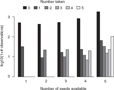
Figure 2.3 Bar plot of observations of number of seeds taken, subdivided by number available: barplot(t(log10(t1+1)), beside=TRUE).
Yet another graphical approach would be to try to visualize these data in three dimensions, as a 3D bar plot or “lollipop plot” (adding stems to a 3D scatterplot to make it easier to locate the points in space; Figure 2.4). 3D graphics do represent a wide new range of opportunities for graphing data, but they are often misused and sometimes actually convey less information than a carefully designed 2D plot; it's hard to design a really good 3D plot. To present 3D graphics in print you also have to pick a single viewpoint, although this is not an issue for exploratory graphics. Finally, R's 3D capabilities are less well developed than those of MATLAB or Mathematica (although the rgl package, which is used in Figure 2.4 and has been partially integrated with the Rcmdr and vegan packages, is under rapid development). A package called ggobi allows you to explore scatterplots of high-dimensional/multivariate data sets.

Figure 2.4 3D graphics: lollipop plot produced in rgl (plot3d(…,type=“s”) to plot spheres, followed by plot3d(…,type=“h”) to plot stems).
2.4.1.3 FRACTION OF SEEDS TAKEN
It may make more sense to work with the fraction of seeds taken, and to see how this varies with number available: Is it constant? Or does the fraction of seeds taken increase with the density of seeds (predator attraction) or decrease (predator saturation) or vary among species?
![]()
Plotting the fraction taken directly (e.g., as a function of number available: plot(SeedPred$available,frac.taken)) turns out to be uninformative, since all of the possible values (e.g. 0/3, 1/3, 2/3, 1) appear in the data set and so there is lots of overlap; we could use sizeplot or jitter again, or we could compute the mean fraction taken as a function of species, date, and number of seeds available.
Suppose we want to calculate the mean fraction taken for each number of seeds available. The command
![]()
computes the mean fraction taken (frac.taken) for each different number of seeds available (available: R temporarily converts available into a factor for this purpose). (The tapply command is discussed in more detail in the R supplement.)

Figure 2.5 Bar plot with error bars: mean fraction taken as a function of number available: barplot2 (mean.frac.by.avail, plot.CI=TRUE,…).
We can also use tapply to calculate the standard errors, ![]()
I'll use a variant of barplot, barplot2 (from the gplots package), to plot these values with standard errors. R does not supply error-bar plotting as a built-in function, but you can use the barplot2 (gplots package) or plotCI (gplots or plotrix package) function to add error bars to a plot (see the R supplement).
While a slightly larger fraction of available seeds is removed when 5 seeds are available, there is not much variation overall (Figure 2.5). We can use tapply to cross-tabulate by species as well; the following commands would show a bar plot of the fraction taken for each combination of number available and species:

It's often better to use a box plot (or box-and-whisker plot) to compare continuous data in different groups. Box plots show more information than bar plots, and they show it in a robust form (see p. 49 for an example). However, in this case the box plot is dominated by zeros and so is not very informative.
One more general plotting strategy is to use small multiples (Tufte, 2001), breaking the plot into an array of similar plots comparing patterns at different levels (by species, in this case). To make small multiples in base graphics, I would use par(mfrow=c(row,col)) to divide the plot region into a grid with row rows and col columns and then draw a plot for each level separately. The lattice package handles small multiples automatically, and elegantly. In this case, I used the command
![]()
to separate out the cases where at least 1 seed was removed, and then
![]()
to plot bar charts showing the distribution of the number of seeds taken for each number available, subdivided by species. (barchart(…,stack=FALSE) is the lattice equivalent of barplot(…,beside=TRUE).) In other contexts, the lattice package uses a vertical bar | to denote a small-multiple plot. For example, bwplot(frac.taken![]() available|species) would draw an array of box plots, one for each species, of the fraction of seeds taken as a function of the number available (see p. 49 for another example).
available|species) would draw an array of box plots, one for each species, of the fraction of seeds taken as a function of the number available (see p. 49 for another example).
Figure 2.6 shows that the all-or-nothing distribution seen in Figure 2.3 is not just an artifact of lumping all the species together, but holds up at the individual species level. The patterns are slightly different, since in Figure 2.3 we chose to handle the large number of zero cases by log-transforming the number of counts (to compress the range of number of counts), while here we have just dropped the zero cases. Nevertheless, it is still more likely that a small or large fraction of the available seeds will disappear, rather than an intermediate fraction.
We could ask many more questions about these data.
• Is the length of time available for removal important? Although most stations were checked every 7 days, the interval ranged from 3 to 10 days (table(tint)). Would separating the data by tint, or standardizing to a removal rate (tint/taken), show any new patterns?
• Do the data contain more information about the effects of distance from the forest? Would any of Figures 2.2–2.6 show different patterns if we separated the data by distance?
• Do the seed removal patterns vary along the transects (remember that the stations are spaced every 5 m along two transects)? Are neighboring stations more likely to be visited by predators? Are there gradients in removal rate from one end of the transect to the other?
However, you may be getting tired of seeds by now. The remaining examples in this chapter show more kinds of graphs and more techniques for rearranging data.
2.4.2 Tadpole Predation Data
The next example data set describes the survival of tadpoles of an African treefrog, Hyperolius spinigularis, in field predation trials conducted in large tanks. Vonesh and Bolker (2005) present the full details of the experiment; the goal was to understand the trade-offs that H. spinigularis face between avoiding predation in the egg stage (eggs are attached to tree leaves above ponds, and are exposed to predation by other frog species and by parasitoid flies) and in the larval stage (tadpoles drop into the water and are exposed to predation by many aquatic organisms including larval dragonflies). In particular, juveniles may face a trade-off between hatching earlier (and hence smaller) to avoid egg predators and surviving as tadpoles, since smaller tadpoles are at higher risk from aquatic predators.* Here, we're just going to look at the data as an example of dealing with continuous predictor variables (i.e., exploring how predation risk varies with tadpole size and density).

Figure 2.6 Small multiples: bar plots of number of seeds taken by number available and species (barchart(frac.taken|species)).
Since reading in these data is straightforward, we'll take a shortcut and use the data command to pull the data into R from the emdbook package. Three data sets correspond to three different experiments:
• ReedfrogPred: Results of a factorial experiment that quantified the number of tadpoles surviving for 16 weeks (surv: survprop gives the proportion surviving) with and without predators (pred), with three different tadpole densities (density), at two different initial tadpole sizes (size).
• ReedfrogSizepred: Data from a more detailed experiment on the effects of size (TBL, tadpole body length) on survival over 3 days (Kill, number killed out of 10).
• ReedfrogFuncresp: Data from a more detailed experiment on the effects of initial tadpole density (Initial) on the number killed over 14 days (Killed).
2.4.2.1 FACTORIAL PREDATION EXPERIMENT (ReedfrogPred)
What are the overall effects of predation, size, density, and their interactions on survival? Figure 2.7 uses boxplot(propsurv![]() size*density*pred) to display the experimental results (bwplot is the lattice equivalent of boxplot). Box plots show more information than bar plots. In general, you should prefer box plots to bar plots unless you are particularly interested in comparing values to zero (bar plots are anchored at zero, which emphasizes this comparison).
size*density*pred) to display the experimental results (bwplot is the lattice equivalent of boxplot). Box plots show more information than bar plots. In general, you should prefer box plots to bar plots unless you are particularly interested in comparing values to zero (bar plots are anchored at zero, which emphasizes this comparison).
Specifically, the line in the middle of each box represents the median; the ends of the boxes (“hinges”) are the first and third quartiles (approximately; see ?box-plot.stats for gory details); the “whiskers” extend to the most extreme data point in either direction that is within a factor of 1.5 of the hinge; any points beyond the whiskers (there happen to be none in Figure 2.7) are considered outliers and are plotted individually. It's clear from the picture that predators significantly lower survival (not surprising). Density and tadpole size also have effects, and may interact (the effect of tadpole size in the predation treatment appears larger at high densities).* The order of the factors in the box plot formula doesn't really change the answers, but it does change the order in which the bars are presented, which emphasizes different comparisons. In general, you should organize bar plots and other graphics to focus attention on the most important or most interesting question: in this case, the effect of predation is so big and obvious that it's good to separate predation from no-predation first so we can see the effects of size and density. I chose size*density*pred to emphasize the effects of size by putting the big- and small-tadpole bars within a density treatment next to each other; density*size*pred would emphasize the effects of density instead.
Box plots are also implemented in the lattice package:
![]()
gives a box plot. Substituting dotplot for bwplot would produce a dotplot instead, which shows the precise value for each experimental unit—good for relatively small data sets like this one, although in this particular example several points fall on top of each other in the treatments where there was high survival.

Figure 2.7 Results of factorial experiment on H. spinigularis predation: boxplot(propsurv![]() size*density*pred,data=ReedfrogPred).
size*density*pred,data=ReedfrogPred).

Figure 2.8 H. spinigularis tadpole predation by dragonfly larvae as a function of (a) initial density of tadpoles (b) initial size of tadpoles.
2.4.2.1 EFFECTS OF DENSITY AND TADPOLE SIZE
Once the factorial experiment had established the qualitative effects of density and tadpole size on predation, Vonesh ran more detailed experiments to explore the ecological mechanisms at work: how, precisely, do density and size affect predation rate, and what can we infer from these effects about tadpole life history choices?
Figure 2.8 shows the relationship between (a) initial density and (b) tadpole size and the number of tadpoles killed by aquatic predators. The first relationship shows the predator functional response—how the total number of prey eaten increases, but saturates, as prey density increases. The second relationship demonstrates a size refuge—small tadpoles are protected because they are hidden or ignored by predators, while large tadpoles are too big to be eaten or big enough to escape predators.
Questions about the functional relationship between two continuous variables, asking how one ecological variable affects another, are very common in ecology. Chapter 3 will present a wide variety of plausible mathematical functions to describe such relationships. When we do exploratory data analysis, on the other hand, we want ways of “connecting the dots” that are plausible but that don't make too many assumptions. Typically we're interested in smooth, continuous functions. For example, we think that a small change in initial density should not lead to an abrupt change in the number of tadpoles eaten.
The pioneers of exploratory data analysis invented several recipes to describe such smooth relationships.
• R incorporates two slightly different implementations of robust locally weighted regression (lowess and loess). This algorithm runs linear or quadratic regressions on successive chunks of the data to produce a smooth curve. lowess has an adjustable smoothness parameter (in this case the proportion of points included in the “neighborhood” of each point when smoothing) that lets you choose curves ranging from smooth lines that ignore a lot of the variation in the data to wiggly lines that pass through every point; in Figure 2.8a, I used the default value (lines(lowess(Initial,Killed))).
• Figure 2.8a also shows a spline fit to the data which uses a series of cubic curves to fit the data. Splines also have a smoothing parameter, the degrees of freedom or number of different piecewise curves fitted to the data; in this case I set the degrees of freedom to 5 (the default here would be 2) to get a slightly more wiggly curve (smooth.spline(Initial, Killed,df=5)).
• Simpler possibilities include just drawing a straight line between the mean values for each initial density (using tapply(Killed,Initial,mean) to calculate the means and unique(Initial) to get the nonrepeated values of the initial density), or plotting the results of a linear or quadratic regression of the data (not shown; see the R supplement). I plotted straight lines between the means in Figure 2.8b because local robust regression and splines worked poorly.
To me, these data present fewer intriguing possibilities than the seed removal data—primarily because they represent the results of a carefully targeted experiment, designed to answer a very specific question, rather than a more general set of field observations. The trade-off is that there are fewer loose ends; in the end we were actually able to use the detailed information about the shapes of the curves to explain why small tadpoles experienced higher survival, despite starting out at an apparent disadvantage.
2.4.3 Damselfish Data
The next example comes from Schmitt et al.'s (1999) work on a small reef fish, the three-spotted damselfish (Dascyllus trimaculatus), in French Polynesia. Like many reef fish, Dascyllus's local population dynamics are open. Pelagic larval fish immigrate from outside the area, settling when they arrive on sea anemones. Schmitt et al. were interested in understanding how the combination of larval supply (settler density), density-independent mortality, and density-dependent mortality determines local population densities.
The data are observations of the numbers of settlers found on previously cleared anemones after settlement pulses and observations of the number of subadults recruiting (surviving after 6 months) in an experiment where densities were artificially manipulated.
The settlement data set, DamselSettlement, includes 600 observations at 10 sites, across 6 different settlement pulses in 2 years. Each observation records the site at which settlement was observed (site), the month (pulse), and the number (obs) and density per 0.1 m2 (density) of settling larvae. The first recruitment data set, DamselRecruitment, gives the anemone area in 0.1 m2 (area), the initial number of settlers introduced (init), and the number of recruits (subadults surviving after 6 months: surv). The second recruitment data set, DamselRecruitment_sum, gives information on the recruitment according to target densities (the densities the experimenters were trying to achieve), rather than the actual experimental densities, and summarizes the data by category. It includes the target settler density (settler.den), the mean recruit density in that category after 6 months (surv.den), and the standard error of recruit density (SE).
2.4.3.1 DENSITY-RECRUITMENT EXPERIMENT
The relationship between settler density and recruit density (Figure 2.9) is ecologically interesting but does not teach us many new graphical or data analysis tricks. I did plot the x axis on a log scale, which shows the low-density data more clearly but makes it harder to see whether the curve fits any of the standard ecological models (e.g., purely density-independent survival would produce a straight line on a regular (linear) scale). Nevertheless, we can see that the number recruiting at high densities levels off (evidence of density-dependent survival) and there is even a suggestion of overcompensation—a decreasing density of recruits at extreme densities.
Settlement Data
The reef fish data also provide us with information about the variability in settlement density across space and time. Schmitt et al. lumped all of these data together, to find out how the distribution of settlement density affects the relative importance of density-independent and density-dependent factors (Figure 2.10).
Figure 2.10 shows a histogram of the settlement densities. Histograms (hist in basic graphics or histogram in lattice graphics) resemble bar plots but are designed for continuous rather than discrete distributions. They break the data up into evenly spaced categories and plot the number or proportion of data points that fall into each bin. You can use histograms for discrete data, if you're careful to set the breaks between integer values (e.g., at seq(0,100,by=0.5)), but plot(table(x)) and barplot(table(x)) are generally better. Although histograms are familiar to most ecologists, kernel density estimators (density: Venables and Ripley, 2002), which produce a smooth estimate of the probability density rather than breaking the counts into discrete categories, are often better than histograms—especially for large data sets. While any form of binning (including kernel density estimation) requires some choice about how finely versus coarsely to subdivide or smooth the data, density estimators have a better theoretical basis for understanding this tradeoff. It is also simpler to superimpose densities graphically to compare distributions. The only case where I prefer histograms to densities is when I am interested in the distribution near a boundary such as zero, when density estimation can produce artifacts. Estimating the density and adding it to Figure 2.10 was as simple as lines(density(setdens)).
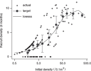
Figure 2.9 Recruit (subadult) D. trimaculatus density after 6 months, as a function of experimentally manipulated settler density. Black points show actual densities and survivorship; gray points with error bars show the recruit density, ± 1 SE, by the target density category; line is a lowess fit.

Figure 2.10 Overall distribution of settlement density of D.trimaculatus across space and time (only values < 200/(0.1 m2); 8 values excluded): hist and lines(density(…)).
The zero-settlement events are shown as a separate category by using breaks=c(0,seq(1,200,by=4)). Rather than plot the number of counts in each category, the probability density is shown using prob=TRUE, so that the area in each bar is proportional to the number of counts. Perhaps the most striking feature of the histogram is the large number of zeros, but this aspect is downplayed by the original histogram in Schmitt et al. (1999), which plots the zero counts separately but fails to increase the height of the bar to compensate for its narrower width. The zero counts seem to fall into a separate category; ecologically, one might wonder why there are so many zeros, and whether there are any covariates that would predict where and when there were no settlers. Depending on your ecological interests, you also might want to replot the histogram without the zeros to focus attention on the shape of the rest of the distribution.
The histogram also shows that the distribution is very wide (one might try plotting a histogram of log (1 + x) to compress the distribution). In fact, I excluded the eight largest values from the histogram. (R's histogram function does not have a convenient way to lump “all larger values” into the last bar, as in Schmitt et al.'s original figure.) The first part of the distribution falls off smoothly (once we ignore the zeros), but there are enough extremely large values to make us ask both what is driving these extreme events and what effects they may be having.
Schmitt et al. did not explore the distribution of settlement across time and space. We could use
![]()
to plot box-and-whisker plots of settlement divided by pulse, with small multiples for each site, for the damselfish settlement data. We can also use a pairs plot (pairs) or scatterplot matrix (splom in the lattice package) to explore the structure of multivariate data (many predictor variables, many response variables, or both; Figure 2.11). The pairs plot shows a table of x-y plots, one for each pair of variables in the data set. In this case, I've used it to show the correlations between settlement to a few of the different sites in Schmitt et al.'s data set (each site contains multiple reefs where settlement is counted). Because the DamselSettlement data set is in long form, we first have to reshape it so that we have a separate variable for each site:
![]()

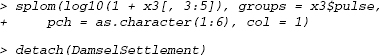
Figure 2.11 Scatterplot matrix of settlement to three selected reefs (logarithm(1 + x) scale), with points numbered according to pulse: splom(log10(1+x3[,3:5]),groups=x3$pulse, pch=as.character(1:6)).
The first few rows and columns of the reshaped data set look like this:

and we can now use pairs(log10(1+x3[,3:5])) (or splom(log10(1+x3[,3:5])) to use lattice graphics) to produce the scatterplot matrix (Figure 2.11).
2.4.4 Goby Data
We can explore the effect of density on survival in more detail with another data set on reef fish survivorship, this one on the marine gobies Elacatinus prochilos and E. evelynae in St. Croix (Wilson, 2004). Like damselfish, larval marine gobies also immigrate to a local site, although these species settle on coral heads rather than on anemones. Wilson experimentally manipulated density in a series of experiments across several years; she replaced fish as they died in order to maintain the local density experienced by focal individuals.*
Previous experiments and observations suggested that patch reefs with higher natural settlement rate have lower mortality rates, once one accounts for the effects of density. Thus reefs with high natural settlement rates were deemed to be of putatively high “quality,” and Wilson took the natural settlement rate as an index of quality in subsequent experiments in which she manipulated density.
Reading from a comma-separated file, specifying that the first four columns are factors and the last four are numeric:
![]()
Left to its own devices, R would have guessed that the first two columns (experiment number and year) were numeric rather than factors. I could then have converted them back to factors via gobydat$exper=factor(gobydat$exper) and gobydat$year=factor(gobydat$year).
R has an attach command that gives direct access to the columns in a data frame: if we say
![]()
we can then refer to year, exper, d1 rather than gobydat$year, gobydat$exper, gobydat$d1, and so forth. attach can make your code easier to read, but it can also be confusing; see p. 63 for some warnings.
For each individual monitored, the data give the experiment number (exper: five separate experiments were run between 2000 and 2002) and information about the year and location of the experiment (year, site); information about the location (coral head: head) of each individual and the corresponding density (density) and quality (qual) of the coral head; and the fate of the individual—the last day it was observed (d1) and the first day it was not seen (d2, set to 70 if the fish was present on the last sampling day of the experiment). (In survival analysis literature, individuals that are still alive when the study ends are called right-censored). Since juvenile gobies of these species rarely disperse, we will assume that a fish that disappears has died.
Survival data are challenging to explore graphically, because each individual provides only a single discrete piece of information (its time of death or disappearance). In this case we will approximate time of death as halfway between the last time an individual was observed and the first time it was not observed:
![]()
For visualization purposes, it will be useful to define low- and high-density and low- and high-quality categories. We will use the ifelse(val,a,b) command to assign value a if val is TRUE or b if val is FALSE, and the factor command to make sure that level low is listed before high even though it is alphabetically after it.

Figure 2.12 shows an xyplot of the mean survival value, jittered and divided into low- and high-quality categories, with linear-regression lines added to each subplot. There is some mild evidence that mean survival declines with density at low-quality sites, but much of the pattern is driven by the fish with meansurv of > 40 (which are all fish that survived to the end of the experiment) and by the large cluster of short-lived fish at low quality and high densities (> 10).
Let's try calculating and plotting the mortality rate over time, and the proportion surviving over time (the survival curve), instead.
Starting by taking all the data together, we would calculate these values by first tabulating the number of individuals disappearing in each time interval:

To calculate the number of individuals that disappeared on or after a given time, reverse the table (rev) and take its cumulative sum (cumsum):

Reversing the vector again sorts it into order of increasing time:
![]()
To calculate the proportional mortality at each time step, divide the number disappearing by the total number still present (I have rounded to two digits):
![]()

Figure 2.12 Mean survival time as a function of density, divided by quality (background settlement) category: xyplot.
Figure 2.13 plots the proportion dying and survival curves by quality/density category. The plot of proportion dying is very noisy but does suggest that the disappearance rate starts relatively high (![]() 50% per observation period) and then decreases (the end of the experiment gets very noisy, and was left off the plot). The survival curve is clearer. Since it is plotted on a logarithmic scale, the leveling off of the curves is an additional indication that the mortality rate decreases with time (constant mortality would lead to exponential decline, which would appear as a straight line on a logarithmic graph). As expected, the low-quality, high-density treatment has the lowest proportion surviving, with the other three treatments fairly closely clustered and not in the expected order (we would expect the high-quality, low-density treatment to have the highest survivorship). Don't forget to clean up with detach (gobydat).
50% per observation period) and then decreases (the end of the experiment gets very noisy, and was left off the plot). The survival curve is clearer. Since it is plotted on a logarithmic scale, the leveling off of the curves is an additional indication that the mortality rate decreases with time (constant mortality would lead to exponential decline, which would appear as a straight line on a logarithmic graph). As expected, the low-quality, high-density treatment has the lowest proportion surviving, with the other three treatments fairly closely clustered and not in the expected order (we would expect the high-quality, low-density treatment to have the highest survivorship). Don't forget to clean up with detach (gobydat).

Figure 2.13 Goby survival data: proportional mortality and fraction surviving over time, for different quality/density categories.
2.5 Conclusion
This chapter has given an overview and examples of how to get data into R and start plotting it in various ways to ask ecological questions. I overlooked a variety of special kinds of data (e.g., circular data such as directional data or daily event times; highly multivariate data; spatial data and maps; compositional data, where the sum of proportions in different categories adds to 1.0); Table 2.1 gives some ideas for handling these data types, but you may also have to search elsewhere, for example, using RSiteSearch(“circular”) to look for information on circular statistics.
2.6 R Supplement
All of the R code in the supplements is available from http://press.princeton.edu/titles/8709.html in an electronic format that will be easier to cut and paste from, in case you want to try it out for yourself (you should).
TABLE 2.1
Summary of Graphical Procedures

Square brackets denote functions in packages; [L] denotes functions in the lattice package.
2.6.1 Clean, Reshape, and Read In Data
To let R know where your data files are located, you have a few choices:
• Spell out the path, or file location, explicitly. (Use a single forward slash to separate folders (e.g., “c:/Users/bolker/My Documents/R/script.R”); this works on all platforms.)
• Use filename=file.choose(), which will bring up a dialog box to let you choose the file and set filename. This works on all platforms but is useful only on Windows and MacOS.
• Use menu commands to change your working directory to wherever the files are located: File/Change dir (Windows) or Misc/Change Working Directory (Mac).
• Change your working directory to wherever the files are located using the setwd (set working directory) function, e.g., setwd(“c:/temp”).
Changing your working directory is more efficient in the long run. You should save all the script and data files for a particular project in the same directory and switch to that directory when you start work.
The seed removal data were originally stored in two separate Excel files, one for the 10-m transect and one for the 25-m transect. After a couple of preliminary errors I decided to include na.strings=“?” (to turn question marks into NAs) and comment=“” (to deal with a # character in the column names—although I could also have edited the Excel file to remove it):

str and summary originally showed that I had some extra columns and rows: row 160 of dat_10 and columns 40–44 of dat_25 were junk. I could have gotten rid of them this way:
![]()
(I could also have used negative indices to drop specific rows or columns: dat_10 [-160,] and dat_25[-(40:44),] would have the same effect).
Now we reshape the data, specifying id.var=1:2 to preserve the first two columns, station and species, as identifier variables:
![]()
Convert the third column to a date, using paste to append 1999 to each date (sep=“.” separates the two pasted strings with a period):
![]()
Then use as. Date to convert the string to a date (%d means day, %b means three-letter month abbreviation, and %Y means four-digit year; check ?strptime for more date format details). Because the column names in the Excel file began with numbers (e.g., 25-Mar), R automatically added an x to the beginning as well as converting dashes to periods (X25.Mar)—include this in the format string:
![]()
Finally, rename the columns.:
![]()
Do the same for the 25-m transect data:

We've finished cleaning up and reformatting the data. Now we would like to calculate some derived quantities: specifically, tcum (elapsed time from the first sample), tint (time since previous sample), taken (number removed since previous sample), and available (number available at previous sample). We'll split the data frame up into a separate chunk for each station:
![]()
for loops are a general way of executing similar commands many times. A for loop runs for every value in a vector.
![]()
runs the R commands inside the curly brackets once for each element of vec, each time setting the variable var to the corresponding element of vec. The most frequent use of for loops is to run a set of commands n times by making vec equal 1:n.
For each data chunk (corresponding to the data from one station), we want to calculate (1) the cumulative time elapsed by subtracting the first date from all the dates; (2) the time interval since the previous observation by taking the difference of successive dates (with diff) and putting an NA at the beginning; (3) the number of seeds lost since the previous observation by taking the negative of the difference of successive numbers of seeds and prepending an NA; and (4) the number of seeds available at the previous observation by prepending NA and dropping the last element. We then put the new derived variables together with the original data and reassign them.
The for loop below does all these calculations for each chunk by executing each statement inside the curly brackets {}, setting i to each value between 1 and the number of stations:


Now we want to stick all of the chunks of the data frame back together. rbind (for row bind) combines columns, but normally we would say rbind(x,y,z) to combine three matrices or data frames with the same number of columns. If, as in this case, we have a list of matrices that we want to combine, we have to use do.call(“rbind”,list) to apply rbind to the list:
![]()
The approach shown here is also useful when you have individuals or stations that have data recorded only for the first observation of the individual. In some cases you can also do these manipulations by working with the data in wide format.
Do the same for the 25-m data (not shown).
Create new data frames with an extra column that gives the distance from the forest (rep is the R command to repeat values); then stick them together.
![]()
Convert station and distance from numeric to factors:
![]()
Reorder columns:
![]()
2.6.2 Plots: Seed Data
2.6.2.1 MEAN NUMBER REMAINING WITH TIME
Attach the seed removal (predation) data:
![]()
Using attach can make your code easier to read, since you don't have to put SeedPred$ in front of the column names, but it's important to realize that attaching a data frame makes a local copy of the variables. Changes that you make to these variables are not saved in the original data frame, which can be very confusing. Therefore, it's best to use attach only after you've finished modifying your data. attach can also be confusing if you have columns with the same name in two different attached data frames: use search to see where R is looking for variables. It's best to attach just one data frame at a time—and make sure to detach it when you finish.
Separate out the 10-m and 25-m transect data from the full seed removal data set:
![]()
The tapply (for table apply, pronounced “t apply”) function splits a vector into groups according to the list of factors provided, then applies a function (e.g., mean or sd) to each group. To split the data on numbers of seeds present by date and species and take the mean (na.rm=TRUE says to drop NA values):

matplot (“matrix plot”) plots all the columns of a matrix against a single x variable. Use it to plot the 10-m data on a log scale (log=“y”) with both lines and points (type=“b”), in black (col=1), with plotting characters (pch) 1 through 8, with solid lines (lty=1). Use matlines (“matrix lines”) to add the 25-m data in gray. (lines and points are the base graphics commands to add lines and points to an existing graph.)

2.6.2.2 SEED DATA: DISTRIBUTION OF NUMBER TAKEN VERSUS AVAILABLE
Jittered plot:
![]()
Bubble plot:
![]()
This plot differs from Figure 2.2 because I don't exclude cases where there are no seeds available. (I use xlim and ylim to extend the axes slightly.) scale and pow can be tweaked to change the size and scaling of the symbols.
To plot the numbers in each category, I use text, row to get row numbers, and col to get column numbers; I subtract 1 from the row and column numbers to plot values starting at zero.
![]()
Or you can use balloonplot from the gplots package:
![]()
Finally, you can use the default mosaic plot, either using the default plot command on the existing tabulation
![]()
or using mosaicplot with a formula based on the columns of SeedPred:
![]()
Bar plot:
![]()
or
![]()
Bar plot of mean fraction taken:

Bar plot of mean fraction taken by species—in this case we use barplot, saving the x locations of the bars in a variable b, and then add the confidence intervals with plotCI:

3D Plots
Using t1 from above, define the x, y, and z variables for the plot:
![]()
The scatterplot3d library is simpler to use, but less interactive—once the plot is drawn you can't change the viewpoint. Plot -avail and -taken to reverse the order of the axes and use type=“h” (originally named for a “high-density” plot in R's 2D graphics) to draw lollipops:
![]()
With the rgl library, first plot spheres (type=“s”) hanging in space:
![]()
Then add stems and grids to the plot:
![]()
Use the mouse to move the viewpoint until you like the result.
2.6.2.3 HISTOGRAM/SMALL MULTIPLES
Using lattice graphics, as in the text:
![]()
or with base graphics:

op stands for “old parameters” (you can name this variable anything you want). Saving the old parameters in this way and using par(op) at the end of the plot restores the original graphical parameters.
Clean up:
![]()
2.6.3 Tadpole Data
As mentioned in the text, reading in the data was fairly easy in this case: read.table(…,header=TRUE) and read.csv worked without any tricks. I take a shortcut, therefore, to load these data sets from the emdbook library:
![]()
2.6.3.1 BOX PLOT OF FACTORIAL EXPERIMENT
The box plot is fairly easy:
![]()
Play around with the order of the factors to see what the different plots tell you.
graycols specifies the colors of the bars to mark the different density treatments. gray(c(0.4,0.7,0.9)) produces a vector of three colors; rep(gray(c (0.4,0.7,0.9)),each=2) repeats each color twice (for the big and small treatments within each density treatment; and rep(rep(gray(c(0.4,0.7,0.9)), each=2),2) repeats the whole sequence twice (for the no-predator and predator treatments).
2.6.3.2 FUNCTIONAL RESPONSE VALUES
First attach the functional response data:
![]()
A simple x-y plot, with an extended x axis and some axis labels:
![]()
Adding the lowess fit (lines is the general command for adding lines to a plot: points is handy too):
![]()
Calculate mean values and corresponding initial densities, add to the plot with a different line type:
![]()
Fit a spline to the data using the smooth.spline command:
![]()
To add the spline curve to the plot, I have to use predict to calculate the predicted values for a range of initial densities, then add the results to the plot:
![]()
Equivalently, I could use the lm function with ns (natural spline), which is a bit more complicated in this case but has more general uses:
Finally, I could do linear or quadratic regression (I need to use ![]() to tell R I really want to fit the square of the initial density); adding the lines to the plot would follow the procedure above.
to tell R I really want to fit the square of the initial density); adding the lines to the plot would follow the procedure above.
![]()
Clean up:
![]()
The (tadpole size) vs. (number killed) plot follows similar lines, although I did use sizeplot because there were overlapping points.
2.6.4 Damselfish data
2.6.4.1 SURVIVORS AS A FUNCTION OF DENSITY
Load and attach data:
Plot surviving vs. initial density (scaled to per 0.1m2); use plotCI to add the summary data by target density; and add a lowess-smoothed curve to the plot:

Clean up:
![]()
2.6.4.2 DISTRIBUTION OF SETTLEMENT DENSITY
Plot the histogram (normally one would specify freq=FALSE to plot probabilities rather than counts, but the uneven breaks argument makes this happen automatically).

The last command is potentially confusing because density is both a data vector (settlement density) and a built-in R command (kernel density estimator), but R can tell the difference.
Some alternatives to try:
![]()
(you can use breaks either to specify particular breakpoints or to give the total number of bins to use).
If you really want to lump all the large values together:

These commands (1) use hist to calculate the number of counts in each bin without plotting anything; (2) use barplot to plot the values (ignoring the uneven width of the bins!), with space=0 to squeeze them together; and (3) add a custom x axis.
Box-and-whisker plots:
![]()
Other variations to try:

Scatterplot matrices: first reshape the data.
![]()
Scatterplot matrix of columns 3 to 5 (sites Cdina, Hin, and Hout)—using base graphics:
![]()
Using lattice graphics:
2.6.5 Goby Data
Plotting mean survival by density subdivided by quality category:

The default amount of jittering is too small, so factor=2 doubles it; see ?jitter for details.
2.6.5.1 LATTICE PLOTS WITH SUPERIMPOSED LINES AND CURVES
To add “extras” like extra points, linear regression lines, or loess fits to lattice graphics, you have to write a new panel function, combining a a default lattice panel function (usually called panel.xxx, e.g., panel.xyplot, panel.densityplot) with components from ?panel.functions. For example, here is a panel function that plots an x-y plot and adds a linear regression line:

Then call the original lattice function with the new panel function:

2.6.5.2 PLOTTING SURVIVAL CURVES
First set up categories for different combinations of quality and density by using interaction, and count the number of observations in each combination.
![]()
Tabulate the number disappearing at each time in each category:
![]()
Reverse order and calculate the cumulative sum by column (margin 2):
![]()
Divide each column (survival curve per category) by the total number for that category:
![]()
Calculate the fraction disappearing at each time:
![]()
Extract the time coordinate:
![]()
Plot survival curves by category:
![]()
* “Bible codes,” where people find hidden messages in the Bible, illustrate an extreme form of datadredging. Critics have pointed out that similar procedures will also detect hidden messages in War and Peace or Moby Dick (McKay et al., 1999).
† Or you should apply a post hoc procedure [see ?TukeyHSD and the multcomp package in R] that corrects for the fact that you are testing a pattern that was not suggested in advance—however, even these procedures apply corrections only for a specific set of possible comparisons, not for all possible patterns that you could have found in your data
* Your computer may be set up to open comma-delimited (.csv) files in Excel, but underneath they are just text files.
* Unless your data are truly voluminous, you should also save a hard-copy, archival version of your data (Gotelli and Ellison, 2004).
† In a text file: when using read.csv you need to add comment.char=“#” if you add metadata in this way.
* If you don't know what a package is, go back and read about them in the R supplement for Chapter 1.
* The + symbol is called a “binary operator” because it is used to combine two values.
* Matrices and data frames can appear identical but behave differently. If x is a data frame, either colnames(x) or names(x) will tell you the column names. If x has a column called a, either x$a or x[[“a”]] or x[,“a”] will retrieve it. If x is a matrix, you must use colnames(x) to get the column names and x[,“a”] to retrieve a column (the other commands will give errors). Use is.data.frame or class to tell matrices and data frames apart.
* != means “not equal to”; in general (but not for NAs), x[x!=y] will select values of x that are not equal to y.
* abz=Albizia grandibracteata, cd=Celtis durandii, cor=Cordia abyssinica, dio=Diospyros abyssinica, mmu=Mimusops bagshawei, pol=Polyscias fulva, psd=Pseudospondias microcarpa, uva=Uvariopsis congensis.
* In fact, the study found that smaller, earlier-hatched tadpoles manage to compensate for this risk by growing faster through the size range in which they are vulnerable to aquatic predators.
* An analysis of variance on the arcsine-square root transformed proportion surviving (Table 1 in Vonesh and Bolker (2005)) identifies significant effects of density, predator, density × predator and size × predator interactions (i.e., density and size matter only when predators are present), but not a significant density × size × predator interaction. Either the apparent increase in size effect at high densities in the presence of a predator is by chance alone, or the statistical test was not powerful enough to distinguish it from chance.
* Unlike the rest of the data sets in the book, I did not include this one in the emdbook package, since all the analyses have not yet been published. I will include them as soon as they become available; please feel free to contact me (BMB) in the meanwhile if you would like access to them.