
5 Stochastic Simulation and Power Analysis
This chapter introduces techniques and ideas related to simulating ecological patterns. Its main goals are: (1) to show you how to generate patterns you can use to sharpen your intuition and test your estimation tools; and (2) to introduce statistical power and related concepts, and show you how to estimate statistical power by simulation. This chapter and the supplements will also give you more practice working with R.
5.1 Introduction
Chapters 3 and 4 gave a basic overview of functions to describe deterministic patterns and probability distributions to describe stochastic patterns. This chapter will show you how to use stochastic simulation to understand and test your data. Simulation is sometimes called forward modeling, to emphasize that you pick a model and parameters and work forward to predict patterns in the data. Parameter estimation, or inverse modeling (the main focus of this book), starts from the data and works backward to choose a model and estimate parameters.
Ecologists often use simulation to explore the patterns that emerge from ecological models. Often they use theoretical models without accompanying data, in order to understand qualitative patterns and plan future studies. But even if you have data, you might want to start by simulating your system. You can use simulations to explore the functions and distributions you chose to quantify your data. If you can choose parameters that make the simulated output from those functions and distributions look like your data, you can confirm that the models are reasonable—and simultaneously find a rough estimate of the parameters.
You can also use simulated “data” from your system to test your estimation procedures. Chapters 6-8 will show you how to estimate parameters; in this chapter I'll work with more “canned” procedures like nonlinear regression. Since you never know the true answer to an ecological question—you only have imperfect measurements with which you’re trying to get as close to the answer as possible—simulation is the only way to test whether you can correctly estimate the parameters of an ecological system. It’s always good to test such a best-case scenario, where you know that the functions and distributions you’re using are correct, before you proceed to real data.
Power analysis is a specific kind of simulation testing where you explore how large a sample size you would need to get a reasonably precise estimate of your parameters. You can also also use power analysis to explore how variations in experimental design would change your ability to answer ecological questions.
5.2 Stochastic Simulation
Static ecological processes, where the data represent a snapshot of some ecological system, are easy to simulate.* For static data, we can use a single function to simulate the deterministic process and then add heterogeneity. Often, however, we will chain together several different mathematical functions and probability distributions representing different stages in an ecological process to produce surprisingly complex and rich descriptions of ecological systems.
I’ll start with three simple examples that illustrate the general procedure, and then move on to two slightly more in-depth examples.
5.2.1 Simple Examples
5.2.1.1 SINGLE GROUPS
Figure 5.1 shows the results of two simple simulations, each with a single group and single continuous covariate.
The first simulation (Figure 5.1a) is a linear model with normally distributed errors. It might represent productivity as a function of nitrogen concentration, or predation risk as a function of predator density. The mathematical formula is Y ~ Normal(a + bx, σ2), specifying that Y is a random variable drawn from a normal distribution with mean a + bx and variance σ2. The symbol ~ means “is distributed according to.” This model can also be written as ![]() specifying that the ith value of Y, yi, is equal to a + bxi plus a normally distributed error term with mean zero. I will always use the first form because it is more general: normally distributed error is one of the few kinds that can simply be added onto the deterministic model in this way. The two lines on the plot show the theoretical relationship between y and x and the best-fit line by linear regression, lm(y~x) (Section 9.2.1). The lines differ slightly because of the randomness incorporated in the simulation.
specifying that the ith value of Y, yi, is equal to a + bxi plus a normally distributed error term with mean zero. I will always use the first form because it is more general: normally distributed error is one of the few kinds that can simply be added onto the deterministic model in this way. The two lines on the plot show the theoretical relationship between y and x and the best-fit line by linear regression, lm(y~x) (Section 9.2.1). The lines differ slightly because of the randomness incorporated in the simulation.
A few lines of R code will run this simulation. Set up the values of x, and specify values for the parameters a and b:
![]()

Figure 5.1 Two simple simulations: (a) a linear function with normal errors (Y ~ Normal (a + bx, σ2)) and (b) a hyperbolic function with negative binomial errors (Y ~ NegBin(μ = ab/(b + x), k)).
Calculate the deterministic part of the model:
> y_det = a + b * x
Pick 20 random normal deviates with the mean equal to the deterministic equation and σ = 2:
> y = rnorm(20, mean = y_det, sd = 2)
(You could also specify this as y = y_det+rnorm(20,sd=2), corresponding to the additive model yi = a + bxi + εi, εi ~ N(0, σ2) (the mean parameter is zero by default). However, the additive form works only for the normal, and not for most of the other distributions we will be using.)
The second simulation uses hyperbolic functions (y = ab/(b + x)) with negative binomial error, or, in symbols, Y ~ NegBin(μ = ab/(b + x), k). The function is parameterized so that a is the intercept term (when x = 0, y = ab/b = a). This simulation might represent the decreasing fecundity of a species as a function of increasing population density; the hyperbolic function is a natural expression of the decreasing quantity of a limiting resource per individual.
In this case, we cannot express the model as the deterministic function “plus error.” Instead, we have to incorporate the deterministic model as a control on one of the parameters of the error distribution—in this case, the mean μ. (Although the negative binomial is a discrete distribution, its parameters μ and k are continuous.) Ecological models typically describe the differences in the mean among groups or as covariates change, but we could also allow the variance or the shape of the distribution to change.
The R code for this simulation is easy, too. Define parameters
![]()
How you simulate the x values depends on the experimental design you are trying to simulate. In this case, we choose 50 x values randomly distributed between 0 and 5 to simulate a study where the samples are chosen from natural varying sites, in contrast to the previous simulation where x varied systematically (x=1:20), simulating an experimental or observational study that samples from a gradient in the predictor variable x.
![]()
Now we calculate the deterministic mean y_det, and then sample negative binomial values with the appropriate mean and overdispersion:
![]()
5.2.1.2 MULTIPLE GROUPS
Ecological studies typically compare the properties of organisms in different groups (e.g., control and treatment, parasitized and unparasitized, high and low altitude).
Figure 5.2 shows a simulation that extends the hyperbolic simulation above to compare the effects of a continuous covariate in two different groups (species in this case). Both groups have the same overdispersion parameter k, but the hyperbolic parameters a and b differ:
![]()
where i is 1 or 2 depending on the species of an individual.
Suppose we still have 50 individuals, but the first 25 are species 1 and the second 25 are species 2. We use rep to set up a factor that describes the group structure (the R commands gl and expand.grid are useful for more complicated group assignments):
![]()
Defining vectors of parameters, each with one element per species, or a single parameter for k since the species have the same degree of overdispersion:
![]()
R’s vectorization makes it easy to incorporate different parameters for different species into the formula, by using the group vector g to specify which element of the parameter vectors to use for any particular individual:
![]()

Figure 5.2 Simulation results from a hyperbolic/negative binomial model with groups differing in both intercept and slope: Y ~ NegBin(μ = ai bi / (bi + x), k). Parameters: a = {20,10}, b = {1,2}, k = 5.
5.2.2 Intermediate Examples
5.2.2.1 REEF FISH SETTLEMENT
The damselfish settlement data from Schmitt et al. (1999; also Section 2.4.3 above) include random variation in settlement density (the density of larvae arriving on a given anemone) and random variation in density-dependent recruitment (number of settlers surviving for 6 months on an anemone).
To simulate the variation in settlement density I took random draws from a zero-inflated negative binomial (p. 145), although a noninflated binomial, or even a geometric distribution (i.e., a negative binomial with k = 1) might be sufficient to describe the data.
Schmitt et al. modeled density-dependent recruitment with a Beverton-Holt curve (equivalent to the Michaelis-Menten function). I have simulated this curve with binomial error (for survival of recruits) superimposed. The model is

Figure 5.3 Damselfish recruitment: (a) distribution of settlers; (b) recruitment as a function of settlement density.
![]()
With the recruitment probability per settler p given as the hyperbolic function a/(l + (a/b)S), the mean number of recruits is Beverton-Holt: Np = aS /(1 + (a/b)S). The settlement density S is drawn from the zero-inflated negative binomial distribution shown in Figure 5.3a.
Set up the parameters, including the number of samples (N):

Define a function for the recruitment probability:
![]()
Now simulate the number of settlers and the number of recruits, using rzinbinom from the emdbook package:
![]()
5.2.2.2 PIGWEED DISTRIBUTION AND FECUNDITY
Pacala and Silander (1990) quantified the strength and spatial scale of competition between the annual weeds velvetweed (Abutilon theophrasti) and pigweed (Amaranthus retroflexus). They were interested in neighborhood competition among nearby plants. Local dispersal of seeds changes the distribution of the number of neighbors per plant. If plants were randomly distributed, we would expect a Poisson distribution of neighbors within a given distance, but if seeds have a limited dispersal range so that plants are spatially aggregated, we expect a distribution with higher variance (and a higher mean number of neighbors for a given overall plant density) such as the negative binomial. Neighbors increase local competition for nutrients, which in turn decreases plants’ growth rate, their biomass at the end of the growing season, and their fecundity (seed set). Thus interspecific differences in dispersal and spatial patterning could change competitive outcomes (Bolker et al., 2003), although Pacala and Silander found that spatial structure had little effect in their system.
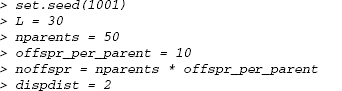
To explore the patterns of competition driven by local dispersal and crowding, we can simulate this spatial competitive process. Let’s start by simulating a spatial distribution of plants in an L × L plot (L = 30 m below). We’ll use a Poisson cluster process, where mothers are located randomly in space at points {xp, yp} (called a Poisson process in spatial ecology), and their children are distributed nearby (only the children, and not the mothers, are included in the final pattern). The simulation includes N = 50 parents, for which we pick 50 x and 50 y values, each uniformly distributed between 0 and L. The distance of each child from its parent is exponentially distributed with rate = 1/d (mean dispersal distance d), and the direction is random—that is, uniformly distributed between 0 and 2π radians.* I use a little bit of trigonometry to calculate the off spring locations (Figure 5.4a).
The formal mathematical definition of the model for off spring location is:
| parent locations | xP, yp ~ U(0, L) |
| distance from parent | r ~ Exp(1/d) |
| dispersal angle | θ ~ U(0,2π) |
| offspring x | xc = xp + r cos θ |
| offspring y | yc = yp + r sin θ |
In R, set up the parameters:
Pick locations for the parents:
![]()
Figure 5.4 Pigweed simulations. (a) Spatial pattern (Poisson cluster process). (b) Distribution of number of neighbors within 2 m. (c) End-of-year biomass, based on a hyperbolic function of crowding index with a Gamma error distribution. (d) Seed set, proportional to biomass with a negative binomial error distribution.
Pick angles and distances for dispersal:
![]()
Add the off spring displacements to the parent coordinates (using rep(…,each= offspr_per_parent)):
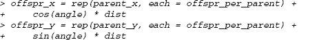
If you wanted to allow different numbers of off spring for each parent—for example, drawn from a Poisson distribution—you could use offspr_per_parent= rpois(nparents,lambda) and then rep(…,times=offspr_per_parent). Instead of specifying that each parent’s coordinates should be repeated the same number of times, you would be telling R to repeat each parent’s coordinates according to its number of offsprihg
Next we calculate the neighborhood density, or the number of individuals within 2m of each plant (not counting itself). Figure 5.4b shows this distribution, along with a fitted negative binomial distribution. This calculation reduces the spatial pattern to a simpler nonspatial distribution of crowding.
![]()
The dist command calculates the distances among plant positions, while rowSums counts the number of distances in each row that satisfy the condition ndist < 2; we subtract 1 to ignore self-crowding.
Next we use a relationship that Pacala and Silander found between end-of-year mass (M) and competition index (C) (Figure 5.4c). They fitted this relationship based on a competition index estimated as a function of the neighborhood density of con-specific (pigweed) and heterospecific (velvetleaf) competitors, C = 1 + cppnp + cvpnv. For this example, I simplified the crowding index to C = 1 + 3np. Pacala and Silander found that biomass M ~ Gamma(shape = m/(1 + C), scale = α), with m = 2.3 and α = 0.49.

Finally, we simulate seed set as a function of biomass, again using a relationship estimated by Pacala and Silander. Seed set is proportional to mass, with negative binomial errors: S ~ NegBin(μ = bM, k), with b = 271.6, k = 0.569.

Figure 5.4d shows both mass and (1 + seed set) on a logarithmic scale, along with dashed lines showing the 95% confidence limits of the theoretical distribution.
The idea behind realistic static models is that they can link together simple deterministic and stochastic models of each process in a chain of ecological processes—in this case from spatial distribution to neighborhood crowding to biomass to seed set. (Pacala and Silander actually went a step further and computed the density-dependent survival probability. We could simulate this using a standard model like survival ~ Binom(N = 1,p = logistic(a + bC)), where the logistic function allows the survival probability to be an increasing function of competition index that cannot exceed 1.)
Thus, although writing down a single function that describes the relationship between competition index and the number surviving would be extremely difficult, as shown here we can break the relationship down into stages in the ecological process and use a simple model for each stage.
5.3 Power Analysis
Power analysis in the narrow sense means figuring out the (frequentist) statistical power, the probability of correctly rejecting the null hypothesis when it is false (Figure 5.5). Power analysis is important, but the narrow frequentist definition suffers from some of the problems that we are trying to move beyond by learning new statistical methods, such as a focus on p values and on the “truth” of a particular null hypothesis. Thinking about power analysis even in this narrow sense is already a vast improvement on the naive and erroneous “the null hypothesis is false if p < 0.05 and true if p > 0.05” approach. However, we should really be considering a much broader question: How do the quality and quantity of my data and the true properties (parameters) of my ecological system affect the quality of the answers to my questions about ecological systems?
For any real experiment or observation situation, we don’t know what is really going on (the “true” model or parameters), so we don’t have the information required to answer these questions from the data alone. But we can approach them by analysis or simulation. Historically, questions about statistical power could be answered only by sophisticated analyses, and only for standard statistical models and experimental designs such as one-way ANOVA or linear regression. Increases in computing power have extended power analyses to many new areas, and R’s capability to run repeated stochastic simulations is a great help. Paradoxically, the mathematical difficulty of deriving power formulas is a great equalizer: since even research statisticians typically use simulations to estimate power, it’s now possible (by learning simulation, which is easier than learning advanced mathematical statistics) to work on an equal footing with even cutting-edge researchers.
The first part of the rather vague (but commonsense) question above is about “quantity and quality of data and the true properties of the ecological system.” These properties include:
• Number of data points (number of observations/sampling intensity).
• Distribution of data (experimental design):
- Number of observations per site, number of sites.
- Temporal and spatial extent (distance between the farthest samples, controlling the largest scale you can measure) and grain (distance between the closest samples, controlling the smallest scale you can measure).
- Even or clustered distribution in space and/or time. Blocking. Balance (i.e., equal or similar numbers of observations in each treatment).

Figure 5.5 The frequentist definition of power. In the left-hand plot, the type I (false positive) rate α is the area under the tails of the null hypothesis HO; the type II error rate β is the area under the sampling distribution of the alternative hypothesis (H1) between the tails of the null hypothesis; thus the power 1–β is the gray area shown that lies above the upper critical value of the null hypothesis curve. (There is also a tiny area, too small to see, where H1 overlaps the lower tail of H0.) The right-hand plot shows power as a function of effect size (distance between the means) and standard deviation; the point shows the scenario (effect size = 2, σ = 0.75) illustrated in the left figure.
- Distribution of continuous covariates—mimicking the natural distribution, or stratified to sample evenly across the natural range of values, or artificially extended to a wider range.
• Amount of variation (measurement/sampling error, demographic stochasticity, environmental variation). Experimental control or quantification of variation.
• Effect size (small or large), or the distance of the true parameter from the null-hypothesis value.
These properties will determine how much information you can extract from your data. Large data sets are better than smaller ones; balanced data sets with wide ranges are better than unbalanced data sets with narrow ranges; data sets with large extent (maximum spatial and/or temporal range) and small grain (minimum distance between samples) are best; and larger effects are obviously easier to detect and characterize. There are obvious trade-offs between effort (measured in person-hours or dollars) and the number of samples, and in how you allocate that effort. Would you prefer more information about fewer samples, or less information about more? More observations at fewer sites, or fewer at more sites? Should you spend your effort increasing extent or decreasing grain?
Subtler trade-offs also affect the value of an experiment. For example, controlling extraneous variation allows a more powerful answer to a statistical question—but how do we know what is “extraneous”? Variation actually affects the function of ecological systems (Jensen’s inequality; Ruel and Ayres, 1999). Measuring a plant in a constant laboratory environment may answer the wrong question: we ultimately want to know how the plant performs in the natural environment, not in the lab, and variability is an important part of most environments. In contrast, performing “unrealistic” manipulations like pushing population densities beyond their natural limits may help to identify density-dependent processes that are real and important but undetectable at ambient densities (Osenberg et al., 2002). These questions have no simple answer, but they’re important to consider.
The quality of the answers we get from our analyses is as multifaceted as the quality of the data. Precision specifies how finely you can estimate a parameter— the number of significant digits, or the narrowness of the confidence interval—while accuracy specifies how likely your answer is to be correct. Accurate but imprecise answers are better than precise but inaccurate ones: at least in this case you know that your answer is imprecise, rather than having misleadingly precise but inaccurate answers. But you need both precision and accuracy to understand and predict ecological systems.
More specifically, I will show how to estimate the following aspects of precision and accuracy for the damselfish system:
• Bias (accuracy): Bias is the expected difference between the estimate and the true value of the parameter. If you run a large number of simulations with a true value of d and estimate a value of ![]() for each one, then the bias is E[
for each one, then the bias is E[![]() — d]. Most simple statistical estimators are unbiased, and so most of us have come to expect (wrongly) that statistical estimates are generally unbiased. Most statistical estimators are indeed asymptotically unbiased, which means that in the limit of a large amount of data they will give the right answer on average, but surprisingly many common estimators are biased (Poulin, 1996; Doak et al., 2005).
— d]. Most simple statistical estimators are unbiased, and so most of us have come to expect (wrongly) that statistical estimates are generally unbiased. Most statistical estimators are indeed asymptotically unbiased, which means that in the limit of a large amount of data they will give the right answer on average, but surprisingly many common estimators are biased (Poulin, 1996; Doak et al., 2005).
• Variance (precision): Variance, or ![]() , measures the variability of the point estimates
, measures the variability of the point estimates ![]() around their mean value. Just as an accurate but imprecise answer is worthless, unbiased answers are worthless if they have high variance. With low bias we know that we get the right answer on average, but high variability means that any particular estimate could be way off. With real data, we never know which estimates are right and which are wrong.
around their mean value. Just as an accurate but imprecise answer is worthless, unbiased answers are worthless if they have high variance. With low bias we know that we get the right answer on average, but high variability means that any particular estimate could be way off. With real data, we never know which estimates are right and which are wrong.
• Confidence interval width (precision): The width of the confidence intervals, either in absolute terms or as a proportion of the estimated value, provides useful information on the precision of your estimate. If the confidence interval is estimated correctly (see coverage, below), then low variance will give rise to narrow confidence intervals and high variance will give rise to broad confidence intervals.
• Mean squared error (MSE: accuracy and precision): MSE combines bias and variance as (bias2 + variance). It represents the total variation around the true value, rather than around the average estimated value (E[d — ![]() ])2 + E[(
])2 + E[(![]() — E[
— E[![]() ])2] = E[(
])2] = E[(![]() — d)2]. MSE gives an overall measure of the quality of the estimator.
— d)2]. MSE gives an overall measure of the quality of the estimator.
• Coverage (accuracy): When we sample data and estimate parameters, we try to estimate the uncertainty in those parameters. Coverage describes how accurate those confidence intervals are and (once again) can be estimated only via simulation. If the confidence intervals (for a given confidence level 1 — α) are dlow and dhigh, then the coverage describes the proportion or percentage of simulations in which the confidence intervals actually include the true value: coverage = Prob(dlow < d < dhigh). Ideally, the observed coverage should equal the nominal coverage of 1 — α; values that are larger than 1 — α are pessimistic or conservative, overstating the level of uncertainty, while values that are smaller than 1 — α are optimistic or “anticonservative.” (It often takes several hundred simulations to get a reasonably precise estimate of the coverage, especially when estimating the coverage for 95% confidence intervals.)
• Power (precision): Finally, the narrow-sense power gives the probability of correctly rejecting the null hypothesis, or in other words the fraction of the times that the null-hypothesis value do will be outside of the confidence limits: Power = Prob(do < dlow or d0 > dhigh). In frequentist language, it is 1 — β, where β is the probability of making a type II error.

Typically you specify an alternative hypothesis H1 , a desired type I error rate α, and a desired power (1 — β) and then calculate the required sample size, or alternatively calculate (1 — β) as a function of sample size, for some particular H1. When the effect size is zero (the difference between the null and the alternate hypotheses is zero—i.e., the null hypothesis is true), the power is undefined, but it approaches α as the effect size gets small (H1 → H0).*
R has built-in functions for several standard cases (power of tests of difference between means of two normal populations [power.t.test], tests of difference in proportions, [power.prop.test], and one-way, balanced ANOVA [power.anova. test]).![]() For more discussion of these cases, or for other straightforward examples, you can look in any relatively advanced biometry book (e.g., Sokal and Rohlf (1995) or Quinn and Keough (2002)), or even find a calculator on the Web (search for “statistical power calculator”). For more complicated and ecologically realistic examples, however, you’ll probably have to find the answer through simulation, as demonstrated below.
For more discussion of these cases, or for other straightforward examples, you can look in any relatively advanced biometry book (e.g., Sokal and Rohlf (1995) or Quinn and Keough (2002)), or even find a calculator on the Web (search for “statistical power calculator”). For more complicated and ecologically realistic examples, however, you’ll probably have to find the answer through simulation, as demonstrated below.
5.3.1 Simple Examples
5.3.1.1 LINEAR REGRESSION
Let’s start by estimating the statistical power of detecting the linear trend in Figure 5.1a, as a function of sample size. To find out whether we can reject the null hypothesis in a single “experiment,” we simulate a data set with a given slope, intercept, and number of data points; run a linear regression; extract the p-value; and see whether it is less than our specified α criterion (usually 0.05). For example:

Extracting p-values from R analyses can be tricky. In this case, the coefficients of the summary of the linear fit are a matrix including the standard error, t statistic, and p-value for each parameter; I used matrix indexing based on the row and column names to pull out the specific value I wanted. More generally, you will have to use the names and str commands to pick through the results of a test to find the p-value.
To estimate the probability of successfully rejecting the null hypothesis when it is false (the power), we have to repeat this procedure many times and calculate the proportion of the time that we reject the null hypothesis.
Specify the number of simulations to run (400 is a reasonable number if we want to calculate a percentage—even 100 would do to get a crude estimate):
![]()
Set up a vector to hold the p-value for each simulation:
![]()
Now repeat what we did above 400 times, each time saving the p-value in the storage vector:

Calculate the power:
![]()
However, we don’t just want to know the power for a single experimental design. Rather, we want to know how the power changes as we change some aspect of the design such as the sample size or the variance. Thus we have to repeat the entire procedure multiple times, each time changing some parameter of the simulation such as the slope, or the error variance, or the distribution of the x values. Coding this in R usually involves nested for loops. For example:

The results would resemble a noisy version of Figure 5.5b. The power equals α = 0.05 when the slope is zero, rising to 0.8 for slope ≈ ±1.
You could repeat these calculations for a different set of parameters (e.g., changing the sample size or the number of parameters). If you were feeling ambitious, you could calculate the power for many combinations of (e.g.) slope and sample size, using yet another for loop, saving the results in a matrix, and using contour or persp to plot the results.
5.3.1.2 HYPERBOLIC/NEGATIVE BINOMIAL DATA
What about the power to detect the difference between the two groups shown in Figure 5.1b with hyperbolic dependence on x, negative binomial errors, and different intercepts and hyperbolic slopes?
To estimate the power of the analysis, we have to know how to test statistically for a difference between the two groups. Jumping the gun a little bit (this topic will be covered in much greater detail in Chapter 6), we can define negative log-likelihood functions for a null model that assumes the intercept is the same for both groups as well as for a more complex model that allows for differences in the intercept.
The mle2 command in the bbmle package lets us fit the parameters of these models, and the anova command gives us a p-value for the difference between the models (p. 206):

Without showing the details, we now run a for loop that simulates the system 200 times each for a range of sample sizes, uses anova to calculate the p-values, and calculates the proportion of p-values that are smaller than 0.05 for each sample size (Figure 5.6). For small sample sizes (< 20), the power is abysmal (≈ 0.2-0.4). Power then rises approximately linearly, reaching acceptable levels (0.8 and up) at sample sizes of 50-100 and greater. The variation in Figure 5.6 is due to stochastic variation in the simulations. We could run more simulations per sample size to reduce the variation, but it’s probably unnecessary since all power analysis is approximate anyway.

Figure 5.6 Statistical power to detect differences between two hyperbolic functions with intercepts a = {10,20}, slopes b = {2,1}, and negative binomial k = 5, as a function of sample size. Sample size is plotted on a logarithmic scale.
5.3.1.3 BIAS AND VARIANCE IN ESTIMATES OF THE NEGATIVE BINOMIAL K PARAMETER
For another simple example, one that demonstrates that there’s more to life than p-values, consider the problem of estimating the k parameter of a negative binomial distribution. Are standard estimators biased? How large a sample do you need for a reasonably accurate estimate of aggregation?
Statisticians have long been aware that maximum likelihood estimates of the negative binomial k and similar aggregation indices, while better than simpler method of moments estimates (p. 119), are biased for small sample sizes (Pieters et al., 1977; Piegorsch, 1990; Poulin, 1996; Lloyd-Smith, 2007). Although you could delve into the statistical literature on this topic and even find special-purpose estimators that reduce the bias (Saha and Paul, 2005), being able to explore the problem yourself through simulation is empowering.
We can generate negative binomial samples with rnbinom, and the fitdistr command from the MASS package is a convenient way to estimate the parameters. fitdistr finds maximum likelihood estimates, which generally have good properties—but are not infallible, as we will see shortly. For a single sample:

(The standard deviations of the parameter estimates are given in parentheses.) You can see that for this example the value of k (size) is underestimated relative to the true value of 0.5—but how do the estimates behave in general?
To dig the particular values we want (estimated k and standard deviation of the estimate) out of the object that fitdistr returns, we have to use str(f) to examine its internal structure. It turns out that f$estimate[“size”] and f$sd[“size”] give us the numbers we want.
Set up a vector of sample sizes (lseq is a function from the emdbook package that generates a logarithmically spaced sequence) and set aside space for the estimate of k and its standard deviation:
![]()
Now pick samples and estimate the parameters:

The estimate is indeed biased, and highly variable, for small sample sizes (Figure 5.7). For sample sizes below about 100, the estimate k is biased upward by about 20% on average. The coefficient of variation (standard deviation divided by the mean) is similarly greater than 0.2 for sample sizes less than 100.
5.3.2 Detecting Under- and Overcompensation in Fish Data
Finally, we will explore a more extended and complex example—the difficulty of estimating the exponent d in the Shepherd function, R = aS /(1 + (a / b)Sd) (Figure 3.10). This parameter controls whether the Shepherd function is undercompensating (d < 1: recruitment increases indefinitely as the number of settlers grows), saturating (d = 1: recruitment reaches an asymptote), or overcompensating (d > 1: recruitment decreases at high settlement). Schmitt et al. (1999) set d = 1 in part because d is very hard to estimate reliably—we are about to see just how hard.

Figure 5.7 Estimates of negative binomial k with increasing sample size. In (a) the solid line is a loess fit; horizontal dashed line is the true value. The y axis in (b) is logarithmic.
You can use the simulation approach described above to generate simulated “data sets” of different sizes whose characteristics match Schmitt et al.’s data: a zero-inflated negative binomial distribution of numbers of settlers and a Shepherd function relationship (with a specified value of d) between the number of settlers and the number of recruits. For each simulated data set, use R’s nls function to estimate the values of the parameters by nonlinear least squares.* Then calculate the confidence limits on d (using the confint function) and record the estimated value of the parameter and the lower and upper confidence limits.
Figure 5.8 shows the point estimates (![]() ) and 95% confidence limits (dlow, dhigh) for the first 20 out of 400 simulations each with 1000 simulated observations and a true value of d = 1.2. The figure also illustrates several of the summary statistics discussed above: bias, variance, power, and coverage (see the caption for details).
) and 95% confidence limits (dlow, dhigh) for the first 20 out of 400 simulations each with 1000 simulated observations and a true value of d = 1.2. The figure also illustrates several of the summary statistics discussed above: bias, variance, power, and coverage (see the caption for details).
For this particular case (n = 1000, d = 1.2) I can compute the bias (0.0039), variance (0.003, or σ![]() = 0.059), mean-squared error (0.003), coverage (0.921), and power (0.986). With 1000 observations, things look great, but 1000 observations is a lot and d = 1.2 represents strong overcompensation. The real value of power analyses comes when we compare the quality of estimates across a range of sample sizes and effect sizes.
= 0.059), mean-squared error (0.003), coverage (0.921), and power (0.986). With 1000 observations, things look great, but 1000 observations is a lot and d = 1.2 represents strong overcompensation. The real value of power analyses comes when we compare the quality of estimates across a range of sample sizes and effect sizes.
Figure 5.9 gives a gloomier picture, showing the bias, precision, coverage, and power for a range of d values from 0.7 to 1.3 and a range of sample sizes from 50 to 2000. Sample sizes of at least 500 are needed to obtain reasonably unbiased estimates with adequate precision, and even then the coverage may be low if d < 1.0 and the power low if d is close to 1 (0.9 ≤ d ≤ 1.1). Because of the upward bias in d at low sample sizes, the calculated power is actually higher at very low sample sizes, but this is not particularly comforting. The power of the analysis is slightly greater for overcompensation than undercompensation. The relatively low power values are as expected from Figure 5.9b, which shows wide confidence intervals. Low power would also be predictable from the high variance of the estimates, which I didn’t even bother to show in Figure 5.9a because they obscured the figure too much.

Figure 5.8 Simulations and power/coverage. Points and error bars show point estimates (![]() ) and 95% confidence limits (dlow, dhigh) for the first 20 out of 400 simulations with a true value of d = 1.2 and 1000 samples. Horizontal lines show the mean value of
) and 95% confidence limits (dlow, dhigh) for the first 20 out of 400 simulations with a true value of d = 1.2 and 1000 samples. Horizontal lines show the mean value of ![]() , E[
, E[![]() ] =1.204; the true value for this set of simulations, d = 1.2; and the null value, d0 = 1. The left-hand vertical density plot shows the distribution of
] =1.204; the true value for this set of simulations, d = 1.2; and the null value, d0 = 1. The left-hand vertical density plot shows the distribution of ![]() for all 400 simulations. The right-hand density shows the distribution of the lower confidence limit, dlow. The distance between d (solid horizontal line) and E[
for all 400 simulations. The right-hand density shows the distribution of the lower confidence limit, dlow. The distance between d (solid horizontal line) and E[![]() ] (short-dashed horizontal line) shows the bias. The error bar showing the standard deviation of
] (short-dashed horizontal line) shows the bias. The error bar showing the standard deviation of ![]() , π
, π![]() , shows the square root of the variance of
, shows the square root of the variance of ![]() . The coverage is the proportion of lower confidence limits that fall below the true value, area b + c in the lower-bound density. The power is the proportion of lower confidence limits that fall above the null value, area a + b in the lower-bound density. For simplicity, I have omitted the distribution of the upper bounds dhigh.
. The coverage is the proportion of lower confidence limits that fall below the true value, area b + c in the lower-bound density. The power is the proportion of lower confidence limits that fall above the null value, area a + b in the lower-bound density. For simplicity, I have omitted the distribution of the upper bounds dhigh.
Another use for our simulations is to take a first look at the trade-offs involved in adding complexity to models. Figure 5.10 shows estimates of b, the asymptote if d = 1, for different sample sizes and values of d. If d = 1, then the Shepherd model reduces to the Beverton-Holt model. In this case, you might think that it wouldn’t matter whether you used the Shepherd or the Beverton-Holt model to estimate the b parameter, but the Shepherd function presents serious disadvantages. First, even when d = 1, the Shepherd estimate of d is biased upward for low sample sizes, leading to a severe upward bias in the estimate of b. Second, not shown on the graph because it would have obscured everything else, the variance of the Shepherd estimate is far higher than the variance of the Beverton-Holt estimate (e.g., for a sample size of 200, the Beverton-Holt estimate is 9.83 ± 0.78 (s.d.), while the Shepherd estimate is 14.16 ± 13.94 (s.d.)).

Figure 5.9 Summaries of statistical accuracy, precision, and power for estimating the Shepherd exponent d for a range of d values from undercompensation, d = 0.7 (line marked “7”), to overcompensation, d = 1.3 (line marked “3”). (a) Estimated d: the estimates are strongly biased upward for sample sizes less than 500, especially for undercompensation (d < 1). (b) Confidence interval width: the confidence intervals are large (> 0.4) for sample sizes smaller than about 500, for any value of d. (c) Coverage of the nominal 95% confidence intervals is adequate for large sample size (> 250) and overcompensation (d > 1), but poor even for large sample sizes when d < 1. (d) For statistical power (1 — β) of at least 0.8, sample sizes of 500-1000 are required if d ≤ 0.7 or d ≥ 1.2; sample sizes of 1000 if d = 0.8; and sample sizes of at least 2000 if d = 0.9 or d = 1.1. When d = 1.0 (“0” line), the probability of rejecting the null hypothesis is a little above the nominal value of ± = 0.05.

Figure 5.10 Estimates of b, using Beverton-Holt or Shepherd functions, for different values of d and sample sizes. True value of b = 10.0. Shepherd estimate lines labeled “9”, “0”, and “1”, correspond to estimates of b when d = 0.9,1.0, or 1.1.
On the other hand, if d is not equal to 1, the Beverton-Holt estimate of b (horizontal lines in Figure 5.10) is strongly biased, independent of the sample size. For reasonable sample sizes, if d = 0.9, the Beverton-Holt estimate is biased upward by 6, to 16; if d = 1.1, it is biased downward by about 4, to 6. Since the Beverton-Holt model isn’t flexible enough to account for the changes in shape caused by d, it has to modify b in order to compensate.
This general phenomenon is called the bias-variance trade-off (see p. 204): more complex models reduce bias at the price of increased variance. (The small-sample bias of the Shepherd is a separate, and slightly less general, phenomenon.)
Because estimating parameters or testing hypotheses with noisy data is fundamentally difficult, and most ecological data sets are noisy, power analyses are often depressing. On the other hand, even if things are bad, it’s better to know how bad they are than just to guess; knowing how much you really know is important. In addition, you can make some design decisions (e.g., number of treatments vs. number of replicates per treatment) that will optimize power given the constraints of time and money.
Remember that the overall quality of your experimental design—including good technique; proper randomization, replication, and controls; and common sense—is often far more important than the fussy details of your statistical design (Hurlbert, 1984). While you should quantify the power of your experiment to make sure it has a reasonable chance of success, thoughtful experimental design (e.g., measuring and statistically accounting for covariates such as mass and rainfall; pairing control and treatment samples; or expanding the range of covariates tested) will make a much bigger difference than tweaking experimental details to squeeze out a little more statistical power.
* Dynamic processes are more challenging. See Chapter 11.
* R, like most computer languages, works in radians rather than degrees; to convert from degrees to radians, multiply by π;/180. Since R doesn't understand Greek letters, use pi to denote π: radians = degrees*pi/180.
* The power does not approach zero! Even when the null hypothesis is true, we reject it a proportion α of the time. Thus we can expect to correctly reject the null hypothesis, even for very small effects, with probability at least α.
![]() The Hmisc package, available on CRAN, has a few more power calculators.
The Hmisc package, available on CRAN, has a few more power calculators.
* Nonlinear least-squares fitting assumes constant, normally distributed error, ignoring the fact that the data are really binomially distributed. Chapter 5, 6 and 7 will present more sophisticated maximum likelihood approaches to this problem.