
In this chapter, we introduce out-of-the-box NetBeans Platform components. These can be integrated directly into your application, as in the case of the Output window and the Navigator. You'll learn the purpose of these components, as well as how they can best be customized and extended.
The NetBeans help system is based on the standard JavaHelp API. The NetBeans Platform provides a module containing the JavaHelp library and exposes a class allowing access to it. To use the help system, set a dependency in your module on the JavaHelp Integration module. The dependency is defined automatically when using the wizard to create a starting point for the JavaHelp system, as described in the next section.
Then, when running the module, choose Help
The IDE provides a wizard to set up new helpsets. It makes an otherwise tricky process child's play. Choose File
The basic helpset is added to the module, together with entries that register them in the layer file. That is done through the Services/JavaHelp extension point, in the following way:
<folder name="Services">
   <folder name="JavaHelp">
      <file name="module-helpset.xml" url="module-helpset.xml"/>
   </folder>
</folder>
In the layer file, the wizard registered the module-helpset.xml file, referencing all other files in the helpset. The module-helpset.xml file is located in the same package as the layer file. Help topics are contained in a folder separate from the Java source files. The nbdocs protocol is used to access the module-hs.xml file, as shown here:
<?xml version="1.0" encoding="UTF-8"?>
<!DOCTYPE helpsetref PUBLIC
   "-//NetBeans//DTD JavaHelp Help Set Reference 1.0//EN"
   "http://www.netbeans.org/dtds/helpsetref-1_0.dtd">
<helpsetref url="nbdocs:/com/galileo/netbeans/module/docs/module-hs.xml"/>
The helpset consists of the following configuration files, all of which are created by the wizard.
Other configuration files making up the helpset are registered in this file. Use the title element to assign the helpset a unique name. The maps element refers to map files that register help topics, defining their unique map IDs, used to reference help topics in the files defining tables of contents and indexes. The view element defines the helpset search engine, tables of contents, and indexes.
<?xml version="1.0" encoding="UTF-8"?>
<!DOCTYPE helpset PUBLIC
   "-//Sun Microsys Inc.//DTD JavaHelp HelpSet Version 2.0//EN"
   "http://java.sun.com/products/javahelp/helpset_2_0.dtd">
<helpset version="2.0">
   <title>My Module Help</title>
   <maps>
      <homeID>com.galileo.netbeans.module.about</homeID>
      <mapref location="module-map.xml"/>
   </maps>
   <view mergetype="javax.help.AppendMerge">
      <name>TOC</name>
      <label>Table of Contents</label>
      <type>javax.help.TOCView</type>
      <data>module-toc.xml</data>
   </view>
   <view mergetype="javax.help.AppendMerge">
      <name>Index</name>
      <label>Index</label>
      <type>javax.help.IndexView</type>
      <data>module-idx.xml</data>
   </view>
   <view>
      <name>Search</name>
      <label>Search</label>
      <type>javax.help.SearchView</type>
      <data engine="com.sun.java.help.search.DefaultSearchEngine">
              JavaHelpSearch</data>
   </view>
</helpset>The map file centralizes registration of help topics within the module. Using its target attribute, you can register HMTL files as help topics and assign them to a unique map ID. Later, refer to the help topics via their map ID when defining files that create tables of contents and indexes. Map IDs are used by the HelpCtx object to call up context-sensitive help, as described later in this section.
<?xml version="1.0" encoding="UTF-8"?>
<!DOCTYPE map PUBLIC
   "-//Sun Microsystems Inc.//DTD JavaHelp Map Version 2.0//EN"
   "http://java.sun.com/products/javahelp/map_2_0.dtd">
<map version="2.0">
   <mapID target="com.galileo.netbeans.module.about" url="module-about.html"/>
</map>
Table of contents files connect map IDs to help topics displayed as helpset tables of contents. Help topics are grouped into folders containing related topics by nesting elements within other elements, as shown here:
<?xml version="1.0" encoding="UTF-8"?>
<!DOCTYPE toc PUBLIC
   "-//Sun Microsystems Inc.//DTD JavaHelp TOC Version 2.0//EN"
   "http://java.sun.com/products/javahelp/toc_2_0.dtd">
<toc version="2.0">
   <tocitem text="My Module">
      <tocitem text="About My Module" target="com.galileo.netbeans.module.about"/>
   </tocitem>
</toc>In the index file, use the element indexitem to register the map IDs of the help topics displayed on the Index tab of the Help window:
<?xml version="1.0" encoding="UTF-8"?>
<!DOCTYPE index PUBLIC
   "-//Sun Microsystems Inc.//DTD JavaHelp Index Version 2.0//EN"
   "http://java.sun.com/products/javahelp/index_2_0.dtd">
<index version="2.0">
   <indexitem text="About My Module" target="com.galileo.netbeans.module.about"/>
</index>
Together, the previously described XML files configure help topics in the application. In the New File dialog, the JavaHelp Help Set wizard combines them in a very simple procedure. After completing the wizard, simply create HTML files and register them as help topics (as described in the previous sections) so they open in the Help window when accessed by the user.
Within a help topic, you can link to external sites or other help topics, even though they are found in other modules.
Typically, you will display external sites in an external browser, since the Help window is inadequate for that purpose. The NetBeans class that helps you in this regard is BrowserDisplayer. Use the object tag in a help topic to reference it:
<object classid="java:org.netbeans.modules.javahelp.BrowserDisplayer">
   <param name="content" value="http://www.netbeans.org">
   <param name="text" value="http://www.netbeans.org">
   <param name="textFontSize" value="medium">
   <param name="textColor" value="blue">
</object >
The BrowserDisplayer class passes the link to the URLDisplayer service. The default implementation of this service is made available, opening the link in the internal Swing HTML browser. Alternatively, you might want the external browser to open instead. Enabling this, we create a class named ExternalURLDisplayer, extending HtmlBrowser.URLDisplayer. This interface is located in the UI Utilities module, on which you set a dependency. This interface includes the showURL() method, providing the link to open a URL. Via this link, pass in a URI to the browse() method of the Java Desktop class, opening the appropriate page in the external browser.
public class ExternalURLDisplayer extends HtmlBrowser.URLDisplayer{
   public void showURL(URL link) {
      try {
         Desktop.getDesktop().browse(link.toURI());
      } catch(Exception ex) {
         Logger.getLogger("global").log(Level.SEVERE, null, ex);
         // show the user a message dialog
      }
   }
}
Next, register this service provider in the module META-INF/services folder, in a file called org.openide.awt.HtmlBrowser$URLDisplayer:
com.galileo.netbeans.module.ExternalURLDisplayer
#position=0
Links to other help topics are created by simply inserting href tags or the nbdocs protocol into your help topics:
<a href="nbdocs://org.netbeans.modules.usersguide/org/netbeans/
   modules/usersguide/configure/configure_options.html">
   Using the options dialog</a>
When using the nbdocs protocol, it is important that you use the code name base of the module to which you will link. In the preceding example, the code name base is org.netbeans. modules.usersguide. After the code name base, specify the path to the applicable help topic. The help system provides an appropriate message if the specified module is not available.
Context-sensitive help enables the user to directly access the help topic relating to the current context of the application. Rather than having users search for a particular topic, it is immediately available.
Create context-sensitive help topics by connecting a specific component in your application to a specific help ID in a map file. For a component to support context-sensitive help, implement the HelpCtx.Provider interface and use its getHelpCtx() method to provide an ID.
Many commonly used classes in the NetBeans APIs implement the HelpCtx.Provider interface, which makes the getHelpCtx() method available. Examples of these classes include Node, DataObject, TopComponent, SystemAction, WizardDescriptor.Panel, and DialogDescriptor. In its subclasses, you need only override the getHelpCtx() method, providing the map ID of the topic to be displayed.
Typically, context-sensitive help topics are made available by means of the F1 key. However, in a dialog or a wizard, overriding the getHelpCtx() method provides a button the user clicks to show related help topics.
Pressing the F1 key provides the help topic, thanks to this shortcut registration in the layer file:
<folder name="Shortcuts">
   <file name="F1.shadow">
      <attr name="originalFile" stringvalue="
              Actions/Help/org-netbeans-modules-javahelp-HelpAction.instance"/>
   </file>
</folder>
Now the user presses the F1 key, which runs the HelpAction that automatically searches the activated component. The ID of the help topic is identified via the getHelpCtx() method. In addition, a JComponent subclass can be used, and then the setHelpIDString() method can be used to define the map ID:
JComponent c = ...
HelpCtx.setHelpIDString(c, "com.galileo.netbeans.module.about");
Note that your component must be in focus; otherwise, the help topic will not be found. By default, the TopComponent is not focusable, to which end you use the isFocusable() method. Make the window focusable simply by calling setFocusable():
final class MyTopComponent extends TopComponent {
   private MyTopComponent() {
      setFocusable(true);
   }
public HelpCtx getHelpCtx() {
return new HelpCtx("com.galileo.netbeans.module.about");
}
}Now MyTopComponent is activated. The user can press the F1 key and the help topic matching the map ID com.galileo.netbeans.module.about will be called. You define a map ID for each help topic in the map file as shown in the "Creating and Integrating a Helpset" section earlier in the chapter. To show the Help window without a specific topic being displayed within it, return HelpCtx.DEFAULT_HELP. The HelpCtx determines the ID of the help topic by using the fully qualified name of the class. In the preceding example, if we were to use new HelpCtx(getClass()), the help ID would be unique, returning com.galileo.netbeans.module.MyTopComponent.
To call the help system programmatically, access it with Lookup (see Listing 9-1). There is a registered implementation of the Help class.
Example 9.1. Calling a specific help topic
Help h = Lookup.getDefault().lookup(Help.Class);
if(h != null)
   h.showHelp(new HelpCtx("com.galileo.netbeans.Module.about"));
   // h.showHelp(HelpCtx.DEFAULT_HELP);
We pass a HelpCtx instance representing a help topic to the method showHelp(). The constructor receives the ID of the requested help topic, which was registered in the map file. Instead, to show the default help topic, pass HelpCtx.DEFAULT_HELP to the constructor.
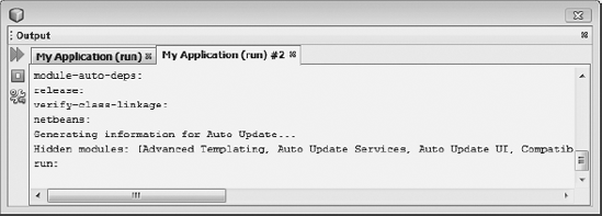
The NetBeans Platform provides the Output window as a display area for showing messages to the user (see Figure 9-1). Typically, messages come from tasks processed by your application. Messages from multiple tasks display in different tabs simultaneously.
To use this module in applications, go to the Project Properties dialog of the application and activate the Output Window module and the I/O APIs module, both within the platform cluster in the Libraries panel. Once modules are activated within the application, dependencies on them can be set in the module.
Next, specify a dependency on I/O APIs in the module. In the Project Properties dialog of the module, set I/O APIs as a dependency.
As a result of the preceding settings, the module writes to the Output window as shown in Listing 9-2.
Example 9.2. Using the Output window
InputOutput io = IOProvider.getDefault().getIO("Task", true);
io.getOut().println("Info message");
io.getErr().println("error message");
io.getOut().close();
io.getErr().close();
In the preceding snippet, we use IOProvider.getDefault(), using Lookup to access the related service provider located in the Output Window module. If the Output Window module (and thus the service provider) is not available, the standard output is used instead. The Output window is implemented as a global service, about which further information is found in Chapter 6.
The getIO() method provides the InputOutput through which the window is accessed. Define the name appearing in the tab or title bar. The Boolean parameter determines whether a new tab is created or an already existing one is used. Using the methods getOut() and getErr(), obtain an OutputWriter, which is a subclass of the Java PrintWriter class. Use println() for printing messages, as is normally done.
The text of the getErr() output is displayed in red in the Output window. It is important to end the stream with the close() method again. Doing so also sets the bold text of tabs back to normal font and signals the user that the task is complete.
If multiple tabs are displayed, use the InputOutput.select() method to ensure the appropriate tab is active. Open the Output window by means of the Window
The Output window has its own toolbar, within which you integrate actions. In Figure 9-1, you can see two actions for stopping and resuming the current process. To that end, there is a variant on the getIO() method, anticipating an array of actions as its second parameter. You can pass in very simple action implementations. However, it is important that your action uses the SMALL_ICON property to provide an icon to be added to the Output window toolbar.
In the following snippet, an example of such an action is illustrated. It derives from the AbstractAction class, which implements the Action interface. In the constructor, create an ImageIcon and assign it to the SMALL_ICON property:
public class StopTask extends AbstractAction {
   public StopTask() {
      putValue(SMALL_ICON,
             new ImageIcon(ImageUtilities.loadImage("icon.gif", true)));
   }
   public void actionPerformed(ActionEvent evt) {
      // stop the task
} }
Finally, pass a second parameter to the getIO() method. The second parameter is an array of actions, in this case consisting of an instance of the StopTask class:
InputOutput io =
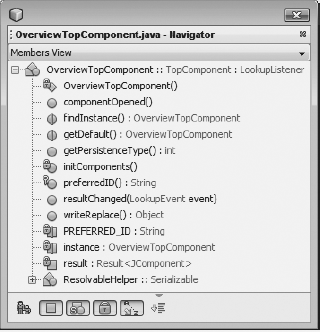
IOProvider.getDefault().getIO("Task", new Action[]{new StopTask()});Context-sensitive panels for navigating documents shown in the editor are defined by using the Navigator and its API. Constructors, methods, and other elements of an opened Java source file are shown by default in the Navigator (see Figure 9-2), allowing the user to double-click these items so that the cursor jumps to the relevant point in the document. However, this is only one of the Navigator's many uses. In fact, the Navigator can be used to direct the user through any kind of document.
The Navigator API provides the NavigatorPanel interface, defining new panels in the Navigator. Panels are added declaratively, using the folder of a specific MIME type in the module layer file. When a file of a particular MIME type is opened, Navigator panels registered under that MIME type are displayed.
However, providing a MIME type is not required. In some cases, a FileObject, DataObject, or Node corresponding to a Navigator panel may not be available. In those cases, use the NavigatorLookupHint interface, adding it to the related component Lookup. The NavigatorLookupHint interface specifies a single method, used to return a MIME type. In this way, a Navigator panel can be associated with a component, even if the component has no corresponding MIME type.
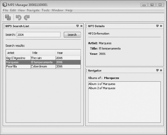
As an example, take the code from the "Intermodule Communication" section in Chapter 6 and extend it with another module. The example in Chapter 6 searches a list and shows Mp3FileObjects as its entries. However, the selected element is made available via the local Lookup. This element, making music titles available, is used in a new module, where we make all albums available in a Navigator panel, as shown in Figure 9-3 and in the sections that follow.
The example also shows how easy it is to extend an application on the NetBeans Platform by adding new modules and components that provide additional features.
The Navigator API belongs not to the standard set of modules in the NetBeans Platform, but to those belonging to the NetBeans IDE. Therefore, specify using that API by going to the Project Properties dialog and choosing the API from the ide cluster. First, activate the cluster, and then select the specific module where the API is found.
Next, add a new module to the suite, with the name MP3 Navigator. Dependencies required by this module are the Navigator API and the Utilities API. Before beginning to code, use the New File dialog to create a new JPanel Form. Change the class created by the wizard so that it extends JComponent instead of JPanel. Next, implement the interfaces NavigatorPanel and LookupListener.
The contents of the JPanel are defined with the Matisse GUI Builder. For example, to understand the code shown in Listing 9-3, you need know that two JLabels and a JList have been added.
Example 9.3. Navigator panel implementation
public class Mp3AlbumNavigatorPanel extends JComponent
implements NavigatorPanel, LookupListener {
private Lookup.Result<Mp3FileObject> result = null;
public Mp3AlbumNavigatorPanel() {
initComponents();
}
public JComponent getComponent() {
return this;
}
public void panelActivated(Lookup context) {
result = Utilities.ActionsGlobalContext().lookupResult(Mp3FileObject.class);
result.addLookupListener(this);
}
public void panelDeactivated() {
result.removeLookupListener(this);
result = null;
}
public void resultChanged(LookupEvent event) {
Collection<? extends Mp3FileObject> mp3s = result.allInstances();
if(!mp3s.isEmpty()) {
Mp3FileObject mp3 = mp3s.iterator().next();
// search for albums of selected artist and display it
albumsOf.setText(mp3.getArtist());
DefaultListModel model = new DefaultListModel();
model.addElement(new String("Album 1 of " + mp3.getArtist()));
model.addElement(new String("Album 2 of " + mp3.getArtist()));
albums.setModel(model);
}
}
}Use the getComponent() method specified by the NavigatorPanel interface to return the Navigator panel. The panelActivated() and panelDeactivated() methods are called if the panel is selected or deselected. With activation of the panel, we receive a Lookup.Result for the Mp3FileObject via the global Lookup. Next, register a LookupListener to be able to react when new entries need be added to the list.
When the Lookup changes, the resultChanged() method is called, which adds new content to the panel. To simplify things, our code will simply add two new entries. In real life, however, you'd typically search a database and display the content you find there.
To enable the Navigator to find and integrate the panel, register the panel in your layer file. This is done in the Navigator/Panels folder. Within this folder, assign the panel to a MIME type relevant to the entries displayed in the panel (see Listing 9-4). In this case, use the audio/mpeg MIME type, although any MIME type could be used.
Example 9.4. Registration of the Navigator panel
<folder name="Navigator">
   <folder name="Panels">
      <folder name="audio">
<folder name="mpeg">
<file name="com-galileo-netbeans-module-mp3navigator-
Mp3AlbumNavigatorPanel.instance"/>
</folder>
</folder>
</folder>
</folder>You might ask how the Navigator knows when to show our panel. The Navigator normally shows entries that correspond to the content of the currently selected node. In cases such as ours, in which we are not dealing with nodes, use the NavigatorLookupHint instead. The NavigatorLookupHint interface provides the getContentType() method, with which the component (in our case the Mp3SearchList) provides the MIME type for which a panel should be shown. Implement this interface in the Mp3SearchList class (see Listing 9-5) and return the audio/mpeg MIME type, which is how our panel was registered in the layer file.
Example 9.5. Implementation of the NavigatorLookupHint interface
final class Mp3SearchList extends TopComponent implements ListSelectionListener {
   private Mp3SearchList() {
      ...
      associateLookup(new ProxyLookup(
         new AbstractLookup(content),
         Lookups.singleton(new Mp3AlbumNavigatorLookupHint())));
   }
   private static final Class Mp3AlbumNavigatorLookupHint
           implements NavigatorLookupHint {
      public String getContentType() {
         return "audio/mpeg";
      }
   }
}
Provide the inner class Mp3AlbumNavigatorLookupHint, implementing the NavigatorLookupHint interface. Add an instance of this class to your local Lookup. Because we defined an AbstractLookup as a local Lookup, which contains the selected entry from the search list, we cannot display this instance directly. Provide a ProxyLookup to which we pass the AbstractLookup and a Lookup providing the Lookups factory. Define this ProxyLookup with the associateLookup() method as a local Lookup. As soon as the Mp3SearchList receives focus, the Navigator is informed about the available NavigatorLookupHint in the global Lookup. As a result, the Navigator calls the method getContentType() and, with the help of the return value, shows the required panel.
The Navigator becomes even more interesting when multiple components are available within it. Many panels can be created as described previously, and the related MIME types can be registered in the layer file. The Navigator switches between panels automatically, depending on which component is currently active.
Finally, be aware of the NavigatorHandler class. The NavigatorHandler class contains the activatePanel() method, to which you can pass a panel that you want opened programmatically.
The Properties window is a component for displaying and editing node properties. Node properties represent data with which the user interacts (see the "Nodes API" section in Chapter 7), while the Properties window allows the user to change those properties.
A group of related properties can be managed by the NetBeans Sheet class, belonging to the Nodes API. The AbstractNode class, which is typically the superclass of your node, provides a sheet of properties via its getSheet() method. Simply override the createSheet() method, adding the node's specific properties to the sheet.
Implementing a Properties window is shown by example. In the example, we show properties of the currently selected MP3 file in the Properties window. First, create a new file type for MP3 files, together with a related Node class, as described in Chapter 7. The end result should be as shown in Figure 9-4.
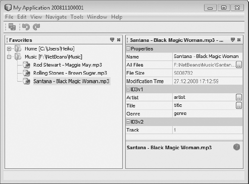
Override the createSheet() method in the Node class (in this example the Mp3DataNode class) representing files of the MP3 type. First, create a Sheet instance via the call to the superclass, providing a set of default properties to the instance. You can see these default properties in the first section of the Properties window in Figure 9-4.
If you do not want this default set of properties, provide your own Sheet instance to the constructor. From Figure 9-4, you can see that the properties can be divided across different areas, and expanded or collapsed by the user. Properties of each area are managed by the Sheet.Set class (see Listing 9-6).
To create the areas for ID3v1 and ID3v2, use the createPropertiesSet() factory method to create two Sheet.Sets. Provide a unique name for the Sheet.Set, using the method setName() for use within the internals of the Properties window module. If you fail to name your Sheet.Set, only the most recently created Sheet.Set is shown. With the setDisplayName() method, specify the name of the heading for the set you create.
Example 9.6. Use createSheet() to provide a sheet of properties shown in the Properties window.
public class Mp3DataNode extends DataNode {
   protected Sheet createSheet() {
      Sheet s = super.createSheet();
      Sheet.Set id3v1 = Sheet.createPropertiesSet();
      Sheet.Set id3v2 = Sheet.createPropertiesSet();
      id3v1.setName("ID3v1");
      id3v1.setDisplayName("ID3v1");
      id3v2.setName("ID3v2");
      id3v2.setDisplayName("ID3v2");
      Mp3DataObject mp3 = getLookup().lookup(Mp3DataObject.class);
      try {
         PropertySupport.Reflection<String> artistProp =
            new PropertySupport.Reflection<String>(mp3, String.class, "artist");
         PropertySupport.Reflection<String> titleProp  =
            new PropertySupport.Reflection<String>(mp3, String.class, "title");
         PropertySupport.Reflection<String> genreProp  =
            new PropertySupport.Reflection<String>(mp3, String.class, "genre");
         Property trackProp = new PropertySupport.Reflection<Integer> (
                 mp3, Integer.class, "getTrack", null);
         artistProp.setName("Artist");
         titleProp.setName("Title");
         genreProp.setName("Genre");
         trackProp.setName("Track");
         id3v1.put(artistProp);
         id3v1.put(titleProp);
         id3v1.put(genreProp);
         id3v2.put(trackProp);
      } catch (NoSuchMethodException ex) {
         ex.printStackTrace();
      }
      s.put(id3v1);
      s.put(id3v2);
      return s;
   }
}
We use Lookup to access a DataObject representing the MP3 file that made its properties available. For each property, create an object. In addition, make a distinction between properties that can be changed and those that can only be displayed. For properties the user is able to change, we provide a PropertySupport.Reflection instance with the corresponding type—in this case a String.
As parameters, pass the DataObject, the property data type, and the name of the getter/setter combination. For example, for the first property, we can pass in the artist, which means that we need to create an Mp3DataObject, as well as the setArtist() and getArtist() methods. Otherwise, a NoSuchMethodException will be thrown.
Then create a different constructor for properties the user should not be able to change. In this case, pass in the getter and setter separately. Since we do not want the user to be able to change the property, pass in null for the setter. To illustrate these points, part of the Mp3DataObject class is shown in Listing 9-7.
Example 9.7. A DataObject supporting properties must include getters and setters. If the property should not be changed, a setter is not provided.
public class Mp3DataObject extends MultiDataObject  {
   public String getArtist() {
      return this.artist;
   }
   public void setArtist(String artist) {
      this.artist = artist;
   }
   ...
   public int getTrack() {
      return this.track;
   }
}
Give created instances representing individual properties a name via the setName() method, and add them to the Sheet.Set via the put() method. Finally, use another put() to add the Sheet.Set to the Sheet, which is returned at the end of the overridden createSheet() method.
A Swing component can be provided as an editor for a property in the Properties window. Doing so, you can support the user by (for example) restricting the available list of values defined for a particular property. In Figure 9-4, you saw the value for the genre property set via a JComboBox. To provide an editor of this kind, provide the following statement for each property with the GenrePropertyEditor, providing a Swing component such as a JComboBox:
genreProp.setPropertyEditorClass(GenrePropertyEditor.class);
Now observe an editor of this kind being created. Focus only on the most important classes and methods.
Start with the GenrePropertyEditor class, which is extended using the standard JDK class PropertyEditorSupport, a base implementation that must be implemented by all user-defined editors. In addition, implement ExPropertyEditor and InplaceEditor.Factory (see Listing 9-8) Obtain a PropertyEnv object via the attachEnv() method, which belongs to ExPropertyEditor, providing access to the Properties window.
Use the attachEnv() method to register an InplaceEditor.Factory instance, which is our class, responsible for the creation of the editor. The getInplaceEditor() method retrieves the editor. Next, provide implementation of the graphic editor's component as a private inner class, derived from InplaceEditor.
To use a JComboBox as the editor, create it as a private member of the class and initialize it with desired values. Then use getComponent() to return the JComboBox from the editor. Also important in the InplaceEditor are the setValue() and getValue() methods, which define and provide the values of the JComboBox, together with the reset() method, which returns a changed entry to its original value, typically via the Esc key.
Example 9.8. The user-defined editor for selecting the genre
public class GenrePropertyEditor extends PropertyEditorSupport
        implements ExPropertyEditor, InplaceEditor.Factory {
   private InplaceEditor ed = null;
   public void attachEnv(PropertyEnv propertyEnv) {
      propertyEnv.registerInplaceEditorFactory(this);
   }
   public InplaceEditor getInplaceEditor() {
      if(ed == null)
         ed = new Inplace();
      return ed;
   }
   private static Class Inplace implements InplaceEditor {
      private PropertyEditor editor = null;
      private PropertyModel  model  = null;
      private JComboBox genres = new JComboBox(
         new String[] {"Techno", "Trance", "Rock", "Pop"});

      public JComponent getComponent() {
         return this.genres;
      }
      public Object getValue() {
         return this.genres.getSelectedItem();
      }
      public void setValue(Object object ) {
         this.genres.setSelectedItem(object);
      }
      public void reset() {
         String genre = (String) editor.getValue();
         if(genre != null)
            this.genres.setSelectedItem(genre);
      }
   }
}With the Options Dialog API and SPI, you easily provide extensions to the NetBeans Platform Options window. Using the Options window, the user can easily and comfortably customize application settings. In addition, the module providing this functionality also provides basic scaffolding of the dialog into which your panels can be integrated declaratively via the layer file.
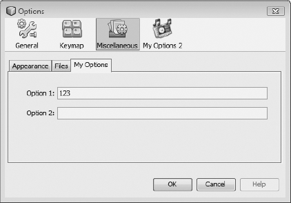
Two types of integration panels are supported: primary panels and secondary panels. A primary panel is a (main) category within the Options dialog, as, for example, the General or Keymap categories (see Figure 9-5). A tab (subcategory) within a primary panel is a secondary panel.
Storing and loading of settings is done via the Preferences API. A specific implementation of this API is provided by the NetBeans Platform, as will be discussed in the "Settings Administration" section.
To create either kind of Options panel, the IDE provides a wizard. You find the wizard under File
In case of a secondary panel, you need to choose a primary panel, specify a title and a tooltip for this panel, and define the keywords for the Quick Search. If you choose the primary panel option, you need to specify the title, a category label, an icon, and the keywords for the Quick Search. Click Next to specify a class name prefix for the classes to be created by the wizard, and then click Finish.
An Options panel consists of a view and a controller. The view provides the GUI, as well as the loading and storing of data. The controller generates the view and mediates between the Options window and the view. The panel that defines the view is derived from the JPanel class. On this panel, you place arbitrary Swing components, which are used to show options in the panel and allow the user to select them.
For example, in Listing 9-9, two text fields are used. The values of these fields are stored and loaded via the Preferences API (see the "Settings Administration" section) using the methods store() and load(). These are called by the controller while opening and closing the panel.
The Options window can be closed by the user when appropriate settings have been selected. At that point, the panel must inform the Options window about its state, either valid or invalid. Implement validation via the valid() method. In this example, we want to make sure the user enters a value in the first field. Accordingly, we add a DocumentListener to the text field. Whenever the user makes an entry in the first text field, the controller is informed via the Controller.changed(), which then calls the valid() method, only returning true when at least one character is entered into the text field.
Example 9.9. View of the Options panel, deriving from JPanel
public final class ModuleOptions1Panel extends JPanel
        implements DocumentListener {
   private JTextField option1;
   private JTextField option2;
   private final ModuleOptions1PanelController controller;
   public ModuleOptions1Panel(ModuleOptions1PanelController  ctrl) {
      this.controller = ctrl;
      initComponents();
      option1.getDocument().addDocumentListener(this);
   }
   public void insertUpdate(DocumentEvent event) {
      controller.changed();
   }
   public void removeUpdate(DocumentEvent event) {
      controller.changed();
   }
   public void changedUpdate(DocumentEvent event) {
      controller.changed();
   }
   public void load() {
      option1.setText(NbPreferences.forModule(ModuleOptions1Panel.class).
              get("option1", "default"));
   }
   public void store() {
      NbPreferences.forModule(ModuleOptions1Panel.class).
              put("option1", option1.getText());
   }
   public boolean valid() {
      if(option1.getText().length() == 0) {
         return false;
      } else {
         return true;
      }
   }
}
Now look at the responsibilities of the controller. Since the controller needs to interact with the Options window, its interfaces are defined by the abstract class OptionsPanelController.
The controller's most important task is creation of the view, using getPanel(), which we provide via the method getComponent(). As you can see in Listing 9-10, getComponent() receives a Lookup. This is a proxy Lookup, containing the Lookups of all controllers available in the Options window. The controller uses the getLookup() method to make a Lookup available, which is already implemented by the abstract class OptionsPanelController. This default implementation provides an empty Lookup. To put objects into the Lookup, override the getLookup() method. This Lookup is received via the getComponent() method, which is used to communicate with other Options panels. See Chapter 6 for a discussion on Lookups.
The method update() is called the first time a panel is accessed. Here, we call the load() method on the panel, which loads data to initialize the fields. When the user clicks the OK button, the applyChanges() method in the Options window is called. Here, the data is saved via the save() method. If the user closes the Options window, we use the cancel() method to handle this scenario, but we obviously do not save the data. Users can also roll back the changes that have been made.
Using the isValid() method, we inform the Options window whether data in the panels is in order. If this is not the case, the OK button is automatically deactivated. Moreover, the Options window must also be informed whether data has been changed. This is done with the isChanged() method.
With the getHelpCtx() method, a HelpCtx object is provided that contains a reference to a help topic displayed if the user clicks the Options window's Help button.
To inform the Options window of changes in data, provide it with code that will register changes. This is achieved via the standard JDK methods addPropertyChangeListener() and removePropertyChangeListener().
You already know the changed() method from the view class ModuleOptions1Panel. This is called when data changes in the view, informing the Options window, which has registered itself as a listener. As a result, the Options window checks again whether data is valid.
Example 9.10. Options panel controller
final class ModuleOptions1PanelController extends OptionsPanelController  {
   private ModuleOptions1Panel panel;
   private final PropertyChangeSupport pcs = new PropertyChangeSupport(this);
   private boolean changed;
   public JComponent getComponent(Lookup masterLookup) {
      return getPanel();
   }
   private ModuleOptions1Panel getPanel() {
      if (panel == null) {
         panel = new ModuleOptions1Panel(this);
      }
      return panel;
   }
   public void update() {
      getPanel().load();
      changed = false;
   }
   public void applyChanges() {
      getPanel().store();
      changed = false;
   }
   public void cancel() {
   }
   public boolean isValid() {
      return getPanel().valid();
   }
   public boolean isChanged() {
      return changed;
   }
public HelpCtx getHelpCtx() {
return null;
}
public void addPropertyChangeListener(PropertyChangeListener l) {
pcs.addPropertyChangeListener(l);
}
public void removePropertyChangeListener(PropertyChangeListener l) {
pcs.removePropertyChangeListener(l);
}
public void changed() {
if (!changed) {
changed = true;
pcs.firePropertyChange(OptionsPanelController.PROP_CHANGED, false, true);
}
pcs.firePropertyChange(OptionsPanelController.PROP_VALID, null, null);
}
}Option panels can be integrated declaratively into the application via the layer file. The layer file entries are processed by two factory methods, responsible for Options panel controller creation, dependent on the type of the panel concerned. The wizard creates the necessary entries in the layer file. These are shown in Listing 9-11.
Example 9.11. Registration of a secondary Options panel
<folder name="OptionsDialog">
  <folder name="Advanced">
    <file name="com-galileo-netbeans-module-ModuleOptions1AdvancedOption.instance">
      <attr name="controller" newvalue="
              com.galileo.netbeans.module.ModuleOptions1OptionsPanelController"/>
      <attr name="displayName" bundlevalue="com.galileo.netbeans.module.Bundle
              #AdvancedOption_DisplayName_ModuleOptions1"/>
      <attr name="instanceCreate" methodvalue="
              org.netbeans.spi.options.AdvancedOption.createSubCategory"/>
      <attr name="keywords" bundlevalue="com.galileo.netbeans.module.Bundle
              #AdvancedOption_Keywords_ModuleOptions1"/>
      <attr name="keywordsCategory" stringvalue="Advanced/null"/>
      <attr name="toolTip" bundlevalue="com.galileo.netbeans.module.Bundle
              #AdvancedOption_Tooltip_ModuleOptions1"/>
    </file>
  </folder>
</folder>
The controller attribute specifies the panel controller, which we looked at earlier. The displayName attribute is a pointer to a bundle where the name of the created panel is stored. The same applies to the toolTip and keywords attributes. The keywordsCategory attribute specifies the relative path to your panel inside the Options window.
Important is the instanceCreate attribute. It is used to specify the factory method, which is new to version 6.5 and is responsible for the controller creation. When dealing with a secondary panel, this is the AdvancedOption.createSubCategory() method.
The registration of a primary panel differs slightly, depending on whether the panel allows secondary panels or not (see Listing 9-12).
Example 9.12. Registration of a primary Options panel
<folder name="OptionsDialog">
   <file name="ModuleOptions2OptionsCategory.instance">
      <attr name="categoryName" bundlevalue="com.galileo.netbeans.module.Bundle
              #OptionsCategory_Name_ModuleOptions2"/>
      <attr name="controller" newvalue="
              com.galileo.netbeans.module.ModuleOptions2OptionsPanelController"/>
      <attr name="iconBase" stringvalue="com/galileo/netbeans/module/icon.png"/>
      <attr name="instanceCreate" methodvalue="
              org.netbeans.spi.options.OptionsCategory.createCategory"/>
      <attr name="keywords" bundlevalue="com.galileo.netbeans.module.Bundle
              #OptionsCategory_Keywords_ModuleOptions2"/>
      <attr name="keywordsCategory" stringvalue="ModuleOptions2"/>
      <attr name="title" bundlevalue="com.galileo.netbeans.module.Bundle
              #OptionsCategory_Title_ModuleOptions2"/>
   </file>
</folder>
Additional to the secondary panel, the preceding entries include the primary panel registration and an icon definition via the iconBase attribute. The factory method for a primary panel is OptionsCategory.createCategory(). This type of registration allows no secondary panels, because of the controller attribute, which specifies that the controller provides an Options panel.
If you've checked the option allowing the primary panel to have secondary panels, the preceding layer entry will contain the advancedOptionsFolder attribute instead of the controller attribute:
<attr name="advancedOptionsFolder"
        stringvalue="OptionsDialog/ModuleOptions2OptionsCategory"/>
In this case, you can place your secondary panels under the folder OptionsDialog/ModuleOptions2OptionsCategory.
Settings and configuration data within the NetBeans Platform is stored and loaded via the JDK Preferences API. With the Preferences class, Java saves and loads settings without users needing to know their physical location. Various implementations are available, so that the settings can be stored in a file, a system registry, or a database. Settings are stored in hierarchical structure in the form of key/value pairs. An instance of the Preferences class represents one node within the hierarchy. Imagine a node as a file in a database where data can be saved.
With the NbPreferences class, the Utilities API provides an implementation of the Preferences API tailored to the NetBeans Platform. The NbPreferences class allows storage of settings in a central configuration location within the application user directory. It does this using properties files. Therefore, the NetBeans Platform implementation lets you handle preferences on a per user basis.
The NbPreferences class provides two methods. The forModule() method provides a Preferences node for each module in a properties file, stored in the config/Preferences folder within the user directory (see Figure 9-6). The root() method provides an application-level node that allows storing global preferences in the file config/Preferences.properties.
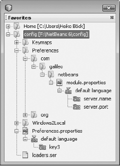
Figure 9.6. Settings can be stored via the NetBeans Platform Preferences implementation, either for a specific module or globally.
Using the NetBeans Platform implementation of the Preferences class, loading and storing user settings is easily accomplished. For example, to store the name and port of a server, you simply make the call shown in Listing 9-13.
Example 9.13. Loading and storing via the Preferences API
Preferences node = NbPreferences.forModule(this.getClass());
String name = node.get("server.name", "localhost");
int port = node.getInt("server.port", 8080);
node.put("server.name", name);
node.putInt("server.port", port);
Apart from the methods shown here for data access, several others are available. For example, you can store arrays or Boolean values. Moreover, you can use the Preferences API with a Preferences instance (which is a node) to register a NodeChangeListener as well as a PropertyChangeListener, notifying you when a child node is added or removed and when changes to them are made.
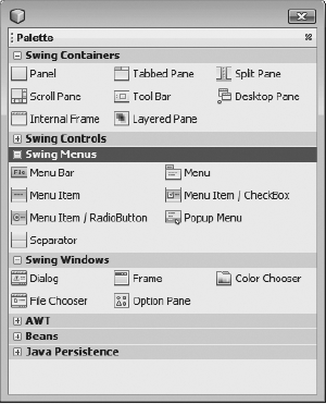
The Palette module, which is part of the NetBeans IDE, is concerned with the graphic display of components that can be dragged and dropped onto a surface in your application. Typical implementations of the module aim to give the user easy access to a range of snippets, created when a component is dropped into an editor. A good example of this is the Matisse GUI Builder in the NetBeans IDE, which places its AWT and Swing components into the palette (see Figure 9-7), from where the user moves them to the NetBeans editor. New components can also be added to the palette at runtime.
The content of the palette is handled by the PaletteController. The PaletteController is available to the TopComponent via its Lookup. Whenever a particular TopComponent is active while a PaletteController is found in its Lookup, the palette opens automatically, displaying its content. The PaletteController is created by a PaletteFactory class.
There are two ways to create the components displayed in the palette. You can define the components within XML files you register in the layer file; alternatively, you can create a node hierarchy and then display the hierarchy as components in your palette. We examine both approaches in this chapter.
Note that you are not limited to providing palettes to your own TopComponents. Optionally, you may register a palette in the layer file under the folder of a MIME type used by a TopComponent in a different module. When a document of that MIME type is opened in the editor, the palette opens. This approach is of particular use to those who want to extend the NetBeans IDE. See the "Palette" section in Chapter 15 for further information on this particular topic.
A component placed into a palette is defined by the XML file shown in Listing 9-14.
Example 9.14. An XML file defining a palette component
<!DOCTYPE editor_palette_item PUBLIC
   "-//NetBeans//Editor Palette Item 1.1//EN"
   "http://www.netbeans.org/dtds/editor-palette-item-1_1.dtd">
<editor_palette_item version="1.1">
   <body></body>
   <icon16 urlvalue="file:/E:/icon16.jpg"/>
   <icon32 urlvalue="file:/E:/icon32.jpg"/>
   <inline-description>
      <display-name>My Palette Item</display-name>
      <tooltip>My Palette Item</tooltip>
   </inline-description>
</editor_palette_item>
Looking at the preceding XML file, you can see that the elements icon16 and icon32 define an icon to be shown for the component in question, assuming that the user has not chosen to hide the component. Typically, the icons are 16 and 32 pixels in size. However, they can have other dimensions as well. Despite that flexibility, it makes sense to use a 16-pixel icon for the icon16 attribute because the same icon is used to represent the component in the Palette Manager, which you can display by choosing it from the palette's context menu. Icons shown in the Palette Manager must be of that size. It is also interesting that, as you've just seen, absolute paths can be used. That implies the icons need not necessarily be found within the module. They are also defined in user-specific lists, which is useful when letting users define their own components in the palette.
With the inline-description element and its subelements display-name and tooltip, you set the text used for the component in the palette. As an alternative to inline-description, you can use the description element. Then, with the attribute localising-bundle, you provide a resource bundle that supplies the values of display name and tooltip. The attributes display name key and tooltip key provide keys for these values. Thus, you may internationalize each of your palette entries. For doing this, it is also useful to have a look at the DTD of the XML file included in the Appendix.
Using the approach just described, many components for display in the palette can be defined. When you're ready to add them to the palette, do so by registering them in the module layer file. Start by defining a new folder in the layer file, with any name you like. Within the folder, create a subfolder for each category of component you want displayed in the palette. Finally, within the category subfolder, register each of the XML files created to define the components. A structure similar to the following results from this procedure:
<folder name="MyPaletteItems">
   <folder name="My Category">
      <file name="myitem1.xml" url="myitem1.xml"/>
      <file name="myitem2.xml" url="myitem2.xml"/>
   </folder>
</folder>
Finally, we need the PaletteController added to the TopComponent for which we are creating the palette. As stated in the introduction of this section, a PaletteFactory class is required for this purpose. The PaletteFactory class makes a createPalette() method available, which is a factory method to which we pass the name of the palette root folder defined in the layer file, in this case MyPaletteItems (see Listing 9-15). All remaining work is handled for us by the PaletteFactory and PaletteController classes.
The second parameter requires implementing the PaletteAction class, offering actions for certain events. In the simplest case, you provide an empty implementation of this abstract class by defining each method as null or returning an empty array.
Components in a palette are represented by NetBeans Node classes. However, in the previous section we defined each component via an XML file. The NetBeans Platform then provided a normal node to represent each XML file. In this section, we look at how a node implementation is used to create palette components, rather than doing so via XML files.
It is important to realize that a node hierarchy used in this way must consist of three levels. The uppermost level is a single root node that you pass to the createPalette() method to generate the components. The middle level, which consists of the child nodes of the root node, defines the categories in the palette. Finally, the second level's children define the palette components.
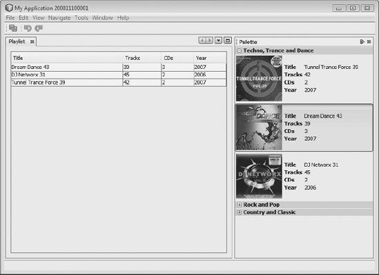
We'll present an example to show how this fits together. We'll create a palette that allows the user to manage music albums via drag-and-drop onto a playlist, as shown in Figure 9-8.
As you saw in Chapter 7, the Children class creates and manages child nodes, while also acting as their container. We use this class to manage the categories displayed as genres in the palette. As in most such cases, we start by extending Children.Keys<String>, which has the createNodes() method for generating nodes. In the example that follows (see Listing 9-16), this approach is used to create three genre nodes.
It's possible you'd create the genre nodes from records retrieved from a database. To do this, see Chapter 13, where the connection and usage of databases in the context of NetBeans Platform Applications is discussed, and extend the example by adding a palette.
Start with the GenreNode, which is quite a simple class. Its constructor receives a Genre as a parameter, which is immediately passed to the AlbumNodeContainer class, at which point we find ourselves within the second and third levels of the node hierarchy.
Example 9.16. All genres shown on the palette are managed by the GenreNodeContainer. A genre is represented by the GenreNode.
public class GenreNodeContainer extends Children.Keys<String>{
   protected void addNotify() {
      setKeys(new String[] {"root"});
   }
   protected Node[] createNodes(String root) {
      return(new Node[]{
         new GenreNode("Techno, Trance and Dance"),
         new GenreNode("Rock and Pop"),
         new GenreNode("Country and Classic")});
   }
}
public Class GenreNode extends AbstractNode{
   public GenreNode(String genre) {
      super(new AlbumNodeContainer(genre));
      this.setDisplayName(genre);
   }
}
The AlbumNodeContainer class, responsible for the creation of albums for a particular genre, is defined in the same way as the GenreNodeContainer class. In the example in Listing 9-17, we again create three nodes, this time of the AlbumNode type and using the createNodes() method, which receives the genre when the addNotify() method is invoked. That happens when users expand the category node. Using the genre parameter, a database for suitable albums that match the genre might be queried. Album data is managed by the Album class.
Example 9.17. The AlbumNodeContainer class manages nodes of a certain genre for albums.
public class AlbumNodeContainer extends Children.Keys<String>{
   private String genre = new String();
   public AlbumNodeContainer(String genre) {
      this.genre = genre;
   }
   protected void addNotify() {
      setKeys(new String[] {genre});
   }
   protected Node[] createNodes(String genre) {
      return(new Node[] {
         new AlbumNode(
            new Album("Tunnel Trance Force 39", "42", "2","2007",
                  "com/galileo/netbeans/Module/cover_small.jpg",
                  "com/galileo/netbeans/Module/cover_big.jpg")),
         new AlbumNode(
            new Album("Dream Dance 43", "39", "3", "2007",
                  "com/galileo/netbeans/Module/cover2_small.jpg",
                  "com/galileo/netbeans/Module/cover2_big.jpg")),
         new AlbumNode(
            new Album("DJ Networx 31", "45", "2", "2006",
                  "com/galileo/netbeans/Module/cover3_small.jpg",
"com/galileo/netbeans/Module/cover3_big.jpg"))
});
}
}Finally, the AlbumNode class is responsible for display of the albums in the palette (as you can see in Figure 9-8). Since an AlbumNode does not own its own nodes, we pass the empty container Children.LEAF to the superclass via the constructor.
Use setDisplayName() to define the name shown on the palette. To make the display name more attractive, you may use HTML tags as well. In Listing 9-18, you can see the getLabel() method, which constructs an HTML string that shows the album data in a table and is used by setDisplayName() in the constructor defining the component display name. The value of getHtmlDisplayName() is used by the Palette Manager, which can be opened after right-clicking inside the palette.
Next, getIcon() shows the component icon, which in this case is an album cover. The user selects whether small or large icons are displayed, assuming that they have provided both types of icons.
Example 9.18. AlbumNode is responsible for displaying palette components.
public class AlbumNode extends AbstractNode {
   private Album album = null;
   public AlbumNode(Album album) {
      super(Children.LEAF);
      this.album = album;
      this.setDisplayName(getLabel());
   }
   public String getHtmlDisplayName() {
      return "<b>" + album.getTitle() + "</b> (" + album.getTracks() + " Tracks)";
   }
   public Image getIcon(int type) {
      return album.getIcon(type);
   }
   private String getLabel() {
      String label = new String("<html>" +
         "<table cellspacing="0" cellpadding="1">" +
            "<tr>" +
               "<td><b>Title </b></td>" +
               "<td>" + album.getTitle() + "</td>" +
             ...
   }
}Once we create the node hierarchy, providing data for the palette, we initialize the palette and add it to the Lookup of the PlaylistTopComponent. That ensures the palette is displayed whenever the playlist is active.
Use the constructor of the PlaylistTopComponent to provide a root node, from which all child nodes are created. The root node receives a new instance of GenreNodeContainer, handling creation and management of child nodes. Finally, we require a PaletteAction instance, which can simply be empty for now. Later, use createPalette() to create the PaletteController, which is then added to the TopComponent 's local Lookup.
private PlaylistTopComponent() {
   ...
   Node root = new AbstractNode(new GenreNodeContainer());
   PaletteActions a = new MyPaletteActions();
   PaletteController p = PaletteFactory.createPalette(root, a);
   associateLookup(Lookups.fixed(p));
}What's still missing is drag-and-drop functionality, which lets us drag albums from the palette and drop them onto the TopComponent. Two additional pieces of code are necessary to implement this functionality. First, make some changes to the Album and AlbumNode classes. Next, add code to the TopComponent, which must react appropriately when albums are dropped onto its surface.
The data we transfer onto the TopComponent is defined by the Album class. To allow data to be draggable, we must define the Transferable interface in this class (see Listing 9-19). We create a new DataFlavor, so data can be identified. We create a static instance of the DataFlavor class in the Album. Next, with the method getTransferDataFlavors(), we return our DataFlavor.
Call the method getTransferData() from the TopComponent, using this to retrieve the album instance, assuming the returned DataFlavor is of the type DATA_FLAVOR. If a different DataFlavor is returned, throw an exception.
Example 9.19. The album contains the data and implements the Transferable interface to provide it via drag-and-drop.
public class Album implements Transferable {
   public static final DataFlavor DATA_FLAVOR =
            new DataFlavor(Album.class, "album");
   ...
   public DataFlavor[] getTransferDataFlavors() {
      return new DataFlavor[] {DATA_FLAVOR};
   }
   public boolean isDataFlavorSupported(DataFlavor flavor) {
      return flavor == DATA_FLAVOR;
   }
   public Object getTransferData(DataFlavor flavor)
           throws UnsupportedFlavorException {
      if(flavor == DATA_FLAVOR) {
         return this;
      } else {
         throw new UnsupportedFlavorException(flavor);
      }
} }
Be aware that the user will not be dragging an Album object, but the Node that represents it. We add the drag functionality to the Node, rather than to the Album object itself. This is done by overriding the drag() method in the Node class, which provides a Transferable instance, in our case the Album instance hiding behind the AlbumNode.
public class AlbumNode extends AbstractNode {
private Album album = null;
...
public Transferable drag() throws IOException {
return album;
}
}Finally, we extend the PlaylistTopComponent such that it takes an action when the palette component is dropped. We also require a TransferHandler registered on the object that displays the result of the dropped component. In our case, we use the table albums with its scroll pane scrollPane.
To define the data that we want to accept and process that data, we begin by implementing our own TransferHandler, called AlbumTransferHandler. In doing so, we simply override two methods. First, we override the canImport() method, which is called when a component is on or over the TopComponent. Here, we determine whether the component is accepted. The test is based on the DataFlavor defined in the Album (see Listing 9-20). If this method returns true, a suitable mouse pointer is shown to the user, indicating that the TopComponent is able to handle the drop event.
Second, we override the importData() method, which is called when the drop event is invoked. Via the TransferSupport object, which is received as a parameter, we obtain the Transferable instance provided by the drag() method from the AlbumNode. We then use getTransferData() and our DataFlavor to obtain the related Album, and then add the data to the JTable.
Example 9.20. Accepting the drop of an album
final class PlaylistTopComponent extends TopComponent {
   private TransferHandler th = new AlbumTransferHandler();
   private PlaylistTopComponent() {
      ...
      albums.setTransferHandler(th);
      scrollPane.setTransferHandler(th);
   }
   private final Class AlbumTransferHandler extends TransferHandler {
      public boolean canImport(TransferSupport support) {
        return support.isDataFlavorSupported(Album.DATA_FLAVOR);
      }
      public boolean importData(TransferSupport support) {
         try {
            Album a = (Album) support.getTransferable().
                    getTransferData(Album.DATA_FLAVOR);
DefaultTableModel model = (DefaultTableModel)albums.getModel();
model.addRow(new Object [] {
a.getTitle(), a.getTracks(), a.getCDs(), a.getYear()} );
return(true);
} catch(Exception e) {
e.printStackTrace();
return false;
}
}
}
}In this chapter, you learned that the NetBeans Platform provides more than APIs. It also provides a range of self-contained components. These can be used by services and extended by service provider interfaces.
We started by looking at the help system, which you can very easily use in your own applications. Among other things, you learned how to create a new helpset and how to set up context-sensitive help. We also looked at the Output window, displaying processing messages, as well as the Navigator and the Properties window. Both are used to display data about the structures in your application. Finally, we looked at the Options window and the palette. You can use these or extend them quite easily via their APIs and SPIs.