C H A P T E R 2
Editing Pages
This chapter introduces you to creating and editing pages in SharePoint Designer 2010. As mentioned in Chapter 1, SharePoint Designer is the latest version of what was Microsoft FrontPage. But instead of an HTML editor that connects to SharePoint, SharePoint Designer 2010 is fully integrated with SharePoint. In this version, it is not even possible to create or edit a web page without being connected to a SharePoint site first. Because of this tight integration, SharePoint Designer makes customizing SharePoint 2010 sites easy, while still giving you the power to make changes previously available only through Visual Studio.
But, before you begin creating pages in SharePoint Designer, you'll take a tour of the editing tools the application provides. The main interface of SharePoint Designer is the Page Editor. The main components of the Page Editor are the task panes, the Ribbon, the editing surface, and the status bar. You will explore these components in detail as you work through this chapter's exercises.
You will learn about the following topics in this chapter:
- SharePoint Designer 2010's task panes
- The Ribbon and its menus
- The three editing views available
- Creation of code snippets
- Creation of a web part page
 Note For all exercises in this chapter, you will use the default Team Site web template. For most page-editing exercises, you will use the
 Home.aspx page or create new pages in the site.
Task Panes
SharePoint Designer 2010 has several task panes available to you (see Figure 2-1). These task panes can be docked inside the application workspace or they can be floated. You can move a task pane around by dragging its title bar. If you want to dock the task pane, drag it to the edge of the application workspace where you want the task pane docked. Each task pane can be closed by clicking its X icon in the upper-right corner of the task pane title bar.
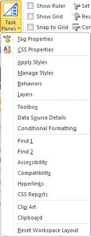
Figure 2-1. Available task panes
Note Some task panes open automatically, depending on the menu item you select. You can open any task pane by clicking the Task Panes menu item on the Ribbon's View tab.
The task panes are grouped according to function. The functional areas are Properties, Styles and Behaviors, Tools, Reports, and External Resources.
Properties Panes
SharePoint Designer has two Properties panes: Tag Properties and CSS Properties.
The Tag Properties task pane enables you to view and edit the properties of the current tag. This pane is displayed automatically when you right-click properties on any element on the page.
The CSS Properties task pane enables you to quickly view and edit the properties of all Cascading Style Sheets (CSS) elements on the page. You can see which rules apply to the current object on the editing surface and other CSS elements that you can modify.
Styles and Behaviors Panes
The four Styles and Behaviors panes enable you to easily change the style or behavior of elements on a web page—including internal, external, or inline styles. Behaviors fall into this category because they usually consist of CSS element changes based on certain behaviors.
The Apply Styles task pane lists all CSS styles loaded on the current page's style sheets. These include internal, external, and inline CSS. The view of the styles can be modified by using the Option menu.
The Manage Styles task pane lists all styles that are defined in the page's internal and external style sheets, but not the inline style sheets. By using the pane's Option menu, you can list all styles or only those used on the current page or the current element.
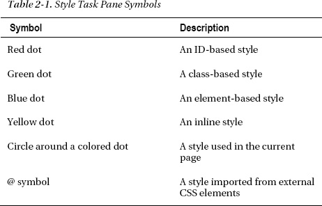
In the Apply Styles and Manage Styles task panes, each style is denoted by an icon depending on where it is derived from (see Table 2-1).
The Behaviors task pane enables you to assign one or more behaviors (small pieces of CSS or JavaScript) to the currently selected object. These behaviors aren't available for all objects but are related to events and are used to perform specific functionality based on those events. As one example, you might add a behavior to the page load event to redirect the user to a new page if that user is using an unsupported browser (see Figure 2-2).
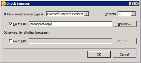
Figure 2-2. Check Browser behavior
The Layers task pane helps you manage the <div> tags in your page when the position type is something other than none.
EXERCISE 2-1. USE TAG PROPERTIES, CSS PROPERTIES, AND LAYERS TASK PANES
In this exercise, you will use the Tag Properties, CSS Properties, and Layers task panes to investigate the anatomy of a page. Follow these steps:
- Open a basic page in SharePoint Designer 2010. For this example, create a basic SharePoint site based on the Team Site template. Open the
Home.aspxpage in the Site Pages document library (see Figure 2-3).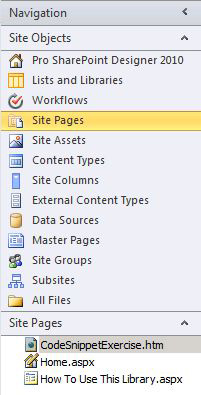
- Open the Tag Properties task pane and the CSS Properties task pane from the Task Panes menu on the Ribbon's View tab.
- Click around the editing surface. Notice the different tag properties and CSS properties of each element that you click. Notice that the CSS Properties task pane will tell you which CSS rule is currently applied to the element that you clicked.
- Add an inline style to an element: Click the paragraph on the page that begins with Add a new image, change. In the CSS properties, change the font family to Times New Roman and change the font size to medium. Don't worry; you are not going to save the changes.
- Click the image element on the right-hand side of the page and view the CSS properties currently applied to it.
- Find the Border CSS property. Click the plus (+) sign to display the three properties that make up a border designation. Change border width to thick. Change border color to #00FF00 (a real bright green). Change border style to solid. Notice that you now have a thick, bright green border around your image.
- Now click the Tag Properties task pane.
- Click the image control and notice that the Tag Properties task pane is now displaying your border inline style properties for the image.
- On the style line of your tag property, delete just the border declaration. Be careful not to delete the margin declaration. The border disappears from your page.
- Now click back to the CSS Properties task pane.
- Click the image element again and notice how the border style elements have been deleted.
- Click around the page and notice the tag and CSS properties of other elements on the page.
Tools Panes
Three Tools panes are provided in Page Editor: Toolbox, Data Source Details, and Conditional Formatting.
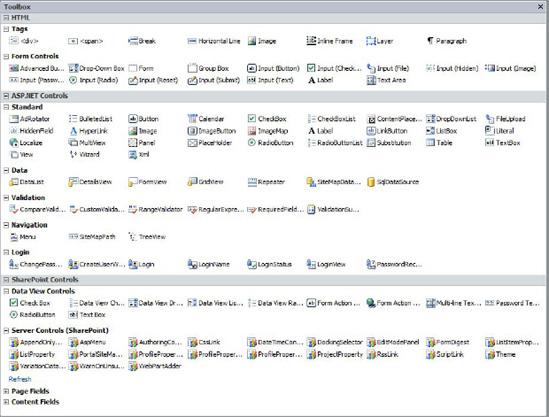
The Toolbox task pane contains objects that enable you to create rich, dynamic web pages. As you can see in Figure 2-4, these objects are grouped into three panes:
- The HTML Controls section contains standard HTML elements.
- The ASP.NET Controls section contains standard ASP.NET server controls. These are client-side controls with server-side functionality. If you are an ASP.NET developer, you will recognize these controls as the same controls available to you in Visual Studio.
- The SharePoint Controls section contains controls that are specific to SharePoint functionality. They are also ASP.NET controls, so they can be controlled by server-side code.
The Data Source Details task pane enables you to see the current data source and to insert data fields into a page to create a view of the data on the page.
The Conditional Formatting task pane enables you to specify different formatting options for an HTML tag, data value, or range of text, depending on whether they meet the conditions you set. A common use of this is to alternate shading on table rows.
Reporting Panes
The Reporting panes are unique in that they are not limited to any one page. They are always docked at the bottom of the editing surface and present the results of an action, such as a searching or page analysis. When more than one pane is displayed, they are arranged in a tabbed format. SharePoint Designer has six Reporting panes: Find 1, Find 2, Accessibility, Compatibility, Hyperlinks, and CSS Reports. Figure 2-5 shows the menu displayed.
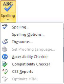
Figure 2-5. Reporting pane menu
The Find 1 and Find 2 task panes are used to display the results of a search. When you perform a Find All search, you have the option to select which pane you want to display the results in.
The Accessibility task pane gives you access to the Accessibility Checker, which enables you to create content that is more accessible to people with disabilities. You can access the Accessibility Checker from the Proofing menu on the Ribbon or by clicking the green begin arrow on the Accessibility task pane. Your page can be checked against WCAG Priority 1 or 2 guidelines and Access Board Section 508 specifications.
Note The WCAG Priority 1 or 2 guidelines are the Web Content Accessibility Guidelines 1.0 or 2.0 published by the World Wide Web Consortium (W3C). These guidelines indicate how to make web content accessible to people with disabilities.
The Access Board Section 508 specifications detail electronic and information technology standards administered by the Access Board, the federal agency created in 1973 to ensure accessibility for people with disabilities.
The Compatibility task pane enables you to run the Compatibility Checker against your page to make sure it is compatible with HTML or CSS standards. You can access the Compatibility Checker through the Proofing menu on the Ribbon or the green begin arrow on the Compatibility task pane.
The Hyperlinks task pane enables you to list all of the hyperlinks on your page. You can also use it to verify your hyperlinks against the current web site.
The CSS Reports task pane displays the results of the CSS Checker. You can use the CSS Checker to check for CSS errors on your page or to get a usage report of class, ID, or element selectors on the current page, open pages, or all pages. The CSS Checker can also be accessed from the Proofing menu on the Ribbon.
External Resources Panes
Because SharePoint Designer is part of the Microsoft Office family, it shares some common elements (such as the Ribbon) that make using SharePoint Designer a familiar experience for Microsoft Office users. The Clip Art and Clipboard task panes, which are the External Resources panes, are two of the elements shared with other Microsoft Office applications. As such, these task panes behave differently than other task panes. First, they dock on only the right-hand edge of the application. They can't be grouped with other task panes docked on the right edge of the editing surface. They dock outside the editing surface, as they do in all other Microsoft Office applications. You can't view both the Clip Art and Clipboard task panes at the same time. You must toggle between the two with a special toolbar menu at the top of the task pane.
The Clip Art task pane, shown in Figure 2-6, is a view of the Microsoft Office Clip Art Manager. The clip art you can use in Microsoft Word, Excel, and PowerPoint is also directly available to you in SharePoint Designer. You can search for illustrations, photos, video, and audio stored in the Clip Art Manager or on Office.com. To insert a clip art item, you can drag it right to the editing surface, from the right-click menu of the art or by just double-clicking the clip art.
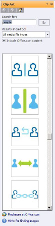
Figure 2-6. Clip Art task pane
The Clipboard task pane is like the Clip Art task pane in behavior. It contains items that have been saved to the Windows Clipboard from other applications.
The Ribbon
The Ribbon has become the toolbar/menu interface in the latest Microsoft Office product line. This is a rich, dynamic, and flexible menu system. Each SharePoint object will have one or more Ribbon menus, depending on the functionality required.
Figure 2-7 shows the Ribbon that is displayed for basic page-editing operations. It consists of Home, Insert, View, and Layout tabs, which are detailed further in the rest of this section.
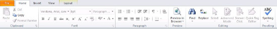
Figure 2-7. Ribbon menu
Home Tab
The Home tab, shown previously in Figure 2-7, consists of basic rich-text editing tools, very much like the tools available to you in any other Microsoft Office application. However, this tab has a few menu items that are specific to SharePoint Designer 2010, including Advanced Mode, Skewer Click, and Quick Tag Editor options.
Advanced Mode
Previous versions of SharePoint supported the concept of ghosted and unghosted pages. This referred to pages in which elements had been changed from the underlying site definition. In SharePoint 2010, Microsoft has changed the terminology of this same concept to customized and uncustomized. Customized refers to pages that have been modified from the site definition.
Site definitions contain page layouts that are predefined and provide a common base for the web site. In Basic editing mode, you are allowed to edit only those portions of the page that have been designated in the page layout as editable. If you want to edit elements outside these basic regions, you need to use Advanced mode.
Advanced mode decouples the page from its site definition. That means that any upgrades or modifications to the underlying site definition will not be picked up in the page. You always have the option to revert back to Basic mode, but all changes made outside the editable regions will be lost. Another disadvantage to customizing pages is that customized pages are stored in the database instead of on the file system, which slows down page rendering.
EXERCISE 2-2. USE BASIC AND ADVANCED MODES
In this exercise, you will work with a page in both Basic mode and Advanced mode to understand the differences between the two:
- Open the
Home.aspxpage (Figure 2-8), located in the Site Pages of a basic Team site.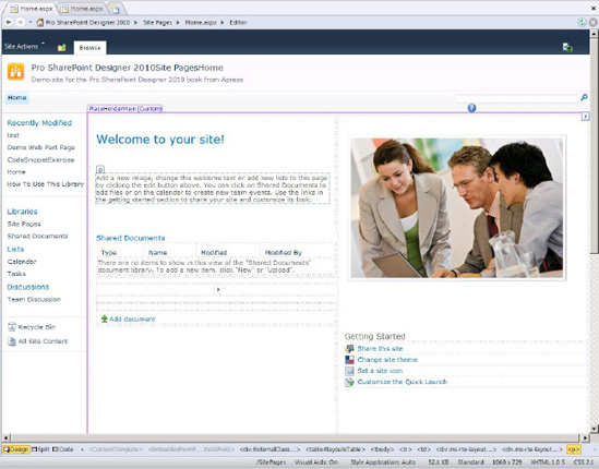
- Notice that the top navigation bar reads Editor.

- Use your mouse to click the Welcome to Your Site heading.
- Notice that you can edit the text on that heading.
- Click the left navigational menu labeled Libraries. Your cursor becomes a circle with a line through it. Notice that you cannot change anything in that area of the page.
- Click around other parts of the page. Notice the different areas that you can edit and the areas that you cannot edit.
- Now click the Advanced Mode icon. The top navigation bar changes to Advanced Editor.
- After the page refreshes, click the different areas of the page. More areas are now available to edit.
- Press Ctrl+S or click the Save menu icon.
- A dialog box appears, warning that your page is no longer based on the site definition. For this exercise, click No.
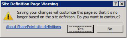
- Close the editing window and do not save your changes.
Skewer Click
The Skewer Click menu is a new menu that enables you to drill down into elements of a page. Think of sticking a skewer through a stack of papers. When you click an element on a page, you will see a menu of all the different objects that make up that element.
EXERCISE 2-3. USE SKEWER CLICK
Try out the Skewer Click menu by following these steps:
- Open the
Home.aspxpage, located in the Site Pages of a basic Team site. - Click the Skewer Click menu.
- Click the main image on the page. A menu, shown in Figure 2-9, pops up.
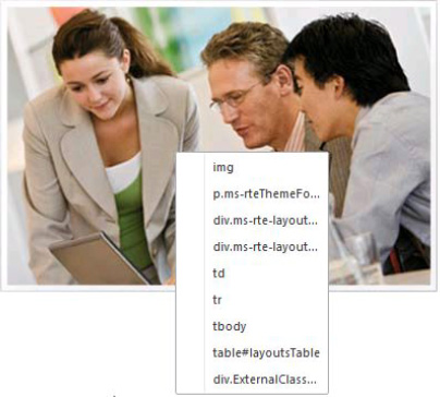
- Run your cursor over the menu items. Notice that as you move the cursor over a particular menu item, the related element is highlighted on the page.
- Move your cursor all the way back to the
imgmenu item. - Click outside the image element to close the Skewer Click menu.
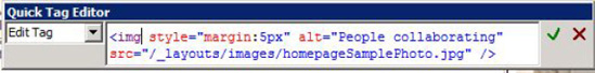
Quick Tag Editor
The Quick Tag Editor enables you to quickly edit the HTML tags on a page. This is a quick alternative to switching to Code mode.
EXERCISE 2-4. USE THE QUICK TAG EDITOR
Follow these steps to practice using the Quick Tag Editor:
- Open the
Home.aspxpage in Design mode. - Click the main image.
- Click the Quick Tag Editor button on the Ribbon.
- Notice the HTML code for the
<img>tag. Also notice that you have the options of wrapping the<img>tag in other HTML and of inserting other HTML via the drop-down list on the left side of the dialog box. - If you made any changes to the tag, you could click the green check mark at the top-right of the dialog box to save your changes. For this exercise, click the red X to close the dialog box without saving any changes.
Note As you clicked around the image element on the Home.aspx page in Exercise 2-4, two more special menus appeared on the Ribbon: the Table Tools and Picture Tools menus. You'll learn about using those menus in later sections of this chapter.
Insert Tab
The Insert tab provides access to almost all of the insertable objects available to you in SharePoint Designer. It is divided into seven sections:
- Table inserts an HTML table with the number of columns and rows specified.
- Pictures inserts images from your file system or from the Clip Art Manager.
- Links inserts a hyperlink to other locations or inserts a bookmark to another location on the same page.
- Data Views & Forms inserts custom views of data connections or custom New/Edit/Display forms for that data. This menu item is discussed in more detail in later chapters.
- Controls provides menu items that correspond to the Toolbox task pane covered previously.
- Web Parts inserts SharePoint web parts and web part zones into pages. Although you can insert web parts only into web part zones in the web interface, you can insert web parts anywhere on the page when using SharePoint Designer.
- Symbol easily inserts the special symbols that are sometimes difficult to do with the keyboard.
Some of these Insert sections have contextual menus that provide greater control over those elements.
Picture Tools
The Picture Tools menu, shown in Figure 2-10, gives you greater control over the picture elements inserted into a page.
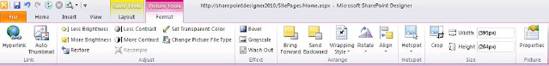
Figure 2-10. Picture Tools menu
Some of the things you can do with the menu are as follows:
- Automatically create a thumbnail link
- Perform simple editing of pictures, such as adjusting the brightness, contrast, transparency, and file type, among other things
- Create borders or other effects
- Layer pictures and wrapping
- Create clickable hot spots
- Crop images
Table Tools
The Table Tools menu, shown in Figure 2-11, gives you more control over tables inserted onto a page. You can use this menu to insert more rows or columns, split or merge cells, format the table, and size and set the cell layout.
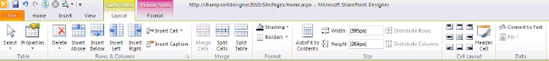
Figure 2-11. Table Tools menu
Layout Tab
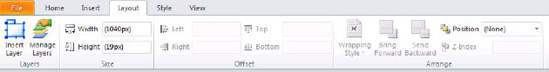
Depending on the type of page you are editing, the Layout tab might display simple menu like the one shown in Figure 2-12, or it could display the Table Layout menu shown earlier in Figure 2-11. Figure 2-12 illustrates the basic Layout menu for a standard ASPX page. Most of the operations center around managing layers on a page. You can insert new layers and then set the position and hierarchy of the layers.
View Tab
We touched on the View tab (Figure 2-13) earlier in the “Task Panes” section. The View tab enables you to select the way you want to edit your page. You can choose to edit your page in Design mode, Code view, or Split view.
In addition to these options, the tab provides a couple of other buttons that offer some unique functionality: Zoom to Contents and Visual Aids. The tab also provides page layout tools in its Ruler and Grid section. These buttons and tools are detailed in the following sections.
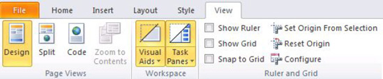
Figure 2-13. View tab
Zoom to Contents
Many times when you are working on a detailed web page, you want to focus on just one section of the page. The Zoom to Contents button will hide everything in the editing surface except the content section you are working with. You can go back to Normal mode by clicking the Zoom to Contents button again.
EXERCISE 2-5. USE ZOOM TO CONTENTS
Visual Aids
When you are working in Design view, SharePoint Designer 2010 provides several visual aids (Figure 2-14) that help illustrate the various components of the page you are editing. These visual aids enable you to see parts of the page that you would normally not see because they are hidden for display. Some examples are script blocks, anchors, and content placeholders. To turn off the different visual aids, select the item from the Visual Aids menu.
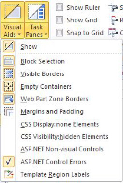
Figure 2-14. Visual Aids menu
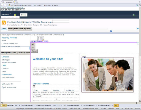
Figure 2-15. Home page with hidden designer elements
Page Sizes and Other Design Elements
To help you with your page layout, SharePoint Designer 2010 provides the following tools, accessed from the View tab, to assist you:
- Show Ruler shows a ruler on the top and side of the application.
- Show Grid overlays a grid on your editing surface. You can change the grid spacing in the Page Editor Options dialog box, shown in Figure 2-16.
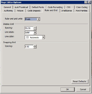
Figure 2-16. Page Editor Options dialog box
- Snap to Grid forces objects to snap to the grid. This makes it easy to keep objects on your page aligned.
- Set Origin from Selection reorients the ruler. Select an element on the page and then select this option, and the zero mark on the ruler will be the left boundary of the item selected.
- Reset Origin resets the origin of the ruler to the left edge of the page.
- Configure opens the Page Editor Options dialog box.
Page Sizes
When you are designing for a particular screen view or page size, it is helpful to be able to see how your work will look at different screen resolutions. The status bar on the bottom of the page has a menu item (Figure 2-17) that enables you to select different screen resolutions. You can select the predefined resolutions or you can edit the selections.
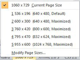
Figure 2-17. Page sizes
List View Tools
This special contextual menu (Figure 2-18) appears whenever a list view control becomes the active control on the page. You will use this menu in later chapters.
Some of the things you can do with the menu are as follows:
- Filter, sort, and group the data in the list view
- Set the paging settings for the control
- Add or remove columns that are viewable
- Enable the inline editing controls
- Work with data connections
- Change the style of the list view control
- Customize the XSLT in the list view
- Set the web part properties
- Perform actions on the table that displays the list (via the full Table Tools menu)
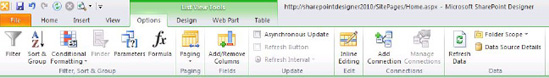
Figure 2-18. List View Tools menu
Editing Surface
The editing surface is where all of the magic happens. When you first open a page to edit, you are presented with the summary of the page, as shown in Figure 2-19. You use this page to view and manage settings for the file. You can set permissions on the file and see its version history. When you are ready to edit, click the Edit File link in the Customization pane.
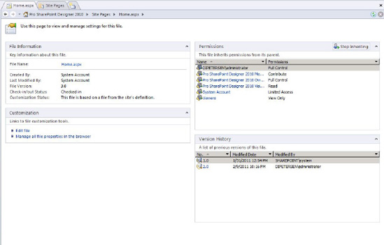
Figure 2-19. Page properties summary
When the file is open to edit, you have the option of editing in three different modes: Design mode, Code view, and Split view. These are covered in more detail next.
Design Mode
Design mode offers a what-you-see-is-what-you-get (WYSIWYG) editing experience. It allows you to create rich, dynamic websites without any knowledge of HTML code. It supports many traditional document-editing functions such as style editing, font selection, copy-paste operations, and drag-and-drop operations to move elements onto the editing surface.
Earlier sections of this chapter covered all of the menus and their functionalities plus all of the task panes that are available in Design mode. If you are comfortable using a word processor to create documents, you will feel comfortable using SharePoint Designer 2010.
Code View
Code view is for the more advanced users. SharePoint Designer 2010 has really grown up in this area. Figure 2-20 shows you what the Home.aspx page you have been working with looks like in Code view.
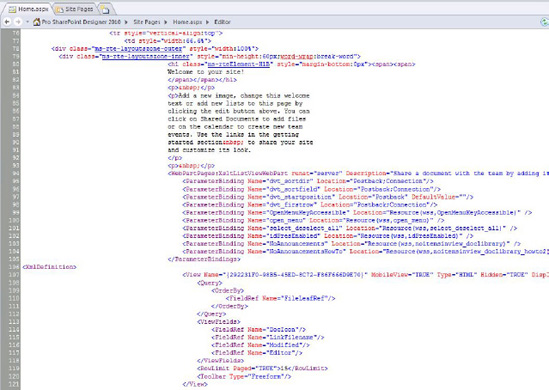
Figure 2-20. Code view
Instead of just providing a text editor for modifying the code for elements on the page, Code view uses color coding to help you recognize different code elements. In fact, Code view offers many of the same features available in modern development environments, including IntelliSense and code snippets.
IntelliSense
IntelliSense has long been part of the Visual Studio development experience. IntelliSense detects what you are typing and then pops up a suggestion for completing your operation. For example, if you were to begin to type the <img> tag, you would be prompted with a list of all properties available to that tag, as shown in Figure 2-21.
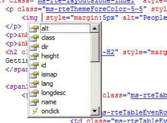
Figure 2-21. IntelliSense menu
The following are some of the things that IntelliSense does while you are editing a page in Code view:
- Completes programming code.
- Completes HTML tags.
- Completes CSS code.
- Closes tags and braces.
- Suggests parameters for HTML tags.
- Automatically codes hyperlinks, which enables you to Ctrl+click through to the source of the code. (For example, a hyperlinked CSS class name would link to a CSS file.)
- Highlights errors in code. If you have errors in your code, IntelliSense will show you the errors in the editor.
Code Snippets
One of the really cool things that you can do in SharePoint Designer 2010 Code view is create and use code snippets. Microsoft has supplied a lot of snippets for the major HTML elements, but if you find yourself typing the same piece of code over and over again, you can create your own code snippet. You can insert a snippet into your code by pressing Ctrl+Enter and selecting the snippet from the list that displays.
EXERCISE 2-7. CREATE AND USE A CODE SNIPPET
Let's say that you always use the same class for all paragraphs on your site. You could create a code snippet that inserts a paragraph tag with the class already defined. Here are the steps:
- Make sure you have SharePoint Designer 2010 open and are connected to a site.
- From the File menu, create a new blank HTML page. Select the Add Item option and then click the More Pages option. You will then see the HTML page item. Select HTML Page and then click Create.
- In the New HTML Page dialog box that displays, name the page Snippet and save it in the Site Pages document library, as shown in Figure 2-22.
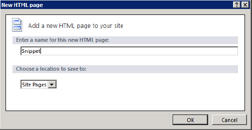
Figure 2-22. New HTML Page dialog box
- After you open the HTML page, access Code view either by clicking Code View from the status bar at the bottom of the page, or by clicking the Code menu item on the View tab.
- Place your cursor between the body tags and type
<pand then a space. IntelliSense suggests the possible attributes you might need with your paragraph. - Select the
classattribute and press Tab. IntelliSense finishes theclassattribute for you and places the cursor between the question marks so you can type the class name. - Type
spd2010as the class name. (This isn't really a name to a CSS class. This is just an example.) Finish by typing the > character after the class, and notice how IntelliSense closes the paragraph tag. When you create code snippets, you can use the single pipe character as a prompt to indicate where to place the cursor when the snippet has been inserted into the code. If you use two pipe characters, it defines a highlighted section that you can use as a text prompt. - Place your cursor between the open and close paragraph tags and type the following:
<p class="spd2010">|Begin typing here|</p> - Highlight the whole paragraph tag and copy it to the Clipboard by pressing Ctrl+C.
- On the Code View Tools menu item, click the Create button in the Code Snippet section. The Add Code Snippet dialog box pops up.
- Type spd2010para in the Keyword box.
- Type SharePoint 2010 Designer paragraph in the Description box.
- Paste your code snippet into the dialog box by pressing Ctrl+V, as shown in Figure 2-23.
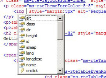
Figure 2-23. Add Code Snippet dialog box 14.
- Click OK.
Now you can test it.
- Erase the paragraph line that you just created.
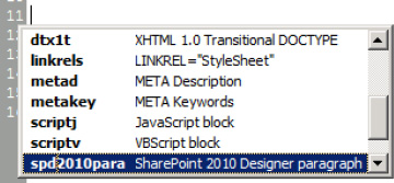
- With your cursor between the body tags, press Ctrl+Enter
Begin typing
spd. Your new code snippet should be highlighted. - Press the Enter or Tab key. Your new code snippet is added to your page, and a highlighted prompt appears, instructing you to begin typing:

- Start typing
SharePoint Designer 2010.<p class="spd2010">SharePoint Designer 2010 - Congratulations, you created your first code snippet!
Split View
Sometimes, when you are editing pages, you want to live in both worlds: you want to make changes in code, but you also want to see how those changes are represented graphically, or you might be making changes in Design view and want to see how those changes are reflected in code. SharePoint Designer 2010 gives you the option to see both views simultaneously:
Making changes in Design view: When you make a change in the Design view, you will automatically see those changes reflected in code.
Making changes in Code view: In Code view, when you are finished making the changes to the code, click in the Design View window to tell SharePoint Designer to redraw the page so you can see your changes.
Status Bar
At the bottom of the editing surface, the Status Bar provides you with a continuously updated status of contextual information on the page. It provides quick, one-click access to any object on the page. You can also switch between Design, Split, and Code views right on the Status Bar.
Creating New Pages
Now that you know what tools you have available, you can dive into creating pages. As you saw in Chapter 1, you can add new pages to your site through the Backstage area available from the File menu. From the Add Item option, you can create pages, lists, or work flows. Later chapters cover lists and workflows in more detail.
There are several kinds of page templates you can use to create new pages with Page Editor:
- Web part page
- New page from master
- HTML page
- ASPX page
- CSS page
- Master page
- JavaScript page
- XML page
- Text file
Using Libraries
Because you are creating new pages for a SharePoint site, you need a place to save the files you create. The common place to save site artifacts is in document libraries. For example, if you create a new site based on the Team Site template, two document libraries are created to store the site artifacts.
Site Pages Library
The Site Pages library is used to create and store pages on the site, including the following:
- Web part pages
- ASPX pages
- HTML pages
Site Assets Library
The Site Assets library is used to store files that are included on pages within the site, including these:
- CSS files
- JavaScript files
- XML files
- Text files
- Images
Note When you create HTML or ASPX pages, they don't have any regions that are editable in Safe mode, so they will all be opened in Advanced mode.
Web Part Pages
Web part pages are pages that have web part regions predefined. When you create a new web part page, you are presented with various layout choices. Figure 2-24 illustrates all of the different web part page layouts that are available. Each grayed-out area represents a web part zone and editable zones —places where you can put web parts, either by using SharePoint Designer or by using the web editing interface.
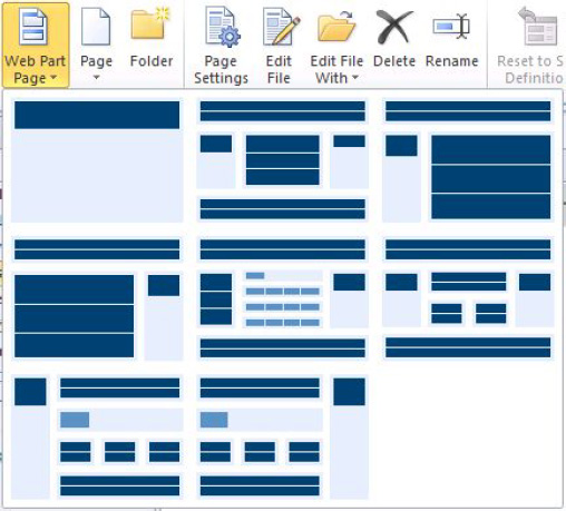
Figure 2-24. Web Part page selector
EXERCISE 2-8. CREATE PAGES AND ARTIFACTS
In this exercise, you will create and edit a new web part page in SharePoint Designer. You will then view the page in the browser and add another web part to the newly created page. You will be able to see how SharePoint Designer reflects changes made in the web editing interface, and how the web editing interface reflects changes made in SharePoint Designer.
Let's get started.
- Make sure that you have a SharePoint site that you can create pages in.
- From the File menu, click Add Item and then select Web Part Page.
- Click the template labeled Header, Left Column, Body, as shown in Figure 2-25.
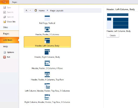
Figure 2-25. Add Item menu
- Click the Create button to the right the page templates.
- In the dialog box that pops up, type Demo Web Part Page as the filename.
- Select Site Pages as the library to store the new file.
- Click the Save button.
- If SharePoint Designer is not already in Design view, click the Design View button on the status bar. You will see that the page has three web part zones. These are also regions that can be edited in Safe mode.
- On the Home tab, click the Preview in Browser button. You will see a blank page in your site.
- In the Site Actions menu item, click Edit Page. Notice the three web part zones, as shown in Figure 2-26. Also notice that the Ribbon menu is also available from the web editing interface.
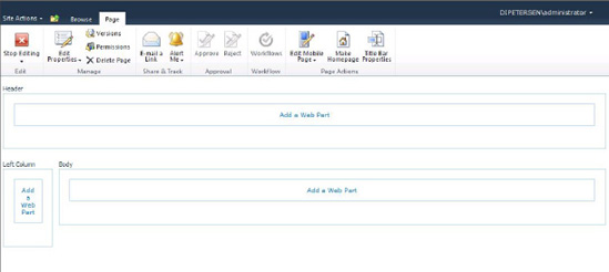
- Click Add a Web Part in the top web part zone.
- Select Lists and Libraries under Categories.
- Select Announcements under Web Parts.
- Click the Add button. A new Announcements web part appears on the page.
- Click the Stop Editing option.
- Now go back to SharePoint Designer and press F5 to refresh the editing surface. The web part you added in the web interface is now present in the SharePoint Designer editing surface.
- Switch to Code view and take a look at the code for the web part, as shown in Figure 2-27.
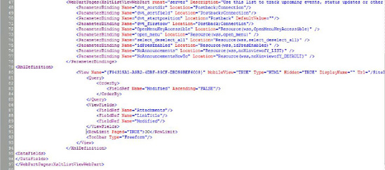
- Switch back to Design view.
- Close the web part page.
- Click the Site Assets library.
- On the Ribbon, click the Assets menu. From the Asset drop-down, select CSS to create a new CSS page.
- Name the page
mystylesheet.css. - Click the filename. The page's properties windows open.
- Click Edit File in the Customization section of the property page. Notice that there is no Design view for CSS files.
- Start typing Table {'. Notice how IntelliSense suggests different elements you can apply the style to. Notice how it also completes the bracket and then suggests style elements.
- Continue typing other elements and notice that the code is color-coded.
- Close the CSS page.
- Experiment with other pages. Try an HTML page. Try a JavaScript file. Notice what menus are available.
Summary
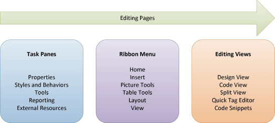
This chapter covered all the tools SharePoint Designer provides when you create and edit pages as depicted in the figure below. You learned about
- Task Panes
- Properties
- Styles and Behaviors
- Tools
- Reporting
- External Resources
- The Ribbon Menu
- Home
- Insert
- Picture Tools
- Table Tools
- Layout
- View
- Editing Views
- Design View
- Code View
- Split View
- Creating Code Snippets
- Using the Quick Tag Editor
You also covered how to create a new web part page and other artifacts, and observed the interaction between the web editing environment and the editing surface in SharePoint Designer.